")
Designing a layout involves placing boxes on a page and ensuring they remain aligned when the screen size changes. For years, that meant working around limitations — floats, manual spacing, or building everything in one direction.
CSS Grid changes the game. Rows and columns function as a single system, allowing galleries, product grids, and team sections to come together with less effort and hold up better over time. In this post, we’ll walk you through the basics of Grid and show you how Divi 5‘s Grid makes it visually appealing.
What Is CSS Grid?
Think of CSS Grid like a spreadsheet for your layout. You set up rows and columns, and everything fits into cells. Some items are confined to one cell, while others span several. The structure holds, giving you clean alignment without margins or positioning hacks.
Here’s how it works: You define a container as the grid, and everything inside becomes a grid item. Rows run horizontally, columns vertically.
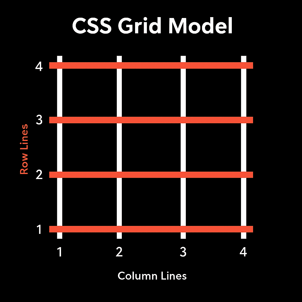
The space between them is referred to as the gap. You control it directly instead of adding padding or extra divs to fake spacing.
You can define every row and column yourself for full control, or let the browser create rows automatically as content fills the space. Both approaches are effective, depending on the layout’s needs.
Grid brings something that older methods couldn’t do well: rows and columns working as one system. Before Grid, you’d align items in one direction at a time using floats or inline blocks. That worked for simple layouts, but it got messy once you needed structure that went both across and down the page.
Grid handles both directions simultaneously, so galleries, product grids, and multi-section pages come together with less code and fewer workarounds. It’s supported across all modern browsers, so there’s no compatibility guesswork.
CSS Grid vs. Flexbox
Flexbox and Grid get compared often, but they solve different problems.
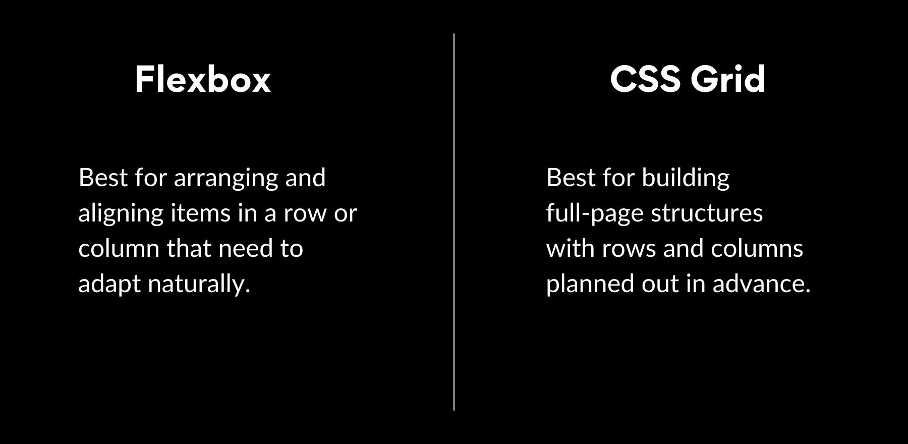
Flexbox works in one direction at a time (either arranging items in a row or stacking them in a column). This makes it great for navigation bars, button groups, or card layouts where everything lines up along a single axis. You control spacing, alignment, and order, but you’re always working within that one line of flow.
Grid works in two directions at once. You define rows and columns together, and items can sit anywhere inside that structure. You’re not limited to a single line. This is where Grid pulls ahead for page sections, image galleries, or dashboards where content needs to align both horizontally and vertically at the same time.
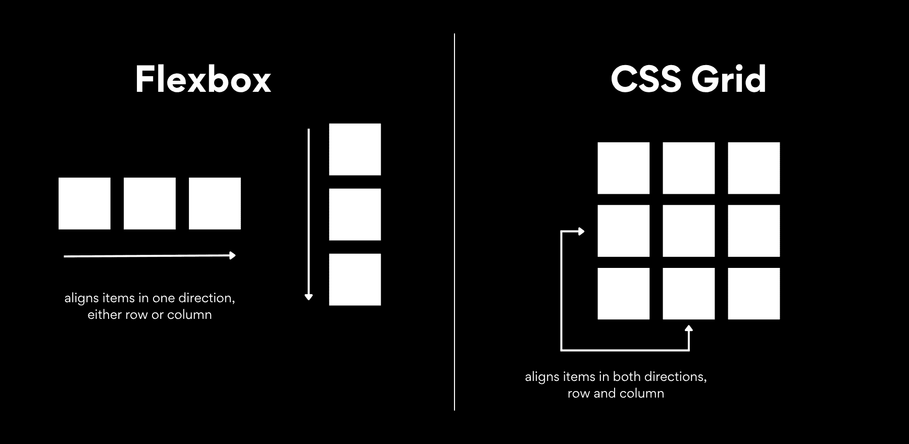
Grid makes advanced layouts easier because you’re not stacking one-dimensional systems on top of each other, hoping they hold together. Rows and columns are part of the same framework, so spacing stays consistent, alignment happens naturally, and making changes doesn’t break the whole structure. You define the layout once, place your items, and the grid keeps everything in position as the screen size changes.
How CSS Grid Works In Practice
Let’s look at how this works in actual code. Starting a grid takes three things: declaring the container, defining your columns or rows, and setting the gap. Here’s a simple example:
.container {
display: grid;
grid-template-columns: 1fr 1fr;
gap: 20px;
}
This gives you a two-column grid. Each column takes up equal space, and there’s a 20px gap between items. Any child elements inside the container automatically flow into this structure.
The fr unit stands for fractional unit. It divides available space into shares. So 1fr 2fr means the first column gets one share and the second column gets two shares. The browser calculates the space and distributes it proportionally.
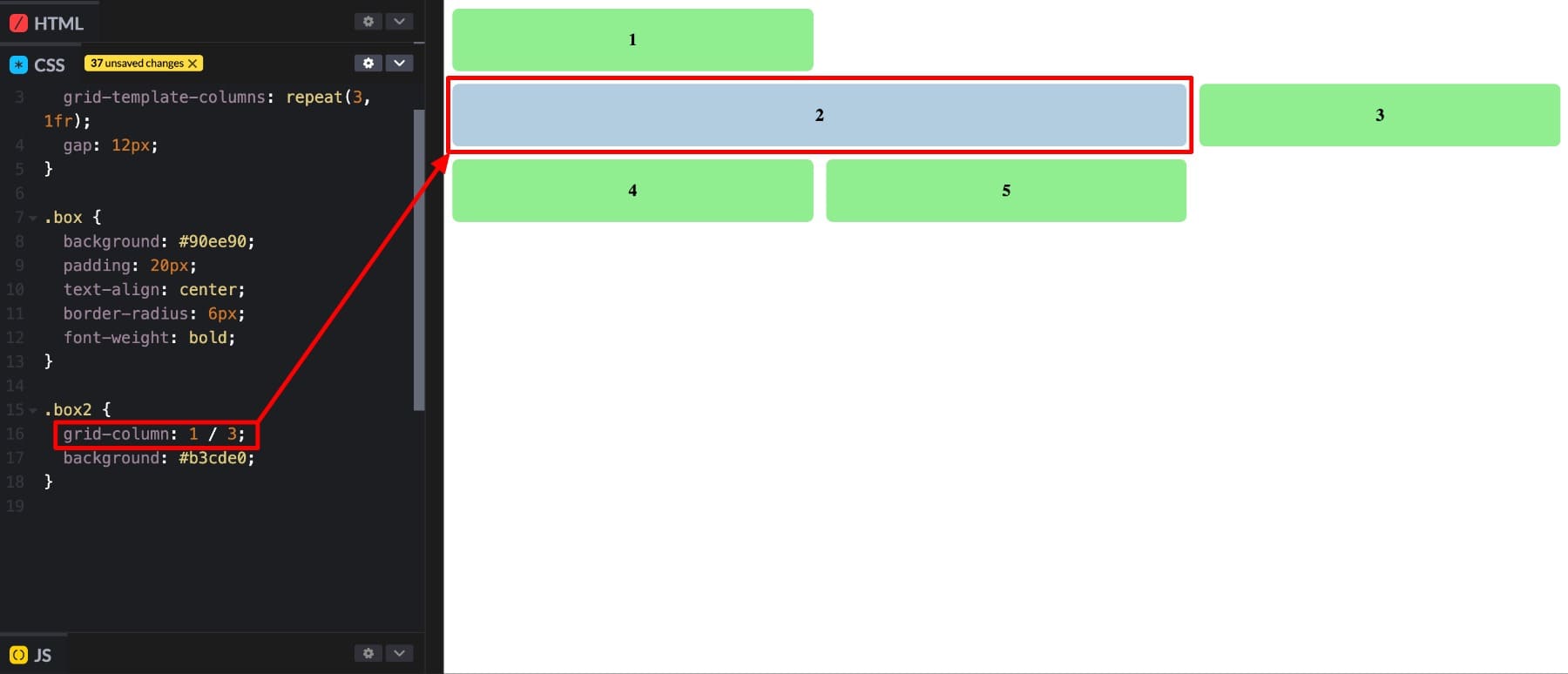
You can also position individual items across multiple cells. The grid-column property controls this. Using grid-column: 1/3 tells the item to start at the first vertical line and end just before the third line. That spans two full columns.
Grid comes with a full set of properties that control layout behavior. Columns, rows, alignment, spacing, and item placement all have their own controls. Here’s the complete list:
| Property | What it Does | Example Value / Use Case |
|---|---|---|
| display: grid | Turns the container into a grid layout. | display: grid; |
| grid-template-columns | Defines how many columns and their widths. | grid-template-columns: 1fr 2fr; |
| grid-template-rows | Defines how many rows and their heights. | grid-template-rows: auto 200px; |
| grid-template-areas | Creates named grid areas for easier placement. | header header" "sidebar main" |
| gap (or grid-gap) | Sets the spacing between rows and columns. | gap: 20px; |
| justify-items | Aligns content horizontally inside each cell. | justify-items: center; |
| align-items | Aligns content vertically inside each cell. | align-items: start; |
| grid-column | Lets an item span across multiple columns. | grid-column: 1 / 3; |
| grid-row | Lets an item span across multiple rows. | grid-row: 2 / 4; |
CSS Grid In Divi 5
Writing CSS Grid by hand requires understanding the syntax, memorizing property names, and testing code to ensure it works. For developers, that’s manageable. For designers, content creators, or anyone building sites visually, it’s a barrier. You either skip Grid or spend time learning code that pulls you out of the design process.
Divi 5 removes that barrier. The core CSS Grid properties have been converted into a visual control inside the builder. Defining columns, adjusting gaps, and spanning items across cells can all be done through options that are visible and clickable. You’re applying the same Grid properties developers use, but you’re doing it visually.
This approach builds on how Divi handles layout overall. Flexbox is the foundation because it covers most everyday layout needs with clean, efficient CSS. It handles alignment, spacing, and responsiveness well for single-direction designs.
Grid sits on top as an optional layer. When a section requires structure in two directions (rows and columns working together), you enable Grid and gain that control without leaving the visual editor. It also works with the responsive editor and customizable breakpoints.
You can define different column counts, gaps, or item spans for desktop, tablet, and mobile. The builder displays each breakpoint as you design, allowing adjustments to occur in context rather than through separate media queries.
The result is a system that strikes a balance between speed and flexibility. Flexbox keeps common layouts lightweight and fast to build. Grid steps in when you need precise, multi-directional structure. Both work inside the same visual workflow, so you’re not switching between tools or writing custom code to access advanced layout features.
What makes this approach work is that you’re building visually the entire time. There’s no back-and-forth between the builder and a code editor. No testing in the browser to see if a property worked. The controls provide immediate feedback, making prototyping layouts faster and adjustments possible in real time. You get the full power of CSS Grid without needing to write or understand a single line of CSS.
New Grid Structures
Enabling Grid in Divi 5 alters the behavior of rows and sections. You’re no longer limited to items flowing in one direction. Columns, rows, offsets, and sizing patterns become part of the layout structure, letting you control exactly where each element sits and how much space it takes.
Modules align to the grid automatically. Gaps adjust based on your settings. Items follow the sizing rules you define, so there’s no need to add manual margins or positioning tweaks to make things line up. The offset editor adds another layer of control by letting you create patterns across the grid. You can make every fourth item span two columns, shift where items start, or break up visual repetition to add rhythm to the layout.
How It Works
Getting started takes one step. Enable the Grid option on any section, row, column, or group.

Once the Grid is active, you define the number of columns and rows using fractional units or repeat patterns. The controls allow you to set flexible sizing, so columns and rows adjust according to available space.

After that, you adjust the gap between items, set alignment, and use item spanning when you want certain modules to stretch across multiple cells.
You can start with a pre-built grid template if you want a layout ready to go. Drop in your modules, and the structure is already set. Or you can define rows and columns from scratch, adjust the gaps, and decide which items span multiple cells to create emphasis. The builder handles the CSS, so you’re working visually the entire time.
Practical Use Cases In Divi
Let’s look at some of the most common CSS grid examples you’ll be able to create without manual coding:
1. Blog Post Grids
Blog grids work naturally with Grid layouts, and Divi’s Loop Builder makes them even more practical. The Loop Builder pulls content directly from your posts (titles, excerpts, images, and metadata) and automatically populates each grid item. When you publish a new post, it appears in the grid. When you delete one, the layout adjusts. There’s no manual updating or rebuilding the layout every time your content changes.
The offset editor adds flexibility. You can make every fourth post span two columns or adjust how specific items stretch across rows. That breaks up the repetition and gives the grid visual rhythm without needing custom code for each variation.
This same approach works for any content that updates regularly. Product grids for WooCommerce shops, portfolio galleries, team member sections, or event listings benefit from the Loop Builder paired with Grid. You design the layout once, define the grid structure, and the content fills itself in as it changes.
2. Image Galleries
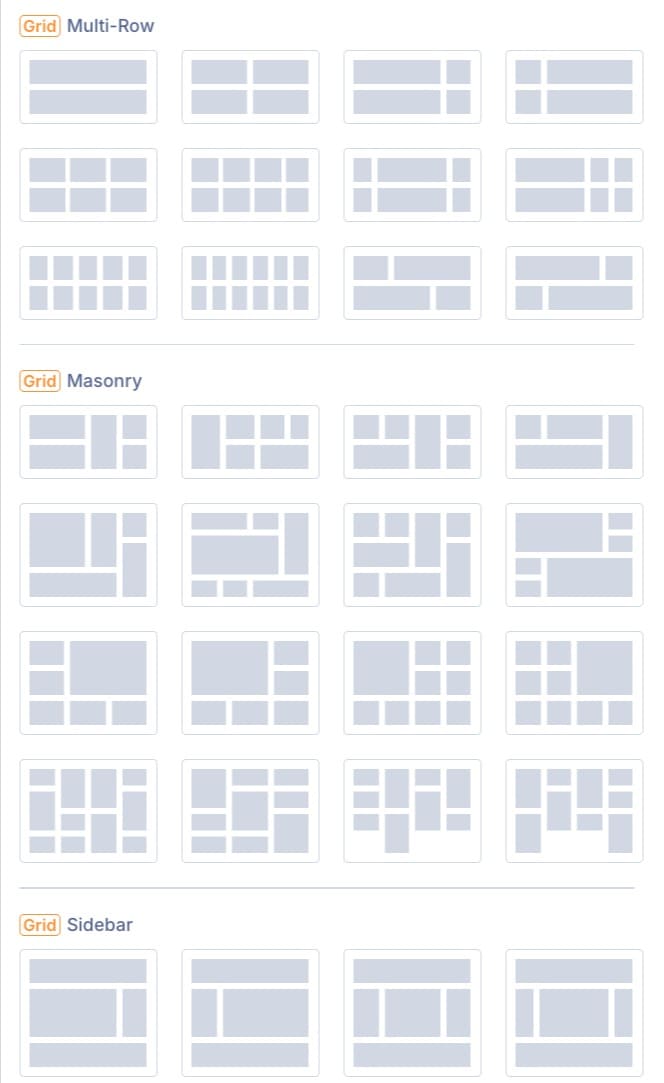
Image galleries show Grid’s structural flexibility. Divi’s grid structures offer three layout options: multi-row grids, masonry layouts, and sidebar sections.
Standard grids arrange images in even rows and columns. Masonry layouts allow images to stack naturally based on height, eliminating awkward gaps that can occur with taller images. Sidebar sections place a featured image or content block alongside a grid of smaller images.
Switching between these structures takes one click. You don’t have to build each layout from scratch or write custom CSS to get Masonry working. The grid handles the structure, and you adjust column counts, gaps, and item spans to match the design you’re after.
3. Page Layouts
Grid makes it easy to create entirely different page designs by adjusting a few settings. Change the number of columns and your layout shifts from a single content stream to a multi-column magazine layout. Adjust row spans and a standard hero section becomes a layered, asymmetric design. Modify gaps and the same content feels either tight and editorial or open and minimal.
The controls live in the settings panel. You can set the grid direction, adjust column and row dimensions, and fine-tune alignment. Each change updates the layout instantly in the builder, so you see exactly how the design transforms as you work. Individual grid items also have their own sizing controls, so you can adjust width, height, and position to create layouts that feel intentional.
Create Grid Layouts With Divi 5 Today
CSS Grid gives you control over rows and columns simultaneously, making complex layouts cleaner and easier to maintain. However, using it directly means learning the syntax and testing the code.
Divi 5 turns every Grid property into a visual control. Flexbox handles everyday layouts, while Grid steps in for structured, two-dimensional designs. Both work inside the same builder. Blog grids, image galleries, and page layouts become faster to build and simpler to adjust. The structure is consistent across screen sizes, and layout changes occur through settings rather than custom CSS.


Leave A Reply