
Flexbox and Grid are the two layout systems that define modern CSS. At first glance, they seem similar. Both handle rows and columns, manage alignment and spacing, and replace the old float-and-table workarounds. The real difference is in how they approach layout challenges and the kind of problems each one solves best.
This post explains the difference between Flexbox and Grid and shows when to use each. We’ll also show you how Divi 5 integrates Flexbox to help you create stunning websites quickly.
What Is Flexbox
Flexbox, short for Flexible Box Layout, is a CSS layout model designed to make arranging elements easier and more predictable.
At its core, Flexbox works in one direction at a time. You can line items up across a row or stack them in a column. That single decision defines how everything inside the container behaves. Rows make items flow horizontally, while columns let them stack vertically.
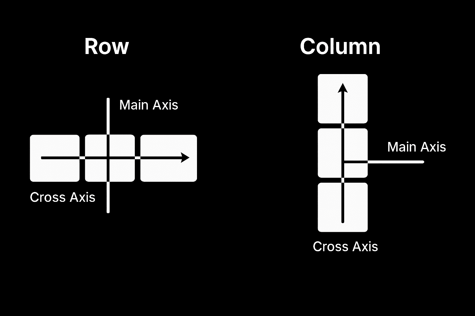
Once you’ve set the direction, Flexbox gives you a set of controls to fine-tune the layout. You can push items to the left, right, or center, spread them out so the gaps are always equal, or stretch them so they automatically fill the available space. You can even change the order of elements without touching your HTML, which makes it easier to experiment with different designs.
These options create layouts that adapt without much effort. For example, a navigation bar can keep its links evenly spaced no matter how wide the screen is.
A row of buttons can sit perfectly centered in a hero section.
A group of cards can stay the same height, even when the content inside each one is different.
Here are some of the Flexbox properties you’ll use most often. They control alignment, spacing, and order:
| Property | Used On | What It Does |
|---|---|---|
| display: flex | Container | Enables flex layout on the container and activates Flexbox behavior. |
| flex-direction | Container | Defines the direction of items: row (default), row-reverse, column, or column-reverse. |
| flex-wrap | Container | Allows items to wrap onto multiple lines: nowrap (default), wrap, wrap-reverse. |
| justify-content | Container | Aligns items along the main axis: flex-start, center, space-between, space-around, space-evenly, flex-end. |
| align-items | Container | Aligns items along the cross axis: stretch (default), flex-start, center, baseline, flex-end. |
| align-content | Container | Aligns multiple rows of content when there is extra cross-axis space: stretch, flex-start, center, space-between, space-around, flex-end. |
| flex | Item | Shorthand for setting flex-grow, flex-shrink, and flex-basis together. |
| flex-grow | Item | Controls how much the item will grow relative to others. |
| flex-shrink | Item | Controls how much the item will shrink relative to others. |
| flex-basis | Item | Sets the initial size of the item before growing or shrinking. |
| align-self | Item | Overrides align-items for a specific item. |
| order | Item | Changes the order in which the item appears within the flex container. |
Flexbox takes care of alignment and spacing in a way that feels logical, reliable, and responsive across screen sizes, and that’s why it became a go-to for modern web design.
What Is CSS Grid
CSS Grid is a layout system that works differently from Flexbox. While Flexbox arranges items in one direction at a time, Grid handles two directions together: rows and columns.
You can picture it like drawing a spreadsheet on your page. The horizontal lines form rows, the vertical lines form columns, and the spaces in between create cells where your content sits.
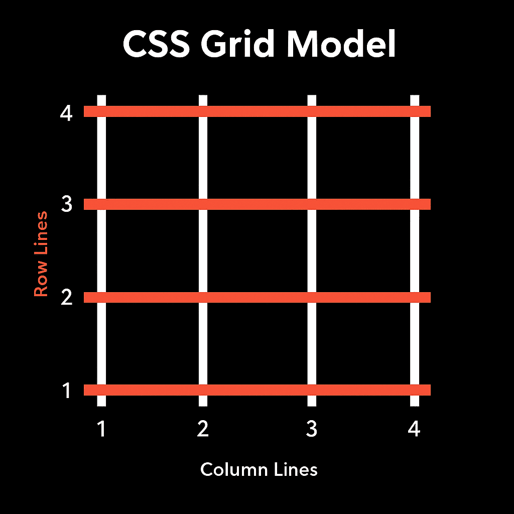
Once the Grid is in place, you decide how the rows and columns should behave. They can all be equal, or you can mix and match sizes. For instance, you might have one wide column beside two narrow ones, or a tall row stacked above shorter rows. Each cell in that structure acts like a container, and content snaps neatly into place.
Items can also stretch across multiple cells. A hero image might take two columns and two rows, while a sidebar might sit in just one column but stretch the full height of the page.
This level of control gives you precision in layout. With Grid, you are designing the blueprint of the page, which makes it useful for layouts like magazine-style pages where headlines, images, and text blocks need to be locked into place.
Image galleries that stay evenly arranged no matter the size, spacing, or number of photos.
Content and sidebar pages lock into two columns on desktop and stack into one on mobile using grid-template-areas.
Here are some of the Grid properties you will use most often. They define the structure of rows and columns, control spacing, and let items adjust across multiple cells:
| Property | What it Does | Example Value / Use Case |
|---|---|---|
| display: grid | Turns the container into a grid layout. | display: grid; |
| grid-template-columns | Defines how many columns and their widths. | grid-template-columns: 1fr 2fr; |
| grid-template-rows | Defines how many rows and their heights. | grid-template-rows: auto 200px; |
| grid-template-areas | Creates named grid areas for easier placement. | header header" "sidebar main" |
| gap (or grid-gap) | Sets the spacing between rows and columns. | gap: 20px; |
| justify-items | Aligns content horizontally inside each cell. | justify-items: center; |
| align-items | Aligns content vertically inside each cell. | align-items: start; |
| grid-column | Lets an item span across multiple columns. | grid-column: 1 / 3; |
| grid-row | Lets an item span across multiple rows. | grid-row: 2 / 4; |
The Difference Between Flexbox And Grid
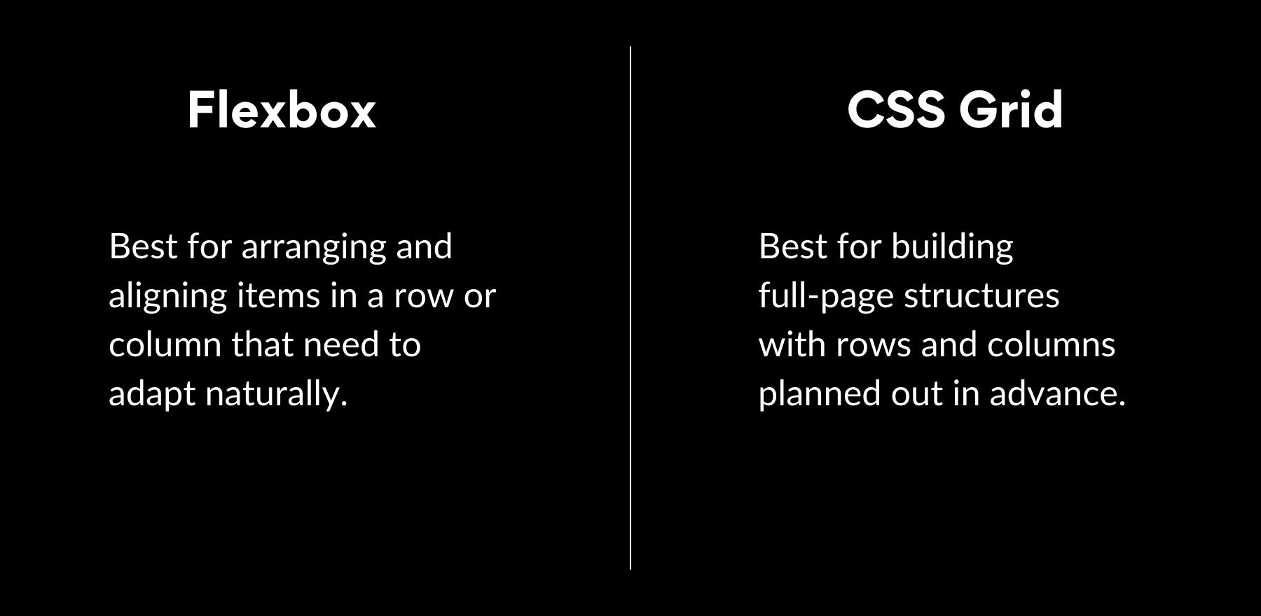
Flexbox and Grid solve different parts of the layout puzzle. One handles alignment and spacing in a single direction, while the other defines the overall framework in two. They often overlap, and in practice, many layouts use both.
So to make the contrast clearer, here’s a side-by-side look at how the two systems compare on the factors that matter most in real web design:
| Factor | Flexbox | CSS Grid |
|---|---|---|
| Syntax | display: flex; | display: grid; |
| Layout Direction | One-dimensional (row or column) | Two-dimensional (rows and columns) |
| Best For | Alignment, spacing, small structures | Page-wide layouts, structured grids |
| Content Flow | Content-driven, items adjust to space | Layout-driven, content snaps into cells |
| Alignment Options | Easy distribution and centering | Precise placement across both axes |
| Complexity | Quick to set up | More setup but powerful for structure |
| Common Examples | Nav bars, button groups, equal cards | Magazine pages, galleries, sidebars |
| Responsiveness | Items naturally reflow on screen size | Needs explicit responsive templates |
| Browser Support | Excellent support across all browsers | Strong support in modern browsers, limited in older ones (e.g. IE11) |
This table makes it clear that there isn’t a clear winner between Flexbox and Grid. Each shines in different scenarios, and the best layouts often combine them.
When To Use Flexbox Vs CSS Grid
The real challenge isn’t learning what Flexbox and Grid are, but knowing which one to reach for in the middle of a project. The decision often comes down to how predictable your layout is.
Flexbox works best when the content itself is driving the layout. It handles elements that change often, such as text that varies in length, buttons that need to space themselves evenly, or form fields that should expand to fill the remaining room. In these cases, you don’t want to hard-code positions. You want the layout to respond naturally as the content shifts.
Grid comes into play when the structure is fixed and predictable. Dashboards, product catalogs, or multi-column sections benefit from rows and columns that stay locked in place no matter what content is dropped in. If you already know the blueprint, like three equal columns or a sidebar next to a main content area, Grid is the better fit.
In short:
- Use Flexbox when layouts need to adapt.
- Use Grid when the structure needs to stay defined.
Flexbox In Divi 5
Flexbox has become the foundation of how rows and columns work in Divi 5. Older layout methods were replaced, and now every section, row, and column runs on Flexbox. That means the controls you use in the builder are directly tied to modern CSS behavior.
Subscribe To Our YouTube Channel
Flexbox in Divi 5 is a layout system that feels natural in daily use while staying powerful under the hood. Most users don’t constantly want to write CSS by hand, but developers using Divi want precision and control without fighting against outdated methods.
Flexbox strikes that balance. It makes simple tasks like centering a header, spacing out buttons, and equalizing column heights quick and intuitive while offering the fine-grained control advanced users expect. In practice, this means designs behave more predictably across screen sizes and require fewer fixes behind the scenes.
Learn Everything About Divi 5’s Flexbox
It’s Built Into Divi 5
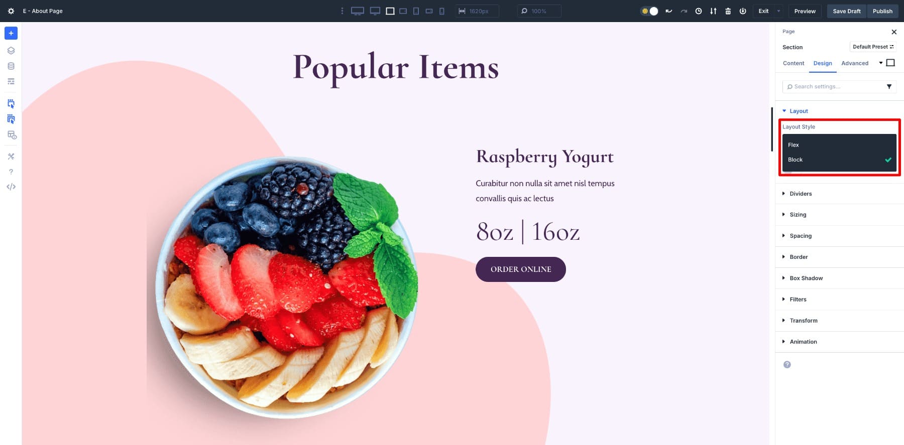
In Divi 5, every section, row, and column you add now runs on Flexbox by default, meaning alignment, spacing, and responsiveness are handled intelligently from the beginning.
At the same time, you’re not locked in. If a design calls for a simpler block layout, you can change a section, row, or column back to Block mode with a single click. The default is modern and predictable, but the option to override it is always there.
Divi 5 also introduces new row structures powered entirely by Flexbox. You can instantly change the number of columns, and Flexbox automatically recalculates the spacing and alignment.
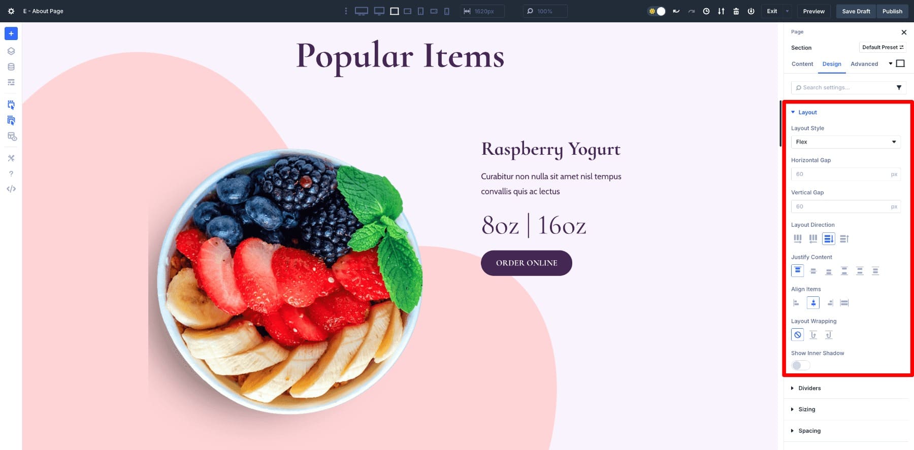
On top of that, each layout element comes with built-in Flexbox controls. Instead of writing CSS, you can fine-tune direction, wrapping, spacing, and order directly in the design panel. Switching from a row to a column, or centering items vertically in a hero, is one click away, and the results update live as you work.
This deep integration is what makes Divi 5 different. Flexbox isn’t layered on top of an older system. The entire layout engine has been rebuilt around it, which is why designs feel more consistent, more responsive, and easier to manage across devices.
Combine Flexbox With Nested Rows
Nested Rows give you the freedom to build grid-like structures without writing CSS. Drop a row inside another row, and suddenly you’re not limited to the standard column structures. You can create complex, multi-level layouts much like a Grid system.
Want a four-column portfolio, a product gallery, or a dashboard? Nested Rows let you do it visually, with containers that are flexible, responsive, and infinitely nestable. That infinite nesting makes them so powerful. You can keep stacking and arranging as your design demands, and Divi handles the alignment and responsiveness automatically in the background.
What makes this even more powerful is how Nested Rows combine with Flexbox controls. The first benefit is the Change Column Structure option. You can instantly change the number of columns, and Flexbox recalculates spacing and alignment in real time. Add or remove a column, and the layout adapts smoothly without breaking, even when Nested Rows are stacked several levels deep.
With Flex enabled, those same columns can also stretch to equal height automatically. This is the kind of result you would typically expect from Grid, and it keeps your pricing tables, product listings, or card layouts neat and consistent without extra effort.
The last piece is responsive control. With Flex, layouts adjust naturally as screen sizes change, but Divi takes it further by letting you define different column structures for different customizable breakpoints.
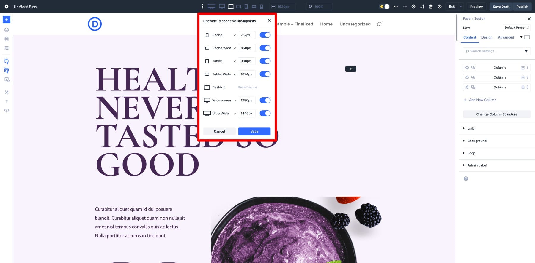
A four-column row on desktop can collapse into two on tablet and a single stack on mobile, all managed visually from the Design tab. The new Responsive Mode Editor also makes it simple to preview and fine-tune those breakpoints directly in the builder, so your layouts look polished at every size without guesswork.
Try Flexbox In Divi 5 Today
That’s the real strength of Divi 5. Flexbox is the foundation, handling everyday alignment and spacing with ease. Grid-like features such as nested rows, column structures, and equal-height options give you the structure needed for more advanced layouts.
Together, they bring the best of both. With Divi 5, you are never at a crossroads. Start with Flexbox, add Grid-inspired structure when you need it, and let Divi handle the complexity in the background.


Confusing. The video only deals with Flex; but ET’s latest LinkedIn post of 15 September has a post labelled ‘CSS grid incoming’. Maybe better to reserve this blog post until CSS Grid component is completed!