
Great carousels do more than slide left and right, they guide attention and create rhythm. With Divi 5’s new Group Carousel module, you can shape transitions visually inside the builder without writing a line of code.
Subscribe To Our Youtube Channel
By styling the active slide differently from the surrounding ones, you create hierarchy, flow, and focus. Small shifts in saturation, scale, borders, and hover states alter the feel of a carousel, from quiet and editorial to bold and energetic, without overwhelming the design.
In this post, we’ll show you how to create transitions that change the experience, not just add movement. Here are four quick ideas you can apply in minutes. Let’s get to it!
How Divi 5 Makes Custom Carousel Transitions Possible
Divi 5’s Group Carousel module gives you full control over how each slide appears and moves without touching code. The trick is understanding two settings that do most of the heavy lifting: Active Groups and Groups.
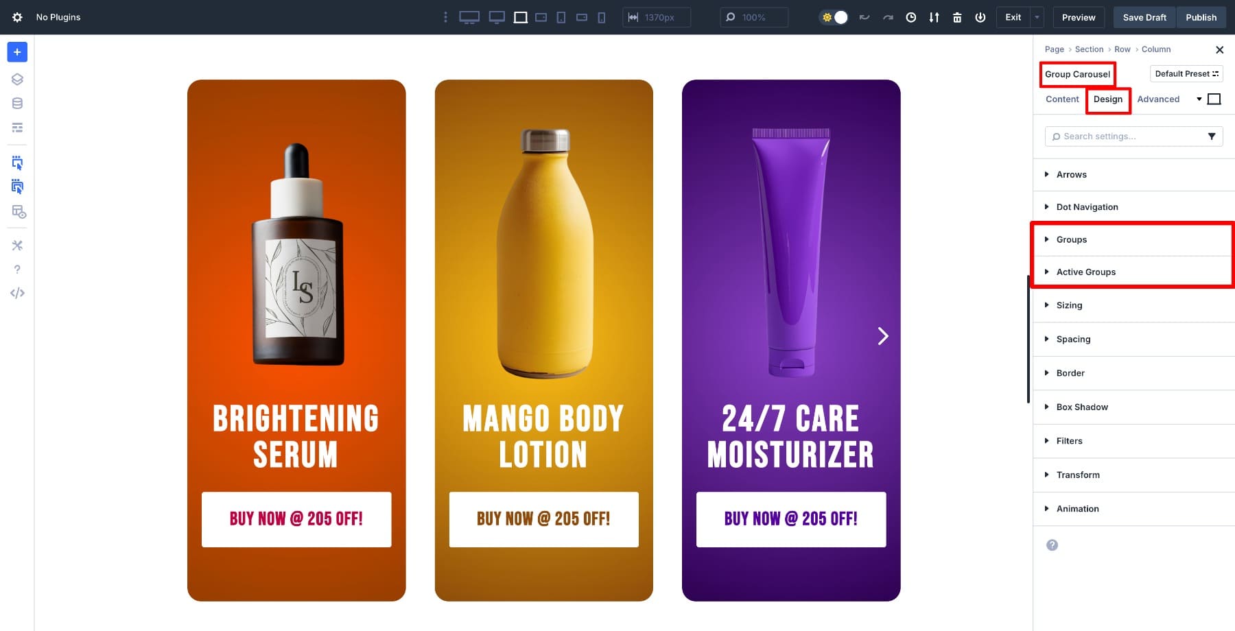
Active Groups control the center slide, the one in focus. This is where you add the “hero” styling: sharper shadows, bolder colors, larger scale, or anything that makes it stand out. Whatever you set here applies only to that single active slide.
Groups handle all the other slides in the carousel. These are usually styled more softly, with lower opacity, grayscale filters, and lighter shadows, so they frame the center slide without competing for attention.
If you don’t change these settings, every slide looks the same. But the moment you style these two states differently, you get instant contrast and hierarchy. The center slide takes the spotlight, and the rest fade into supporting roles.
That’s why this small detail makes such a big difference: it looks like a complex animation, but it’s really just two toggles inside the Visual Builder.
Learn Everything About Divi 5’s Group Carousel Module
4 Carousel Transition Effects You Can Try
Below are four easy ways to add motion and depth to your carousels using Divi’s built-in design options.
1. Make Your Center Slide Pop With Filters
Picture a logo carousel where one logo shines in full color while the rest quietly fade into grayscale. As the slides move, each logo smoothly shifts from muted to vibrant when it reaches the center, then softens again as it moves away. Without hard cuts or visual chaos, the visitors see a natural flow that tells them exactly where to look.
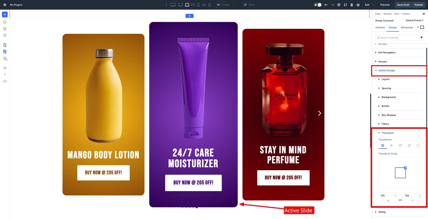
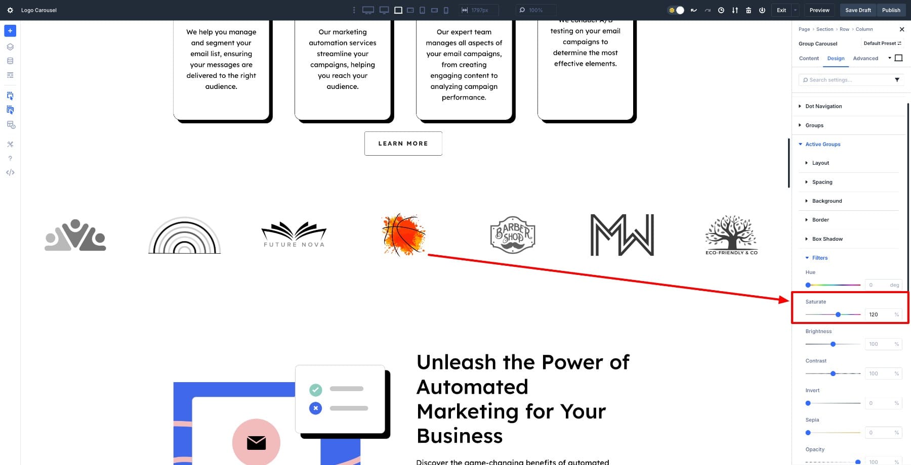
To build this, open your Group Carousel module and go to the Design settings. Under Active Groups, set the Saturate filter to around 120% to make the center slide pop in full color.
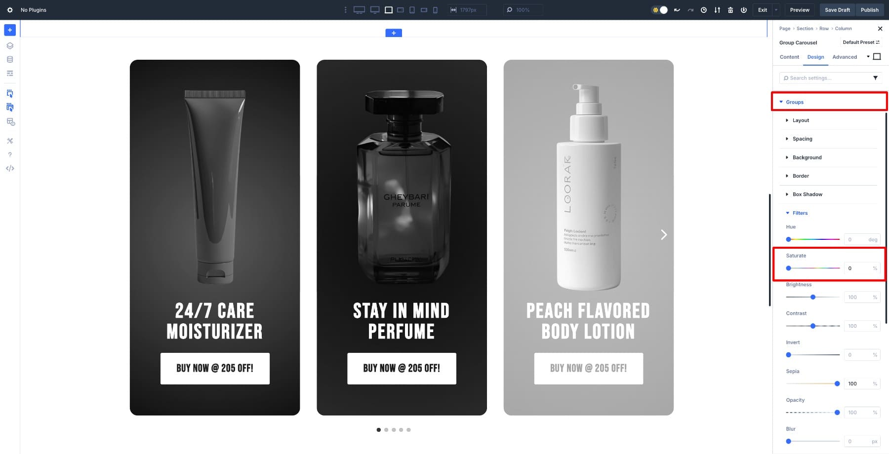
Then switch to Groups and set Saturate to 0% to desaturate the surrounding slides.
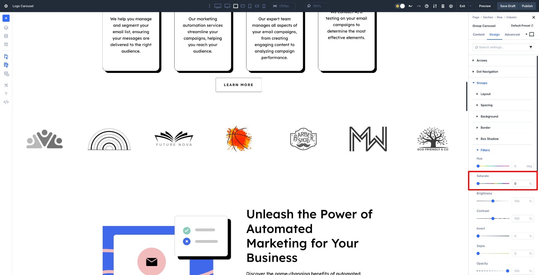
That’s it. As the carousel moves, the transition happens automatically. This simple tweak works beautifully for logo bars, client showcases, or any carousel where you want a single focal point at a time.
But saturation is just the starting point. In the same Filters tab, you can blur inactive slides to make the center sharper, adjust brightness to create a spotlight effect, or increase contrast to make the active slide feel more defined. By mixing and matching these settings, you can build countless variations of transition effects without touching a line of code.
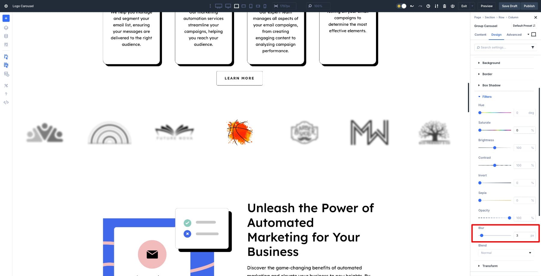
An example of how the blurred logos will look with only the center slide visible
That was a subtle one. Now let’s dial it up a notch with a little movement.
2. Add Subtle Movement With Transform Effects
Imagine scrolling through a carousel and feeling the center image lean toward you just a little. It’s subtle, but it immediately tells your eyes, this is the one to pay attention to. That’s what transform effects do best, they add movement without turning the layout into a circus.
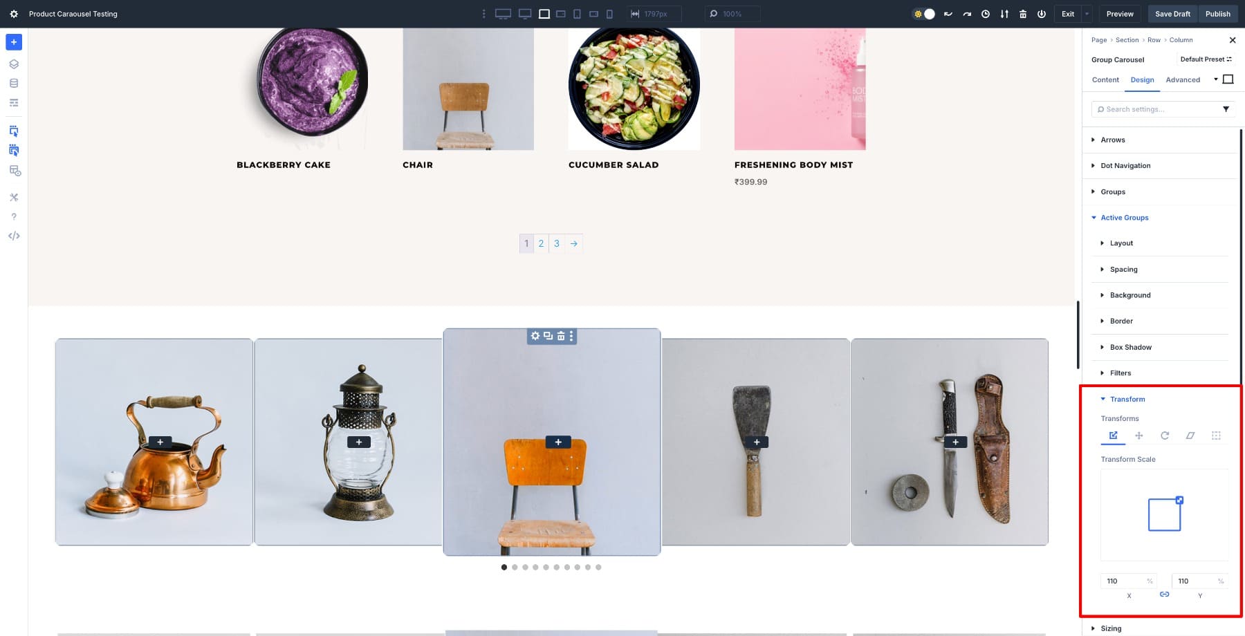
Under Active Groups, set the (Transform) Scale to about 110%. This small bump makes the center slide feel closer and more alive.
Then, switch to Filters and increase Saturation to around 200% to amplify the colors and make the focal slide pop.
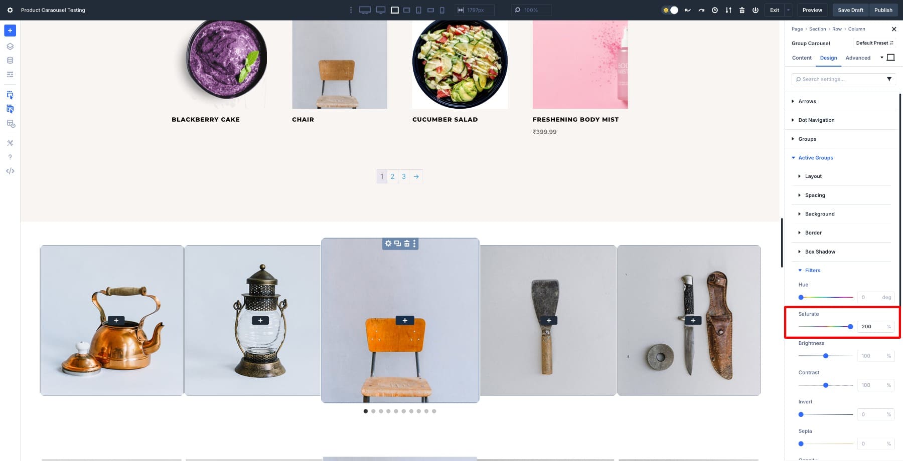
Leave the Groups settings at their defaults, or keep Scale at 100% and Saturate at 100% for a more balanced, minimal look. This contrast between the enlarged, vivid center slide and the smaller, softer surrounding slides creates depth and pulls attention where it belongs.
Transform effects are your go-to when you want a carousel to feel dynamic without becoming chaotic. A small scale or rotation adds depth and energy, making your slides feel alive without overcomplicating the design. Pair it with subtle translate or skew adjustments, and you can create endless transition variations that feel unique every time.
3. Add Interaction And Personality With Hover Effects
Movement works even when users don’t do anything. But sometimes, giving them a chance to interact makes it feel personal.
A static carousel can look polished, but it doesn’t always feel personal. Hover effects change that. Imagine moving your cursor over a team member’s photo and seeing a glimpse of their hobby or a different expression. It’s a small change, but it immediately makes the carousel feel more human and approachable.
To set this up, switch your layout to Hover state.
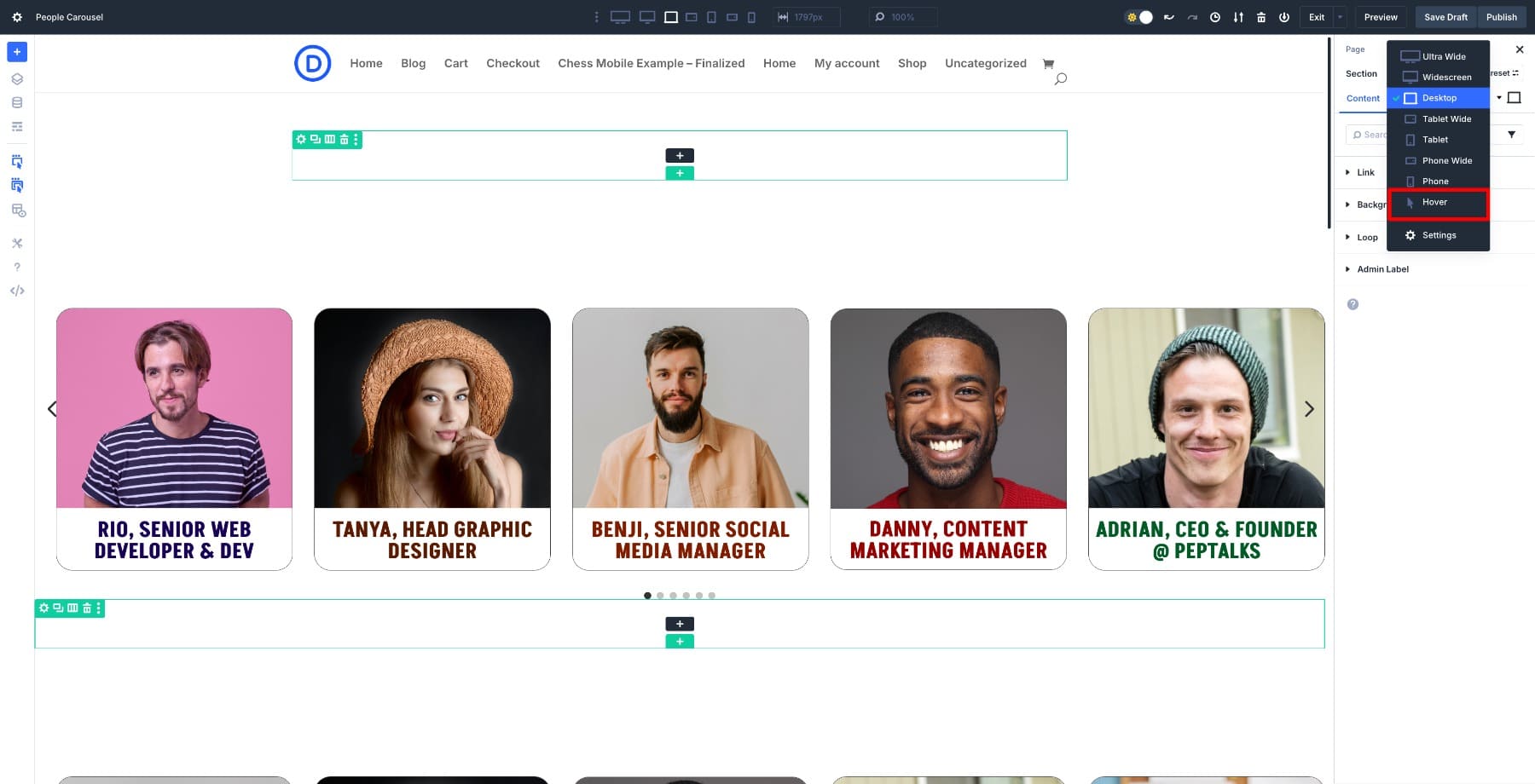
Now, just replace the default image with the alternate one you want to reveal on hover. You can do this for each slide, giving every image its own moment of personality.
The transition between images is smooth and automatic. It’s an easy way to turn a clean layout into an experience that invites interaction and lingers in memory.
Hover effects shine when your goal isn’t just to display faces but to spark a connection. They make visitors pause, look closer, and remember what they saw.
4. Frame The Focal Point With Border Effects
Sometimes, the simplest way to draw attention is to frame it. Picture a feature carousel where the center slide carries a clean, bold border while the surrounding slides fade quietly into the background.
Under Active Groups, go to Border and add a border with your preferred width, style, and color. A solid border with a 10px width works well for most designs. Pick a color that either complements your brand or contrasts with the slide content to make it stand out.
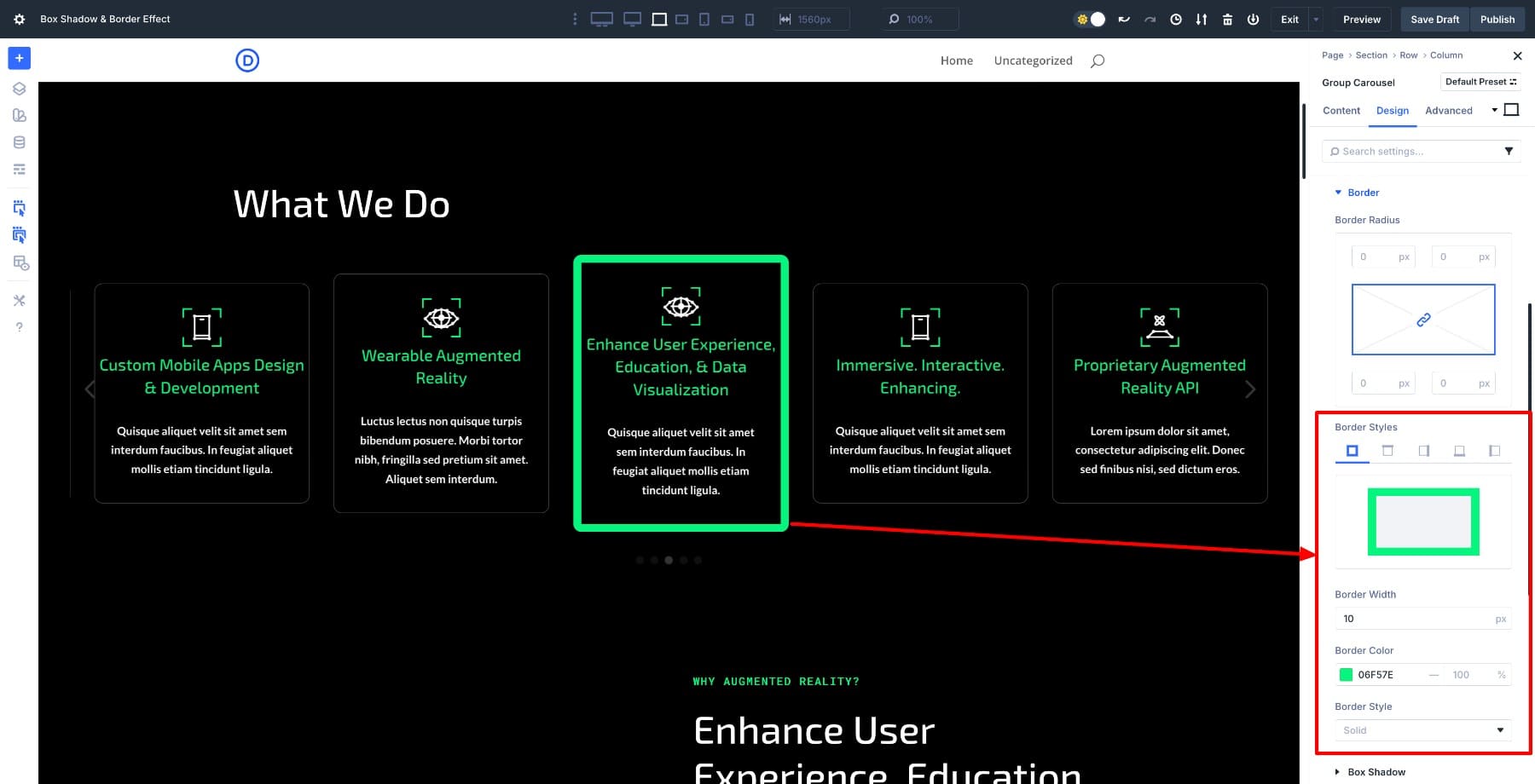
For Groups, either remove the border entirely or use a thin, lighter outline. This keeps the layout balanced while making sure the active slide always commands attention.
Combine Effects For Impact
Your carousel really comes to life when you strategically layer multiple effects to create visual depth that single transitions can’t match. Consider pairing a scale transform with a defined border so the active slide grows while simultaneously gaining a distinct frame. Or combine grayscale filters with a prominent box shadow to make your center slide pop in full color while surrounding slides recede. For added sophistication, try mixing saturation adjustments with a subtle lift effect on hover to create an engaging, multi-dimensional experience.
That said, restraint is essential. Overloading effects or pushing their intensity too far will overwhelm visitors and dilute your message. Your goal is to guide attention naturally, not force it. Start by selecting two complementary effects, evaluate how they work together, and refine from there. When executed thoughtfully, layered transitions produce a polished, professional carousel that feels both intentional and cohesive.
We’ve also published a comprehensive guide on mastering carousel transition effects that covers applying different animations to individual slides. It’s worth exploring for more advanced techniques.
Build Custom Carousels With Divi 5 Today
Motion gives your carousel personality, while restraint keeps it elegant. With Divi 5, you can create transitions that feel deliberate and polished without the need for plugins or custom code.
The Group Carousel module gives you the tools to do it all visually. Start with one effect, refine it until it feels right, and layer thoughtfully when you need more impact. The goal isn’t to add noise but to guide attention and build focus. Try building your own carousel transitions in Divi 5 today!


“1. Make Your Center Slide Pop With Filters: Picture a logo carousel where one logo shines in full color while the rest quietly fade into grayscale. As the slides move…” Do you have any info or link showing how to create this?