
With Divi 5, CSS Grid is built into the Visual Builder, so you can create true two-dimensional layouts using rows and columns together without touching a stylesheet. That makes sticky sidebar layouts much easier to build, especially when it is time to make them responsive.
In this post, we will walk through a step-by-step tutorial to build a sticky sidebar that stays clean across desktop, tablet, and phone without writing a single line of CSS.
Let’s get started!
What Is CSS Grid?
CSS Grid is a two-dimensional layout system that allows you to create complex grids with rows and columns inside a single container. Unlike Flexbox or older methods like floats, CSS Grid gives you full control over both axes. Simply define the structure once, and the content snaps into place.
Key concepts include the grid container (the parent with display: grid), grid items (the direct children), explicit tracks (rows/columns), implicit tracks (auto-crated for overflow), and placement controls like grid-row to span full height or grid-column to stretch across columns. Introduced in 2017 and now supported in 95% of browsers, CSS Grid is a lightweight and semantic layout system. Best of all, Divi 5 brings it directly into the Visual Builder.
Key Features Of CSS Grid In Divi 5
Divi 5 transforms CSS Grid from a developer’s tool into a visual experience that anyone can wield right inside the Visual Builder. Instead of writing code, you’ll discover pre-built Grid templates ready to drop into the page. Pick one, tweak it, and watch your layout come alive in real time. Not only is this a faster building experience, but it also allows you to experiment freely and land on designs that feel custom-created without touching a CSS stylesheet.
Everything happens within an intuitive settings panel where clickable options allow users to adjust gaps, define column widths, and align items with ease.
You can create custom offset rules that make every fourth item span two columns, providing instant visual rhythm, all without the need for plugins or custom classes.
When you pair this with Divi 5’s Loop Builder, you can loop blog posts, WooCommerce products, team bios, or any custom post type, without being restricted to Divi 4’s legacy blog, shop, and portfolio modules.
If you’ve been waiting for a reason to try Divi 5, this is it: professional-grade layouts, zero code, and results that load faster than ever.
Benefits Of CSS Grid In Divi 5
CSS Grid in Divi 5 isn’t just a feature — it’s a complete system that makes professional design faster, more flexible, and accessible to everyone.
Quick Wire-Framing
With CSS Grid in Divi 5, speed is the name of the game. Wire-framing a complex layout that once took hours of trial and error now happens in minutes. Drag a template, adjust column spans, and fine-tune gaps on the fly to see changes instantly. Whether you want to create a sidebar for a blog roll page or sidebar navigation for a portfolio, Divi 5 lets you build, test, and refine in far less time.
Ultimate Design Freedom
Design freedom is no longer for professional developers. You can use offset rules to create repeating patterns, stagger images across rows for a masonry look, or craft magazine-style symmetry without a single line of CSS. Divi 5’s visual controls unlock creativity, empowering you to design layouts that truly stand out.
Built-In Responsiveness
Responsiveness is built into CSS Grid in Divi 5. Switch to mobile view using Customizable Responsive Breakpoints or the Responsive Editor, and collapse your 3-column layout into a single stack with one click. Adjust Column and Row spans for each breakpoint, reorder content visually, and turn the sticky sidebar into a fullwidth menu on smaller screens. No media queries to write, no surprises in testing, just consistent, professional results every time.
It’s A Scalable System
Divi 5’s CSS Grid system scales with you. Beginners can start with drag-and-drop templates, while pro developers can dive into custom track definitions and precise placement. Either way, there’s no need for custom solutions or third-party plugins that add unnecessary bloat to your website. Because Divi 5 generates clean, semantic CSS, your sites render faster than ever.
In short, Divi 5’s CSS Grid system enables faster builds, bolder designs, and improved performance.
In this section, we’ll walk you through the steps to create a sticky sidebar layout using CSS Grid in Divi 5. The entire process takes only a few minutes, thanks to Divi 5’s intuitive interface.
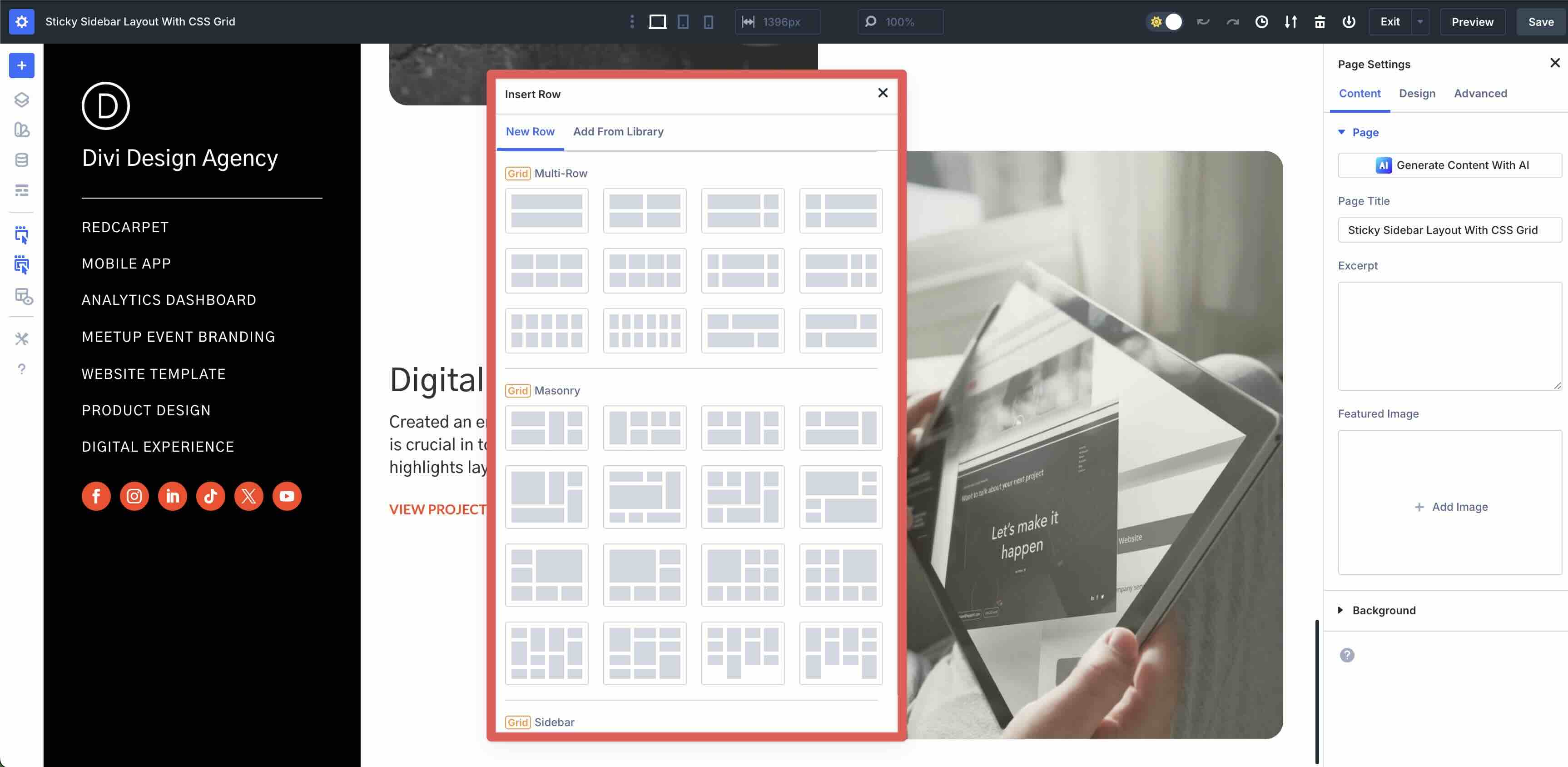
Step 1: Create the Grid Structure
Create a new page in Divi or open an existing one. When the Visual Builder loads, click the blue + icon to add a new section.
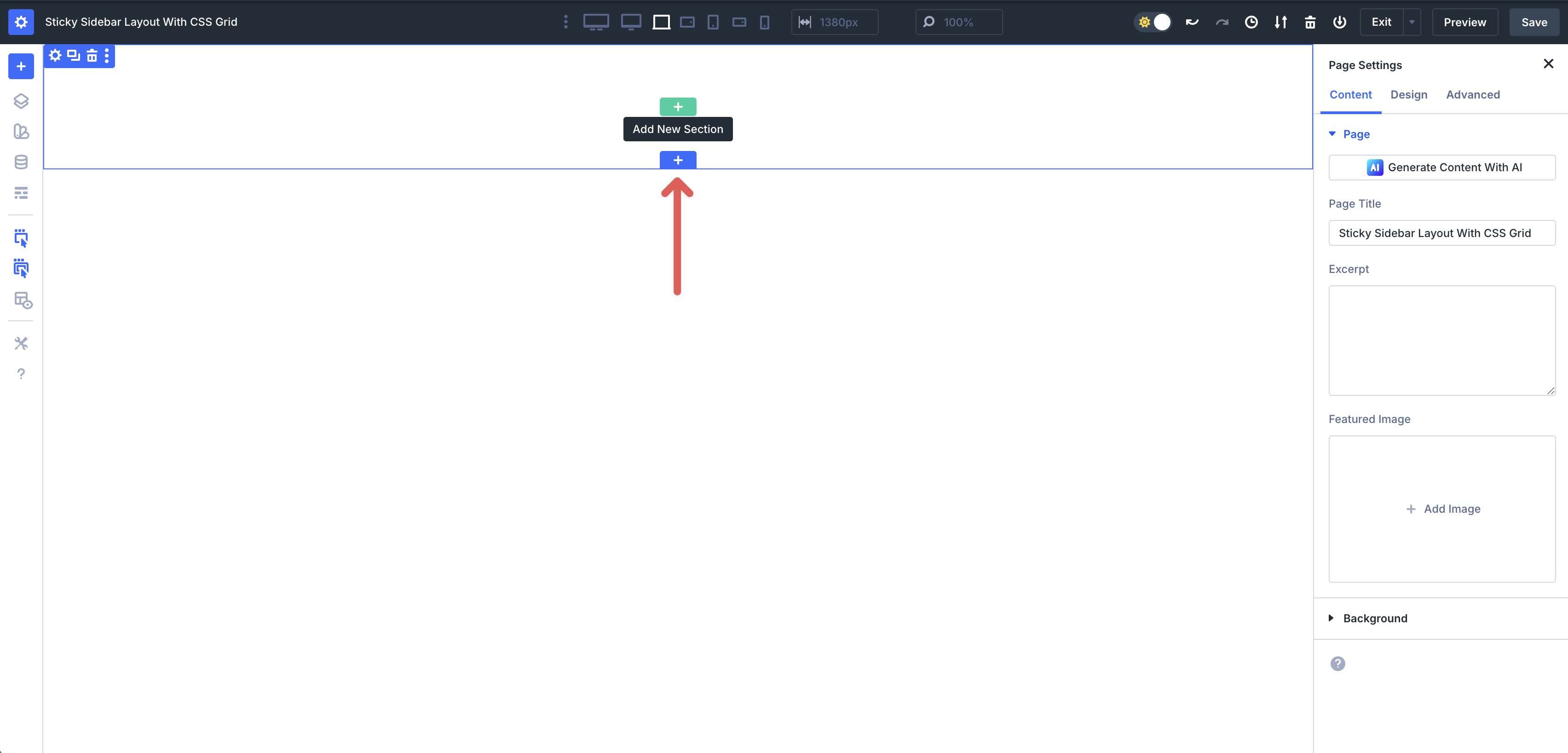
Add a Single Column Flex Row to the section.

Click into the Section’s Design tab, expand the Spacing menu, and enter 0px Padding to the top and bottom.

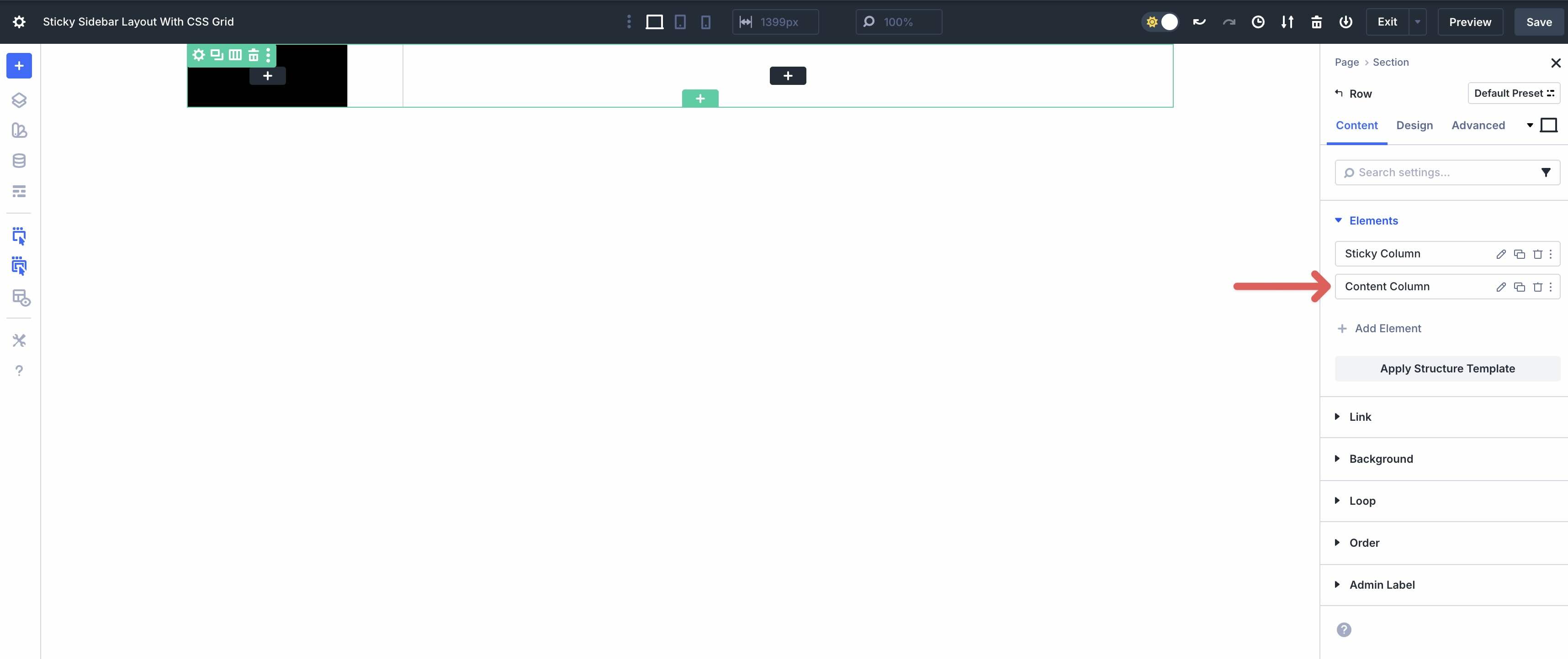
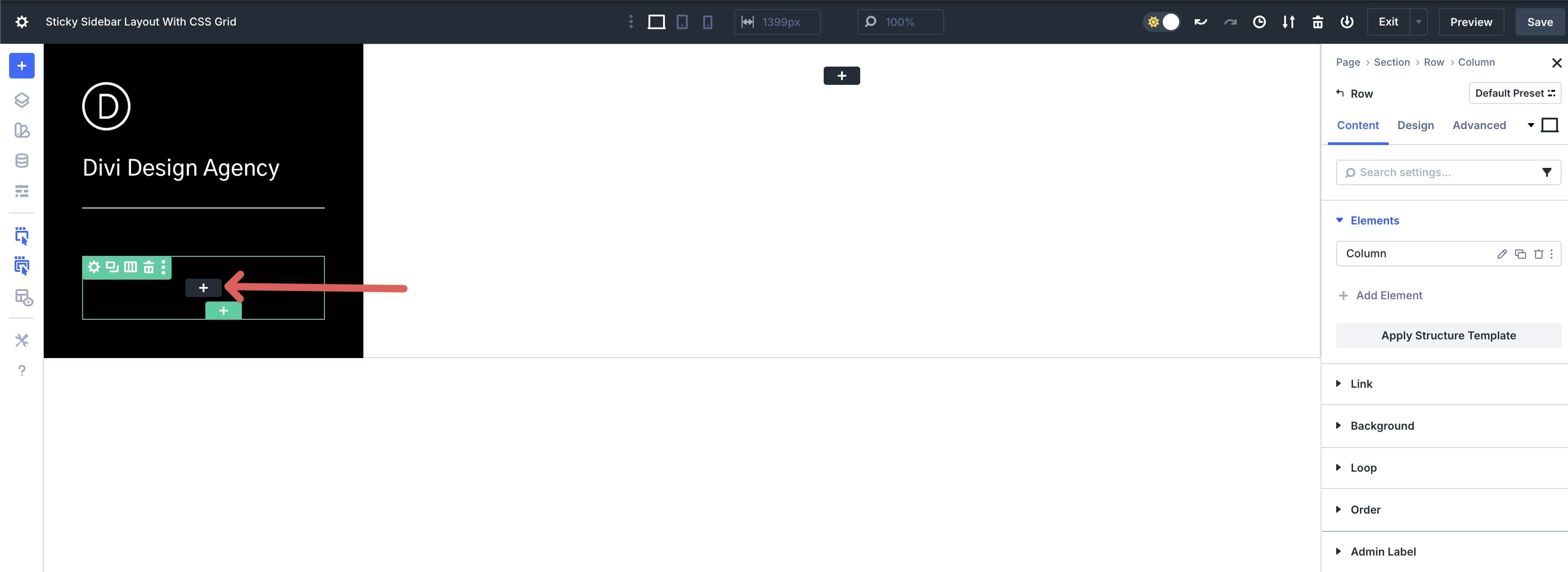
Now switch to the Row settings. In the Content tab, expand the Elements menu. Click + Add Element to add a new Column to the Row.
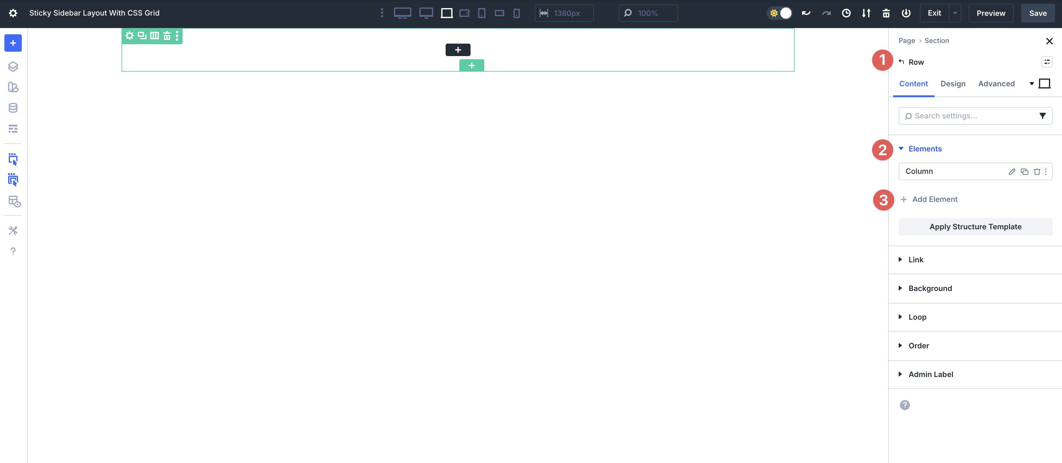
Click into the first Column and assign an Admin Label to it. When working with complex layouts, it’s helpful to title the elements to make them easier to identify as we add content to them.
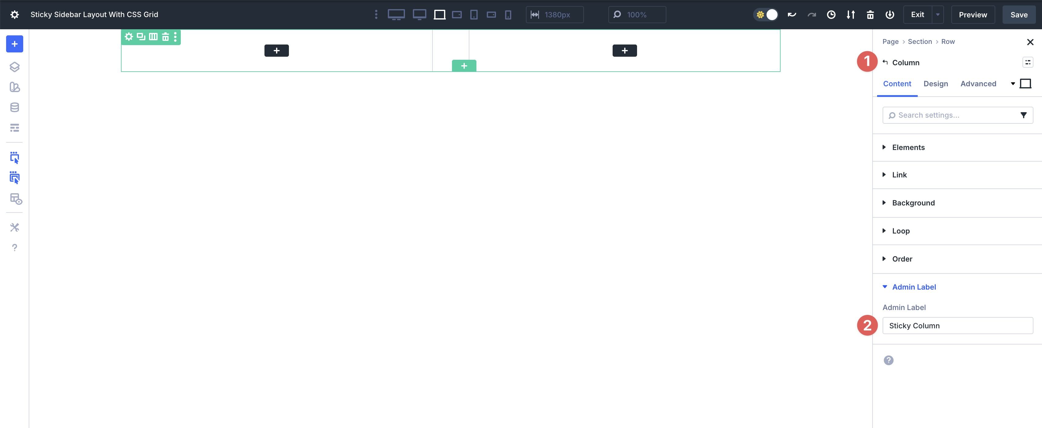
Repeat the step to rename the second Column.
Adjust The Column Settings
In the first Column, assign #000000 as the Background Color.

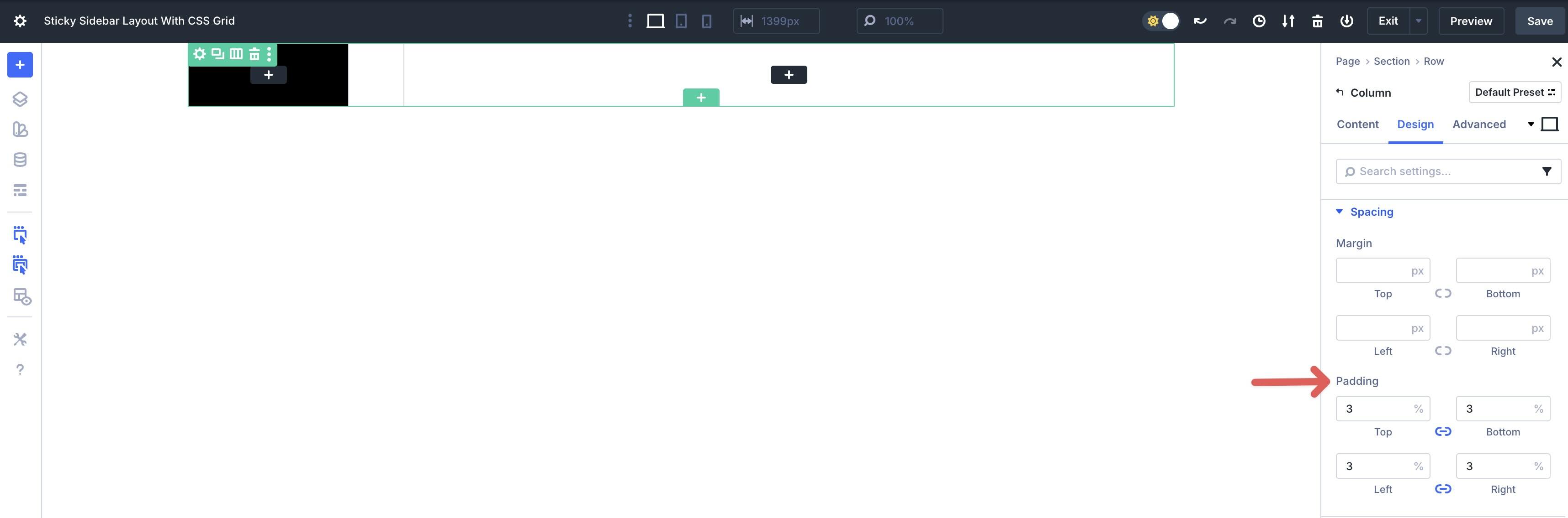
In the Design tab, expand the Sizing menu and change the Column Class to 1/4.
Next, expand the Spacing menu. Apply 3% Padding to all sides.
Click into the second Column of the Parent Row.
Assign #ffffff as the Background Color in the Content tab. In the Design tab, expand the Sizing menu and apply a 3/4 Column Class.
Adjust The Row Settings
Now we need to adjust the Parent Row’s settings. In the Content tab, assign #000000 as the Background Color. In the Design tab, expand the Layout menu. Adjust the Row’s Horizontal and Vertical Gap to 0px.
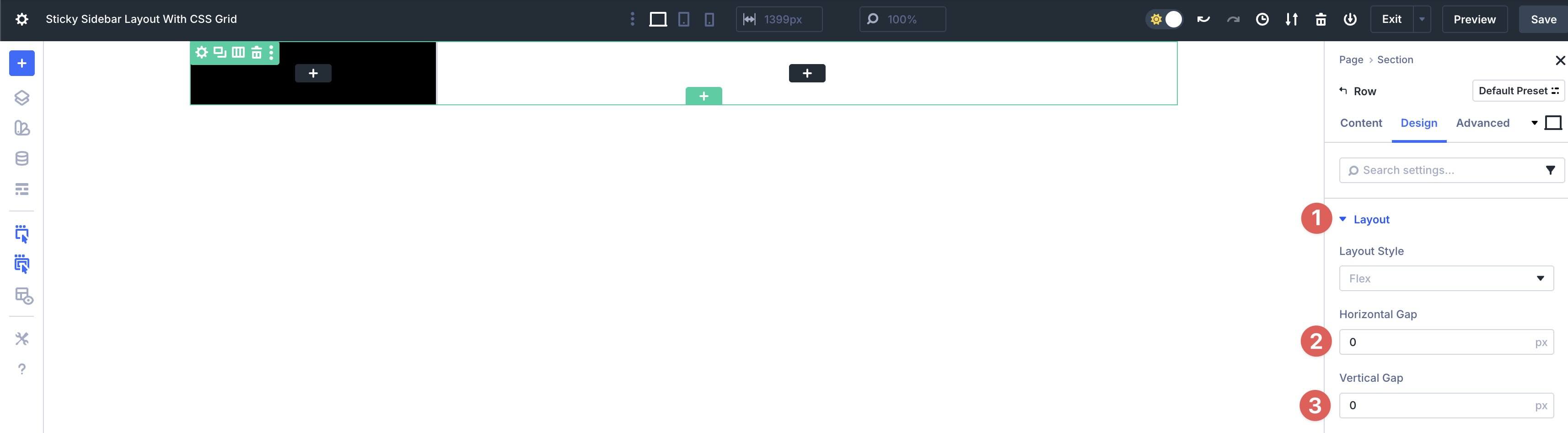
Expand the Sizing menu and set the Width to 100% and the Max Width to none.

Step 2: Add Content To The First Column
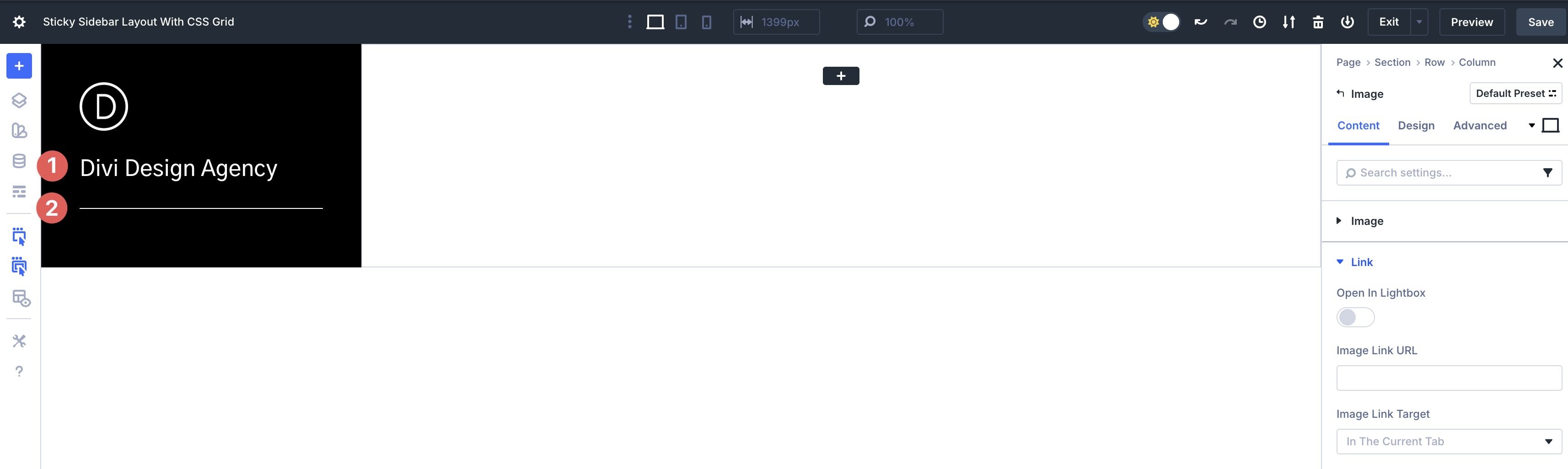
With our Row structure in place, we can begin adding content to the first Column. Click the black + icon to add an image module.

Upload an image, style the module as desired, and add a Homepage Link using Divi 5’s Dynamic Content icon.

Select Homepage Link from the available options.

Add a Heading module, followed by a Divider module, then style as desired.
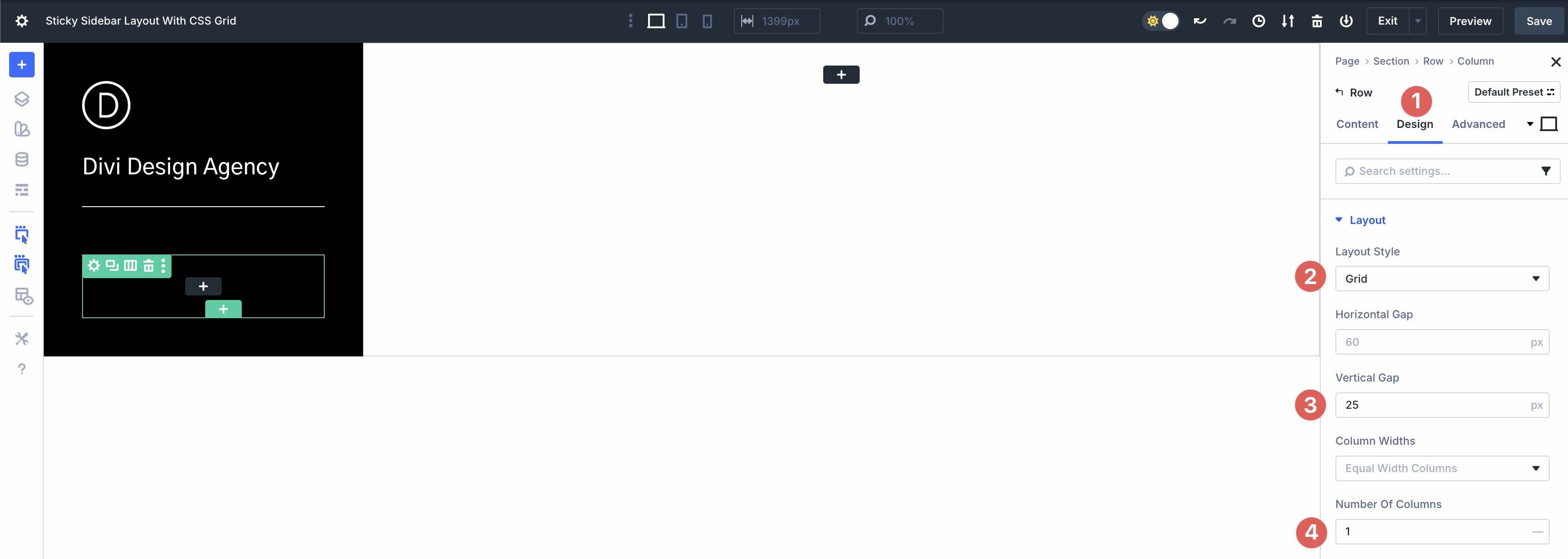
Next, add a Single Column Nested Row to the Column. This will house the links for our layout.
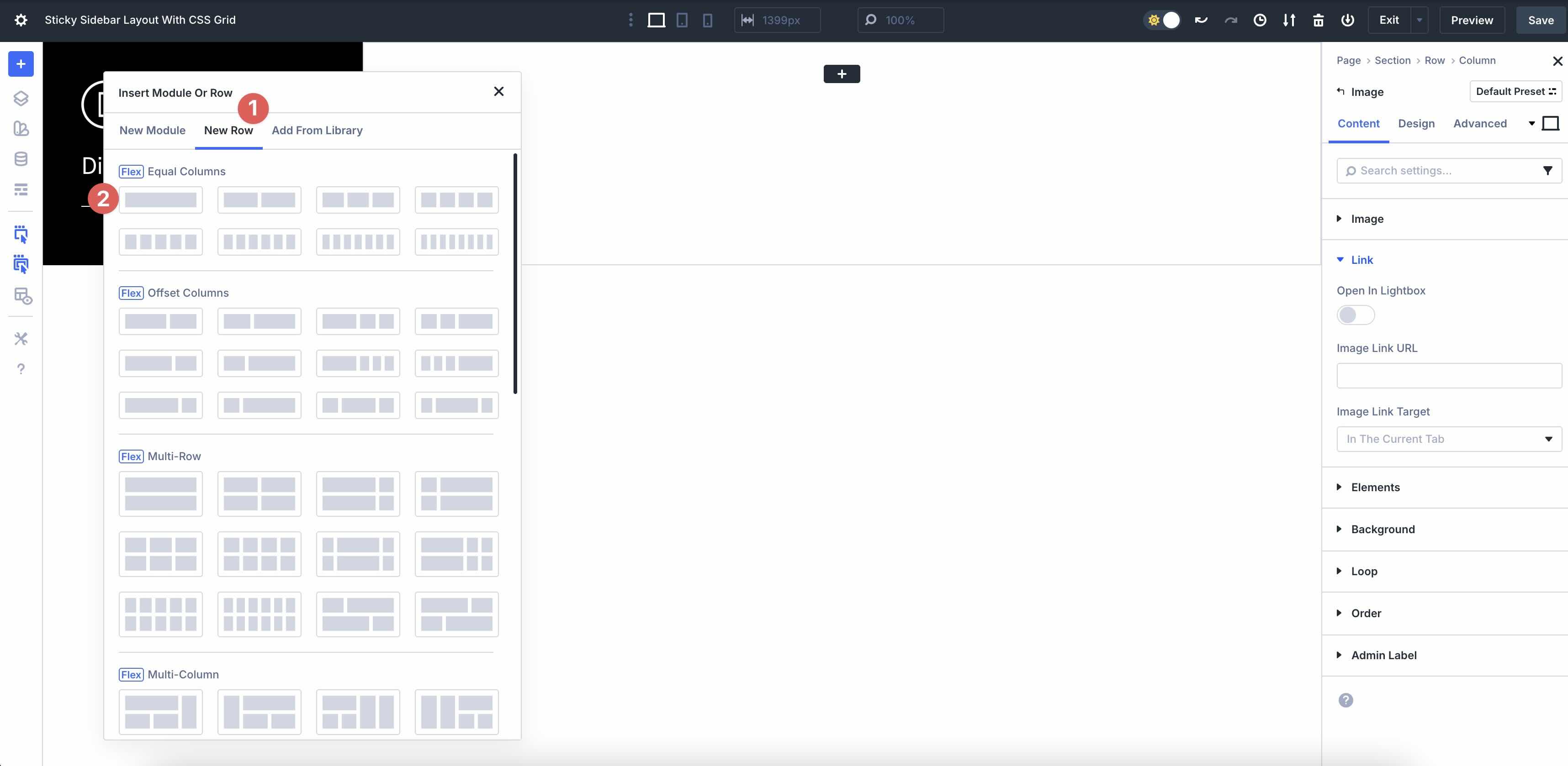
Navigate to the Design tab and select Grid as the Layout Style. Set a Vertical Gap of 25, and set the Number of Columns to 1.
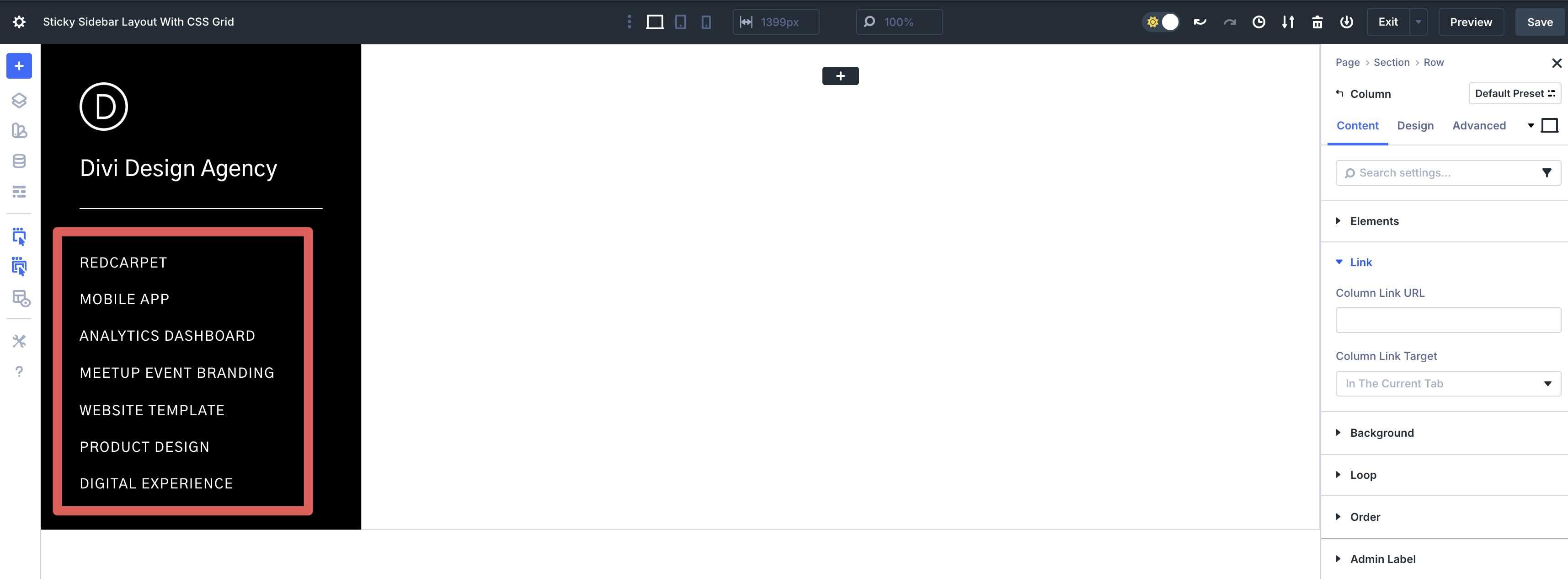
Click the black + icon to add a Heading module. Style the Heading as desired.
Expand the Link menu. In the Module Link URL field, enter an anchor link (for example, #red). This will let you jump to the matching section on the page for easy navigation.

Repeat the steps to add as many menu links (Heading modules) as desired.
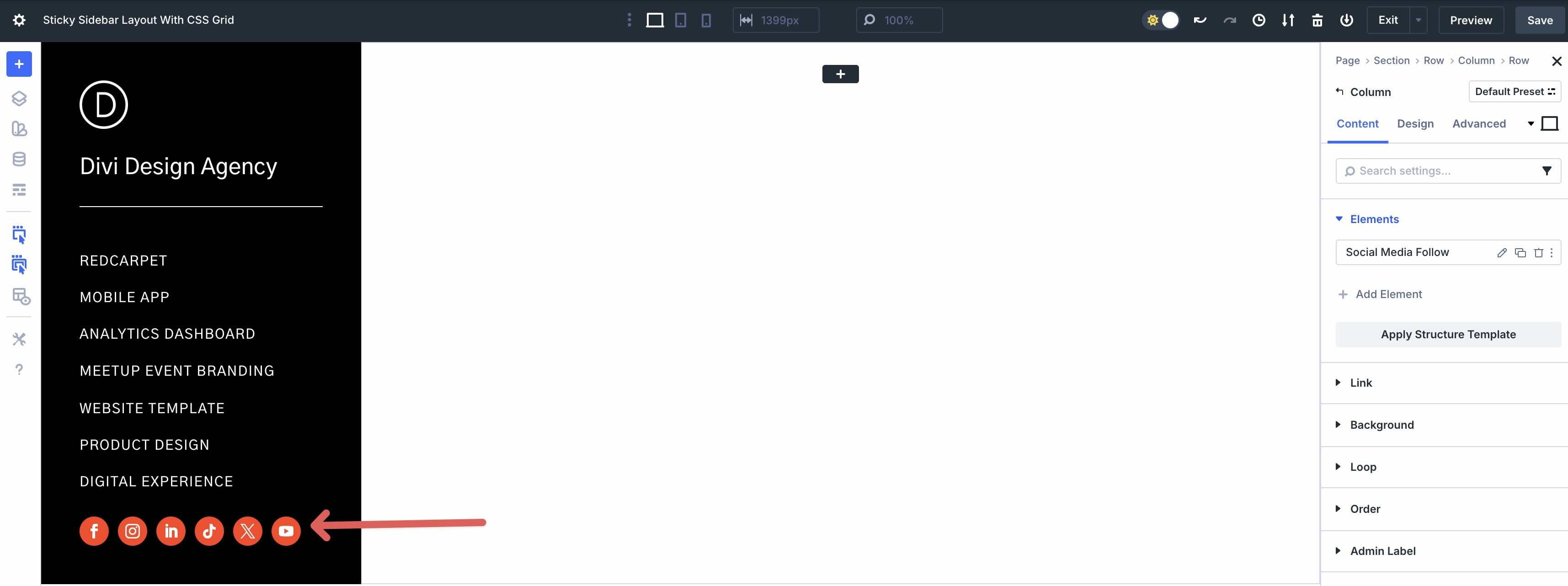
Next, add a new Single Column Row to the Column, followed by a Social Media Follow module.
Add Social Networks and style the module as desired.
Make The Sidebar Sticky
Before we proceed to setting up the second Column, we need to configure the Sticky options. In the Column’s settings, click the Advanced tab. Expand the Scroll Effects menu and set the Sticky Position to Stick to Top.
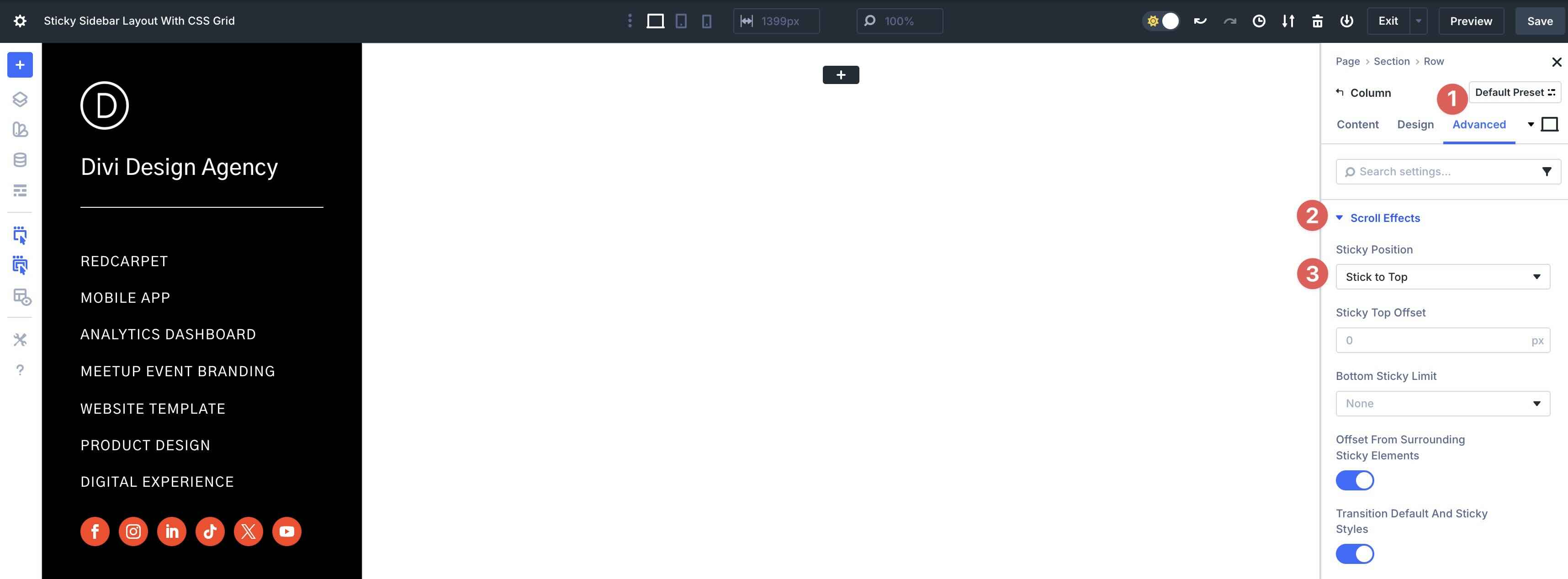
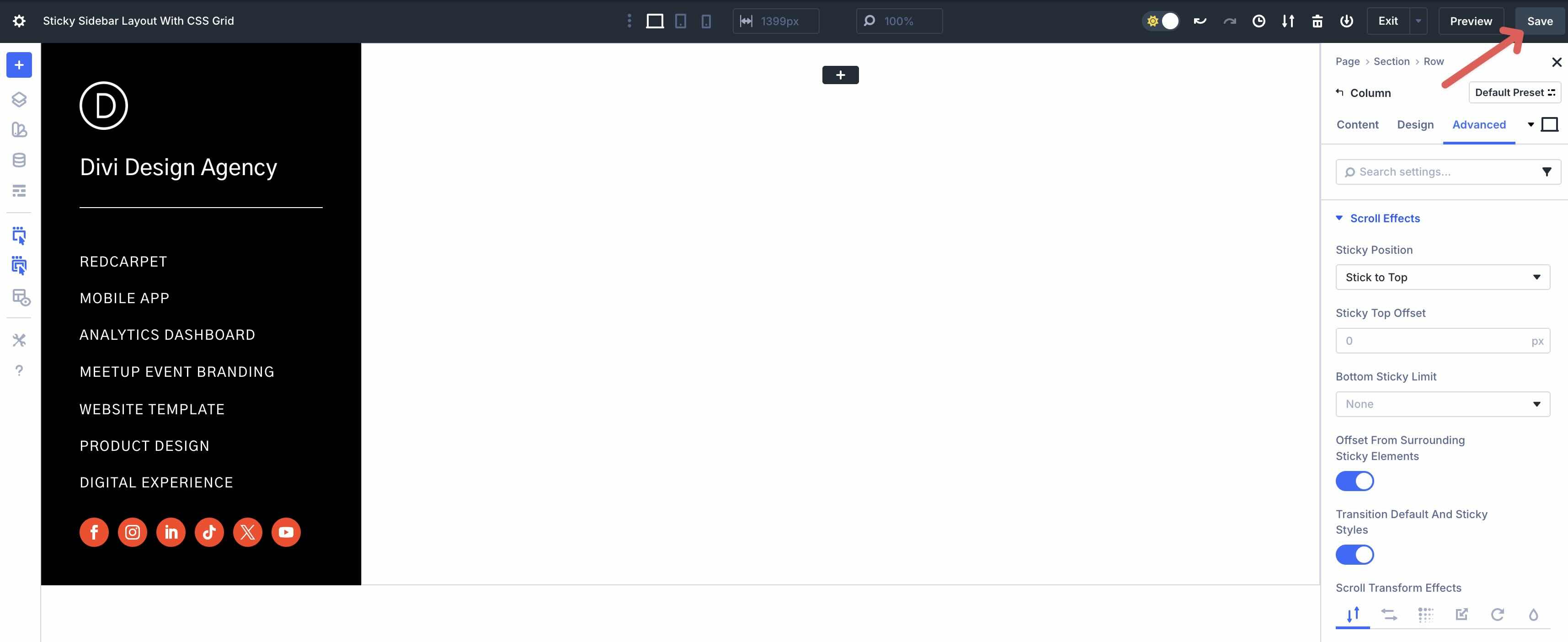
Before proceeding to the next step, save your progress by clicking the Save button at the top right of the Visual Builder.
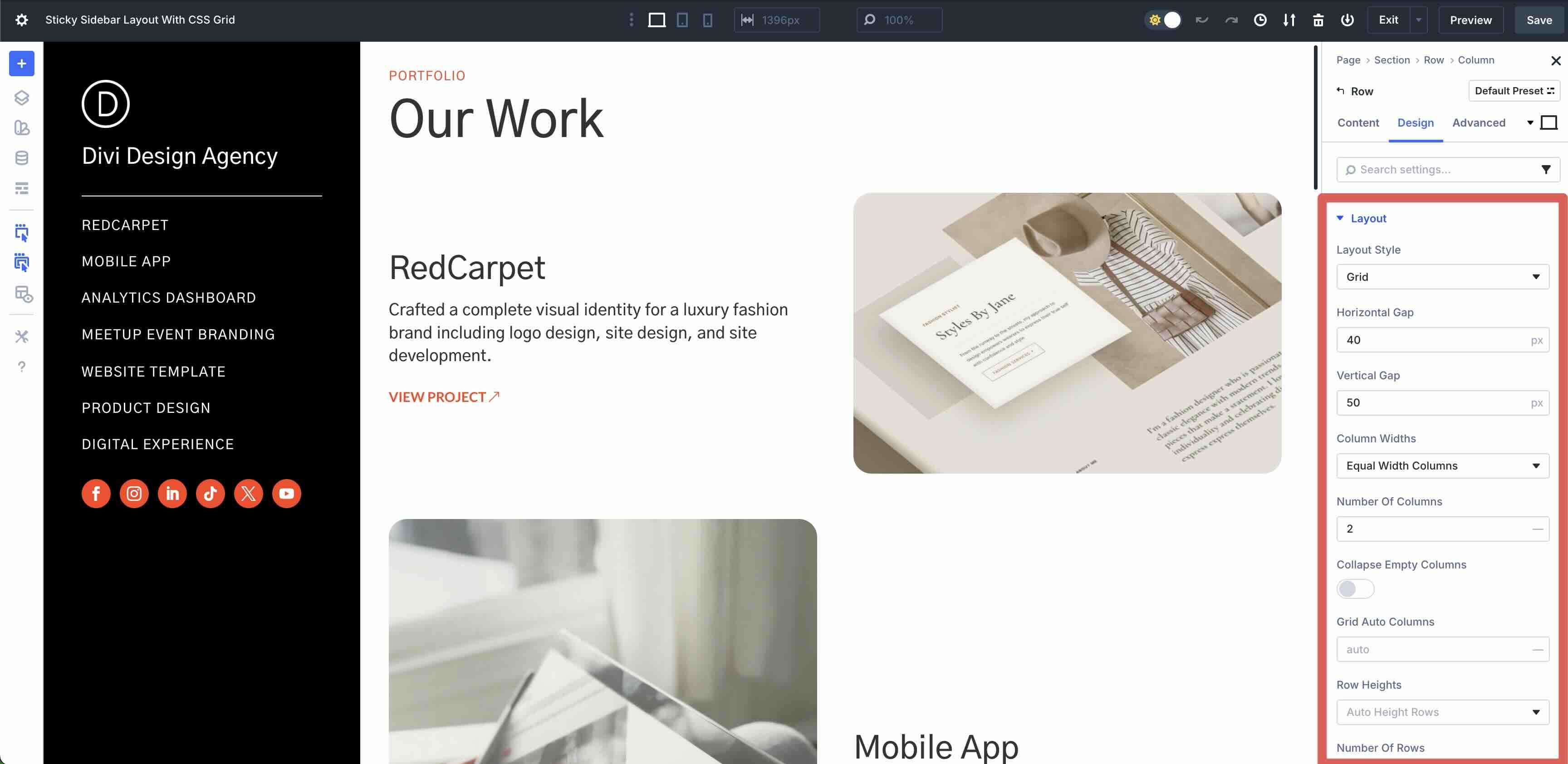
Step 3: Set Up The Second Column
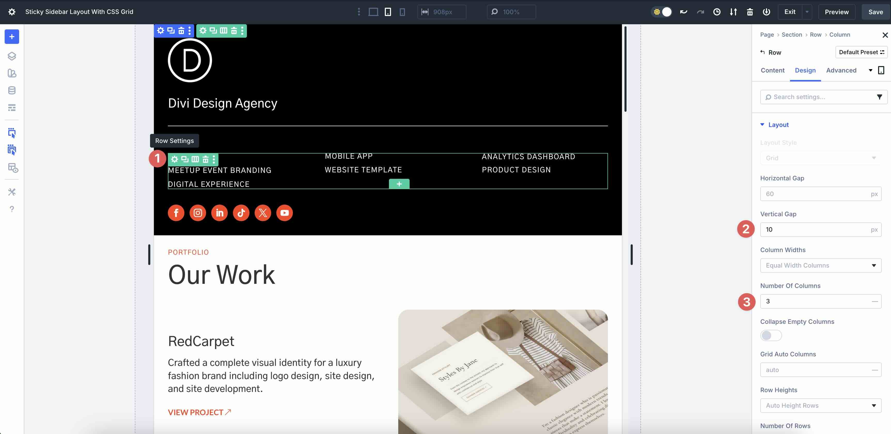
In the second Column, add a new Single Column Nested Row. In the Design tab, set the Row to Grid in Layout Style. Set the Horizontal and Vertical Gap to 40px. In the Column Widths field, choose Equal Width Columns. Set the Number Of Columns to 2.
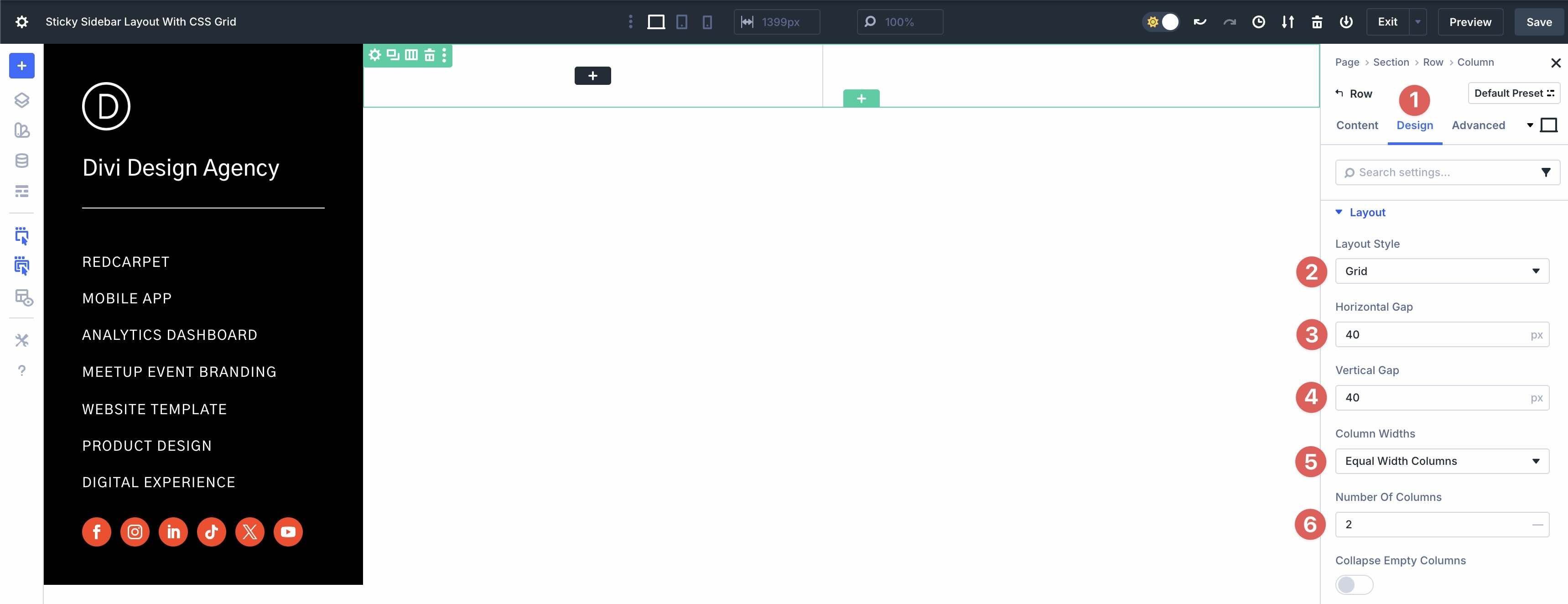
Expand the Spacing menu and assign 3% Padding to all four sides.

Step 4: Add Content To The Second Column
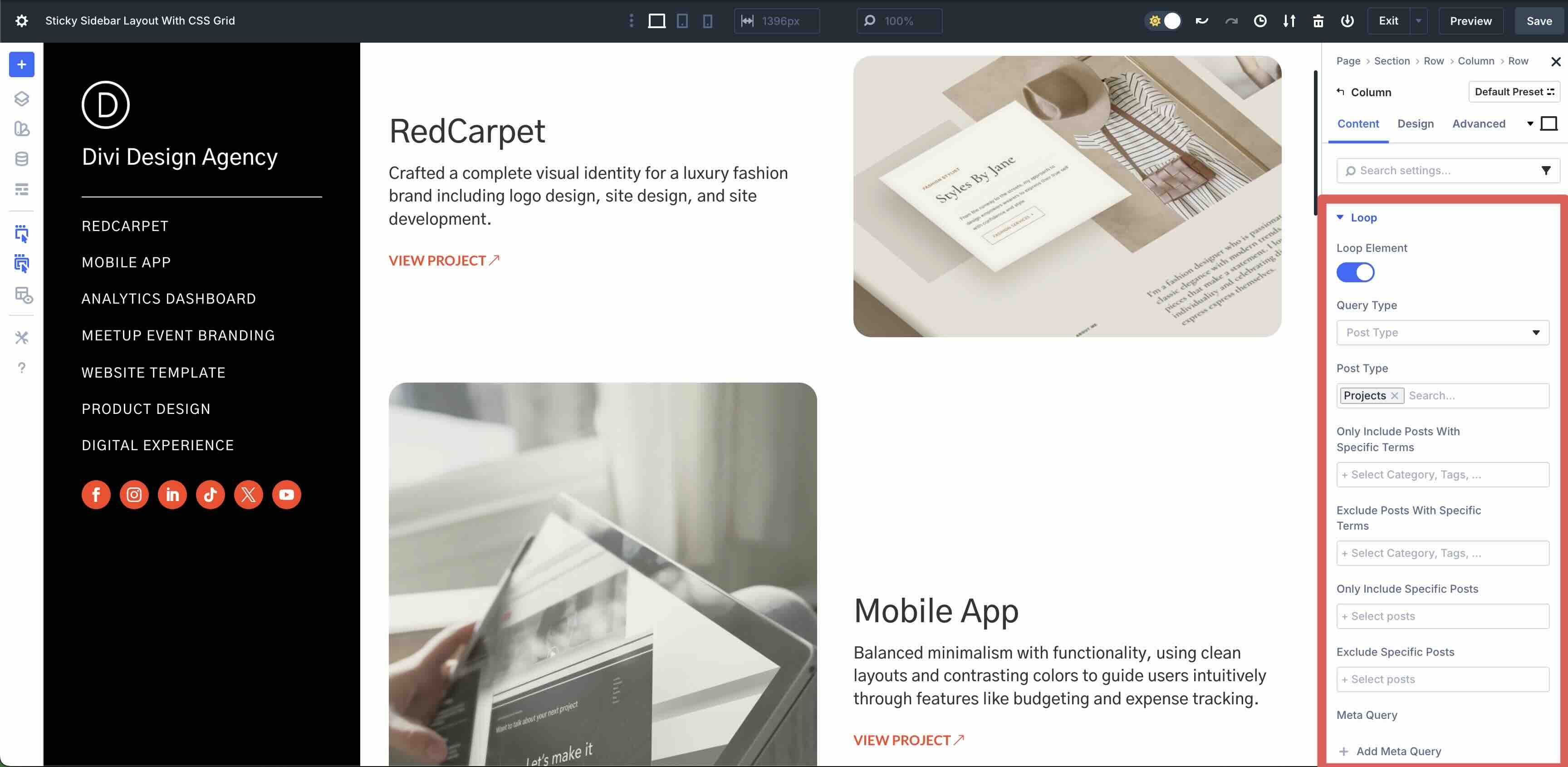
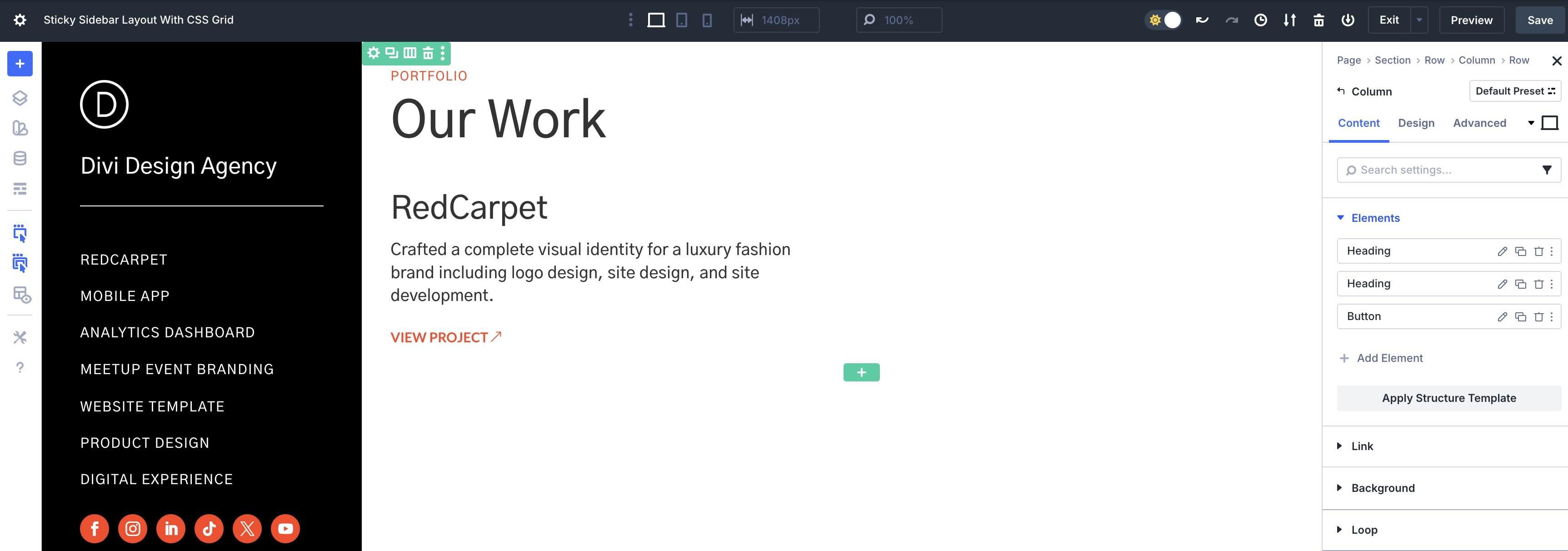
With the Grid settings in place, we can start adding modules. In the first Grid item, add two Heading modules. Style them as desired.
In the Grid Item settings, assign 15px Vertical Gap.
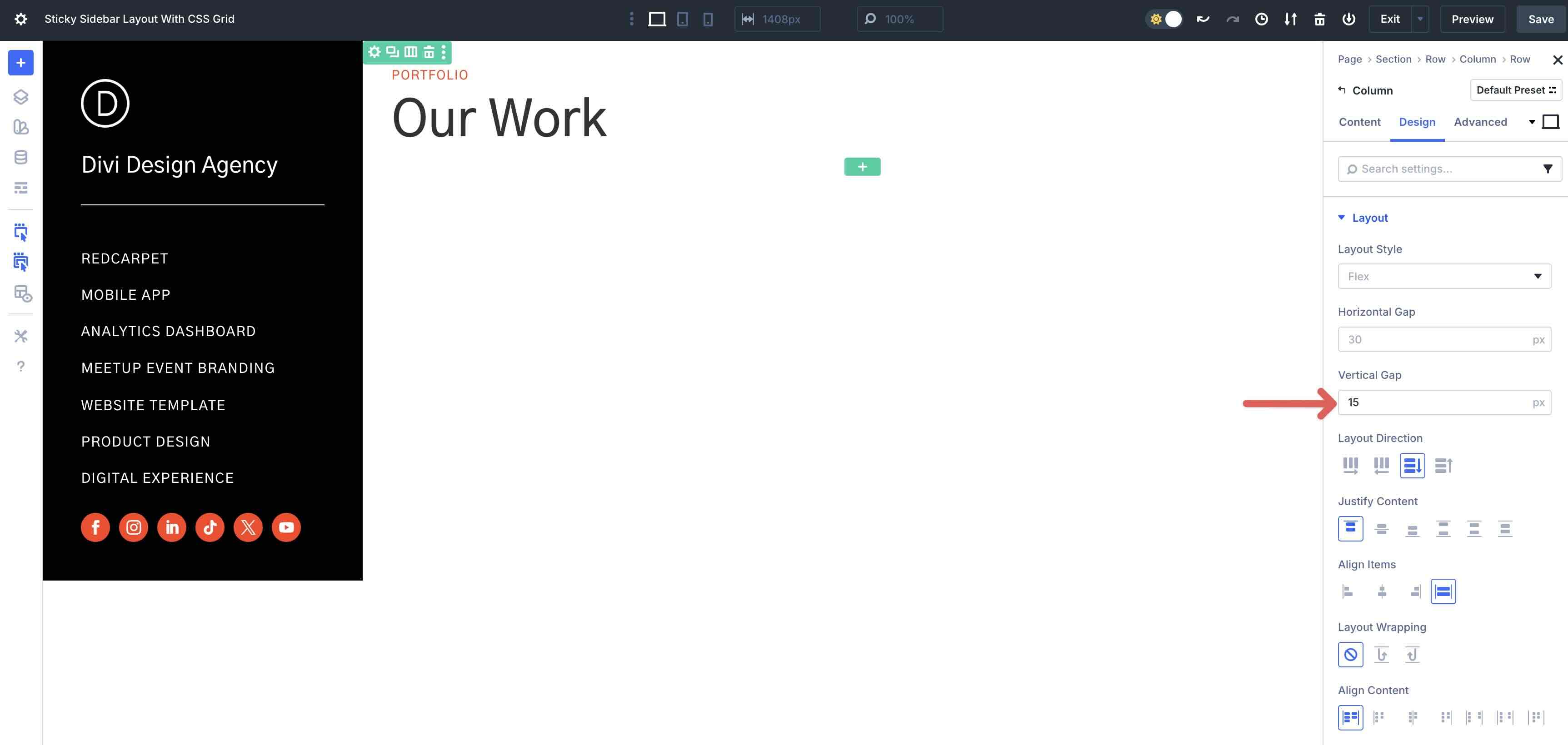
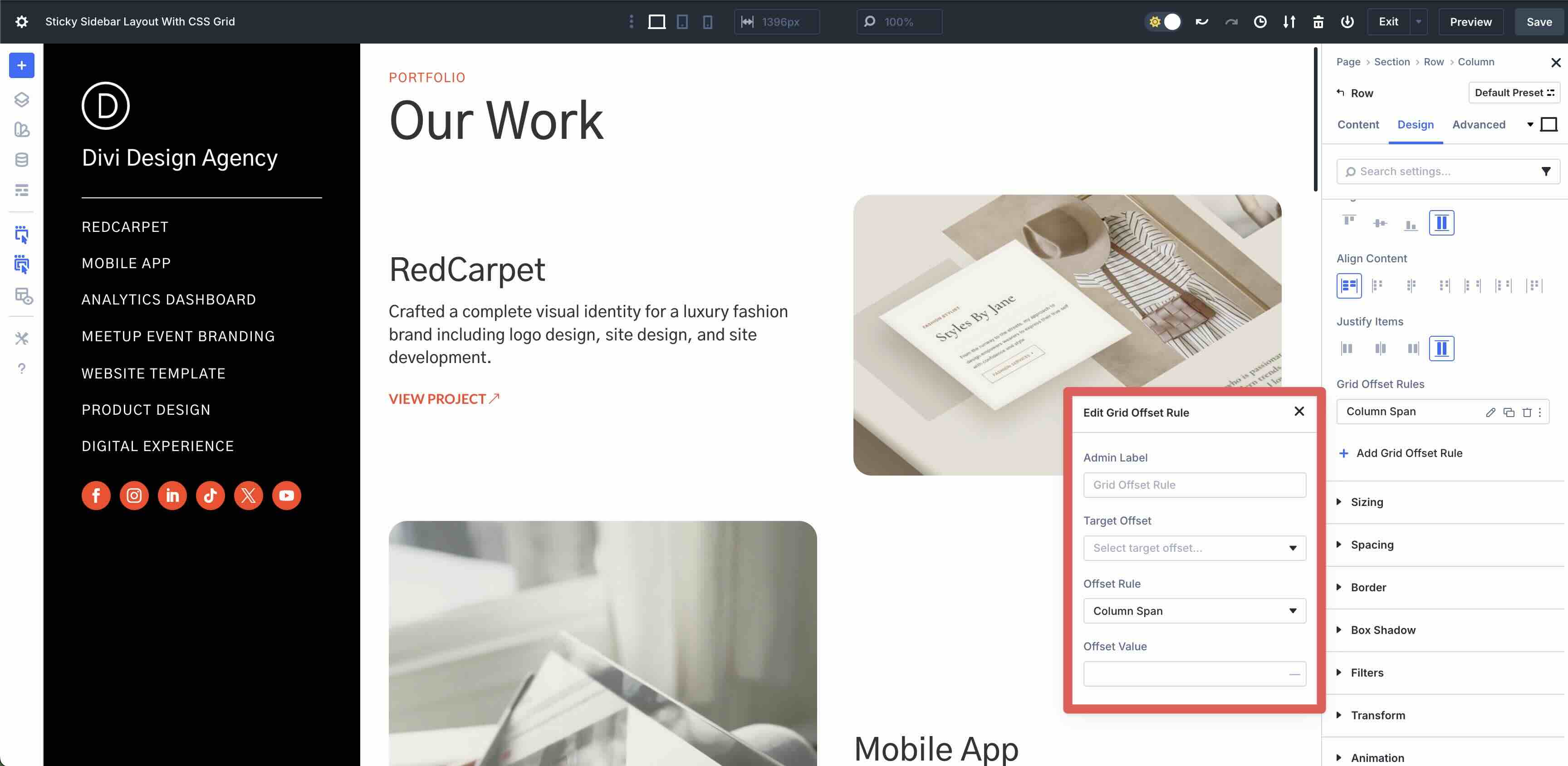
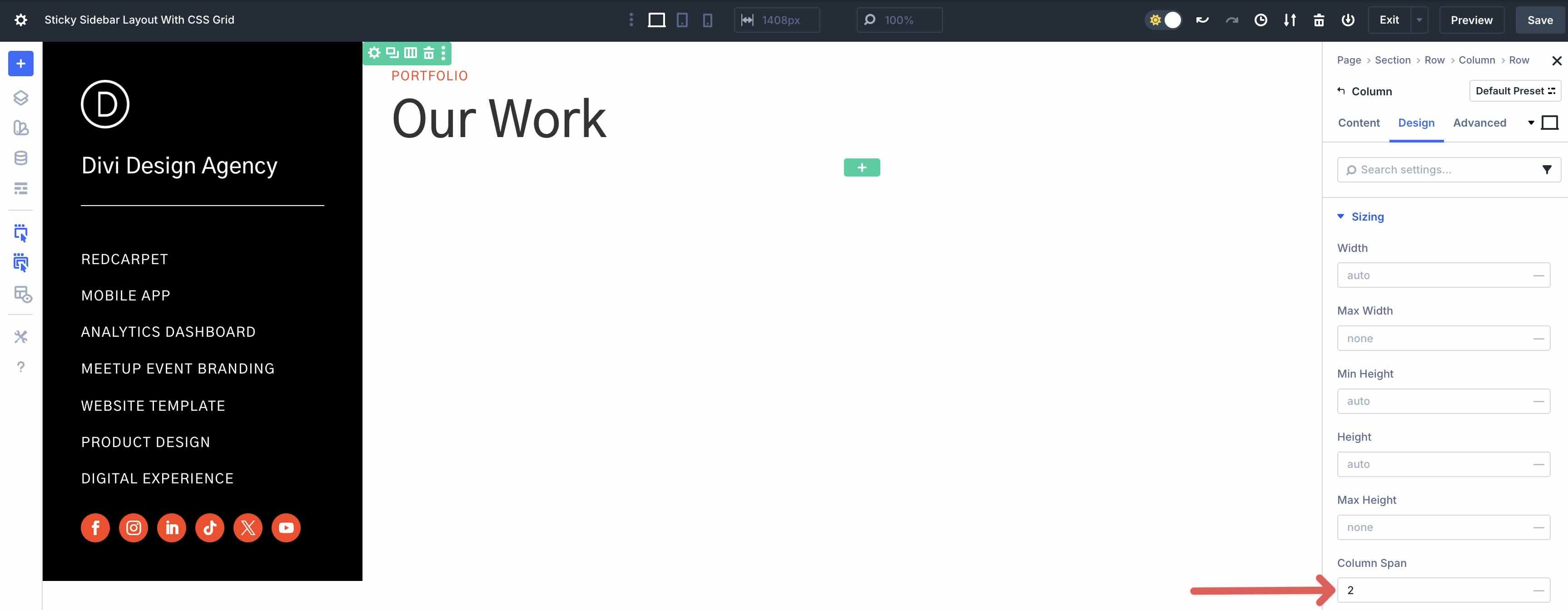
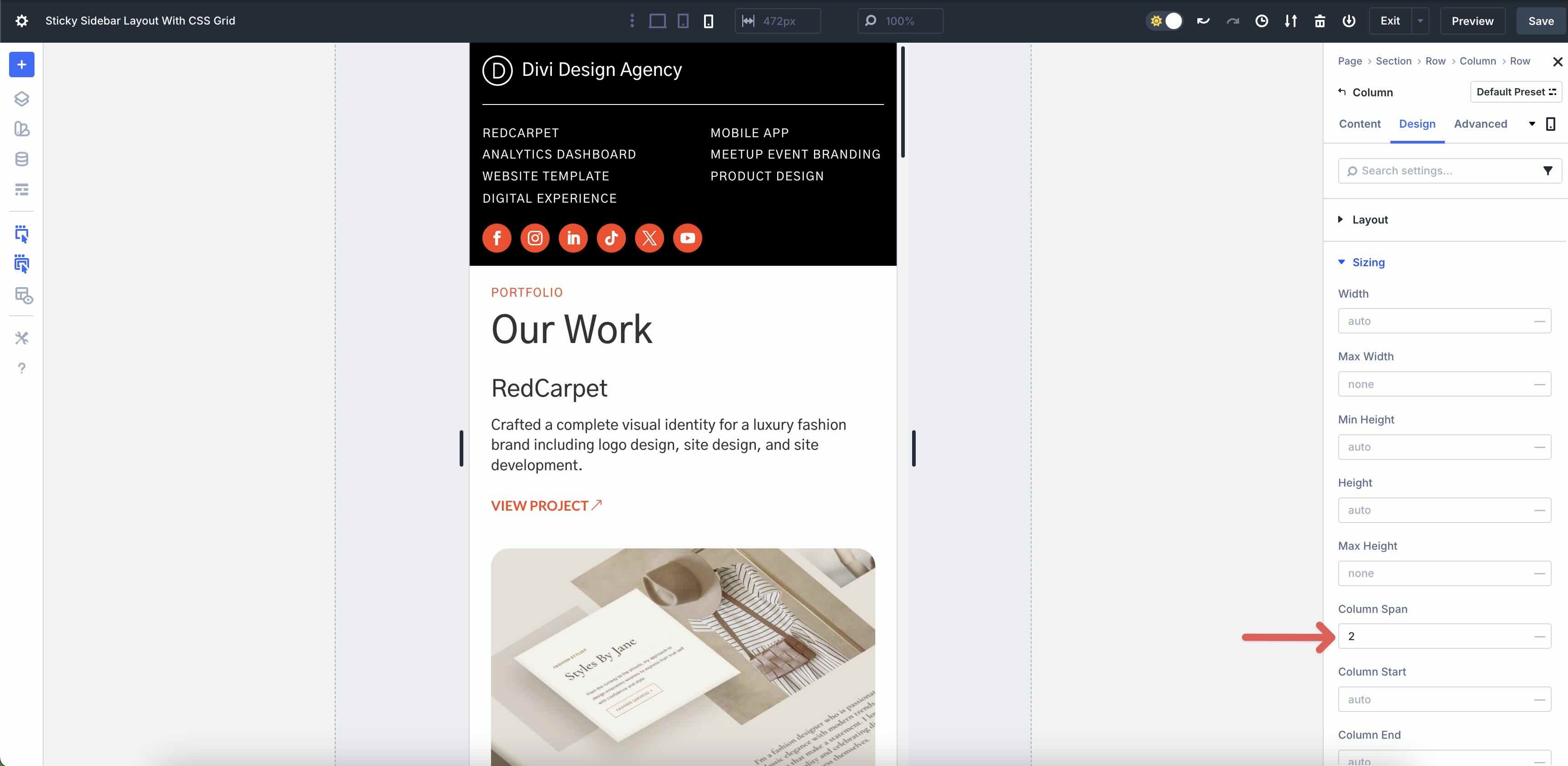
Expand the Sizing menu and locate the Column Span field. Enter 2 as the value. This tells Divi to expand the Grid Item to the full width of the Row, which is set to 2 Columns.
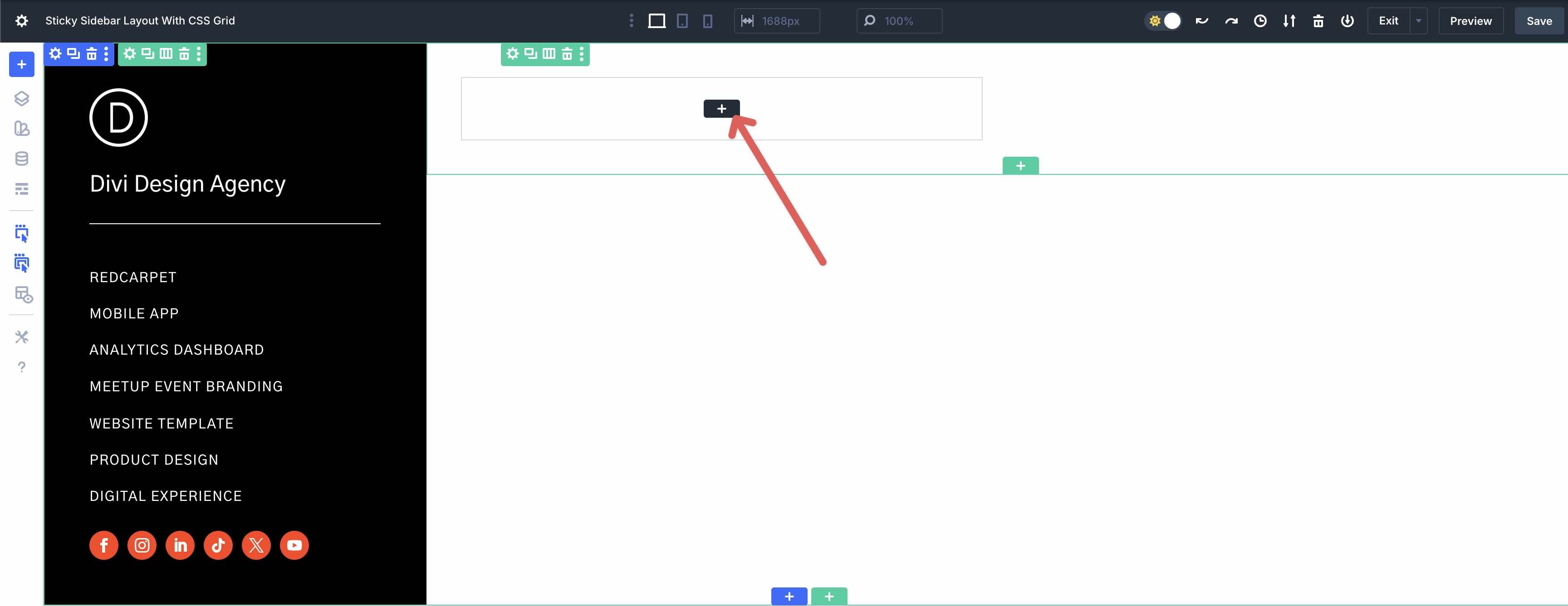
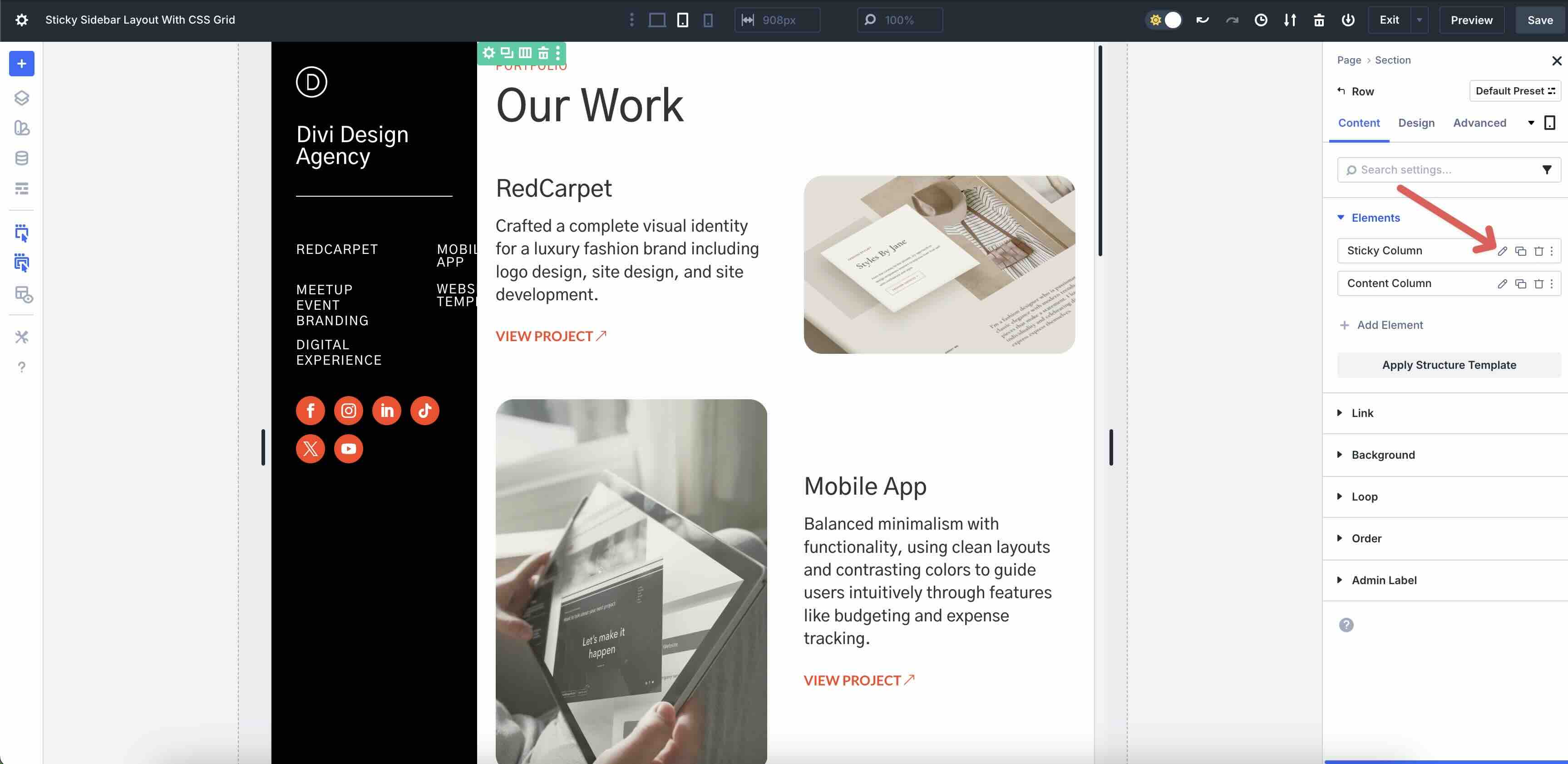
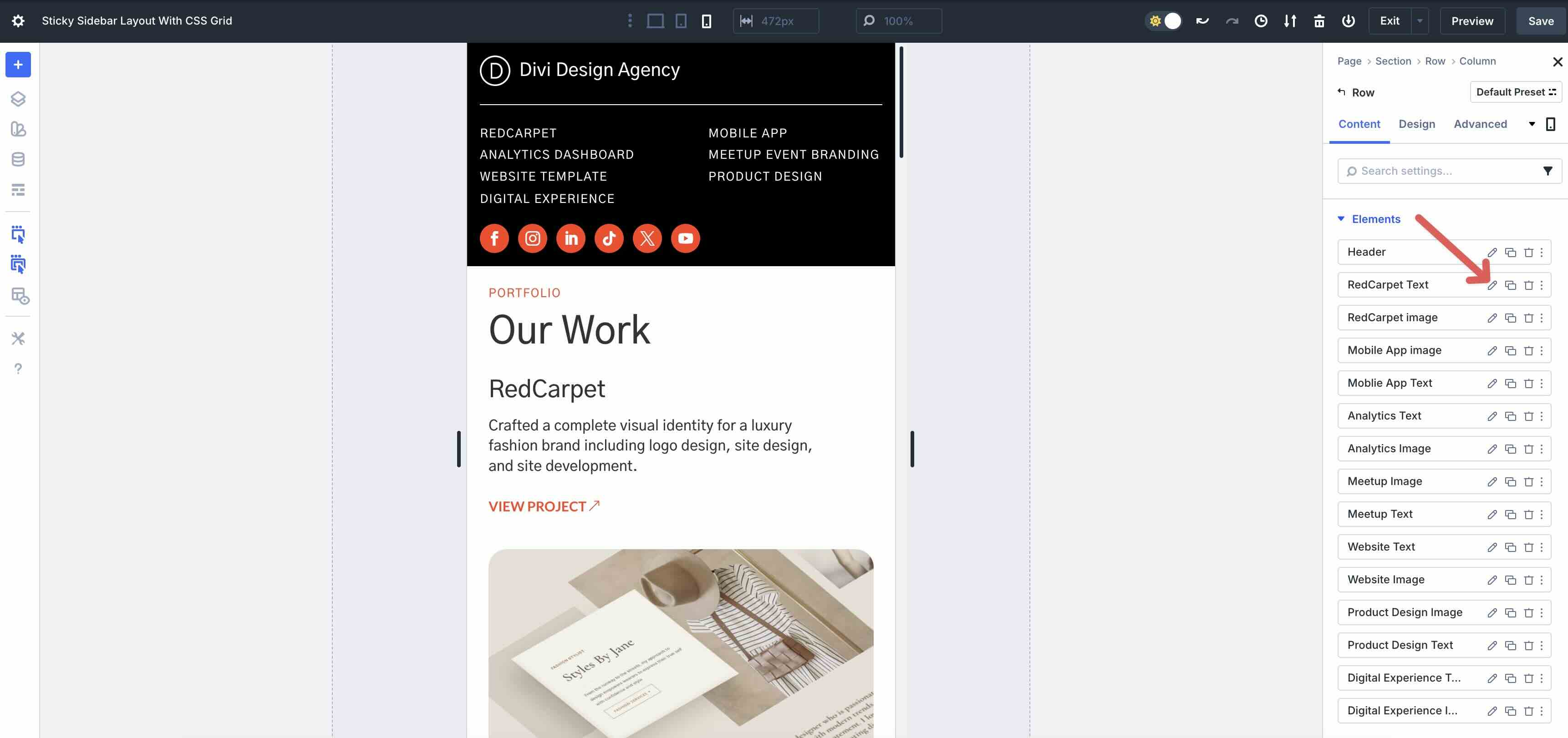
Navigate back to the Grid Row’s main Content tab. Click + Add Element to add a new Grid Item.
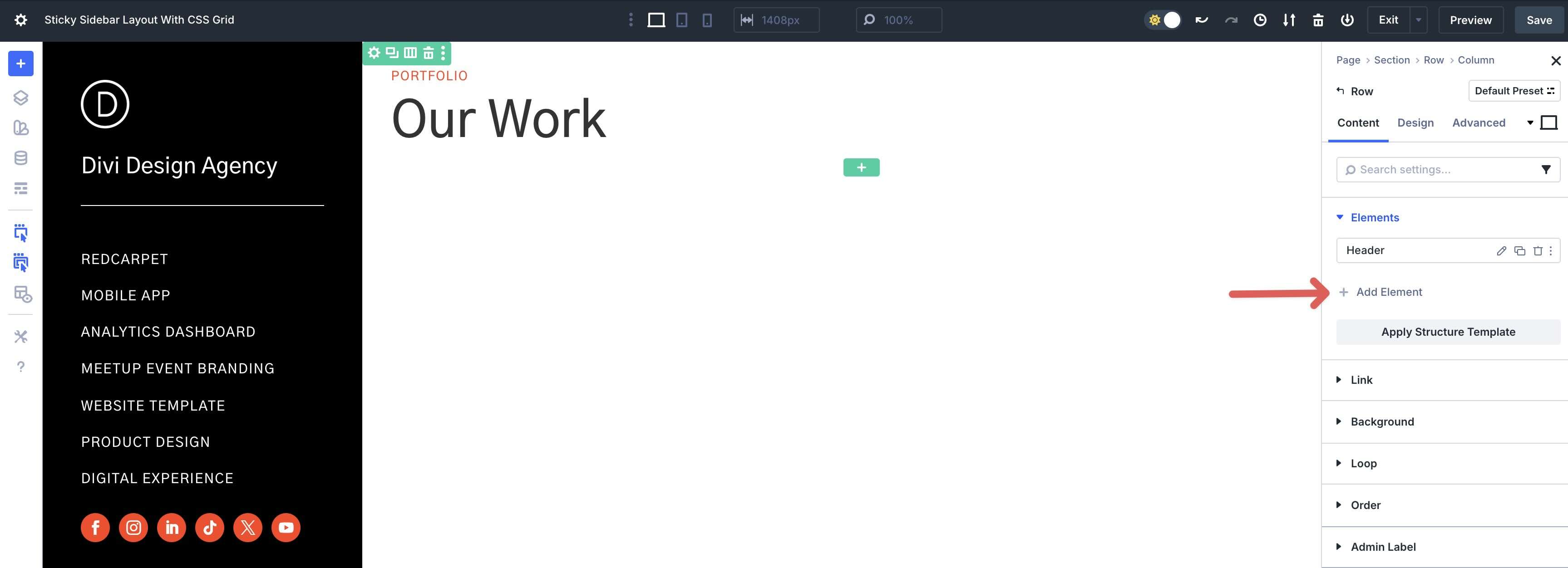
Divi will stack the new Grid Item vertically, placing it in the second Row of the Grid.
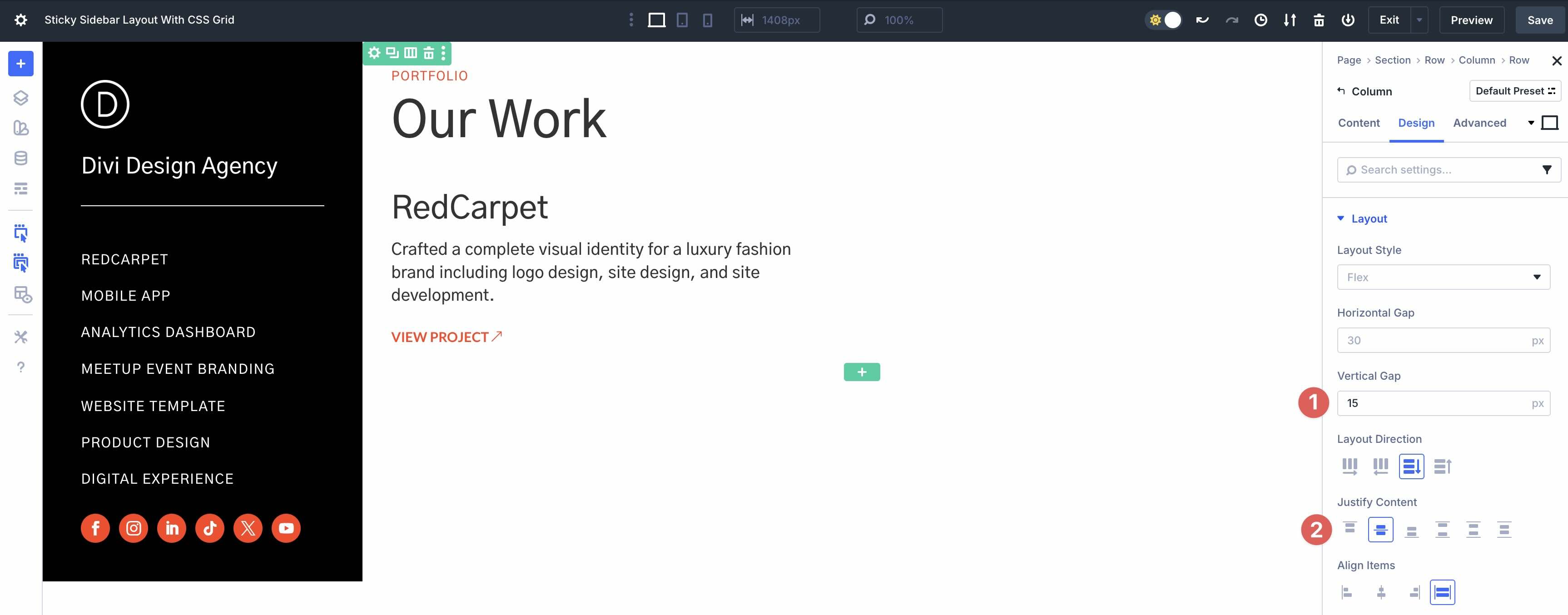
In this Grid Item, we’ll add Heading, Text, and Button modules. Style them as desired.
Open the Design tab. In the Layout menu, assign 15px Vertical Gap and set Justify Content to Center.
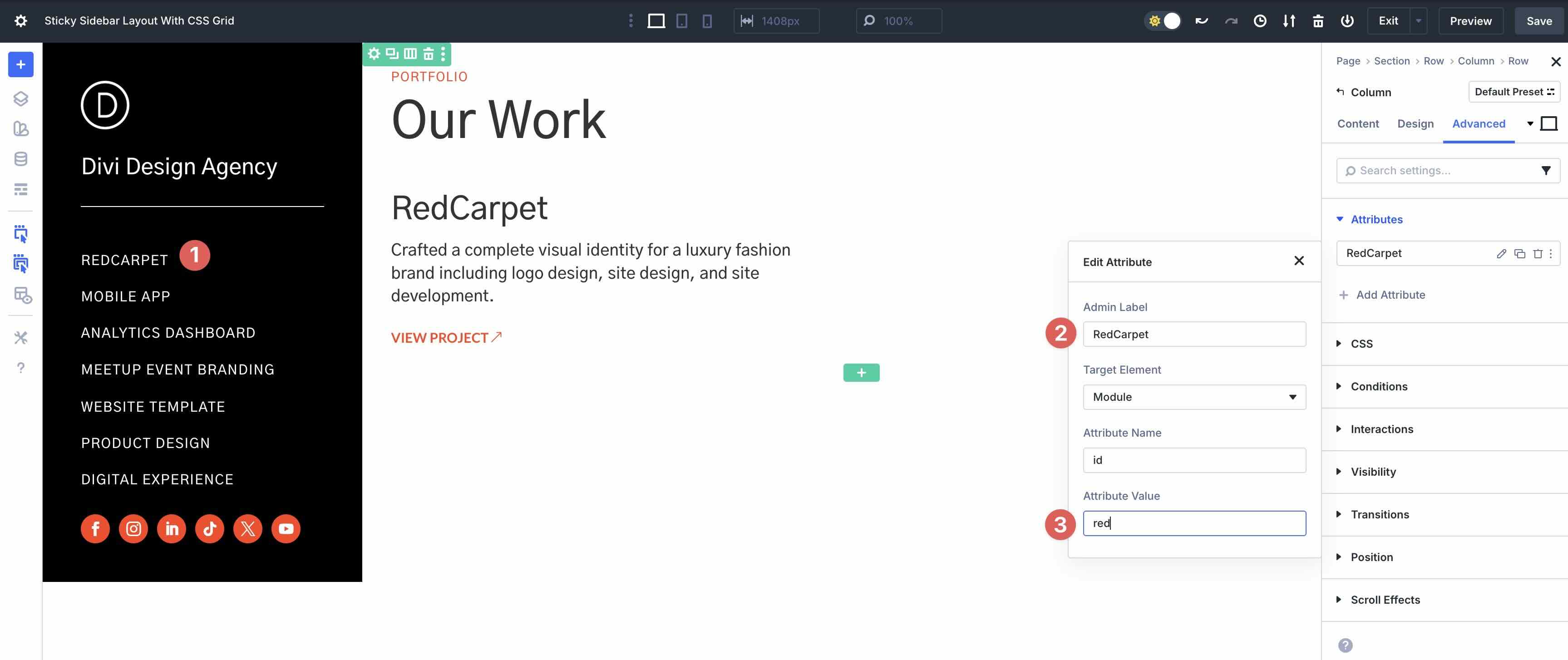
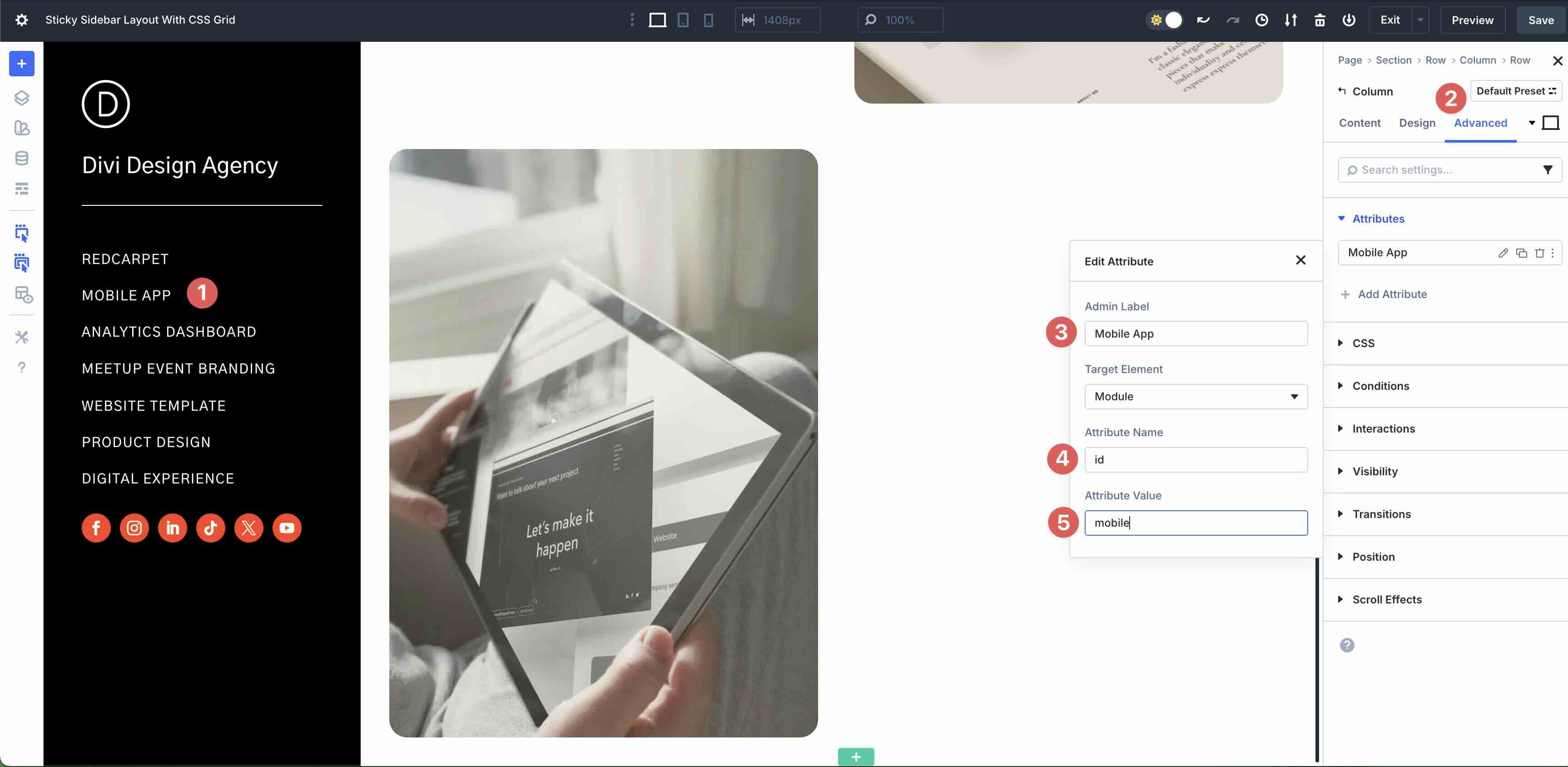
Navigate to the Advanced tab. We’ll need to set an anchor link that corresponds to the first menu item in the first Column. Expand the Attributes menu. Click the + Add Attribute button.
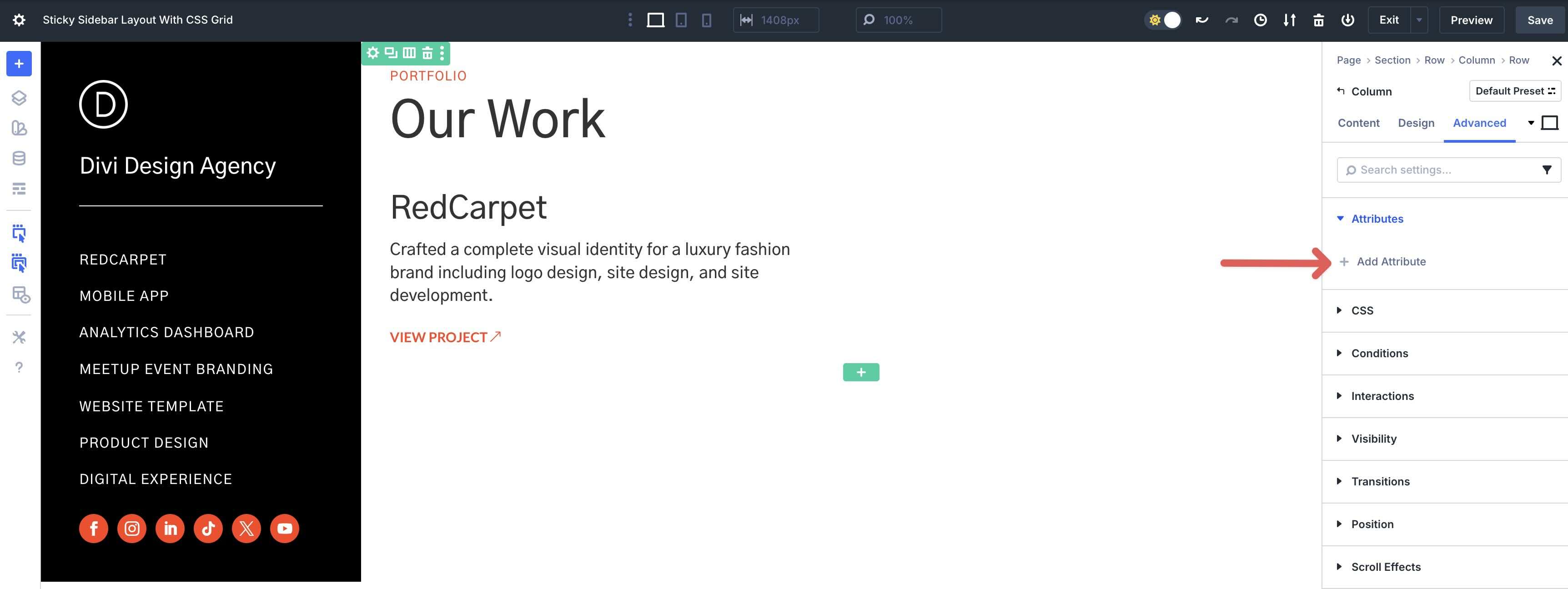
Select id from the available options.
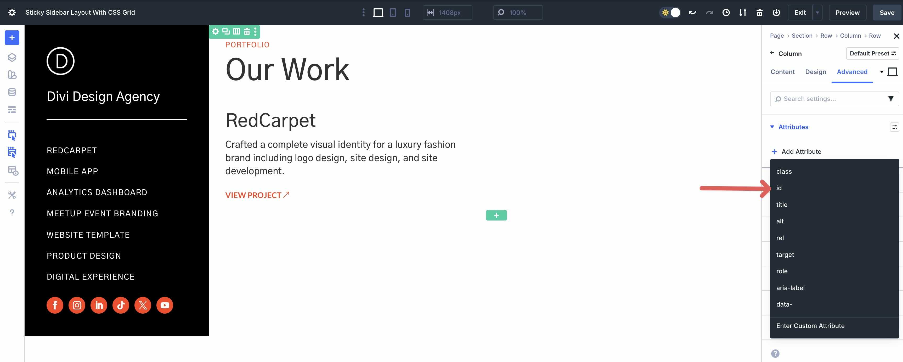
Add an Admin Label for the Attribute. In the Attribute Value field, enter the anchor link you specified for the first heading module in the menu section.
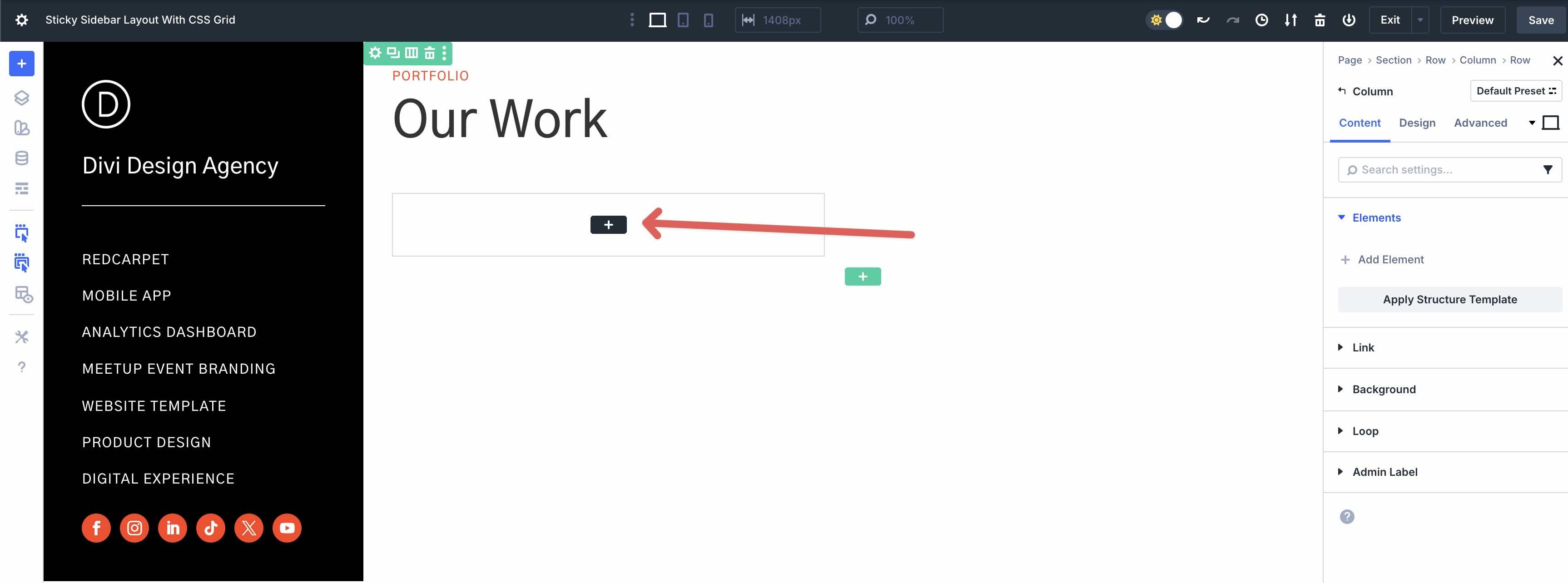
Add A New Grid Item
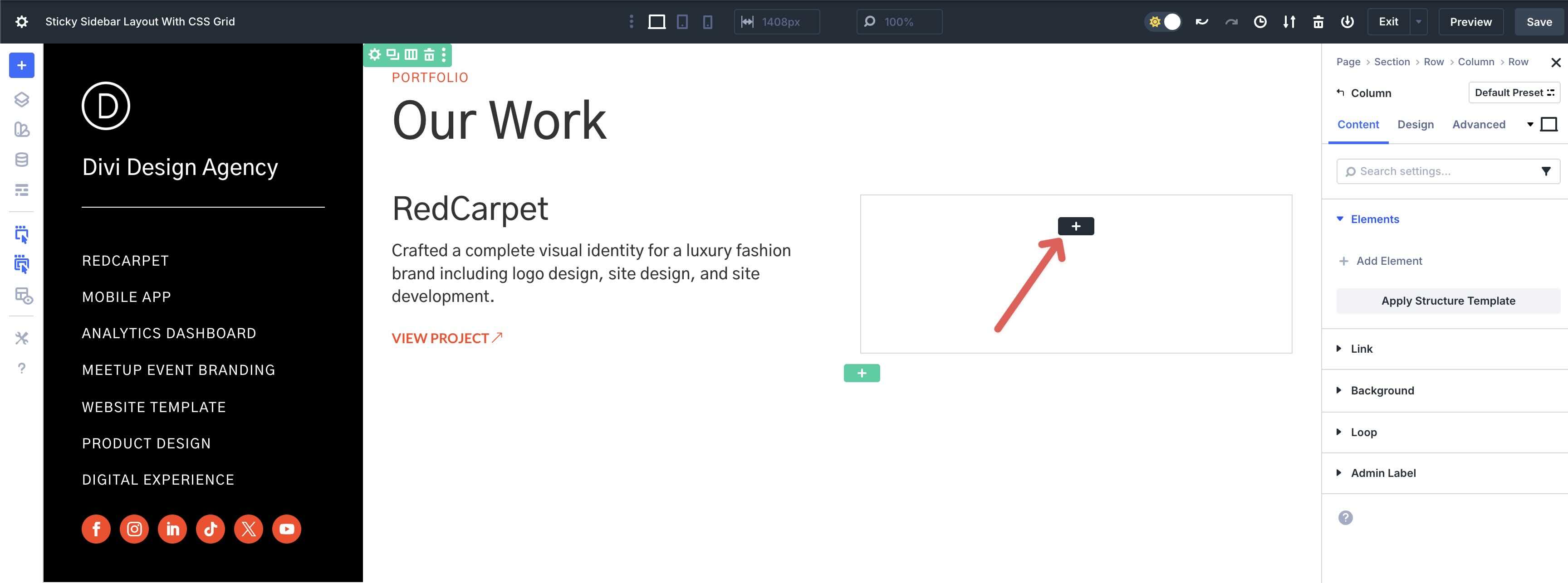
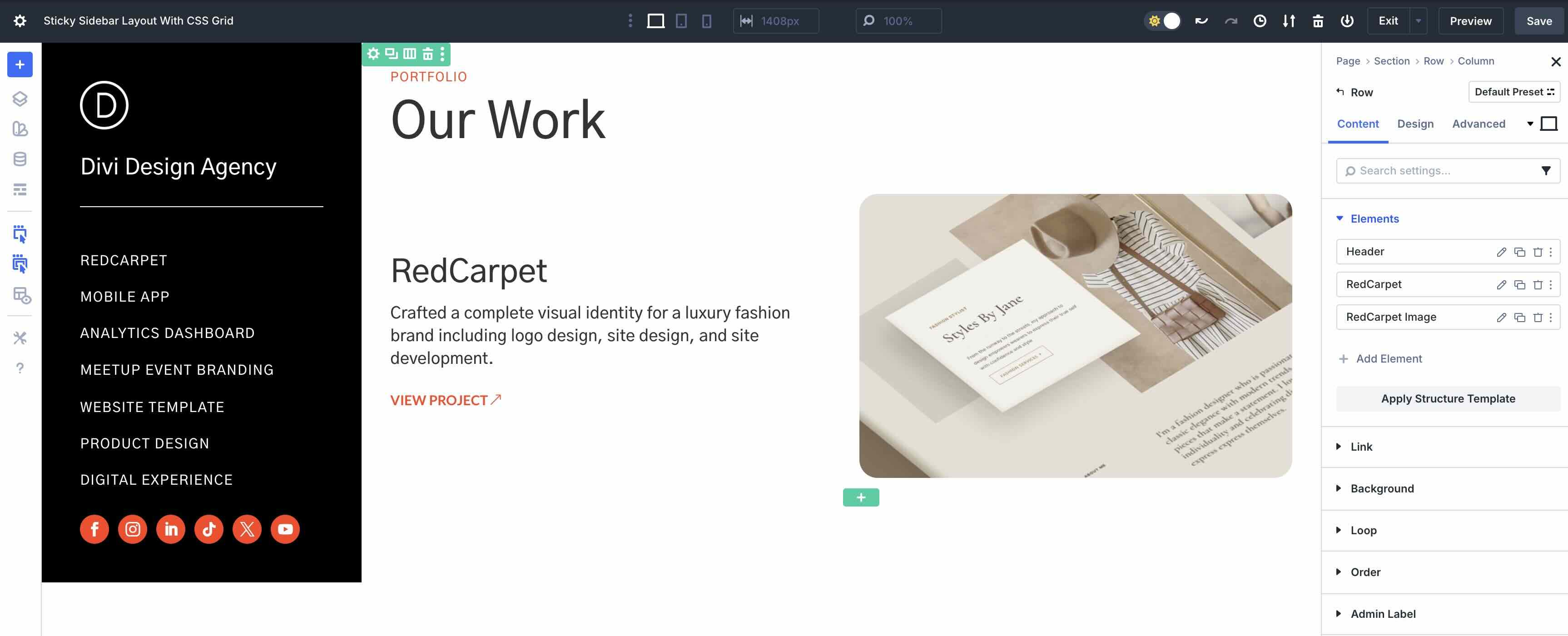
Click back to the Row’s Content tab and add a new Grid Item. This time, add an Image module and style it as desired.
This serves as the basic structure of the Grid.
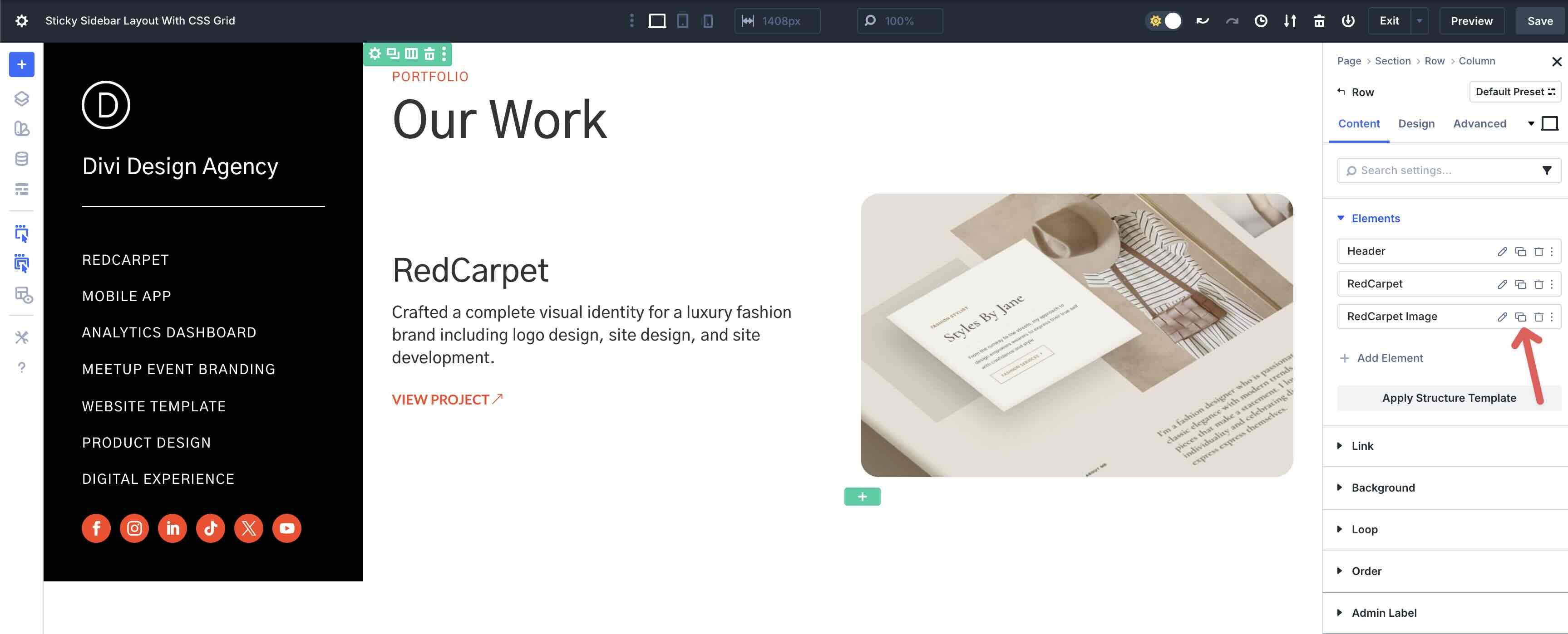
Duplicate And Edit Grid Items
To make things easy, you can copy Grid Items by clicking on the Duplicate Item icon.
Be sure to add Attributes for each new section of the Grid that corresponds with their menu item links.
Reposition Grid Items by clicking and dragging them throughout the Grid.
From there, simply edit the module’s content while keeping styles intact throughout the Grid.
Repeat these steps to add as many items as needed. Ensure that you assign anchor links (Attributes) to ONLY the text Grid Items. We will cover why in the next step.
Step 5: Adjust Settings For Responsive Breakpoints
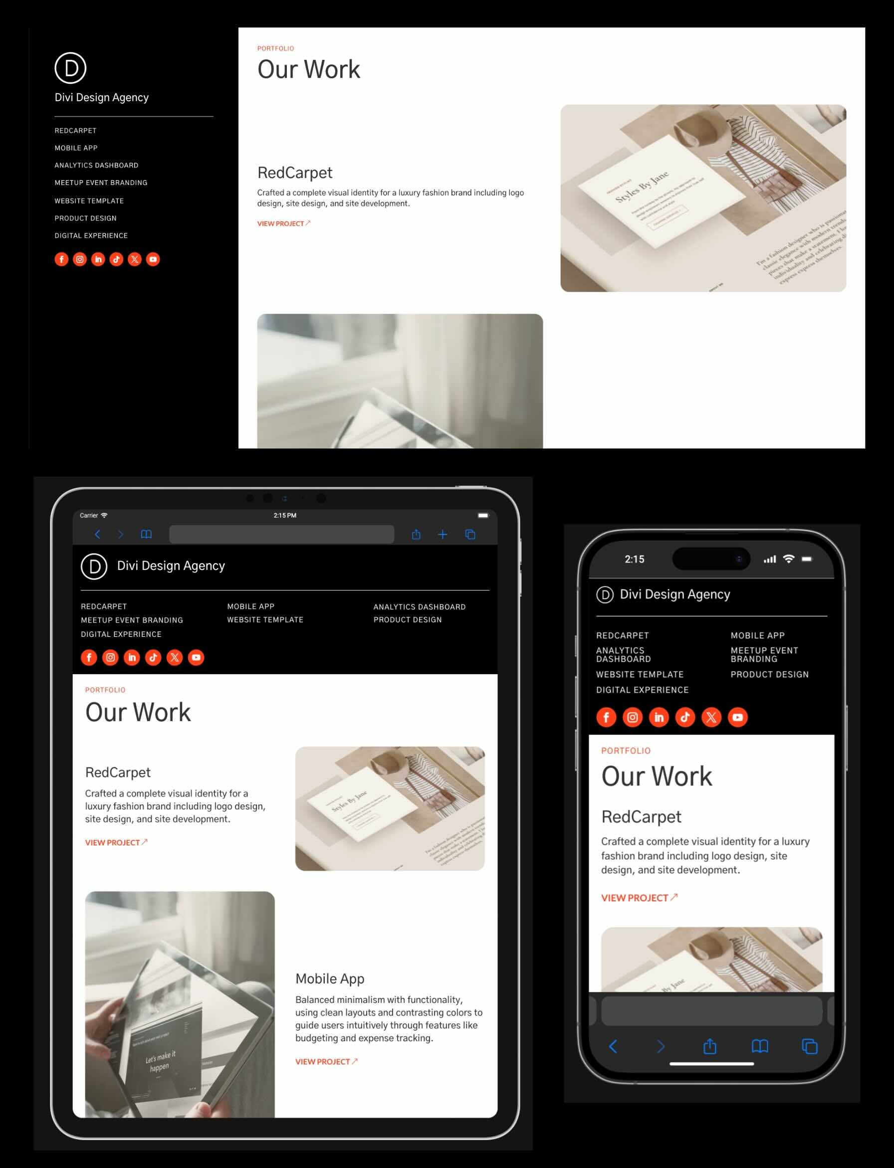
Our design looks great on Desktop, but when navigating through Divi 5’s Customizable Responsive Breakpoints, you’ll see that we need to make some changes.
Thankfully, Divi 5 makes it easy to make quick changes to Tablet and Phone breakpoints, ensuring your layout looks flawless on all screen sizes. While in the Tablet Breakpoint, click the Settings icon for the main Row.
Click on the Pencil icon to edit the first Column’s settings.
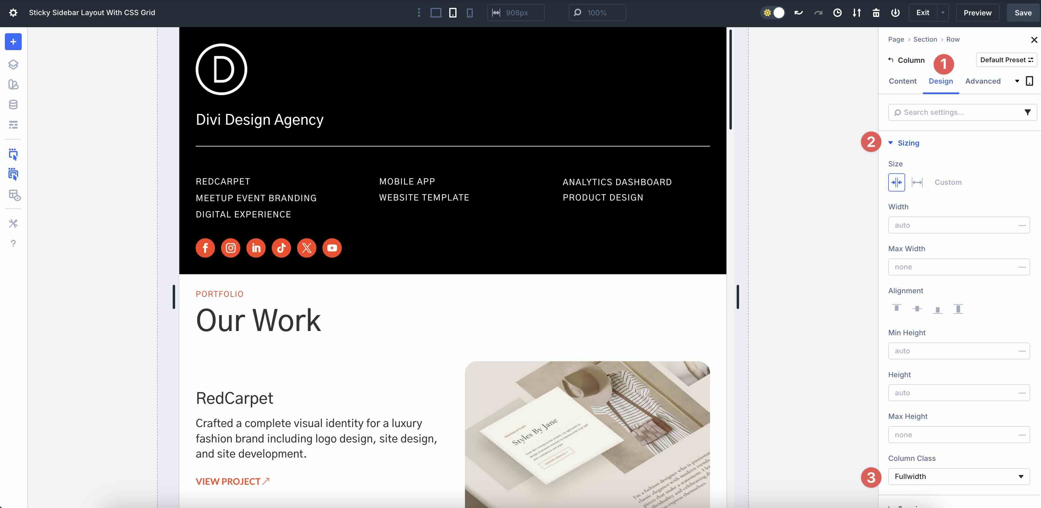
Navigate to the Design tab and expand the Sizing menu. Set the Column Class to Fullwidth. This will expand the Sticky Column’s width to fill the entire Row.
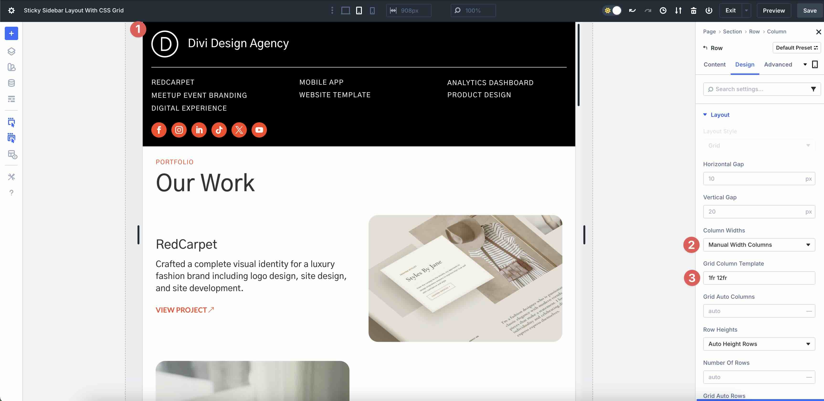
Hover over the Column in the Visual Builder canvas. Click the Settings icon for the Row containing the menu links. In the Design tab, set the Vertical Gap to 10px and set the Number Of Columns to 3.
Scroll through the Sticky Column’s settings to make tweaks to Spacing or Gaps.
Make adjustments to the Row settings that house the logo (Image module) and title to ensure it looks good on small device screens. For example, you can assign Column Widths to Manual Width Columns and specify a custom Grid Column Template, such as 1fr 12fr, to stack items horizontally instead of vertically.
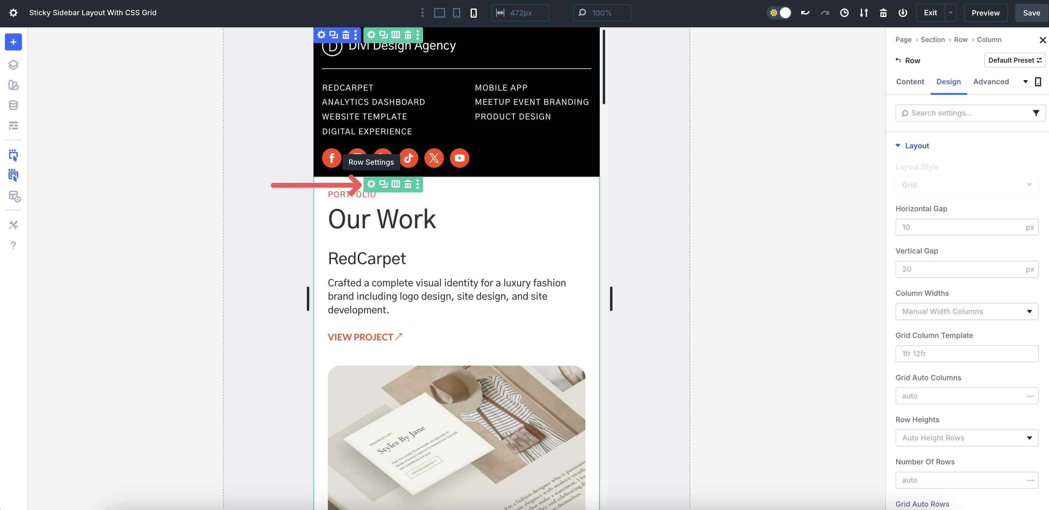
Adjust The Grid Row For Responsiveness
Switch to Phone view. Click the Settings icon for the Grid Row.
Click the pencil icon of the second Grid Item to adjust its settings.
Navigate to the Design tab. Adjust the Column Span to 2. This will allow the content to occupy the full width of the Row. Repeat the steps to adjust the remaining Grid Items to 2.
As you scroll down the page, you’ll notice that the Grid Items are all occupying 2 Columns, but the order isn’t what we’d like.
To fix this, we can adjust each Column’s Row Start and Row End values to align them perfectly. Since the first two Grid Items (which occupy 4 “Rows” on mobile) are aligned the way we want, we need to adjust the 5th Grid Item so that they stack appropriately.
Click on the 5th Grid Item and navigate to the Design tab. Expand the Sizing Menu and locate the Row Start and Row End fields.

Adjust each value to 4. Divi will then align the text above the image for a more polished appearance.
Repeat the steps to adjust any other Grid Items where the image appears first in the design. Adjust the value by 4 for each adjustment. For example, the 9th Grid Item would have Row Start/End values of 8, the 13th Grid Item would have values of 12, and so on.

That’s it! As you can see, Divi 5 makes it quick and easy to create a fully responsive sticky sidebar layout with CSS Grid.

Unlock CSS Grid in Divi 5 Now
With Divi 5‘s built-in CSS Grid feature, sticky sidebars are no longer a headache. In just a few minutes, you can build a layout that’s responsive and polished. From quick wireframing to seamless mobile stacking, CSS Grid in the Visual Builder enables faster builds, bolder designs, and a smoother user experience that keeps visitors engaged.
Ready to level up with Divi 5? Head to the Divi Members Area and download the latest Divi 5 Public Beta to experiment with CSS Grid today. Let us know what you think in the comments, or drop us a comment on our social media platforms.


Leave A Reply