
Building a CSS Grid layout isn’t difficult to understand, but it can be challenging to execute cleanly. Sketching columns is easy. Keeping spans, gaps, and breakpoints in sync across pages is where most people stall.
The good news: there are several ways to build real grids. You can write CSS by hand, use WordPress blocks, or lean on page builder plugins. You can also use Divi 5 if you prefer to place items on a grid with controls instead of writing code.
They all work, but in different ways. Some give total control, but slow you down during iteration. Others let you move fast during setup, but box you in once layouts get complex. The right choice depends on how comfortable you are with code and how much customization your project needs.
In the sections ahead, we’ll walk through each method and show you what works and what doesn’t.
Before You Build, Understand the Grid
Before diving into code or a page builder, it’s worth revisiting how CSS Grid actually works. Understanding the structure behind it will save you hours of trial and error in the future.
A CSS Grid is a hidden framework built from intersecting lines. The vertical ones define your columns, and the horizontal ones define your rows. Your content sits neatly in the spaces where those lines meet.
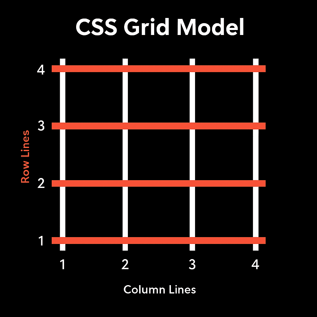
Here’s what catches most people off guard: when you create a three-column grid, you’re not working with three boxes. You’re working with four vertical lines and the gaps between them. The columns themselves are just the empty spaces those lines outline.
You define where every element sits on that structure using three basic ideas:
- Start – the line where the element begins.
- Span – how many columns or rows it stretches across.
- End – the line where it finishes.
Take this example. The code below instructs the element to start at column line 1 and span two columns, ending at line 3. It now spans the first and second columns instead of fitting in just one cell.
.item1 {
grid-column: 1 / 3; /* Starts at line 1, ends at line 3 */
grid-row: 1 / 2; /* Stays on the first row */
}
Change the start line, and the element shifts position without needing margins or extra wrappers. Change the span, and it grows or shrinks inside the grid. This line-based positioning is what makes grids stable, flexible, and predictable when you’re hand-coding or using a visual tool.
Once you start thinking in terms of lines instead of boxes, layout building clicks into place. You stop guessing because every placement has logic behind it.
From here on, everything we’ll cover is just a different way of setting and controlling those same lines. Writing CSS by hand, using Gutenberg, or building visually in Divi 5 all do the same thing under the hood.
4 Ways To Build CSS Grids For Your Website
Now that you know how a grid works beneath the layout, let’s look at the different ways you can actually build one.
1. Building CSS Grid Layouts With Code
Before page builders existed, CSS was the only way to create grids. Even today, it remains the most direct way to understand what’s happening under the hood. When you write it yourself, you see how every part of the structure connects.
To start, you need a container. Turning it into a grid begins with a single property: display: grid; this tells the browser to treat the container as a grid and start dividing it into tracks.
Once the grid is active, you define its basic structure using columns and rows. Columns create vertical tracks, rows form horizontal ones, and together they define how your content will be arranged. The properties grid-template-columns and grid-template-rows are what make that structure visible in your code.
.grid-container {
display: grid;
grid-template-columns: repeat(3, 1fr);
grid-template-rows: repeat(2, 120px);
gap: 12px;
}
This creates a grid with three equal columns and two rows, each 120px tall. The value 1fr means one fraction of the available space, so each column stretches evenly to fill the container. The gap property handles the spacing between items and tracks, which cuts down on the need for margins on individual items.
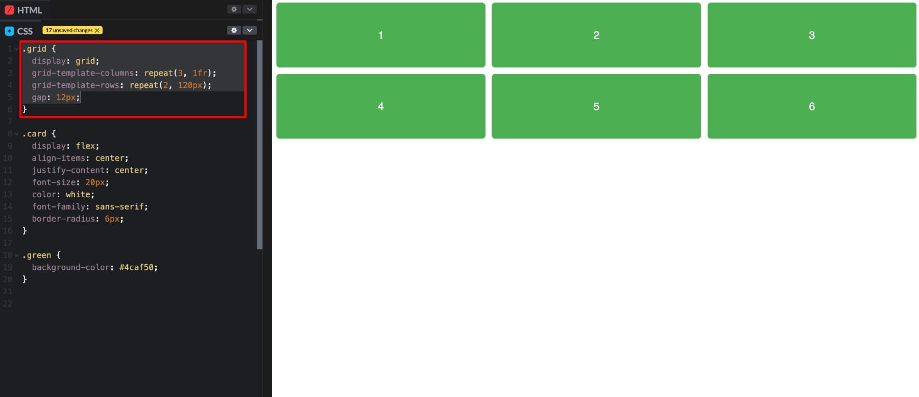
At this stage, items automatically flow into the grid, one per cell, from left to right and top to bottom. The real advantage of CSS Grid shows up when you start controlling where each item sits using grid lines. This is where grid-column and grid-row come in.
.hero-image {
grid-column: 1 / 3;
grid-row: 1 / 2;
}
.hero-text {
grid-column: 3 / 4;
grid-row: 1 / 2;
}
In this example, the image starts at column line 1 and ends at line 3, so it spans across two columns. The text sits beside it in the third column, both aligned neatly on the first row. You’ve just built a custom layout without any extra wrappers or positioning tricks.
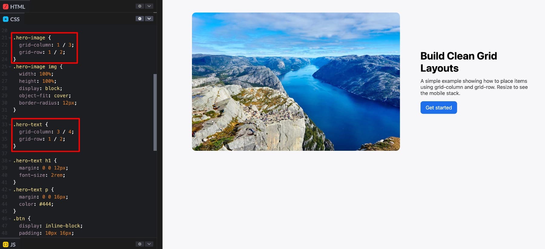
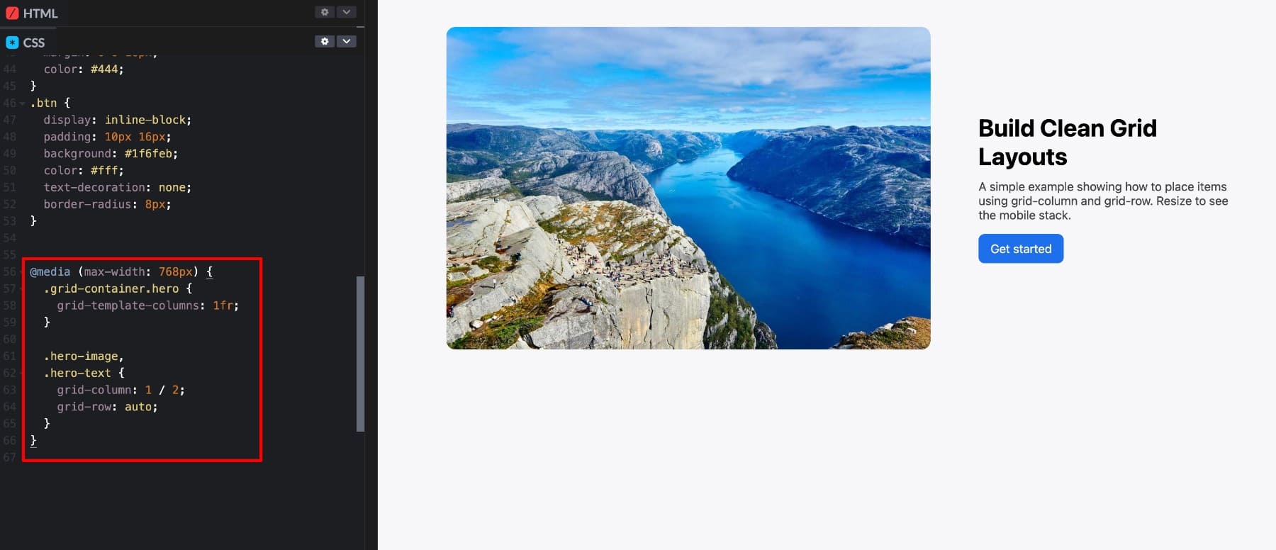
To make layouts responsive, you use media queries to redefine how the grid behaves on different screens. This is how the structure you created adapts to fit smaller devices.
@media (max-width: 768px) {
.grid-container {
grid-template-columns: 1fr;
grid-template-rows: auto;
}
.hero-image,
.hero-text {
grid-column: 1 / 2;
}
}
Here, the browser gets told that when the screen width drops below 768 pixels, the layout should collapse into a single column. The same elements now stack vertically instead of sitting side by side. It’s a simple but powerful way to make a layout responsive without rewriting the structure.
Writing CSS Grid by hand gives you complete control. You decide exactly how elements align, how far they stretch, and how they behave at each breakpoint. But that control requires understanding grid syntax, line-based placement, and fractional units. Iteration takes longer too. You edit, save, refresh, and test after every adjustment. Small updates like changing column counts require code edits. For developers, this precision makes sense.
For designers who prefer visual feedback, it feels like overkill. Visual tools handle that part. The first stop is WordPress, where the Gutenberg editor lets you build grid-style layouts without writing a single line of CSS.
2. Building Layouts With Gutenberg
If you want a visual way to build grids inside WordPress without touching CSS, Gutenberg now includes a true Grid option. Depending on your WordPress version and enabled features, you can insert the Grid block, choose Auto or Manual column modes, set a minimum column width, and adjust gaps, all from the sidebar.
For simple card grids or galleries, this works well. Drop content into cells, tweak column count, set gaps, and you can preview results right in the editor. The Auto mode is handy on smaller screens because the grid reflows based on the minimum column width you set. That behavior is built into the Grid layout type.
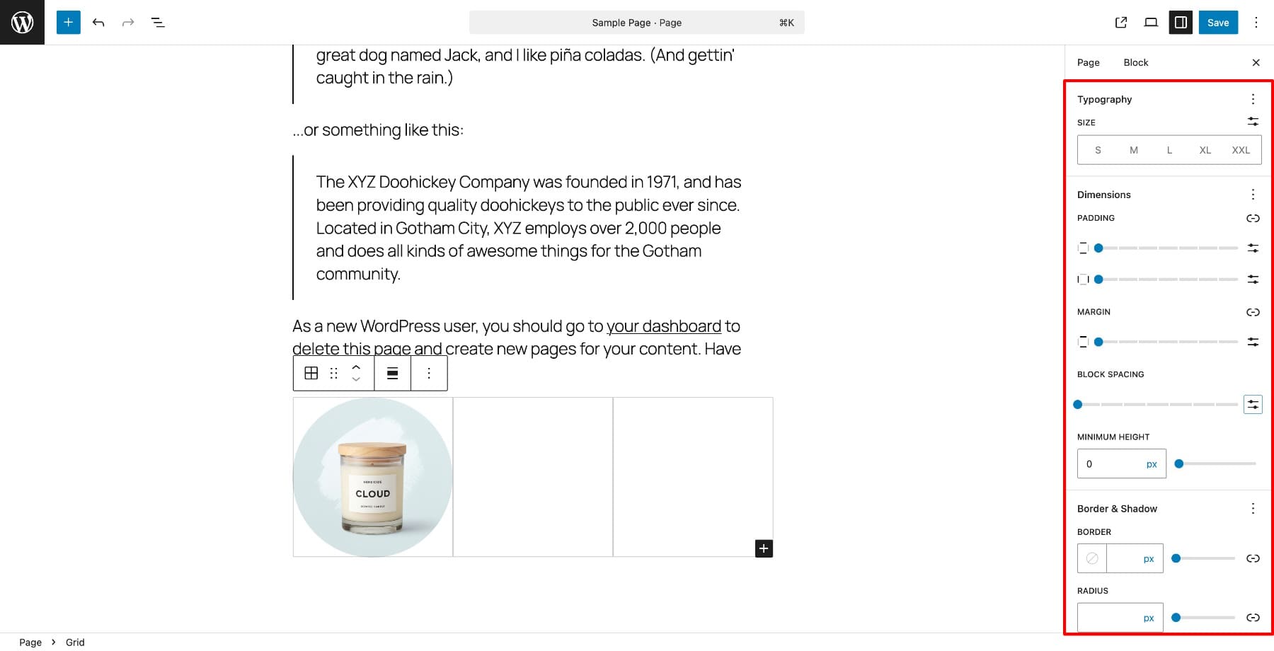
The simplicity that makes it fast can also box you in once your layouts get more complex. The visual interface is easy to use, but the controls don’t go as deep as hand-coding. Here are two specific places you might run into trouble:
- You likely can’t define detailed templates like “set five columns, make the second row auto-height, place one item to span from column two to four, then change the layout entirely at tablet size.” The UI focuses on column count, minimum width, and uniform cards. For anything with custom spans or non-uniform rows, you’ll need to add custom CSS or switch to another method.
- Responsive behavior is simple by default. The Grid block collapses items based on the minimum column width you set, but it doesn’t give full breakpoint-by-breakpoint grid-template control in the UI. If your layout needs every breakpoint to behave differently, the block won’t offer the fine controls you’re looking for.
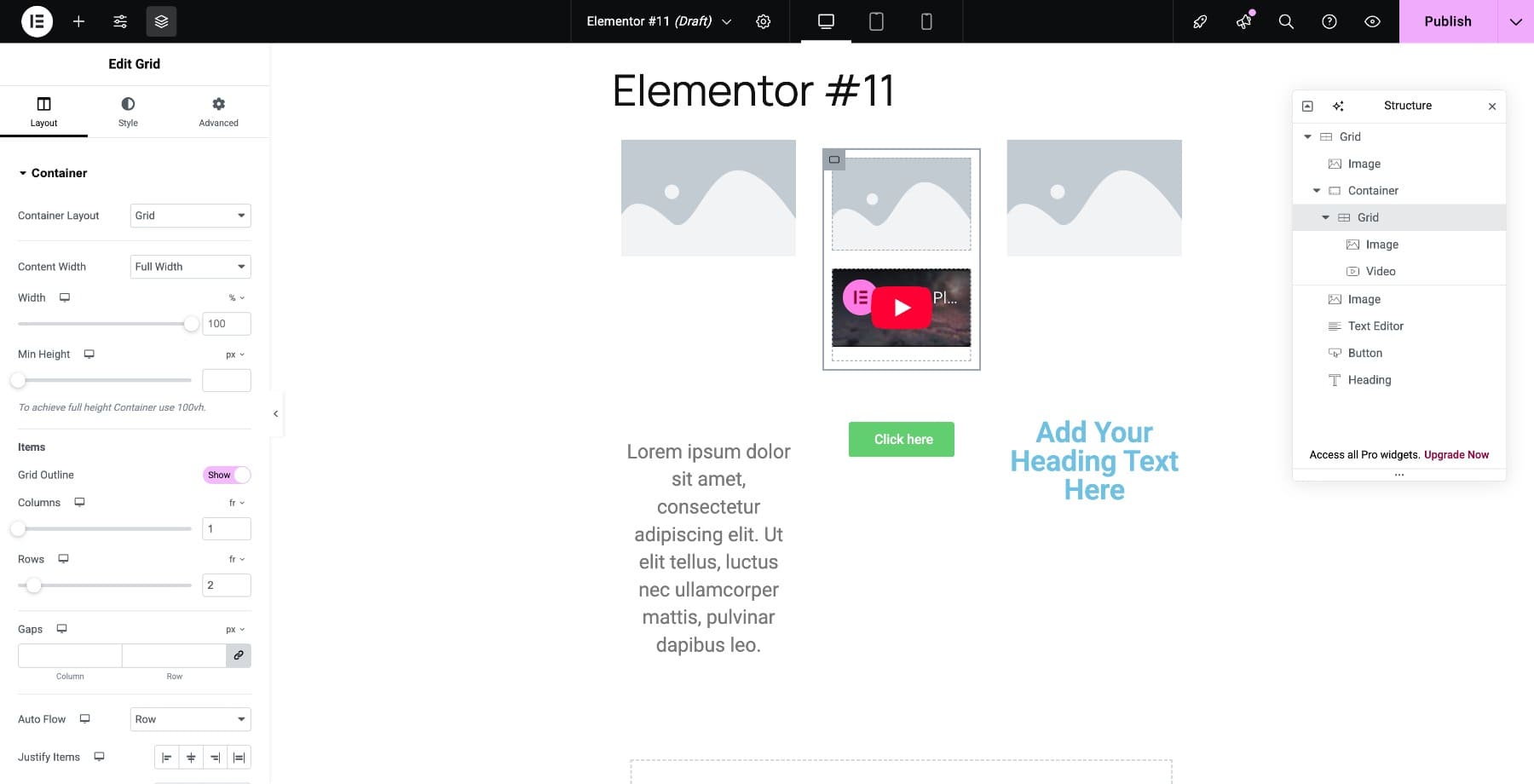
3. Using Divi 5’s CSS Grid
Divi 5 treats Grid as a first-class layout system, not an afterthought. Other builders simulate grids with layers of nested containers or limited presets. Divi gives you true CSS Grid controls built directly into the builder, fully visual and code-free.
When you switch any container to Grid layout, the right sidebar updates with visual controls for columns, rows, gaps, and spans. You’re no longer typing properties like grid-template-columns. You’re adjusting sliders and dropdowns that instantly update your layout on screen.
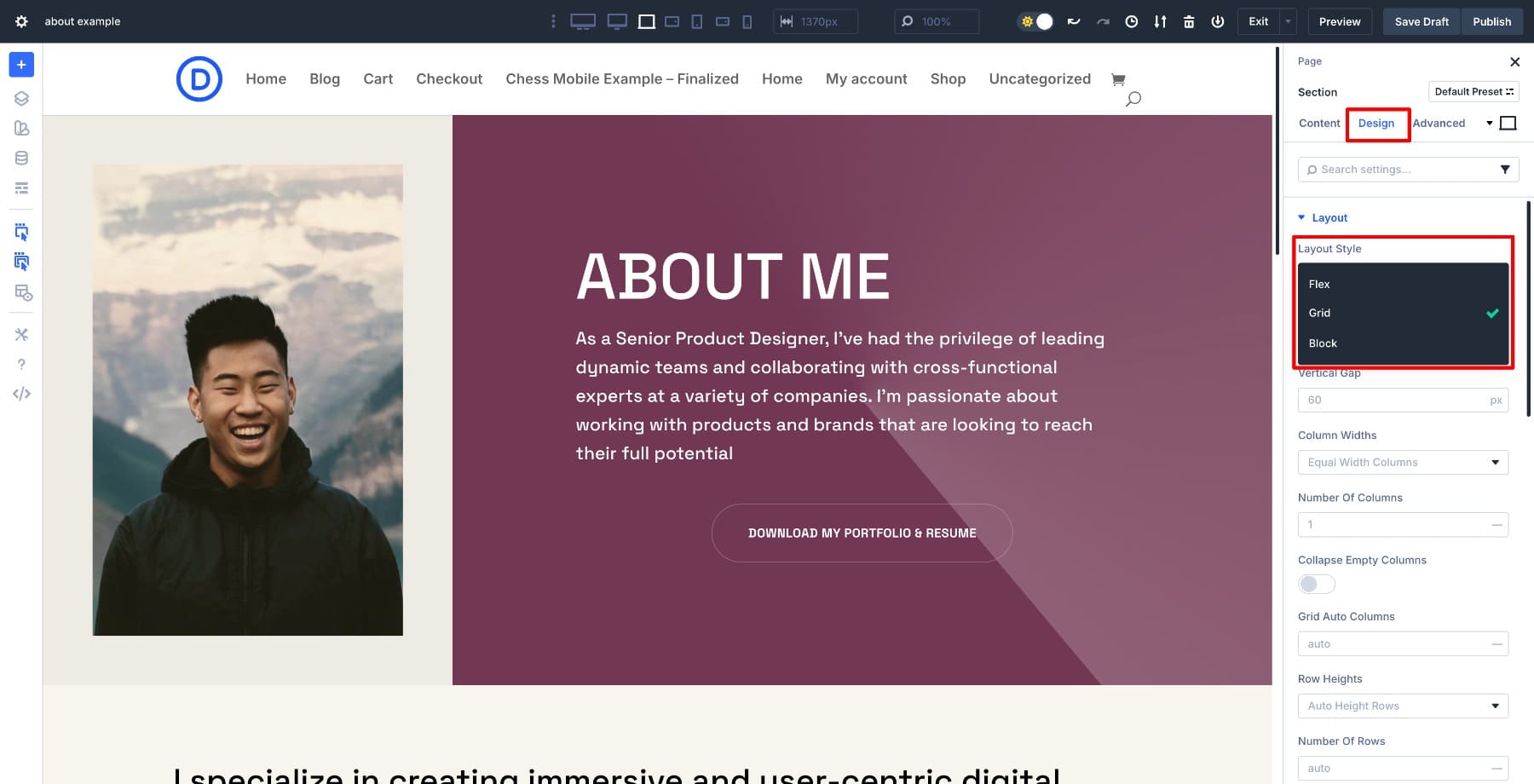
For beginners, Divi includes pre-built grid structures such as two-column layouts, card grids, hero sections, and galleries. You can pick one, drop in your modules, and get a functional design in seconds.
If you prefer control, you can define your own grid manually. Each module includes visual fields for column start, span, and end. These follow the same logic as CSS Grid, letting you move modules around with precision and clarity without touching any code.
Divi’s Grid is part of the system rather than a plugin, so it integrates with every other Divi feature: Flexbox alignment, Option Group Presets, Nested Modules, and Design Variables. You can mix layout techniques to create custom designs that stay consistent across your site. Grid handles structure, Flexbox handles alignment, and both work together in one place.
This approach removes the need for extra wrappers, spacing tricks, or repeated sections. Your layouts stay lightweight, clean, and easy to adjust.
Learn Everything About Divi 5’s Grid System
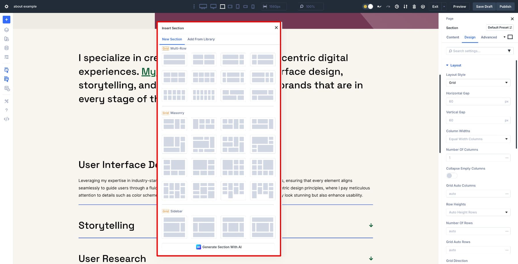
Start Faster With Pre-Built Grid Layouts
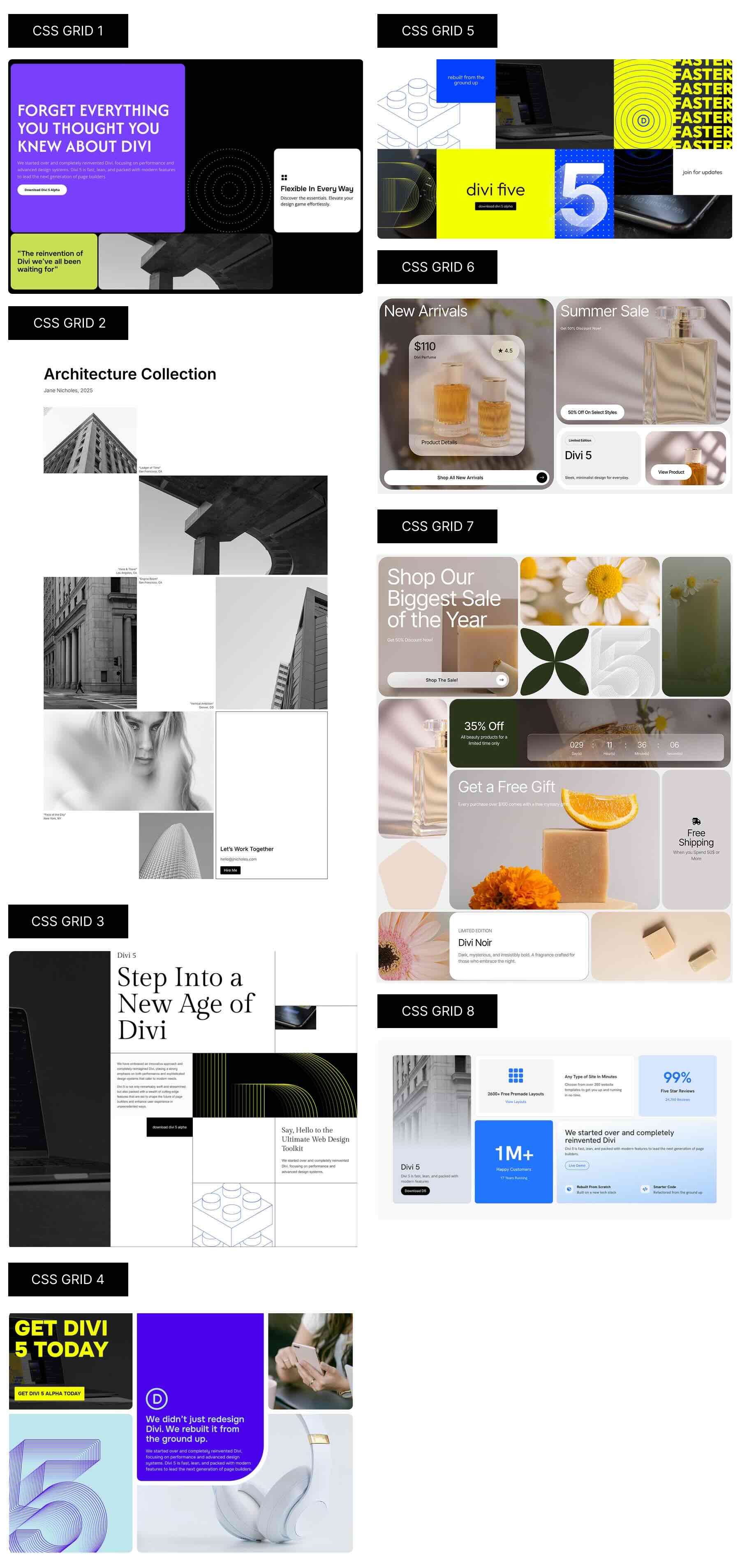
Want to skip the setup entirely? We’ve built 8 ready-to-use Divi Grid sections — prestyled CSS Grid layouts you can drop into any page and customize. Download them, import them into your site, and drop in your content. The grid structure is already built. You’re just customizing, not starting from zero.
Download Beautiful CSS Grid Layouts
4. Using Other Popular Page Builders
Page builders bridge the gap between code and no-code. They give you more visual freedom than Gutenberg and remove the learning curve of CSS. Most use a section-column-nested column model.
You start with a section, divide it into columns, and when the layout needs more precision, you nest another set of columns inside. It’s intuitive enough that anyone can build a decent grid visually, and flexible enough to handle most modern website layouts.
This approach addresses many of the frustrations associated with coding by hand or relying on Gutenberg. You see changes live, adjust widths with sliders, tweak spacing visually, and drag elements exactly where you want them. Page builders also handle responsive scaling better than basic WordPress blocks. You can preview tablet and mobile views instantly and fine-tune each version without touching CSS.
But behind that convenience lies a structure that becomes heavy quickly. Every time you add something creative, such as an overlapping image, a multi-column hero, or a staggered gallery, you’re nesting another container within another. A single section might contain rows, columns, and inner columns, all of which are used to achieve what should be a single grid.
Each new idea adds another layer. Multiply this by ten or twenty sections, and your structure becomes far heavier than it looks on the surface.
Spacing control also requires extra effort. Margins, padding, and gaps live in separate panels, so adjusting one card often means jumping through multiple layers to get the spacing right.
Responsive layouts can also be inconsistent. Each builder handles stacking differently, and when you need custom spans or a new layout at tablet size, you often end up duplicating sections and hiding them per device. It works, but it adds weight and maintenance overhead.
Page builders like Elementor give you strong visual control. Many still lean heavily on nested Flexbox structures for complex layouts, even though some now offer Grid-style containers. Divi 5 builds CSS Grid directly into its core layout system so you get precise, two-dimensional control without deep nesting.
Try Divi 5’s CSS Grid Today!
Understanding CSS Grid isn’t the bottleneck. The real unlock is how fast you can build once you know what you’re doing.
Hand-coding gives you control, but it slows you down. Gutenberg makes it easy but limits flexibility. Traditional page builders add power but pile on complexity. Each method works until it doesn’t.
Divi 5 provides native CSS Grid functionality without requiring code or workarounds. Visual controls, responsive breakpoints, reusable structures, and pre-built layouts all work together. You’re building with the actual grid system, not around it.


Leave A Reply