")
Divi 5‘s new Grid layout system makes it easy to build responsive, editorial-style sections that stay perfectly aligned at every breakpoint. In this free pack, you’ll find 8 prestyled CSS Grid section designs, each crafted for clean structure, strong hierarchy, and quick edits. Drop them into any page and swap the content.
Preview
Let’s take a look at all 8 Grid Sections in this pack. The download is further down the post.
Subscribe To Our Youtube Channel
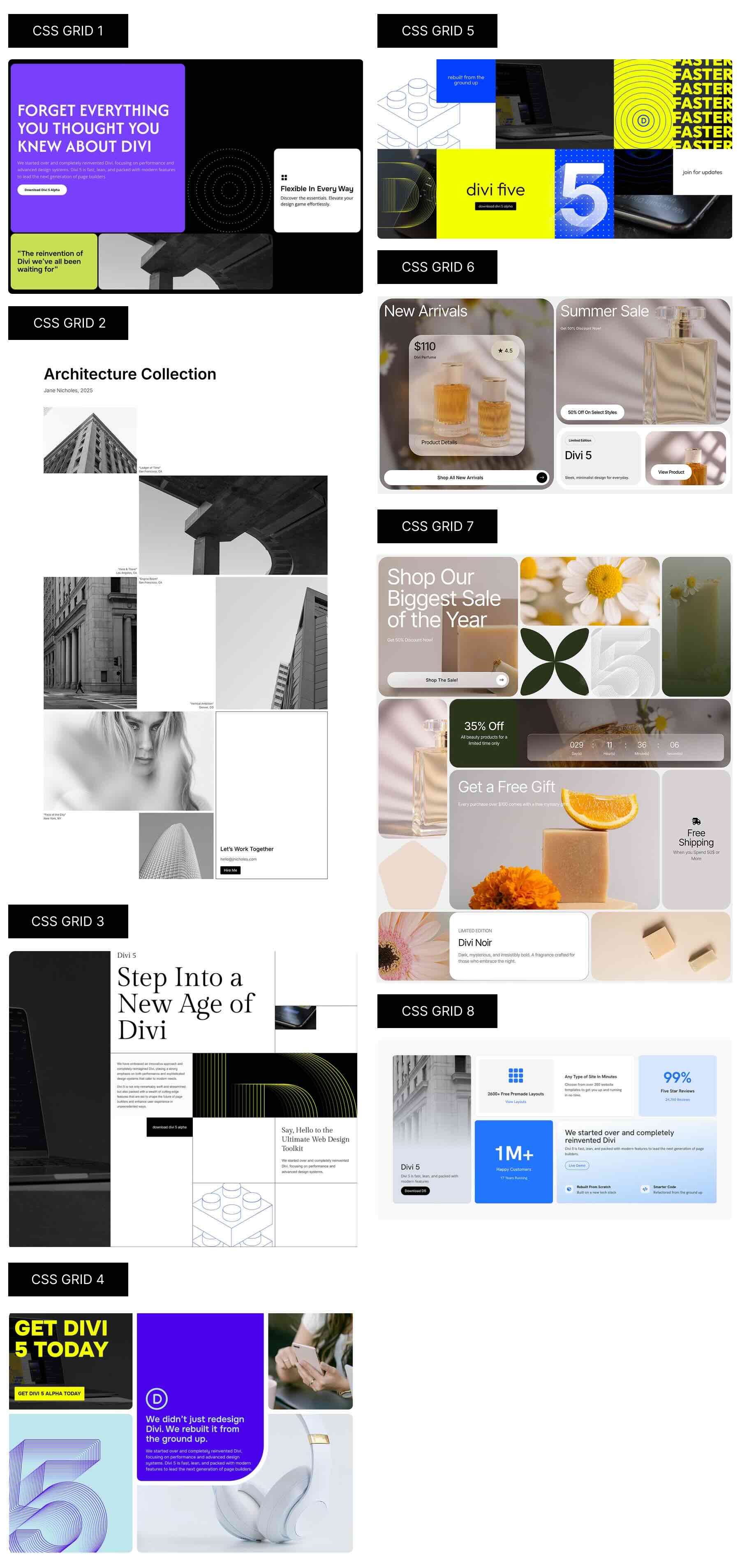
Download 8 CSS Grid Sections For Divi 5
Get all 8 grid sections for free. These are prestyled sections designed to look great out of the box. Import them into your Divi Library and add them to any page.

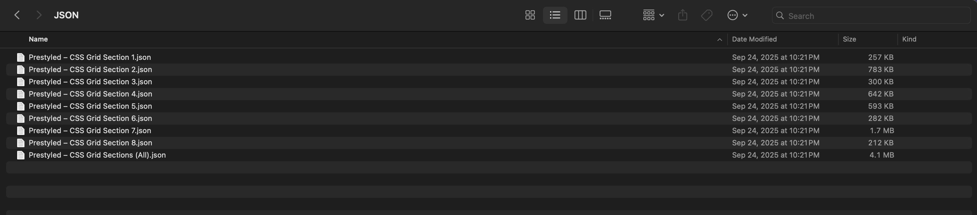
What’s Included (9 Exports)
Once you download and unzip the folder, you’ll find all 9 layout exports neatly organized as individual sections and a full “All Sections” pack.
Prestyled – Individual Sections (8) → Ready-made designs.
Prestyled – All Sections (1) → Full pack of all designs.
How To Use The Grid Designs
Keep your download folder close by to start importing them to your Divi website.
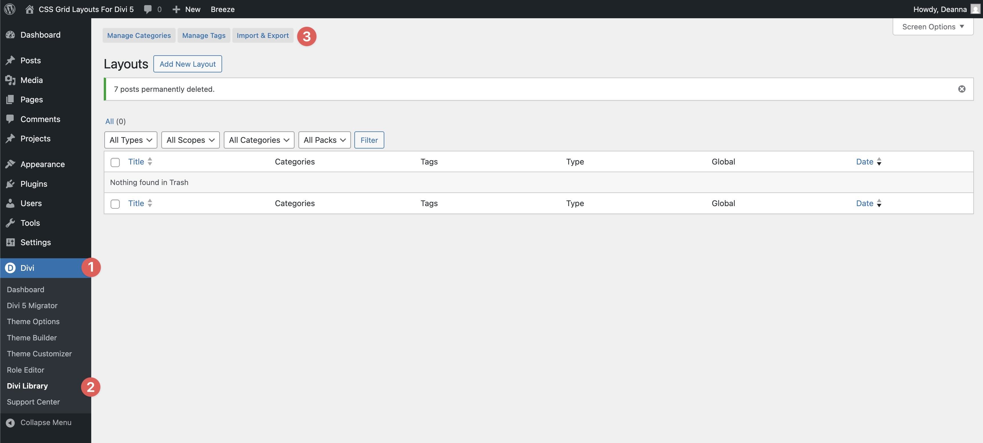
1. Import Sections Into The Divi Library
First, we’ll need to import the layouts to your Divi site. Go to Divi → Divi Library. Click the Import & Export button towards the top of your screen.
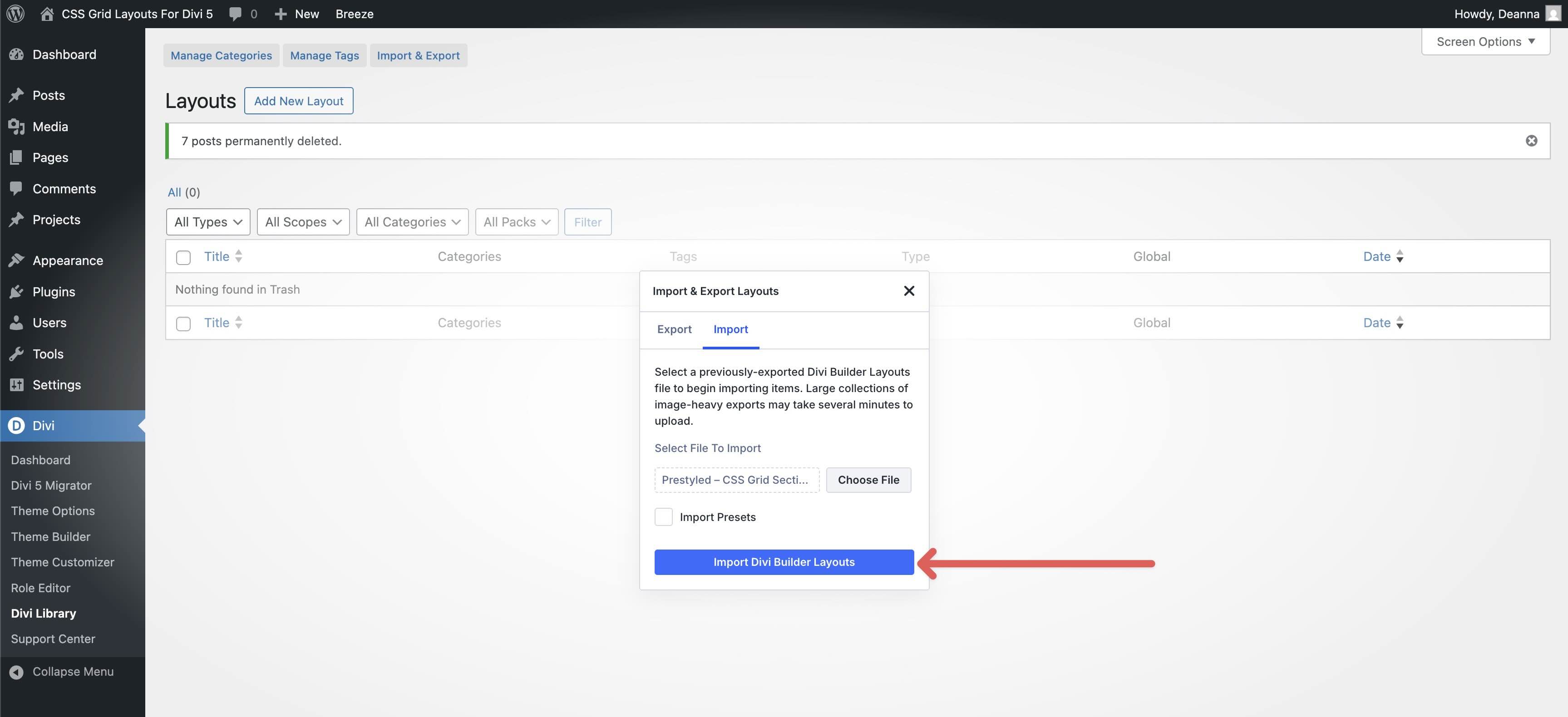
When the Import & Export Layouts modal appears, select the Import tab and click Choose File to locate the JSON files on your computer.
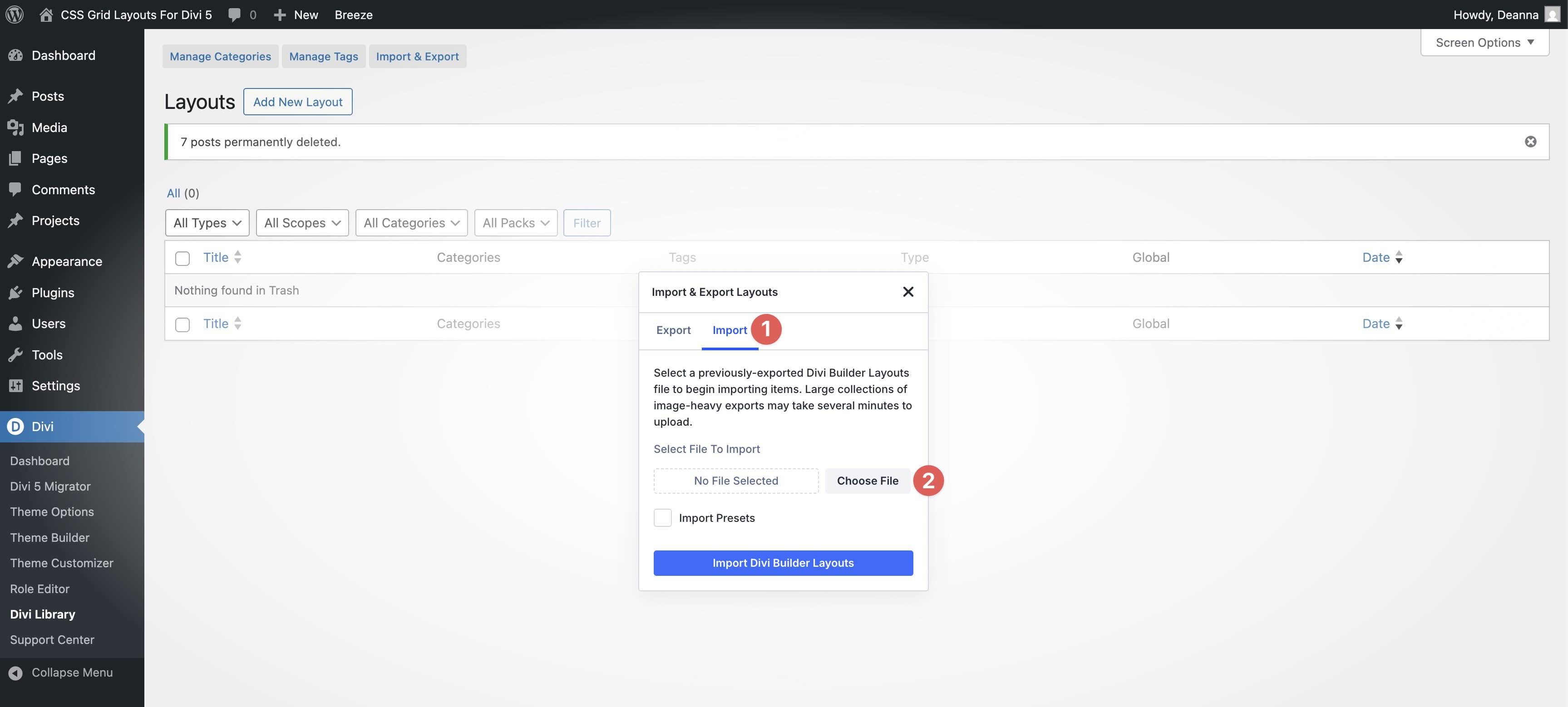
Choose the Prestyled – CSS Grid Sections (All) file and click it to import it.
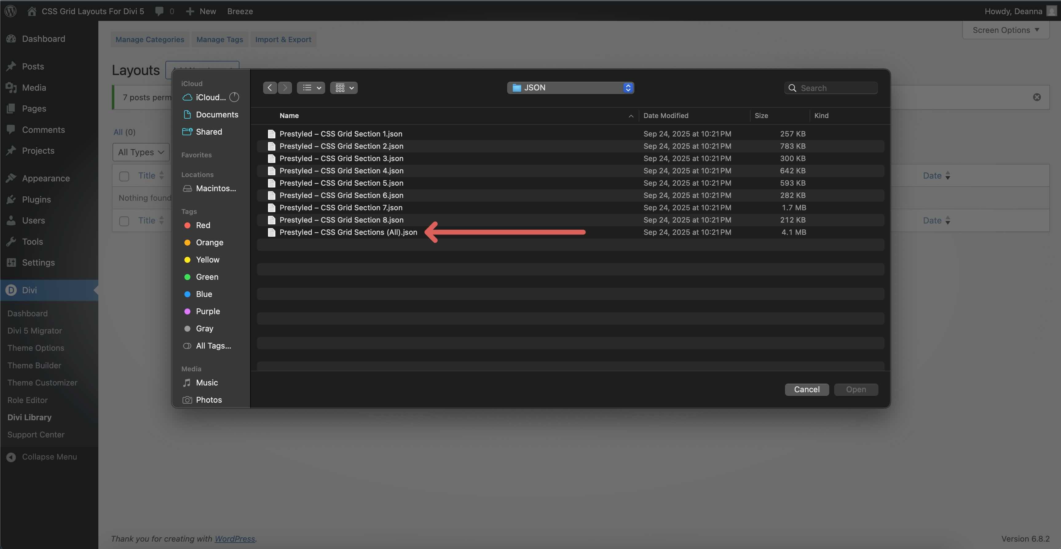
Once the file is loaded, click Import Divi Builder Layouts to install them.
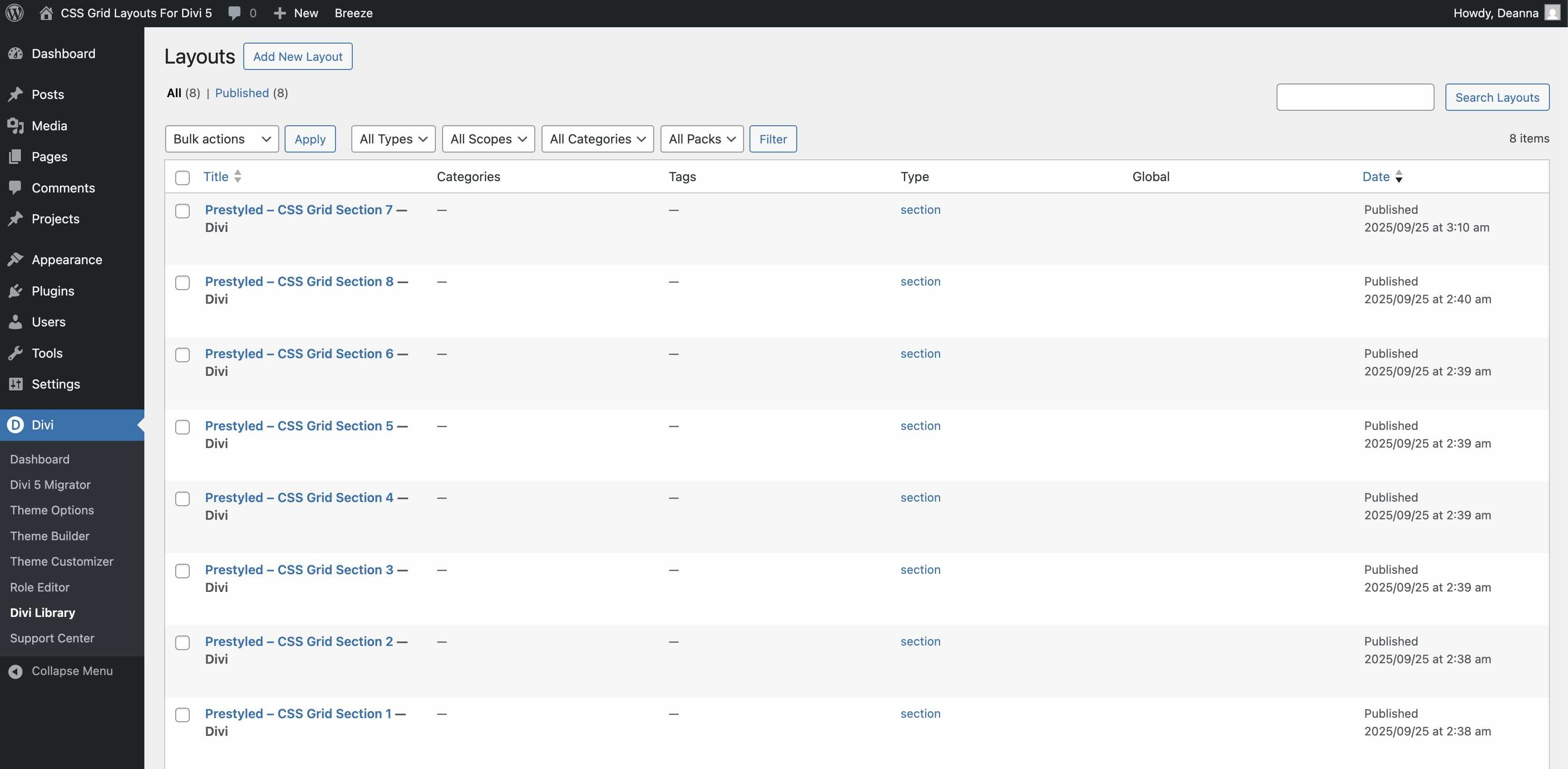
Once imported, all 8 CSS Grid layouts will appear in the Divi Library.
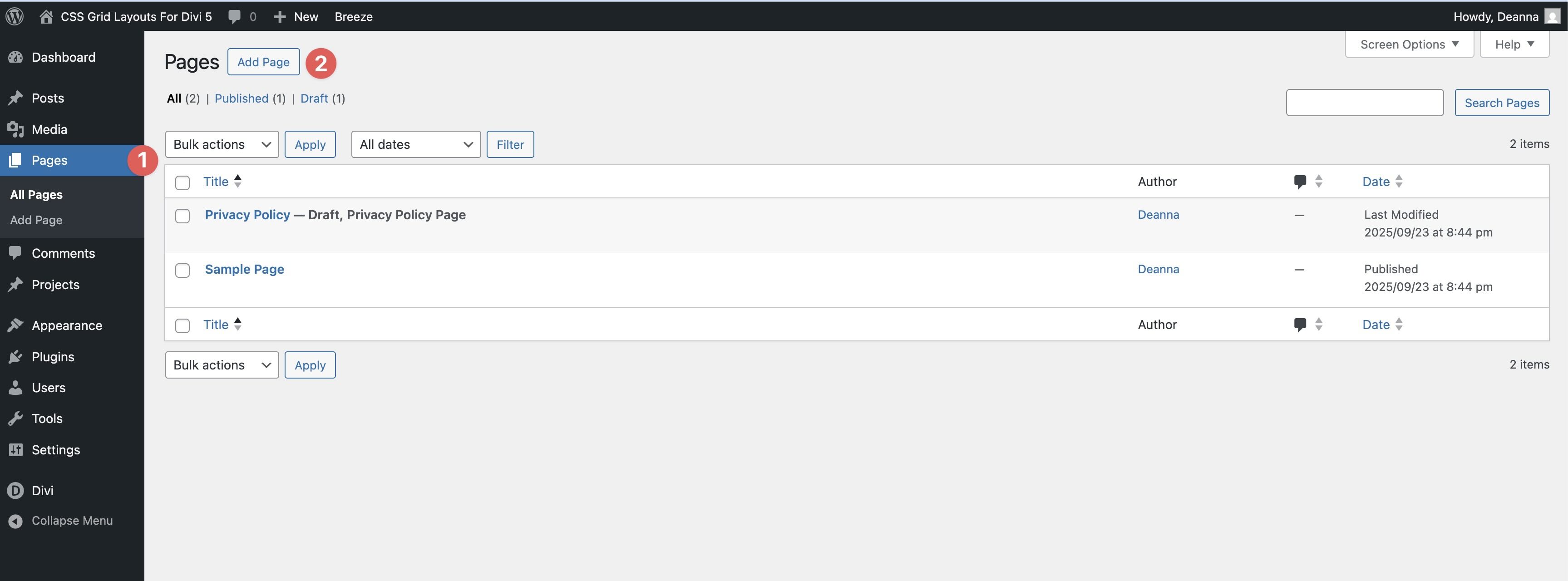
2. Add A Grid Section To A Page
Navigate to Pages → All Pages. Open a page in the Visual Builder (or create a new one).
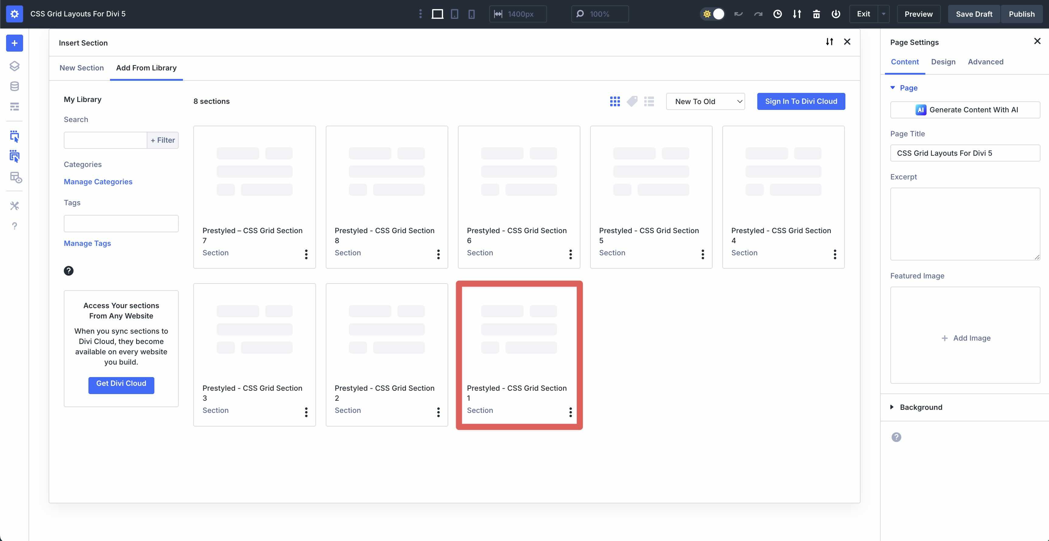
Click the black “+” in the Visual Builder. When the Insert Section modal appears, click the Add From Library tab.
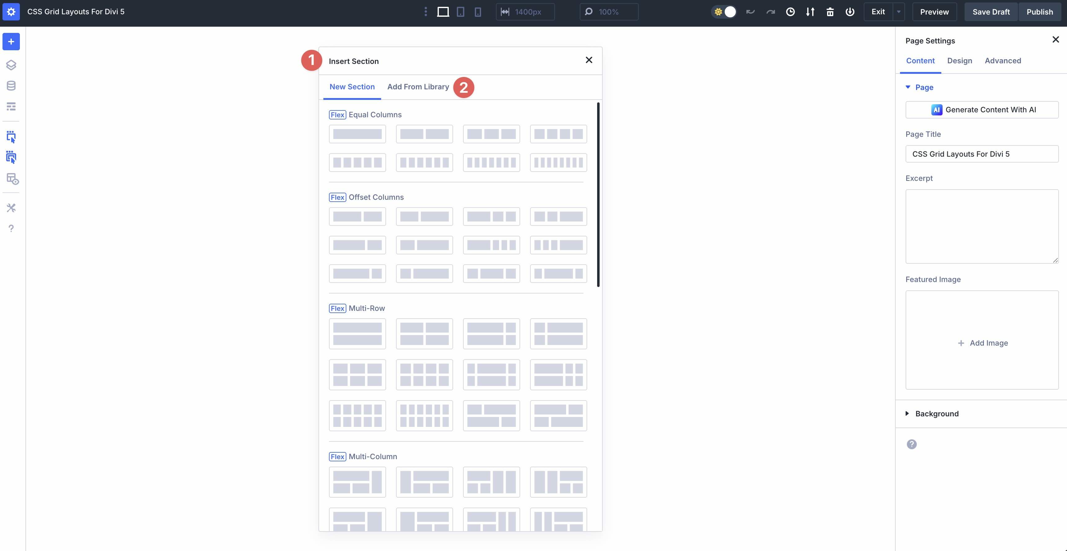
Pick the Grid section you want to insert.
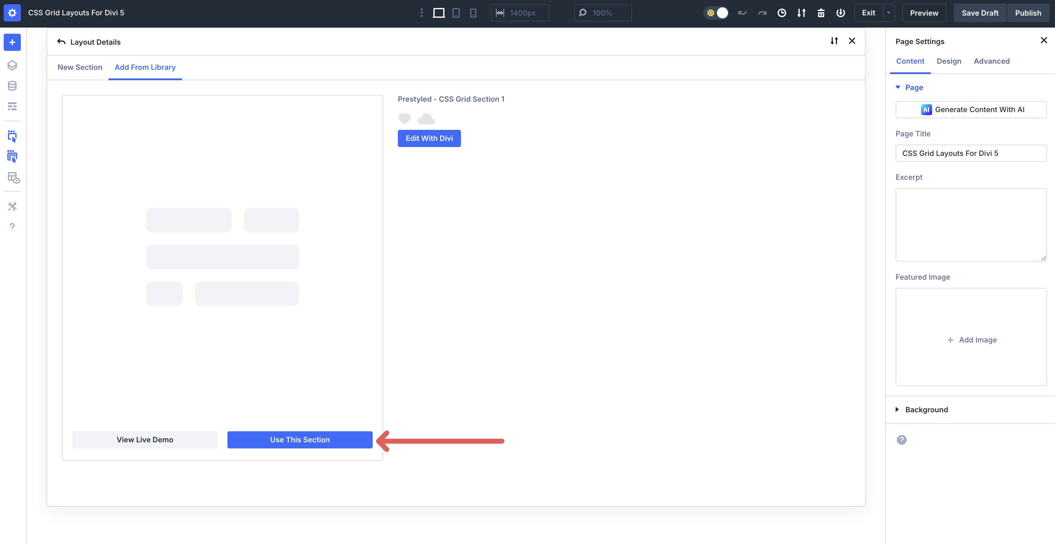
Click Use This Section to load it.
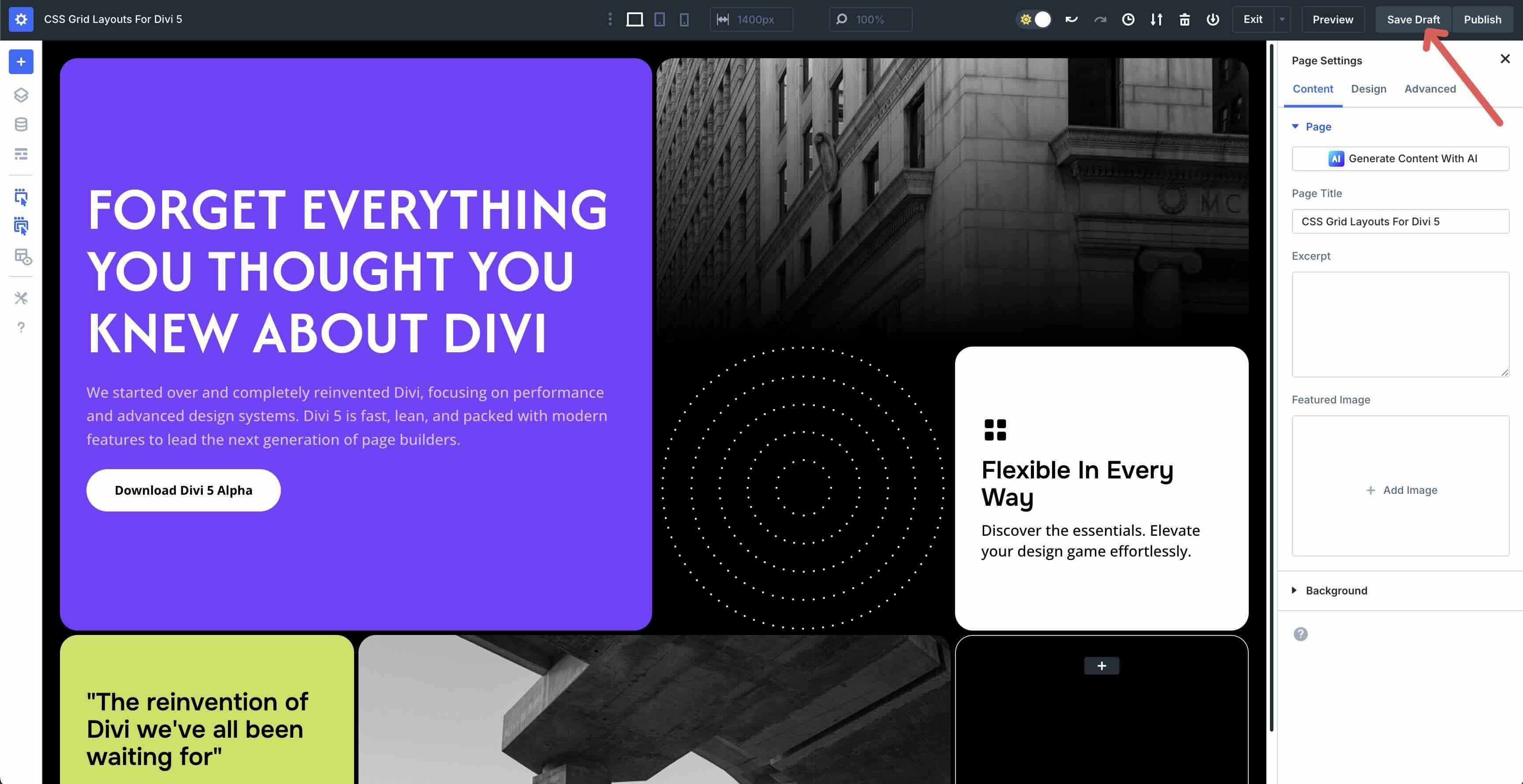
Finally, save the page by clicking Safe Draft at the top right of the Visual Builder.
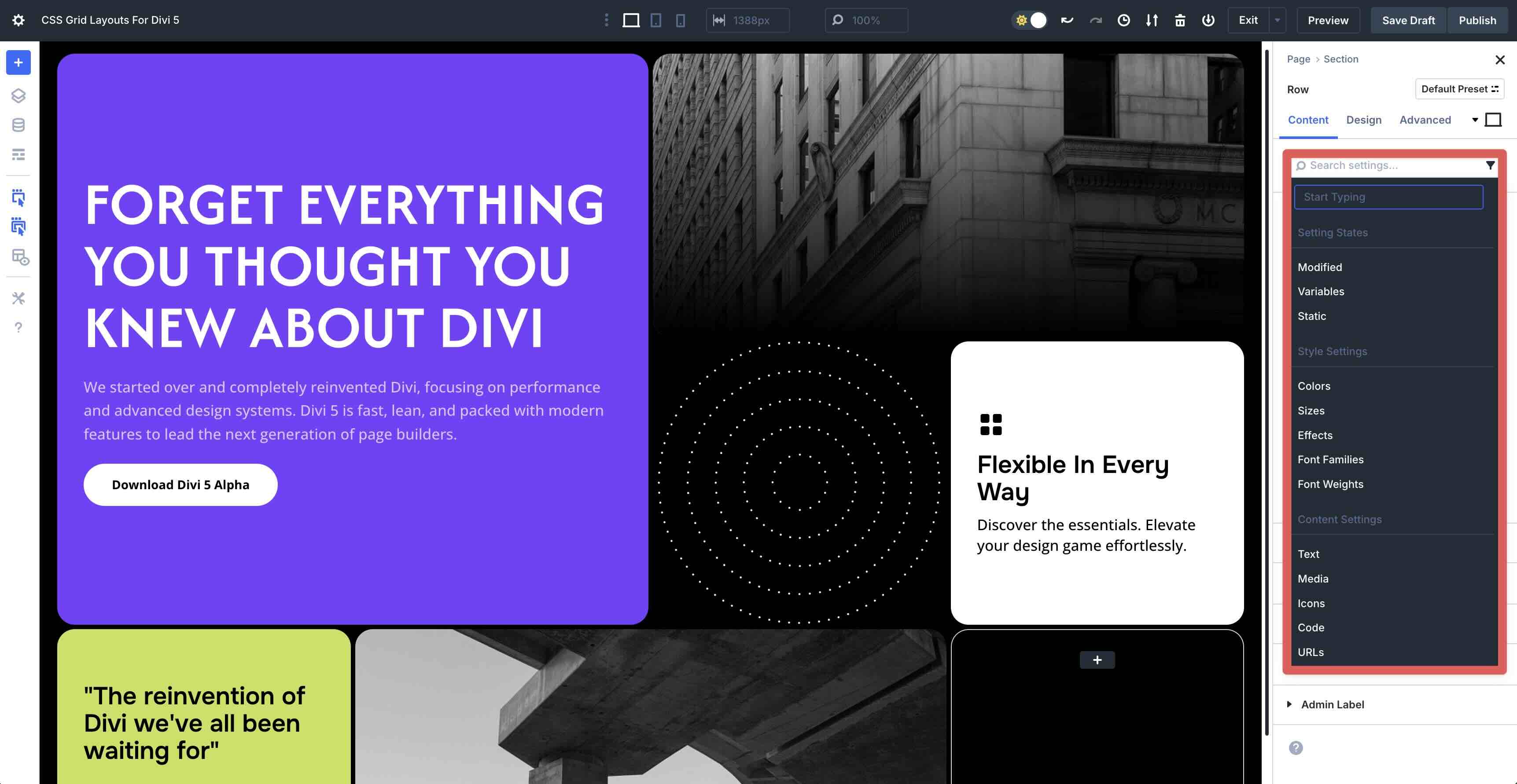
Customizing The Grids
These sections ship with ready-made layout, spacing, and typography styles. However, you can still tweak anything at the section, row, Column, or module level to better match your brand.
Divi 5’s Grid controls give you precise layout control while keeping everything responsive.
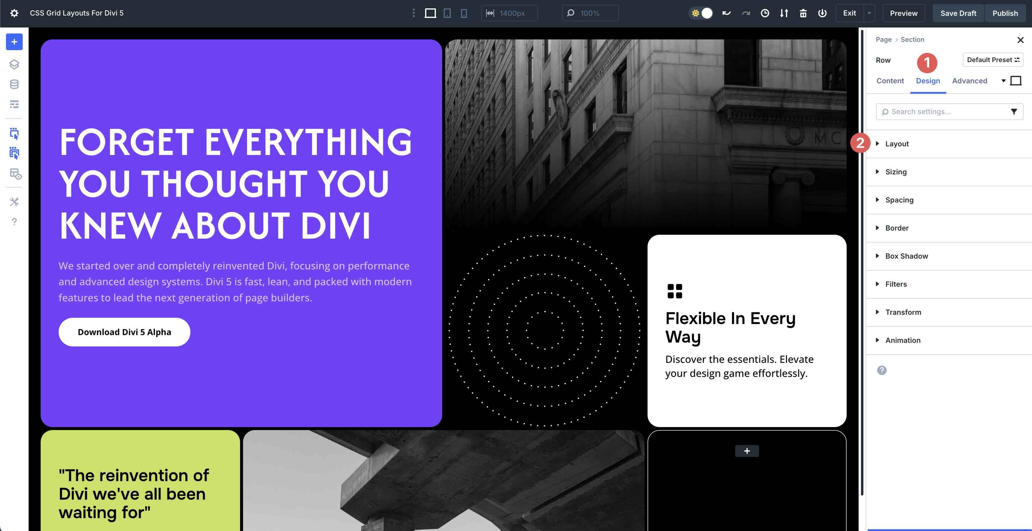
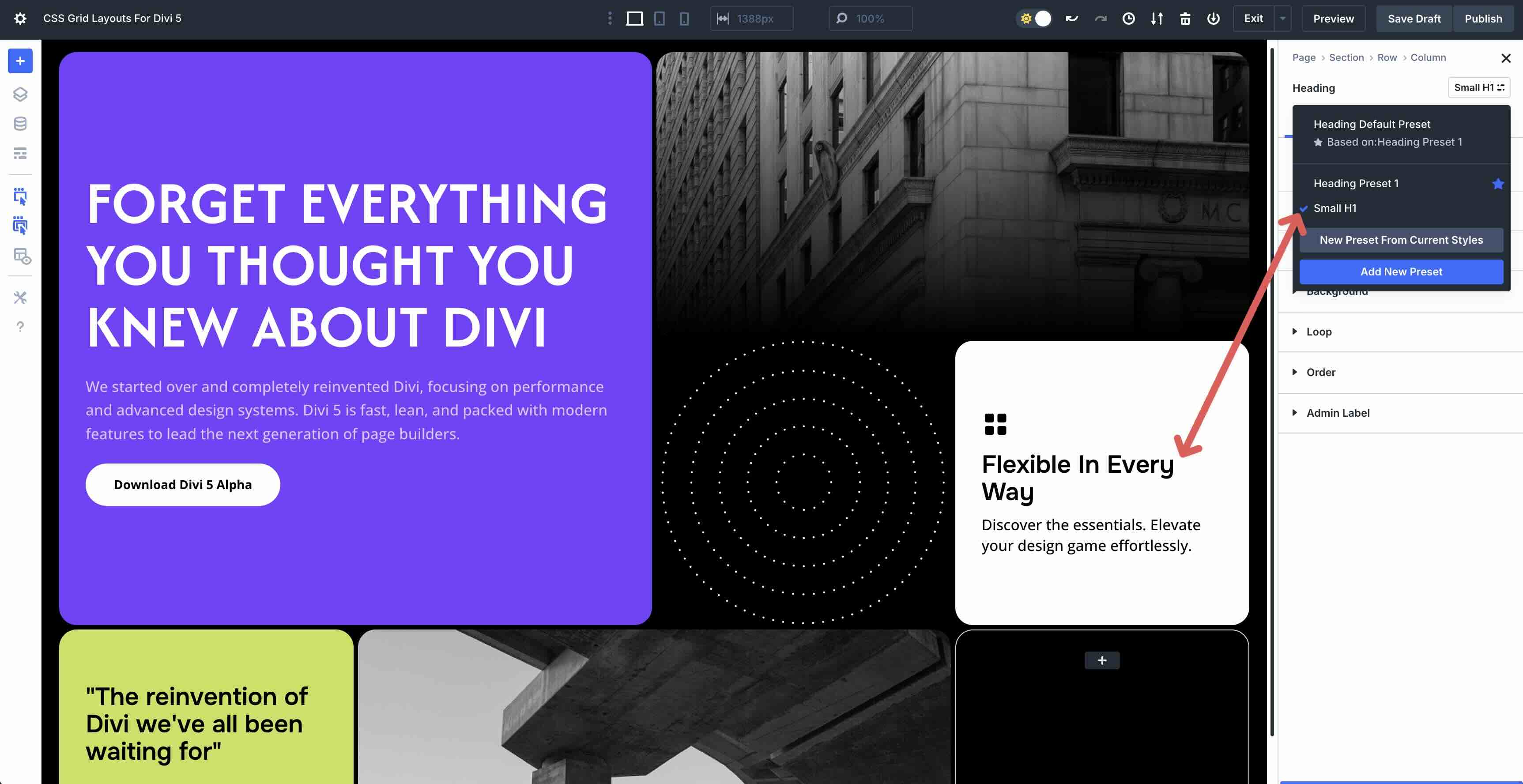
1. Edit Grid Tracks (Columns & Rows)
Open the Grid container (row) settings. Click the Design tab. Expand the Layout menu to reveal the settings.
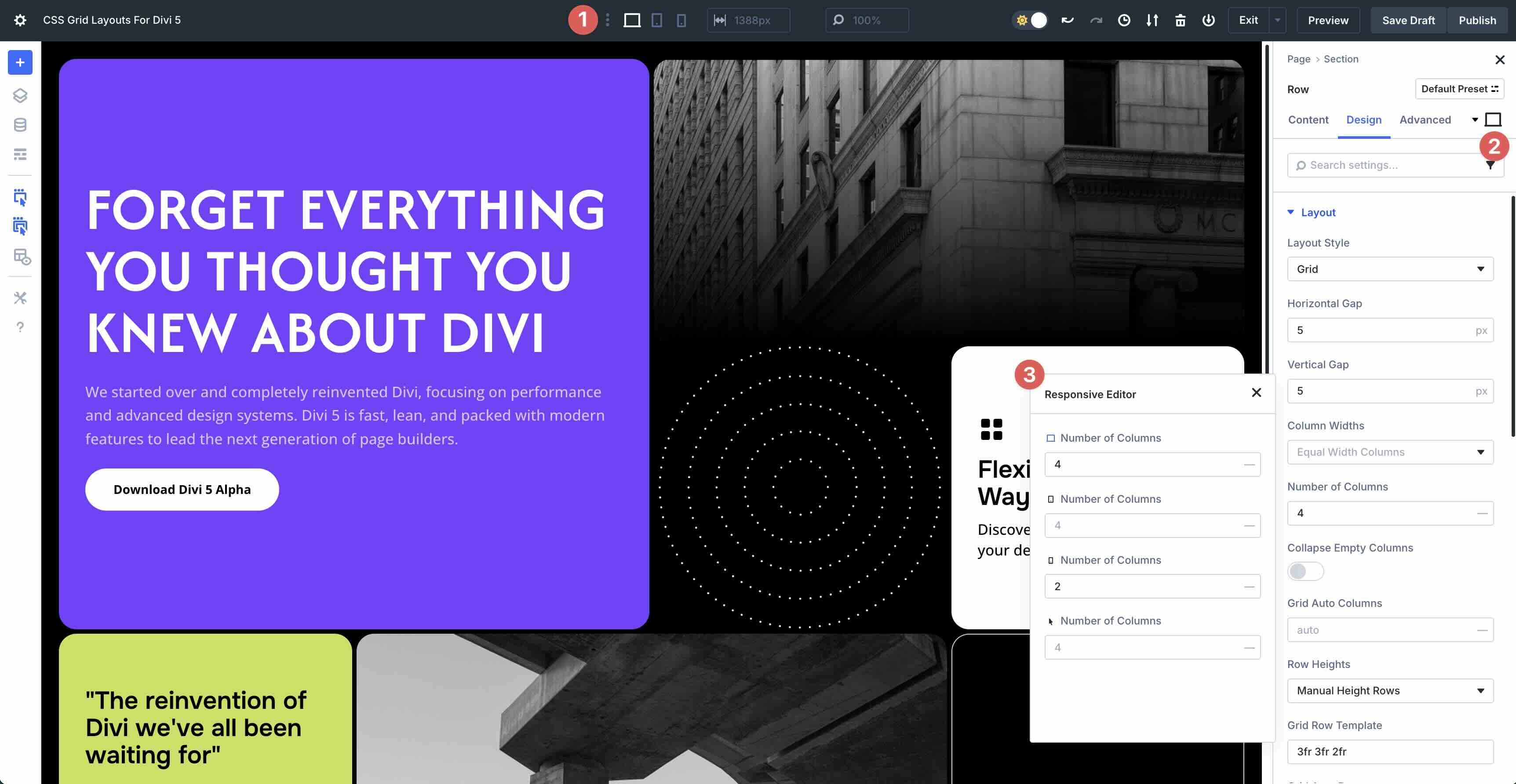
You can change the number of columns for different breakpoints — Desktop, Tablet, and Phone.
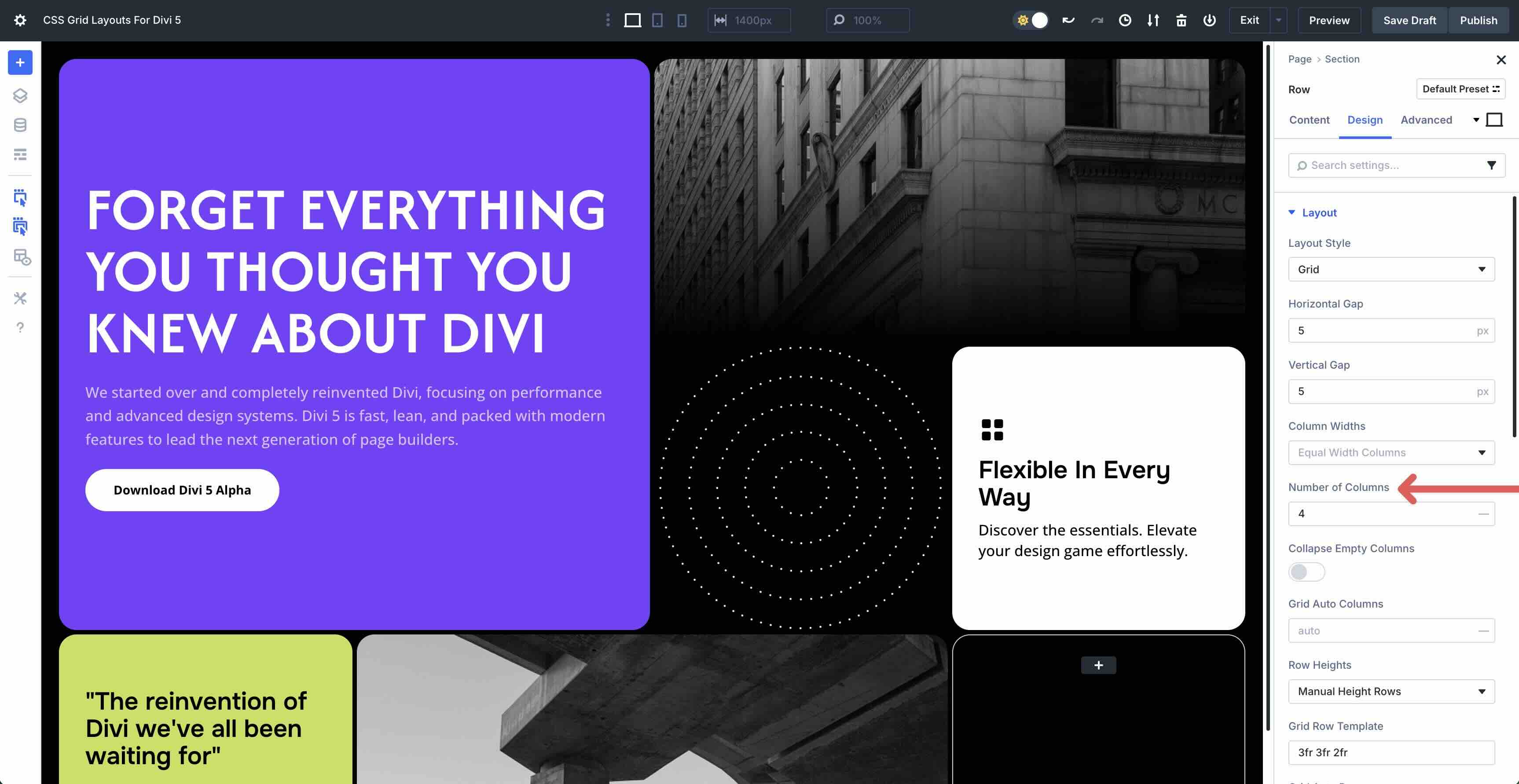
You can use Divi 5’s Customizable Responsive Breakpoints or the Responsive Editor to change the number of columns in the Grid. In this case, 4 on Desktop, 4 on Tablet, and 2 on Phone.
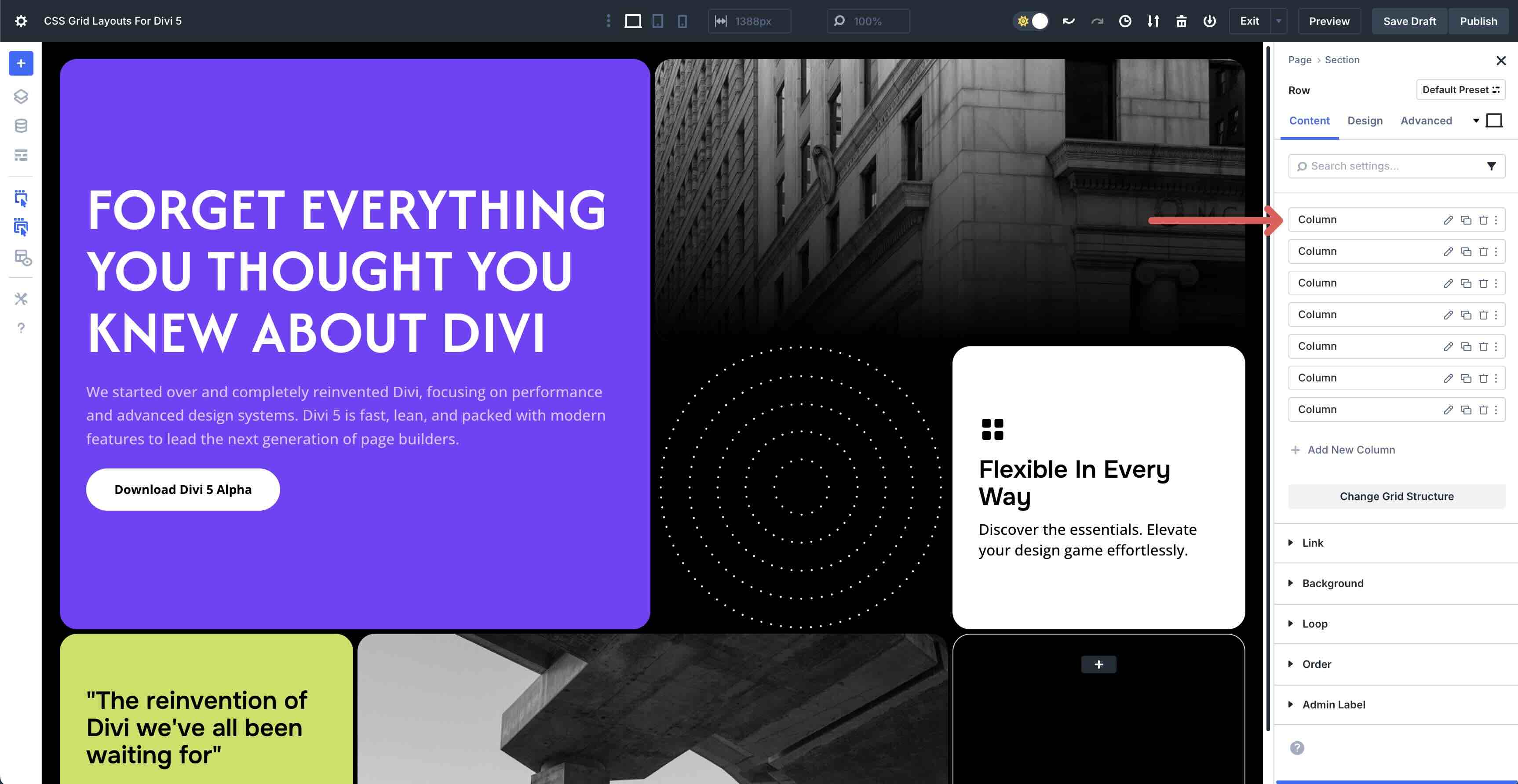
You can control column and row settings and the Column level, too. Click into one of the Grid’s columns and navigate to the Design tab.
Expand the Sizing menu. Locate the Column Span field. Increase or decrease the amount of space the Column should occupy horizontally.
You can also control how many rows the Column should span vertically. In this example, it is set to 2, but you can increase or decrease the number to change the Column’s behavior entirely.
Additionally, you can change the Horizontal and Vertical Gap in your Grid to control the space horizontally and vertically.
2. Use Auto-Fit Patterns
Enable auto-fit where available so cards wrap neatly at each breakpoint. This keeps rows balanced without manual reflows. While in the Grid container (row), scroll to Grid Auto Columns and ensure that Auto is selected.
It ensures that extra columns are automatically added when grid items are placed beyond the defined Grid, helping control the width of those additional columns.
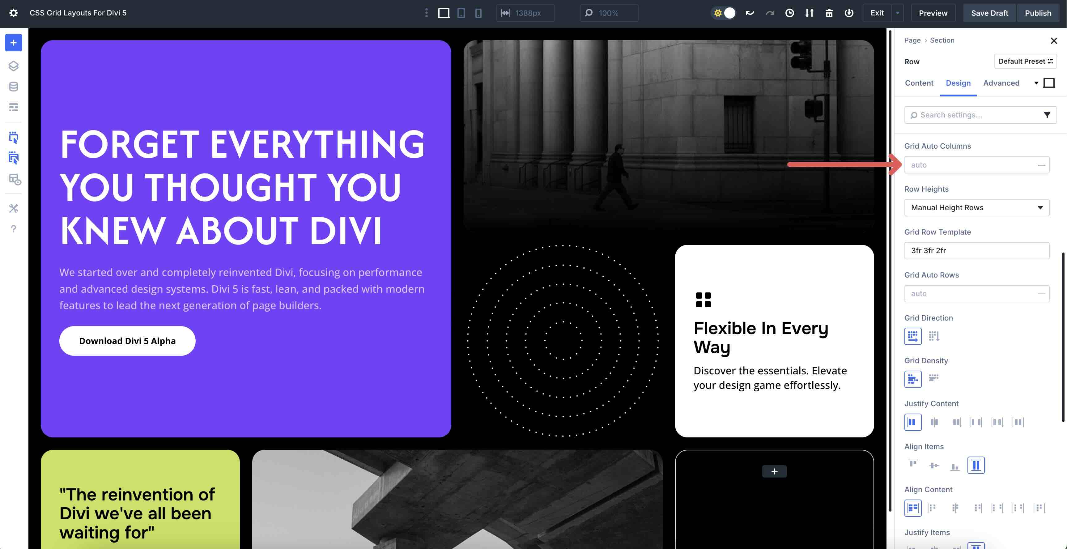
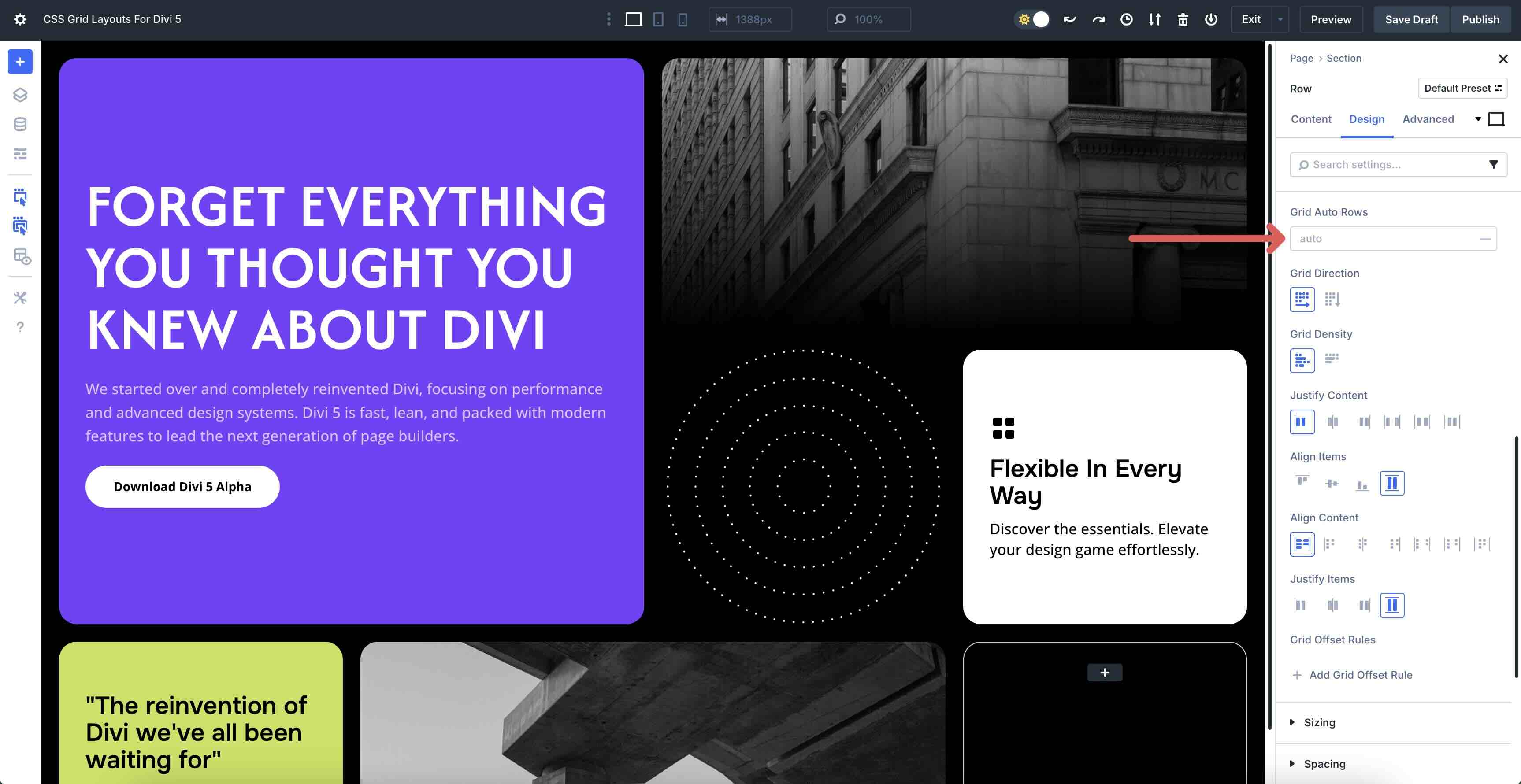
Now, let’s define the size for extra rows automatically created when grid items are placed beyond the set Grid. Grid Auto Rows controls the height of overflow rows, similar to how setting the auto value for Grid Auto Columns ensures extra columns are added and their widths are managed effectively.
3. Place & Span Items
Individual Grid items (columns) can be placed exactly where you want them. In the Layout menu in the Column’s Design tab, you’ll find Column Start and Column End. These let you control the horizontal position of your item within the Grid, making it flexible for custom layouts.
Column Start picks the vertical line where your Grid item begins on the left side. Enter a positive number, like 1, to align it to the very left, or 2 to skip the first Column and start in the second. Choosing Auto tells the Grid to automatically position based on its natural flow, without you needing to specify an exact line number.
Column End sets the vertical line where your Grid item finishes on the right side. Like Column Start, these values can be positive or negative.
Row Start and Row End work similarly to their Column counterparts but control the vertical placement of your Grid items. Row Start sets the horizontal line where the item begins at the top, letting you choose a starting point.
On the other hand, Row End defines where the item stops at the bottom, allowing it to span multiple rows. Use positive numbers for precise placement or negatives for creative overlaps, and the Grid adapts dynamically as you adjust.
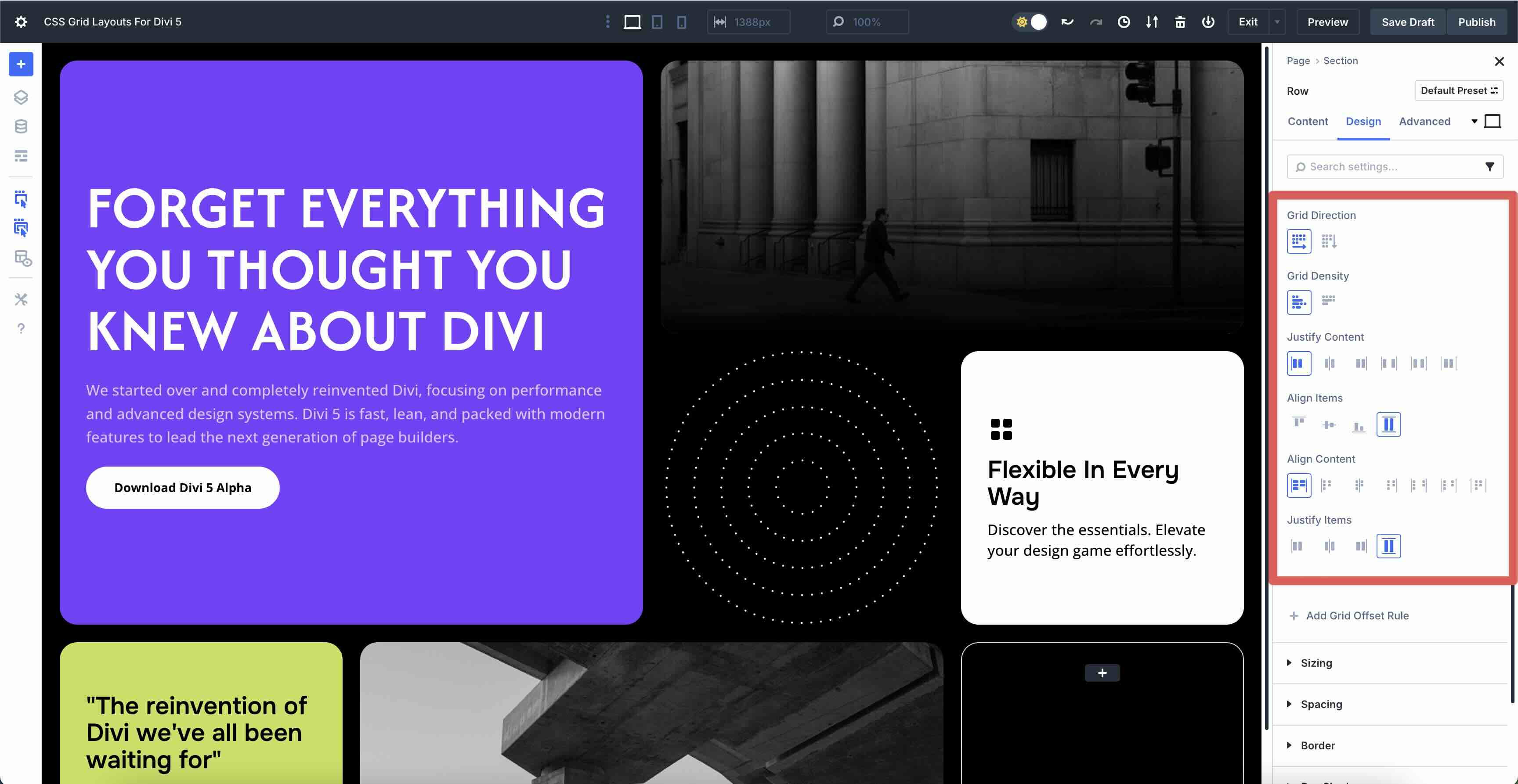
4. Align & Distribute
In Divi 5’s CSS Grid, you can fine-tune how your Grid items are arranged. Grid Direction lets you switch between row-based or column-based layouts, determining the primary flow of your Grid items. Grid Density adjusts the spacing between Grid lines, allowing you to make your layout feel tighter or more spaced out.
Use Justify Content and Align Content to control the overall distribution of items across the Grid. For more precise control, use Align Items to adjust the alignment within each cell (Column), ensuring everything lines up neatly across rows for a polished look.
5. Responsive Toggles Per Breakpoint
Customize your layout’s columns, gaps, and spans at each breakpoint to ensure a polished look across devices. For example, use fewer columns and smaller gaps on mobile, and expand them for desktops.
Adjust font sizes with CSS units like max to maintain readability, and set max-width on headings to prevent awkward text wrapping on smaller screens.
6. Add, Duplicate, Or Reorder Grid Items
Manage your layout by adding, duplicating, or reordering Grid items in Divi 5. Duplicate a card (Column) to maintain consistent styling across your design. Just copy an existing item and tweak it as needed. Drag items to reorder them, arranging your content in the perfect sequence.
Remove unwanted items to keep your Grid clean if something’s not working. To ensure tidy rows, keep the number of items aligned with your intended column count, preventing awkward gaps or overflows.
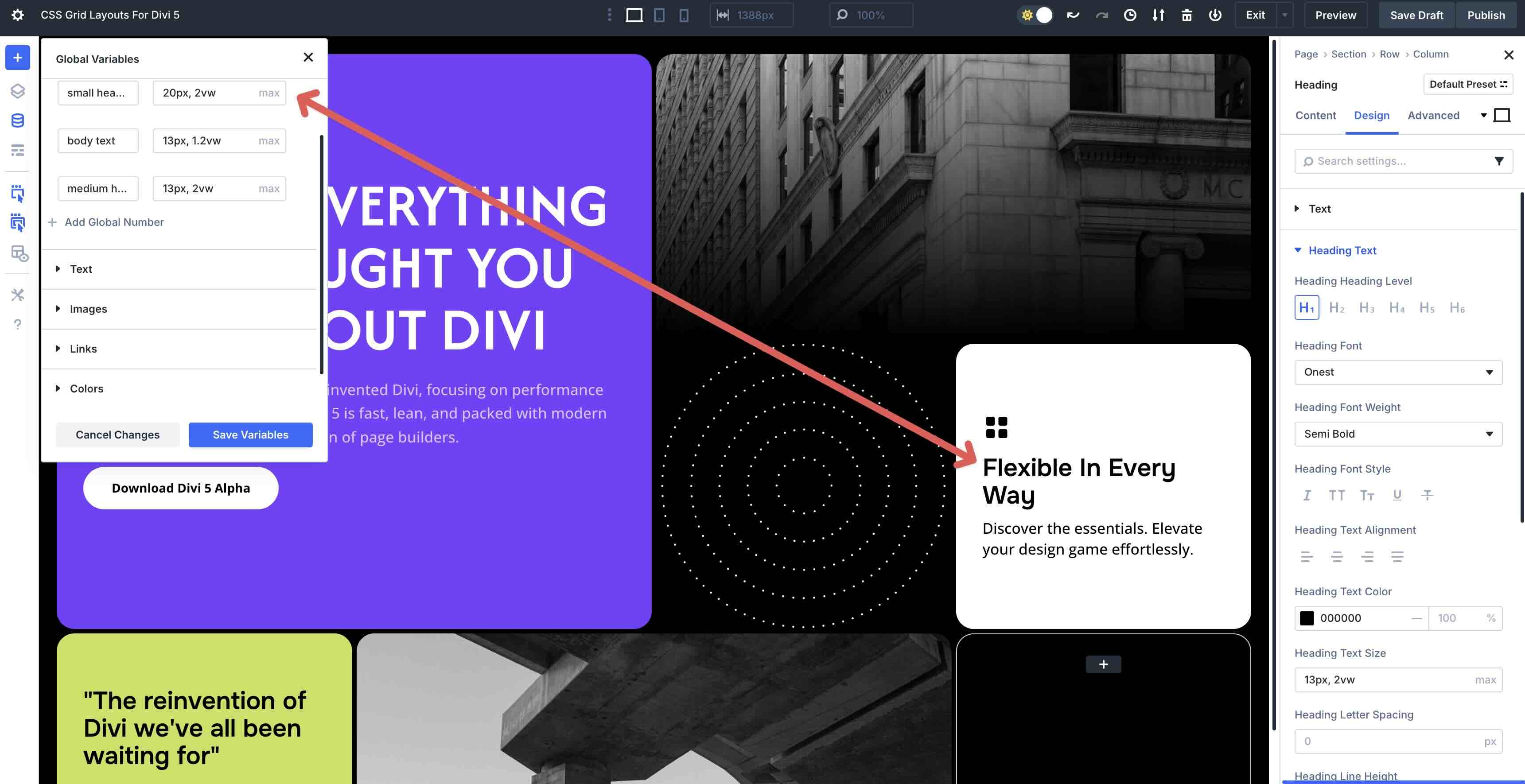
7. Use Design Variables, Presets, And Extend Attributes
Speed up your workflow by leveraging Design Variables, Presets, and Extend Attributes. Link colors and spacing to Design Variables for a cohesive look that’s easy to update globally.
Save your favorite card styles as Presets to reuse them quickly and keep your project consistent.
With Extend Attributes, you can apply a change from one card to another instantly, saving time on bulk updates. For fast global tweaks, you can use Find and Replace to adjust colors, font sizes, or spacing across the entire Grid with a single action.
Start Building With CSS Grid In Divi 5
These 8 prestyled Grid Sections are a quick way to speed up your Divi 5 builds. Download them, drop them into any page, and tailor them to your content. The new Grid system handles the structure so you can focus on design.


You should just implement this functionality:
1. copy (url with some json) code from your page
2. paste inside any page you are editing.
and everything in backend would be done for you.
no 20 steps.
boom. now that would be progress