
Choosing colors with hex codes means guessing your way through lighter versions, darker buttons, and accessibility fixes. Divi 5 introduces a redesigned Color Picker with HSL controls to its new Color System, allowing you to build and scale palettes with ease. You can create lighter or darker accents by adjusting a single value, store everything as Global Color Variables, and update the entire site from one place.
This guide walks through modern color palettes for 2026 and shows you how to apply them directly inside Divi 5.
Why HSL Is The Better Way To Build Modern Palettes
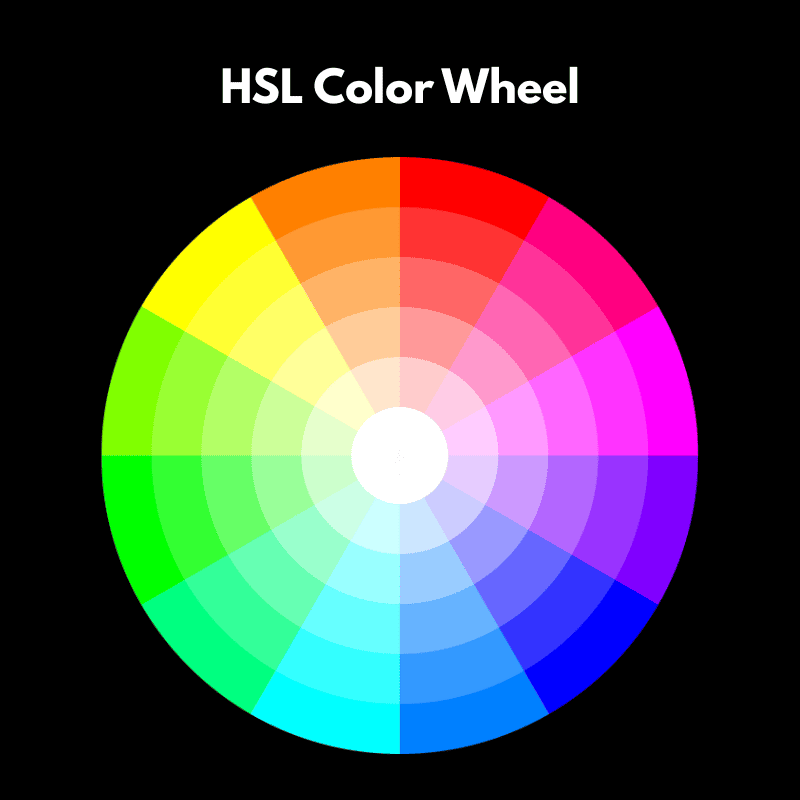
Most designers still choose colors in HEX, even though they cannot look at #5C7AEA and know how to make a lighter version. You cannot tell how saturated it is. When a client asks for something slightly softer or darker, you end up guessing, nudging sliders, and hoping it looks right.
Subscribe To Our Youtube Channel
HSL changes how this works. It separates Hue, Saturation, and Lightness, so you can generate a full range or related colors from a single base color. Keep the Hue the same and increase Lightness for backgrounds. Reduce it for buttons or text. Adjust Saturation for accents. Every color is kept in a consistent relationship, which makes the brand feel like a unified system.
This approach also simplifies accessibility. If text fails contrast, you adjust Lightness or Saturation until it meets the WCAG AA (4.5:1 for normal text) with small, predictable changes that don’t break your gradients or force you into guessing games.
Modern design systems rely on variables, and HSL makes those variables controllable. When every shade is mathematically linked, you can recolor an entire layout instantly, maintain consistent UI patterns, and support light and dark themes without rebuilding from scratch. Many modern UI frameworks and CSS tools use HSL for exactly this reason, because color becomes flexible, scalable, and simple to maintain over time.
How Divi 5 Uses HSL
Divi 5 brings HSL functionality into its Color System, so you can create infinite relative color combinations from a single primary.
You define your primary brand color once as a Design Variable inside Divi’s Variable Manager. From there, you use HSL sliders to adjust the hue, saturation, or lightness and create variations like lighter backgrounds, darker text, or muted accents. Each new color can be saved as its own variable, but it stays mathematically linked to the original.
That connection is what makes this powerful. Let’s say you create a button color that’s 20% darker than your primary. If your client later decides to change the primary from yellow to green, that button automatically adjusts to stay 20% darker than the new green. You don’t have to hunt down every instance or recalculate shades. The relationship holds, and your design stays consistent.
Divi 5 also includes tools like Inspector and Find & Replace, which let you update colors across multiple elements or entire pages in a few clicks.
Once your color variables are in place, swapping an old hex code for a new variable takes seconds. Because Design Variables are global, changes you make in one place apply across your entire site.
This means you can launch a seasonal campaign, test a brand refresh, or tweak contrast for accessibility from a single place and trust that everything connected to that color will adjust with it. If you’ve ever spent an hour nudging hex codes because a client wanted “just a slightly softer blue,” you already know why this matters.
Learn More About Divi’s HSL & Relative Colors
Building Color Palettes in Divi 5
Every palette in this guide follows the same structure: one primary color, one secondary, a few accents, and neutral backgrounds. Here’s how to set that up in Divi 5.
1. Start With One Primary Color
Every palette starts with a single primary brand color. Buttons, CTAs, key icons, and links usually draw from this shade. In Divi, you store it as a Design Variable.
By default, you can assign one primary, one secondary, one heading, and one body text color. To add your primary color, paste your color’s hex code in the Primary Color field of the Colors tab in the Variable Manager.
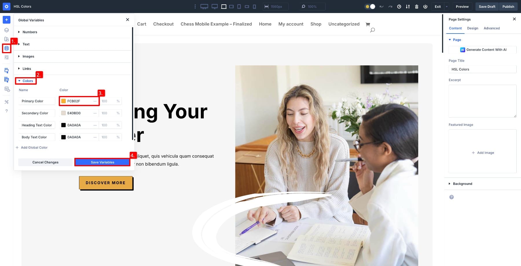
Add your secondary color the same way. The secondary adds contrast and often handles highlights, badges, small backgrounds, or UI elements that need personality without overpowering the primary.
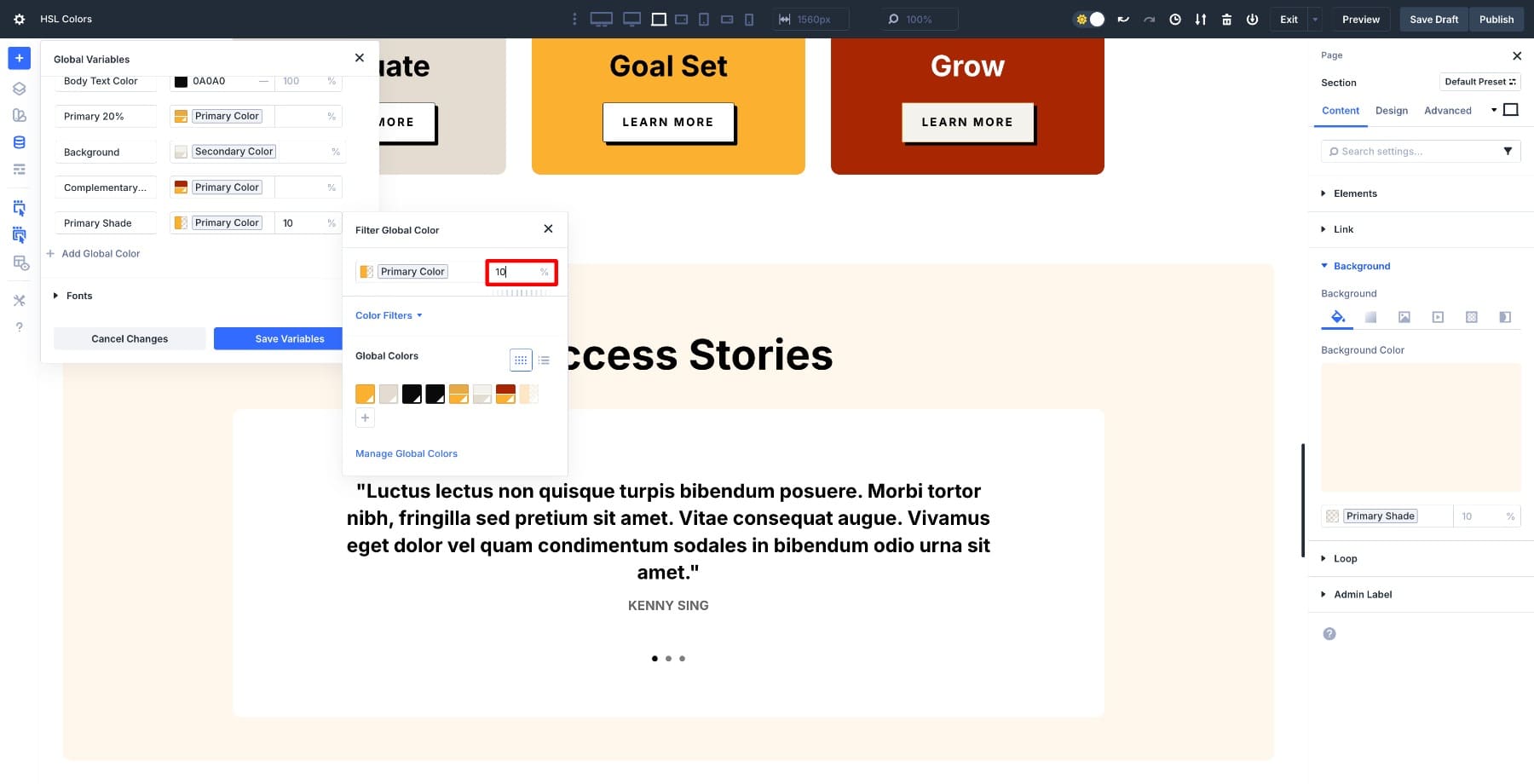
2. Create Accent Colors
Accents can be used for alerts, notice boxes, or playful touches depending on your brand style. Divi’s color system lets you create accents that stay connected to the primary, so when the primary changes, the accent adjusts with it.
To create an accent, click Add Global Color and name it.
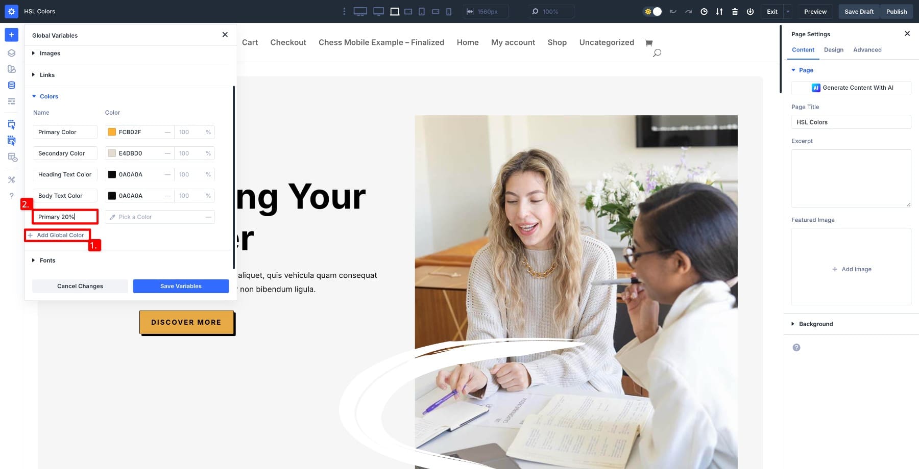
Select the primary color as the base and adjust the Saturation to -20% to make the color softer.
Now, if you change the primary color, this accent updates automatically.
You can create other colors by modifying Hue and Lightness values. You’re not limited to adjusting one value at a time. Combine Hue, Saturation, and Lightness to create unique colors. For example, this one uses the primary as the base with Hue and Lightness adjusted to -25.
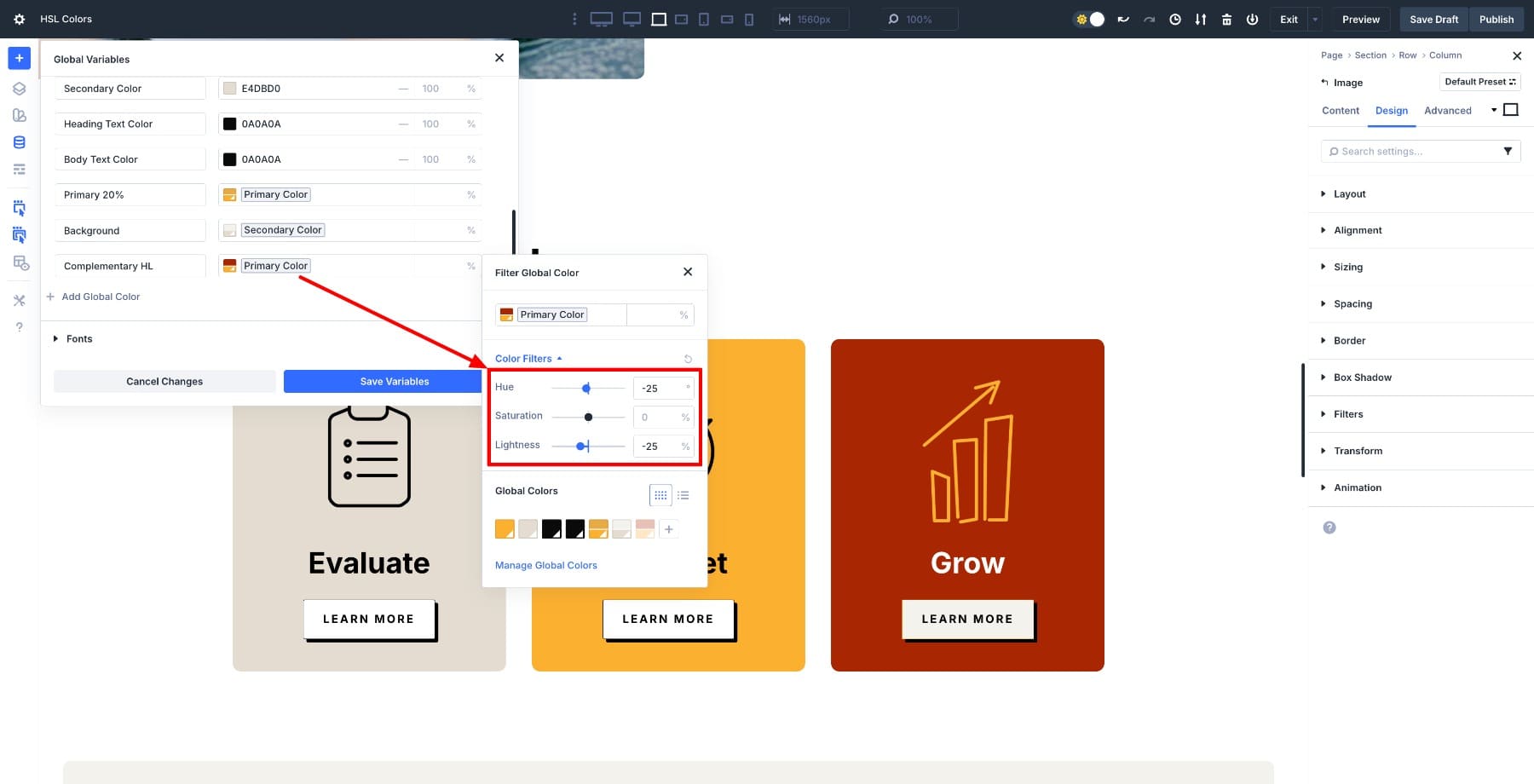
3. Add Background Colors For Sections And Cards
Every palette needs neutrals for text, muted text, page backgrounds, and card backgrounds. These are low-saturation shades defined in HSL so you can adjust contrast without rebuilding the palette.
For example, this background is adapted from the secondary color by adjusting the Lightness to 10%.
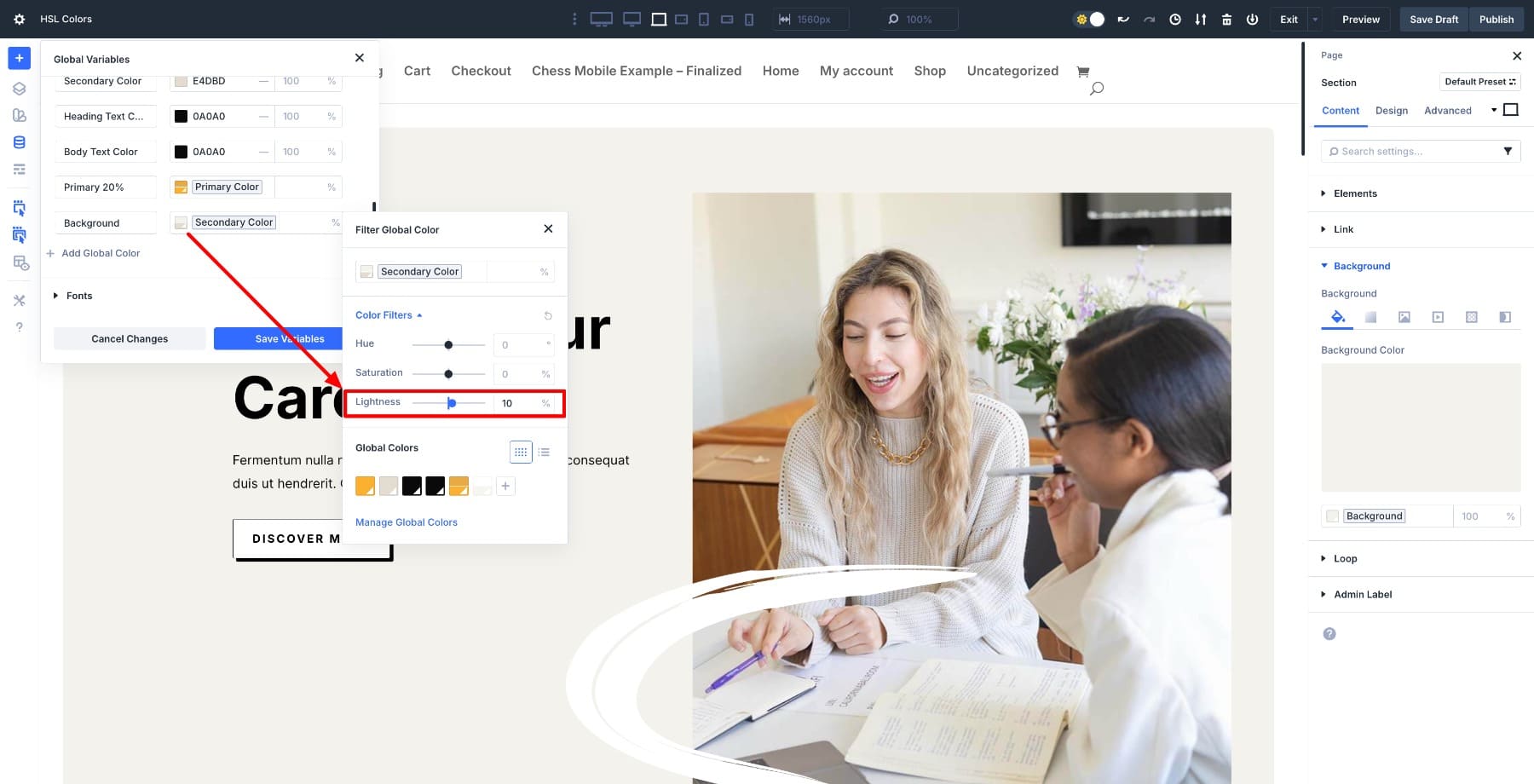
You can create multiple shades and tints by adjusting Lightness and Saturation, or adjust the opacity to create a transparent variation.
Because everything stays connected, recoloring becomes simple. Change the primary or secondary color, and the entire layout updates.
Modern Color Palettes For 2026
Below are five palettes designers are using across SaaS, portfolios, agencies, and eCommerce this year. Each one includes a primary, secondary, accent, and complementary color, plus neutrals for backgrounds and text. All values are written in HSL, so you can paste them directly into Divi’s Variable Manager.
Each palette follows the same structure: the primary anchors the brand, the secondary adds depth, the accent is derived by adjusting saturation or lightness, and the complementary comes from a noticeable hue shift. Backgrounds and shades are tinted versions of the primary or secondary. Because everything is mathematically linked through HSL, changing the primary automatically recalculates the entire palette.
1. Sunset Orange
Secondary Color: hsl(13, 25%, 25%)
Heading Text: hsl(0, 0%, 4%)
Body Text: hsl(0, 0%, 4%)
Accent Color: hsl(14, 65%, 55%) (Primary – Saturation 20%)
Complementary: hsl(194, 85%, 30%) (Primary +180 Hue, darker)
Background: hsl(13, 25%, 90%)
Primary Shade: hsl(14, 85%, 65%) (Primary + Lightness 10%)
Bold orange primary for friendly, high-attention interfaces. The secondary is a darker clay tone that adds depth to cards and UI surfaces while staying warm.
2. Midnight Blue
Secondary Color: hsl(220, 30%, 20%)
Heading Text: hsl(0, 0%, 100%)
Body Text: hsl(0, 0%, 85%)
Accent Color: hsl(220, 65%, 70%) (Primary + Lightness 15%)
Complementary: hsl(40, 90%, 55%) (Primary +180 Hue)
Background: hsl(220, 20%, 8%)
Primary Shade: hsl(220, 65%, 45%) (Primary – Lightness 10%)
Bright blue primary keeps dark mode energetic. Deep navy secondary for cards and headers. The complementary gold works well for icons, pricing, and notification badges.
3. Emerald & Gold
Secondary Color: hsl(156, 20%, 20%)
Heading Text: hsl(0, 0%, 100%)
Body Text: hsl(0, 0%, 85%)
Accent Color: hsl(156, 45%, 55%) (Primary + Lightness 15%)
Complementary: hsl(36, 75%, 55%) (Primary +180 Hue)
Background: hsl(156, 15%, 7%)
Primary Shade: hsl(156, 45%, 30%) (Primary – Lightness 10%)
Deep emerald primary gives the design a modern, premium feel. Darker forest tone for the secondary keeps everything cohesive without going full black. The complementary gold adds warmth to pricing, badges, and CTA highlights.
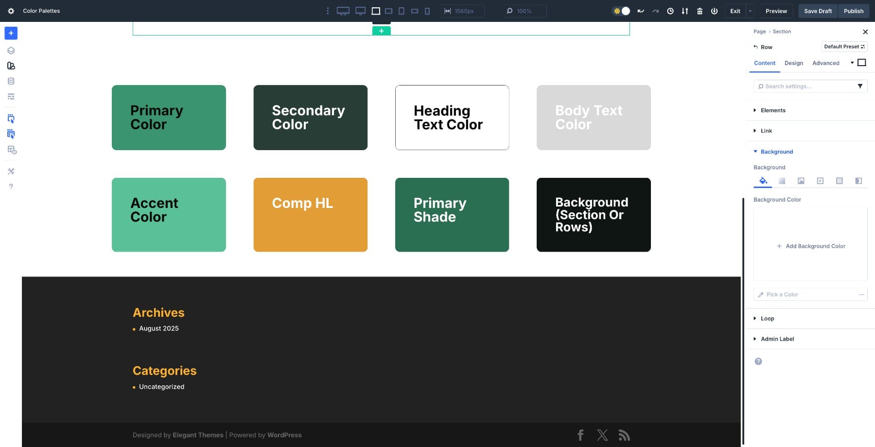
4. Dusty Rose
Secondary Color: hsl(345, 100%, 12%)
Heading Text: hsl(0, 0%, 100%)
Body Text: hsl(0, 0%, 70%)
Accent Color: hsl(32, 75%, 82%)
Complementary HL: hsl(345, 55%, 62%)
Primary Shade: hsl(345, 100%, 82%)
Background: hsl(162, 15%, 8%)
Muted rose primary paired with a deep wine secondary. The accent keeps buttons and highlights soft. The charcoal-green background adds contrast without pure black.
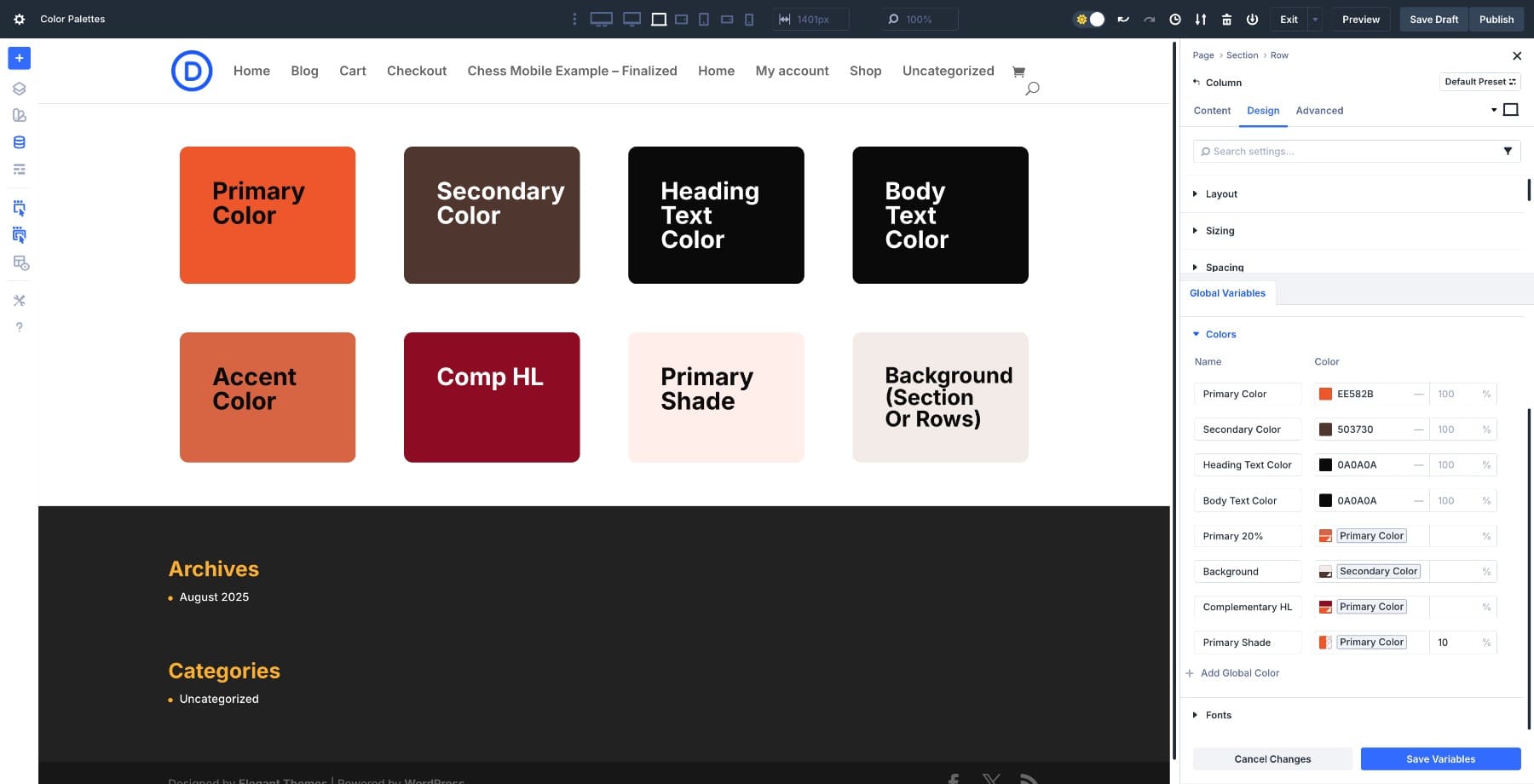
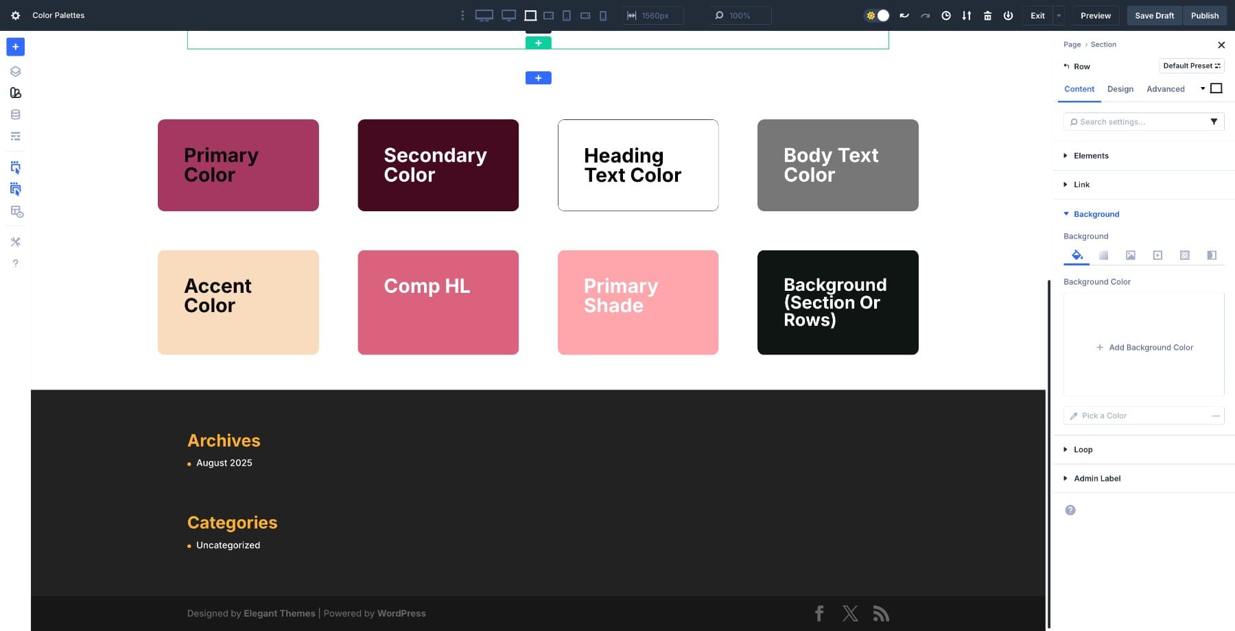
5. Rose & Slate
Secondary Color: hsl(220, 35%, 30%);
Heading Text Color: hsl(0, 0%, 100%);
Body Text Color: hsl(0, 0%, 80%);
Accent Color: hsl(60, 30%, 92%);
Comp HL: hsl(20, 25%, 55%);
Primary Shade: hsl(345, 75%, 75%);
Background (Section or Rows): hsl(230, 70%, 94%);
Soft rosy primary with a deep slate blue secondary creates a modern, balanced look for portfolios, boutique brands, and creative agencies. Pale warm neutral accent for cards. Calm lavender-grey background keeps sections easy on the eyes.
Applying A Color Palette To Your Site
We’ve covered why HSL works and how to build palettes in Divi 5. Now let’s see how this plays out when you actually apply a palette to a real layout. We’ll use the Soft Rose & Slate Palette and walk through the process from setup to live changes.
1. Add Each Color As A Global Color Variable
Open Variable Manager > Colors > Add Global Color. Paste the HSL values for your primary, secondary, accent, and complementary colors.
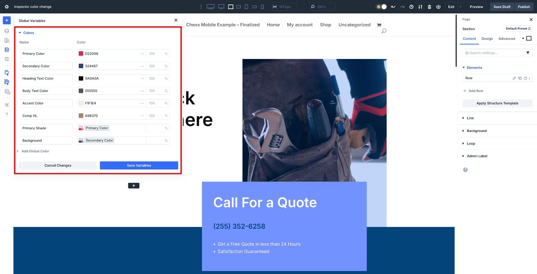
Once saved, these colors become part of your site-wide design system. You’re not storing random hex codes anymore. You’re creating a connected palette where every shade knows its relationship to the others.
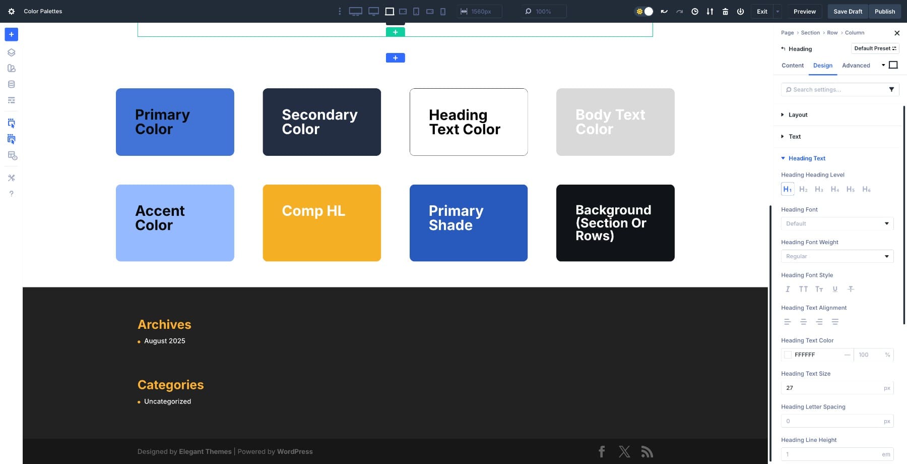
2. Apply Variables Using Inspector
Open any module, row, or section. In the Colors tab, Inspector shows you all the colors currently in use. Hover over any field, click the dynamic content icon, and select your saved color.
This is where the workflow gets noticeably easier. You’re not copying and pasting hex codes or trying to remember which shade goes where. You select a variable, and Divi handles the rest.
3. Change One Color, Update Entire Site
Go back to Variable Manager and change the primary color. Every element linked to that variable updates instantly across your entire site.
Because everything is mathematically linked through HSL, you’re not hunting down individual elements or recalculating shades. You change one value, and the design adjusts across headers, footers, blog posts, and landing pages. If you’ve ever spent hours manually updating colors for a rebrand or seasonal campaign, you already know why this matters.
Try Out Divi 5’s New Color System Today!
Color palettes work best when they’re built as systems, not collections of random shades. When every color is linked through HSL and saved as a variable, your site becomes easier to scale, fix, and update without hunting down individual elements or recalculating hex codes.
Divi 5 treats color like a design system. You can adjust lightness for accessibility, shift the primary hue for a rebrand, or test seasonal themes without rebuilding buttons, cards, or text styles from scratch. Change one value in Variable Manager, and the design adjusts across your entire site.
Pick a palette from this guide, paste the HSL values into Divi, and build from there.


IS THERE A VIDEO EXPLAINING THESE STEPS?
Yes, the one embedded in the blog post.