
Two of Divi 5‘s latest features, Interactions and the Group Carousel module, offer a way to create interactive, sliding carousels to help you showcase products, team members, testimonials, or anything you can imagine.
In this post, we’ll show you how to create an interactive content reveal carousel that combines these two features to boost engagement, keep visitors on your site longer, and elevate their browsing experience. Let’s dive in!
What Is The Group Carousel Module?
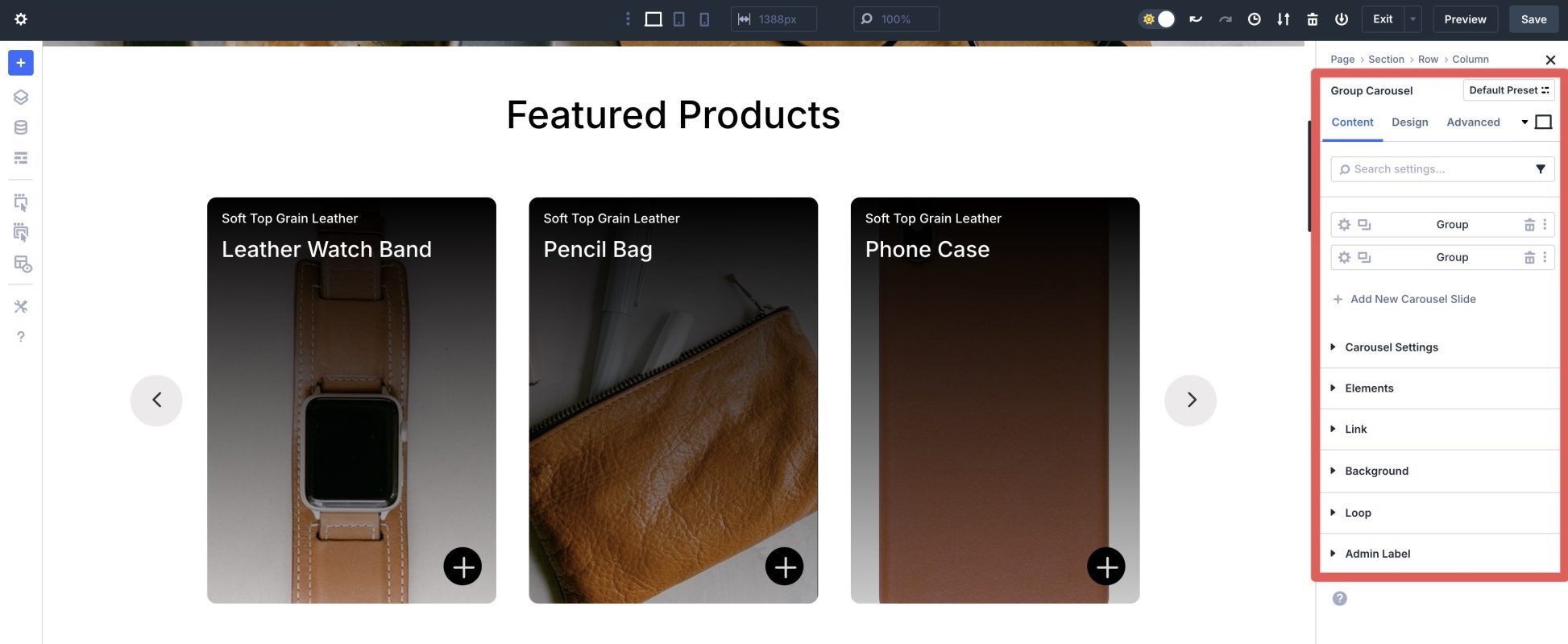
The Group Carousel module allows you to build dynamic, responsive carousels or sliders for any content type, from static images to dynamic posts pulled in by the Loop Builder. With built-in navigation options like arrows and dots, customizable layouts, and mobile-friendly responsive tools, the module provides an excellent way to create engaging carousels and sliders.
Its integration with Divi’s design settings and extensive styling capabilities allow you to create advanced effects, such as animated transitions or hover-based triggers, making it a powerful tool for creating engaging, interactive designs.
- What It Is: A flexible module for creating carousels and sliders of groups — either static or dynamic with the Loop Builder — supporting navigational controls, transition speed, and number of slides to display.
- Key Settings: Multiple layout options, including full-width, multi-column, and integration with features like Nested Rows.
- Customization Options: Style slides, including colors, spacing, background options, hover effects, and transitions, and add custom content per slide. It also fully integrates with Design Variables.
- Pair With Interactions: Easily create content reveals via a trigger.
What Is Divi 5 Interactions?
Divi 5 Interactions is a standout feature that allows users to create dynamic, no-code interactivity by adding triggers, effects, and animations to any element within the Visual Builder. This system allows you to define triggers, such as clicks, viewport enter or exit, or mouse over effects, that initiate effects like toggling visibility for content reveals, switching style presets, or applying animations on hover. With the ability to target specific modules, rows, or sections, Interactions enable precise control over user-driven experiences.
Key Components of Interactions
There are three main parts to Interactions. Here’s how they work:
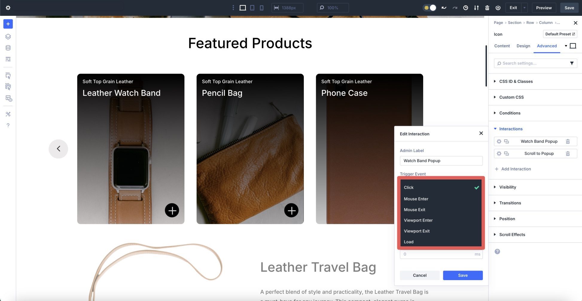
Trigger Events
Triggers initiate the Interaction. You can create them to trigger actions like pop-ups, content reveals, effects on elements when hovering, scroll-based effects, and time-based effects like pop-ups loading after a time delay. Here are the available triggers:
- Click: Assign to a button, image, or other design module to launch an interaction (such as a content reveal).
- Mouse Enter/Exit: Activates an interaction when the user enters or leaves the element with their mouse.
- Viewport Enter/Exit: Introduces effects as the element enters or leaves the visible area of the screen.
- Load: This event triggers an element to start when the page loads or after a time delay
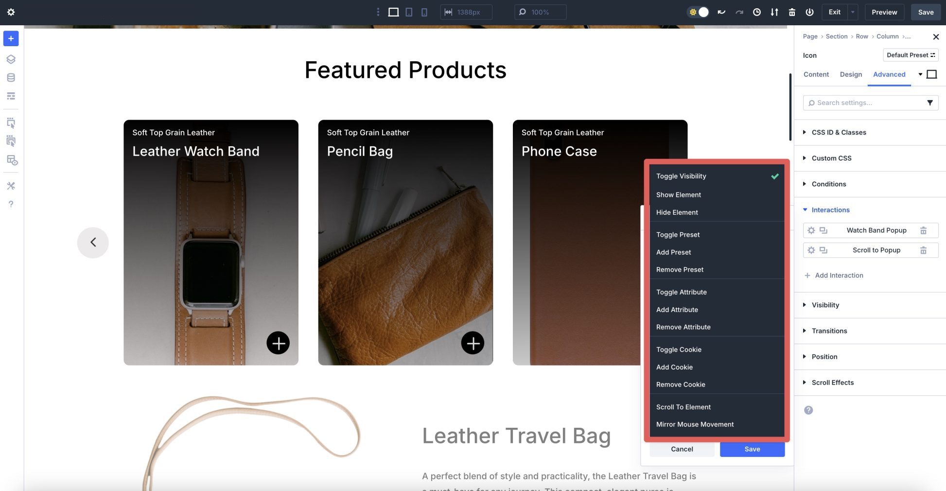
Effect Actions
Effect actions determine what happens after a trigger is activated. You can show or hide elements, animate with various effects, or apply preset transitions to alter styles as the user scrolls.
- Toggle Visibility: Affects an element’s state, between visible and hidden.
- Show/Hide Element: Toggles the visibility of an element
- Toggle Preset: Toggles a design element’s preset on or off, with an option to replace the current preset.
- Add Preset: Used to add a preset style class to an element.
- Remove Preset: Clears the preset style from an element.
- Toggle Attribute: Sets or unsets a specific HTML attribute value on an element, such as a CSS ID and class
- Add Attribute: Assigns a specific HTML attribute value, such as a CSS class or ID, to an element if it’s currently missing.
- Remove Attribute: Removes a specific attribute from an element.
- Toggle Cookie: Use this to add or remove a cookie value. For example, you could set a cookie when a pop-up appears and use Divi 5’s conditional settings to ensure it only appears once.
- Add Cookie: Use this to place a custom cookie value in a user’s browser.
- Remove Cookie: Use this to delete a previously set cookie.
- Scroll to Element: Smoothly scrolls the page to a specified element
- Mirror Mouse Movement: This allows you to define a mouse-tracking movement for an element. You can set the element to translate, scale, change opacity, tilt, or rotate, and adjust the movement sensitivity.
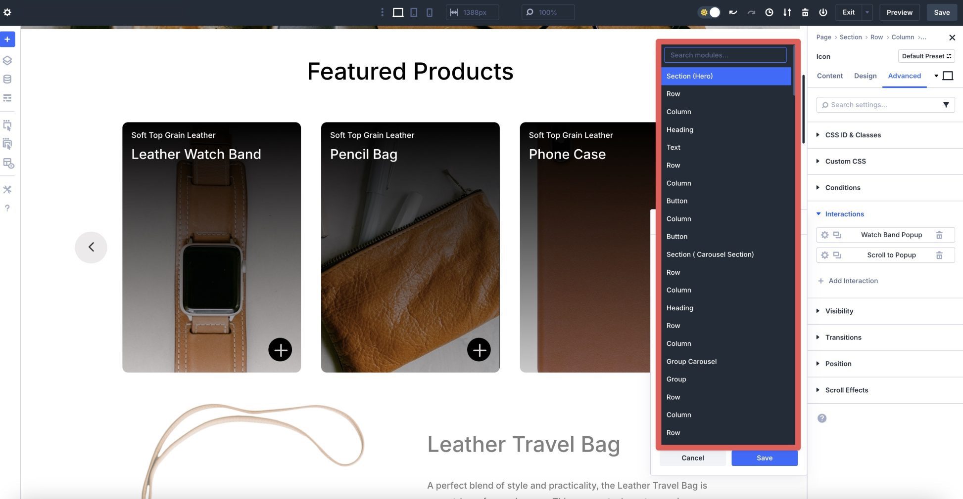
Target Module
The target is the element that the Interaction affects, like a module, row, column, or section. You can target the element itself or any other element on the page, giving you the flexibility to create more complex interactions.
How The Group Carousel Module and Interactions Work Together
The Group Carousel module and Divi 5 Interactions combined can create interactive content reveal carousels that captivate users with dynamic content and responsive behavior. The Group Carousel module serves as the core content display, enabling you to build a sleek slider filled with static or dynamic content, like products. Divi 5 Interactions enhances this by adding triggers and effects.
Interactions can create hover-based effects (such as scaling or tilting images) to make parts of each slide more engaging. Combining the Group Carousel module and Divi 5 Interactions is a great way to keep users engaged and potentially increase sales, conversions, and lower bounce rates.
How To Create An Interactive Content Reveal Carousel With Divi 5
In this section, we’ll walk you through the steps to create an interactive content reveal carousel that features products on a Divi website. By the end, you’ll have a better understanding of how the Group Carousel module works in conjunction with Interactions to create an engaging product display.
We won’t use the Loop Builder in this post to simplify things. Read this post if you’d like to learn more about how to use it to create dynamic loops.
Step 1: Add And Configure The Group Carousel Module
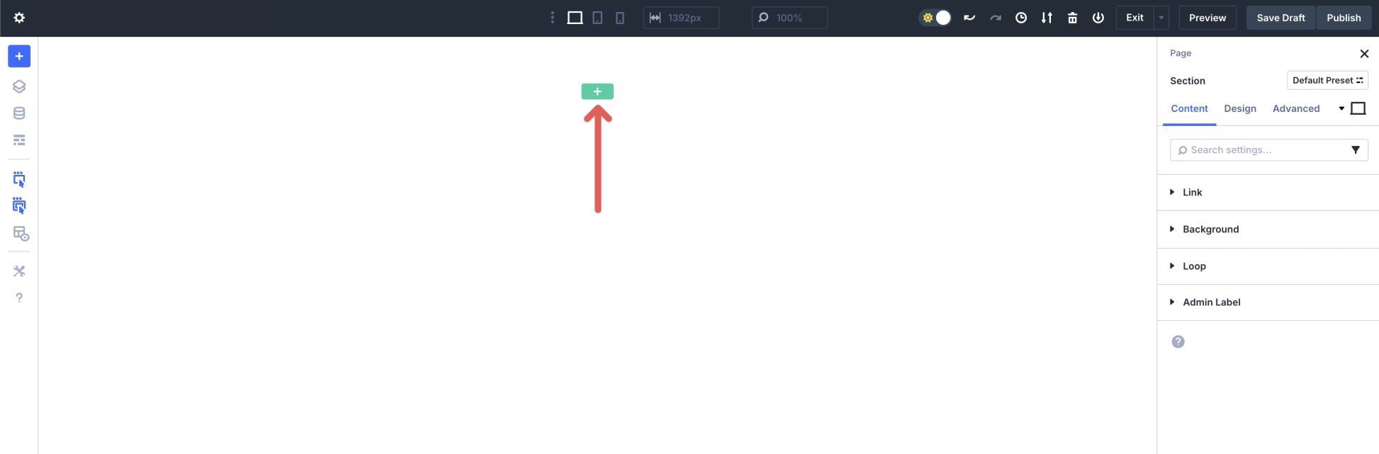
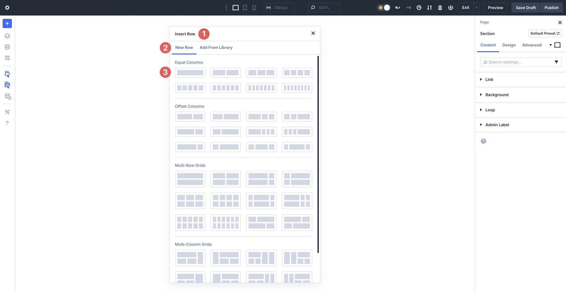
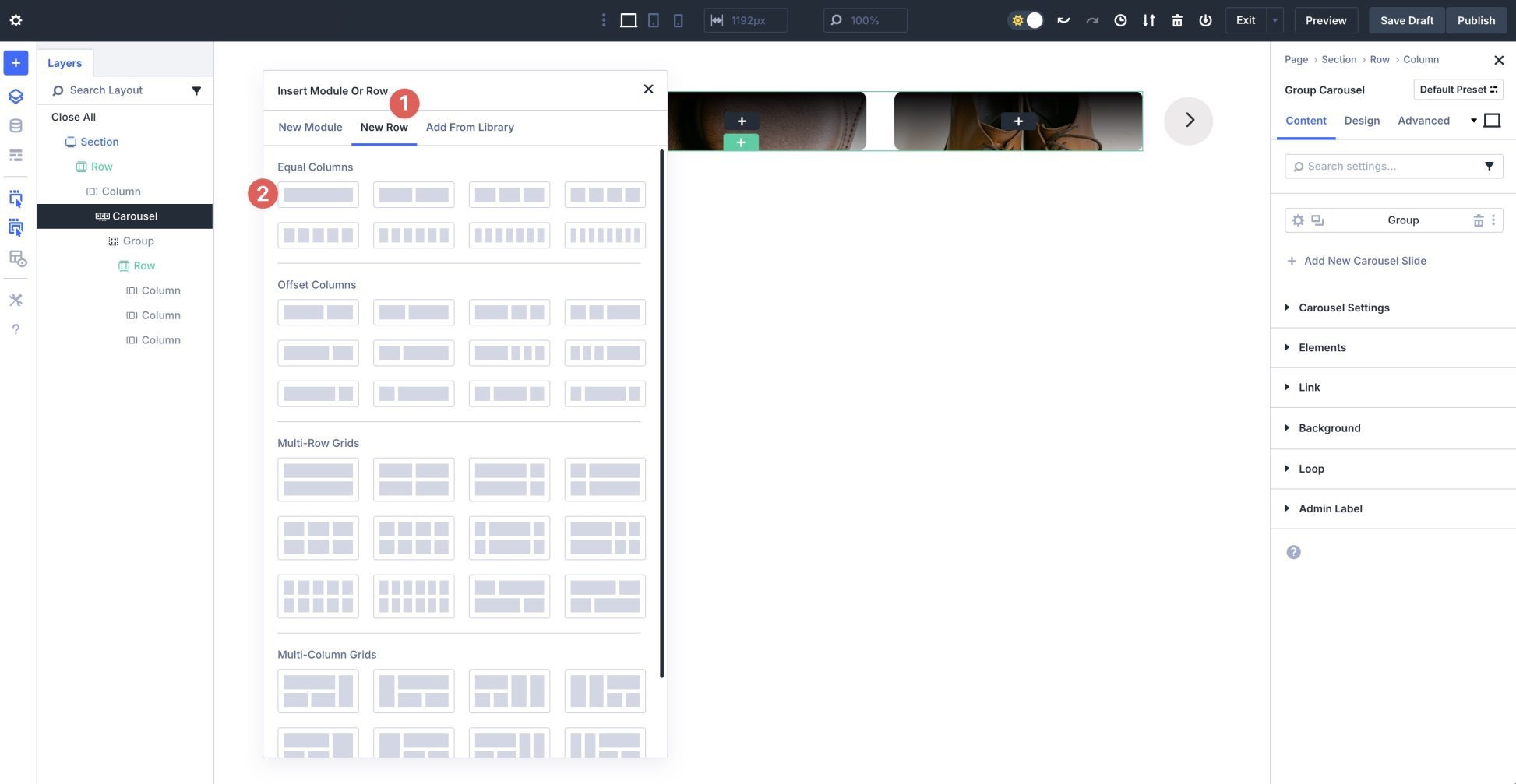
Create a new page in your WordPress website. Enable the Visual Builder and click the green + button to add a new row.
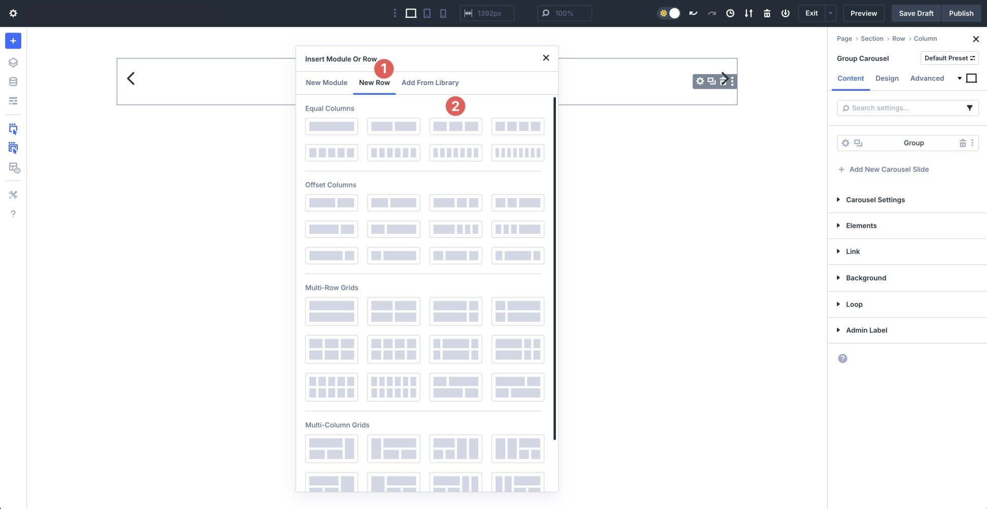
When the Insert Row dialog box appears, select a single column row under Equal Columns.
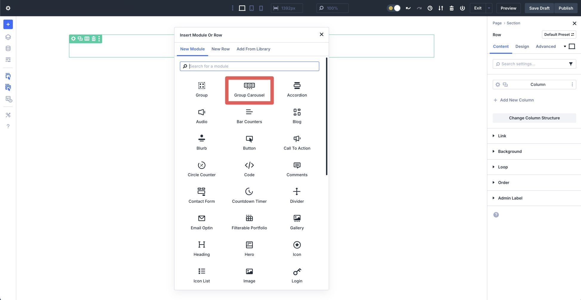
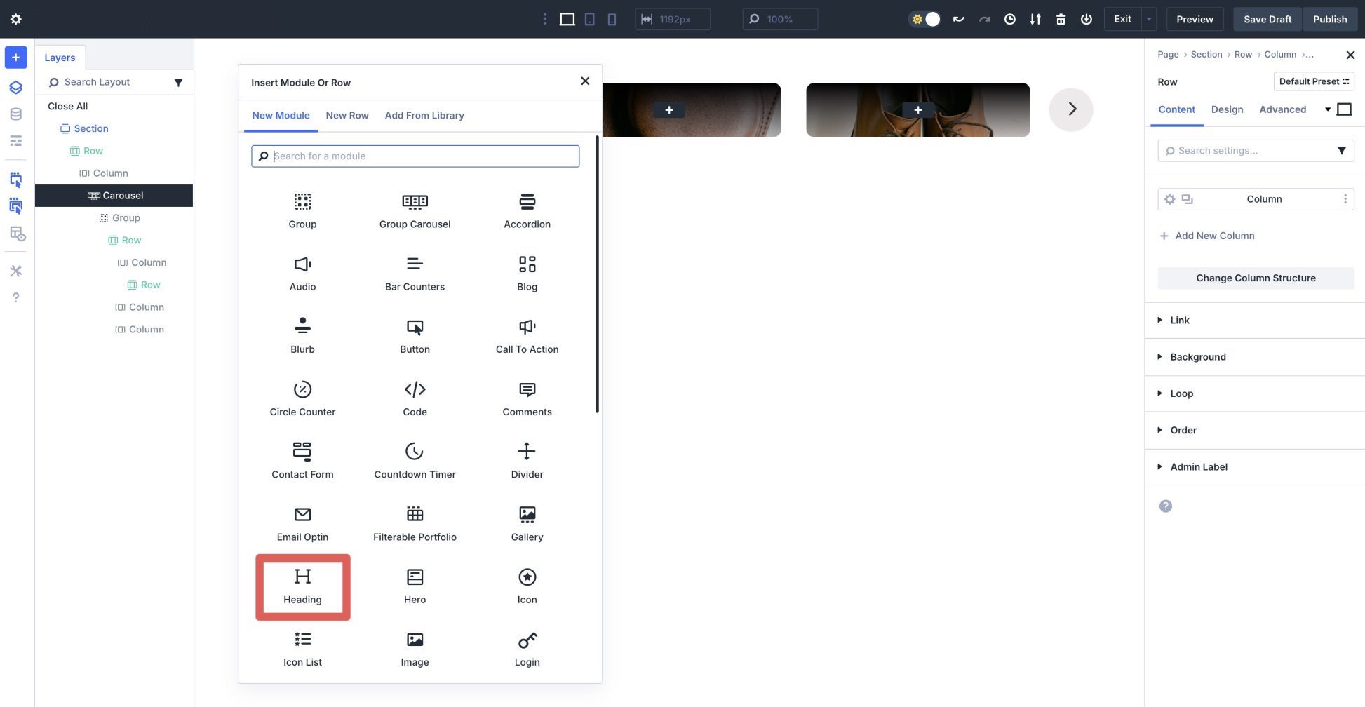
Select the Group Carousel module from the available options in the Insert Module Or Row dialog box.
Click the black + icon to add a new module inside the Group Carousel module.
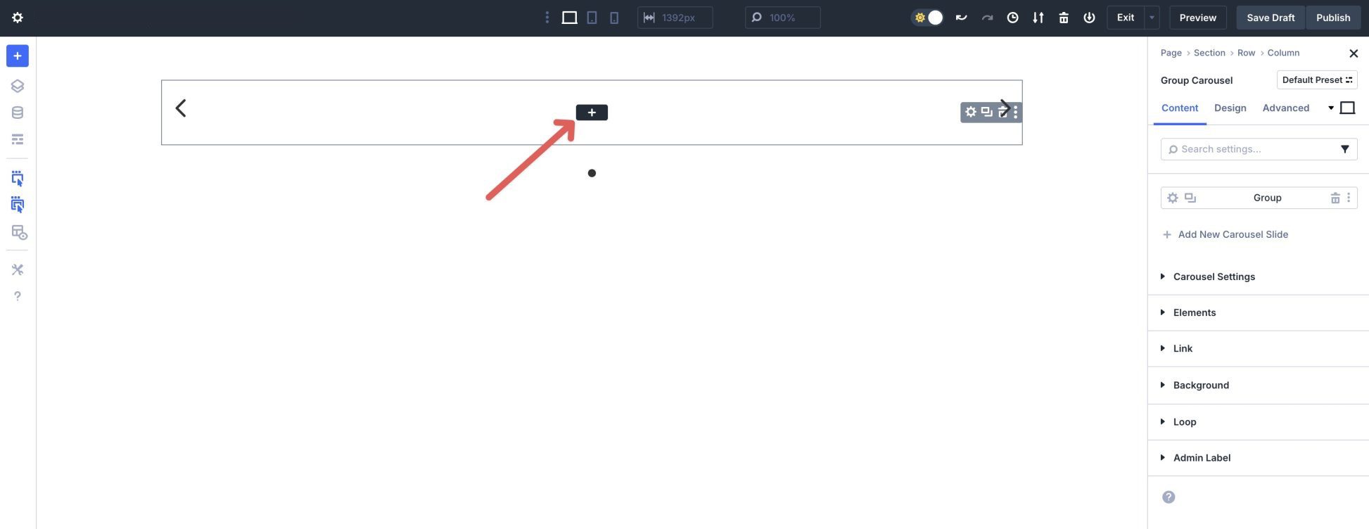
Click the New Row tab and select a three-column row.
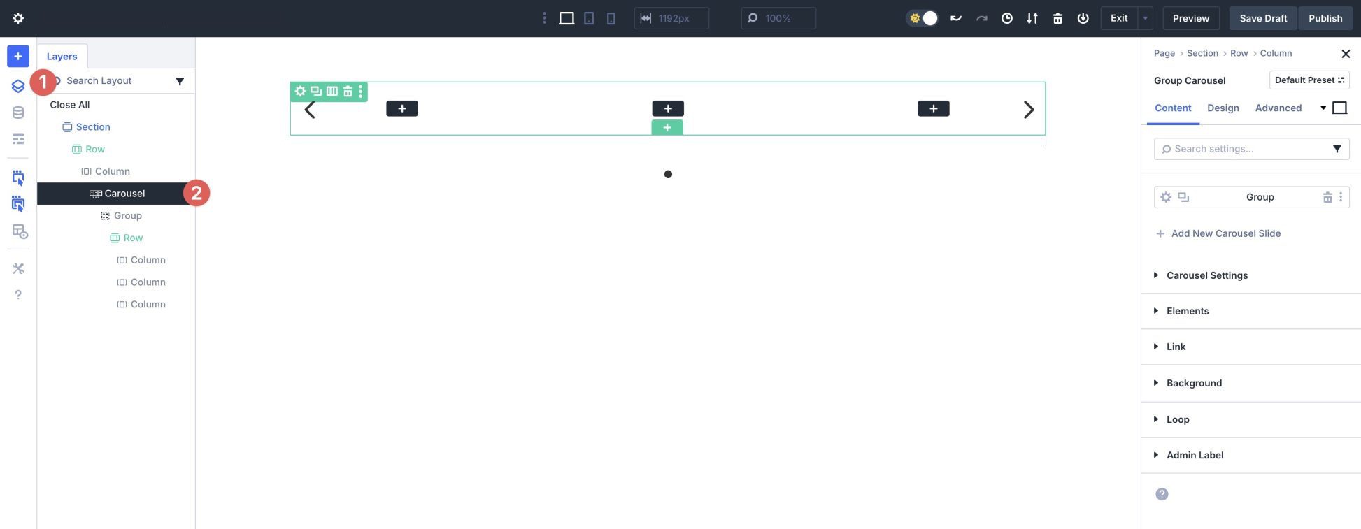
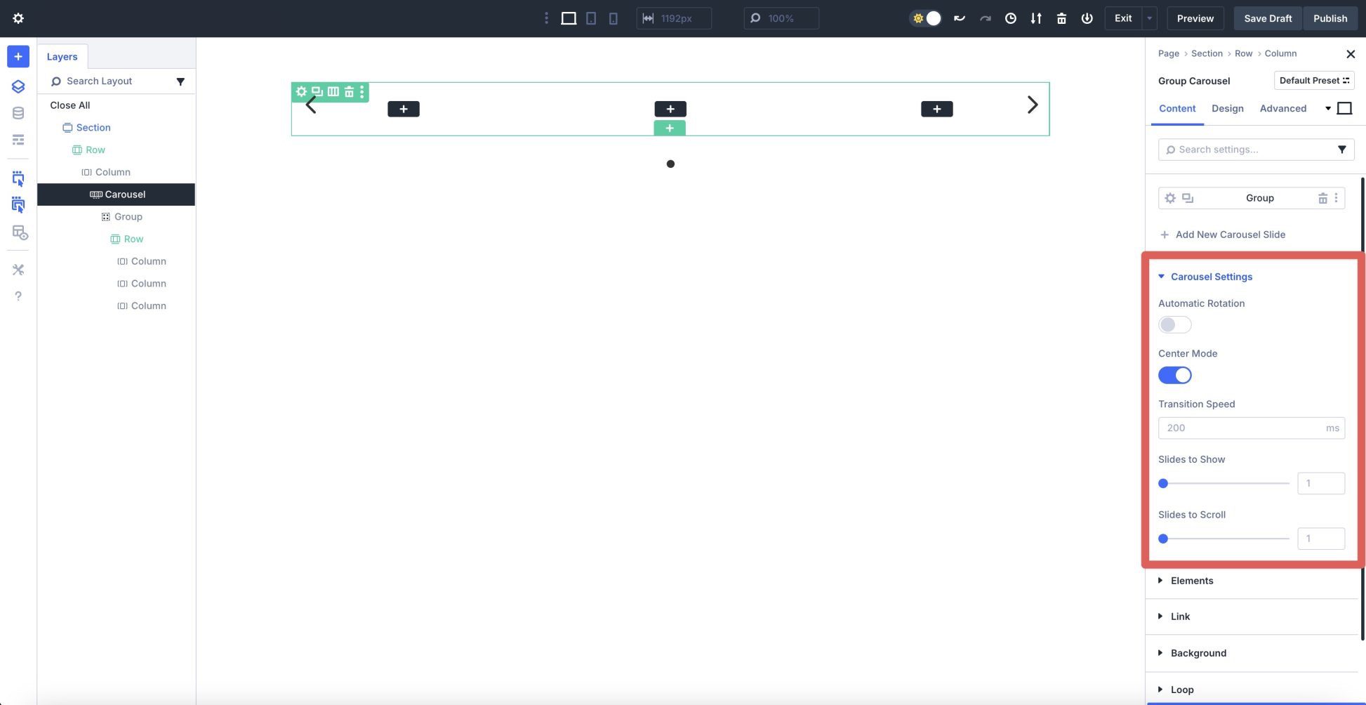
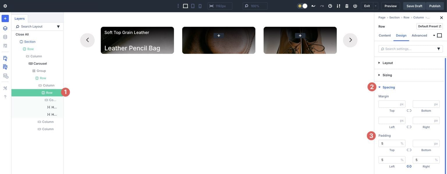
Before adding content to our Group Carousel, we need to configure the module’s settings. In the Layers panel, select the Group Carousel module. Expand the Carousel Settings dropdown menu.
Leave Automatic Rotation toggled to off and enable Center Mode.
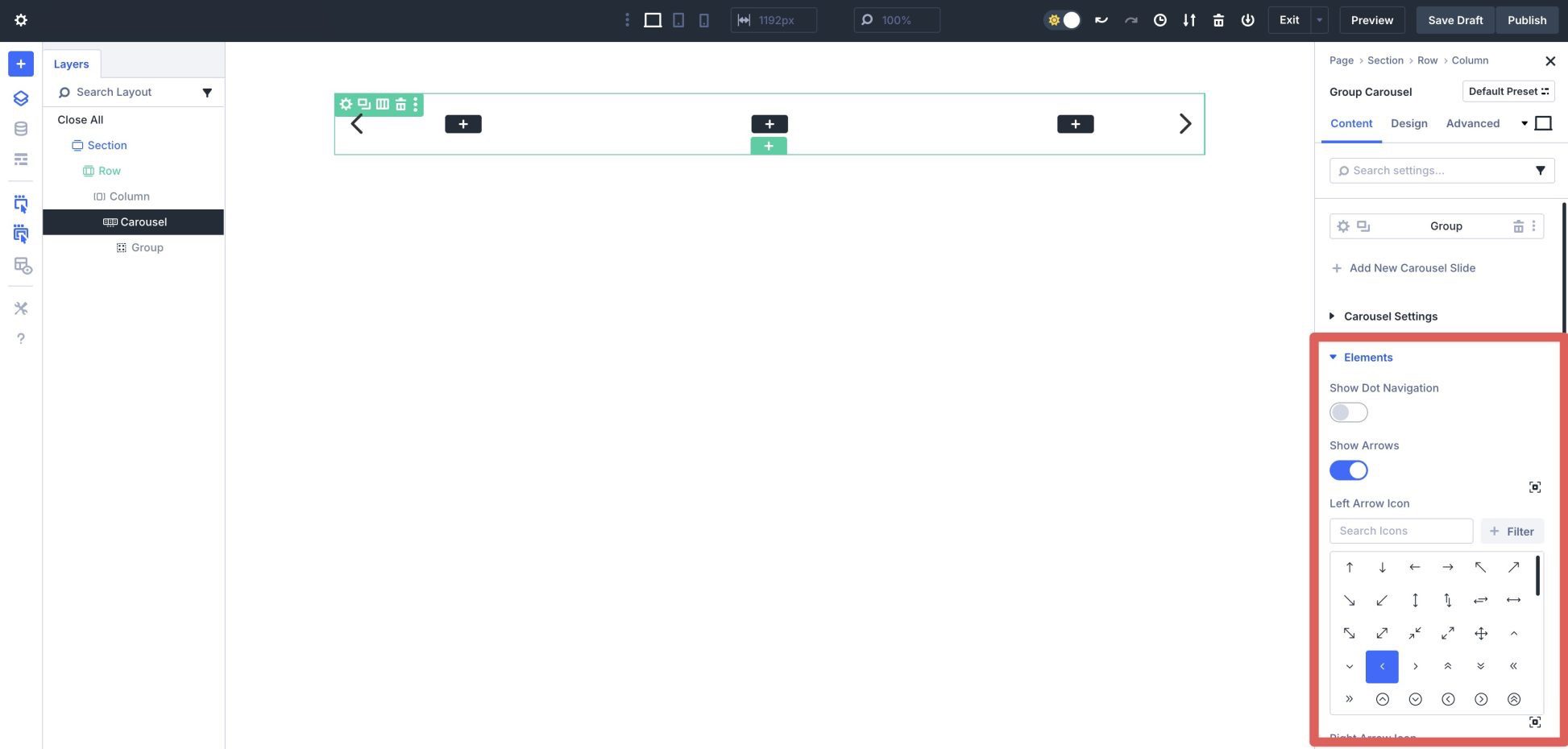
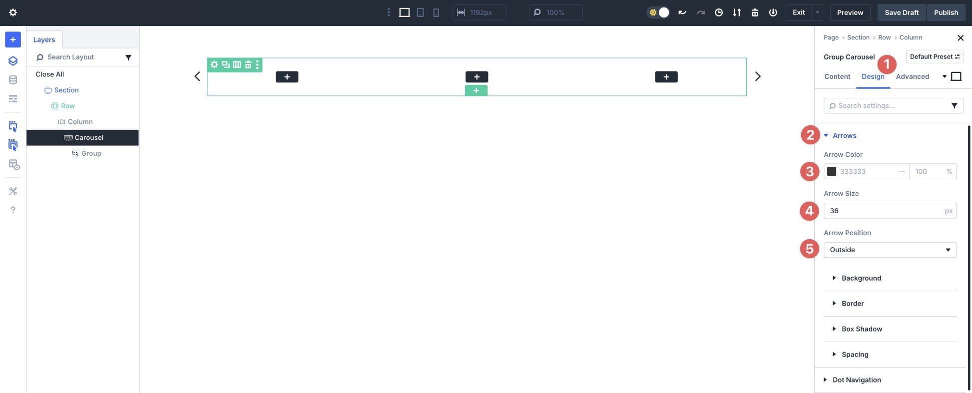
Next, expand the Elements dropdown menu. Turn Show Dot Navigation off but leave Show Arrows enabled. Arrow icons are selected by default, but you can choose the look you want from Divi’s vast icon library.
Navigate to the Design tab. Expand the Arrows dropdown menu. Use #333333 as the Arrow Color and set the Arrow Size to 36px. Set the Arrow Position to Outside.
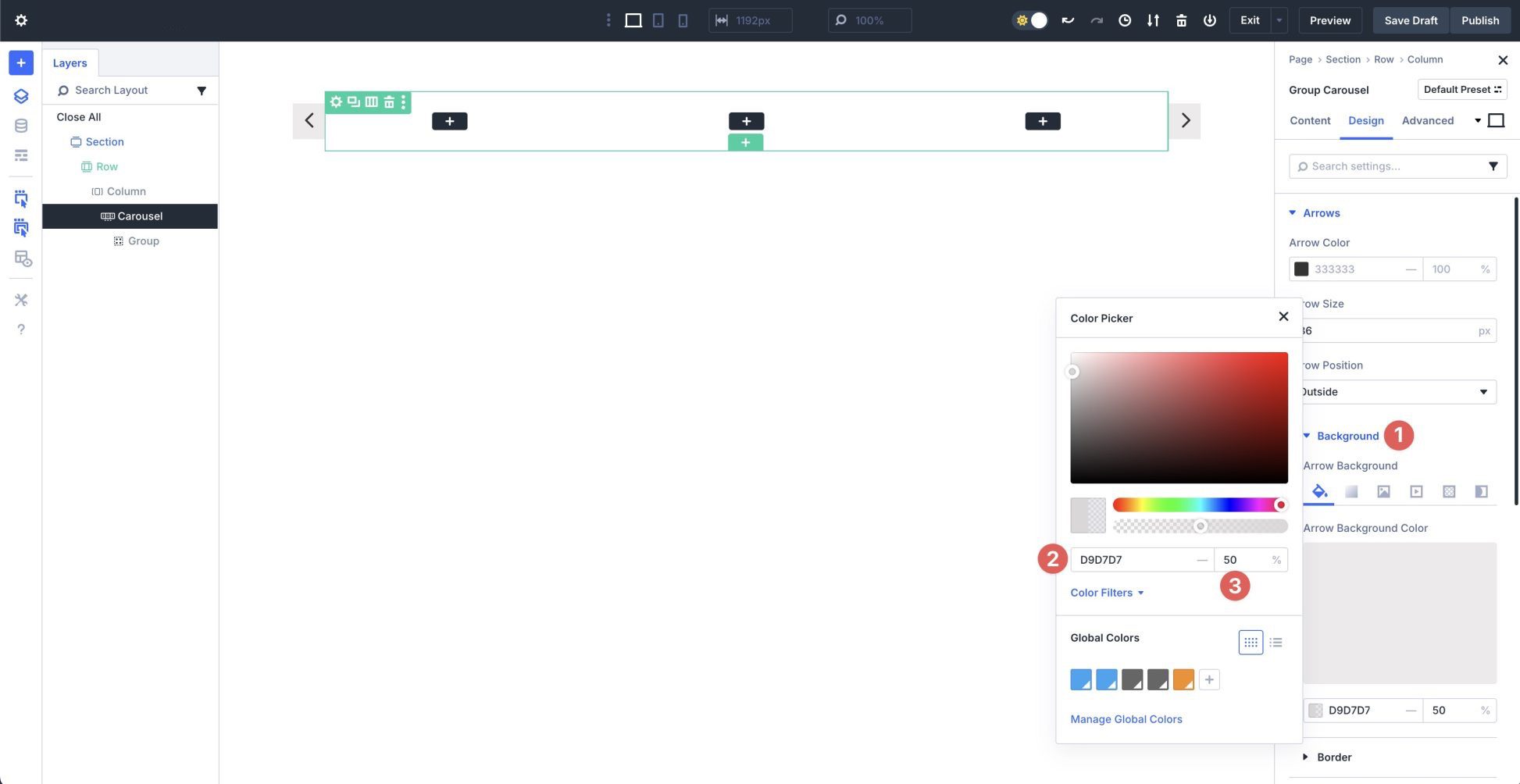
Expand the Background dropdown menu. In the Arrow Background Color tab, click + Add Background Color. Add #D9D7D7 as the background color and set the Opacity to 50%.
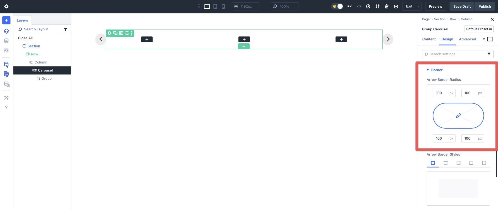
In the Border dropdown menu in the Arrows settings, assign a 100px Arrow Border Radius.
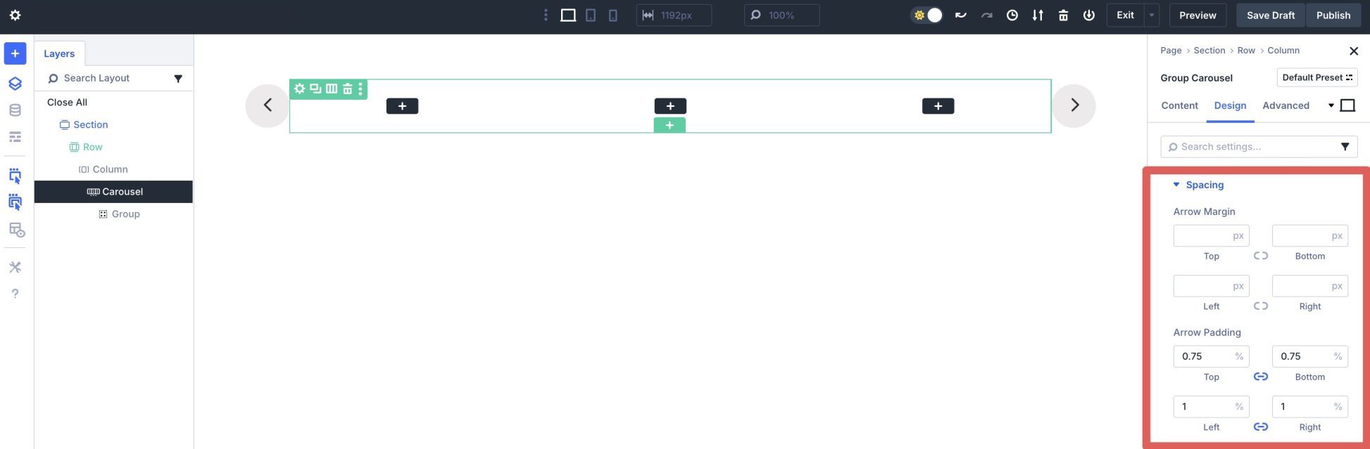
Finally, expand the Spacing dropdown menu in the Arrows settings. Add .75% Arrow Padding to the top & bottom and 1% to the left & right.
Step 2: Configure The Row’s Settings
Now, we’ll start adding content to the row. Use the Layers panel to click into the first column. Expand the Background tab and click the Background Image settings. Add an image to the background.
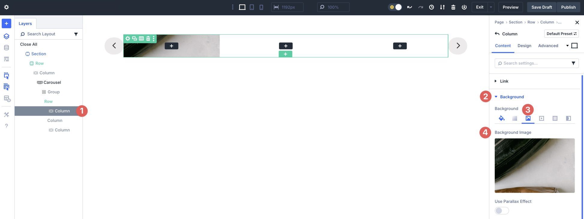
Open the Background Gradient settings. Click + Add Background Gradient.
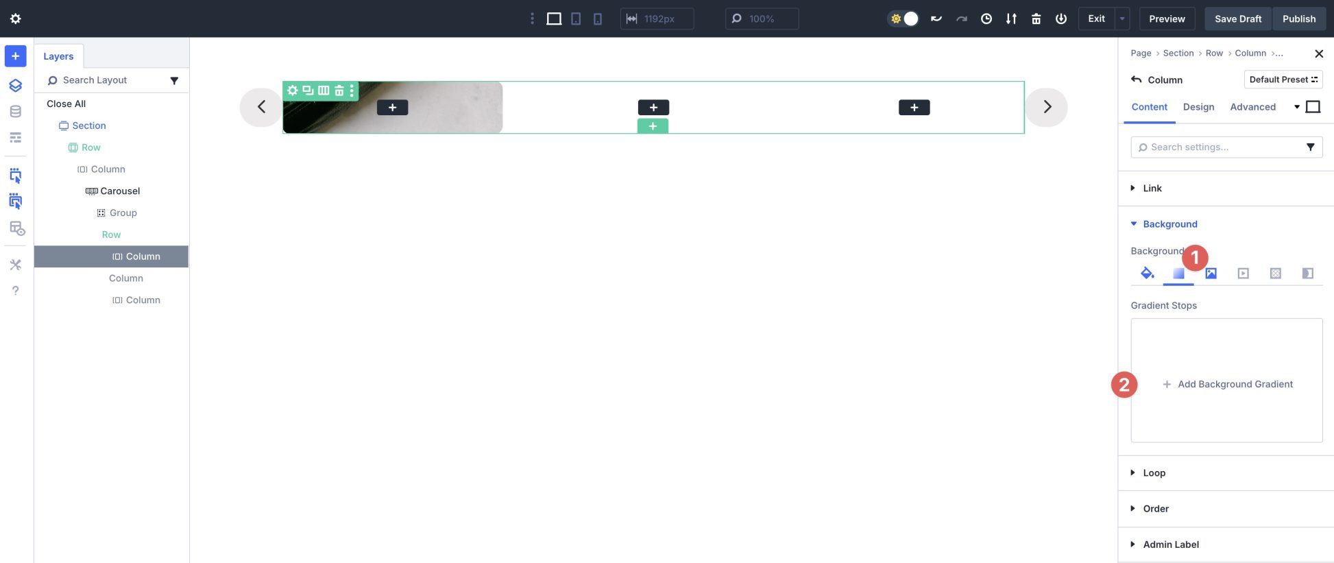
Click the first Gradient Stop to adjust the color.
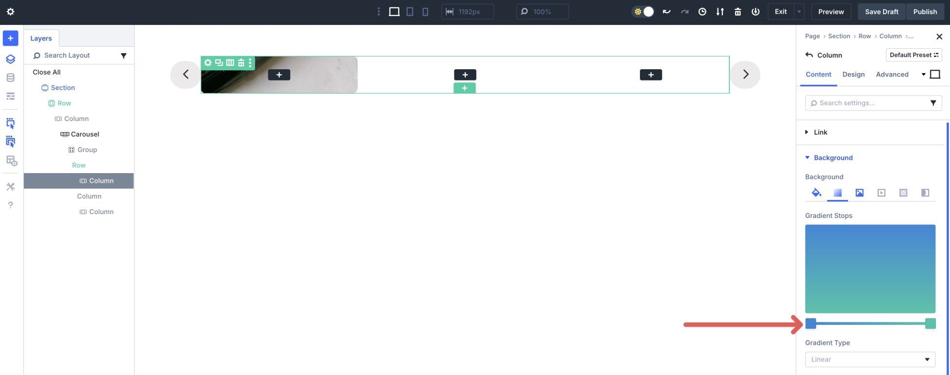
Choose #000000 as the color.
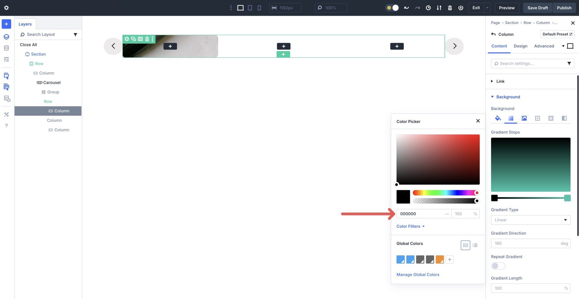
Next, click the second Gradient Stop. Use #000000 as the color and set the Opacity to 20%.
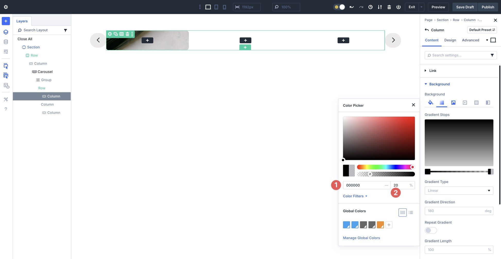
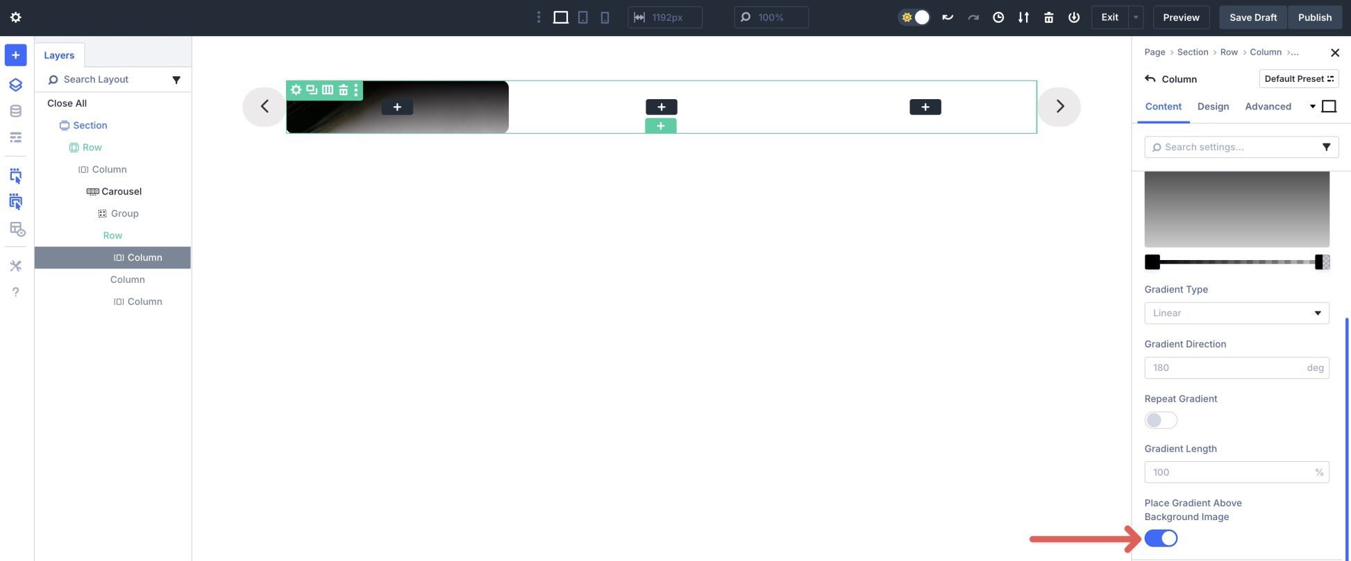
Scroll down and enable Place Gradient Above Background Image.
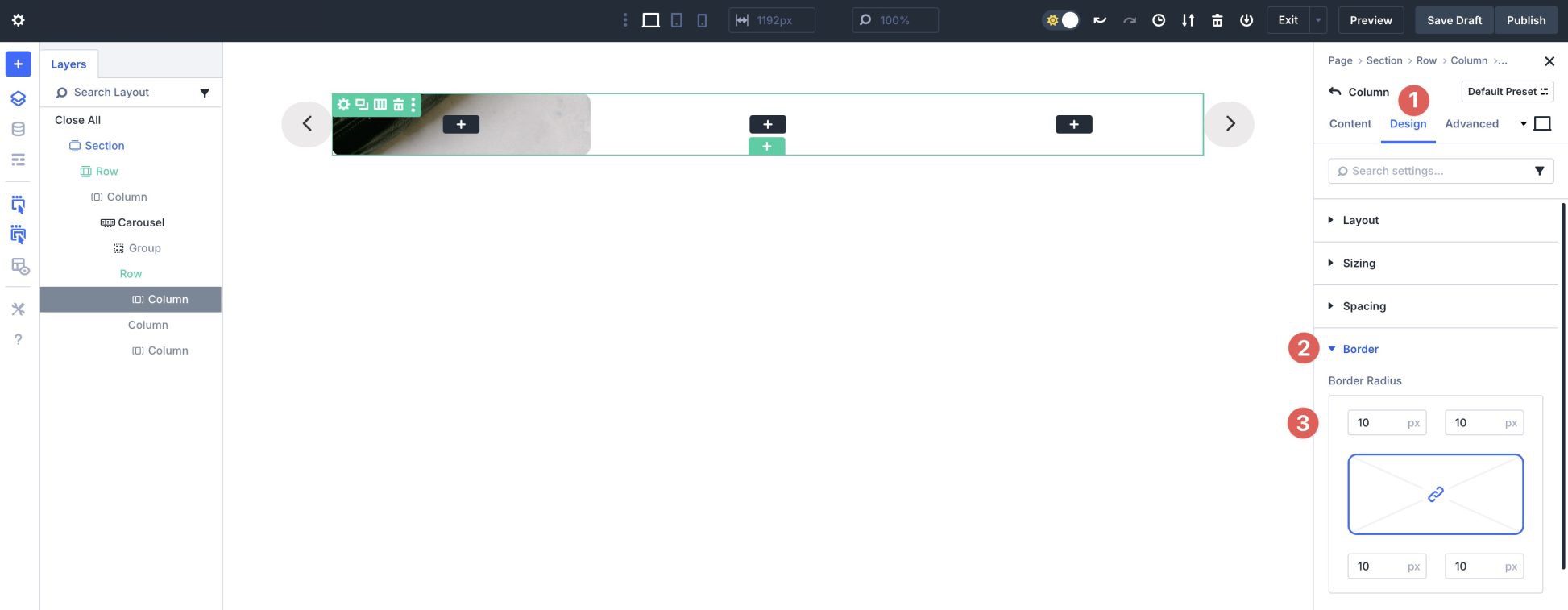
Next, click the Design tab. Expand the Border dropdown menu to reveal the settings. Assign a 10px Border Radius to the column.
Repeat the steps to add a Background Image, Background Gradient, and Border Radius to columns two and three. Once completed, your layout should look similar to the image below.
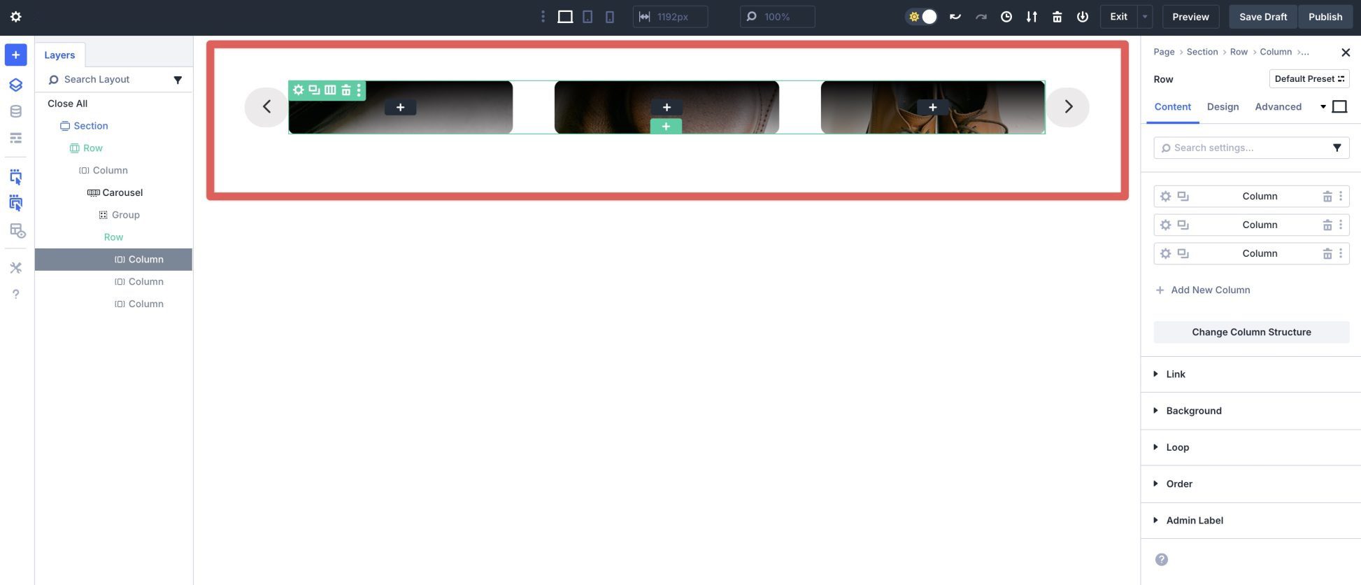
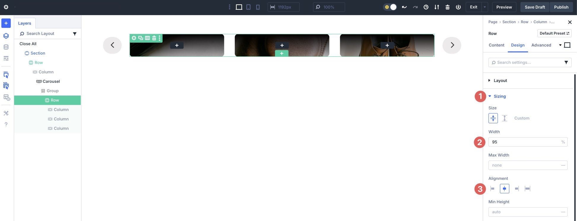
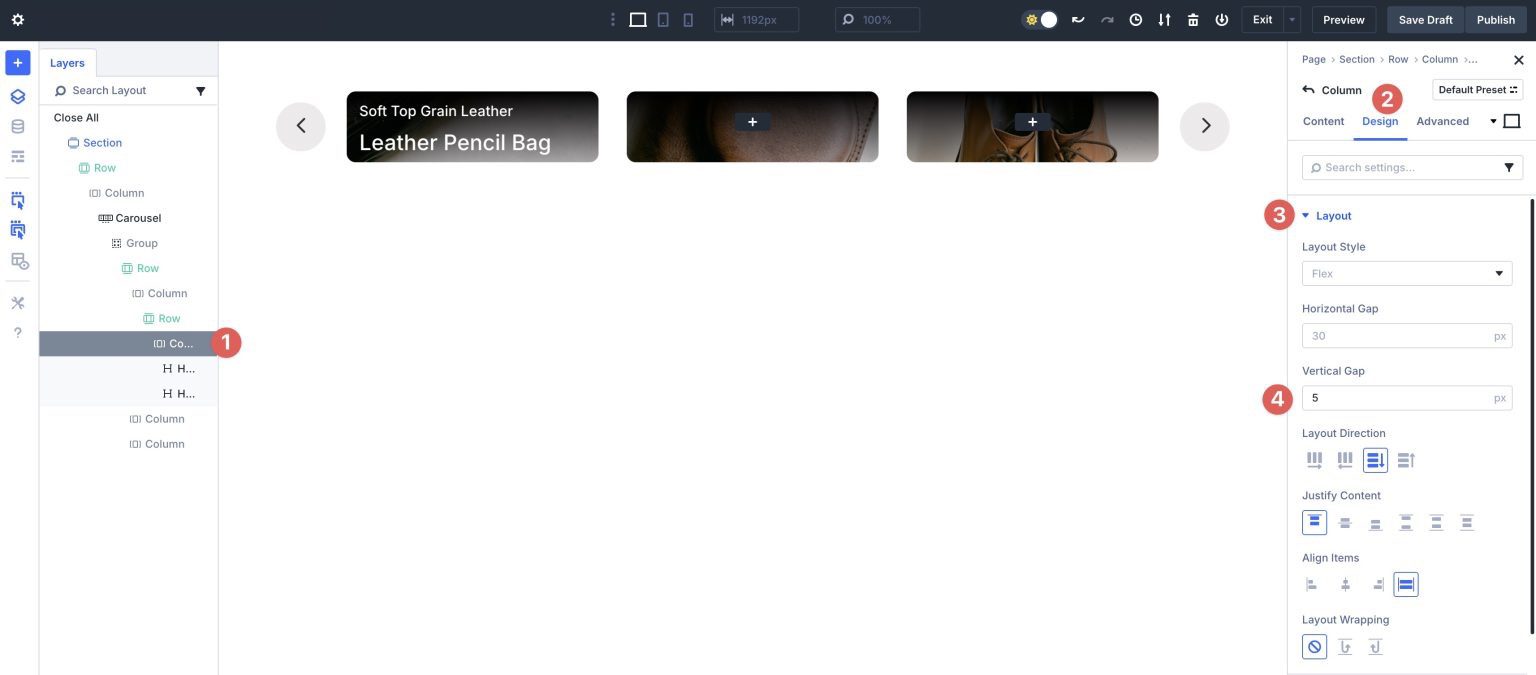
Now we must adjust the row’s width and Flex settings. Click the Design tab for the row. Expand the Layout dropdown menu and adjust the Horizontal Gap to 3.5. Leave all other settings as is.
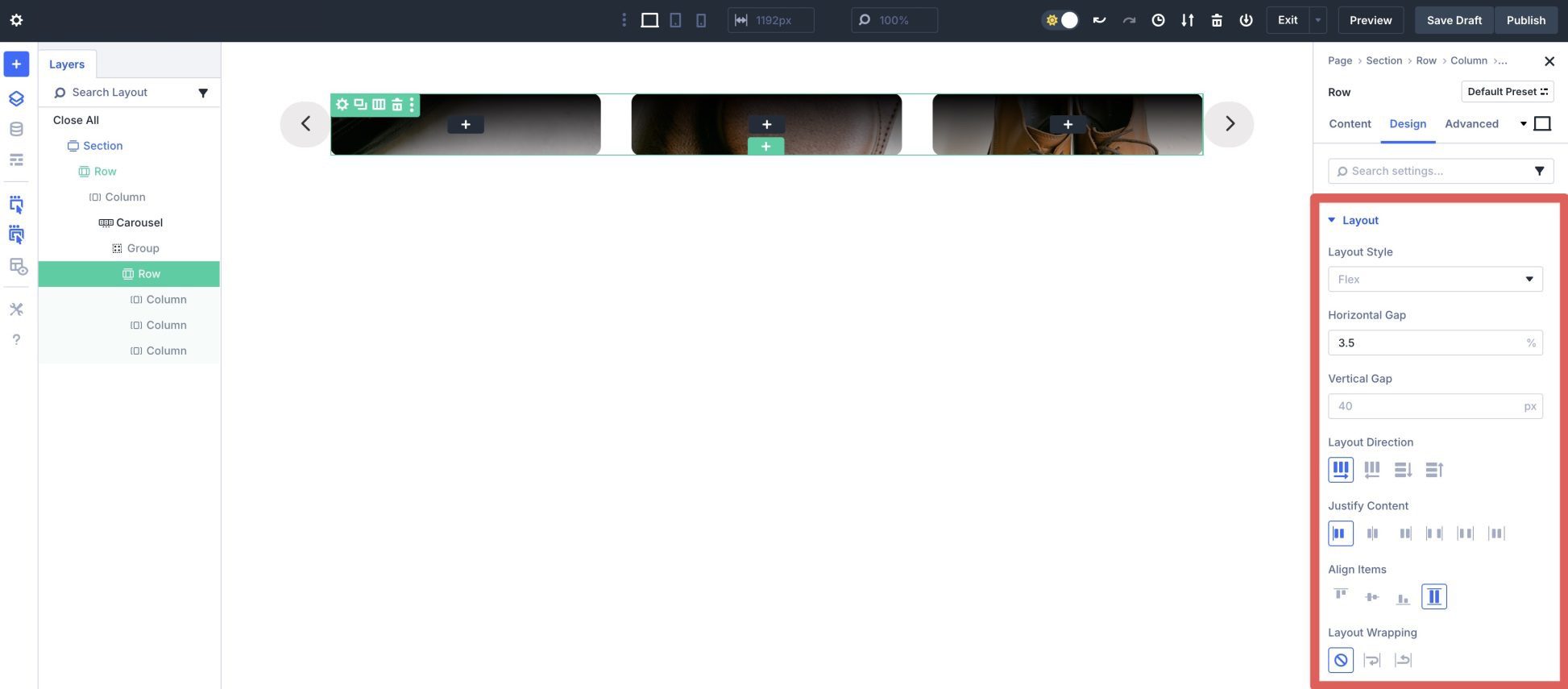
Expand the Sizing dropdown menu. Set the Width to 95% and the Alignment to Center. This will give the arrows in the slide a bit of breathing room.
Step 3: Add Content To The Row
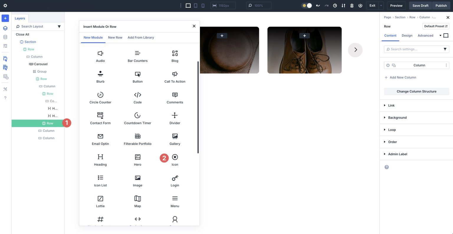
Click on the black + icon in the first column to add a new module.
Click the New Row tab and select a single column row.
Add A Heading Module
Locate the Heading module and add it to the first column.
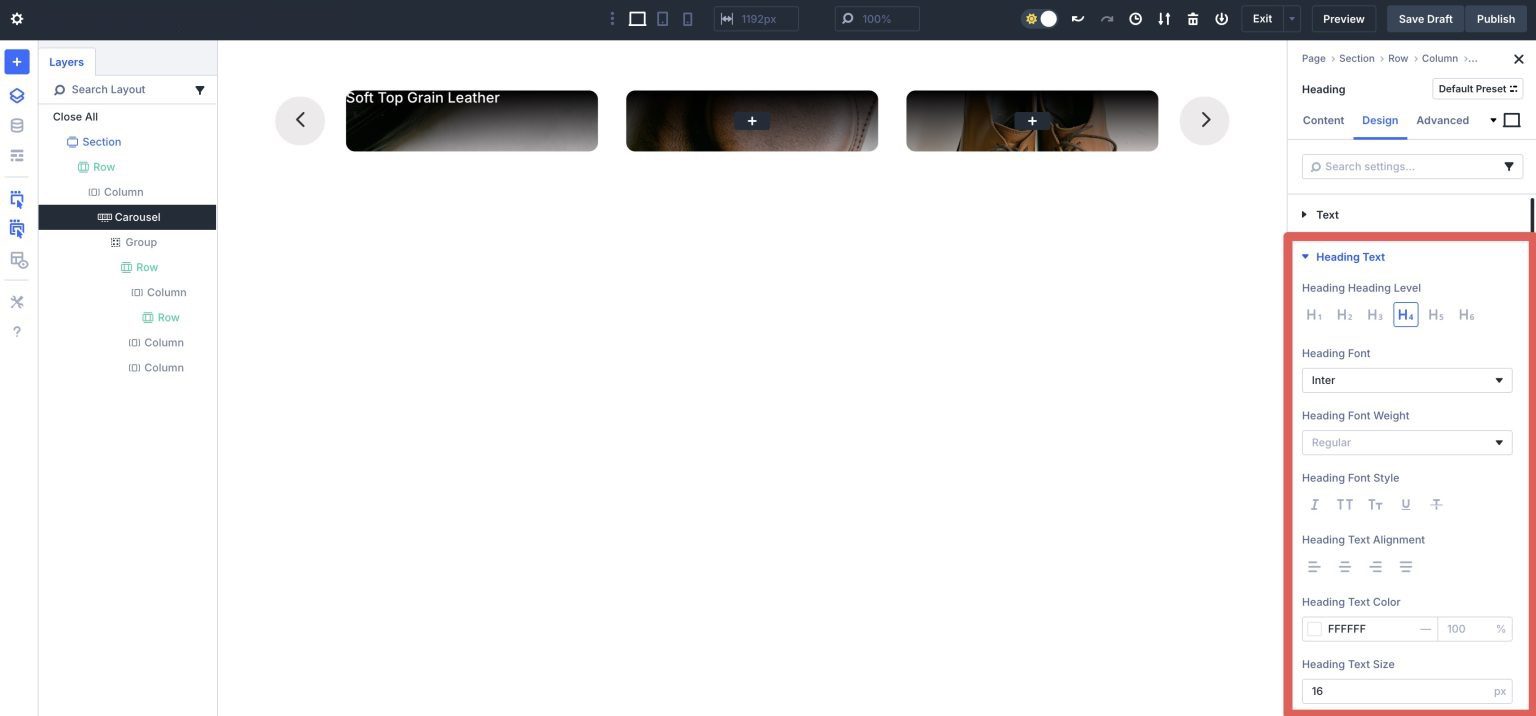
Give the Heading module a Title and then click the Design tab.
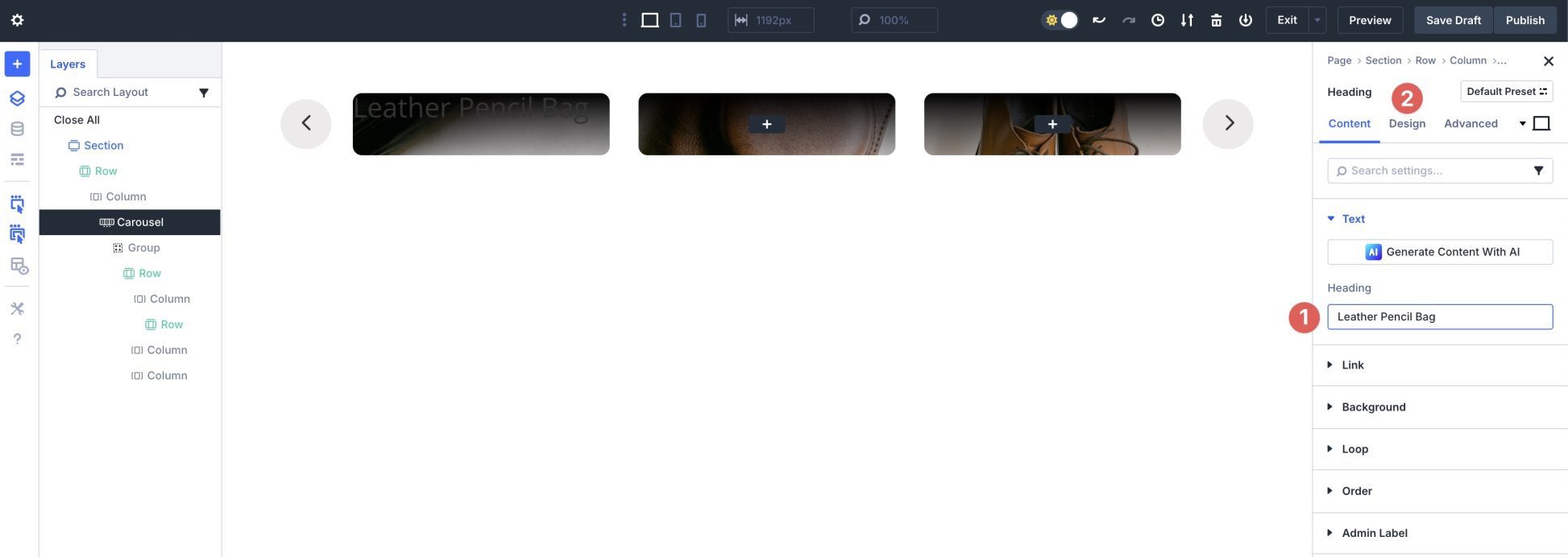
Expand the Heading Text dropdown menu. Set the Heading Level to H4. Select Inter as the Heading Font, and #ffffff as the Heading Text Color. Set the Heading Text Size to 16px.
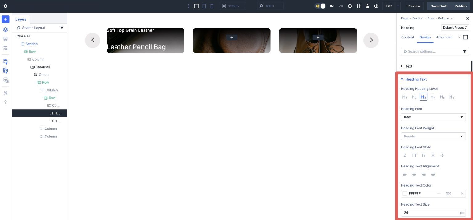
Add A Second Heading Module
Add another Heading module under the first one in the first column. Give it a Title, and navigate to the Design tab. Set the Heading Heading Level to H3, Heading Font to Inter, Heading Text Color to #ffffff, and the Heading Text Size to 24px.
Use the Layers panel to select the row we added to the first column. We will adjust the row’s spacing. Under the Spacing dropdown menu, add 5% padding to the top, left, and right.
Now click into that row’s column. Click on the Design tab and expand the Layout settings. In the Vertical Gap field, add 5px.
Duplicate this row and add it to the second and third columns. Change the titles for each of the heading modules.
Add An Icon Module
Add a new single column row to the first column. Click the black + icon to add a new module and select the Icon module.
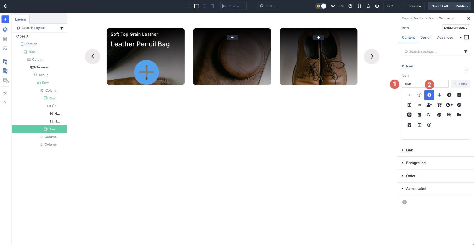
When the Icon module’s settings appear, select the + icon from the Divi icon library.
In the Background dropdown menu, select #000000 as the Background Color.
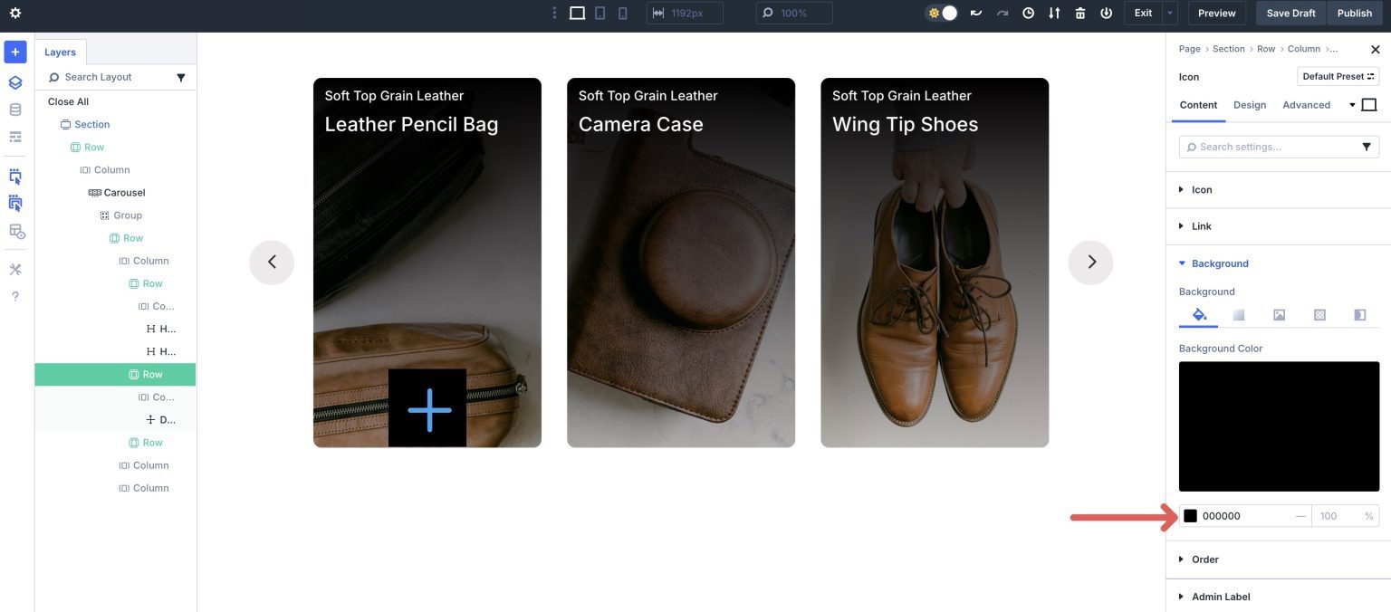
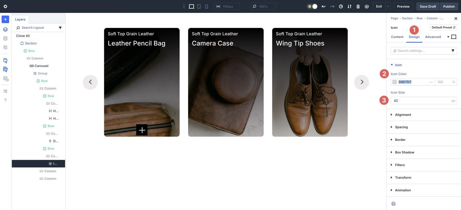
Navigate to the Design tab. Expand the Icon dropdown menu. Assign #d9d7d7 as the Icon Color and set the Icon Size to 42px.
Expand the Alignment tab and set the Icon Alignment to Right.
Expand the Spacing dropdown menu. Add 5% Margin to the bottom and right for the icon.
Finally, expand the Border dropdown menu and assign a 100px Border Radius to the icon.
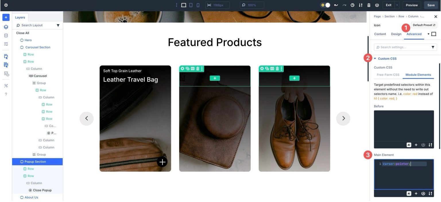
Because we’ll use the Icon module to close the content reveal section, we’ll need to add a bit of CSS to let the user know it’s a clickable item. Navigate to the Advanced tab and expand the Custom CSS dropdown menu. Click Module Elements and add cursor:pointer; into the Main Element field:
Duplicate the row with the Icon module and add it to the second and third columns.
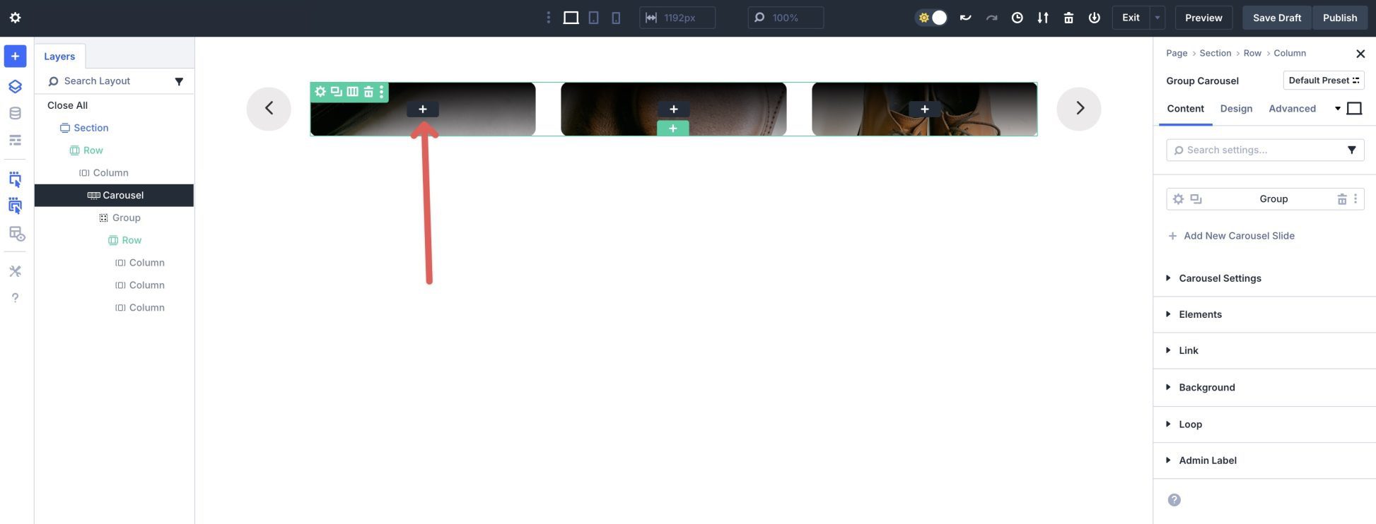
Step 4: Duplicate The First Group
Once the first Group is added and styled, you can easily copy it and change images and headlines. In the main settings panel for the Group Carousel module, click the Duplicate icon to copy the first Group.
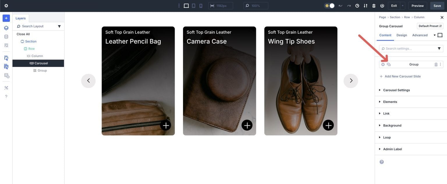
Click the Layers view to select the second Group.
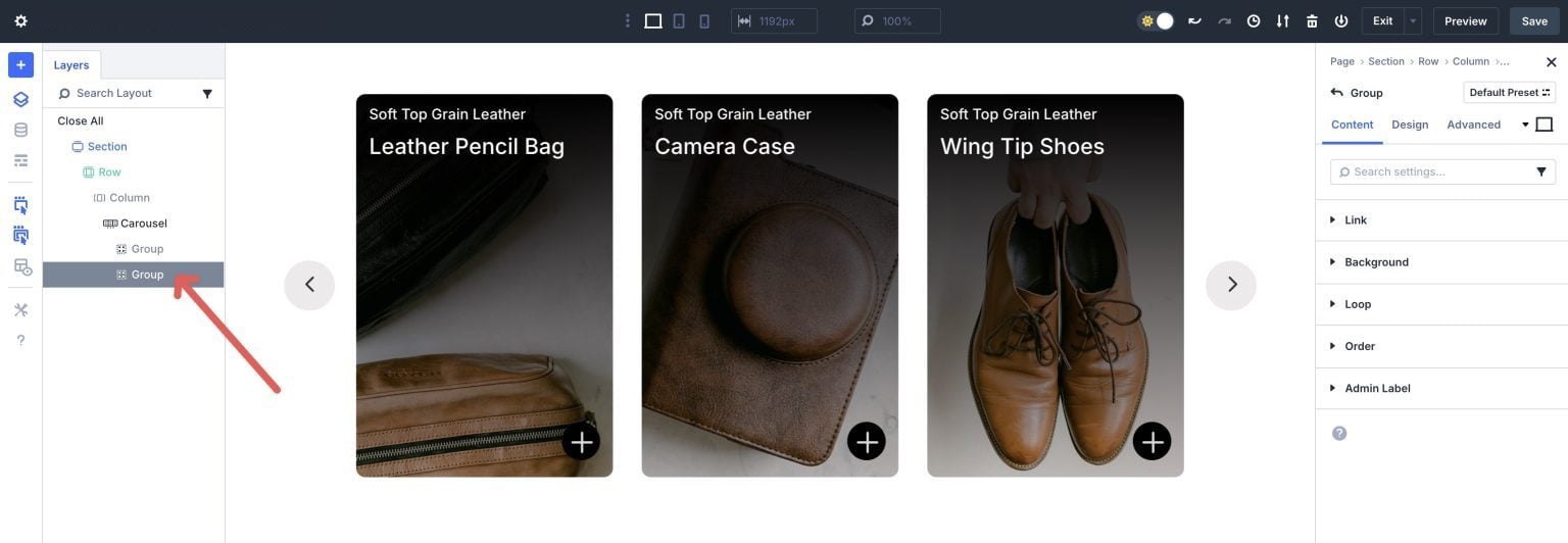
Repeat the steps above to replace background images and text. Once complete, preview the Group Carousel to ensure it works as intended.
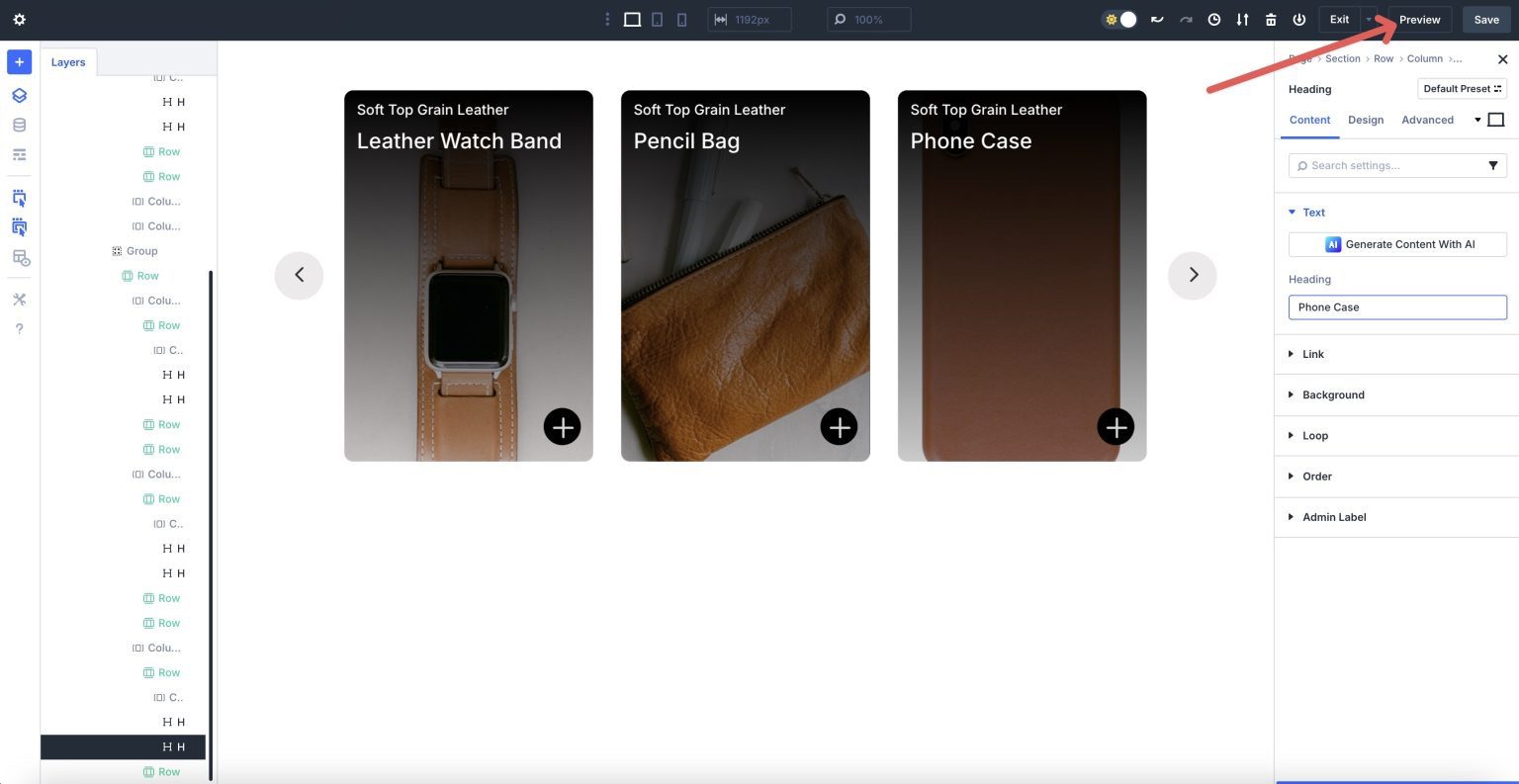
Divi will open the page in a new tab, allowing you to view the layout.
Back in the Visual Builder, use Divi 5’s Customizable Responsive Breakpoints to make any changes necessary to the Group Carousel before we proceed with the next step.
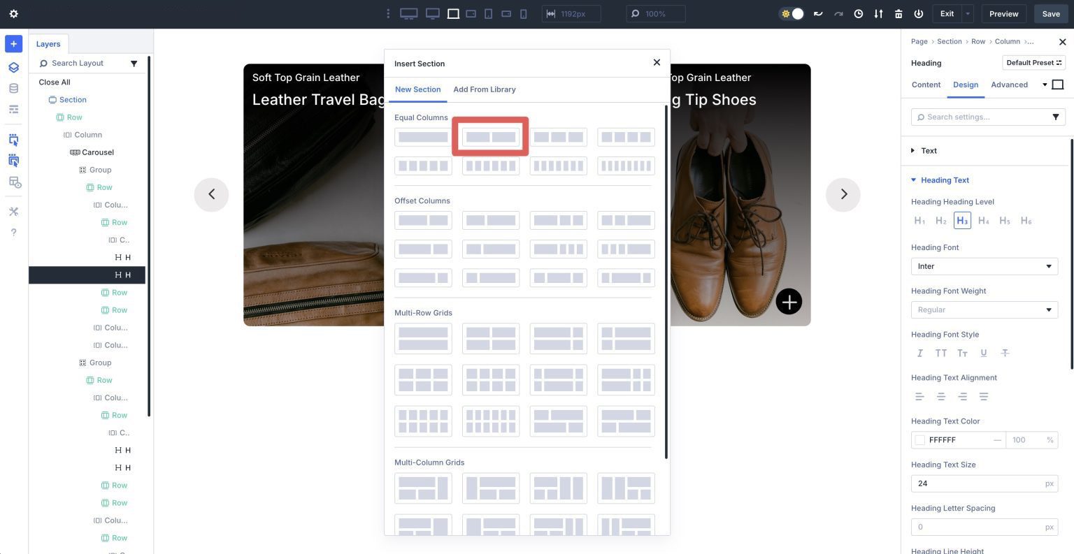
Step 5: Create The Content Reveal Section
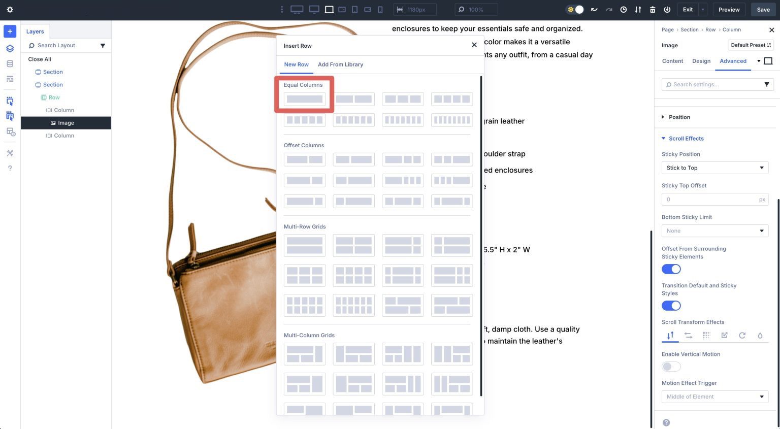
Start by creating a new section underneath our Group Carousel section. When the Insert Section dialog box appears, click to add a two-column row.
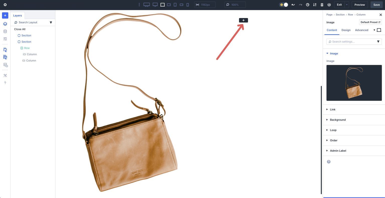
Add An Image Module
Select the Image module and add it to the first column.
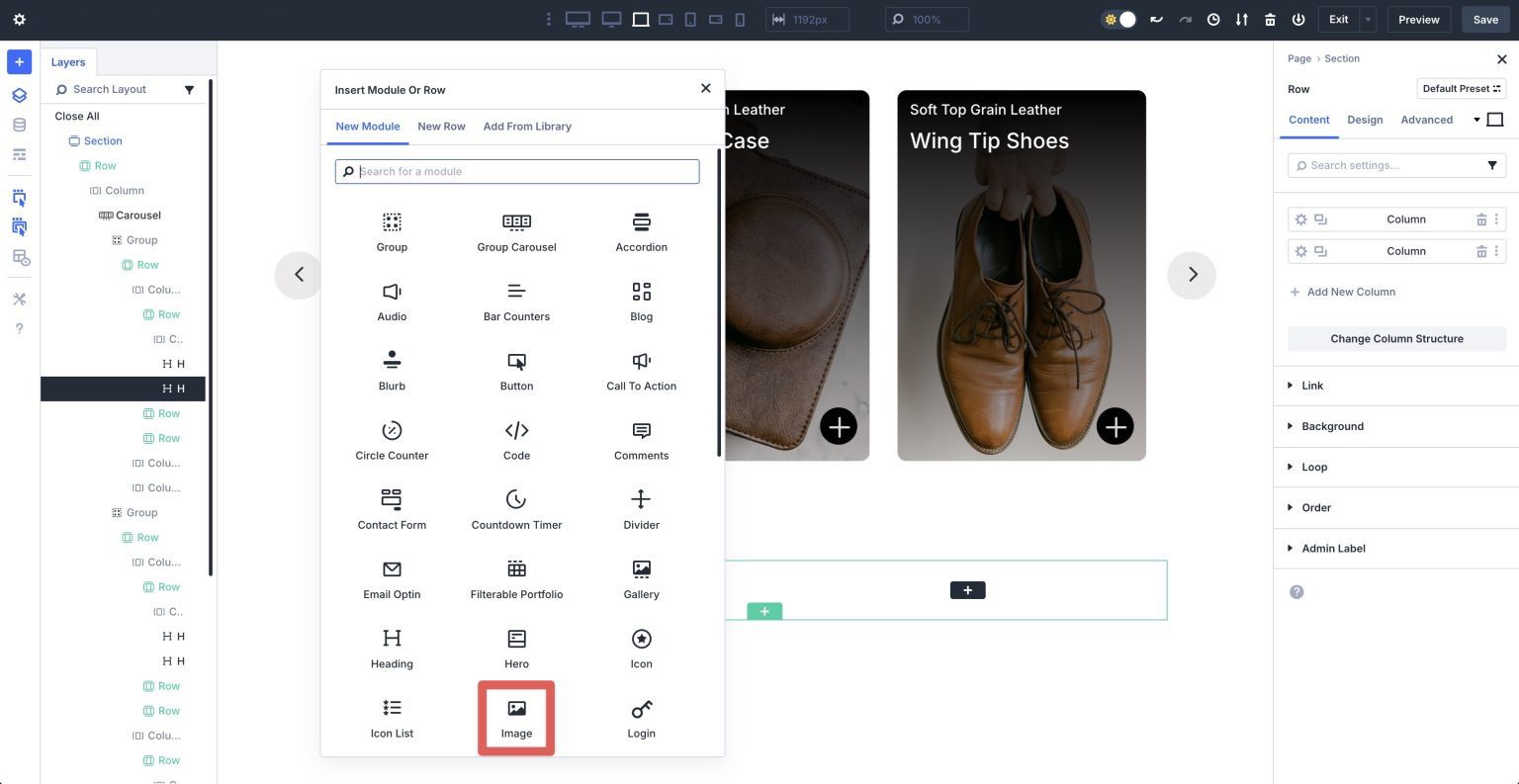
Click the black + icon to add a module to the second column.
Add Text Modules
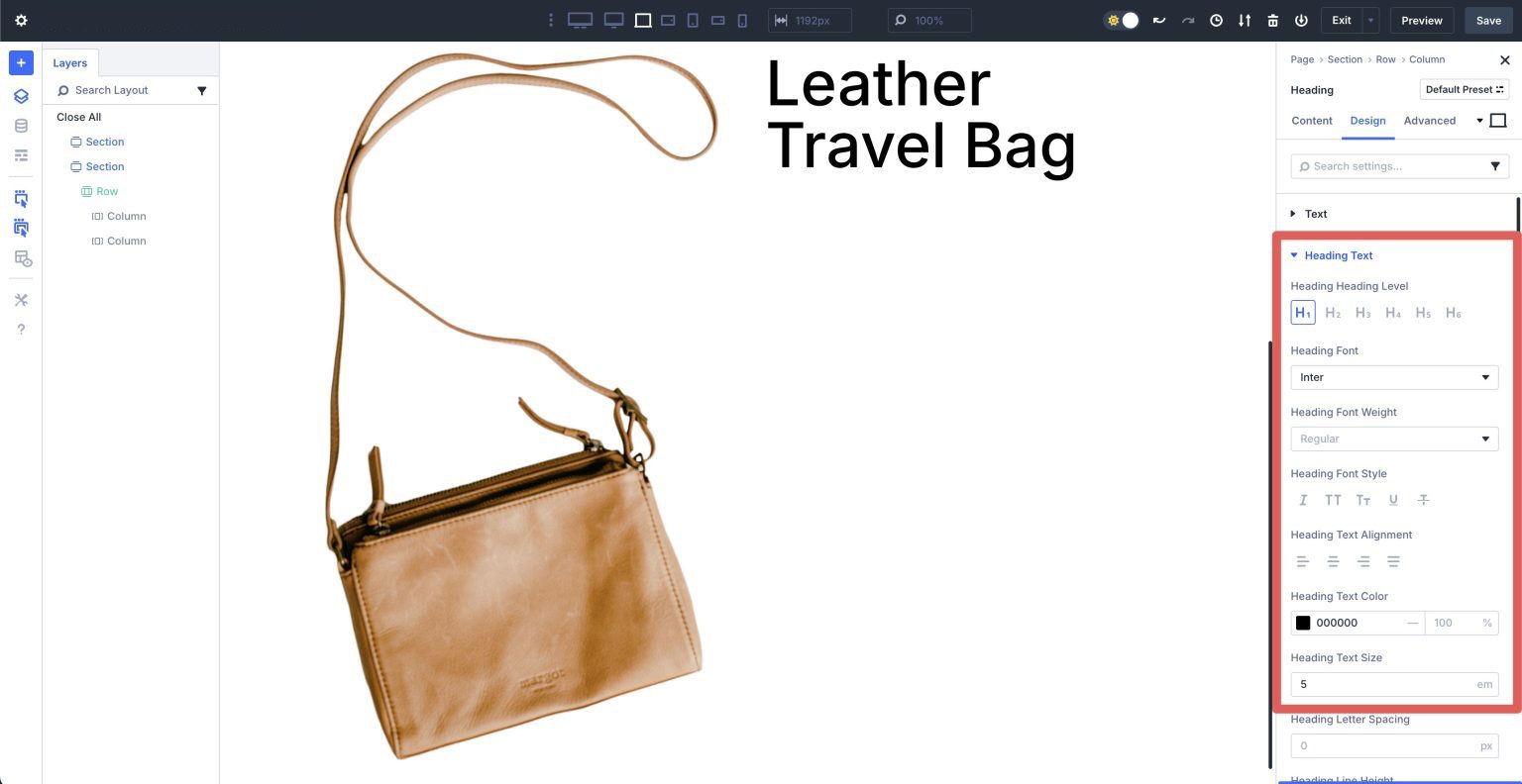
Add a Heading module, give it a Title, and expand the Heading Text dropdown menu. Set the Heading Heading Level to H1, Heading Font to Inter, Heading Text Color to #000000, and the Heading Text Size to 5em.
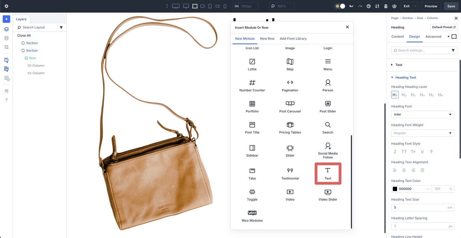
Add a Text module underneath the Heading module.
Enter text in the Body field or use Divi AI to help you generate a description.
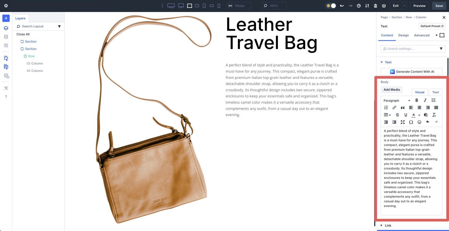
Swap to the Design tab. Expand the Text dropdown menu. Set the Text Font to Inter, the Text Text Color to #000000, and the Text Text Size to 16px. Adjust the Text Line Height to 1.8em.
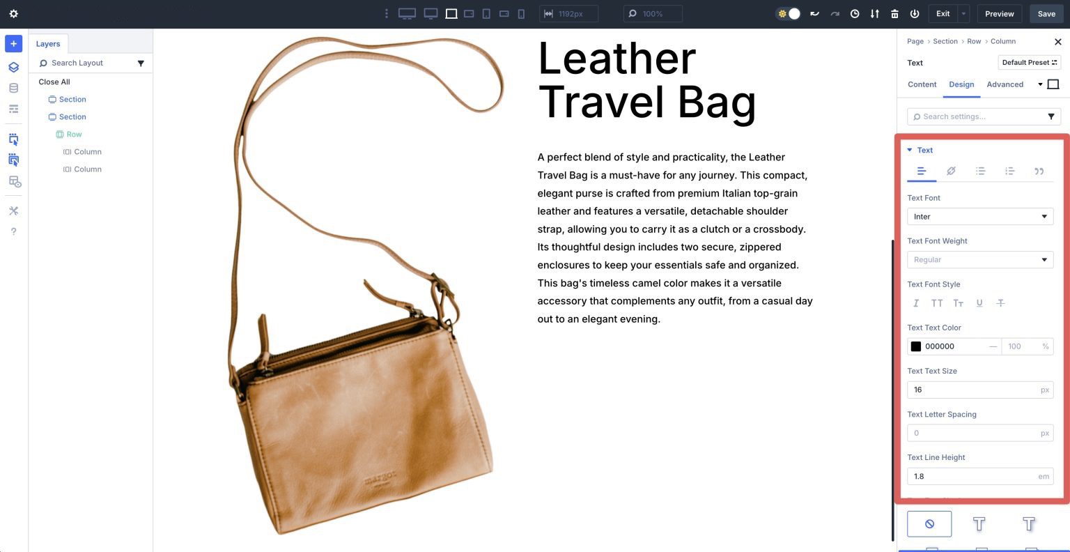
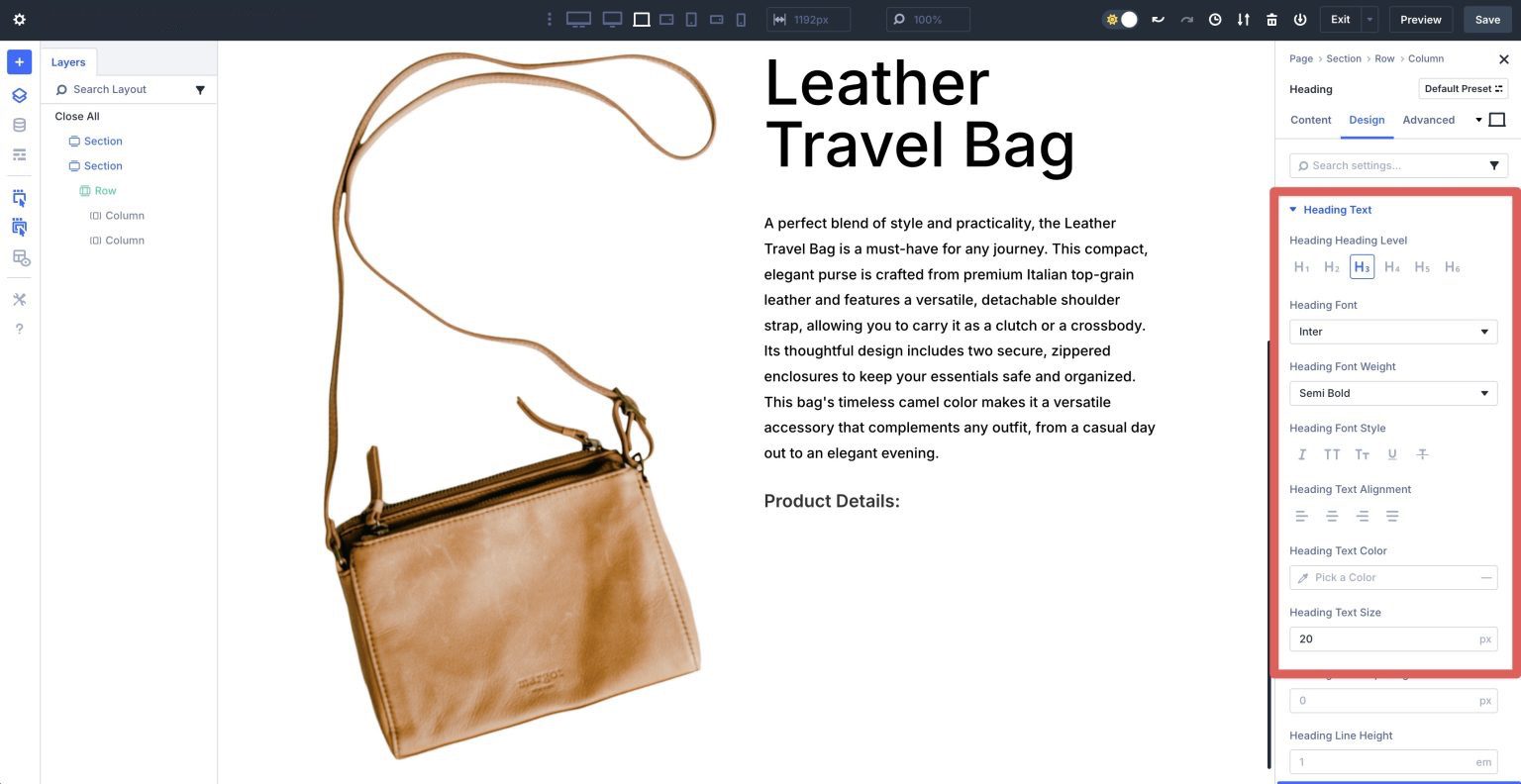
Add a new Heading module under the Text module. Add a Title and swap to the Design tab. Expand the Heading Text dropdown menu. Assign H3 as the Heading Heading Level, Inter as the Heading Font, Semi Bold as the Heading Font Weight, and 20px as the Heading Text Size.
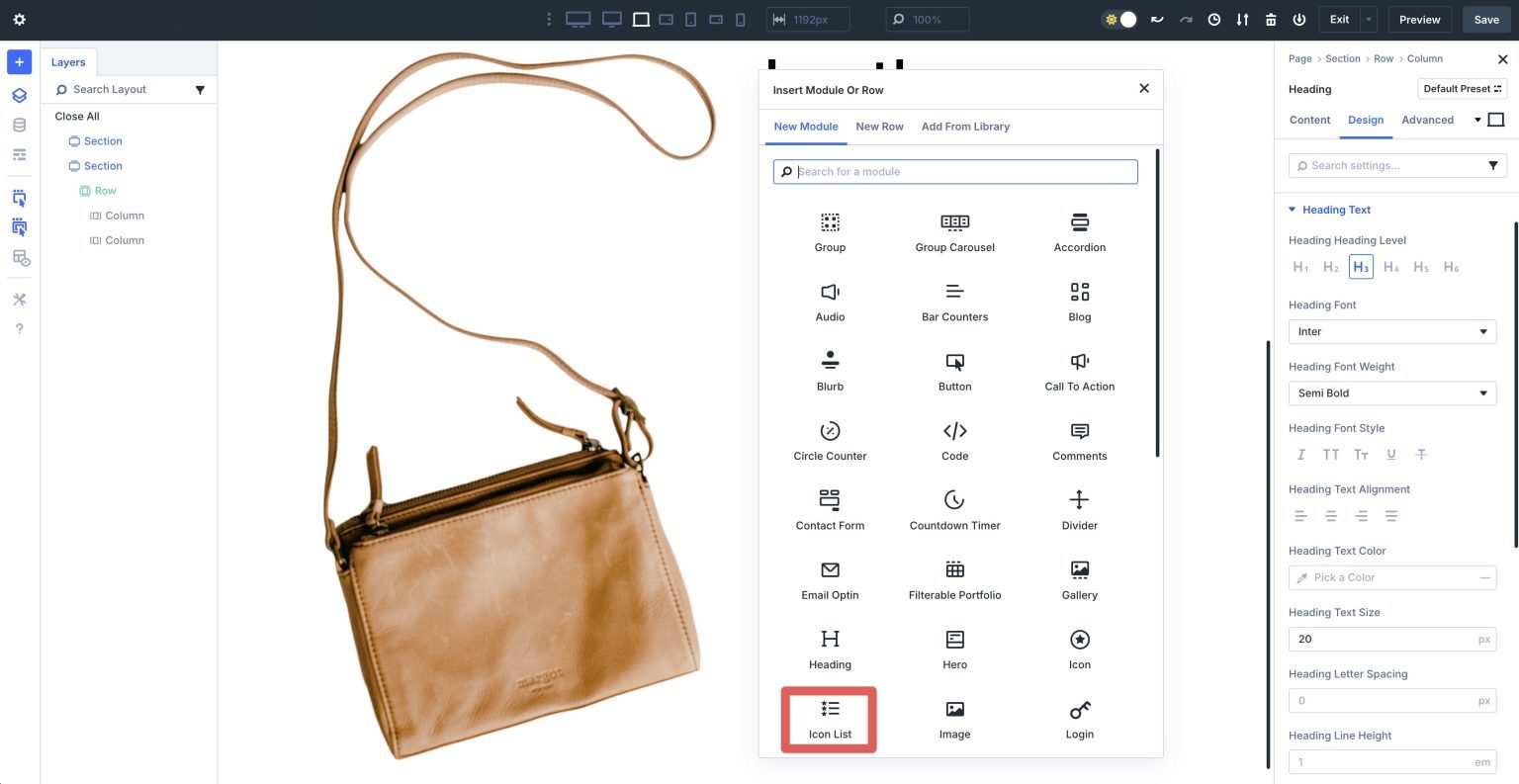
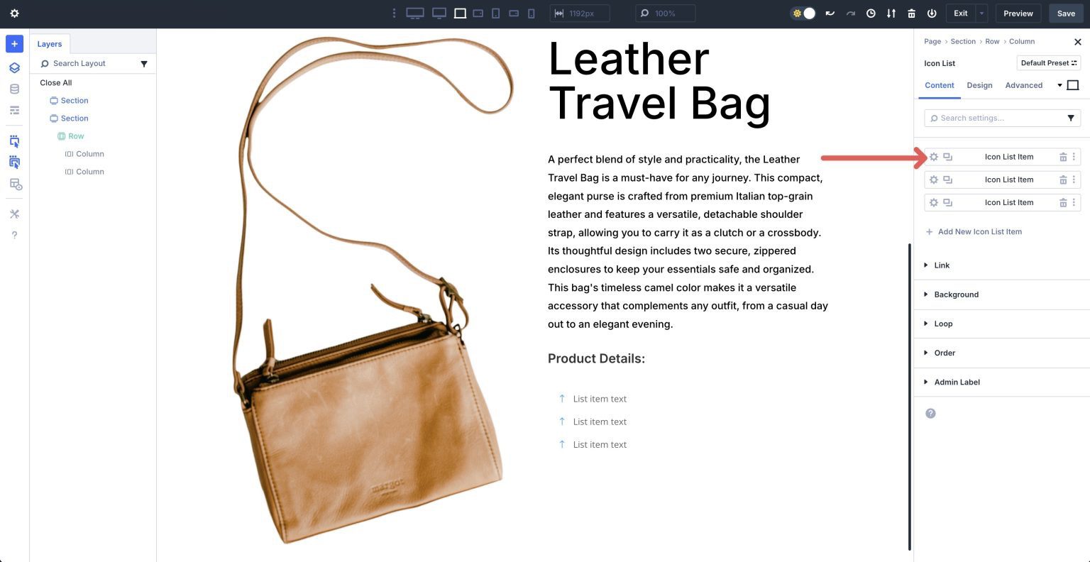
Add An Icon List Module
Next, find and select the Icon List module to add it to the second column.
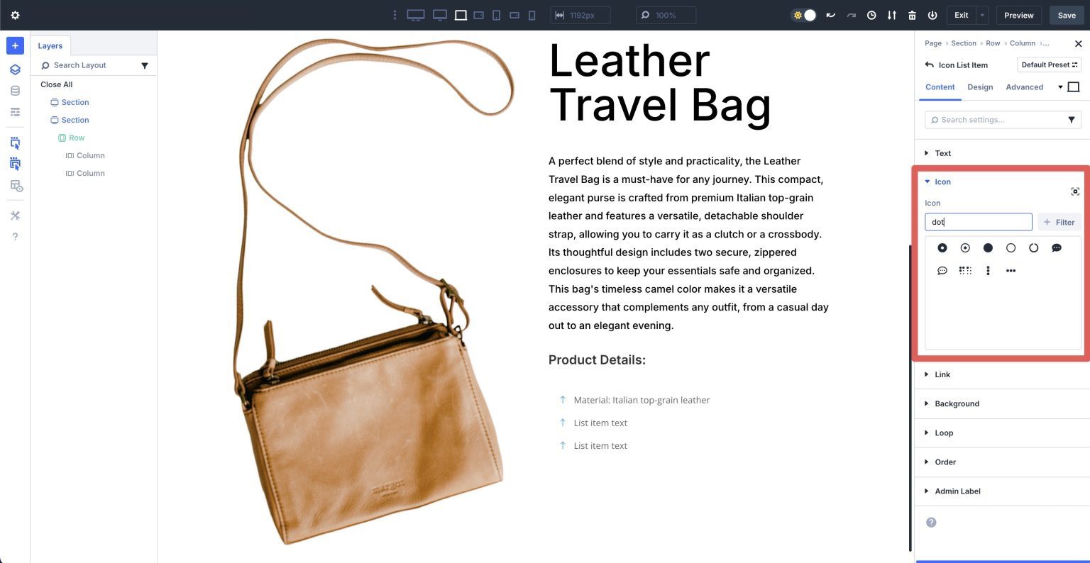
The Icon List module settings reveal three list items. To edit its content, click on the Settings Icon in the first Icon List Item.
Expand the Text dropdown menu and assign text to the Text field.
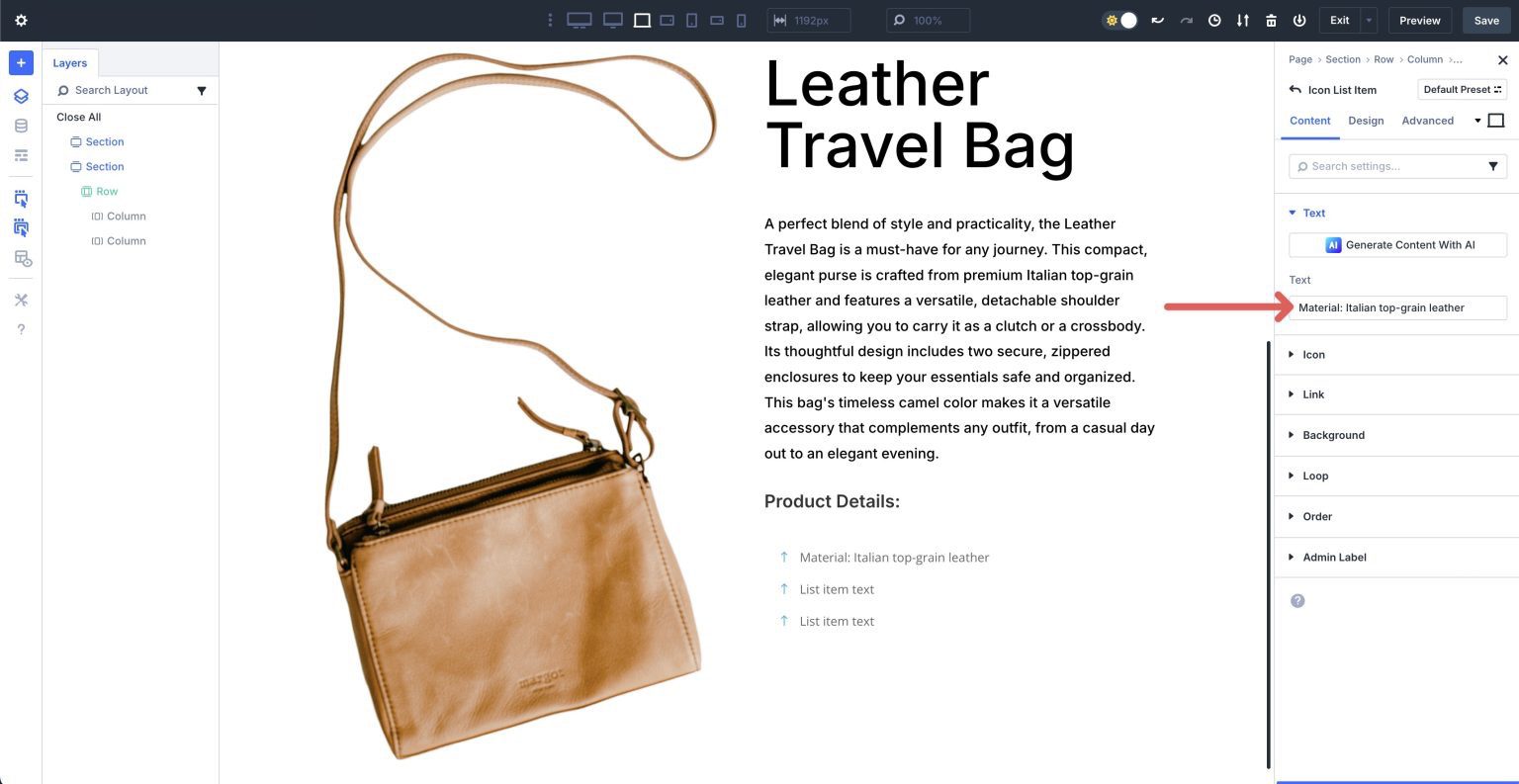
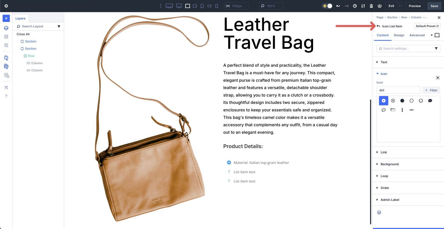
Select an icon for the Icon List Item in the Icon dropdown menu.
Click the return arrow at the top left of the Icon List Item’s settings to return to the module’s main settings.
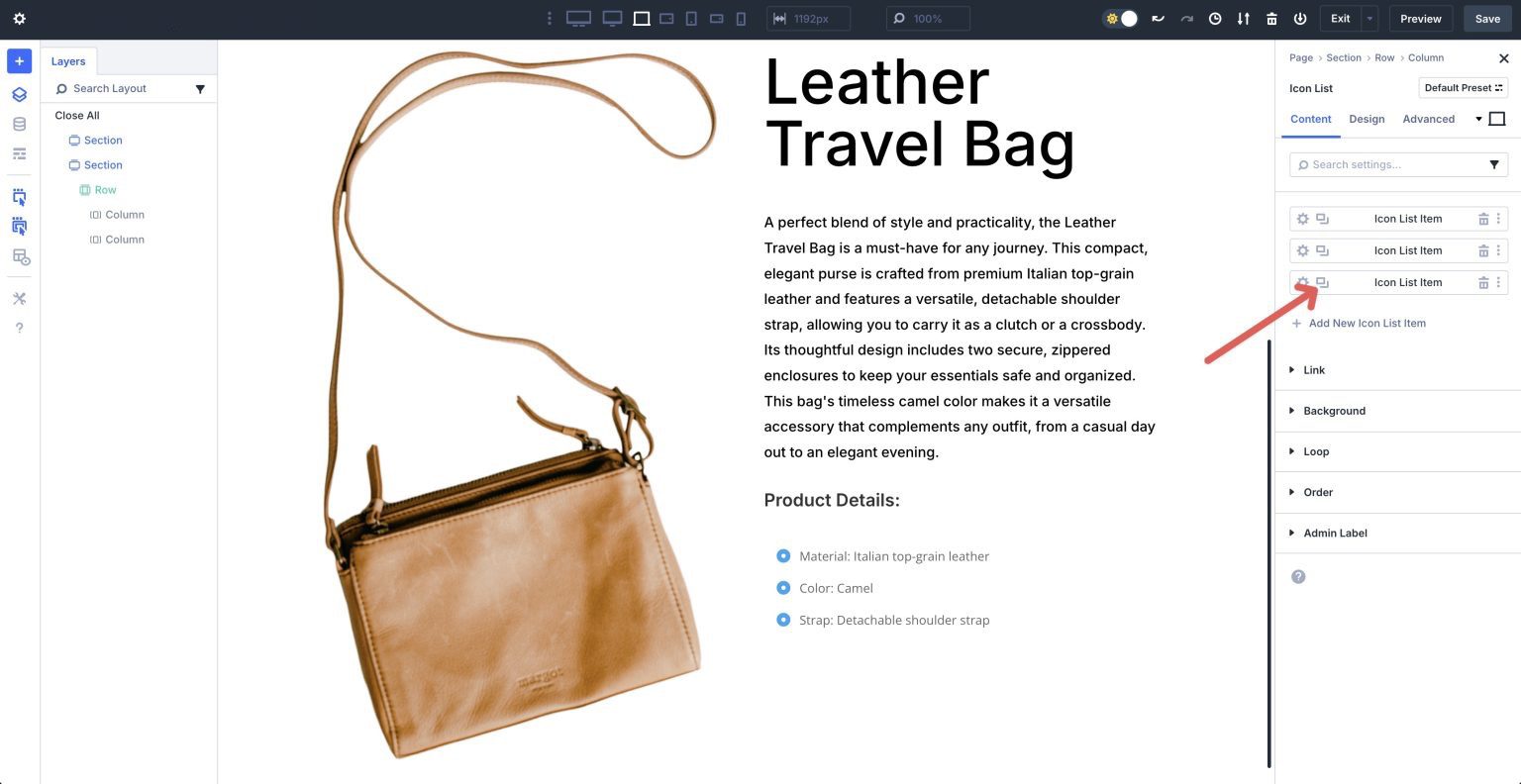
Repeat the steps above to add text and assign an icon for the remaining Icon List Items. Click the Duplicate icon to add additional Icon List Items as necessary.
Once all list items are in place, click the Design tab to make style changes. Expand the Icon dropdown menu and assign #000000 to the Icon Color field. Set the Icon Size to 18px.
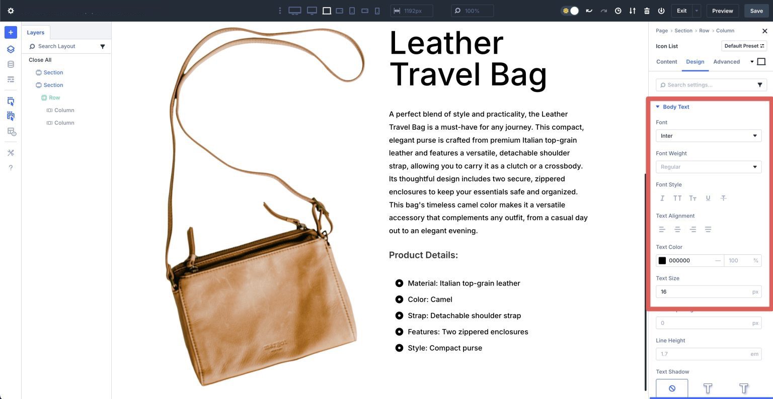
Expand the Body Text dropdown menu. Assign Inter as the Font, #000000 as the Text Color, and 16px as the Text Size.
Duplicate The Heading And Icon List Modules
Next, duplicate the H3 Heading module we created and drag it below the Icon List module in the second column.
Leave all design settings the same, but give the Heading module a different title. Duplicate the Icon List module and drag it below the new Heading module we just created. Change the text for each of the Icon List Items. Leave all style settings as is.
Repeat the steps above to duplicate the Heading and Icon List modules again.
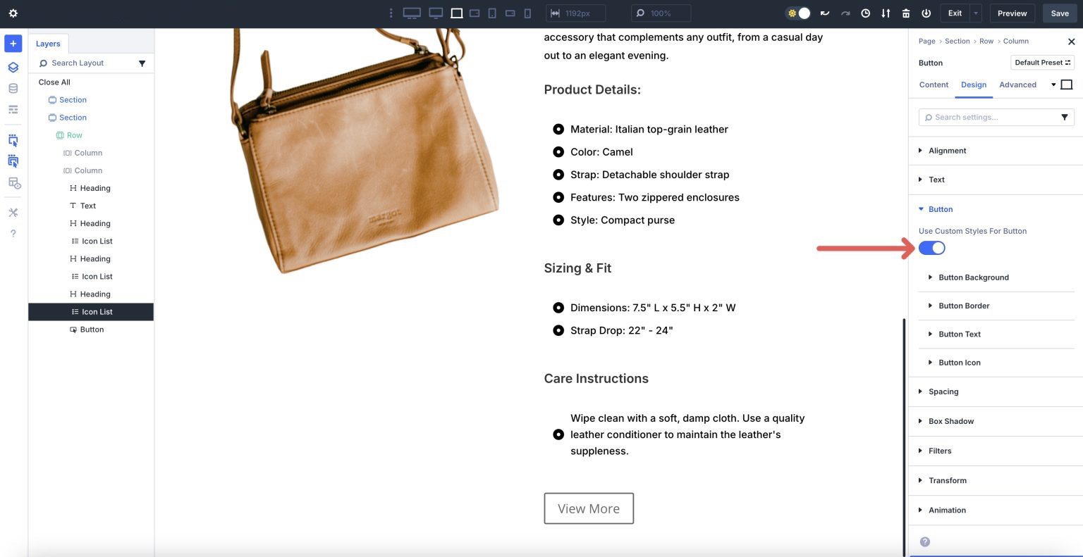
Add A Button Module
Add a Button underneath the last Icon List module in the second column. When the Button’s settings appear, add Button Text and click the Design tab. Expand the Button dropdown menu and enable Use Custom Styles For Button.
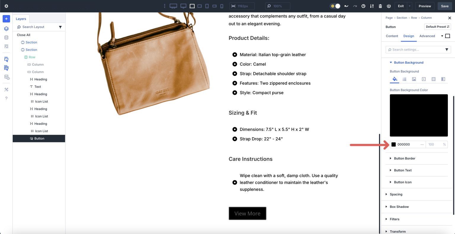
Expand the Button Background dropdown menu and assign #000000 as the Background Color.
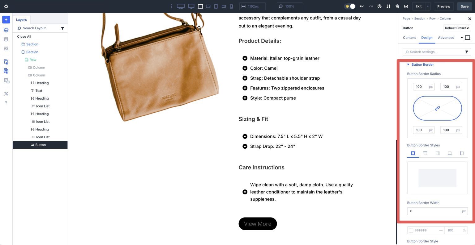
Next, expand the Button Border dropdown menu. Assign a 100px Button Border Radius. Add 0px to the Button Border Width under Button Border Styles.
In the Button Text dropdown menu, set the Button Font to Inter, Button Text Color to #ffffff, and Button Text Size to 16px.
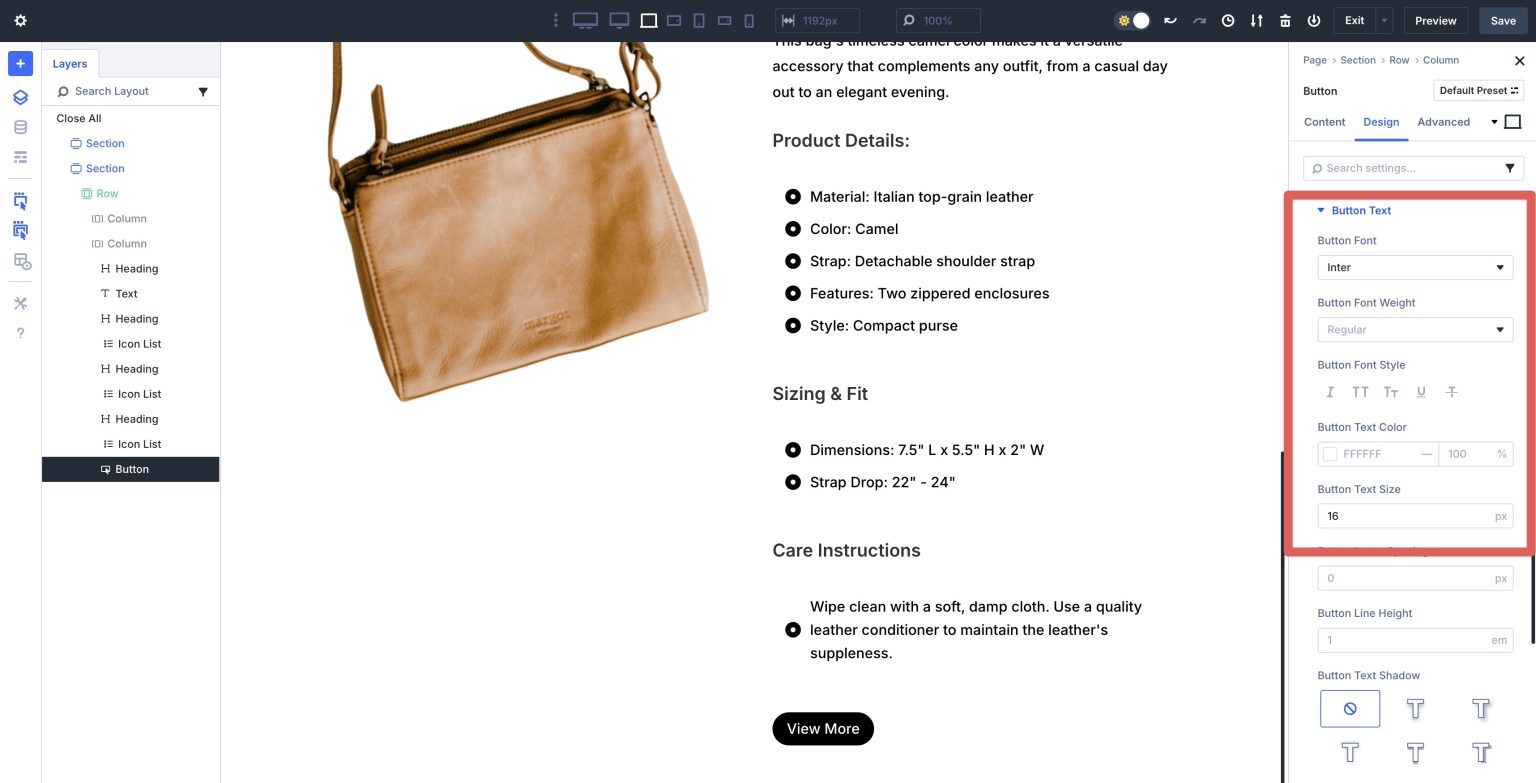
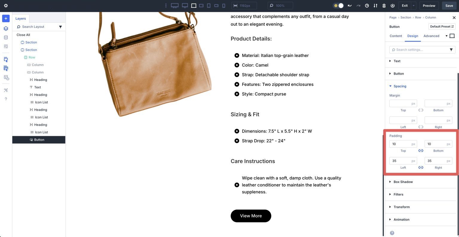
Finally, expand the Spacing dropdown menu. In the Padding settings, assign 10px padding to the top and bottom and 35px to the left and right.
Add A New Row
Click to add a new single column row underneath the row containing our product.
Add An Icon Module
Add an Icon module. In the module’s settings, select an icon for the module.
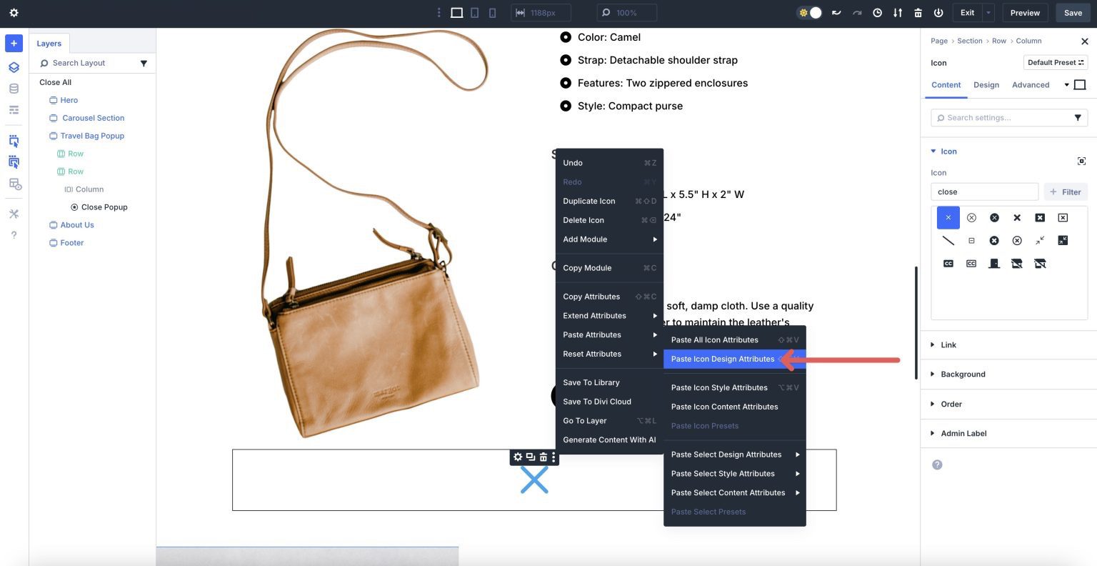
Rather than style the Icon module, scroll up, select an Icon module in the Group Carousel, right click to reveal the settings menu, and click Copy Attributes.
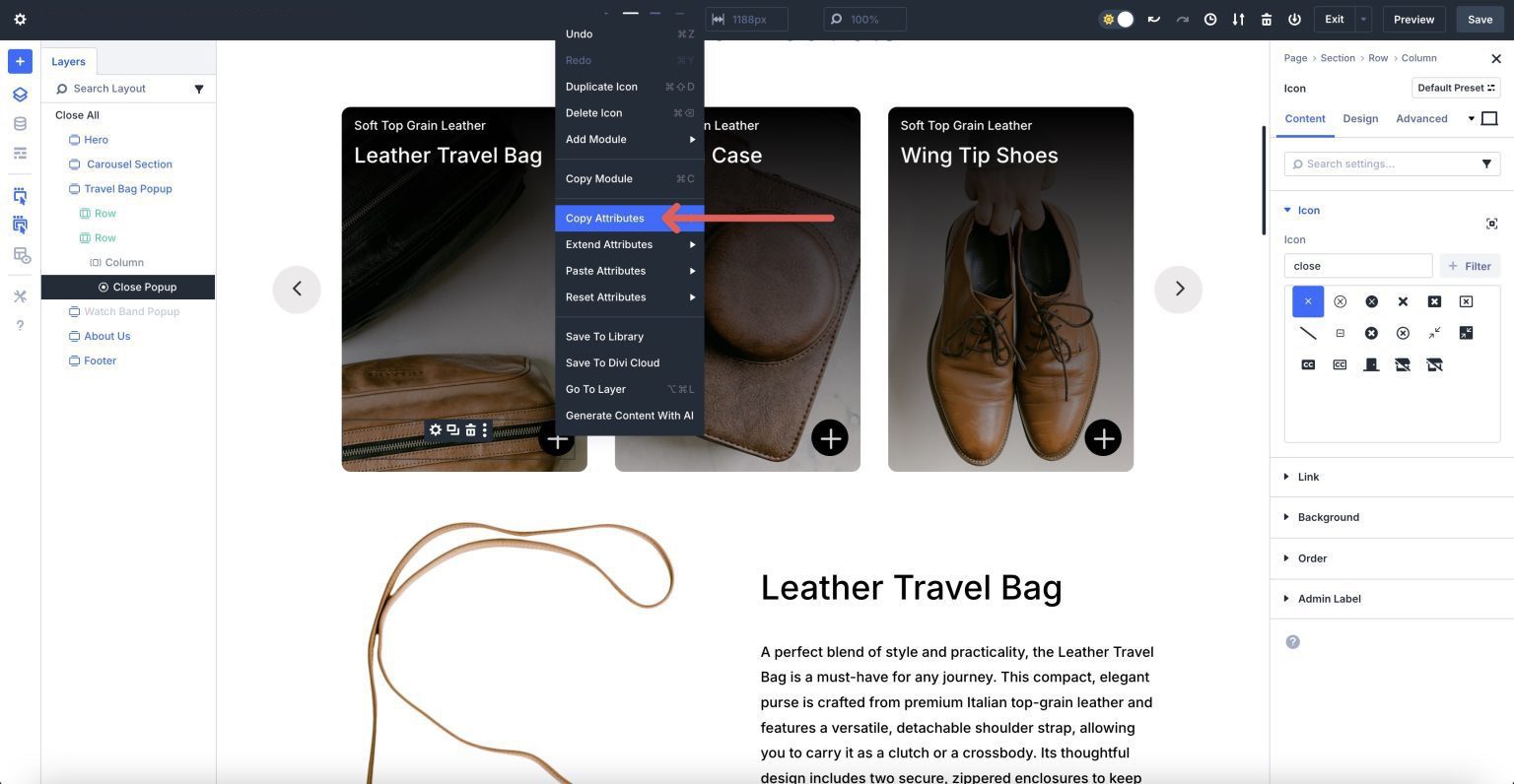
Scroll back down to the Icon module we added to the new row, right click, and select Paste Icon Style Attributes.
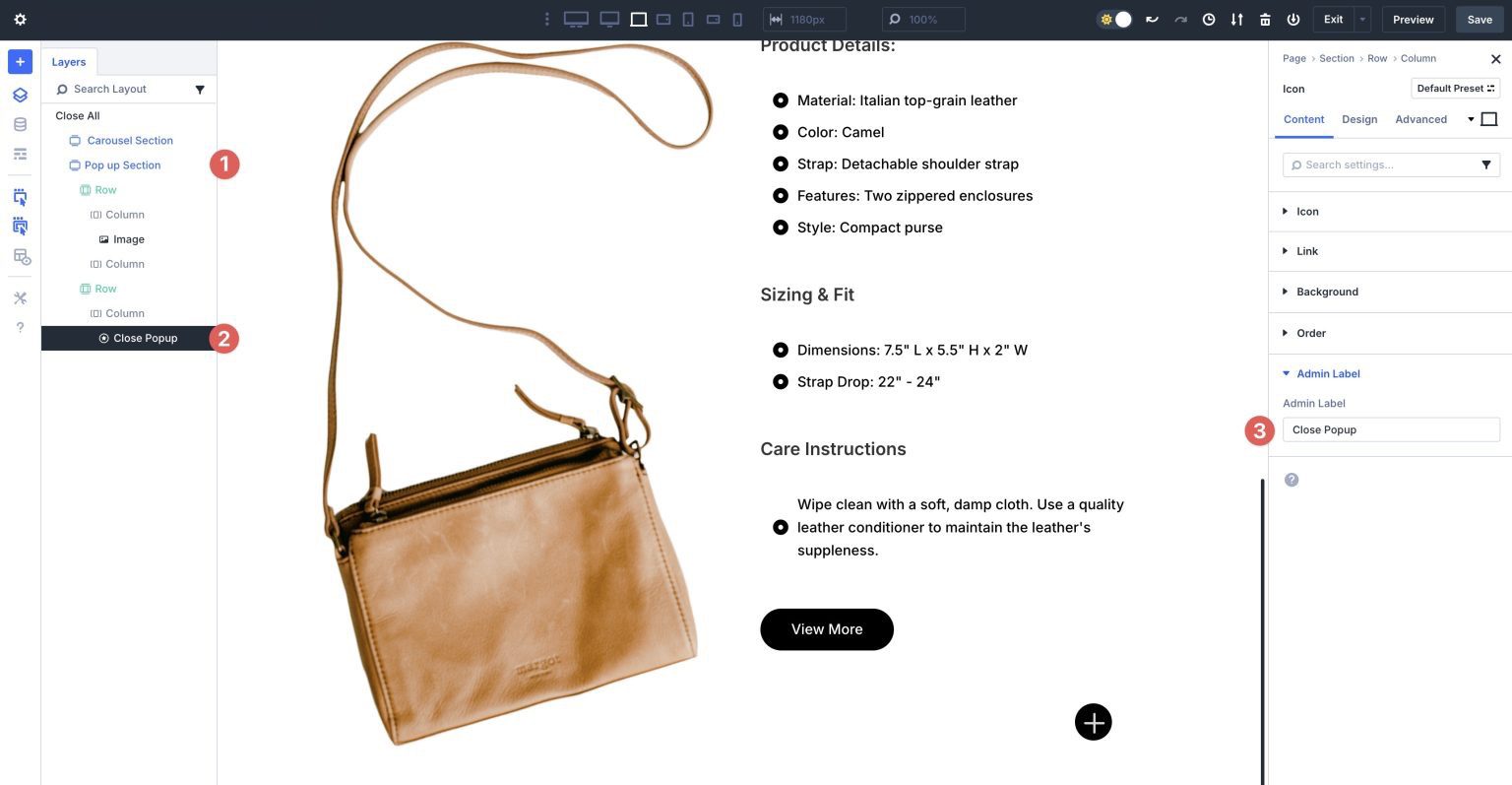
Assign Names To The Content Reveal Elements
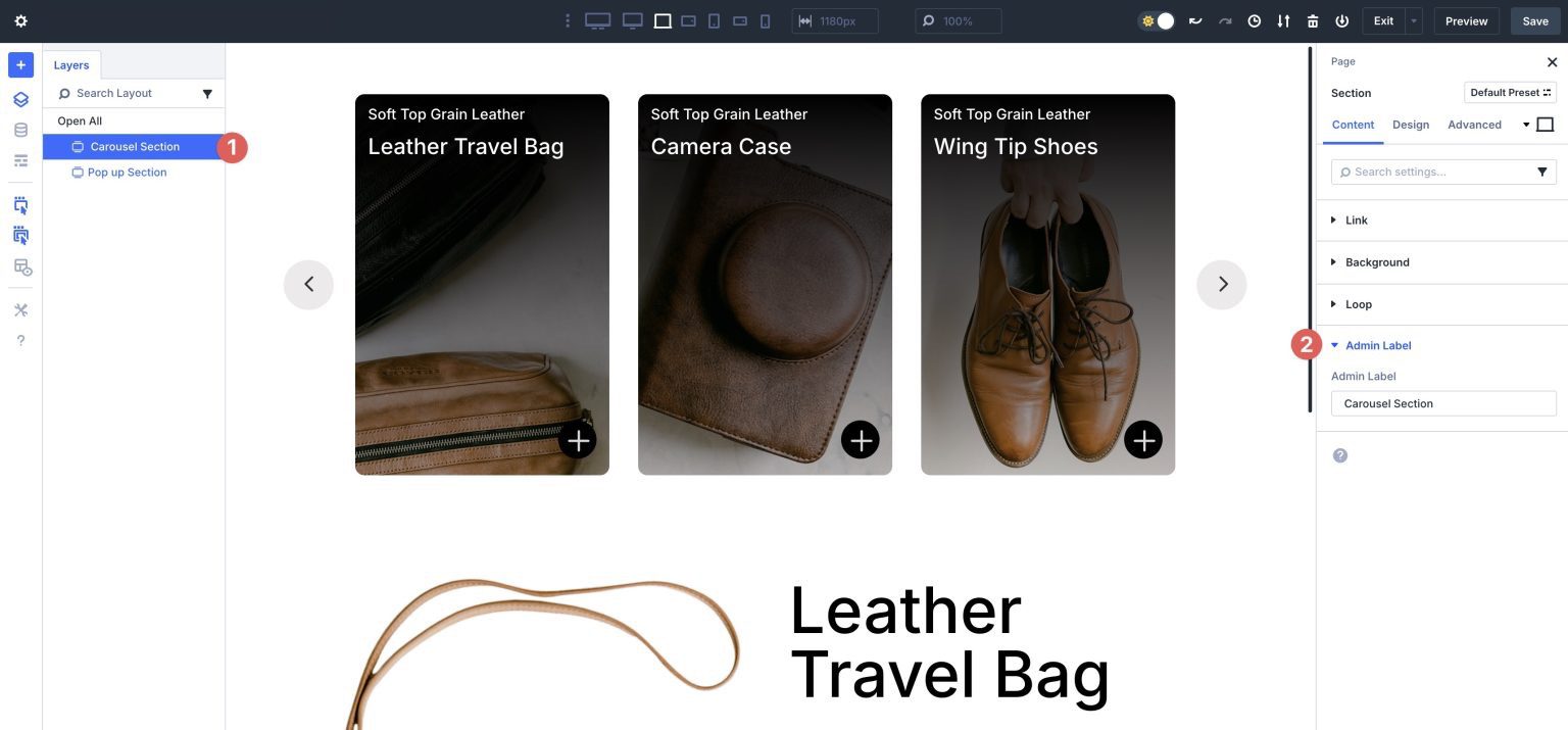
Before setting Interactions for the content reveal, we need to ensure everything is properly labeled. This will help us identify which modules to target when setting the Interactions. Name the first Section Carousel Section. This can be done in the Layers view or the Admin Label field of the section’s settings.
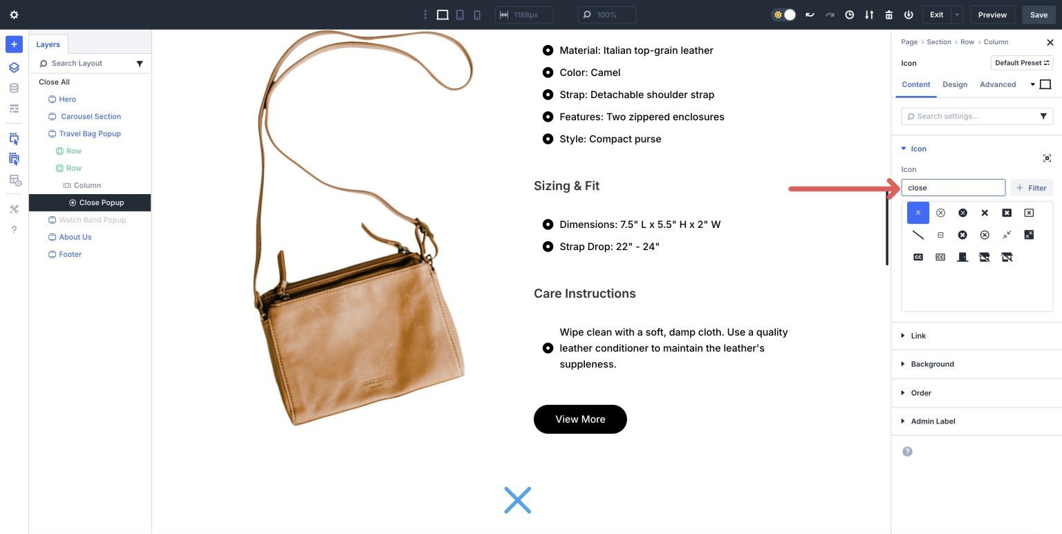
Expand the Carousel Section and locate the Icon module in the first column of the Group Carousel module. In the Admin Label field, enter Content Reveal Trigger.
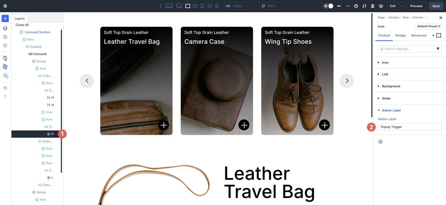
Repeat the steps above to name the second section of the layout to Content Reveal Section and the last Icon module in the second section to Close Content Reveal .
Step 6: Create The Interactions
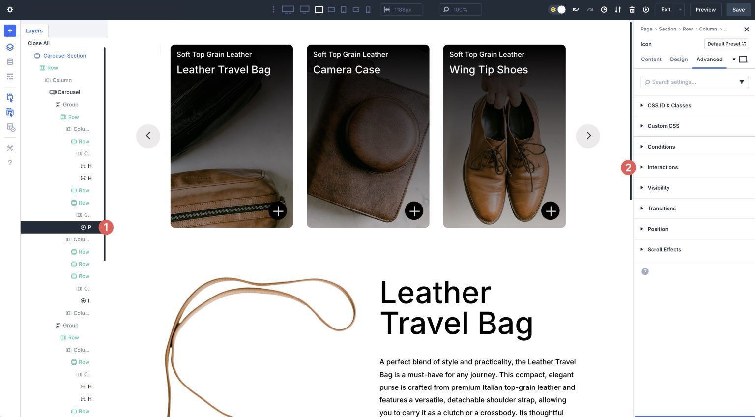
We must set up a few interactions to make everything work seamlessly. First, select the Icon module in the first section, located in the first column of the Group Carousel module. Navigate to the Advanced tab and expand the Interactions dropdown menu.
Click the + Add Interaction button to add a new Interaction.
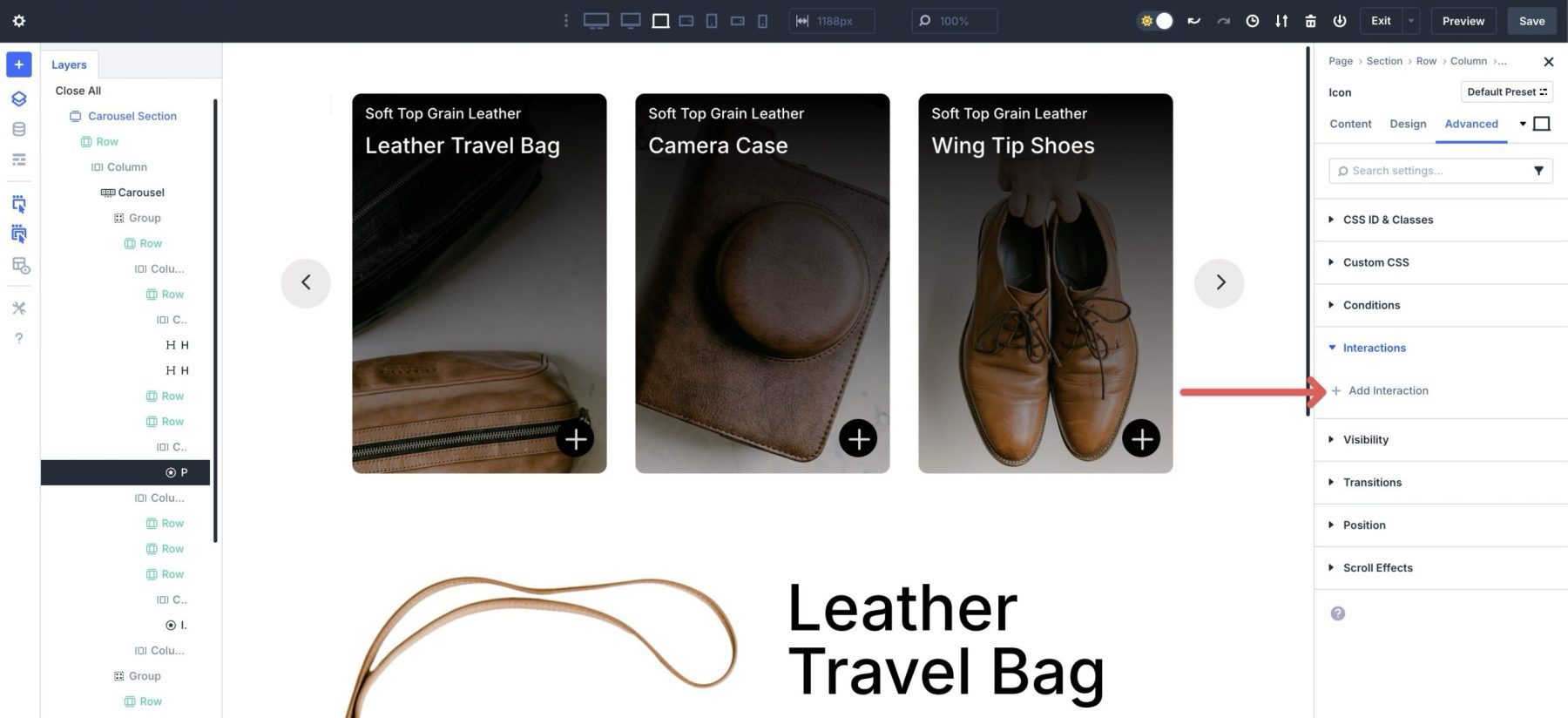
When the dialog box appears, use the following settings:
- Admin Label: Launch content reveal
- Trigger Event: Click
- Effect Action: Toggle Visibility
- Target Module: Section (Content Reveal Section)
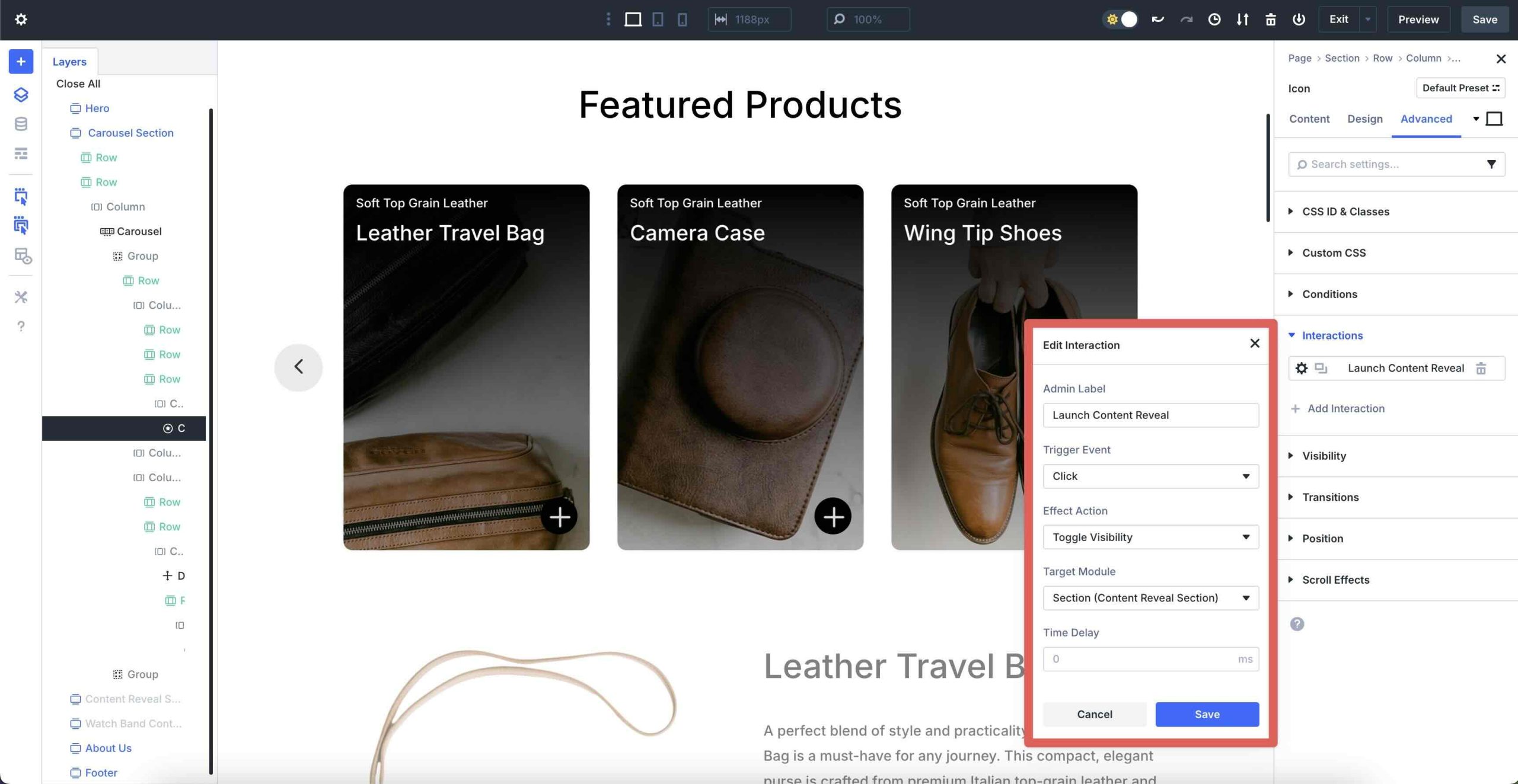
Be sure to Save the Interaction.
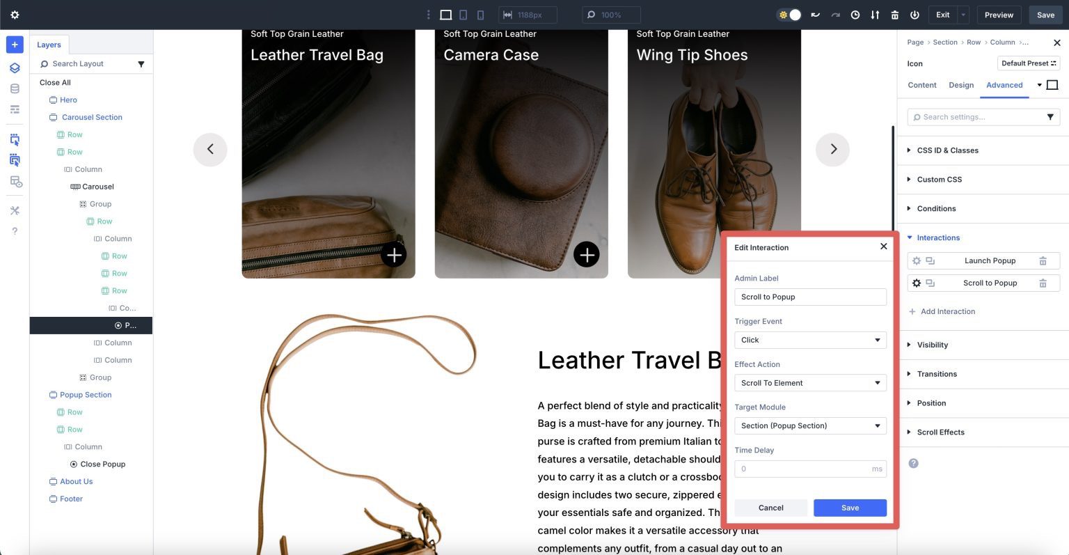
Create A Scroll To Content Reveal Interaction
We will create another Interaction that will scroll the user to the content reveal section. This will keep users from having to scroll unnecessarily to view the content reveal’s content. Click to add a new Interaction. Enter the following settings:
- Admin Label: Scroll to Content Reveal
- Trigger Event: Click
- Effect Action: Scroll To Element
- Target Module: Section (Content Reveal Section)
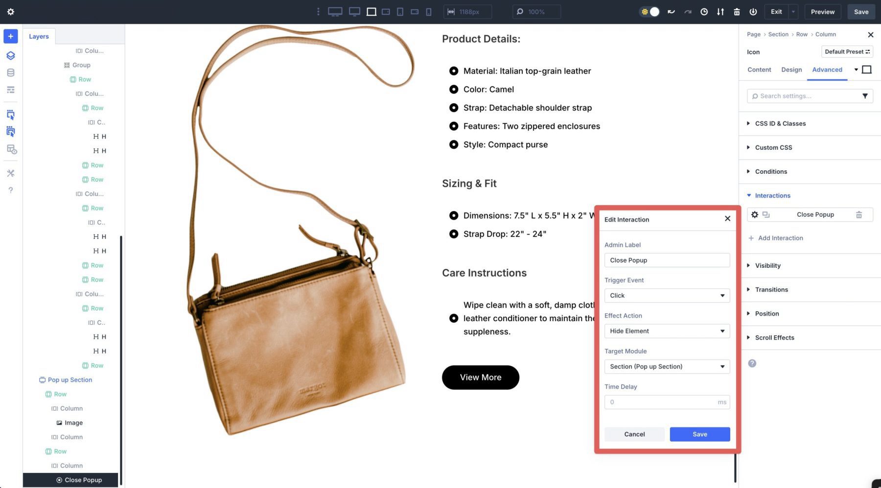
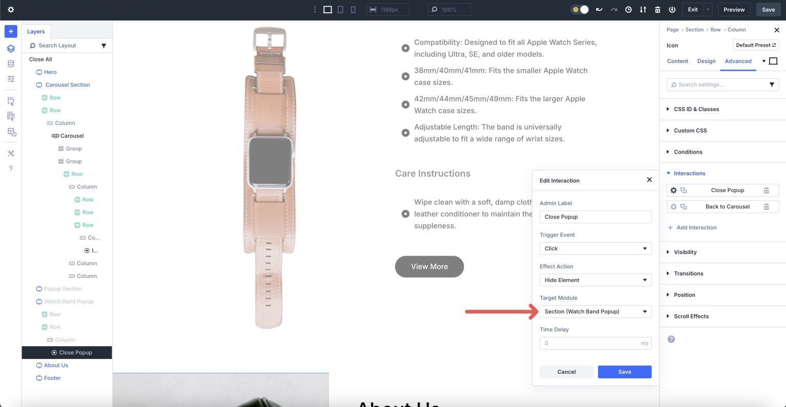
Create A Close Content Reveal Interaction
Next, we must create an Interaction to close the content reveal. Navigate to the row that houses our close button. Open the Advanced tab, add a new Interaction, and enter the following settings:
- Admin Label: Close Content Reveal
- Trigger Event: Click
- Effect Action: Hide Element
- Target Module: Section (Content Reveal Section)
Click the Save button to enable the Interaction.
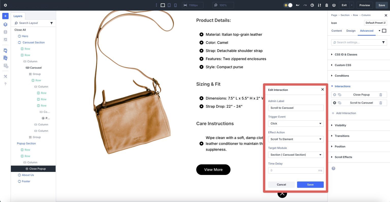
Create A Scroll To Element Interaction
We’ll create a second Interaction that will take users back to the Carousel Section once they close the content reveal. This is an important step, especially for mobile users who would otherwise have to scroll back to the top of the page to view additional slides.
Create a new Interaction and enter the following settings:
- Admin Label: Scroll to Carousel
- Trigger Event: Click
- Effect Action: Scroll To Element
- Target Module: Section (Carousel Section)
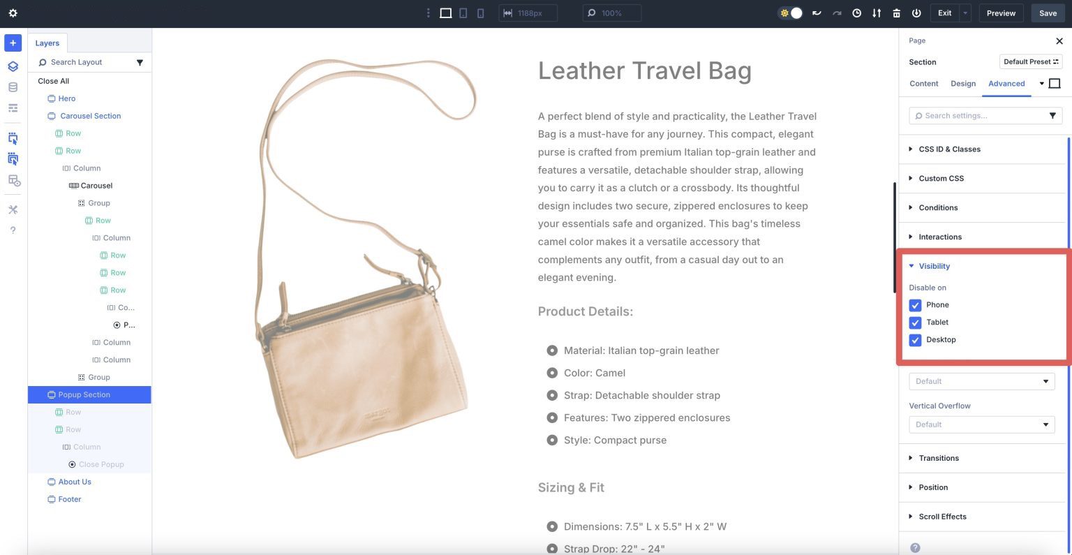
Hide The Content Reveal Section
The last step is to hide the content reveal section until a trigger is clicked. In the Advanced tab, click the Visibility dropdown menu. Select all three breakpoints — Phone, Tablet, and Desktop — to disable them.
Make responsive adjustments and preview the page in a new browser tab. The layout should look similar to this:
To create content reveals for the additional products in the Group Carousel, copy the Content Reveal Section using the Layers view and change the content.
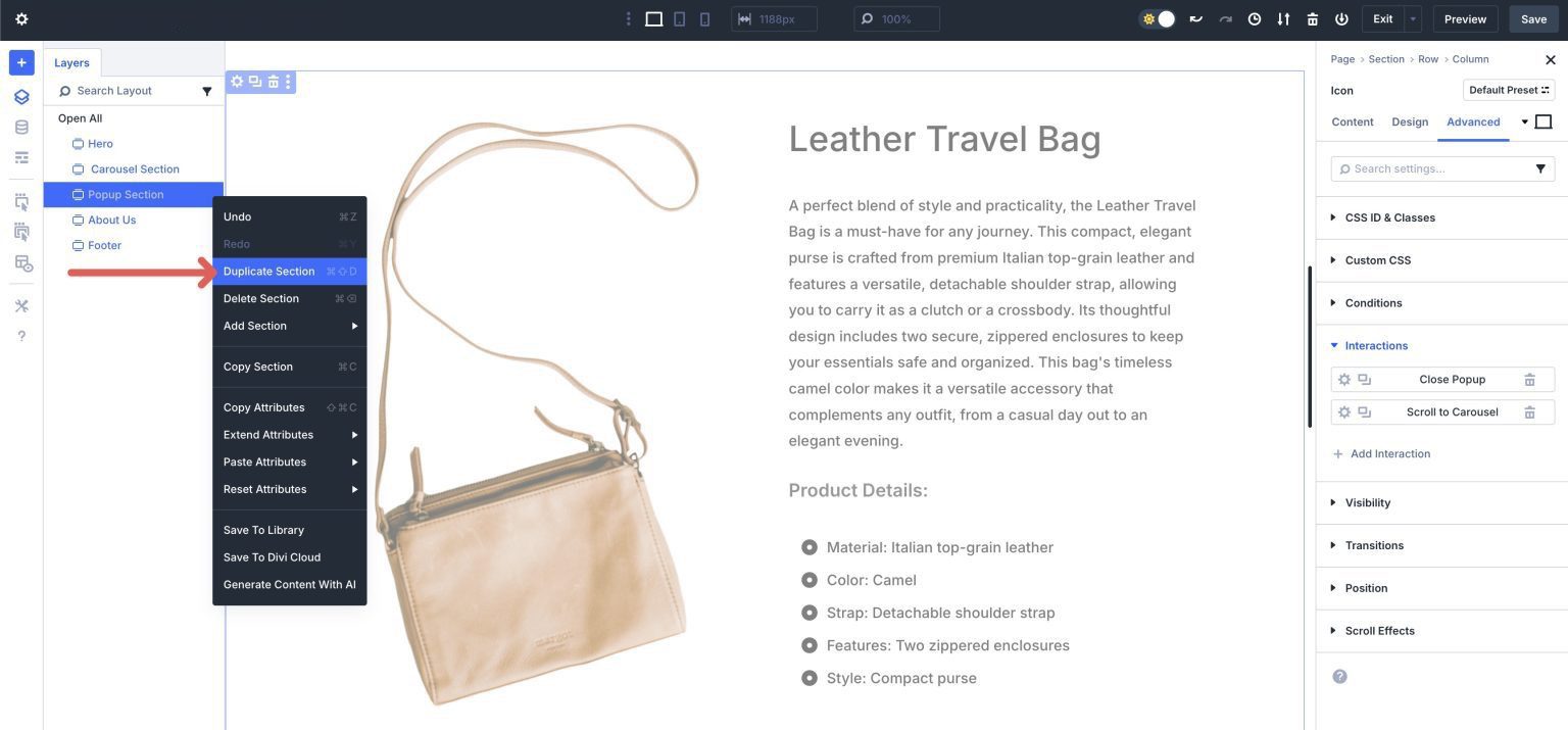
You’ll also need to adjust the Interaction triggers when you add new content reveal sections. For example, we added a new content reveal for the leather watch band in our Group Carousel module. To select the second Group in the Carousel, use the Layers view.
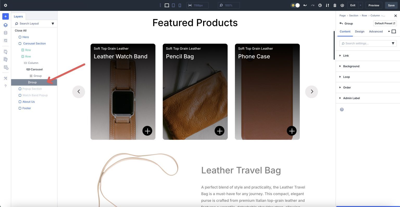
Click the Icon module in the first column of the second Group and navigate to the Advanced tab. Expand the Interactions dropdown menu and click on the first Interaction. Change the Admin Label to a different name and select Section (Watch Band content reveal) in Target Module.
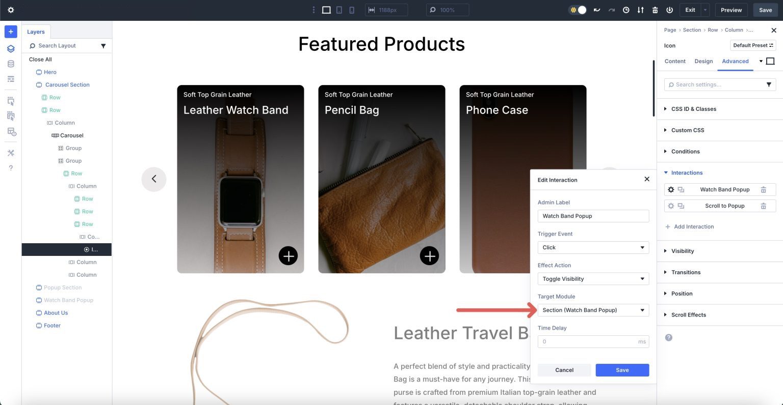
Repeat the steps above to adjust the Scroll to content reveal Interaction in the Carousel and the Interactions in the Watch Band content reveal’s close button Icon module.
That’s it! As you can see, Divi 5 makes it easy to add interactive content to your website in a few simple steps.

Build Interactive Carousels In Divi 5 Today
The integration of the Group Carousel and Interactions in Divi 5 gives you a powerful toolkit for creating engaging, visually stunning carousels. This is just a glimpse of what’s possible with Divi 5. As we continue toward the official Beta Phase, we’ll be rolling out even more features to enhance your design workflow. Now, it’s your turn to explore and experiment with these new features and share your thoughts with the Divi community!


Hi everyone! I’m testing Divi 5, and while I still find a few minor alignment bugs when using flex adjustments, overall it’s fantastic. Could you please help me with a question? I was trying to use dynamic file loading from the library via shortcode. As a test, I used interactions to hide a row and included some code with a shortcode. But I noticed that a blurb configured on the main page changes the characteristics of what’s being loaded. Do you have any tips?
Hey, Andre. Thanks for testing Divi 5! 😊
For your shortcode and dynamic file loading issue with interactions, keep in mind that Interactions can sometimes affect how content renders due to visibility toggling or dynamic loading timing. A good tip is to test shortcodes outside of hidden elements first to ensure they behave as expected, then gradually add interactions. Also, check if any CSS or scripts tied to the blurbs are impacting the loaded content. If the issue persists, feel free to reach out to our friendly support team, we’ll take a closer look! 👍