
Traditional layout methods often break at smaller widths. Content misaligns, spacing collapses, and manual fixes pile up. Flexbox solves this by defining relationships instead of fixed positions. In Divi 5, these controls live in the Visual Builder, and the new Flexbox release makes alignment, wrapping, ordering, and spacing straightforward across breakpoints.
In this post, we’ll walk you through using Flexbox for responsive design, and we’ll also show you how Divi 5 makes it easy to build responsive layouts.
Common Responsive Problems You Might Face
Your website looks perfect on your laptop screen. Then you check it on your phone, and everything falls apart. Most developers hit these same walls when building responsive sites. You spend hours getting one screen size right, only to find three new problems when you test another device.
These layout headaches show up in predictable patterns. Each fix for one screen size seems to break something on another screen.
Content Won’t Align Properly
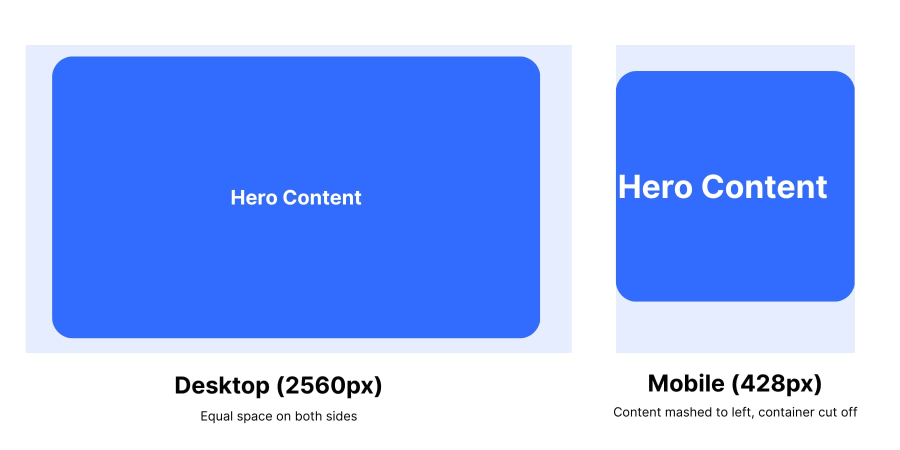
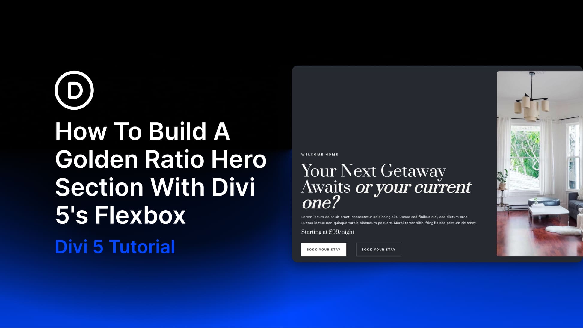
On desktop, the hero looks perfectly centered. On a phone, it suddenly feels clipped or shifted. That usually means the hero is a fixed-width box that doesn’t fit the smaller screen, so there’s nothing for the browser to truly center.
Fix it by making the hero flexible and letting the container handle centering. Give it a sensible max width so it can shrink on small screens, and center it with your layout alignment (Flexbox/Grid). The hero stays centered on desktop and fits cleanly on phones without overflow.
Uneven Spacing Issues
On desktop, four columns with small gaps can feel balanced. When the layout collapses to two wider columns on tablet, those same tiny gaps start to feel cramped.
Mixed content makes it more obvious: short cards leave awkward blanks while longer cards press against their neighbors. Generous desktop padding can also eat up space on a phone, shrinking the reading area.
Fix it by letting spacing scale with the layout. Increase gaps when columns reduce, keep a steady vertical rhythm, and ease side padding on smaller screens. If needed, adjust container spacing per breakpoint or let the container distribute space between items so everything breathes.
How Flexbox Solves Responsive Problems
Traditional CSS positioning relies on fixed measurements and flow manipulation. You float elements, clear them with hacks, and use positioning that pulls content out of normal flow. Every screen size needs different fixes because the relationships between elements aren’t defined.
Flexbox improves on this hacky method by relying on relational sizing instead of absolute measurements. Elements know how to behave relative to their container and siblings. Add content or change screen sizes, and the relationships stay intact.
Flexbox Handles Alignment Better
Flexbox fixes the math problems that break traditional layouts. When your hero item is fluid or narrower than its container, justify-content: center splits the available space evenly on both sides. Forget about manual margin calculations or negative positioning that only works on one screen size.
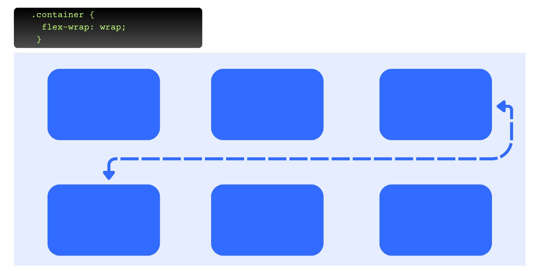
Element overflow becomes manageable. Set flex-wrap: wrap, and your three-column layout drops the third column below the first two when space runs out. Your content reflows instead of getting cut off or creating horizontal scrollbars.
Spacing Is Easily Adjustable
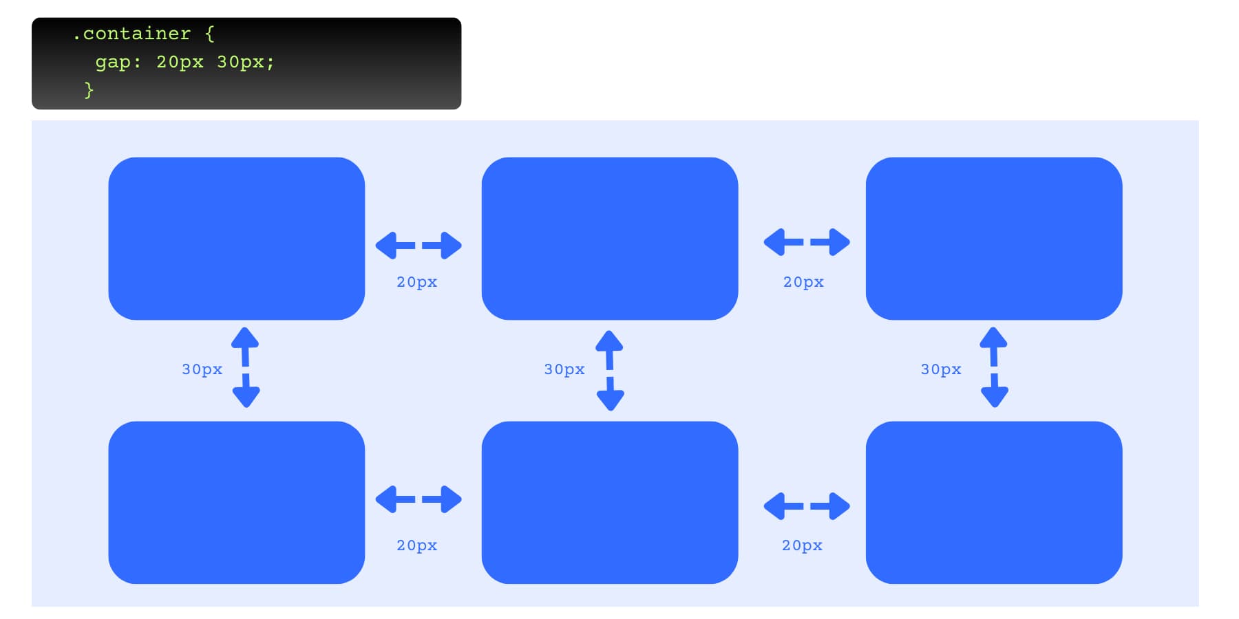
Fixed pixel gaps break visual proportion when containers change size. Those 16px gaps between 280px cards look balanced, but the same 16px gaps between 350px tablet cards look cramped. The spacing ratio drops from 6% to 4.5%.
The gap value is whatever you set. If you want spacing to scale, use relative units (%, vw) or clamp(), or use justify-content: space-between to distribute leftover space.
Traditional layouts use fixed pixel gaps that look cramped when content grows. Use justify-content: space-between when you want the browser to distribute leftover space between items. It’s different from gap (a fixed spacing value).
Layouts Can Be Adapted
Column structures flip with one property change. Your horizontal desktop navigation becomes a vertical mobile stack by switching flex direction from row to column at mobile breakpoints. The HTML is the same, but the layout behavior is different.
Element order changes without touching the HTML structure. The order property moves your sidebar above the main content on mobile while keeping it on the right on desktop. Content hierarchy adapts to different screen priorities using CSS alone.
How Divi 5 Simplifies Flexbox
Flexbox solves layout headaches that have plagued web developers for years. But consider this: you need to memorize dozens of properties and their interactions. Should you use flex-basis: auto or flex-basis: 0%? When does flex-shrink override flex-basis? How do align-content and align-items differ when flex-wrap is enabled?
Visual builders like Divi 5 put flexbox power into an interface anyone can use. You click “center” instead of remembering justify-content: center.
What Is Divi 5
Divi 5 represents a complete rebuild of Divi, not just an update. Our team spent over 2.5 years rewriting every module, setting, and interaction from the ground up. This fresh foundation replaces the old shortcode system with a modern framework that works better with current WordPress standards.

The changes run deep and affect how you work with layouts, design elements, and responsive features. Here are the major improvements:
- Complete codebase rebuild: Eliminates shortcodes, uses block-based framework, loads faster by only including modules you actually use
- Flexbox Layout System: Replaces Divi 4’s fixed block layouts with flexible Flexbox controls for alignment, spacing, and element ordering
- Option Group Presets: Create reusable style blocks for typography, borders, shadows, and backgrounds that work across different element types
- Loop Builder: Create dynamic content queries for any post type, supports WooCommerce products, ACF fields, custom post types, repeater fields
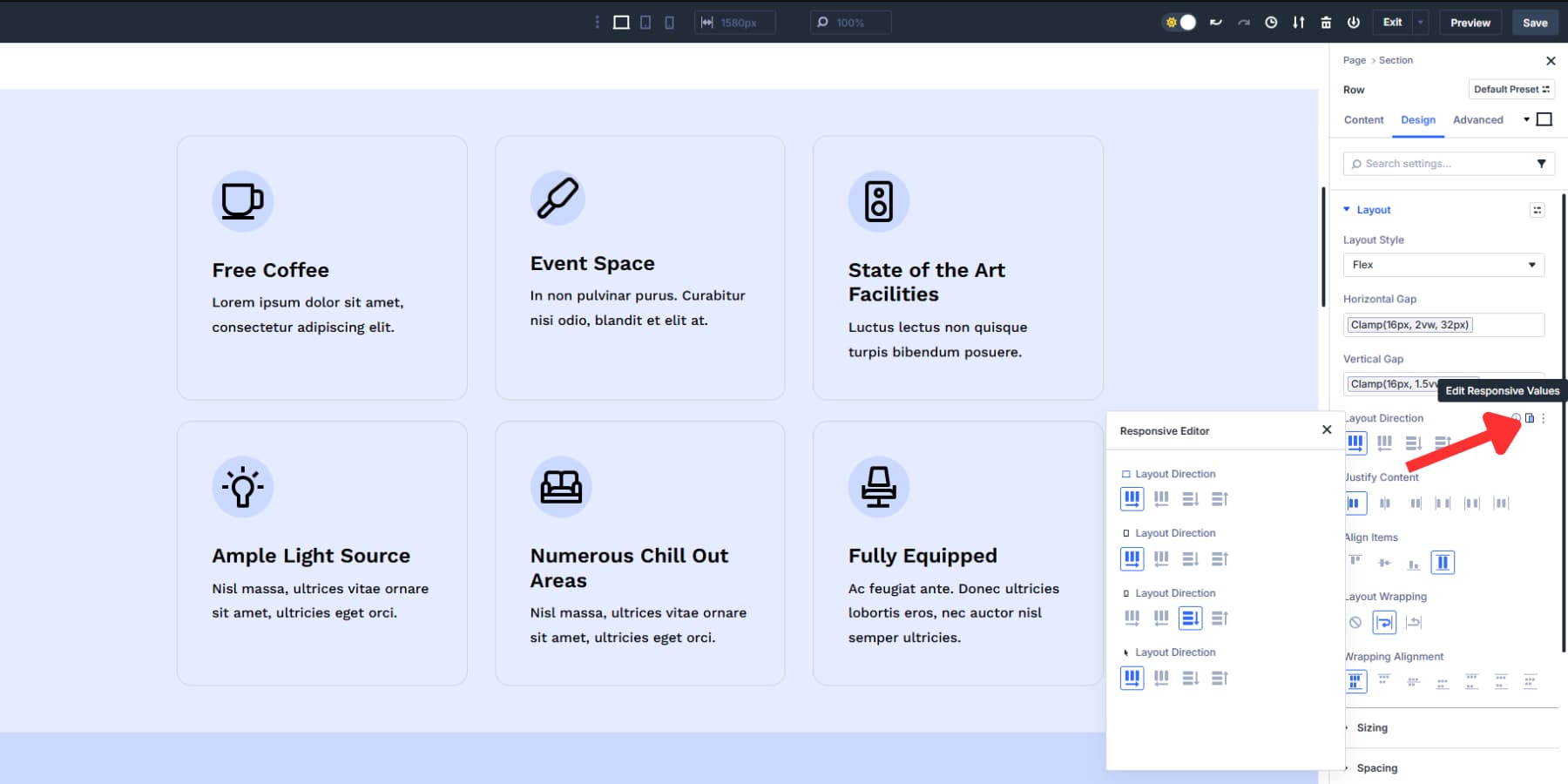
- Responsive Editor: View, modify, reset responsive, hover, sticky states for any setting across all view modes
- Design Variables: Store colors, fonts, numbers, images, text, and URLs as reusable values. Change your primary brand color once, and it updates sitewide.
- Advanced Units: Use CSS functions like clamp(), calc(), min(), max() through visual controls instead of writing custom code
- Relative Colors & HSL: Advanced color management with mathematical color relationships and HSL controls
- Nested Rows: Place rows inside other rows with infinite nesting depth for complex layout structures
- Interactions: Build popups, toggles, mouse movement effects, scroll-based animations without plugins
- Enhanced Visual Builder: Dockable panels, tabbed interface, light/dark modes, keyboard shortcuts, improved layers navigation with breadcrumbs
Building Responsive Websites With Divi 5
You’ve seen how flexbox solves responsive headaches, but theory only gets you so far. Real projects need a systematic approach that turns Divi 5’s powerful features into actual websites that work everywhere. Building responsive layouts becomes straightforward when you understand how to apply Divi 5’s tools in practice. Have a look:
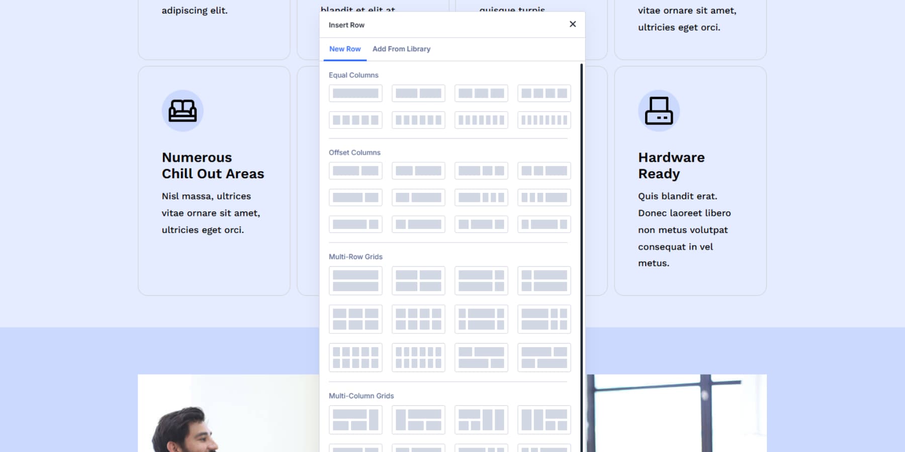
1. Start With Desktop Layout Using Flexbox
Your desktop version sets the stage for everything else. Open Divi 5’s Visual Builder and choose your row structure. The new row templates give you multi-column options from the start, but you can customize any layout once you dive into the settings.
If your Divi 5 website already has sections, you can convert the existing block sections to flex by going to Design > Layout > Flex.
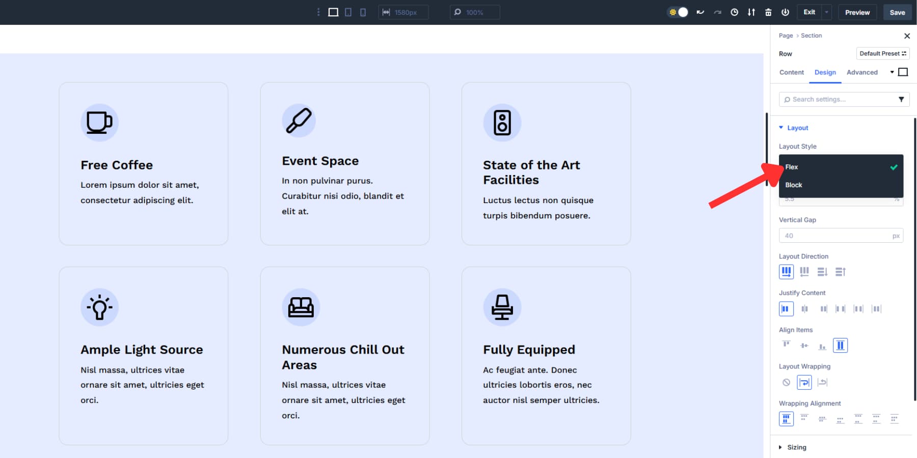
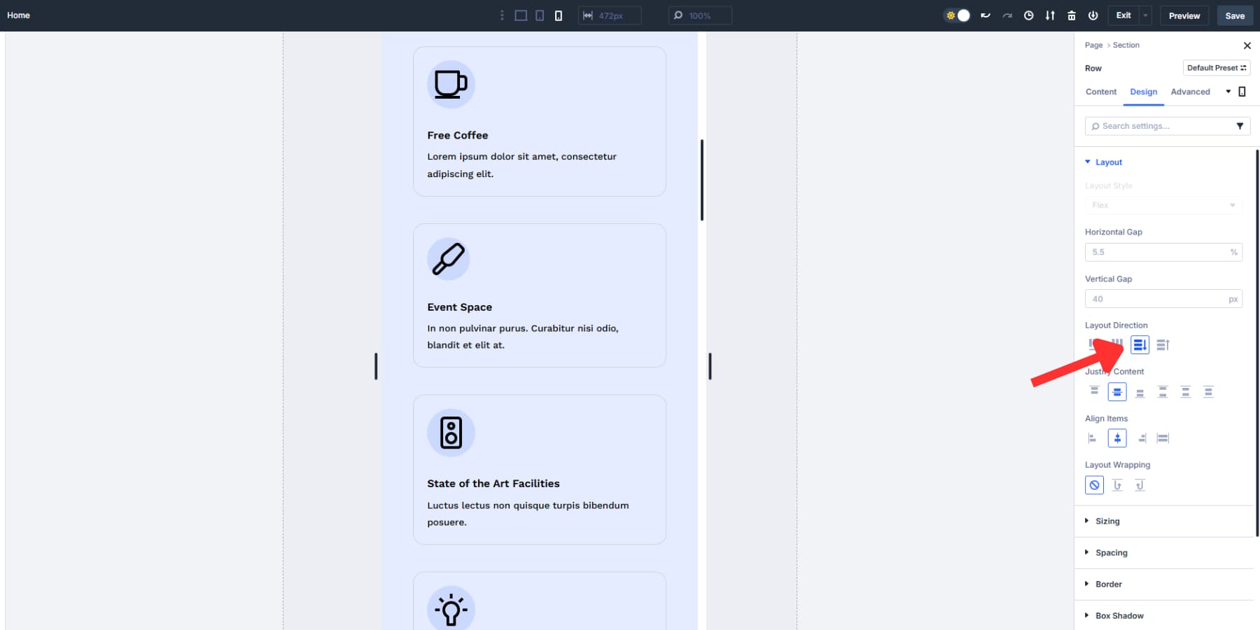
Direction controls whether your content stacks vertically or lines up horizontally. Row direction places elements side by side, while column direction stacks them top to bottom. Both options also have a reverse direction, which flips the sequence.
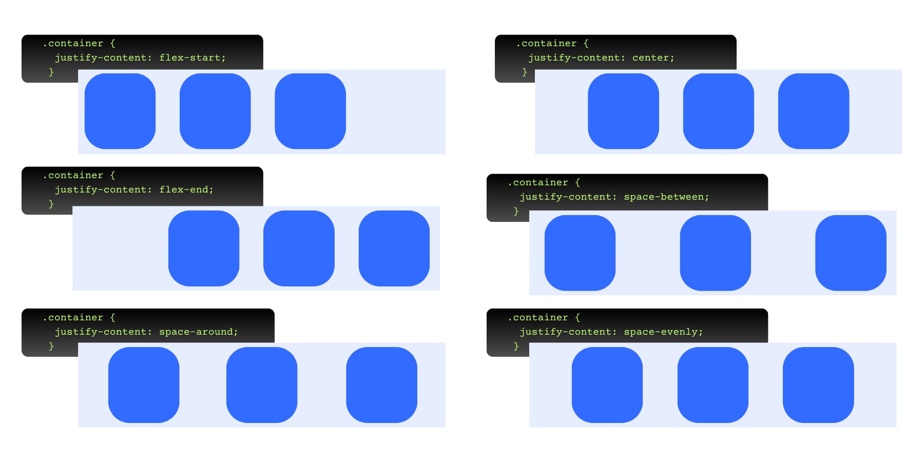
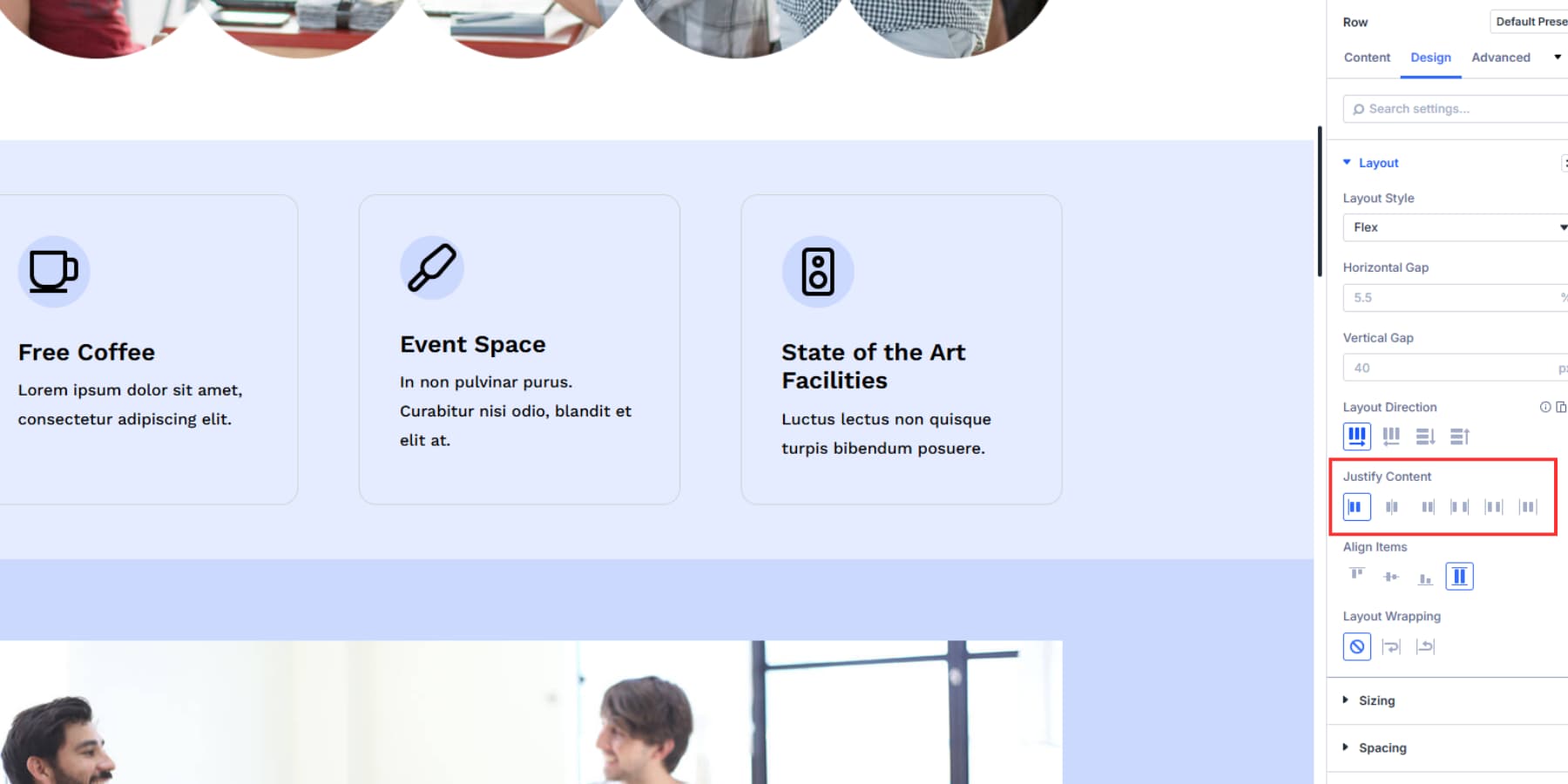
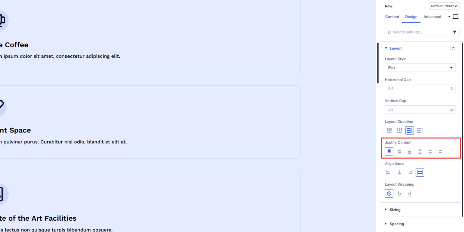
Justify Content handles spacing along your main direction. Start pushes everything to the left, End shoves it right, Center bunches everything in the middle, Space Between puts equal gaps between elements, and Space Around adds space on all sides.
For vertical layouts, “start” aligns items at the top, “middle” centers them, and “end” positions them at the bottom.
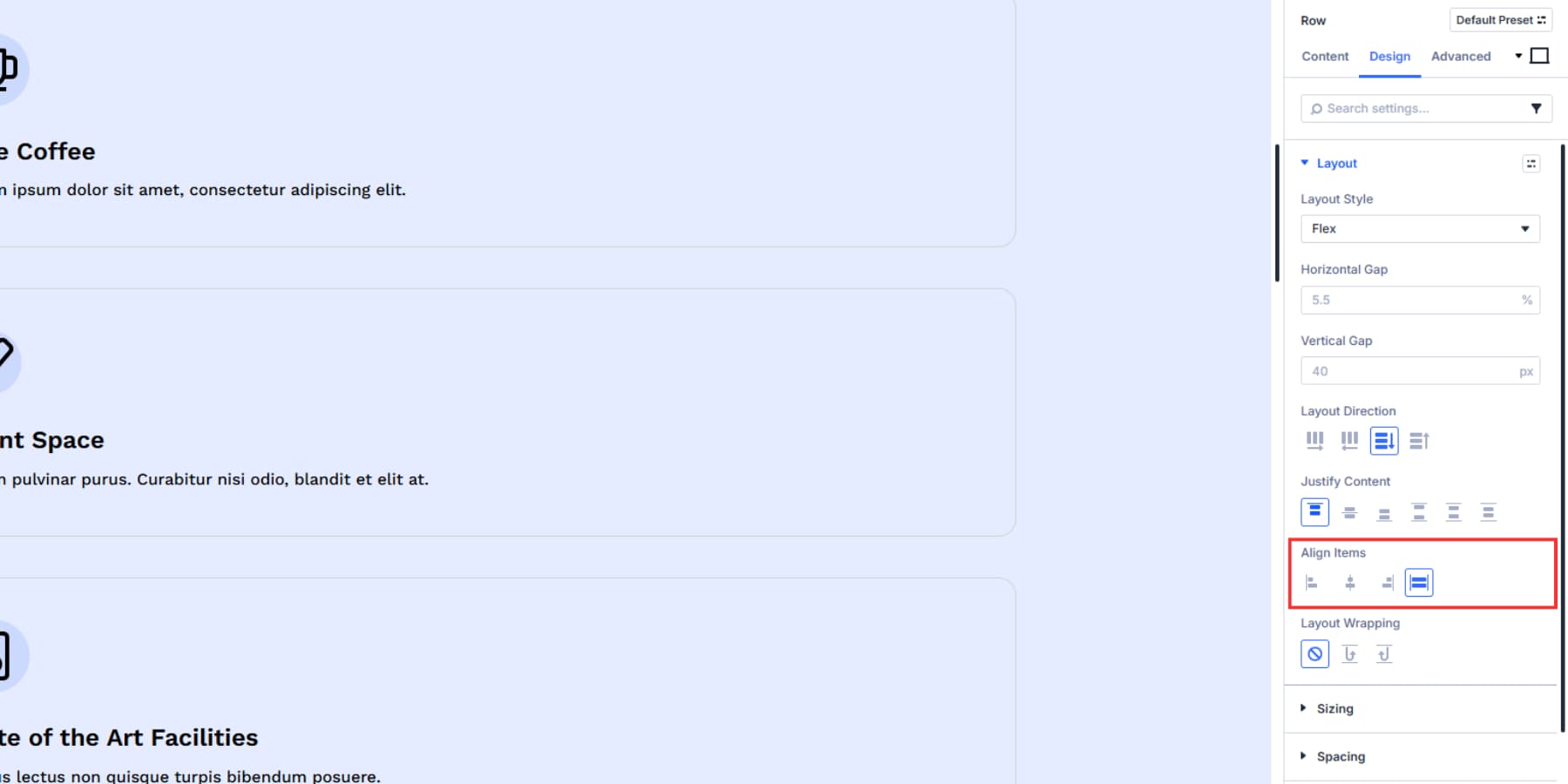
Align Items positions content along the cross-axis. With a row layout, that means it determines where items sit top-to-bottom. With a column layout, it sets where items sit left-to-right.
Layout wrapping decides what happens when content runs out of room. Wrap lets elements drop to the next line. Nowrap forces everything to squeeze into one line. Meanwhile, reverse wrap does what wrap does, but flips the sequence.
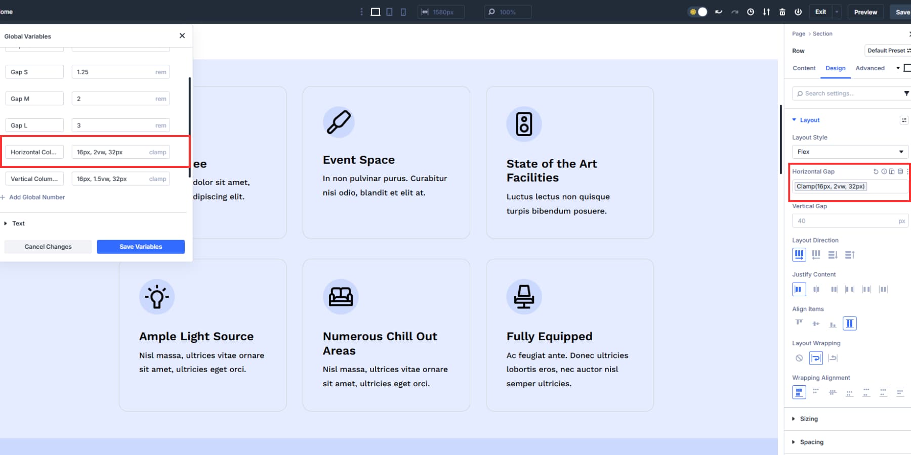
Gap controls set the actual space between elements. Use Design Variables here to store your spacing values. Create a variable and reuse it across your layout. Use Advanced Units with clamp() functions through visual controls, so your gaps scale smoothly between screen sizes without writing CSS, and keep your spaces proportionate.
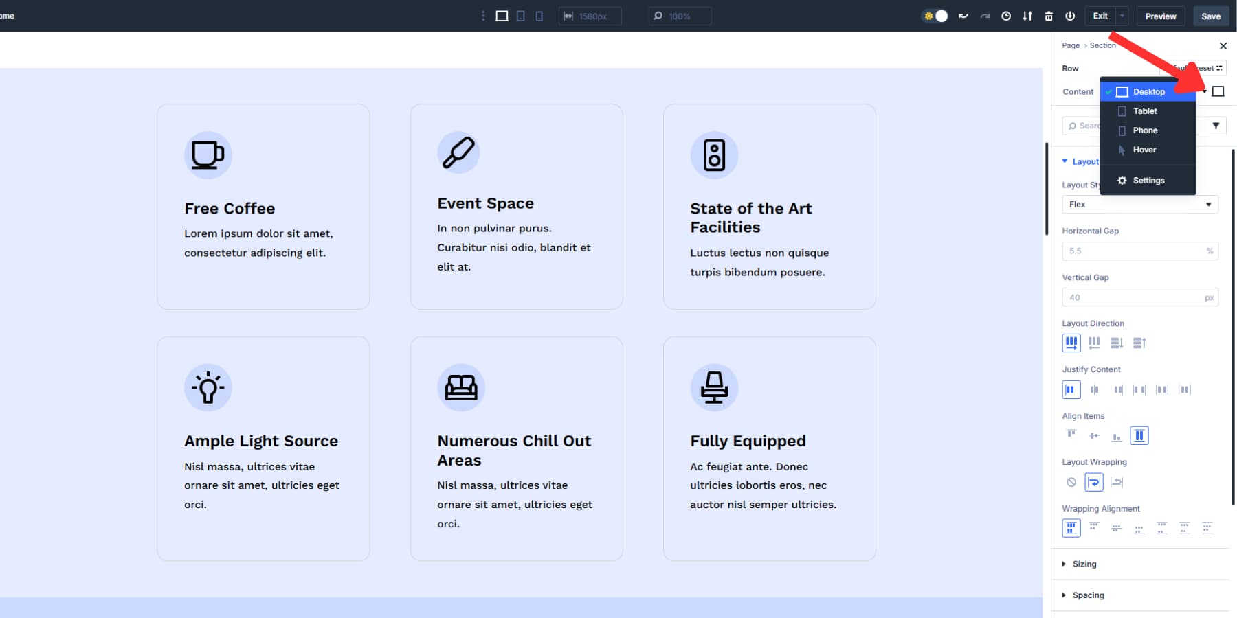
2. Configure Your Seven Custom Breakpoints
Divi 5 gives you seven breakpoints instead of the old three-size system. Divi 5 includes seven customizable breakpoints (Phone, Phone Wide, Tablet, Tablet Wide, Desktop, Widescreen, Ultra Wide). Widths are site-wide and editable; three are enabled by default.
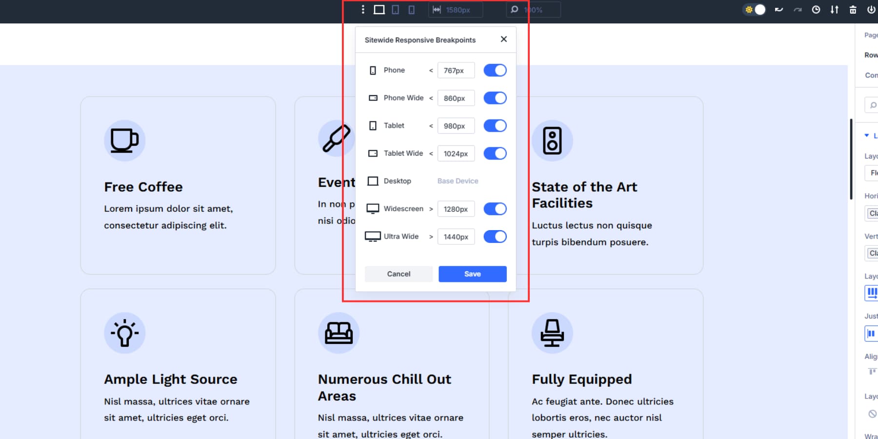
Click on any breakpoint value to modify it. Type in your custom pixel width. The system updates immediately across your entire website. All pages use these same breakpoint values, so one change affects your whole site’s responsive behavior.
Canvas scaling lets you test any breakpoint size by dragging the editor edges. The canvas scales down proportionally while maintaining accurate spacing relationships. Drag wider or narrower to see precisely how elements behave at different widths without switching devices or preview modes.
3. Adjust Spacing And Alignment On Various Breakpoints
Switch between breakpoints using the device icons at the top to preview how your layout looks at each width. This shows you exactly what needs fixing before you make changes.
Each column has responsive controls that let you adjust gap, direction, justify content, and align items for specific breakpoints while staying in your current view. This speeds up fine-tuning.
You may consider turning your desktop three-column row layout into single-stacked columns on mobile. If necessary, you can even change the alignment and justification.
If you used clamp() values to gap your columns and items, your gaps automatically scale smoothly between screen sizes. This reduces manual adjustments needed across breakpoints, since the spacing grows and shrinks proportionally with screen width.
Use Divi 5’s responsive editor for quick tweaks to individual elements without changing your main preview.
4. Preview Across All Breakpoints
Switch through all seven breakpoints to see your responsive design in action. Click from Ultra Wide down to Phone and watch how smoothly your flexbox properties adapt your layout. Your gap values should scale proportionally, alignment should stay consistent, and content should reflow naturally.
Test your layout with actual content instead of placeholder text for the best results. As we mentioned, clamp() will automatically adjust the spaces.
However, suppose you notice something is not right. In that case, you can update the Design Variable for the value, and it will automatically update everywhere, making manually finding and editing the gaps redundant.
This final walkthrough confirms that your systematic approach worked. Your desktop foundation, custom breakpoints, flexbox adjustments, and scaling units combine into a layout that works beautifully everywhere. You’ve created a truly responsive design that adapts intelligently to any screen size.
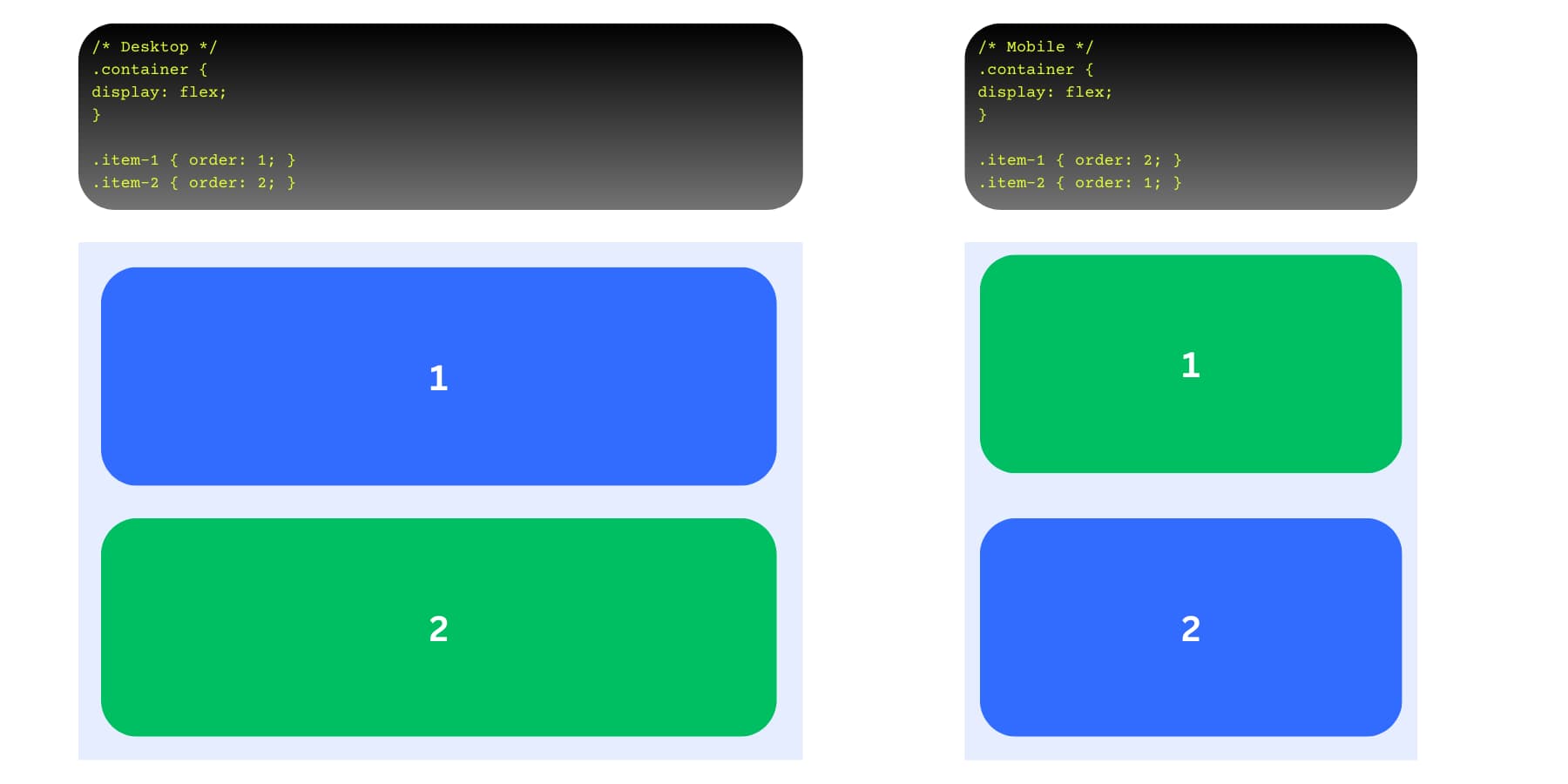
Reorder Content With Order Controls
Divi 5’s responsive controls solve the old mobile stacking problems that plagued earlier versions. Your three-column row desktop layout looks natural, but sometimes you need your CTA to appear between the value propositions on other breakpoints.
Switch to another breakpoint and open the Order tab. Change the first value proposition column’s order to one, CTA to two, and the second value proposition column’s order to 3. Each column gets a number. Lower numbers appear first in the stacking order.
Your desktop layout keeps its original order, while other device users see content arranged by priority. Each element gets a number, and Divi 5 arranges them accordingly at each breakpoint.
This removes the need to duplicate sections or create separate layouts. One set of content works across all screen sizes, just with different visual priorities for other devices.
Recreate Sections Easily Using Option Group Presets
Once everything works perfectly, save your responsive flexbox settings as an Option Group Preset by clicking its icon on the layout tab and labeling it appropriately.
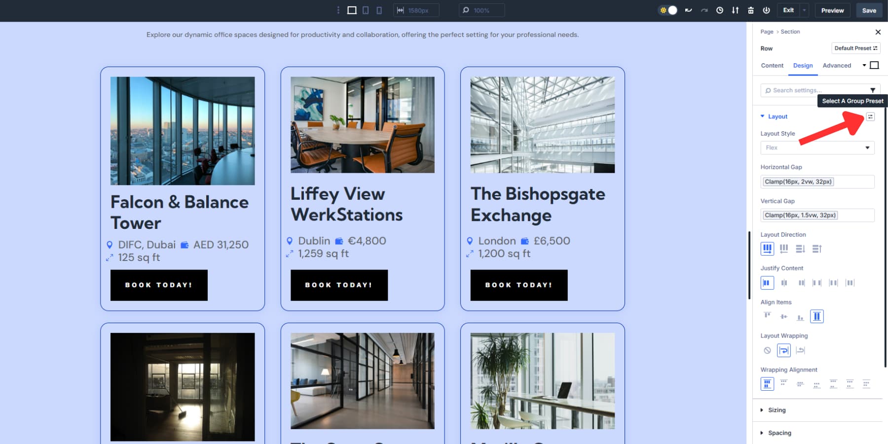
This captures all your gap values, alignment choices, and breakpoint adjustments in one reusable package. Apply this preset to future sections and get the same responsive behavior instantly, without rebuilding these settings from scratch each time.
Try Flexbox In Divi 5 Today
Responsive design challenges that once required custom CSS and complex calculations are now solved with Flexbox. However, it requires memorizing dozens of CSS properties and their interactions.
Divi 5 turns those complex CSS properties into simple visual controls. Your desktop foundation scales smoothly across all seven breakpoints with minimal intervention. All changes happen before you, in real time.
Get Divi 5 and start building with flexbox controls that actually make sense.


Hi there, one question.
You write : “Layout wrapping decides what happens when content runs out of room”
But the thing i don’t understand is : how do i decide if i want to have 3 columns.. or 2.. or 1, when content run out of room ?
Thx !
Hey Gus. You’d be looking at the width (+ gap) of each child element inside the Flex container to create “columns.”