
Divi 5 offers Flexbox, Nested Rows, and CSS Grid, which, when combined, build a stunning structure that stays responsive all the time. You can create a parent grid for your main structure, then build smaller grids inside its columns to organize content with real control.
In this post, we’ll show you how to create nested grids using these new features. We’ll recreate the design step by step and show you how to style each grid level separately, ensuring everything stays clean, flexible, and easy to update. Let’s get to it!
Step-by-Step Tutorial On Creating Nested Grids
Before we get started, let’s take a quick look at the grid layout we’ll recreate:
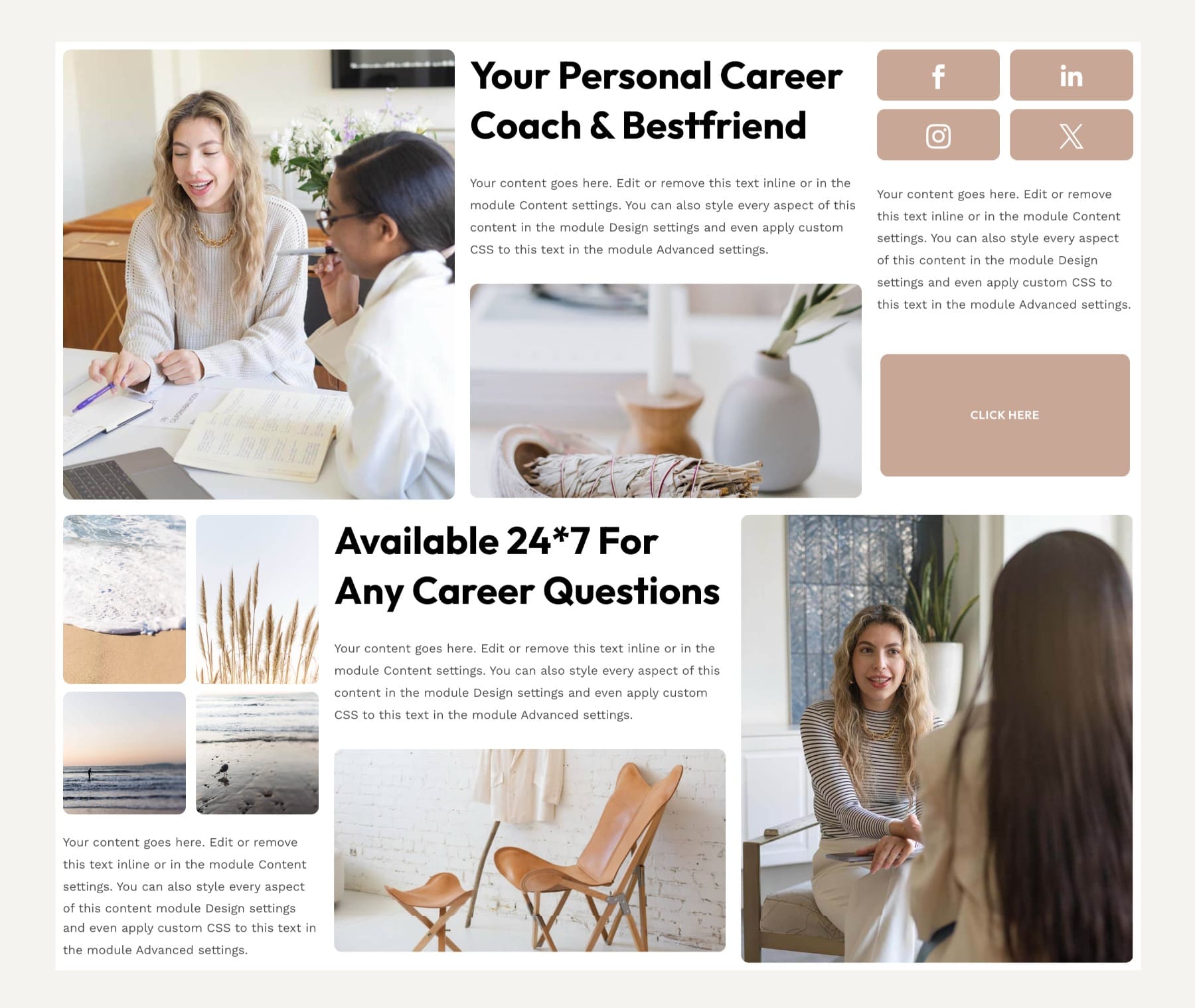
This layout uses one main grid to hold two sections of content. Each section includes its own smaller grid for images, text, and social icons. The parent grid controls the overall structure, while the inner grids keep each content group perfectly aligned. Both sections stay balanced on desktop and reflow naturally on mobile, even though each part uses a different layout pattern.
We’ll use a combination of CSS Grid, Nested Rows, and Flexbox to build this. If you want to learn more about how each of these layout methods work, those guides cover everything in detail.
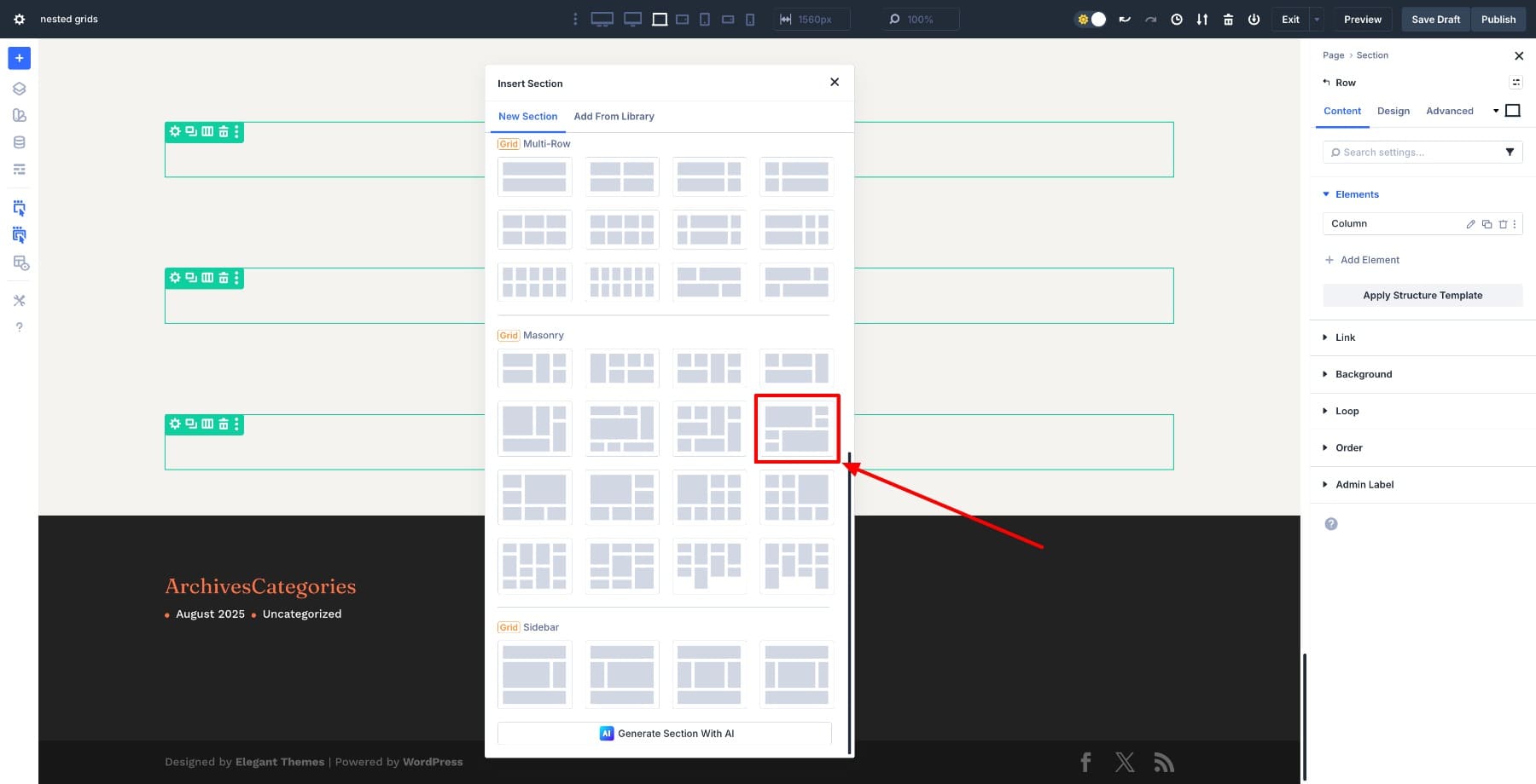
1. Set Up Your Main Grid Structure
Start with a new Section and insert a Masonry Grid Row.
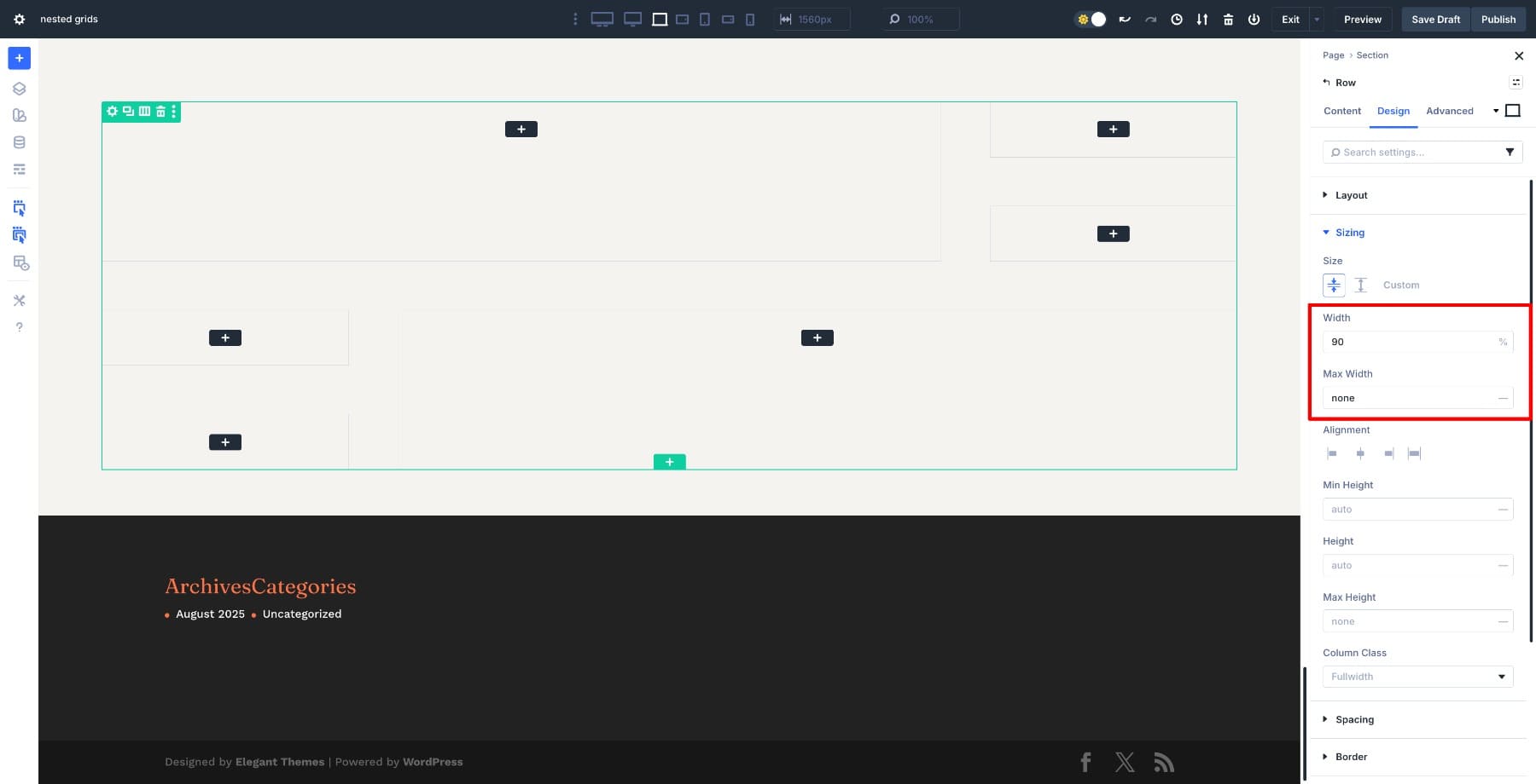
Set the Row’s Width to 90% and Max Width to none.
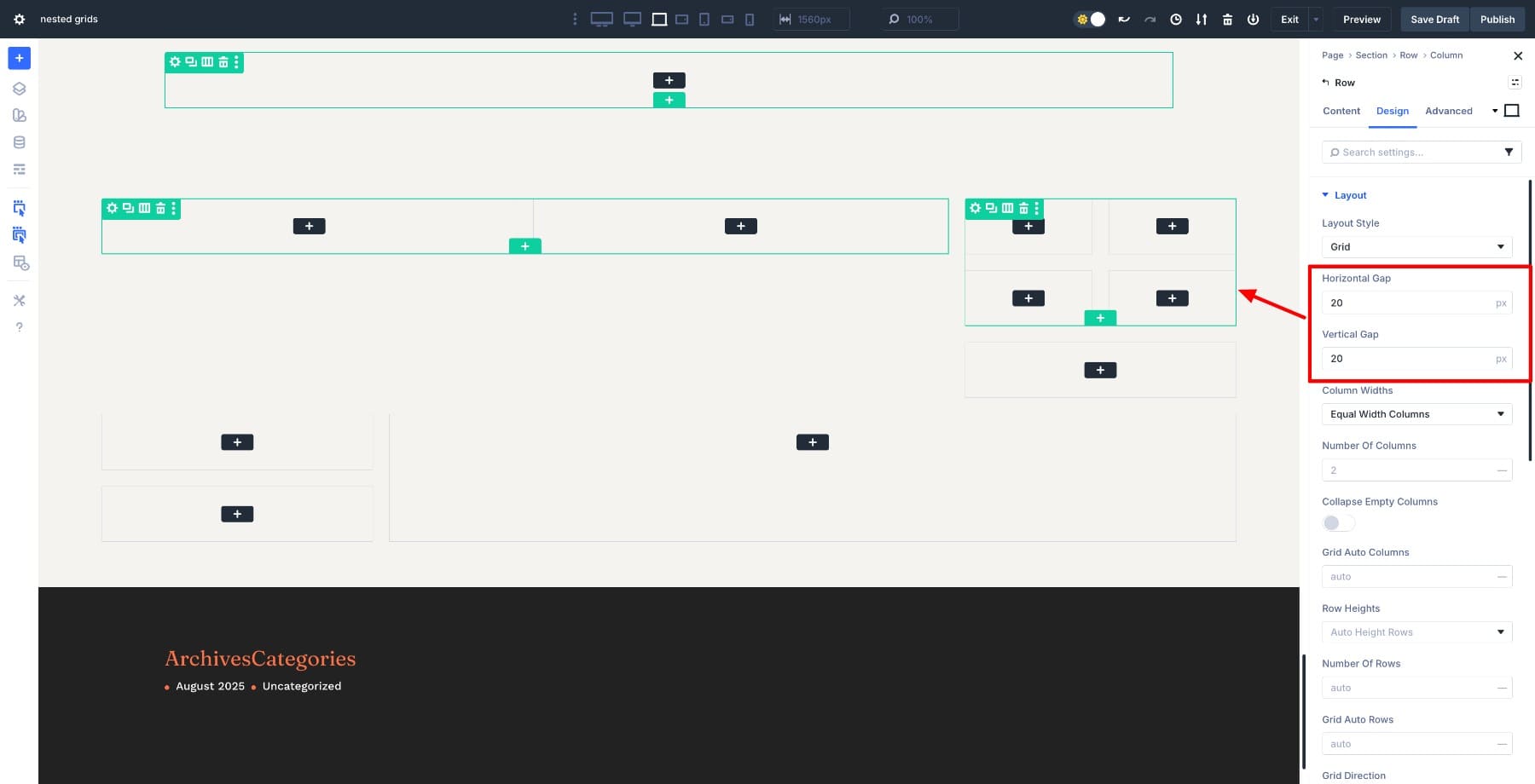
Go to Design > Layout and set Horizontal Gap and Vertical Gap to 20px. This keeps the row gap consistent across columns.
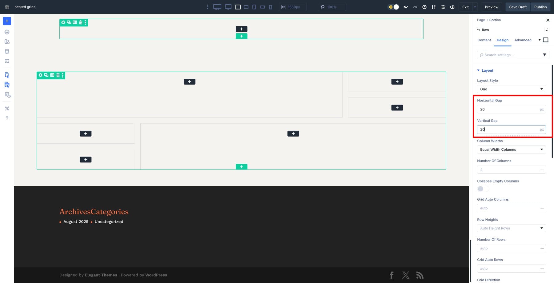
The parent grid acts as the main layout frame, so keep its spacing clean and consistent before adding anything inside.
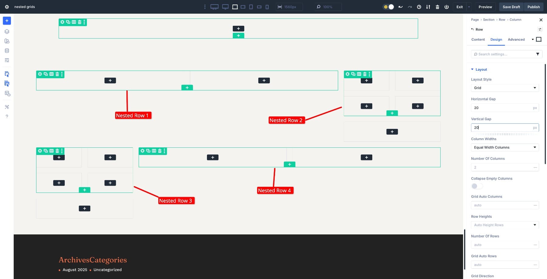
2. Nest Grids For Content Sections
Nest a two-column Flex row in the left column and a 4-column Grid row on the right.
The left column will hold the image and description. The right column will have social links. Set the Horizontal and Vertical gaps to 20px in both rows (we might change them later).
Repeat the same steps for the rows below. This gives you one main row and four nested rows inside the structure.
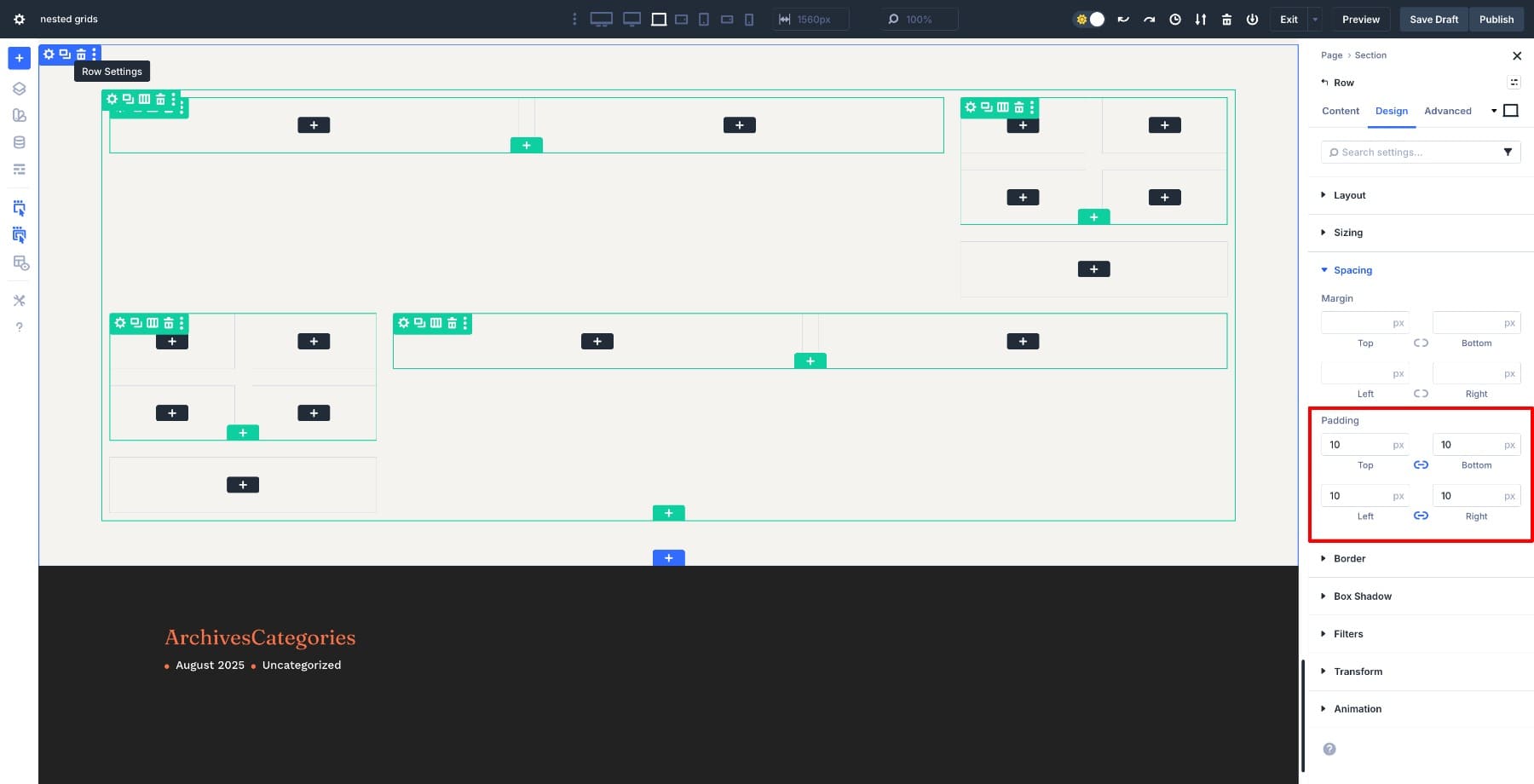
Add 10px Padding in all directions of the parent row to maintain design consistency.
3. Fill Grids With Images, Text, And Icons
Fill the first nested two-column row on the left. In the left column, add an Image module and upload your main coach photo. Keep the image full-width so it fills the column, then give it a small Border Radius (10px) in the Design tab to match the rounded card style.
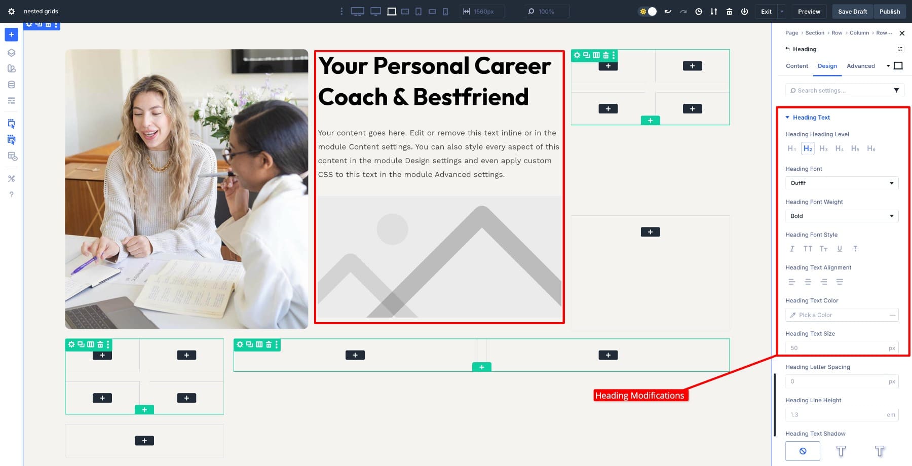
In the right column, add a Heading module. Customize it, paste your title, and set it to an H2 tag in the Design tab. Under that, add a Text module for the body copy with your short description paragraph, then add another Image module.
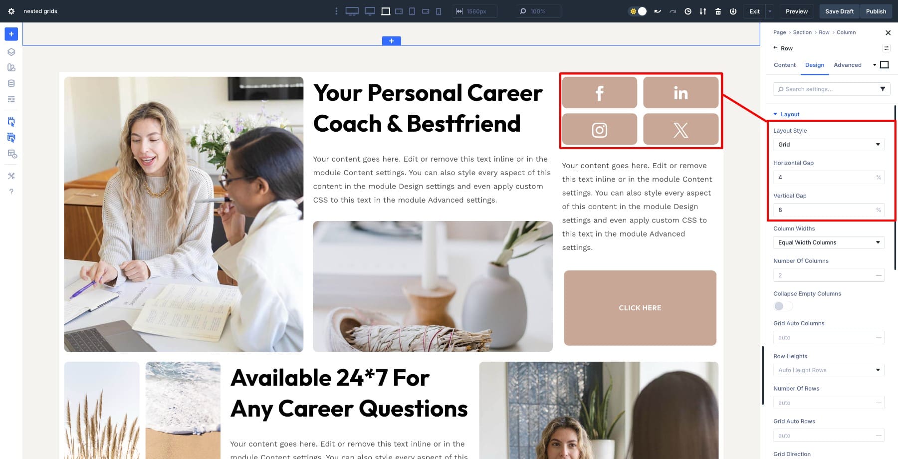
Move to the nested four-column grid in the right parent column. Add an Icon module into each column and keep only one network per module, so each icon sits in its own square.
Add 20px top and bottom padding to all icons so they sit in the center.
Adjust the Background Color (#C8A797), Icon color (#FFFFFF), and column’s Border Radius to 10px to match the design.
Below the social icons, insert a Text module.
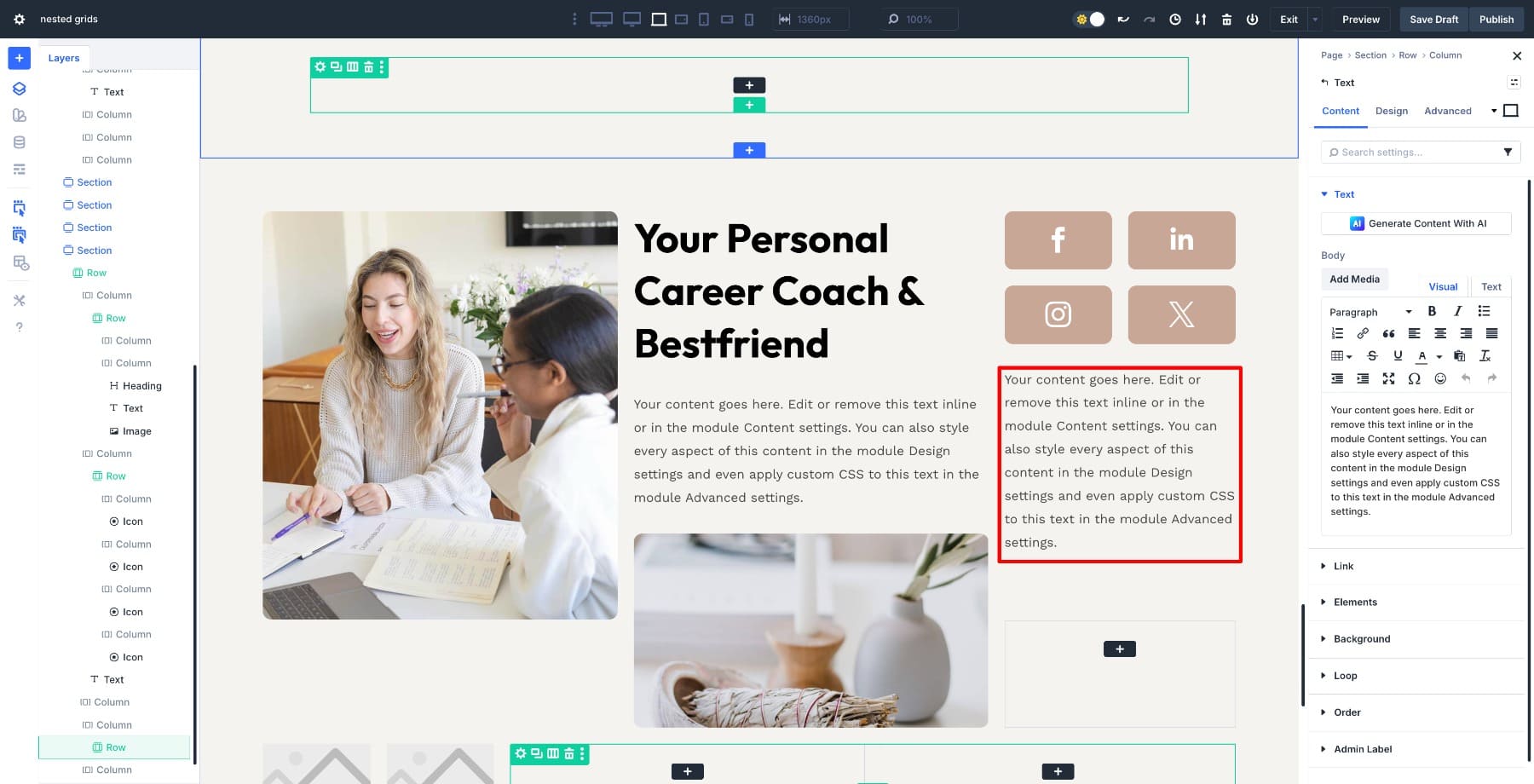
Add a Button module in the column below it. Customize it with Background Color, Border Radius (10px), and Padding 20% top and bottom, 35% left and right.
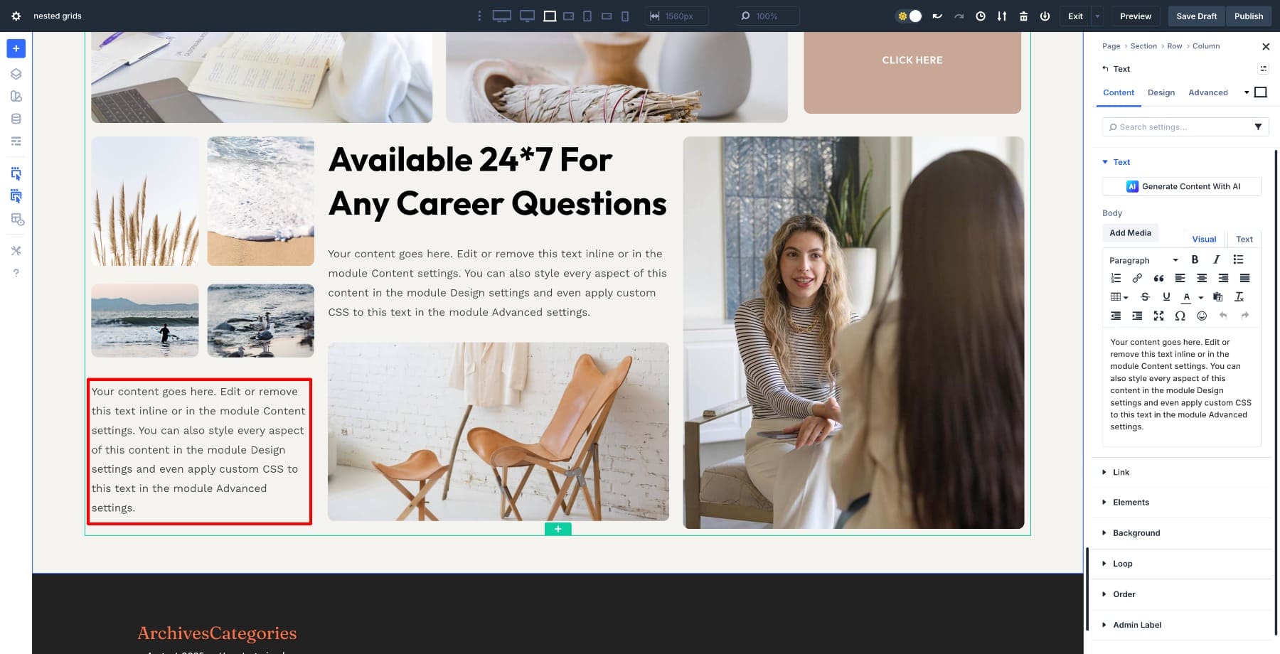
Repeat the same pattern in the lower nested rows. This time, the left nested grid will hold four images since you don’t need social media icons again.
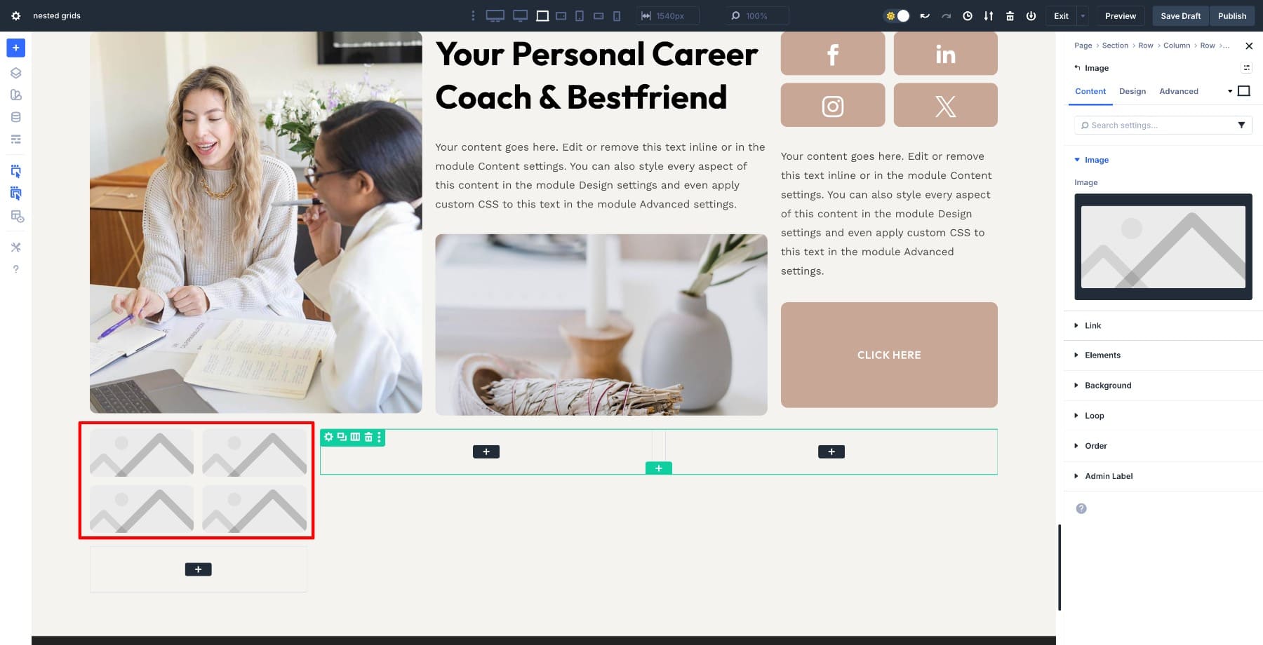
In the column below the images, add a Text module. For the rest, follow the same structure.
4. Apply Different Styles To Each Grid Level
With the content in place, clean up the layout. Start by styling the parent row. Change the background color to white to separate the layout from the page background.
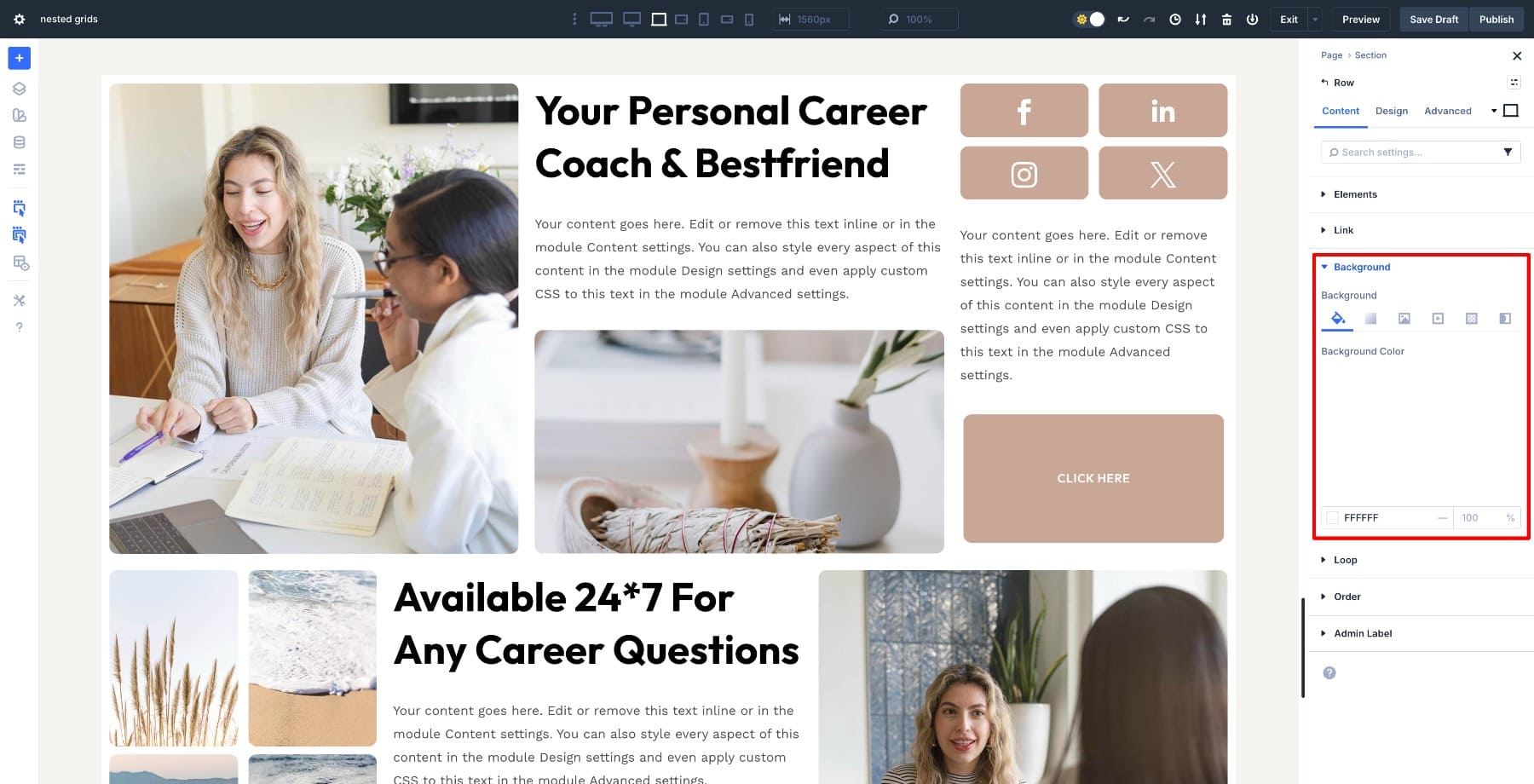
Remember how we added 10px Padding on all sides? That now handles the outer spacing for the entire structure, keeping the layout clean without touching individual columns.
Move into the nested 4-column grid at the top right. This row holds the social icons, so the column sizes can be adjusted based on the available space. Set this row to Grid and adjust the Horizontal and Vertical gaps to 4% and 8%. (Using % values so they adjust relative to screen sizes.) These smaller gaps create tighter spacing inside the group without affecting the parent layout.
Scroll to the second 4-column row at the bottom. This row contains images and needs to adjust more freely on smaller screens. Keep this row as Flex with Layout Wrapping enabled and apply 4% Horizontal / 10px Vertical Gap. With wrapping enabled, the grid can break naturally into multiple rows on tablets and phones, keeping images evenly spaced without stretching.
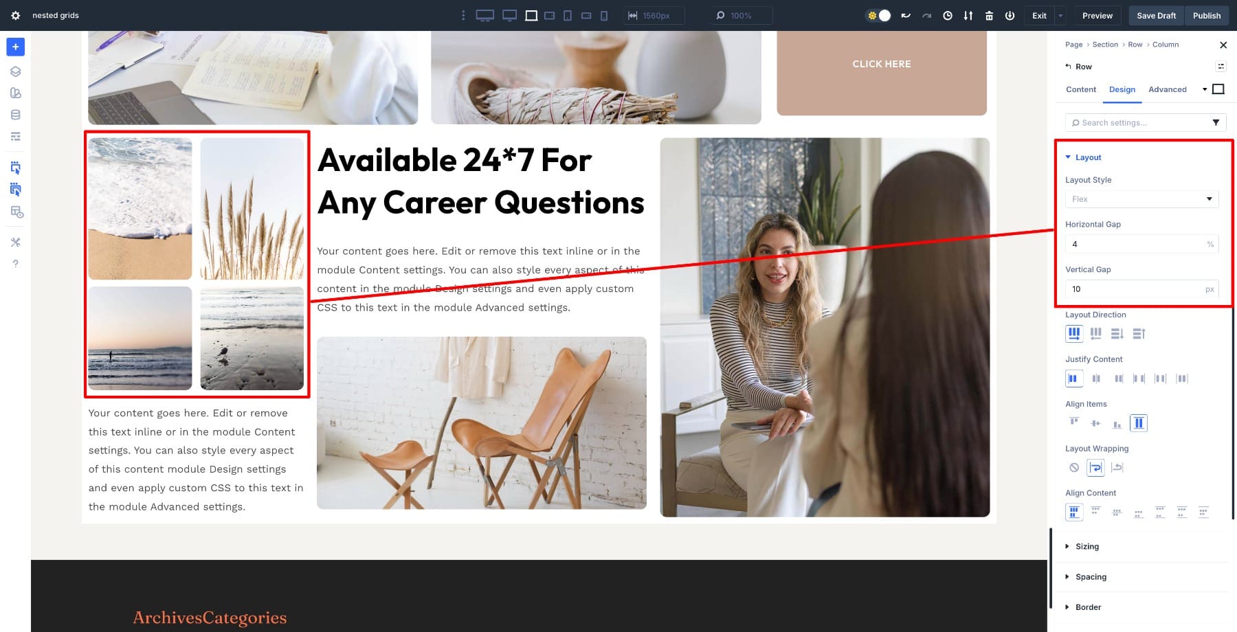
Both rows have matching spacing, but each behaves differently: the top row stays fixed and linear, while the bottom row adapts to available space.
5. Fine-Tune Elements For Responsive Sizes
The layout is already responsive because each grid controls its own structure.
Tweak a few things and preview on each mode to see if anything looks off. Check the text sizes in the nested two-column rows. Reduce the heading size slightly on phone and keep body text width set to full. Avoid resizing padding or margins and let the gaps you set earlier do the work.
With these small tweaks, the layout flows naturally across all devices, and the nested structure keeps every content block balanced without rebuilding anything for mobile.
Design Complex Layouts With Divi 5’s Flexible Grid System
Nested layouts used to require padding tricks, duplicate rows, and constant fixes for mobile. Divi 5 gives you the flexibility of Flexbox, Grid, and Nested Rows to build complex structures that stay organized on their own. The parent row handles the overall layout, while each inner grid follows its own spacing rules, making the design flexible without extra CSS.
Once you finish a layout like this, save it to your Divi Library. You can reuse it as a template for pricing sections, team blocks, course cards, and product features without needing to rebuild the structure. Nested grids let you design once and reuse everywhere, with none of the layout headaches.


Leave A Reply