")
Managing dozens of color variations across a design system creates unnecessary chaos. You might spend hours adjusting tints and shades instead of building the actual website.
However, there’s a way to build colors that are flexible, consistent, and easy to maintain: with Hue, Saturation, Lightness (HSL)-based colors. Divi 5 gives you the tools to do this without overcomplicating your workflow.
In this post, we’ll walk through setting up semantic color roles so you can design intuitive layouts without the grunt work. Let’s get to it!
What Are Semantic Color Roles
Semantic color roles organize your palette by purpose. Instead of naming colors “blue” or “red,” you name them by what they do: primary, secondary, warning, error, success, and info.
Subscribe To Our Youtube Channel
This naming system solves a common problem. You’re building a site and need an error color. You could create a new red or hunt for the red you used before. With semantic naming, you just grab “error” and move on.
Every error across your site uses the same color because they all reference the same variable. Form validation, alert messages, and other common uses. Perfect consistency without thinking about it.
The naming creates a shared language as well. Hand your project to another designer or client, and they understand immediately. Primary handles main actions. Warning handles alerts. Success handles confirmations. The room for confusion is completely gone.
HSL And Relative Colors: A Brief Overview
HSL stands for Hue, Saturation, and Lightness. This color model gives you a more intuitive way to work with colors compared to RGB values.
Hue is the actual color as a degree on the color wheel, ranging from 0° to 360°. Red sits at 0 degrees, green at 120, and blue at 240.
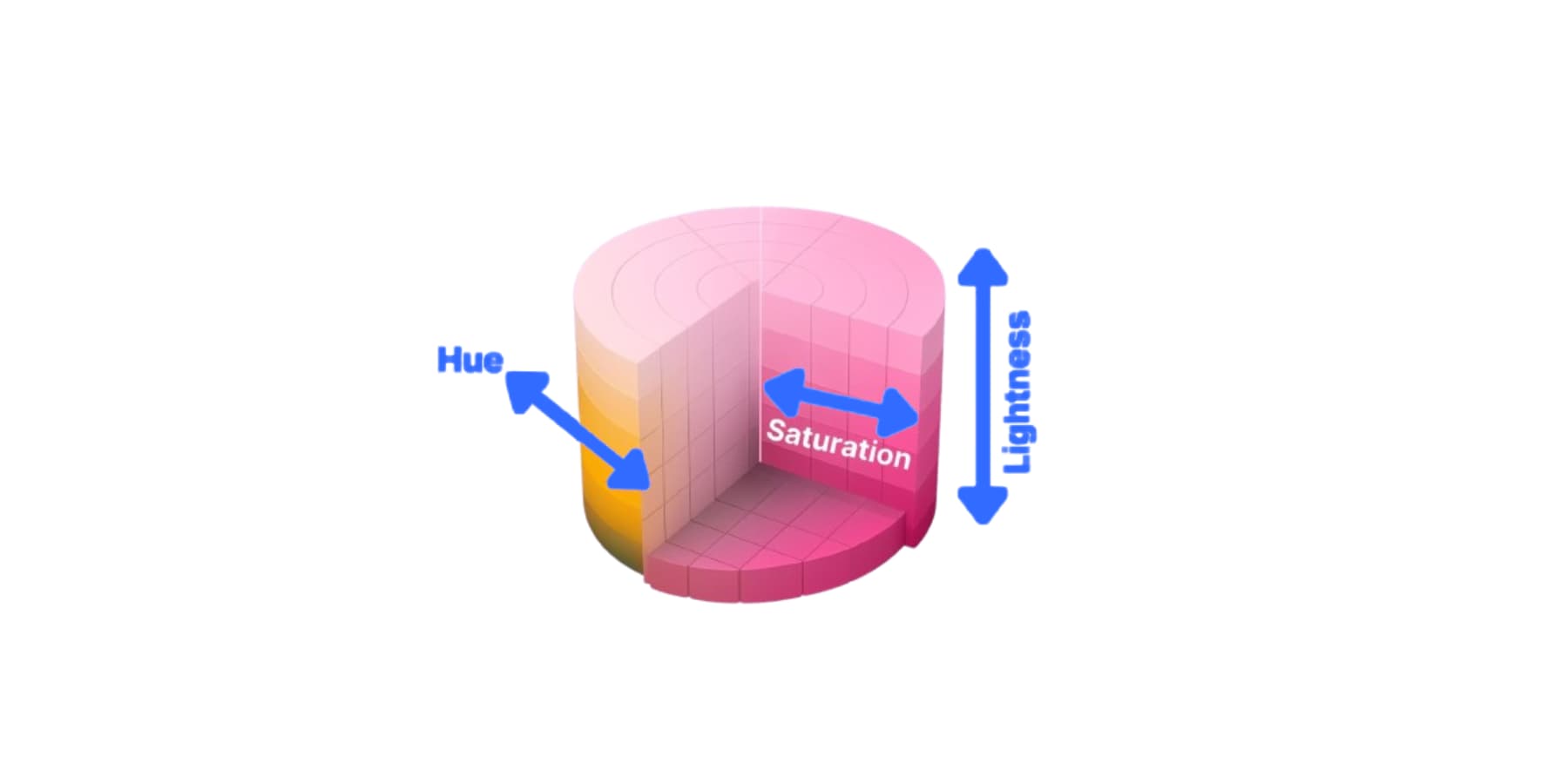
Saturation controls how pure or vivid the color appears, measured from 0% (completely gray) to 100% (fully saturated). Lightness adjusts brightness from 0% (black) to 50% (pure color) and then to 100% (white).
Relative colors build variations directly from a base color. Instead of defining each shade separately, you pick a root color and create lighter, darker, or muted versions by adjusting the HSL values.
Your primary blue becomes the foundation. Reduce its lightness by 20% to get a darker variant. Drop the saturation to 40% for a muted version. Each variation references the original.
This creates linked color families. Change your base blue to green, and every variant shifts with it. Your button hover states stay consistently darker than the main buttons. Your background tints remain appropriately light. The relationships hold because each variation pulls from the same root. You set up the system once, and your entire palette moves together.
Using HSL Colors In Divi 5
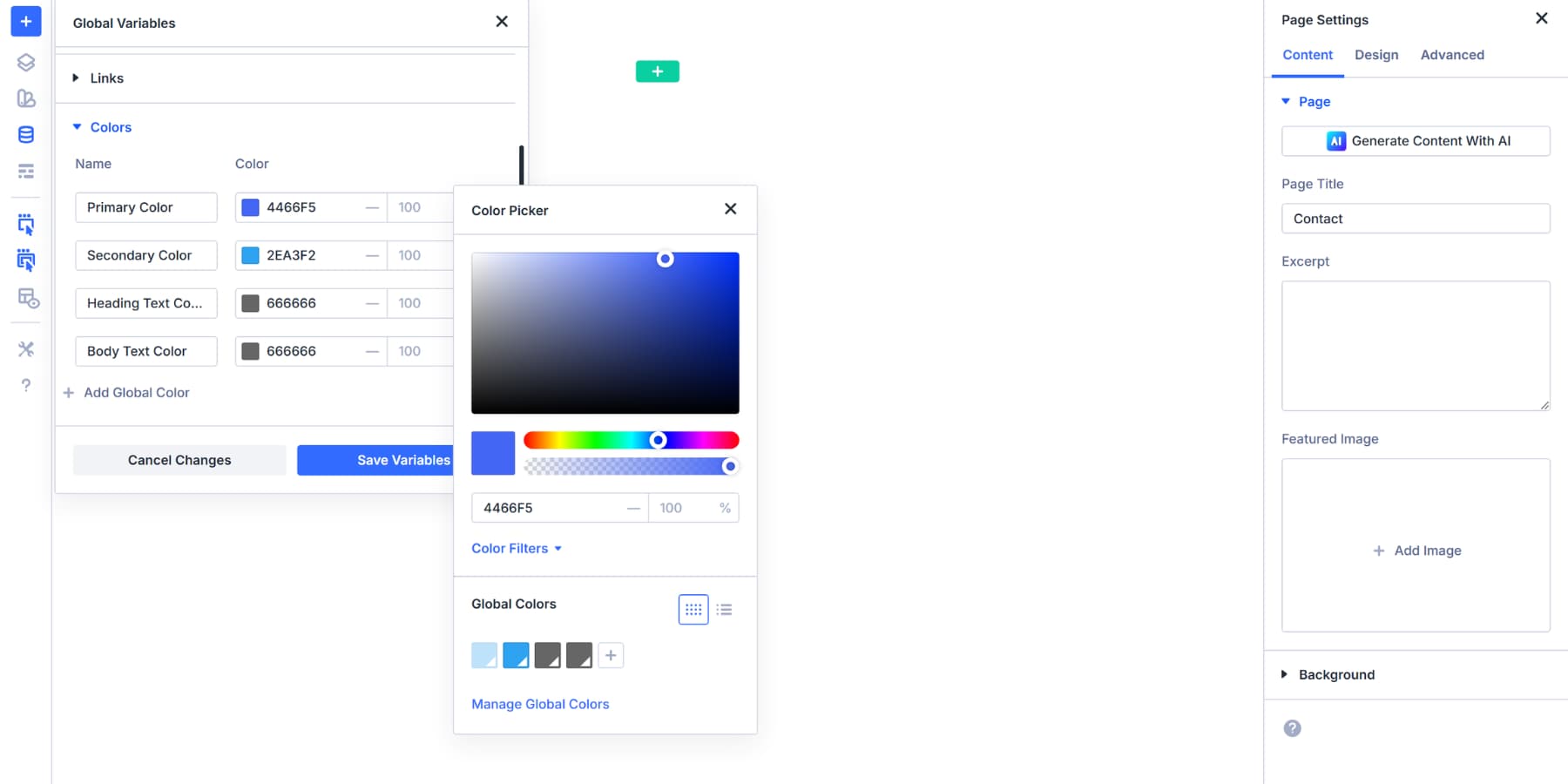
Divi 5 builds HSL controls directly into the color picker. Every color field across the builder gives you access to hue, saturation, lightness, and opacity sliders without leaving the interface.
Click any color swatch in your module settings. The picker opens. You’ll see the visual selector at the top and the color input field below it, where you can paste hex codes or input RGB/HSL values.
Look for the Color Filters dropdown underneath that input field. Click it. The HSL sliders expand below: hue, saturation, and lightness. Hue shifts the color around the wheel.
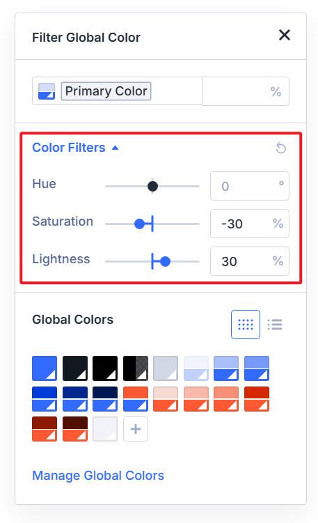
Saturation controls how vivid or muted the colors appear. Lightness adjusts the perceived darkness or brightness. Drag any slider and watch the preview update instantly above.
A darker version of your brand blue for button hover states means pulling the lightness slider down 20%. A softer background that won’t compete with text means dropping saturation by 30%. The changes happen live, so you see exactly what you’re getting before you commit.
Color swatches throughout Divi now display small markers. A plain swatch means static color. Markers appear when it’s linked to a variable or modified with HSL. You can tell at a glance which colors tie into your system and which ones don’t.
You can still type values directly if that’s faster for you. But the sliders remove the guesswork when you need variations of the same color.
Creating Relative Colors With HSL Controls
Now that you understand how HSL sliders work in the color picker, the next step is to integrate them with your design system. This turns individual color adjustments into a structured palette that updates automatically when you change the foundation. We will use Divi 5’s Design Variables here.
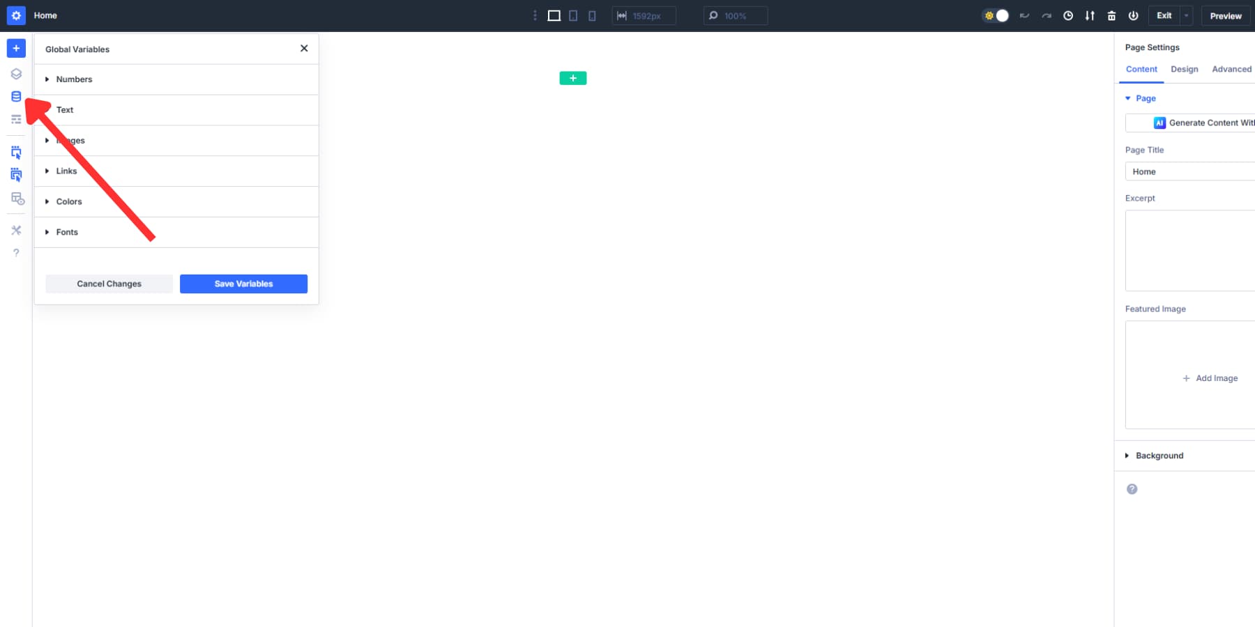
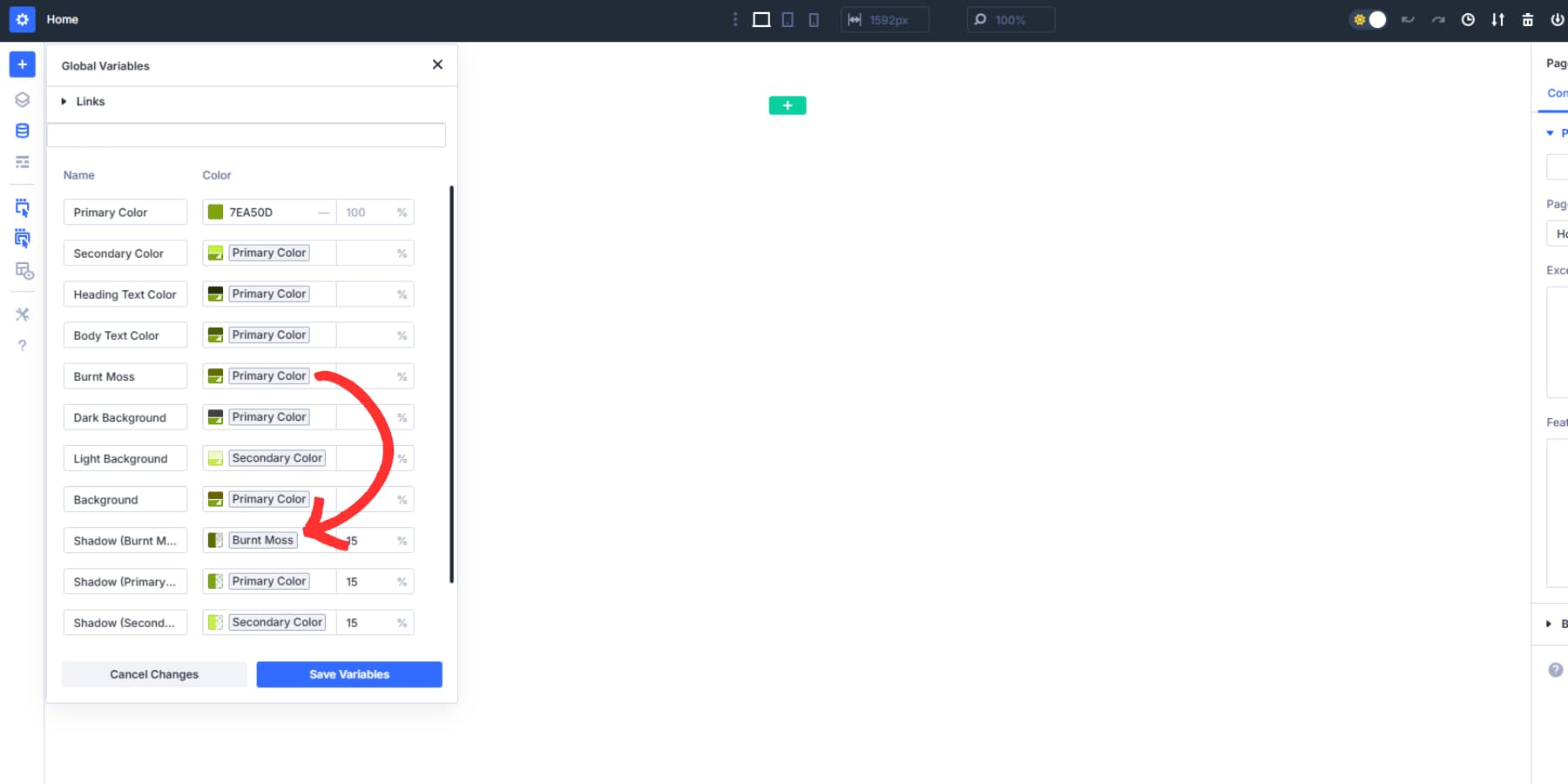
Start in the Variable Manager. Open it from the left sidebar, then click the Colors tab. Add a new color variable.
The color picker appears. You’ll see all your saved global colors listed. Select one to use as your base. This pulls in that color value as your starting point.
Click the swatch again to reopen the picker. Look for Color Filters and expand them. The HSL sliders appear below: hue, saturation, and lightness.
Drag any slider to create your variation. Button hover states work well with something darker. Pull lightness down 20%. Backgrounds stay softer when you drop saturation by 30%. The preview updates instantly as you move each slider.
Give this new color a descriptive name, such as “Primary Dark” or “Soft Background.” Save it. You’ve created a relative color that references the original base color.
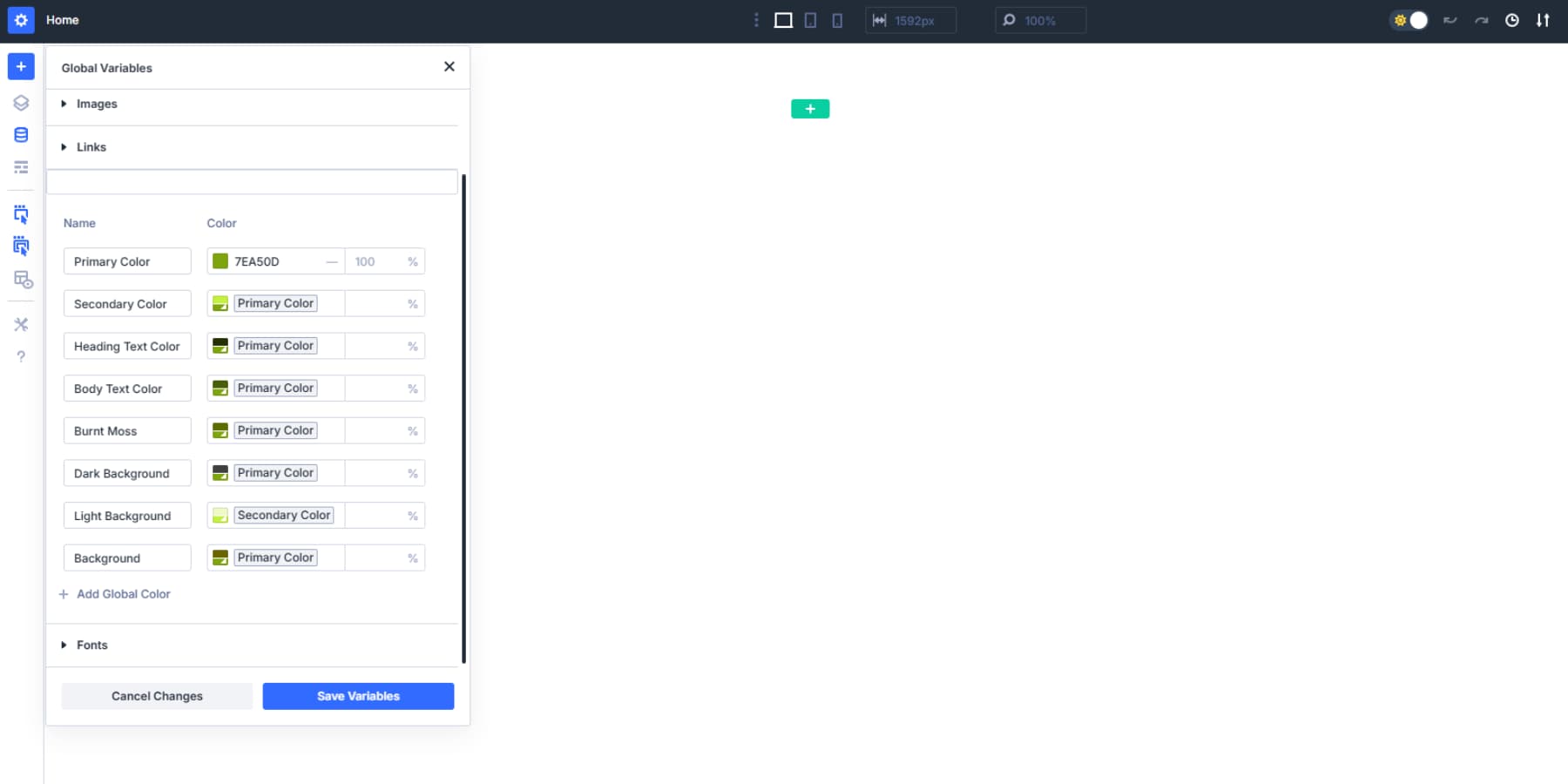
Change your base color later, and this variation automatically shifts with it. The connection stays intact. Adjust the root once, and every connected color updates across your entire site.
You can even stack these. Build a third color based on your first relative color.
Click the color field and select the desired color to use these variables across your Divi modules wherever you need them.
Building A Semantic Color Palette In Divi 5
Now we’ll put theory into practice. You’ve seen how relative colors and HSL work in Divi 5. This section walks you through building a complete semantic palette from scratch.
Setting Up Your Primary Color As The Foundation
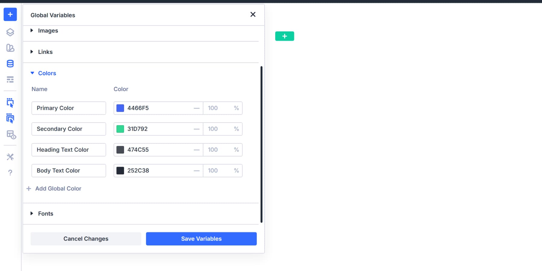
Open the Variable Manager from the left sidebar in Divi 5. Click the Colors tab. You’ll see default entries for Primary, Secondary, Heading, and Body text colors.
Click into the Primary Color field. Enter your main brand color as a hex code.
This becomes your base. Everything else you build can reference this value. Similarly, you can change the Secondary and Text color variables as well.
You use the secondary color on your website to make things stand out and keep the design interesting.
Creating Your Warning Color With HSL
Warning colors communicate caution. They need yellow or orange tones that stand apart from your brand colors. Enter a hex code around the yellow to orange range. Something like #FFA500 works well for most designs.
Now, add a new color variable for your warning color. Name it “Warning” and save it.
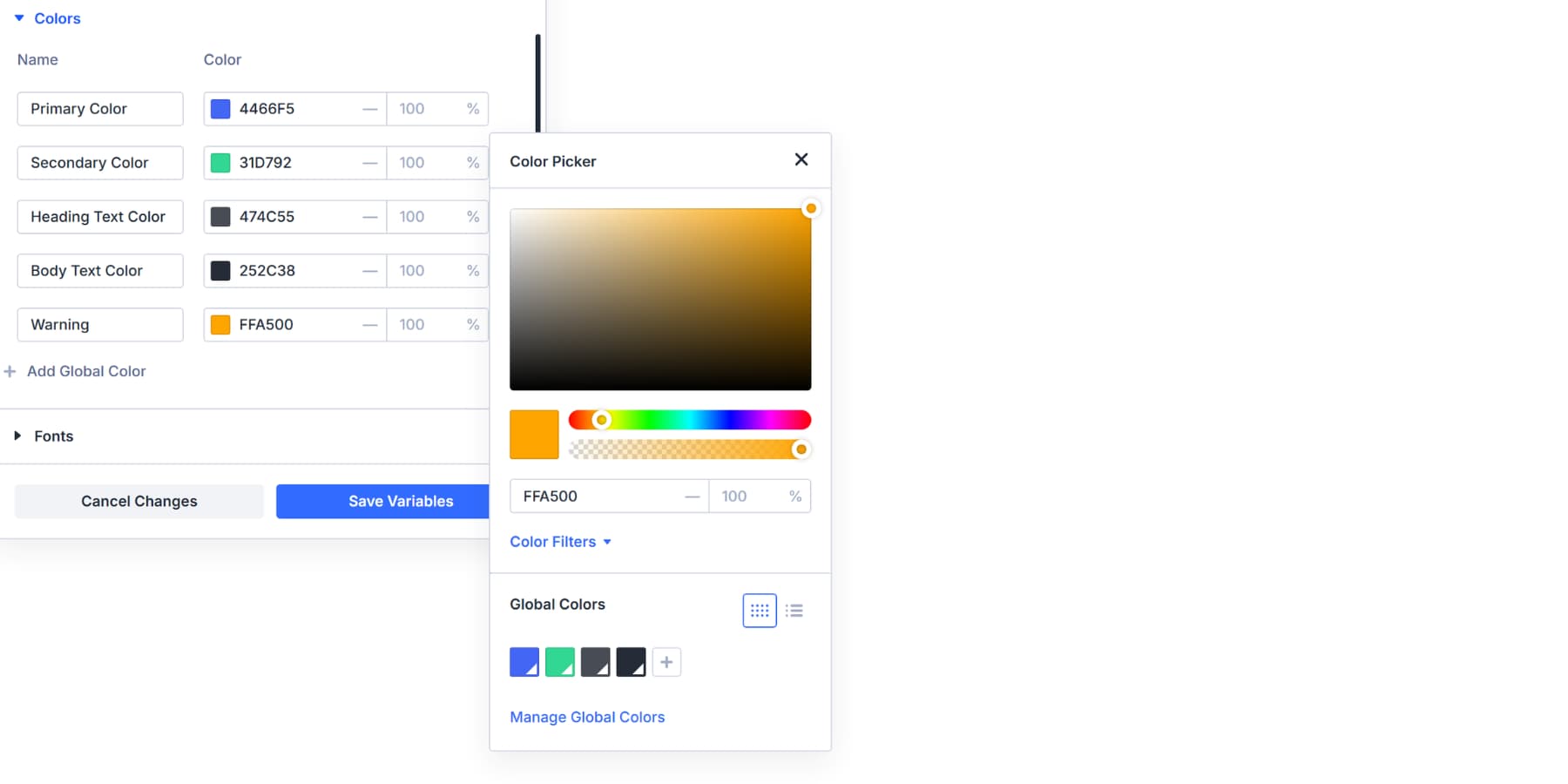
The warning color sits alongside your primary, not derived from it. You can adjust the HSL sliders to shift your base colors into a proper yellow or orange by changing the hue, but the range varies enormously for every color. So, if you update the color in the future, the warning shade derived will also change to some other color.
Semantic colors require distinct meanings. Warning means caution. Your primary color represents your brand. Mixing color roles with brand/base colors dilutes both and makes it very difficult to judge changes. So, it’s better to keep them distinguished.
You now have a distinct semantic color that can be used to alert users. Form validations, alert banners, and caution messages can all reference this variable.
Building Error And Success Color Roles
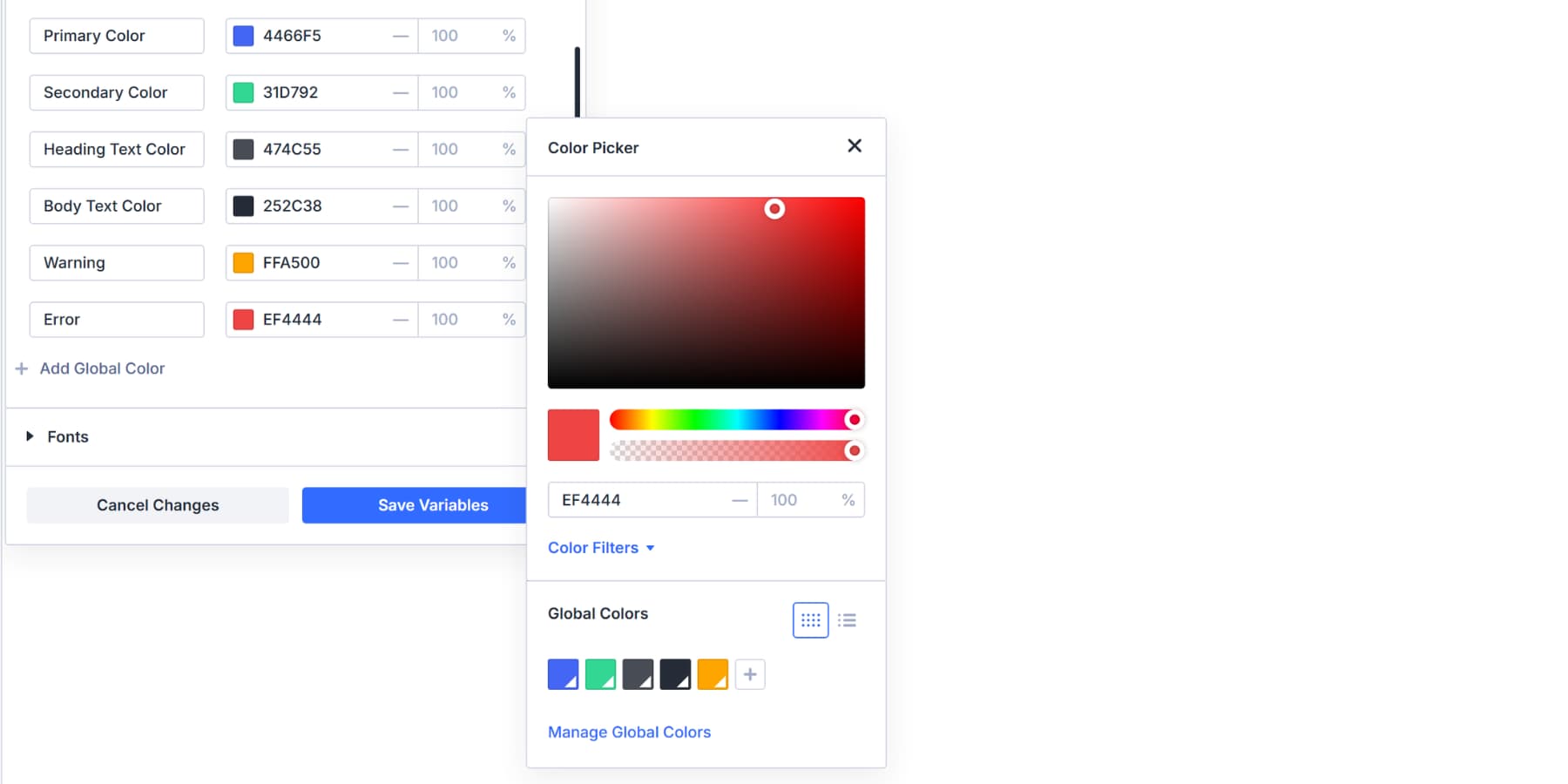
Add two more color roles to round out your system. Error handles failures, alerts, and destructive actions. Success confirms completions and positive states.
For Error, use red around #DC2626 or #EF4444. Apply this to failed form validation messages, delete buttons, system alerts, failed payment notifications, and critical warnings. Anywhere users need to see that something went wrong or an action can’t be undone.
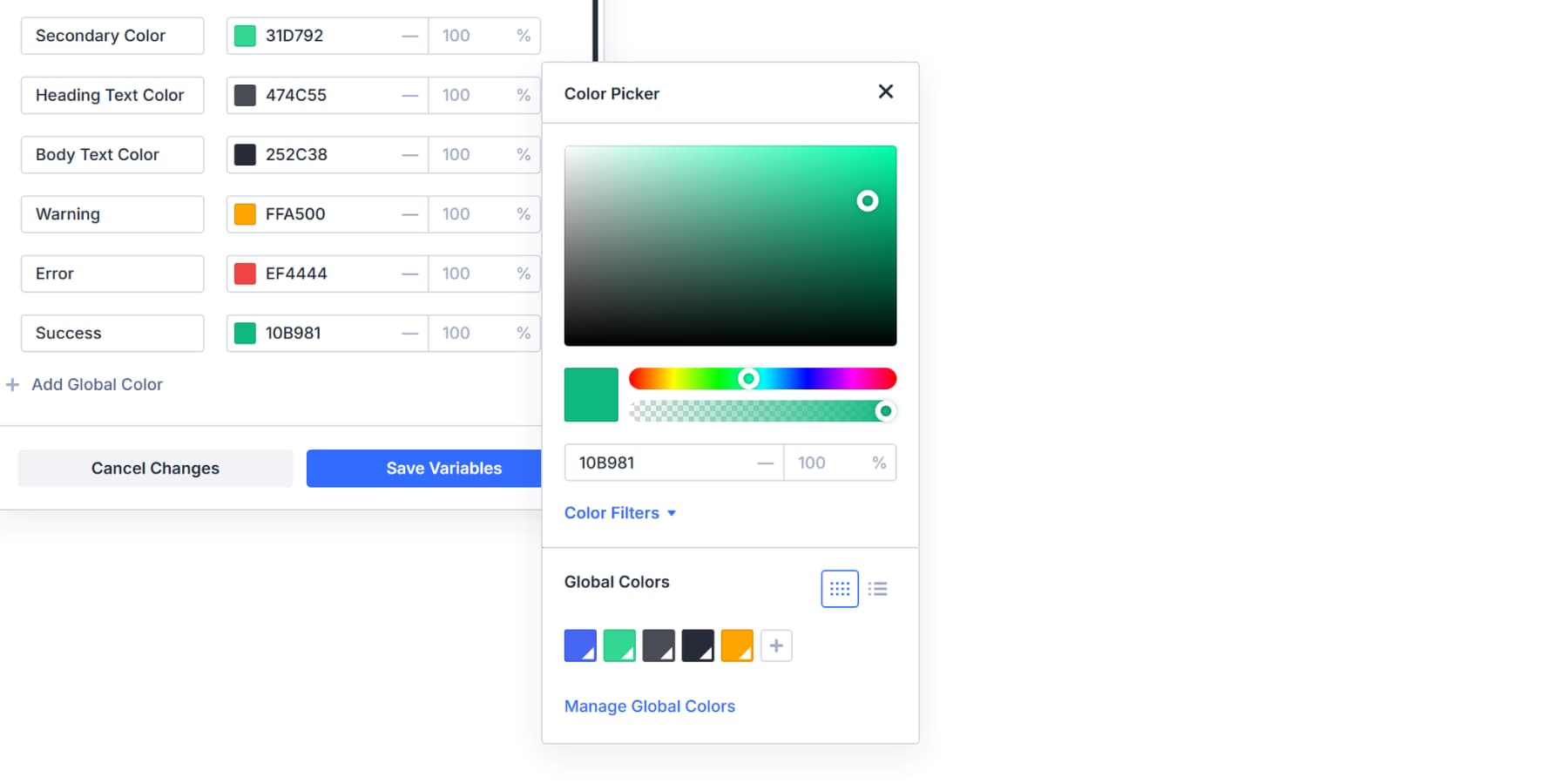
For Success, opt for green shades like #10B981 or #22C55E. This covers confirmation banners, completed task checkmarks, active status indicators, payment success screens, and positive metrics. Any time you’re showing that an action worked or a state is healthy.
Adding An Info Color To Complete The System
Info rounds out your feedback palette. This color is used for neutral messages, helpful tips, and general notifications that don’t fit into the warning, error, or success categories.
Choose blue around #3B82F6 or #2563EB for Info. Blue reads as calm and informative without triggering urgency or concern. Add this variable to your Variable Manager using the same process. Pick your hex code, name it “Info,” and save.
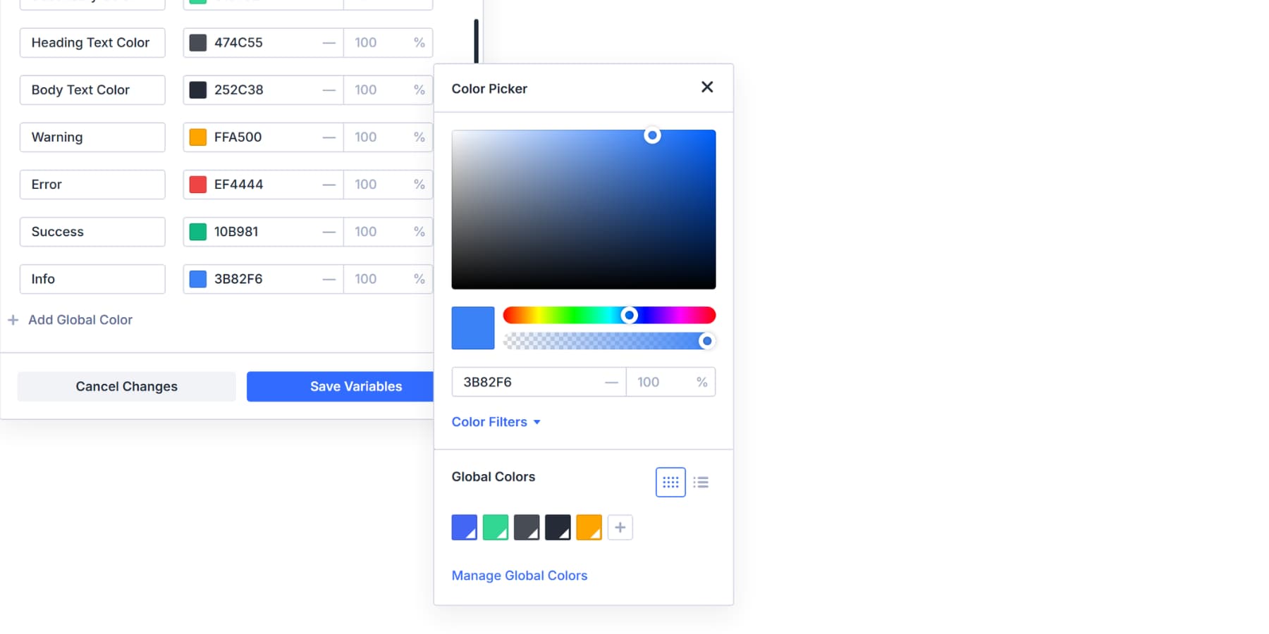
You can apply this to tooltips, system updates, feature announcements, help text, onboarding messages, informational banners, and other similar content.
Your palette now has multiple distinct roles. Primary and Secondary drive your brand identity. Warning, Error, Success, and Info handle every type of user feedback. Each color has a clear purpose, and that purpose stays consistent everywhere it appears.
Creating Lighter And Darker Variations For Each Role
Each semantic color needs variations for different contexts. Your Primary color works for main buttons, but you need lighter shades for backgrounds and darker ones for hover states. Building these variations now provides you with a comprehensive toolkit that handles every design scenario.
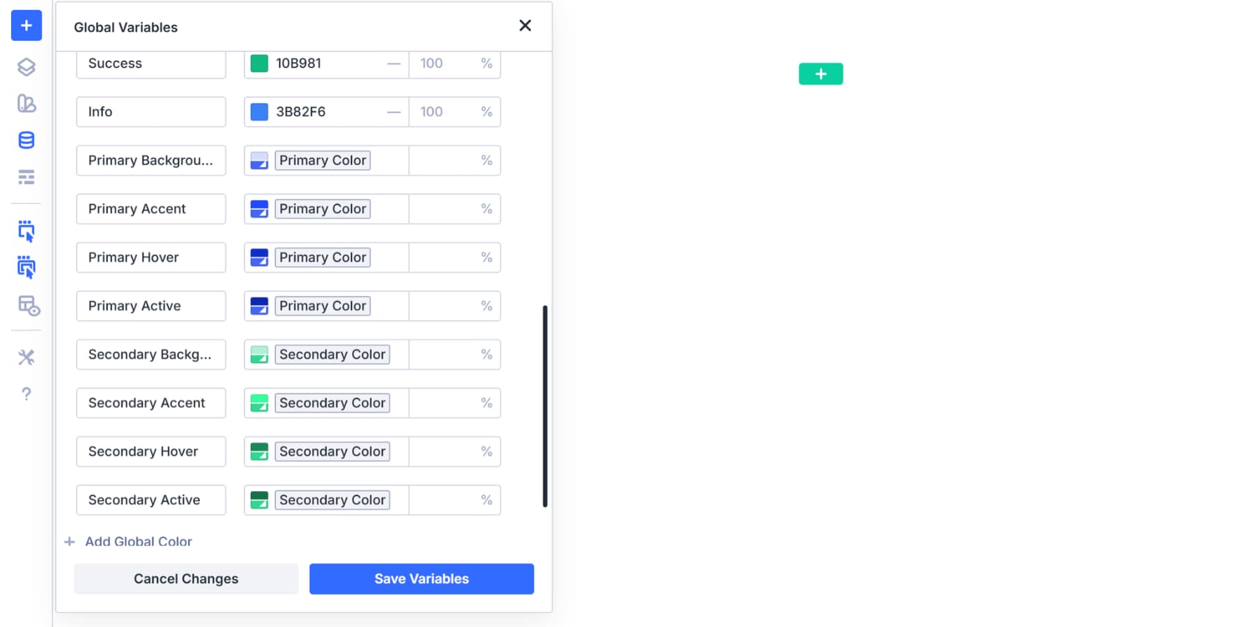
Primary Color Variations
Start with your Primary color in the Variable Manager. Add new color variables and select Primary as the base for each. Open Color Filters and create these variations:
- Primary Background (+30% lightness): Section backgrounds, card backgrounds, and large areas where full color would overwhelm
- Primary Accent (+50% saturation): Subtle accents, secondary backgrounds, and soft dividers
- Primary Hover (-20% lightness): Button hover states, active navigation items, and focused form fields
- Primary Active (-25% lightness): Pressed button states, active selections, and emphasized borders
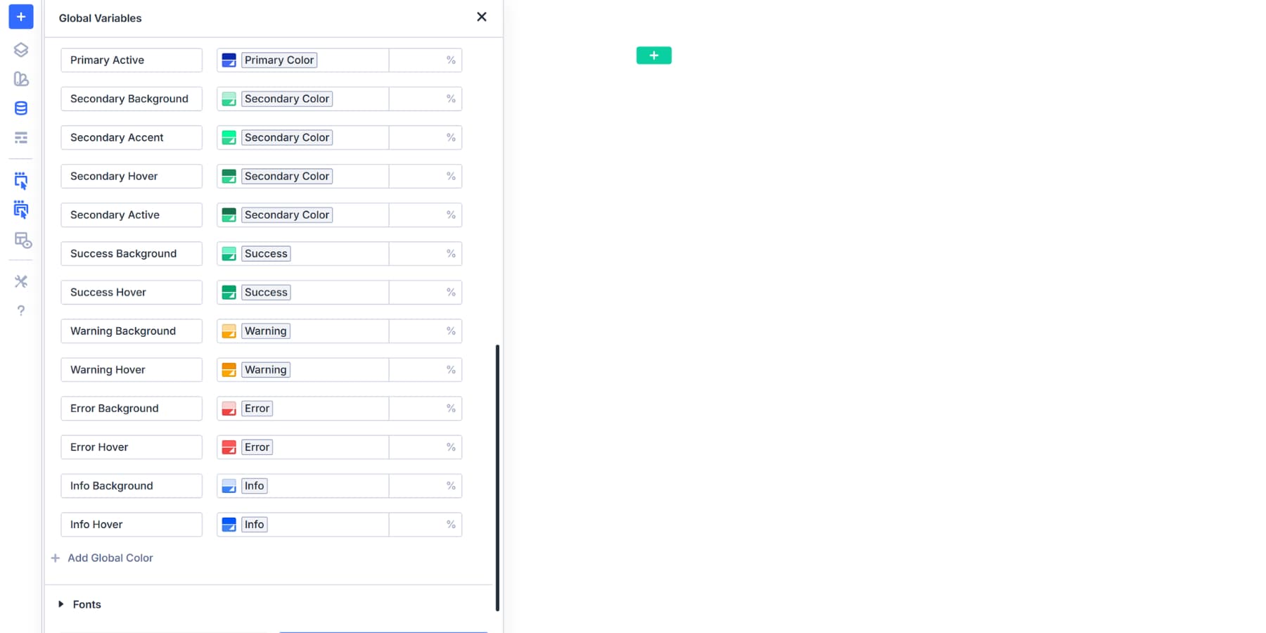
Secondary Color Variations
Build Secondary variations the same way, using your Secondary color as the base:
- Secondary Background (+30% lightness): Alternate section backgrounds, sidebar fills, and complementary card backgrounds
- Secondary Accent (+50% saturation): Supporting element backgrounds, alternative accents, and secondary dividers
- Secondary Hover (-20% lightness): Secondary button hover states, alternative navigation hovers, and complementary active states
- Secondary Active (-25% lightness): Pressed secondary buttons, alternative selections, and supporting emphasized elements
Success Color Variations
Build Success variations using the same approach:
- Success Background (+30% lightness): Confirmation message backgrounds, success banner fills, and positive status indicators
- Success Hover (-10% lightness, +35% saturation): Completed action buttons, active success states, and emphasized checkmarks
Warning Color Variations
Create Warning shades for caution messages:
- Warning Background (+30% lightness): Caution banner backgrounds, tooltip fills, and notice boxes
- Warning Hover (-10% lightness, +35% saturation): Warning button hover states, alert borders, and emphasized caution text
Error Color Variations
Repeat the process with your Error color as the base:
- Error Background (+30% lightness): Alert box backgrounds, form error field backgrounds, and “danger” banners
- Error Hover (-10% lightness, +35% saturation): Dismiss hover states, critical warning text, and destructive action confirmations
Info Color Variations
Finish with Info color variations:
- Info Background (+30% lightness): Informational banner backgrounds, help text boxes, and neutral notification fills
- Info Hover (-10% lightness, +35% saturation): Info button hover states, link colors, and emphasized informational text
These are some examples and the most common uses; you can create as many variations as you want.
You can even generate more shades from existing shades. If you must add more variations, remember to label each clearly: “Primary Light,” “Error Dark,” “Success Extra Light.”
With this foundation in place, color decisions become faster and more consistent. You’re no longer hunting for hex codes or eyeballing shades. You’re pulling from a system that already works. The naming tells you precisely what it is and prevents confusion or mix-ups when your client or team is working on the website.
Try Color Management In Divi 5 Today!
Your semantic color palette creates intuitiveness and consistency that holds up across every page, module, and future update. The system you built means faster decisions and cleaner handoffs. When your primary green shifts to olive in the subsequent rebrand, every variation moves with it because the relationships remain intact.
If you’re working with existing sites that have scattered static colors everywhere, Find and Replace can quickly swap those old hex codes for your new semantic variables.
Your next project deserves a color system that actually works. Download Divi 5 and set yours up in the next 20 minutes.


Leave A Reply