
Sometimes a label or icon needs one extra line of context, but you don’t want to crowd the page. Tooltips are perfect for form hints, feature explanations, and subtle onboarding.
In this post, we’ll show you how to create responsive hover/tap tooltips in Divi 5 with Interactions. Let’s get to it!
What Are Tooltips (And Why Use Them)?
Tooltips are small messages that appear when you hover over or click a webpage. Move your cursor over a button; a small box might say what it does. Click an icon, and you might see a quick note.
Websites use tooltips to save space. Instead of filling the page with explanations, they only reveal details when needed. Some sites also use them to highlight new features you might overlook. The best ones keep the text brief, usually under 180 characters.
When designed well, tooltips help without getting in the way. They answer quick questions so people can easily keep moving through a site.
Tooltips And More, Made Easy With Divi 5’s Interactions
Divi 5 includes a brand new feature called Interactions that fundamentally changes how websites respond to visitors. Interactions let you create dynamic behaviors where elements on your page react to user actions, all without writing any code.
The new Interactions options are accessible through the Advanced tab of any module, row, column, or section in Divi’s visual builder.
The system has three parts: triggers, effects, and targets. Triggers are user actions like clicking, hovering, or scrolling. Effects are what happen next, like showing hidden content, changing colors, or moving elements. Targets are the parts of your page that get affected.
Tooltips are just one use case. The same tools can toggle FAQ sections, animate hero content on scroll, and build pop-ups without the need for custom code.
The interactions automatically work across desktop, tablet, and mobile devices.
Building Your Tooltip In Divi 5
Now that you understand what Interactions can do, it’s time to build your first tooltip. The process is straightforward and happens entirely within Divi’s visual builder. You’ll work with the same interface you already know, just with some new options that control how elements respond to user actions.
1. Creating Your Tooltip Content First
Before you set up any interactions, build the actual tooltip content on your page. Start by adding a Text Module to your section and typing your tooltip message. You can also use an Icon List Module for tooltips. Keep the text and icons short and helpful; around 20 to 30 words works best for most cases.
Style your tooltip to look the part. Give it a background color that stands out from your page but stays readable. Add 5 to 10 pixels of padding so the text has breathing room. Set a border radius of 8 to 12 pixels for that classic tooltip bubble look. You can add a subtle box shadow to lift it off the page.
For text styling, use a font size slightly smaller than your body text, around 14 or 15 pixels. Make sure the text color contrasts nicely with your background choice. White or dark text on both dark and light backgrounds works well. You can also use Design Variables for colors and spacing to tie tooltips into your site’s broader styling system.
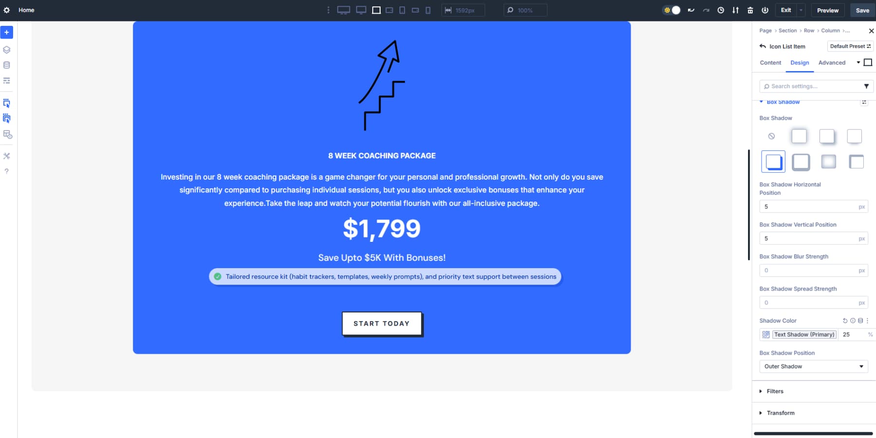
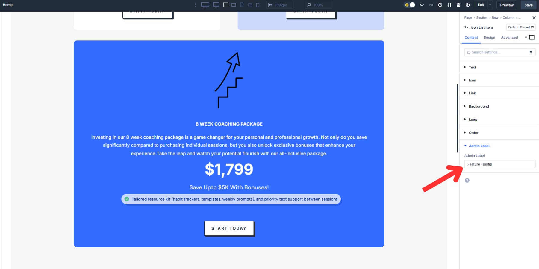
Name it using the Admin Label field, like “Feature Tooltip” for easy identification during setup.
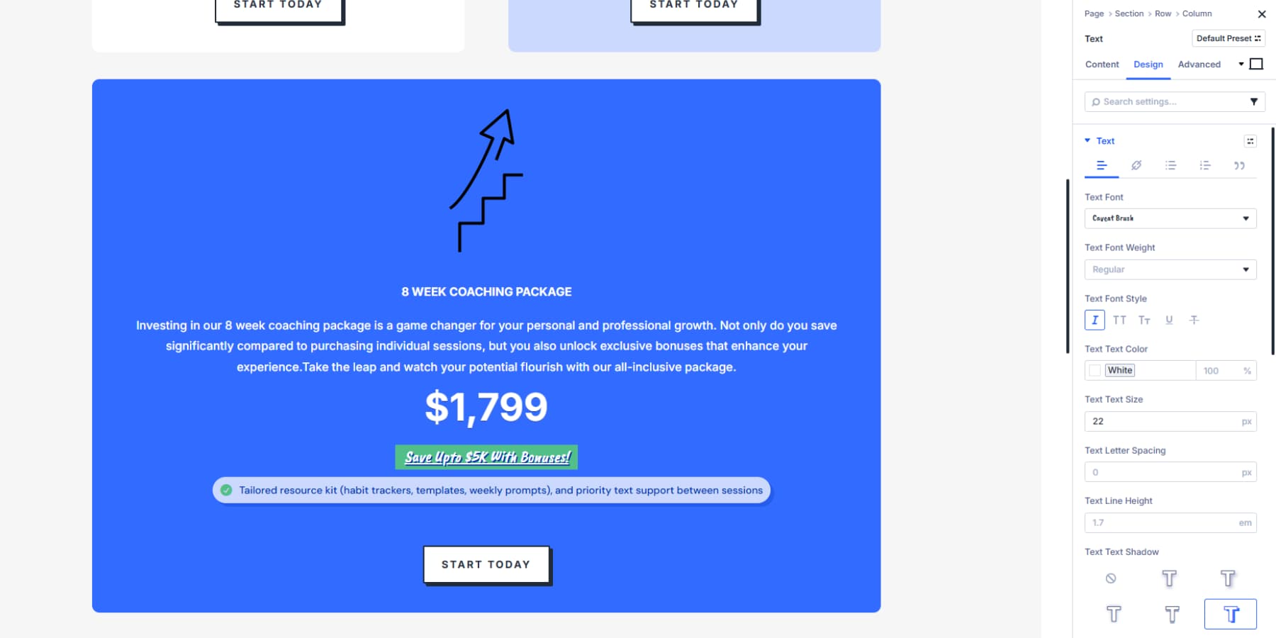
Consider adding visual cues to the “parent” module where the tooltip might appear. For example, try an underline for text elements or a subtle background color. These hints tell visitors that extra information is waiting for them.
You may also add custom CSS to the parent module so that when hovered over, it displays the classic “?” cursor, indicating that more information is available.
Go to the module’s advanced settings and put the following CSS:
selector p {
cursor: help;
}
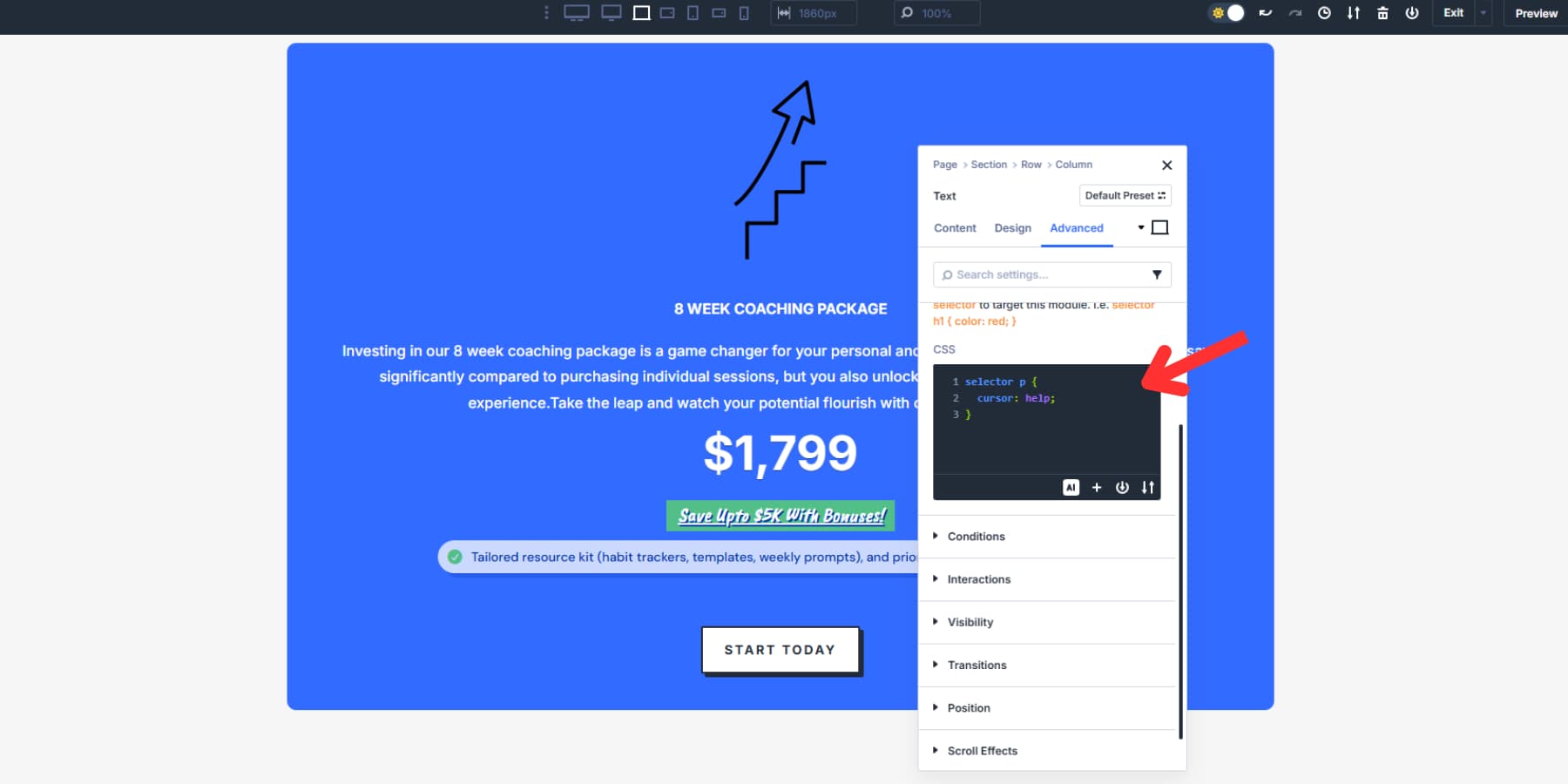
You might need to adapt the code to match your module. For example, if your tooltip parent is a button, you would replace it p with button instead. This is not a required step, but it is a standard setup for tooltips.
2. Configuring Interactions And Triggers
Now, select the module that will trigger your tooltip and head to the Advanced tab. Look for the Interactions dropdown near the bottom.
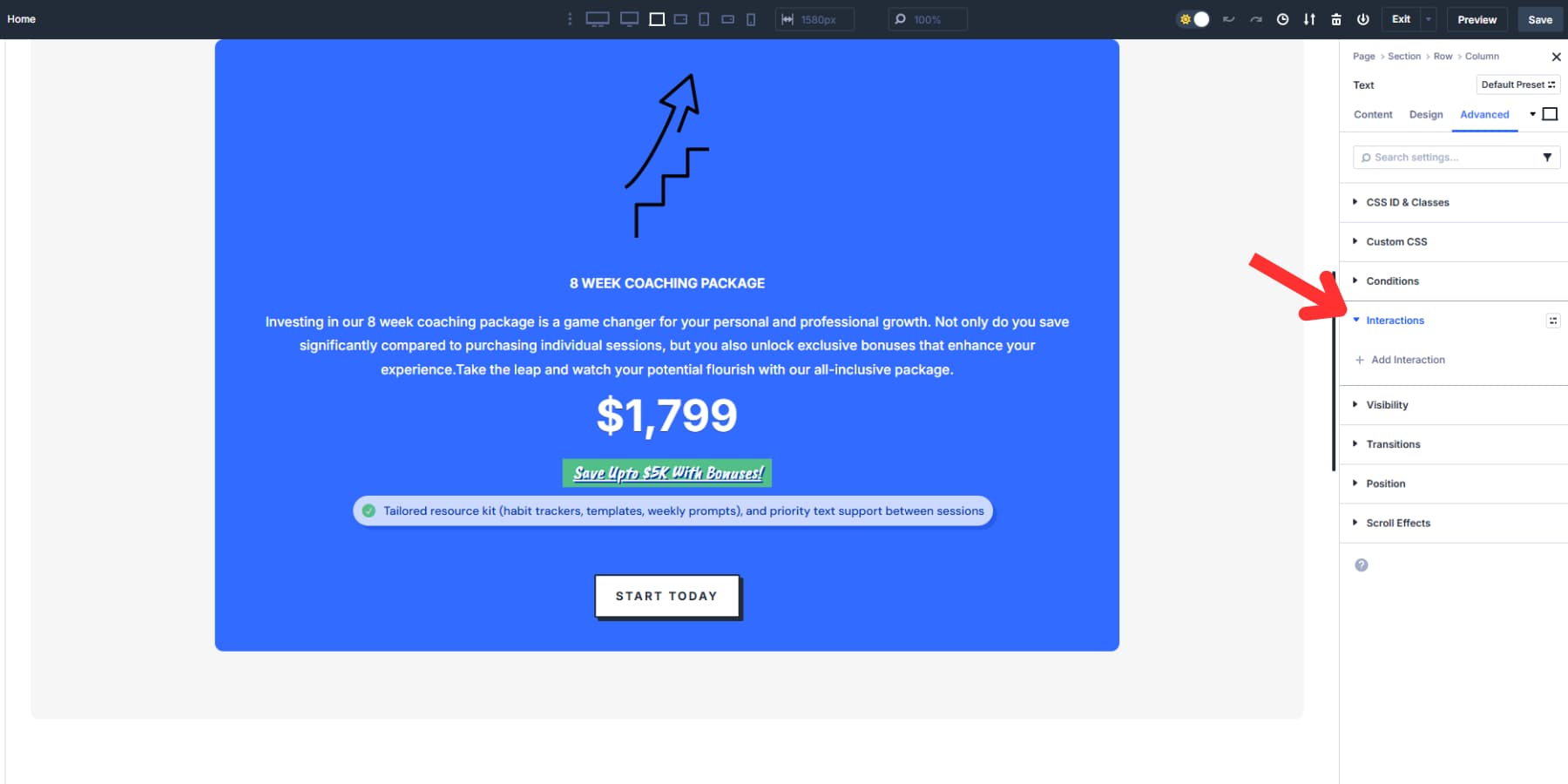
Hit “Add Interaction” and you’ll see six trigger options: Click, Mouse Enter, Mouse Exit, Viewport Enter, Viewport Exit, and Load. Go with “Mouse Enter” for a standard hover tooltip.
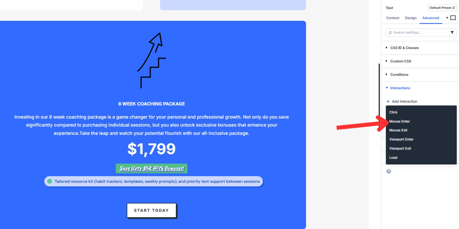
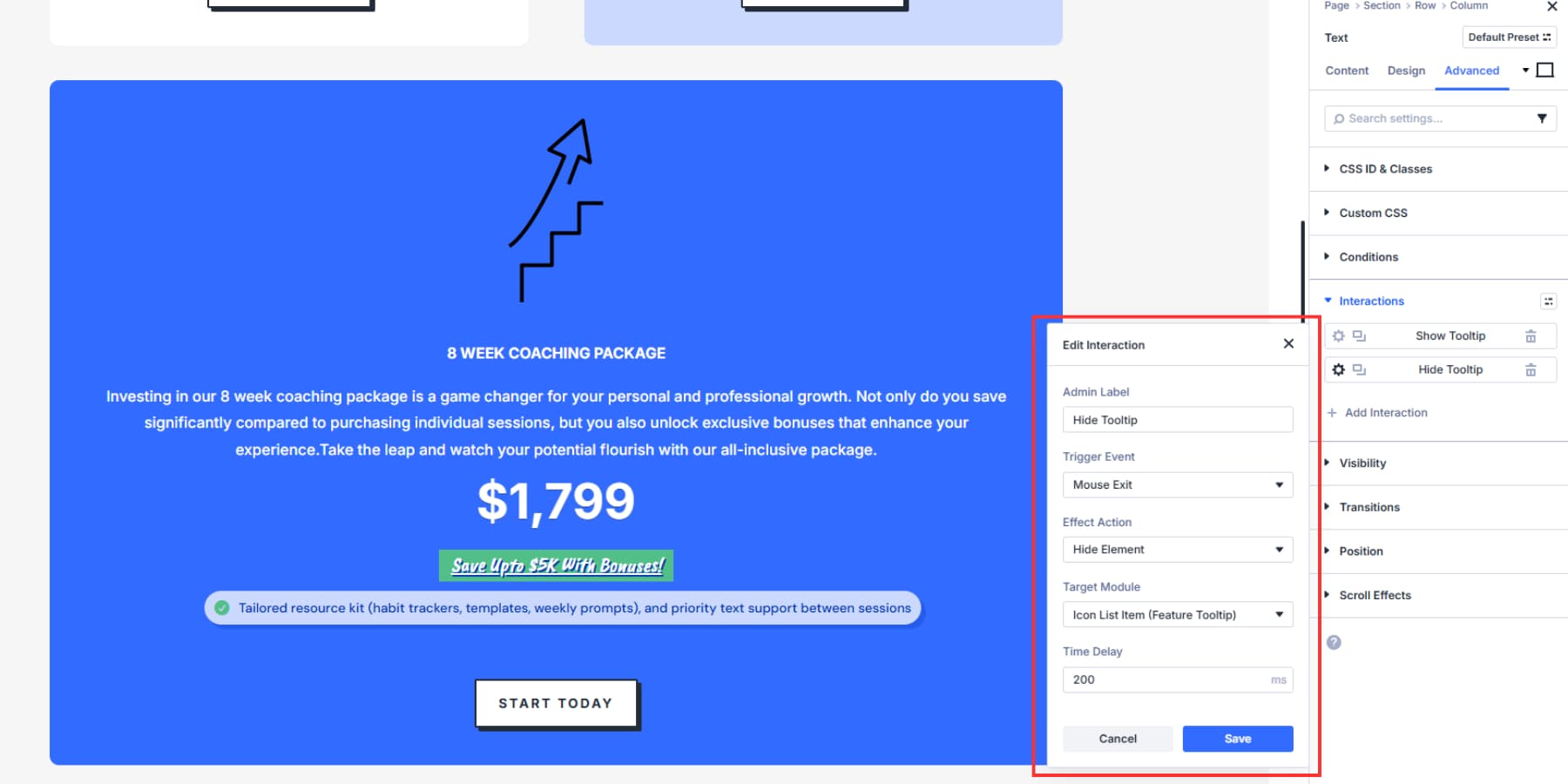
The interaction editor opens. In the Admin Label field, name your interaction something clear, like “Show Tooltip.” Your Trigger Event should show Mouse Enter. Since your tooltip starts hidden, pick “Show Element” for the Effect Action.
The Target Module dropdown lists every element on your page by name. Find your tooltip here. Good naming pays off at this point. Add a slight delay of 200 to 300 milliseconds so the tooltip doesn’t pop up during quick mouse passes. Save the interaction when you’re done.
Create a second interaction to hide the tooltip. Click “Add Interaction” again, pick “Mouse Exit” as your trigger, set “Hide Element” as the effect, and target the same tooltip. This handles the disappearing act when people move away.
Add a 200 to 300 millisecond delay here, too. This prevents the tooltip from disappearing too quickly, making it look jarring.
3. Positioning Your Tooltip
After building your tooltip and setting show and hide actions, choose where they appear. In the tooltip module settings, go to Advanced > Position and switch from Default to Absolute.
Absolute positioning places the tooltip relative to its parent container, so the tooltip and trigger stay linked and move together when users scroll. So it’s natural to see the position of your tooltip module change drastically. We’ll fix this eventually.
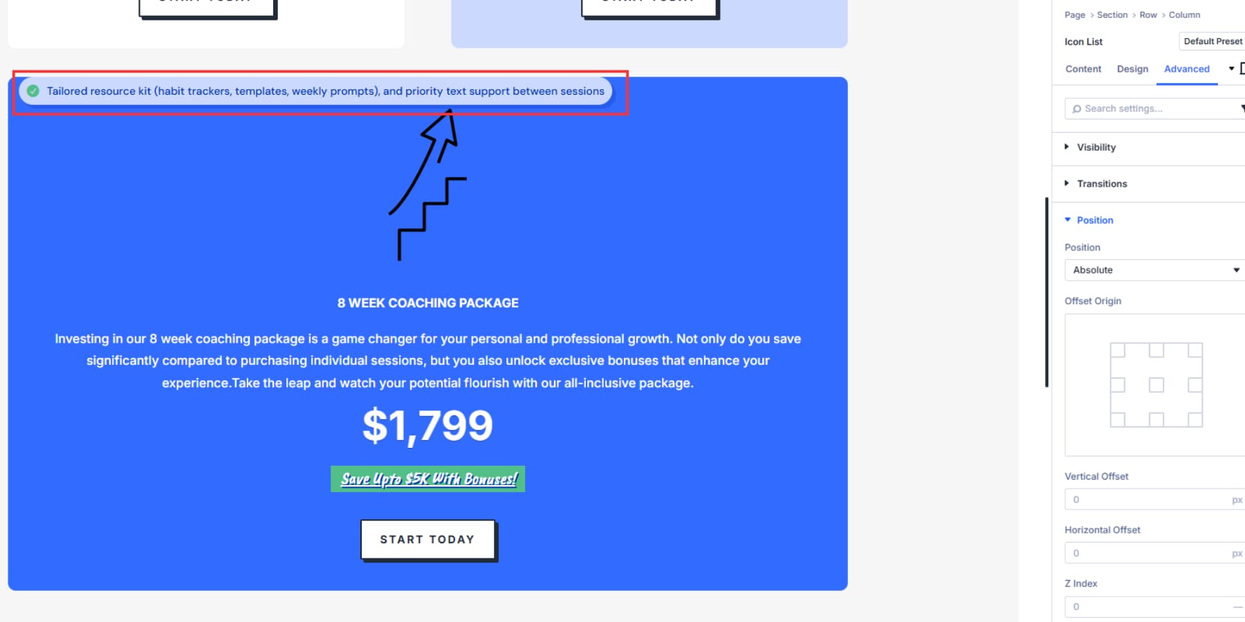
Divi 5 provides vertical and horizontal offset controls to fine-tune the tooltip’s placement. These offsets set how far the tooltip sits from its reference point inside the container.
But, first, pick the offset origin, the corner or edge that acts as the anchor: top, top left, top right, bottom, bottom left, bottom right, or center, center left, center right.
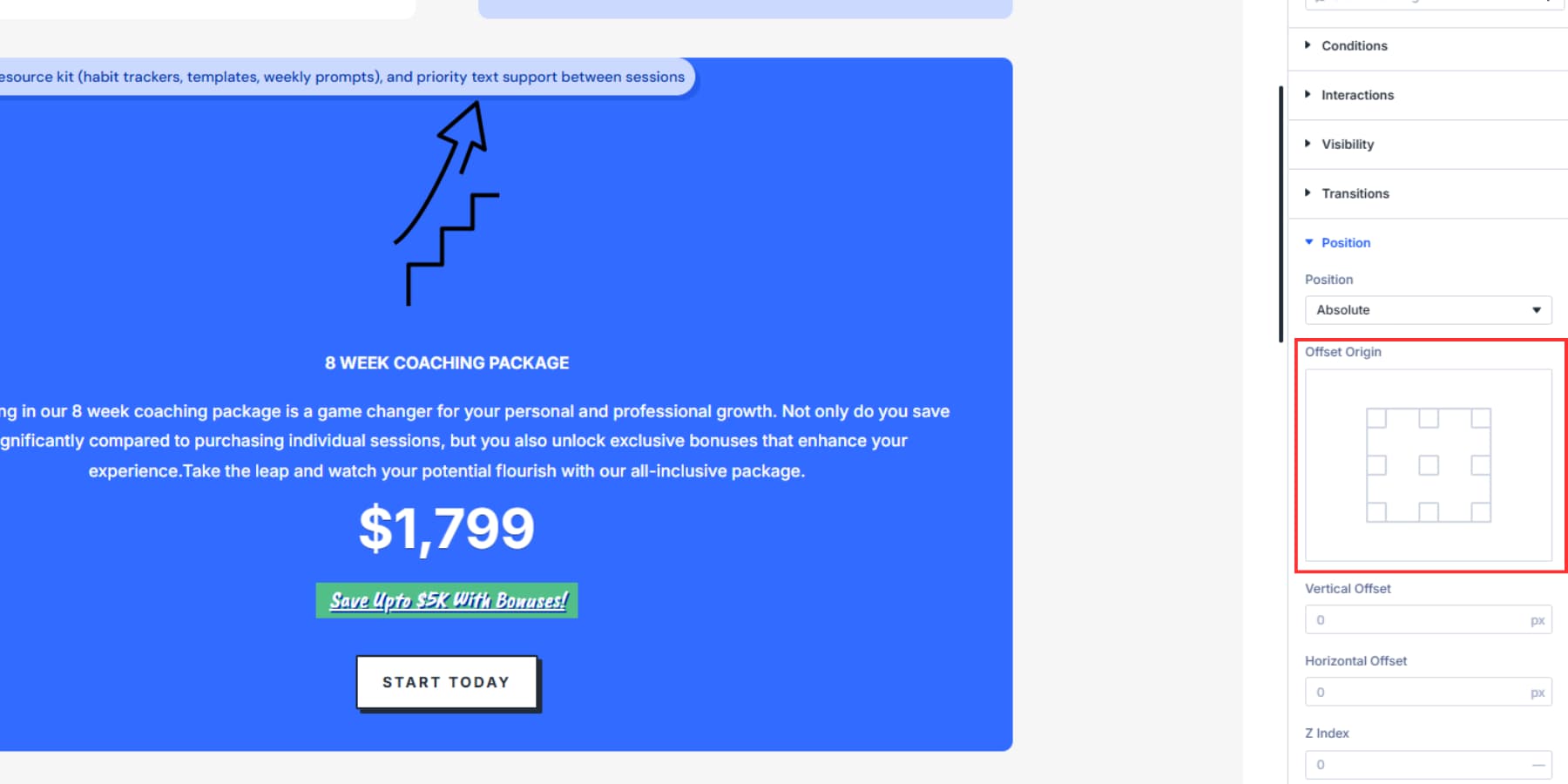
If the origin is top left, offsets measure from the tooltip’s top left corner. If you choose bottom right, the same offsets measure from the tooltip’s bottom right corner.
This changes how the offsets affect position. For example, a top left origin with a 20px horizontal offset places the tooltip’s left edge 20px from the container edge, and a top right origin with a 20px horizontal offset places the tooltip’s right edge 20px from the container edge.
Working With Offset Controls
If you pick any alignment other than center, use the vertical and horizontal offset controls to position the tooltip. These offsets set the tooltip’s distance from the chosen origin inside the container. For responsive positioning, you can use advanced units such as viewport units or percentages instead of pixels.
Viewport units give consistent spacing relative to screen size. A horizontal offset of 3vw keeps the tooltip 3% of the viewport width from its reference edge, scaling across devices. Also, ensure that you add a proper Z Index to your tooltip so it always appears atop of all elements, below or above it.
Place the tooltip about 15–25 px from its trigger to avoid crowding while keeping the connection clear.
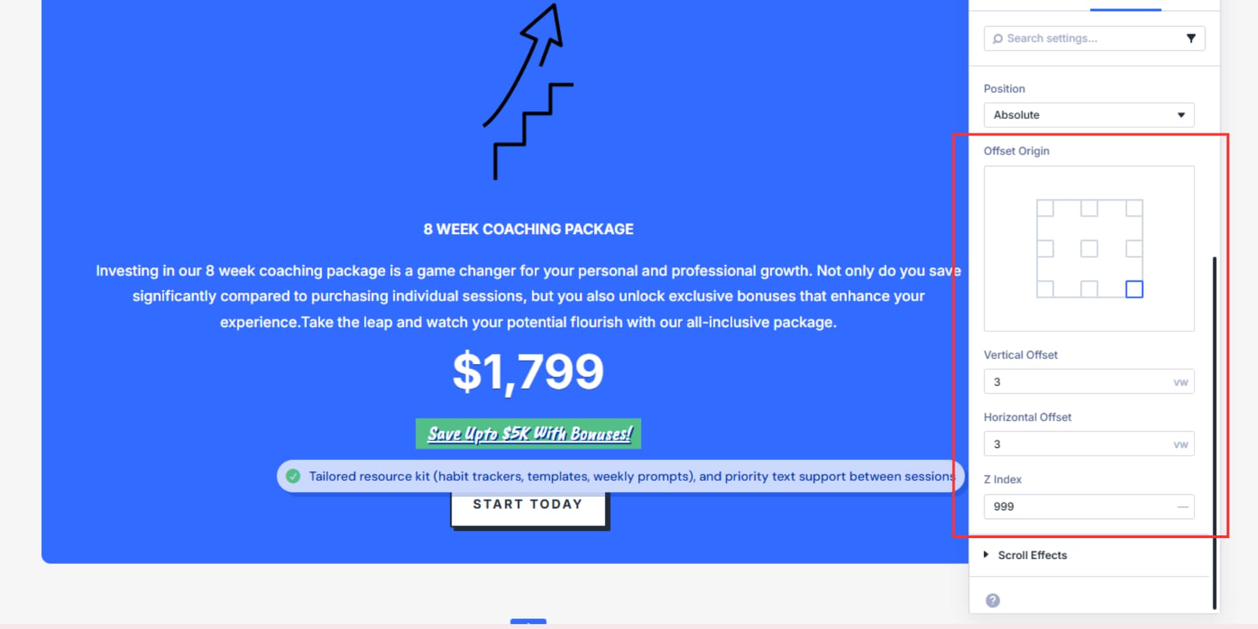
Negative offsets can flip sides but add mental overhead. Instead, set the origin where you want the tooltip (bottom for above, right for left) so you can use simple positive offsets.
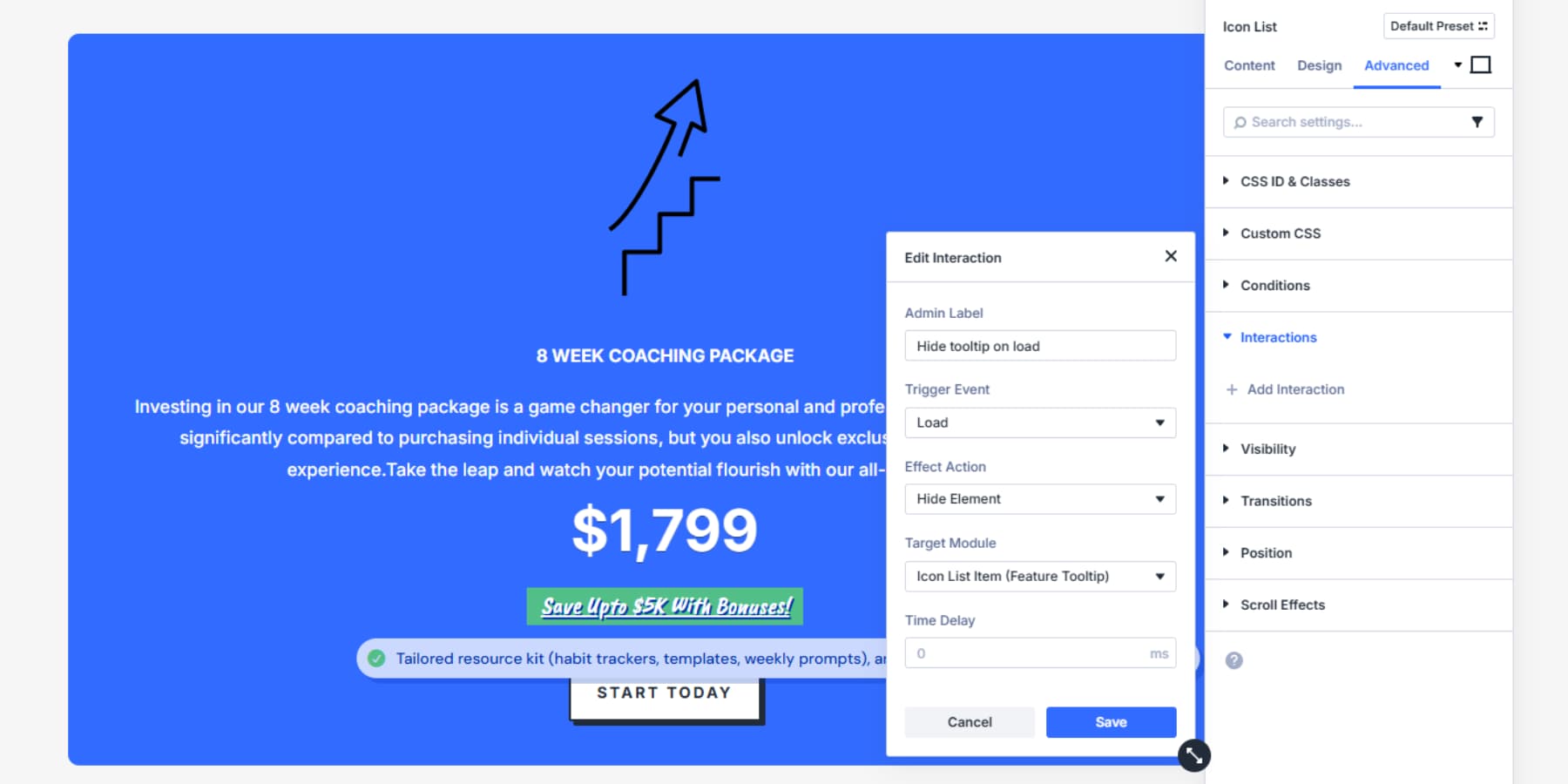
Once you decide on the exact position and behavior, hide your tooltip module by going to the tooltip module’s settings panel > Advanced > Interaction and select “Load” as the trigger, “Hide Element” as Effect Action, and the module itself as the Target. This will ensure the module remains hidden until the parent is hovered over.
That’s all, your tooltip is now ready!
Download The Tooltip Layout
If you want to test the tooltip, download the layout below! Import the file to your Divi Library, once uploaded, you’ll be able to access it inside any build you’re working on.

Try Interactions In Divi 5 Today
Tooltips keep pages clean while giving readers the extra detail they need. With Interactions in Divi 5, you can show and hide tooltip content on hover or tap, add a short delay to prevent flicker, and place each tooltip precisely with Absolute, Offset Origin, and Z-Index. The result is consistent across Divi 5’s seven responsive breakpoints.
Want to go deeper on the feature itself? Read the Interactions release post for an overview of triggers, effects, and targets.


Thank you for this interesting and well-explained explanation.
This new feature for Divi 5 is really great!
Is it possible to have the tooltip triggered when hovered over a specific word or phrase in a body of text instead of being triggered by the entire module?
The simplest method is to use the global HTML title attribute on the specific word or phrase. The browser will automatically display the attribute’s value as a basic, unstyled tooltip on hover.
So in a Text Module, in the Code view, you’d add a span tag around the word(s) with the title attribute like this example.