
Building interactive elements that look good across every user action takes more effort than it should. You set up a button’s default appearance, then manually create variations for when someone hovers over it.
Each state needs its own color, and each color requires its shades. Keeping them all visually cohesive means juggling numbers that don’t relate to each other. Divi 5 combines HSL-based color variables with state management to simplify and make this process more consistent. Here’s how to set it up.
What Are HSL Colors
HSL stands for Hue, Saturation, and Lightness. Unlike hex codes or RGB values that mix red, green, and blue channels together, HSL separates color into three independent controls.
Hue measures the actual color position on a wheel using degrees. Red lands at 0°, yellow at 60°, green at 120°, cyan at 180°, blue at 240°, and magenta at 300°. The wheel completes at 360°, returning to red.
Saturation controls color intensity as a percentage. Full saturation at 100% delivers the purest, most vivid version of that hue. Zero saturation removes all color information, leaving only gray. Mid-range values produce muted or pastel tones.
Lightness handles brightness on a scale from 0% to 100%. At 0%, any color becomes black. At 100%, it turns white. The middle point of 50% shows the color at its truest form, neither darkened nor lightened.
How Do They Impart Consistency
HSL maintains visual harmony through shared values. Pick a brand blue and build lighter versions by increasing lightness in equal steps. Darker versions get the opposite treatment. All shades share the same hue degree, so they read as the same color family.
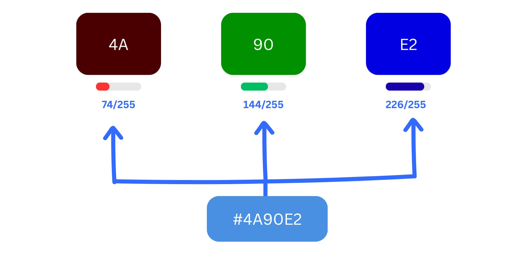
Hex colors are made by mixing red, green, and blue values. Each pair (like 4A, 90, E2) shows how much of each color is used, from 0 to 255. Together, they create the final color #4A90E2.
Hex codes make this tedious. Creating five shades of #718DF2 means calculating new values for red, green, and blue channels separately. One wrong calculation, and your light blue looks too light, while your dark blue appears in an entirely different shade. The shades stop feeling related.
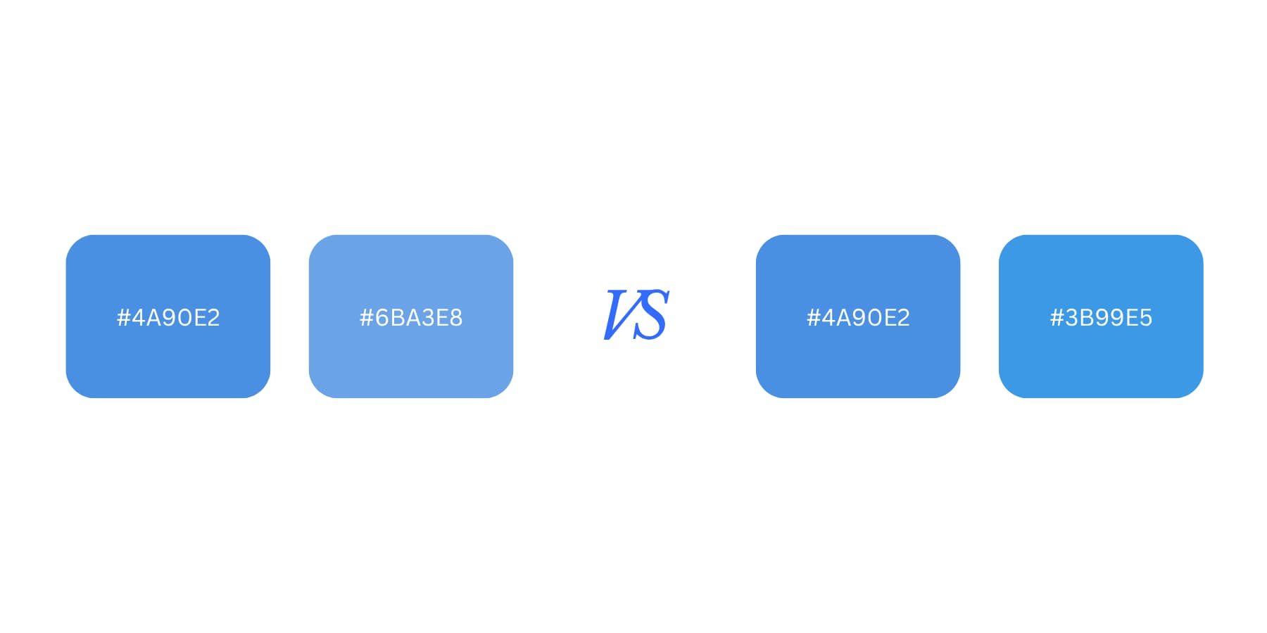
HSL locks the color wheel position. Your blue stays at 240° across every variation. Only saturation and lightness change between shades. The eye recognizes this connection immediately. The palette looks intentional instead of randomly assembled.
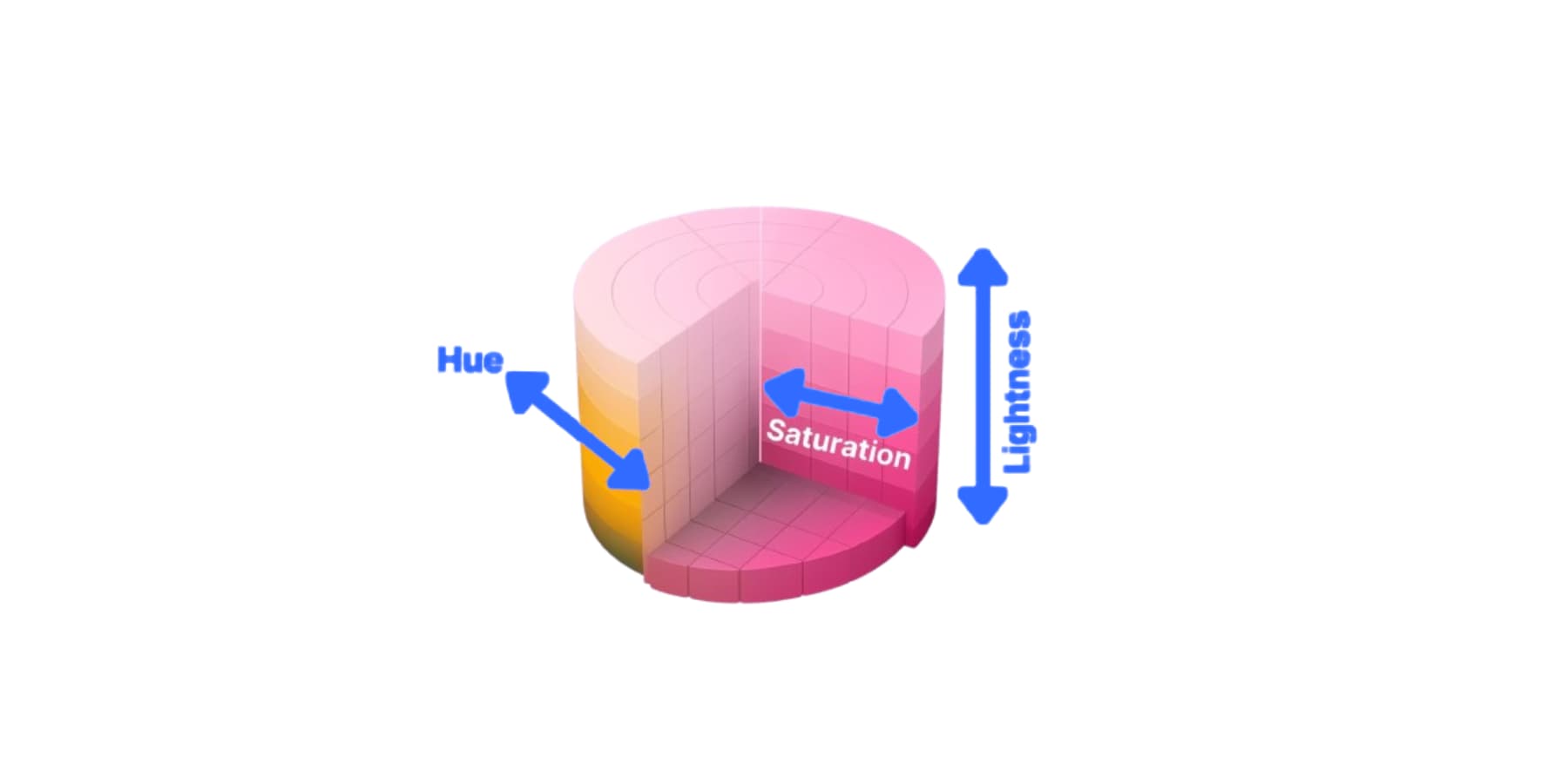
How HSL colors work, inspired by the graphic on Wikipedia about the same topic
This structure also prevents muddy results. Lightening a saturated orange won’t accidentally produce beige. The hue stays put at its degree value. Adjustments occur within clear boundaries, ensuring every color remains clean and predictable. If you are interested, we go into what HSL is and why you should master it, here.
How To Add HSL-Based Color Variables In Divi 5
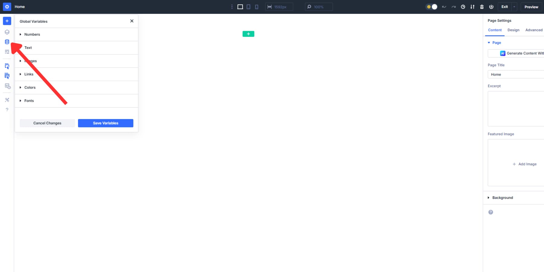
Variables make it easy to reuse your HSL-based colors without needing to memorize the color hex codes and their HSL settings. For adding these variables, we will use Design Variables.
The Variable Manager holds your Colors tab, which can be found in the left toolbar.
Drop a hex code into the Primary Color field, and it becomes your base.
Click the swatch, and the picker opens. Color Filters sit at the bottom. Expand it, and three sliders appear. Hue moves your color around the wheel. Saturation controls the intensity. Lightness brightens or darkens the result. The preview shifts as the sliders move. Save that adjusted version as a new variable with a name that makes sense later.
Using these sliders, you can create shades of your colors.
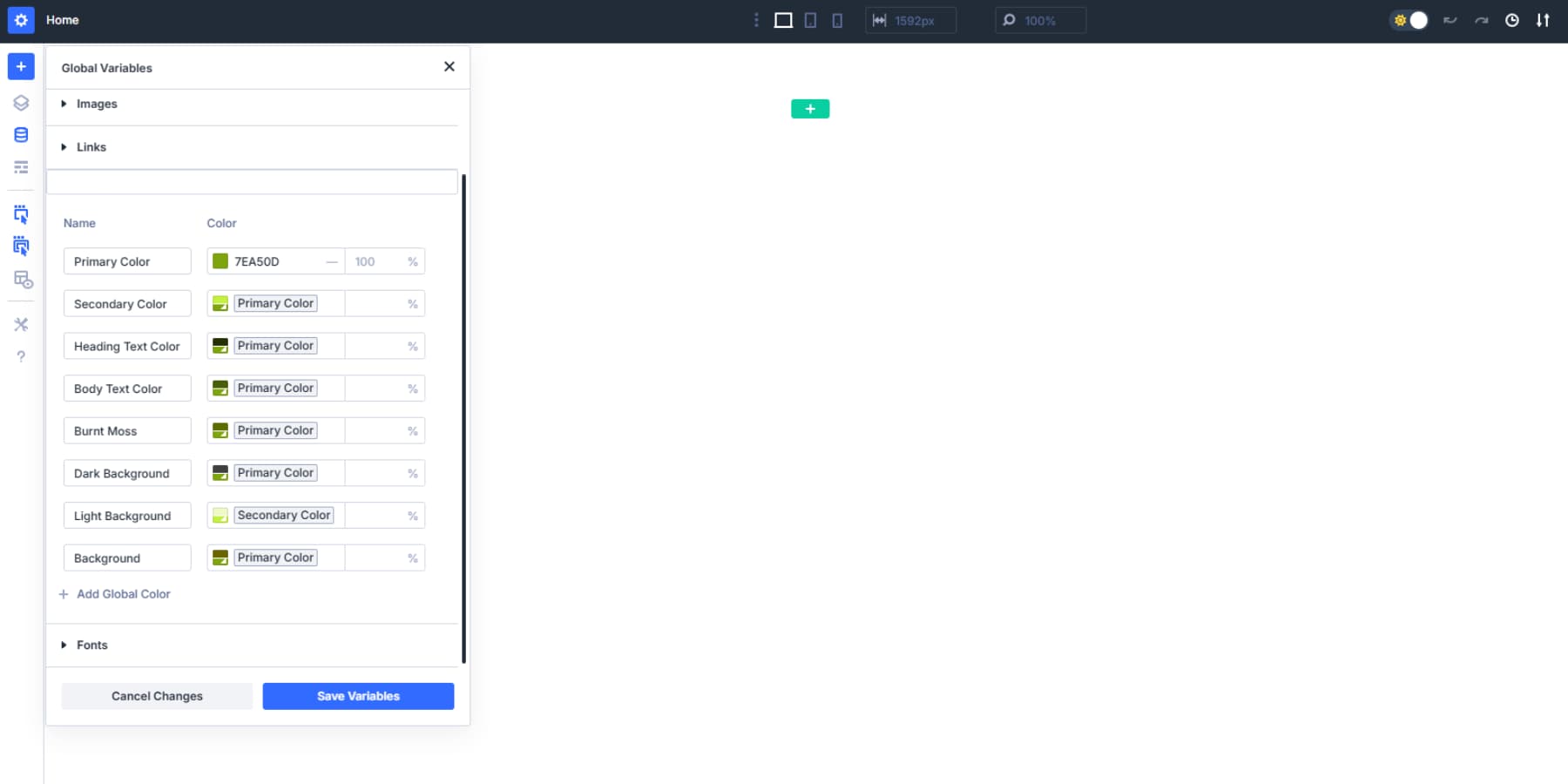
That second color can link back to the first one. Click it, adjust the sliders differently, save it again. That’s a third color, connected to the second. The fourth connects to the third. Each one can be built on the previous.
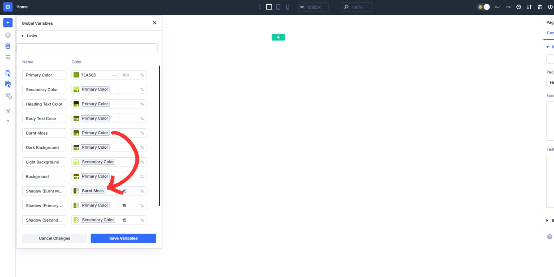
Change the Primary Color to something completely different. The second color recalculates itself based on those same slider positions. The third adjusts to match the new second. The fourth follows the third. The whole chain updates while maintaining the same tonal relationships between each shade.
To use these variables, click the color field and select the swatch that denotes the actual color.
A single brand color expands into as many variations as the design needs. Hover states, muted backgrounds, darker accents, lighter fills. They all stay tethered to each other. Rebuild the palette at any time by changing a single value at the top.
States: A Quick Rundown
States (also known as CSS States) control how elements look when people interact with them. They respond to clicks, cursor movements, and keyboard navigation. In CSS, they’re handled with something called pseudo-classes.
Hover (:hover) kicks in when your cursor lands on something. A button darkens. A link underlines itself. An image scales up slightly. This happens without clicking.
Focus (:focus) shows up differently. Tab through a form on your keyboard. Each field gets a visible outline or glow as you land on it. Click a button once, and it remains highlighted with focus until you move to another location. Keyboards and screen readers need these visible signals.
Active (:active) pseudo class lasts only a moment. Press and hold a button. The color shifts. The element might sink a pixel or two. Release, and it returns to normal. Blink and you miss it.
Other pseudo classes exist for different situations, like :visited for links someone has already clicked on, or :disabled for inactive form fields. However, :hover, :focus, and :active cover most interactive elements you’ll build, so we focused on those three here.
How To Manage States With HSL-Based Variables In Divi 5
With that out of the way, you may wonder if you need to code or add CSS to make your website interactive and manage potentially tens and hundreds of colors. Not with Divi 5. You can manage the states of your sections and modules right inside the visual builder.
This also pairs with the powerful HSL variables to keep colors linked across different interactions. We’ll show you where these controls are located and how to use them effectively. Have a look:
Applying Hover States In Divi 5
Divi 5 puts the controls for the hover state right where you need them. Click any module on your page. Buttons, images, text blocks, blurbs, call to actions, testimonials.
The settings panel opens on the right side of your screen. Look at the top section, where the Content, Design, and Advanced tabs are located. Just below those tabs, you’ll see a small devices icon.
Clicking on it will display a menu with various device options, including the Hover state option.
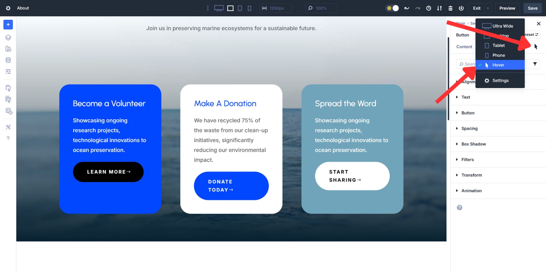
Selecting this will switch your view to the Hover state settings. You can make any changes to your module here.
Change the colors by choosing a slightly darker or lighter version of the variables created with HSL sliders.
This works for any design property. Shadows. Border Colors. Text weight. Image scale. Opacity. Spacing, anything. The hover settings stay separate from default settings. Change your default blue to purple later, and the hover green remains green. These simple hover adjustments add polish to every interaction without requiring any code.
Using Interactions For State Changes
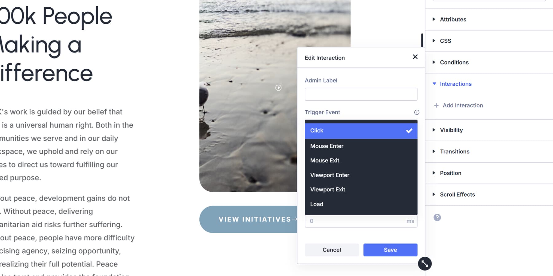
Divi 5 includes a built-in Interactions system that extends the capabilities of state controls. You’ll find it in the Advanced Tab of any element.
There are several triggers:
- Mouse Enter and Mouse Exit work similarly to hover states, but can target any element on your page.
- Click triggers can behave like an active state, responding when someone presses a button.
- Viewport Enter fires as people scroll, and Viewport Exit does the opposite.
- Load triggers wait for a delay you set, then execute.
Those hover state settings we covered earlier only change the element you’re hovering over. Interactions break that limitation. Hover over a button. A section three rows down changes its background. Click an icon. Different modules can respond at once.
Building State Variations With Presets
You can even change the presets of a module using Interactions. The principle matches how CSS states work, responding to user actions with visual changes. Let’s see a few examples:
Focus
Style a section with a lighter shade of your primary color created with HSL as the background. Save this as the Section Default preset by clicking on the Presets button on the top right and selecting ‘New Preset From Current Styles’.
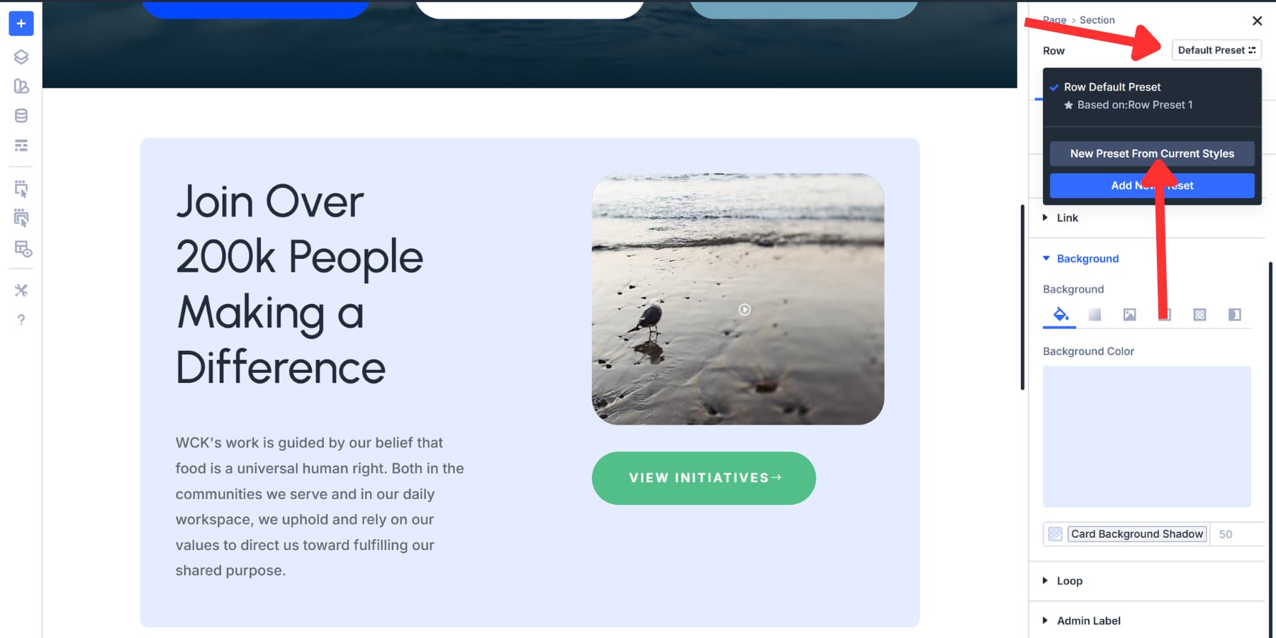
Then, click on the same icon and now select ‘Add New Preset’. Change the background to one of the Primary Color variables. Add a border using a dark variation variable. Save as Section Highlighted.
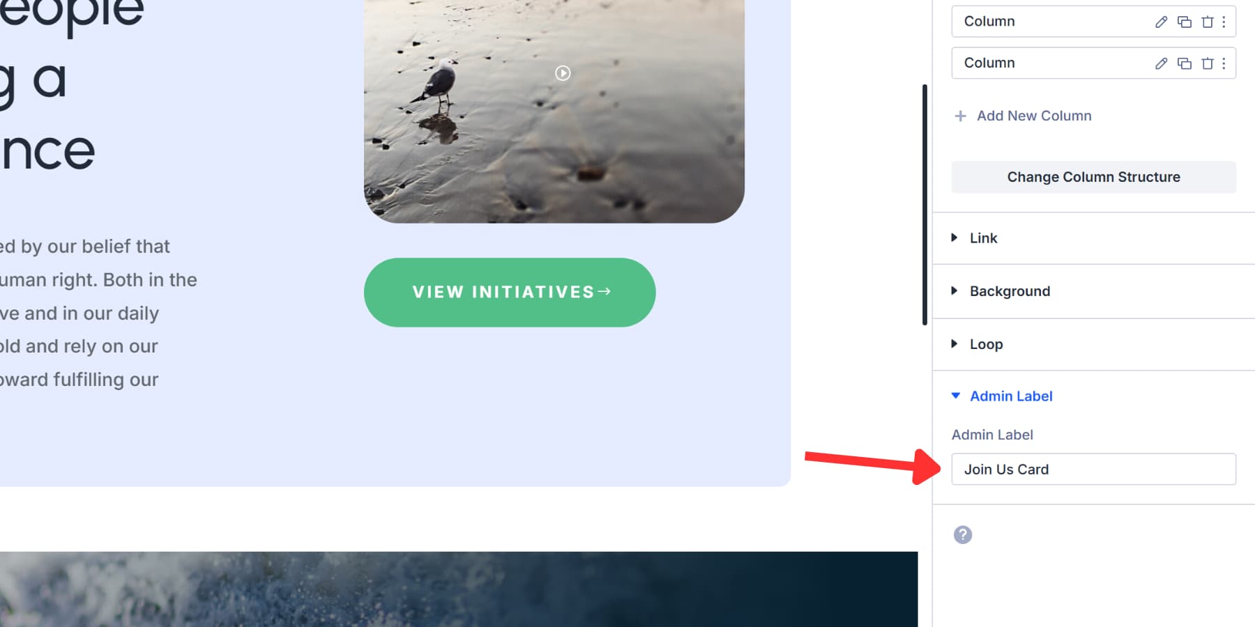
You can even add box shadows, opacity, transform scale, and more to make the highlight more striking. Then, go to the Admin tab and label this section with a memorable name.
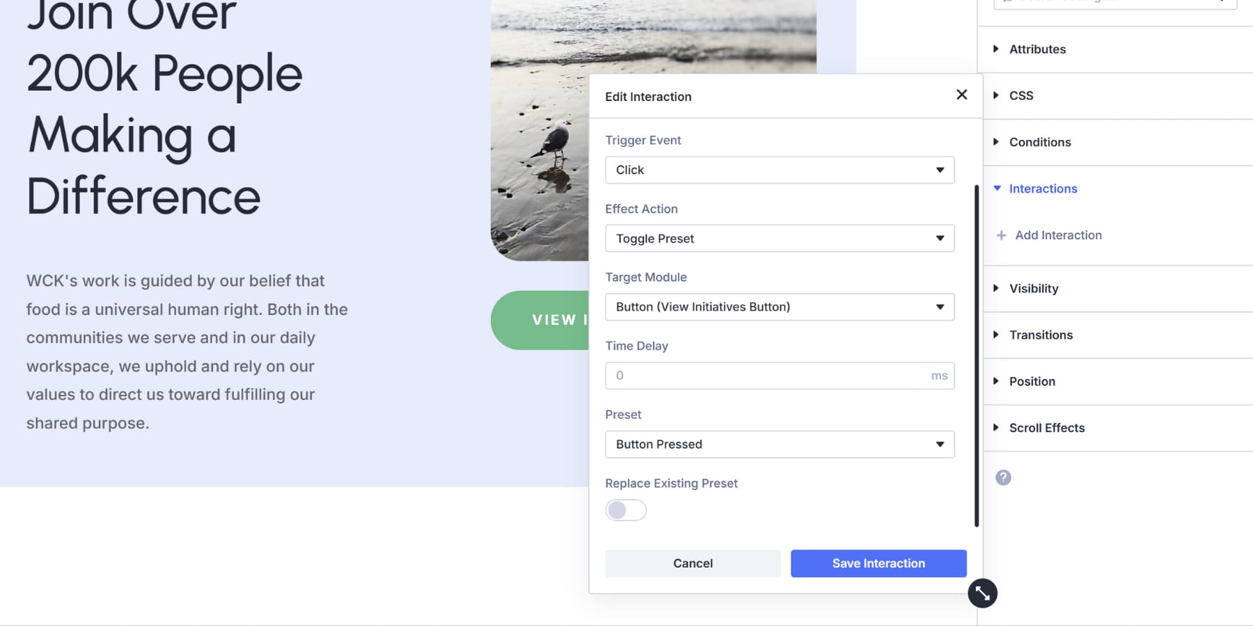
Open Advanced, then Interactions. Add one with an appropriate label, ‘Viewport Enter’ as the trigger, ‘Toggle Preset’ as the effect, and select the section you want to target.
Here’s where adding an admin label in the last step would help you quickly find your section. You can even add a slight delay to make the presets appear smoother when they are toggled.
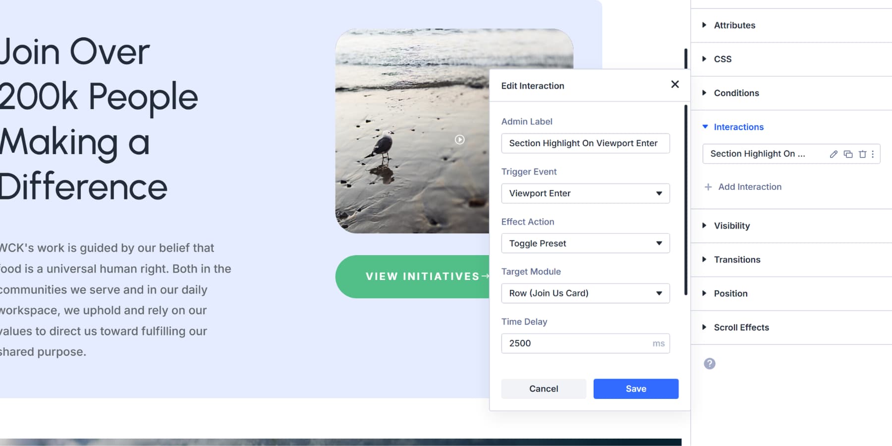
Then, select “Section Highlighted” as the preset and save.
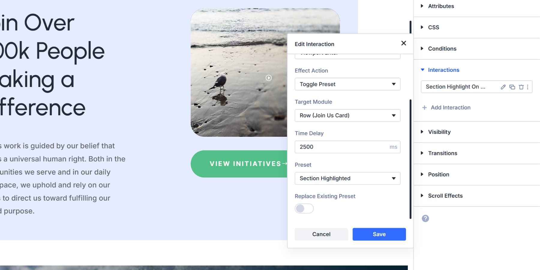
The section brightens now when it scrolls into view, acting like a focus state drawing attention to that content.
Active
To enable an active state, you can use Click triggers. Style a button with a base color and save this as a preset.
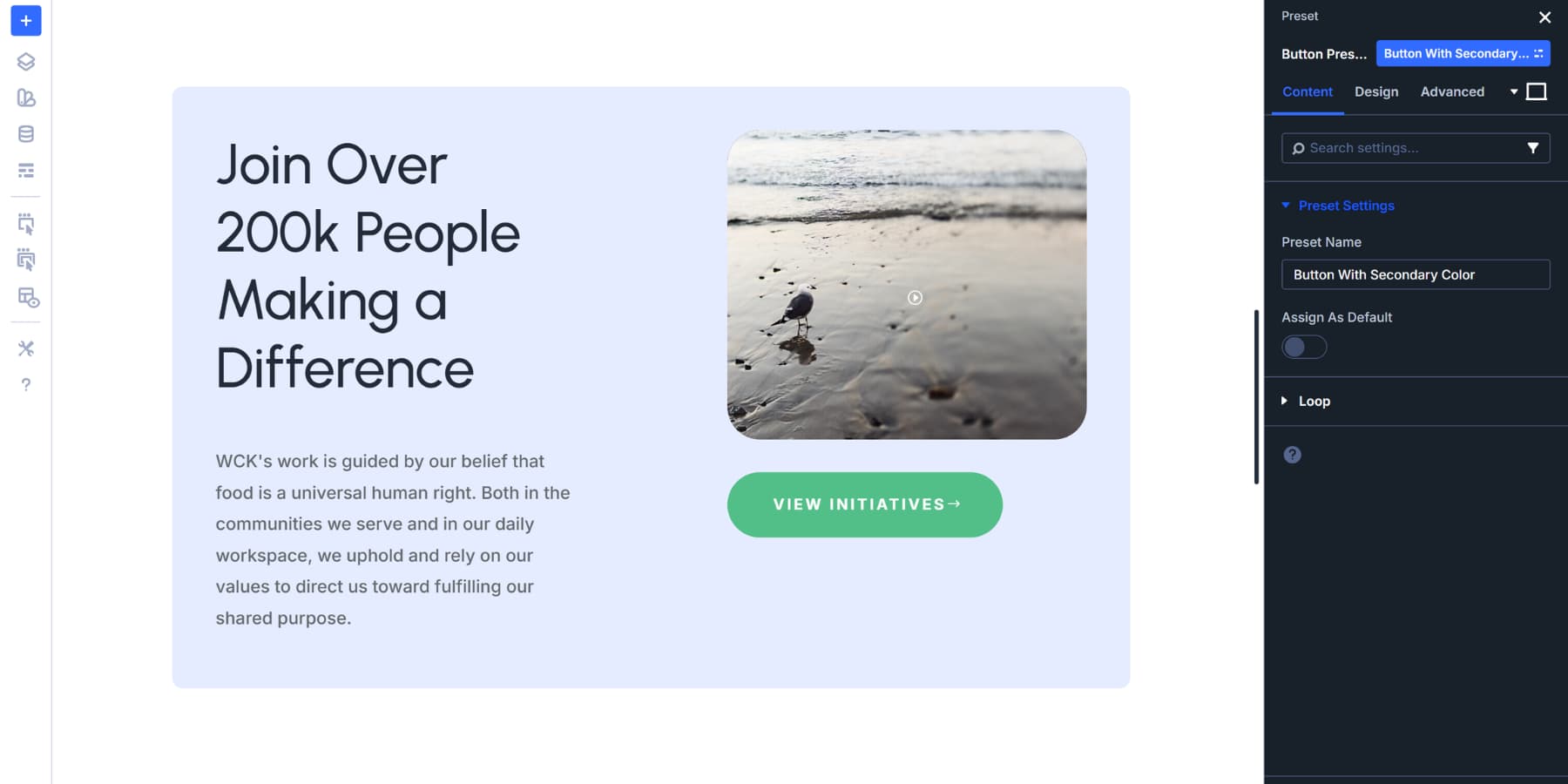
Then, change to a darker variation and save as “Button Pressed” preset. Style it as you prefer.
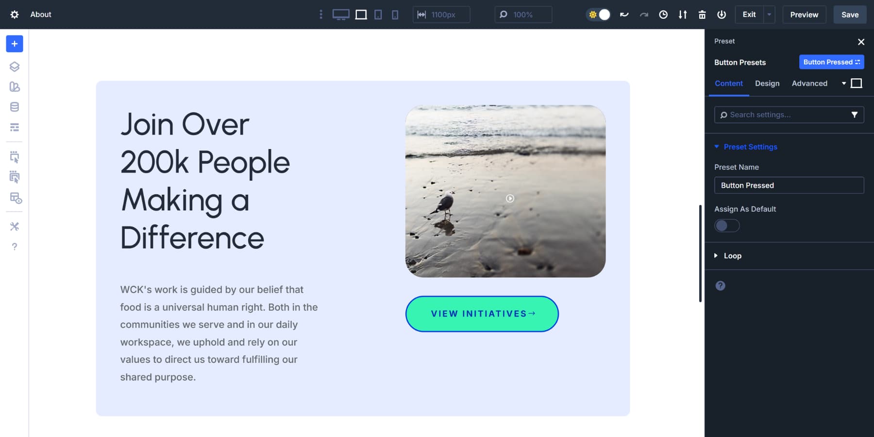
Then, add a label in the settings. Add an Interaction with a Click, toggling between both presets. This makes your button versatile while emulating proper states.
Interactions give you control over what changes and when they occur. You can target any element on your page, not just the one being interacted with. Style changes, visibility toggles, and preset swaps all become possible without requiring code. To learn more about this feature in detail, we recommend consulting this comprehensive guide.
State Controls Built Into Specific Modules
Beyond the Hover state settings and Interactions, Divi 5 weaves state management into individual modules where it makes sense. These controls operate on similar principles to CSS states, but they work directly within the visual builder.
The Contact Form Module includes focus styling for form fields. Here, you can easily add a variation variable of the normal fields to indicate that the field is in focus.
The Group Carousel Module offers separate controls for Groups and Active Groups. Inactive slides can get one set of styles. The active slide receives another. You could apply variations of your colors to these states to clarify the group’s state for your visitors.
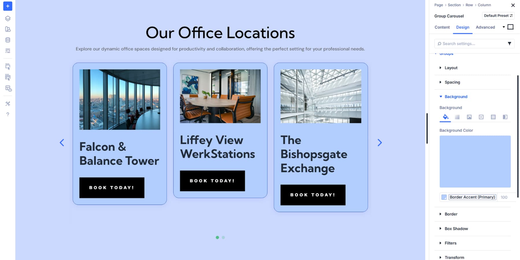
Beyond these, you can also add different filters, transforms, or backgrounds that switch automatically as slides rotate.
Try Color Management In Divi 5 Today
Building sites that respond to every interaction doesn’t need to be complicated anymore. Divi 5 puts color consistency and state management in the same place, right inside the visual builder. Your designs stay cohesive across every hover, focus, and click.
The system handles the technical parts while you handle the creative decisions. Start building with these tools today and watch your interactive elements come together faster than ever before.


Leave A Reply