
Thanks to new features in Divi 5, you can build modern, space-efficient blog layouts that go beyond rigid rows. Pair Loop Builder to pull in dynamic posts with CSS Grid to arrange them in flexible, masonry-style layouts that stay responsive across breakpoints.
In this post, we’ll walk through the setup step by step so you can recreate it in minutes!
What Is CSS Grid In Divi 5?
CSS Grid in Divi 5 is a robust layout system that transforms how you design blog pages, enabling advanced grid-based arrangements, such as masonry layouts. Unlike traditional layouts, CSS Grid enables items to automatically adapt to the Grid without requiring explicit positioning, resulting in a seamless and dynamic display.
Key Features Of CSS Grid
- Pre-Built Grid Templates: You can apply grid templates at the container level, either using one of Divi 5’s new CSS Grid row templates, or create your own using the Grid Layout Style.
- Customizable Options: Fine-tune column and row templates, set dimensions, adjust grid directions, alignment, justification, and even control individual item width, height, or position.
- Offset Editor: Create asymmetrical, repeating patterns, like making every 4th post span two columns, for a varied, engaging look.
Benefits of CSS Grid
CSS Grid enables you to create masonry grids that enhance the user experience. It integrates perfectly with dynamic content, ensuring your blog posts display beautifully and responsively across all devices. Paired with Divi 5’s Loop Builder, CSS Grid automatically arranges your posts into a stunning masonry layout, giving your blog a modern, professional look.
What Is The Loop Builder In Divi 5?
The Loop Builder in Divi 5 is a dynamic tool that transforms any Divi module into a repeatable template for looping content, such as posts, terms, users, or custom post types. It gives you unparalleled control to create custom blog feeds without being confined to rigid, traditional modules.

Key Features Of Loop Builder
- Dynamic Templates: Design templates using Divi modules, pulling in dynamic content like post titles, featured images, excerpts, or custom fields.
- Customizable Queries: Filter content by post type, categories, tags, meta values, or ordering, and add pagination or offsets for precise control over what displays.
- Seamless Integration: Works with any Divi layout system, including Flexbox and CSS Grid, extending far beyond the limitations of standard Blog or Post Slider modules.
Benefits Of Loop Builder
Loop Builder is perfect for building custom blog feeds with full design flexibility over each looped item, such as stylized postcards. It eliminates reliance on static modules, making it ideal for creating dynamic, tailored layouts. When paired with CSS Grid, Loop Builder effortlessly generates blog post cards that seamlessly flow into a stunning masonry grid, adding a touch of extra flair to your website.
How To Build A Masonry Blog With Divi 5’s Loop Builder + Grid
With a clear understanding of how CSS Grid and Loop Builder work in Divi 5, you’re ready to bring your masonry blog layout to life. We’ll walk you through combining these features to create a dynamic grid that showcases your blog posts with style and flexibility.
Let’s dive into the process, starting with setting up the foundation for your layout. By the end, your layout will look similar to this:
Step 1: Configure The Layout
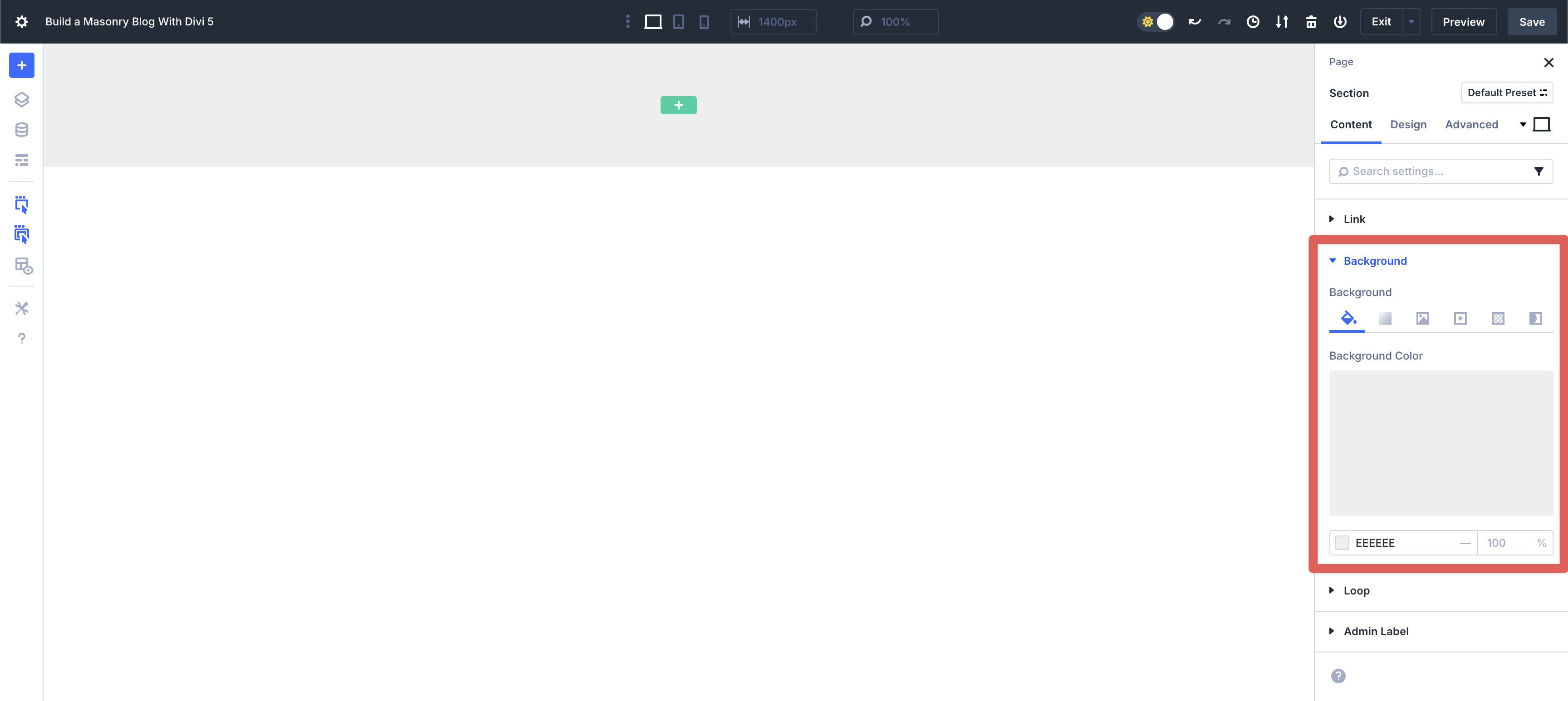
To get started, create a new page and open the Visual Builder. Add a new Section to the page. In the Section’s Content tab, add #eeeeee as the Background Color.
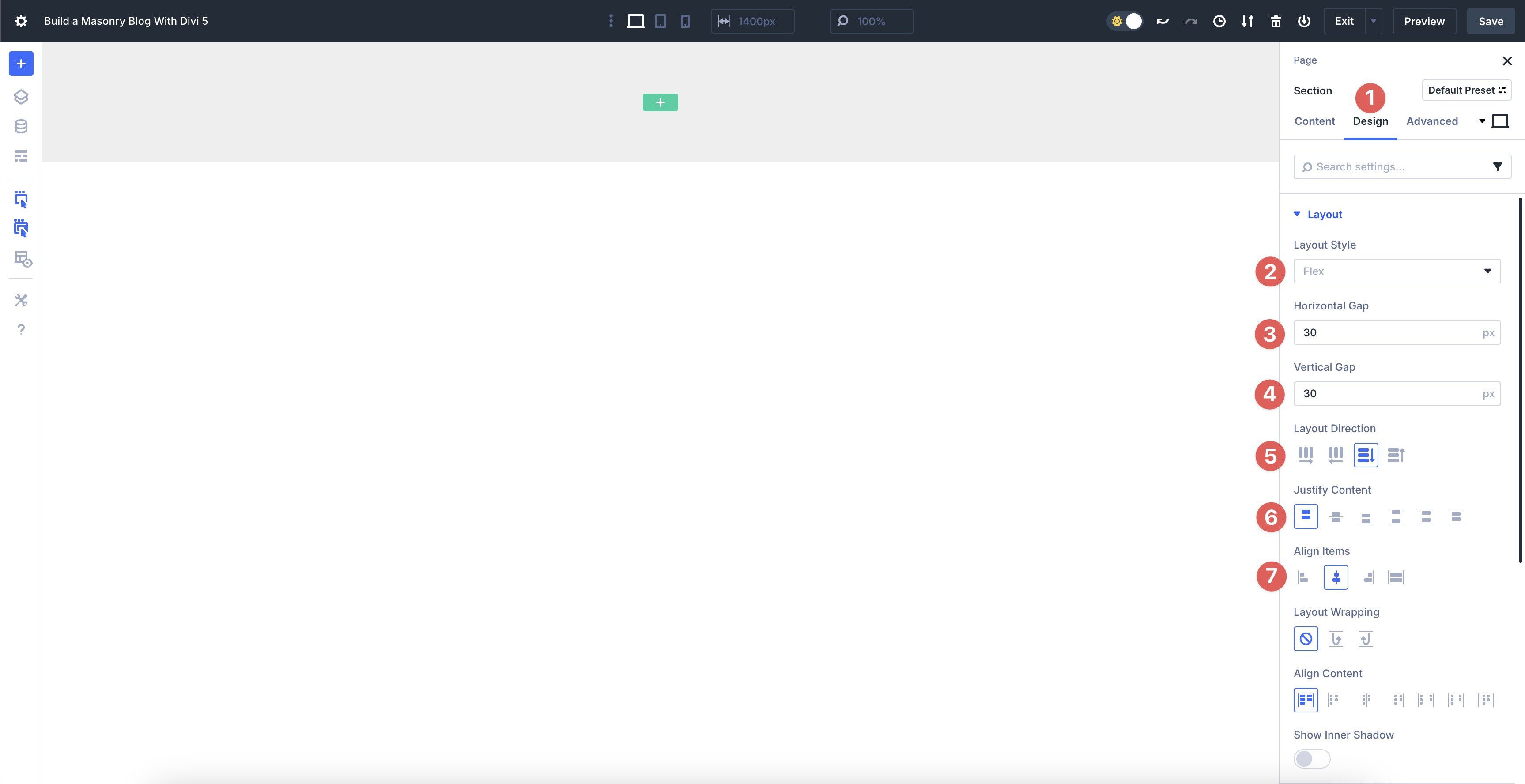
Next, switch to the Design tab. Expand the Layout menu and ensure the Layout Style is set to Flex. Add a 30px Horizontal and Vertical Gap. Set the Layout Direction to Column, Justify Content to Start, Align Items to Center, and leave all other settings at their defaults.
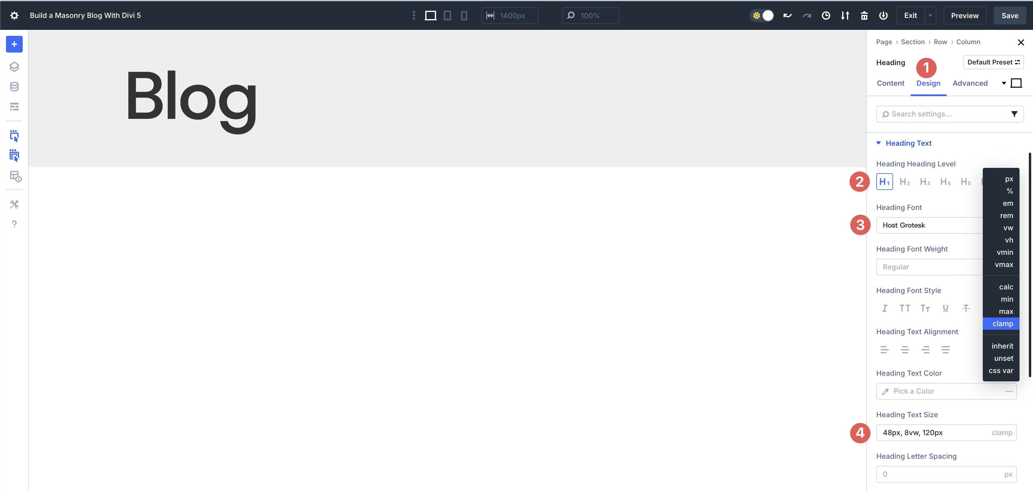
Next, we’ll add a Single-Column Row to the Section. Add a Heading module and give it a title, such as Blog. Click the Design tab. Set the Heading Heading Level to h1. Select Host Grotesk as the Heading Font, and set the Heading Text Size to 48px, 8vw, 120px. Use the dropdown next to the Heading Text Size field to select Clamp.
Finally, add another Single Column Row underneath the first. This will be our parent container.
Step 2: Enable And Configure CSS Grid On The Parent Container
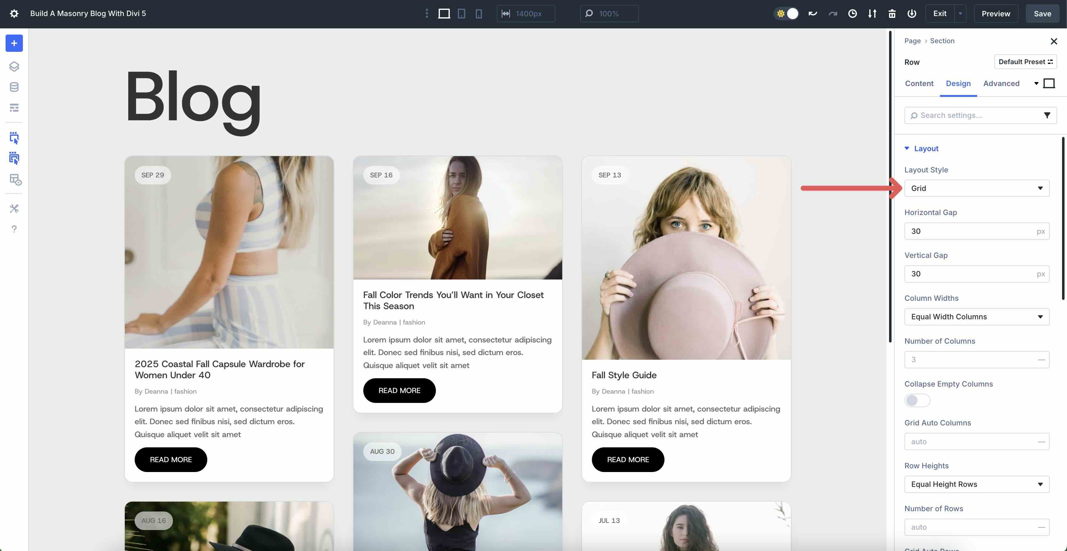
With the Row structure in place, we need to configure the settings for CSS Grid. With the Row selected, click the Design tab. Expand the Layout menu and select Grid as the Layout Style. Add a 30px Horizontal and Vertical Gap for the row.
Under Column Widths, select Equal Width Columns and set the Number of Columns to 3. Choose Equal Height Rows for the Row Heights field.
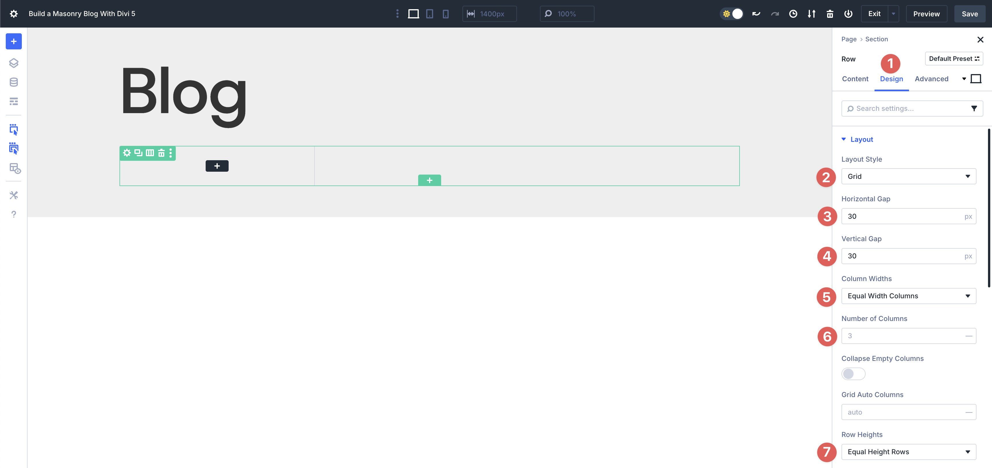
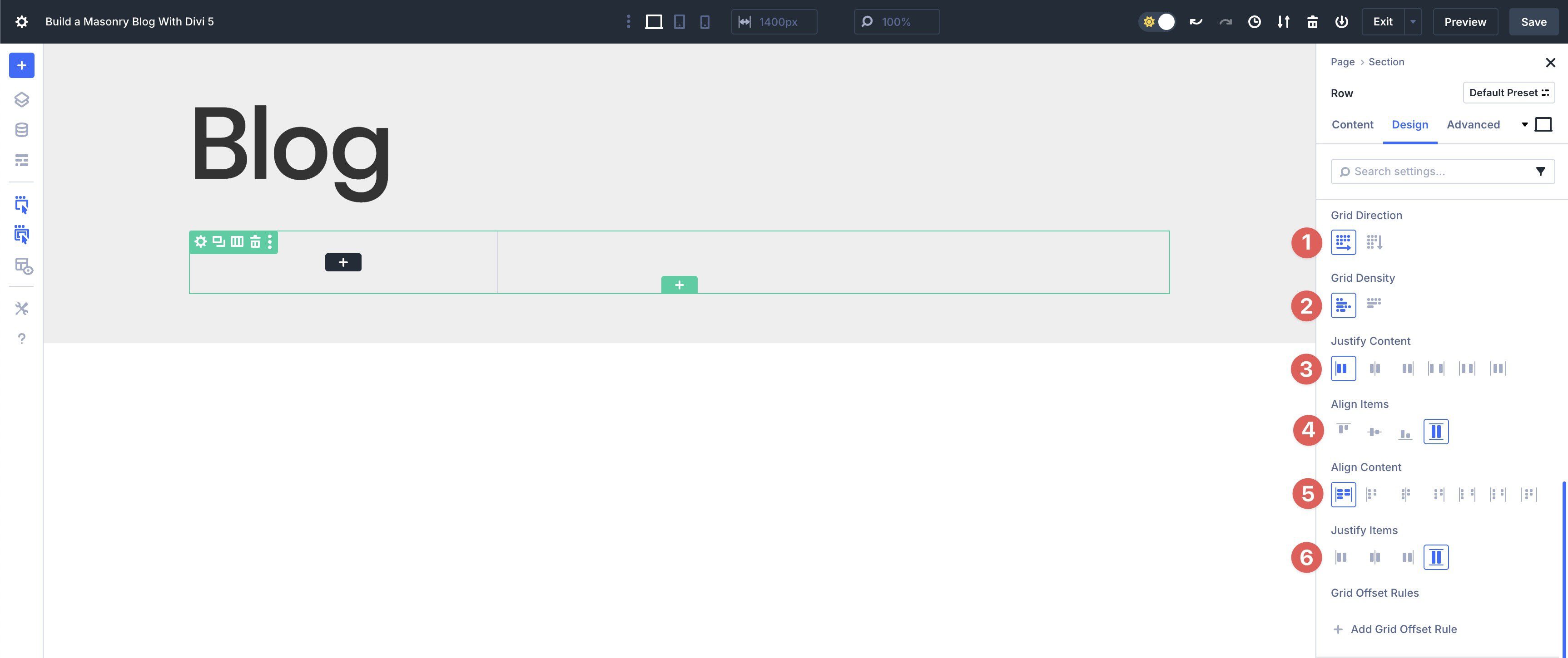
Choose Row for the Grid Direction and Dense for the Grid Density. Select Start for Justify Content, and choose Stretch for Align Items, Align Content, and Justify Items.
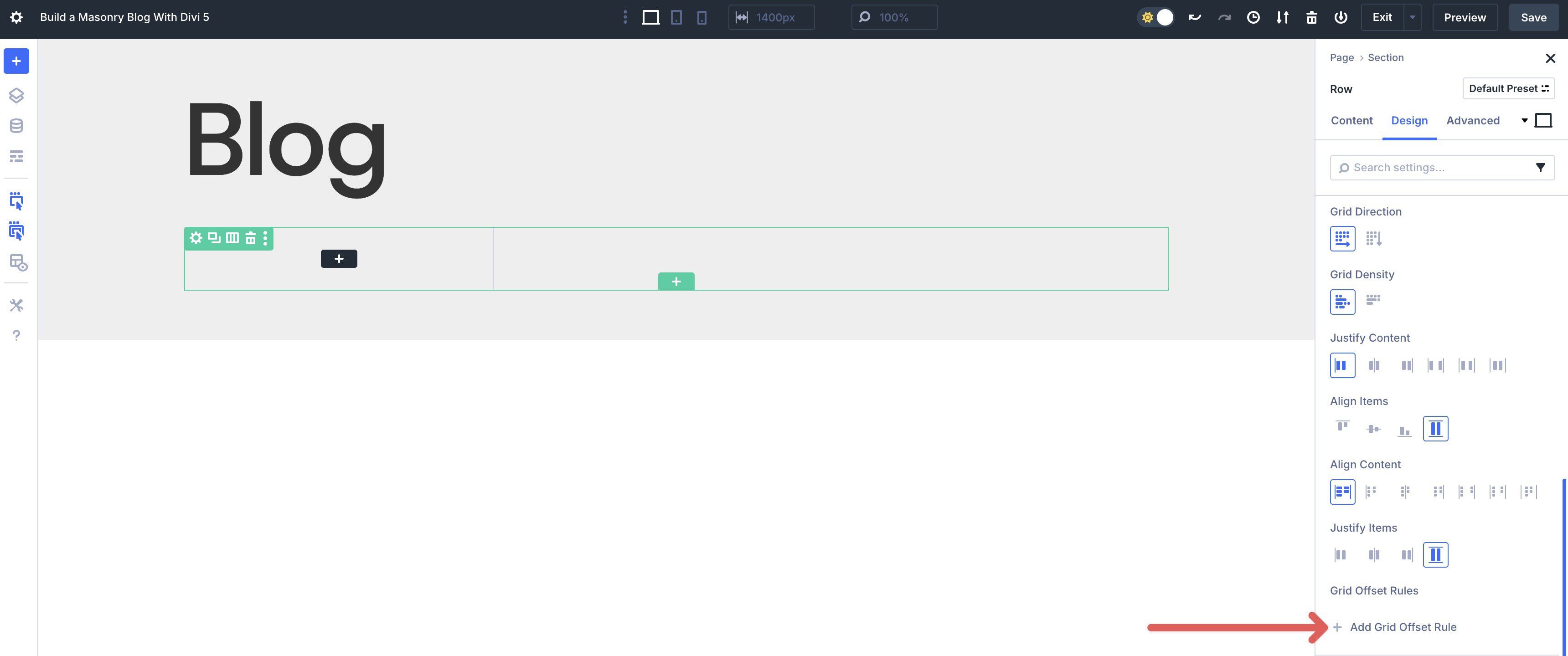
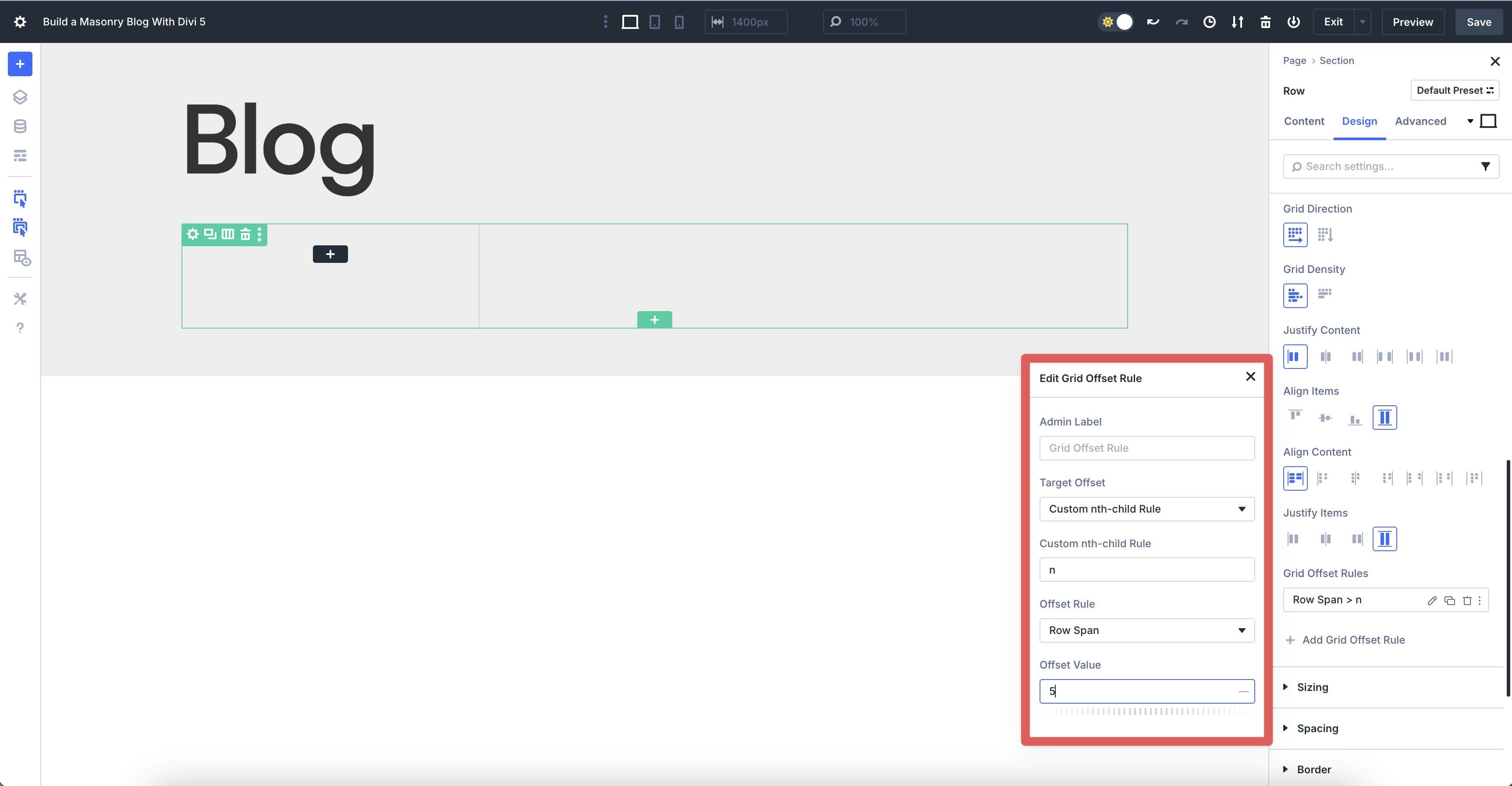
Create Grid Offset Rules
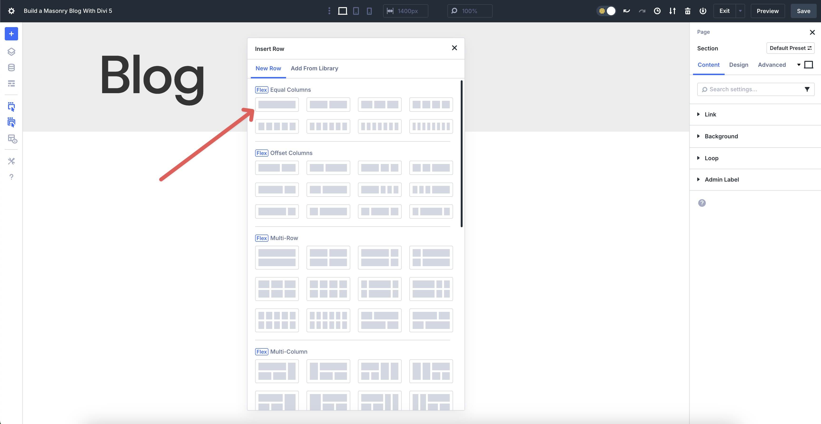
Next, we’ll set up a couple of Grid Offset Rules for our Grid. Grid Offset Rules enable you to apply targeted adjustments to specific items within your Grid, such as making every nth item span multiple columns, shifting positions, or resizing automatically, without requiring custom CSS.
To create a new Rule, click the + Add Grid Offset Rule button.
Use the following settings for the first rule:
- Target Offset: Custom nth-child Rule
- Custom nth-child Rule: n
- Offset Rule: Row Span
- Offset Value: 5
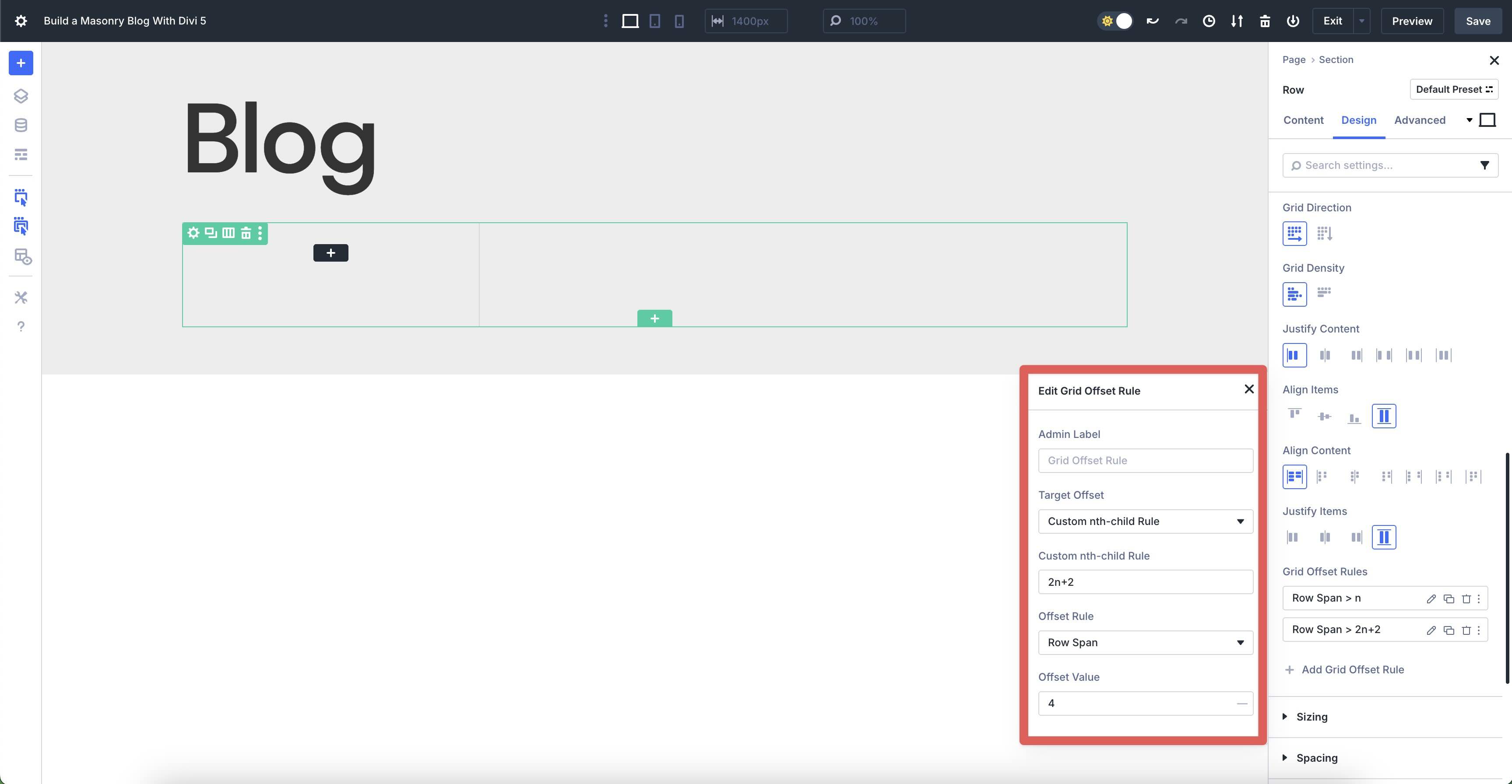
We’ll add a second Offset Rule with the following settings:
- Target Offset: Custom nth-child Rule
- Custom nth-child Rule: 2n+2
- Offset Rule: Row Span
- Offset Value: 4
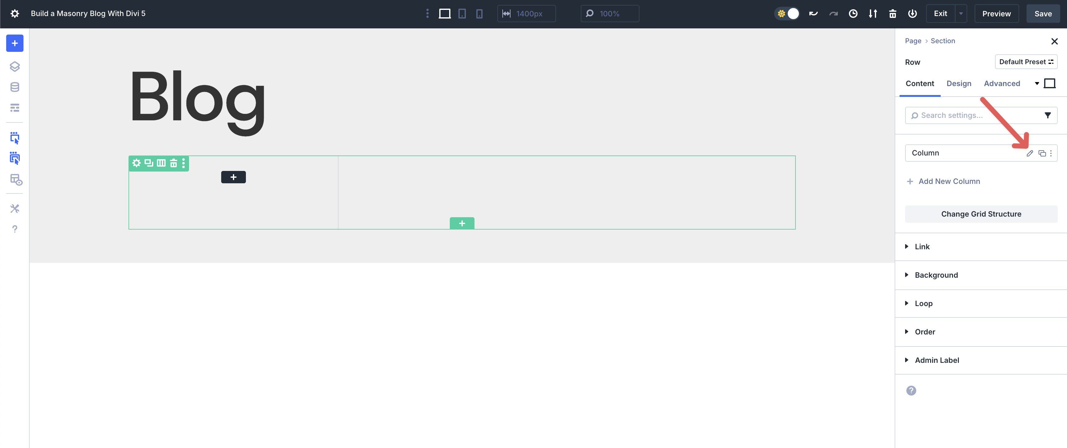
Step 3: Configure The Loop Builder For Dynamic Blog Posts
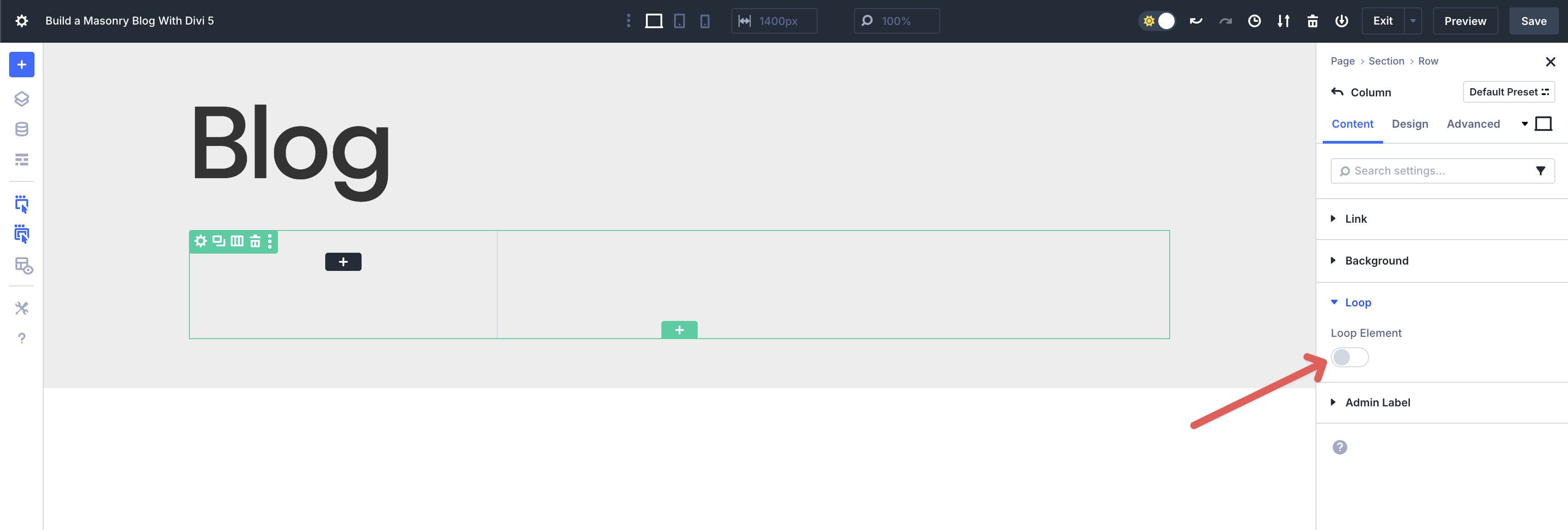
Now that we’ve configured the Grid settings, we need to set up our custom Loop. Navigate to the Row’s Content tab and click the Column’s pencil icon to reveal its settings.
Expand the Loop dropdown menu and enable the Loop Element toggle.
When the options appear, set the Query Type to Post Type (selected by default) and choose Posts for the Post Type.
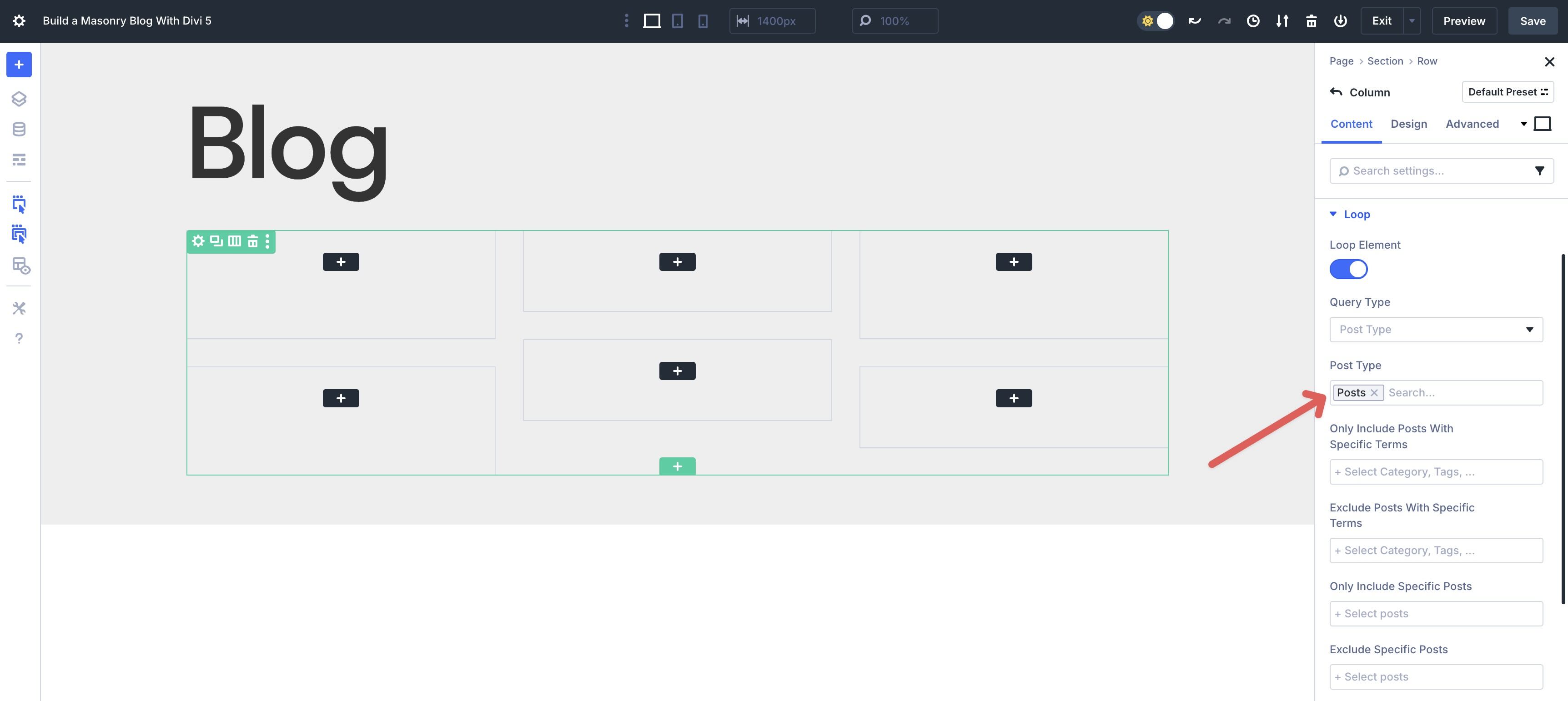
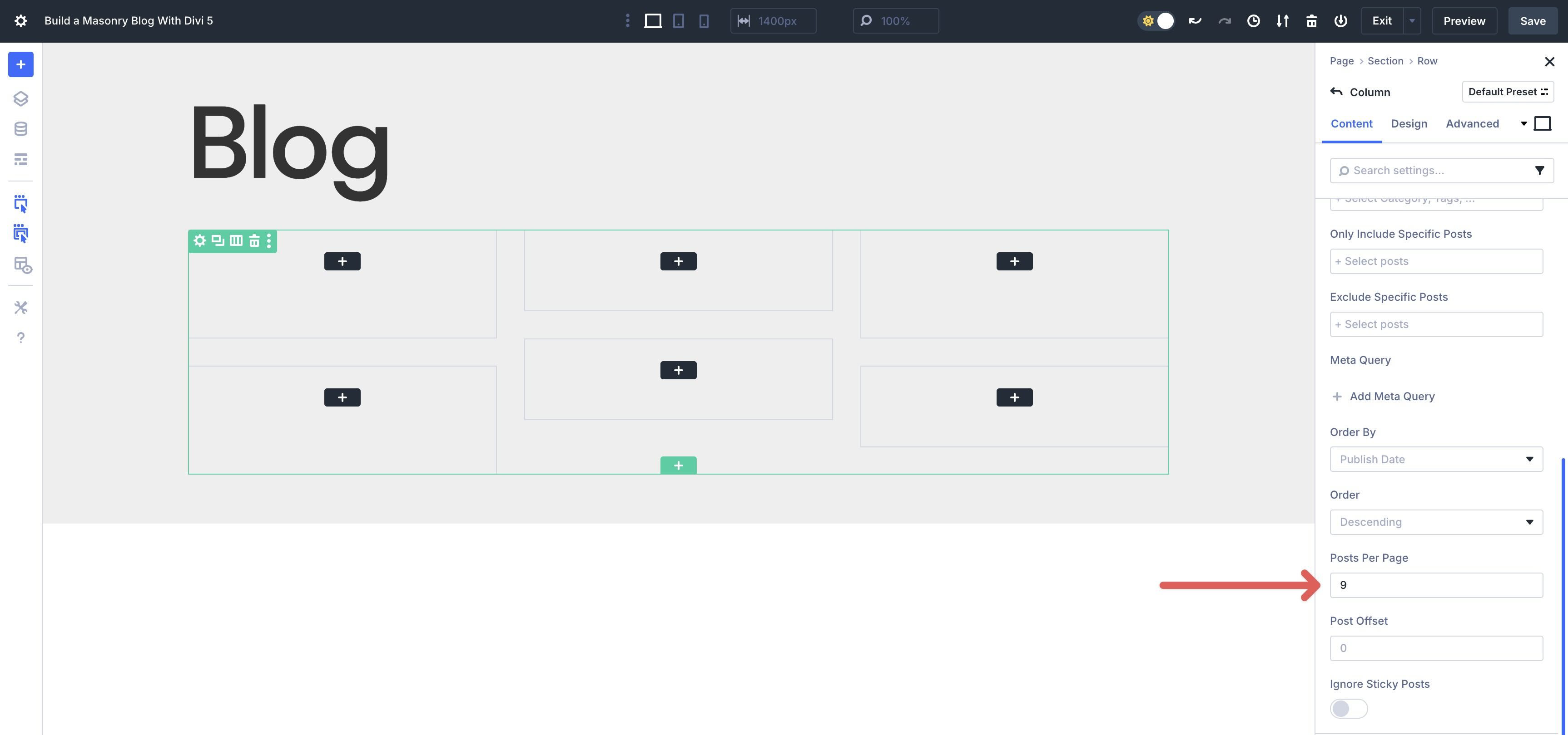
Scroll down and locate the Posts Per Page field and enter 9 as the value.
The final step is to add a Loop Link, so when someone clicks on a Grid item, they will be automatically directed to the corresponding post.
Scroll up to locate the Link dropdown menu and expand it. Click the dynamic content icon and select Loop Link from the available options.
Step 4: Design The Looped Item
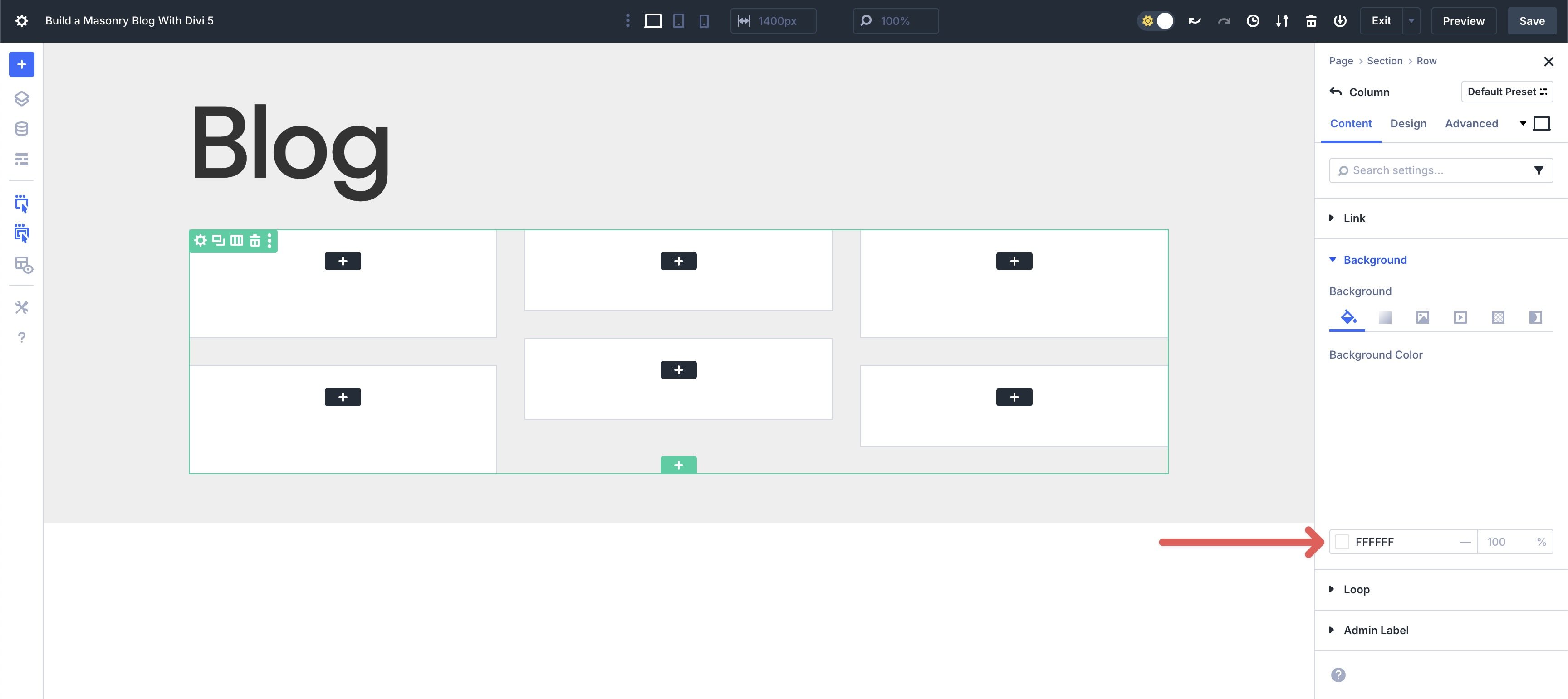
Now, we can start designing the layout. While in the Column’s settings, click to expand the Background menu. Assign #ffffff as the Background Color.
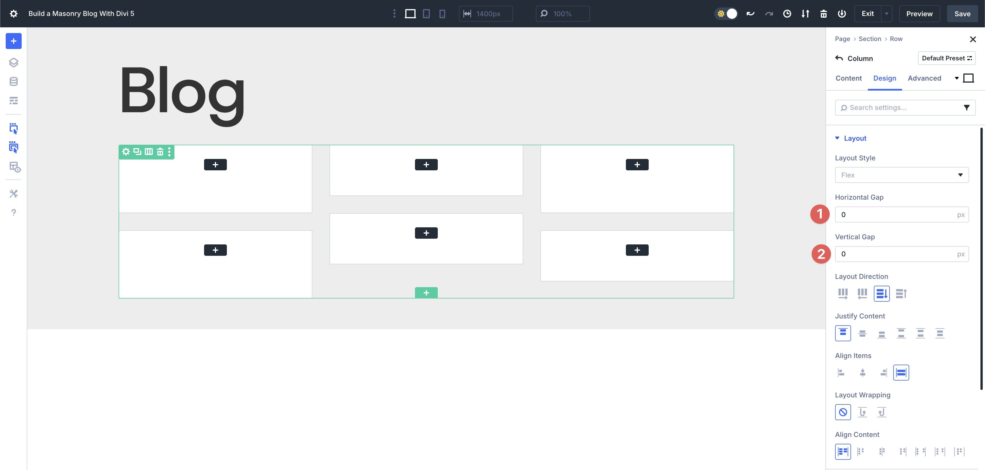
Next, navigate to the Design tab. Expand the Layout menu and set the Horizontal and Vertical Gap to 0. Leave all other Flex settings as is.
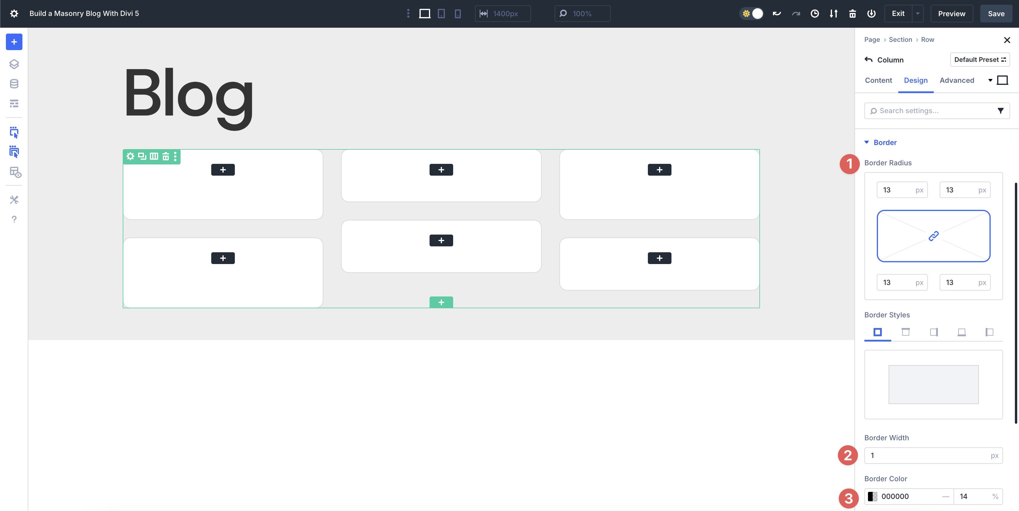
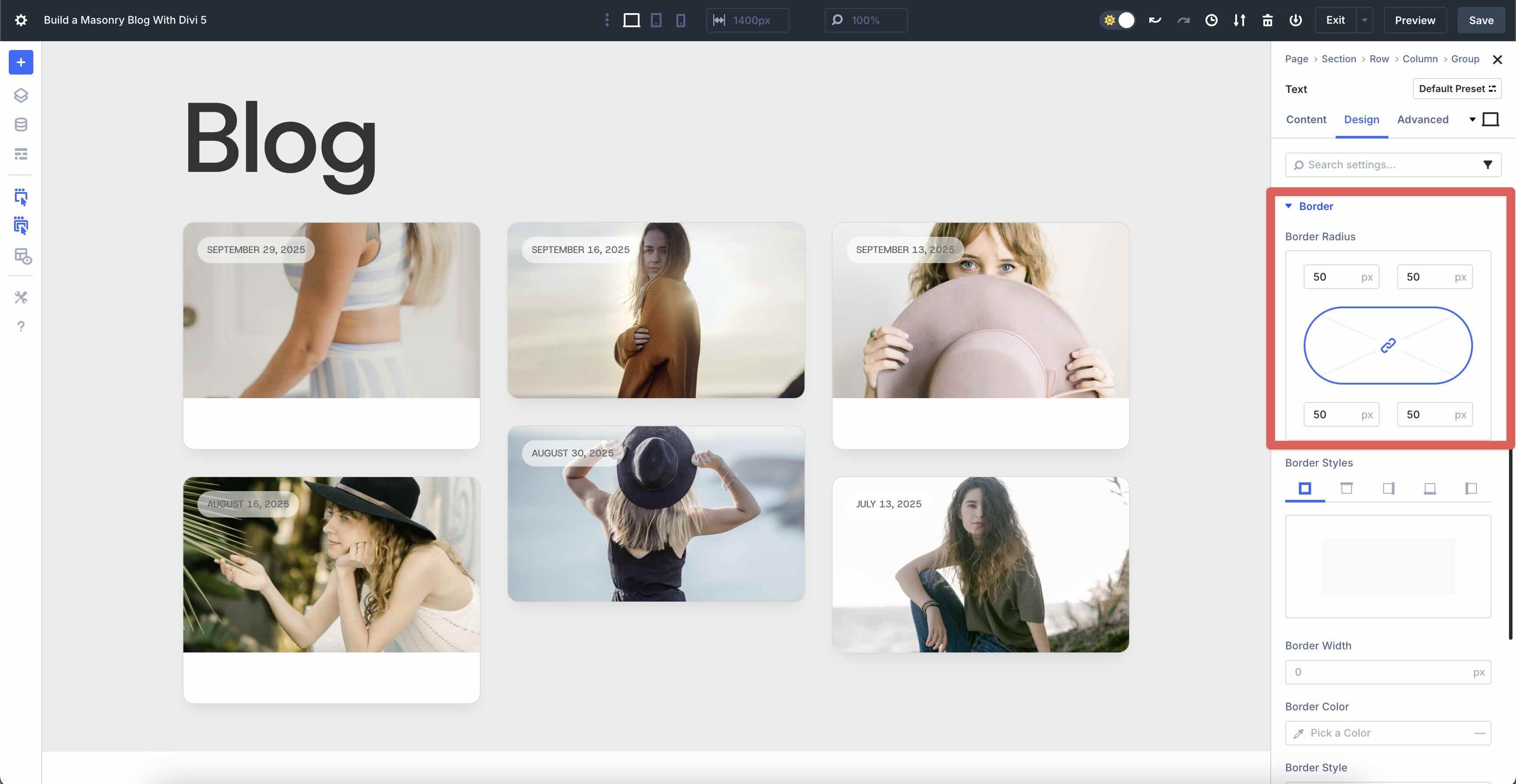
Scroll to locate the Border menu and expand it. Enter 13px for the Border Radius, 1px as the Border Width, and #000000 as the Border Color. Adjust the Border’s Opacity to 14%.
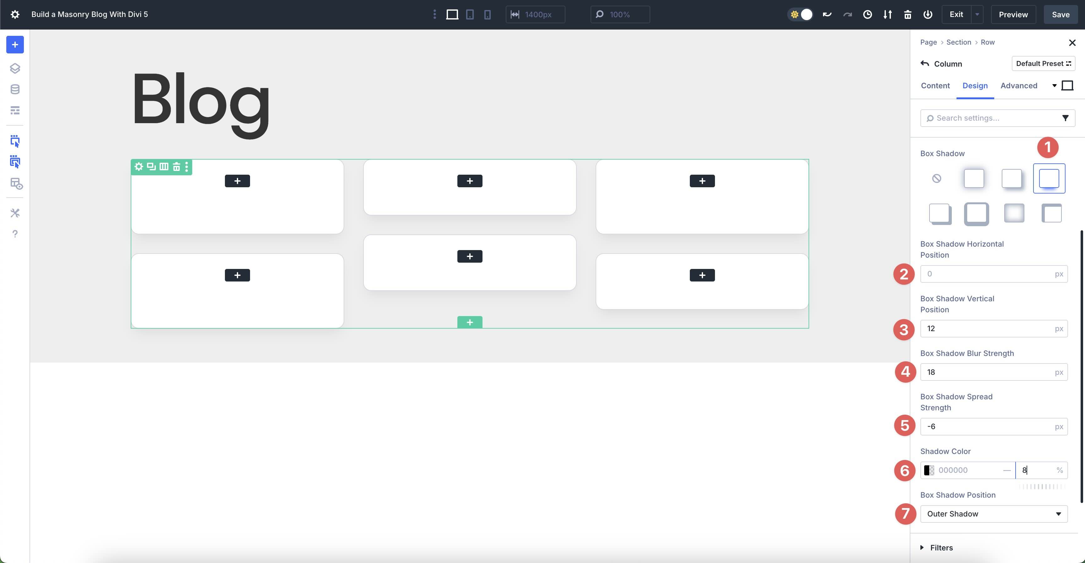
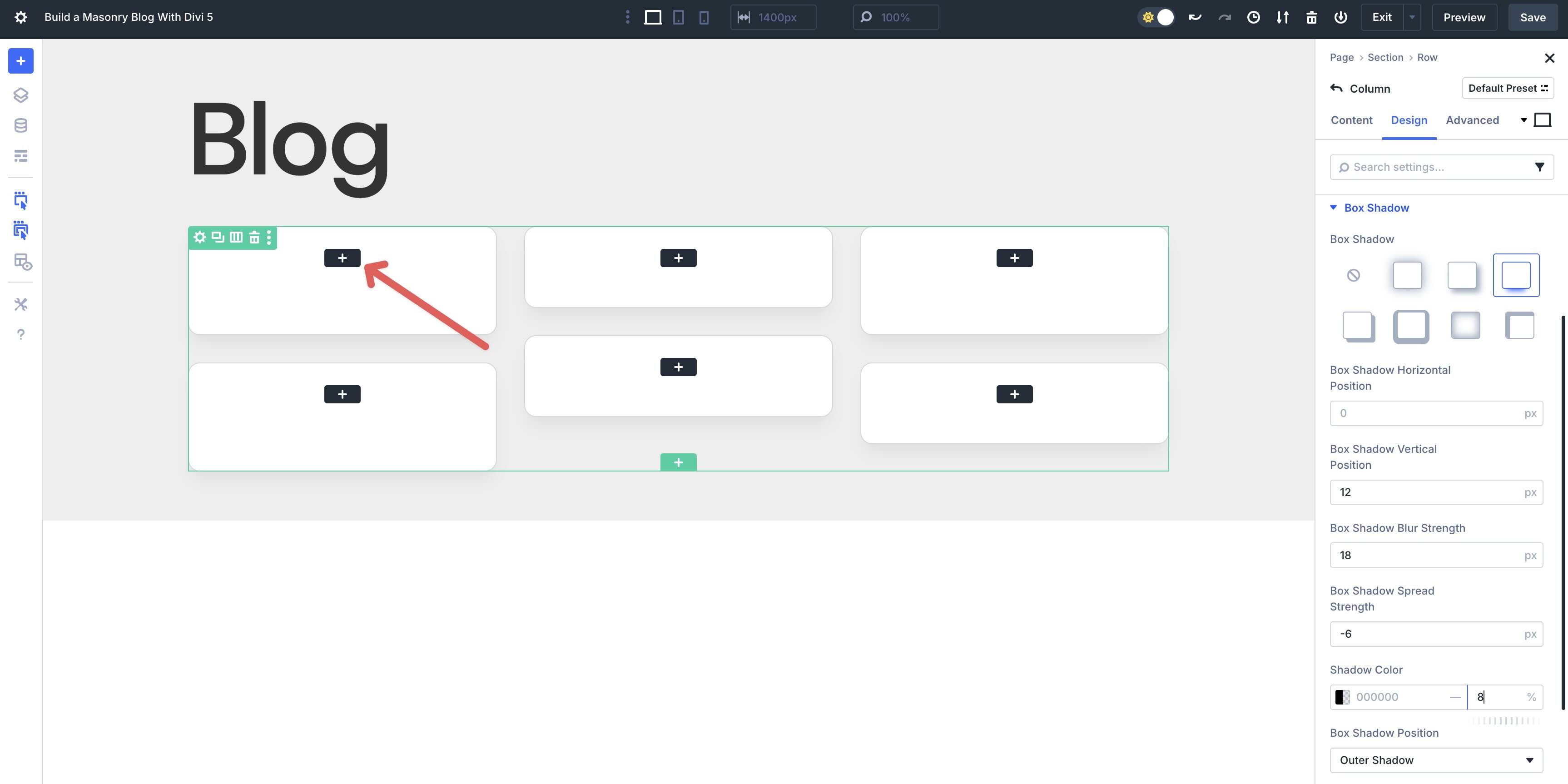
Now we’ll add a Box Shadow to the Loop column. Choose Preset 3 in the Box Shadow field. Set the Box Shadow Horizontal Position to 0px and the Vertical Position to 12px. Enter 18px in the Box Shadow Blur Strength field and -6px in the Box Shadow Spread Strength. Set the Shadow Color to #000000 with an 8% Opacity. Finally, select Outer Shadow for the Box Shadow Position.
Now, we can start adding content to the Loop.
Add A Group Module
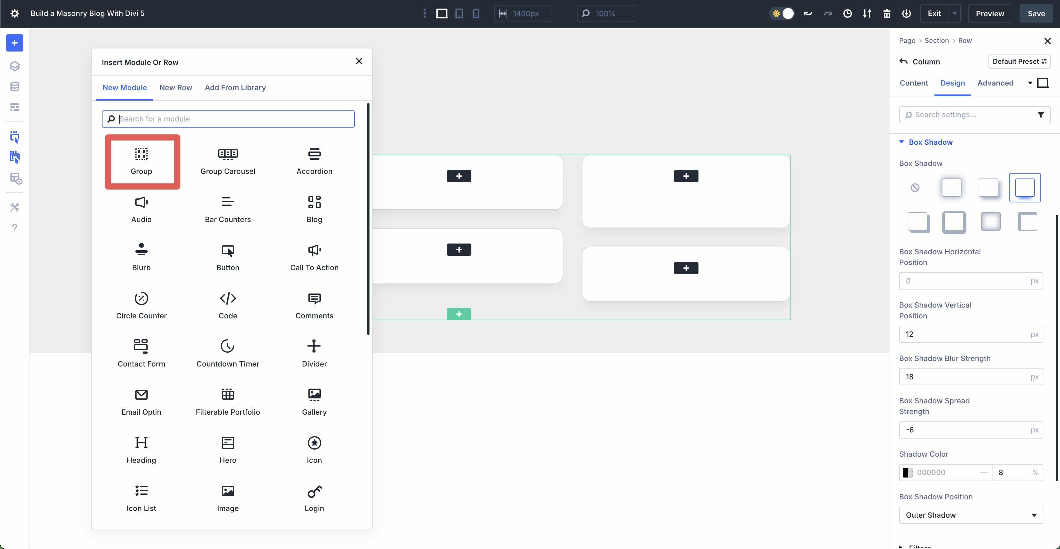
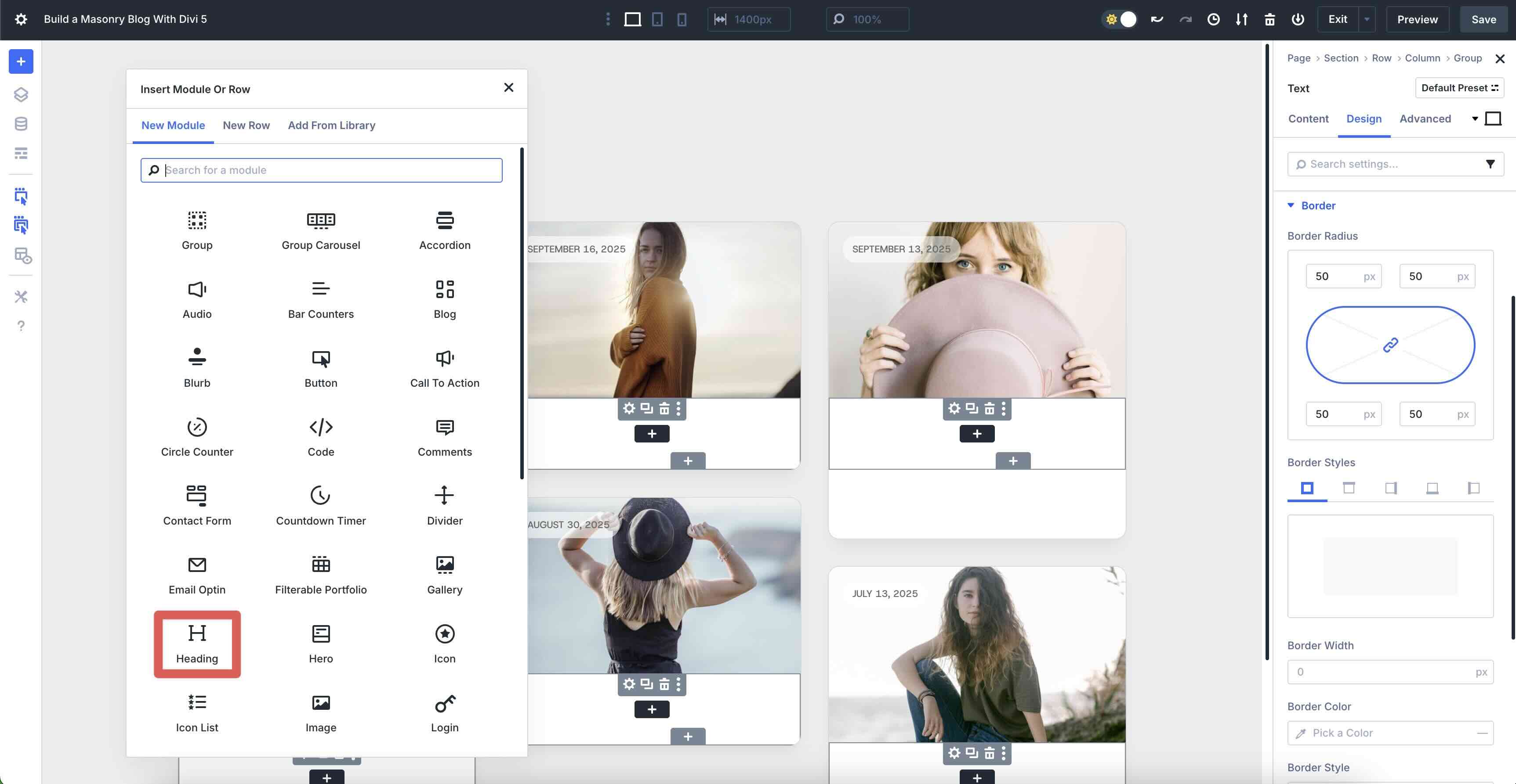
Click into the first Group item. Click the black “+” icon to add the first module.
When the Insert Module Or Row modal appears, click to add a Group module.
In the Group module’s Content tab, expand the Background menu. Select the Background Image tab, click the Dynamic Content icon, and select Loop Featured Image.
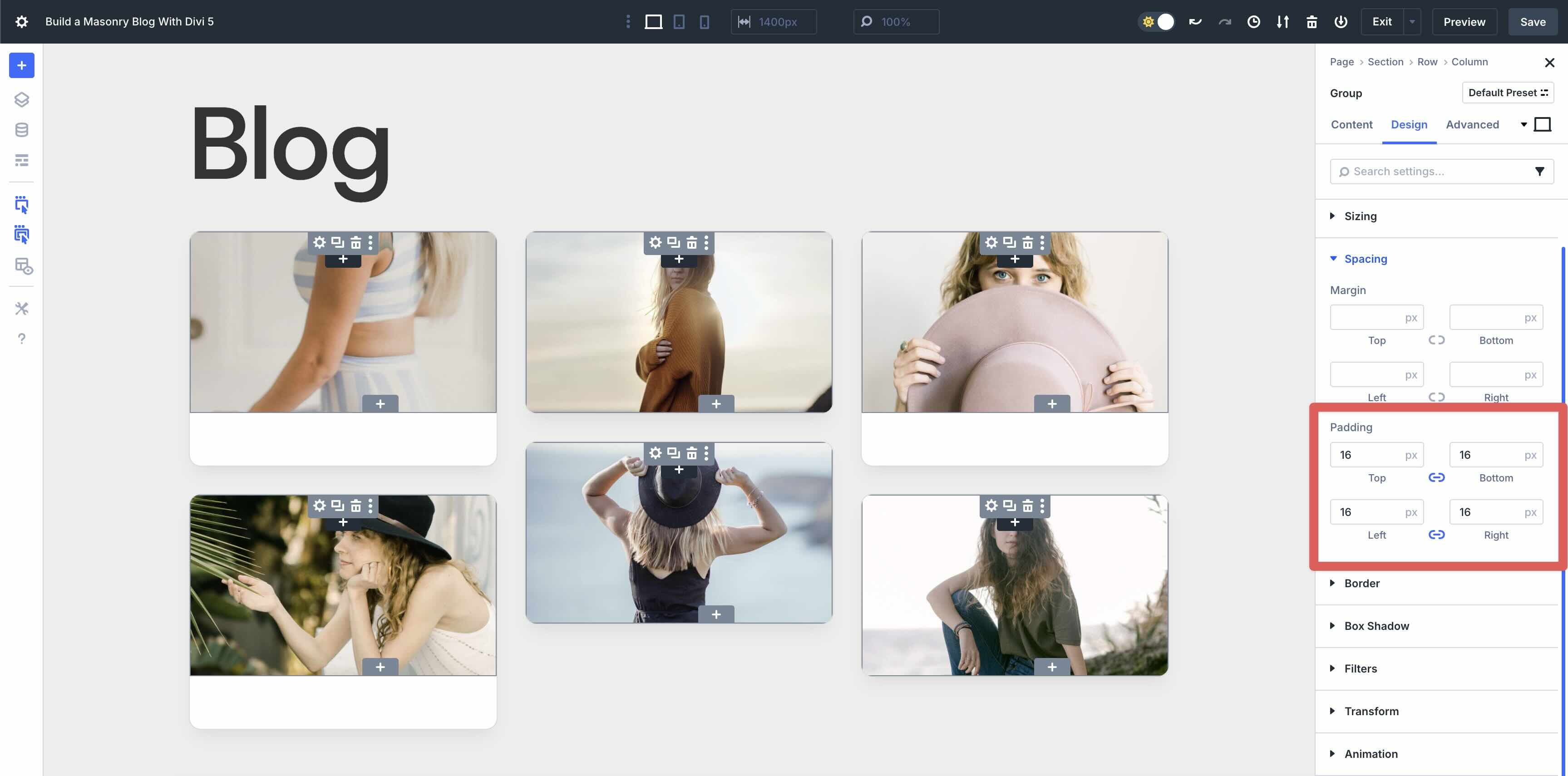
Click the Design tab and then expand the Sizing menu. In the Min Height field, add 200px.
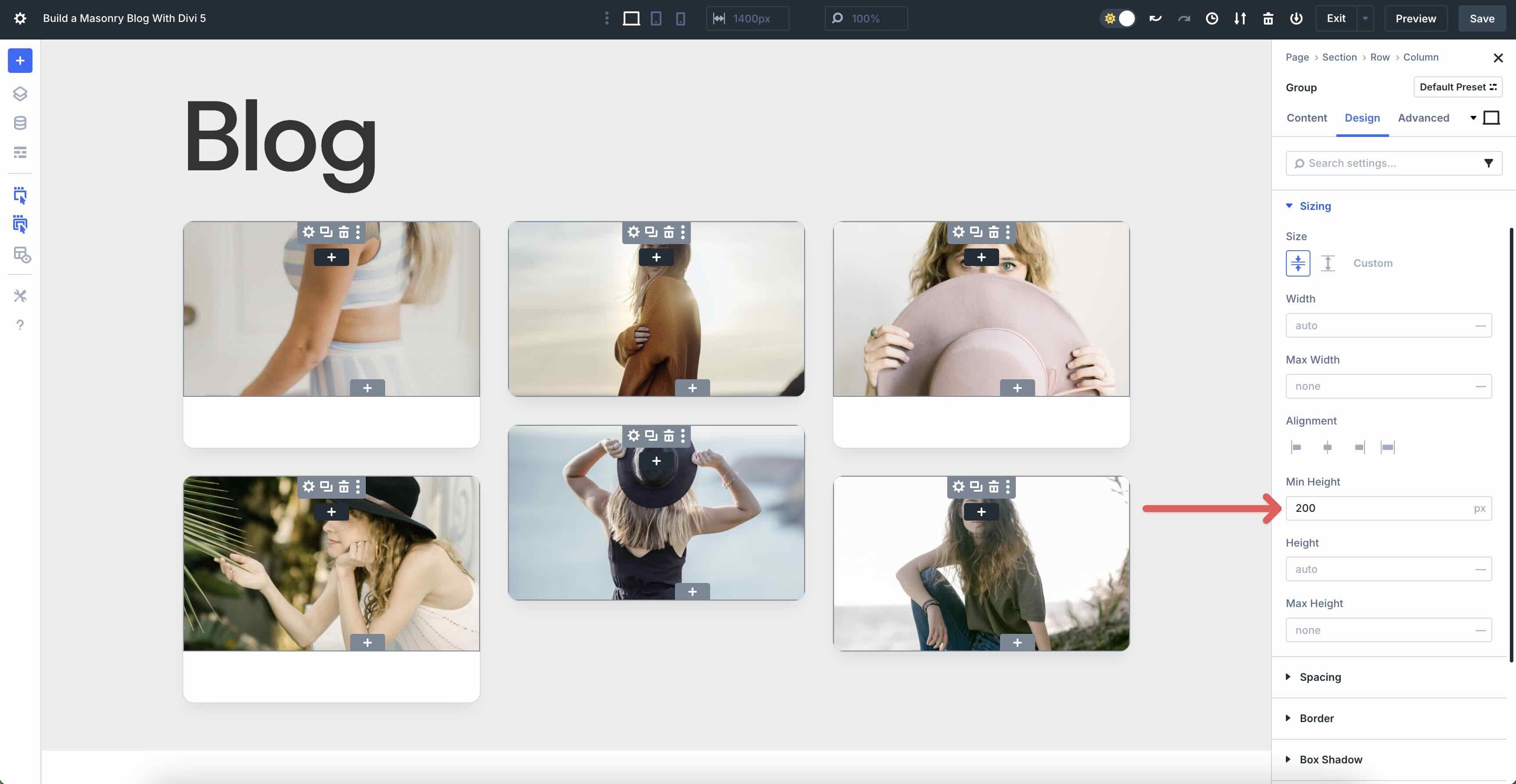
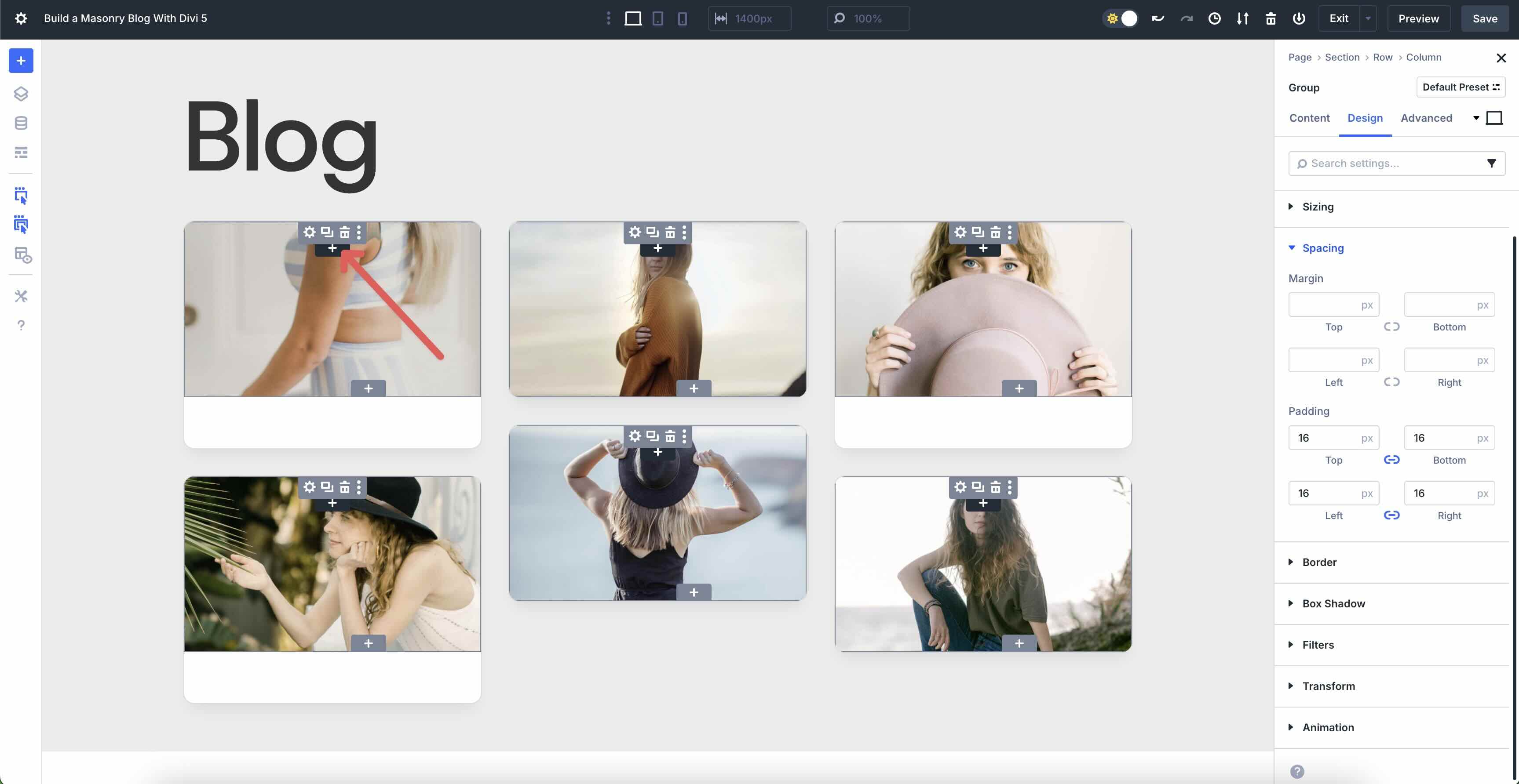
Now, expand the Spacing menu. Enter 16px Padding to all four sides (top, bottom, left, and right).
Add A Text Module
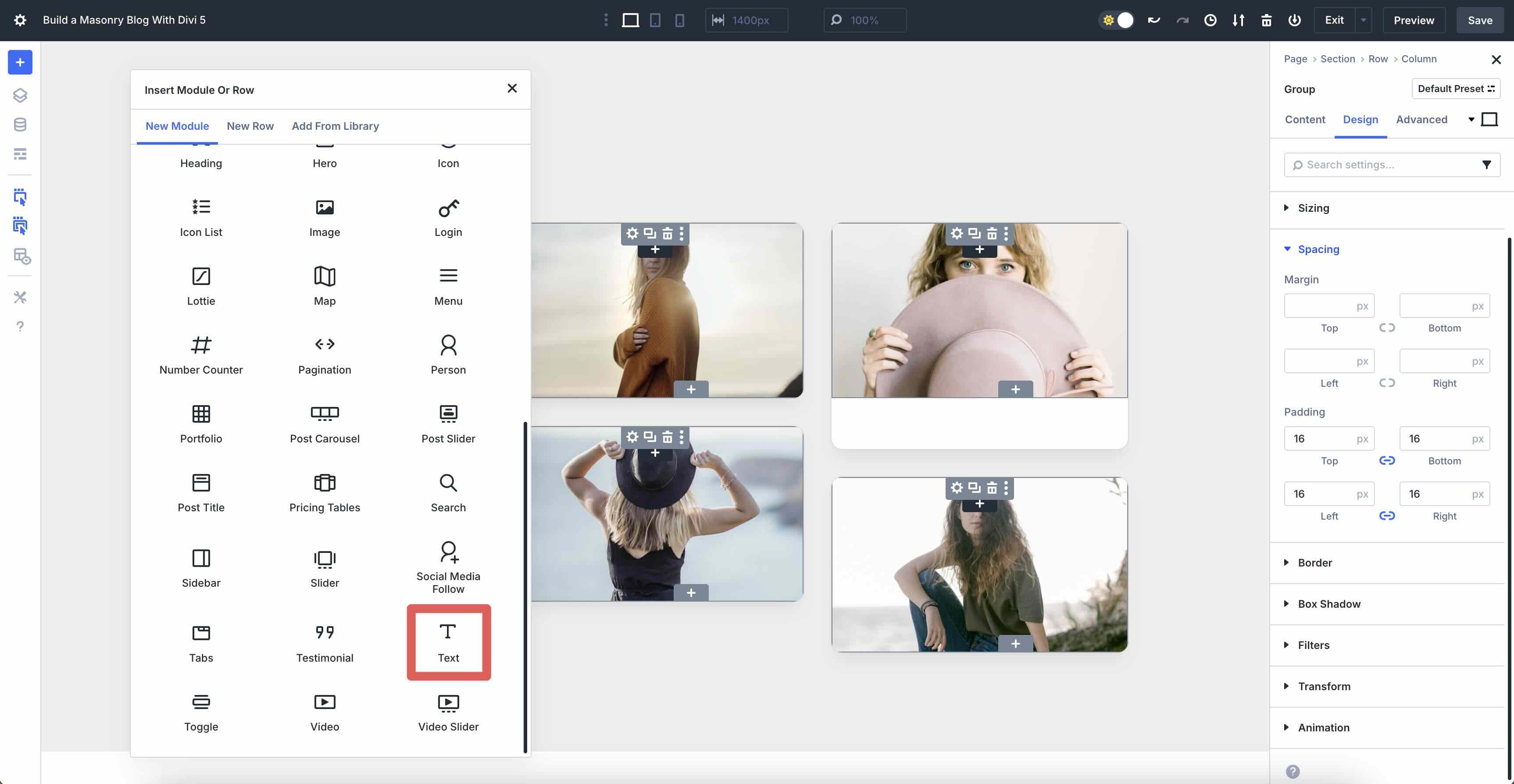
Click the black “+” icon to add a new module to the Group module.
Click to add a Text module.
In the Text module’s Content tab, click the Dynamic Content icon just above the Body field. Select Loop Publish Date from the available options.
Next, we’ll add a background color to the text. Expand the Background menu in the Content tab. In the Background Color field, enter #ffffff as the Background Color and set the Opacity to 60%.
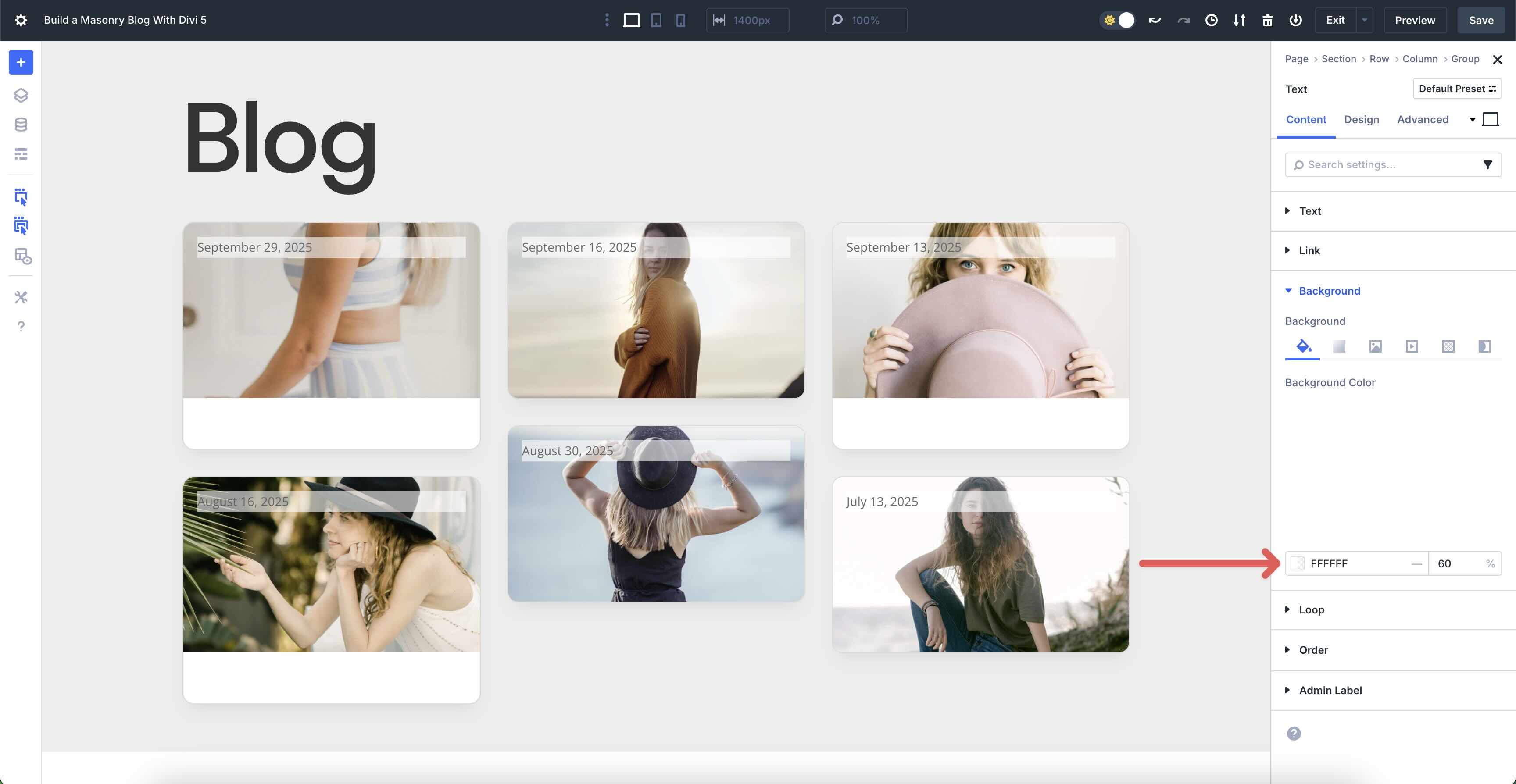
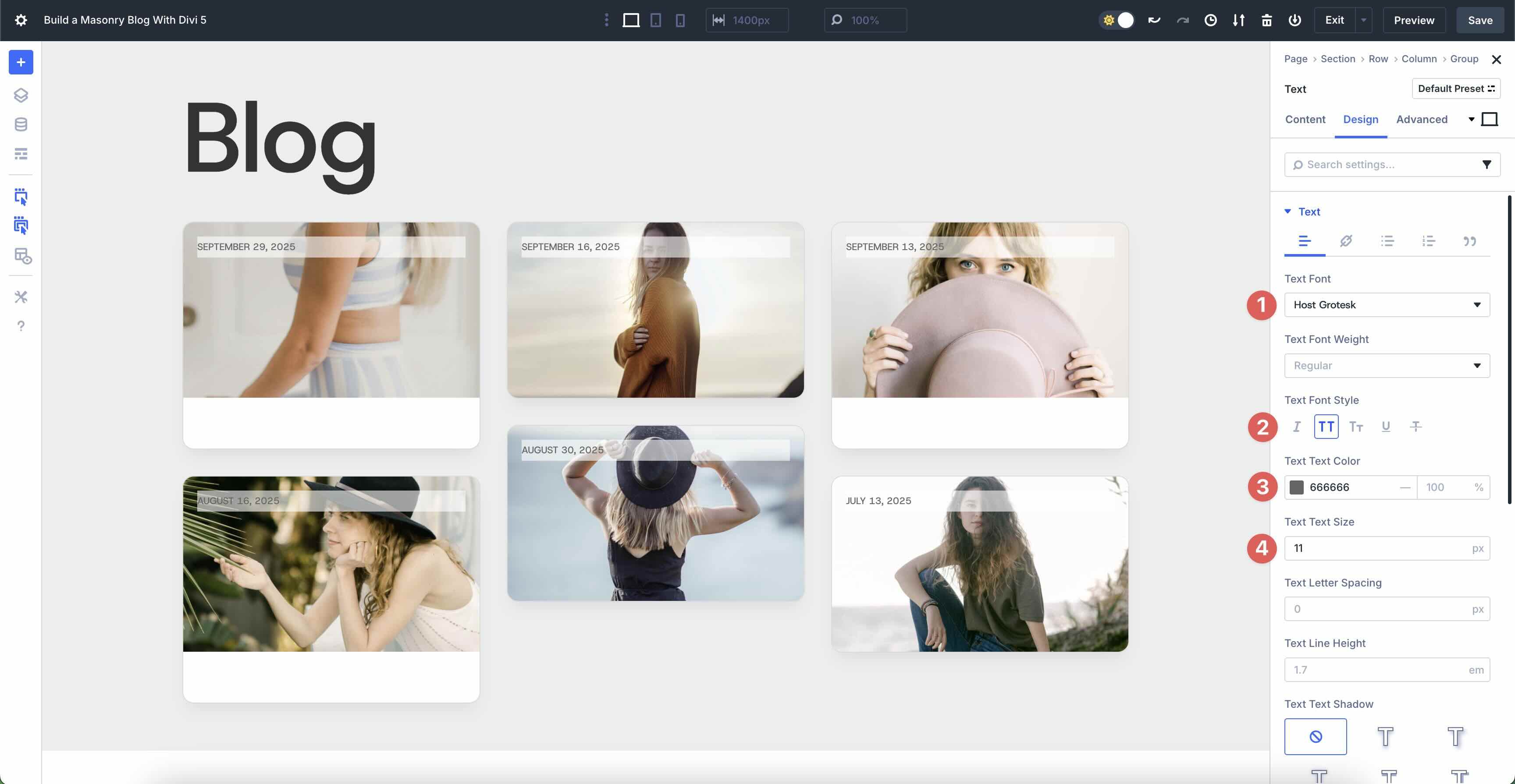
Click the Text module’s Design tab. Expand the Text menu. Enter Host Grotesk as the Text Font, Uppercase as the Text Font Style, and #666666 as the Text Text Color. Set the Text Text Size to 11px.
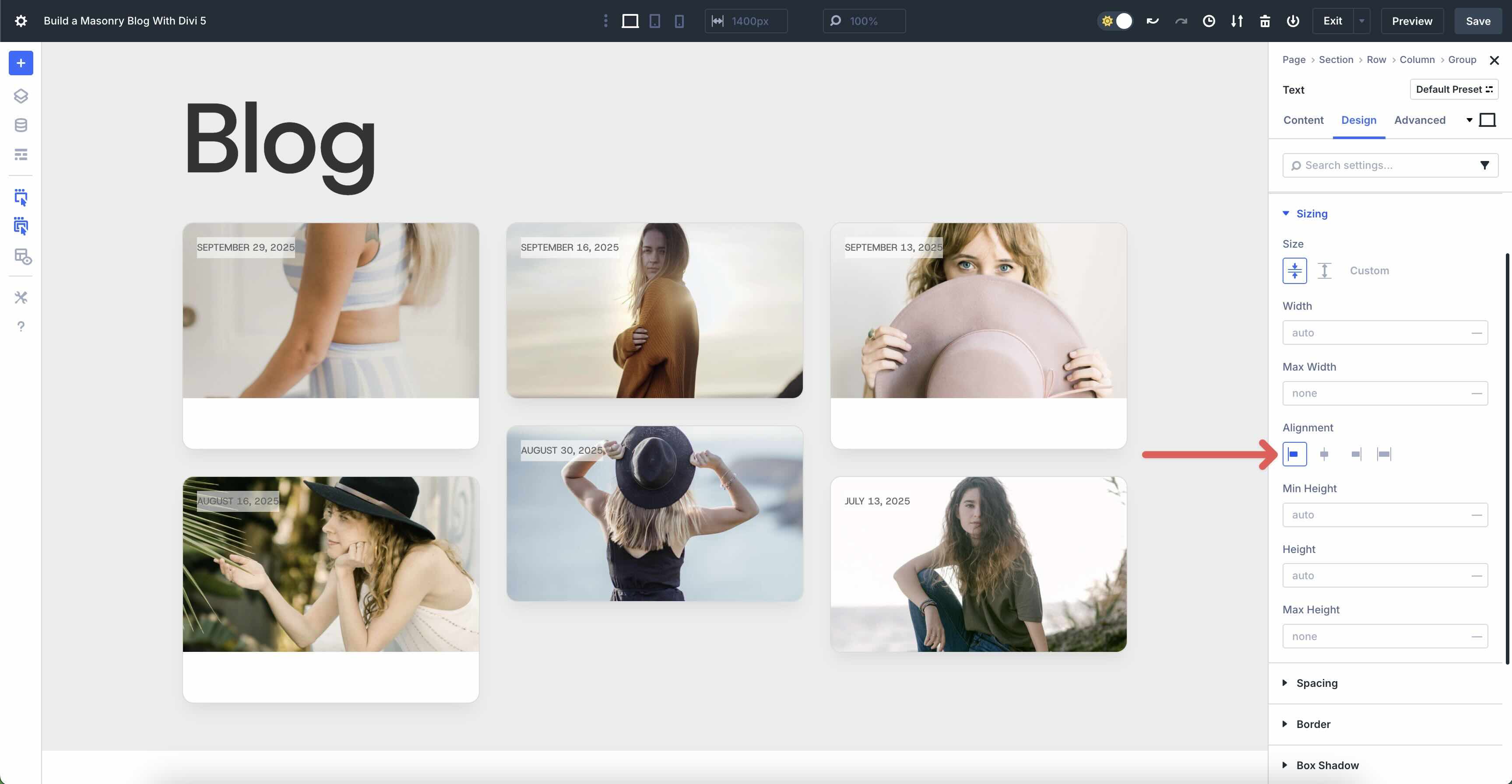
Expand the Sizing menu. Set the Alignment to Start.
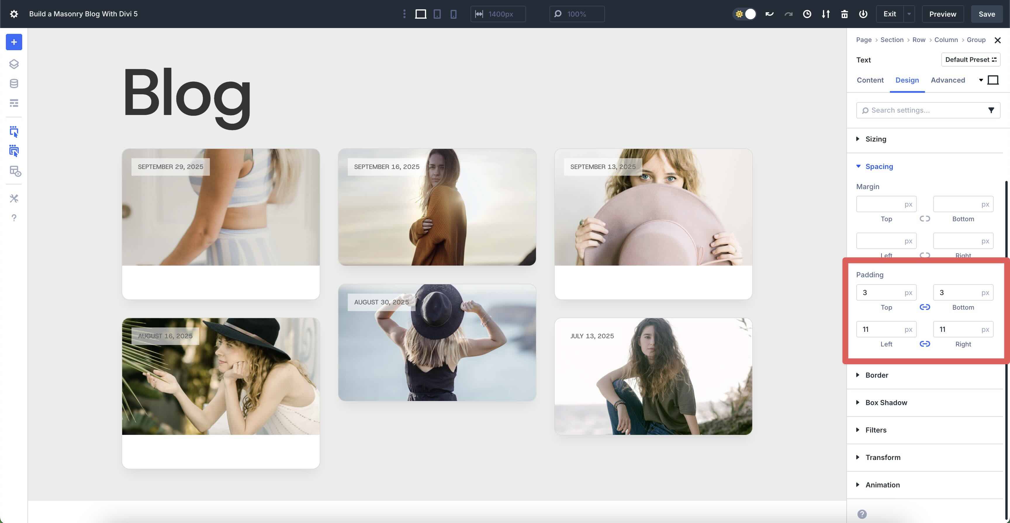
In the Spacing settings, add 3px Padding to the top and bottom and 11px Padding to the left and right.
Finally, expand the Border menu. Add 50px Border Radius to the Text module.
Add Another Group Module
Now, let’s add another Group module to the first Group item in our Loop. Once added, click to add a Heading module to the Group.
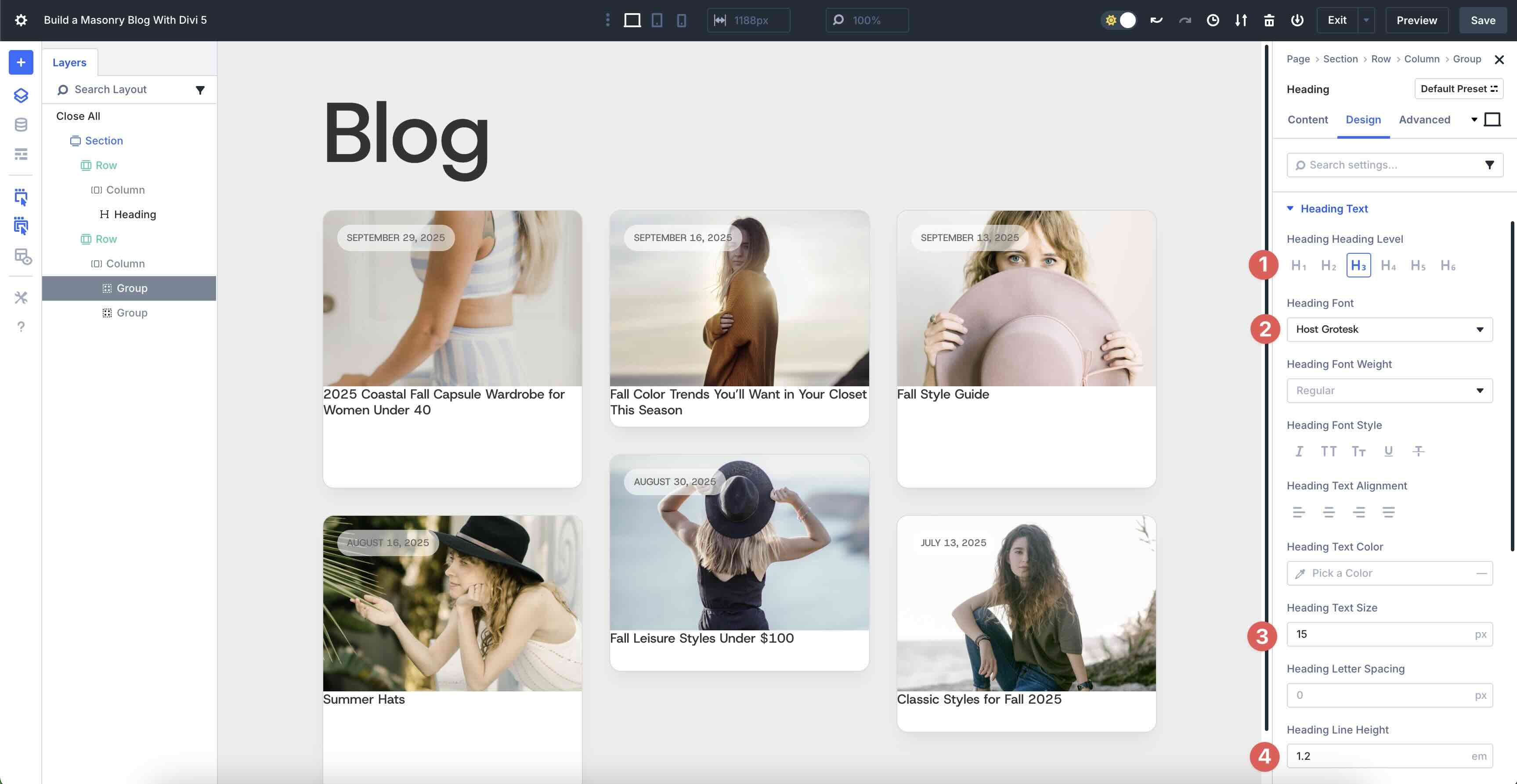
When the Heading module’s settings appear, click the Dynamic Content icon above the Heading field. Select Loop Post Title from the options.
Navigate to the Heading module’s Design tab. Expand the Heading Text menu and select h3 as the Heading Level. Choose Host Grotesk as the Heading Font, 15px as the Heading Text Size, and 1.2em as the Heading Line Height.
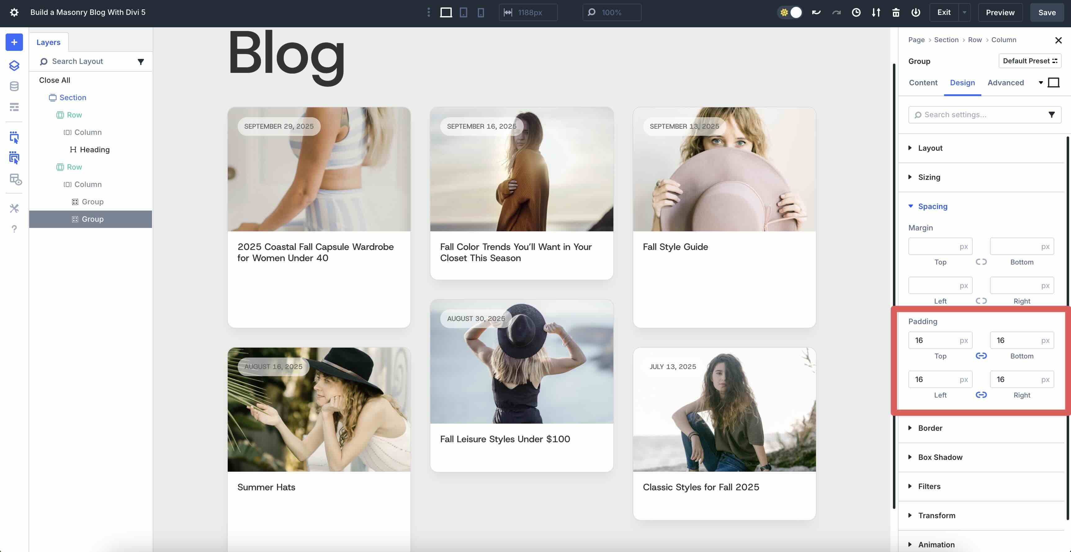
Before we move on, we need to add some padding to the Group module that contains the Heading module. Use Divi 5’s Layers View to select the second Group module. Navigate to the Design tab and scroll down to the Spacing settings. Add 16px Padding on all four sides.
Add A Third Group Module
Next, we’ll add a third Group module, but we want to place it into the Group that contains the Heading module. Click the black “+” icon to add a new module. Select the Group module. When the Insert Row or Module modal appears, click to add a Text module.
In the Text module’s Content tab, click the Dynamic Content icon and select Loop Author from the available fields.
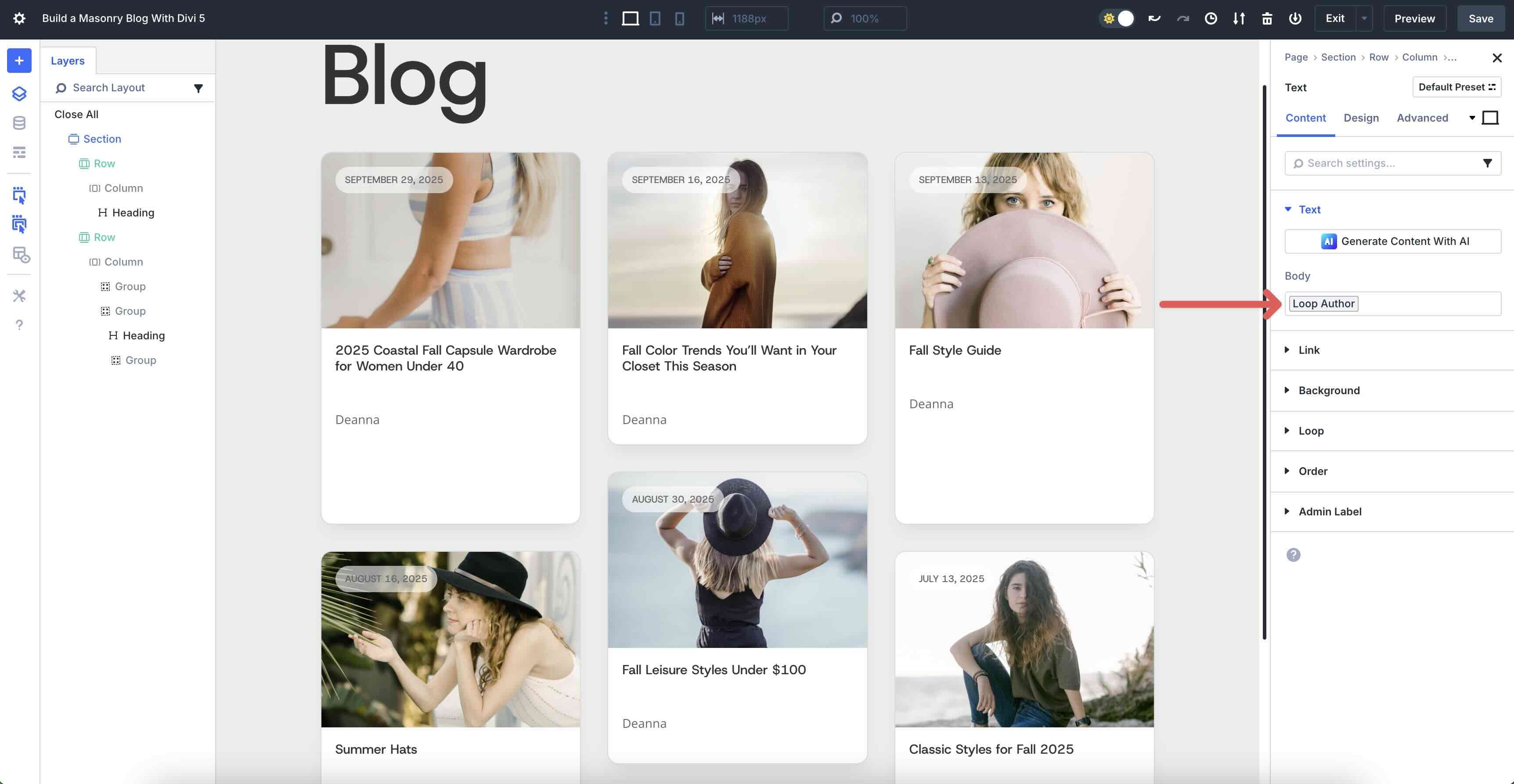
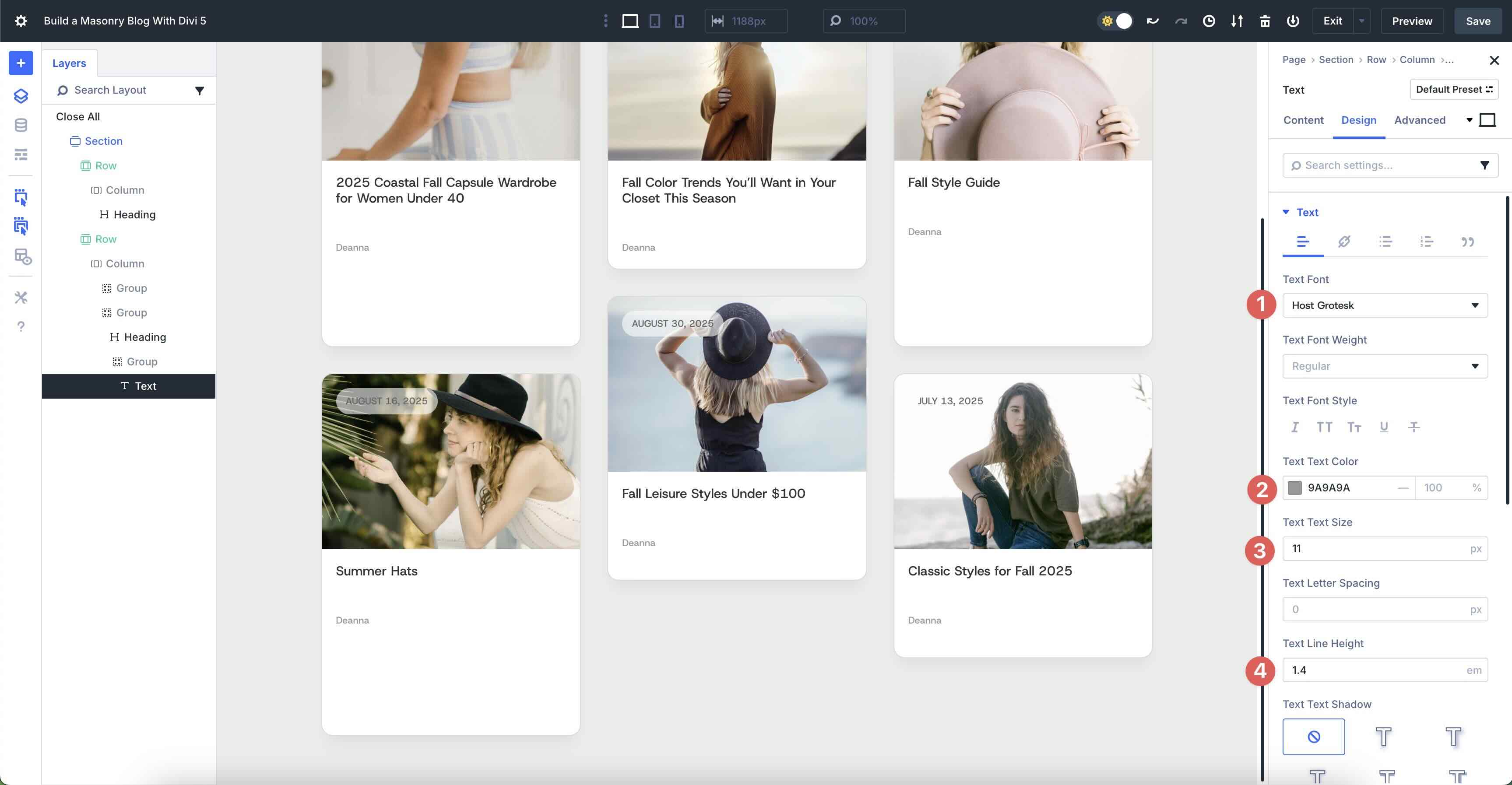
In the Design tab, select Host Grotesk as the Text Font, #9a9a9a for the Text Text Color, 11px as the Text Text Size, and 1.4em as the Text Line Height.
Use the Layers View to duplicate the Text module.
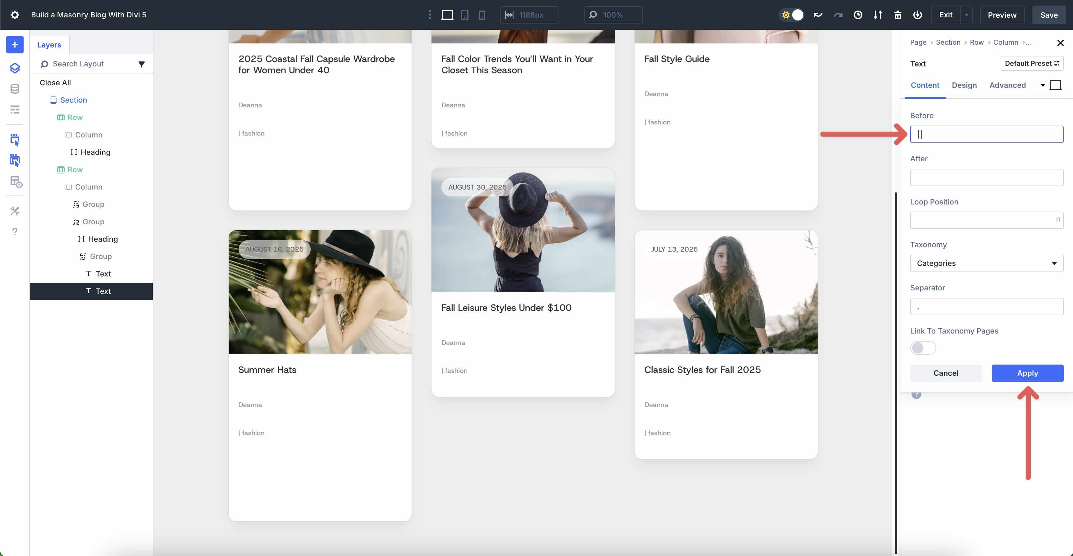
In the second Text module, click the Dynamic Content icon and select Loop Post Terms as the custom field. In the Before field, add a “|”.
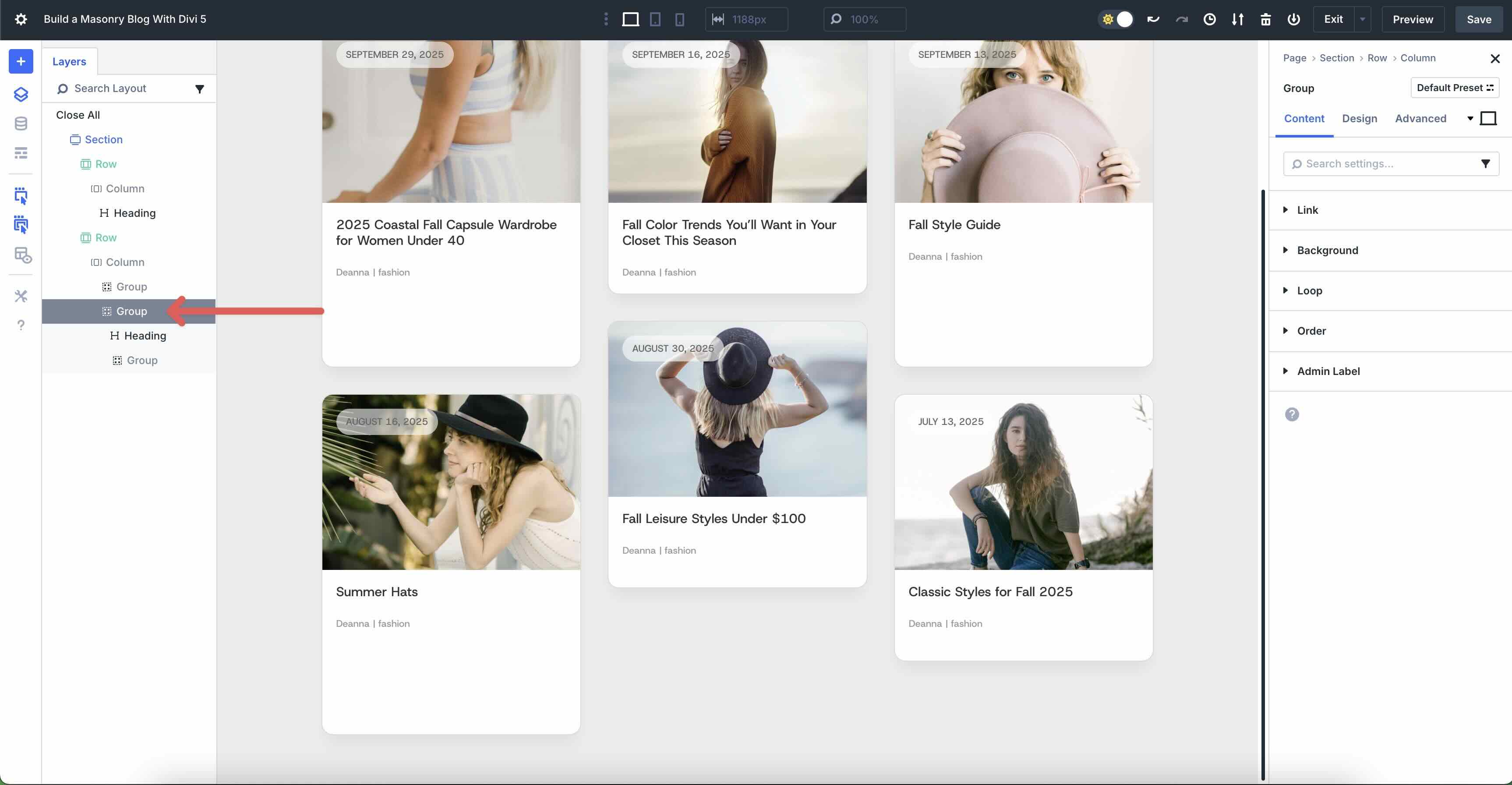
Before we move on, we must adjust the Group’s settings so that the two Text modules stack side by side. In the Design tab, click the Layout menu to expand it. Add 4px Horizontal and Vertical Gap and choose Row as the Layout Direction.

Add A Text Module To The Second Group
The next step is to add another Text module, but this time, we’ll add it to the second Group that contains the Heading module. Use the Layers View to select the second Group module.
Click the Black “+” icon and select the Text module. Once in place, use the Layers View to drag it into place below the third Group module. Be careful not to add it outside of the 2nd Group.
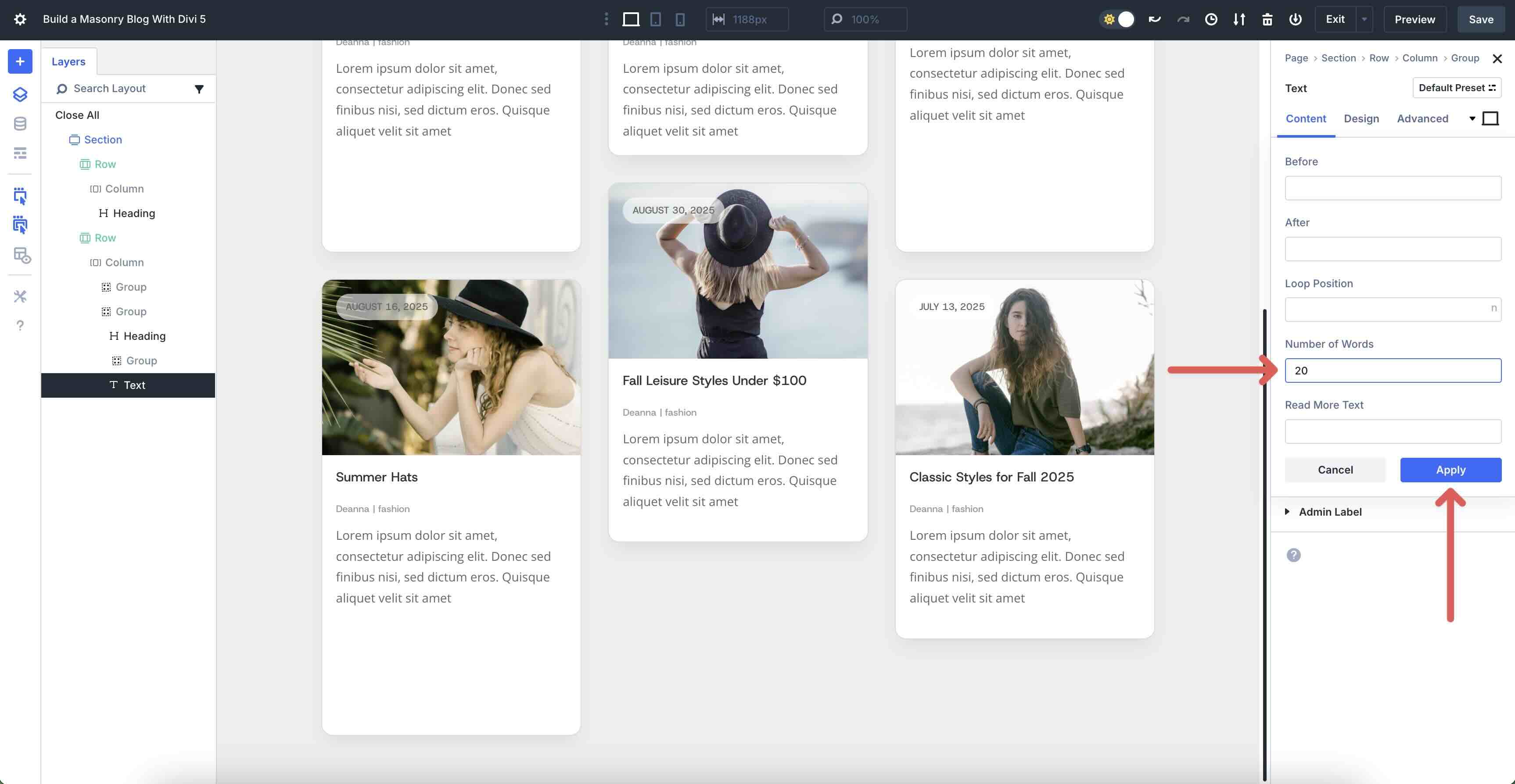
Click the Dynamic Content icon above the Body field and select Loop Excerpt from the available fields. When the modal appears, add 20 into the Number of Words field. Click Apply to save it.
Add A Button Module
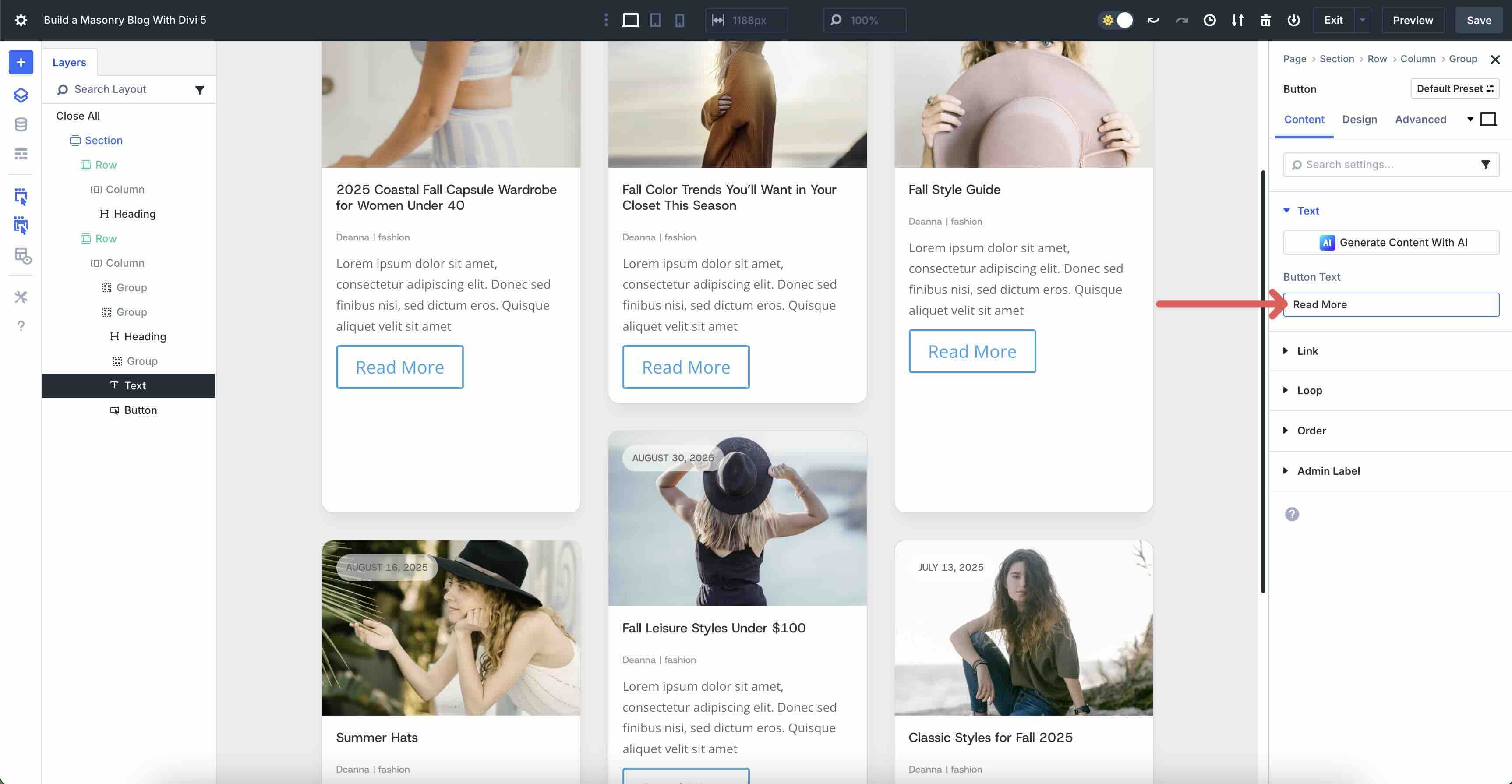
Click the Black “+” icon underneath the Text module we just added and select the Button module.
In the Button module’s Content tab, add Read More into the Button Text field.
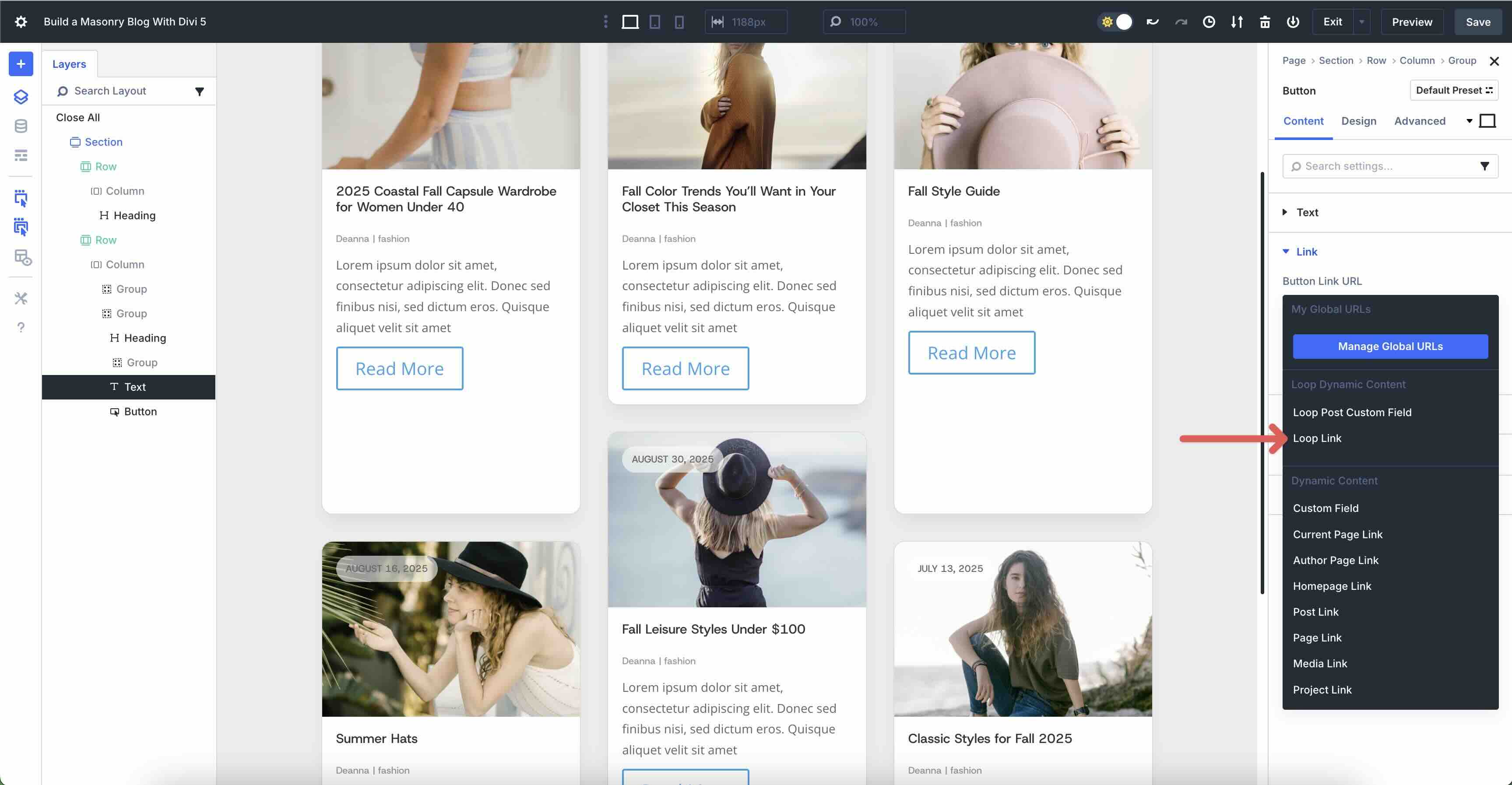
Expand the Link dropdown menu. Click the Dynamic Content icon directly above the Button Link URL field. When the options appear, select Loop Link.
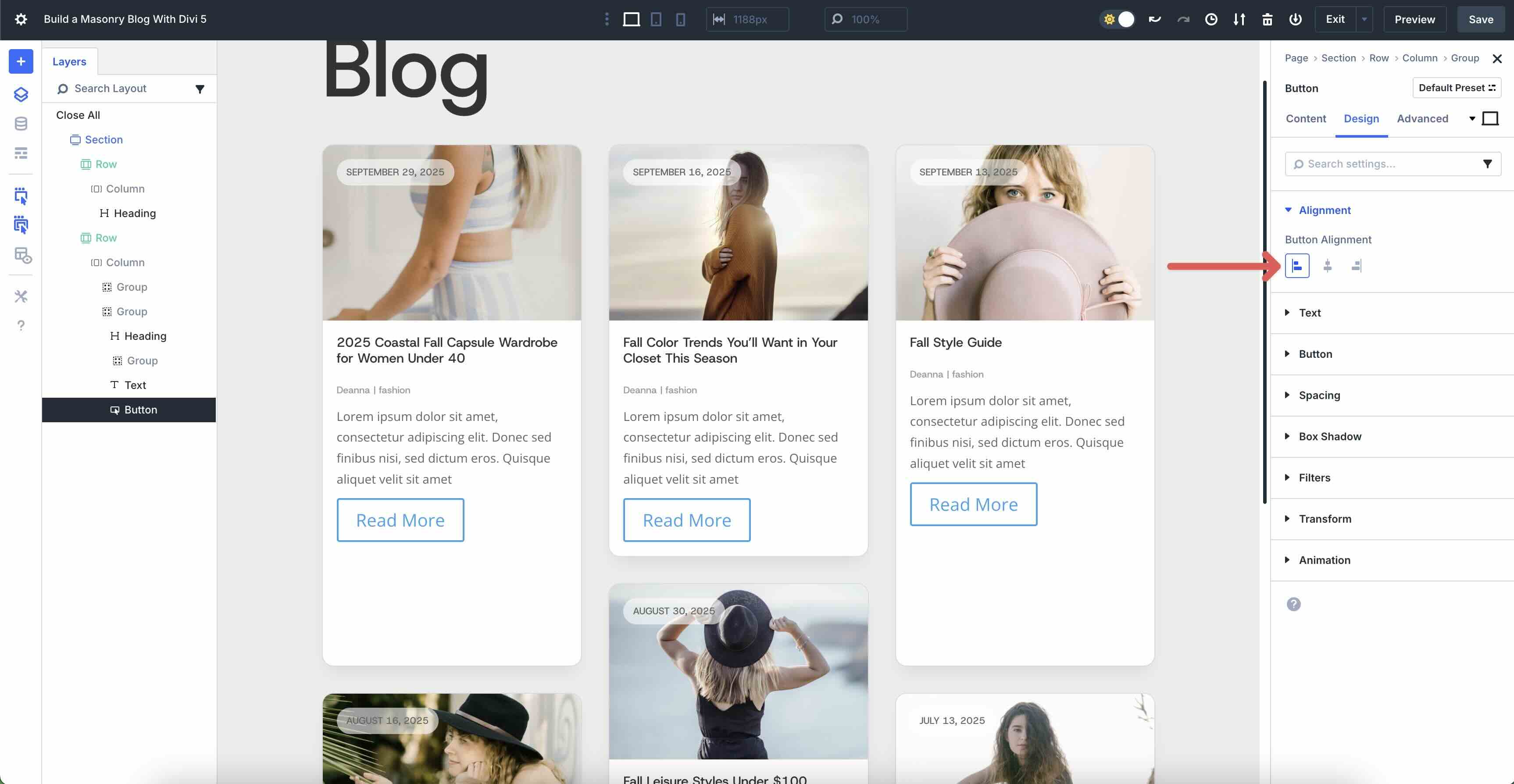
In the Design tab, expand the Alignment menu and select Left.
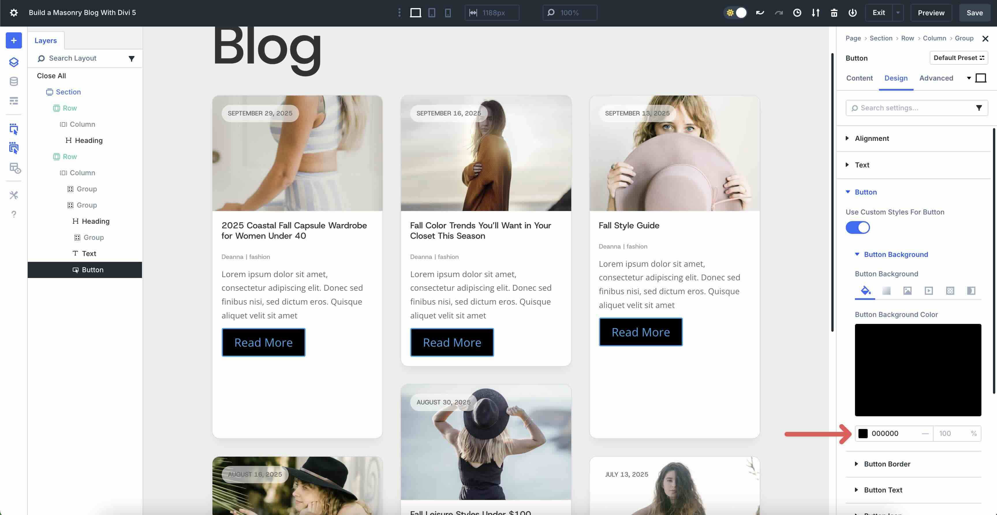
Expand the Button dropdown menu. Toggle Use Custom Styles For Button on.
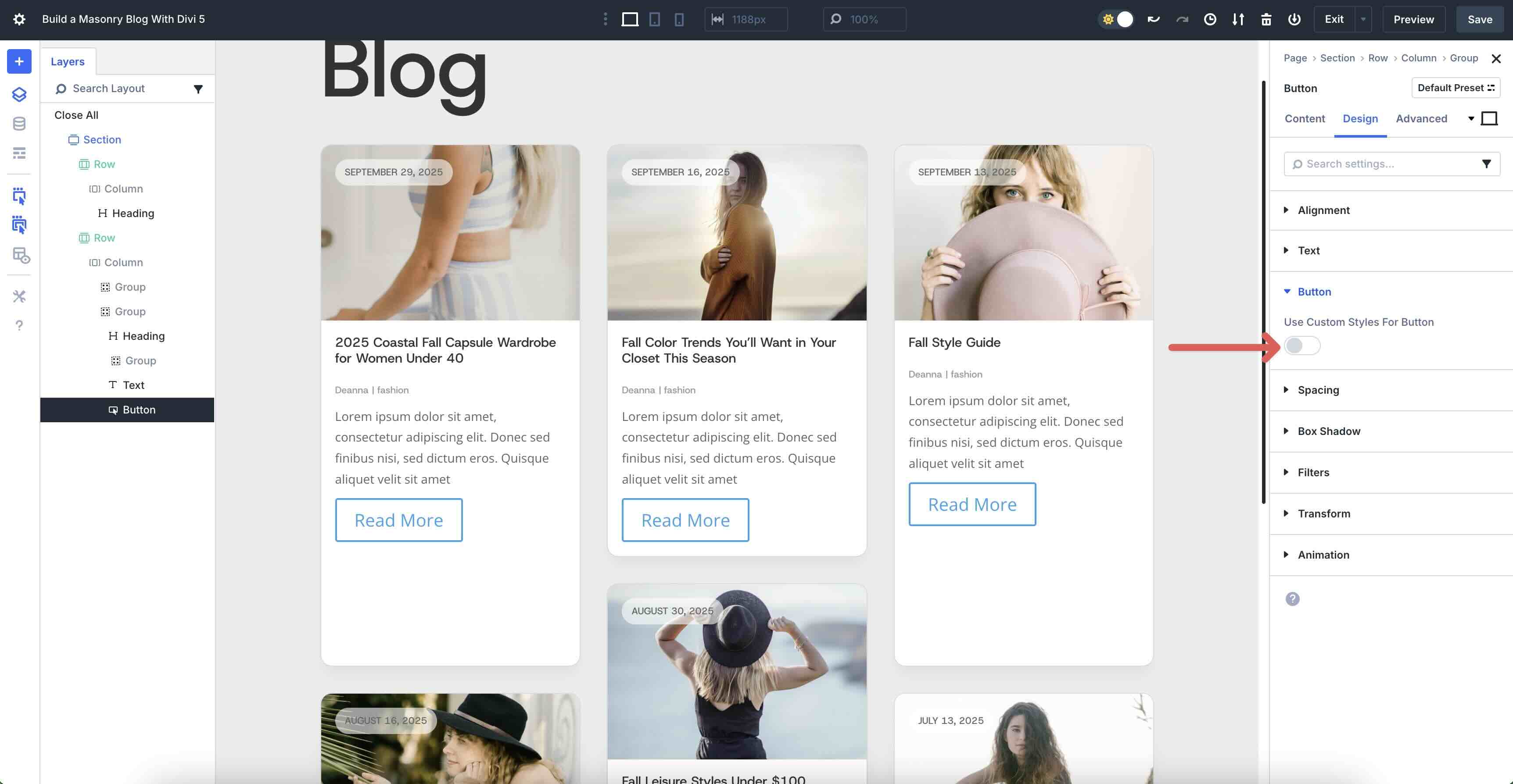
In the Button Background menu, set the Button Background Color to #000000.
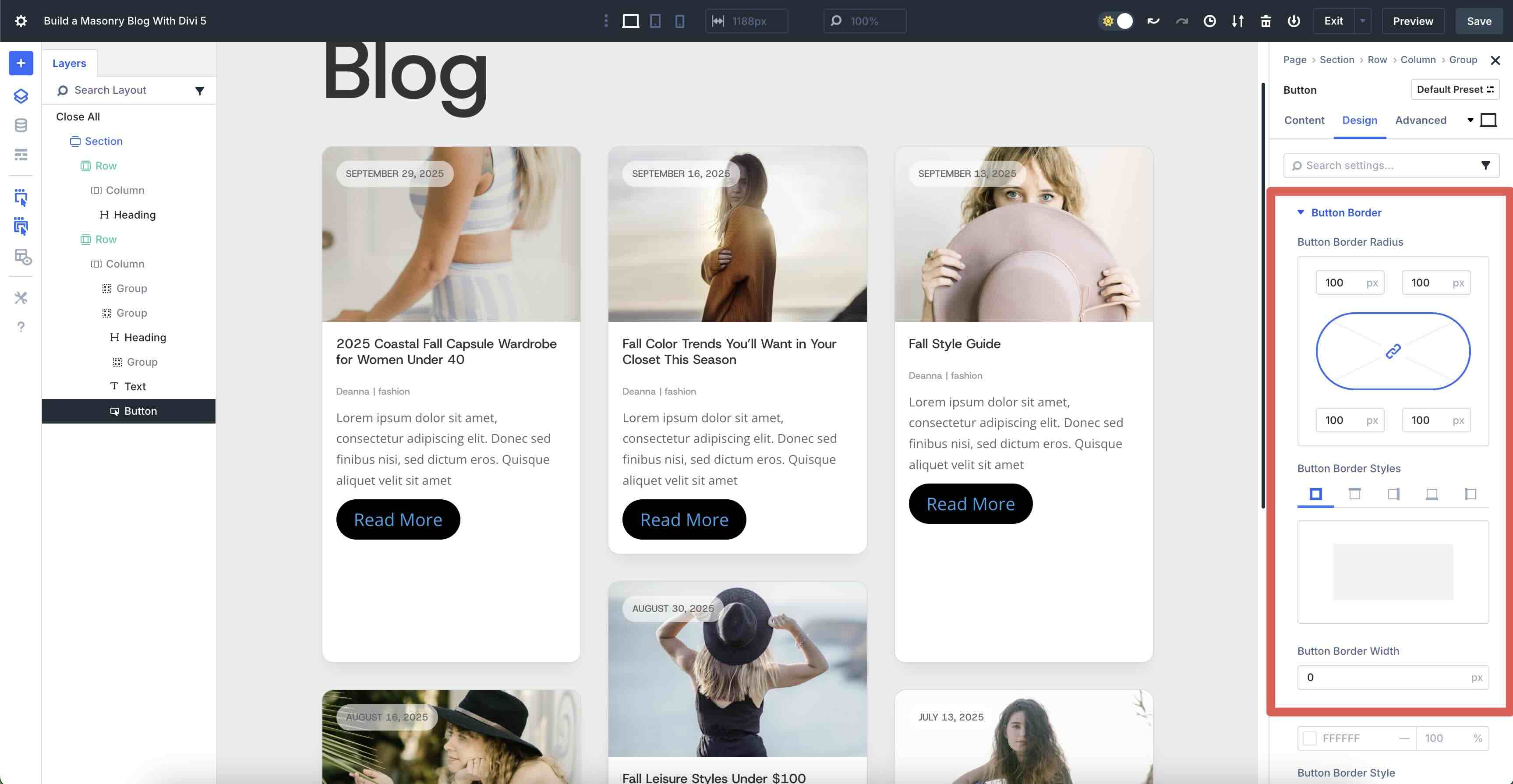
Expand the Button Border menu and enter 100px for the Button Border Radius and set the Button Border Width to 0px.
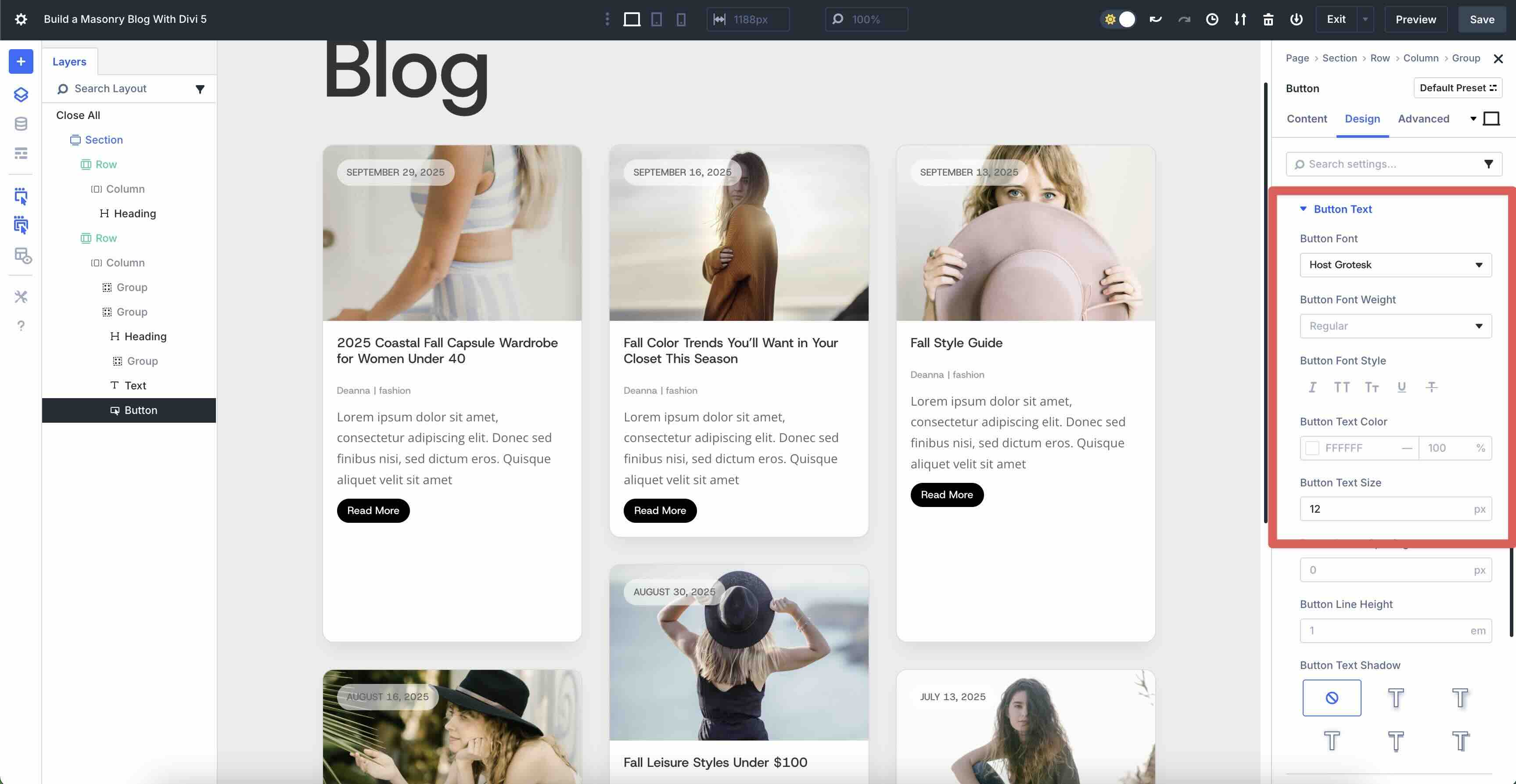
Next, expand the Button Text menu. Enter Host Grotesk as the Button Font, #ffffff as the Button Text Color, and 12px as the Button Text Size.
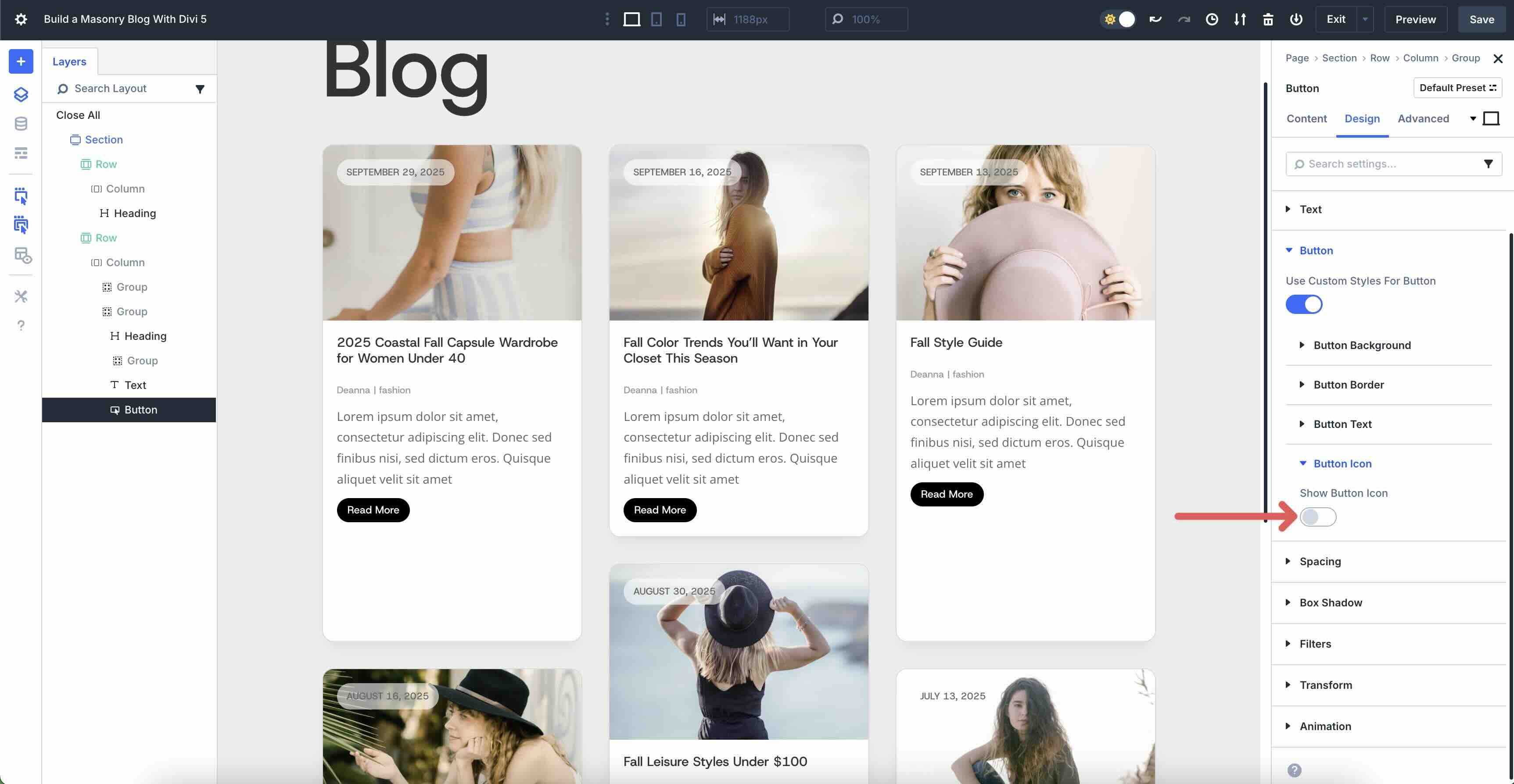
Now, expand the Button Icon menu and toggle Show Button Icon off.
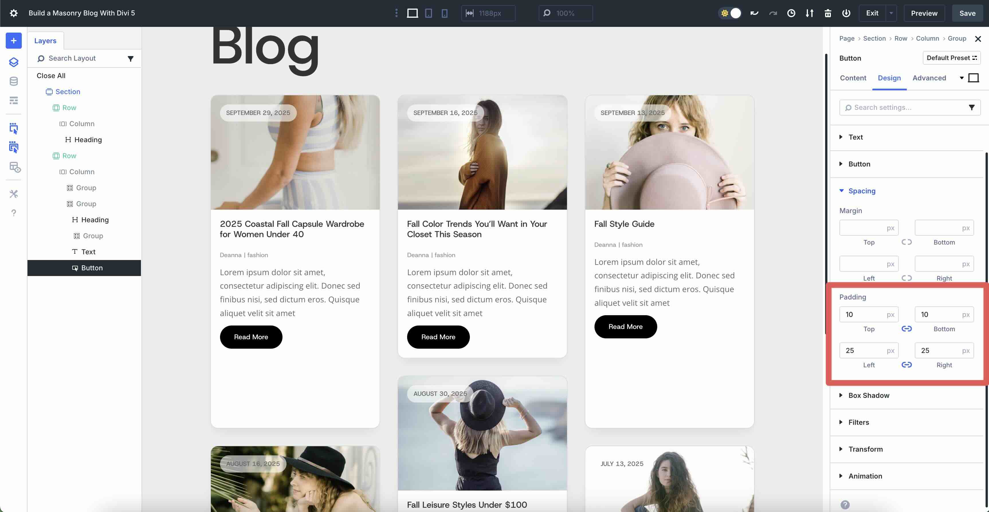
Finally, expand the Spacing dropdown menu. Add 10px Padding to the top and bottom and 25px to the left and right.
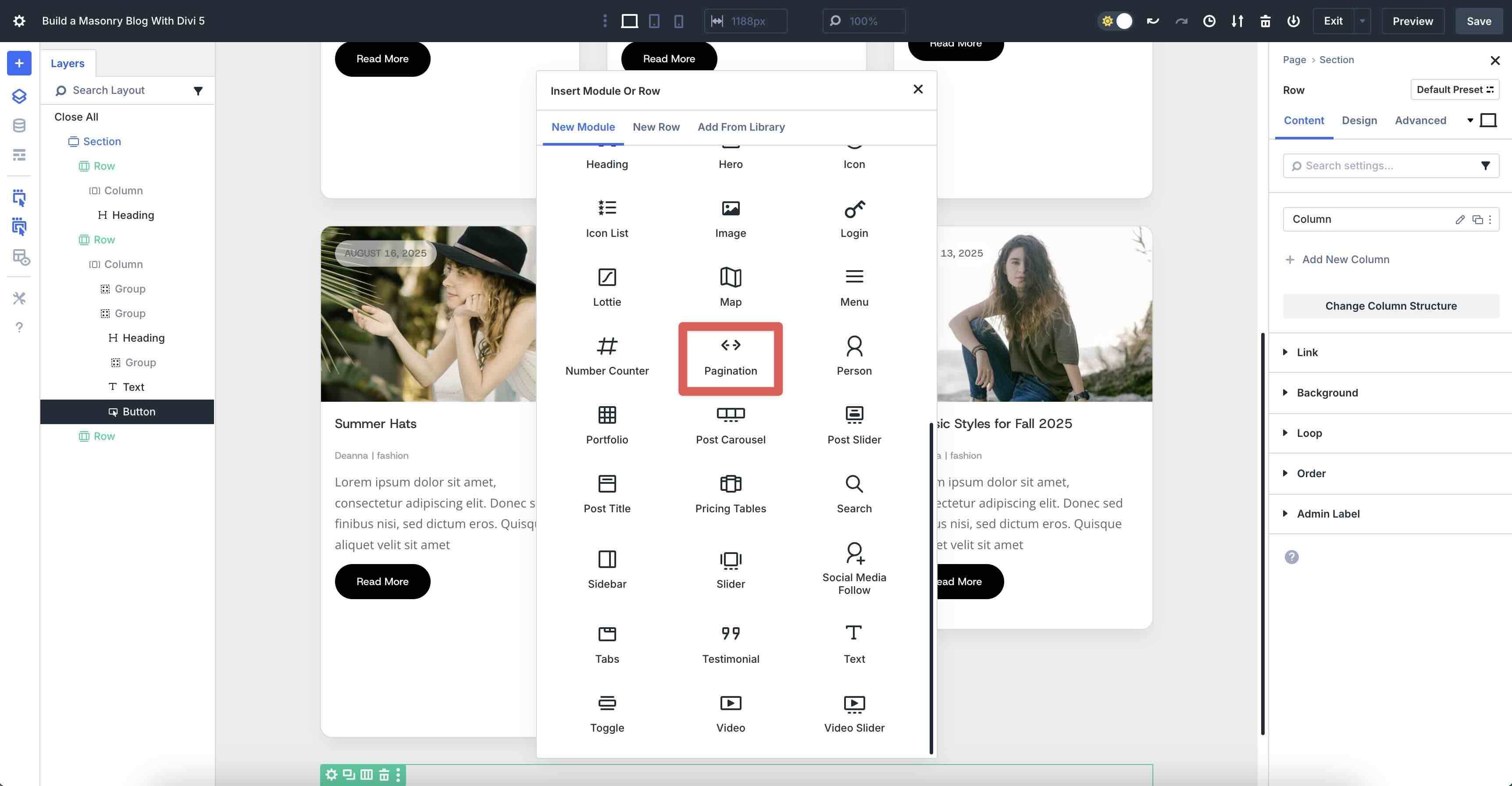
Add Another Single Column Row
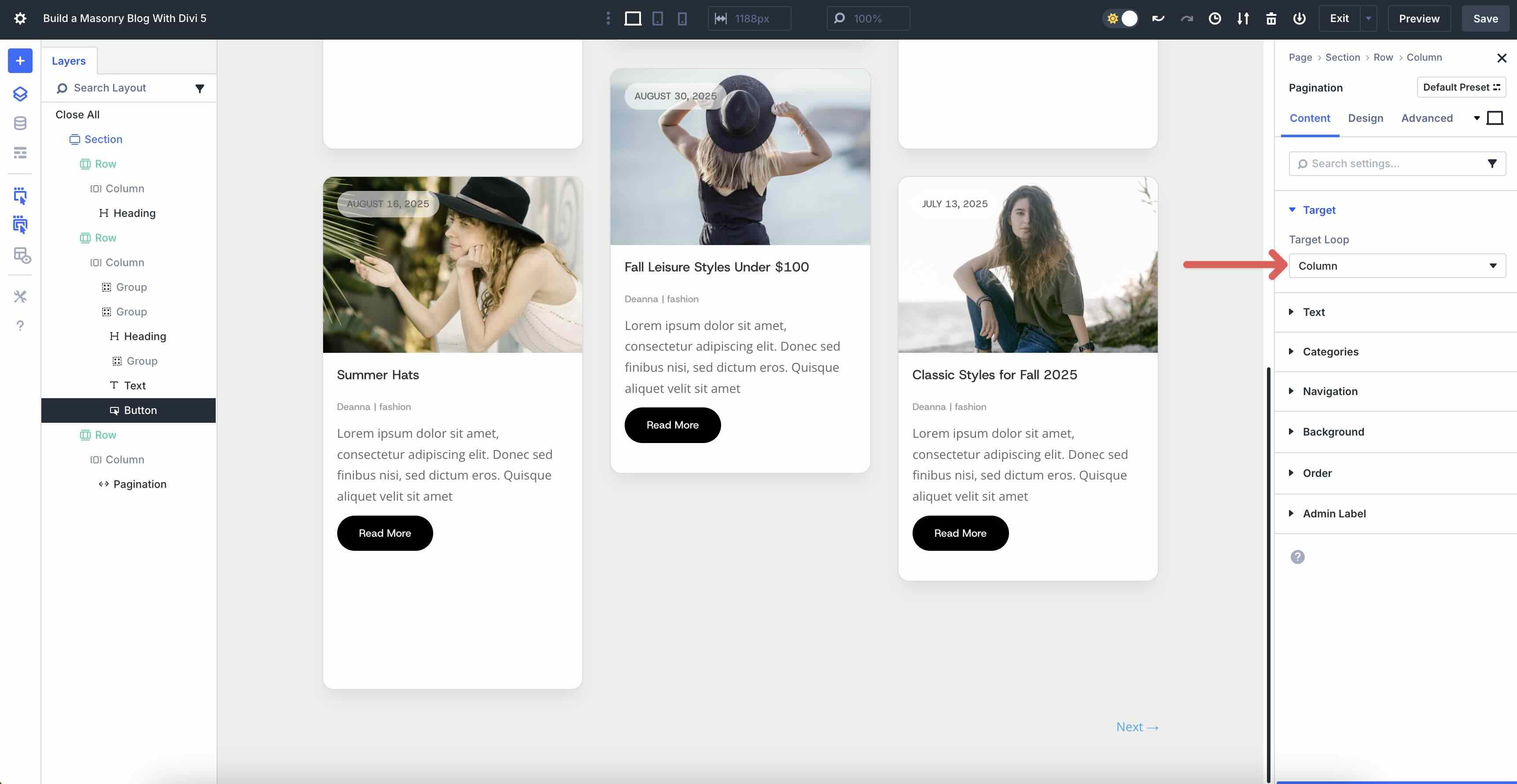
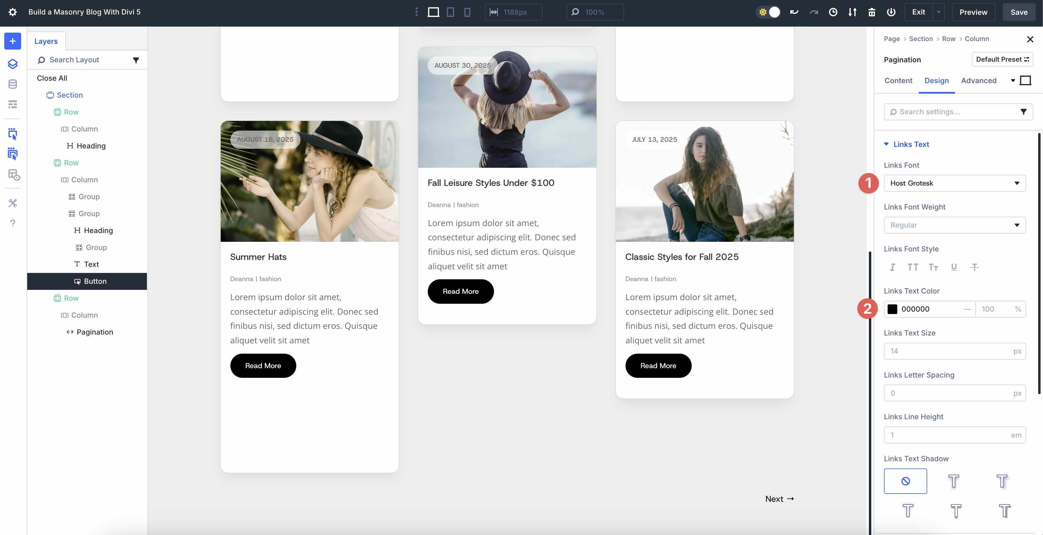
The last step is to add a single-column row to house the Pagination module. Add a new single-column row underneath our Grid Loop row and select the Pagination module.
In the module’s Content tab, expand the Target menu. In the Target Loop field, select Column. Leave all other settings at their defaults.
In the Design tab, expand the Links Text menu. Select Host Grotesk as the Links Font and use #000000 as the Links Text Color.
That’s it! As you can see, creating a modern blog page is simple, thanks to Divi 5’s Loop Builder and CSS Grid features. If you’d like to download the file and experiment with these features, you can do so by filling out the form below. You can upload the section layout to your Divi library and use it for any page you build.

Bring Your Blog To Life With Divi 5 Today
With Divi 5’s Loop Builder and CSS Grid, you have a winning combination to make your blog stand out. Loop Builder handles dynamic content effortlessly, letting you build custom, repeatable post templates that bring your blog to life. CSS Grid delivers the masonry style with its flexible, responsive grid layouts that break free from static blog modules.
Now it’s your turn. Download the latest Divi 5 Public Alpha, experiment with these features, and share your thoughts with us in the comments below!


Thank you for a thorough guide, Deanna. This is exactly what I was looking wanted, however, I was surprised to see that it is not a responsive layout which is not optimal in this day and age.
Are you planning on doing a similar layout that is responsive?
Best regards,
Lasse
Thanks for your feedback, Lasse! The layout actually uses Divi 5’s CSS Grid, which is fully responsive and adapts across devices. If you’re seeing any responsivity issues, please reach out to our support, we’re here to help! More tutorials on responsive grid layouts are definitely in the works.
Thanks, I have two questions: 1. Is this just a (fake) masonry effect isn’t it? The height of each column is artificially varied, not by the contents itself? 2, The final result of the tutorial looks different than the preview at the beginning of this page? On the final image is some blank space below the button and every image has the same height. On the preview image the heights of the images varies. How does this work? Thanks for feedback
Same issue here, the final result is the same than in your last picture, with is differente than the first picture and first animated gif.