
At its core, Flexbox is a powerful CSS layout model that gives you precise control over how items flow and align within a container. Divi 5 integrates Flexbox directly into the Visual Builder, turning every element into a flexible container. Flexbox isn’t just a minor update; it’s a shift that enables you to create responsive sites with just a few clicks.
In this post, you’ll learn how to harness Divi 5’s Flexbox system to build simple, fully responsive layouts that adapt beautifully to every screen size. We’ll walk through setup, key features, and provide a hands-on tutorial using Divi’s new Flexbox system.
Let’s dive in.
Understanding Flexbox Basics in Divi 5
If you’ve built sites with Divi 4, you already know how capable it is with pre-defined row templates, specialty sections, and responsive controls. The Visual Builder made complex designs accessible, and for many layouts, Divi 4’s system just works. But when it comes to truly fluid, adaptive column breakdowns — especially with custom widths, natural wrapping, or per-device reordering — Divi 4 often asked you to reach for CSS or duplicate sections.
Subscribe To Our Youtube Channel
Divi 5 doesn’t replace what made Divi 4 great. It elevates it with Flexbox — a modern, visual, no-code way to build responsive layouts that feel native to today’s web.
A Side-By-Side Comparison
Divi 4 laid a rock-solid foundation with its grid-based system and breakpoint-specific styling. Divi 5 builds on that foundation by introducing Flexbox, giving you more freedom within the same familiar workflow. Here’s a breakdown of the key differences:
| Aspect | Divi 4 | Divi 5 |
|---|---|---|
| Column Limits | Pre-defined presets (up to 6 columns, nested rows with Specialty sections) | Unlimited. Add as many as you need |
| Column Sizing | Fixed ratios per preset; custom widths via CSS | Visaul controls: grow, shrink, or set exact width |
| Mobile Stacking | Vertical stack + hide/show per device | Native wrapping + direction control per breakpoint |
| Reordering | Requires CSS or section duplication/visibility controls | Reordering per device with a single click |
| Nesting | Specialty sections only | Any row, anywhere; fully flexible |
| Custom CSS Needed? | Often for advanced responsiveness | Rarely; Flexbox handles it visually |
| Core Strength | Reliable, proven, fast for standard layouts | Fluid, adaptive, future-proof |
Key Components Of Flexbox In Divi 5
Flexbox works through a clean parent-child relationship, seamlessly integrated into the Visual Builder you already know.
Rows = Flex Containers: Simply navigate to Design > Layout > Flex. By default, this is selected when you choose a pre-defined Flex Row structure. The Row manages spacing, alignment, and flow across all breakpoints.
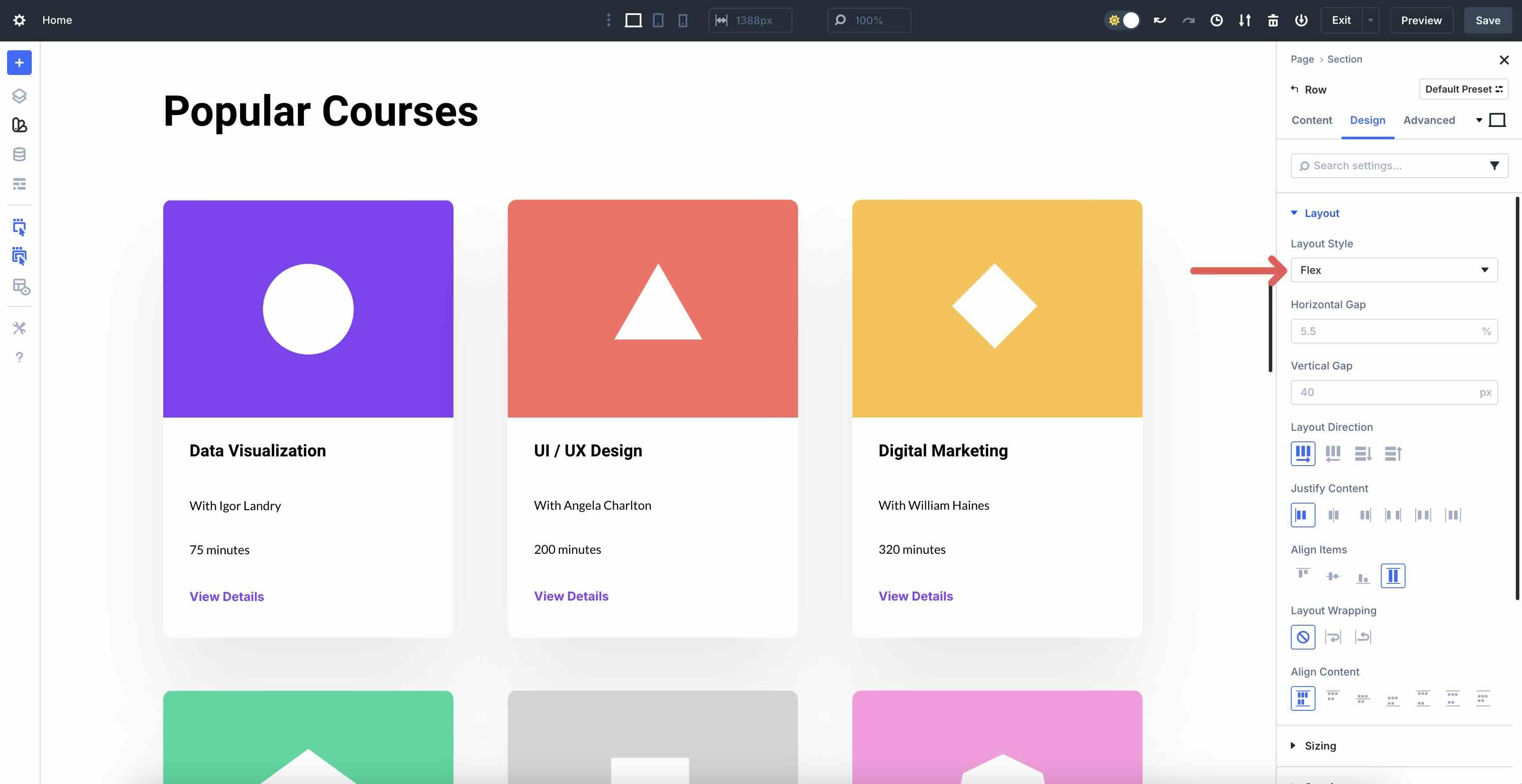
Columns = Flex Items: Add any number of columns to the row. No need to pick from presets. Each Column can grow to fill space, shrink to fit, or stay fixed. Adjust the settings via the Sizing tab.
Core Properties
These four controls, located in the Layout settings, are the heart of responsive column breakdowns. Set them once on desktop, then tweak per breakpoint with full confidence.
Layout Direction
Layout Direction is the foundation of every Flexbox container in Divi 5, as it determines how flex items are arranged. By default, it’s set to Row, arranging items horizontally from left to right, like traditional side-by-side columns. You can also choose Row Reverse to flip that flow right-to-left, Column to stack items vertically from top to bottom, or Column Reverse to stack from bottom to top.
Under the hood, this setting directly controls the CSS flex-direction property. In practice, most designers keep Row on desktop and override to Column on tablets and phones to create clean, mobile-first stacking.
Justify Content
Justify Content controls how extra space is distributed between and around your flex items along the main axis, making it one of the most powerful settings in Divi 5’s Flexbox system. By default, it’s set to Start, which packs everything flush against the beginning of the main axis. When in Row direction, items stack from left to right. In Column, items stack to the top.
The available options are:
- Start: Everything hugs the start (left or top).
- Center: Items are centered as a group.
- End: Everything is pushed to the far end (right or bottom).
- Space Between: The first item begins on the start edge, with the last item on the end edge. Perfectly even gaps are added between the rest.
- Space Around: Adds equal space on all sides of every item, including the edges.
- Space Evenly: Mathematically perfect spacing everywhere, including before the first item and after the last.

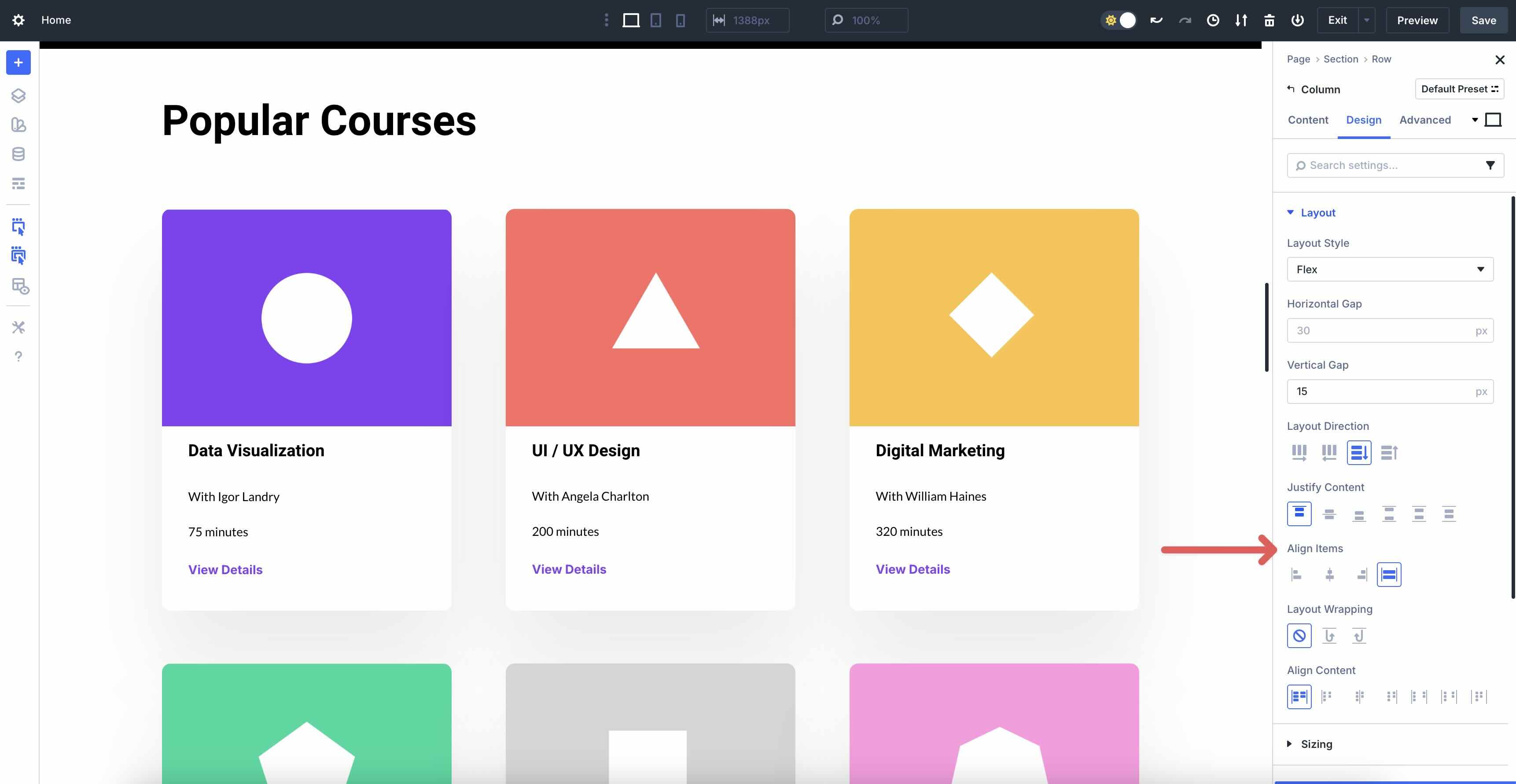
Align Items
Align Items controls how your flex items line up along the cross-axis — the direction perpendicular to the main axis — so it’s the setting that finally gives you perfect vertical centering and equal-height columns without any hacks.
By default, Divi 5 sets it to Stretch, which forces every item to expand and fill the full height (in Row direction) or width (in Column direction) of the container. This is why cards with different amounts of text look perfectly equal in height the moment you switch a Row to Flex.
Available items are:
- Stretch: Items grow to match the tallest/widest sibling (the famous “equal height columns” fix)
- Start: Everything hugs the top (in Row) or left side (in Column)
- Center: True vertical centering in Row direction, or horizontal centering in Column direction
- End: Everything aligns to the bottom (Row) or right side (Column)
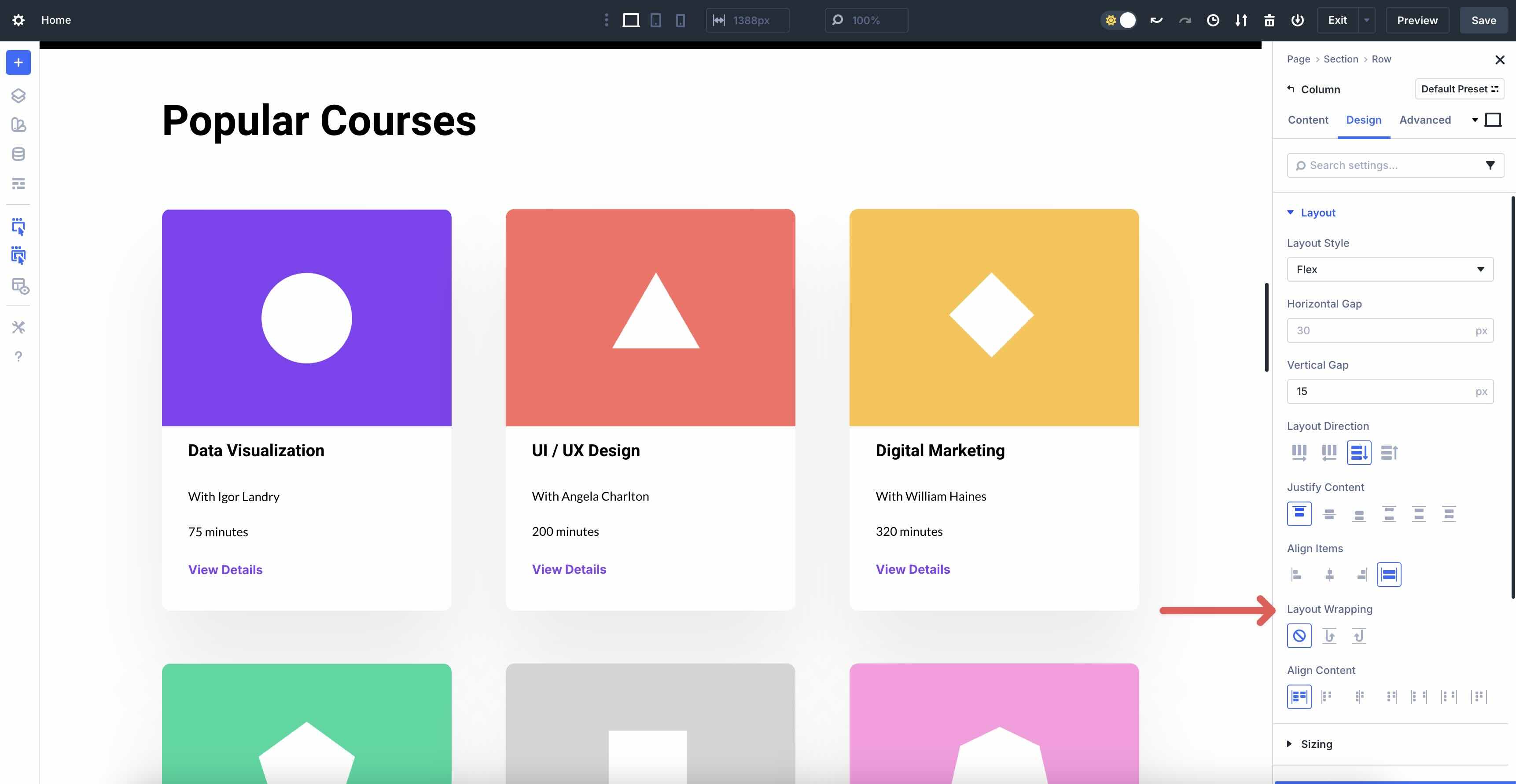
Layout Wrapping
Layout Wrapping transforms a single Flex row into a fully responsive, multi-row grid with no additional sections. By default, it’s set to No Wrap, meaning all items stay forced onto one line, regardless of the number of flex items added. When space runs out, items may either shrink, overflow off the edge, or get hidden.
The three options are:
- No Wrap: Everything stays on a single line (default, useful for fixed-count layouts)
- Wrap: Items automatically flow onto new Rows (or Columns, if Direction is Column) when they no longer fit.
- Wrap Reverse: Same as Wrap, but new rows appear above the previous ones (or to the left in Column direction).
Setting Up Flexbox In Divi 5
Getting started with Flexbox in Divi 5 is straightforward. Here’s a step-by-step guide to building a responsive layout that stacks on mobile:
Add A Section And Row
Add a new Section in the Visual Builder. When the Insert Section modal appears, you can select a Flex template from the available options. Choices include Equal Columns, Offset Columns, Multi-Row, and Multi-Column.
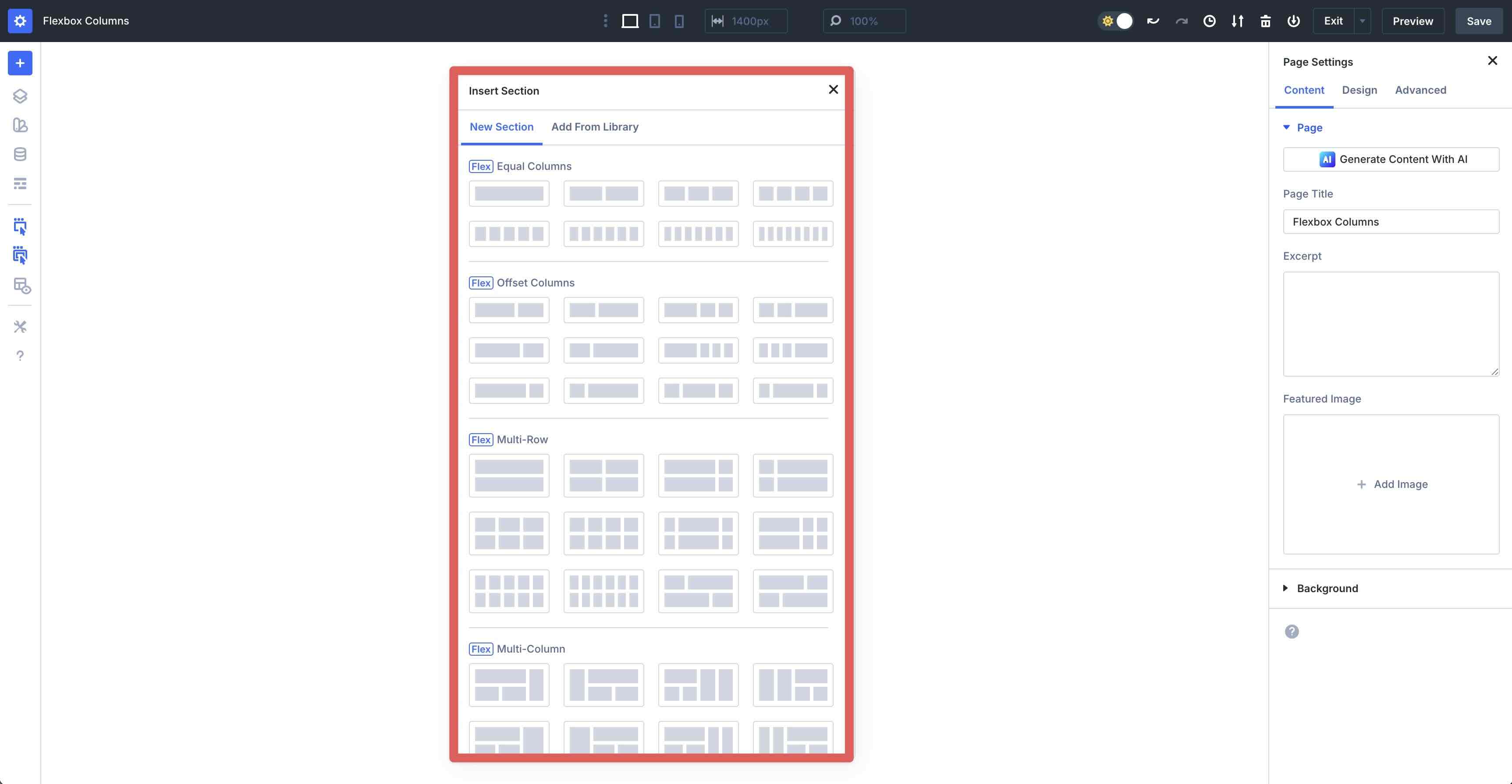
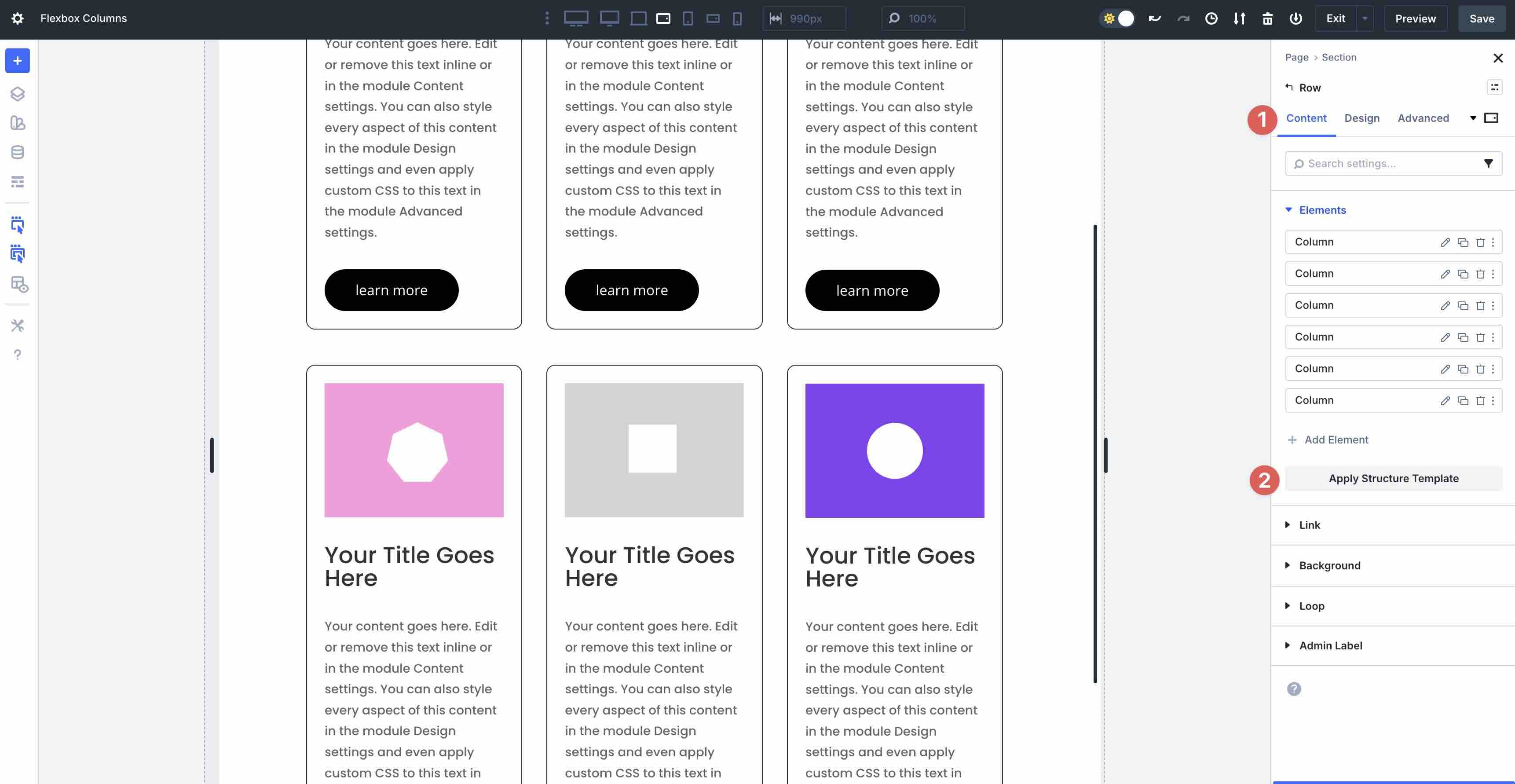
Choose a Single Column Row for a quick start. In the Row’s Content tab, expand the Elements tab. Click the Duplicate icon to add more Columns.
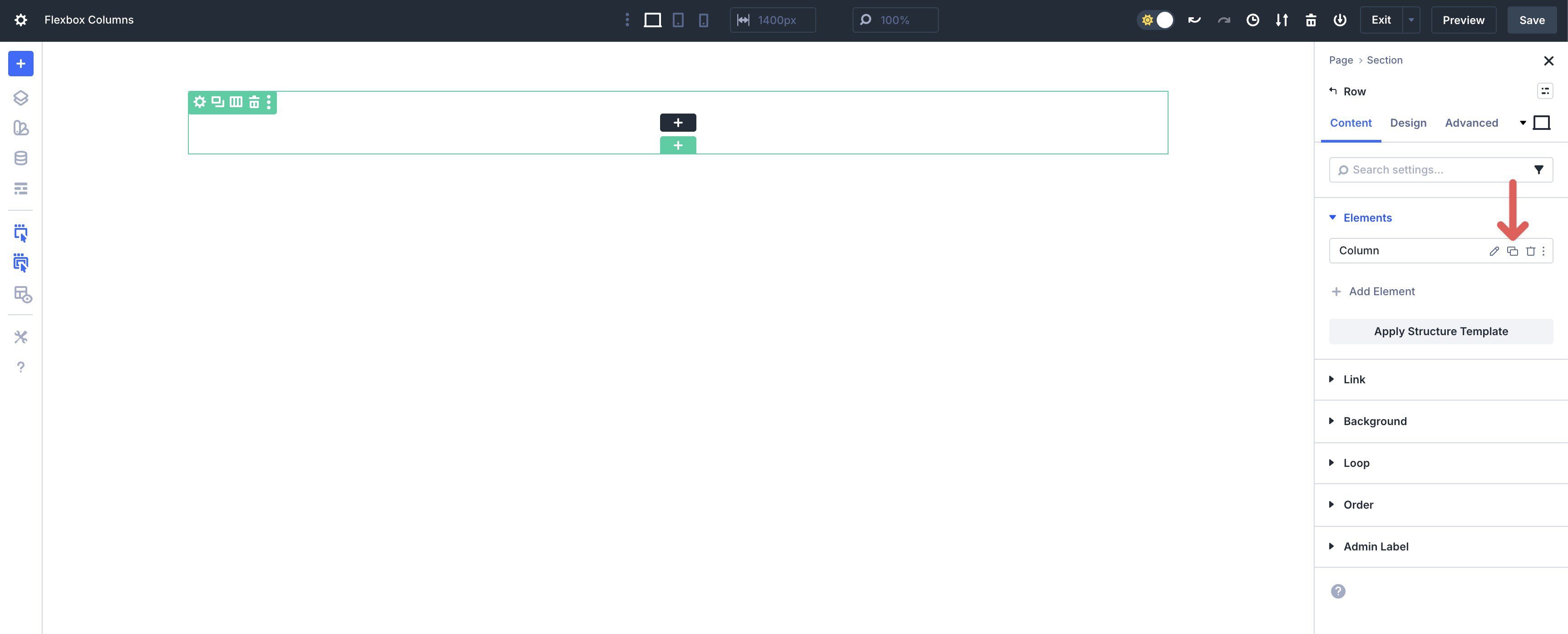
Add 5 more Columns to the Row. These will serve as Flex items in the Row.
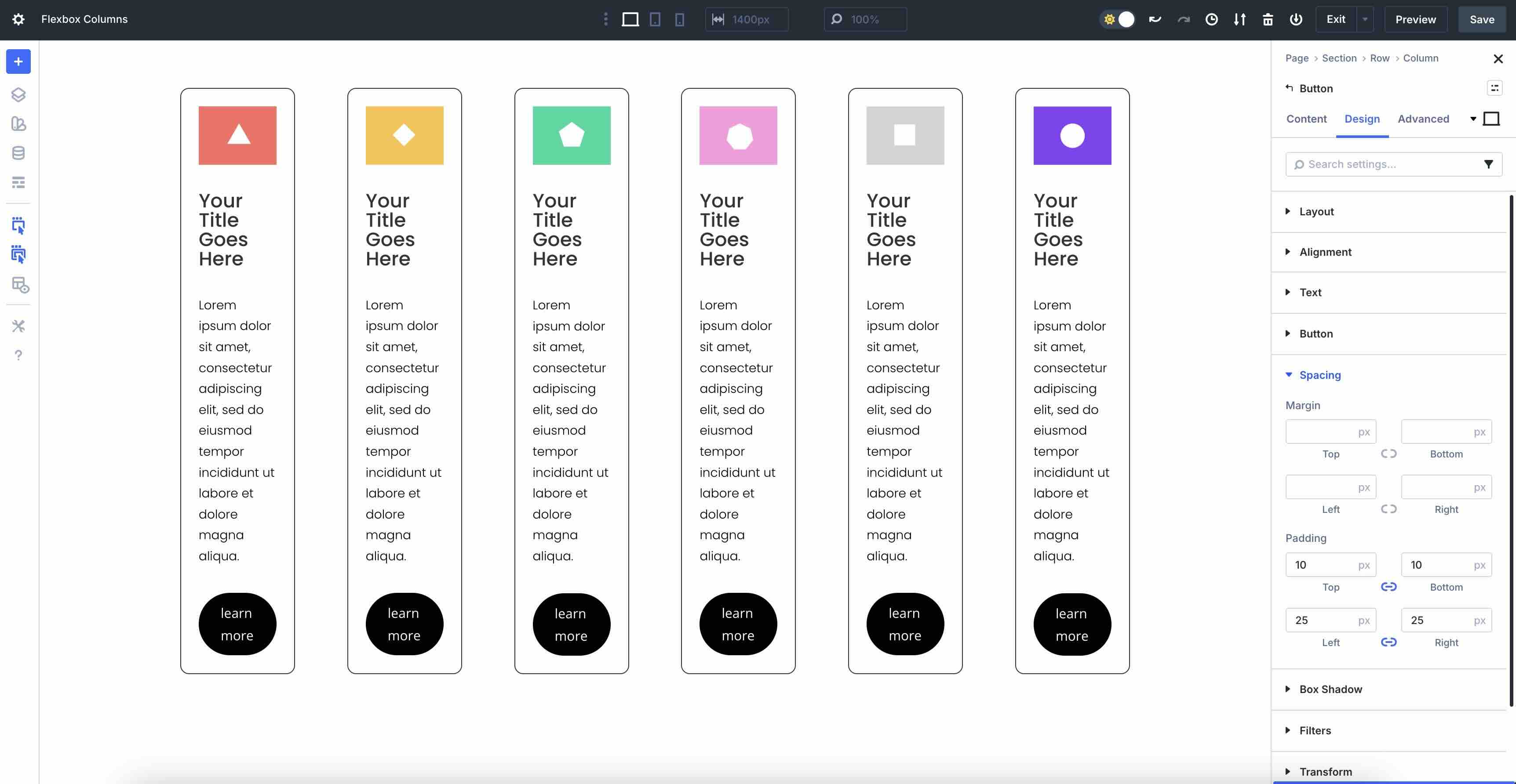
Add an Image, Text, and Button module to each Column and style it as desired.
Configure Flex Basics
With the Row settings open, go to the Design tab. Ensure that Flex is enabled in the Layout Style settings.
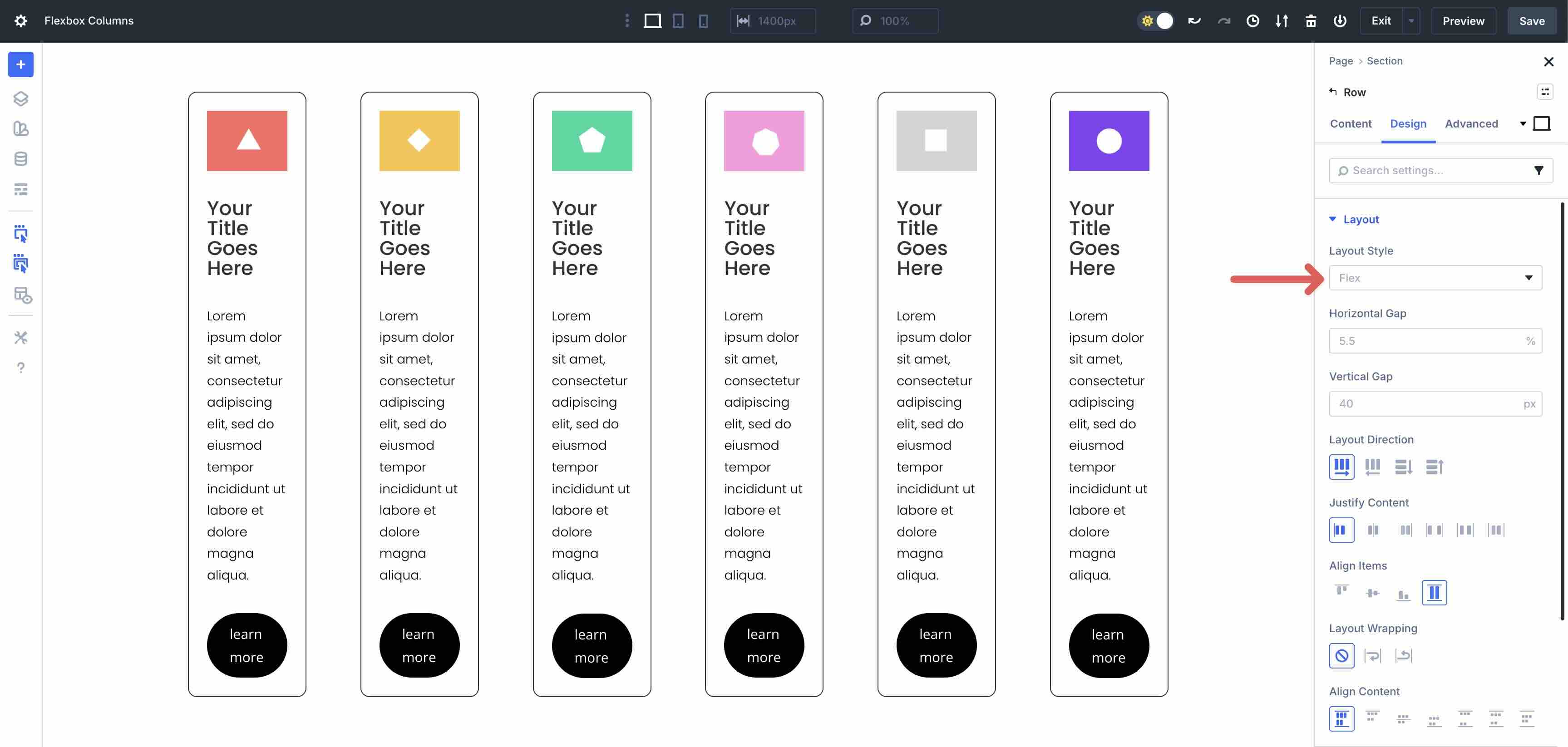
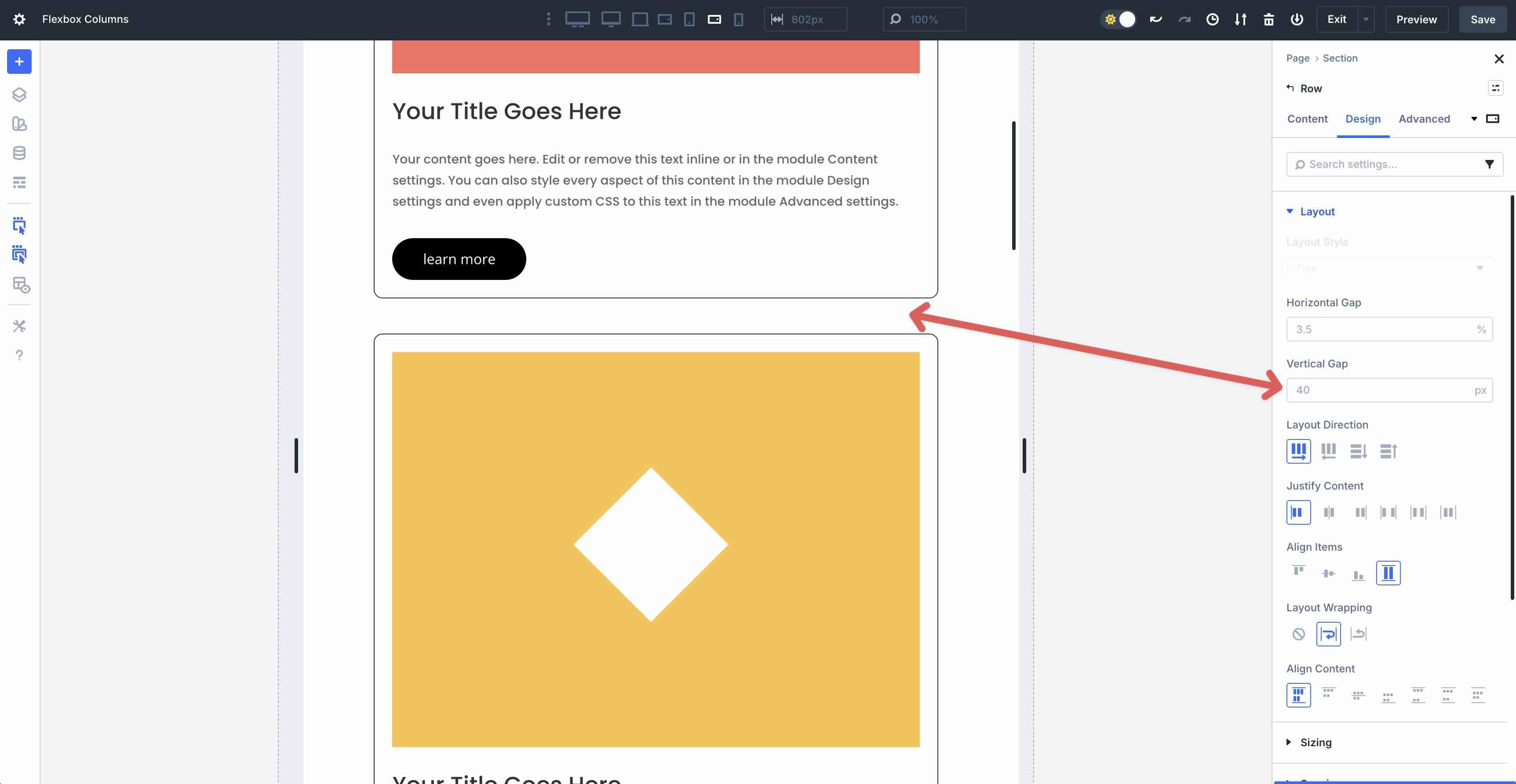
First, we’ll adjust the Horizontal Gap for the Row. Default is set to 5.5%. Adjust that value to 3% or 4%, depending on your preferences. As you make the change, the horizontal space between each Column (flex item) adjusts.
Leave all settings at their defaults, but enable Layout Wrapping. This will allow our flex items to wrap to the next line, creating a uniform look.
Responsive Adjustments
To ensure your layout looks great on every device, use Divi 5’s Customizable Responsive Breakpoints to make changes as necessary.
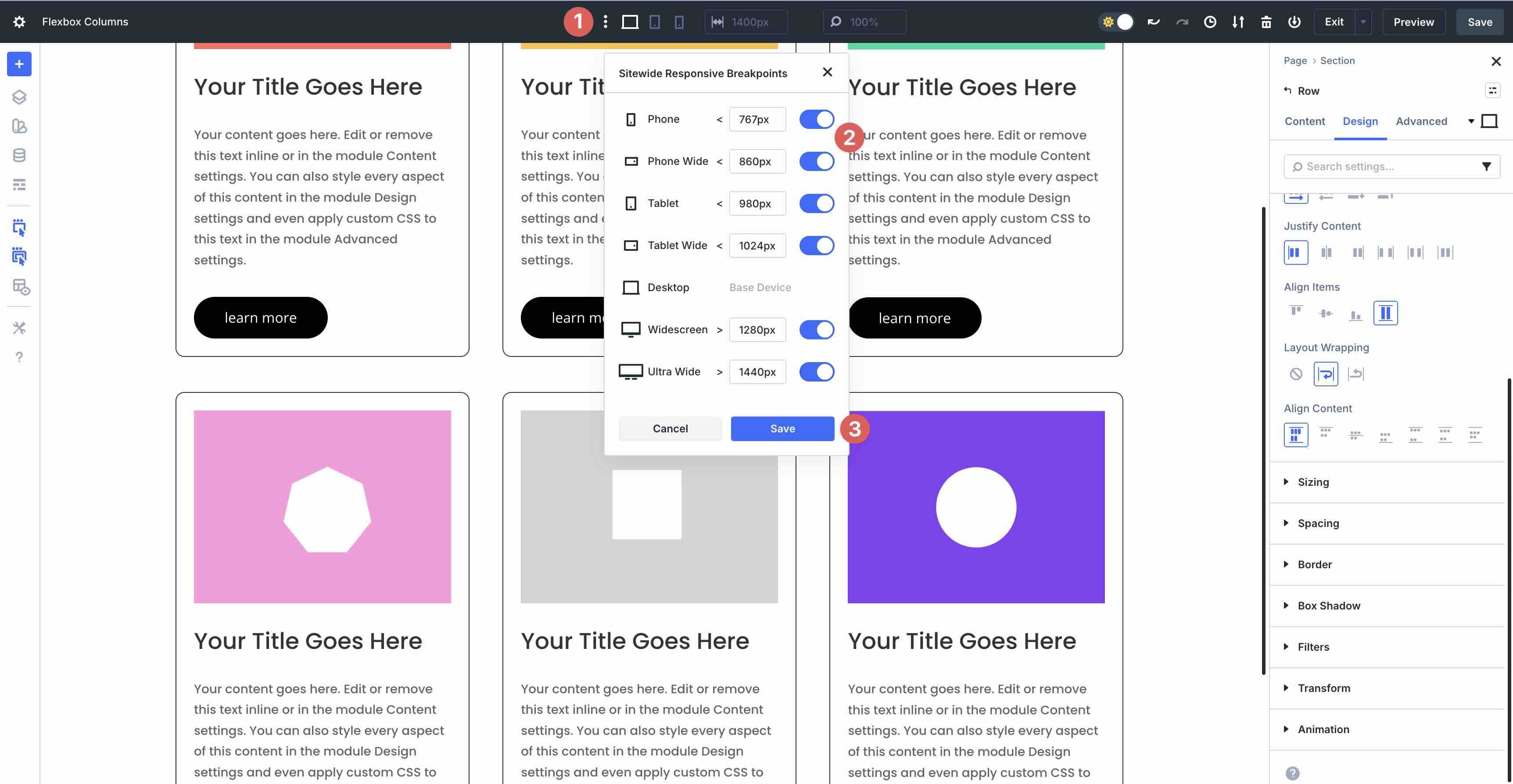
You can navigate through each breakpoint, adjusting the Layout Direction as needed.
You can also adjust the Vertical Gap on smaller devices to reduce the amount of space between flex items.
Applying Structure Templates
Divi 5 allows you to easily restructure Flex rows for smaller device screens with a simple feature. The Apply Structure Template feature helps you create responsive layouts with a single click. In the Row’s Content tab, click the Apply Structure Template button to use different row structures on smaller breakpoints.
Once clicked, Divi 5 reveals the Flex row options available to you. For example, you can change from a 3-column layout to a 2-column layout on the Tablet Wide breakpoint for a more responsive viewing experience.
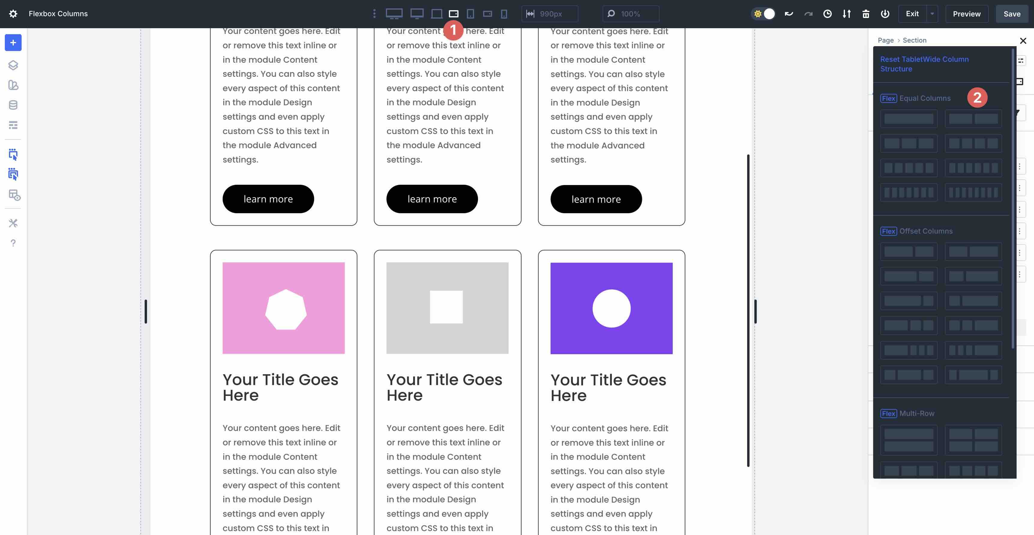
This gives you complete control over how your columns stack on various breakpoints.
Custom Column Ordering
In Divi 5, custom column ordering allows you to rearrange the stacking order of columns within rows across various breakpoints without hiding them in the visibility settings or custom CSS. For example, having alternating rows on desktop often required CSS workarounds to avoid the stacking of similar elements on smaller devices.
Now, you can use Column ordering to change the order of columns on tablet and phone views, providing users with a seamless browsing experience. Select the first Column within a Row. Select the Column’s Content tab and click to expand the Order settings.
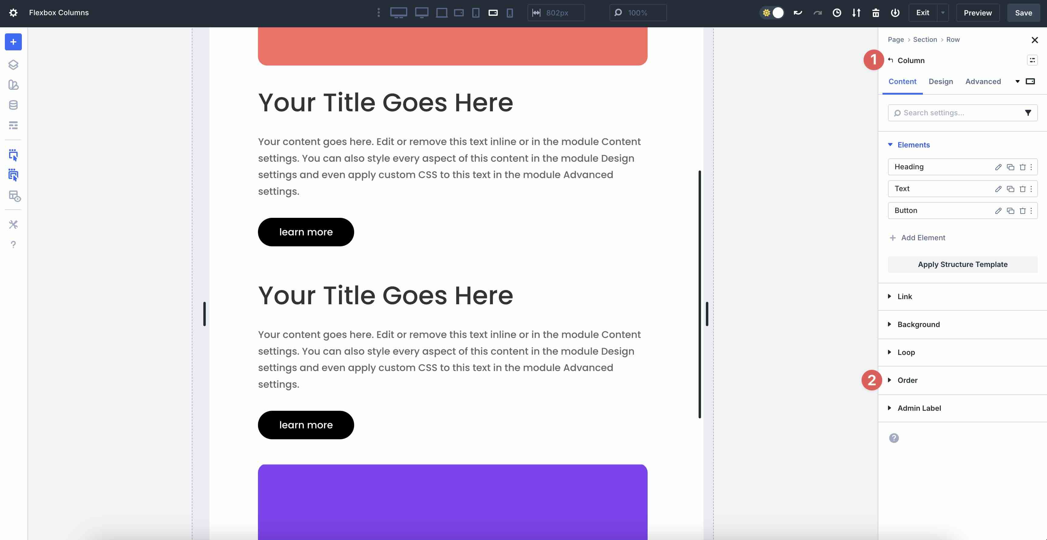
Set the first Column’s Display Order to 1 (leave the second Column at 0). On smaller screens, this moves the first Column underneath the second. It’s a quick way to adjust column stacking on mobile without CSS, hidden elements, or duplicated rows.
Best Practices
Divi 5’s Flexbox system is powerful, but like any tool, it works best when used intentionally. Here are a few best practices to help you build faster, cleaner, and more responsive layouts.
Start Simple, Then Refine Per Breakpoint: Keep it simple on desktop view. Set your ideal layout (Layout Direction, Justify Content, Align Items, Layout Wrapping) on desktop, then use the defaults (Stretch for equal heights, Start for Justify Content). Adjust when needed. This keeps your settings lightweight and ensures your site loads quickly.
Let Flexbox Do The Heavy Lifting: Don’t duplicate rows and use visibility settings to make changes for small device screens. Use Wrap + Apply Structure Template or Column Order instead. Fewer sections = better performance and easier updates.
Use Realistic Gutters: Default Horizontal and Vertical Gaps are generous for a reason. On small screens, reduce the gap slightly rather than crushing content. Pair this with a minimum width on columns (Sizing> Width> Min Width) so that text never becomes unreadable.
Know When To Switch To CSS Grid: Flexbox is perfect for one-dimensional layouts (rows or columns). If you need true two-dimensional control, like overlapping items, complex layouts, or precise placement, use Divi’s CSS Grid system to achieve the look you’re going for.
Responsive Columns Are Simple With Divi 5
Native Flexbox integration is a powerful addition to Divi 5. What used to require CSS, duplicate sections, or a third-party plugin is now just a few clicks in the Visual Builder. Wrapping, perfect vertical alignment, and pre-breakpoint reordering finally feels native. The results are faster builds, cleaner code, and layouts that look perfect on every device. Whether you’re redesigning an existing site or starting fresh, Flexbox in Divi 5 makes responsive design feel effortless.
Ready to try it yourself? Download the latest Divi 5 Public Beta today and start designing with Flex. We can’t wait to see what you build. Drop a comment below or tag us on social media and share your designs with us! Your feedback helps us make Divi 5 better, so we’re eager to hear your thoughts.


Leave A Reply