
Flexbox dropped in Divi 5 a few weeks ago, and Grid followed soon after. Both tools control how your content is arranged on the page, providing you with two solid options to build layouts.
But how are they different? They appear quite similar at first glance. This post breaks down the differences between Flexbox and Grid in Divi 5, showing you when to use each one. Have a look!
What Flexbox Does In Divi 5
Flexbox is a CSS layout model that Divi 5 uses as its foundation. It works in one direction, meaning you can arrange things horizontally or vertically, not both at once.
Subscribe To Our Youtube Channel
This system replaces specialty sections and full-width sections. You no longer need those because Flexbox performs the same function with fewer restrictions. You can nest a row inside a column, then nest another row inside that. You can nest rows inside columns, with multiple levels of nesting.
The main benefit is control. You can adjust the spacing between elements, change how elements align, and reorder content for different screen sizes in the Visual Builder, located under your Layout menu.
There’s no need to write CSS for basic positioning tasks anymore, which saves time and makes layouts more accessible to build.
How To Use Flexbox In Divi 5
Start by adding a row to your section. You’ll see options for equal columns, multi-row layouts, or multi-column layouts. Select one and add your modules to the columns as you normally would.
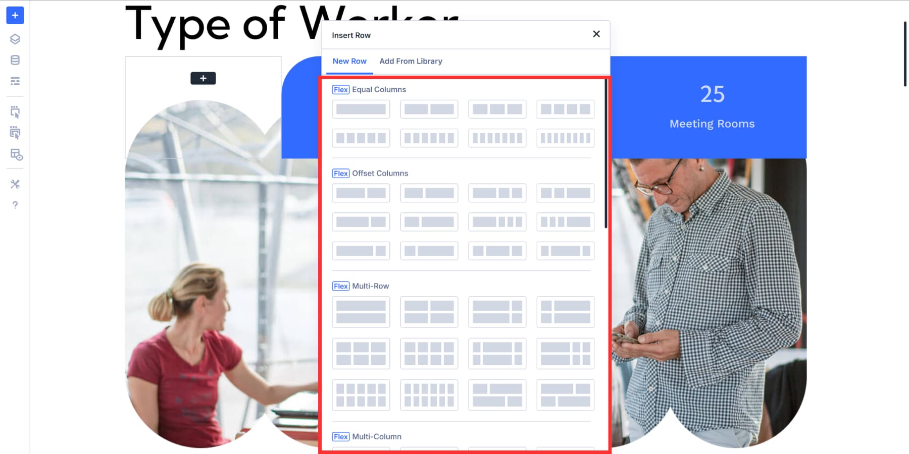
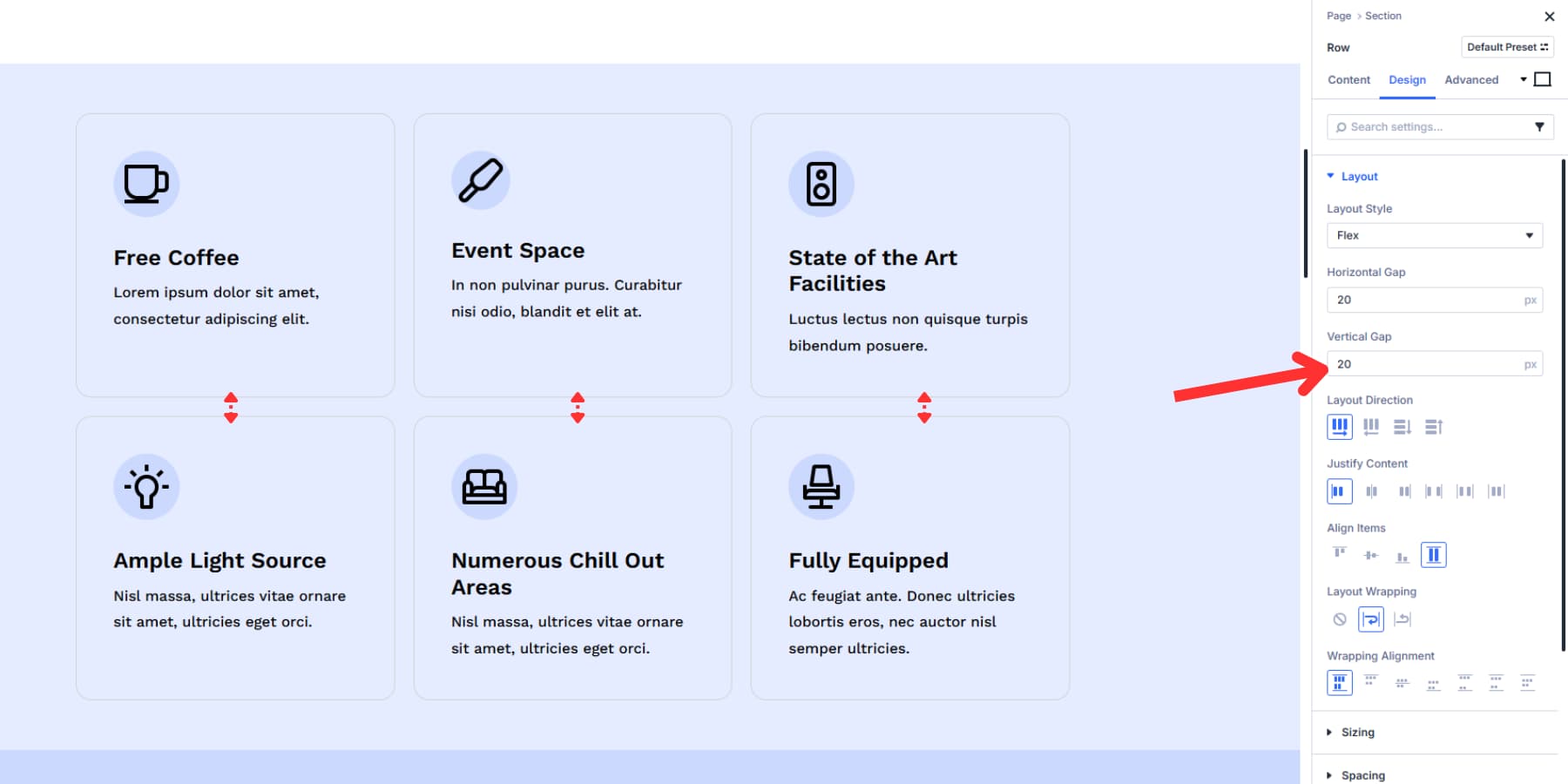
Once your modules are in place, click the settings icon on the row. Then, navigate to the Design tab and locate the Layout settings. That’s where all the Flexbox controls live.
You can switch an existing layout to Flexbox by changing the Layout Style here.
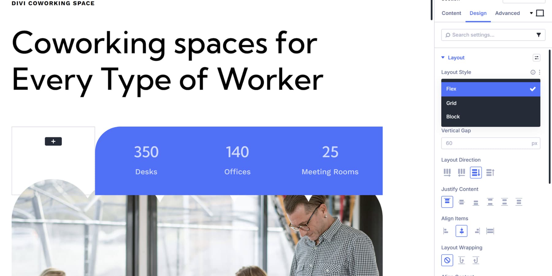
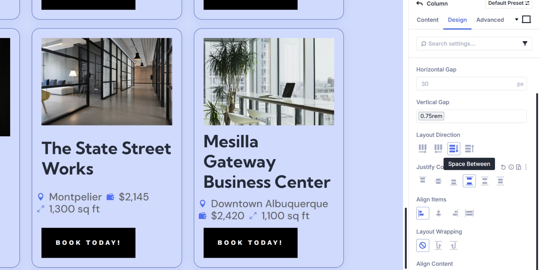
From here, you can also adjust Layout Direction to control whether content flows horizontally or vertically.
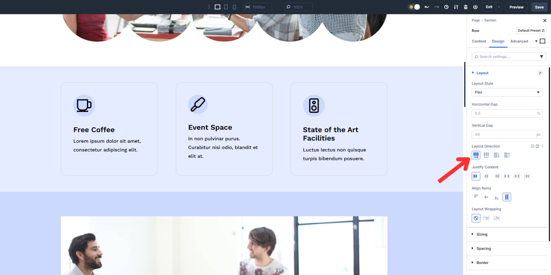
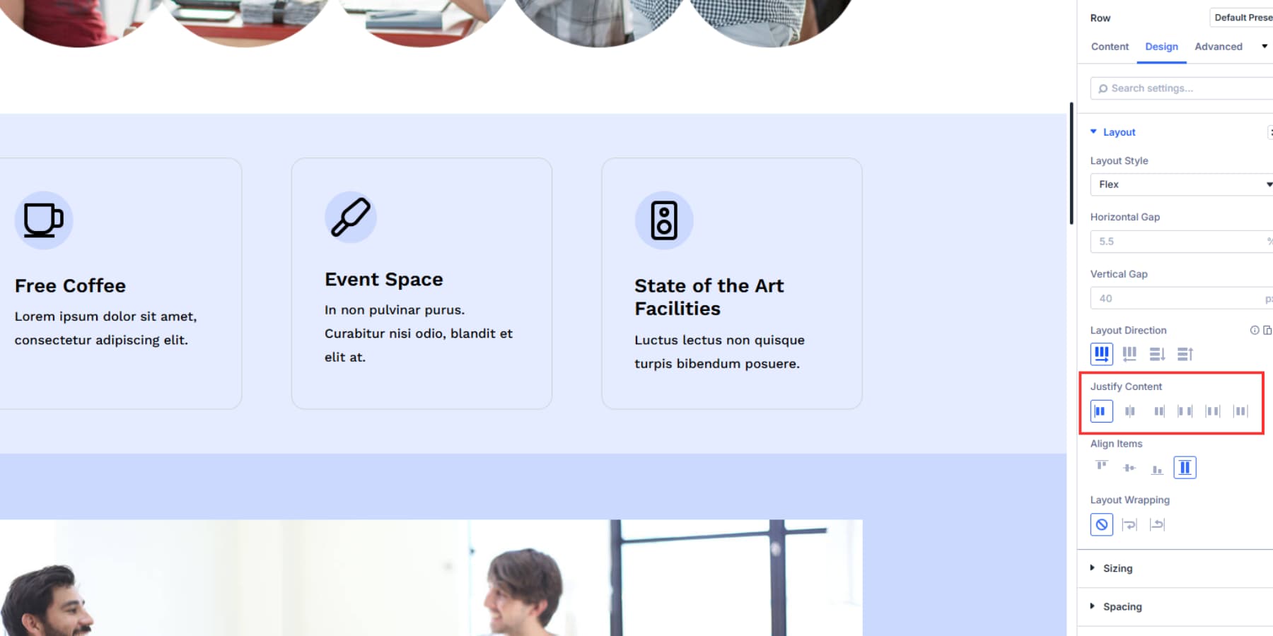
Justify Content handles alignment and distribution. Align Items controls how elements sit inside the row.
There are also spacing controls for horizontal and vertical gaps between columns.
If you’ve used Divi before, the process feels familiar. The difference is that you now have more options to fine-tune how things look without leaving the Visual Builder.
What Grid Does In Divi 5
Grid is a CSS layout model that controls rows and columns simultaneously. It creates a structure with defined cells, and content placed inside fills those cells based on the rules you set.
This system arrived in Divi 5 a few days ago. You work with it at the container level. Set up your grid structure by defining the number of columns and rows you need, setting their sizes, and adjusting the spacing between them. Items you add flow into the Grid based on that structure and make whatever layout you would like to make.
Divi 5 ships with pre-built templates that utilize common grid patterns, eliminating the need for manual setup. Choose a template, and your modules will snap into position automatically.
You can control where individual items sit, make specific elements span multiple columns or rows, and create repeating patterns where certain items behave differently from others. Once you set the rules, the Grid handles placement automatically.
Using Grids In Divi 5
Adding a row to your section will show pre-built grid templates alongside the Flexbox options. Pick a grid template that matches your layout needs.
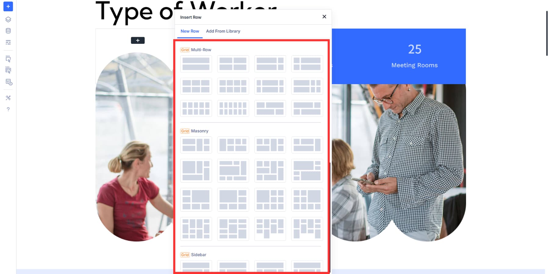
You can also convert existing layouts to Grid from the Layout Style under the Design Tab of your section’s settings.
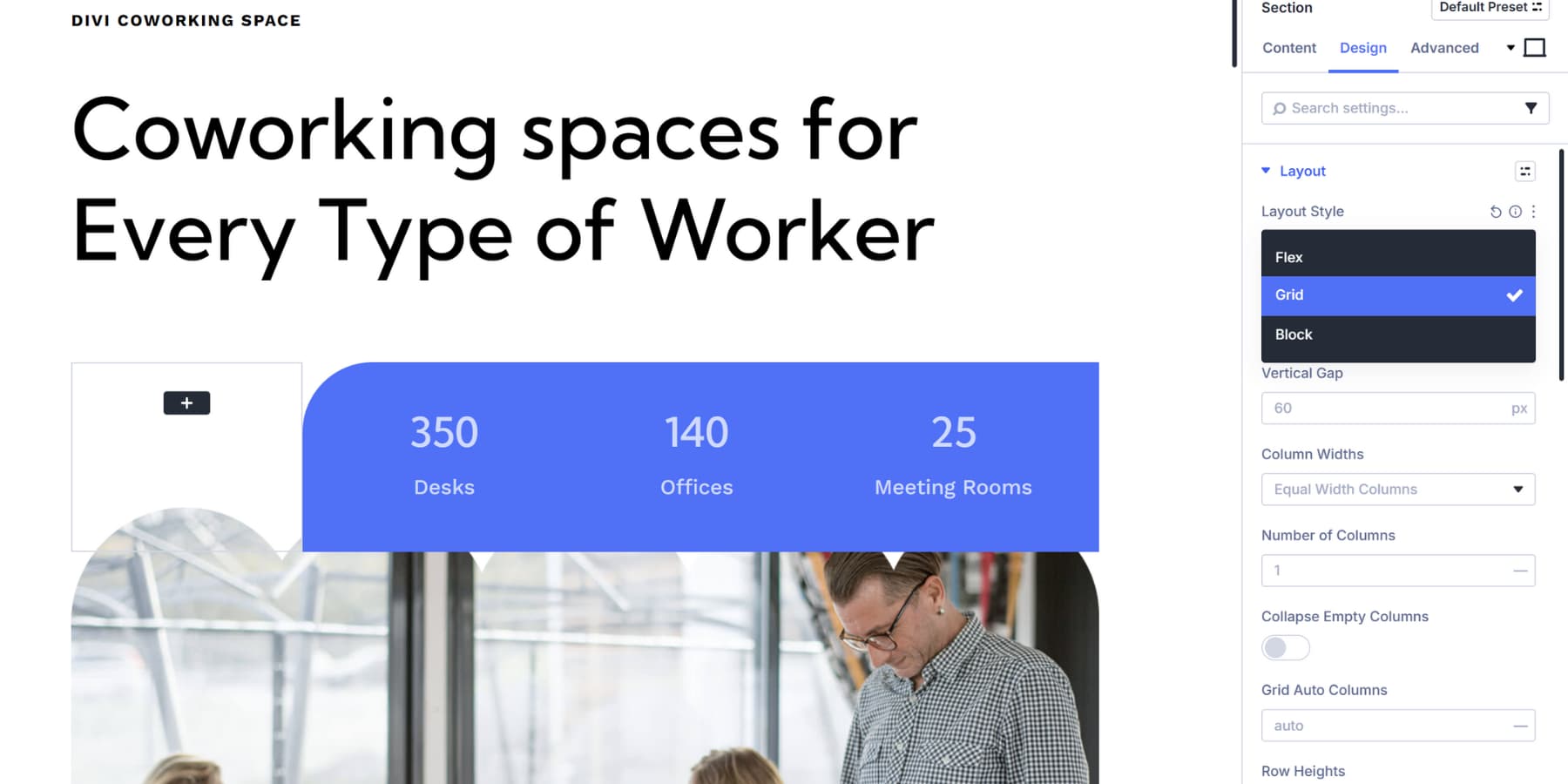
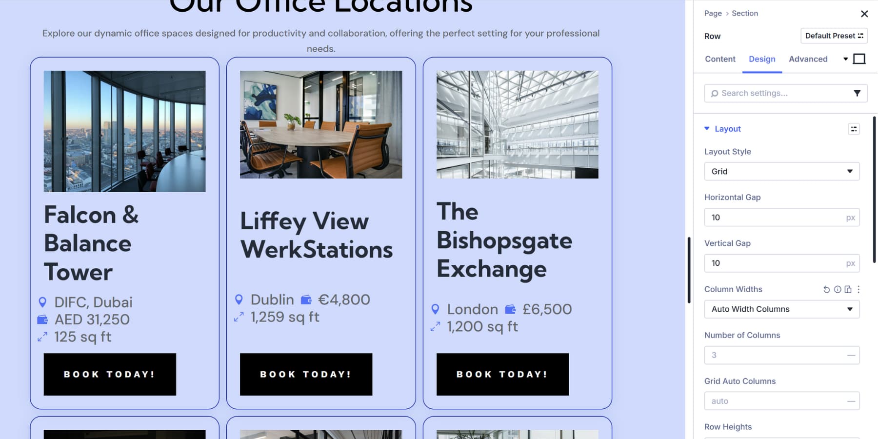
You can add modules to the grid cells or customize your grid structure. Column Widths let you control how grid columns behave. Row Heights work the same way but control vertical space.
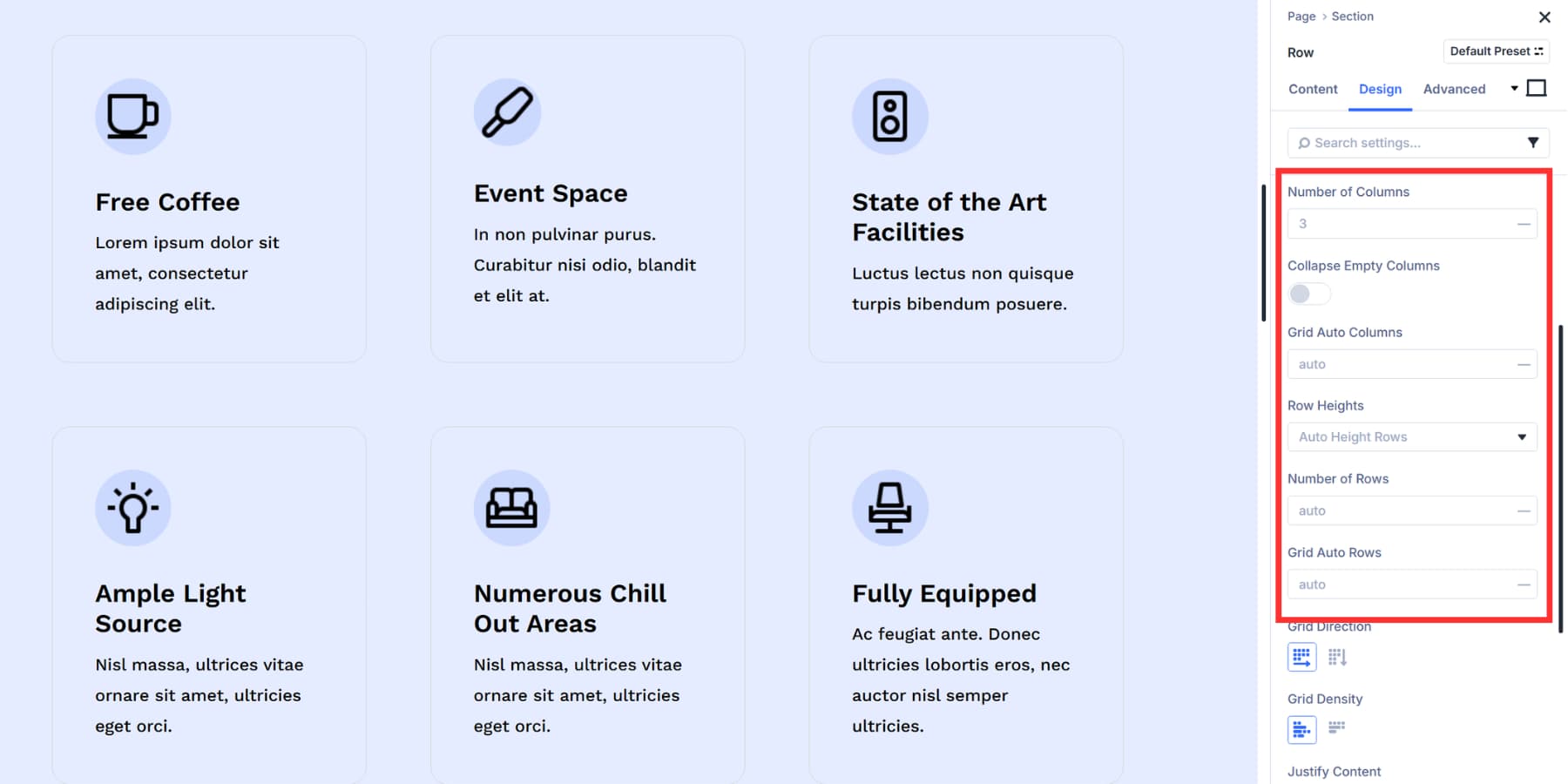
Grid Auto Columns and Grid Auto Rows handle a specific problem: what happens when items get placed outside your defined grid structure. These settings indicate to the grid how wide or tall the overflow cells should be. Without this, overflow items would have unpredictable sizes.
Collapse Empty Columns removes any column without content from your layout. The remaining columns expand to fill that space automatically.
Column Widths and Row Heights give you control over cell sizing. Set columns to equal width for uniformity, auto to size based on content, or manual for custom CSS. Rows work the same way with auto, equal, minimum, or fixed options.
Gap controls add spacing between cells horizontally and vertically. Grid Direction allows you to adjust how content flows through the Grid.
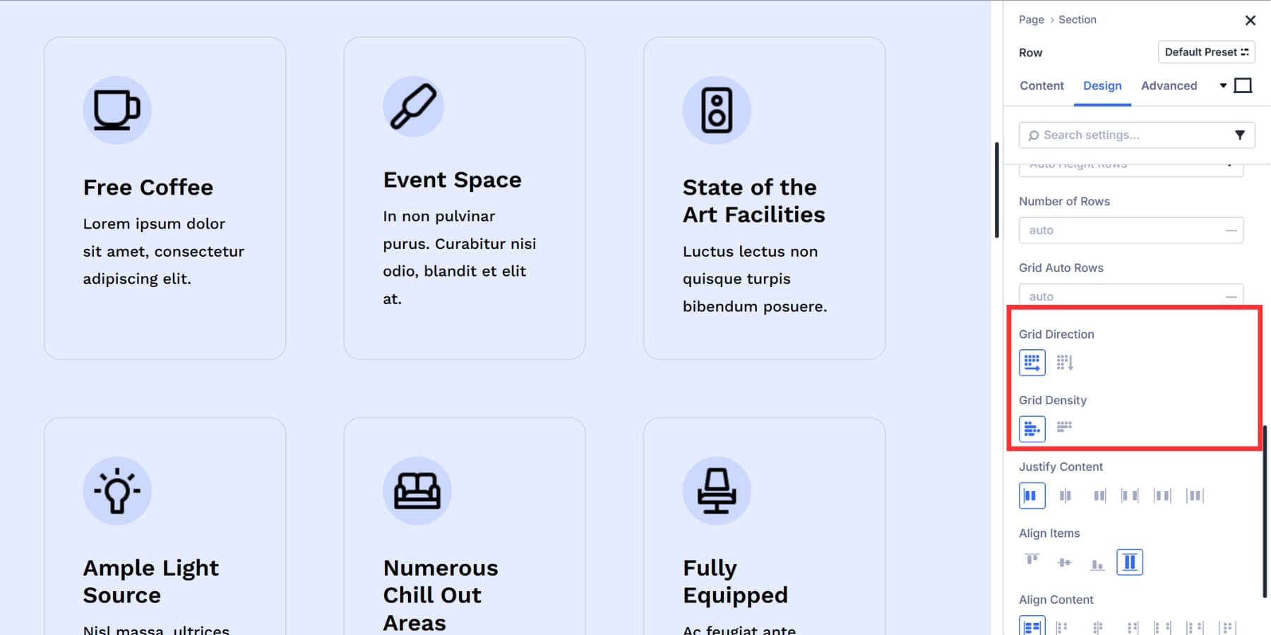
Grid Direction controls how items fill cells automatically. Row fills left to right, column fills top to bottom. Grid Density packs items tightly to fill gaps or keeps them in natural order.
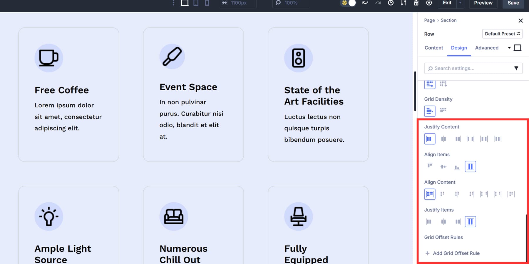
Justify Content distributes the grid horizontally inside its container. Align Content does the same vertically. Justify Items and Align Items work differently. They control how content is arranged within individual cells, both horizontally and vertically.
Open the settings for individual items inside your Grid and go to the Sizing option group. This is where you control width, height, and position within the Grid.
So, How Are They Different?
Both tools live in the same Layout Style dropdown and arrange your modules on the page, making them look interchangeable at first glance. However, they’re built for different purposes, and selecting the right one can significantly speed up your workflow.
Flexbox better suits certain layout types, while Grid handles others more efficiently. Knowing which situations call for each tool helps you avoid conflicts with settings that weren’t intended for your project.
Here’s when to use Flexbox and when to use Grid, and how to choose between them when either one could work.
When You Need Flexbox In Divi 5
Flexbox in Divi 5 works best when dealing with layouts that move in a single direction. You’ll also want Flexbox for button groups and navigation bars. Flexbox handles when elements need to wrap to the next line automatically based on the screen width. Set Layout Wrapping to Wrap, and your content adjusts without overflow issues. Mobile layouts get easier, too.
Divi 5 allows you to reorder columns for different screen sizes using responsive controls in the Visual Builder. For example, you can put your call to action first on mobile and last on desktop without duplicating the entire section or writing custom CSS.
Flexbox also fits situations where you’re building as you go. Add a module, check how it looks, add another. The layout adjusts naturally as you add more content.
If you need buttons at the bottom of columns, even when text lengths differ, you can use Module Groups with Justify Content set to space between them. Content remains at the top, and buttons are positioned at the bottom.
This system provides you with precise control over spacing and alignment in single rows or columns. When your layout flows in one direction and needs that kind of flexibility, Flexbox gets the job done.
When You Need Grid In Divi 5
Grid in Divi 5 gives you control over rows and columns simultaneously. The system works at the container level. Set your structure once, and items you add conform to that Grid automatically.
This works well with Loop Builder. Build a blog template, turn on grid layout style, and your posts snap into your defined grid structure. You can adjust column counts, set custom row patterns, and change gap sizes. The content fills in based on those rules.
The offset editor lets you create patterns where specific items behave differently. For example, every fourth item could span two columns, starting at the second item. These patterns would repeat across your layout without manual placement.
Grid also fits when you need items to span multiple cells. A featured post can span two columns, while regular posts take one. You control this through the Sizing options in each item’s settings. Set width, height, and position for individual grid items.
How To Pick The Right One
Choosing between Flexbox and Grid comes down to how your content needs to flow and whether you need control in one direction or two. Here’s how to choose between them.
| If Your Layout... | Choose |
|---|---|
| Flows in one direction (row or column) | Flexbox ✅ |
| Controls rows and columns simultaneously | Grid ✅ |
| Needs equal heights across items | Flexbox ✅ |
| Uses Loop Builder for dynamic content | Grid ✅ |
| Requires specific items to span multiple cells | Grid ✅ |
| Builds progressively as you add modules | Flexbox ✅ |
| Has full structure defined upfront | Grid ✅ |
| Needs content reordering on mobile | Flexbox ✅ |
You can switch between Flexbox and Grid at any time in your container’s settings. Test one to see how your content behaves, and then adjust as needed. Divi 5 lets you change layout systems without losing your modules or starting over.
Try Flexbox & Grid In Divi 5 Today
The Layout Style dropdown in Divi 5 offers two additional solid options: Flexbox and Grid. After building a few layouts, you’ll develop a sense of which tool is best suited for each job.
Start with what makes sense for your current project, then experiment with the other one when you hit something it’s better suited for. The beauty of Divi 5 is that you can switch between them at any time without losing your work.


Although several posts have already been made about grids, I’m unable to implement them in Divi 5. I don’t understand the terminology used, and I often can’t understand how the layout reacts. ‘Columns’ is in ‘Content’, ‘Columns’ is in ‘Design’. ‘Grid Direction’ depends on ‘Number of Columns’. I’m trying to use my CSS knowledge to understand the implementation in Divi 5, but I can’t. Perhaps the problem is 30 inches in front of my screen. Perhaps a ‘real’ programmer could handle it. But Divi is actually intended for ‘users’ without CSS knowledge.
I agree with this. The UI is not clear whatsoever. This makes is very dificult to work with the grid system.
I think the UI is abundantly clear, it is just that CSS Grid has its own logic (this is not a Divi thing, but a CSS thing), which has to be understood.
One of the ways Divi has made Grid easier is through the premade grid templates. When you add a new section, there is a list of layout structures with both Flex and Grid layouts. These are all prebuilt and ready for you to insert modules and content. Using those will probably get you a long way.
Divi has ‘Columns,’ but it might be simpler to think of those and others as ‘containers.’ So section/row/column/group are all containers.
Built into flex and grid are two very different approaches to organizing their direct children. The container can be set to flex/grid and have specific setting applied to them that are inherited only by direct children.
Inside those settings are different ways of creating “flex/grid-columns” and “flex/grid-rows” but they are conceptually different from one another. I recommend looking up ‘Flexbox Froggy’ and ‘Grid Garden,’ which are two simple and gamified ways learning the CSS. If you have a basic understanding of the CSS, then using Divi’s Layout panel is a breeze. I am guessing your confusion is likely in determining the parent container (with layout set to grid/flex) and how that relates to its immediate children, so spending some time in the CSS will help clear up the concepts and make Divi fall into place for you.