
Every website owner wants an accessible website, but it often takes work and some research. While the average user can navigate a website without supporting technologies, many people, including potential customers and fans, rely on an unseen layer of your website.
Subscribe To Our Youtube Channel
Screen readers and other assistive technologies tap into this unseen layer (i.e., machine-readable signposts) to interpret your content correctly. Visual design alone doesn’t communicate function or relationships to users who rely on these tools.
ARIA attributes (Accessible Rich Internet Applications) solve this problem by adding semantic meaning to HTML elements. They tell assistive technologies what something is, what it does, and how it relates to other elements on the page. Divi 5‘s Custom Attributes feature makes implementing ARIA straightforward, and we’ll show you how.
Understanding ARIA Attributes In Divi 5
ARIA is a specification that extends HTML with attributes designed specifically for accessibility. These attributes don’t do or change anything on your page. Instead, they describe, interpret, and announce what is on your page to assistive technologies. These technologies, in turn, help users to navigate your page by overcoming their particular disability.
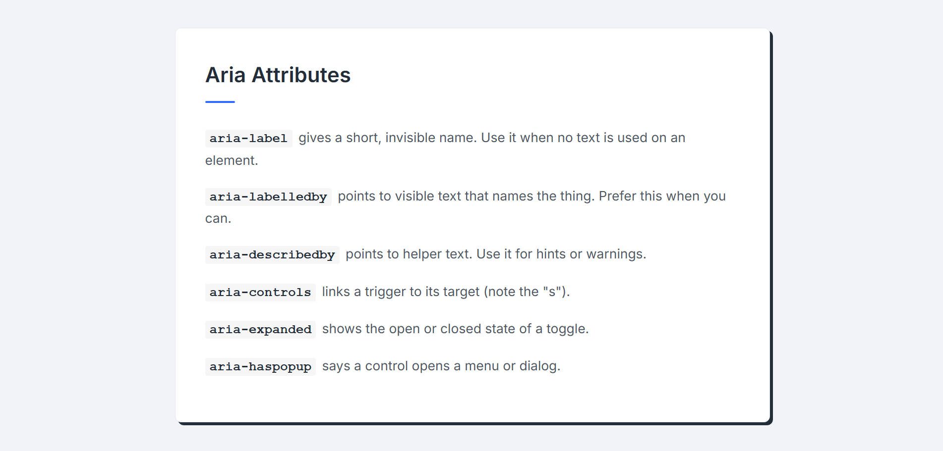
There are three ARIA attribute categories to be familiar with:
- Labels: aria-label, aria-labelledby, and aria-describedby provide names and descriptions for elements.
- States: aria-expanded and aria-hidden communicate dynamic states or visibility to assistive technologies.
- Relationships: aria-controls and aria-haspopup connect triggers to their targets, like buttons that open popups.
Agentic AI also relies on ARIA attributes to help understand how to take actions on a page. For instance, if an AI Agent (or a person, for that matter) wanted to know if they should click a button to open a popup, they would want to know that the button has an associated popup (using haspopup). If it didn’t, they’d probably reconsider if the button they were focused on was the one they needed to click.
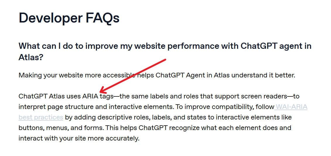
From ChatGPT Atlas’ Developer Docs
How To Add ARIA Attributes In Divi 5
The process is identical for every module or container. The only difference might be the sub-elements available for targeting based on the particular module.
Select the module you want to enhance. You can click the gear icon or click directly on the module in the Visual Builder.
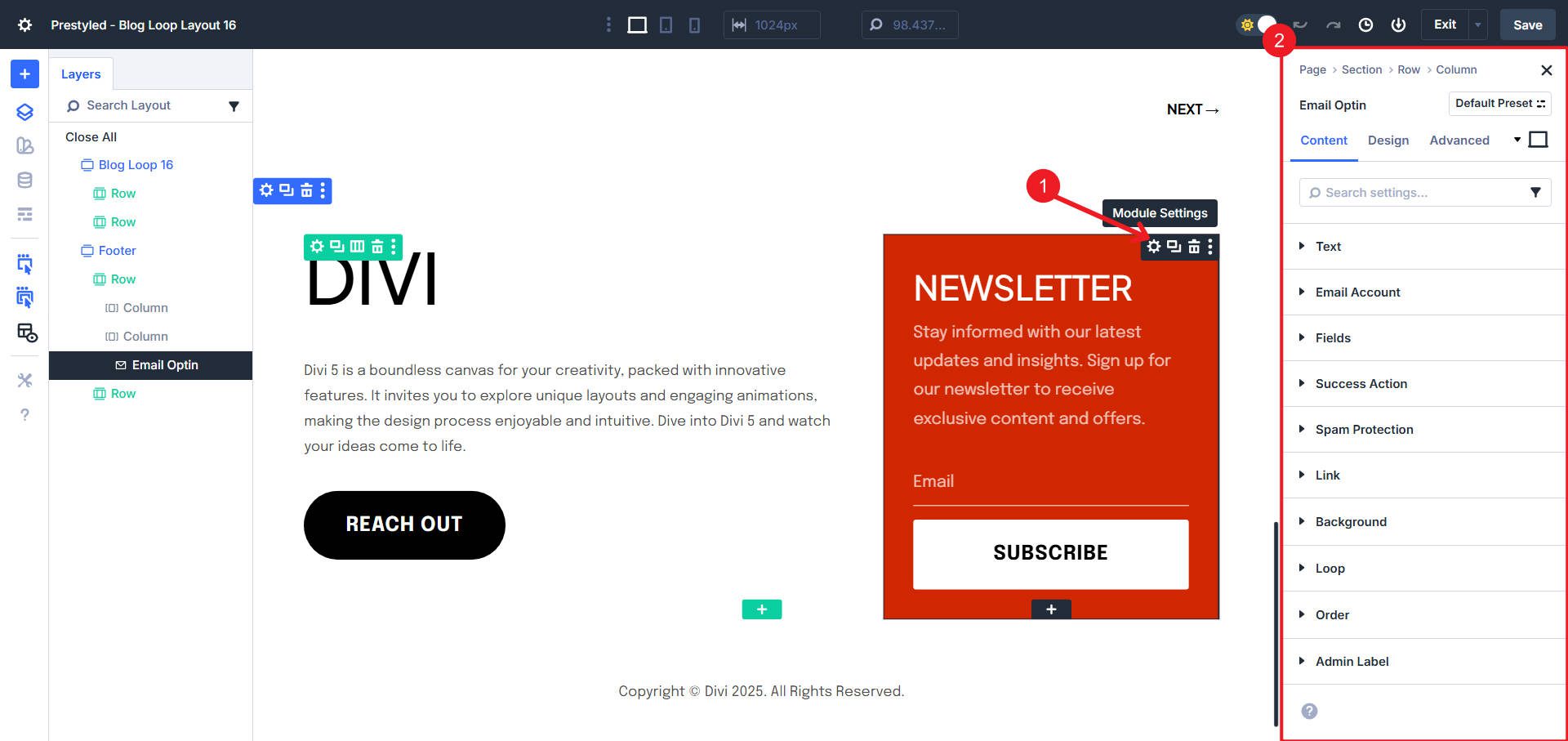
Navigate to the Advanced tab in the right sidebar settings panel. Open the Attributes option group. Click “Add Attribute” to create a new attribute entry.
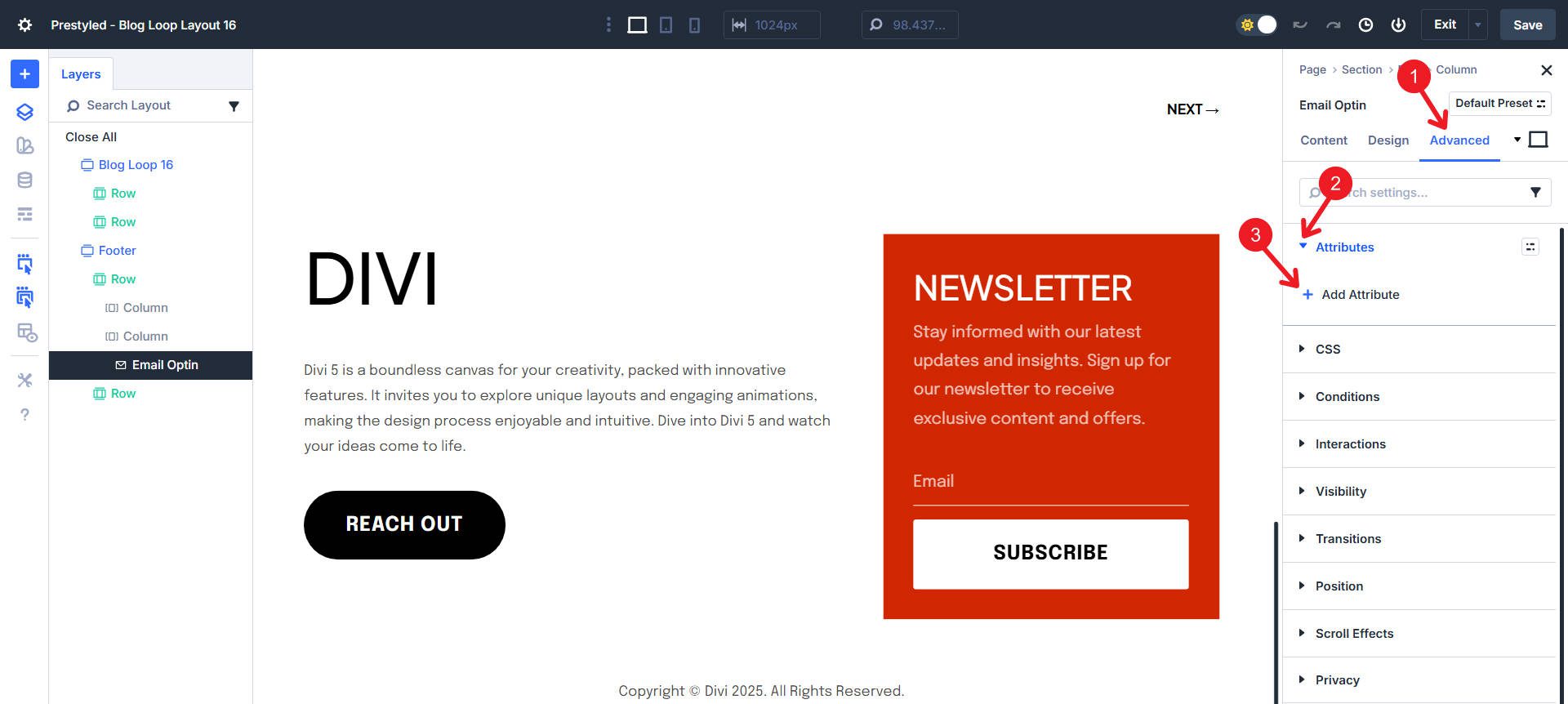
There will be a prepared dropdown of common attribute types that you can select from. Or, you can select “Custom Attribute” to type it all out yourself.
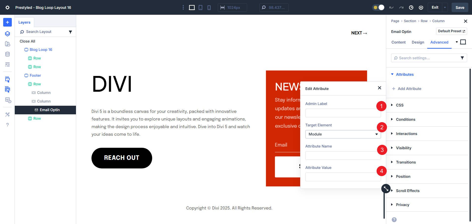
There are four fields you can use to create an Attribute:
- Admin Label: Name this attribute for your own reference (e.g., “Hide decorative image from screen readers”). If you leave this blank, it will automatically be given a name based on your other inputs.
- Target Element: Choose whether to apply the attribute to the module itself or a specific sub-element. Available options vary by module. An Image Module lets you target the image element directly. A Blurb Module exposes title, content, and icon as separate targets.
- Attribute Name: Enter the ARIA attribute name (e.g., “aria-hidden”, “aria-label”).
- Attribute Value: Enter the attribute’s value (e.g., “true”, “dialog”, “Close menu”).
Practical ARIA Implementations
There is a lot you could do in terms of ARIA on a Divi website. It really comes down to knowing when to add them and when it doesn’t make sense. Here are a few defined situations where you may want to add ARIA to your Divi Modules.
Decorative images add visual interest but don’t necessarily convey meaningful information.
Without ARIA, screen readers attempt to provide context to users by announcing the image filename or alt text. Say I run a blog where I use stock photos for featured images. I tend to name my featured images similarly to the blog title to keep things simple on my end. However, if users see my blog title, they don’t necessarily need to hear about the featured image. This is a good opportunity to categorize this image as decorative.
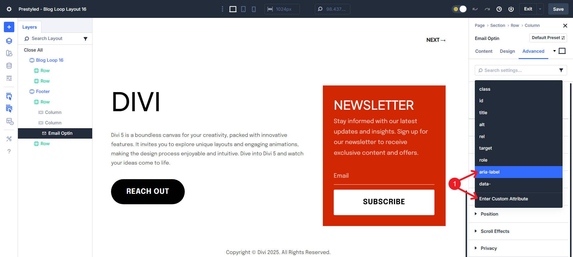
Open the Image Module containing your decorative graphic. Go to the Advanced tab > Attributes > Add Attribute.
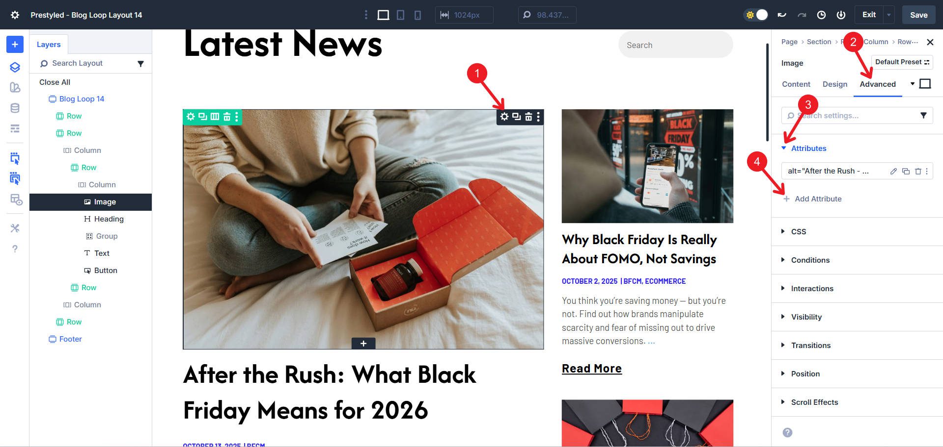
Choose Enter Custom Attribute. We will use the aria-hidden attribute to make this image invisible to assistive technologies. We can construct the attribute like this:
- Admin Label: “Hide decorative image” or leave blank
- Target Element: Image
- Attribute Name: aria-hidden
- Attribute Value: true
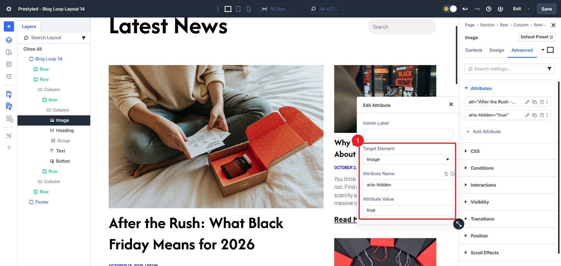
The screen reader now skips this image entirely, moving directly to meaningful content. However, do not use aria-hidden on images that convey meaning. If an image shows product features, illustrates a process, or provides context for surrounding content, it needs proper alt text instead.
Buttons that trigger popups or modals create a major accessibility challenge. Without proper ARIA, screen reader users don’t know that clicking opens additional content. This example has a popup section on the page that is not visible unless an Interaction toggles the visibility.
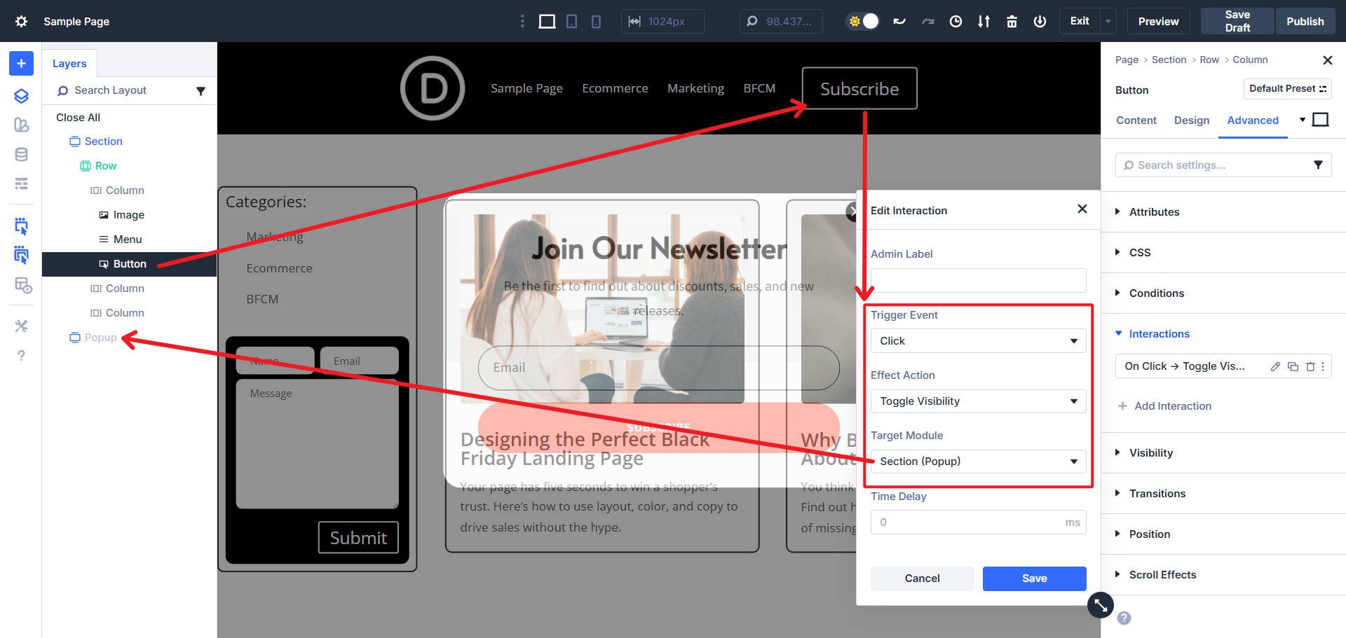
This implementation requires two parts: attributes on the trigger button and attributes on the popup container itself. This popup also has a close button/icon, which should also have a similar trigger button aria.
Part 1: Configure The Trigger Button
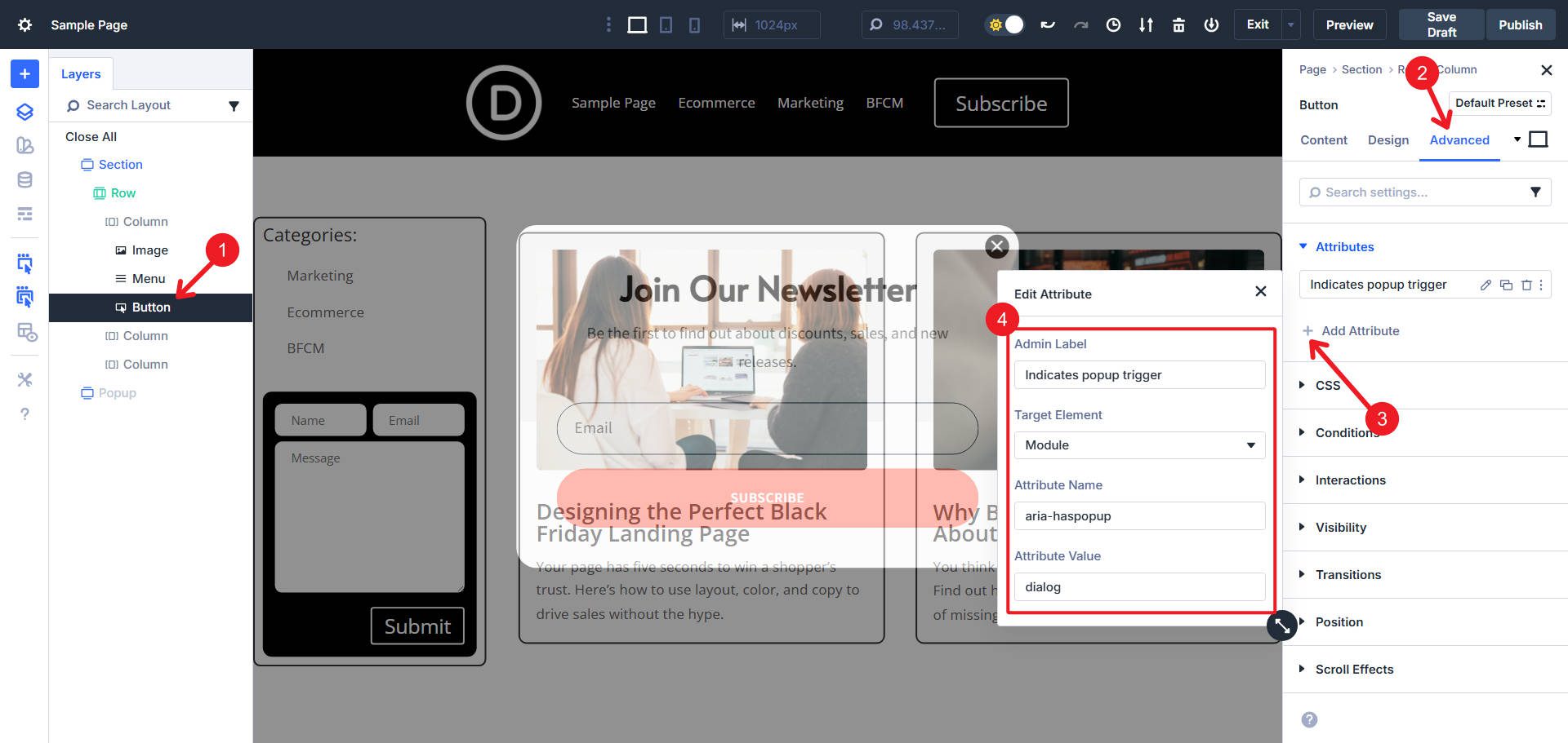
Select the Button Module that triggers your popup. Add two attributes to it:
- Admin Label: “Indicates popup trigger”
- Target Element: Module
- Attribute Name: aria-haspopup
- Attribute Value: dialog
- Admin Label: “Controls popup modal”
- Target Element: Module
- Attribute Name: aria-controls
- Attribute Value: modal-popup

The aria-controls value must exactly match the ID you’ll assign to the popup in Part 2. Choose a descriptive, unique ID. If you have multiple popups, use “modal-popup”, “modal-contact”, “modal-video”, etc.
Part 2: Configure The Popup Container
Open the Container that serves as your popup. We will add three attributes to this modal:
First attribute:
- Admin Label: Leave blank
- Target Element: Module
- Attribute Name: id
- Attribute Value: modal-popup
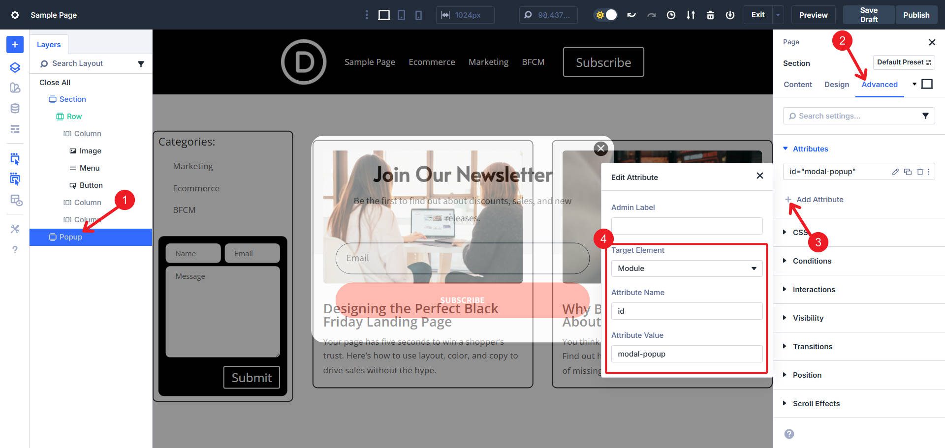
This ID must match the aria-controls value from the button.
Second attribute:
- Admin Label: Leave blank
- Target Element: Module
- Attribute Name: role
- Attribute Value: dialog

Third attribute:
- Admin Label: Modal behavior
- Target Element: Module
- Attribute Name: aria-modal
- Attribute Value: true

Now, when a screen reader user encounters the button, they know that it opens a specific HTML element. When the popup appears, assistive technology correctly identifies it as a modal dialog and manages focus appropriately.
If your popup has a title (a Text or Heading Module at the top), you can add one more attribute to create an even stronger connection. Add an ID to that title element, then add aria-labelledby to the popup container pointing to that title ID.
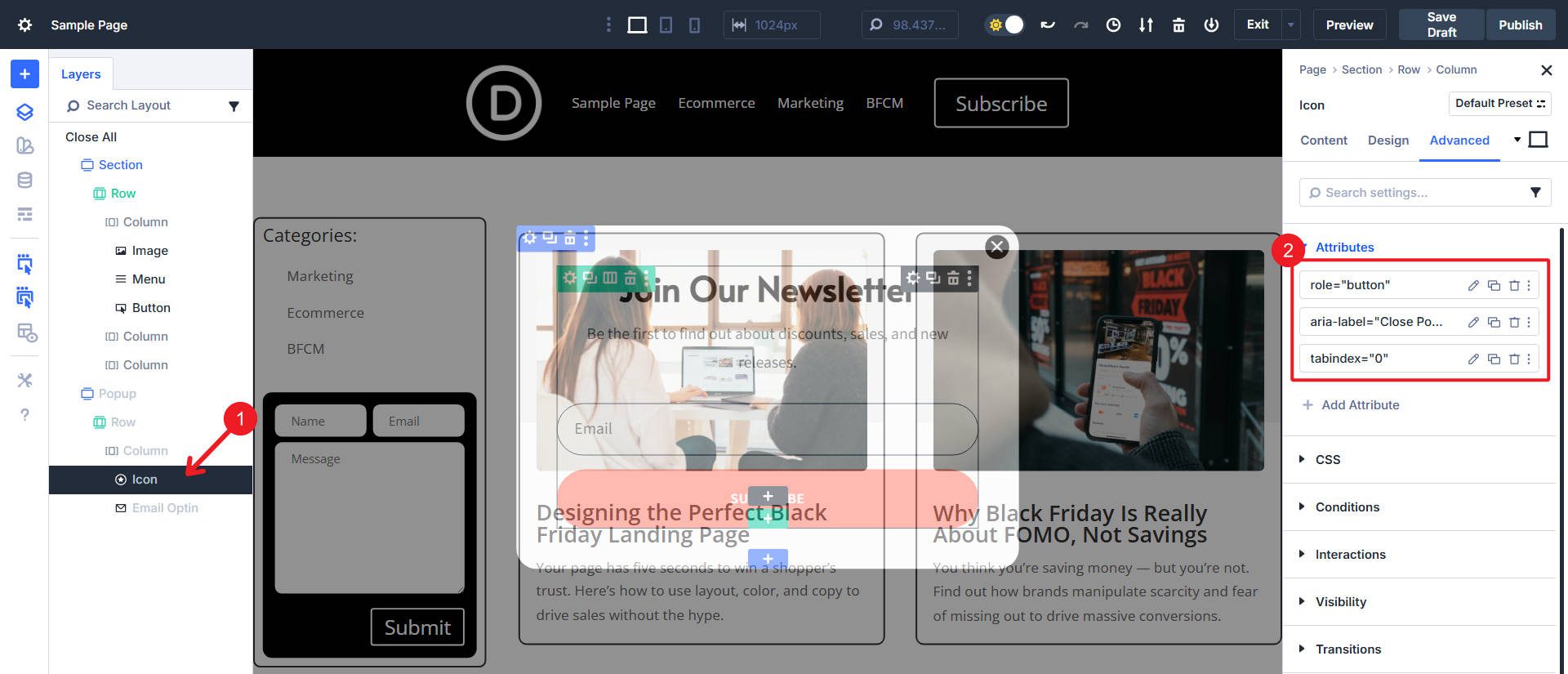
Since this popup has a close icon/button in the top right, you should assign it role=”button” and tabindex=”0″ attributes.
3. Blurb Module As Feature Card With aria-labelledby
Feature cards, service listings, and product cards often present information in a modular format, consisting of an icon or image, a title, and descriptive text. Visually, users immediately understand that the title labels or describes the entire card. Screen reader users navigating by landmarks or regions don’t get that context unless you explicitly create the relationship.
The aria-labelledby attribute connects a broader element to text that names it. This is more powerful than aria-label because it leverages text already on the page rather than creating a hidden duplicate label.

This is an example of two Blog Cards. Their Blog Titles are obvious and effective descriptors of the cards’ purpose.
Open the Blurb Module (or Container) that represents your feature card. First, you need to add an ID to the title element. Go to the Advanced tab > Attributes > Add Attribute.
Use these settings:
- Admin Label: Leave blank
- Target Element: Title
- Attribute Name: id
- Attribute Value: blog-1

Choose a unique ID or use dynamic data from a custom field attached to the blog post type if your cards are in a loop.
Now add a second attribute that references this ID. Click “Add Attribute” again (we’re in the Blurb Module). Configure this additional attribute like this:
- Admin Label: Leave blank
- Target Element: Module
- Attribute Name: aria-labelledby
- Attribute Value: blog-1
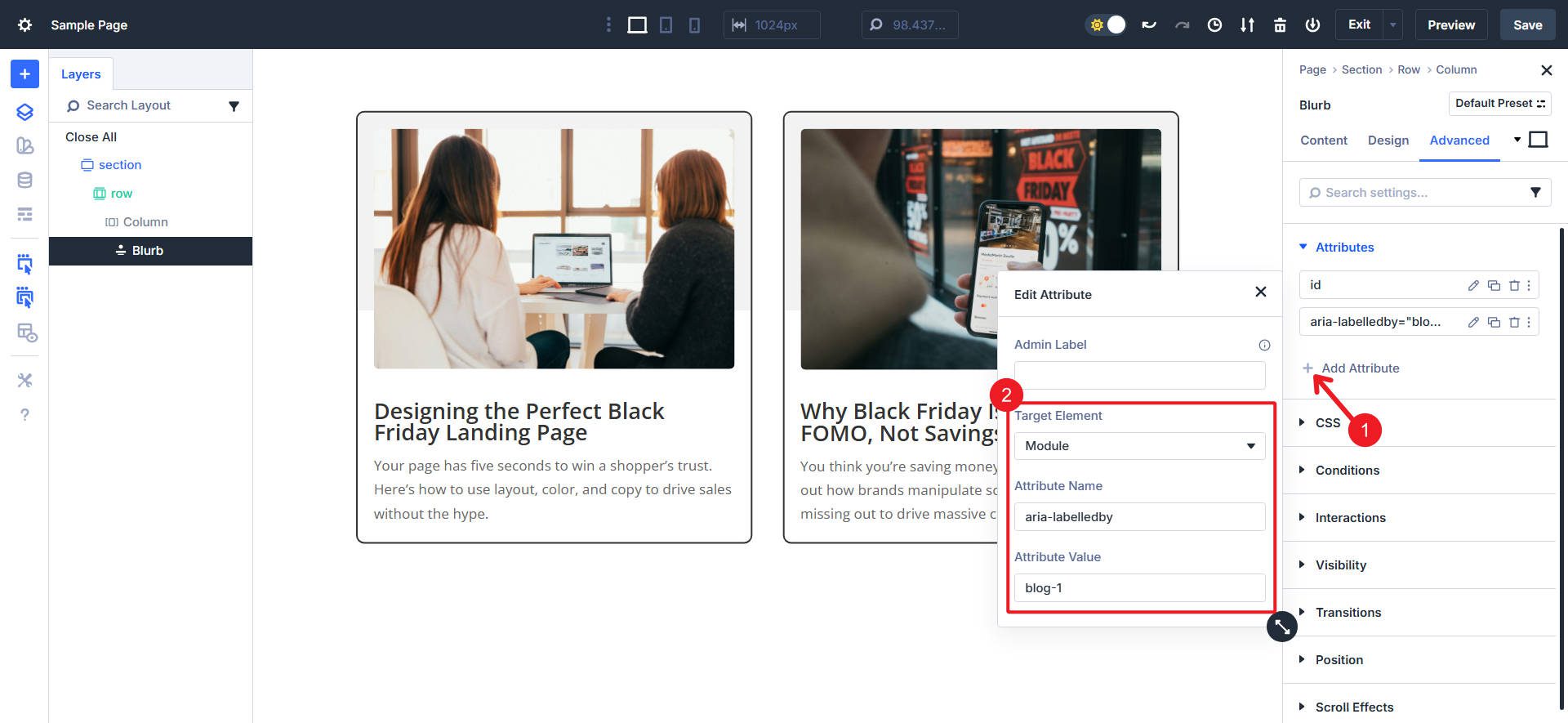
The value must exactly match the ID you just created in the title.
When a screen reader user navigates to this card, assistive technology announces the title as the label for the entire region (i.e., the card itself).
Sidebars group related content, such as recent posts, categories, newsletter signups, or contextual information. Screen reader users benefit enormously from landmark regions that let them jump directly to (or away from) major page sections. Without proper semantics, sidebars become just another div container with no special meaning.
Open the Container that serves as your sidebar (we built the below example with a Divi’s Grid Layout. Go to the Advanced tab > Attributes > Add Attribute and use these attribute details:
- Admin Label: Leave Blank
- Target Element: Module
- Attribute Name: role
- Attribute Value: complementary
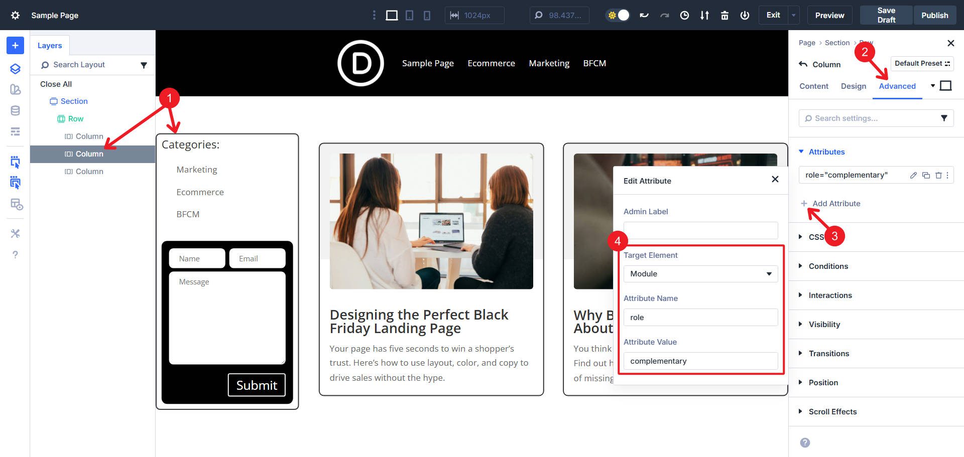
The ‘complementary’ role identifies this as a landmark region for content that supports the main content.
Add a second attribute on the same container:
- Admin Label: Leave Blank
- Target Element: Module
- Attribute Name: aria-label
- Attribute Value: Blog Sidebar
Choose a label that accurately describes the sidebar’s purpose: “Blog Sidebar”, “Related Resources”, “Course Navigation”, or any other label that clearly identifies the content to users who can’t see the visual layout.

Screen reader users can now navigate directly to this landmark by pulling up their landmarks list (a common screen reader feature). They’ll see “Blog Sidebar, complementary” as a navigation target, letting them jump straight to this content or skip it entirely based on their needs.
Best Practices For ARIA Implementation
There are a few things to keep in mind when attempting to add aria attributes:
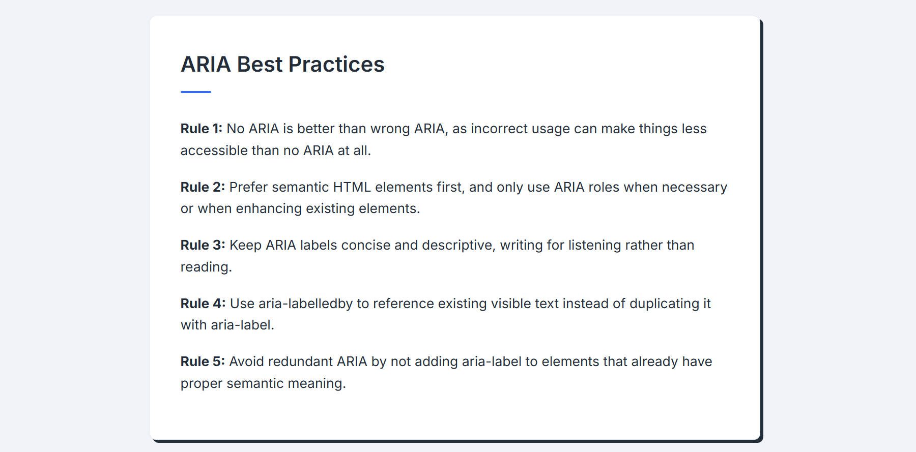
Rule 1: No aria is better than wrong aria. In other words, if you implement aria attributes incorrectly, you are often making things less accessible than if there were no attempt at all.
Rule 2: Whenever possible, use Semantic HTML elements. When that isn’t possible or easy, you can assign role=”” equivalents to add semantic roles to more generic elements. For example, a button element is better than a div with role=”button.” An aside element is better than a section with role=”complementary.” However, using role=”” is valid and sufficient.
Rule 3: Keep aria-label text concise and descriptive. Write for listening, not reading. “Download 2024 annual report PDF” works better than “Click here to download the PDF version of our 2024 annual financial report”.
Rule 4: Use aria-labelledby when visible text exists. If the label you need is already on the page, use aria-labelledby to point to it instead of duplicating it with aria-label.
Rule 5: Avoid redundant ARIA. Don’t add aria-label to an element that already has a proper semantic meaning. A heading element with text content doesn’t need aria-label—it’s already properly labeled.
Try Out Divi 5’s Custom Attributes Feature Today
ARIA fills critical gaps where HTML semantics fall short. It transforms generic divs into meaningful interface elements, connects related content, and communicates dynamic behavior to assistive technologies.
Start with the highest-impact implementations: decorative images with aria-hidden and dialog patterns for popups. These two patterns alone dramatically improve accessibility for common Divi layouts. Divi 5 gives you the tools to implement it correctly.


Leave A Reply