
Clickable areas, such as hotspots on your website, can reveal hidden content, trigger pop-ups, or launch animations, transforming static pages into interactive elements that guide people precisely where you want them to go.
Divi 5‘s Interactions handles all of this without requiring any custom coding. We’ll walk through the exact steps to create interactive elements that respond to clicks, hovers, or scrolls. Have a look!
What Are Hotspots?
Hotspots are clickable or hoverable zones that are layered over sections, images, and graphics. You’ll see them on product showcases where each feature gets its own spot. Maps use them to mark locations. Infographics rely on them to break down complex data without cramming everything into one view, among other use cases.
Subscribe To Our Youtube Channel
Rather than flooding a page with paragraphs of text, you can tuck information behind these small markers. Users get details exactly when they want them, not before. This keeps pages clean and scannable while still offering depth.
You control exactly where attention goes and what appears when. This gives you precision over how content unfolds.
Divi 5’s Interactions: A Quick Overview
Divi 5’s Interactions is a built-in tool that adds interactivity to your website without writing code. You’ll find it in the Advanced tab of any module, column, row, or section in the Visual Builder, ready to transform static elements into dynamic experiences.
The system operates on three core components that work in tandem:
- Triggers define specific events, such as a click or a mouse position change.
- Effects determine the action that occurs, such as fading in content or switching between presets.
- Targets specify which element receives that effect.
With this system, you can trigger pop‑ups that slide in as users scroll, create toggles to show or hide content, apply style changes when sections come into view, and more.
You can layer multiple triggers on a single element for more intricate interactions. A section might fade in only after someone scrolls past the halfway point and waits three seconds. An image could change on hover and reveal text on click, giving you complete control over how content flows.
Because Interactions runs natively within Divi 5, you don’t need extra plugins, and your workflow remains simple. You work on what triggers each action and where effects should appear with simple dropdowns.
Creating Hotspots With Divi 5
Building hotspots in Divi 5 can be done through the Interactions feature. You’ll apply those same trigger and target principles to your own page elements. We’ll walk you through this process using actual modules and settings, so you can see how the pieces fit together and replicate the technique on your own projects. Let’s move on without further ado:
Add Your Base Image Or Section
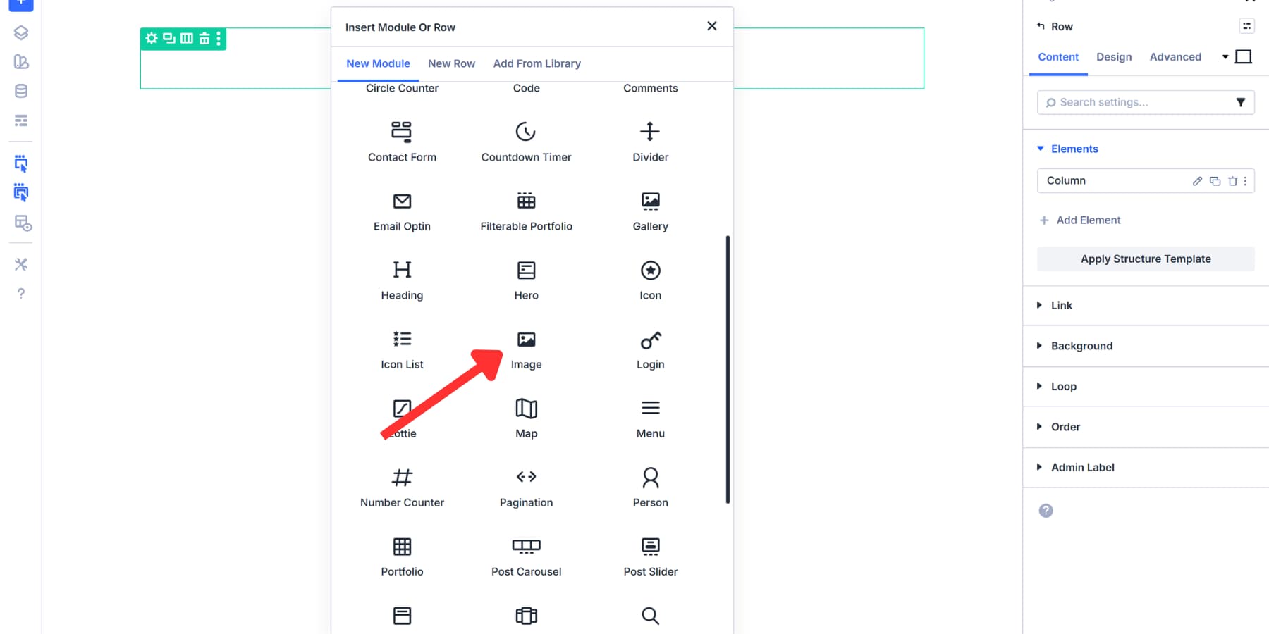
Start with a fresh section in the Visual Builder. Click the blue plus button on the left panel to insert one. This serves as your foundation. The simplest approach is to use an Image module. Click the green plus to add a row, then the black plus to insert the Image module.
Upload your product photo, infographic, or map, and enable Force Fullwidth in the Sizing tab of the Design settings.
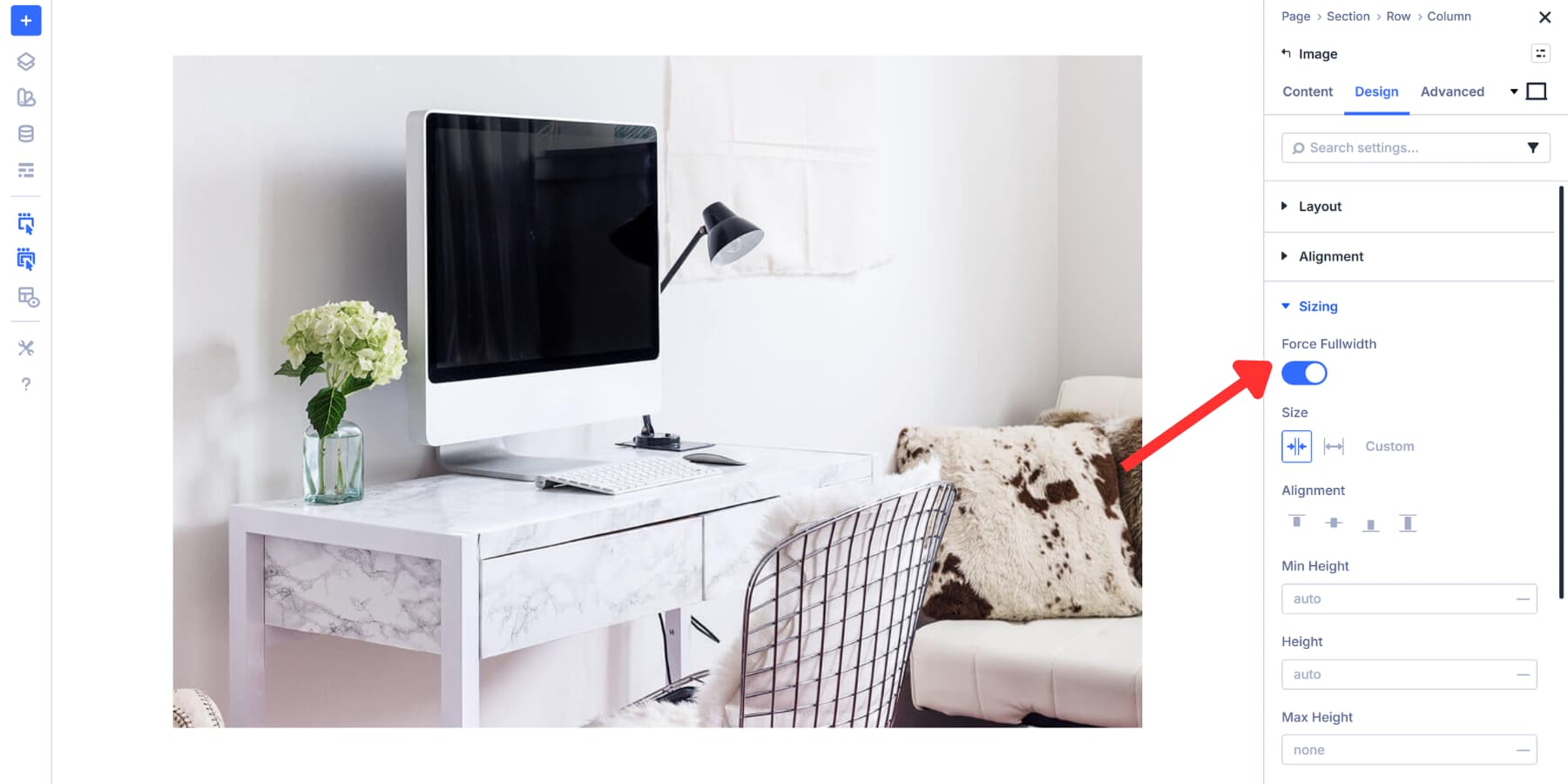
For a section background, instead, click into your section settings, go to the Content tab, and expand the Background section. Upload your image. Then you’ll need to configure a few things. Head to the Design tab, find Sizing, and set the Min Height to a value of approximately 600px, based on your image dimensions.
Back in Background settings in the Design tab, set Background Image Size to Cover, Position to Center, and Repeat to No Repeat. This prevents tiling and distortion.
The background method works well for full-width designs where markers float over the entire image. The Image Module is faster to set up and more effective when you need the visual content within your layout.
Pick whichever fits your needs. Ensure your image has clear focal points and good contrast, allowing users to easily identify clickable areas.
Build Hotspot Markers
We recommend using Module Groups for your hotspot markers. Click the gray plus icon within your column and select the Group module.
Module Groups make positioning straightforward. When you move a group, everything inside it moves as one unit. They let you treat each marker and its content as a single element. Just add your marker and content, adjust positioning, and you’re ready.
Anything placed into a column without a group will require you to adjust each marker individually. That gets messy fast when you’re putting multiple hotspots.
You could use an image or button instead, but icons work better as a marker. The load quicker than images, tons are already available inside Divi, and stay sharp at any screen size. Additionally, they’re easier to style with your brand colors and Design Variables, without worrying about file formats or compression. Just pick the one that makes sense in the context.
Styling Your Marker
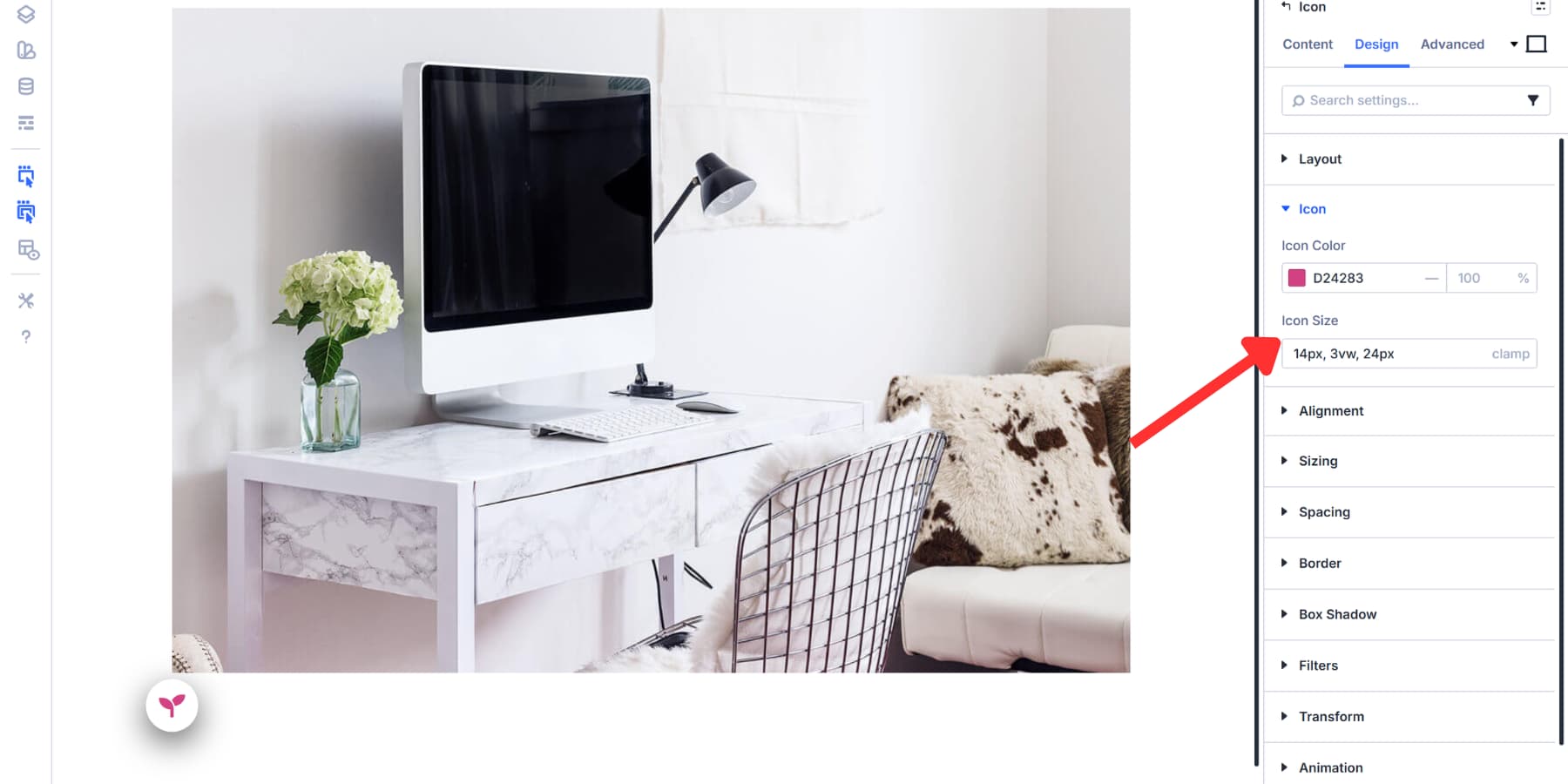
You should style your icon so it stands out clearly against your background. You can also add a background circle or shape behind the icon through the Design tab to boost visibility. A subtle shadow or border helps separate the marker from busy backgrounds.
Choose a contrasting color that draws attention. Set the size to be large enough to be easily clickable; usually, a size between 14px and 24px works well.
Divi 5 supports Advanced Units, such as clamp(), which creates fluid sizing that adapts to different screen sizes. For this example, we’re using clamp(14px, 3vw, 24px) for the icon size. This ensures markers remain readable on mobile devices at a minimum of 14px while scaling up smoothly on larger screens without exceeding 24px.
Add a hover effect for better feedback. Select the hover state icon (cursor arrow) in the top right of your settings tab.
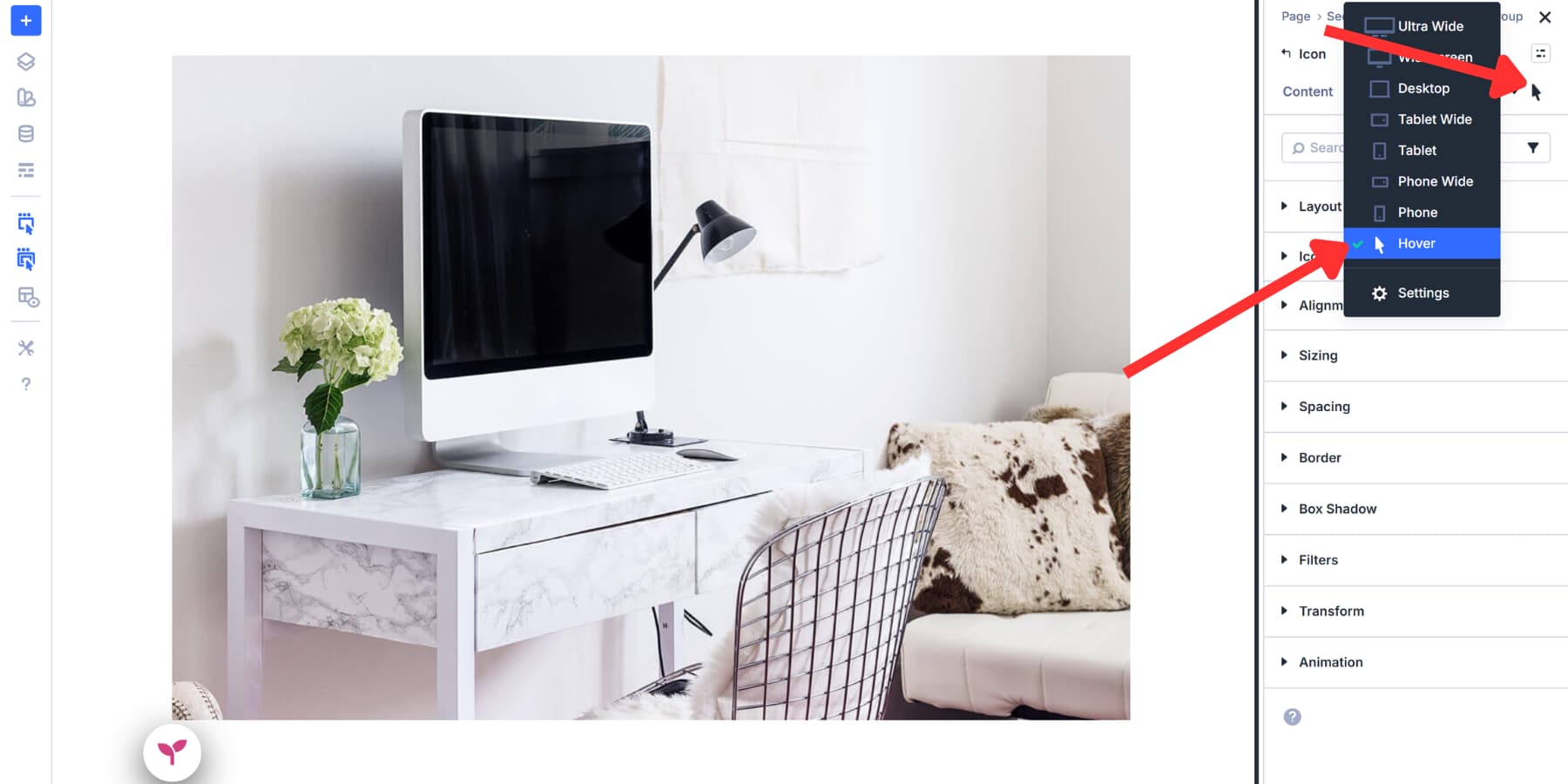
Go to Design > Transform and set X and Y to 110% so markers grow slightly on hover.
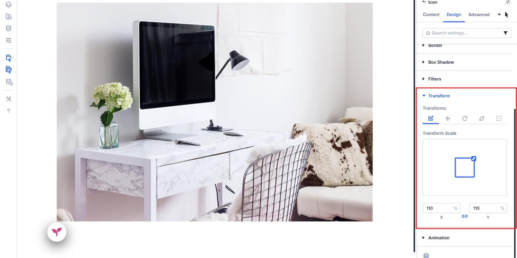
You can also adjust background colors, shadows, or opacity in the hover state, though scale effects work best without disrupting the design.
Keep the styling consistent across all your markers by creating an Element Preset from your current styles and applying it to other markers, so users instantly recognize them as clickable elements.
Position Your Hotspot Markers
Now you’ll need to place your markers exactly where they belong on your image. Open the Module Group settings and head to the Advanced tab. Scroll down to the Position section.
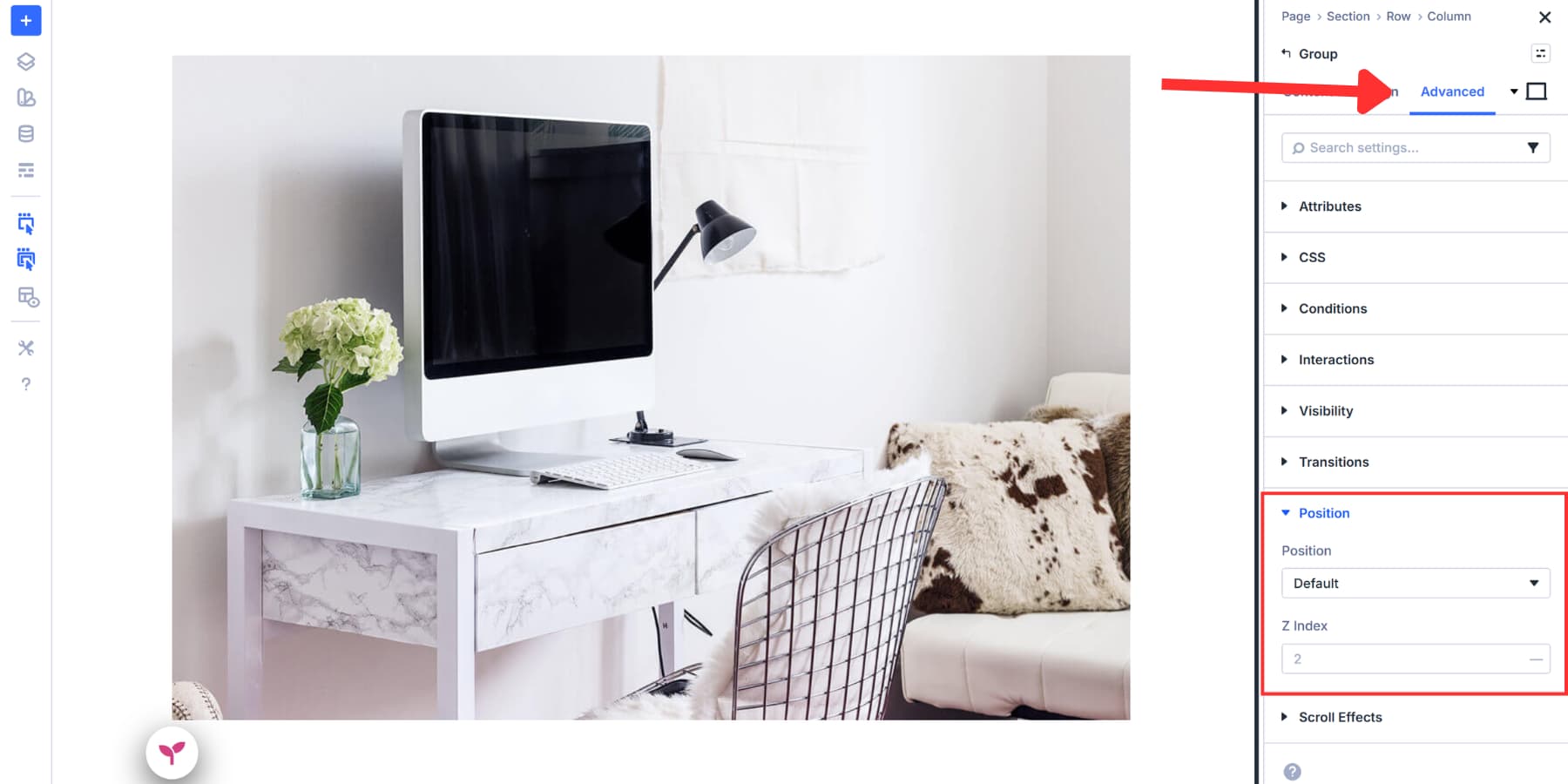
Position controls how an element sits relative to its container. You’ll find three positioning types available: Absolute, Fixed, and Relative. For hotspots, you’ll usually choose Absolute. Absolutely positioned elements float inside their parent container, allowing you to place them anywhere over your background image.
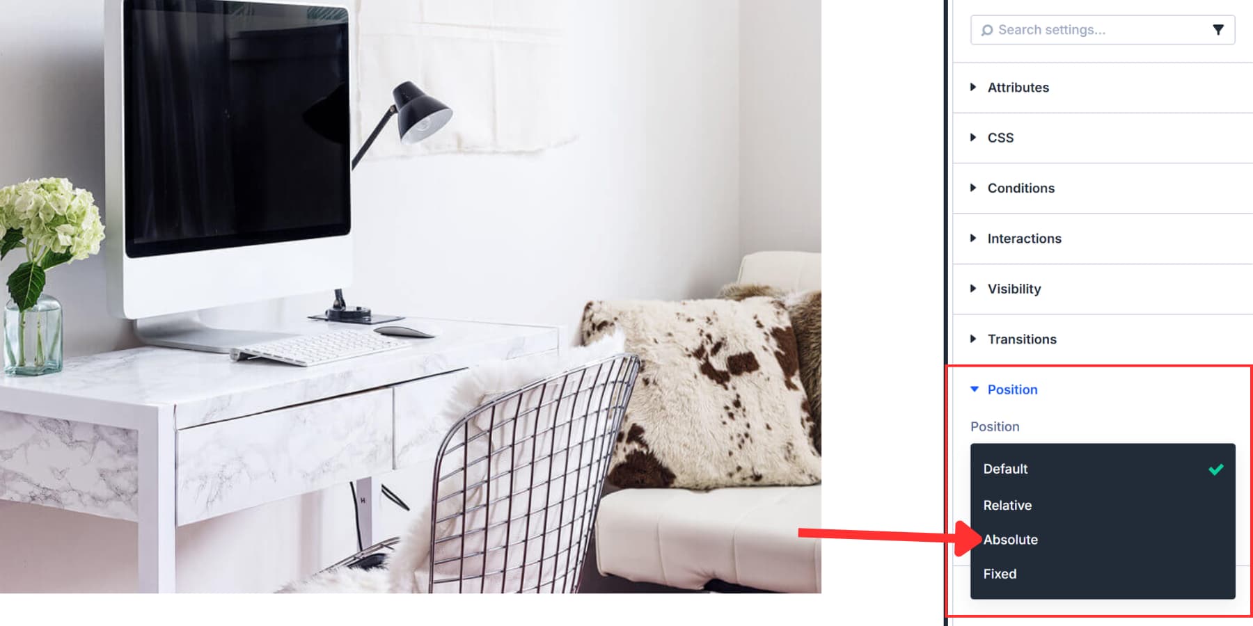
The following offset values are reference points only. Each image has different focal points and dimensions. So, your position settings may differ significantly from the example we’re showing you.
Once you select the position, you’ll see the Offset Origin grid. This determines which corner of your container serves as the starting point for measurements. We selected the top left square for this example.
Next, set your Vertical Offset and Horizontal Offset values. These numbers indicate to Divi the distance from your chosen origin point to place the marker. We’re using 60% vertical and 19% horizontal here.
The Z Index setting controls stacking order. Set it to 2 (or higher than surrounding elements) so your marker appears above the background image. The Icon group now appears at the top of the anchor point.
Create The Content Areas
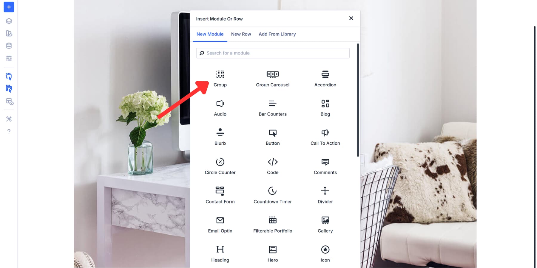
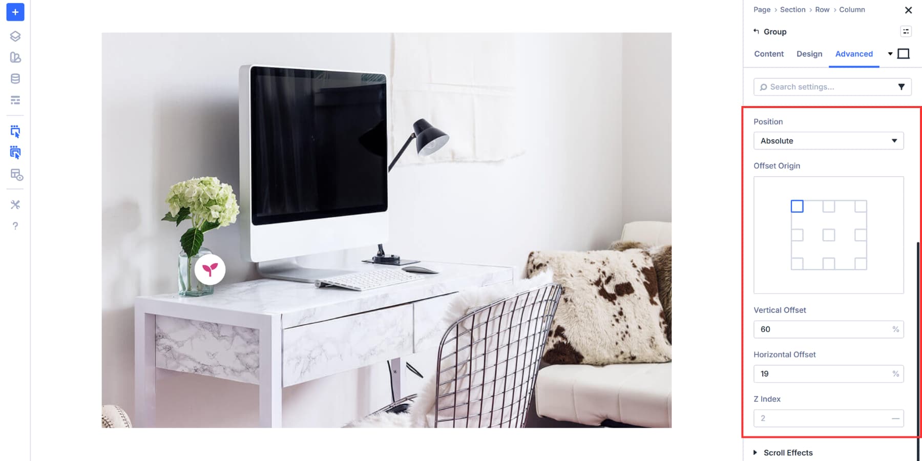
You’ll add another Module Group inside your existing one. Divi 5’s Nested Modules make this possible. Right-click on your icon, then click Add Element > Add Element Below and select the Group module.
This nested structure gives you full control over your content. Managing pieces without a group can quickly turn into a mess. Groups keep related content together as one movable unit.
For this example, we’re adding three elements inside the nested group: an Image module, a Heading module, and a Text module. These three pieces form your hotspot content area.
Click the gray plus within your nested group. Add the Image module first. Upload your product detail photo or diagram. Next, add the Heading module. Type your content title. Then insert the Text module and write your description.
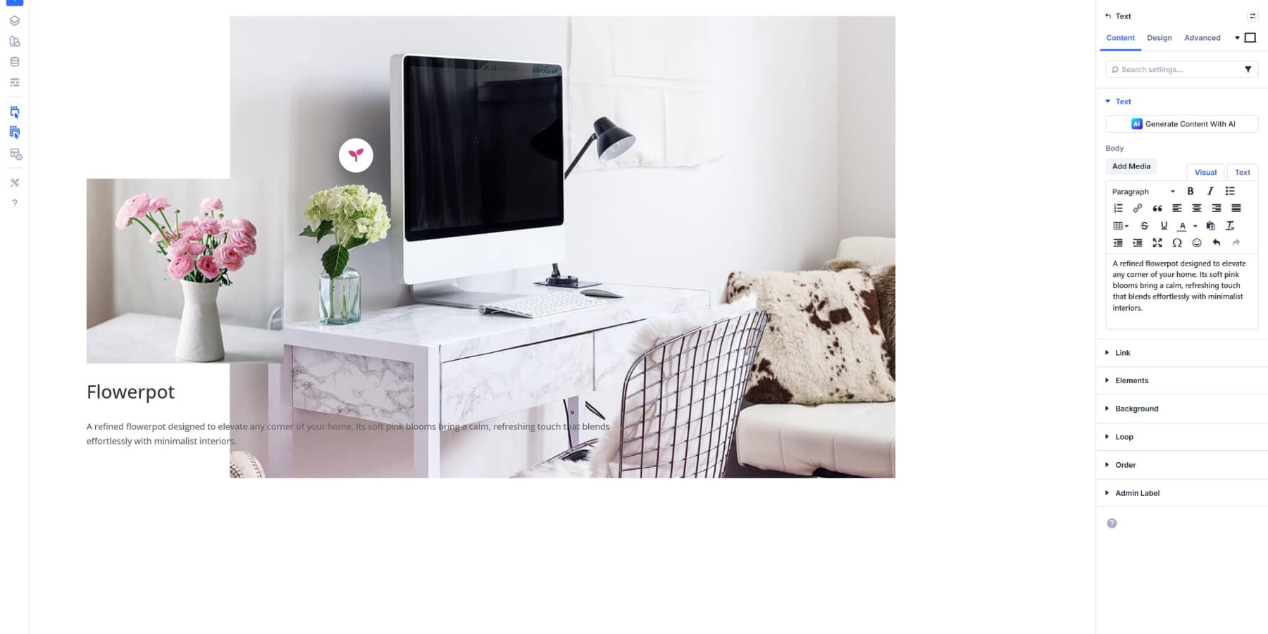
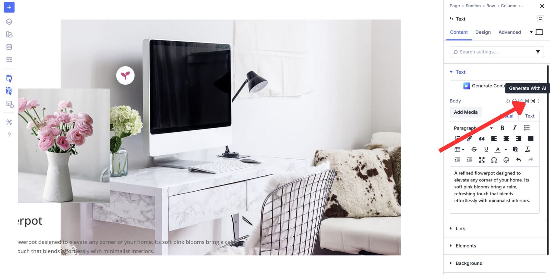
You can also use Divi AI to generate your heading and text content. Simply click the Divi AI icon in any text field and let it generate copy that aligns with your brand’s voice. You can use Divi AI to generate images as well.
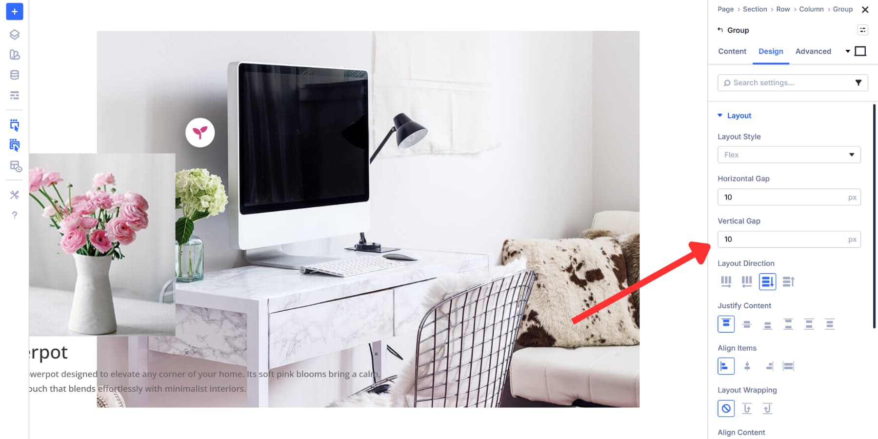
Stack them vertically by keeping the default flex direction setting in the Group design settings. If you want more breathing room between elements, open your nested group settings and go to Design. Find the Spacing section and add a Gap value. Something like 10px works well for most layouts. Don’t worry about the design, we will cover that shortly.
Lastly, in the content tab, scroll down to Admin Label. Type something descriptive like “Hotspot Content 1” or “Product Detail Panel.”
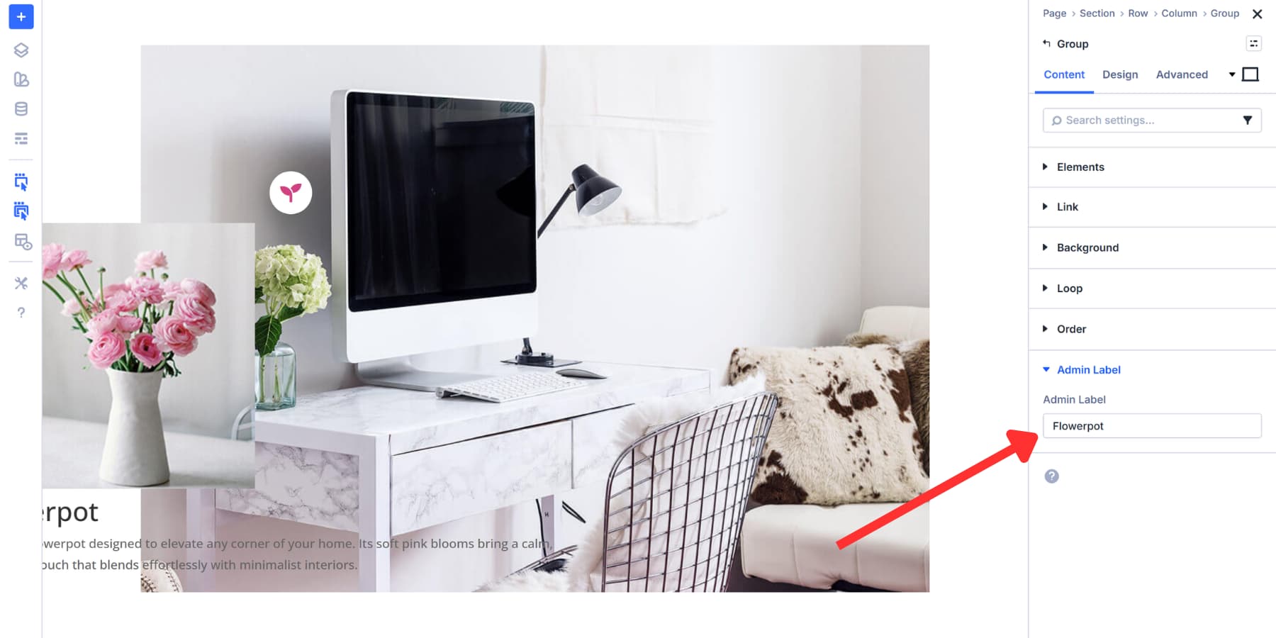
This label helps you find specific groups more easily when we set up Interactions. It will not appear on your live site.
Styling The Content Area
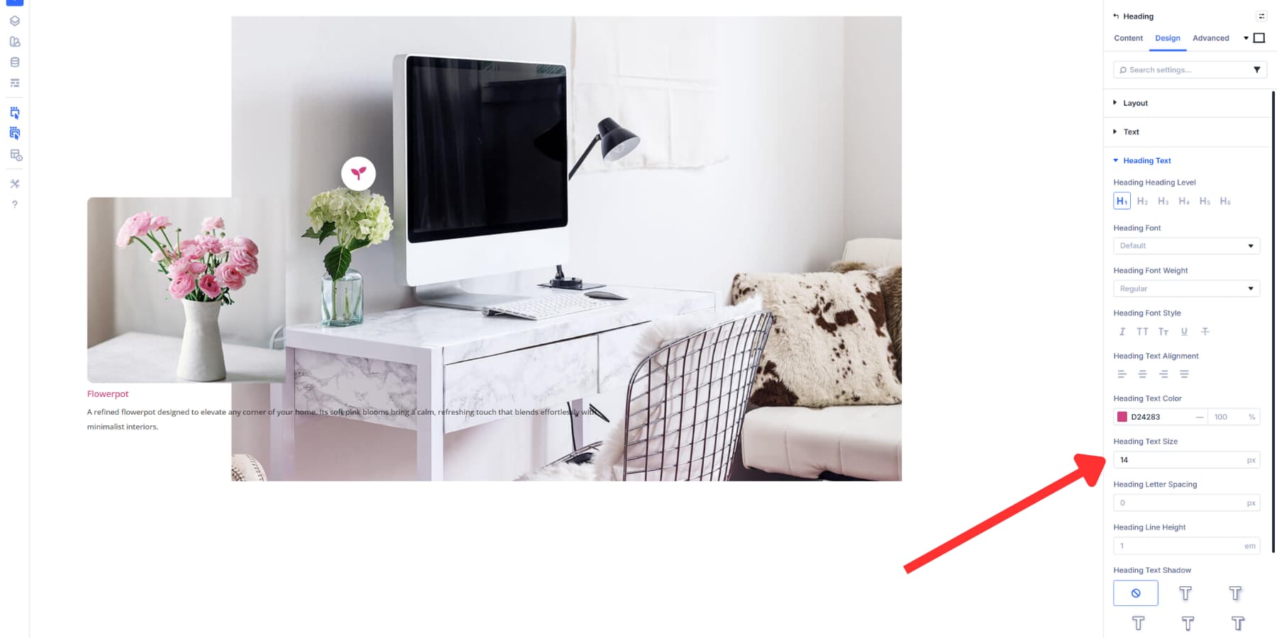
Your content group needs visual treatment that separates it from the background. For text, we are adhering to the brand’s color palette. Likewise, we are adjusting the font size so it looks proper and doesn’t consume much space.
Then, set a background color for the Content group so that it stands out and remains readable.
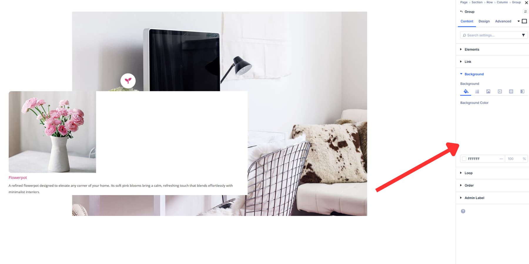
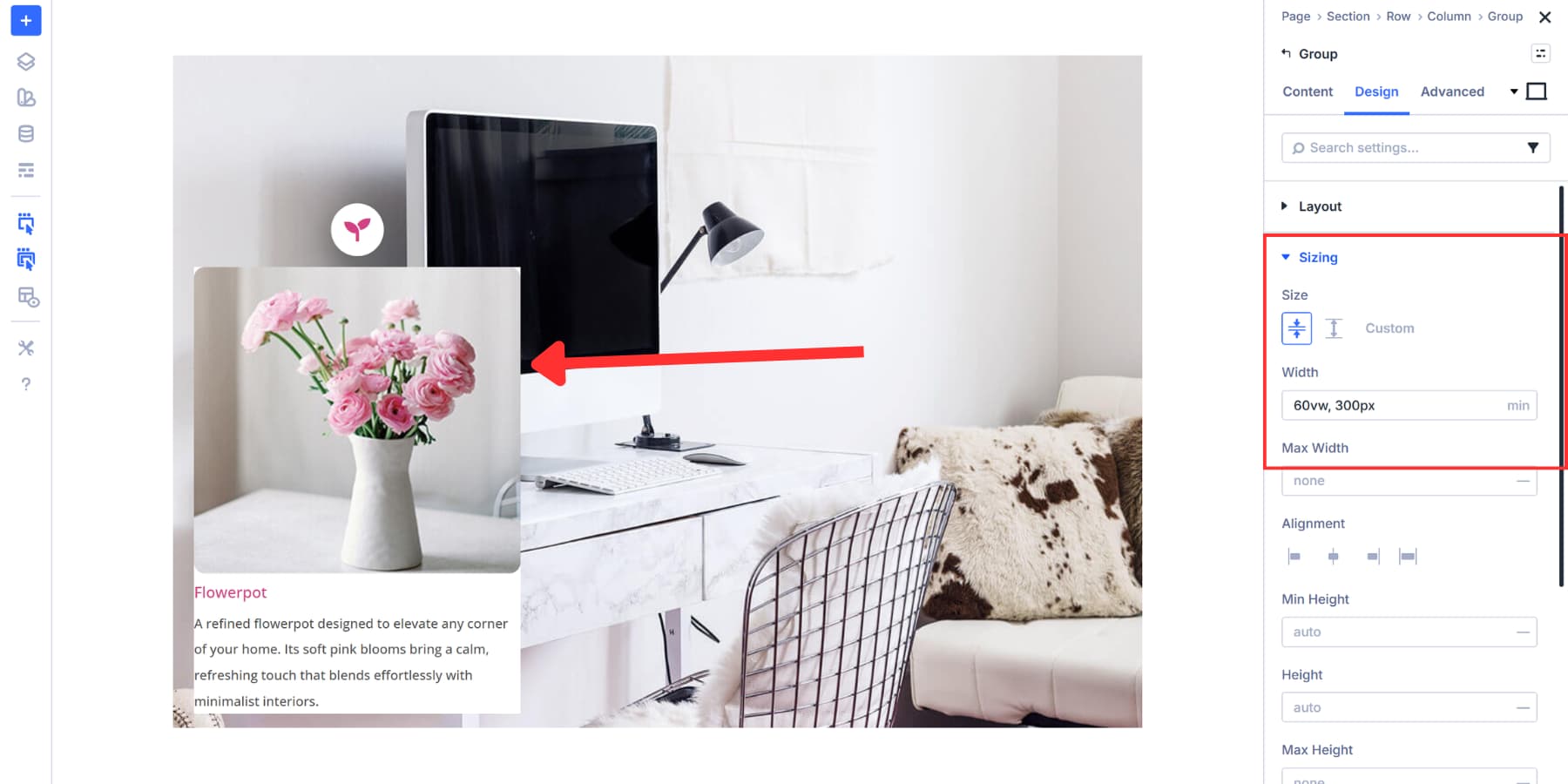
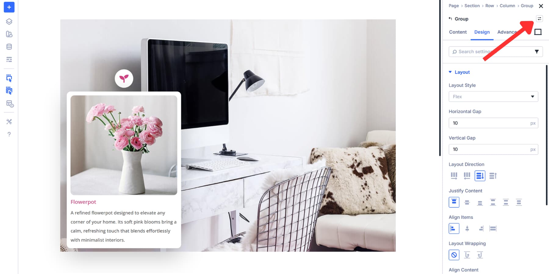
Head to the Design tab of your Content module group and open the Sizing section. Set your width value there. We set Size to Shrink to Fit so the group doesn’t expand beyond its content.
And for actual sizing, you can set a fixed width in pixels, but we’re using min(60vw, 300px) instead. The 60vw makes the content box responsive out of the box, adapting automatically to various screen sizes without you needing to set different widths at each breakpoint.
This makes the content box responsive by default. On smaller screens, it can scale up to about 60vw, so it stays readable without overwhelming the layout.
On larger screens, the min() function caps the width at 300px, preventing the box from stretching too wide and ensuring comfortable line lengths for reading.
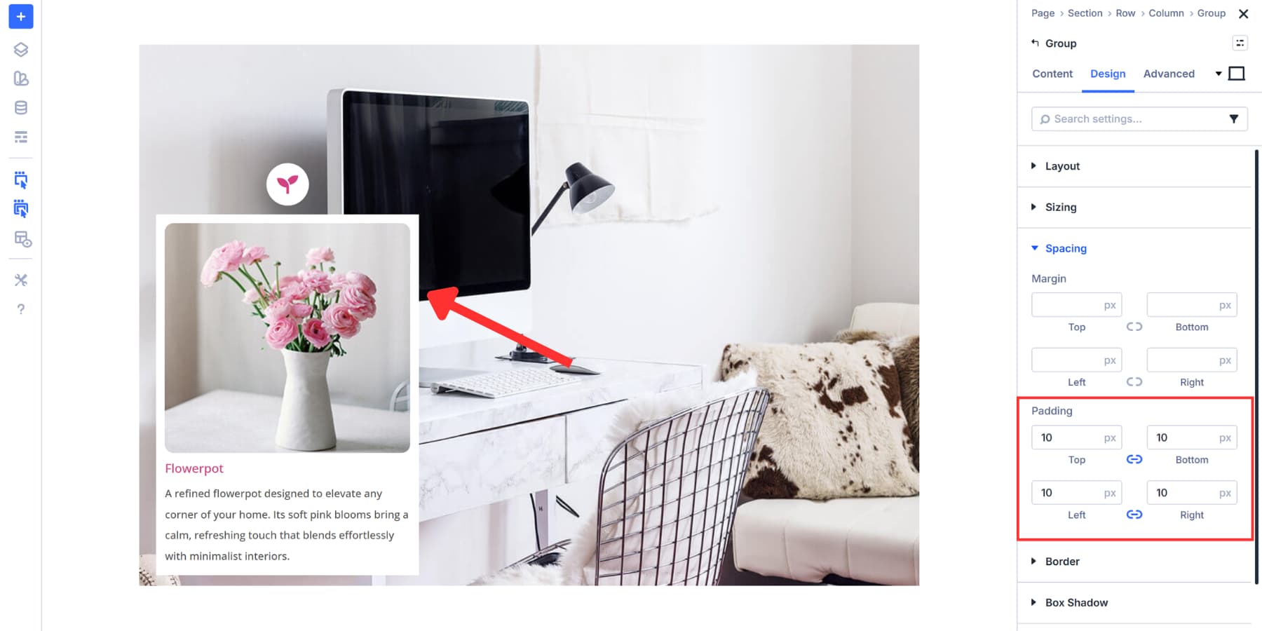
You may also add padding on all sides to make it a little breathable.
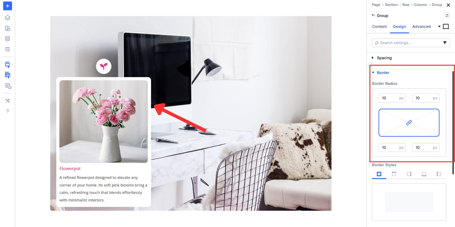
Consider adding a border radius as well for a polished look.
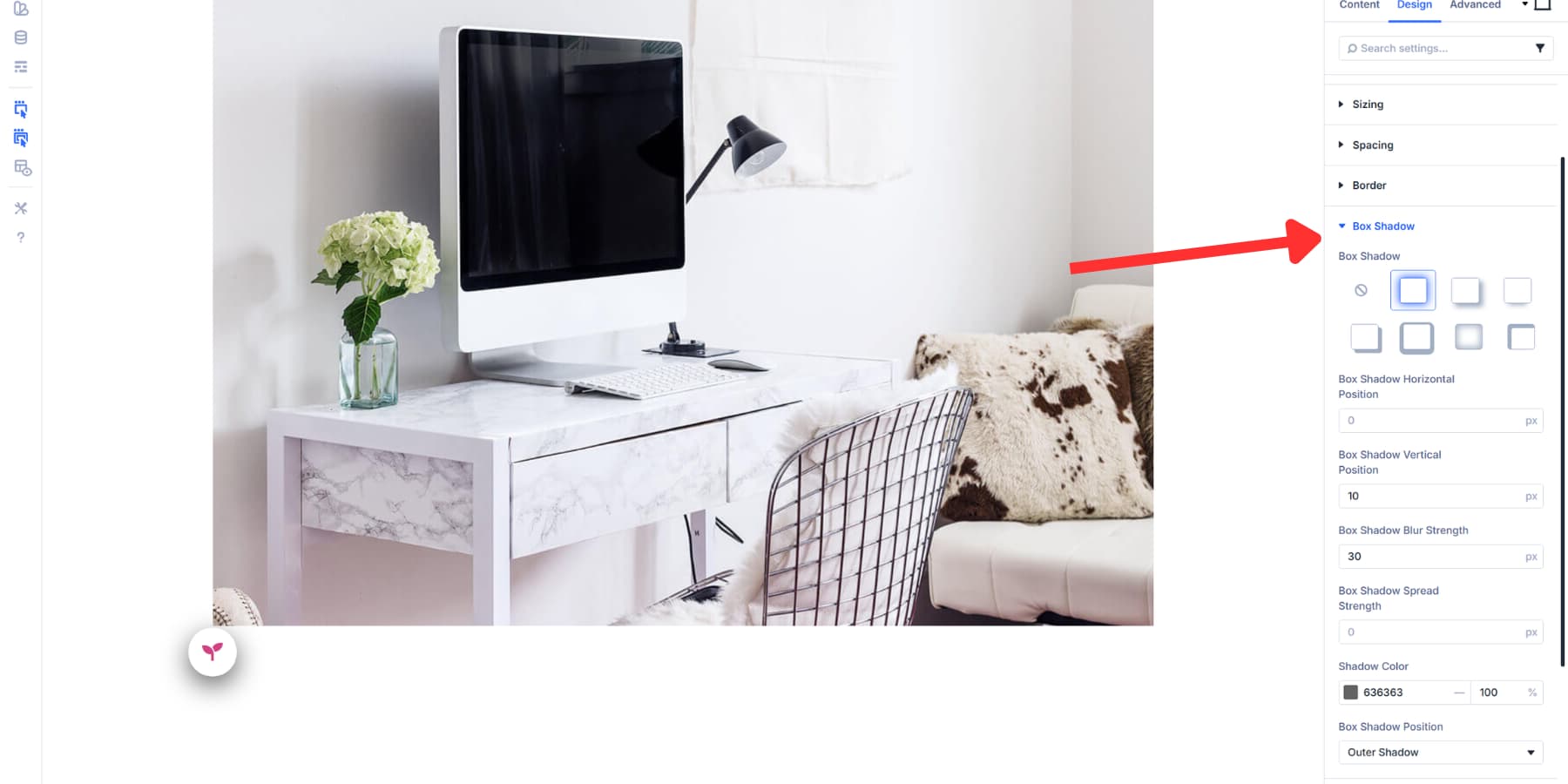
Finally, add a Box Shadow. We’re using a 20px vertical offset, 60px blur strength, and black at 25% opacity. This lifts the content box off the page visually, adding depth. Adjust these values to achieve the desired prominence of the shadow.
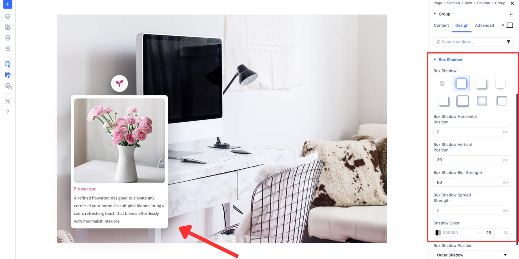
Once you’ve styled your content group, save it as an Element Preset. This allows you to apply the same background, sizing, padding, borders, and shadows to additional hotspot content areas with a single click. You’ll save time and maintain consistency in your design across all markers.
Position Your Content Area
The content group sits next to the marker, not below it. So, similar to the icon, we’ll use Positioning to get this right. Here, too, we will use absolute positioning, allowing it to float independently within the marker group.
For Offset Origin, we selected the left center square. This anchors our measurements to the left edge of the marker group, vertically centered. Starting from this point makes horizontal placement more predictable when positioning content to the right.
We set Horizontal Offset to 110%. This pushes the content box to the right of the marker. The 110% value places it just beyond the marker’s edge with a small gap between them. Your percentage will vary based on marker size, the desired spacing, and the precise placement of your marker.
The Z Index remains at 2, keeping the content above the background image without causing stacking conflicts.
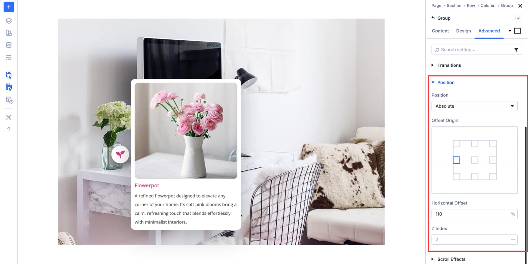
The content now appears positioned beside the marker. You will need to use these values based on where you want your content to display relative to your marker. Different layouts will require the content to be positioned above, below, or at varying distances from the marker itself.
Hide The Content By Default
The content group needs to start hidden so it only appears when users click the marker. We’re disabling visibility on all devices for this nested content group.
In the Advanced tab of the content group, scroll to Visibility and check Phone, Tablet, and Desktop under Disable On. This hides the content across every screen size. When you apply these visibility settings, the group will have a faded-out look, indicating it is hidden.
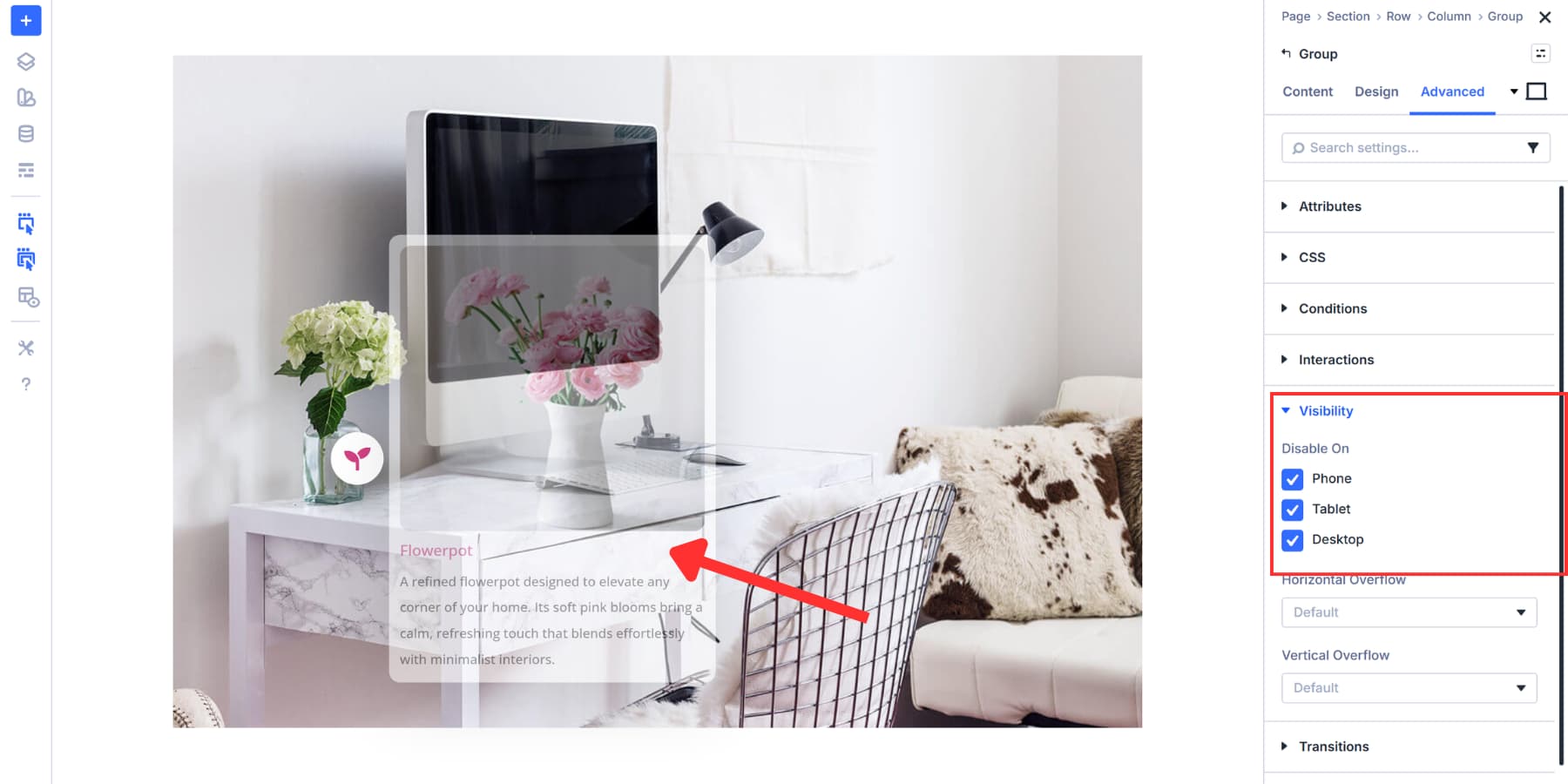
Without this step, all your hotspot content would display at once, cluttering the page and defeating the purpose of interactive reveals.
Hiding it by default lets Interactions control when and how the content appears. When we set up the click trigger in the next section, the interaction will override this visibility setting and show the content exactly when needed.
Connect Markers To Content
Now we bring the hotspot to life. Interactions on the icon control when your content appears and disappears.
We’re using Mouse Enter and Mouse Exit triggers here. When someone hovers over the marker, the content slides into view. When they move away, it hides again.
This works well for quickly accessing information, as users can scan multiple hotspots without needing to click each one. Click triggers work better when you want users to open and close content deliberately, but hover feels more fluid for browsing.
Open your icon settings and go to the Advanced tab. Scroll to Interactions and click Add New Interaction. Set the Trigger Event to ‘Mouse Enter’.
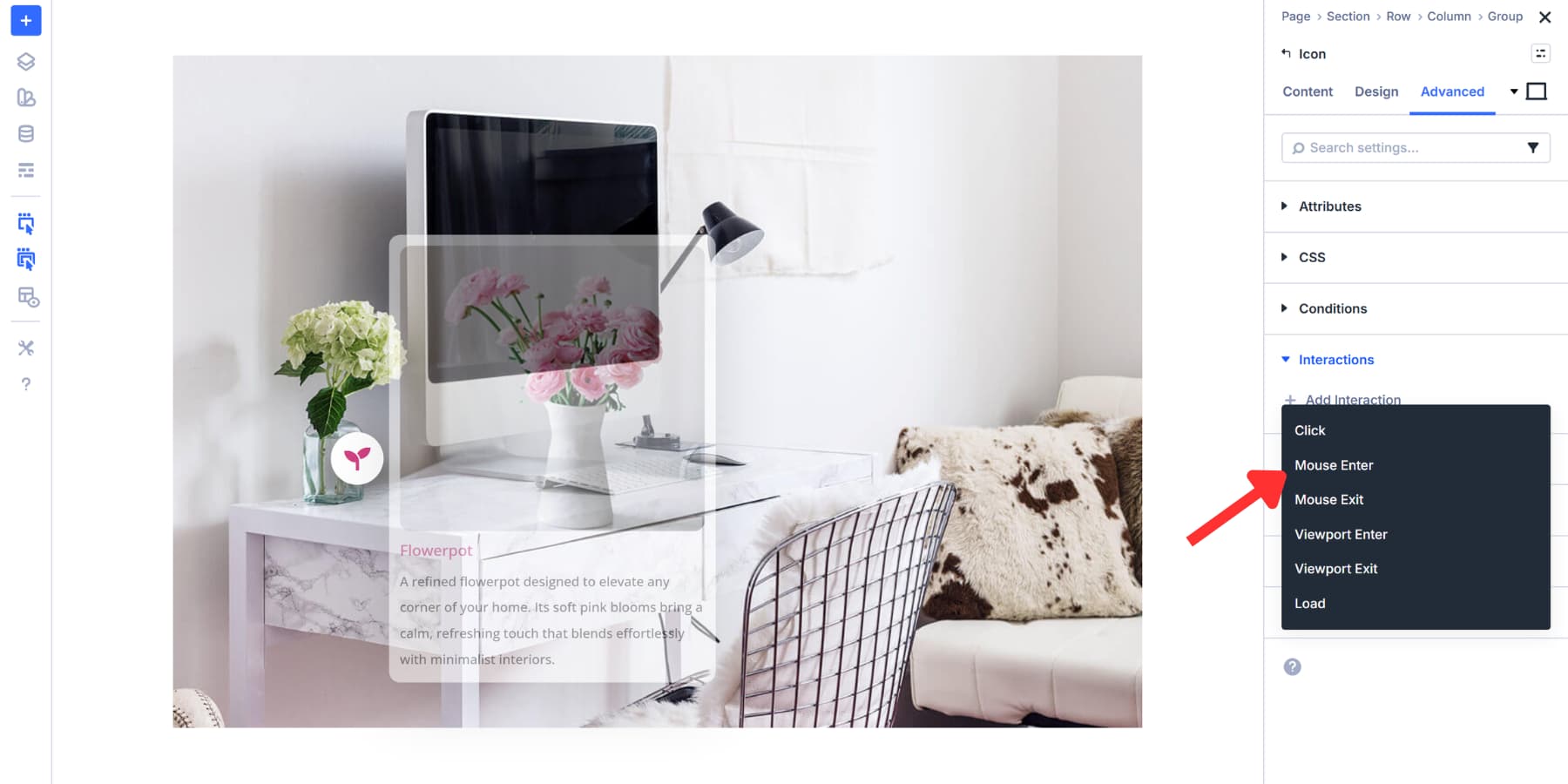
And add a label for reference.
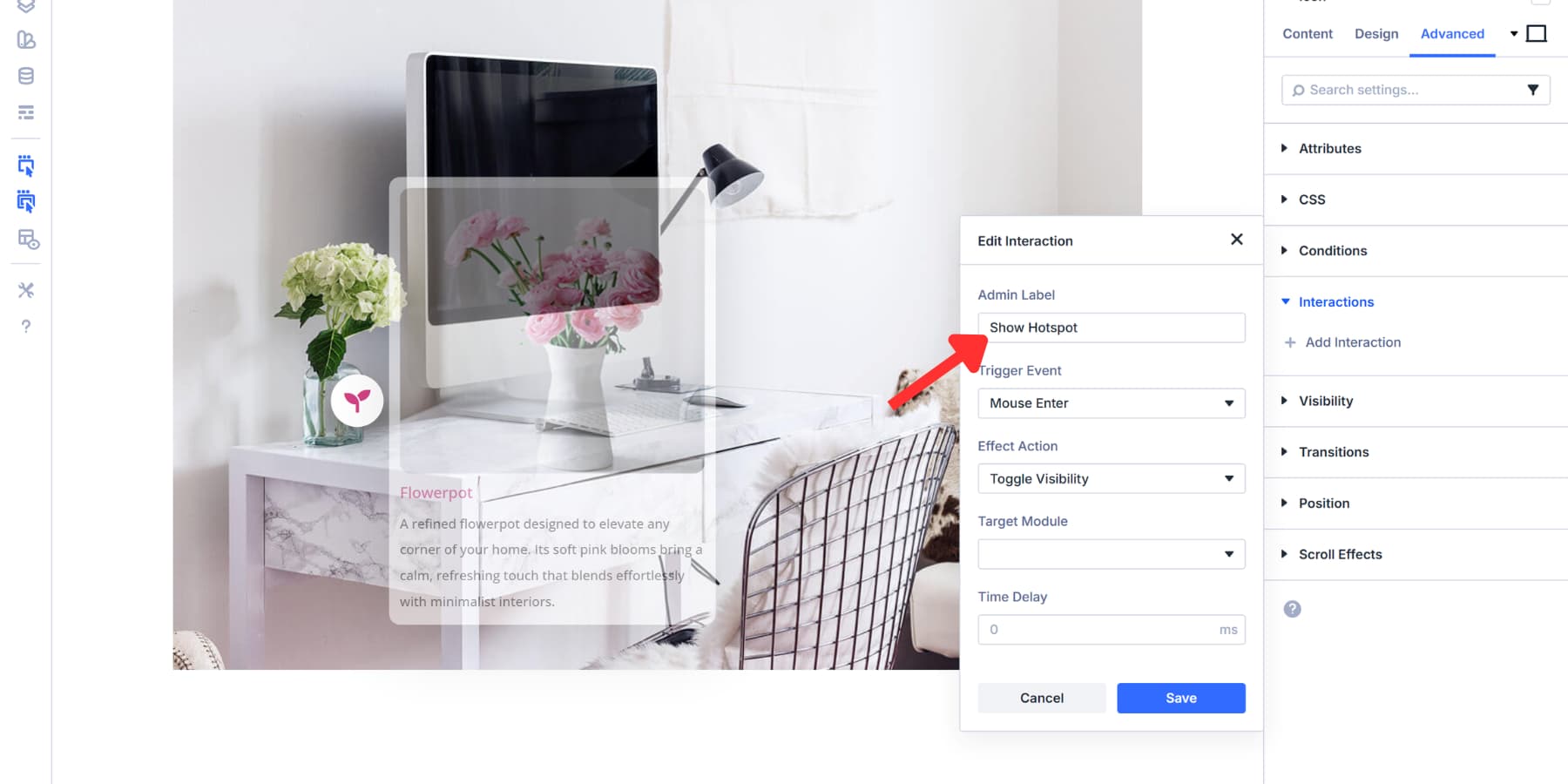
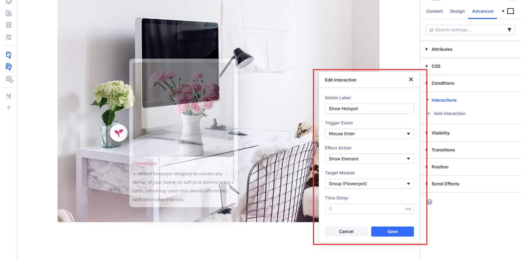
Then, set the Effect Action to “Show Element” and the Target Module to your content group. The Admin Label you added earlier appears in the dropdown, making the right group easy to spot. You may adjust the time delay to have a smoother entry, but we are keeping it at 0.
Click Save, and then, using the duplicate option, add a second interaction.
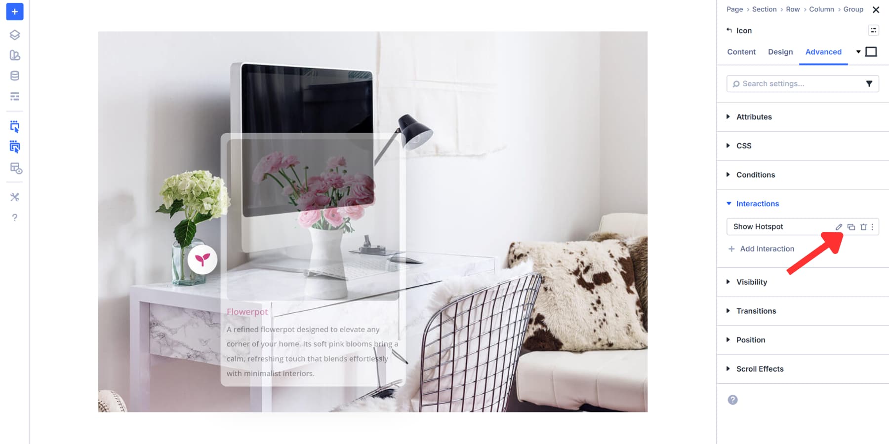
Here, just change the Trigger Event to Mouse Exit, Effect Action to Hide Element, and leave the target as is. Label this “Hide Hotspot” or a similar name for reference.
For click-based reveals, use one interaction with ‘Click’ as the trigger and ‘Toggle Element Visibility’ as the effect. Users tap once to show, tap again to hide.
Adding More Hotspots
You’ve built one complete hotspot. The rest go faster. Those Element Presets you saved earlier do the heavy lifting. Apply the marker preset to a new icon, apply the content preset to a new nested group, and you’re halfway done.
You’ll still need to replace the content for each hotspot with fresh material. Update the image, rewrite the heading, and modify the text to match the marker’s representation. Then adjust Position settings to place the marker and content group over the right spot on your image. Finally, update the Target Module in your interactions to point at the correct content group.
This workflow remains clean because everything is connected. Presets maintain consistent styling across all markers. Interactions link triggers to specific targets without confusion. Admin Labels help you track which piece controls what.
Divi 5 builds consistency into the workflow itself. That’s the real win. You set colors, shadows, borders, and sizing once, then apply them everywhere. When you add hotspot number five, you’re not sitting there matching pixel values and hex codes to hotspots one through four. The design stays locked. You focus on content and placement while Divi keeps everything uniform across every hotspot you add.
Download 5 Hotspot Layouts For Free!
We’ve created 5 hotspot designs that you can download below for free. These layouts demonstrate exactly how Interactions work and serve as a starting point. Open them in the Visual Builder and customize them for your own content.

Try Building Hotspots In Divi 5 Today!
Your site doesn’t need more content. It needs better control over the content you already have. Hotspots provide the precision you need, allowing you to pack depth into every page without overwhelming anyone. The tools are built right into Divi 5.
The process takes minutes, not hours. Your visitors get exactly what they came for, without having to hunt through paragraphs or click through multiple pages. Start building yours today.


Leave A Reply