
Card layouts show up all over a site, but you often rebuild them from scratch or copy and paste the same stack of modules. Module Groups in Divi 5 allow you to bundle an image, heading, text, button, or any other module into one card and reuse it anywhere.
In this tutorial, we’ll build a clean card, save it to your Divi Library, and import it on any page. We’ll also pair it with the Loop Builder to auto-generate grids for posts or products.
How Module Groups Work
A Module Group in Divi 5 is a container that holds multiple modules together as one packaged unit. Think of it like creating a custom building block. Instead of working with individual modules (an image here, a heading there, a button somewhere else), you group them into a single entity that moves, saves, and functions as one piece.
The benefit becomes obvious the moment you need the same design pattern in multiple places. You build the card once, drop it wherever you need it, and the entire structure stays intact, including its styling and spacing.
Subscribe To Our Youtube Channel
This matters most when you’re designing at scale. Building a team page with twelve employee cards or a product grid with thirty items means you’re either duplicating modules repeatedly (making updates tedious later) or reconstructing the same layout from memory each time. Module Groups eliminate both problems. Design the card once, save it to your library, and pull it onto any page in seconds.
Module Groups also work with the Loop Builder, which automatically generates repeated layouts by pulling data from your posts, products, or custom post types. Pair a Module Group with the Loop Builder, and you can design the card template once, while Divi automatically fills it with dynamic content. One card design can populate fifty product listings without manual work.
Learn Everything About Divi 5’s Module Groups
Build Your Card Design
Before we start building, here’s the card we’re aiming for.
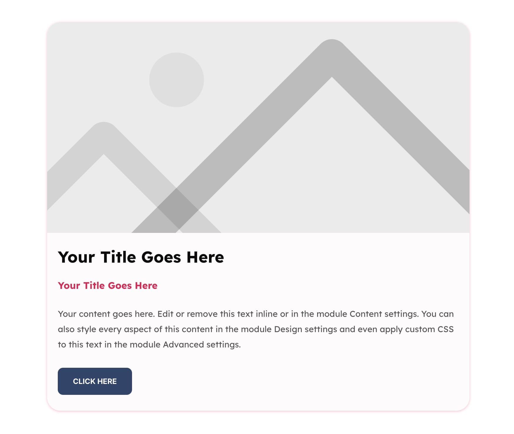
It features a clean image area, a bold title, supporting text, and a button, all wrapped within a Module Group. Once saved to your Library, you can drop this card into any page and swap the content. If you want, you can also alter its structure and styling as you like. Let’s build it step by step.
1. Build Card Structure
Open a new page or section and add a single-column (Grid) Row. One column keeps the card centered and lets the content flow vertically, which is perfect for this layout.
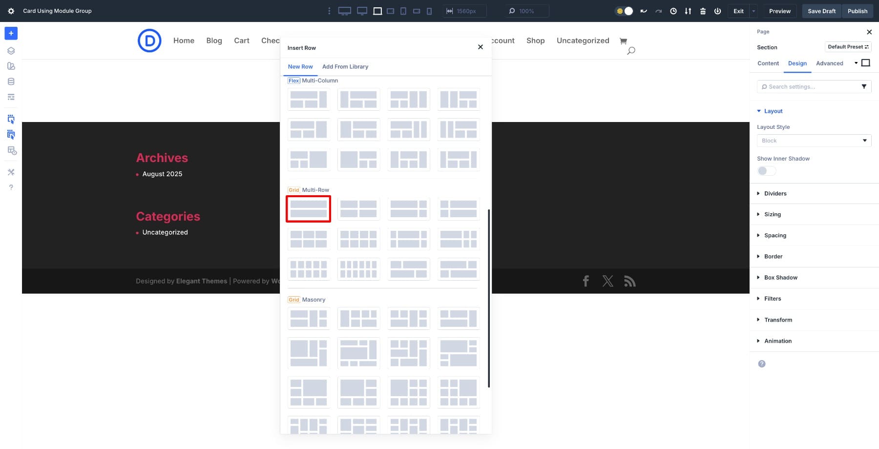
If your Row has multiple columns, delete the extras. Then adjust the Row width to 55% (only while you’re designing, so elements fit neatly).
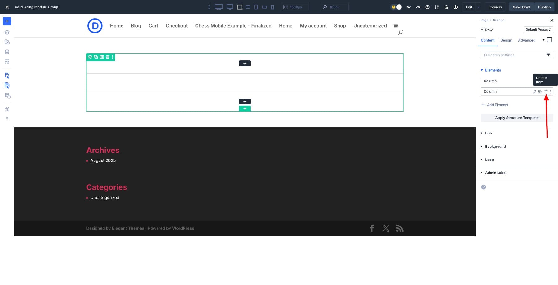
Inside the column, insert a Module Group. This will act as the container for every element of the card, keeping them bundled as one component.
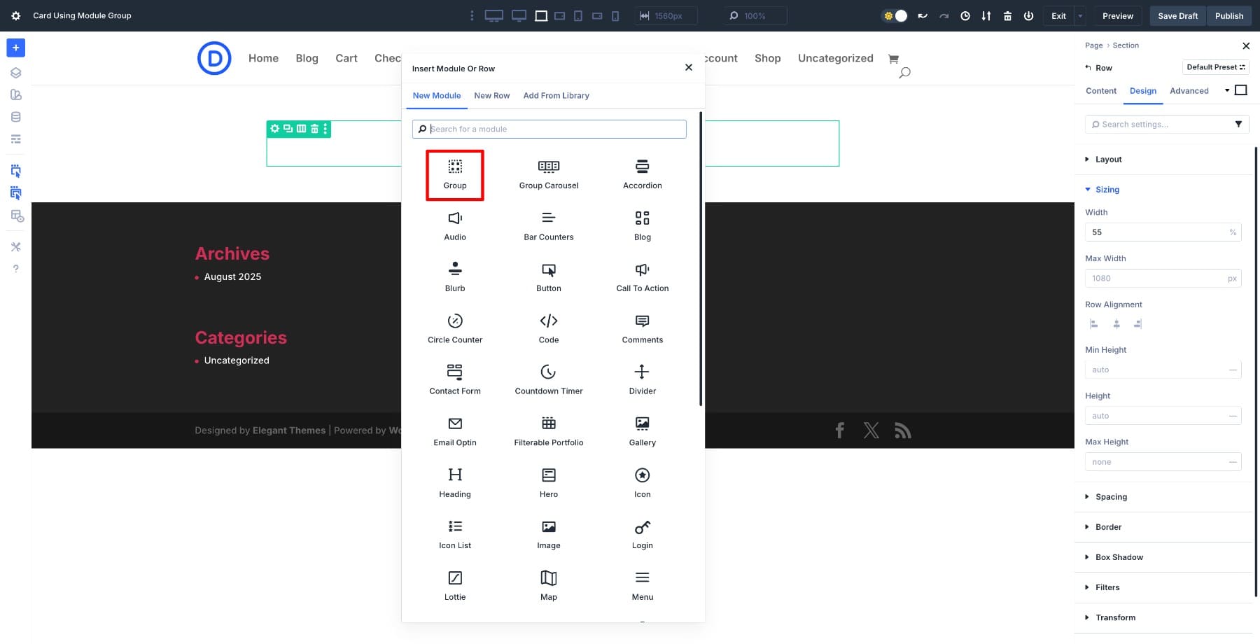
With the Module Group in place, start adding modules inside it. (Use the black plus button to add modules inside the group. The gray plus button ends the group.)
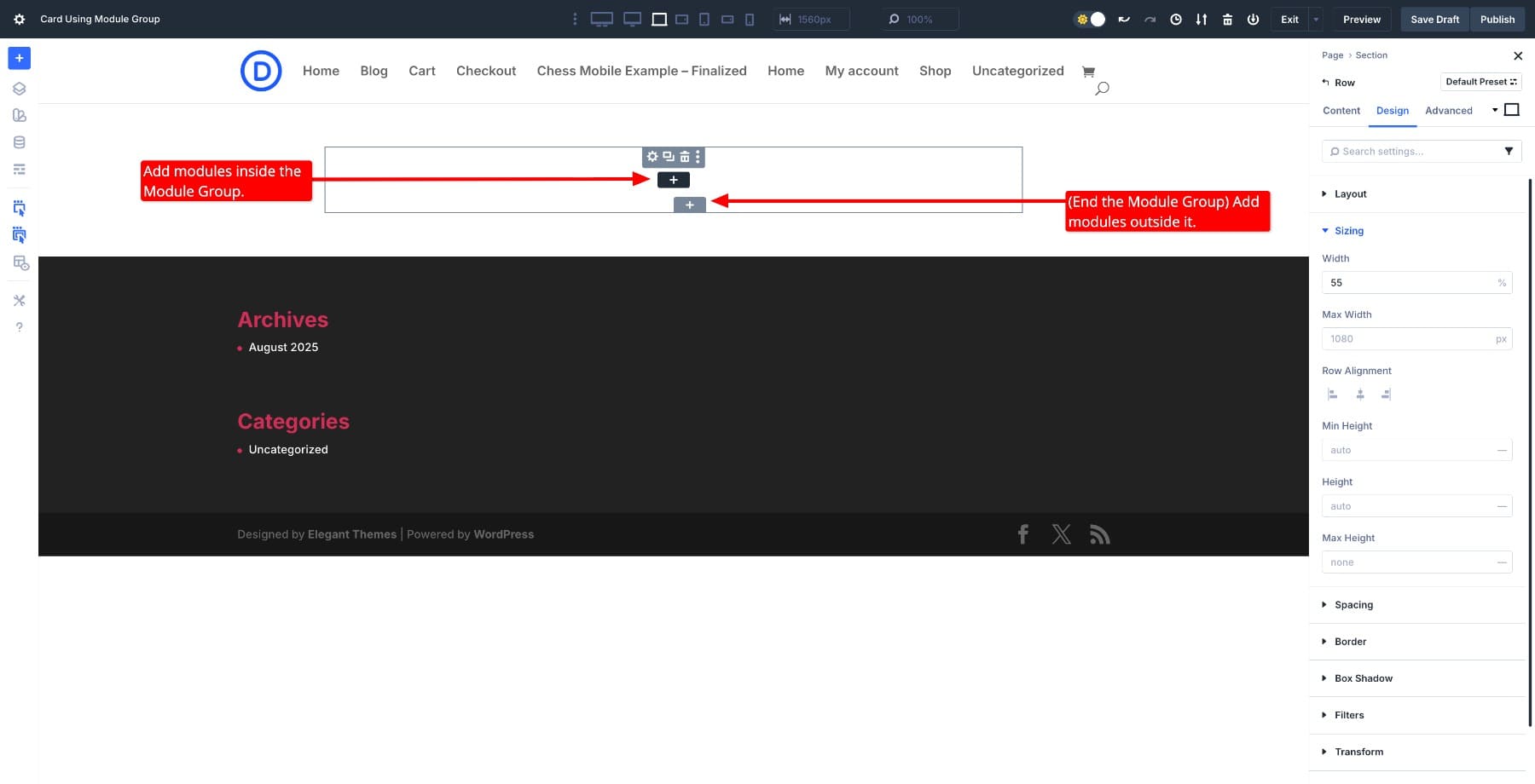
Add an Image Module to serve as the card’s visual header. Below it, insert a Heading Module and set it to H2. Add another Heading Module, this time styled as H4. You can use it as a category label, tagline, or small subheading. Insert a Text Module for a short description. Finish with a Button Module that links to a page, post, product, or any URL.
Within the Module Group, these modules function as a single unit. Switch the Row structure to two columns and drag the group between them, and everything moves intact. You can still rearrange modules freely within the group itself.
2. Style The Card
Right now, the card is just a stack of modules. Modify your Headings, Text, and Button Modules to match your design.
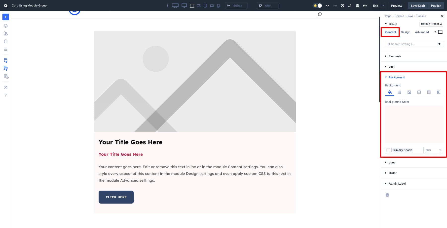
Since the group holds everything, it becomes the ideal place to add any background, spacing, border, or shadow. Any applied effects will wrap around the entire card.
Click on Module Group settings > Content > Background. Add a subtle color as the background.
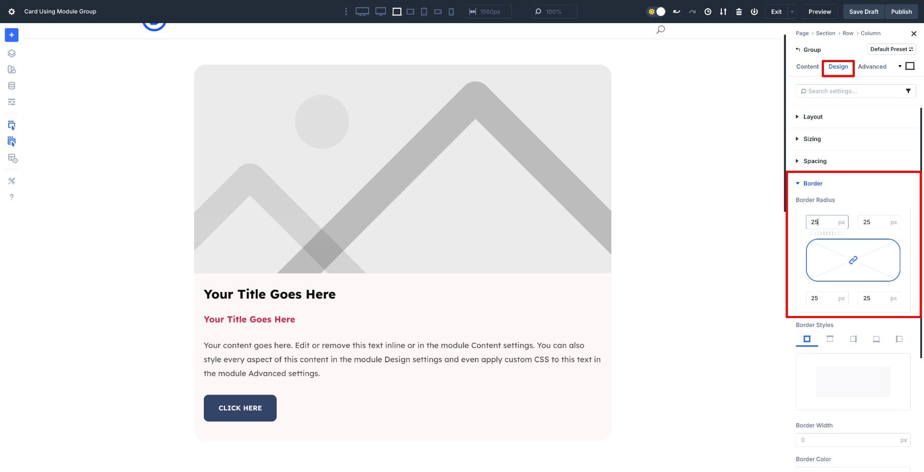
Next, navigate to Design > Border. Add 25px Border Radius to soften the edges.
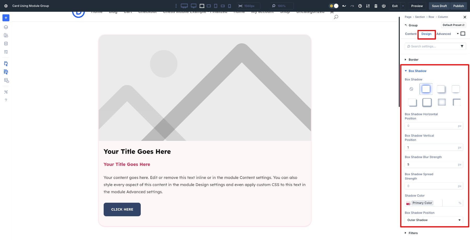
We’ll also add a subtle Box Shadow to give it a lifted effect.
You can also adjust the Vertical Gap between inner modules by going to Layout (make sure the Layout Type is set to Flex) > Vertical Gap.
3. Save Your Card To The Divi Library
Once the card looks the way you want, turn it into a reusable component by saving the entire Module Group directly to your Library.
Hover over the Module Group, click the three dots, and choose Save to Library. Give your card a clear name. You can also add categories or tags to keep things organized, especially on larger sites.
After saving, the card becomes part of your Divi Library, and you can pull it onto any page. If you work across multiple sites, save this card to Divi Cloud to make it available everywhere you design.
4. Insert It Anywhere
To reuse the card on a new page, open the Divi Builder and add a Row. Switch to the Add From Library tab.
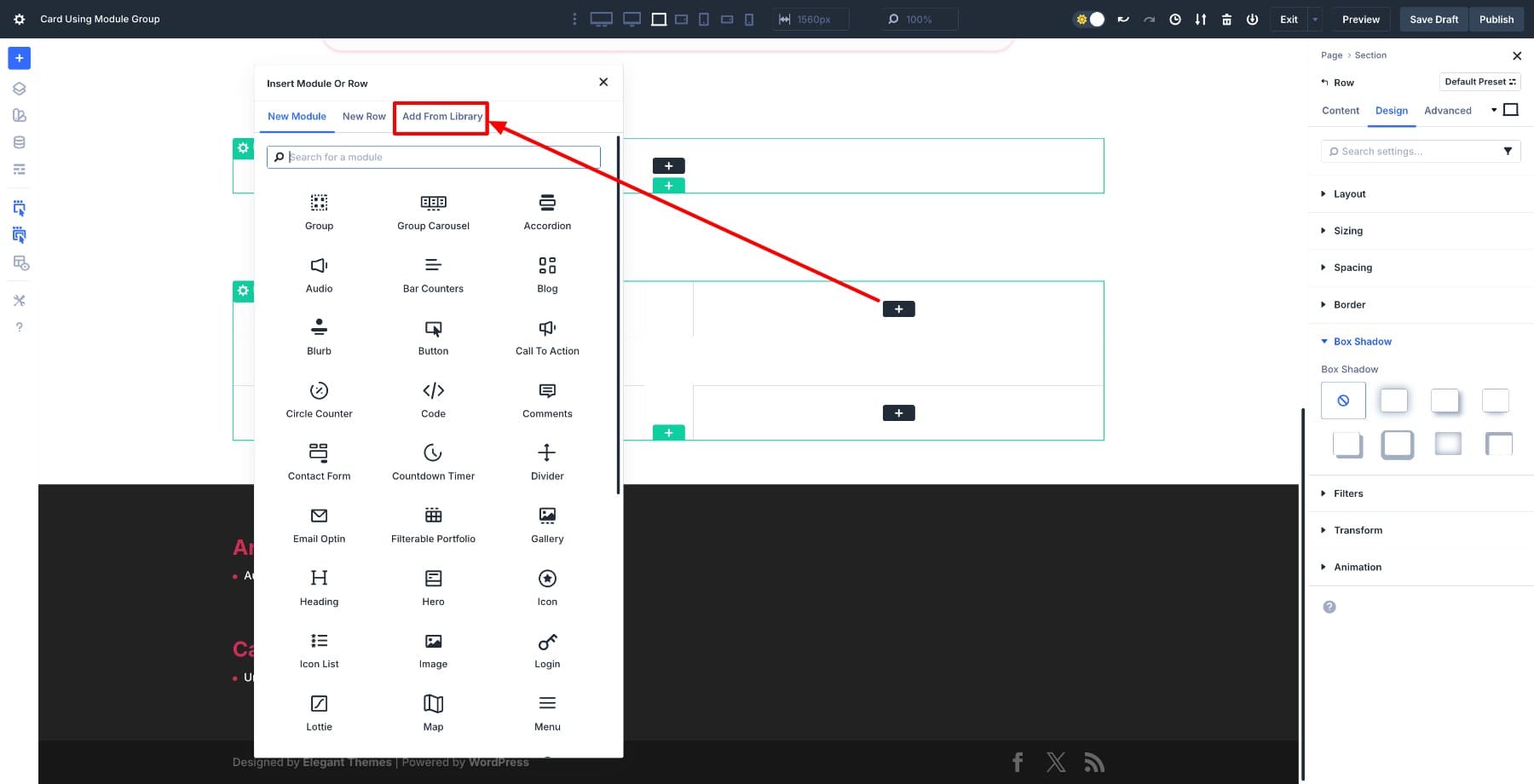
In the next window, choose your saved card design.
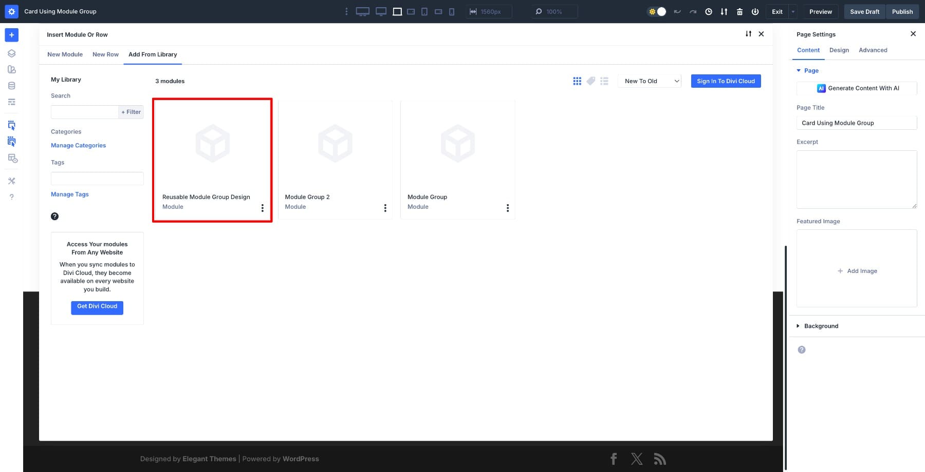
The entire card drops in with the same structure, styling, and spacing you already set up. Replace the image, update the text, or change the button link.
Bonus: Auto-Generate Card Grids With The Loop Builder
Now that you have a Module Group saved, you can pair it with the Loop Builder to auto-generate entire grids. The Loop Builder automatically pulls content from your posts, products, or custom post types and populates repeated layouts. Design the card once as a Module Group, connect it to the Loop Builder, and watch it fill with dynamic content.
The same card structure you built can now display blog posts, WooCommerce products, team members, portfolio items, or any other content type. Let’s look at two common examples.
1. Blog Post Loop
Say you want to display your latest blog posts in a grid. Add your card layout from the library and go to the row’s column settings > Content > Loop. Turn it on, set the Post Type to Posts, select the number of posts to display, and leave the other settings unchanged.
Hover over the content fields to locate the Dynamic Content icon and choose relevant options. After you connect each field to Dynamic Content, the Loop Builder populates your card with the featured image, post title, excerpt, and link for each post.
2. Product Loop
The process is identical for WooCommerce products. Create a new Loop Builder Row, set the Post Type to Products, and choose a specific category (or leave unchanged). You can pull in product images, titles, prices, and Add to Cart elements by adding the right Woo modules and connecting Dynamic Content.
The Module Group maintains visual consistency, while the Loop Builder handles the data.
You can also customize what appears in each card. If your products don’t use categories or you’d prefer not to show the date, delete those modules from the Loop Item. Want to add author names, read time, or custom fields? Drop those modules into the group, select the relevant options via Dynamic Content, and the Builder will populate them dynamically.
Since this card uses Design Variables, updating the design across every instance takes seconds. Change the card’s background color by updating your Primary Color variable. To adjust the border radius, update a Border Radius Design Variable. Every card using those variables updates instantly.
This applies to spacing, typography, button styles, and any other property controlled by a Design Variable. One change updates the entire system, from a handful of cards to hundreds generated through the Loop Builder.
Try Module Groups In Divi 5 Today!
You now have a card design saved to your Divi 5 Library that works across any page and automatically populates with dynamic content through the Loop Builder. More importantly, you have a workflow that scales.
Design the structure once, control it globally with Design Variables, and let the Loop Builder handle repetition. This same approach works for team grids, service cards, testimonial layouts, or any repeating pattern you need on a site.


Leave A Reply