
With the release of Divi 5‘s CSS Grid feature, Divi users are equipped with intuitive tools to build layouts that adapt seamlessly across devices, eliminating the steep learning curve that comes with learning CSS code. At the heart of this innovation lie the column and row grid parameters, Divi’s streamlined controls for defining grid templates, sizing, gaps, alignment, and offsets.
In this post, we’ll guide you through understanding, implementing, and mastering these core parameters, unlocking advanced grid-based designs that boost your creativity. Let’s dive in and unlock the full potential of CSS Grid in Divi 5.
Understanding CSS Grid In Divi 5
CSS Grid is a two-dimensional layout system that allows designers to create complex, responsive layouts by defining rows and columns in a grid container. Unlike traditional methods like Flexbox or floats, CSS Grid allows for precise control over the horizontal and vertical placement of elements simultaneously. You can define grid tracks, span items across multiple cells, set flexible or fixed sizes using units like fr (fractional) or auto, and control gaps. This makes it a go-to for structured, yet creative designs.
Divi 5 integrates CSS Grid into the Visual Builder, eliminating the need for custom code or third-party plugins. The magic starts at the container level: simply choose a predefined CSS Grid structure or enable it on any element, and Divi transforms it into a fully editable grid with visual controls for rows, columns, gaps, alignment, and more.
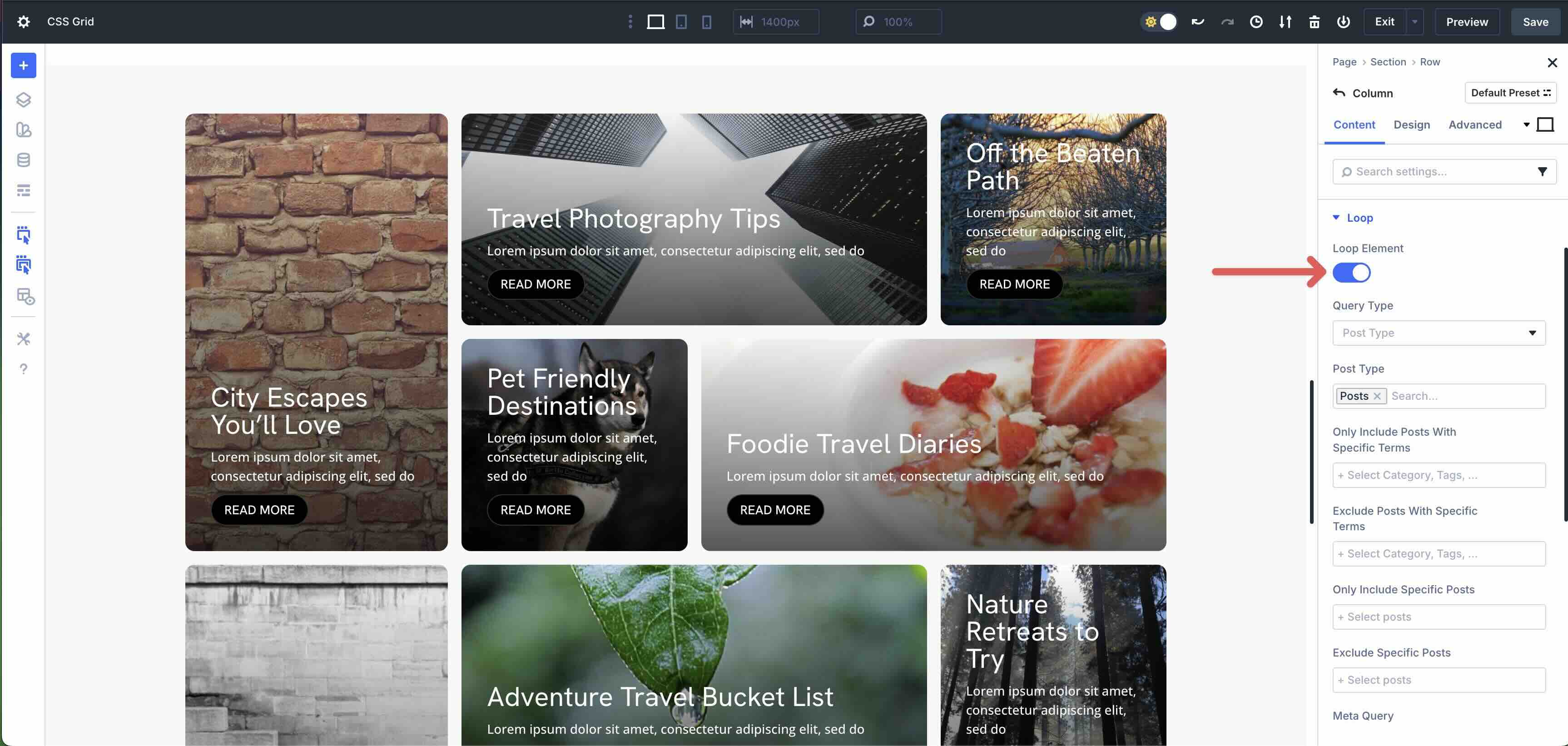
Any new module added to the Grid automatically conforms to the defined structure. This behavior also extends to the Loop Builder, where dynamic content, such as blog posts, products, or portfolio items, inherits the grid rules, ensuring consistent styling even as content updates in real-time.
Benefits Of CSS Grid In Divi 5
Using CSS Grid in Divi 5 brings quite a few benefits, including:
- Streamlined Workflows: You can build complex grids in minutes using drag-and-drop controls instead of writing CSS.
- Easier Wireframing: Visualize structure with the Visual Builder, iterate faster, and reduce back-and-forth changes.
- Greater Design Flexibility: Break free from symmetrical row structures and create asymmetrical or modular layouts with ease.
- Responsive By Default: Grids adapt across breakpoints with built-in responsive controls.
- Dynamic Content Ready: CSS Grid works well with the Loop Builder, Woo, and ACF content.
Core Column And Row Grid Parameters
Divi 5’s CSS Grid system revolves around intuitive, visual controls that mirror native CSS properties. These parameters are grouped into Grid Row, Grid Column, and shared settings, accessible directly from the grid-enabled container’s Design tab. Below, we break down each category with practical examples to help you build everything from simple cards to intricate layouts.
Grid Row Parameters
The CSS Grid controls at the grid row level give you full command over vertical structure, height, alignment, and spacing. Let’s break down each setting to provide a clear understanding of their purpose.
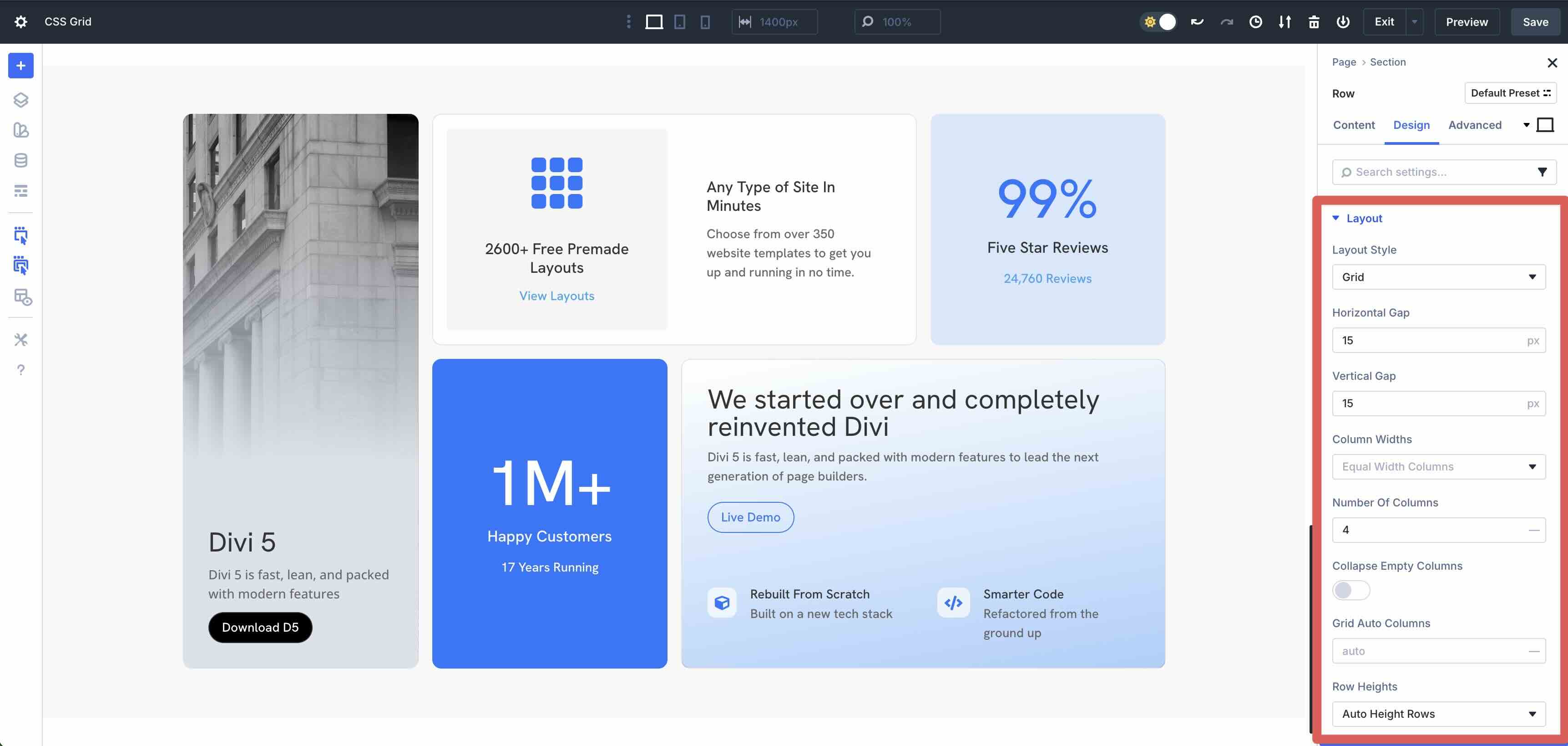
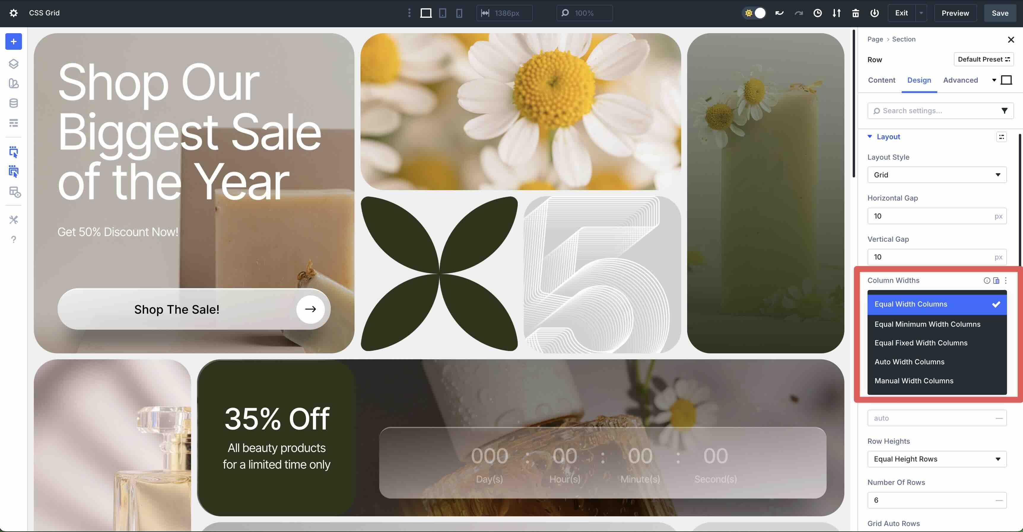
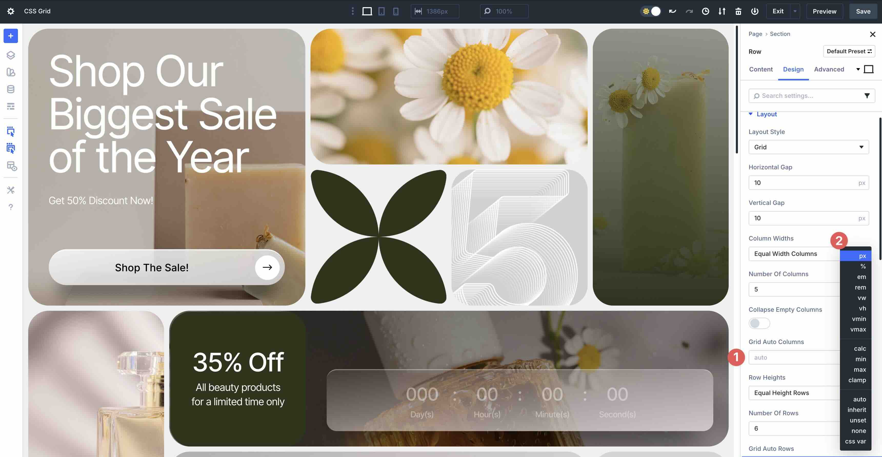
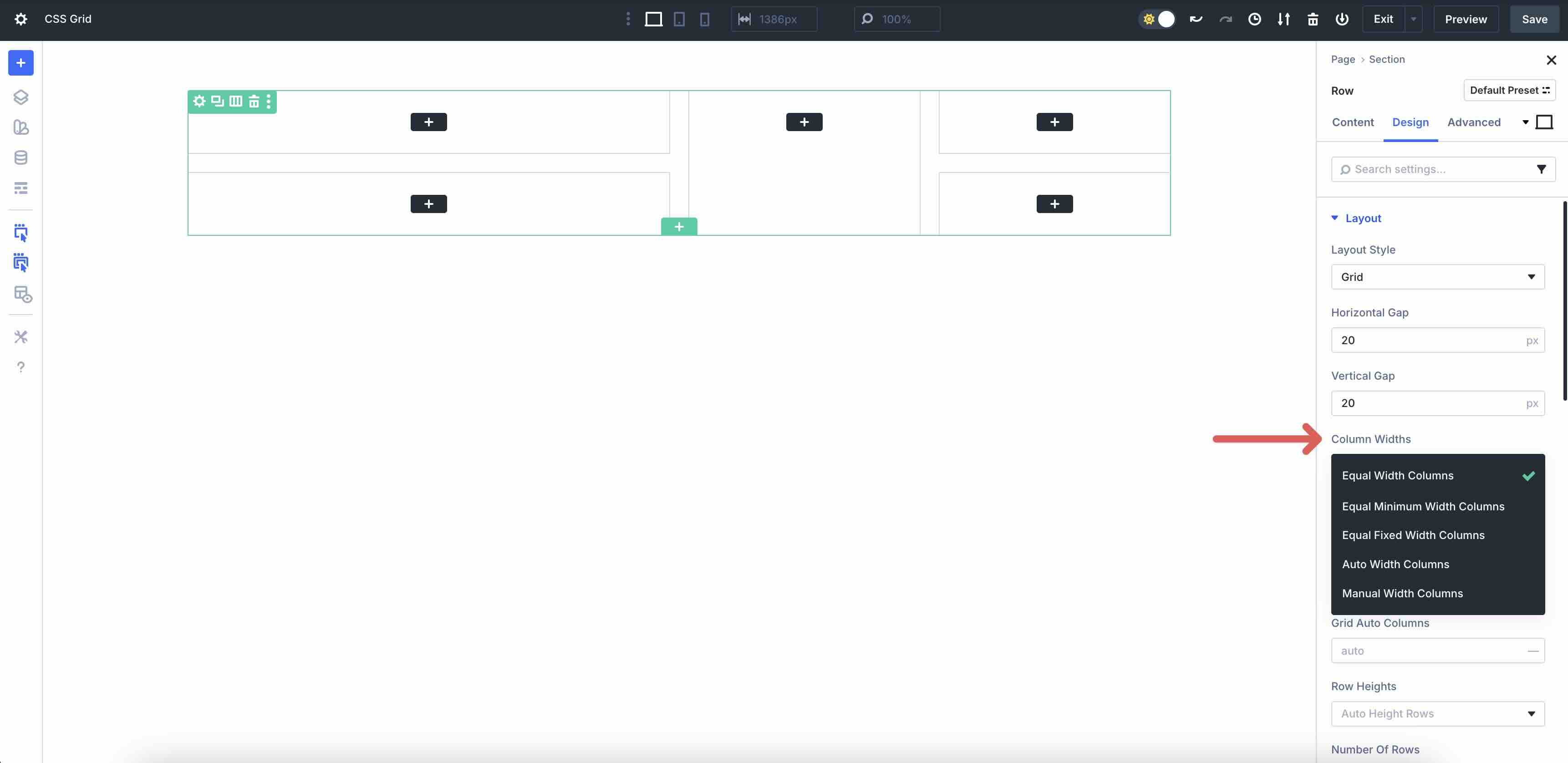
Column Widths
These settings serve as the central control for defining horizontal track sizing in Divi 5’s CSS Grid.
Here’s a breakdown of how each shapes layouts:
| Option | What It Does | CSS Equivalent | Use Case |
|---|---|---|---|
| Equal Width Columns | All explicit columns share identical width (100% ÷ number of columns). | grid-template-columns: repeat(5, 1fr) | Great for creating perfectly balanced cards. |
| Equal Minimum Width Columns | Each column gets at least a fixed minimum; extra space is distributed evenly. | repeat(5, minmax(200px, 1fr)) | Responsive product grids where items must never shrink below a readable size. |
| Equal Fixed Width Columns | Every column is a locked pixel value ( 250px, etc.); overflow creates horizontal scroll if needed. | repeat(5, 250px) | Masonry galleries or fixed-width card carousels. |
| Auto Width Columns | Columns size to content; unused space collapses. | repeat(5, auto) | Irregular content like icons + labels where alignment isn’t critical. |
| Manual Width Columns | Full custom pattern input (1fr 2fr 300px auto). | Any valid grid-template-columns string | Asymmetrical hero sections. |
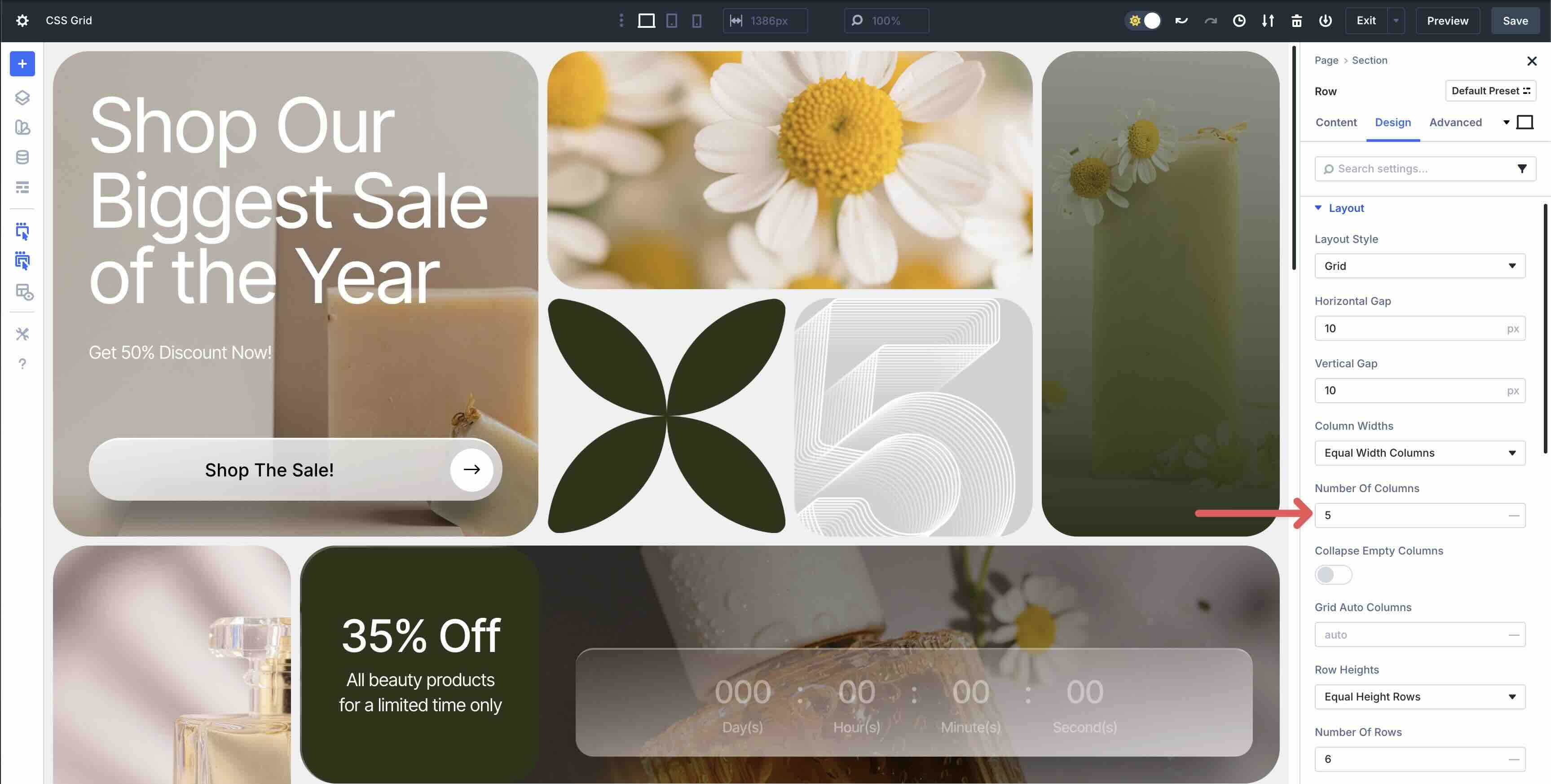
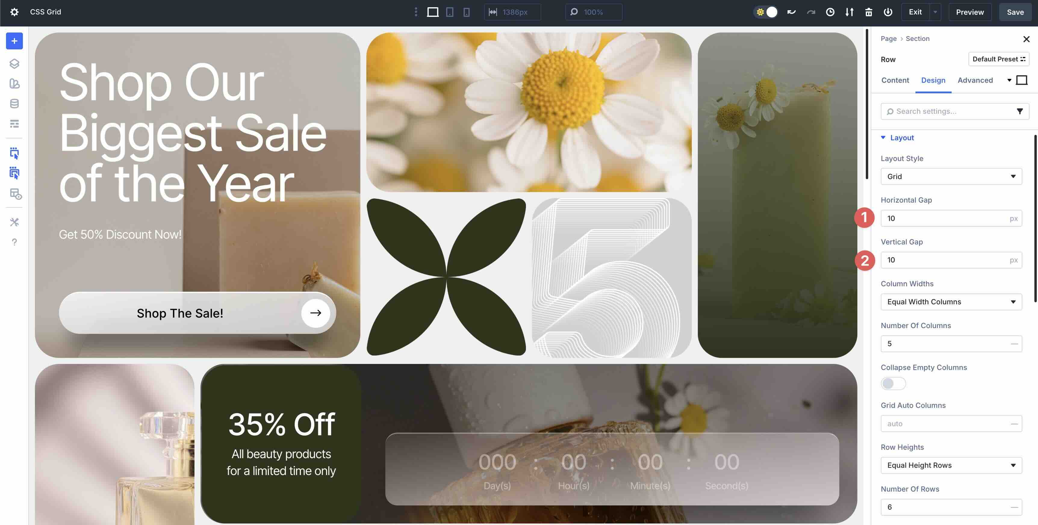
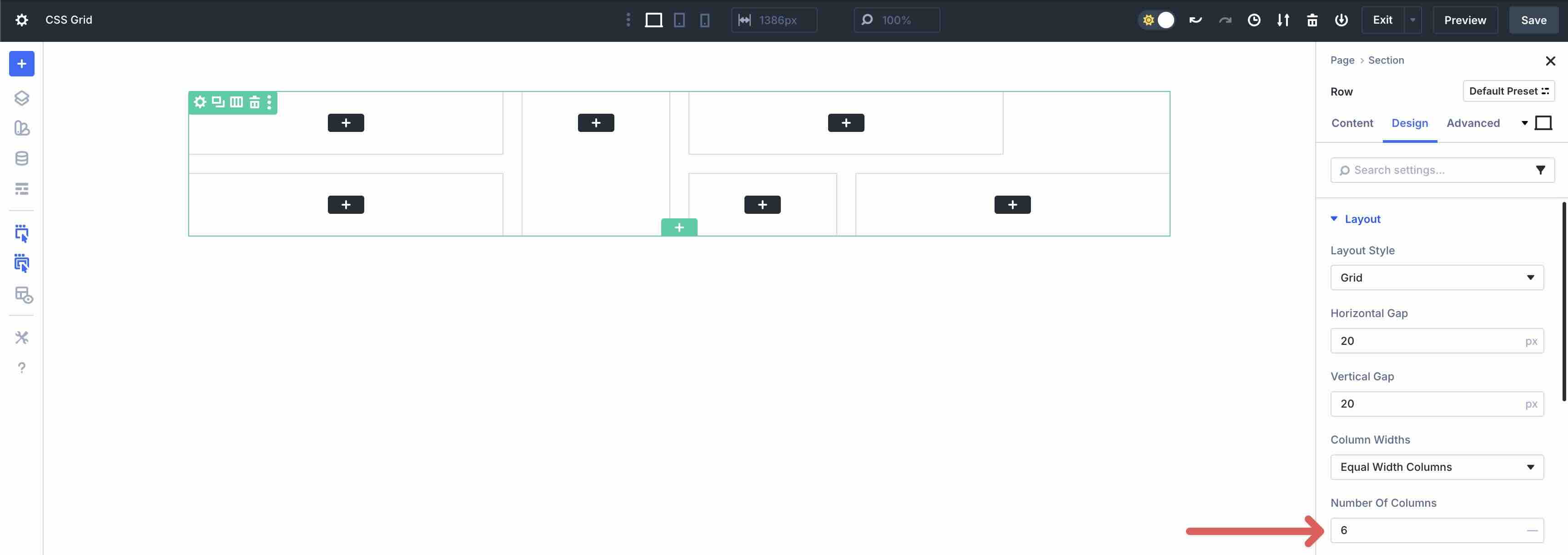
Number Of Columns
The number of columns field allows you to specify the number of vertical columns your grid layout will have across the container’s width. In the example below, the design spans the width of 5 columns before wrapping to the next Row.
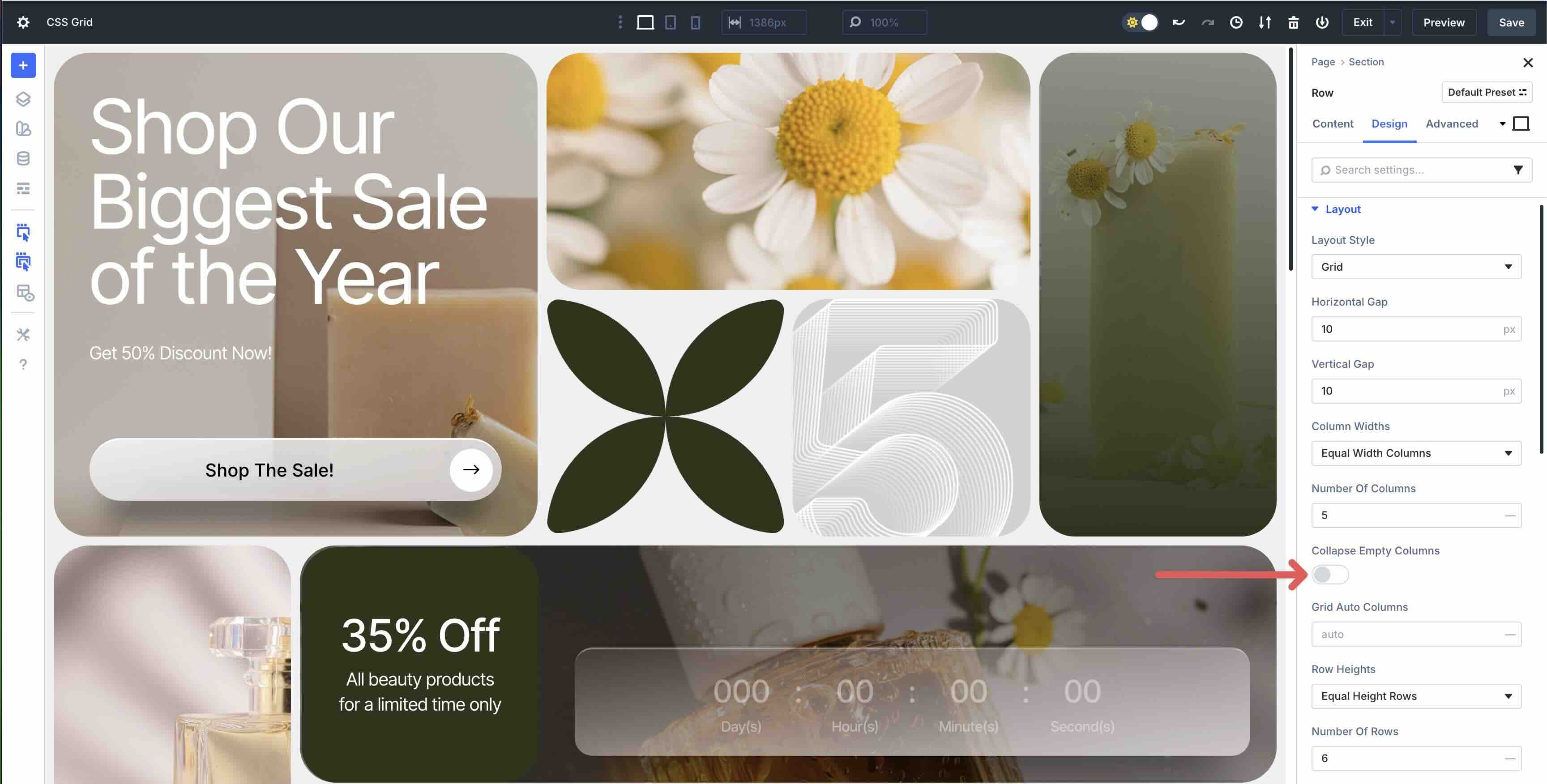
Collapse Empty Columns
When this setting is enabled, it allows you to hide columns that don’t contain any modules. It allows the remaining content to fill the empty space, giving the layout a uniform and consistent style.
Grid Auto Columns
Grid Auto Columns controls what happens when your layout needs more columns than you planned for. If an item gets placed past your defined grid, Divi automatically creates an extra column for it.
By default, this is set to auto, which means the new column will size itself to the content inside it, instead of stretching or squeezing to match the rest of the grid. In this example, the Countdown module ends up in one of these automatically created columns, so its width adjusts naturally to fit the module.
Row Heights
The Row Heights dropdown is the vertical counterpart to Column Widths. It defines how explicit row tracks are sized in the CSS Grid. This control offers options that mirror the CSS grid-template-rows property.
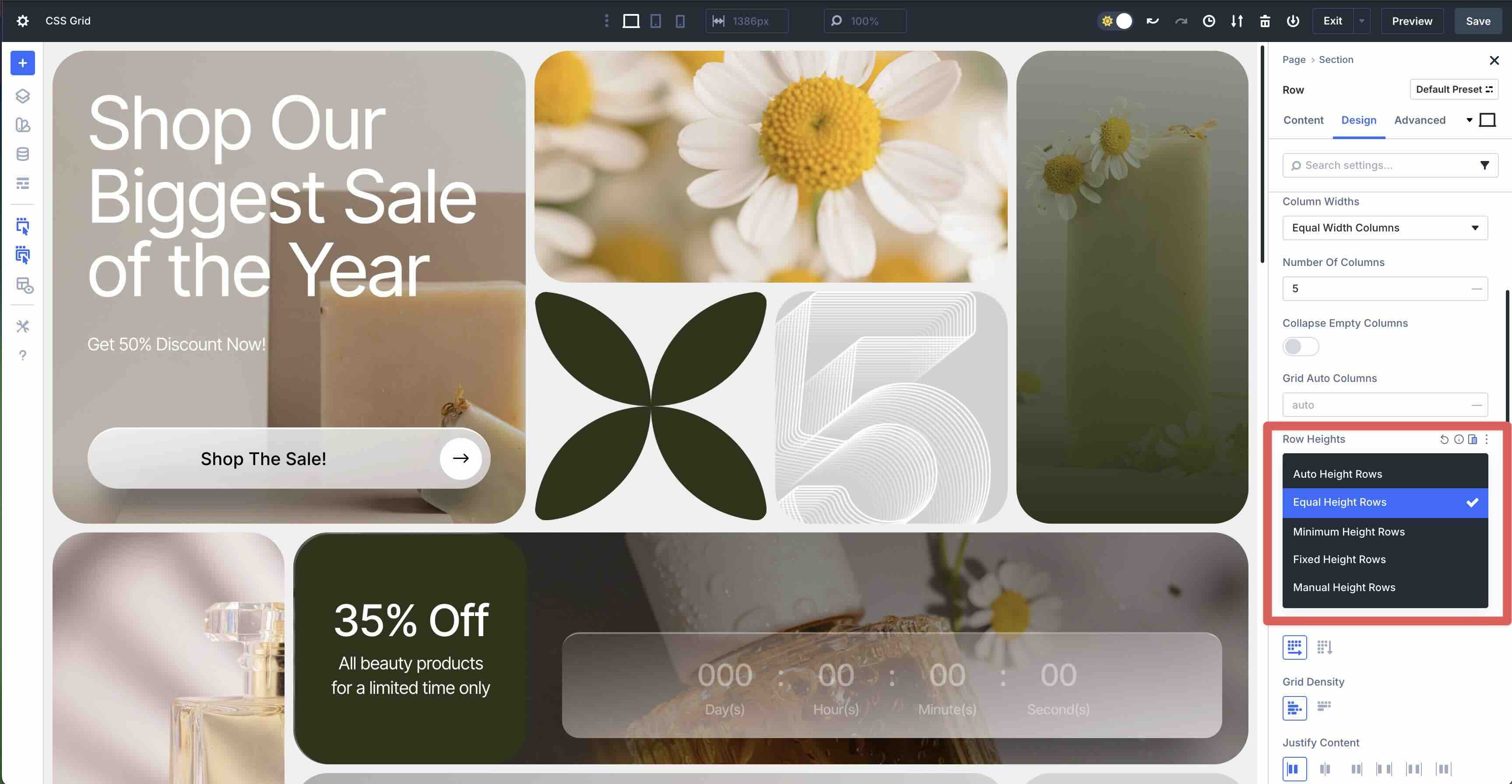
Below, we break down each option:
| Option | What It Does | CSS Equivalent | Use Case |
|---|---|---|---|
| Equal Height Rows | All defined rows share equal available space (when the grid has extra vertical space). | grid-template-rows: repeat(6, 1fr) | Good for stretching content uniformly, despite varying content. |
| Auto Height Rows | Rows Each row sizes to its tallest item’s content. A good choice for grids with mixed content heights. | repeat(6, auto) | Blog grids where post excerpts vary in length. |
| Minimum Height Rows | Rows never shrink below a minimum height (e.g., 200px), but they can grow taller if content needs more space. | repeat(6, minmax(200px, 1fr)) | Cards that must stay readable on mobile. |
| Fixed Height Rows | Locks every row to a specific pixel value (e.g., 300px). Content may overflow if it exceeds the set height. | repeat(6, 300px) | Hero banners or fixed-height sliders. |
| Manual Height Rows | Full custom input (200px auto 1fr 100px). | Any valid grid-template-rows string | Complex layouts with header, flexible content, footer. |
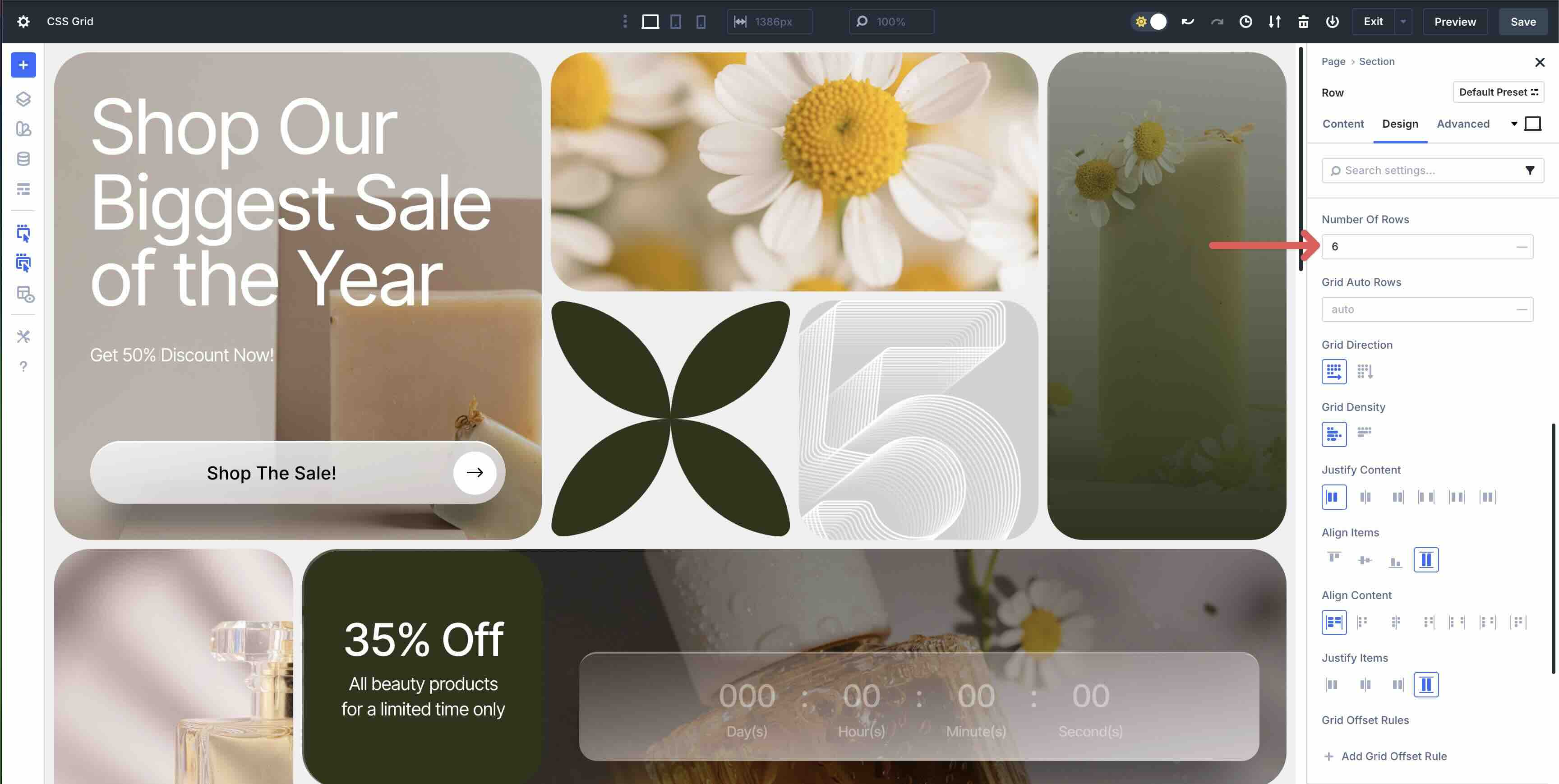
Number Of Rows
This field allows you to set the number of horizontal rows in the Grid, but only when Manual Height Rows isn’t selected in the Row Heights field.
When Manual Height Rows is selected, the Grid Row Template field appears, allowing you to control every Row’s height, just like raw grid-template-rows in CSS. Manual mode requires an explicit track list, like in this example (2fr 1fr).

Grid Auto Rows
This controls implicit rows that are created when content overflows defined rows. With auto, implicit rows are created when items are placed outside the explicitly defined rows, and they size based on Grid Auto Rows.

Grid Direction And Grid Density
In Divi 5, Grid Direction and Grid Density are powerful parameters in the Design tab that appear when CSS Grid is enabled on a Divi Row. Grid Direction toggles the primary flow axis: Row (default) fills items left-to-right then top-to-bottom, ideal for promotional banners and product grids. Column stacks items top-to-bottom then left-to-right, perfect for tall sidebars or mobile-first layouts.
Grid Density controls gap-filling behavior, preserving gaps when modules span multiple cells. Dense enables the CSS property grid-auto-flow: Row dense, allowing the browser to backfill empty spaces with smaller items for a tighter, masonry-style pack. Because both settings define container-wide placement logic, they apply uniformly to all child modules and cannot be set individually, making the Row the center point for flow and visual rhythm in your designs.

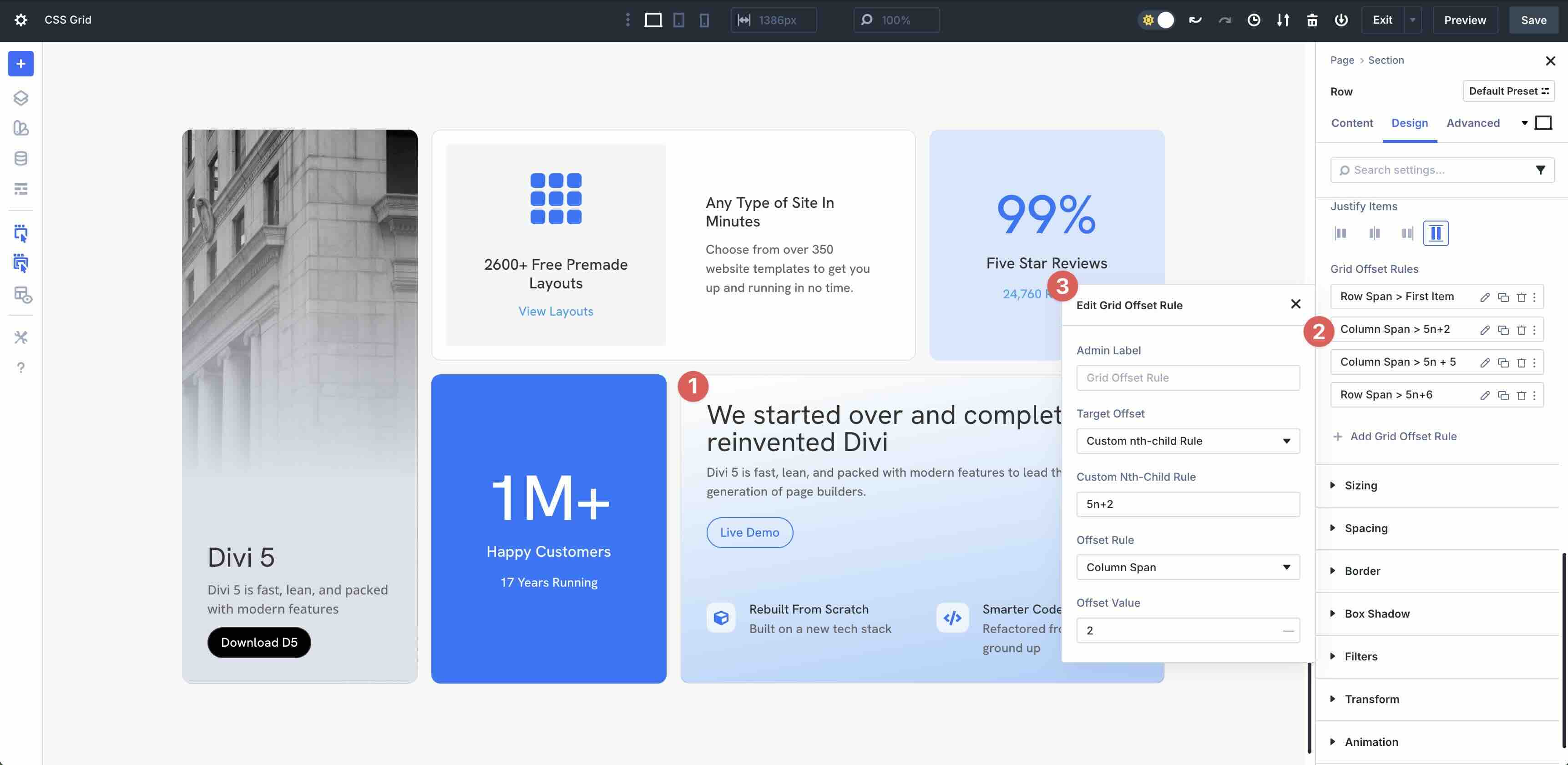
Grid Offset Rules
Grid Offset Rules in Divi 5 enable you to target specific items in a CSS Grid (such as every third product or the last blog post) and apply a precise layout change, such as spanning more columns or rows, starting at a different line, or ending early.
Each rule has three parts:
- Target Offset: Who to style (example, Last Item).
- Offset Rule: What to change (example, Column Span).
- Offset Value: How much (example, 3).
You can stack multiple rules, as they apply top to bottom. In the example below, the first Grid Offset Rule targets the first item (Column) in the layout, adds a row span offset rule, and an offset value of 2. It allows the Column to span two rows of the Grid.
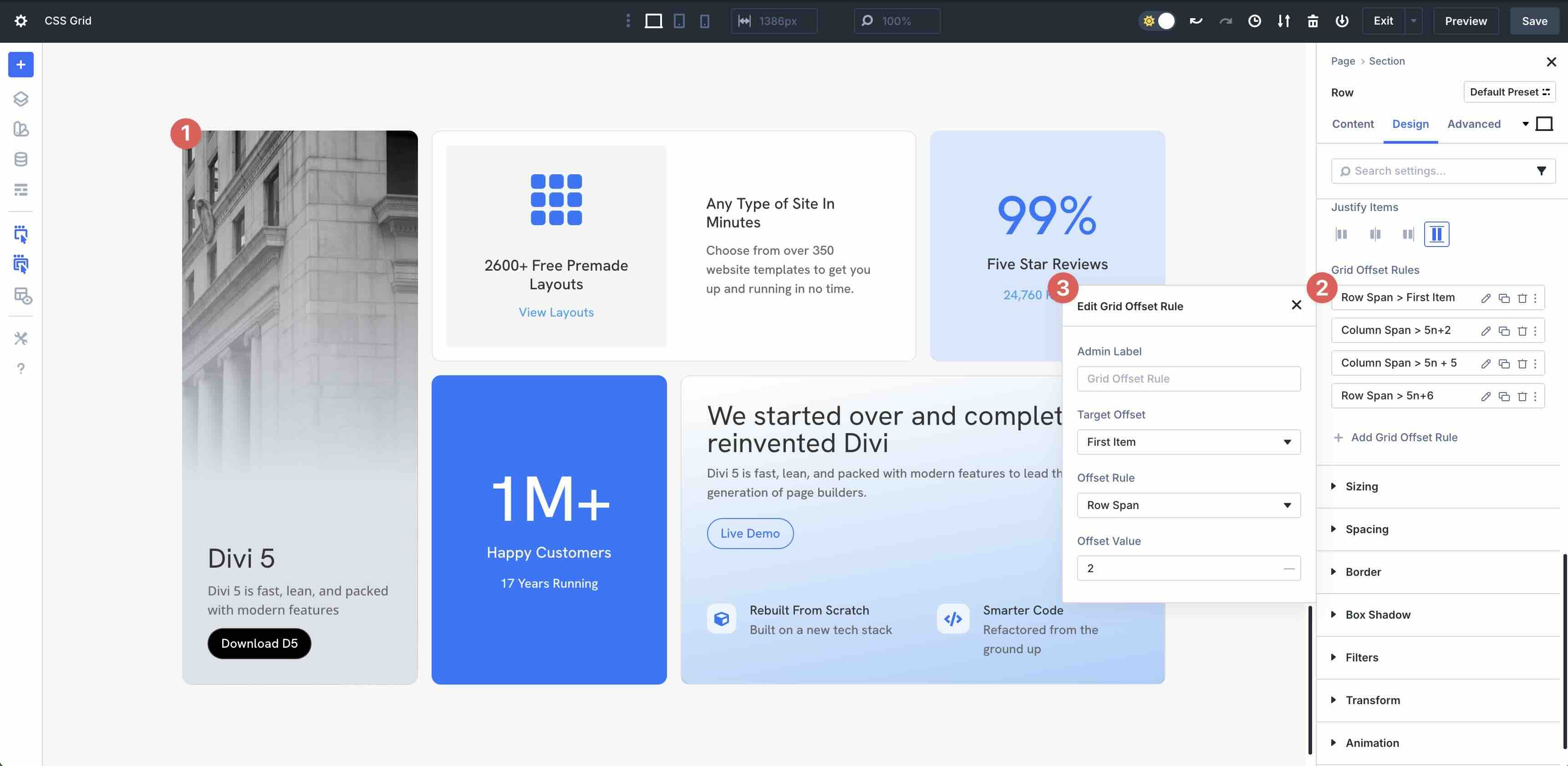
The rule 5n+2 with Column Span: 2 targets every 5th item starting from the 2nd — in this case, the card that reads “We started over and completely reinvented Divi” — making it double the width of standard Grid items.
Grid Column Parameters
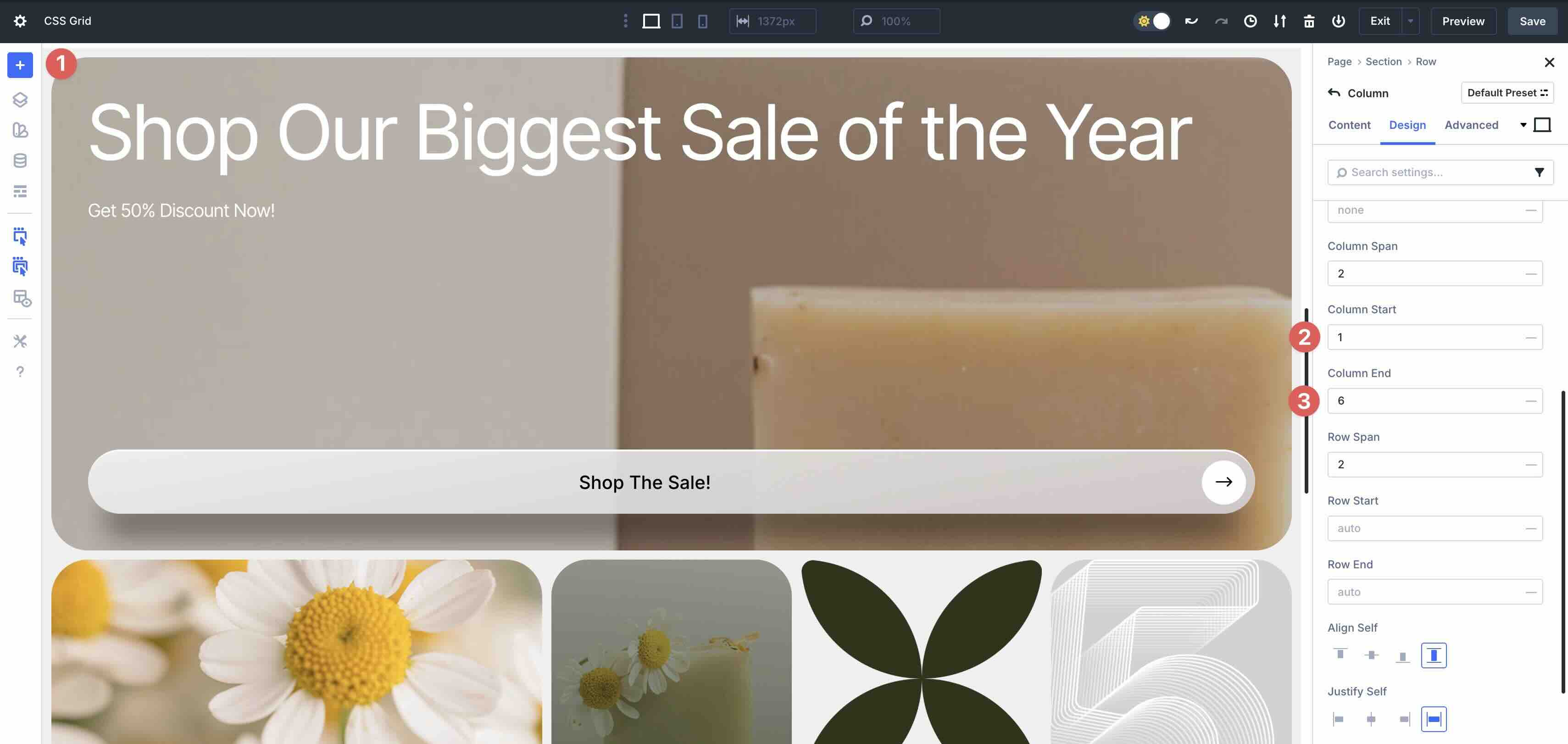
In Divi 5, enabling CSS Grid on a Divi Row instantly transforms all child Divi Columns into Grid items, even if their individual Layout Style is set to Flex. This is by design: the parent Row’s display grid takes precedence, and Divi exposes full Grid item controls — Column Span, Row Span, Start/End lines, Align Self, and Justify Self — directly on each Column, regardless of its labeled mode. In this example, the hero card spans 2 columns and 2 rows because these Grid item settings are active.
You may still see Flex-related labels in some places, but the parent Row’s Grid layout controls item placement. Use Row-level Shared parameters (Justify Content and Align Items) for container-wide rules, and Column-level Grid settings for precise per-item placement.
Each of these inherited Flex properties is located in the Divi Column’s Design tab, in the Layout and Sizing menus. Let’s take a closer look at these parameters and what each does:
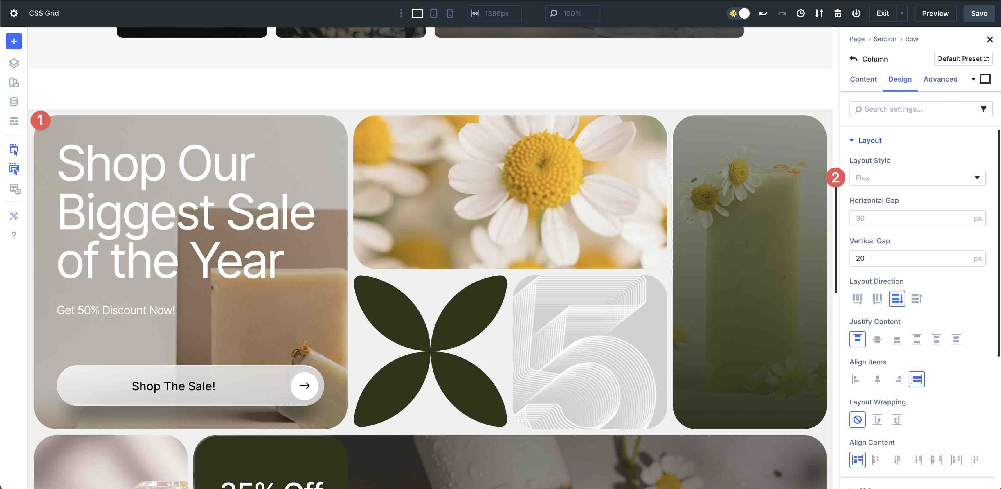
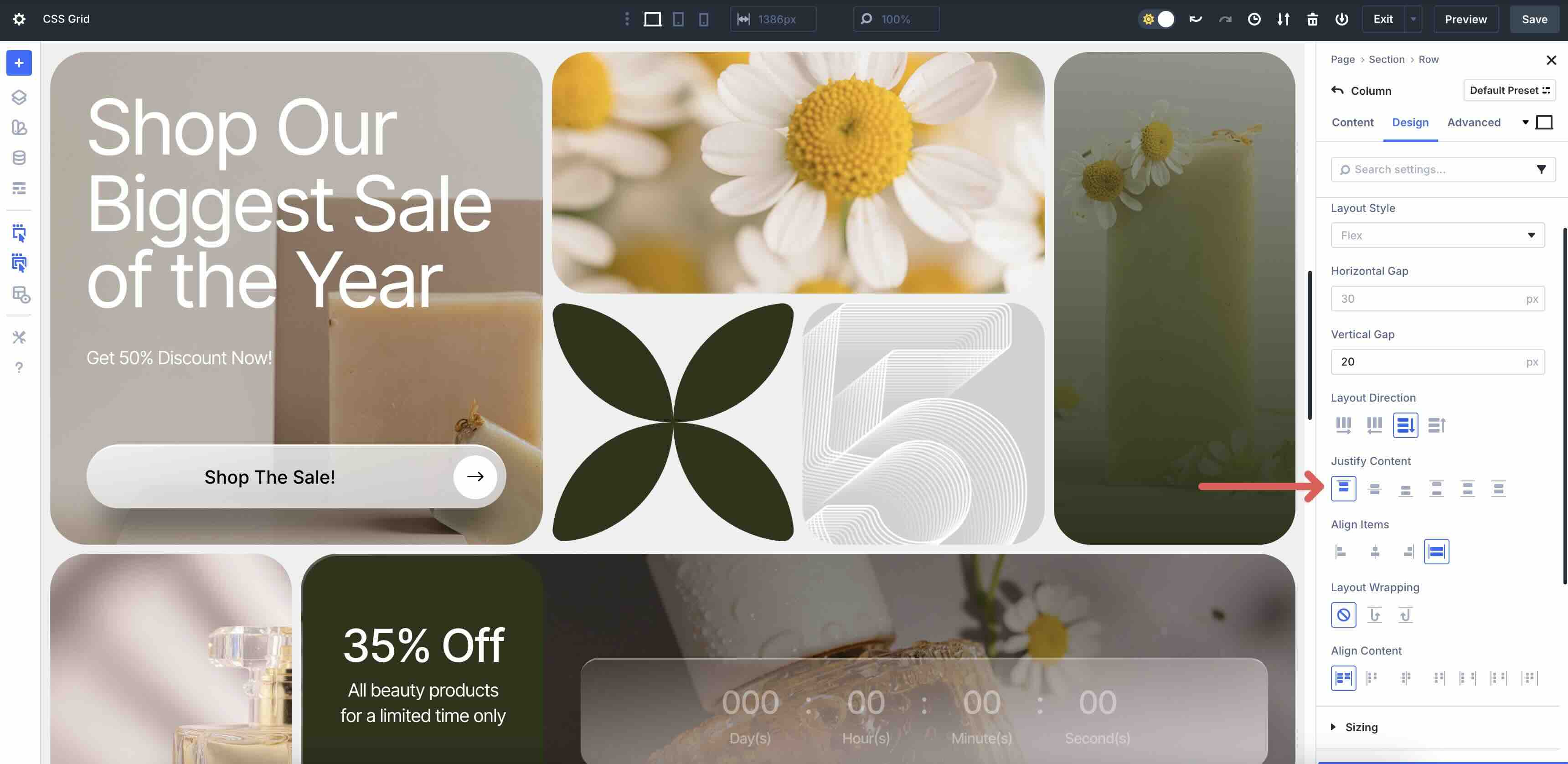
Layout Direction
The Layout Direction controls how child modules inside a single column are arranged. By default, Row is selected, which tells the Column (as a container) to arrange its inner modules from left to right. On the other hand, the Column displays the items within it to flow from top to bottom. The parent Row’s Grid Direction still controls overall placement; this only affects the internal flow.
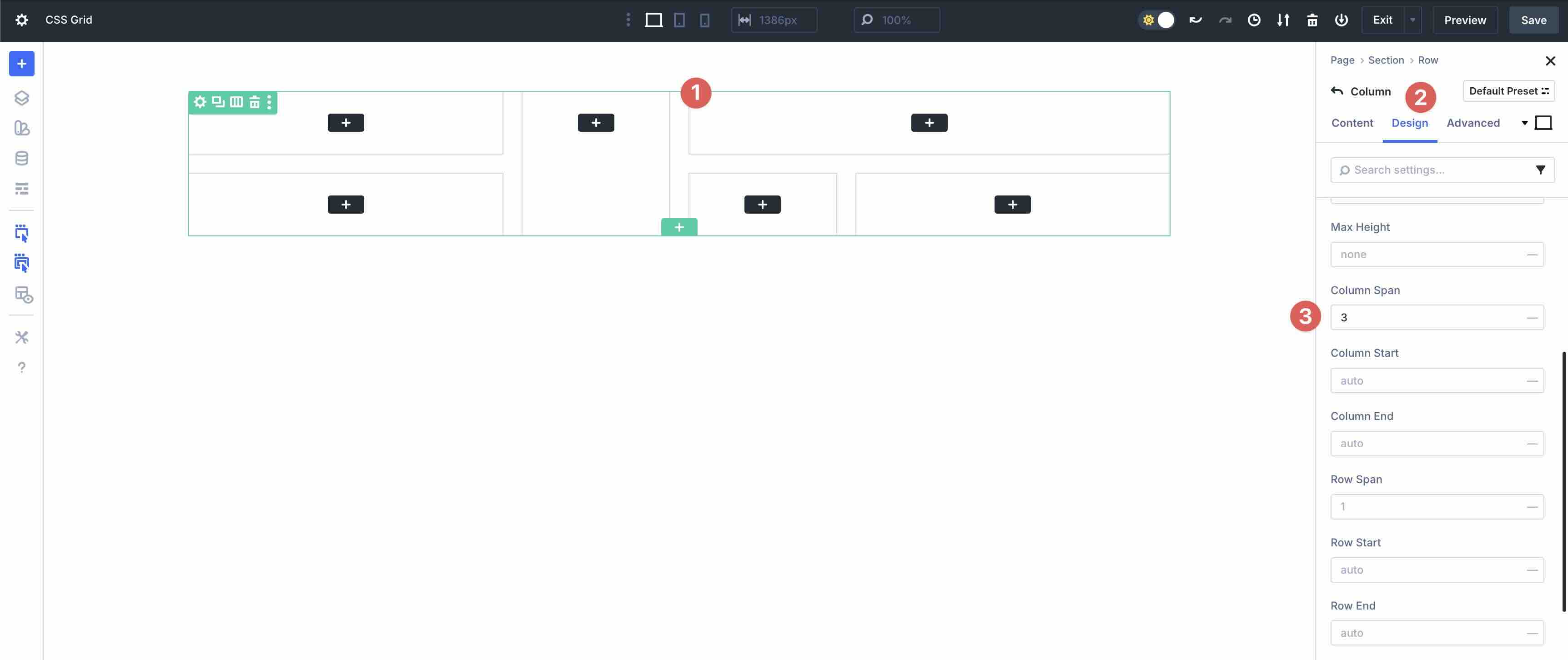
Column Span
The Column Span field allows you to set the number of columns that a Grid item should span, horizontally. In this example, it’s set to 2 out of 5 columns. As you adjust this value, the Column will either occupy more or less space in the Row.
Column Start And Column End
The Column Start option controls where a Grid item begins horizontally. It’s the grid-column-start property in CSS. In Divi 5, it appears in the Column’s sizing settings when the parent Row uses CSS Grid.
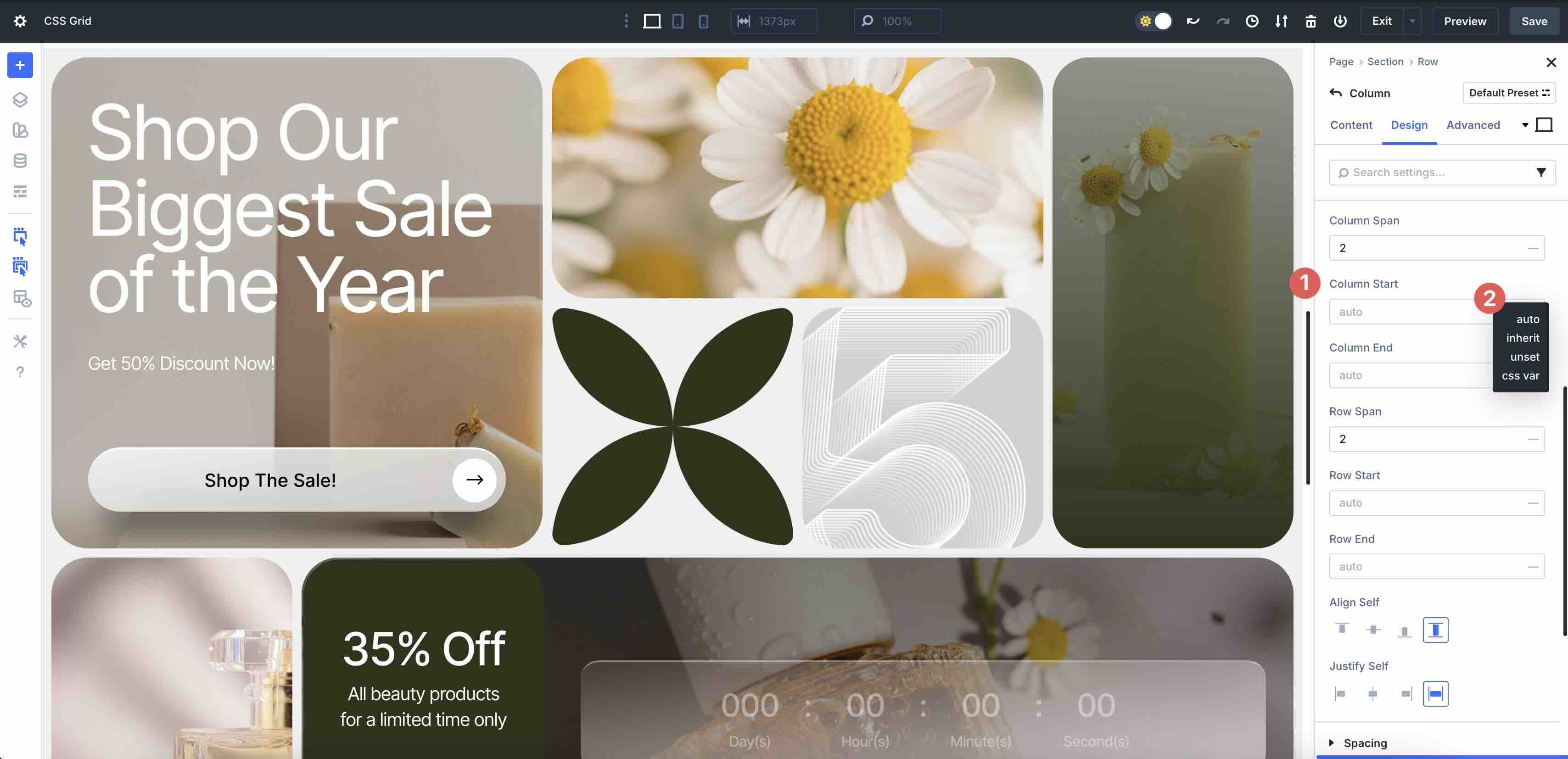
The dropdown menu offers four options:
| Option | CSS | Behavior | Use Case |
|---|---|---|---|
| Auto | grid-column-start:auto | Item starts in the next available column based on DOM order and flow. | Natural, sequential layouts. |
| Inherit | grid-column-start:inherit | Inherits the Column Start value from its parent (a nested Row or Section). | Sync placement across nested grids — if a parent Row says “start at column 3”, all children inherit it. |
| Unset | grid-column-start:unset | Resets to the browser’s default (auto) — same as selecting auto. | Override a preset or global style that forced a start value. |
| CSS Var (custom CSS variable) | grid-column-start: var(--my-start) | Lets you dynamically control placement via a CSS variable defined in Theme Customizer → Additional CSS or Design Variables. | Used for theme-wide responsive logic. |
Column End defines the exact horizontal line where a Grid item stops, giving you control over width when combined with Column Start. For example, in a 5-column Grid, set Column Start: 1 and Column End: 6. The item will span columns 1-5.
Row Span
Row Span in Divi 5 controls how many vertical rows a Grid item occupies in the Grid. By default, this is set to 1. In this example, it is set to 2, which tells Divi to allow the Column to occupy two vertical rows in the layout. As you adjust this value, the height of the Column either increases or decreases.
Row Start And End
The Row Start and Row End controls determine the starting Grid row from which the Column begins its vertical placement. By default, items auto-place in order (filling row 1, then row 2). Setting a Row Start value allows you to pin the item to a specific row, jumping over or overlapping others to create custom arrangements.
Row End defines the ending Grid row for vertical spanning. Leave Row End on Auto unless you need an explicit stop line, and use Row Span for most “taller card” layouts. Adjusting the value controls where the item ends vertically within the Grid.
Align Self
The Align Self option controls how the items are aligned within the Grid item (Column). Items can be aligned from the Start (top), Center, End (bottom), or Stretch, which forces the Column itself to stretch and fill the entire height of its Grid Row, ignoring the content’s natural height.
Justify Self
Justify Self aligns the Grid item (Column) within its cell, but horizontally. Options include Start, End, Center, and Stretch.

Divi 5’s shared parameters are container-level controls that apply uniformly to all Grid items within a container. Available at the Row and Column levels, these options mirror native CSS Grid properties, giving you global control over spacing, alignment, wrapping, and content distribution.
Vertical And Horizontal Gap
This controls the spacing between rows. Horizontal Gap controls the amount of spacing between columns from start to end (left to right), while Vertical Gap controls spacing vertically. These settings can be found at the Row and Column levels.
Justify Content
These options align the entire Grid along the horizontal axis when there’s extra space in the container. When choosing Start, all items will pack to the left, Center aligns items to the middle, and End packs them to the right. Space Between allows the first and last items to align flush to the edges with equal space between. Space Around places equal space around all items, and Space Evenly adds equal space everywhere, including the edges.
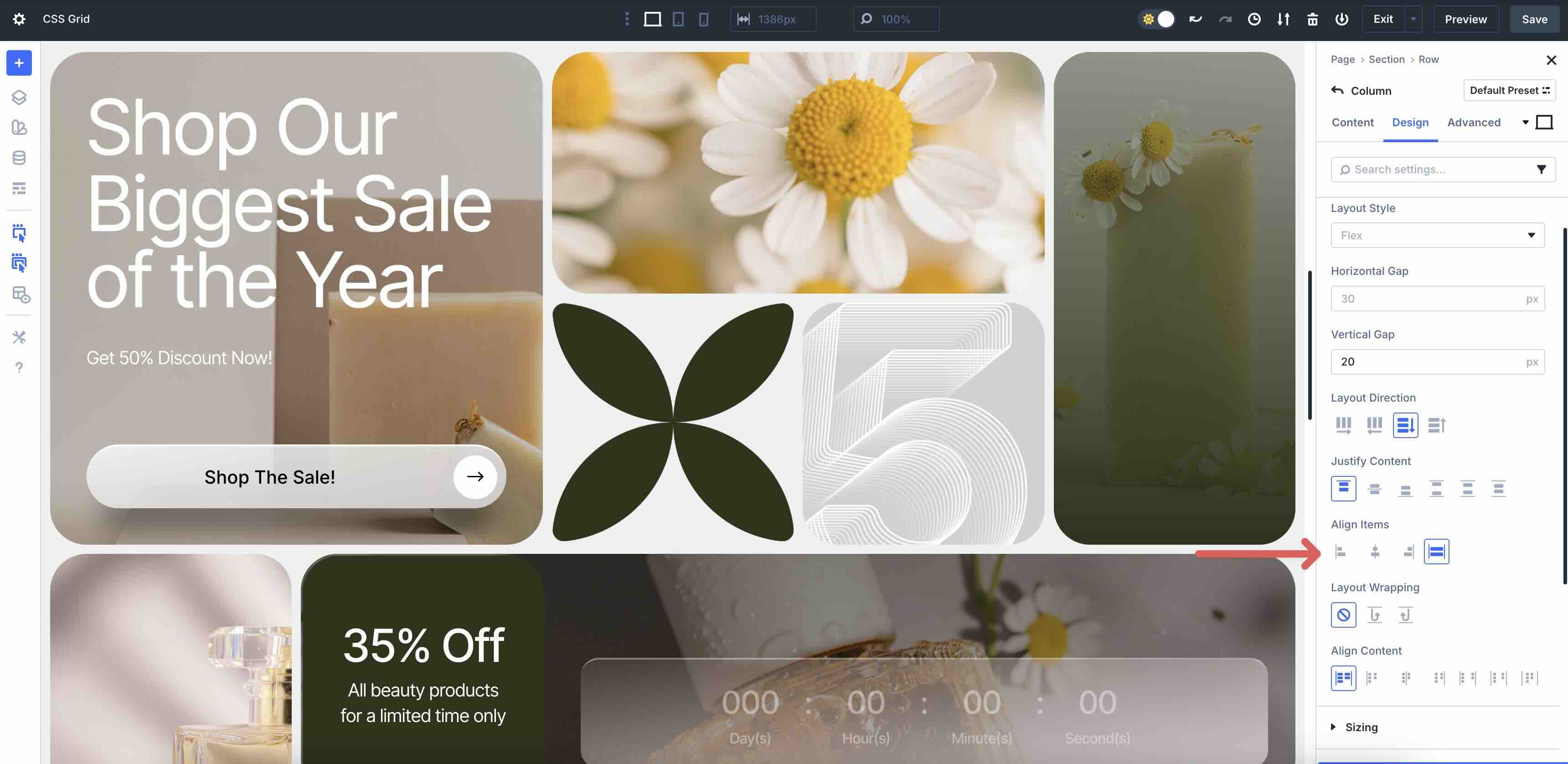
Align Items
This option aligns all Grid items along the vertical axis within their Row or Column. Start aligns items to the top, Center aligns them vertically to the middle, and End aligns items to the bottom. Finally, Stretch fills the full row height.
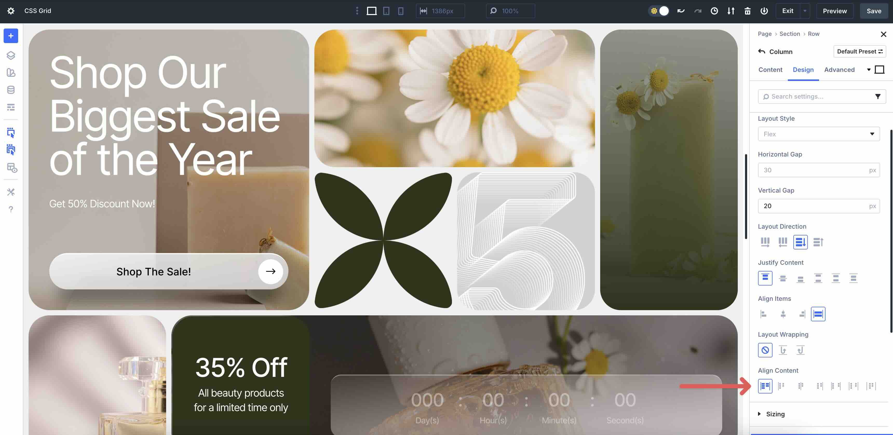
Align Content
Align Content aligns the entire Grid block along the vertical axis when the Grid is shorter than the container. Options include Start, Center, End, Space Between, Space Around, and Space Evenly.
Pro Tip: Set Horizontal and Vertical Gap and Justify/Align Content at the Row level for global consistency. Override with column-level Align Self / Justify Self for individual tweaks.
Setting Up & Implementing Grid Parameters
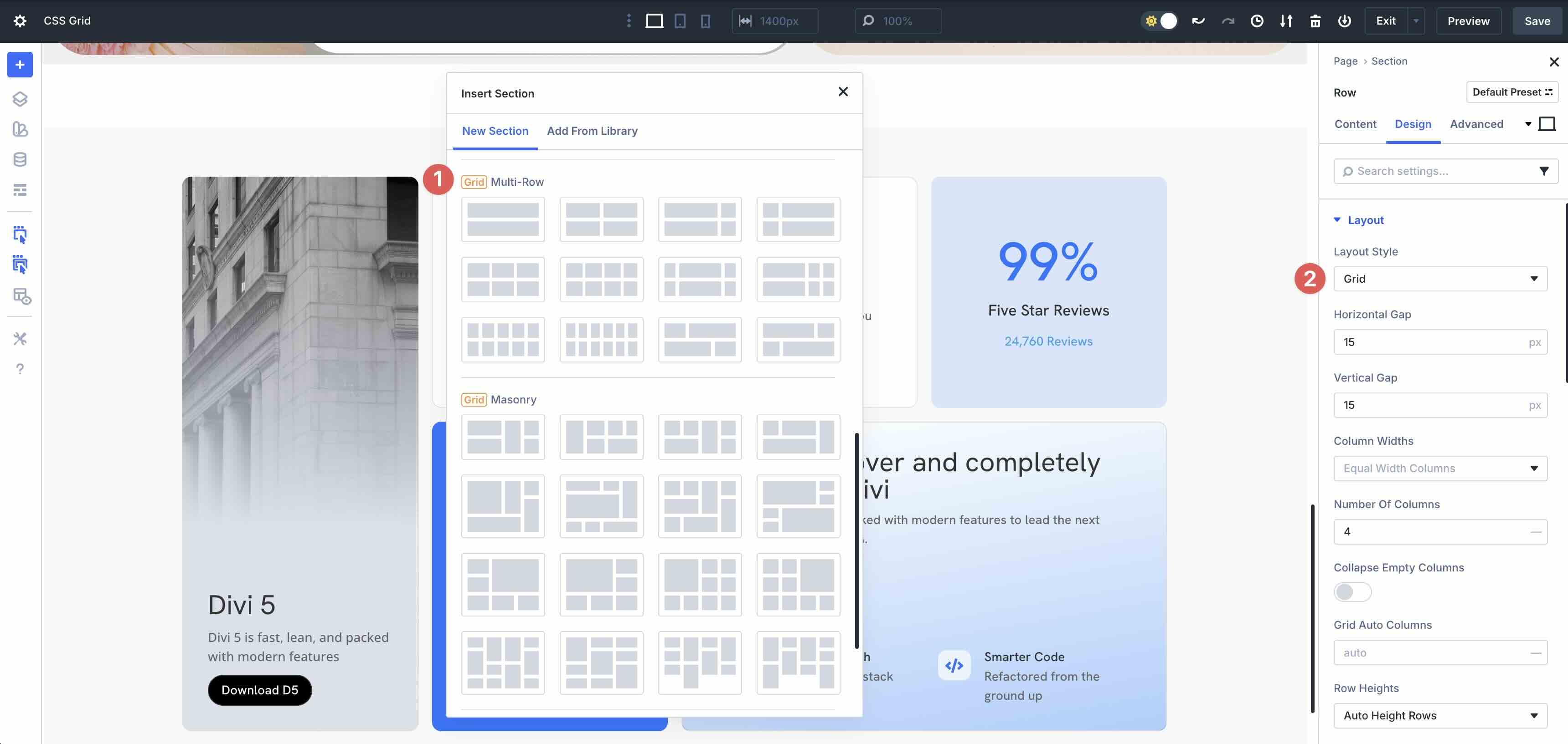
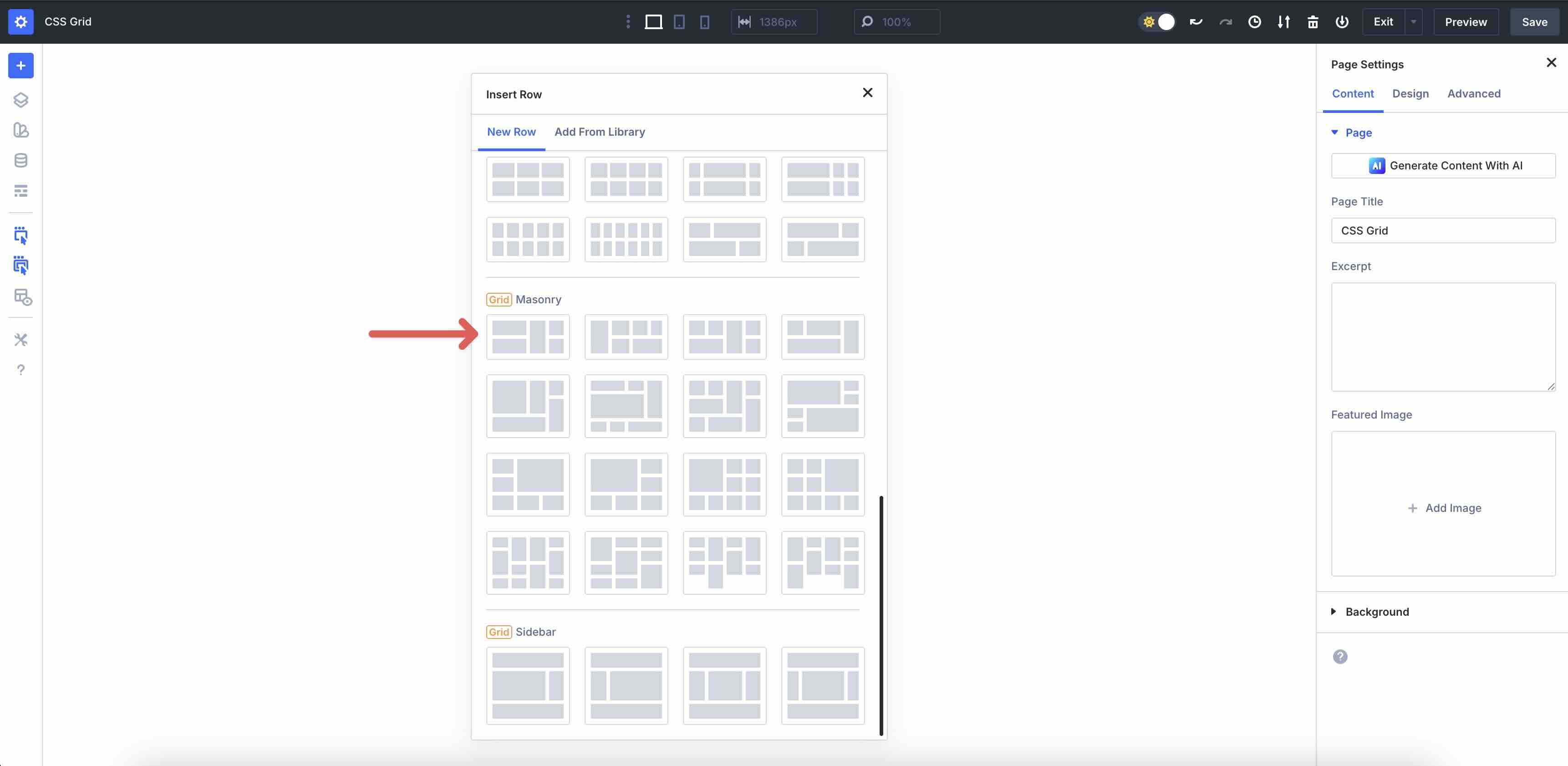
Using CSS Grid in Divi 5 is simple and can be accomplished in a few easy steps. Start with selecting a pre-made template from the Insert Row modal. Divi 5 offers Multi-Row, Masonry, and Sidebar templates that make it easy to get started.
In the Row, click the Design tab, expand the Layout menu, and adjust the Horizontal and Vertical Gap as desired.
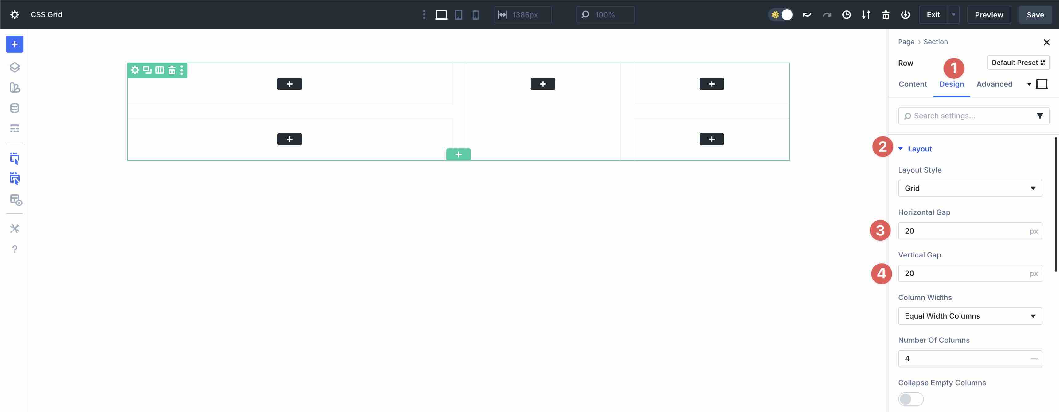
Set the Column Width options.
Choose the Number Of Columns.
When adding columns to the Grid, click into each Grid Column and adjust the Column Span for a uniform look.
Add modules to each Column and style them as desired.
Finally, make adjustments to the layout using Divi’s Customizable Responsive Breakpoints.
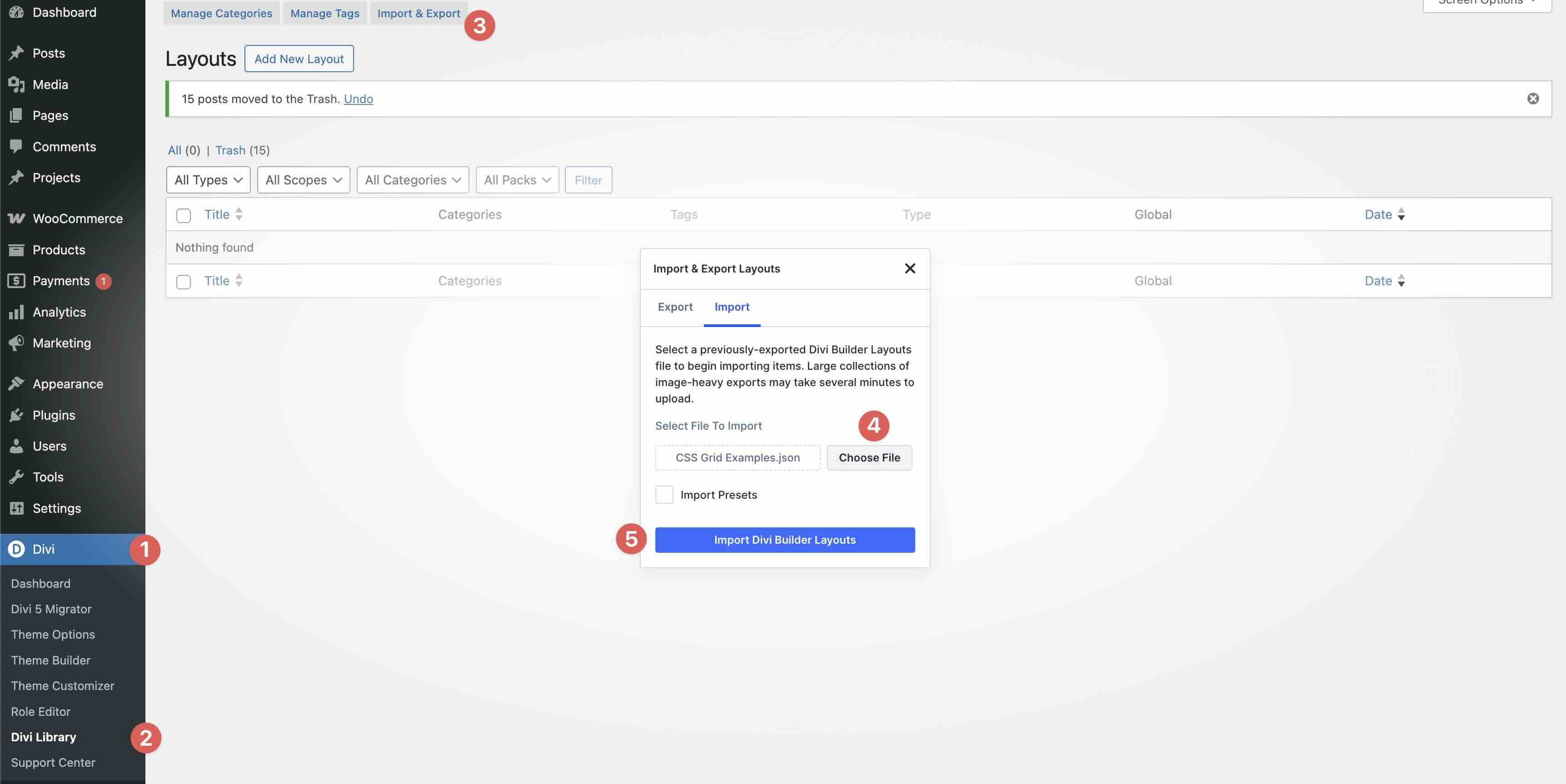
Fill out the form below to download the examples used in this article. To import them, navigate to Divi > Divi Library. Click the Import & Export button, select the file, and import it by clicking the Import Divi Builder Layouts button.

Best Practices For Using CSS Grid In Divi 5
Divi 5’s CSS Grid is powerful, but smart workflows make it fast, maintainable, and scalable. Follow these tips to build professional layouts in minutes:
- Start With Premade Templates: Divi 5 offers ready-made Grid templates that provide instant structure and a responsive foundation. Start with one of these templates, tweak column widths, gaps, and add offset rules to fit your desired look.
- Test Responsiveness: Never assume desktop = mobile. Use Divi 5’s Customizable Responsive Breakpoints or Responsive Editor to preview and adjust.
- Combine With Other Divi Features: Divi 5’s ecosystem is full of features you can use alongside CSS grid, including Presets, Design Variables, Nested Rows, and Loop Builder, making it a one-stop shop for creating scalable layouts in minutes.
Try CSS Grid In Divi 5 Today!
Understanding Column and Row Grid parameters in Divi 5 enables you to create layouts that are both efficient and expressive, transforming static containers into responsive, asymmetrical designs with drag-and-drop precision. From defining track sizes and spans to fine-tuning gaps, offsets, and alignment, these controls eliminate the need for custom coding while delivering native CSS Grid performance. Whether you’re building a portfolio, a dynamic product grid, or a blog powered by Loop Builder, CSS Grid makes it easy to create beautiful layouts.
Dive into the Divi 5 Public Beta today, experiment with these examples, and learn to create designs that evolve from structured to stunning.


Leave A Reply