")
Your site is full of things people can click. Menus, buttons, icons, banners, and form submits. They can look identical, but the HTML underneath tells browsers, screen readers, and search engines what each element actually is.
With Divi 5, you can control that meaning directly in the builder using Semantic Elements and Custom Attributes. In this post, you will learn the practical rule for choosing links vs buttons, plus real Divi 5 examples you can copy into your own layouts.
Links and buttons can look the same, but they do different jobs in your code.
A link uses the <a> tag with an href attribute. It points to a URL. Click it, and you move to a new page, a different section, or an external site. A button uses the <button> tag for in-page actions. You can also apply role=”button” to a non-button element, but then it must be focusable and support keyboard activation so it behaves like a real button. Click it, and something happens right where you are: a form submits, a modal opens, content toggles, a menu appears.
| Element | Tag | Purpose | Keyboard Activation |
|---|---|---|---|
| Link | <a href="..."> | Navigation to another location | Enter key |
| Button | <button> or role="button" | Action on current page | Space bar or Enter key |
Both can be styled to look identical. CSS can make a link look like a button and a button look like a link. The visual treatment doesn’t change what the element actually does under the surface.
Why Does The Distinction Matter?
Search engines primarily discover and crawl pages by extracting URLs from links with href attributes. If key navigation is built as buttons with JavaScript handlers instead of links, those destinations are far less reliable for discovery and internal linking, which can hurt crawling and indexing coverage.
Screen readers let users jump between elements by type. Someone navigating your site can pull up every link to see where they can go or every button to see what actions they can take. Mark navigation as a button, and it vanishes from the links list. Mark a form submit as a link, and assistive technology announces it wrong, telling users they’re going somewhere when they’re not.
Keyboard behavior differs, too. Buttons respond to Space and Enter. Links only respond to Enter. Style a link to look like a button, and keyboard users hit Space expecting something to happen. Nothing does. If you use role=”button” on a non-button element, make it focusable (tabindex=”0″) and ensure it activates with both Enter and Space so it matches native button behavior.
The mismatch breaks user expectations, wastes crawl resources, and creates accessibility barriers that native semantic elements solve automatically.
Introducing Divi 5’s Semantic Elements
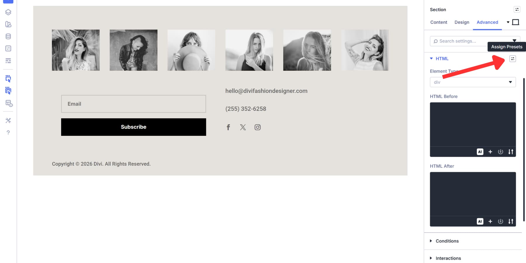
Semantic Elements in Divi 5 put control over your HTML markup directly in the builder. You don’t need custom code or plugins to swap a div for a button tag or add ARIA labels to improve accessibility. The tools sit right in the settings panel where you’re already working.
Every module gets an HTML option group in the Advanced tab. Open it, and you’ll find Element Type at the top. That dropdown lets you change any element’s underlying tag. Wrap a group of links in a <nav> element for clearer navigation semantics. Make a container a header. Convert an icon into a proper button. The styling stays the same. The semantic meaning shifts.
Element Type controls what your modules become in the code. A Button Module styled to look clickable can stay as a link when it navigates somewhere, or become a true button when it performs an action. You’re deciding this upfront instead of accepting whatever default Divi chooses.
Custom Attributes Add Another Layer
Custom Attributes sit just below Element Type in that same panel. This tool handles ARIA roles, data attributes, and keyboard focus controls. Anything that tells browsers and assistive technology how your elements function goes here. You pick what you’re targeting, name the attribute, and set the value.
Button and link markup get precise with this feature. Element Type might turn your Icon Module into a button tag, but Custom Attributes lets you target a Contact Form submit to add things like aria-label, data attributes, or tracking hooks without changing the form structure. In most cases, the submit is already a real button, so you typically don’t need role=”button”.
Both tools work inside the Visual Builder. You build the design, then define what everything means in the same interface. They give you complete control over whether something acts as navigation or performs an action on the page.
How To Access These Settings In Any Module
Open any module’s settings panel and click the Advanced tab. You’ll see two new option groups near the top: Attributes and HTML.
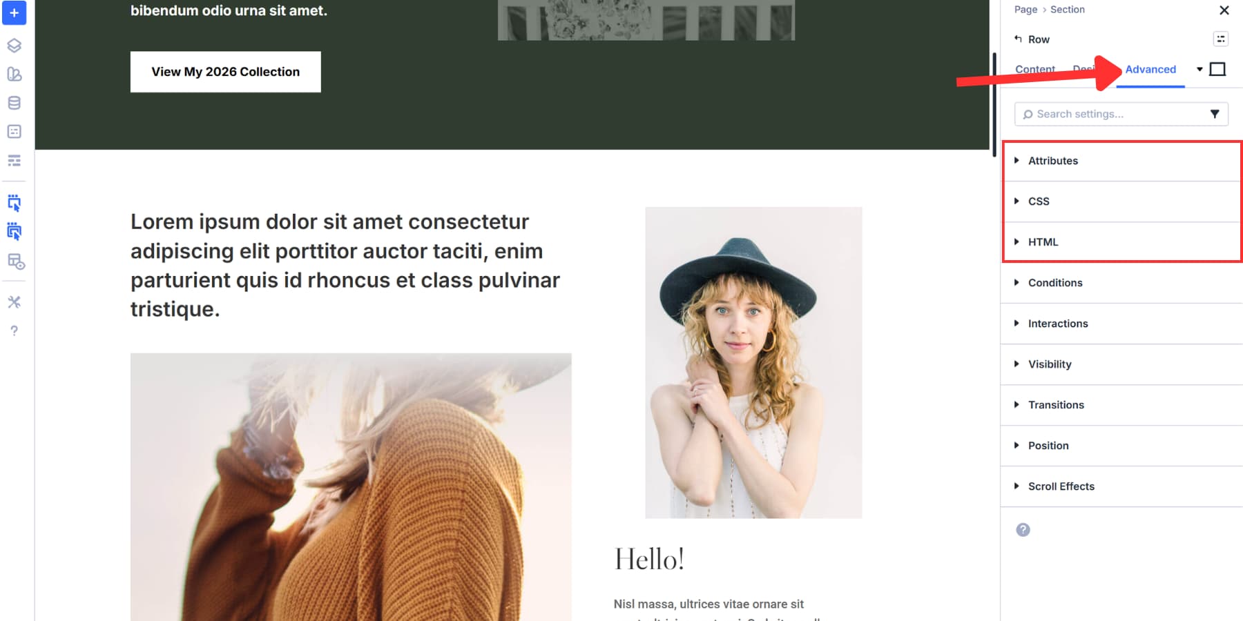
HTML contains Element Type. Click the dropdown to see all available semantic tags. Pick one, and Divi swaps the default wrapper tag for whatever you selected. The module looks the same on your page. The code underneath reflects the actual purpose of that element.
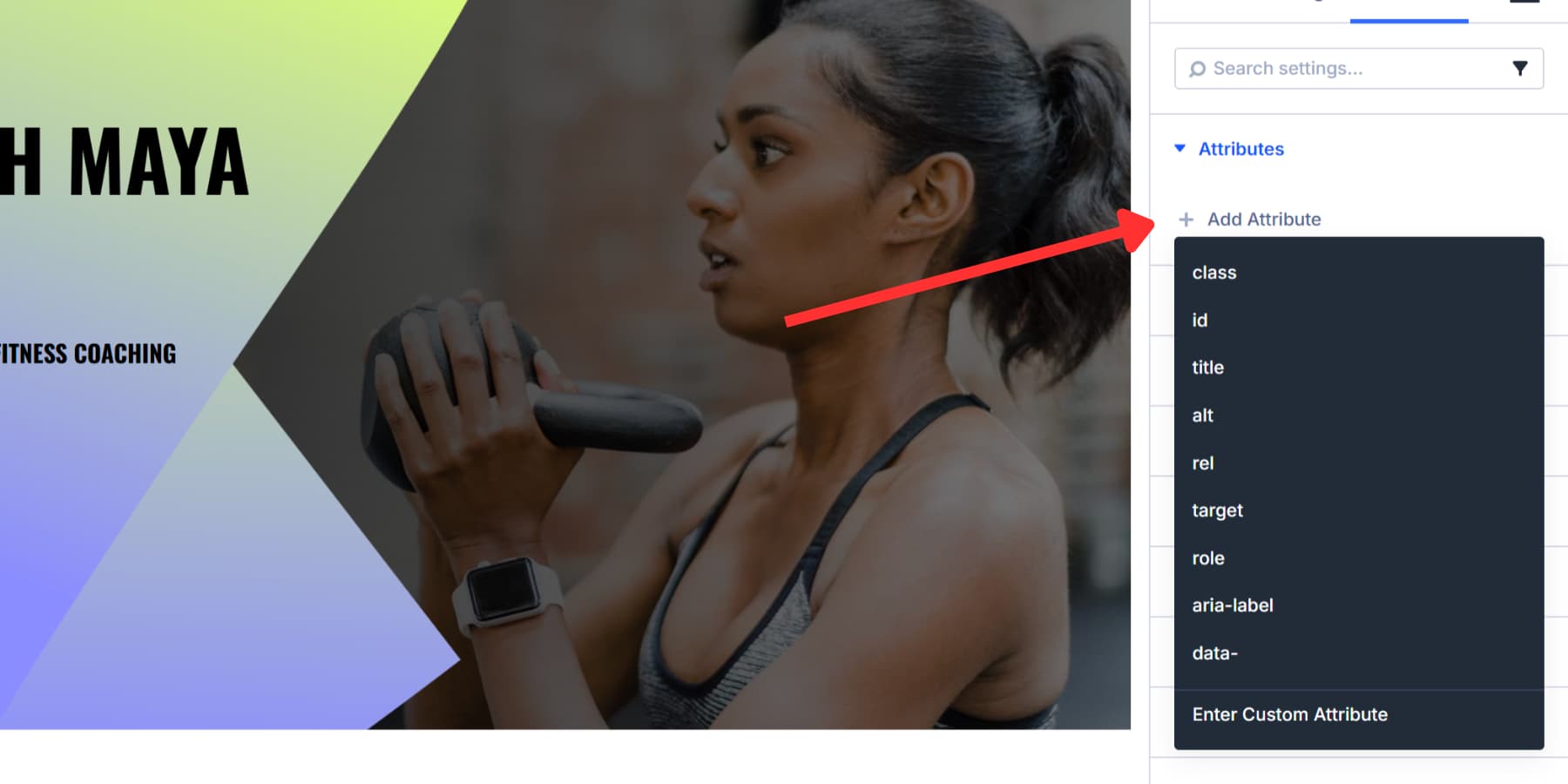
Attributes handle everything else. Click Add Attribute to start. You’ll get fields for Target Element, Attribute Name, and Attribute Value. Attribute Name is where you type what you’re adding: role, aria-label, data-tracking, whatever you need. Attribute Value is what you’re setting it to.
Element Type swaps the module wrapper tag. Set an Icon Module’s Element Type to <button>, and it becomes a real button in the markup. Custom Attributes go deeper. They target pieces inside modules without touching the wrapper itself.
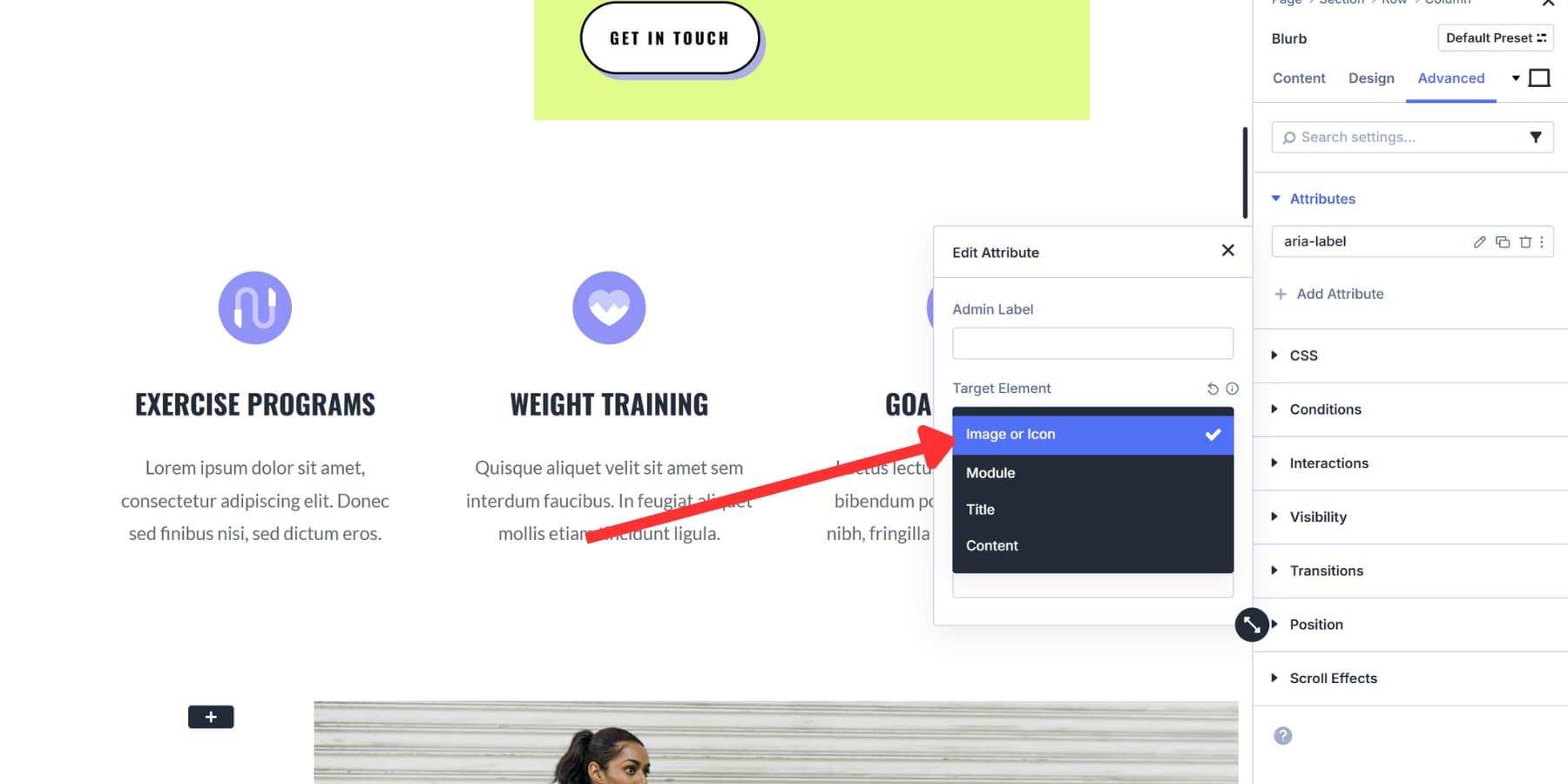
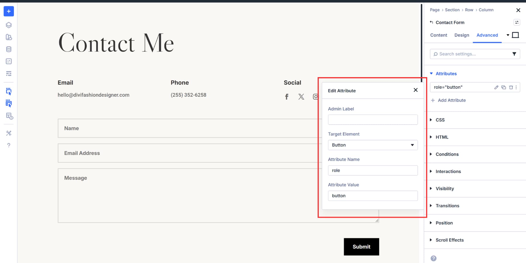
A Contact Form Module contains input fields, labels, and a submit button. All of that sits inside one wrapper. You don’t want to turn the entire form into a button tag. You want to target just the submit element. In most cases, it is already a real button, so you typically don’t need role=”button”. That’s where Custom Attributes come in. Pick the Button from the Target Element, add the role, and you’re done.
Sometimes you’ll use both. An Icon Module opening a popup gets Element Type set to button for the wrapper. Then you add aria-label through Custom Attributes to tell screen readers what clicking it does. Two tools, one element, complete control.
Both options save with the module. Change your mind later, and you can edit or remove them anytime. They also work with Option Group Presets, so you can bundle a set of attributes together and reuse them across your site without rebuilding the setup each time.
Use button tags for actions that happen on the same page. Form submissions, content toggles, popup triggers, and modal windows all require the <button> tag or the role=”button” attribute added via Custom Attributes. These elements perform operations without taking visitors somewhere else:
| Element Type | Button Tag Usage |
|---|---|
| Form Submissions | Contact form submit, newsletter signup submit, search submit |
| Content Toggles | FAQ accordions, show/hide sections, expandable panels |
| Modal Triggers | Popup windows, lightboxes, dialog boxes |
| Interface Controls | Filter buttons, sort controls, tab switchers |
| Menu Actions | Mobile menu open/close, dropdown triggers |
Button actions can also be inside modules with multiple parts. A Contact Form Module includes input fields, labels, and a submit button, all within a single wrapper. You need to target just the submit element.
Click Add Attribute, and you’ll see Target Element with a dropdown showing every component inside that module. Select Button, add role as the attribute name, and button as the value.
The same approach works for Email Optin Modules, search forms, and anywhere else a form needs to perform an action. You’re marking just the interactive element, not the entire module structure. This precision keeps your markup clean and your accessibility accurate.
Choosing Between Element Type And Custom Attributes
The distinction comes down to what you’re targeting. Element Type changes the entire module wrapper. Custom Attributes drill into specific pieces.
Use Element Type when the entire module performs a single action. An Icon Module opening a modal can have its Element Type set to button. The entire icon is treated as a <button> in the code. You could also use role=”button” through Custom Attributes, but Element Type is faster when you’re changing the whole wrapper anyway. Use role=”button” only when you can’t output a real <button>, and make sure keyboard behavior is supported.
Use Custom Attributes when modules have multiple parts. An Email Optin Module has an input field and a submit button. You don’t want the input marked as a button. Just the submit element needs the role=”button” attribute. Target that piece through Custom Attributes and leave everything else alone.
A Few Examples
- A contact form submit should be a real <button> (or input type=”submit”). Use Custom Attributes for aria-label or tracking if needed.
- Newsletter signup form submissions should use real buttons. Add aria-label where the visible text is not specific enough.
- An Icon Module that opens a pricing comparison modal has its Element Type set to button. The entire icon becomes clickable with proper semantics.
- Toggle buttons that show and hide FAQ answers have the role=”button” attribute. Content expands and collapses without leaving the page.
- Filter buttons on a portfolio page sorting projects by category need role=”button”. The page content updates are in place.
- Video play buttons overlaying thumbnail images need the role=”button” attribute. They start playback in an embedded player or lightbox.
When To Use The Link Tag
Use link tags for all navigation. Your site menu, footer links, blog post titles, internal page connections, and external references. Anything that takes a visitor somewhere new needs the <a> tag with an href attribute pointing to that destination:
| Element Type | Link Tag Usage |
|---|---|
| Site Navigation | Menu items, footer links, breadcrumbs |
| Content Links | Blog post titles, "Read More" buttons, related articles |
| Anchor Links | #contact, #pricing, same-page section jumps |
| External References | Outbound links to other websites, resources |
| File Downloads | PDFs, documents, media files with download attribute |
Google follows links with href values. That’s how pages get crawled and indexed. Set your navigation as buttons instead, and search engines won’t find those pages. They stay invisible to organic search.
Divi’s Button Module already uses the <a> tag by default. Type a URL into the link field, and you’re done. The Button Module describes the style, not the tag. When it links somewhere, it outputs an <a> element.
Screen readers announce links differently from buttons. Users can pull up a list of every link on your page to scan where they can go. That only works when you’ve marked them correctly.
When you need actual button behavior for actions like form submissions or pop-up opens, you’ll add role=”button” via Custom Attributes. We’ll cover that in the next section.
A Few Examples
- A Button Module in your header, linked to /contact, uses the default <a> tag. The href points visitors to your contact page.
- Blog post cards with “Read More” styled as buttons remain links. Each one points to a different post URL.
- Anchor links like #services that jump to page sections stay as <a> tags with the # prefix in the href.
- Download buttons for PDFs or price sheets can use an <a> tag, and you can add the download attribute when appropriate.
- Footer social icons linking to your Facebook or LinkedIn profiles are links. External URLs go in the href field.
- Breadcrumb navigation at the top of product pages uses link tags for each clickable segment leading back through your site hierarchy.
Start Building Websites In Divi 5 Today!
Links take people somewhere. Buttons make something happen. When your markup matches that intent, navigation becomes easier to crawl, interfaces become easier to use, and assistive technology announces actions correctly.
With Divi 5, you do not have to guess. Use Semantic Elements to choose the right tag, then use Custom Attributes to add labels, roles when needed, and any extra behavior hooks. Build the design, then make the meaning explicit.
If you want to apply this workflow on real layouts right away, try Divi 5 and start setting proper semantics as you build.


Leave A Reply