
Most designers do not size things once. A heading that looks balanced at 56px on desktop can feel oversized on a phone, so you create a smaller mobile value, then a tablet value between the two. Then you repeat that work for font sizes, section padding, margins, gaps, border radius, widths, and other numeric values across the site.
Fluid sizing with CSS clamp() solves the problem at the math level. One value can scale smoothly between a minimum and maximum as the viewport changes. The challenge is that writing good clamp() expressions by hand takes time, and external generators still leave you copying values into your design system one by one.
Divi 5’s Variable Generator removes that friction. It creates complete sizing scales and adds them directly to your Design Variables. You can generate fluid values for typography, spacing, gaps, radius, border width, width, and more, then reuse those variables in numeric fields across the Visual Builder.
This is the numeric companion to a color-variable workflow. Instead of turning one brand color into a full palette, you turn a few base values into a responsive sizing system.
- 1 Where To Find The Numeric Variable Generator
- 2 One Generator, Multiple Numeric Systems
- 3 Font Size: Build A Fluid Type Scale
- 4 Spacing: Create Consistent Margins And Padding
- 5 Gap: Control Space Between Flex And Grid Items
- 6 Radius: Standardize Corner Rounding
- 7 Border Width: Create Consistent Strokes
- 8 Width: Build Responsive Width Tokens
- 9 Clamp And Size: Generic Numeric Variables
- 10 Customize And Inspect The Generated Values
- 11 Add The Variables To Your Site
- 12 Use Variables With Presets For A Full System
- 13 Why This Beats Manual Responsive Sizing
Where To Find The Numeric Variable Generator
The Variable Generator lives inside the Variable Manager.
- Open any page in the Visual Builder.
- Click the Variable Manager icon in the left sidebar.
- Open or hover over the Numbers group.
- Click the generator icon for the Numbers group to open the Variable Generator.
The generator opens as a full-screen modal. The configuration panel sits on the left, and the live preview sits on the right. As you adjust the settings, the generated scale updates in the preview.
One Generator, Multiple Numeric Systems
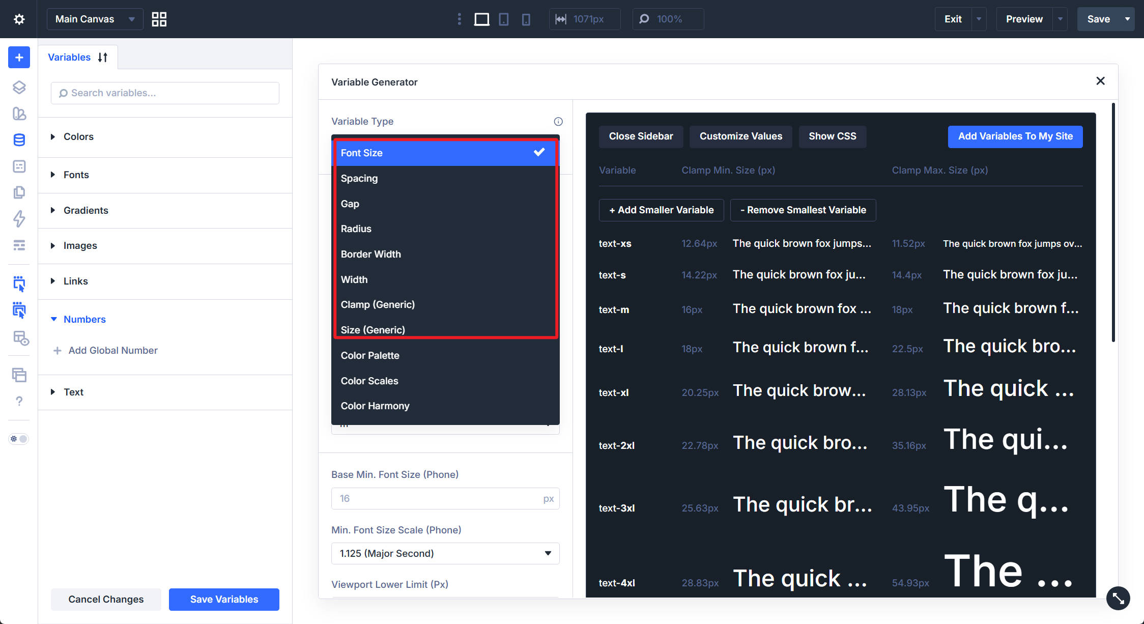
The most important setting is the Variable Type dropdown. It determines the type of numeric variables you are generating and changes the controls shown below it.
The numeric variable types include:
- Font Size: A type scale for headings, body text, buttons, and other text fields.
- Spacing: A spacing scale for margin and padding.
- Gap: A scale for horizontal and vertical gaps in Flexbox and Grid layouts.
- Radius: A scale for border radius values.
- Border Width: A scale for border thickness.
- Width: A scale for element widths, min-widths, and max-widths.
- Clamp (Generic): A flexible clamp-based value for numeric use cases.
- Size (Generic): A generic fixed sizing value for use cases that do not need a full scale.
Each numeric type follows the same basic workflow.
- Scale Type: Choose whether the generator creates a fluid scale with clamp(), a fixed responsive scale with values per breakpoint, or a fixed single scale with one value across screen sizes.
- Variable Prefix: Set the naming prefix for the generated variables.
- Suffix Style: Choose how generated steps are named, such as T-shirt sizes or numeric steps.
- Base Size: Choose the anchor step for the scale.
- Minimum And Maximum Values: Define the smallest and largest values the scale should use.
- Ratios: Control how aggressively smaller and larger steps move away from the base size.
- Generated CSS Units: Choose the output unit, such as px or rem.
- 1rem Equals: Define the rem-to-pixel conversion used in the preview and generated values.
The preview reflects the generated values instantly. You can review the scale visually, inspect the generated CSS, customize individual values, and then add the variables to your site.
Font Size: Build A Fluid Type Scale
Font Size is usually the best place to start because typography is one of the most visible parts of a responsive design system.
With Scale Type set to Fluid Scale (CSS Clamp), Divi generates font size variables that scale between a minimum and maximum value as the viewport changes.
You define the phone side of the range with Base Min. Font Size and a minimum ratio. Then you define the desktop side with Base Max. Font Size and a maximum ratio. The viewport settings determine the range where the value grows.
The ratio settings are what make the type scale feel intentional. A tighter ratio on small screens keeps headings from becoming too large. A stronger ratio on desktop lets headings scale up with more impact.
The preview shows each generated step, such as text-xs, text-s, text-m, text-l, and larger heading values. You can add or remove smaller and larger steps before importing the scale.
The default settings are a good starting point if you do not want to tune the math manually. After importing the variables, you can use them in font size fields across Text modules, Heading modules, Button modules, Blurbs, and other text option groups.
A fluid type variable covers the full responsive range in one value. That means you do not need to manually set separate phone, tablet, and desktop font sizes for every text element unless a specific design calls for an override.
Fluid, Fixed Responsive, And Fixed Single
The Font Size generator can also create non-fluid systems.
- Fluid Scale: Outputs clamp() values that scale smoothly between a minimum and maximum.
- Fixed Responsive: Outputs separate values for breakpoints such as phone, tablet, and desktop.
- Fixed Single: Outputs one static value across screen sizes.
Fluid Scale is usually the most useful option for a modern responsive sizing system. Fixed Responsive works when you want explicit breakpoint control. Fixed Single works when a value should not change across screen sizes.
Spacing: Create Consistent Margins And Padding
Switch Variable Type to Spacing to generate a scale for margin and padding values.
The controls are similar to Font Size. You choose minimum and maximum base values, set ratios, choose naming options, and preview the generated scale. The defaults are tuned for layout spacing rather than typography.
A Generate Space-0 toggle can add a zero value to the scale. This is useful when you want a formal variable for removing margin or padding without typing a manual value.
The preview shows each spacing step as a visual block, making it easier to judge the rhythm of the scale.
After importing, use spacing variables in margin and padding fields across sections, rows, columns, and modules.
For example, you might use:
- space-s for tight internal padding
- space-m for standard module spacing
- space-l for section padding
- space-xl for larger hero or landing page spacing
A shared spacing scale helps your layouts feel connected. Instead of choosing random padding values on each page, you reuse a small set of responsive decisions.
Gap: Control Space Between Flex And Grid Items
The Gap type creates variables for horizontal and vertical gap fields.
Gaps control the space between Flexbox and Grid children. They are different from padding because they affect the relationship between items rather than the space inside an item.
The Gap generator uses the same fluid logic and displays a preview with paired items so you can see how each value affects the space between elements.
Use these variables in Divi 5’s Layout option group, where horizontal and vertical gap settings are available for Flexbox and CSS Grid layouts.
Fluid gap variables are especially useful in responsive card grids, feature rows, product layouts, testimonial sections, and navigation layouts. As the viewport narrows, the gap can scale with the rest of the design instead of staying locked to one fixed pixel value.
Radius: Standardize Corner Rounding
The Radius type creates a scale of border radius values.
Use it to standardize the corner style of buttons, cards, images, forms, containers, and other framed elements. The Radius generator includes optional settings such as:
- radius-none: A zero-radius value for square corners.
- radius-full: A fully rounded value for pills, circles, and strongly rounded shapes.
The preview renders rounded boxes so you can see the curvature of each step.
Apply these variables in the Border option group’s border radius fields.
A shared radius scale helps your design feel intentional. Buttons, cards, forms, images, and containers can all pull from the same set of corner values instead of each using a slightly different radius.
Border Width: Create Consistent Strokes
The Border Width type generates a scale for border thickness.
These values are smaller than spacing or width values by nature, but they still benefit from standardization. A consistent border width scale keeps cards, inputs, buttons, dividers, and framed elements visually aligned.
The generator can also create a border-none token for removing borders through a variable.
Use these variables in the Border option group’s border width fields.
They can also be useful in SVG workflows when a numeric stroke value is available. A shared stroke scale helps line weights feel consistent across icons, illustrations, and interface elements.
Width: Build Responsive Width Tokens
The Width type creates variables for element width values.
These values are useful for containers, cards, media blocks, buttons, forms, images, and layout elements that need a controlled width or max-width.
The Width generator includes a Generate Width-Full toggle for a full-width token. The preview shows each generated width as a horizontal bar, so the scale is easy to compare visually.
Use width variables in the Sizing option group on sections, rows, columns, and modules.
A fluid width variable can let an element grow with the viewport up to a sensible ceiling. This is often cleaner than setting fixed widths separately for each breakpoint.
Clamp And Size: Generic Numeric Variables
The last two numeric types are for values that do not fit neatly into the main token families.
Clamp (Generic)
Clamp (Generic) creates a fluid clamp() value for a custom use case.
Use it when you need one responsive value instead of a full scale. You set the variable name, minimum value, maximum value, and viewport range. Divi generates a variable that scales between those values.
This is useful for one-off fluid values such as a custom icon size, decorative offset, media height, special container width, or other numeric setting that should scale smoothly.
Size (Generic)
Size (Generic) creates a fixed numeric variable for use cases outside the main sizing systems.
Use it when you need a reusable number that should not become part of a larger scale. Depending on the selected scale type, you can use it for static or responsive values.
Generic variables are best used sparingly. The main token families should cover most of your design system. Use generic values when a design needs something specific.
Customize And Inspect The Generated Values
The preview area includes tools for reviewing and adjusting the generated variables before you add them to your site.
Customize Values
Click Customize Values to edit individual generated values. This is useful when the overall scale is right, but one step needs a small adjustment.
Use this carefully. Too many manual changes can weaken the consistency of the scale. It is best for small corrections, not for rebuilding every value by hand.
Show CSS
Click Show CSS to inspect the generated CSS for each variable. This lets you review the clamp() or calc() output before importing the variables.
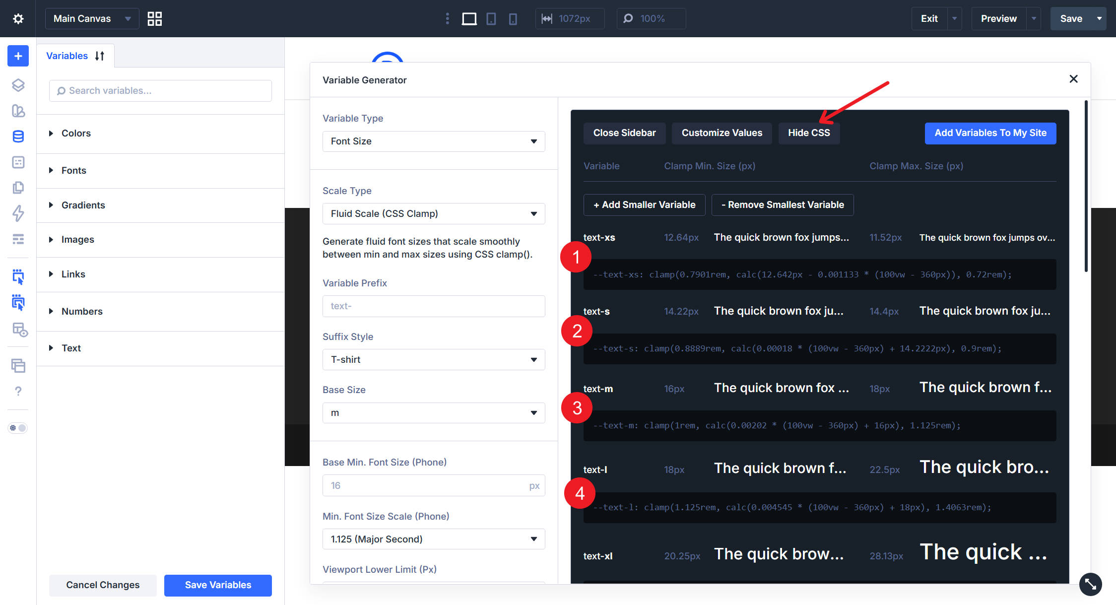
This is helpful if you want to understand the math behind the scale, document your system, or confirm that the generated values match your intended range.
Add The Variables To Your Site
When the scale looks right, click Add Variables To My Site.
Divi adds the generated values to the Numbers group in the Variable Manager as individual numeric Design Variables. The names use the prefix and suffix settings you chose in the generator.
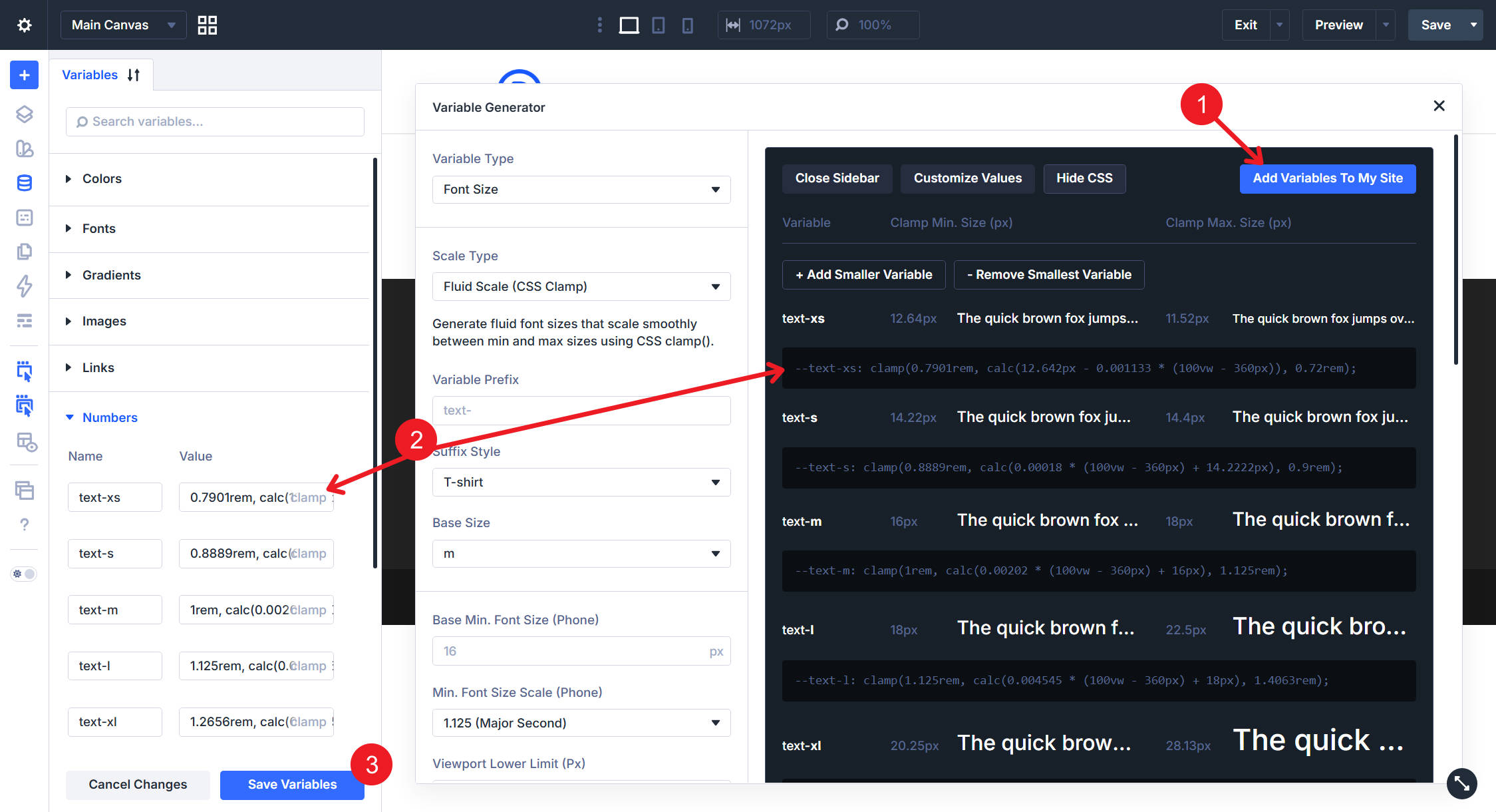
Review the new variables in the Numbers group, then click Save Variables to commit the changes.
After that, the variables are available in supported numeric fields throughout Divi. Use them for font sizes, margin, padding, gap, radius, border width, width, and other numeric values.
Use Variables With Presets For A Full System
The Variable Generator creates the values. Presets decide where those values get used. A strong Divi 5 workflow looks like this:
- Generate your numeric variables with the Variable Generator.
- Apply those variables to module settings such as typography, spacing, borders, and sizing.
- Save those settings as Option Group Presets or Element Presets.
- Use those presets across your site so new modules inherit the same sizing system.
For example, you might create a Button Element Preset that uses your generated font size, padding, radius, and border width variables. You might also create a Card Border Option Group Preset that uses your shared radius and border width variables.
Variables hold the reusable numbers. Presets apply those numbers to real design patterns.
Why This Beats Manual Responsive Sizing
Manual responsive sizing works, but it does not scale well. You set desktop, tablet, and phone values on one module, then repeat the same decisions across the site.
The Variable Generator in Divi 5 gives you a more systematic workflow. You define the rules once: base values, ratios, viewport range, units, and naming. Divi creates the variables and stores them where you can reuse them.
That gives you three advantages:
- Consistency: The same spacing, type, radius, and width values appear across the site.
- Responsiveness: Fluid values can scale smoothly without separate breakpoint edits.
- Maintainability: Updating a variable can update every setting that references it.
Pair these numeric variables with generated color variables, and you get the foundation of a complete Divi 5 design system: colors and numbers defined once, reused through presets, and adjusted from a central place.


Leave A Reply