

Print magazines built reader trust through typography long before the web existed. The way a headline breaks, how wide a column runs, where a paragraph breathes, and how a section begins all tell readers how to move through the page before they read a single sentence.
That same editorial feeling is possible on the web, but it depends on having the right controls in the right place.
Divi 5 now includes a broader set of text styling options directly inside the builder. You can create multi-column text, add drop caps, control paragraph spacing, refine line wrapping, enable hyphenation, use small caps, and set vertical text direction without splitting content into extra modules or writing custom CSS.
In this tutorial, we’ll show you how to use Divi 5’s new text styling options to create magazine-style blog posts that feel more structured, readable, and editorial.
What Makes Blog Text Feel Like A Magazine Page?
Pick up a magazine, and the page already tells you what to read first. That happens before a single word fully registers. The headline, subheading, body text, pull quotes, captions, and section markers all create a visual path.
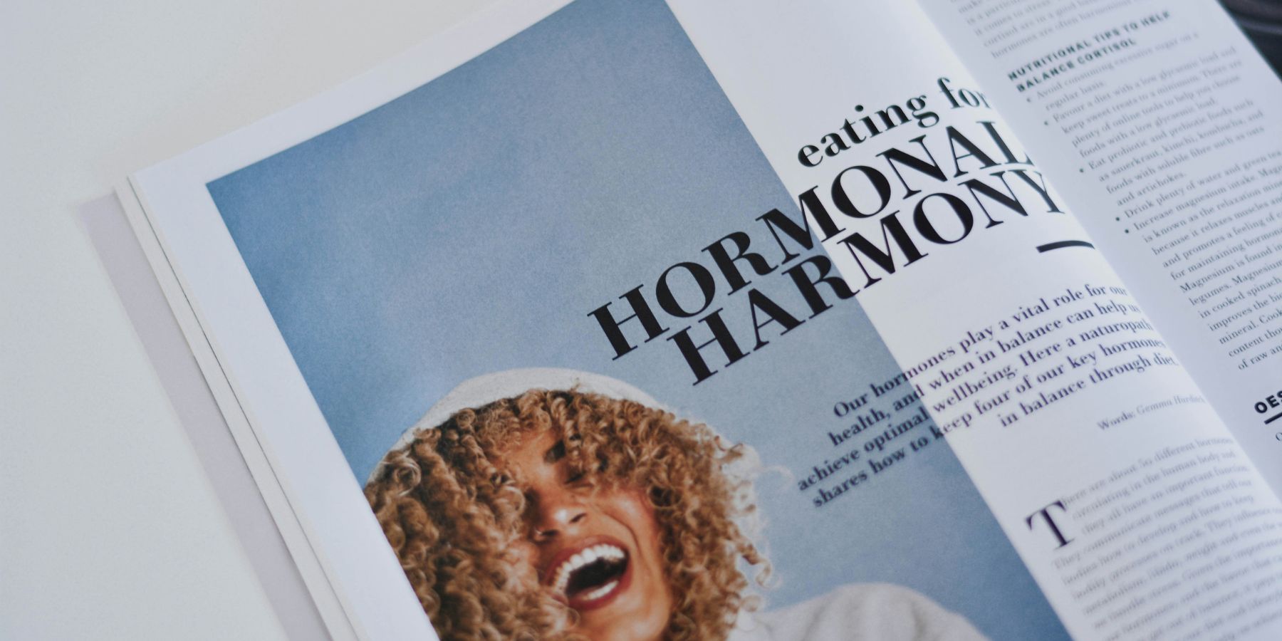
Image by Content Pixie On Unsplash
The headline usually carries the most visual weight. The subheading sits below it with a different size, weight, or rhythm. Body text often runs in narrower columns so the reader’s eye does not have to travel too far across the page. Shorter lines make it easier to return to the next line without losing place.
Drop caps open longer sections and give the first paragraph a stronger entry point. Paragraph spacing controls the pace of the page, giving readers natural stopping points without making the article feel disconnected.
These details do not just make a page look editorial. They help the page read better. Each decision supports the next, and the result feels more intentional than a long block of default text.
Why These Details Matter For Readability
Long-form blog posts ask more from readers than short updates or landing page copy. Before they commit, readers scan the page. They look for structure, hierarchy, section breaks, and signs that the content will be easy to follow.
Clear differences between the headline, subheadings, body copy, quotes, and labels help readers orient quickly. Line length affects how comfortably they move through a paragraph. Paragraph spacing gives the eye clean return points. Drop caps and small caps create editorial moments without needing extra design elements.
The goal is not to make every blog post look like a printed magazine spread. The goal is to borrow the parts that help digital content feel easier to enter, scan, and finish.
Introducing Divi 5’s New Text Styling Options
Divi 5 adds more text styling controls directly inside the Design tab, alongside the font, size, color, alignment, and spacing settings you already use.
These controls include column counts, drop caps, text direction, stroke position, capitalization, paragraph and list spacing, hyphenation, and line wrap styles. They are available across relevant title and body text option groups, so you can shape different text types independently.
That matters for blog layouts. A heading can use balanced wrapping while body text uses default wrapping. A paragraph can flow through two columns while a blockquote stays full width. A section label can use small caps while the main body stays in sentence case.
Instead of treating the text as one large block, Divi 5 lets you style each part of the article with more intention.
7 Ways To Style Blog Posts Like A Magazine
The controls below are most powerful when used together. You do not need to apply every setting to every post, but each one solves a different editorial problem.
1. Set Up Multi-Column Body Text
Long lines can make body text feel heavier than it needs to be. When a paragraph stretches across a wide layout, the reader’s eye has to travel farther to the right and then find the next line again on the left.
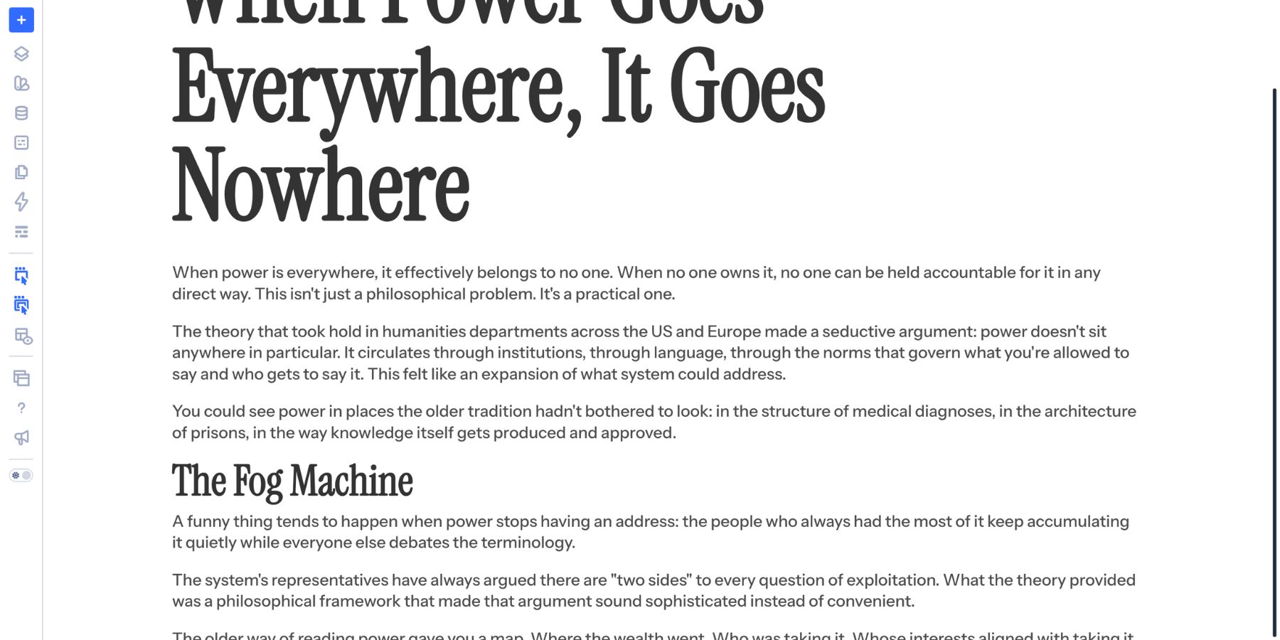
Multi-column text helps by shortening the line length. The same content becomes easier to scan because the reader’s eye travels a shorter distance before returning to the next line.
In Divi 5, you can create columns from a single text control. Open the relevant text option group and enter a value in the Text Columns field. The paragraph divides immediately without extra containers or duplicate modules.
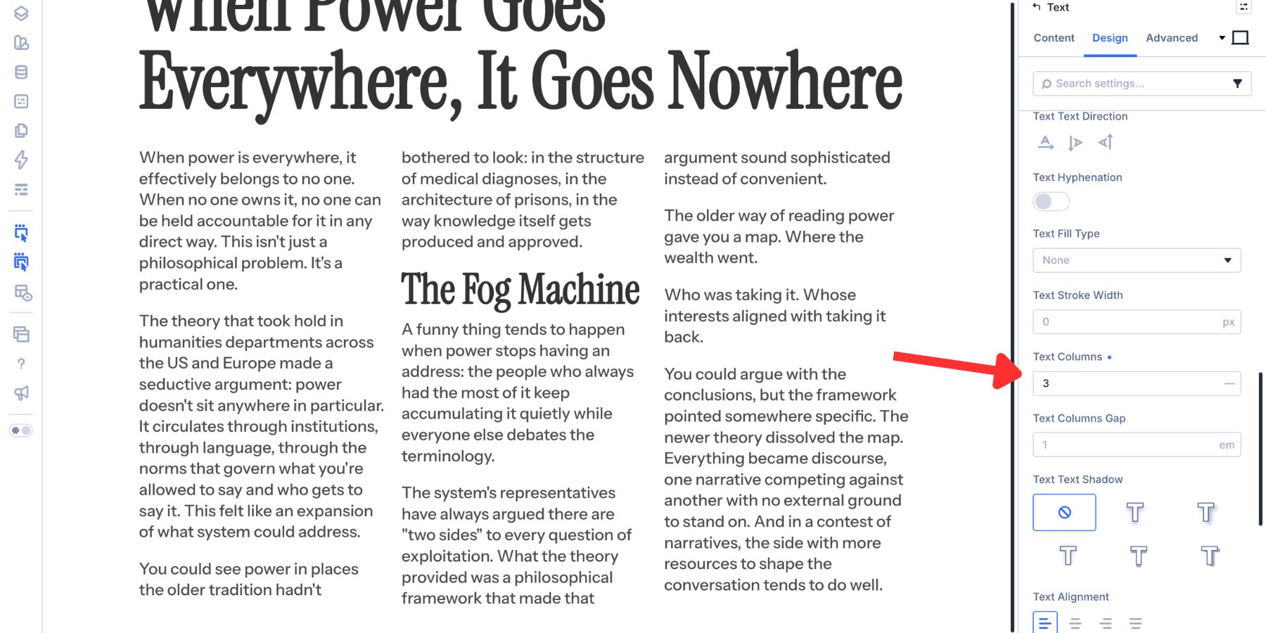
The useful part is that each text type can have its own column setting. A long paragraph can use two columns, while a blockquote stays full width. A heading can stay in one column, while the body copy beneath it flows into two or three. Divi 5 includes column controls for multiple text types, including:
- Link Columns: For standalone links.
- Unordered List Columns: For bulleted lists.
- Ordered List Columns: For numbered lists.
- Heading Text Columns: For heading levels H1 through H6.
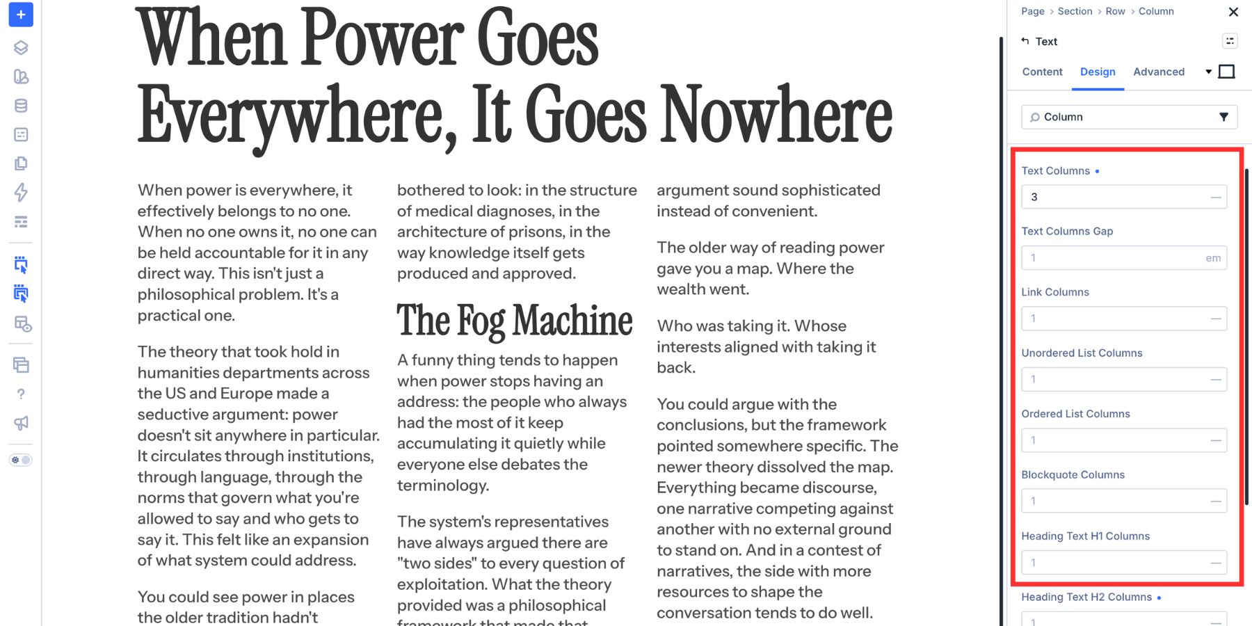
Use columns for longer passages, editorial intros, feature-style articles, and blog posts where the text width feels too wide. On smaller screens, reduce the column count so the layout stays readable.
2. Add Drop Caps To Open Sections
Drop caps give a long section a stronger opening. The enlarged first letter creates a visual entry point, helping readers understand where the next thought begins. In Divi 5, you can apply a drop cap by adjusting the Drop Cap Line Size value in the body text settings.
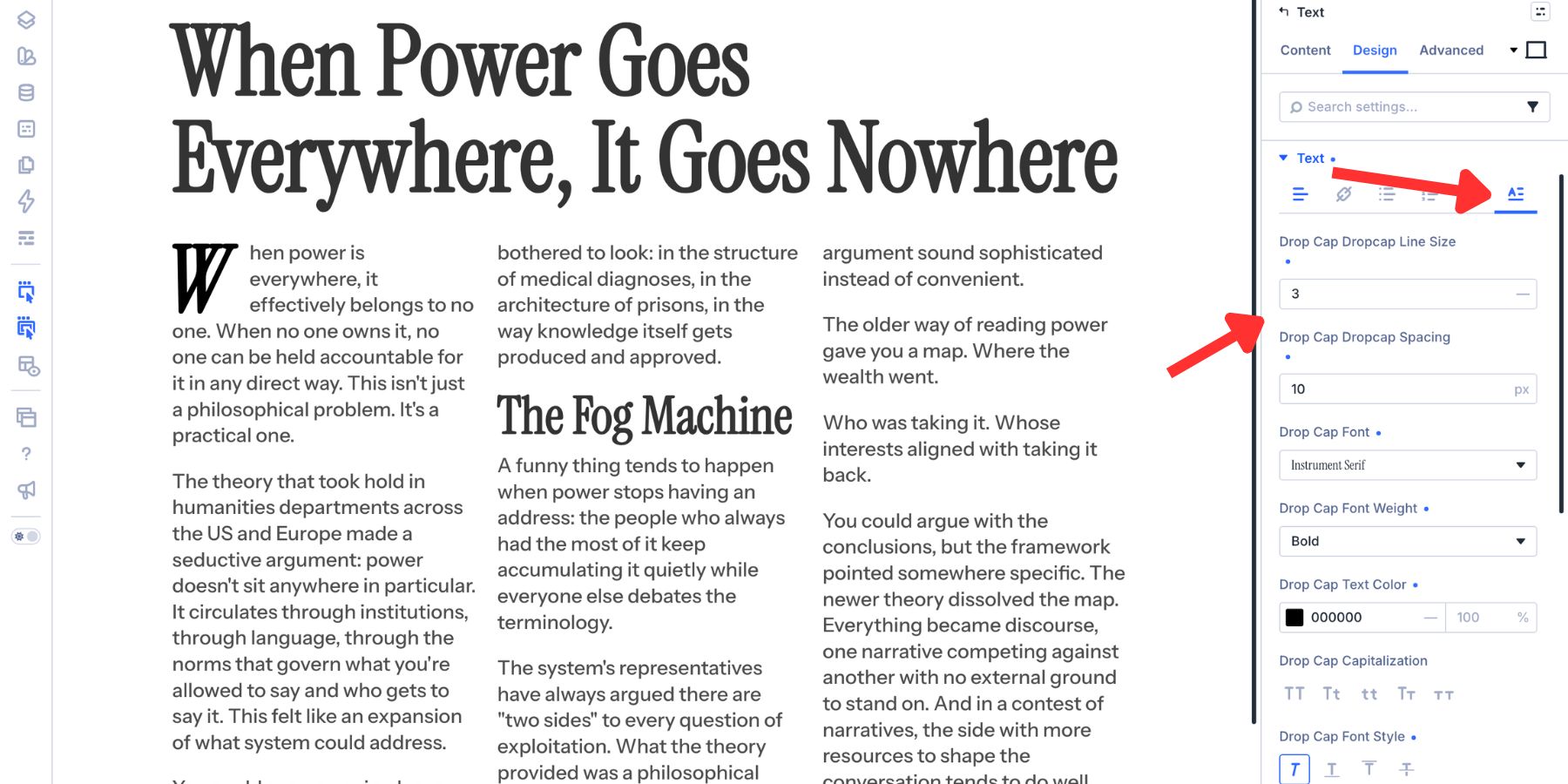
If you are unsure where to start, try a drop cap that spans three lines. That gives the opening letter enough presence without overwhelming the paragraph. After the line size is set, adjust the supporting settings:
- Drop Cap Spacing: Controls how close the body text sits beside the enlarged letter.
- Font: Lets the first letter use a different typeface if the design needs contrast.
- Font Weight: Adds or reduces visual mass.
- Text Color: Lets the drop cap use an accent color.
- Capitalization, Font Style, And Text Shadow: Add finishing details when the drop cap needs more character.
Drop caps work best at the beginning of substantial sections. Avoid using them on every short paragraph. The more often they appear, the less special they feel.
3. Adjust Paragraph Spacing
Line height and paragraph spacing are related, but they do different jobs. Line height controls the space between lines inside the same paragraph. Paragraph spacing controls the gap between separate paragraphs.
In Divi 5, Paragraph Spacing is handled inside the text option group. It applies spacing within the text content itself rather than pushing the entire module around from the outside.
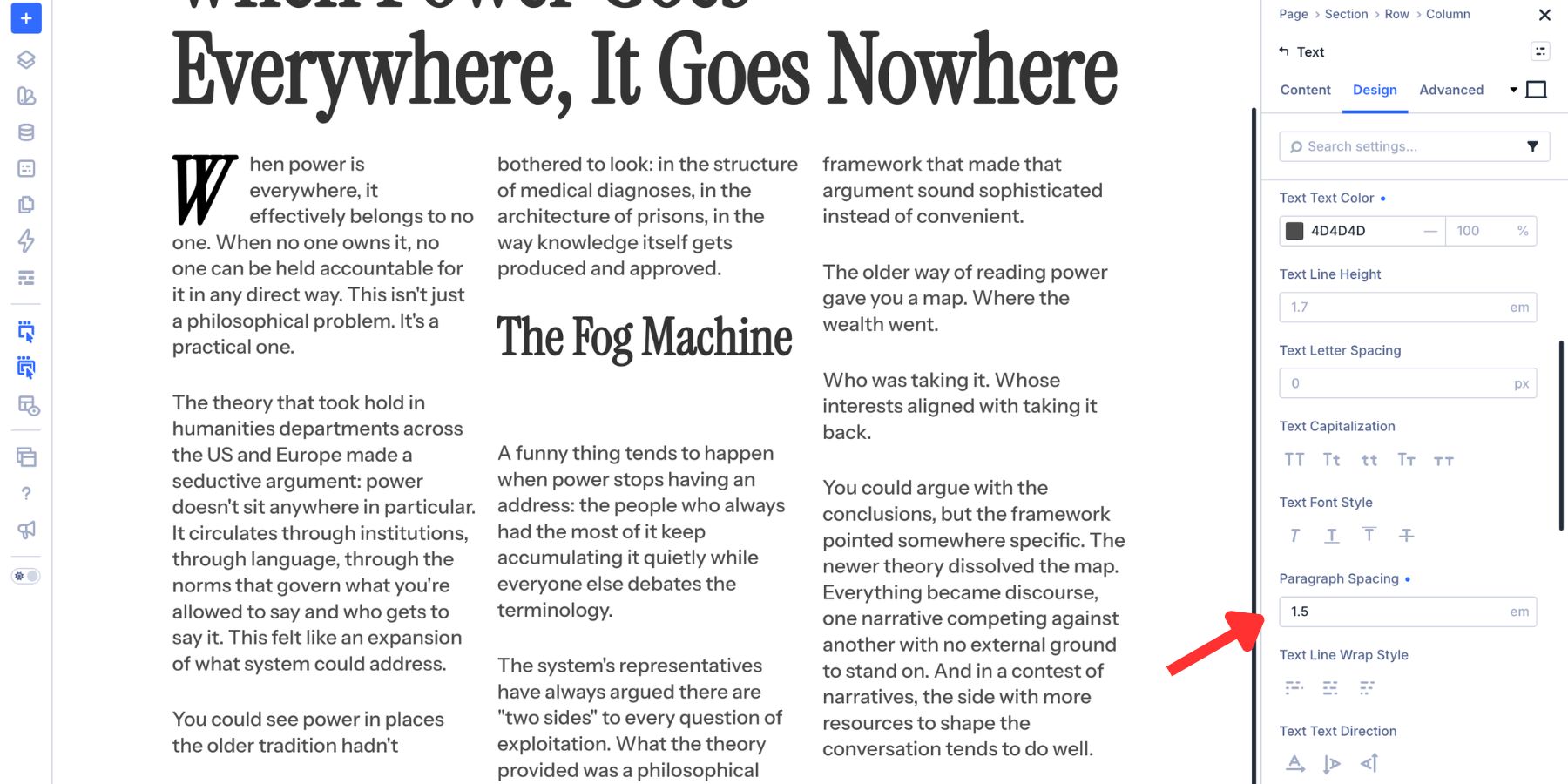
That makes it useful for long-form posts. The spacing travels with the text and keeps paragraphs from collapsing into one dense block.
The default unit is em, which ties the spacing to the font size. Larger text gets more breathing room, and smaller text stays tighter. You can also use units such as px, %, rem, vw, vh, vmin, vmax, or functions like calc(), min(), max(), and clamp().
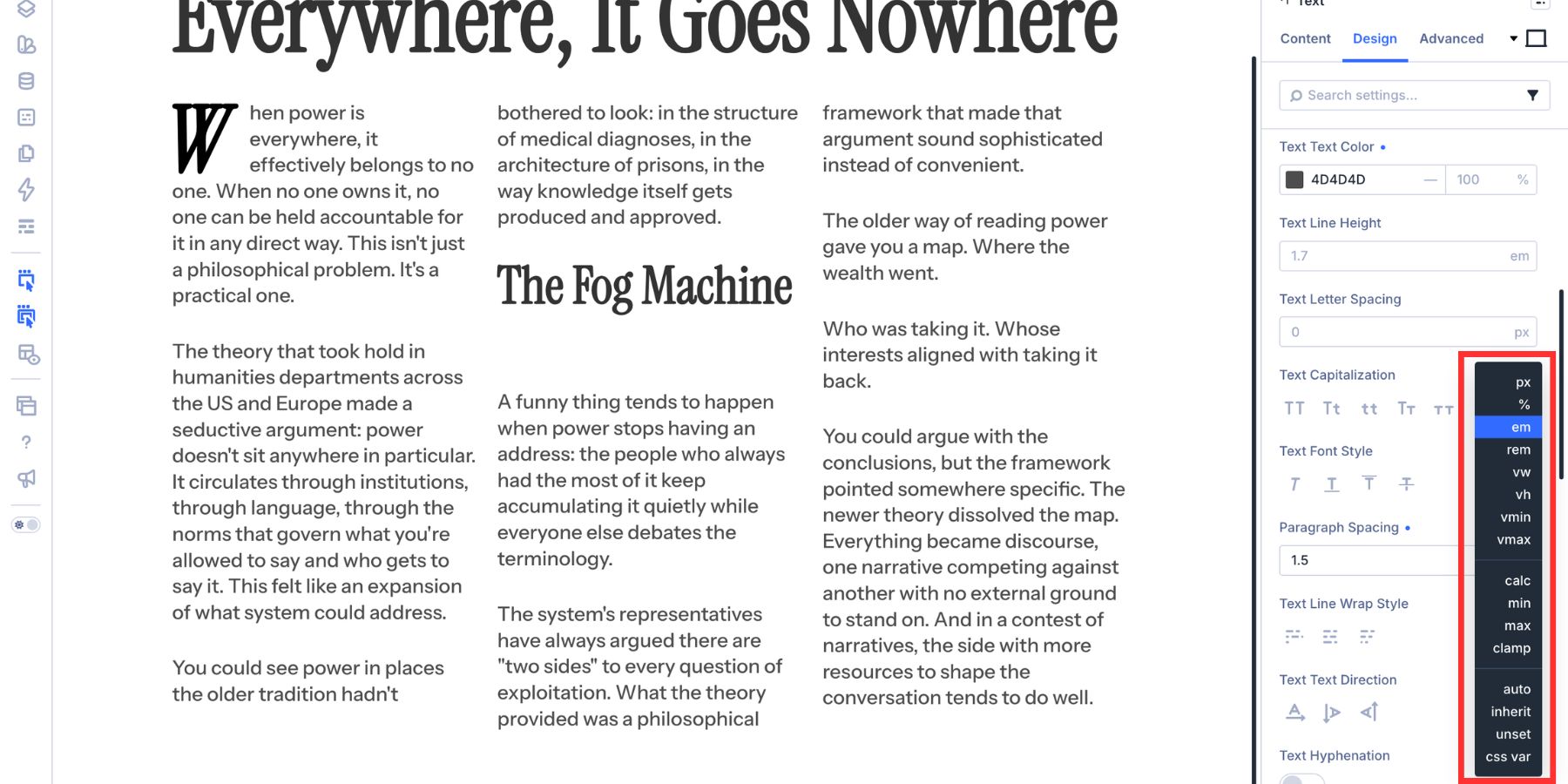
clamp() is especially useful for fluid editorial layouts. It lets you set a minimum, preferred, and maximum value so spacing can respond to screen size without becoming too tight or too loose. For a full workflow, read our guide on building fluid spacing ramps with clamp() in Divi 5.
4. Choose The Right Line Wrap Style
A heading that breaks awkwardly can make a layout feel unfinished. A final line with one lonely word can interrupt the rhythm of a paragraph. Both issues come down to how the browser wraps text. Divi 5’s Text Line Wrap Style gives you three options.
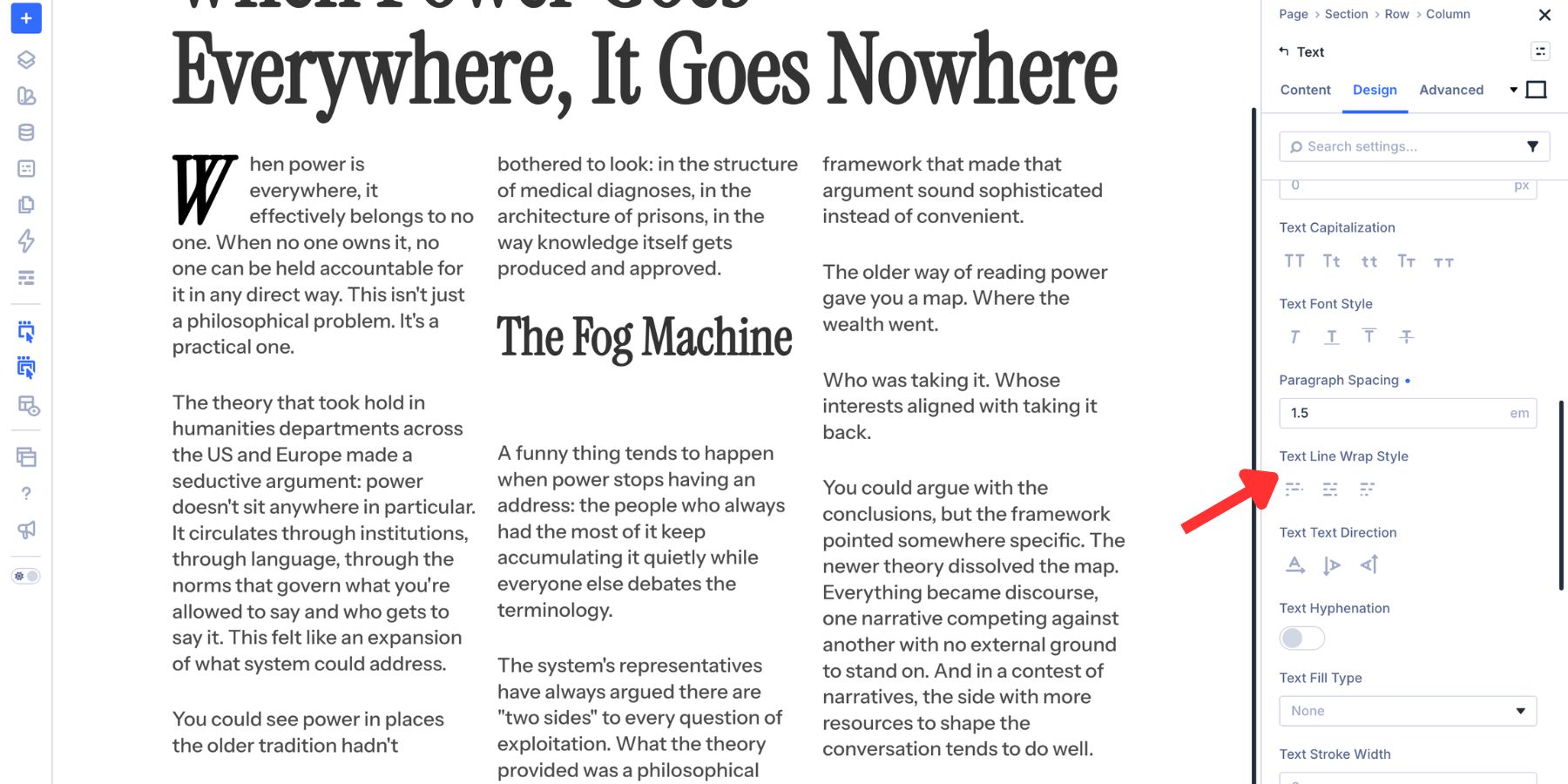
- Default: Uses the browser’s normal wrapping behavior.
- Balanced: Distributes short text more evenly across lines, which is useful for headings.
- Pretty: Helps avoid awkward last-line endings, especially in body text.
Each text type has its own line wrap controls. Body text, links, unordered lists, ordered lists, blockquotes, and heading levels H1 through H6 can be handled separately.
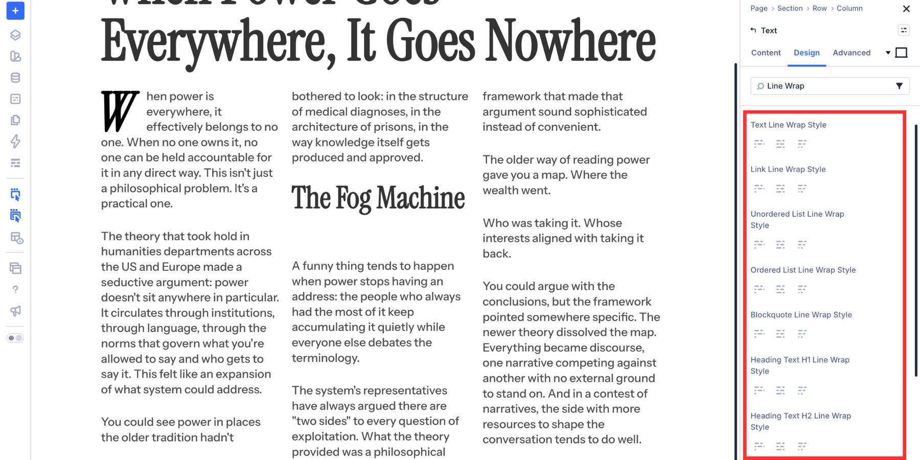
For editorial layouts, Balanced usually works well on headings because uneven heading breaks are highly visible. Pretty can work well on body copy where an orphaned word at the end of a paragraph disrupts the reading rhythm.
Use these settings selectively. Body text and headings often need different wrapping behavior.
5. Enable Hyphenation In Narrow Columns
Columns improve line length, but they also make each line narrower. That can create problems when the content includes long technical terms, URLs, product names, or compound words.
Hyphenation helps those long words break at more natural points instead of overflowing the column or creating awkward gaps. Divi 5 includes a Text Hyphenation toggle for different text types, including body text, links, lists, blockquotes, and headings.
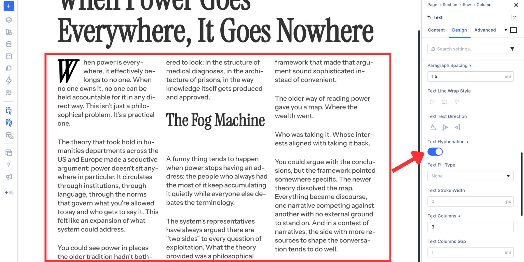
The separation is useful. You can enable hyphenation for body copy inside a narrow column while leaving headings untouched.
That distinction matters. Body text may benefit from cleaner word breaks, but a hyphenated H1 can interrupt the headline’s impact. For most magazine-style layouts, turn hyphenation on where long-form reading needs help and keep it off where display typography needs to stay intact.
6. Apply Small Caps For Editorial Detail
Small caps are useful for bylines, section markers, metadata, labels, and short editorial cues. They feel structured without carrying the same visual weight as full uppercase text. Print publications often use small caps when they want a line of text to feel deliberate without competing with the headline above it.
In Divi 5, open the relevant body text or heading text option group in the Design tab. Then choose Small Caps from the Text Capitalization controls.
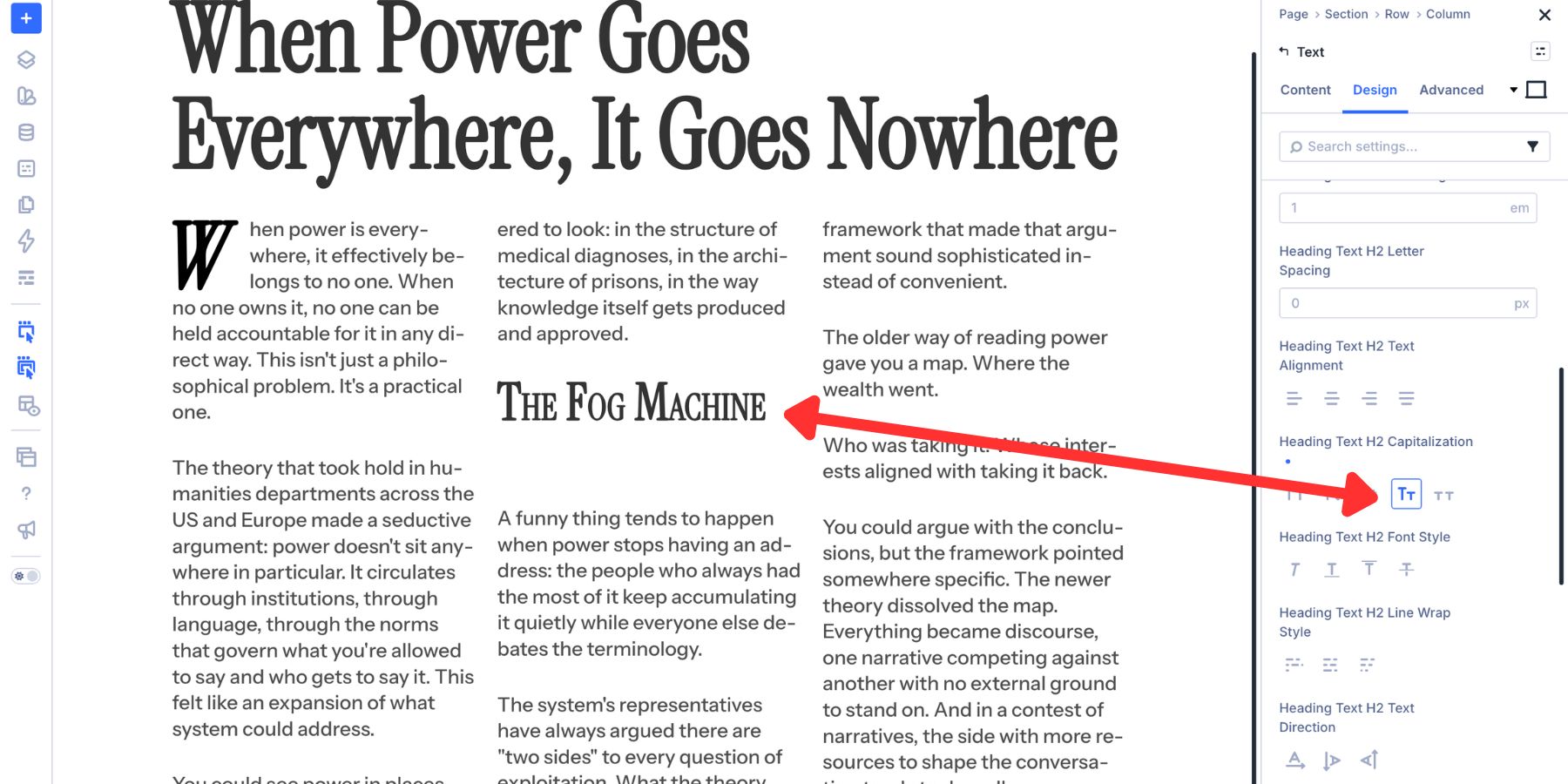
The capitalization row also includes other options:
- All Caps: Converts text to uppercase for maximum emphasis.
- Capitalize: Capitalizes the first letter of each word.
- Lowercase: Converts all text to lowercase.
- Small Caps: Displays lowercase letters as smaller uppercase forms.
- All Small Caps: Applies small-cap styling across the full line.
Use small caps sparingly. They work best on short text, not long paragraphs.
7. Control Text Direction For Sleek Headings
Magazine layouts often use side labels, vertical markers, and directional text to create structure around the main article content. Divi 5’s Text Direction controls make that kind of treatment easier to build visually. For this example, the heading and body text sit in separate columns.
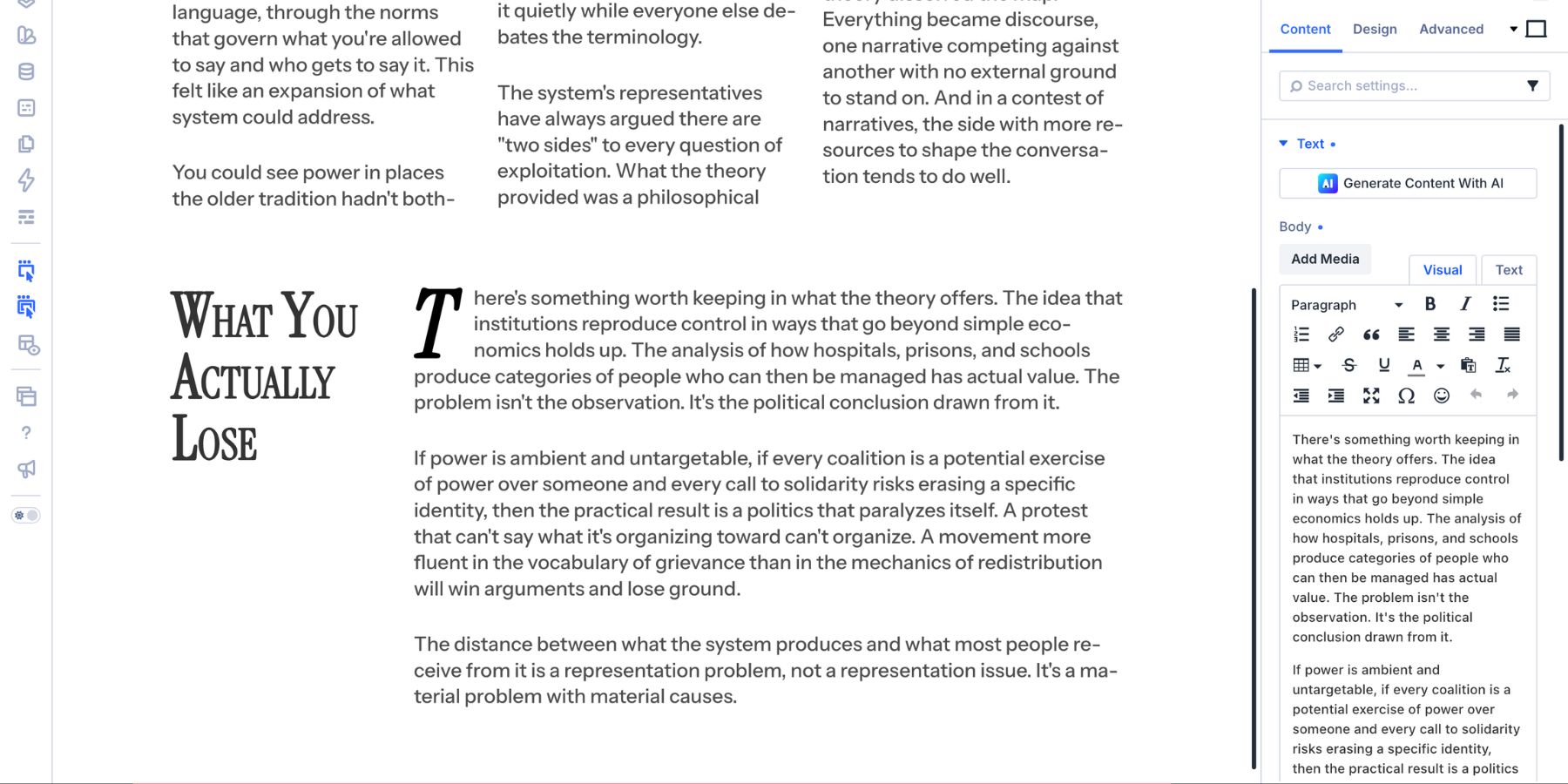
Divi 5 includes three text direction options:
- Standard Horizontal: Text flows normally across the line.
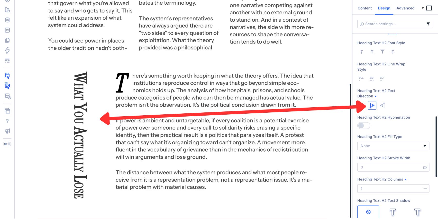
- Vertical Right To Left: Text runs vertically, with new lines starting to the left.
- Vertical Left To Right: Text runs vertically in the opposite direction.
Standard Horizontal is the default.

Vertical Right To Left creates a vertical heading treatment.
Vertical Left To Right creates the alternate vertical flow.
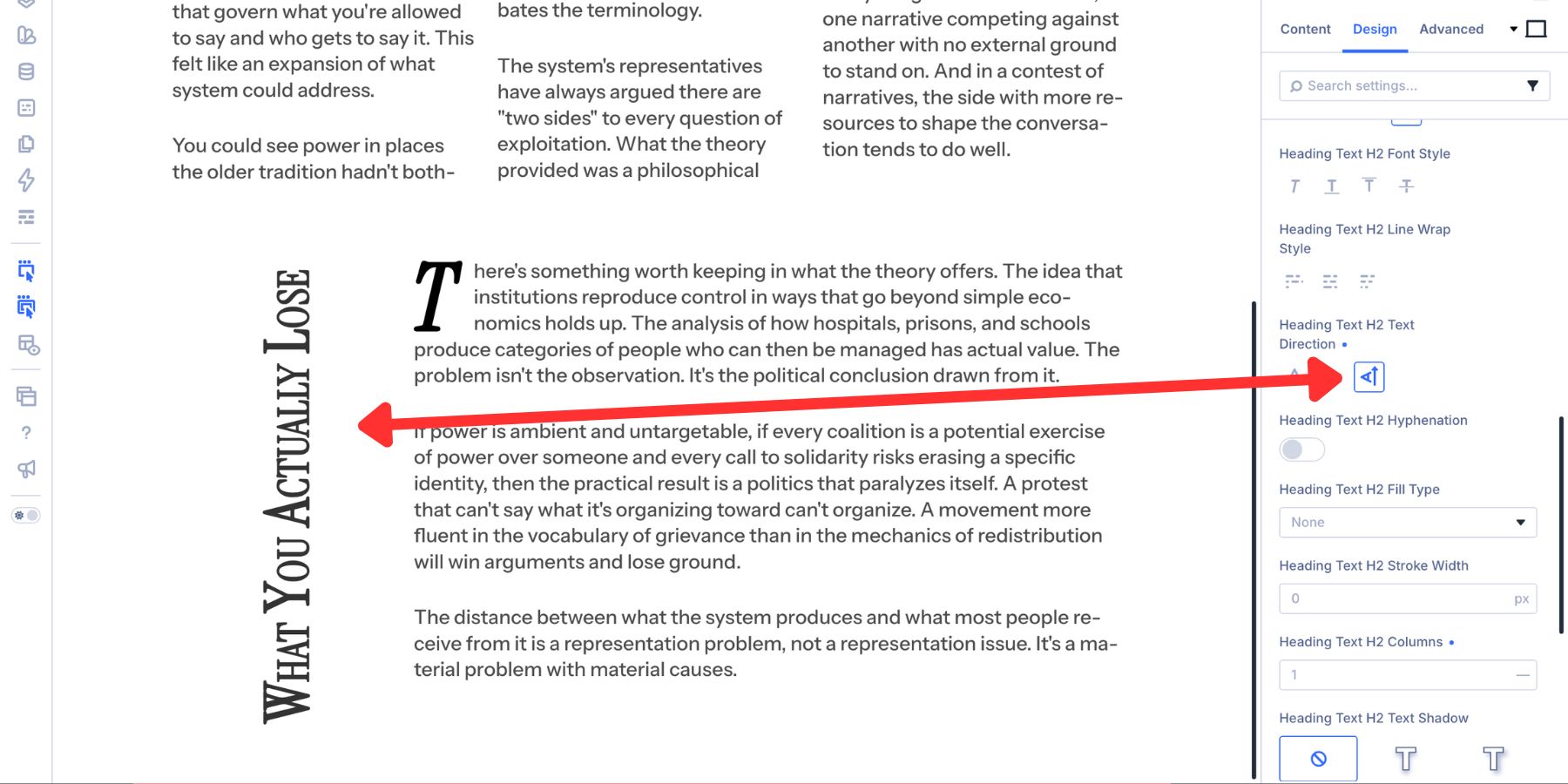
Vertical text works best for short headings, section labels, dates, category markers, or editorial side notes. For anything longer, check readability carefully and adjust the layout at smaller breakpoints. On phones, switching back to Standard Horizontal is often the cleaner choice.
Custom Typography Without Leaving The Divi 5Builder
Magazine-style blog design is not about adding decoration for the sake of it. It is about giving readers a clearer way into the content.
Columns control line length. Drop caps create strong openings. Paragraph spacing sets rhythm. Line wrap styles clean up awkward breaks. Hyphenation helps narrow columns behave better. Small caps add editorial structure. Text Direction creates vertical markers and side labels.
Divi 5 brings these controls into the Visual Builder, inside the same Design tab where you already manage fonts, colors, and spacing. That means you can shape long-form content without splitting every idea into a separate module or reaching for custom CSS.
Use the settings with restraint, combine them where they support the reading experience, and your blog posts can feel more editorial without becoming harder to manage.









Wowww! That’s a lot of control, and much appreciated. Thank you.