

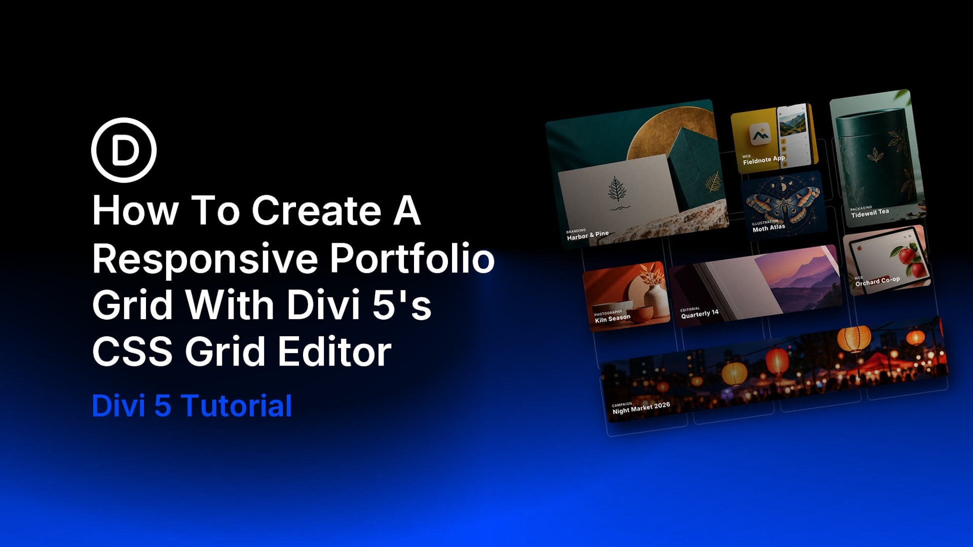
Portfolio projects often need different amounts of space. A brand identity might deserve a large feature card, while a campaign image works across the width of the section. With Divi 5 and its CSS Grid Editor, you can arrange these items with visual controls and adjust for any sized device.
In this tutorial, we’ll build a masonry-style portfolio with eight manually created project cards. The desktop layout combines regular, featured, tall, wide, and full-width cards. We’ll then rearrange it to two columns on tablet and one column on phone.
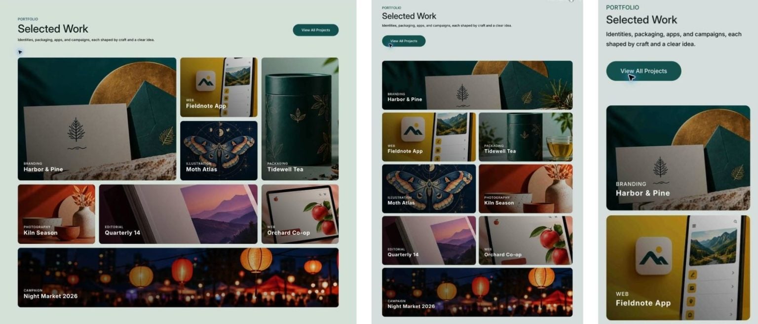
We built this layout to show how portfolio items can extend beyond equal-width columns, then checked the finished design on desktop, tablet, and phone. We’ll adjust the card positions and the column count for each device.
- 1 What Is CSS Grid?
- 2 What Is The CSS Grid Editor?
- 3 Preview And Prerequisites
- 4 Set Up The Portfolio Section And Grid Row
- 5 Portfolio Cards
- 6 Arrange The Desktop Grid With The CSS Grid Editor
- 7 Adapt The Grid For Tablet
- 8 Adapt The Grid For Phone
- 9 Check And Customize Your Portfolio Grid
- 10 Give Your Portfolio Room To Vary
What Is CSS Grid?
CSS Grid is a browser layout system for arranging content in two dimensions: rows and columns. You define both together, allowing elements to share a structure across the page while occupying different amounts of space.
A grid has two parts: the parent container and its direct children, called grid items. The container defines the structure, including track sizes, spacing, and default alignment. Its items occupy that structure.
Each row or column is a track. Where a row and column intersect, they form a cell. The space between tracks forms the gaps. Tracks can be equal in size or use different widths and heights to suit the content.
Grid lines are the boundaries on either side of each track. Items can flow into available cells automatically or start at specific grid lines. A span determines how many tracks an item occupies: spanning two columns makes it wider, while spanning two rows makes it taller. You can also adjust an item’s alignment within its assigned space.
What Is The CSS Grid Editor?
The CSS Grid Editor in Divi 5 is a custom visual component that makes Grid easy to create. You can drag items to new positions, resize them across tracks, and adjust gaps and track sizes. Placement edits are stored as rules on the parent container. Responsive overrides let you adjust the structure for different screen widths.
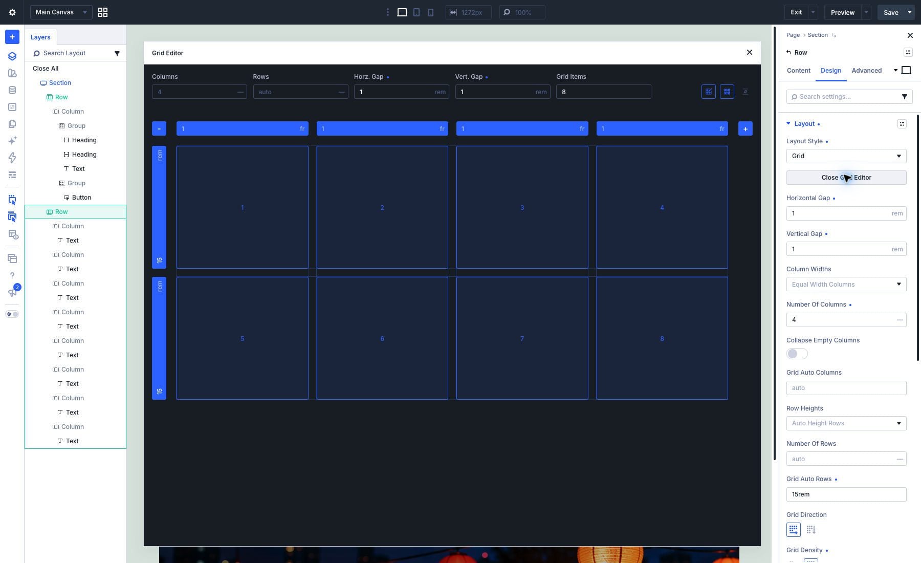
We’ll use these controls to build a portfolio with varied card sizes, then simplify its arrangement for tablet and phone.
Preview And Prerequisites
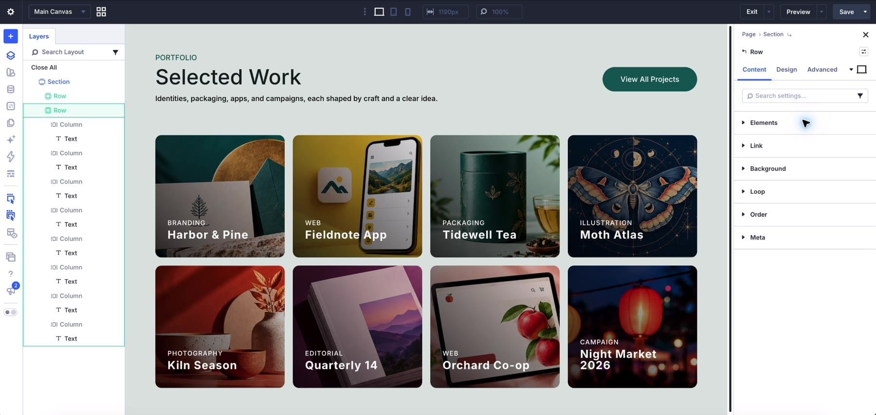
The desktop arrangement places the first project in a two-column, two-row layout. A tall card occupies the right side, a wide card sits further down, and the final project stretches across the bottom of the grid.
On tablet, the featured and banner cards span both columns. The other cards occupy one cell each, with automatic placement determining their starting positions.
On phone, every card occupies a single cell. This produces one vertical sequence of projects with a consistent row height.
Before you begin, have Divi 5 installed and gather eight project images, project titles, and category labels. Optimize each image to keep its file size under 200 KB. Divi 5’s Aspect Ratio and Image Framing settings let you adjust the proportions and positioning of image elements within their frames. Open a page in the Visual Builder and start with a new section for your portfolio.
Set Up The Portfolio Section And Grid Row
Keep the section introduction brief. You can add a heading, such as “Selected Work,” above the grid, followed by a sentence describing the projects. Place that content in a separate row so it remains outside the portfolio’s placement rules.
Set the section’s Background Color to #dbe4df and its top and bottom Padding to 5%. Below your introduction, add a single-column row to serve as the first project card.
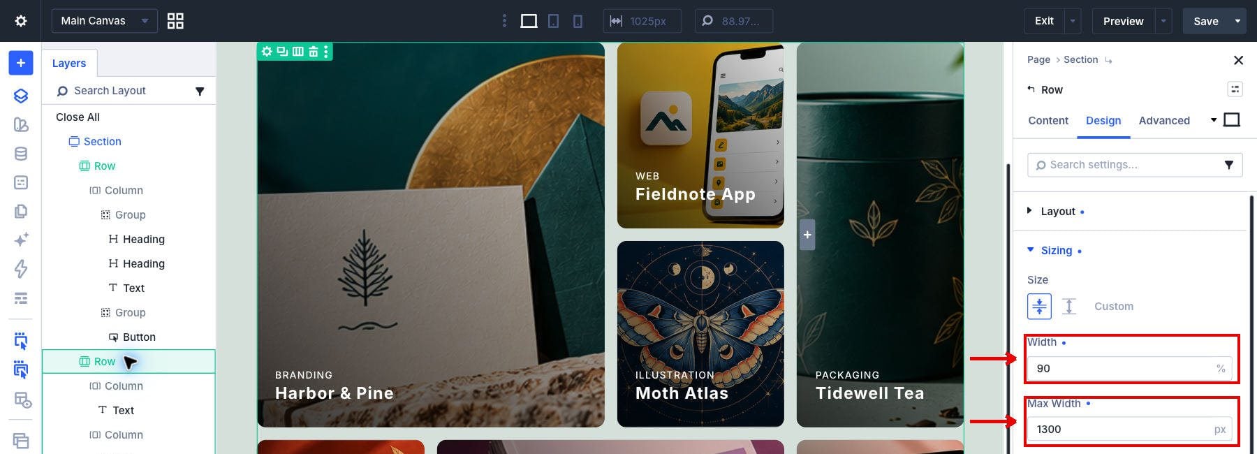
Open the row’s Sizing settings, then set Width to 90% and Max Width to 1300px.
These row-sizing values maintain the grid’s inset from the section’s edges and limit its width on larger screens.
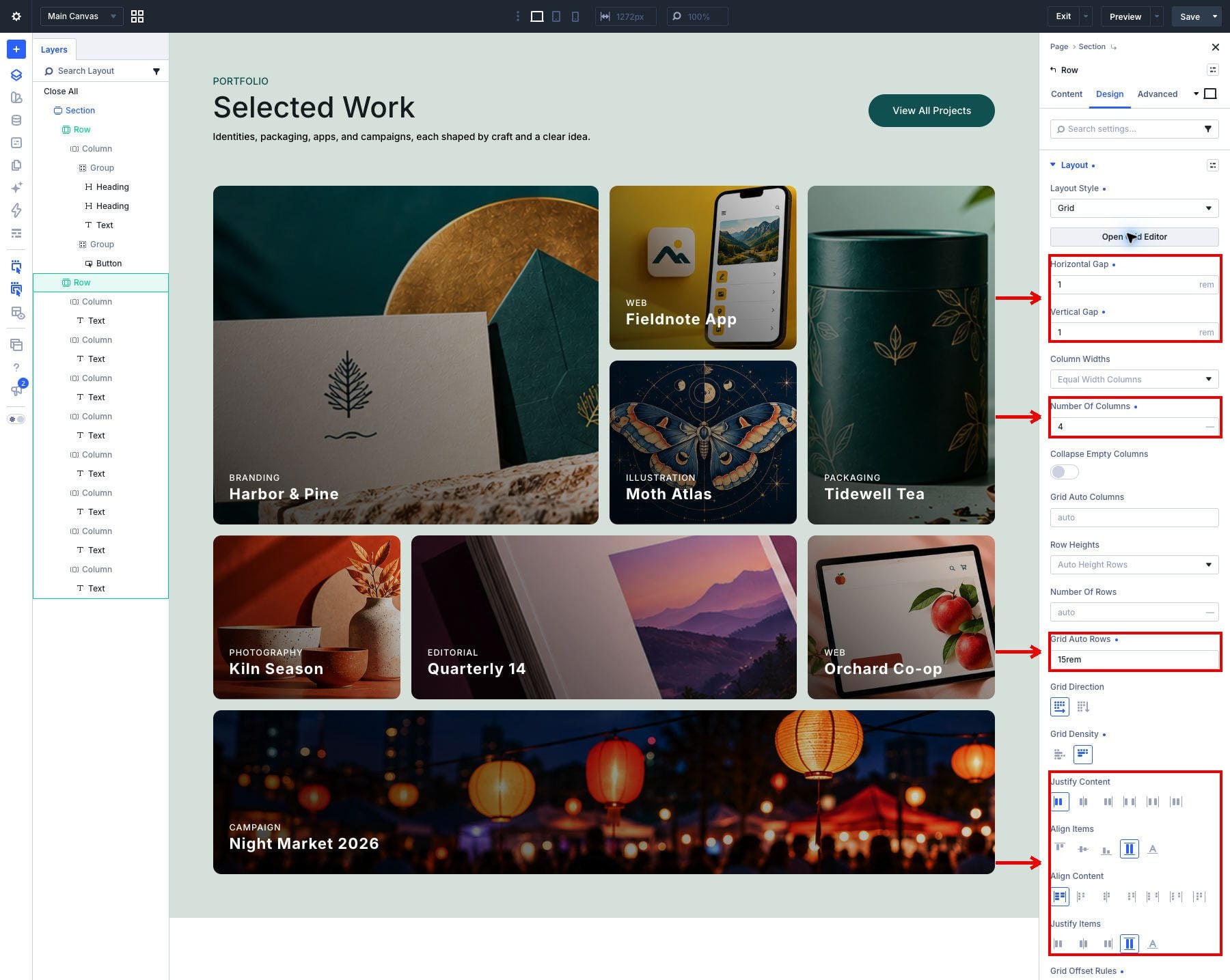
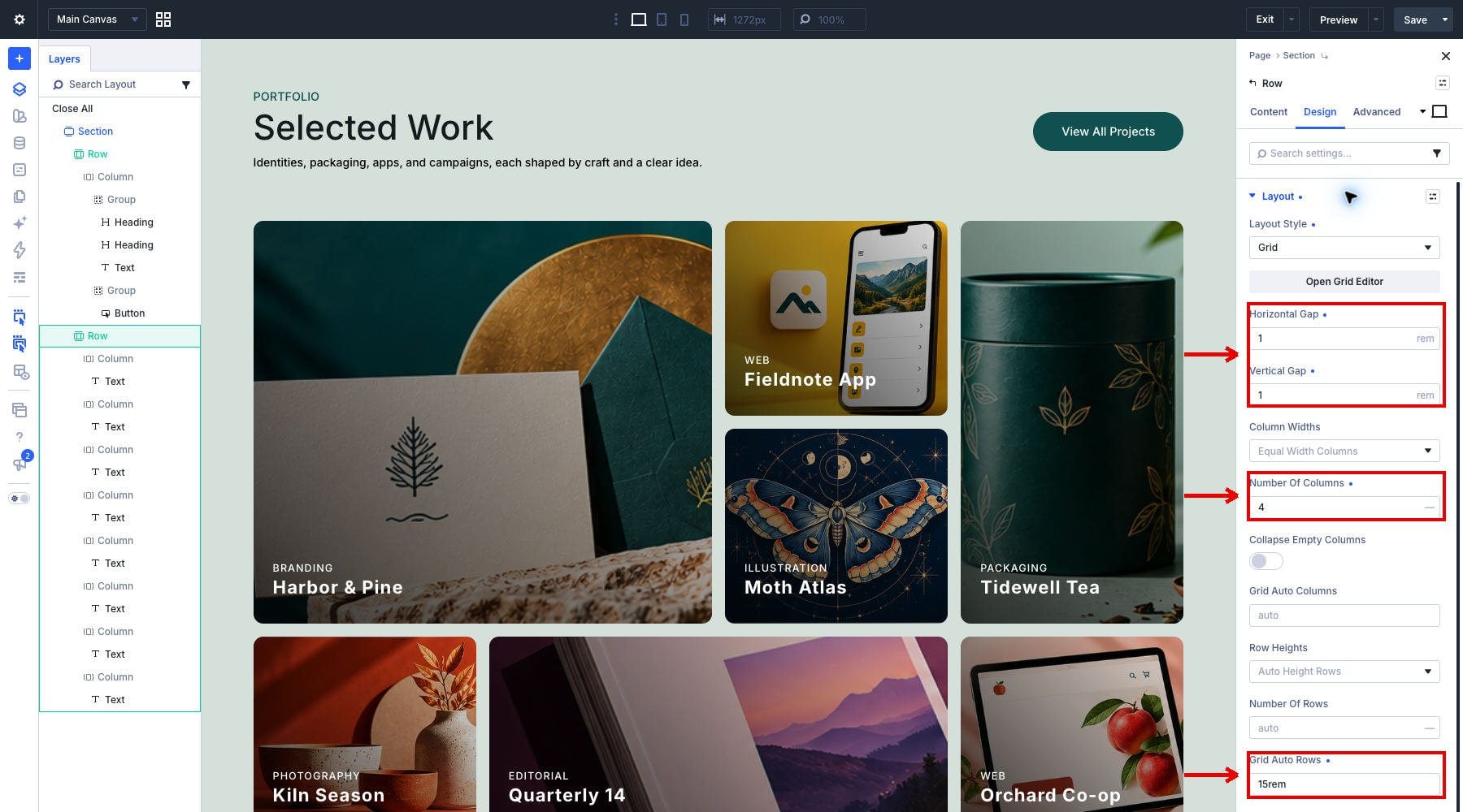
Go to Design > Layout and set Layout Style to Grid. Use the following desktop values:
- Column Widths: Equal Width Columns.
- Number Of Columns: 4.
- Horizontal Gap: 1rem.
- Vertical Gap: 1rem.
- Grid Auto Rows: 15rem.
- Grid Density: Auto.
The four tracks establish the base structure. A card can span several of these tracks while the row keeps its widths equal. Each automatically created row is 15rem tall, with the vertical gap separating adjacent rows.
Portfolio Cards
Open the first column’s settings and set its Background Color to #134e48.
Choose a project image under Background and keep Background Image Size set to Cover. The image fills the card’s background, so its crop changes with the card’s dimensions.
Add a linear gradient. Set the first stop to rgba(0, 0, 0, 0.8) at 0%, using black with 80% opacity.
Configure the second stop to rgba(0, 0, 0, 0.1) at 100%, using black with 10% opacity.
Set Gradient Direction to 45deg and turn on Place Gradient Above Background Image so the overlay darkens the background behind the card’s white text. Use the same stops on all eight cards, then check the result against each project’s image.
Align Portfolio Card Text At The Bottom
Under Layout, set the card’s Layout Style to Flex and its Layout Direction to Column. Set Justify Content to End to hold the text at the bottom as the card’s height changes. The row determines where the card sits, while these settings control the content inside it.
Set Padding to 24px on all sides to leave room around the category and title.
Set Border Radius to 12px on all corners.
Under Advanced > Visibility, set Horizontal Overflow and Vertical Overflow to Hidden.
Add Portfolio Item Title And Category
Add a Text Module inside the card.
Enter BRANDING on the first line and Harbor & Pine beneath it, then apply Heading 3 to the project title in the text editor.
Set the category text color to #ffffff and Letter Spacing to 1px. For the source layout’s fluid category size, set Text Size to clamp(0.72rem, calc(12.642px – 0.001133 * (100vw – 360px)), 0.7901rem).
Set the Heading 3 text color to #ffffff and Font Weight to 700. For the title’s Text Size, enter the source layout’s fluid value: clamp(1.125rem, calc(0.004545 * (100vw – 360px) + 18px), 1.4063rem).
Duplicate And Personalize The Cards
Duplicate the entire card column until you have eight cards, then select the second card before changing its content. Duplication preserves the background overlay and styling you just configured.
In the duplicate’s Background settings, choose its project image and set the size to Cover so it fills the card as the shape changes.
Edit the duplicate’s Text Module to replace the category and project title. Keep the title formatted as Heading 3.
Repeat the image, category, and title changes for the remaining six cards. The source layout uses these projects in this order:
- Harbor & Pine — Branding.
- Fieldnote App — Web.
- Tidewell Tea — Packaging.
- Moth Atlas — Illustration.
- Kiln Season — Photography.
- Quarterly 14 — Editorial.
- Orchard Co-op — Web.
- Night Market 2026 — Campaign.
Keep this order while arranging the desktop grid. It will also determine the project sequence when the cards return to automatic placement on smaller screens.
Arrange The Desktop Grid With The CSS Grid Editor
Return to the row’s Layout settings and click Open Grid Editor. Its canvas lets you move numbered items between cells and resize them using their corner handles. These edits create placement rules on the row. The Grid Editor documentation explains how the canvas and rule controls work together.
Use the following positions to reproduce the desktop arrangement. Each entry gives Column Start, Row Start, Column Span, and Row Span, in that order:
- Harbor & Pine: 1, 1, 2, 2.
- Fieldnote App: 3, 1, 1, 1.
- Tidewell Tea: 4, 1, 1, 2.
- Moth Atlas: 3, 2, 1, 1.
- Kiln Season: 1, 3, 1, 1.
- Quarterly 14: 2, 3, 2, 1.
- Orchard Co-op: 4, 3, 1, 1.
- Night Market 2026: 1, 4, 4, 1.
To leave room for the featured card, move the third item, Tidewell Tea, to column four of the first row and Fieldnote App to column three of that row.
Keep Harbor & Pine in the top-left cell, and resize it to span two columns and two rows. Extend Tidewell Tea across two rows while keeping its width at one column.
Resize Quarterly 14 to span the middle two columns of row three, then stretch Night Market 2026 across all four columns in row four. Moth Atlas fills the cell below the Fieldnote App. Kiln Season and Orchard Co-op occupy the outer cells of row three. Check these positions against the list above.
For exact placement, review the editor’s rules and check their start and span values against the list. Give the rules recognizable Admin Label names based on their project titles. Keep each rule targeted to its corresponding card and leave unused end values empty.
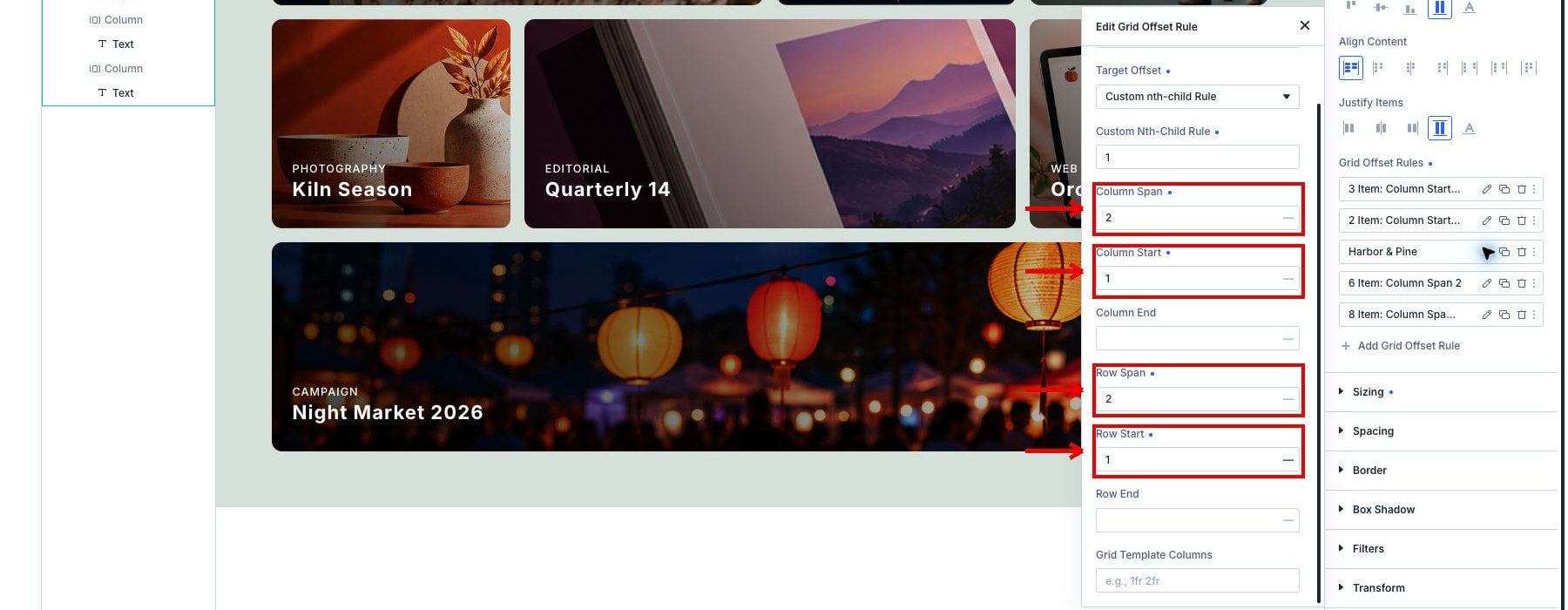
The first card occupies the width of two tracks and the height of two rows, including the gap between them. The desktop grid, therefore, combines different card dimensions within one shared track structure.
Adapt The Grid For Tablet
Switch the responsive controls to Tablet, then set Number Of Columns to 2 in the row’s Layout settings.
To reduce the spacing and card height for the narrower layout, set Horizontal Gap and Vertical Gap to 0.75rem and Grid Auto Rows to 13rem.
Open each card’s Column settings and go to Design > Sizing. Select Tablet in the responsive controls, then set both Column Start and Row Start to Auto. The cards can then flow into the two available tracks. The following clip shows an intermediate reset on the first card; its featured width is set afterward.
Give Harbor & Pine and Night Market 2026 a Column Span of 2 and a Row Span of 1; the other six cards need both spans set to 1.
Apply these settings to all eight cards. Resetting the start allows the grid to place cards on the two available tracks. Reducing the spans prevents the desktop banner from creating extra columns and gives every tablet card a one-row height. Check that the first and last projects occupy complete rows and the middle six form three pairs.
Adapt The Grid For Phone
Switch to Phone and set the row’s Number Of Columns to 1. Keep both gaps at 0.75rem and set Grid Auto Rows to 16rem.
Open each card’s Column settings, go to Design > Sizing, and select Phone in the responsive controls. Set both Column Span and Row Span to 1. Keep Column Start and Row Start at Auto, checking the featured and banner cards as well as the regular cards.
Repeat the sizing changes for all eight cards, then review the portfolio from the first project through the last. The 16rem rows create taller cards than the tablet layout does, while the single-column structure gives each project the full available width. Check each background crop and ensure the category and title remain within the padded area.
Check And Customize Your Portfolio Grid
Save the page and inspect its front-end result at desktop, tablet, and phone widths. Resize the browser between those sizes as well, especially around the breakpoints where the column count changes.
At tablet width, check that the first and last cards span both columns while the middle six form three pairs.
At phone width, scroll through the full portfolio. All eight projects should appear in one column with readable text and no horizontal overflow.
Inspect the grid structure and the content inside it before using the portfolio on your site. In particular, confirm that the banner stops spanning four tracks on smaller screens and that longer project titles fit within their cards.
- Desktop and tablet: correct card positions without overlaps, with the featured and banner cards spanning both available tracks on tablet.
- Phone: one column without horizontal scrolling.
- Card content: readable titles inside the padded area and background crops that keep each project’s important details visible as the card changes size.
- Order: a clear project sequence across devices.
Add Another Project To The Grid
When adding projects, duplicate a completed card Column and open Design > Sizing to adjust its placement. For a ninth card below this desktop grid, set Column Span to 2 and Row Span to 1.
Set Column Start to 1 and Row Start to 5. Check that the new card occupies the first two columns below the full-width banner.
On Tablet, use Auto for both starts and keep the spans at 2 and 1. The new card should fill a complete row beneath the existing projects.
On Phone, keep both starts at Auto and set both spans to 1. Check the new card at the bottom of the single-column layout, then replace its image and text with the new project’s content.
You can adapt the same structure to your own work by choosing which projects receive extra space. Change a card’s span to alter its size within the grid, then review its background crop and responsive placement together.
Give Your Portfolio Room To Vary
Standard, equal-width grids often force unique projects into uniform boxes, clipping bold imagery and flattening visual hierarchy. By combining Divi 5, CSS Grid its native CSS Grid Editor, you break free from those rigid constraints—giving standout pieces the room they deserve while maintaining a cohesive, responsive flow.
Whether you’re highlighting a brand identity with a multi-cell feature card or scaling your layout down to a clean single column on mobile, visual layout control makes complex web design approachable.
Ready to build your own custom layouts? Download Divi 5 today or explore our deep dive to Learn More About Divi 5 features and capabilities.








Leave A Reply