

In Part 5 of our Mastering Flexbox series, we showed you how to use Display Order and Wrap Reverse in Divi 5 to create more intentional mobile stacking flows without duplicating sections or writing custom CSS for common reordering patterns.
Now, in Part 6, we’re bringing the workflow together. You’ve already learned the individual Flexbox controls and layout patterns that make Divi 5 more flexible across breakpoints. In this post, we’ll cover key tips for combining those tools into cleaner, more maintainable responsive layouts that adapt well across screen sizes.
Let’s dive in.
- 1 Why Responsive Design Feels Different In Divi 5
-
2
Key Tips For Building Responsive Layouts
- 2.1 1. Start With Clear Content Hierarchy
- 2.2 2. Use Per-Breakpoint Controls Wisely
- 2.3 3. Build Efficient Structures With Wrap + Column Class
- 2.4 4. Combine Alignment, Gap, And Grow To Fill For Consistent Spacing
- 2.5 5. Use Module Groups And Nested Modules For Better Control
- 2.6 6. Make Mobile Reordering Part Of Your Workflow
- 2.7 7. Optimize For Performance, Accessibility, And Maintainability
- 2.8 8. Test With Real Content
- 3 Troubleshooting Tips For Responsive Flexbox
- 4 Download The Layouts
- 5 Download For Free
- 6 Master Responsive Layouts With Divi 5
Why Responsive Design Feels Different In Divi 5
Divi 5’s Flexbox Layout System changes how you can approach responsive design. Instead of relying on duplicate rows, hidden spacers, or custom CSS for every breakpoint issue, you can start with a clean desktop structure and apply targeted adjustments where the layout actually needs to change.
That means fewer duplicate sections, more predictable responsive behavior, and less maintenance over time. Customizable Responsive Breakpoints and the Responsive Editor also make it easier to preview and adjust layouts across different screen sizes, so you can make decisions based on the actual layout instead of guessing.
The result is a workflow that feels more intentional: build the cleanest structure first, then use Flexbox and responsive controls to refine how it behaves on Tablet, Phone, and any custom breakpoints your project uses.
Key Tips For Building Responsive Layouts
Here are eight practical tips to help you combine everything covered so far in the series. Each tip builds on earlier Flexbox controls and focuses on responsive decisions you can apply in real Divi 5 projects.
1. Start With Clear Content Hierarchy
One of the most important shifts when building responsive layouts in Divi 5 is planning your content hierarchy before you start styling.
On Desktop, your layout might follow a logical left-to-right flow. On Phone, that same order may not be the best reading experience. Before you build, decide what should appear first on smaller screens: the heading, CTA, image, featured card, form, sidebar content, or something else.
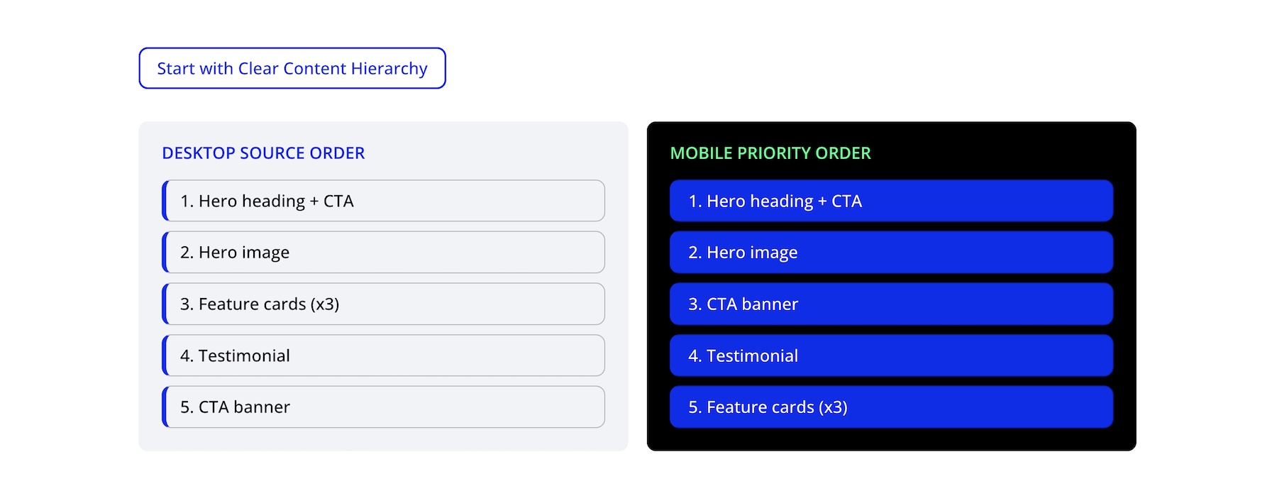
Start with a clean desktop source order, then use Display Order at the Tablet or Phone breakpoint only when the mobile flow needs to change. This helps you keep one layout structure instead of duplicating sections for mobile.
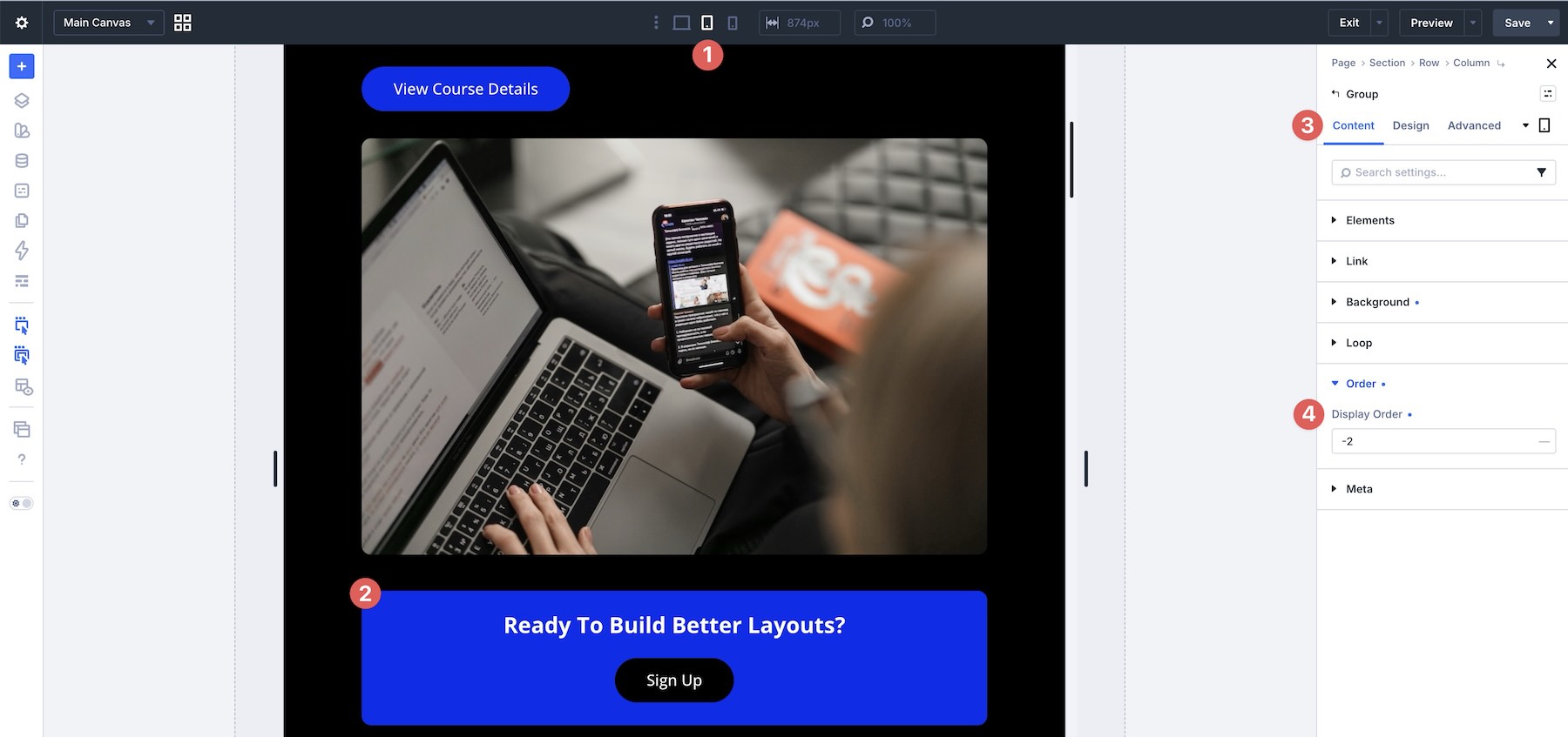
This planning step prevents many mobile stacking issues before they happen and makes the rest of your responsive decisions easier.
2. Use Per-Breakpoint Controls Wisely
Divi 5 gives you responsive control across breakpoints, but that doesn’t mean every setting needs an override. The best approach is to change settings at Tablet or Phone only when the layout needs different behavior.
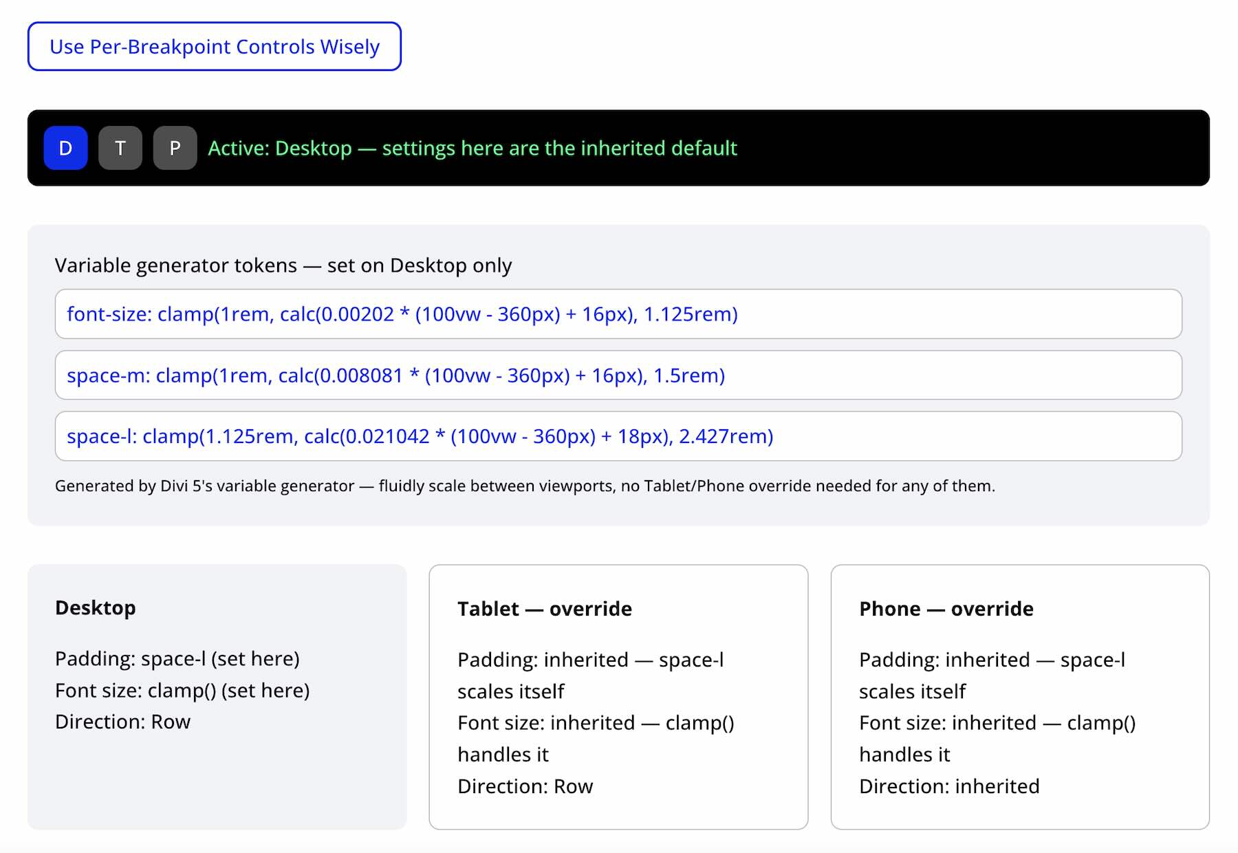
For example, fluid values like clamp() and reusable values from Divi’s Variable Generator can often reduce the need for breakpoint-specific spacing or typography overrides.
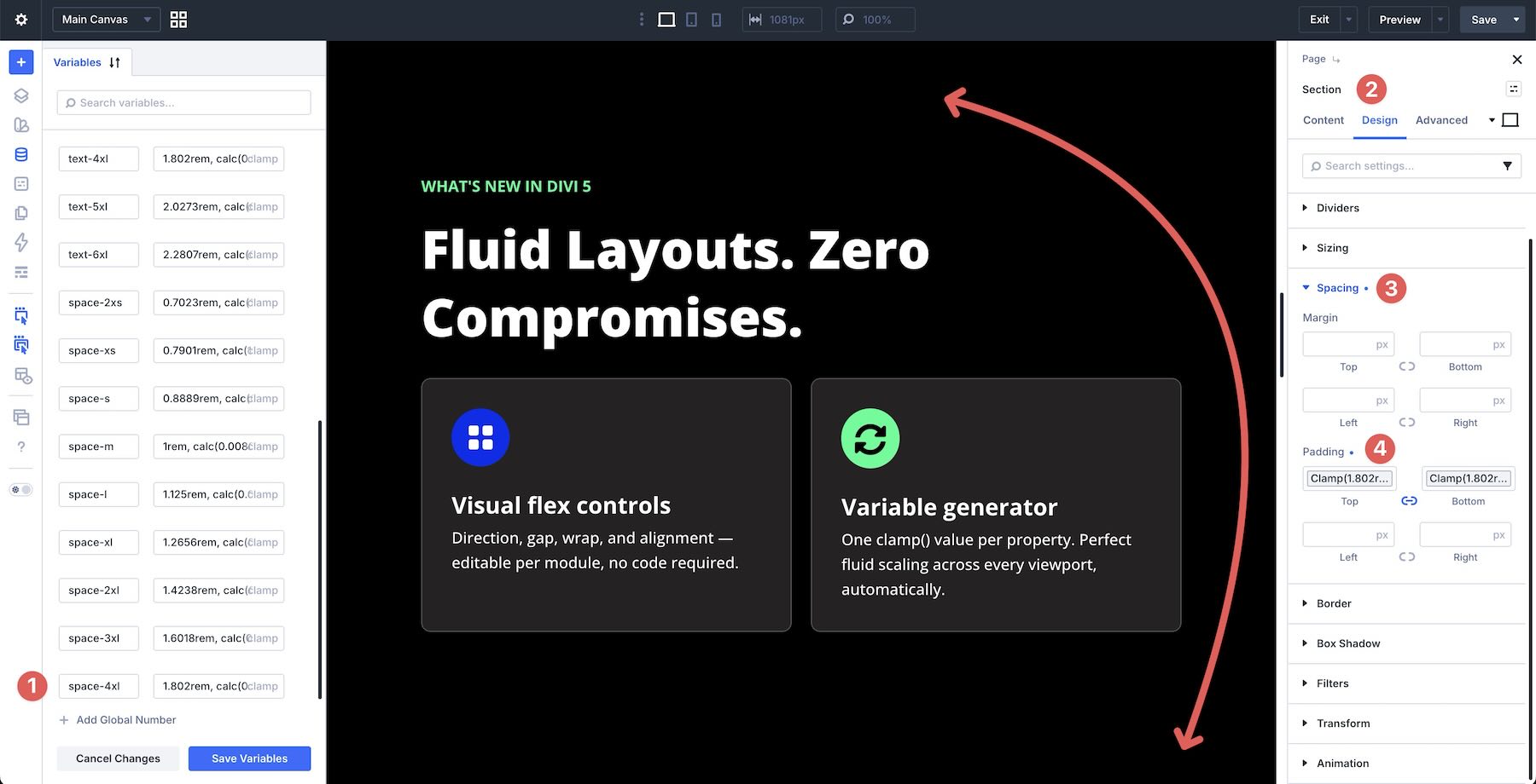
Save breakpoint overrides for structural changes, such as Layout Direction, Layout Wrapping, Column Class, Display Order, Align Items, or gap values when the layout becomes cramped. This keeps your desktop layout cleaner and makes future edits easier to track.
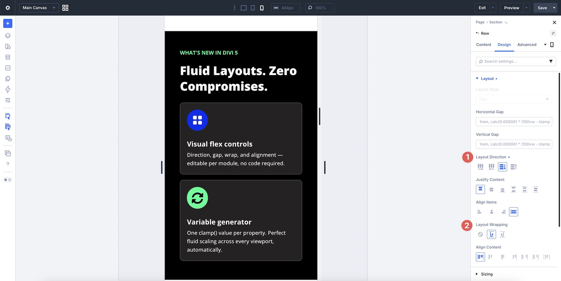
3. Build Efficient Structures With Wrap + Column Class
With Flexbox, you often don’t need multiple separate rows just to create a multi-line layout. When using Flex as the Layout Style, a single row with Layout Wrapping > Wrap and intentional Column Class settings can handle many responsive card grids, feature sections, and content blocks.
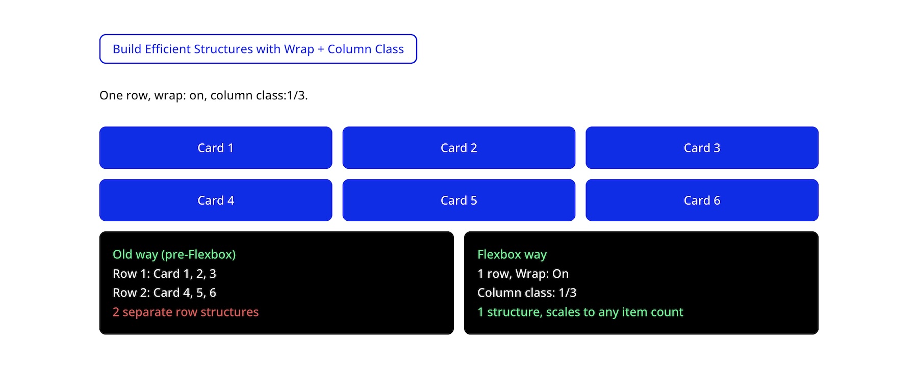
With Wrap enabled, one row can contain six cards and allow them to move onto additional lines. For example, you might use Column Class > 1/3 on Desktop, Column Class > 1/2 on Tablet, and a Fullwidth structure on Phone when each card needs its own line.
This technique, covered in Part 3 of our Mastering Flexbox course, reduces the number of rows you need to manage and makes future layout edits easier.
4. Combine Alignment, Gap, And Grow To Fill For Consistent Spacing
Flexbox becomes most useful when you combine settings instead of relying on a single control. For card layouts, Justify Content > Space Between, Gap, and Grow To Fill can work together to keep content areas balanced when text lengths vary.
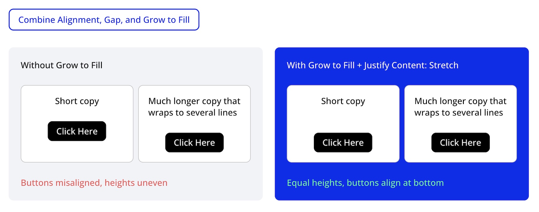
This pattern, detailed in Part 2, is especially useful for feature cards, testimonials, pricing tables, team member cards, and other multi-column sections where content length varies but alignment still needs to feel consistent.
5. Use Module Groups And Nested Modules For Better Control
One of Divi 5’s biggest layout advantages is the ability to create smaller Flex containers inside larger layouts using Module Groups and Nested Modules.
Instead of trying to control every element from the parent column, wrap related elements, such as a heading and body text or a set of buttons, in their own Module Group. That group becomes its own layout context with independent controls for Layout Direction, Justify Content, Align Items, and Gap.
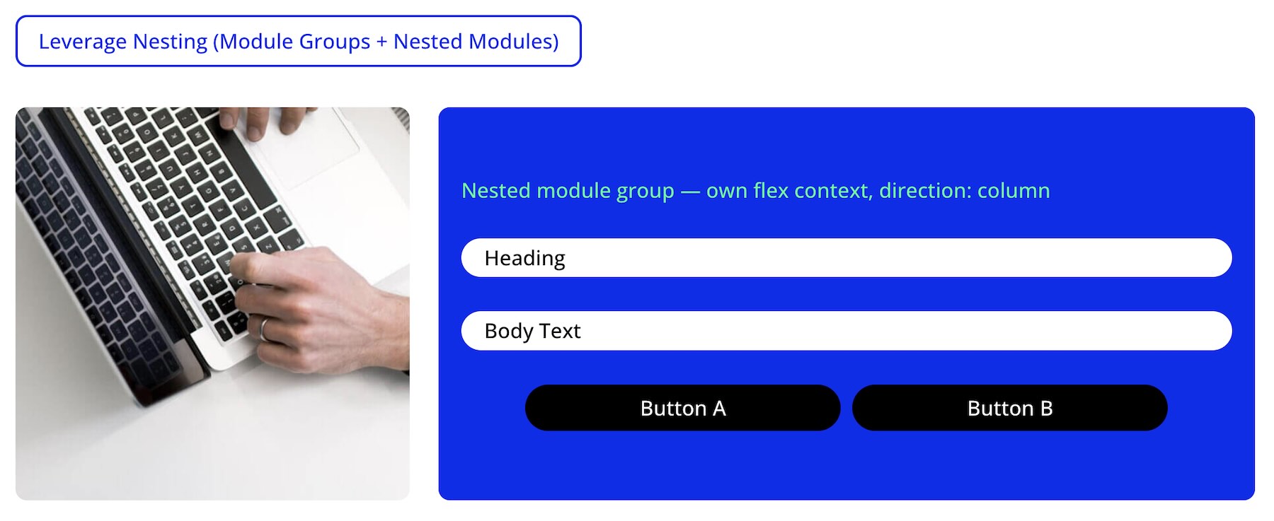
The button group in the example below can have its own Display Order and breakpoint overrides without affecting the outer column. You can also change spacing, alignment, or Layout Direction inside the group at specific breakpoints while keeping the parent structure intact.
6. Make Mobile Reordering Part Of Your Workflow
Treat mobile reordering as a standard review step, not an afterthought. Depending on your layout, you may need to adjust Display Order, Layout Direction, or Layout Wrapping at the Tablet or Phone breakpoint.
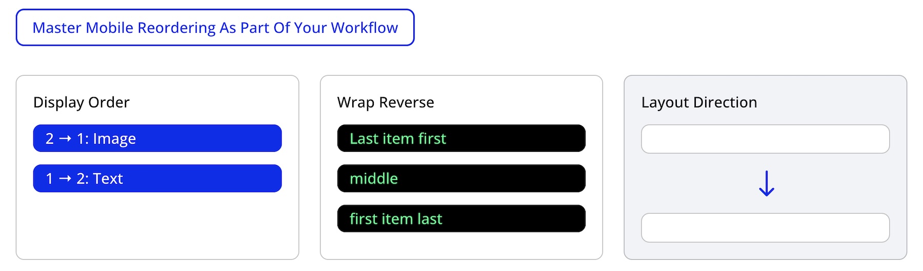
By default, content follows the layout’s source order. In many cases, that works well. In others, a CTA, featured card, image, sidebar, or form needs to appear earlier on smaller screens. Handling these changes with breakpoint-specific controls helps you keep a clean desktop structure while improving mobile flow.
Once this becomes part of your regular process, mobile stacking issues are easier to catch before a page goes live.
7. Optimize For Performance, Accessibility, And Maintainability
Great Flexbox layouts are not only visually clean. They should also be easy to maintain, efficient, and logical for visitors using keyboards or assistive technology.
Start with a source order that makes sense as a reading order. Use Display Order sparingly for visual reordering, and always test the result. Remember that visual order and source order can differ, so keyboard focus and screen reader flow should still feel logical.
It is also good practice to avoid unnecessary nesting. Module Groups and Nested Modules are useful, but every extra container adds complexity. Use as many nested containers as the design needs, but avoid adding groups just to compensate for unclear structure.
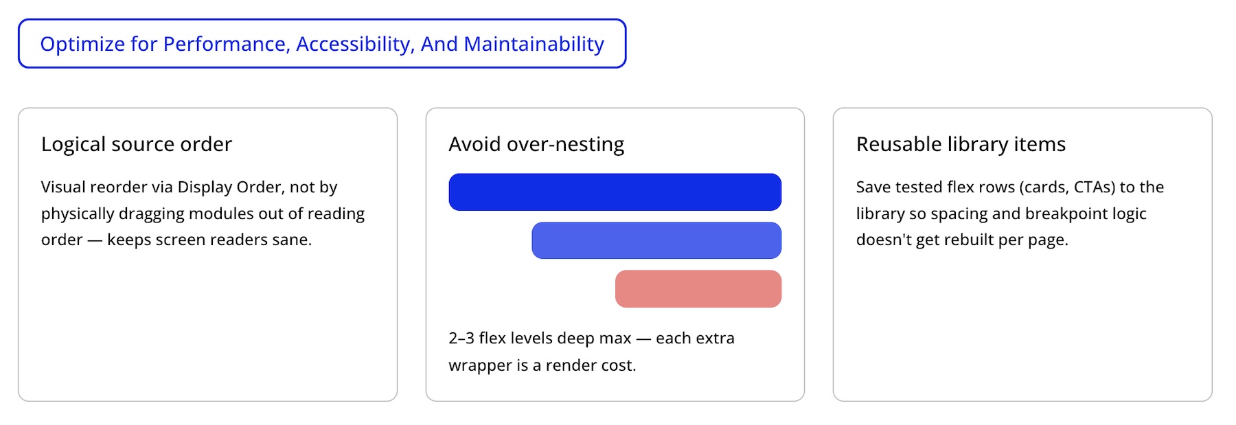
Finally, save tested Flexbox structures to the Divi Library when you know you’ll reuse them. For consistent spacing, sizing, and styling across a site, combine those reusable structures with Design Variables and Presets.
After saving or publishing, use the Tab key on the live page to check focus order through buttons, links, forms, and other interactive elements. If focus jumps in a confusing way, review the source order, Display Order values, and mobile structure.
8. Test With Real Content
Placeholder text and perfectly cropped images can hide responsive issues, so test with realistic content early.
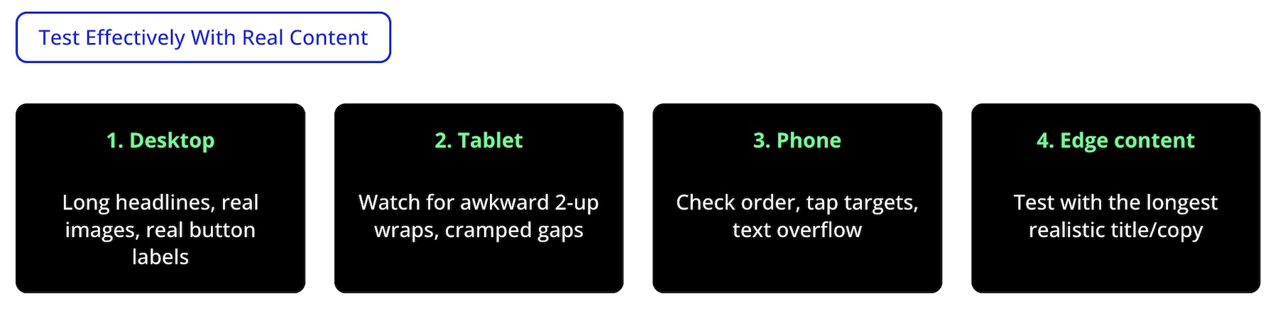
For effective testing, use long headlines, real supporting copy, realistic button labels, real image dimensions, and the longest practical titles you expect to publish. On Tablet, watch for awkward wrapping and cramped gaps. On Phone, check stacking order, tap targets, text overflow, and whether key actions appear early enough.
These habits help you catch responsive issues while the layout is still easy to adjust.
Troubleshooting Tips For Responsive Flexbox
Even with a solid understanding of Flexbox, a few issues can come up when building responsive layouts in Divi 5. Knowing what to check first can save time.
Don’t Overdo It With Display Order
One common mistake is relying on Display Order to fix every layout issue instead of improving the underlying structure. Display Order is powerful, but using it on too many elements can make future edits harder to understand.
Start with a clean source order, then use Display Order only for items that truly need to move at a specific breakpoint.
Know The Difference Between Gap And Spacing
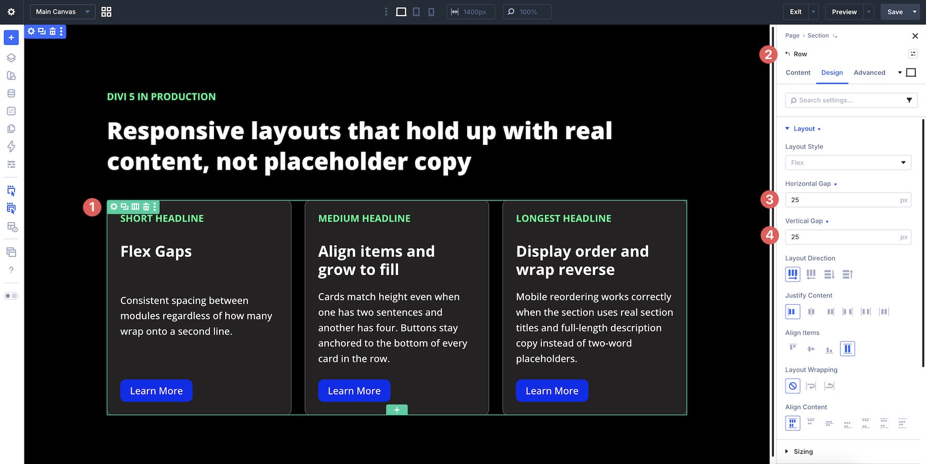
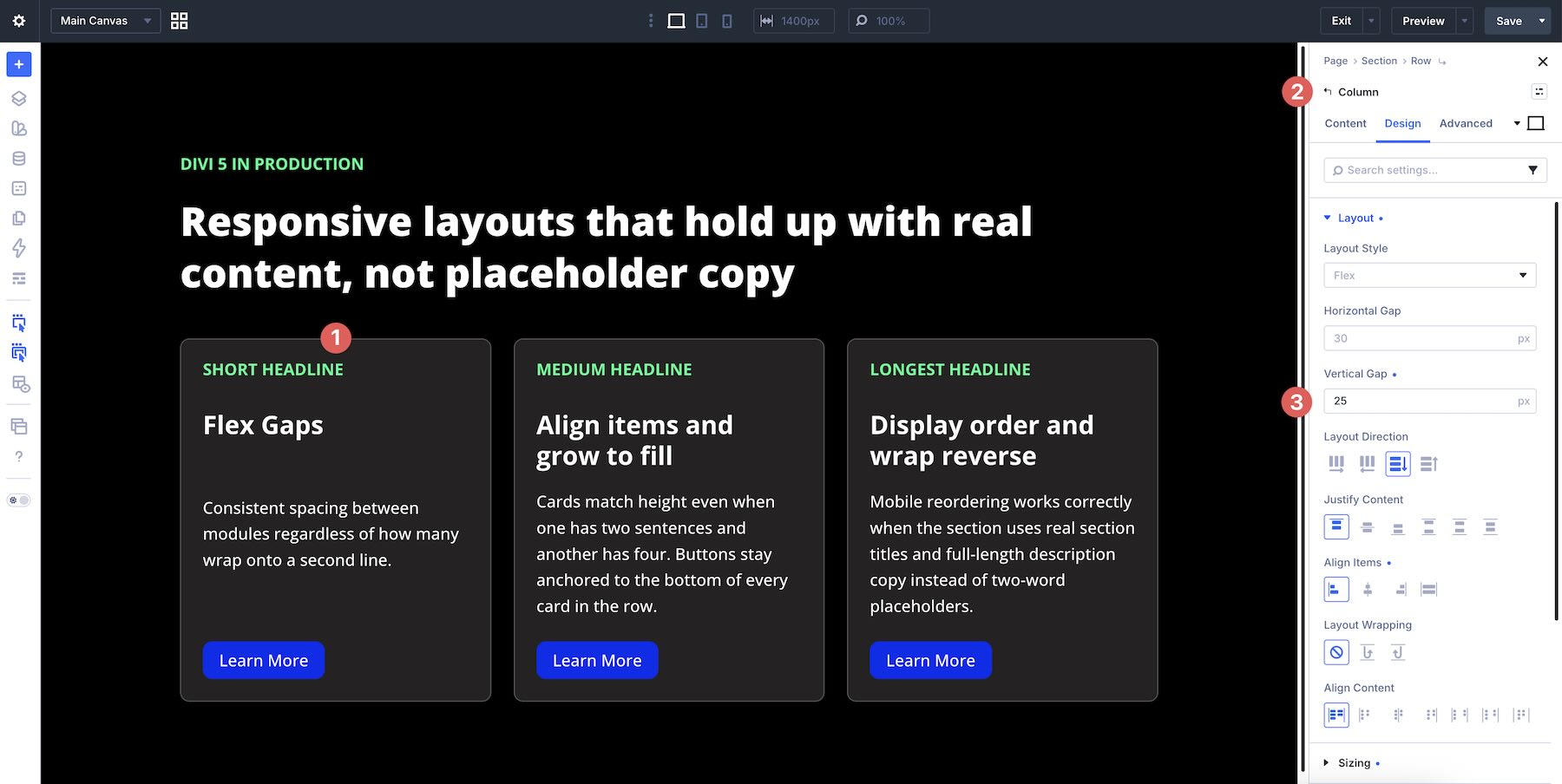
Many layout issues come from using margin or padding to create space between every individual item. In many Flexbox layouts, Horizontal Gap and Vertical Gap are better for spacing between direct child items inside the same parent container. They keep spacing centralized and easier to adjust across breakpoints.
At the Section level, Horizontal Gap may have no visible effect when the section uses a vertical/Column layout direction. Vertical Gap is useful for controlling spacing between multiple rows inside that section.
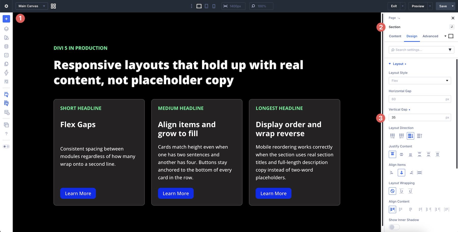
Apply gaps at the Row level when you want consistent spacing between Columns.
Apply gaps at the Column, Module Group, or Nested Module level when you want spacing between modules or nested items inside that container.
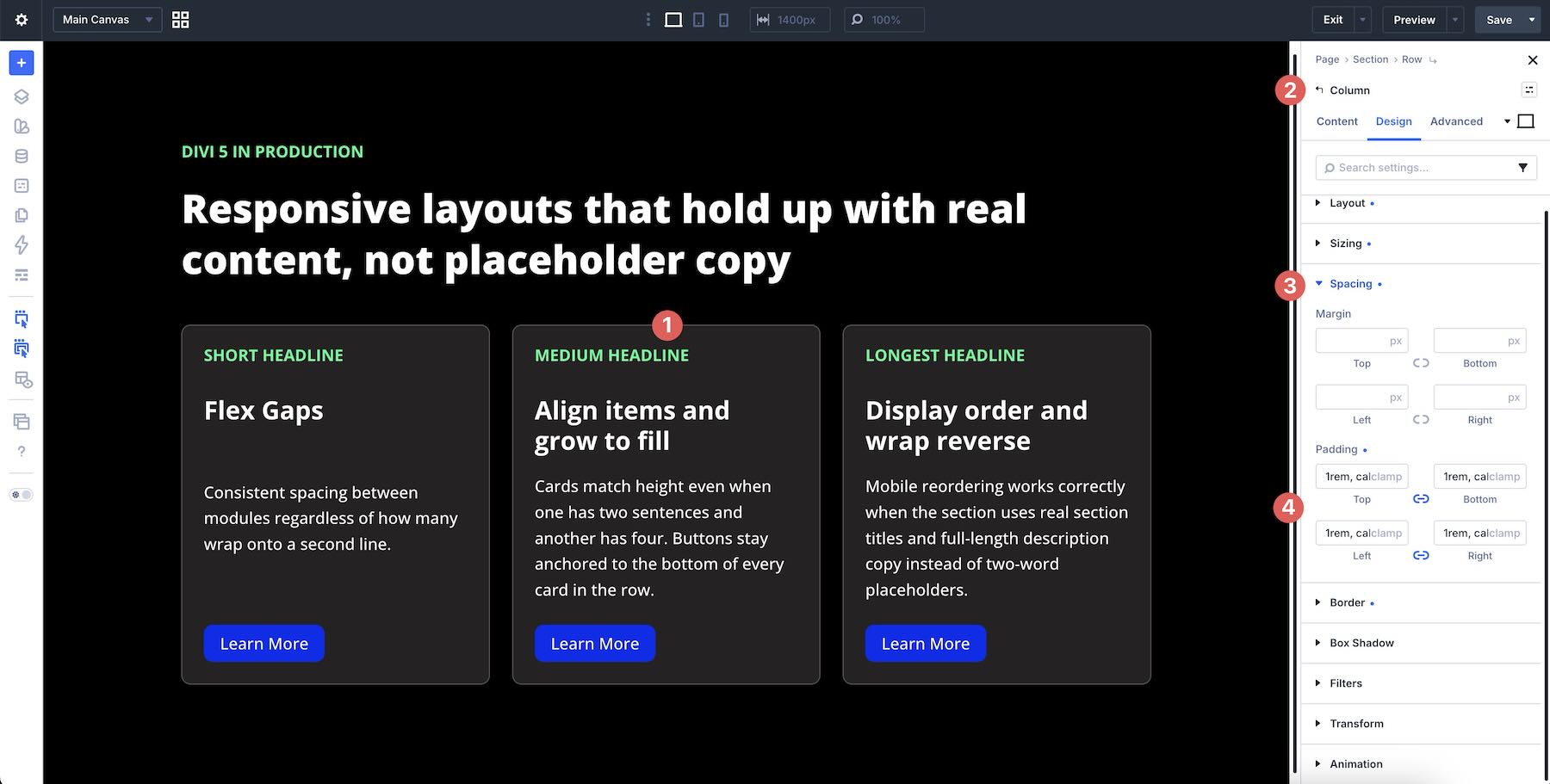
That said, Padding is still useful inside Rows, Columns, and Module Groups when you want breathing room around the content itself.
Use Structure Templates For Quick Responsive Column Changes
Manually adjusting Column Class on each column works well, but Structure Templates can speed up bigger responsive changes. In the Content tab of a row, use the Apply Structure Template button in the Elements option group.
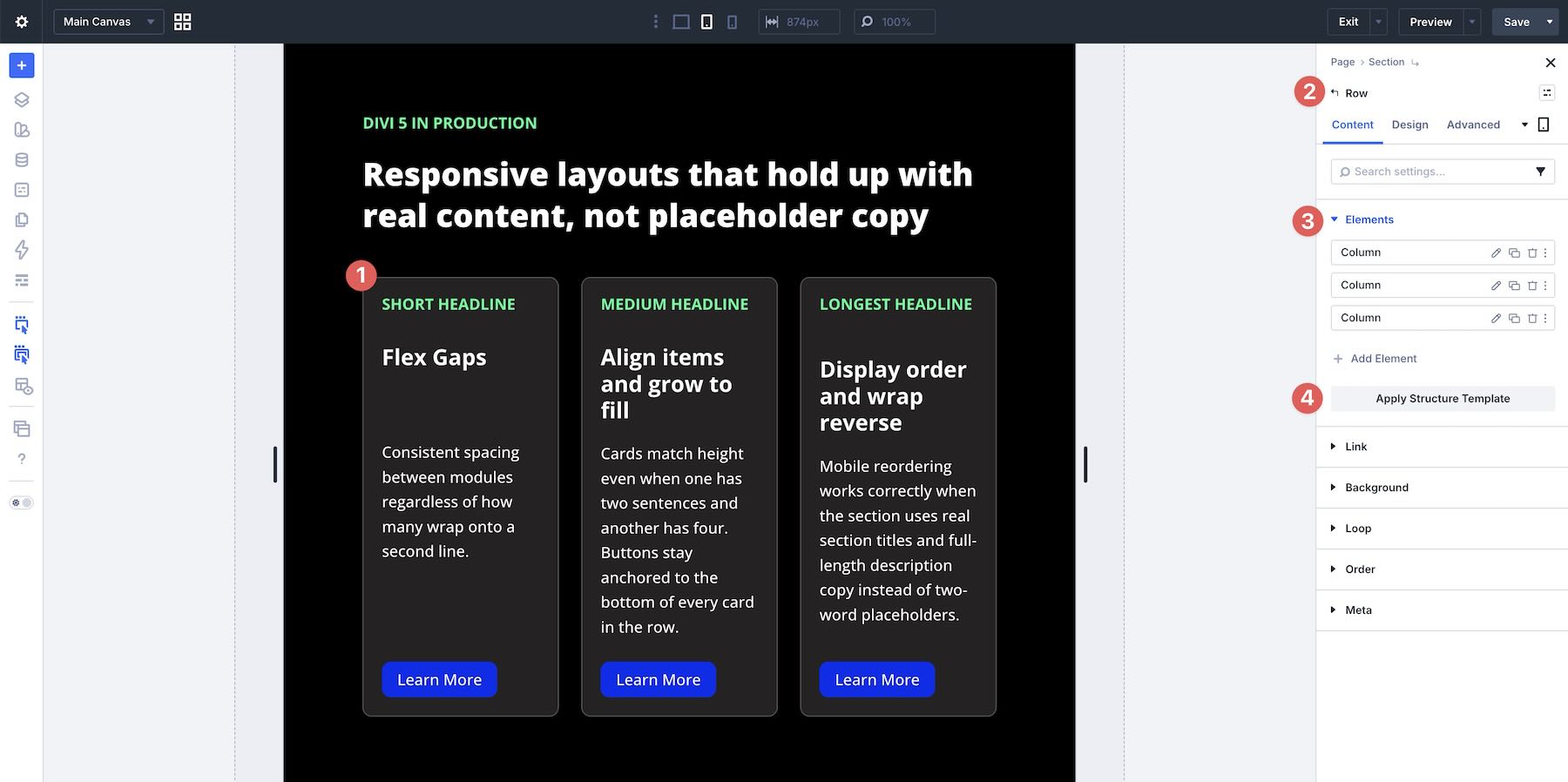
This lets you change a row’s column structure at a specific breakpoint without manually editing every column one by one.
Structure Templates are especially useful in rows with many columns or layouts that need a very different Tablet or Phone structure.
Avoid Forcing Single-Column Layouts Too Aggressively
It can be tempting to make every mobile layout a single vertical stack. That can work, but it can also create unnecessarily long pages, especially on Tablet.
In many cases, Layout Wrapping combined with smart Column Class settings lets Flexbox create a more balanced responsive layout. For example, a four-card row may work better as two columns on Tablet and one column on Phone, instead of becoming one long stack too early.
Reserve forced single-column structures for layouts where the content truly benefits from a strict vertical reading order.
Know Where Responsive Settings Live
One common source of confusion in Divi 5 is that responsive controls can appear in multiple places. You’ll find the Breakpoint Switcher at the top of the builder, responsive controls inside the settings panel, and responsive value icons next to individual fields.
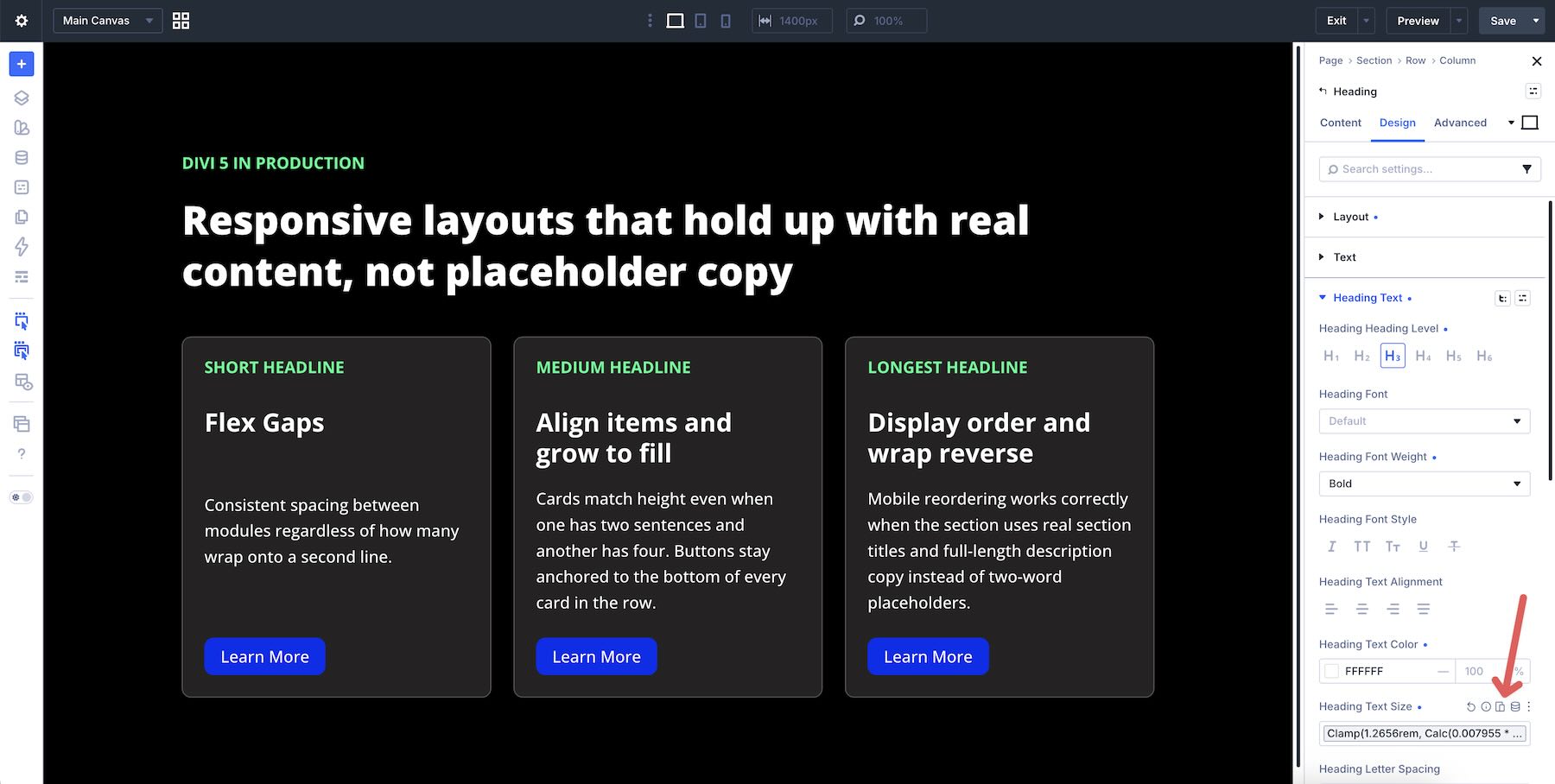
To reduce guesswork, use the Responsive Editor. Click the responsive icon next to a setting to view and manage values across breakpoints in one place. This makes it easier to see what is active on Desktop, Tablet, and Phone.
Download The Layouts
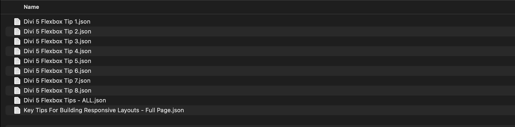
To help you practice everything covered in this post, we’ve prepared a zipped file with example layouts. These include the tip examples, plus a full workflow layout that shows how the techniques work together.
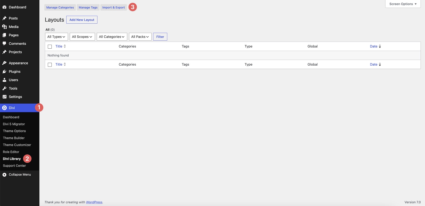
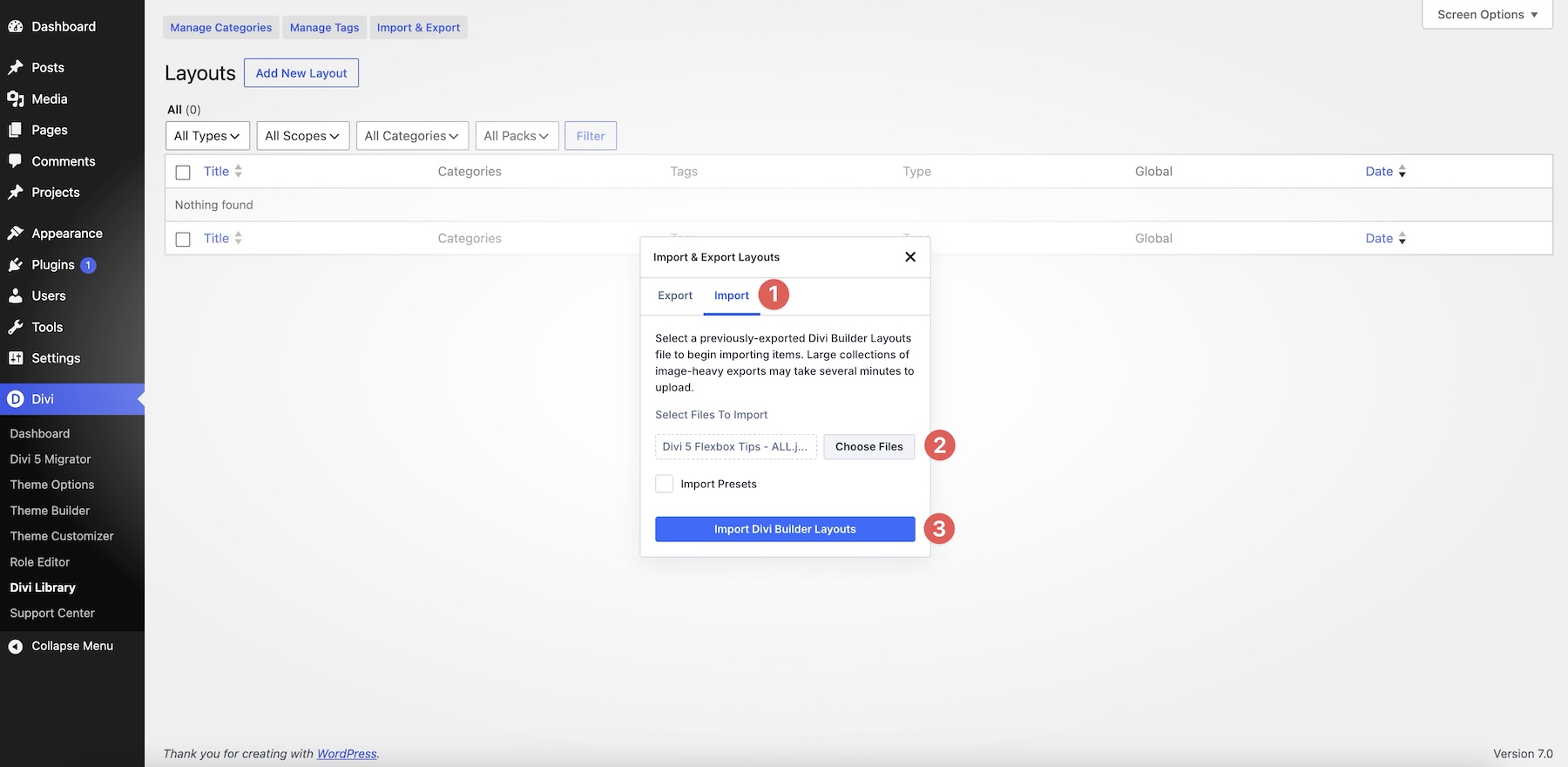
Go to your WordPress dashboard and navigate to Divi > Divi Library. Then click the Import & Export button at the top.
Switch to the Import tab, select a JSON file from your computer, and click Import Divi Builder Layouts.
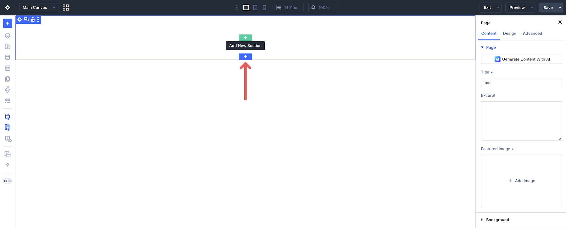
Once the files are imported, open a page in the Visual Builder or create a new one. To import a single section, click the blue + icon on the Canvas.
Select the Add From Library tab, choose the layout you want to use, and click Use This Section to load it onto the page.
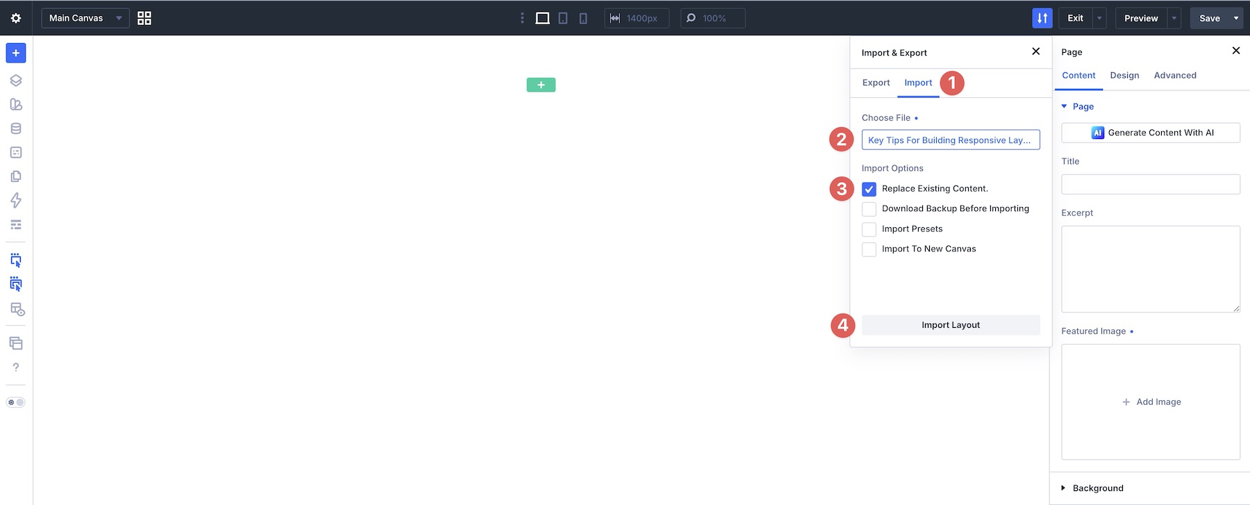
For the full page layout, select the Workspace icon in the Builder Bar, enable Export & Import under Page Bar Icons, and click the Export & Import icon in the top bar.
Switch to the Import tab, choose the Key Tips For Building Responsive Layouts – Full Page.json file from your computer, make sure Replace Existing Content is checked, and click Import Layout.

Master Responsive Layouts With Divi 5
You no longer need extra rows, hidden spacers, or custom CSS for many common responsive layout patterns. With Divi 5‘s Flexbox tools and the tips in this post, you can build layouts that adapt across breakpoints while staying easier to maintain.
In Part 7 Of Mastering Flexbox: Building Flexible Button, Menu, And Link Rows, we’ll focus on compact, responsive navigation elements, button groups, tag clouds, and link rows that work across different screen sizes.
Download Divi 5, import the example layouts, and start applying these responsive techniques. Drop a comment below and let us know which tip was most helpful, or what responsive challenge you’re still working through.










Leave A Reply