


In Part 4 of our Mastering Flexbox series, we showed you how to align content without hidden spacers or custom CSS by using Justify Content, Align Items, Grow To Fill, Module Groups, and Nested Modules.
Now it’s time to solve another common responsive layout challenge: mobile stacking order. On desktop, a complex layout can look polished and intentional. But when that same layout stacks on mobile, the default order may not create the best reading flow. Images can stack above the wrong text, key CTAs can appear too low, featured cards can lose priority, and the overall rhythm can feel off.
Divi 5’s Flexbox Layout System gives you visual controls for reordering content across breakpoints. With Display Order, and in some cases Wrap Reverse, you can improve the mobile experience inside the Visual Builder without duplicating sections or writing custom CSS for common reordering patterns.
In this part, you’ll learn how to fix common mobile stacking problems, create more intentional mobile-first flows, and maintain stronger visual hierarchy across breakpoints.
Let’s dive in.
Why Mobile Reordering Matters
On desktop, carefully designed layouts often rely on side-by-side relationships. Images and text alternate, supporting content sits beside key messages, and featured elements are positioned for visual balance.
On mobile, those same elements usually stack vertically. Divi follows the source order of the layout, so the element that appears first in the structure usually appears first on smaller screens. That can create issues such as:
- Images stacking above other images instead of pairing with their related text.
- Important CTAs appearing below long sections of supporting content.
- Featured cards appearing after less important cards.
- Mobile layouts that feel visually disconnected from the desktop design.
These issues affect more than aesthetics. Poor mobile ordering can make a page harder to scan, slow down decision-making, and push important actions farther down the screen. Visitors on phones need a logical flow that presents the most relevant information at the right moment.
Divi 5 lets you correct these issues without creating duplicate sections for mobile. With Flexbox ordering controls, you can adjust the mobile experience while keeping one cleaner layout structure.
Core Reordering Features In Divi 5
Divi 5 gives you a few important tools for controlling content order across breakpoints. The main one is Display Order. Wrap Reverse can also help in specific wrapped layouts, especially when you want to change how wrapped lines stack.
Display Order
The primary tool for reordering content is Display Order, located in the Content tab under the Order option group. You can use it on flex items such as columns, modules, rows, and Module Groups, depending on the parent layout context.
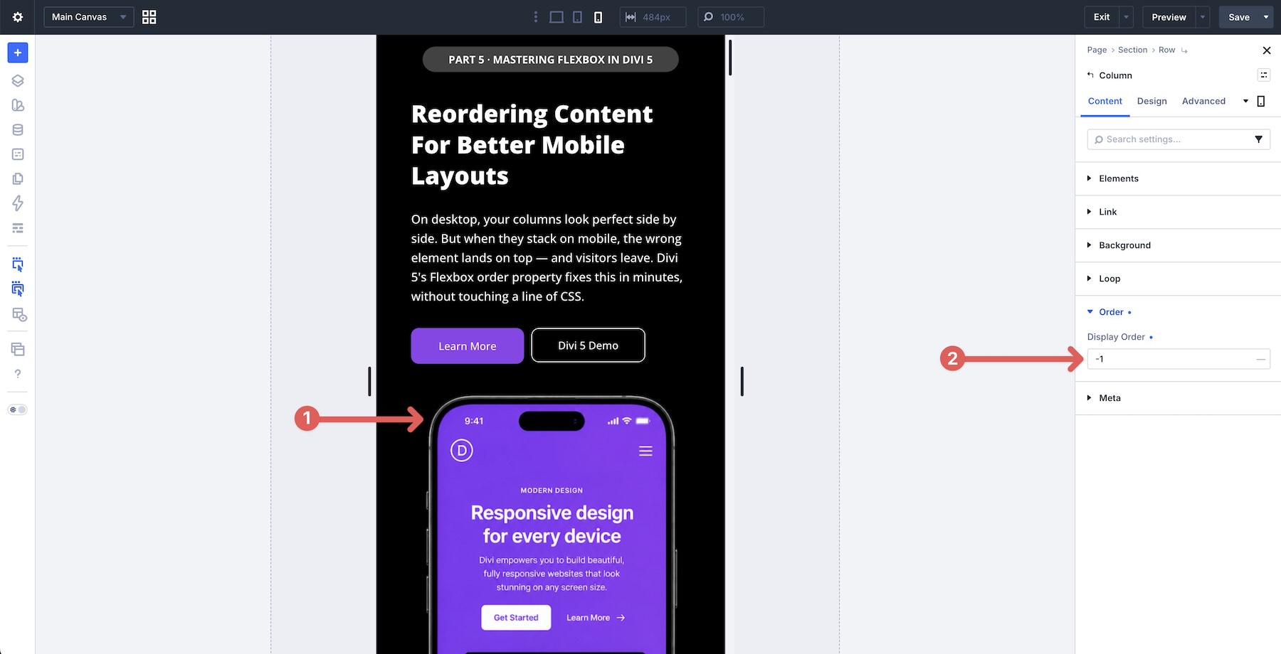
Lower numbers appear earlier in the visual order, while higher numbers appear later. The default value is 0. You can use negative numbers, such as -1, to pull an element earlier, or positive numbers to move an element later in the visual order.
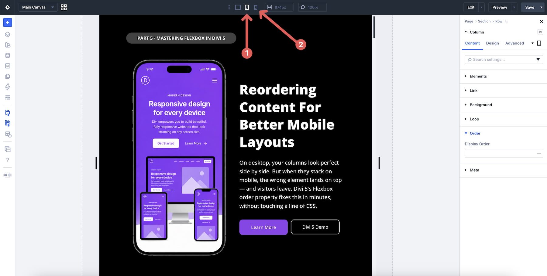
In most cases, adjust Display Order at the Tablet and Phone breakpoints while leaving Desktop at its default source order. This keeps your desktop structure easier to maintain while giving you targeted control on smaller screens.
Wrap Reverse
Wrap Reverse is useful when working with wrapped content. Instead of new flex lines stacking in the normal cross-axis direction, Wrap Reverse places wrapped lines in the opposite direction. This does not replace Display Order for precise item-by-item reordering, but it can help with certain responsive patterns where an entire wrapped line should move visually.
Mobile Reordering Examples
Below are six examples that show how to solve common mobile stacking problems using Divi 5’s Flexbox reordering controls. Each example explains the desktop goal, the mobile issue, and the targeted adjustment that improves the mobile flow.
1. Hero Section
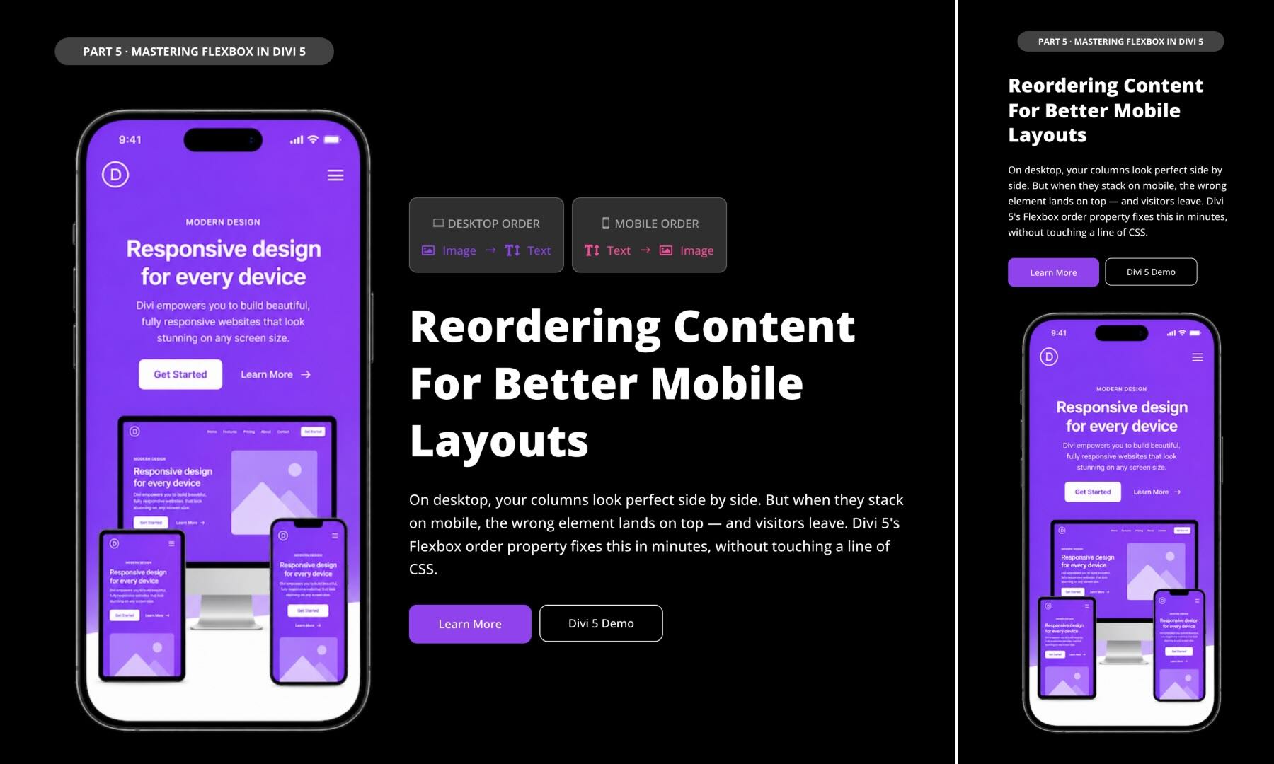
Goal: Create a classic two-column hero layout with an image on the left and the headline, description, and CTAs on the right on desktop, while making sure the main message appears first on mobile.
The Problem On Mobile: By default, Divi stacks columns according to their source order. If the image column comes first, mobile visitors may see a large image before they see the headline, supporting text, or CTA buttons. This delays the page’s main message.
The Solution: Use Display Order to set the content column to -1 at the Phone breakpoint. This pulls the content column above the image on mobile while leaving the desktop layout unchanged.
Why Put Content Above The Image On Mobile?
On phones, space is limited and users scan quickly. Showing the heading and value proposition first helps visitors understand the page before they commit to scrolling. Placing CTA buttons higher can also make the next action easier to find.
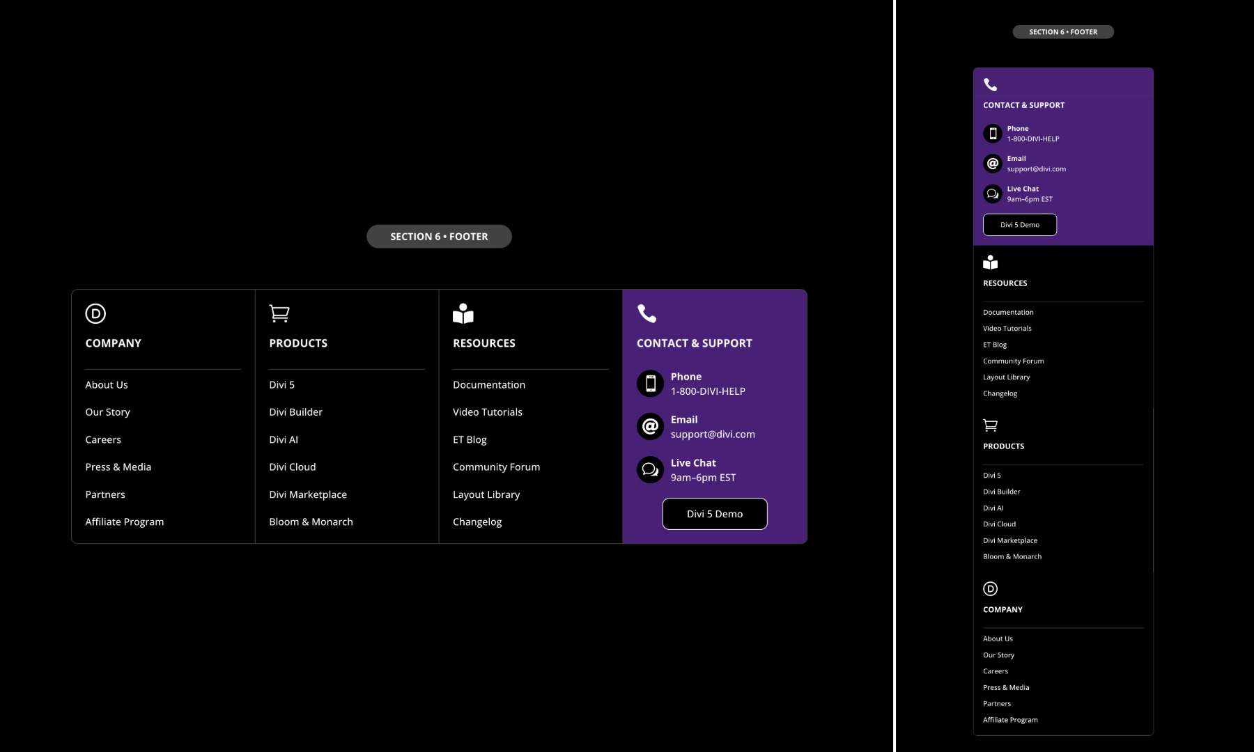
Goal: Create a four-column footer on desktop, such as Company, Products, Resources, and Contact & Support, while making sure the Contact column appears higher on mobile.
The Problem On Mobile: When footer columns stack on smaller screens, the Contact & Support column may end up last. This can force mobile users to scroll through less urgent link groups before reaching phone numbers, email links, or support options.
The Solution: Enable Layout Wrapping > Wrap on Tablet. Then, on the Phone breakpoint, switch to Wrap Reverse. This changes how the wrapped columns stack, allowing the last column to move higher in the mobile flow without manually assigning Display Order values to every column.
Why Use Wrap Reverse Here?
Wrap Reverse is useful when the main issue is line-level stacking rather than precise individual ordering. For footers, it can be a low-maintenance way to bring later columns, such as contact details, higher on smaller screens while keeping the desktop footer structure intact.
3. Alternating Image-Text Rows
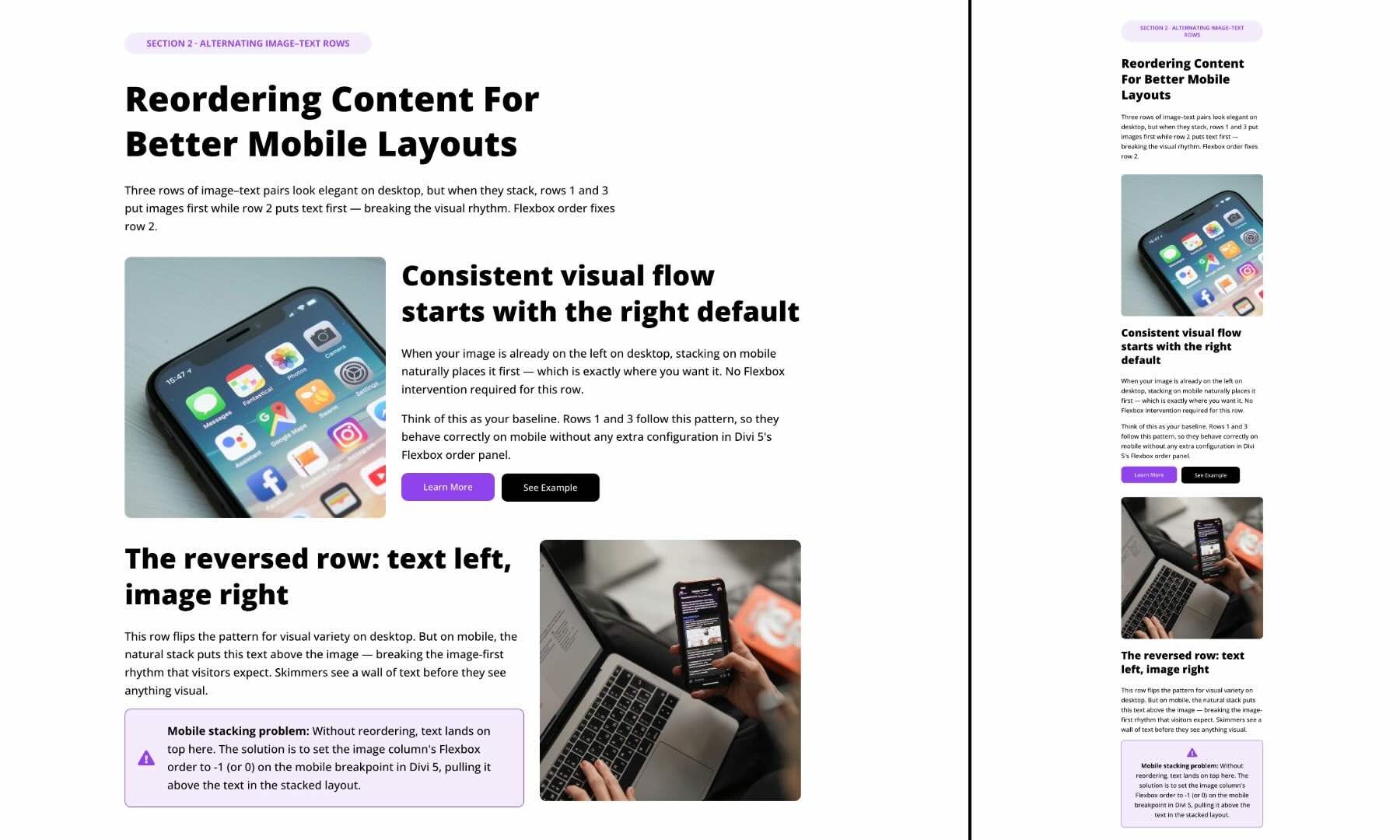
Goal: Maintain an alternating layout on desktop, such as image left/text right followed by text left/image right, while creating a consistent mobile flow.
The Problem On Mobile: With alternating rows, the default stacking behavior can create inconsistent mobile sequences. The first row may stack image first, while the second row stacks text first because its desktop source order is reversed. This can make the mobile layout feel uneven.
The Solution: On the second row, set the image column’s Display Order to -1 at the Phone breakpoint. This pulls the image above the text on mobile while keeping the desktop alternating layout unchanged.
Why Put The Image Above Text On Mobile?
For supporting content sections, images can act as visual anchors that introduce each topic. A consistent image-first pattern can make repeated sections easier to scan. This is different from a hero section, where the headline and CTA usually deserve priority.
4. Featured Card Grid
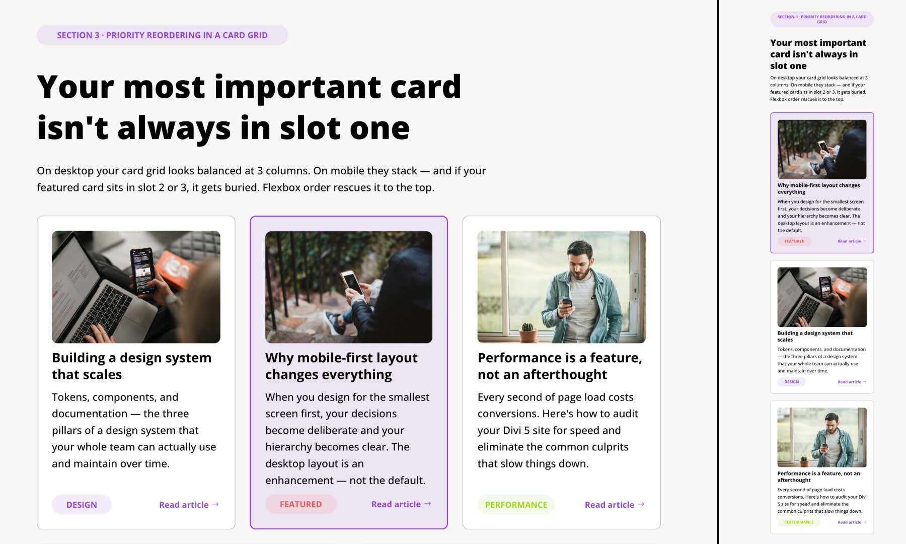
Goal: Create a balanced three-column card grid on desktop with a featured card in the middle, while making sure the featured card appears first on mobile.
The Problem On Mobile: On desktop, the featured card may sit in the center for visual balance. When the columns stack on mobile, the first card in the source order appears first, pushing the featured card into the second position.
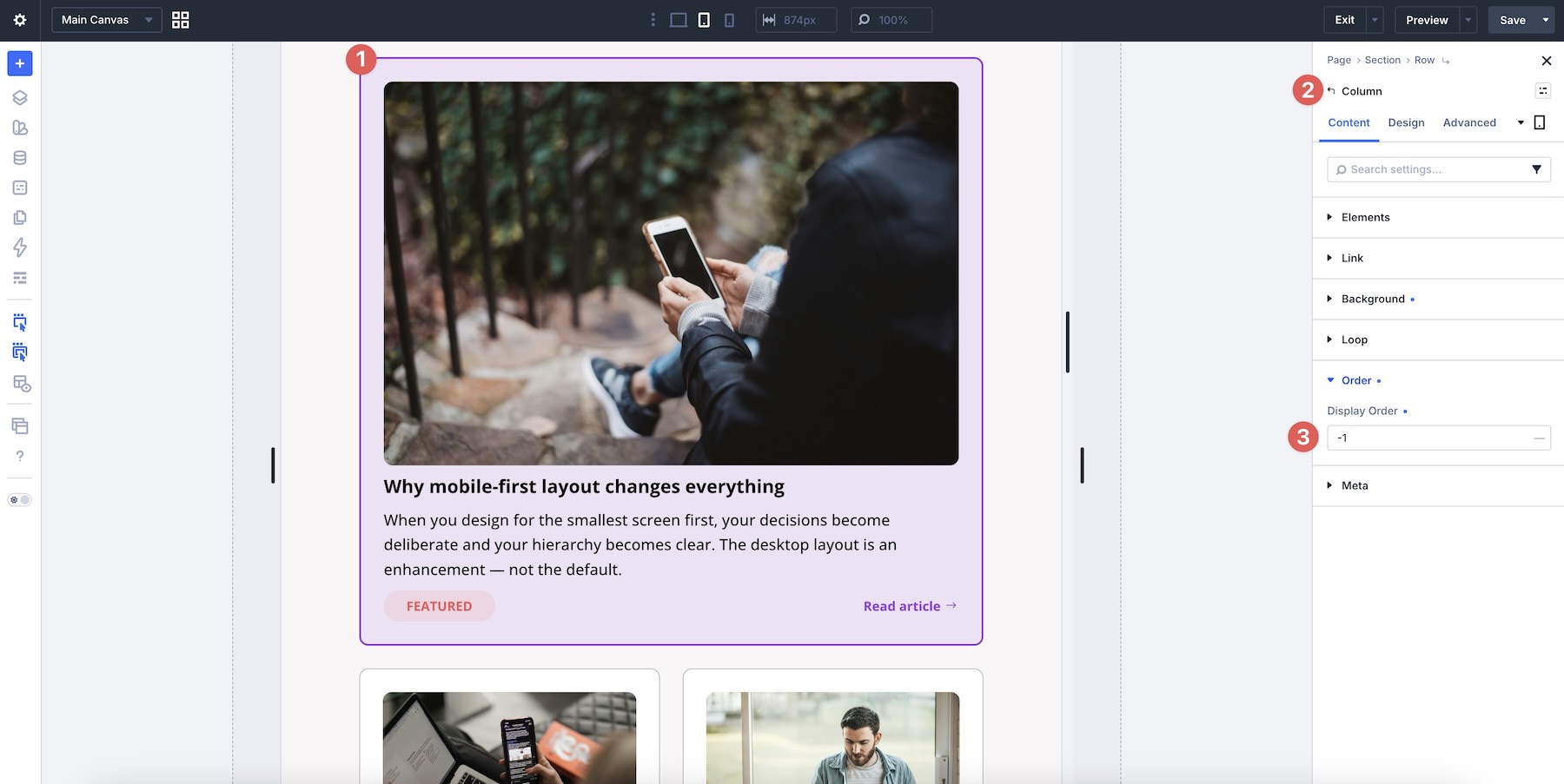
The Solution: Set the middle column, which contains the featured card, to Display Order > -1 at the Tablet and Phone breakpoints. This moves the featured card to the top of the mobile stack while keeping the desktop grid unchanged.
Why Put The Featured Card First On Mobile?
On mobile, users see one card at a time. If one card highlights a key offer, main benefit, or most important option, placing it first gives it immediate visibility and supports a clearer hierarchy.
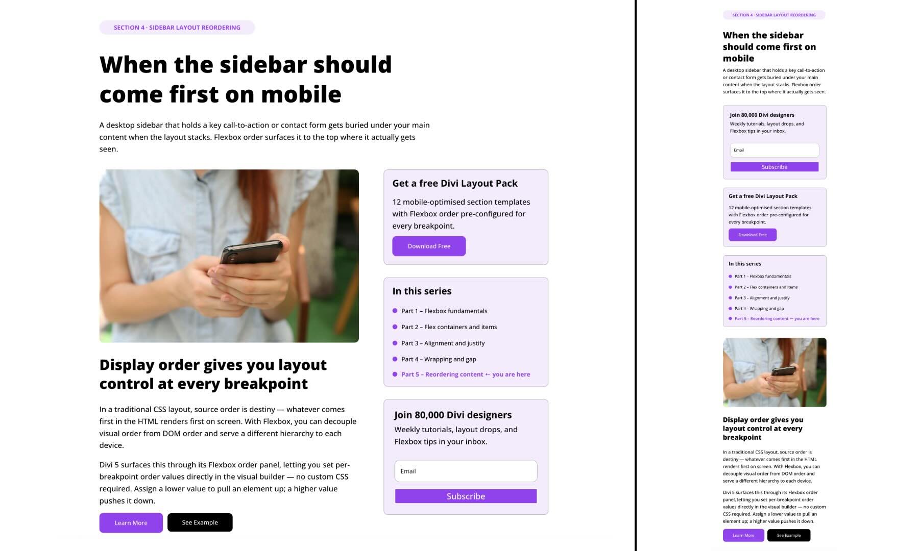
Goal: Create a two-column layout with main content on the left and a sidebar on the right on desktop, while making sure high-value sidebar content appears earlier on mobile.
The Problem On Mobile: By default, Divi stacks columns in source order. If the main content column appears first, the sidebar may be pushed far down the mobile page, even if it contains important CTAs, forms, or opt-ins.
The Solution: Set the sidebar column’s Display Order to -1 at the Tablet and Phone breakpoints. This moves the sidebar above the main content on smaller screens. Inside the sidebar, set the email opt-in Module Group to Display Order > -1 so it appears at the top of the sidebar content.
Why Put The Sidebar First On Mobile?
Sidebars often contain high-value actions, such as newsletter signups, contact forms, or promotional CTAs. Moving the sidebar higher can make those actions more visible before users scroll through a long article or page.
Why Move The Email Opt-In To The Top Of The Sidebar?
The email opt-in is often one of the most important actions in a sidebar. Moving it to the top creates an earlier opportunity for engagement while preserving the desktop layout.
6. Call To Action + Blurbs
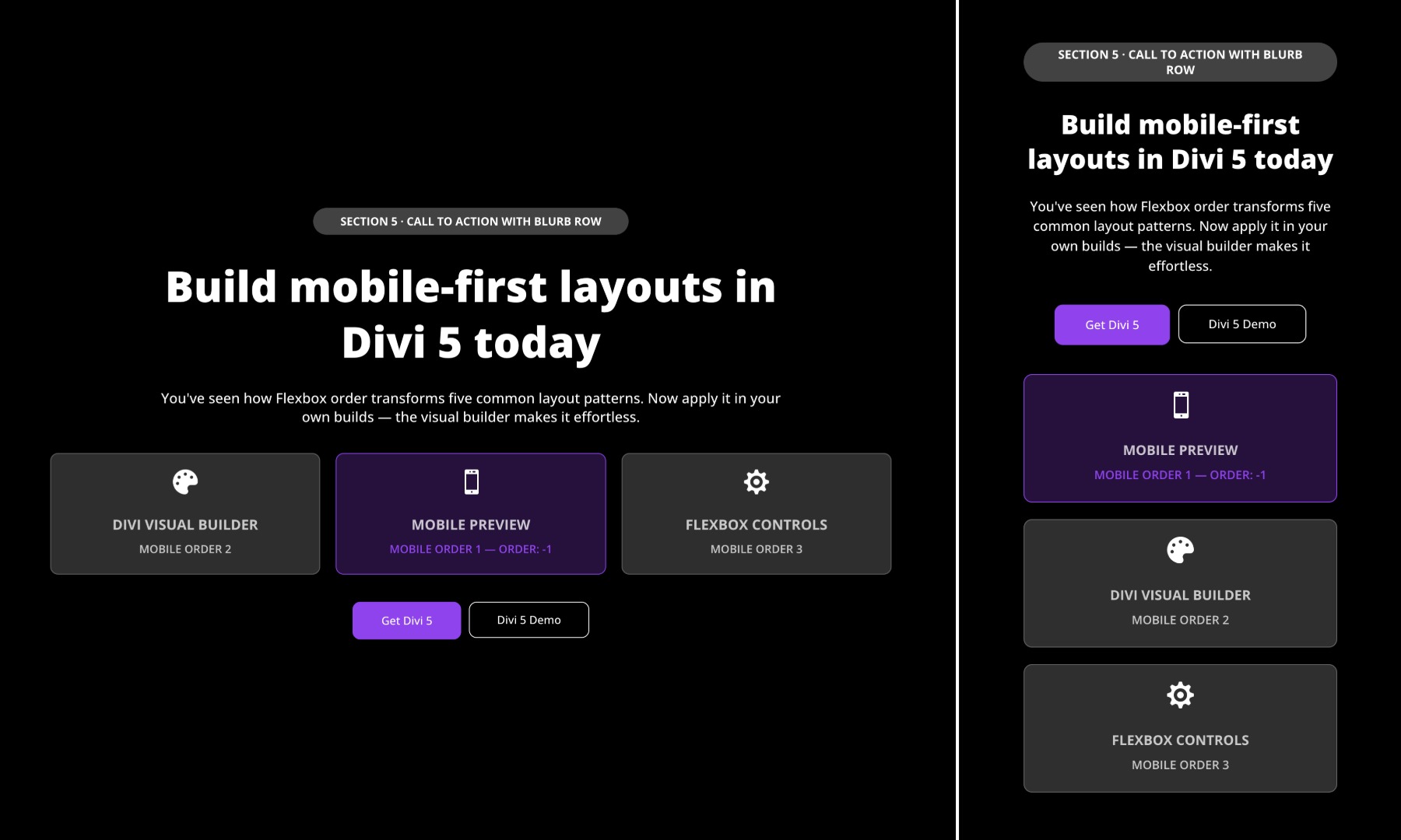
Goal: Create a section with a headline row, three feature blurbs, and a prominent button group on desktop, while bringing the CTA buttons higher on mobile.
The Problem On Mobile: If Divi stacks rows in source order, users see the headline, then the blurbs, and only then reach the CTA buttons. On mobile, this can place the primary action too far down the page.
The Solution: Use Display Order at the row level instead of only at the column level. For mobile, reorder the three rows like this:
- Row 1, Headline + copy: Display Order > 0
- Row 3, Buttons: Display Order > 0
- Row 2, Blurbs: Display Order > 1
This moves the button row directly after the headline on mobile without changing the desktop layout.
Why This Works
For conversion-focused sections, users should see the primary action early. Moving the buttons directly after the headline gives mobile visitors a clearer path to action, while the blurbs still provide supporting information afterward.
Step-By-Step Build Walkthrough
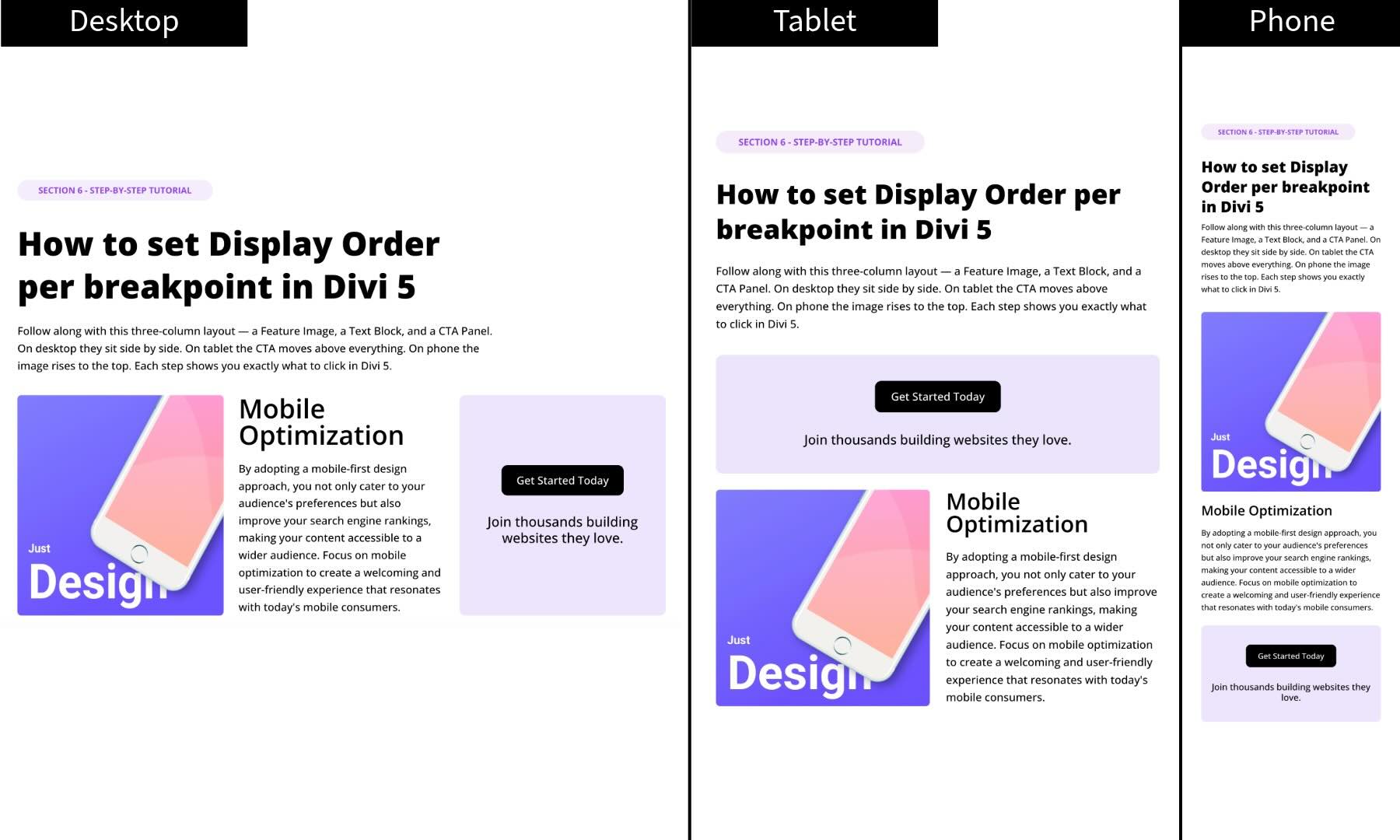
Now that you’ve seen how Display Order and Wrap Reverse can improve mobile layouts, let’s build a simple three-column section. On Desktop, the columns sit side by side. On Tablet, the CTA moves higher. On Phone, you can choose the order that best supports the content hierarchy.
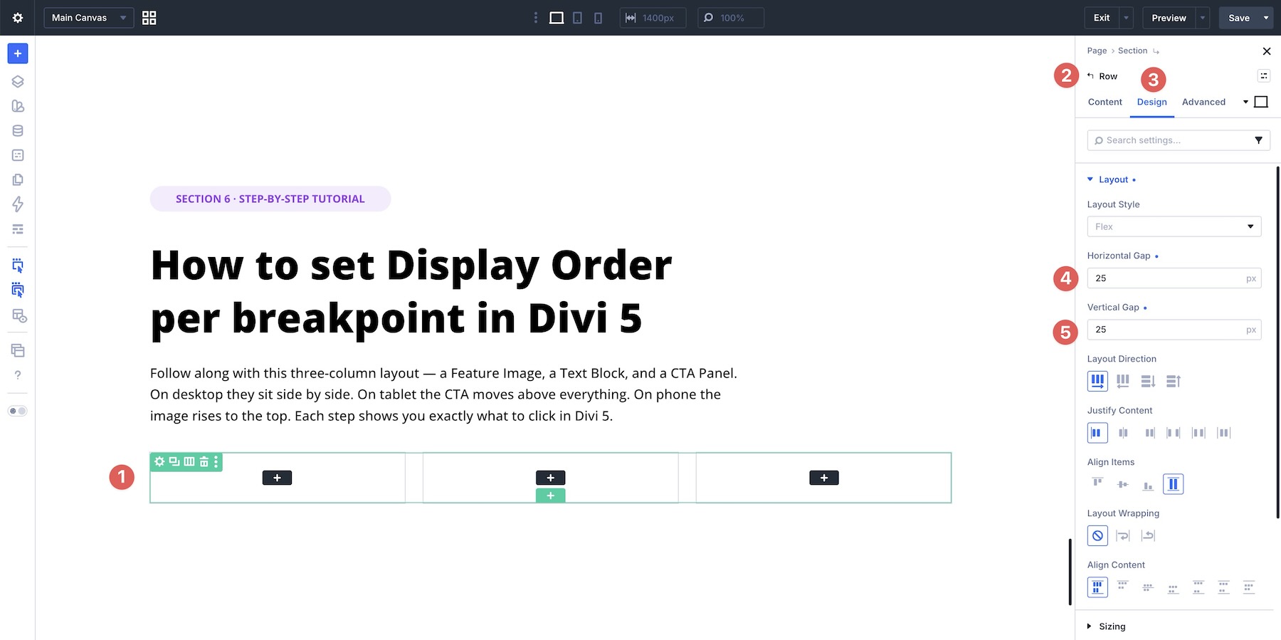
Step 1: Create The Desktop Layout
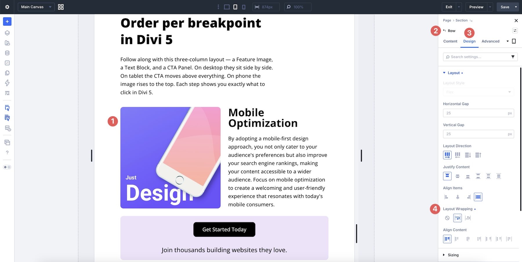
Add a three-column row to a page in the Visual Builder. Set the Vertical Gap and Horizontal Gap to 25px, then leave the remaining layout settings at their defaults unless your design needs additional adjustments.
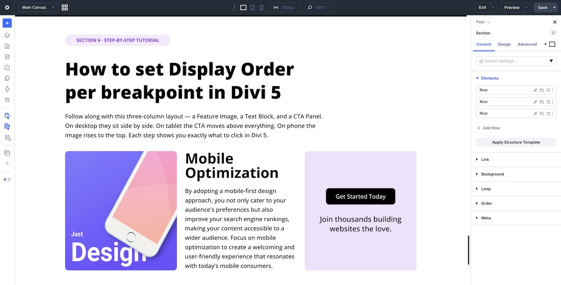
Add an image to the left column, supporting text to the middle column, and a CTA to the third column.
Step 2: Adjust Column Classes On Tablet
At the top of the builder, click the Tablet icon in the Responsive Breakpoint switcher. Any settings you change from this point forward apply to the Tablet breakpoint, while the Desktop layout remains unchanged.
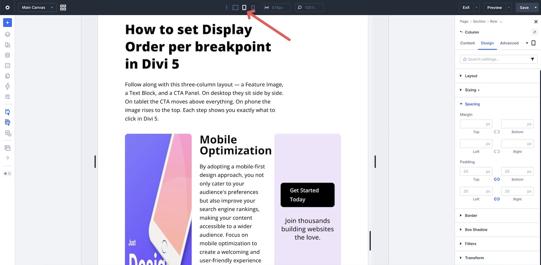
Next, adjust the number of columns shown at the Tablet breakpoint. Open each column and assign a Column Class, such as 1/2 for the first two columns and Fullwidth for the third column.
Step 3: Enable Layout Wrapping
Next, enable Layout Wrapping at the Tablet breakpoint. Without wrapping, the Column Class settings may not break into multiple lines as expected when the available width changes.
In the row’s Design tab, open the Layout option group and set Layout Wrapping to Wrap. This allows the columns to move onto additional lines.
Step 4: Set The Display Order
While still on the Tablet breakpoint, select column 3, which contains the CTA. In the column’s Content tab, go to Order > Display Order and enter -1.
Setting Display Order to -1 pulls the CTA column earlier in the visual order at the Tablet breakpoint. This gives the call to action higher visibility without changing the desktop source order.
Step 5: Switch To The Phone Breakpoint
After making changes at the Tablet breakpoint, switch to the Phone breakpoint.
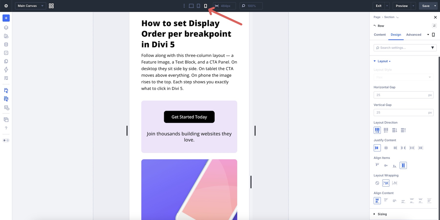
Review how the section stacks on Phone. Divi 5’s responsive controls let you make additional Phone-specific adjustments when the ideal mobile order differs from Tablet.
If you want the image to appear first on Phone while keeping the CTA higher on Tablet, adjust the third column, the CTA column, to Display Order > 2 at the Phone breakpoint.
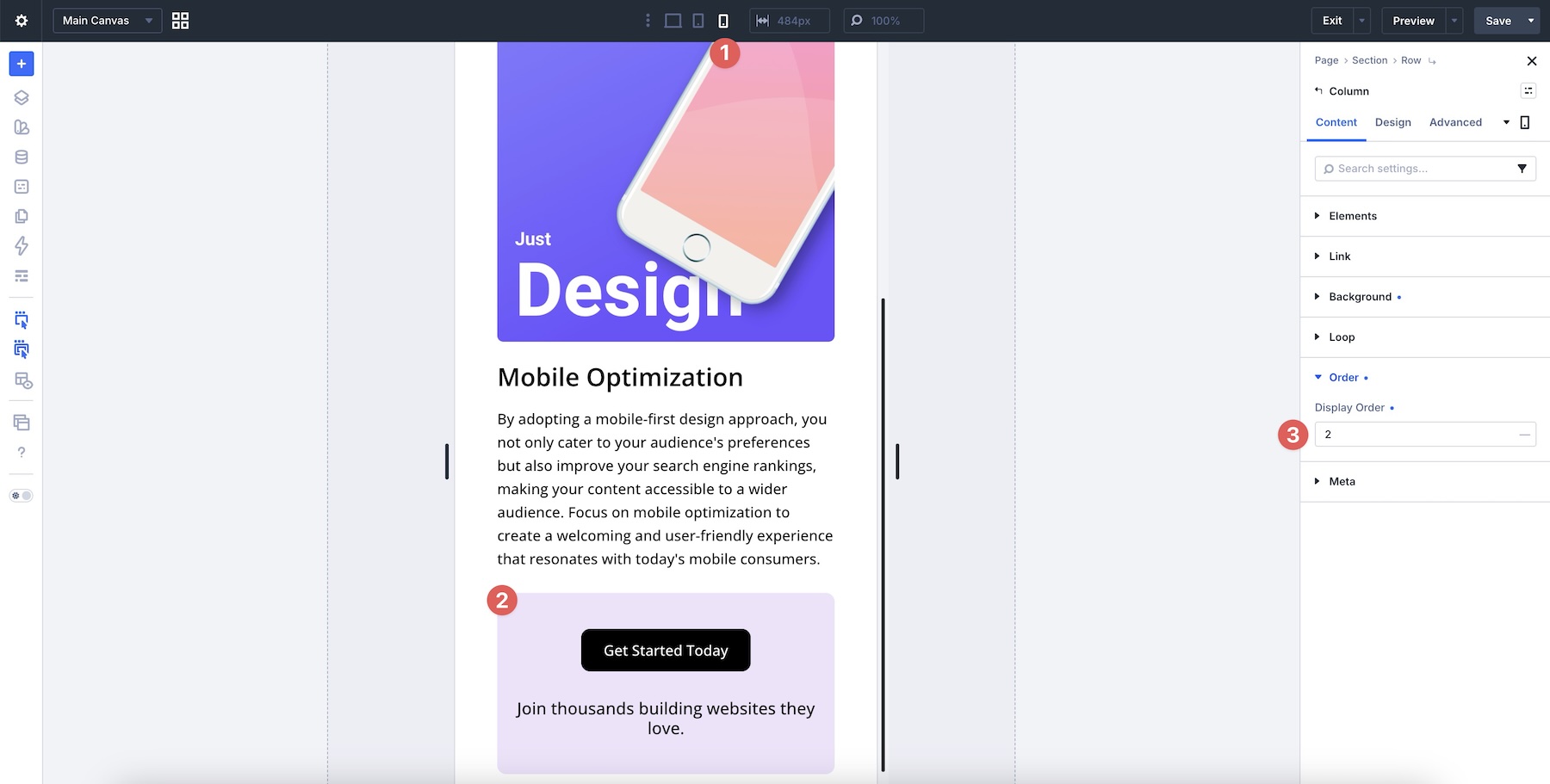
When you cycle through all breakpoints, each breakpoint displays the CTA in the order you specified.
Responsive Best Practices And Tips
Now that you know how to reorder content with Flexbox in Divi 5, here are practical tips to help you use these tools effectively while keeping layouts clean and easier to maintain.
Set Display Order Values At The Breakpoint Level
Avoid changing the order on Desktop unless the desktop design specifically requires it. Make most reordering adjustments at the Tablet or Phone breakpoint using Divi’s Customizable Responsive Breakpoints and/or the Responsive Editor. This keeps your desktop layout governed by clean source order while allowing targeted mobile changes.
Use Negative Values When Appropriate
When an important element, such as a featured card or primary CTA, needs to appear earlier on mobile, set its Display Order to -1. This is usually cleaner than assigning large positive numbers to every other item. Negative values clearly mark the item that should move earlier.
Only Reorder Elements That Need It
Every flex item starts with the same default order value. You usually only need to adjust the items you want to move. Reordering every column creates unnecessary maintenance work and makes future troubleshooting harder.
Reorder Based On Content Hierarchy, Not Just Appearance
The strongest reason to change order on mobile is to improve the visitor’s flow through the page. Prioritize key messages, calls to action, featured cards, opt-ins, or visual anchors based on what the user needs to see first. Every reordering decision should support the mobile content hierarchy, not just mirror a desktop design pattern.
Download The Layouts
To make the workflow easier to explore, we’ve created a zipped folder containing the section layouts used in this post. These are the finished, reordered versions, so you can inspect how Display Order, Layout Wrapping, and Wrap Reverse work together across breakpoints.
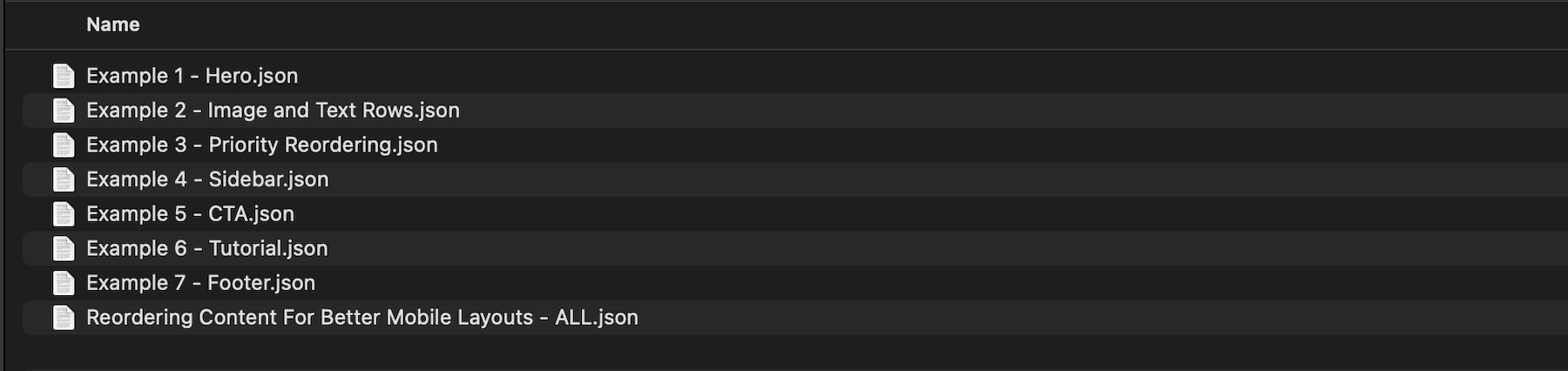
To use them, fill out the form below to access the files. Then go to Divi > Divi Library and click the Import & Export button.
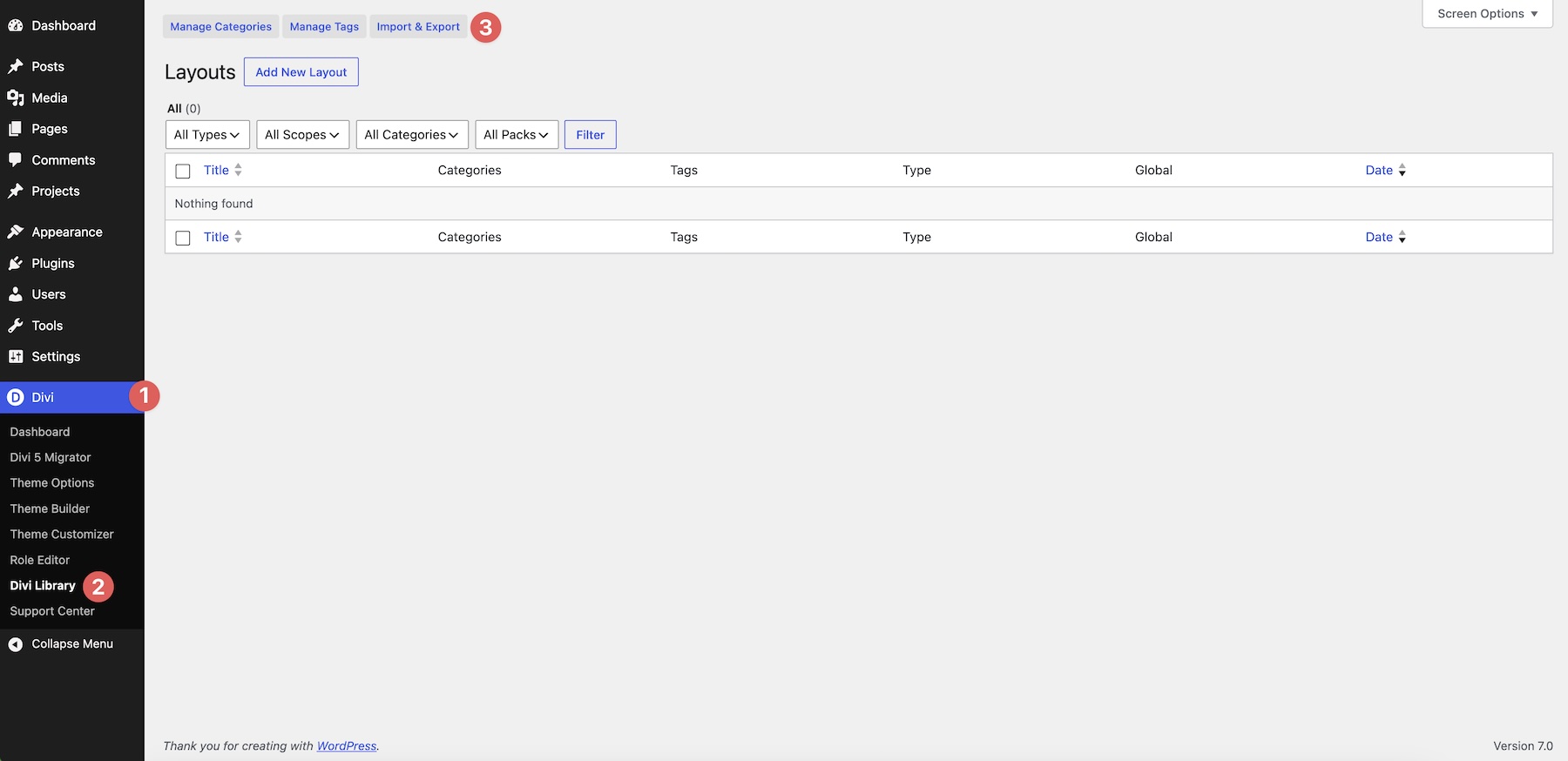
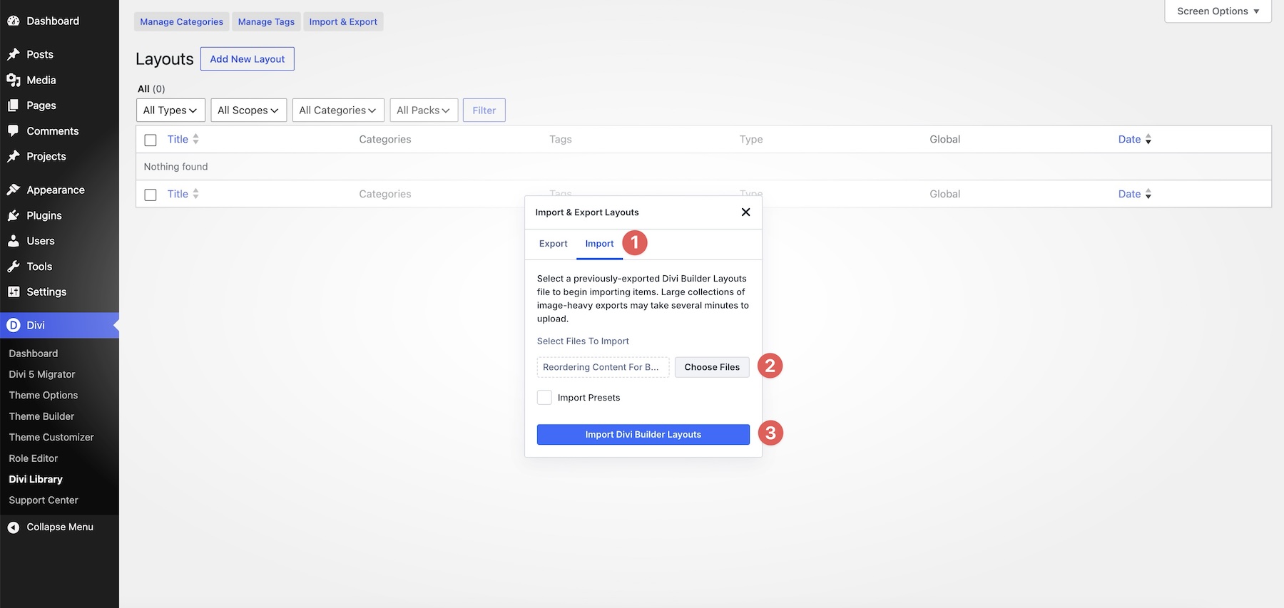
Switch to the Import tab, choose a JSON file to upload, and click Import Divi Builder Layouts.
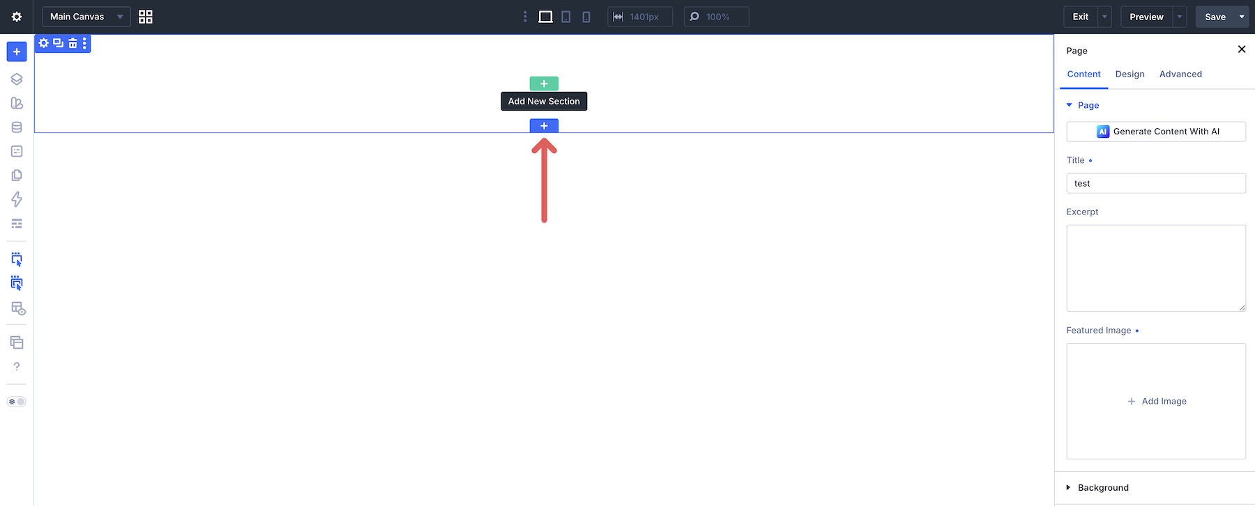
Next, create a new page or open an existing one in the Visual Builder. Click the blue + icon to add a new section to the page.
Choose Add From Library, select a layout, and click Use This Section.

Unlock Mobile Reordering In Divi 5
You no longer need to duplicate sections or write custom CSS for common mobile reordering patterns. With Divi 5‘s Flexbox ordering controls, you can create more intentional mobile layouts while keeping the desktop structure intact.
In Part 6 Of Mastering Flexbox: Key Tips For Building Responsive Layouts, we’ll bring everything together with responsive layout strategies, breakpoint-level adjustments, and real-world workflow tips for building cleaner Divi 5 layouts.
Download Divi 5, import the example layouts, and start experimenting with mobile reordering. Drop a comment below and let us know which reordering technique you found most useful.










Leave A Reply