

Picking a font used to be a short decision. You chose the font, picked a weight, adjusted the size, and moved on. Variable fonts change that workflow. One font can include a range of adjustable axes, and each axis changes something about how the letters are drawn.
Inside Divi 5, those axes become visual controls. Depending on the font you choose, you can stretch letters wider, squeeze them narrower, lean them forward, round their corners, adjust stroke density, or fine-tune a weight that sits between two traditional font styles. The real value appears when you combine settings instead of moving one slider at a time. A plain sans can become sharper and more editorial. The same font can become softer and friendlier. A serif can use its expressive axis for headlines, then turn that personality down for body text.
In this post, we’ll walk through 7 variable font combinations you can try in Divi 5. Each example uses a specific font, a specific set of axis values, and a practical design context so you can see how the settings work together.
- 1 What A Variable Font Actually Is
- 2 How Divi 5 Handles Variable Fonts
-
3
7 Variable Font Setting Combinations To Try In Divi 5
- 3.1 1. Build A Whole Page With Google Sans Flex
- 3.2 2. Open Up The Letters With Science Gothic
- 3.3 3. Fine-Tune Roboto Flex For A Blog Feed
- 3.4 4. Keep It Simple With Inter
- 3.5 5. Turn Wonk On And Off With Fraunces
- 3.6 6. Lean The Letters With Recursive
- 3.7 7. Go Thin And Wide With Bricolage Grotesque
- 4 Working With Variable Fonts In Divi 5
- 5 One Font, As Many Looks As You Need
What A Variable Font Actually Is
A traditional font family is usually made from separate font files. Regular is one file, Bold is another, Light is another, and italic styles may use separate files too. If you want several weights on one site, the browser may need to load several font files, each with a fixed style.
A variable font works differently. It stores a range of styles inside one font file. Instead of choosing only Regular, Medium, Bold, or Black, you can move along the available range and choose the exact value that fits the design.
Source: VariableFonts.io
That flexibility is the point. You get more typographic range from one typeface, and you can make smaller decisions than a static font family usually allows.
The Ranges Are Called Axes
Each adjustable range inside a variable font is called an axis. An axis controls one part of the font’s design, and each one has a short tag you may see in font documentation.
Source: Font Playground
Common axes include:
- Weight: Controls how light or heavy the strokes are.
- Width: Makes the letters narrower or wider.
- Slant: Tilts the letters without necessarily switching to a separately drawn italic style.
- Optical Size: Adjusts the font for the size it is displayed at, usually making smaller text more readable and larger text more refined.
Font designers can also create custom axes. One font might let you round corners. Another might change the counters inside the letters. Another might add a playful morph, a handwritten feel, or a pixel-like structure. That is why variable fonts are not all the same. The font you choose determines which controls are available.
Not Every Font Has The Same Axes
Some variable fonts only include a Weight axis. Others include Weight, Width, Slant, Grade, Roundness, or more unusual font-specific controls.
That matters inside Divi 5 because the builder only shows the controls the selected font supports. If a font does not include a Width axis, you cannot make it condensed with a variable font slider. If it does not include Roundness, there will be no roundness control to adjust.
That is why every example below names the font and the axis values together. The settings only work when the font includes the axes underneath them.
How Divi 5 Handles Variable Fonts
Divi 5 supports the latest Google Fonts collection, including variable fonts and the controls they provide.
When you choose a supported Google variable font inside a text option group, Divi checks which axes that font includes and shows the matching controls in the builder. A simple variable font may give you one slider. A more advanced one may expose several.
For example, Google Sans Flex gives you controls such as Weight, Width, Slant, Rond, and Grade. A display font may expose one unusual axis that changes the whole personality of the typeface.
The important part is that you do not need to memorize every axis a font supports before you start. Choose the font, open the relevant text option group, and Divi shows the available controls for that font.
More Than Sliders: New Text Styling Options
The same Divi 5 release also added new base-level styling options to title and body text groups. These settings work with variable and non-variable fonts, and they help you control how text behaves inside the layout. A few of the most useful additions include:
- Text Columns: Create magazine-style text layouts without splitting copy into separate modules.
- Drop Caps: Add and style large first letters in body text.
- Text Direction: Create vertical text treatments.
- Stroke Position: Control whether text strokes sit centered or outside the letters.
- Capitalization: Apply more specific capitalization styles.
- Paragraph And List Spacing: Control spacing between paragraphs and list items.
- Hyphenation: Help long words break more cleanly inside narrow containers.
- Line Wrap Style: Control how text breaks across lines.
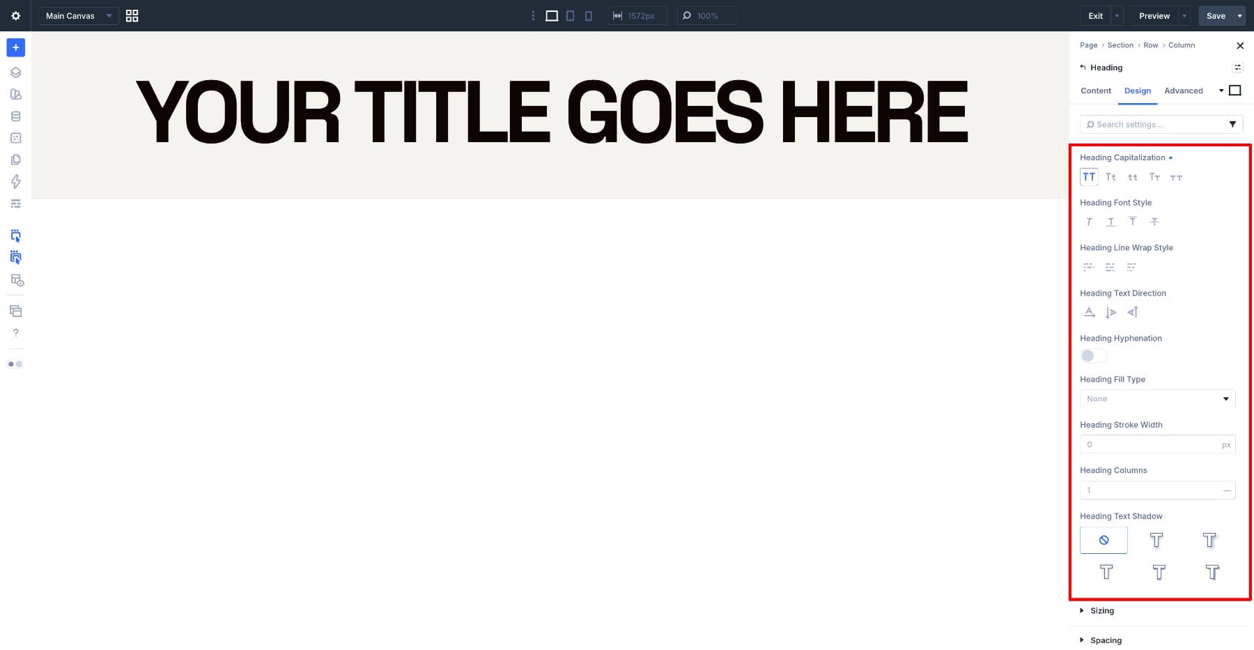
Think of it this way: variable font axes shape the letters themselves. Divi 5’s text styling options shape how those letters sit inside the layout.
7 Variable Font Setting Combinations To Try In Divi 5
One thing to sort out before you start: axis values are adjusted directly in the variable font controls. Your text sizes, line heights, spacing, and colors can still use Design Variables where supported, but the variable font axis values themselves should be treated as part of the typography style you save.
Once a combination looks right, save it as an Option Group Preset. That way, you can apply the typography treatment later without re-entering several axis values by hand.
1. Build A Whole Page With Google Sans Flex
Google Sans Flex is a strong starting point because it includes several practical axes. You can adjust weight, width, slant, roundness, and grade, which makes it useful for building a full page from one typeface. For this example, we’ll use it on a consultant-style page and create three text levels: a large name or hero heading, a section heading, and body text.
Pick Google Sans Flex from the Heading Font dropdown. The variable font controls appear underneath. Start with the hero heading. Set the heading level to H1, set Heading Text Size to 10vw, and set Heading Line Height to 1em so the lines sit close together. Use these variable font settings:
- Variable Font Weight: 550
- Variable Font Width: 115
- Variable Font Slant: 0
- Variable Font Rond: 0
- Variable Font Grade: 100
Width does the most visible work here. At 115, the letters stretch sideways and fill more of the line. The weight stays at 550, which keeps the strokes open instead of overly heavy. Grade at 100 adds density without widening the letters, which helps the heading feel stronger without forcing a new line break.
Rond stays at 0, keeping the corners sharper and more businesslike. Now use the same font for the section heading, but pull back the weight:
- Variable Font Weight: 420
- Variable Font Width: 111
- Variable Font Grade: 80
- Heading Text Size: 60px
The section heading keeps the same general proportions, but it reads as a level below the hero because the strokes are lighter and the size is smaller.
For body text, narrow the letters and raise the weight:
- Variable Font Weight: 600
- Variable Font Width: 86
- Variable Font Grade: 40
- Text Size: 17px
Width at 86 fits more words on each line, which helps longer paragraphs. Narrow letters can look lighter at small sizes, so the weight increases to 600. Grade drops to 40 because body text does not need the same extra density as a large heading.
Now the page has three levels from one font: a wide hero heading, a lighter section heading, and a narrower body style. They feel connected because the underlying letterforms are the same, but each level has its own role.
Worth trying: Go back to the hero heading and pull Variable Font Rond from 0 to 100 while leaving the other settings in place. The corners round off, the stroke endings soften, and the same page shifts from sharp and technical to friendlier and more open.
That is the advantage of using a multi-axis font. You can change the feeling of the entire typography system without switching typefaces.
2. Open Up The Letters With Science Gothic
Science Gothic gives you axes for weight, width, slant, and Ctrs. Ctrs refers to counters, which are the enclosed spaces inside letters like o, e, a, and p. When you adjust the Ctrs axis, those inner spaces open or close while the outside of the letter stays more controlled. That means you can change how open the text feels without dramatically changing how much room it takes up.
Here is the hero setup for a tech landing page:
- Variable Font Weight: 420
- Variable Font Width: 99
- Variable Font Slant: 0
- Variable Font Ctrs: 0
- Heading Text Size: 73px
- Heading Line Height: 1.2em
The size gives the heading presence, while Ctrs at 0 keeps the counters tight and the letterforms squared off. That is what gives the heading its machine-like tone. Now move the Ctrs slider on its own and watch letters like o and e. Drag it gradually rather than jumping to a final number, because the change is easier to understand in motion.
For the section heading, make the opposite move: thinner and wider.
- Variable Font Weight: 320
- Variable Font Width: 116
- Variable Font Slant: 0
- Variable Font Ctrs: 0
- Heading Text Size: 48px
Weight at 320 with width at 116 spreads the heading across the column without making it feel heavier. Thin and wide reads quieter than solid and upright, which helps it sit below the hero.
For body text, narrow the letters back down:
- Variable Font Weight: 333
- Variable Font Width: 85
- Variable Font Ctrs: 0
- Text Size: 17px
The body weight stays close to the section heading so the two feel related. All three levels keep Ctrs at 0, which carries the squared-off visual language from the headline down to the paragraph.
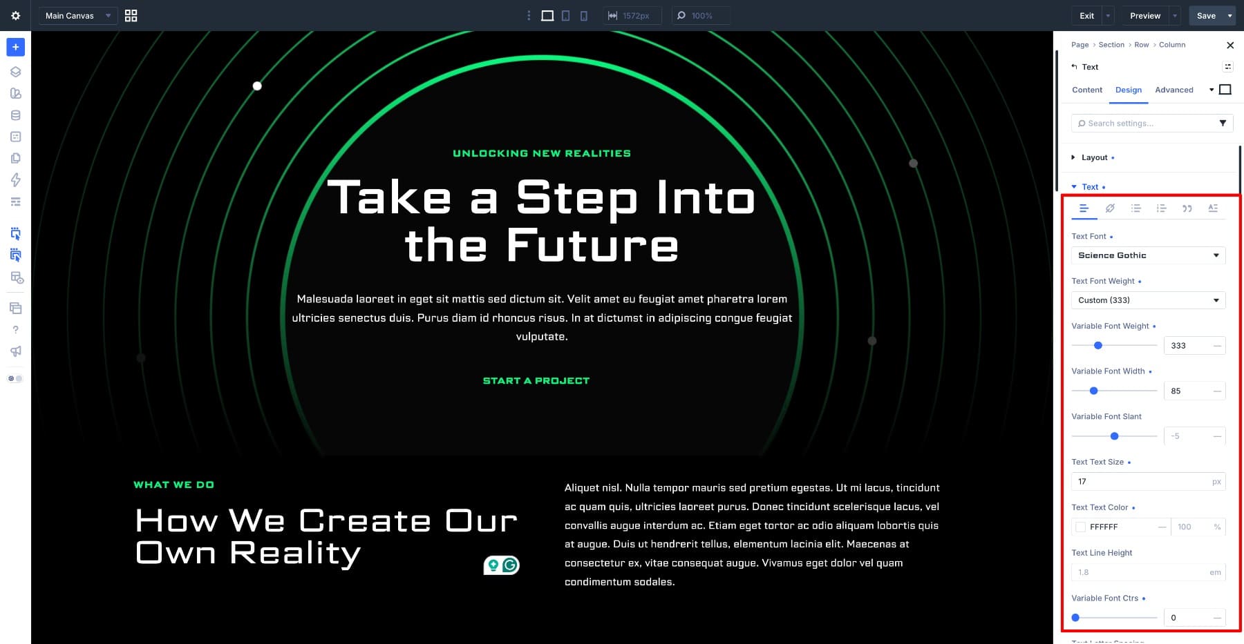
Science Gothic also includes a Slant axis, but this kind of wide technical typography often works best upright. Leave Slant at 0 unless the layout needs a sense of movement.
3. Fine-Tune Roboto Flex For A Blog Feed
Roboto Flex gives you a wide set of controls. Along with weight, width, slant, and grade, it exposes more detailed axes such as Thin Stroke, Thick Stroke, lowercase height, and other fine-tuning controls. Those stroke controls are especially useful in editorial layouts because a masthead, post title, and paragraph each need different amounts of contrast and readability.
For the blog masthead, try:
- Variable Font Weight: 595
- Variable Font Width: 135
- Variable Font Slant: -5
- Variable Font Grade: 27
- Variable Font Thin Stroke: 25
- Variable Font Thick Stroke: 127
The wide gap between Thin Stroke and Thick Stroke gives the letters more contrast. The uprights and curves feel fuller, while the connecting strokes stay thinner. Width at 135 spreads the masthead out, and Slant at -5 gives it a subtle lean without making the whole layout feel unstable.
Post titles need that contrast pulled back:
- Variable Font Weight: 500
- Variable Font Width: 100
- Variable Font Slant: 0
- Variable Font Grade: 0
- Variable Font Thin Stroke: 86
- Variable Font Thick Stroke: 96
- Heading Text Size: 42px
The stroke values are only ten points apart, which makes the titles feel more even. That matters in a blog feed because readers are scanning several titles in a row, and the words need to land before the letterform details do.
Body text closes the stroke contrast even further:
- Variable Font Weight: 400
- Variable Font Width: 100
- Variable Font Grade: 0
- Variable Font Thin Stroke: 90
- Variable Font Thick Stroke: 92
- Text Size: 17px
At body size, thin strokes are the first thing to disappear on smaller or dimmer screens. Keeping Thin Stroke and Thick Stroke close together makes the letters feel more even and readable.
The masthead and body text sit at opposite ends of the same idea. Large text can handle more contrast and personality. Small text usually needs the settings pulled back so the paragraph stays comfortable to read.
4. Keep It Simple With Inter
Not every variable font needs a long panel of sliders. Inter is a good example. It is built for screens and interfaces, and its main practical control is weight. That can be enough. An event registration page runs on hierarchy. The headline needs to feel immediate. The subheading needs to register as a label. The body copy and prices need to stay clear.
Use Inter for the full page and set the weights by role:
- Heading, Variable Font Weight: 900
- Subheading, Variable Font Weight: 400
- Body, Variable Font Weight: 400
Weight at 900 gives the heading enough force, especially on a dark background. The subheading above it stays lighter because it is a supporting label, not the main message. Body text stays at 400, where Inter is most comfortable for reading.
This example is intentionally simple. A variable font does not need five axes to be useful. Sometimes the right weight range is enough to build a clean hierarchy.
5. Turn Wonk On And Off With Fraunces
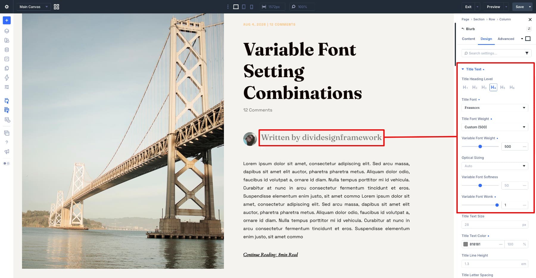
Fraunces is a serif variable font with expressive axes, including Wonk and Soft. Wonk changes specific letterforms. At 0, Fraunces behaves like a cleaner serif. At 1, some letters become more off-kilter and editorial. That makes it great for headlines, but it should be handled carefully in long-form text.
For the headline, turn Wonk on:
- Variable Font Weight: 700
- Variable Font Soft: 0
- Variable Font Wonk: 1
- Heading Text Size: 70px
The change can feel subtle at first, then hard to unsee. Most letters stay familiar, while a few add the personality. Soft stays at 0 so the corners keep their edge. For the byline, keep Wonk on but reduce the weight:
- Variable Font Weight: 500
- Variable Font Soft: 0
- Variable Font Wonk: 1
At a smaller size, the odd letterforms are still visible, but they are not loud. The weight at 500 keeps the byline sitting below the headline.
For body text, turn Wonk off:
- Variable Font Weight: 400
- Variable Font Soft: 0
- Variable Font Wonk: 0
The same quirk that makes Fraunces interesting in a headline can slow down reading in a paragraph. Turning Wonk off gives the body text a calmer, more comfortable serif voice.
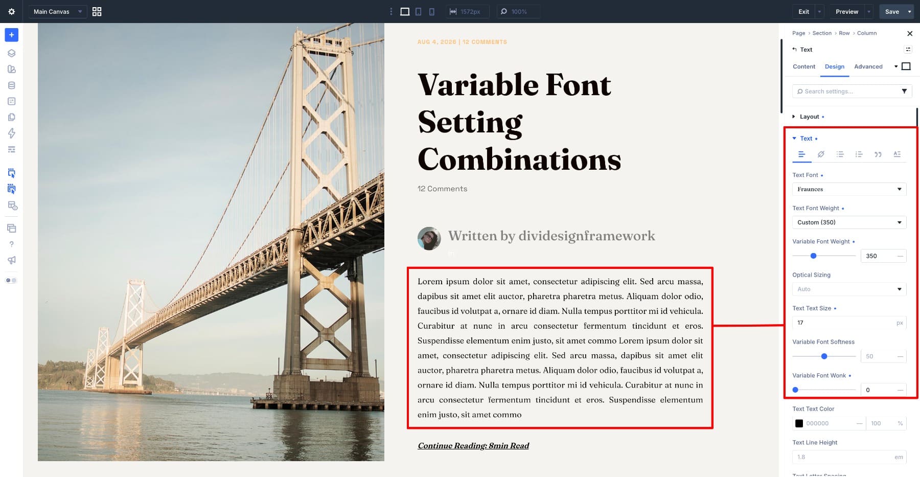
One more axis is worth testing: Soft. Push Soft up on the headline and the corners round off. Fraunces becomes warmer without losing its serif structure, which can work well for food, lifestyle, editorial, or boutique brand layouts.
The useful pattern here is simple: turn the personality up where the text is large, then turn it down where people need to read for longer.
6. Lean The Letters With Recursive
Slant and italic are not the same thing. Italic styles are often separately drawn letterforms. Slant tilts the existing letterforms. Recursive makes that difference easy to see. Move the Slant slider slowly and the letter shapes stay related as they lean forward.
Recursive also includes Casual, which softens the font’s personality as you raise it. That gives you two different ways to create contrast: motion through Slant and tone through Casual. For a tech company page, let the heading lean while the body text stays upright. For the section heading:
- Variable Font Weight: 700
- Variable Font Slant: -15
- Variable Font Casual: 0
- Heading Text Size: 44px
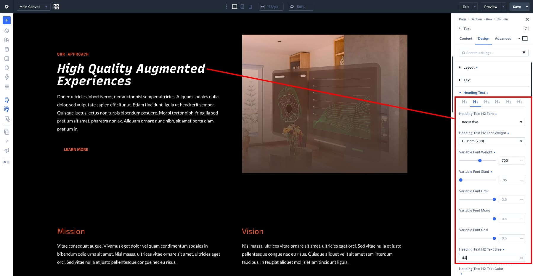
Weight at 700 matters because a light slanted heading can look unstable. The heavier weight gives the angle enough structure.
For the subheading, repeat the slant:
- Variable Font Weight: 600
- Variable Font Slant: -15
- Variable Font Casual: 0
- Text Size: 14px
A short subheading is a good place to repeat the angle because it reinforces the treatment without making long text tiring. Increase letter spacing if the subheading is uppercase, since small all-caps text usually needs more room.
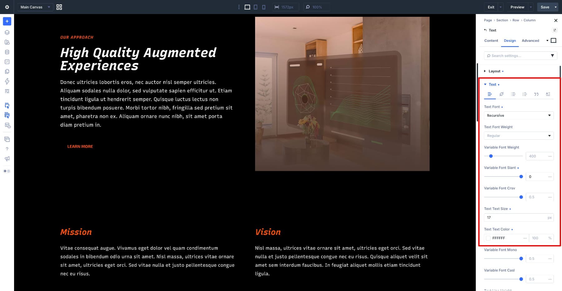
For the body text, turn the slant off:
- Variable Font Weight: 400
- Variable Font Slant: 0
- Variable Font Casual: 0
This is what makes the slant feel intentional. The heading leans, the supporting label echoes it, and the paragraph stays still beneath both of them.
Then test Casual. Push it up on the heading while Slant stays at -15. The letters soften and shift from engineered to more hand-drawn. A middle value can work well for product pages that want a technical structure without feeling cold.
Recursive also includes a Mono axis. Set it to 1 for specs blocks, code snippets, or technical labels where every character should take the same width.
7. Go Thin And Wide With Bricolage Grotesque
Bricolage Grotesque gives you weight, width, and optical size. Its lower weight range makes it useful for layouts that need a masthead that feels large, elegant, and airy instead of loud. For a modeling agency page, build the hierarchy by taking weight away instead of adding it. For the masthead:
- Variable Font Weight: 300
- Variable Font Width: 100
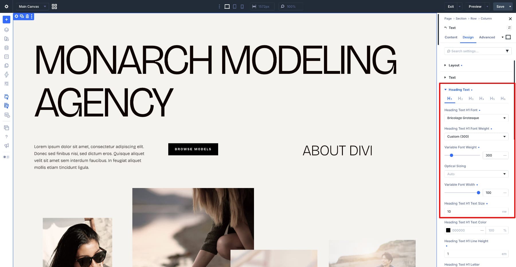
At 300, the strokes are light enough to feel refined. Set large in all caps, the heading fills the screen without shouting. For the section heading:
- Variable Font Weight: 200
- Variable Font Width: 87.5
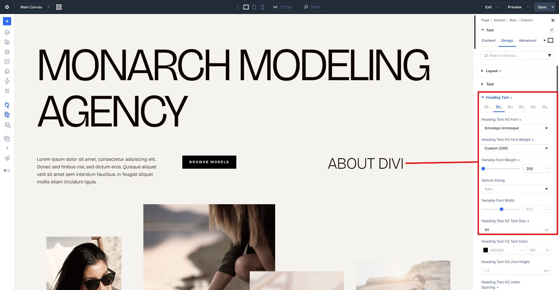
The weight drops to 200, and the width narrows to 87.5. That makes the section heading quieter than the masthead without relying only on size. For body text:
- Variable Font Weight: 250
- Variable Font Width: 87.5
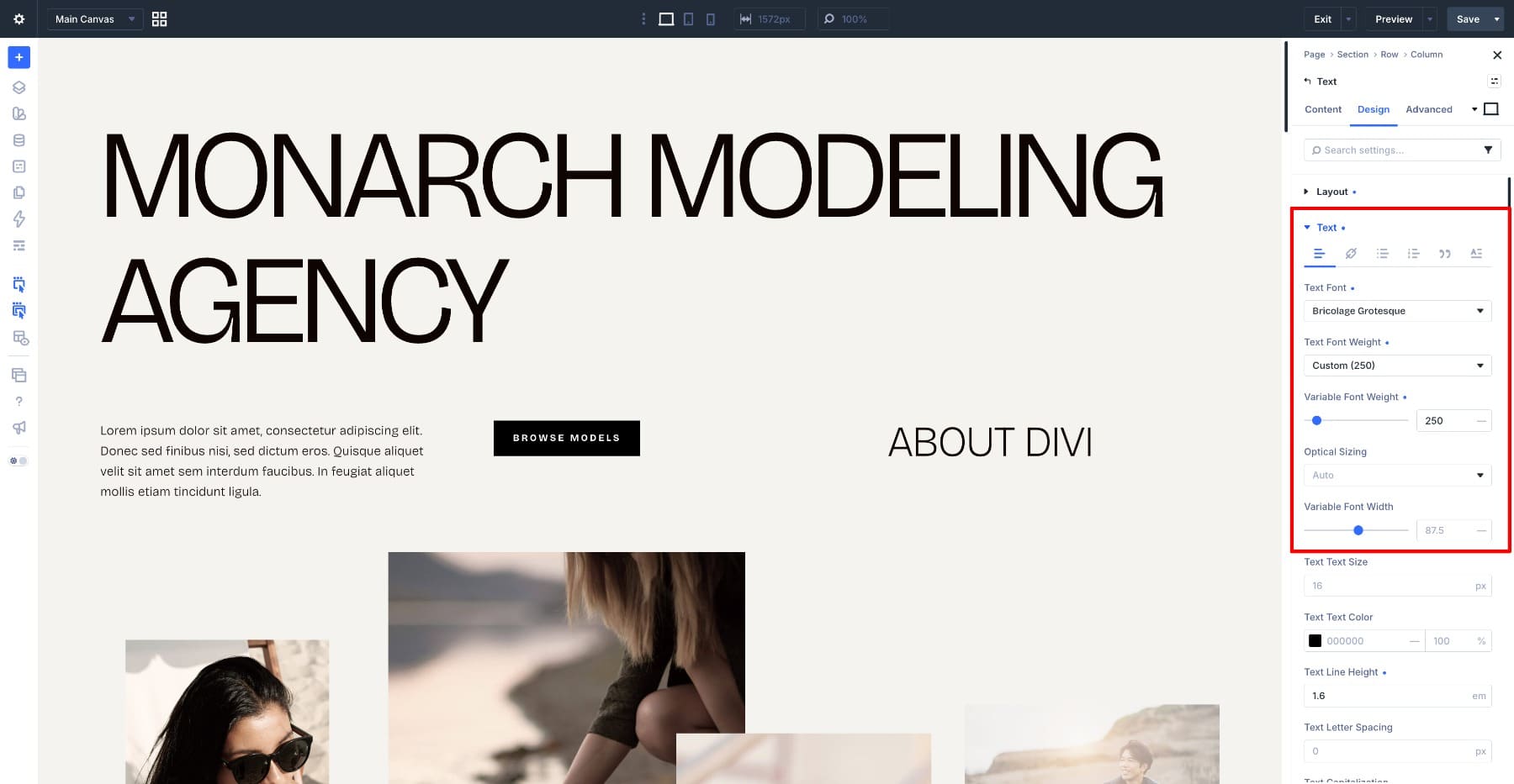
The body text is slightly heavier than the section heading, which may sound backwards until you see it at reading size. Small text loses visual strength faster than large text, so 250 keeps the paragraph solid. The width stays at 87.5, so the body text and section heading still feel like part of the same system.
This page never gets heavier than 300. The hierarchy comes from proportion, size, spacing, and restraint.
Working With Variable Fonts In Divi 5
A few habits make variable fonts easier to use.
- Find The Variable Fonts First: On Google Fonts, use the variable fonts filter before choosing a typeface. Open the specimen page and check which axes the font supports. Tools like Wakamai Fondue can also inspect a font file and list its axes, ranges, and features.
- Let The Axes Decide What You Build: Work backward from the design problem. If you need condensed headings, choose a font with a Width axis. If you need softer typography, choose a font with Roundness, Softness, or a similar control.
- Move One Slider At A Time: When a font has several axes, do not drag everything at once. Move one setting, look at what changed, then adjust the next one.
- Set The Big Text First: Axis changes are easier to see at display sizes. Get the headline right first, then pull the settings back for section headings, labels, and body copy.
- Turn Down Personality For Body Text: Roundness, Wonk, Slant, Casual, and other expressive axes can work beautifully in headings, but they often need to be reduced for paragraphs.
- Save Each Combination As A Preset: A full typography treatment can include several axis values. Save one Option Group Preset per role, such as Hero Heading, Section Heading, Subheading, or Body Text, so the settings can be reused consistently.
- Use One Font For More Than One Job: Before adding a second font, check whether the current variable font can handle the job with a different weight, width, grade, slant, or personality setting.
Variable fonts reward deliberate adjustments. The best results usually come from a few clear settings repeated across the site, not a different axis value on every module.
One Font, As Many Looks As You Need
Most sites add a second font because the first one feels wrong in one place. The headline needs more presence. The body text feels too heavy. The section heading needs to stretch wider or sit quieter. With a variable font, that gap may be one slider away.
The 7 examples above show different ways to use that flexibility in Divi 5. Google Sans Flex can build a whole page and shift from sharp to friendly. Science Gothic can tighten or open its counters. Roboto Flex can fine-tune stroke contrast across a blog feed. Inter can build hierarchy with weight alone. Fraunces can turn Wonk on for headlines and off for paragraphs. Recursive can lean headings while keeping body text upright. Bricolage Grotesque can create an elegant system by staying thin and wide.
Before you go back to the font dropdown, open the variable controls on the font you already chose. You may be able to create the hierarchy, tone, and variation you need without switching typefaces at all.










Great article, Ekta. It would be helpful for variable fonts to be isolated when opening the Text font dropdown selector. Variable fonts up top and isolated. The workflow now is to visit the google fonts page and run filters there, then back to divi to work.