

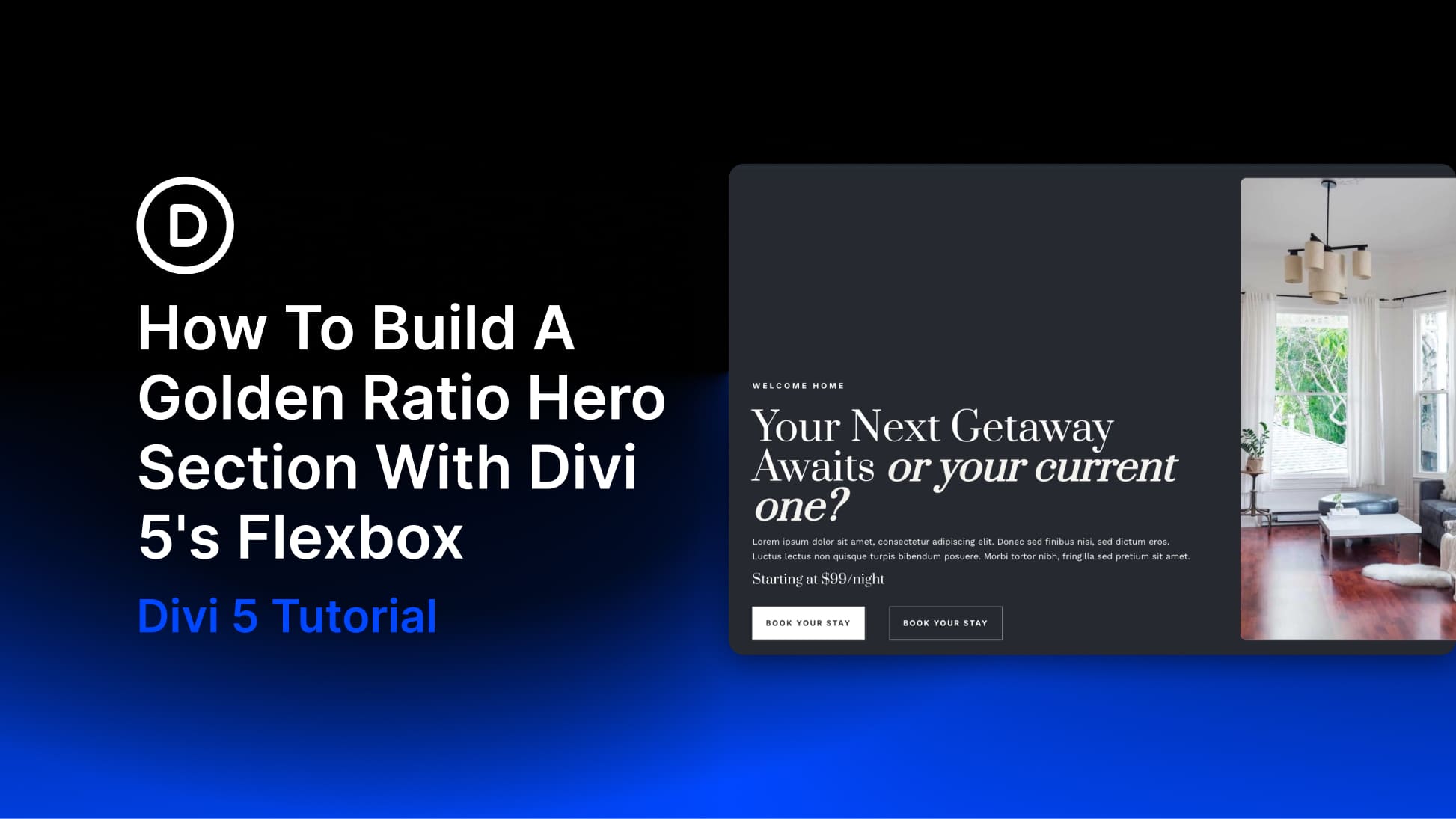
A hero section sets the page’s tone, and proportion helps guide visitors to the right place first. In a two-column layout, giving the content more room creates a stronger focal point while keeping the image present and supportive.
In Divi 5, you can create that balance with a 3/5 and 2/5 Flexbox row, which gives you a practical 60/40 split. It is not the exact golden ratio, which is closer to 61.8/38.2, but it follows the same idea: one side leads while the other supports it. In this tutorial, we’ll build that hero section using Divi 5, with Flexbox handling the alignment, spacing, and responsive behavior.
What Is The Golden Ratio In Hero Design?
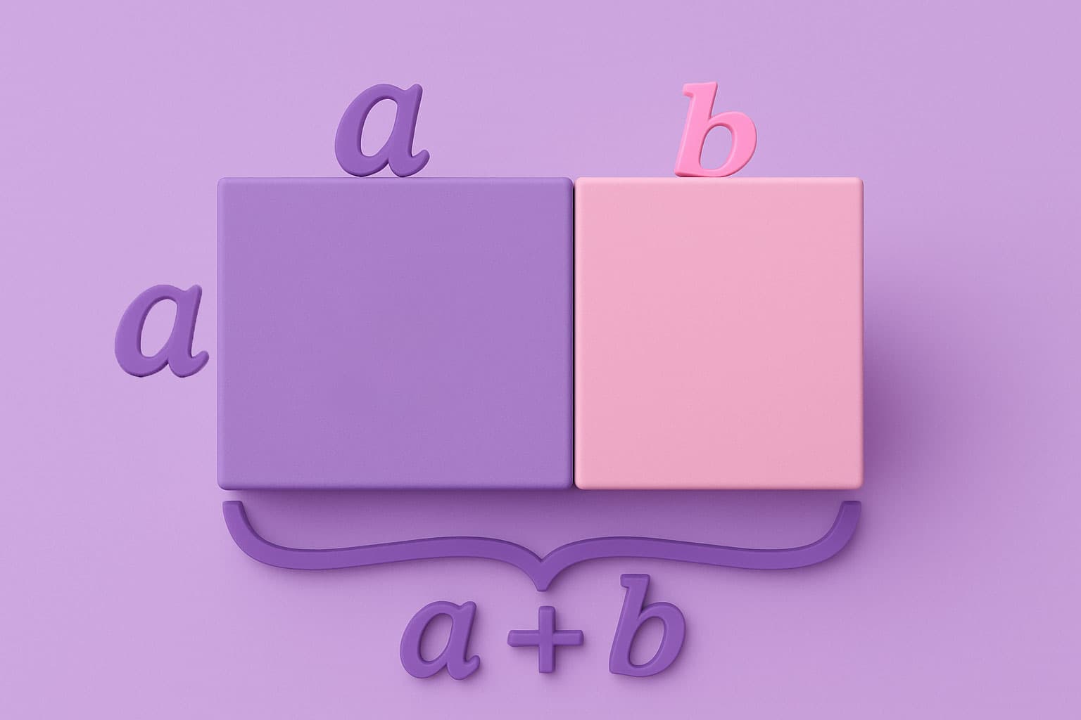
The Golden Ratio is a proportion of about 1:1.618.
In layout terms, it gives you a way to divide space so one side leads without the other disappearing. The exact split is closer to 61.8/38.2, but a 60/40 split is a practical version for hero sections. The larger side carries the main message. That includes the headline, supporting text, and call-to-action buttons. The smaller side holds a visual that reinforces the message without competing for attention.
A 50/50 layout puts both sides on equal footing. That can work in some designs, but it also gives the copy and image the same visual weight. A 60/40 structure gives one side a clear lead. Visitors can read the content first, then move to the visual. That predictable flow is useful in a hero section because it helps people understand the page quickly. The tricky part is turning that proportion into a working layout without fighting the builder.
In Divi 5, Flexbox is built into the layout system for sections, rows, and columns. That means you’re working with a model that understands how elements should share, stretch, and respond to space. The real advantage of Flexbox in responsive design is that it defines relationships between elements rather than fixed positions. This helps proportions like 60/40 hold across screen sizes with fewer manual adjustments.
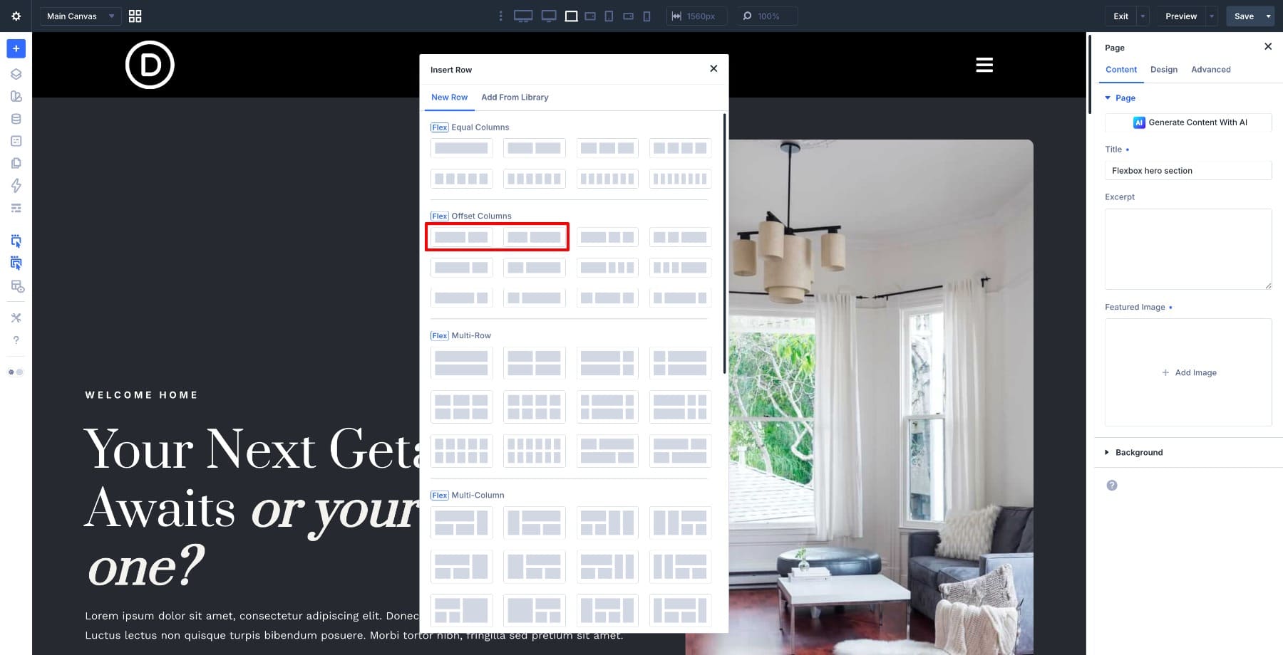
You pick a pre-built 3/5 and 2/5 flex row from the row templates, and the proportion is already there. Everything else, including alignment, spacing, and responsive behavior, follows from the flex controls you set on top of it.
What Makes This Layout Work In Divi 5
A few Divi 5 features do most of the heavy lifting in this layout. The 60/40 column split comes from Divi 5’s Flexbox row templates. When you insert a row, you’ll find offset column options that make this layout easy to set up. No manual width calculations are needed. The first column takes up 3/5 of the row, and the second takes up 2/5. That gives you the structural foundation right from the start. From there, Flexbox controls at the row and column level handle the rest.
Setting Align Items to Stretch makes both columns fill the available height of the row. This keeps the image and content vertically aligned without padding tricks. Also, the Image module in the right column uses a custom Aspect Ratio to fill its column completely. That is what gives the image its height without a fixed value.
If you’re new to these properties, this beginner’s guide to Flexbox CSS properties explains how each one works before you start applying them. For a full reference of every setting available in Divi 5, this breakdown of every Flexbox setting in Divi 5 covers them in detail.
Learn Everything About Divi 5’s Flexbox
What We’re Building
The hero section we’re building has two columns set in a 60/40 split. The left side holds the main content. It includes a label, headline, supporting description, a pricing detail, and two call-to-action buttons.
The right side holds a full-height image that fills its column completely. It sits flush against the edge without gaps. Here’s a preview of the final design:
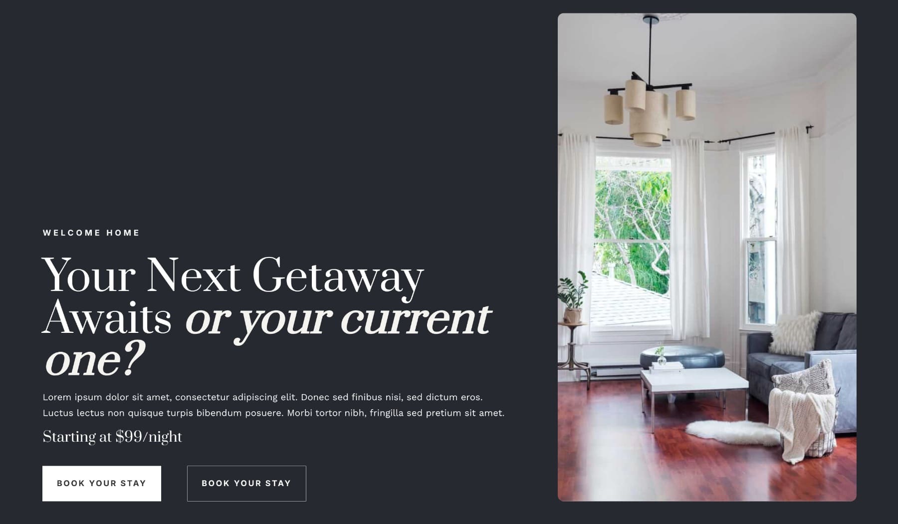
The content sits toward the bottom of the left column rather than dead center. That gives the layout a more intentional feel. Flexbox handles the column heights, content positioning, and spacing between modules, so the structure stays consistent.
Build The Golden Ratio Hero Section
With the concept in place, let’s put it together in Divi 5. Each step builds on the last. By the end, you’ll have a structured hero section with Flexbox handling the layout throughout.
Step 1. Create The Section And Set Up The Row
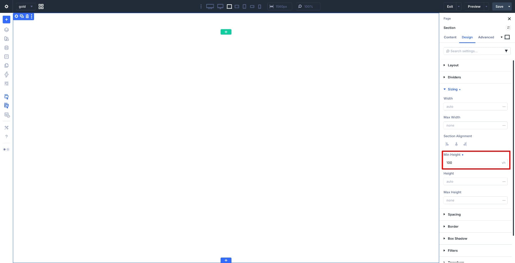
Start by adding a new Section to your page. Open Section Settings > Sizing and set the Min Height to 100vh.
This tells the section to take up at least the full height of the viewport. The hero fills the first screen on load, even before the visitor scrolls.
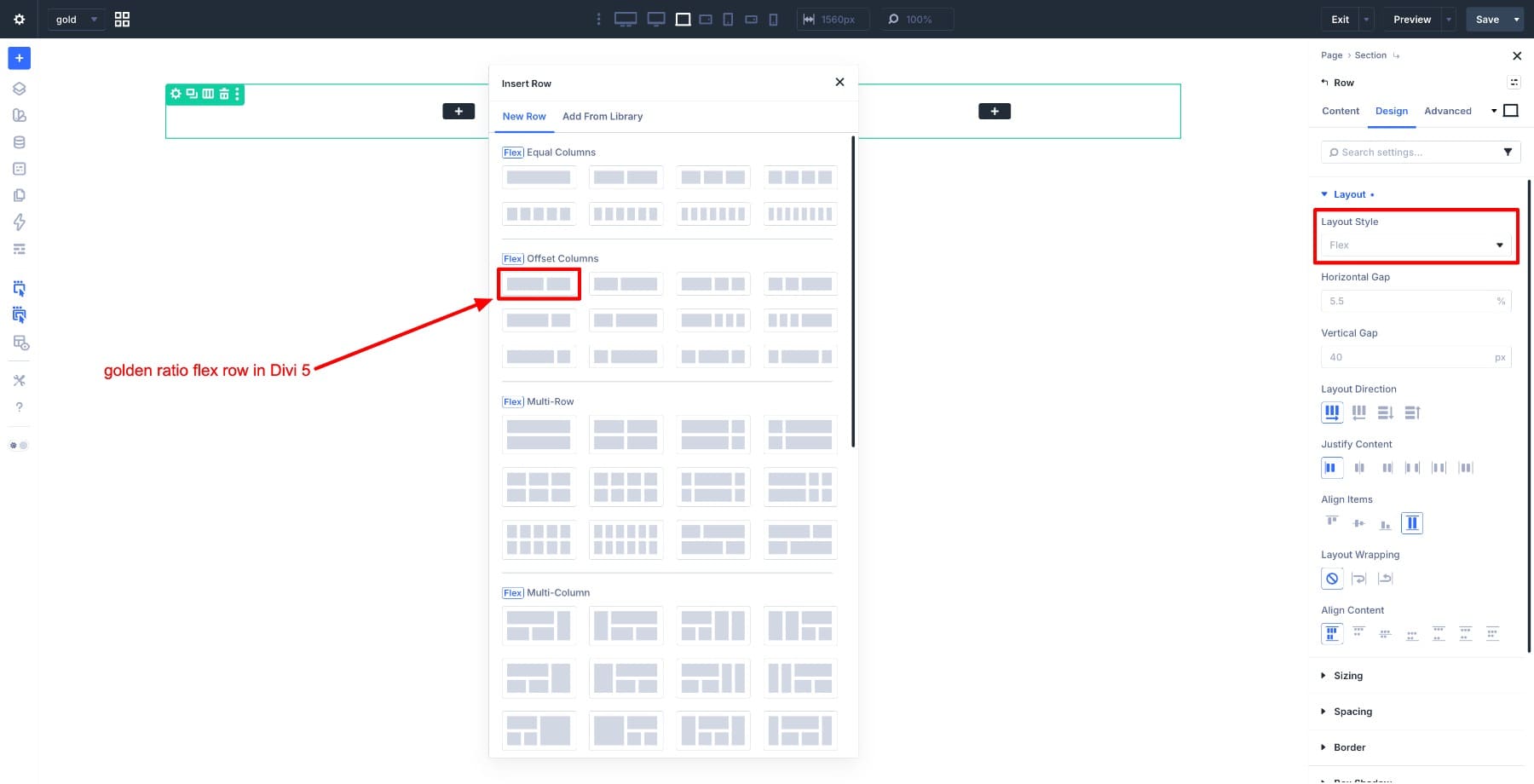
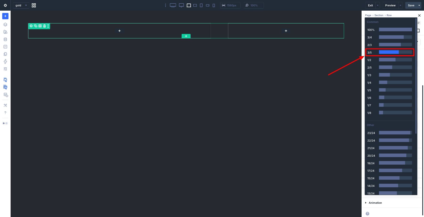
Next, insert a row inside the section. Divi 5 includes a pre-built Flexbox offset column row that reflects the practical 60/40 proportion. Select that from the row templates.
New rows in Divi 5 are Flex by default, but it’s worth confirming this under Design > Layout Type > Flex before moving forward.
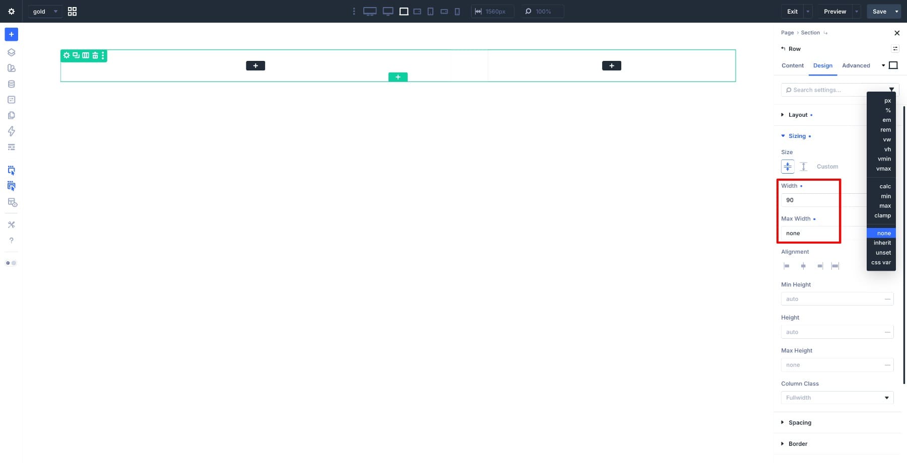
Open the Row Settings and go to Design > Sizing. Set the Width to 90% and the Max Width to None.
The 90% width gives the row breathing room from the browser edges. Removing the max width cap lets it scale across larger screens without hitting a fixed boundary.
Step 2. Build The Hero Section Layout
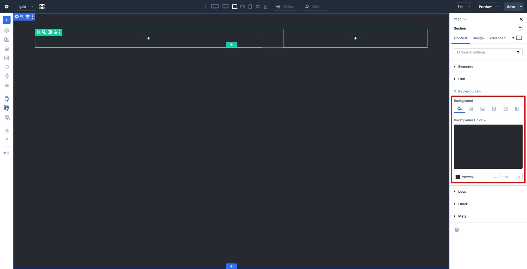
Open the Section Settings and set #26292F as the Background Color. This dark background gives the hero its contrast. It also keeps the white typography readable against it.
Next, open the Row Settings and confirm the column proportions.
Go to Row > Content > Elements, select the first column, and make sure it occupies 3/5 of the row. If you selected the pre-built offset row in Step 1, this should already be set correctly.
With the proportions confirmed, start adding content to the left column.
Add a Text module for the label above the heading. Then add another Text module for the main title. Using a Text module here lets you apply italic styling to part of the heading, which a Heading module does not support. In the editor, use the format dropdown to set the content as Heading 1, then select the second part of your text and apply italic. Follow it with a Text module for the supporting description, then one more for the pricing detail.
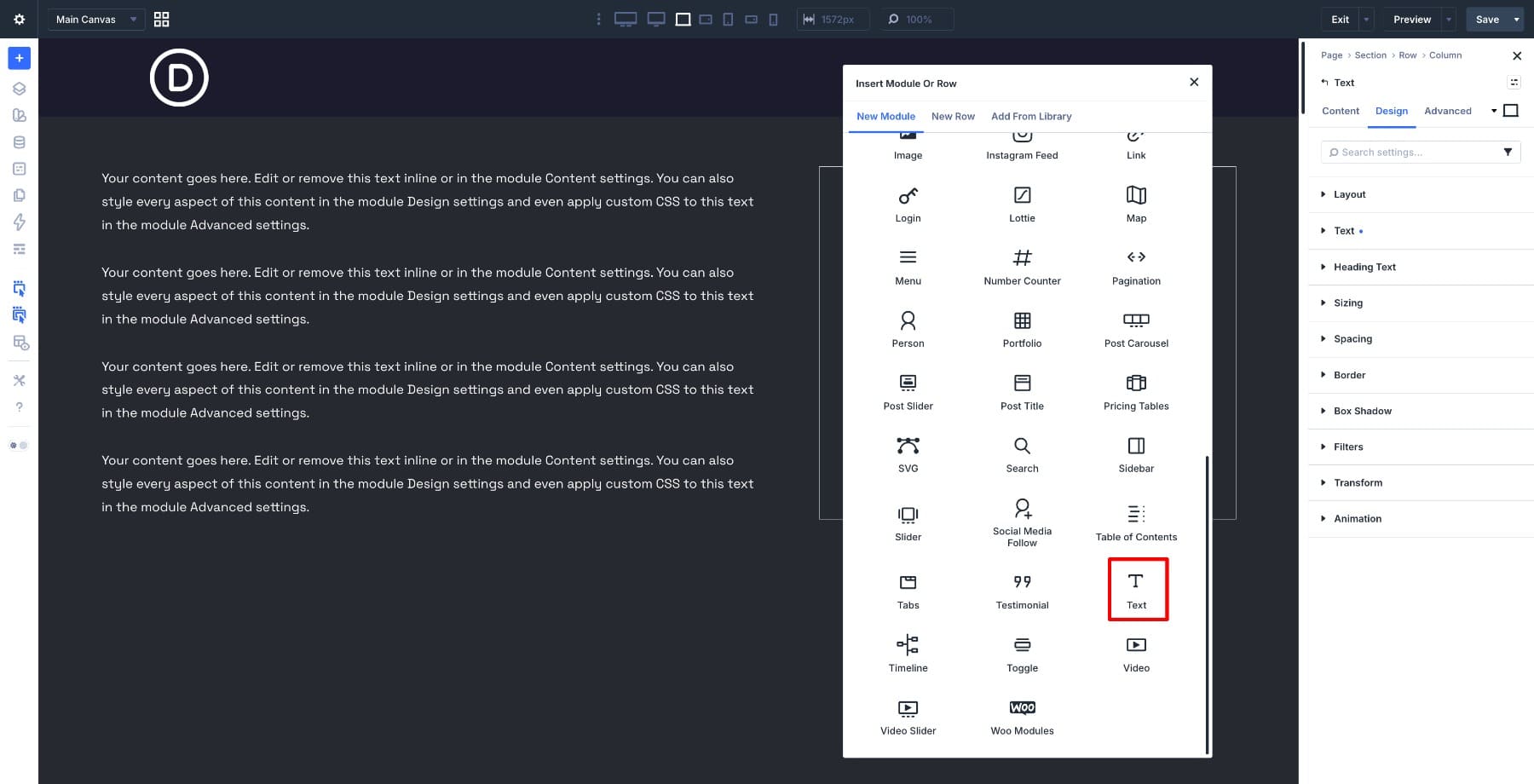
Below the text modules, insert a nested row inside the left column and place your Button modules inside it side by side.
Using a nested row here keeps the buttons on the same line. It also gives you flex controls over their spacing without affecting the rest of the column layout.
For the right column, add an Image module and upload your image. Open Design > Sizing and set the Aspect Ratio to 1:1.7. Aspect ratio controls the width-to-height relationship of the module. Instead of setting a fixed height, you define a proportion and the module scales to match it as the column width changes across different screen sizes.
The 1:1.7 ratio gives the image a tall portrait proportion that fills the column without a fixed height value.
Step 3. Style The Content
With the structure in place, we can work through the typography and colors. We’ll go in visual order, starting from the top of the left column and working down.
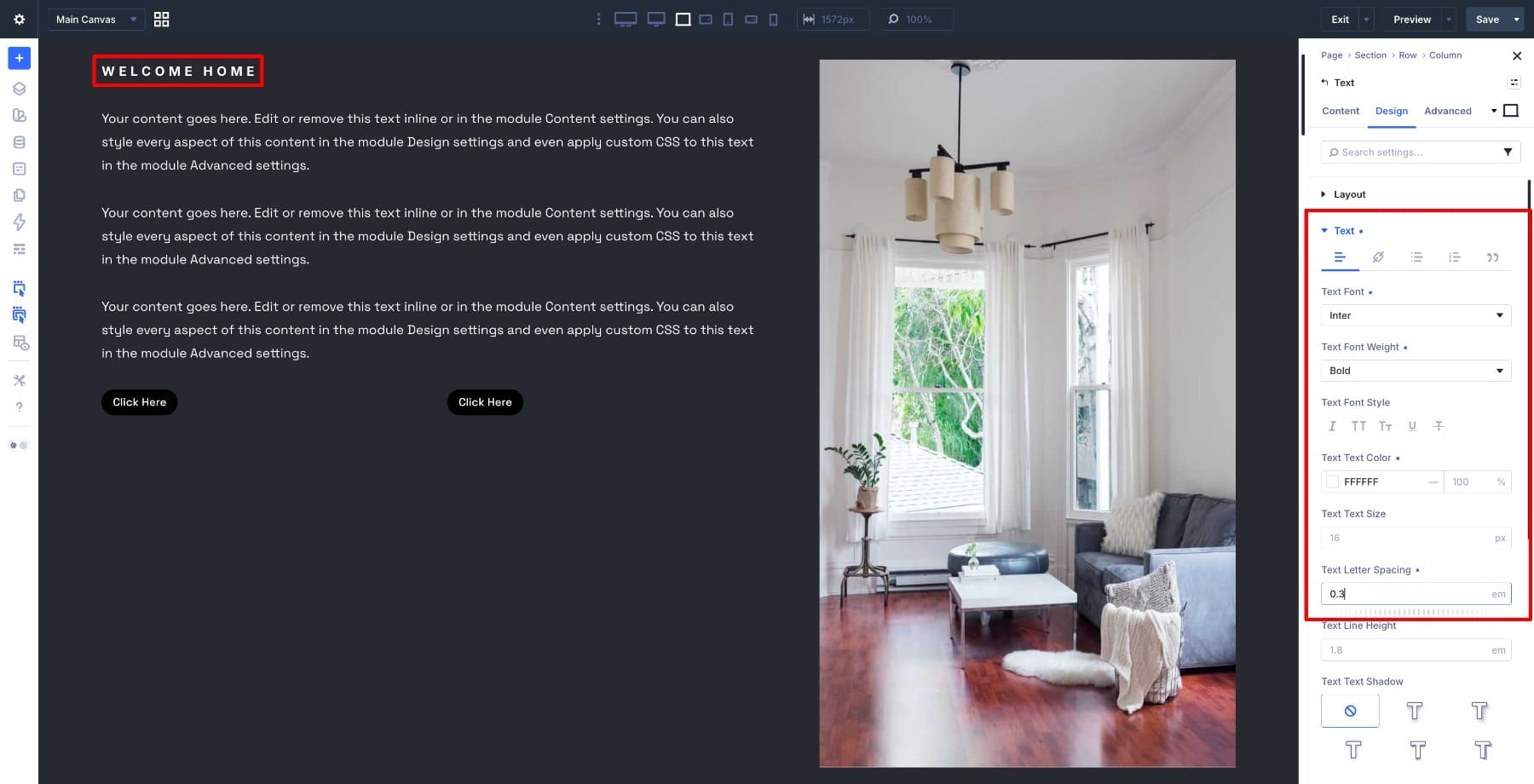
The Welcome Home label sits above the heading and acts as a quiet entry point into the content. Open its Text module and set the font to Inter Bold, the color to #FFFFFF, the size to 16px, the letter spacing to 0.3em, and the line height to 1.8em. The wide letter spacing and small size keep it readable without pulling focus from the heading below.
Open the Text module for the heading. In Content, set the format to H1. This unlocks the H1 settings in the Design panel. Go to Design > H1 Text and set the font to Prata, the color to #FFFFFF, the size to 72px, and the line height to 1.2em.
To style part of the heading differently, switch to inline editing, highlight the second portion of your text, and apply Bold and Italic from the inline toolbar. This creates visual contrast within the headline without needing a separate module.
For the description and pricing text modules, keep Prata as the font for consistency. Adjust the sizes to reflect each module’s role. The description should stay smaller and comfortable to read.
The pricing text gets a size of 24px. This gives it enough presence without competing with the heading above it. Set the buttons’ row Width to 500px so the buttons sit side by side.
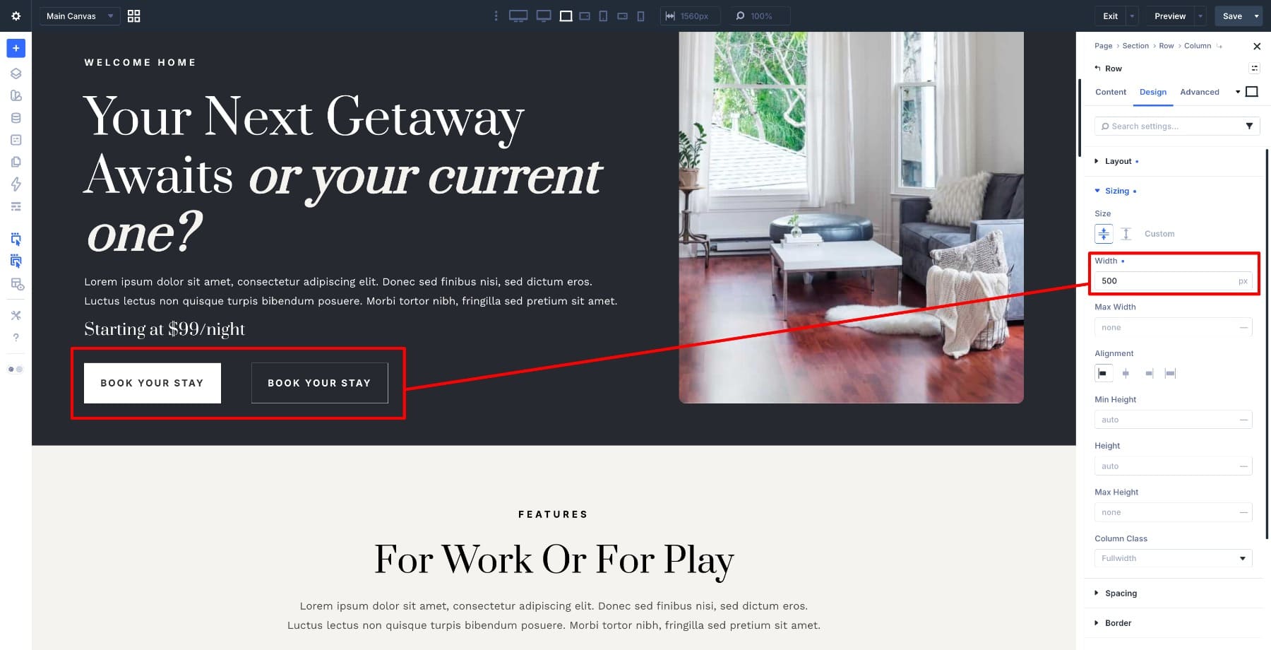
For the buttons, set the primary button’s background to #FFFFFF with a text color of #333333. Reverse those values for the secondary button. Use Inter Bold on both so the button text stays consistent with the label and feels like part of the same type system.
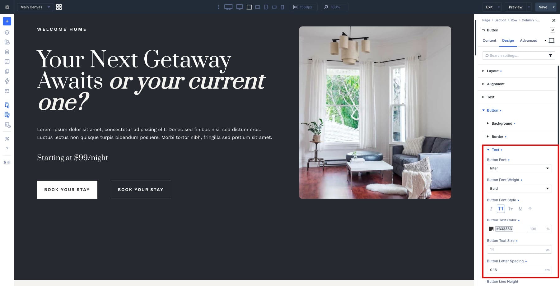
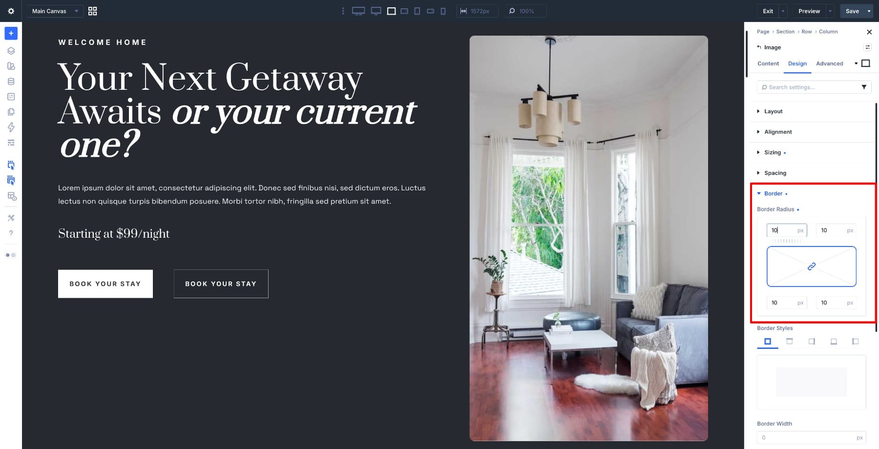
On the right column, add a 10px Border Radius to the Image module to round the corners of the image slightly. This softens the edge where the image meets the dark background. It also keeps the overall layout from feeling too rigid.
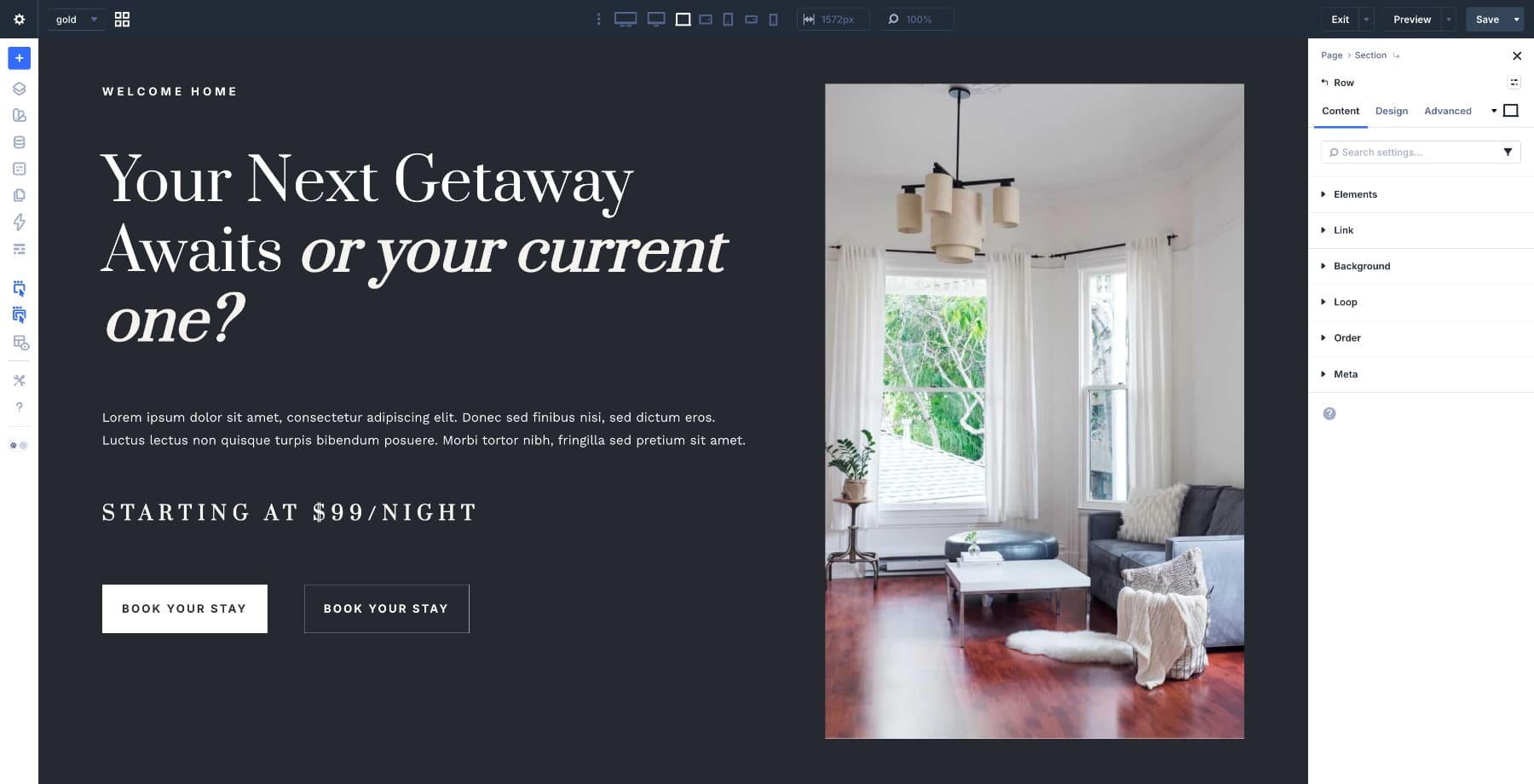
At this point, the left column has all its content and the right column has its image. Here’s what the full layout looks like before we move on to alignment.
Step 4. Adjust Alignment And Vertical Positioning
The content and image are in place, but the columns still need layout instructions.
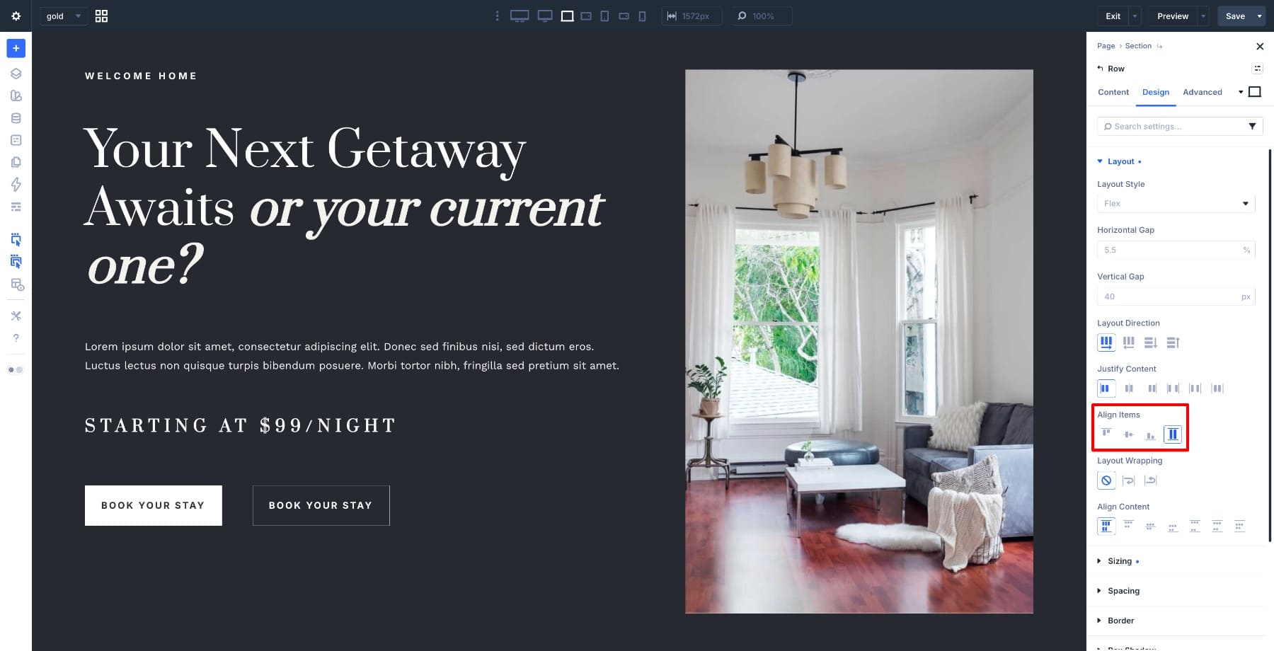
This step is where Flexbox does the structural work. Open the Row Settings and go to Design > Layout. Set Align Items to Stretch. This tells both columns to expand across the available row height. The image and content occupy the same vertical space without either one falling short.
Next, open the Left Column settings and set the Layout > Vertical Gap to 15. By default, Divi adds vertical gap between modules in a column.
Adjusting it here lets the heading, description, pricing, and buttons sit closer together as a grouped unit. They no longer feel like separate pieces floating apart.
Then position the content inside the left column. Open the Left Column settings and go to Design > Layout. Set Justify Content to End so the content group moves toward the bottom of the column.
Step 5. Optimize For Mobile
Flexbox makes the responsive adjustments here more manageable than they would be with a block-based layout. Alignment, spacing, and column behavior are controlled at the container level. That means you’re adjusting a handful of settings rather than hunting down individual modules.
If you want a fuller picture of how Divi 5 handles responsive layouts with Flexbox, this guide on using Flexbox for responsive web design walks through the full system.
Switch to the responsive view and start with the section. Reduce the Min Height to 60vh on tablet so the hero scales down proportionally rather than dominating the screen. Scale the heading and body text sizes down as well, so readability holds at smaller widths.
Next, change the column layout so the content stacks above the image on mobile. Divi 5 lets you set a different row structure per breakpoint. That means you can switch to a single-column layout on mobile without touching the desktop version.
These adjustments keep the same proportional logic intact across screen sizes.
Start Using Flexbox In Divi 5 Today!
The golden ratio gives you a starting point, not a formula to follow precisely. In this layout, the 3/5 and 2/5 rows create a practical 60/40 split. A flex row and a handful of alignment controls are enough to build a hero section that feels considered.
The real value is that the structure is reusable. Swap the content. Change the image. Adjust the typography. The underlying logic stays intact because Flexbox handles the layout rather than a patchwork of manual spacing decisions.




My question has to do with using px for text instead of rem or clamp.
I thought that was one of the big things with Divi 5 was the use of clamp?
You can use either, but it is easiest to set clamp values as Design Variables and use those consistently via Presets.
“Apply an italic style to the second part of the heading text to create contrast within the headline itself” How do I do this with a title? I can do it with a text module, but it doesn’t allow me to do it with a title. ¿?
Hey, JC! That instruction is referring to using a Text Module, not the Heading Module.
The Heading Module lets you style the whole heading/title, but it does not currently support selecting only part of the title text and applying inline formatting like italic to just that portion. The article’s workflow uses a Text Module for the main title because the Text Module allows partial inline styling. 👍
Placing an H4 above an H1 is incorrect because it breaks the logical heading hierarchy of the page. The H1 should introduce the main topic of the page, while lower-level headings like H2, H3, and H4 should be used for subsections beneath it. Using an H4 before the H1 can make the structure confusing for screen readers, accessibility tools, and search engines.
I wonder why you have to place a divider module, and cannot use an image module to place the image… it isn’t really logical. (I struggled before and just put the image as a background of the column).
Can you explain this?