
Your design looks almost right, but something feels off. The spacing seems awkward. The proportions don’t work. You adjust margins and padding, but that nagging sense of imbalance remains. The missing piece might be the golden ratio.
This mathematical principle has guided great design for centuries. And, our eyes naturally prefer these specific ratios. Most designers skip the golden ratios or misapply them because of how hard it is to crack. However, with a page builder like Divi 5, you can apply perfect proportions without complex calculations.
Let’s find out more.
What Is The Golden Ratio?
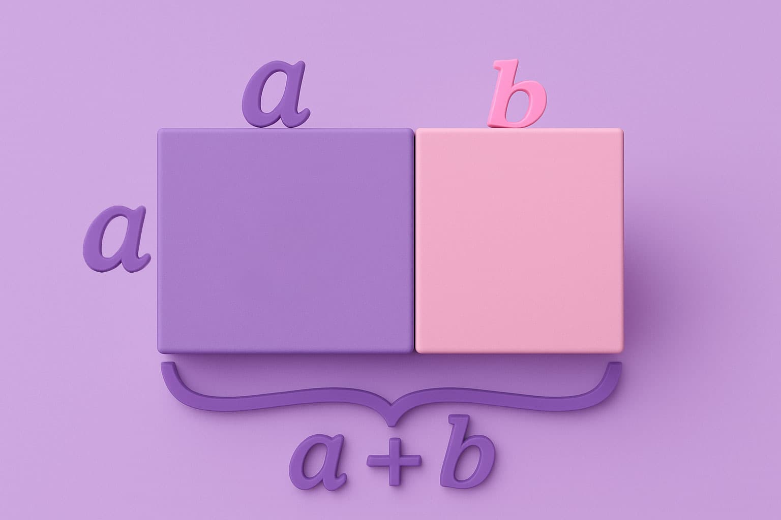
The golden ratio equals approximately
1.618.
Where did it come from? You get this number when you divide a line into two parts, where the longer part divided by the shorter part equals the whole line divided by the longer part.
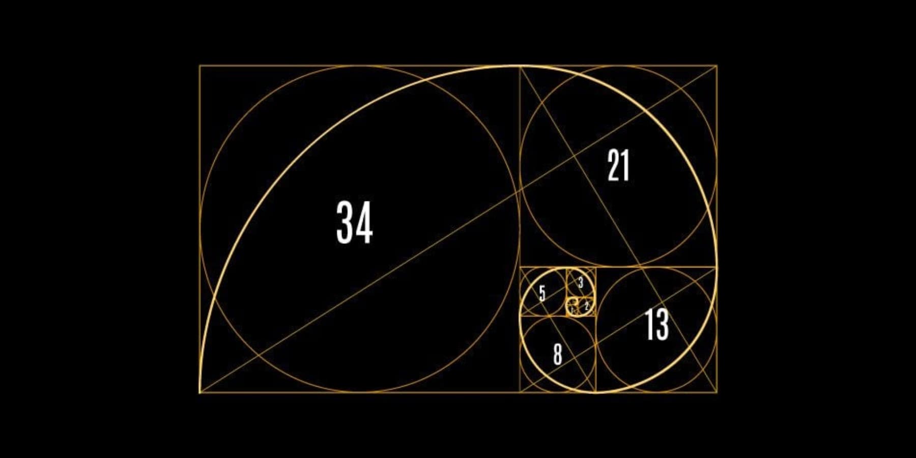
You can calculate the golden ratio using the Fibonacci sequence. Start with 0 and 1. Add them to get 1. Then add 1 and 1 to get 2. Keep adding the last two numbers: 1, 2, 3, 5, 8, 13, 21, 34, 55, 89, 144. When you divide any larger number by the previous number, you get closer to 1.618.
This ratio appears everywhere in nature. Sunflower seed spirals follow it. Nautilus shells grow using these proportions. Even your face likely follows golden ratio measurements between your features. When something follows this ratio, your brain recognizes it as naturally pleasing.
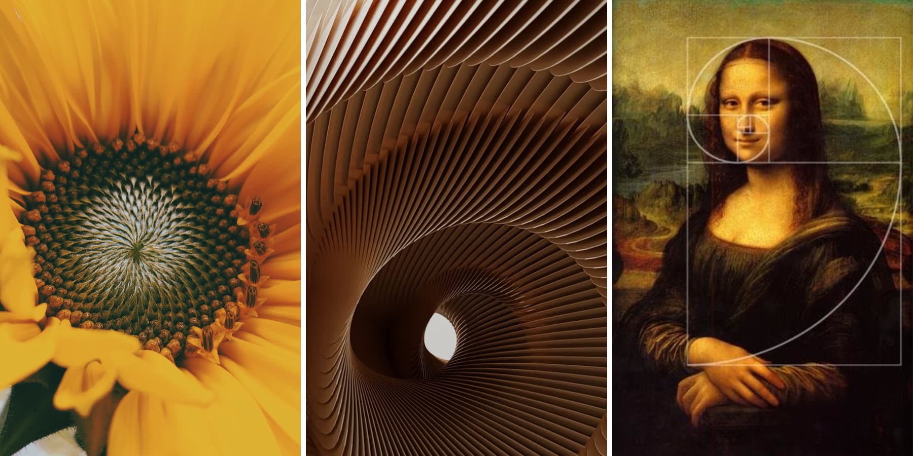
Images Courtesy: Lucas and Dynamic Wang on Unsplash and Milena Carolina dos Santos Mangueira
The symbol φ (phi) represents a unique mathematical ratio that the ancient Greeks discovered around 300 BCE. They referred to it as the “divine proportion,” believing it revealed a special visual balance and beauty.
Why It Matters: From Old Buildings To Web Design
The Greeks used this ratio for the Parthenon temple, and the Egyptian pyramids follow these measurements. Artists like Leonardo da Vinci studied these proportions for years. Da Vinci drew the famous “Vitruvian Man,” showing the golden ratios in the human body.
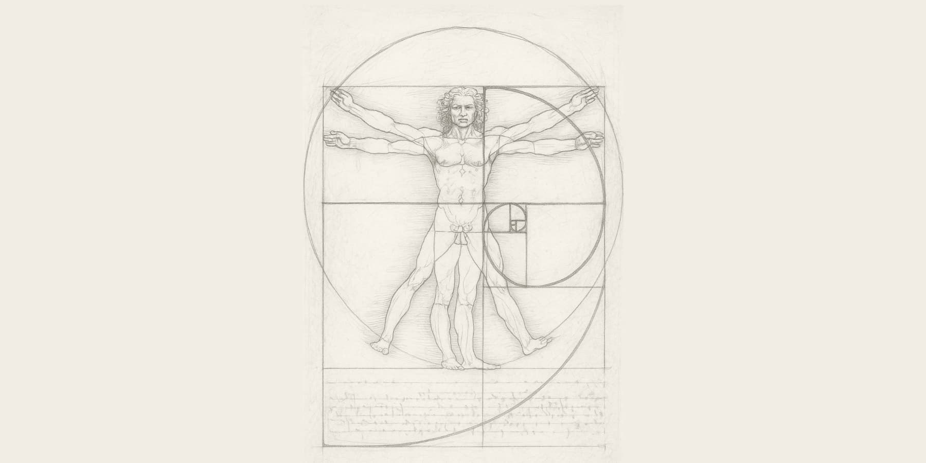
Representational Image
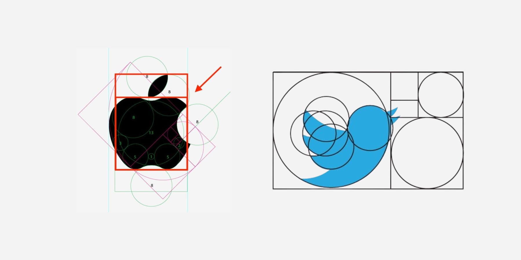
Well-established designers still use this. Apple’s logo uses the golden ratio proportions. The erstwhile Twitter bird logo followed these measurements. Magazines place important content at golden ratio spots instead of right in the center.
Images Courtesy: Widewalls & Design Shack
Scientists studied why people like golden ratio shapes. Brain scans show more activity in pleasure areas when people look at golden ratio rectangles. This is inherent to humans as this happens across all cultures and ages.
Your brain processes these proportions faster than other ratios, which means a better user experience. When website proportions get too far from 1.618, visitors feel uncomfortable and leave sooner.
The ratio creates balance without being perfectly even. Perfect symmetry can look boring on websites. The golden ratio gives just enough asymmetry to create visual interest while maintaining the clean, professional look users expect.
Why Your Designs Feel “Off” (And How Ratios Fix This)
You just spent hours perfecting your layout. The colors are just right. The fonts work together. But something still feels off. The sidebar seems too wide. The header looks a bit cramped. The content area doesn’t flow with the rest.
This is a common experience. Many designers adjust sizes based on what feels right in the moment. Maybe you set the main content to 70 percent and the sidebar to 30 percent. These numbers sound reasonable, but they don’t always look natural.
Our eyes look for balance and familiar patterns. When proportions aren’t quite right, the whole design feels awkward, even if you can’t explain why. It might not be a big mistake, just a small detail that unsettles you.
The real issue is often proportion. When layouts ignore what feels balanced, your brain notices. Something feels off, even if you can’t put your finger on it.
How Wrong Ratios Sabotage User Experience
Bad proportions make things look strange. Your brain expects certain shapes and sizes to go well together. Imagine a hero section that takes up exactly half of your screen. It looks stiff and awkward.
Now, consider one that uses 43 percent or 67 percent of the space. That looks unbalanced and messy.
This can hurt your website. People decide very fast if they trust what they see. If the page looks off, they might think your business is untrustworthy. Messy design makes people believe your work is not good.
The golden ratio can help fix this. Instead of making your hero section 70 percent, try 61.8 percent, leaving the next section 38.2 percent visible.
These numbers are not random. They follow a special pattern called 1.618 that you see in nature, like in flowers and shells. Your eyes know this pattern and feel calm when they see it.
The trick is how the parts relate to each other. Everything feels right if your header size matches your content area using the golden ratio. Your footer, menu, and content start to fit together instead of looking like they are fighting for space.
How To Calculate Golden Ratio Proportions
You don’t need fancy math. Just remember 62 and 38. These numbers add up to 100, so they work as percentages.
Split any space by giving 62% to the bigger part and 38% to the smaller part. Your website is 1000 pixels wide. Make your main content 620 pixels. Put your sidebar at 380 pixels. Perfect golden ratio.
Got a 500-pixel-tall section. Your main area gets 310 pixels. The rest receives 190 pixels.
Quick Rules For Website Parts
The hero section should take about 60% of what people see first. The rest goes to your main content preview. Make cards 60% as tall as they are wide. A 300-pixel-wide card becomes 180 pixels tall.
Buttons work the same way. A width of 100 pixels means a height of 60 pixels. Your text column is 600 pixels wide. Stop adding content around 370 pixels down. Then add your next section.
Does It Look Right?
Step back from your screen. The parts should feel balanced now. Your eye flows smoothly from section to section. If you keep staring at one spot, the proportions might be off.
Popular websites use these same 62/38 splits everywhere. You’ll start seeing the pattern once you know what to look for. The math stays hidden, but the visual harmony stands out immediately.
Common Golden Ratio Mistakes Designers Make
Most designers know the golden ratio exists and want to use it. Here’s where they commonly struggle.
The biggest mistake is applying ratios randomly without a system. You use golden ratios for your header, thirds for your content grid, and random percentages for your footer. Pick one approach and use it consistently across your design.
Many designers round 1.618 to easy numbers like 1.5 or 1.7. Your brain notices the difference between 62% and 60%, and that small gap affects the visual harmony you’re working to create.
Another common issue is mismatching ratio elements. For example, you might create a perfectly proportioned hero section but then add an image gallery that uses completely different spacing ratios. The visual disconnect breaks the flow you established.
Some designers apply the golden ratio to text without considering reading comfort. A line length that follows perfect mathematical proportions might exceed comfortable reading width. Readability takes priority over mathematical precision.
Web designers also often overlook responsiveness. Desktop proportions that look balanced can feel cramped or stretched on smaller screens. Golden ratios need different applications across device sizes.
Many page builders default to arbitrary layouts that ignore proportional harmony. Standard three-column grids use 33/33/33 splits instead of more natural ratios.
The most limiting mistake is abandoning the approach after initial attempts. Golden ratios work best when applied systematically across your layout structure, not as isolated adjustments.
Why Do Many Page Builders Ignore Golden Ratios?
Page builders grew up around programmer thinking. Developers love numbers that divide cleanly. Twelve columns, four sections, fifty-fifty splits.
Many builder companies genuinely believe users should control their own design choices. They don’t want to push specific aesthetic theories on people who might prefer different approaches. Some designers hate the golden ratio and prefer other proportion systems. Why force one mathematical principle when creativity thrives on options?
The real technical issue is messier than design philosophy. Golden ratios create weird decimals that break on older devices. Try building a responsive grid where one column is 61.8% wide. Clean percentages like 25% or 33% behave predictably across every device.
Most page builder companies started as technical solutions, not design tools. They are built around systematic, logical layouts that work reliably.
Users rarely complain about proportions. They complain about broken mobile layouts and slow loading times. Company priorities follow actual user feedback, not design theory.
Some builders worry about overwhelming beginners. New users already face dozens of layout choices, and adding mathematical considerations might scare away people who just want something clean and professional.
Building Perfect Proportions With Divi 5
Before we dive into the nitty-gritties of how Divi 5 turns Golden Ratio design from a mathematical headache into point-and-click simplicity, let’s take a short detour and understand what makes Divi the go-to choice for WordPress designers who want professional results without the coding nightmare.
What Is Divi?
Divi is a WordPress page builder designed for people who care about visual design without compromising on features.
You can drag and drop over 200 modules around, change text, and pick new colors. Everything happens right on your page, so you see exactly what visitors will see.
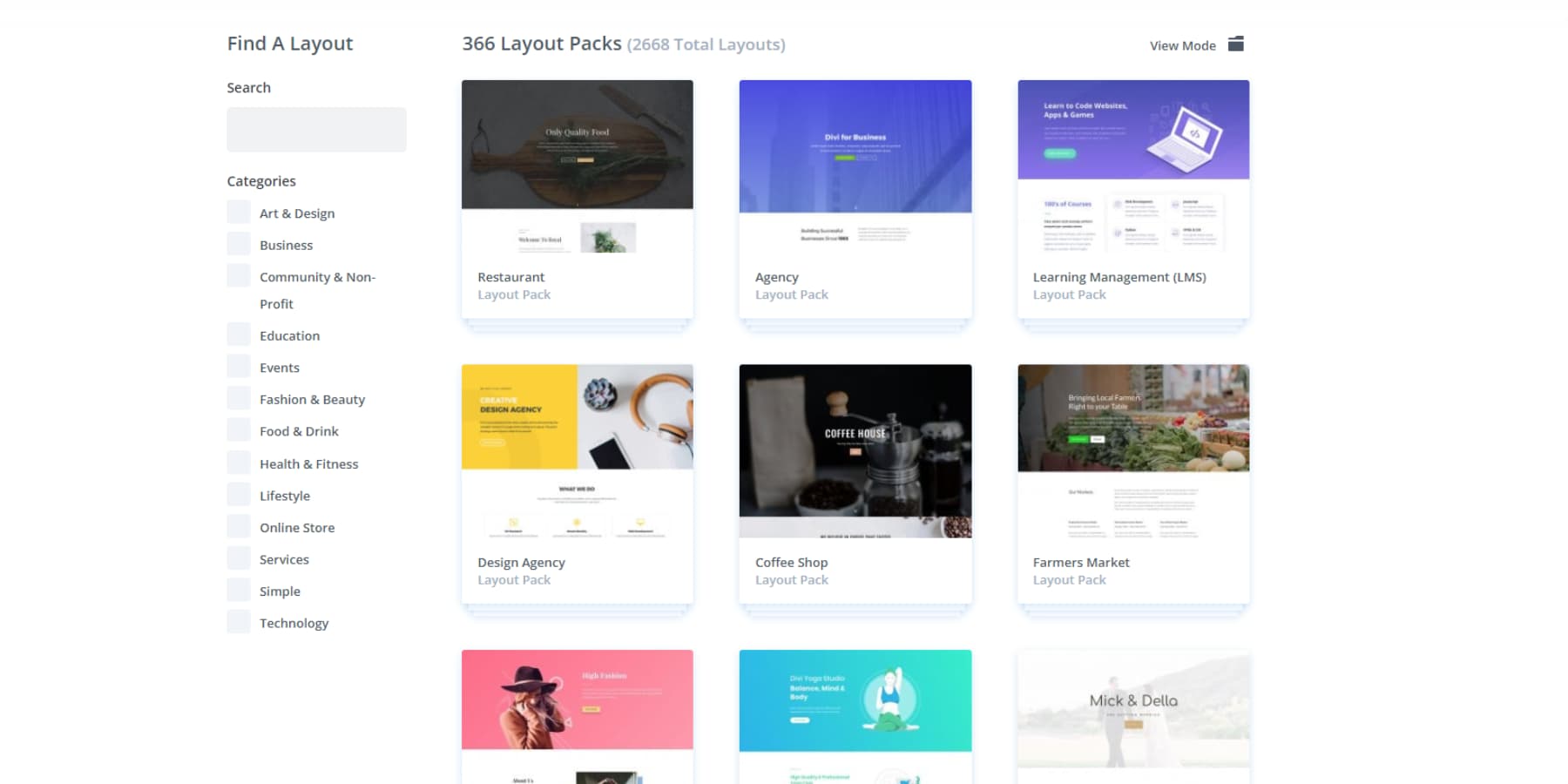
The theme comes packed with 2000+ pre-made layouts. These aren’t basic templates but full designs for restaurants, photographers, consultants, and dozens of other businesses. Pick one that fits your style and customize from there.
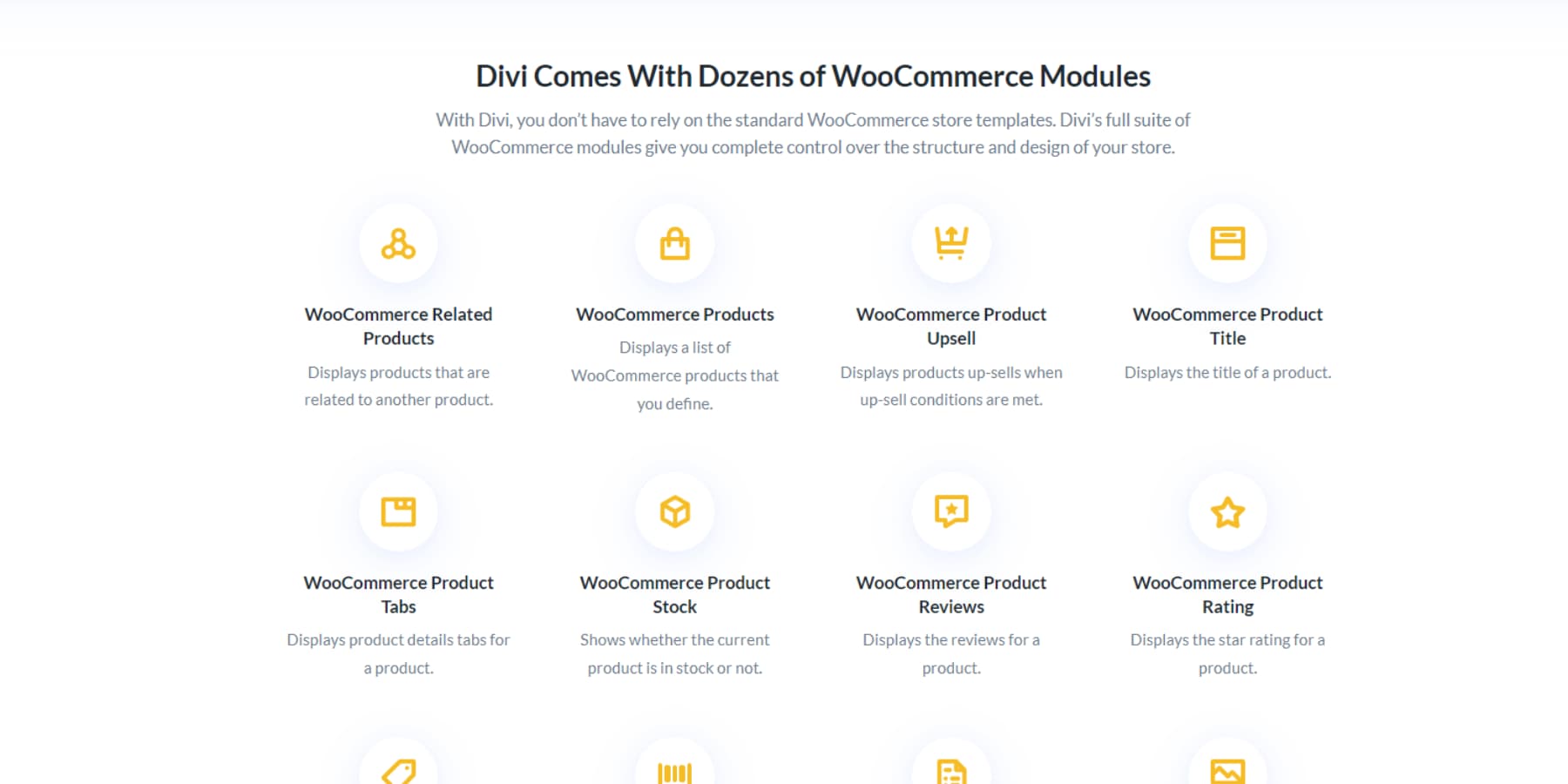
If you sell products online, Divi includes 20+ modules made specifically for shops. Your product pages will look professional and actually help convert browsers into buyers.
Build Websites Without the Headaches
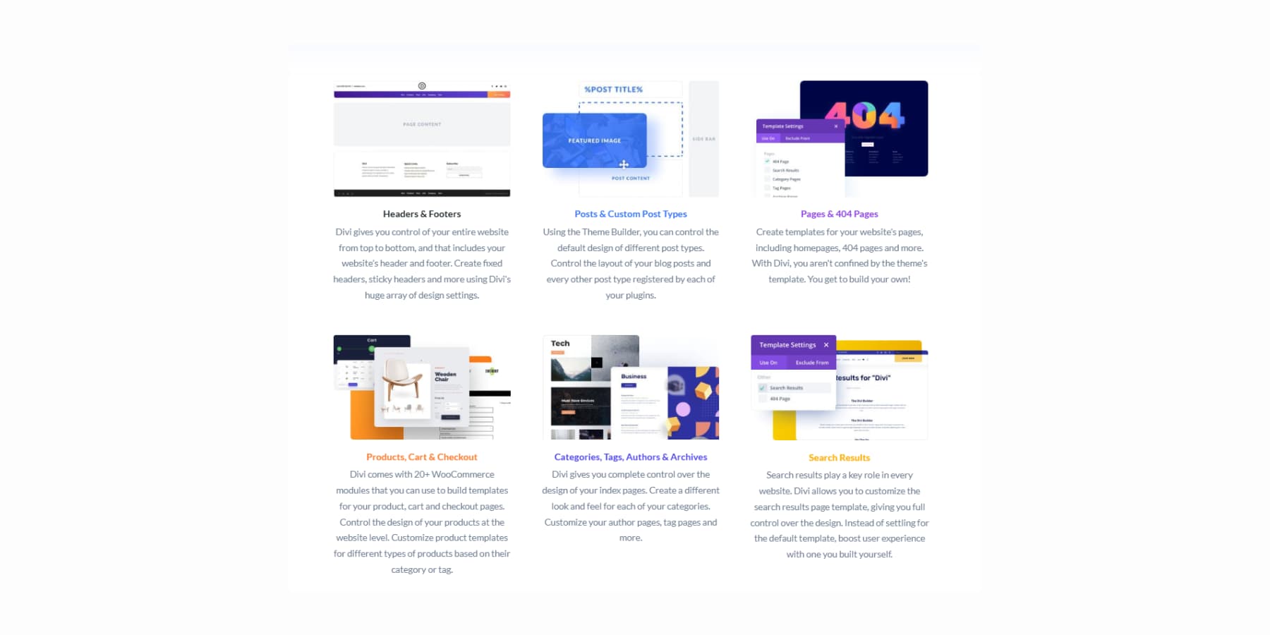
The Theme Builder lets you design every part of your site. You can create custom headers that match your brand, build unique blog layouts, and even make your 404 pages look amazing.
Divi AI brings the convenience of AI right into your design canvas. You can generate text,
images,
code,
and entire page sections using Divi AI.
You can even edit your existing photos by just describing what you need.
Divi Quick Sites solves the biggest problem website builders face: staring at a blank page without knowing where to start. You can choose from professional starter sites, which have professional website templates, created by our design team, and features unique images and artwork you won’t find anywhere else.
Or let Divi AI build custom layouts based on your business description.
This AI-generated website isn’t just a wireframe. It will contain relevant headings, copies, and images per your description. You can ask Divi AI to generate all images, use one from Unsplash, or use placeholders so you can replace them yourself.
You can even pre-select your fonts and colors and let AI run with them. And of course, the websites remain editable just like regular websites, so you can tweak whatever you need per your taste.
Divi 5: The Next Step
Building websites should feel natural, like sketching ideas on paper. You have a vision, and your tools should help bring it to life without getting in the way. That’s exactly what drove us to rebuild Divi from the ground up completely.
Divi 5, available today as an alpha and ready to be used on new websites, represents years of listening to what you need when creating websites. It is not bells and whistles or features no one really uses, but real improvements that make your work faster and more enjoyable. We kept everything you love about Divi and took it to the next level.
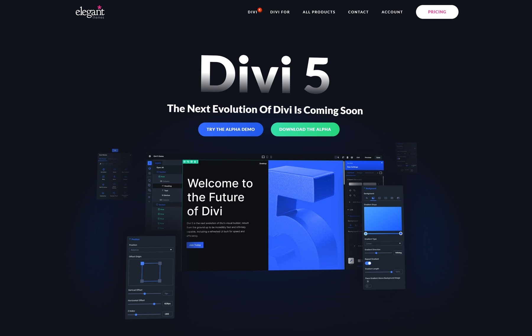
We rebuilt everything from scratch using new web tools. Pages load faster now, and the controls work better. You can keep your designs the same across your whole site without extra work.
What’s Improved? What’s New?
- Complete Framework Rebuild gets rid of old shortcodes. Everything runs on new block-based code that loads faster and works better.
- One-click editing lets you click any part of your page to edit it immediately. No more hunting for small icons or digging through menus.
- Customizable Breakpoints give you seven screen sizes to work with instead of three. You can change each one to fit your exact needs.
- Advanced Units Support lets you use calc(), clamp(), min(), max(), and all new CSS units right in the builder.
- Design Variables let you save colors, fonts, sizes, images, text, and links in one place. Change them once, and they will update everywhere on your site.
- Option Group Presets let you save and reuse styles for borders, fonts, shadows, and spacing. These work across different parts of your site.
- Nested Rows let you put rows inside other rows. You can build complex layouts without special sections.
- Module Groups combine several modules into one unit. This makes complex layouts easier to manage. You can also make your custom modules.
- Multi-Panel Workspace lets you place panels where you want them. You can work with several settings open at the same time.
- Attribute Management gives you exact control when you copy, paste, and reset styles, content, and presets between different parts.
- Light/Dark Mode lets you pick the theme that’s easier on your eyes while you work.
- Canvas Scaling lets you resize your work area to see how your site looks on different screens. No need to switch preview modes.
- Performance Improvements make pages load faster, display quicker, and feel smoother when you’re building.
Try Divi 5 Today
Divi 5 is now available for new website projects. We rebuilt it from the ground up to make your workflow faster and easier. Download the Public Alpha and try it on your next new site to see the improvements. It’s free for all Divi members, new and old.
We suggest using it only for new sites while we improve the migration system for existing Divi 4 sites. If you’re starting fresh, now is a great time to try the updated interface and better performance.
How To Use Golden Ratios Using Divi 5
Enough said. Let’s take a deep dive and see how we can implement golden ratios in your website using Divi 5 and, better yet, how they can be standardized so you don’t have to scramble around with math every time you create a new section or page.
Design Variables let you save and reuse values across your site. They form your site’s visual identity DNA. Divi 5 has six types: colors, fonts, images, text strings, links, and numbers. Each has a specific role:
- Color variables hold brand colors, backgrounds, text colors, and other hues used site-wide.
- Font variables keep fonts consistent for headings, body text, and special elements.
- Image variables store common graphics like logos or background patterns for easy use.
- Text string variables save reusable content like slogans, contacts, and legal notes.
- Link variables keep URLs you often use, like social media or key pages.
- Number variables handle measurements in pixels, percentages, ems, rems, and viewport units and work with CSS functions like calc() to keep proportions right on any screen.
Setting Up Your Golden Ratio Variables
Open your Divi 5 dashboard and find the Variable Manager icon in the left sidebar.
Click it to open the variables panel. Add your colors, fonts, images, text, and link variables.
Then, go to the Numbers tab to create your golden ratio variables. Start by adding these number variables:
Typography Variables
- H1 Size: clamp(47px, 4.7vw, 76px)
- 47px minimum: Even on the smallest phones (320px wide), your H1 stays large enough to establish hierarchy. Anything smaller loses impact as a main heading.
- 4.7vw middle value: This viewport width unit makes text scale smoothly. At 1000px screen width, 4.7vw = 47px. At 1600px, it grows to 75px
- 76px maximum: We get this by multiplying 18px × 1.618 three times (18 × 1.618 × 1.618 × 1.618 = 76.244px)
- H2 Size: clamp(29px, 3.5vw, 47px)
- 29px minimum: Keeps H2 noticeably smaller than H1 on mobile while staying readable
- 3.5vw scaling: Proportionally smaller scaling than H1 to maintain hierarchy
- 47px maximum: Exactly 76px ÷ 1.618 = 47.122px
- H3 Size: clamp(18px, 2.9vw, 29px)
- 18px minimum: Matches body text size on mobile to save vertical space
- 2.9vw scaling: Grows more gently than larger headings
- 29px maximum: Precisely 47px ÷ 1.618 = 29.124px
- H4 Size: clamp(14px, 2.2vw, 22.4px): Continue dividing ~ 29px ÷ 1.618 = 17.994px, but we set minimum to 22.4px for readability
- H5 Size: clamp(13px, 1.8vw, 18px): Our base font size of 18px fits perfectly in the scale here
- Body Text Size: clamp(16px, 1.6vw, 18px): Standard 18px base that all calculations stem from
The clamp() function lets text resize smoothly between screens. It takes three values: the smallest size for phones, the middle value for scaling, and the largest for desktops. We use viewport width (vw) in the middle because it makes text grow gradually as screens get bigger. No sudden jumps between sizes.
On desktop, we stick to perfect golden ratios. Mobile screens need minor adjustments to keep text readable. Pure calculations might suggest 11px for some headings, but that strains your visitors’ eyes. Setting practical minimums like 14px preserves the golden ratio’s visual harmony while ensuring everyone can comfortably read your content. The proportional relationships stay intact; they just shifted up slightly for readability.
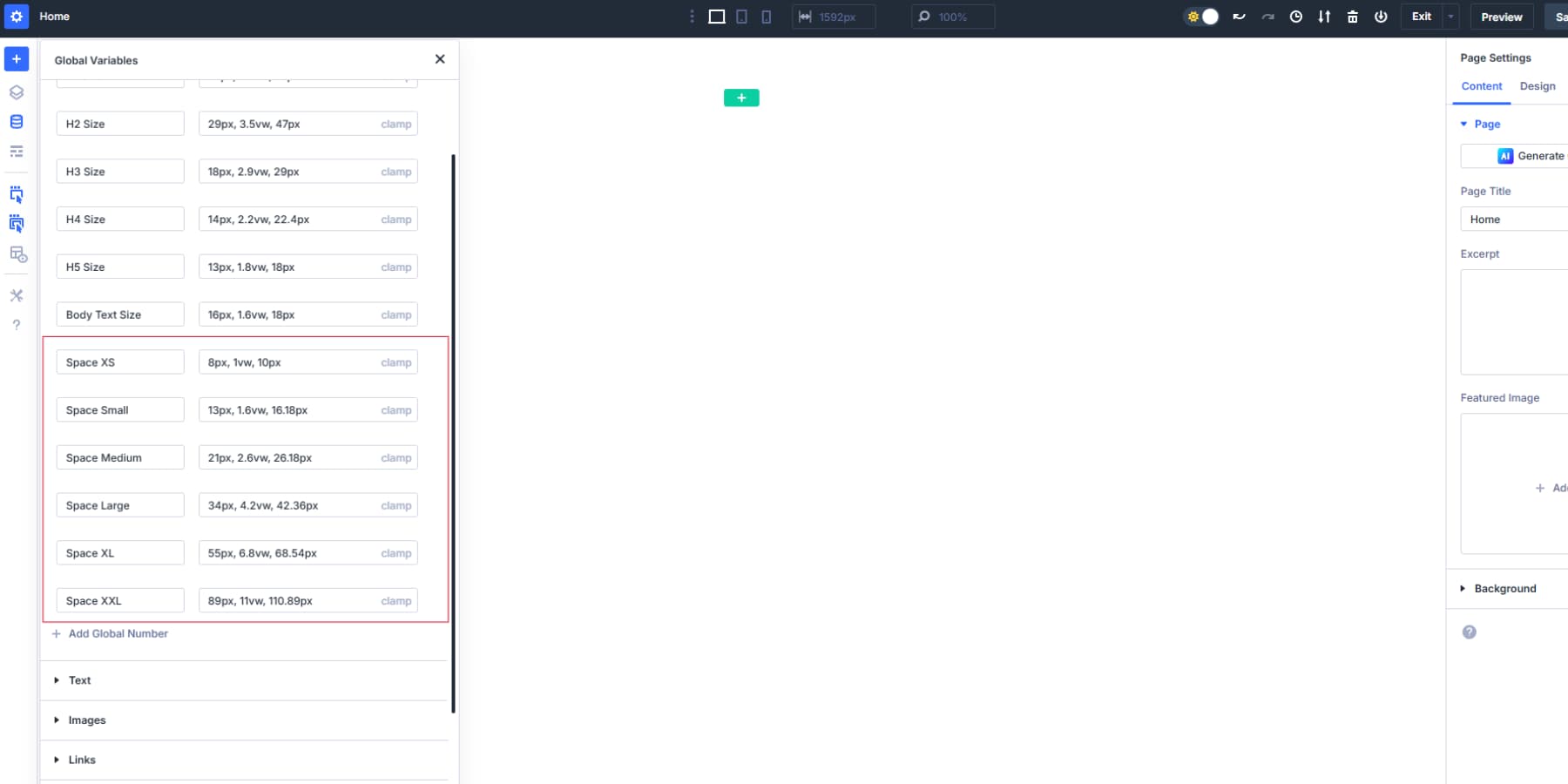
Spacing Variables
Each value multiplies the previous by exactly 1.618:
- Space XS: clamp(8px, 1vw, 10px)
- Why 10px base: This is the smallest comfortable touch target padding on mobile. Industry wisdom recommends 44px minimum touch targets, and 10px padding on all sides, plus content gets you there. Smaller than 10px makes elements feel cramped.
- Why 8px minimum: On phones under 360px wide, even 10px can feel too spacious. We drop to 8px to maximize content space while keeping elements distinguishable.
- Why 1vw: Grows the spacing proportionally and gives you exactly 10px at 1000px screen width
- Space Small: clamp(13px, 1.6vw, 16.18px): Ideal for button padding and form field spacing.
- Space Medium: clamp(21px, 2.6vw, 26.18px): Great for spacing between related content blocks.
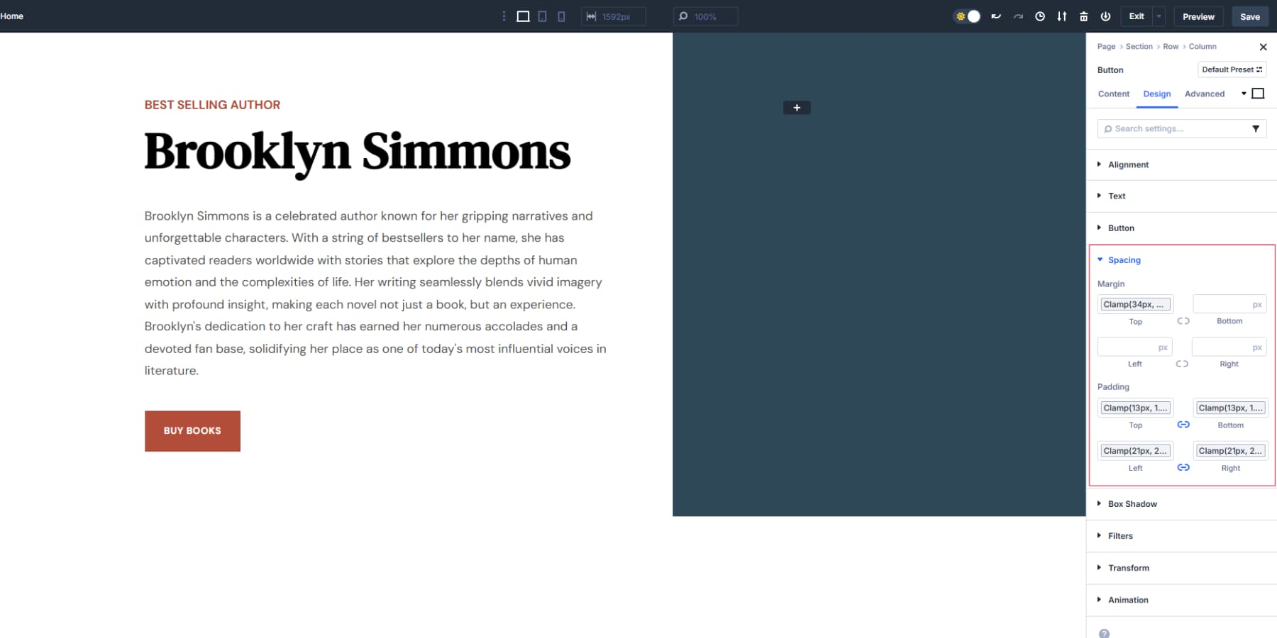
- Space Large: clamp(34px, 4.2vw, 42.36px): Creates breathing room between major sections while scaling with screen size.
- Space XL: clamp(55px, 6.8vw, 68.54px): Great for top/bottom padding on hero sections and major feature blocks. Hero sections need substantial padding even on mobile. Below 50px, hero content feels cramped against the edges.
- Space XXL: clamp(89px, 11vw, 110.89px): Use sparingly. Maybe for special sections that need dramatic breathing room.
Layout Variables
- Primary Column Width: 61.803%
- How we get it: Divide 1 by 1.618 = 0.61803 (or 61.803%)
- Use this for your main content area in any two-column layout
- Secondary Column Width: 38.197%
- Use for your sidebar column in the same row
- Derived from 100% – 61.803% = 38.197%
- Container Max Width: 1165px
- Text becomes hard to read when lines stretch beyond 72 characters,
- and assuming 10px as the minimum text size, the optimal reading width (720px) × golden ratio (1.618) = 1165px
- Apply to your main Section or Row that holds your content
- Text becomes hard to read when lines stretch beyond 72 characters,
- Golden Height Ratio: calc(100% / 1.618)
- This can be used as a value in the heights for module/module groups, such as images, call-to-action boxes, hero sections, team member cards, etc.
- This would create rectangles instead of squares or random shapes. Your brain finds these proportions naturally appealing, like a perfectly framed photo.
- How do we get this? The golden ratio says that if width = 1.618, then height = 1. So if width = 100%, then height = 100% ÷ 1.618 = 61.8%. This formula does that math automatically.
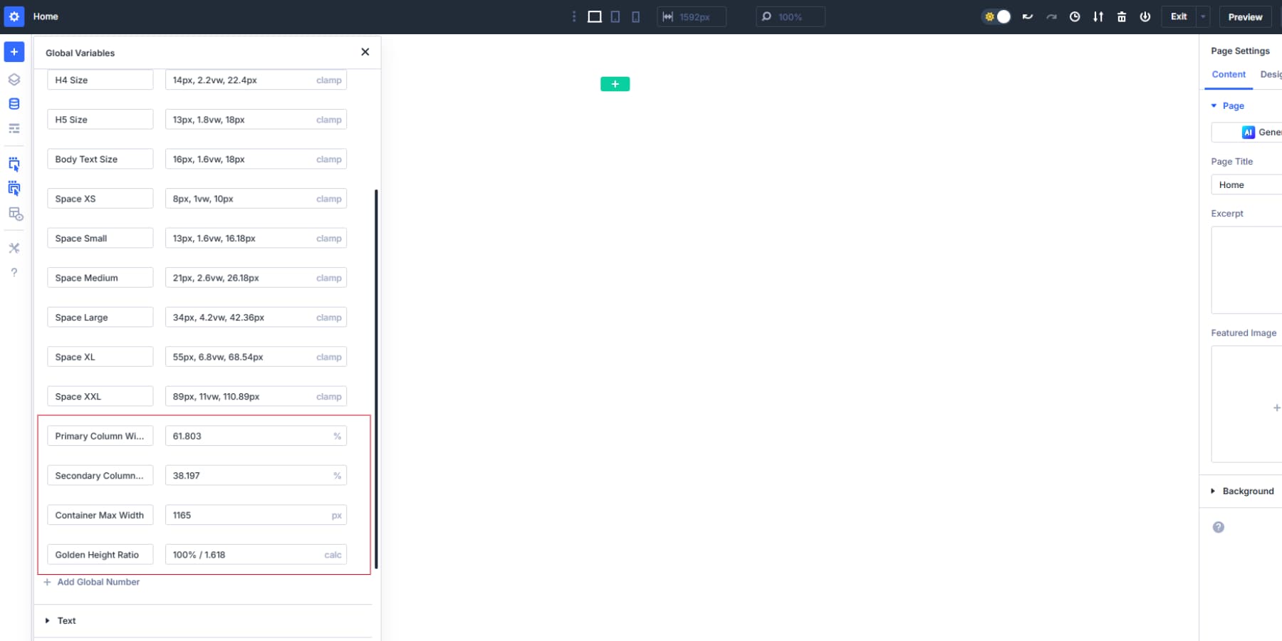
Save these variables in Divi 5’s Variable Manager. Then, use them anywhere by clicking the variables icon next to the width, height, or max-width fields. After the initial setup, no math is needed. Also, none of these variable labels are fixed; you may swap the labels with something that makes sense.
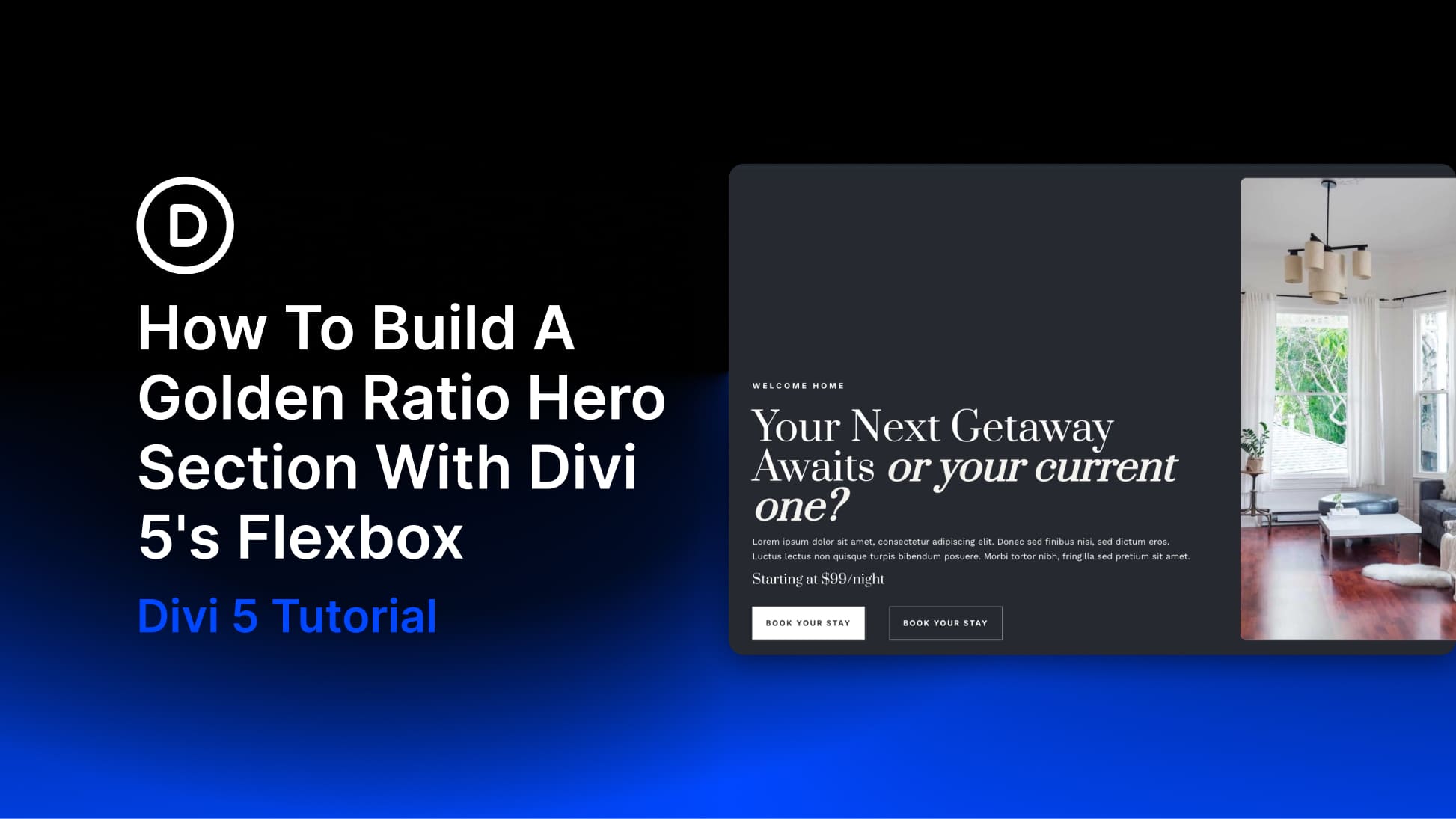
Creating A Hero Section With Golden Ratios
Let’s build a hero section for a book’s landing page, inspired by one of the Starter Site collection’s designs, using the golden ratio variables we just created. And that’s the fun part. You can take those carefully calculated variables and watch how they affect a real hero section.
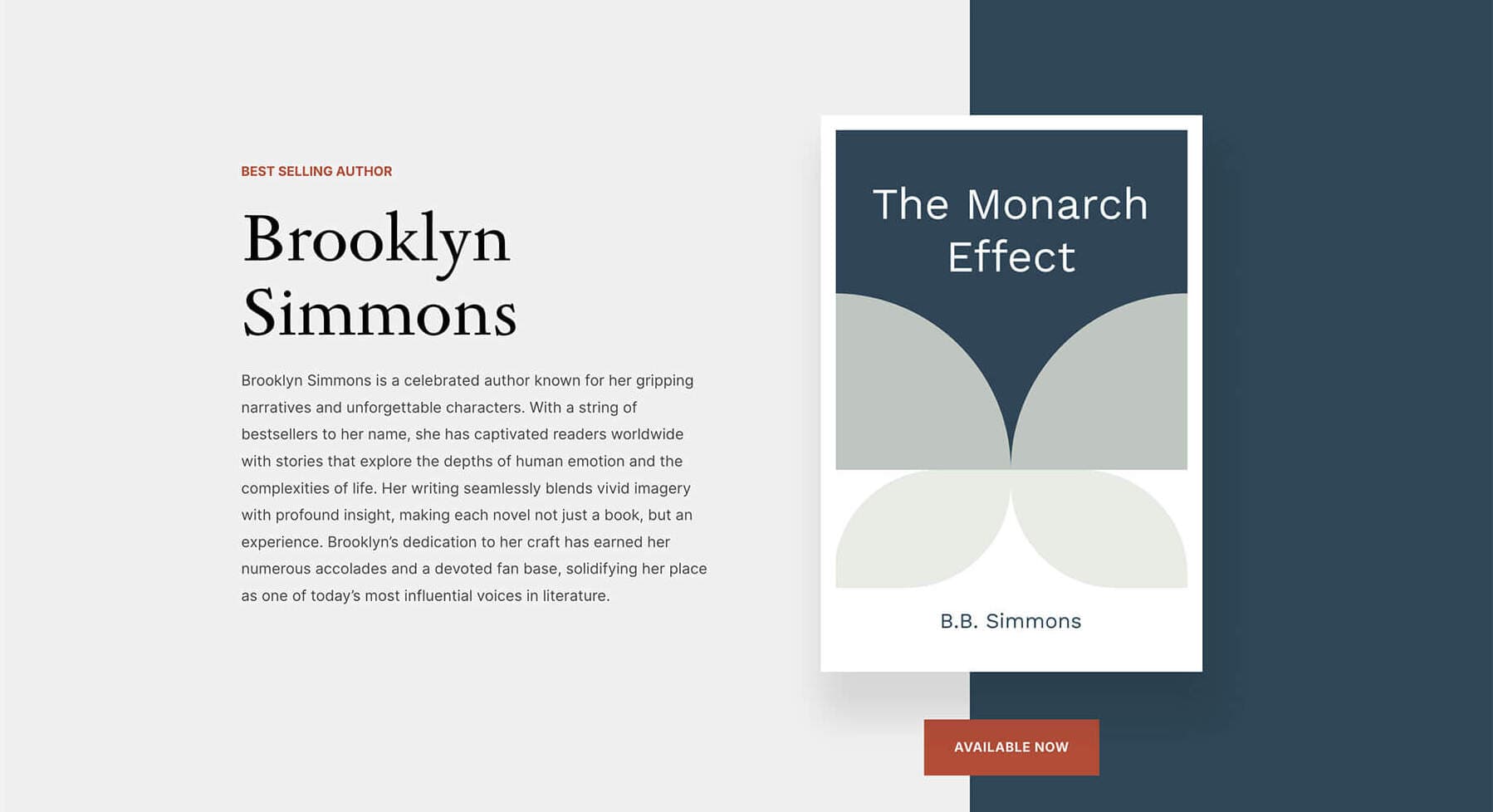
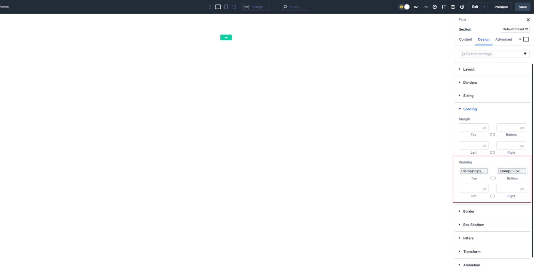
Start by creating a new section in Divi 5’s Visual Builder. Set the height using your Golden Height Ratio variable. This makes it natural for your brain to recognize as pleasing.
Add your Space XL variable to the top and bottom padding. This provides enough breathing room on mobile while expanding appropriately on desktop.
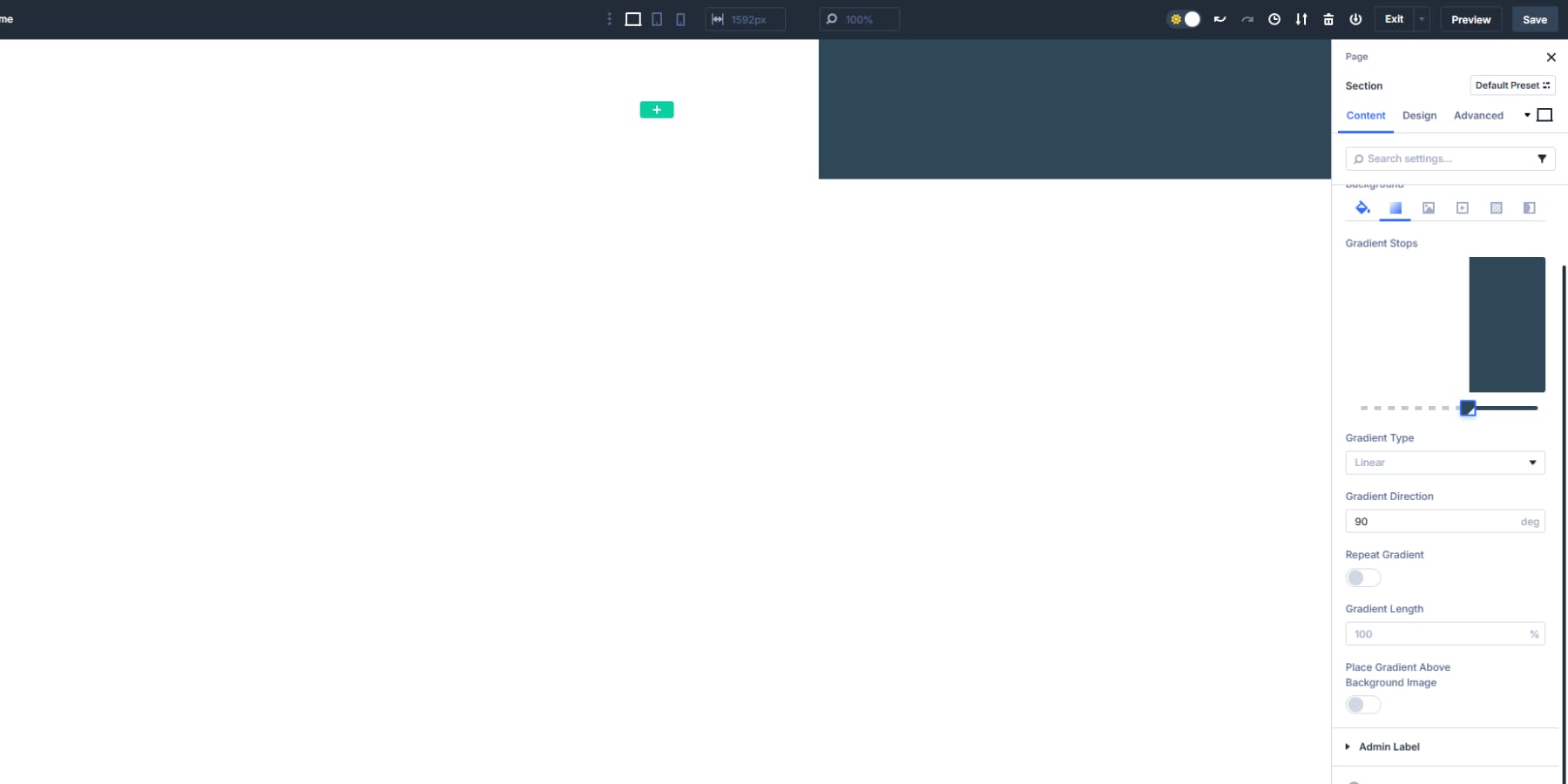
For the section background, you have two main options using your Design Variables:
Option 1: Solid Color Background
- Click the background color field and select your Primary Color variable from the dropdown. This keeps your hero section consistent with your brand identity. If your Primary Color is too light for text contrast, use your Secondary Color variable instead. Make sure whichever color you choose provides enough contrast for your text to remain readable. Keeping up with our inspiration, we will add a gradient of the background and primary colors with a 72% stop and at 90°.
Option 2: Image Background
- Apply your Hero Image variable (if you created one) through the background image field. Click the variables icon next to the background image setting and select your saved image variable. When using background images, add an overlay for text readability. Set the overlay color to your Primary Color variable and adjust the opacity to 40-60%. This darkens the image enough to make white text crisp and readable.
- You can also use your Secondary Color variable for the overlay if it contrasts your chosen background image better.
Creating The Two-Column Layout
Add a row with two columns.
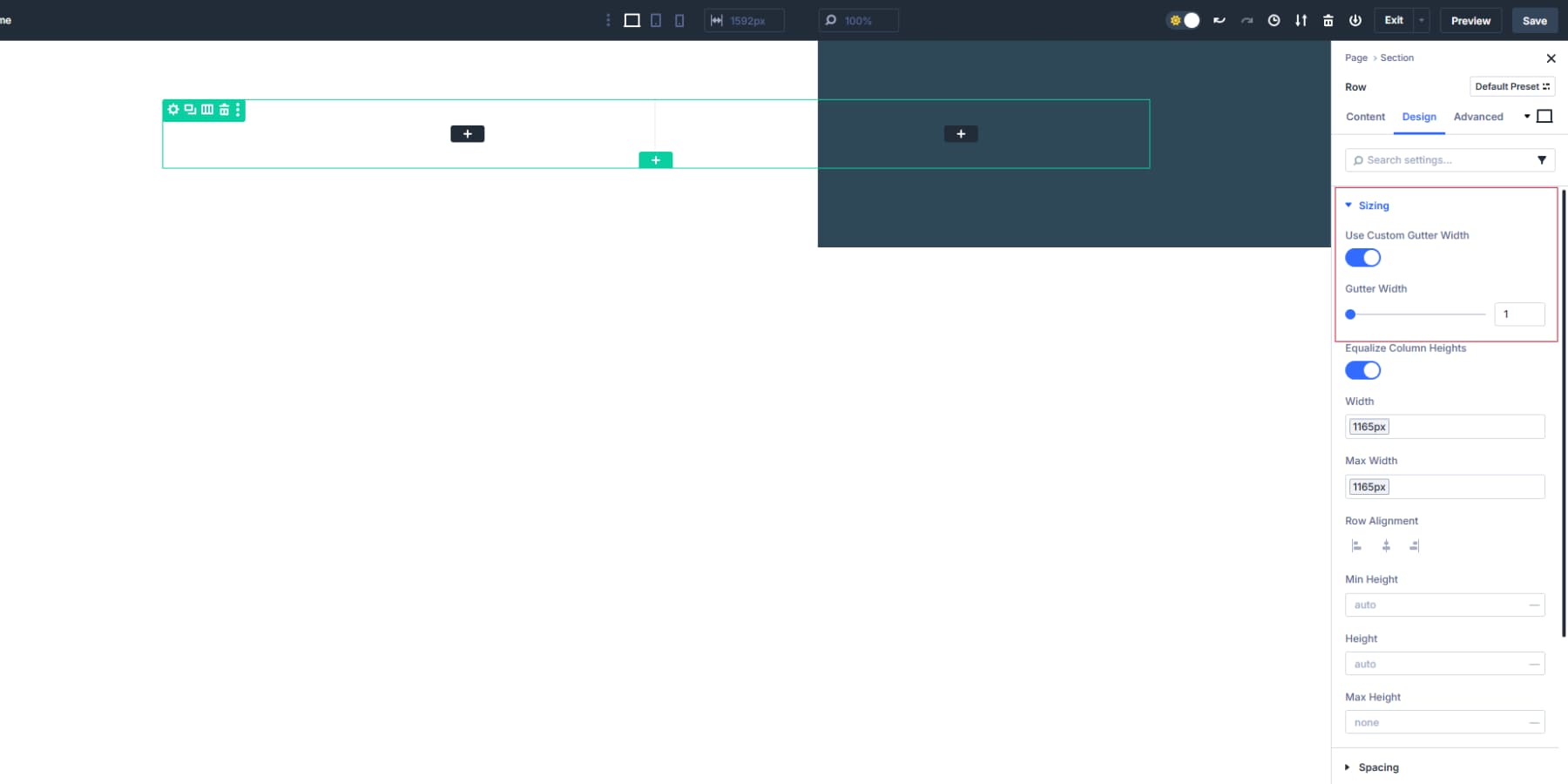
Set the left column width to your Primary Column Width variable and the right column to your Secondary Column Width variable. We will also turn on the “Equalize Column Heights” option. Then, the Container Max Width variable will be applied to keep the content readable on larger screens. This prevents text lines from stretching too wide, especially on wider screens.
We will also enable “Use Custom Gutter Width” and set it to 1. This will help us use golden ratio spacings between our modules.
Apply your Space Medium variable to the first column’s right and the second column’s left padding to add breathing space between columns. This creates enough separation between the columns without making them feel disconnected.
The larger column will hold your main message and call-to-action. The smaller column can contain a simple hero image or remain empty for a clean, text-focused design.
Setting Up Typography That Flows
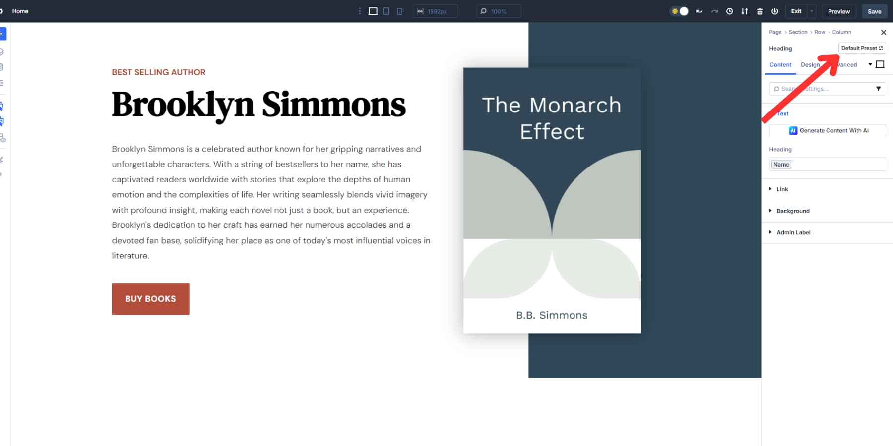
In your main column, add two Heading modules.
Set the first one to H5 and apply the H5 Size variable. In this example, this text module carries the content “Best Selling Author.” We will also use the secondary color for this text and apply an uppercase font style. We’ll also apply the body font to the text to make it distinctive and increase its weight to bold.
Set the second one to H1 and apply your H1 Size variable. This becomes your main headline. In this example, we will use the author’s name, which was added earlier, as a design variable. If you are short on ideas, you can use Divi AI to help you with great heading text.
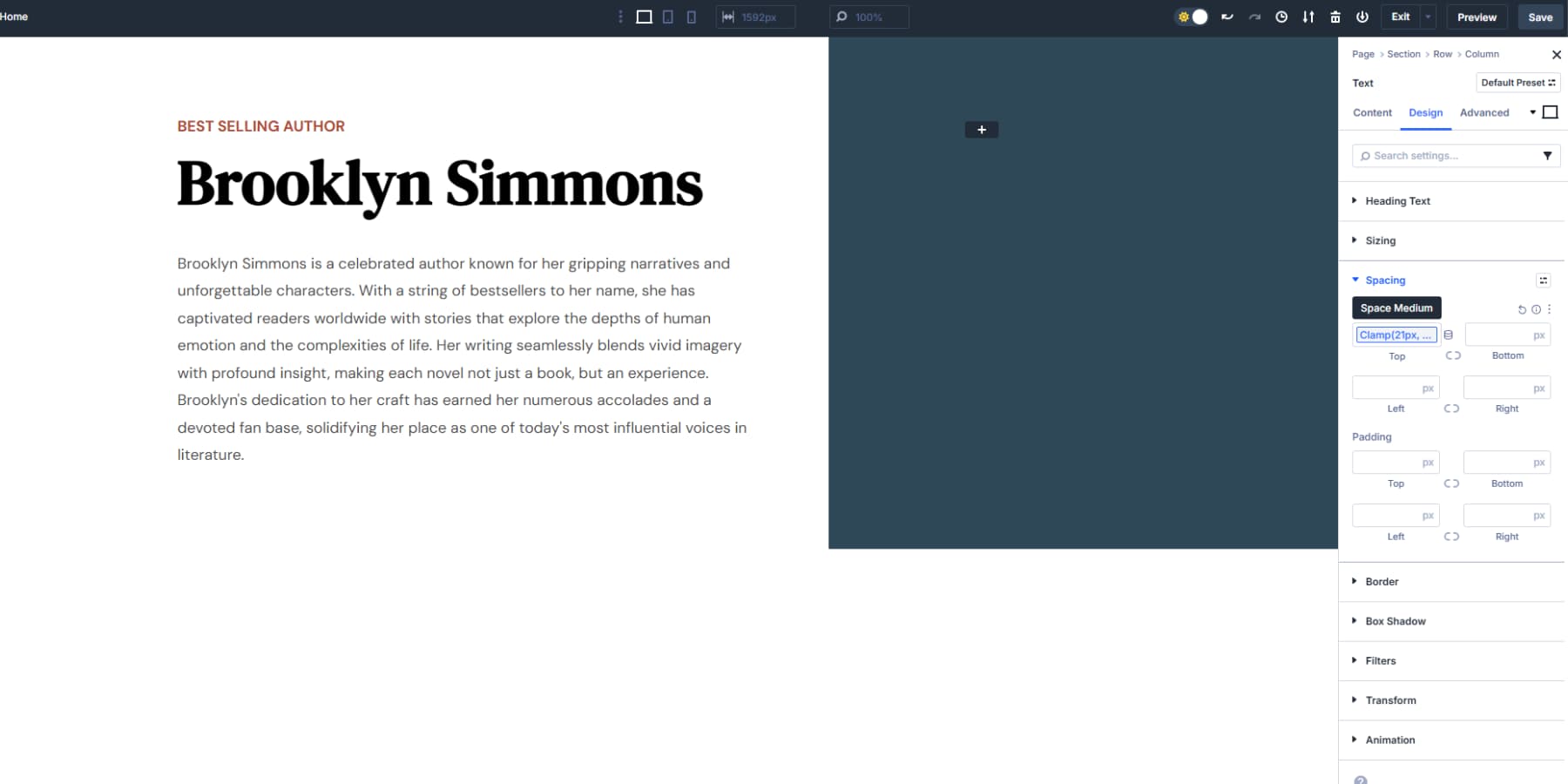
Below that, add a Text module for your supporting paragraph. Apply your Body Text Size variable and color variable. Keep this to 2-3 sentences explaining your core value proposition. For this example, we will add a brief introduction to our author. You can also use Divi AI to help you with the copy here.
Space these elements using your Space Medium as the margin between the headline and paragraph.
Then, add a Button module below your text. Apply your colors. We are using the Primary Color Design Variable and button text.
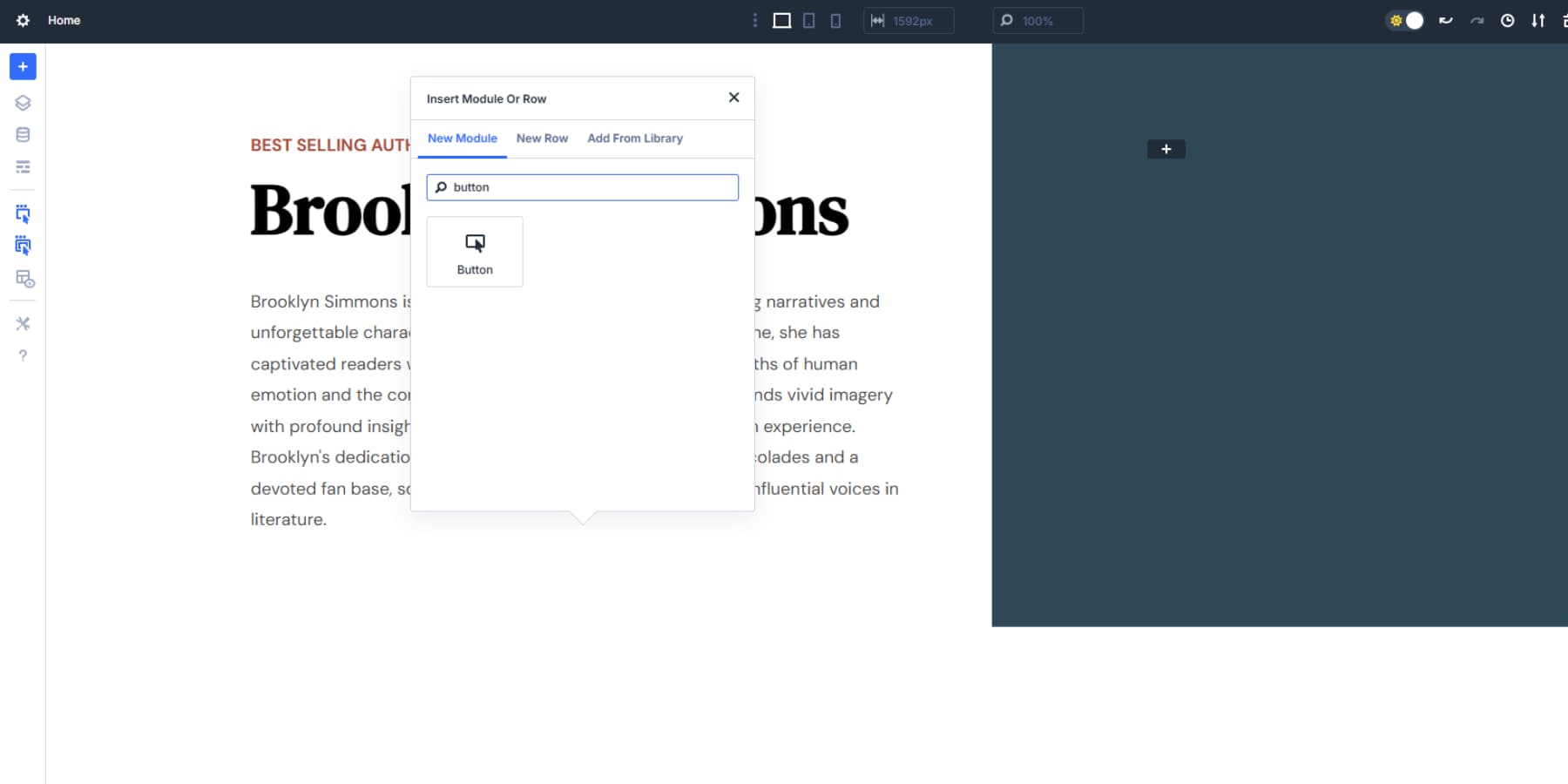
Add your Space Medium variable to the left and right padding and Space Small to the top and bottom for button dimensions. This creates a button that’s proportional to your text without being oversized. Use your Space Large variable as the top margin to separate it from the paragraph.
The button text should use your Body Text Size variable to maintain consistency with your paragraph text. We will also apply the button link design variable we added earlier.
Styling The Right Column
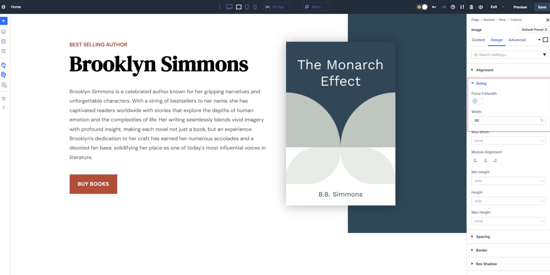
The right column can hold anything from an image to an onboarding form. If using an image in the smaller column, keep it simple. A photo of your team, your office, or a clean illustration works well. Don’t overthink the image placement: center it normally within the column. For this example, we will include the image Design Variable of a recent book. And also add a box shadow to make it stand out.
We will also adjust the image’s width to be around 90% so it looks more aligned.
For consulting websites, sometimes leaving the right column empty creates a cleaner, more professional look that puts full focus on your message.
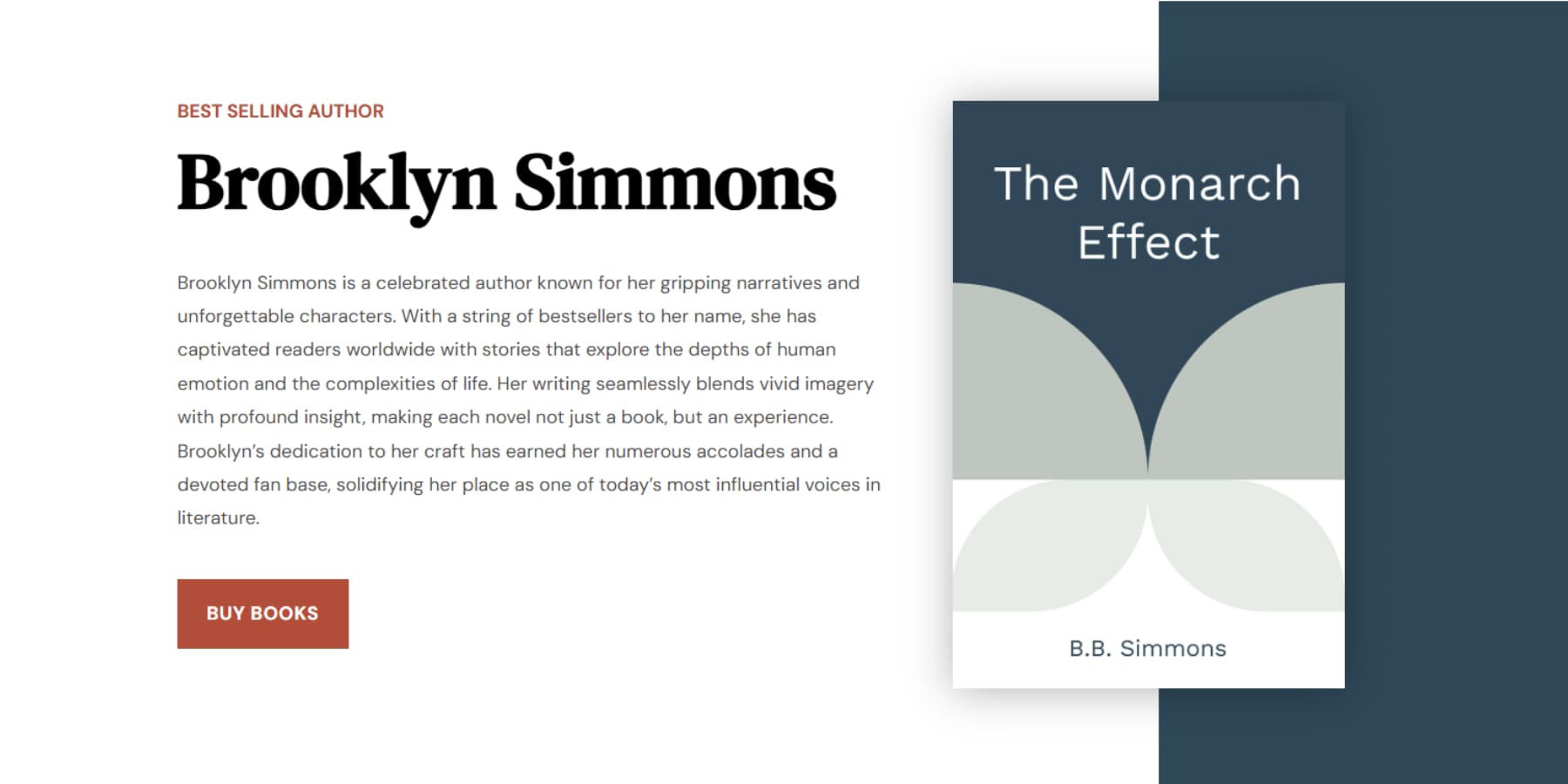
The Result
The following is the result:
Use Divi 5’s canvas scaling to test your hero’s appearance across different screen sizes. The clamp() functions in your variables should handle the responsiveness automatically.
While the golden ratio variables provide excellent proportional harmony, you might need minor adjustments based on your specific content. Long headlines might need slightly smaller text. Short, punchy taglines could handle larger sizes. Some brand styles call for tighter or looser spacing.
The beauty of Design Variables is that these changes take just two clicks. Open the Variable Manager, adjust your H1 Size or Space Large variable, and watch the shift apply instantly across your entire site.
Your H1 should remain prominent but readable on mobile (47px minimum). Your spacing should feel generous but not excessive on any screen size. The two-column split gives you a classic, professional layout that works well for service businesses where trust and clarity matter more than flashy design elements.
Maintaining Golden Ratios Site-Wide With Option Group Presets
Design Variables handle the numbers, but Option Group Presets ensure they are used consistently across the entire site.
Build your first section using the variables we created. Get the typography, spacing, and layout exactly right. Then click the preset icon next to each styling group (Typography, Spacing, Border, etc.) and save them as Option Group Presets.
This creates reusable design blocks that already contain your golden ratio proportions. Instead of starting from scratch, apply these presets every time you add a new section or module.
When you need to adjust proportions site-wide, change the variable once. Every preset using it updates across your entire site instantly. No hunting through individual pages to make changes.
Your golden ratios stay consistent without the manual work.
Math To Beautiful Design, Divi 5 Makes It Easy
That nagging feeling when layouts look “almost right” finally makes sense. You weren’t being picky: your brain was picking up on proportional relationships that felt off.
Golden ratios give you a reliable starting point, but most builders make you do the math every time. Divi 5‘s Design Variables system changes that completely. Calculate your 1.618 proportions once, save them as variables, then click to apply them anywhere on your site.
Need to adjust spacing across fifty pages? Change one variable instead of editing each page individually. Want consistent typography that follows the golden ratios? Set your clamp() values once and watch them scale perfectly across all devices.
The math works everywhere, but Divi 5 actually makes it practical to use consistently.


Leave A Reply