
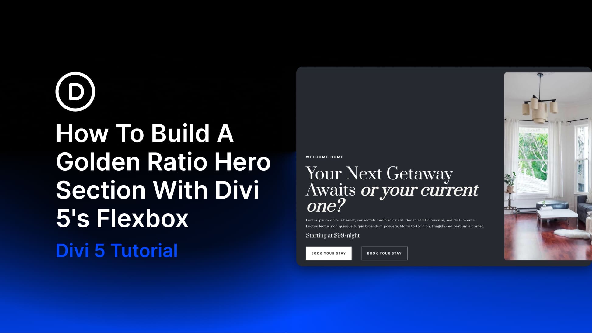
Good layout starts with a clear model for alignment and spacing. Flexbox provides that model by organizing content along a single axis with predictable control over direction, alignment, wrapping, and gap.
This post covers the basics of these CSS properties and how they work together. After the fundamentals, we show how the same approach is implemented visually in Divi 5 using the Flexbox Layout System. Let’s get to it!
What Is CSS Flexbox?
Mobile traffic overtaking desktop changed web design. Developers needed layouts that work on phones, tablets, and desktops. Old methods often failed.
Flexbox fixed this. CSS Flexbox makes elements adapt. Add display: flex to a container, and its direct children become flexible. They can grow, shrink, or stay fixed based on space.
Flexbox lays items in a straight line, either rows left to right or columns top to bottom. You choose the direction.
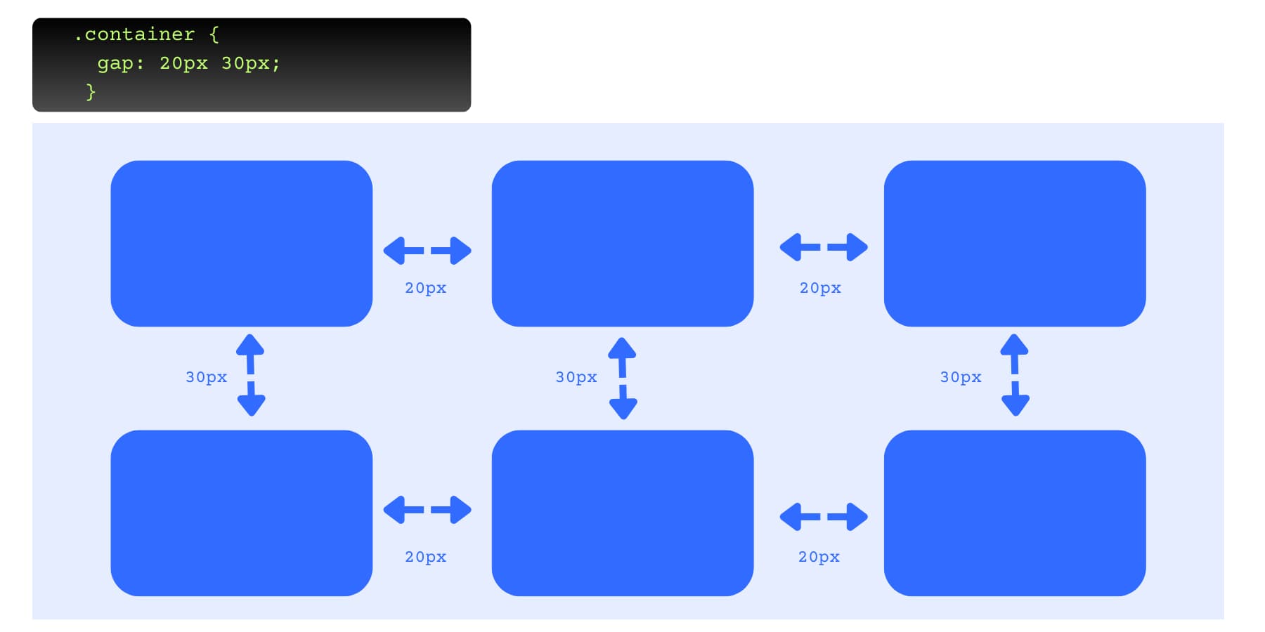
The container controls the layout. You set how items align and space out, such as spread evenly, centered, or stacked. The gap property adds consistent space between items without extra margins or padding. Older techniques required tricky margin math and broke often.
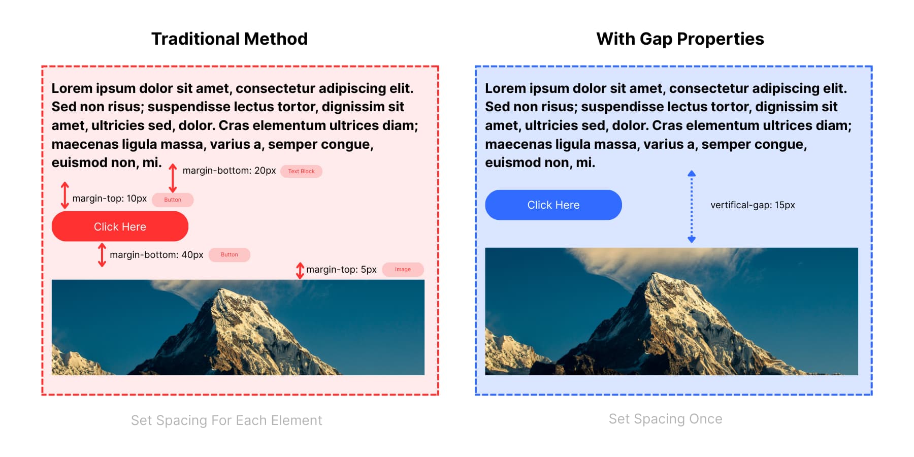
The traditional method makes random spacing choices: 10px here, 20px there, 40px somewhere else. These scattered values cause inconsistencies and make it hard to know which spacing applies. Gap properties remove guesswork by using one consistent rule for all elements.
A Quick Guide To Flexbox And Its Properties
Flexbox splits into two camps: properties for containers and properties for items. Container properties affect the whole group, while item properties let you tweak individual elements. Most layouts need just a handful of these properties, such as:
display: flex
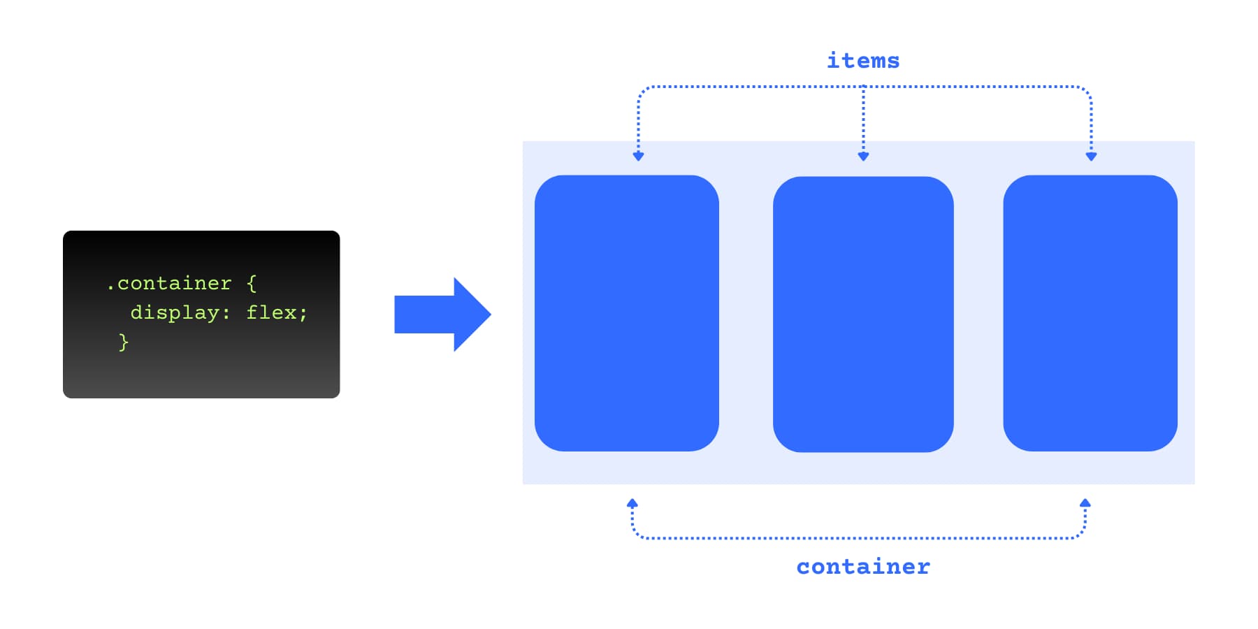
Turn any element into a flex container by adding display: flex. Its direct children become flex items. Items line up in a row by default instead of stacking like standard block elements. Your spacing headaches disappear because flex items follow different rules than regular elements. The container now controls how its children (or items) behave, and you get predictable results instead of the usual CSS surprises.
flex-direction
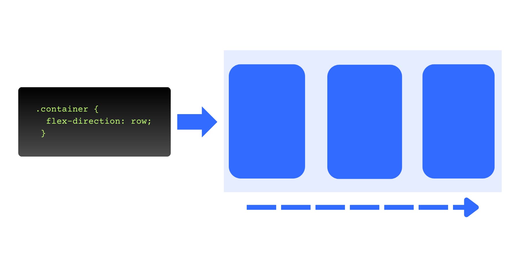
Pick which direction items flow. Use a row for the left-to-right arrangement.
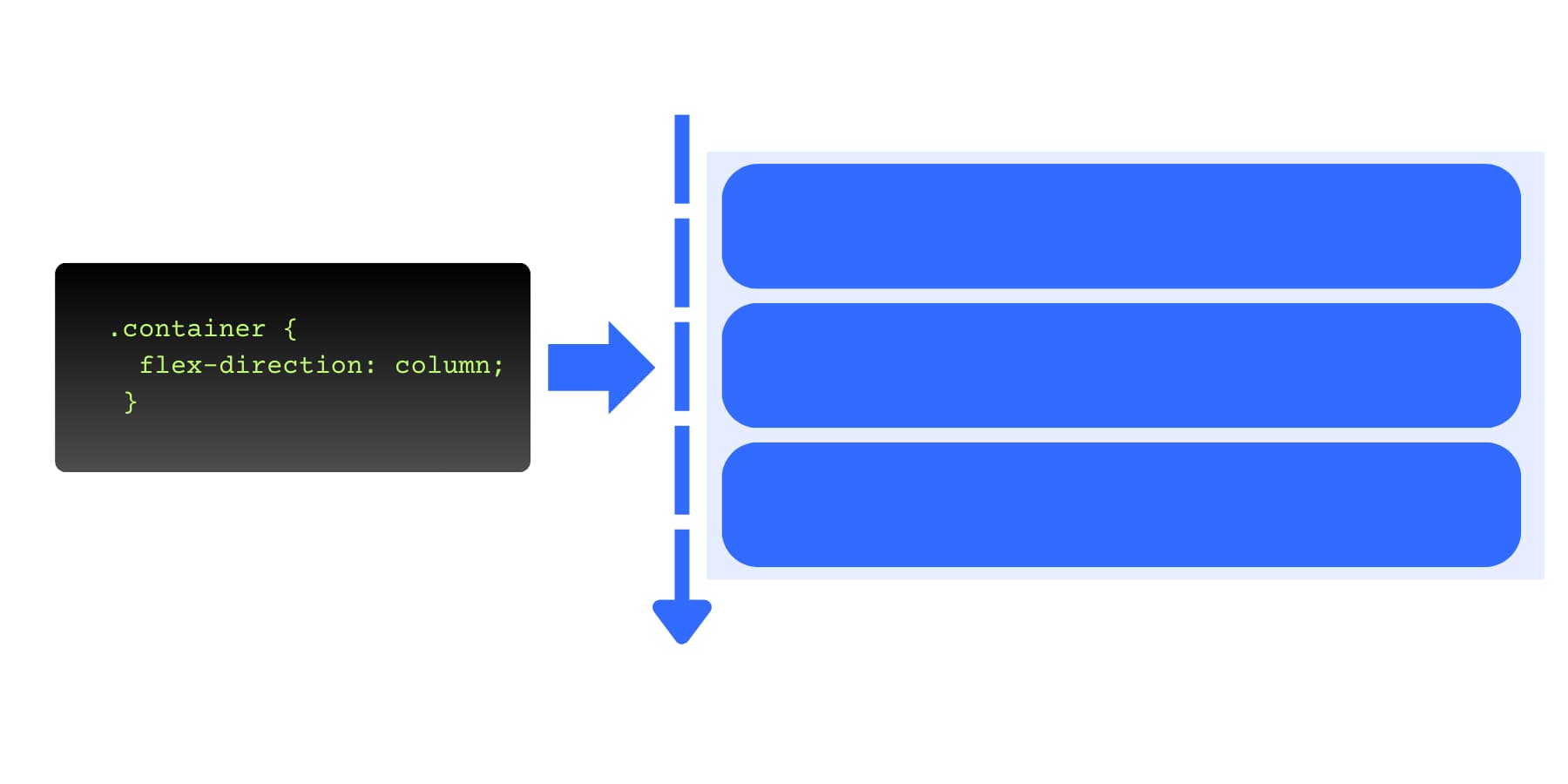
and a column to stack items vertically.
Add reverse to either one, and items flip their order completely.
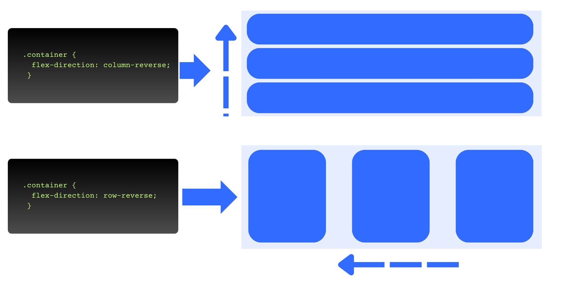
This choice sets your central axis, which affects how other properties work.
Switching from row to column changes how justify-content and align-items behave, so direction comes first in your planning.
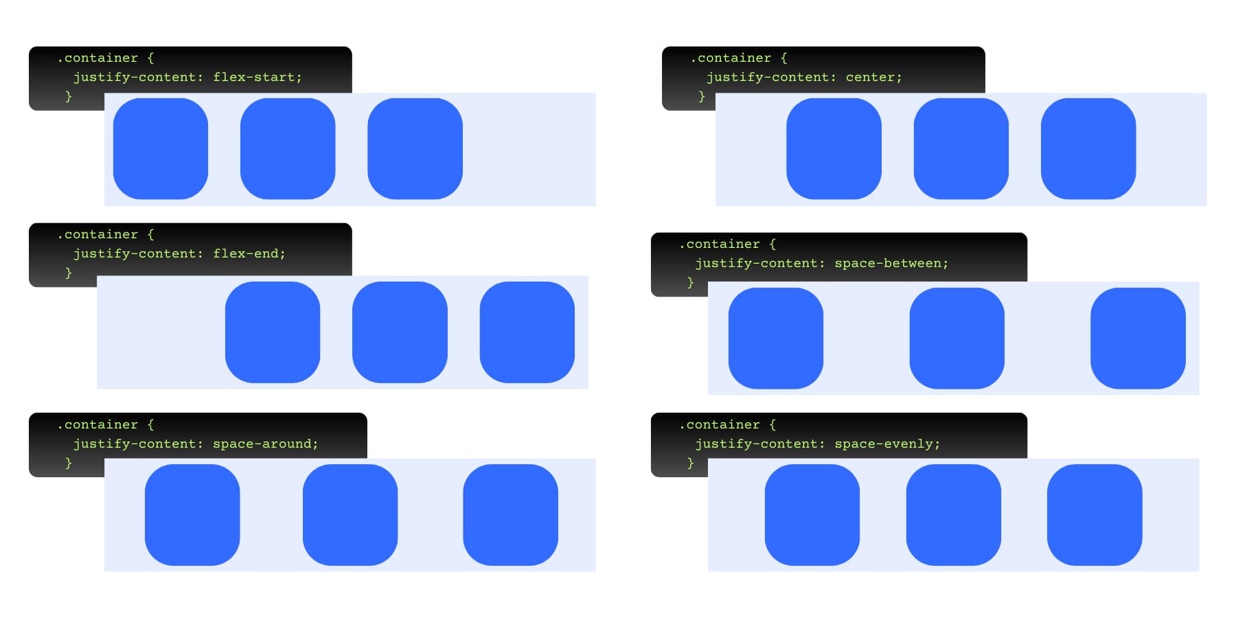
justify-content
This property distributes leftover space along your central axis. Items take what they need, and then this property handles the remainder. Use flex-start to bunch everything at the beginning, center to cluster items in the middle, and flex-end to put everything towards the end. At the same time, space-between is used to spread items apart with equal gaps. The space-around value gives each item equal space on both sides, while space-evenly creates identical gaps everywhere.
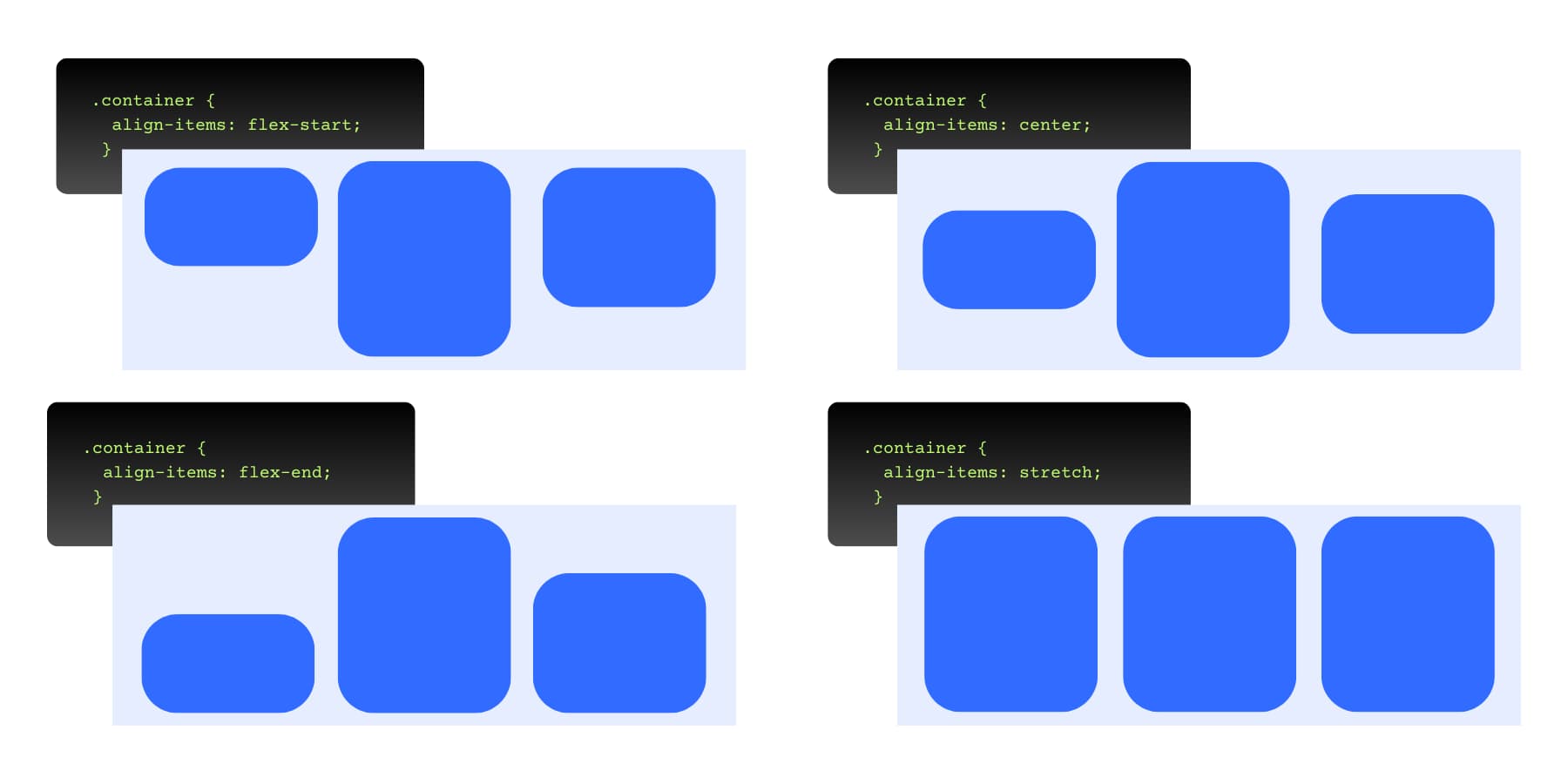
align-items
It handles alignment on the cross-axis. For horizontal layouts, this means vertical alignment. For vertical layouts, it controls horizontal positioning. It supports values like flex-start, center, flex-end, stretch, and baseline (not the space-* values). Set it to center, and items align to the middle regardless of their heights. The default value is stretch: items stretch to fill the container’s cross-size. If the container’s cross-size is auto, it often equals the tallest item so items appear equal in height.
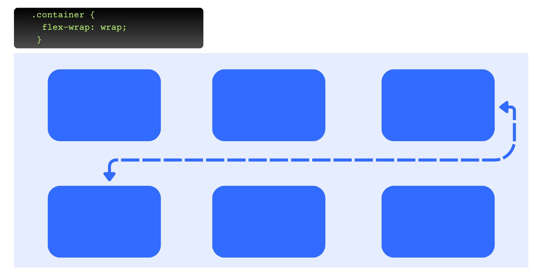
flex-wrap
Decides what happens when items run out of room. The default nowrap keeps everything on one line by shrinking items. Switch to wrap and items that don’t fit drop to new lines while maintaining their preferred sizes. You can reverse the wrapping direction, too. Wrapping turns your single line into multiple lines, creating layouts that resemble grids.
gap
It adds space between items without messing with margins. Set gap: 20px, and every item gets consistent spacing. You can set different horizontal and vertical gaps if needed. The space only appears between items, not around the edges. This beats calculating margins that break when you change layouts later.
These properties work well once you get the hang of them. The tricky part is remembering what each one does and typing out all that CSS. You write some code, refresh your browser, see it’s not quite right, then go back and adjust. Visual builders like Divi flip this around by letting you click buttons instead of typing property names.
Divi 5 Makes Flexbox Visual
As we established, learning Flexbox is one thing; remembering what justify-content: space-between does is another. You spend more time typing properties than designing. Instead of writing CSS, you use buttons and sliders that show exactly what each option does in the Divi builder. Divi 5 brings this to Flexbox, turning abstract concepts into straightforward, clickable controls.
Before we dive deeper, let’s briefly look at what Divi is.
What Is Divi?
Divi is a website builder that makes WordPress work for people who want good-looking sites without the hassle.
You can drag any 200+ modules around your page and change the text where it sits. Pick colors and watch them appear instantly while you work on the real site, not some preview that might lie to you later.
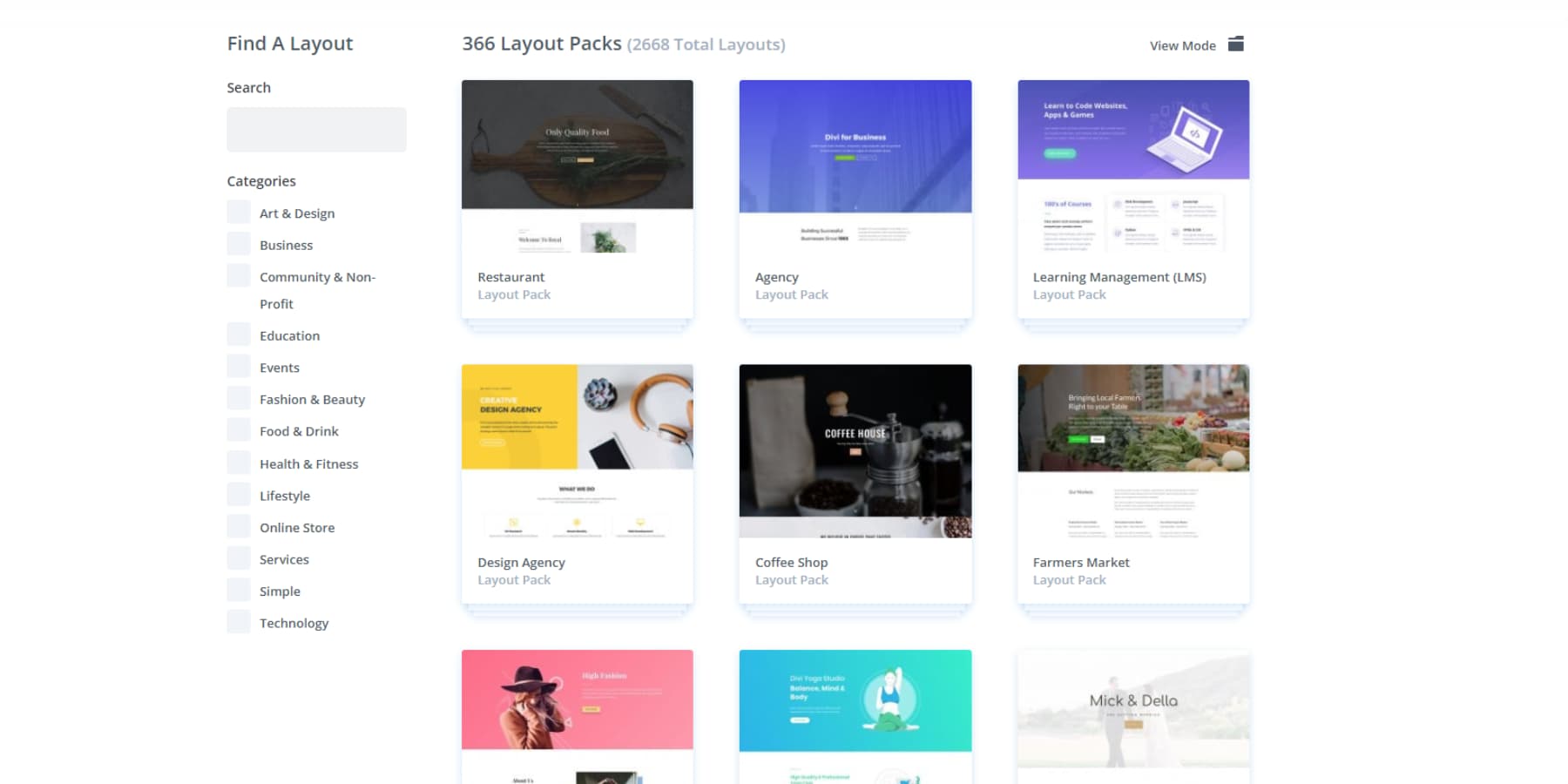
The theme includes 2000+ layouts for restaurants, photographers, consultants, and other businesses, so you can find one you like and tweak it until it works perfectly for your needs.
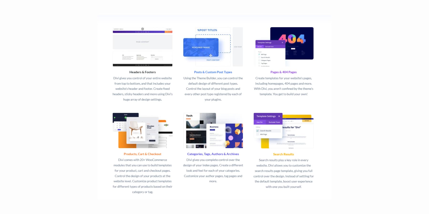
The Theme Builder gives you control over every part of your site. You can design headers that stand out instead of looking like everyone else’s, build blog pages people want to read, and even make your 404 pages interesting enough that visitors stick around instead of leaving.
Divi AI Helps You Build Quick
Once, making themes and templates meant juggling different apps for copy, images, and design ideas. Divi AI gathers everything you need into one unified interface: right where you build your websites.
Tell it you need text, and it writes it.
Ask for custom images, and it creates them. You can even describe photo edits and watch it make the changes.
Plus, it handles code and builds new sections when you ask.
Divi Quick Sites saves you from staring at a blank page without knowing where to start. You can pick from the starter sites our team designed, with original images and artwork that look good.
You can also describe your business to Divi Quick Sites and let it build something from scratch using AI. These AI-built sites come with real headlines, copy, and images matching your description.
Generate everything with AI, grab photos from Unsplash, or drop in placeholders for your images. Set your fonts and colors first, then let AI work around your brand choices while keeping everything editable afterward.
Divi 5: The Future-Proof Website Builder
Divi 5 rebuilds the entire framework from the ground up.

The Visual Builder runs smoother, pages render faster, and the codebase can more effectively support modern web standards. You get cleaner markup, better performance, and a foundation ready for the present and future.
The interface also gets streamlined. Settings appear more logically organized, and everyday tasks require fewer clicks. The overall experience feels more responsive, no matter if you’re building simple pages or complex layouts.
You get the same visual building approach you know, just with a much stronger foundation underneath.
What’s New In Divi 5
The new architecture opens doors for features that weren’t possible before. These 18+ additions change how you build and manage websites.
Here’s an example of what you get:
- Flexbox Layout System: Visual controls for alignment, spacing, and positioning. Elements can grow, shrink, or wrap to new lines automatically. Works with Nested Rows and Module Groups for complex layouts without code.
- Nested Rows: Put rows inside other rows with infinite nesting. Build complex layout structures without code workarounds.
- 17 WooCommerce Modules: Complete product page builders including Product Gallery, Add to Cart, Reviews, Ratings, Stock notices, Breadcrumbs, Product Meta, Upsells, and more. Cart and checkout modules coming soon.
- Interactions System: Create pop-ups, toggles, scroll animations, mouse-movement effects, and viewport triggers. Mix multiple triggers for complex behaviors like promotional banners that fade in after scrolling.
- Responsive Editor: Lets you view, edit, and reset responsive hover and sticky states for any setting simultaneously without switching view modes for faster, more precise, and less cluttered editing.>
- Loop Builder: Build dynamic content that pulls from your database. Create custom post layouts, product grids, and repeating sections. Works with WooCommerce products.
- Option Group Presets: Create reusable styles for typography, borders, shadows, and backgrounds. Apply these across any compatible element, not just single modules.
- Design Variables: Set global values for colors, fonts, spacing, numbers, images, and text. Change your primary color once, and it will update everywhere automatically.
- Advanced CSS Units: Use clamp(), calc(), min(), and max() functions through visual controls. No code required for responsive typography and spacing calculations.
- Relative Colors and HSL: Create mathematically beautiful color systems. Build color variations that automatically maintain harmony when the base color is changed.
And more is coming! Our development team continues adding features ~every two weeks as they prepare for the Public Beta release.
A Quick Overview Of Divi 5’s Flexbox Setup
Divi 5’s visual approach removes the guesswork from Flexbox implementation. Instead of memorizing property names and typing CSS, you get buttons and sliders that show exactly what each control does. Have a look at how easy it is.
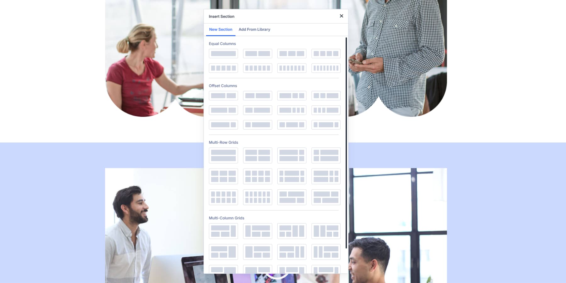
1. Setting Up Your First Flex Row
Start by picking your row structure from the expanded template selection. Divi 5 offers many more layout options, including equal columns, multi-row grids, and multi-column setups.
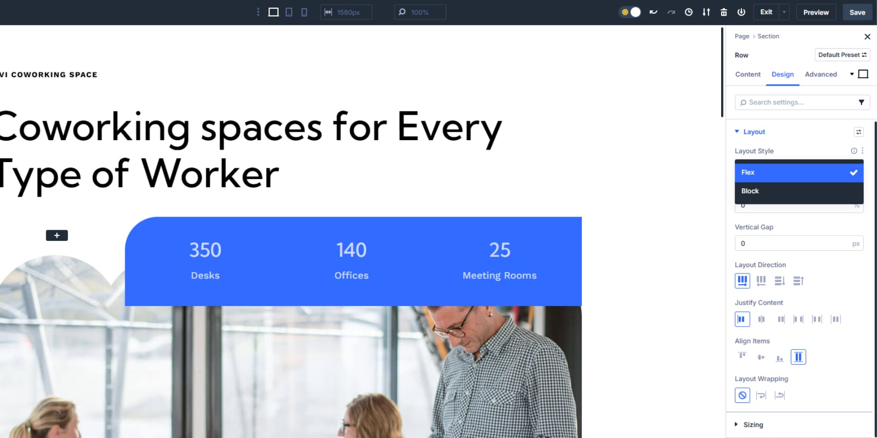
New sections in Divi 5 start with Flexbox automatically. When you add a fresh row, it comes ready with flex properties turned on. But if you’re working with existing sections from older Divi versions, you’ll need to switch them manually from the default block layout to flex by clicking the settings icon on your row, navigating to the Design tab > Layout, and changing “Block” to “Flex.”
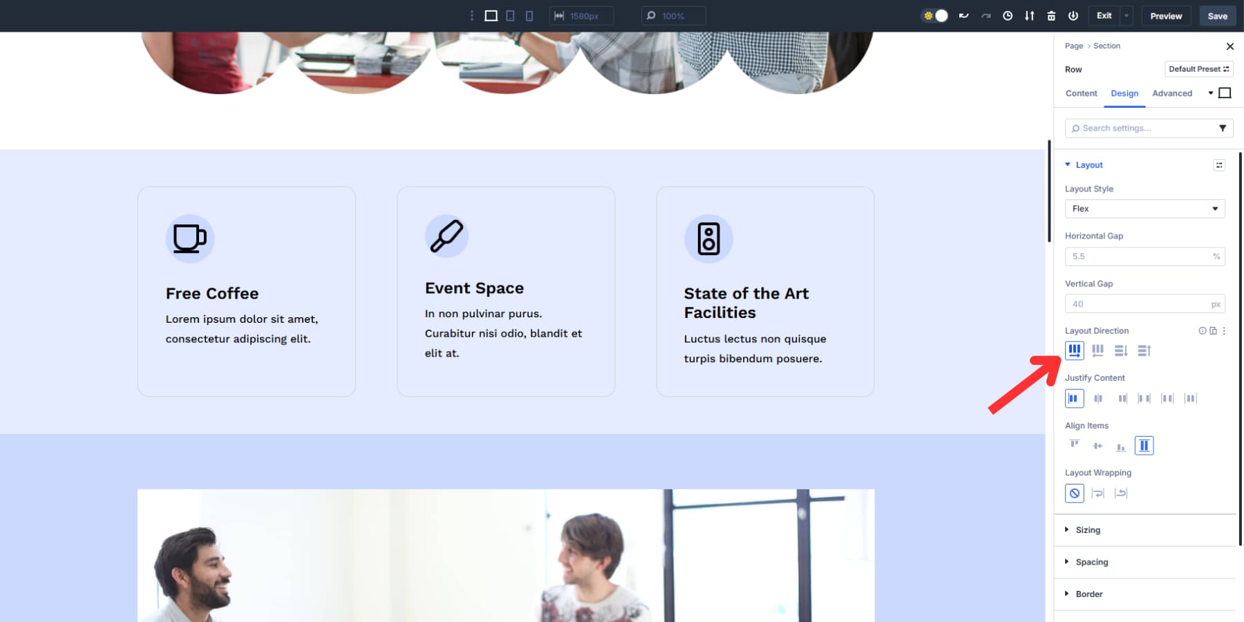
2. Understanding Direction, Flow, Alignment
Your Layout Direction field determines where items end up. Row is the default setting, which makes items line up horizontally.
Switch to column, and items stack elements vertically like regular web layouts.
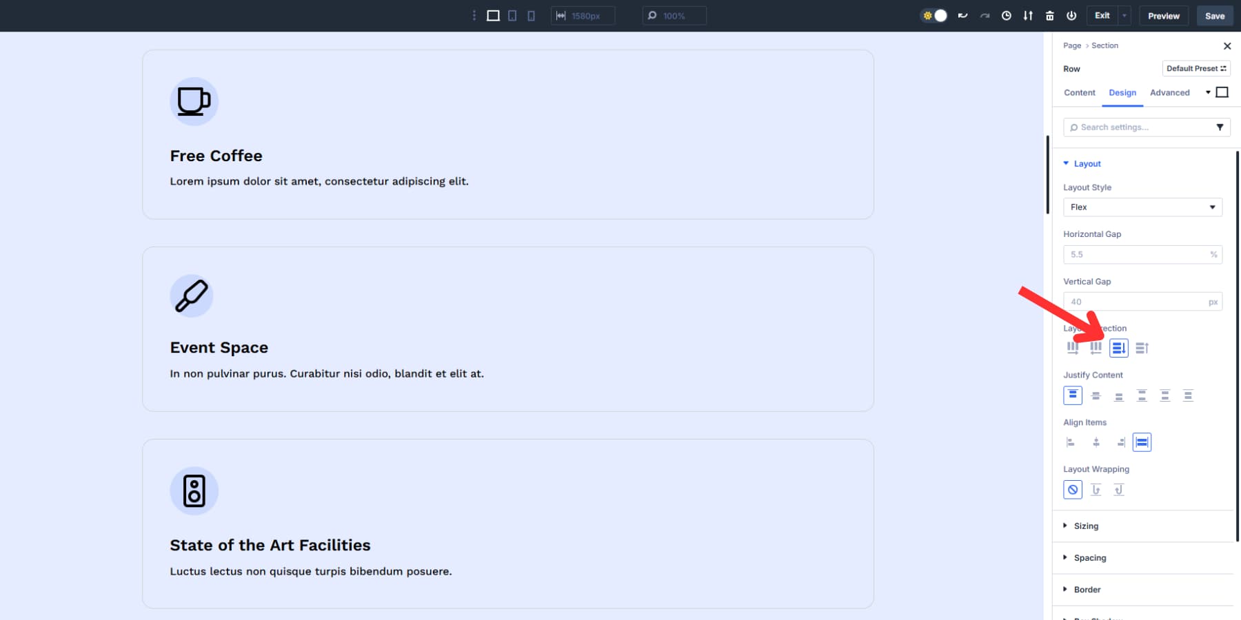
Both options come with reverse versions that flip the order completely.
Meanwhile, Justify Content decides what happens with leftover space along your main axis. For rows, start means left, middle centers horizontally, and end aligns right.
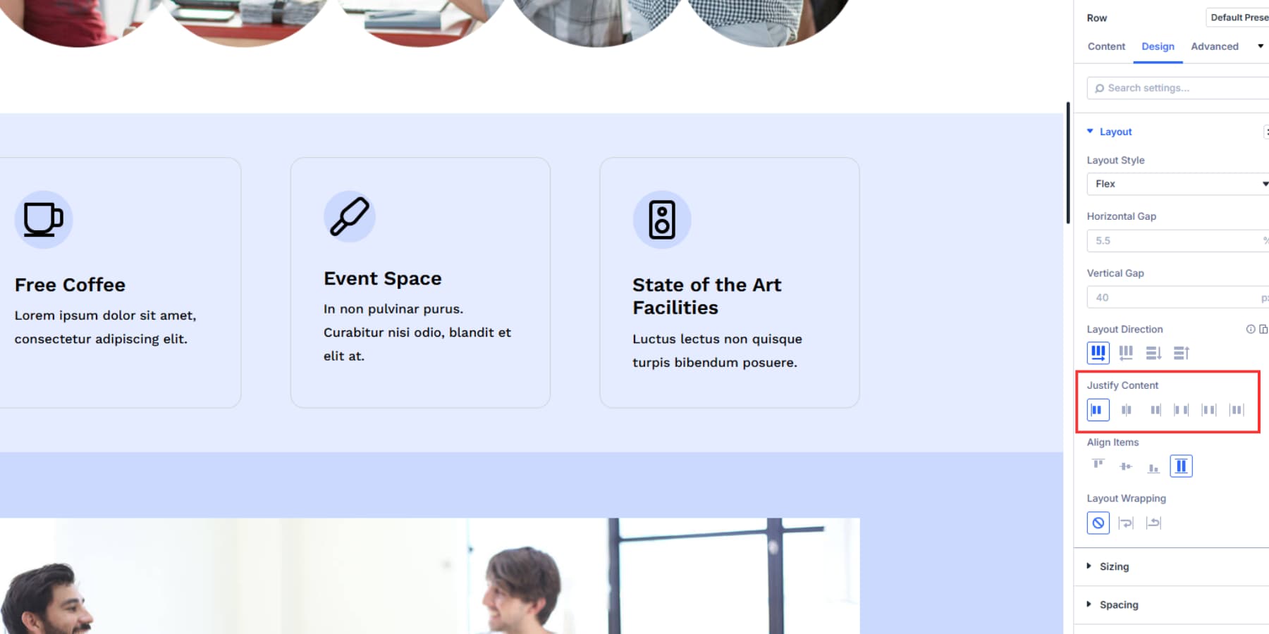
For columns, start means top, middle centers everything, and end pushes items to the bottom.
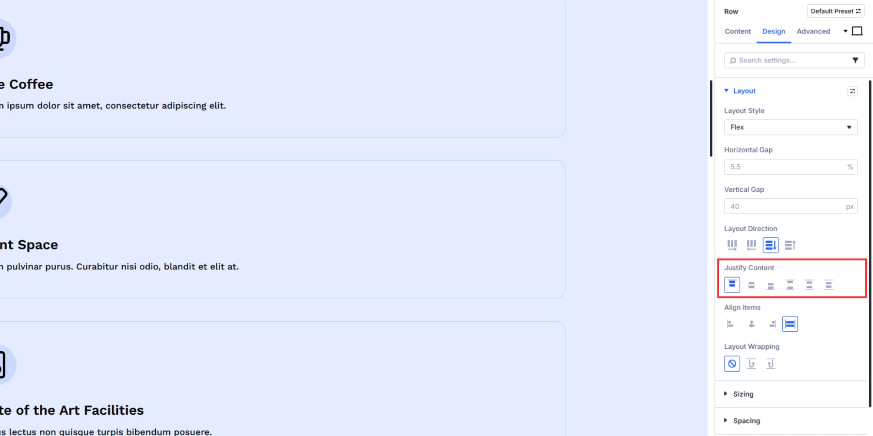
Beyond the standard start, center, and end alignment, you also have space between spreads items apart with equal gaps, perfect for navigation menus or card layouts.
Space around gives each item equal breathing room on both sides, which is useful when you want consistent margins. And, space evenly creates identical gaps everywhere, ideal for balanced visual spacing.
Align Items works perpendicular to your flow direction. If you choose row layout, this controls the vertical positioning of items.
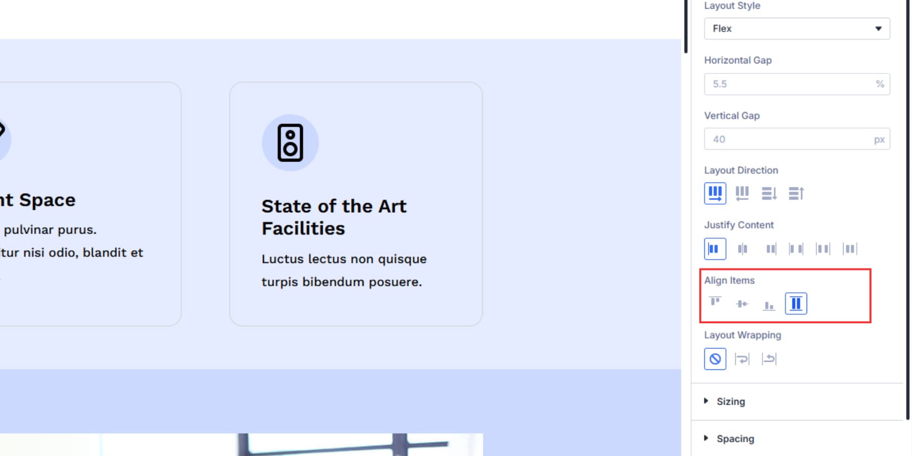
If you picked column layout, it handles horizontal alignment.
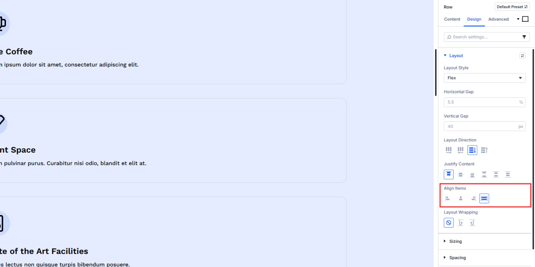
The center keeps everything aligned to the middle, the start positions items at the beginning edge, the end pushes them to the far edge, and the stretch makes items fill the available space.
These controls solve common layout headaches without custom CSS calculations.
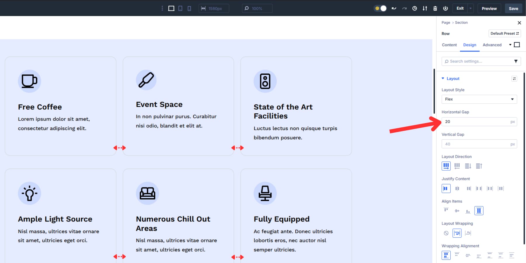
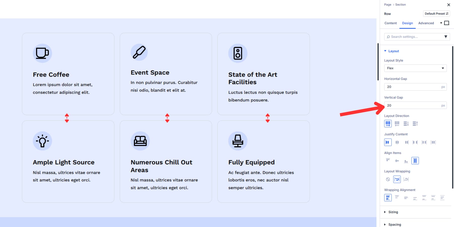
3. Spacing Things Out With Gap Controls
Gap controls add space between flex items in your container: columns, modules, and any content type work. Gaps create breathing room without messy padding or margin math. The gap appears only between items, not around the outer edges.
Set your horizontal gap to 20px, and every column will have that exact spacing.
Change the vertical gap to 20px, and all gaps will update instantly.
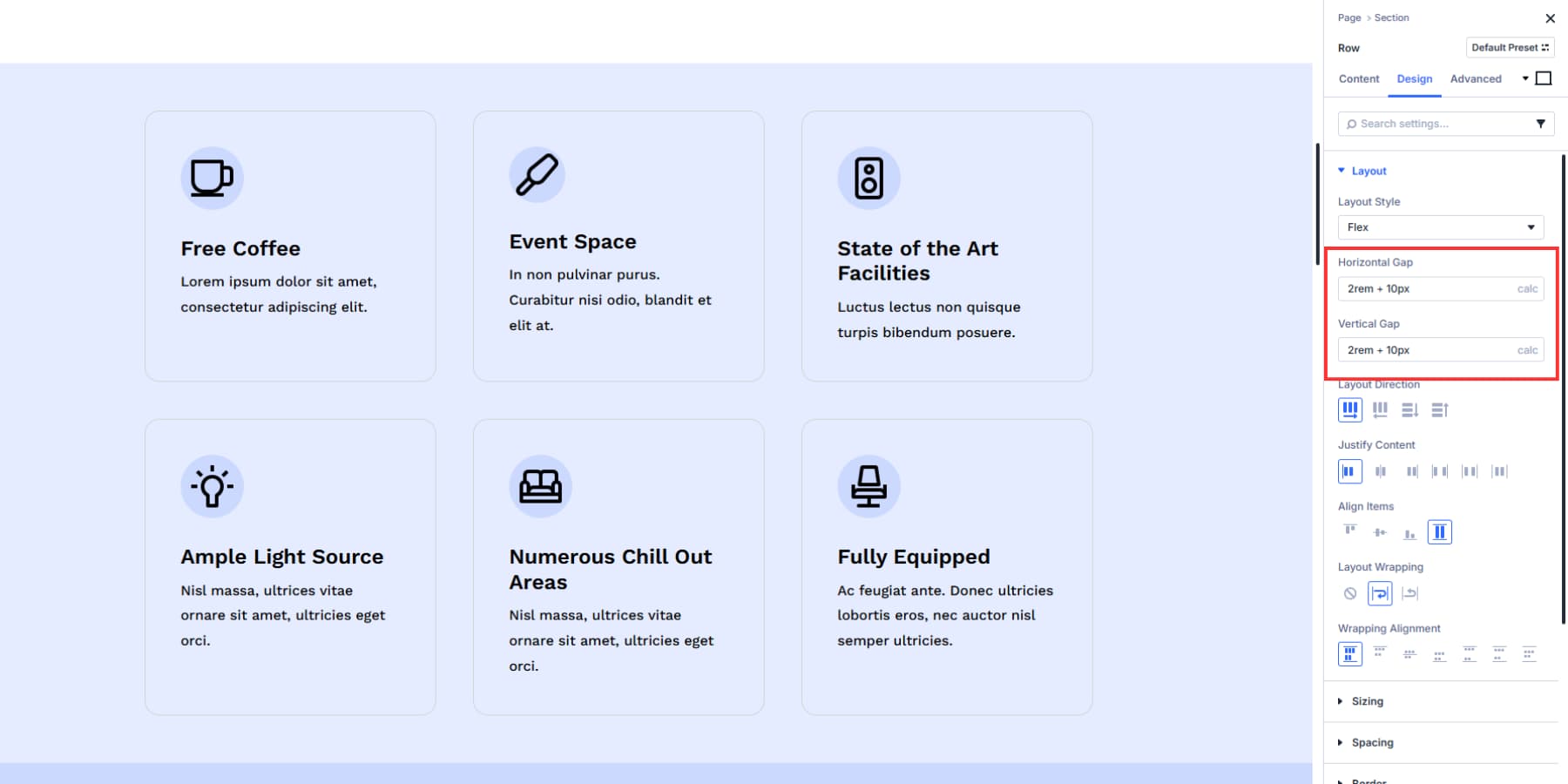
Divi 5 supports advanced CSS units like viewport lengths and percentages. You may use clamp() for responsive gaps that scale between screen sizes. The calc() function, which combines units like calc(2rem + 10px), is also supported.
Gap controls here also support Design Variables. Add a number variable called “Horizontal Column Gap” with clamp(16px, 2vw, 32px) as the value. Apply that variable to gap controls across your site.
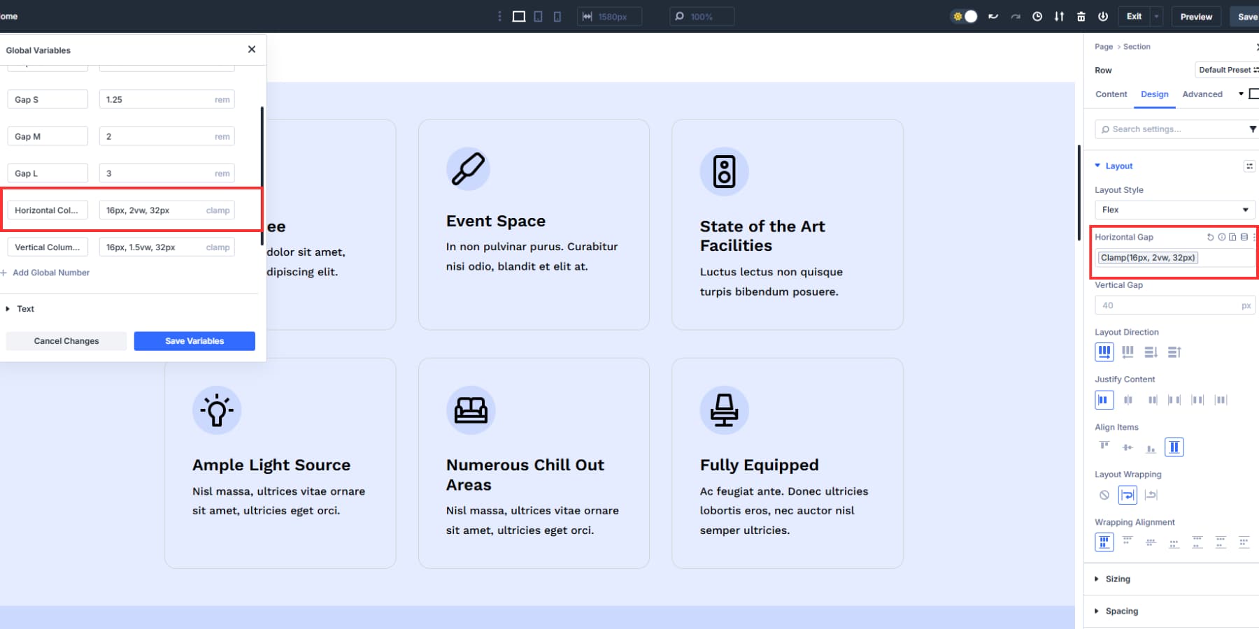
When you want tighter spacing later, edit the variable; every gap will update instantly.
4. Controlling How Items Wrap
Layout wrapping controls what happens when items run out of horizontal space. The default no wrap setting keeps everything on one line by shrinking items to fit the container. Switch to wrap and items that don’t fit drop to new lines while maintaining their natural sizes.
Wrap reverse does the same thing as regular wrap, but flips the direction. New lines appear above the previous ones instead of below.
This gives you control over visual hierarchy when items overflow. The wrapping behavior stays consistent across different screen sizes, so your layout adapts predictably from desktop to mobile without breaking.
Divi 5 also gives you Wrapping Alignment controls. This feature appears automatically when you enable flex wrapping and multiple-line forms. When the direction is set to row, the wrapping alignment is available for vertical alignment.
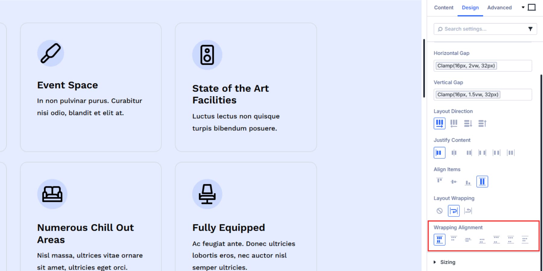
Likewise, for column direction, the options are for horizontal alignment.
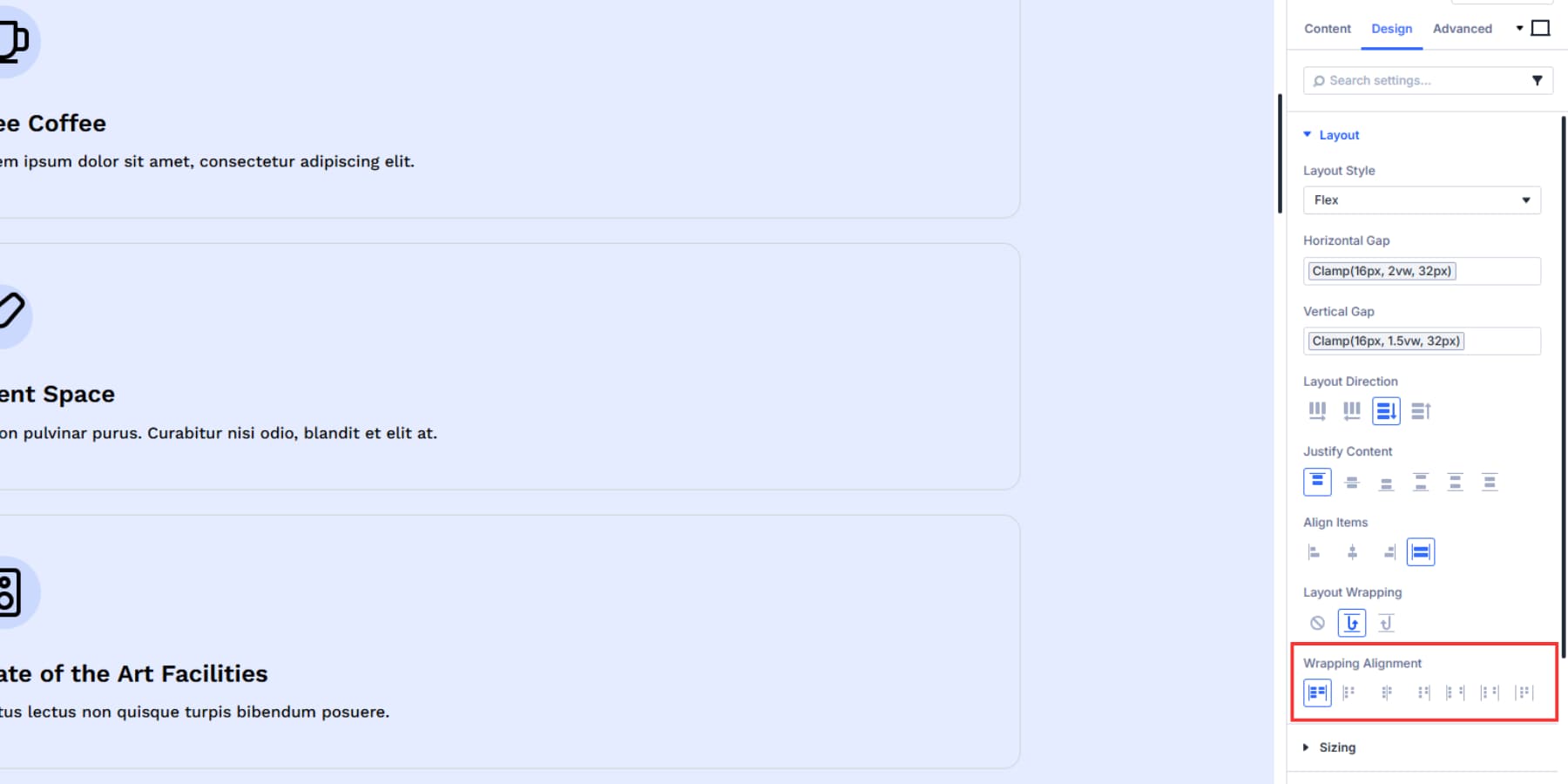
Stretch makes all lines expand to fill the available vertical space. Start bunches of lines at the beginning, center clusters in the middle, and end by pushing them toward the opposite edge.
Space between spreads lines apart with equal gaps, space around gives each line equal breathing room on both sides, and space evenly creates identical gaps between all lines.
This works great for card layouts, image galleries, or any content that needs to flow naturally across multiple rows. Items maintain their proportions and spacing while rearranging based on available width. You get clean breaks without items getting crushed together on small screens.
5. Working Across Different Screen Sizes
Divi 5’s seven breakpoints give you granular control over how your layouts adapt.
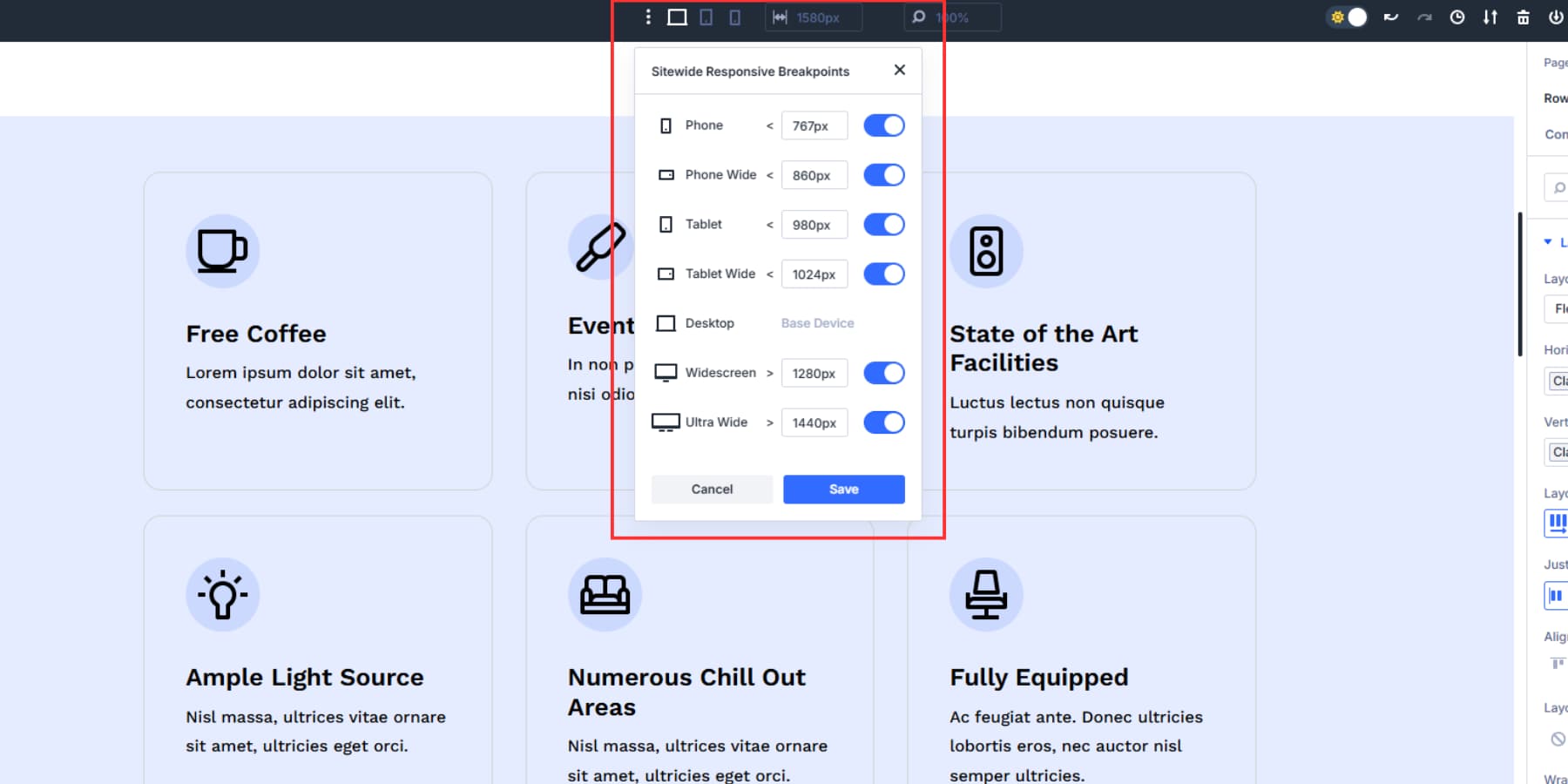
Each breakpoint works independently, so you can switch your Layout Direction to column on mobile while your desktop row layout stays untouched. You might center everything on phones, but keep that space between alignment on larger screens.
Your desktop three-column setup can become a single-column stack on mobile without affecting the middle breakpoints. Each screen size gets exactly what works best for that viewing experience.
The new Responsive Editor makes this process much smoother. Click the responsive editor icon next to any setting to view and modify values for all screen sizes at once.
However, if you are using clamp() values to gap your rows and columns, that would automatically scale between breakpoints without requiring manual changes.
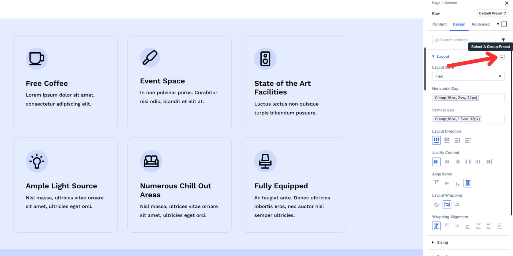
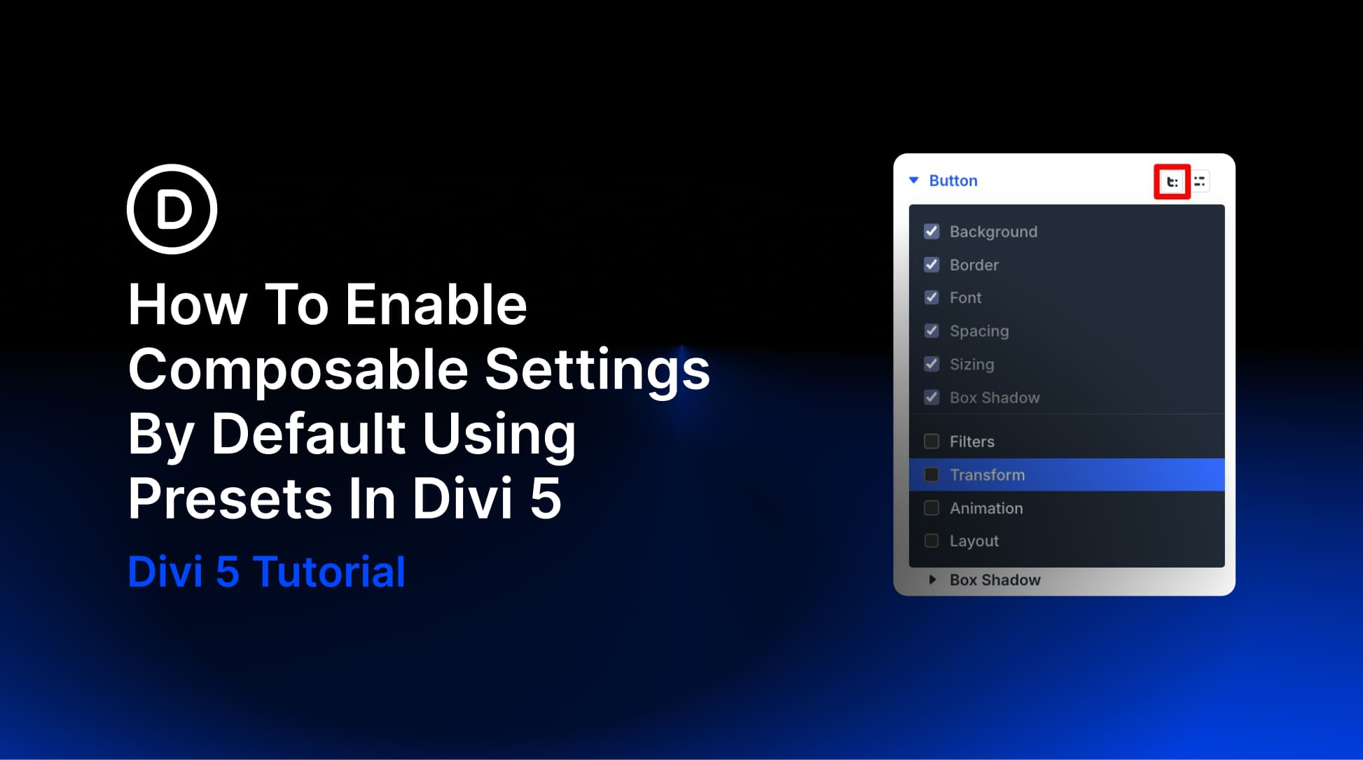
6. Creating Option Group Presets
After you get your Flexbox layout working the way you want it, you can save those settings as an Option Group Preset by clicking on the Option Group Presets option and labeling it aptly.
Your gap values, alignment choices, and wrap settings are bundled together. When you click save, that exact layout configuration becomes reusable across your site. When you want to use the saved preset, click on the preset icon on the new row and select the preset you just saved.
The preset keeps your advanced units intact. Your responsive spacing transfers with all the math you set up, and the changes were even made on different breakpoints.
Get Started With Divi 5’s Flexbox Today
Flexbox eliminates the margin and padding math that breaks when you change layouts. You stop fiddling with responsive design with media queries and custom sections.
Divi 5 turns these abstract CSS properties into visual controls. You can click buttons to set direction, drag sliders to adjust gaps, and toggle wrapping on and off. The Responsive Editor handles all seven breakpoints from one panel, so you see results instantly instead of guessing at code.
Save successful combinations as presets and reuse them anywhere. You spend time designing instead of debugging CSS syntax.


I’m really loving Divi 5 right now, I visit the blog daily just to find out the updates and what new things I can do. When Divi 5 Alpha first came out it came with big warnings that it was not ready for producing websites yet, but I made a great woocommerce based online takeaway site with it, quite advanced and it worked great.
Can someone ask Nick to do another Showcase submission, it’s been sooo long, they used to be quite common. Maybe make it a Divi 5 showcase, get people even more excited!