

Styling a Contact Form 7 form to match your website used to mean writing custom CSS, chasing the right selectors, and checking every field again on mobile. Even when the CSS worked, the form often still felt separate from the rest of the page. That matters because forms are conversion points. When they look disconnected from your design system, they can make the whole experience feel less polished.
Divi 5 brings Contact Form 7 forms back into that system. With the Contact Form 7 Styler module, you can display forms you already built with Contact Form 7 and style them directly inside the Divi 5 Visual Builder.
This post walks through the full styling process, including inputs, labels, placeholder text, buttons, messages, focus states, checkboxes, radios, and reusable presets.
What Is The Contact Form 7 Styler Module In Divi 5?
The Contact Form 7 Styler module lets you display existing Contact Form 7 forms inside Divi and style them like native Divi elements. You still create and manage the form fields, email settings, validation, and integrations inside Contact Form 7. The Divi module handles how the form looks on the page.
That distinction is important. The module does not replace Contact Form 7. It gives your existing CF7 forms access to Divi 5’s design controls so you can style them without writing custom CSS for every selector.
Once you add the module and select a form, you can customize the main parts of the design from the builder, including input fields, textareas, select menus, labels, placeholder text, checkboxes, radio buttons, the submit button, and form messages.
The module only appears when the Contact Form 7 plugin is installed and activated on your WordPress site.
The CF7 Styler also gives you control over interaction states. With Divi 5’s focus editing, you can style how fields look when someone clicks or tabs into them. For checkboxes and radio buttons, you can also style the checked state so selected options feel intentional instead of browser-default.
Validation messages, success messages, invalid form messages, failure messages, spam messages, and acceptance messages can all be styled to match your design language. The result is a form that feels consistent from first click to final submission.
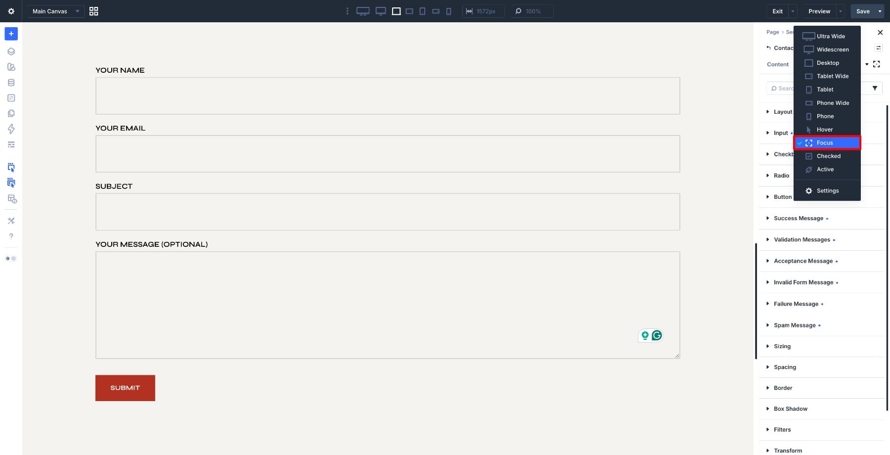
Focus editing gives you a dedicated way to design the active field state separately from the default field styling.
What makes this different from a CSS workaround is that the CF7 Styler connects your form to Divi 5’s broader design system. You can reuse typography, colors, spacing, borders, and presets instead of styling the same form pieces manually on every page.
And once you have a design you like, you can reuse it with Copy/Paste Attributes or turn the local settings into presets. That means your contact page, landing page, newsletter form, and sidebar form can all share the same visual language without rebuilding the design from scratch.
Before You Start
To use the Contact Form 7 Styler module, install and activate Contact Form 7 first.
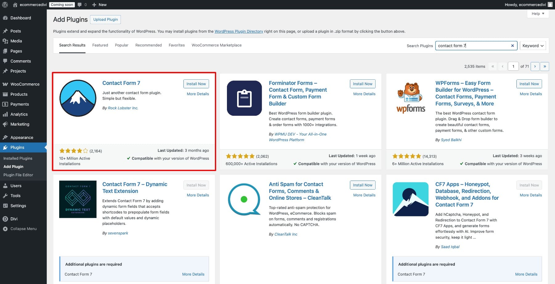
Then go to Contact in your WordPress dashboard and create a new form or open an existing one.
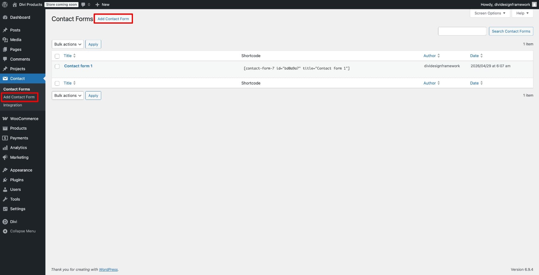
Before you bring the form into Divi, check the form itself. Make sure the fields are correct, labels are clear, required fields are intentional, and the Mail tab is configured properly. Divi will style the form, but Contact Form 7 still controls the form structure and submission behavior.
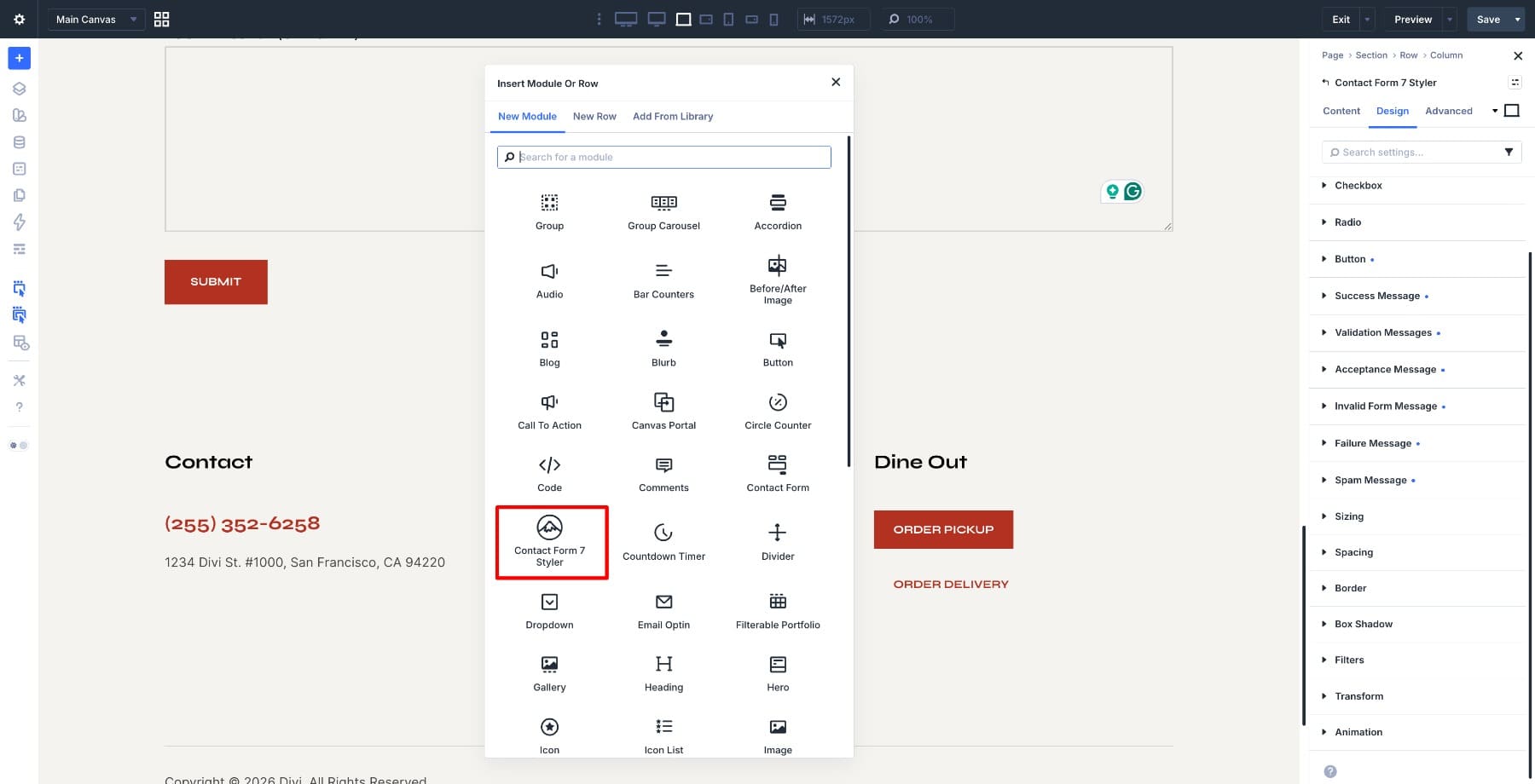
With your form ready, open the page where you want to display it and enable the Divi Builder. Add the Contact Form 7 Styler module to your layout and select your form from the dropdown in the module settings.
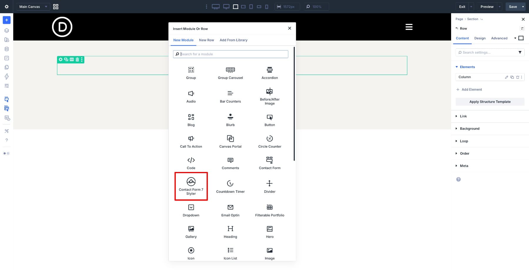
The form will load inside the builder, giving you a live preview of the fields you are styling. From here, you can start shaping the design.
Styling The Contact Form 7 Form Step By Step
With the form loaded in the builder, style each part of the design systematically. This keeps the form cohesive and makes it easier to reuse later.
Step 1. Set Up The Form Layout
Start by adding a one-column Row to your section. This gives the form enough horizontal space and keeps the layout simple.
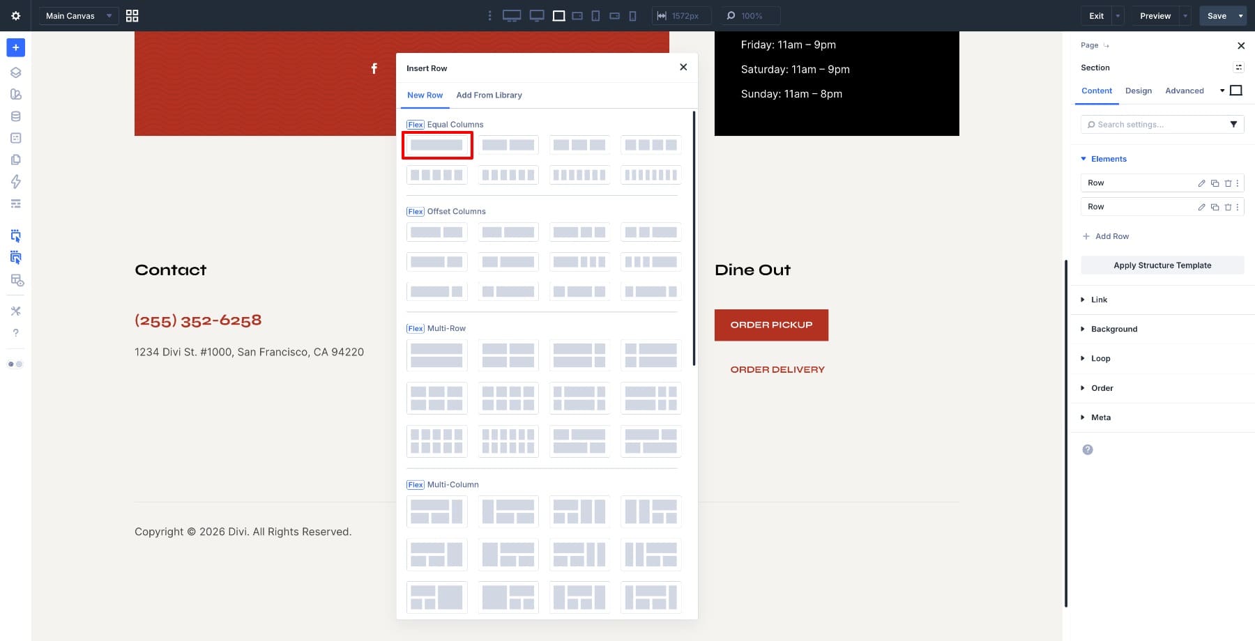
Place the Contact Form 7 Styler module inside the row and select your form from the Form dropdown.
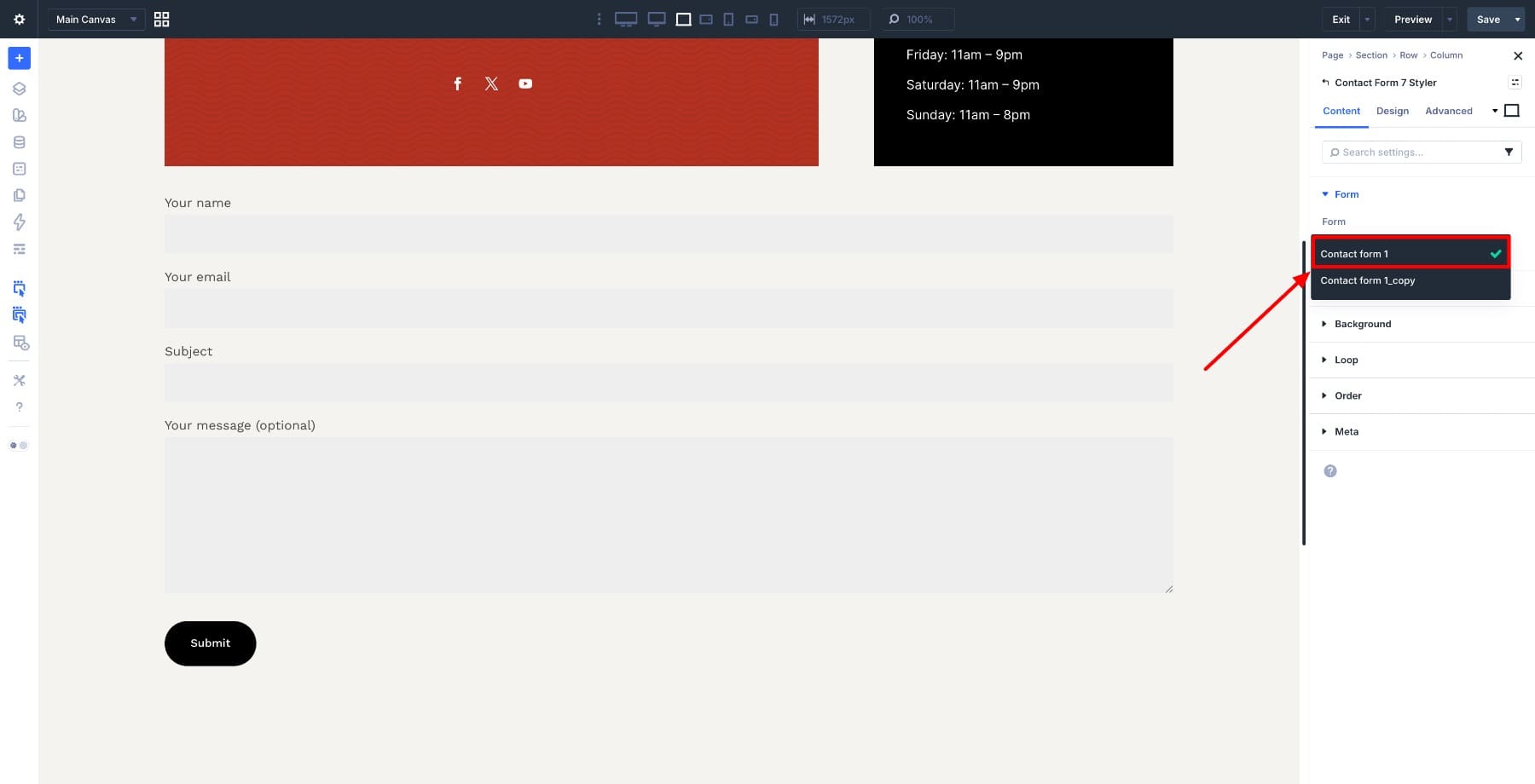
Once the module is in place, adjust the row width and alignment to match the layout around it. In this example, the form uses the full available section width so it feels balanced with the content blocks above it.
For now, focus on structure. Getting the layout right first gives every design decision in the next steps a better foundation.
Step 2. Style The Input Fields
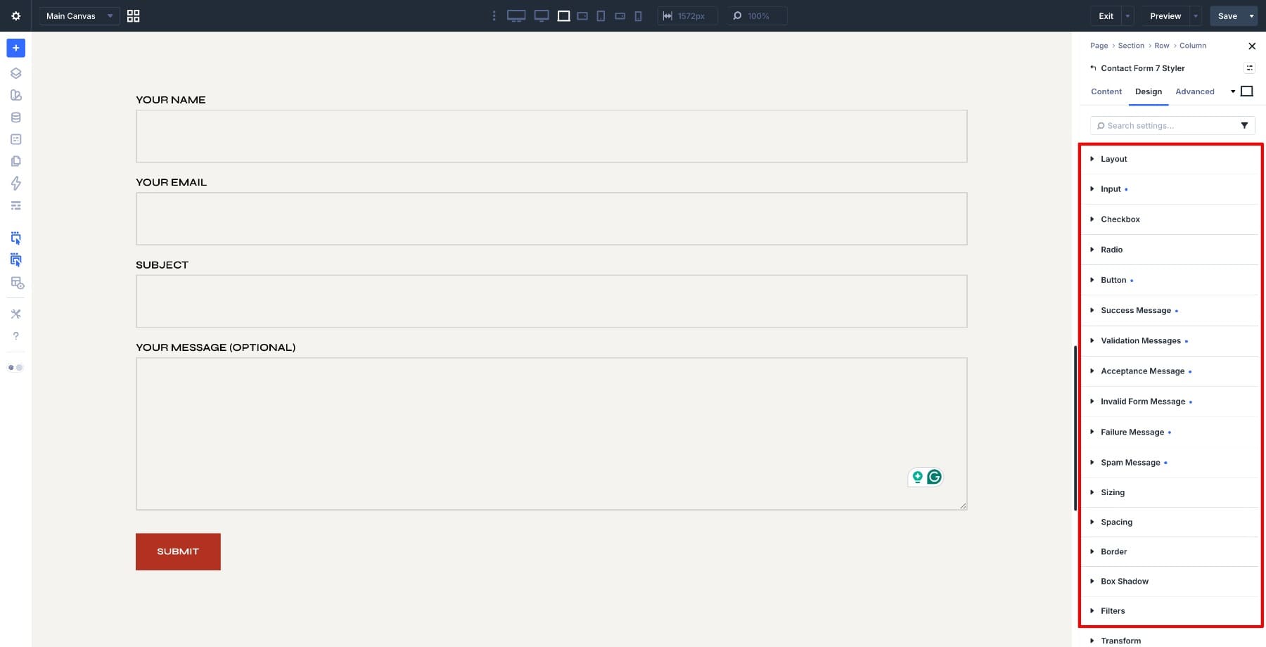
Open the Contact Form 7 Styler module settings and go to Design > Input. The Input group controls text fields, email fields, number fields, textareas, and select menus.
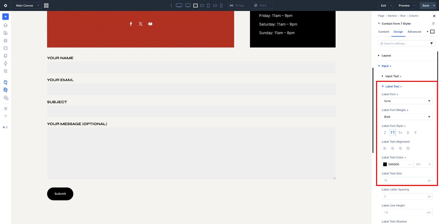
Go to Input Text. Set the Font to Syne, the Field Text Size to 16px, and the Font Weight to Bold. Then set the Text Color to Black so the field text matches the structured style used across the page.
For Label Text, use the same core settings: Syne, 16px, Bold, and Black. Enable All Caps so the labels feel deliberate and easy to scan.
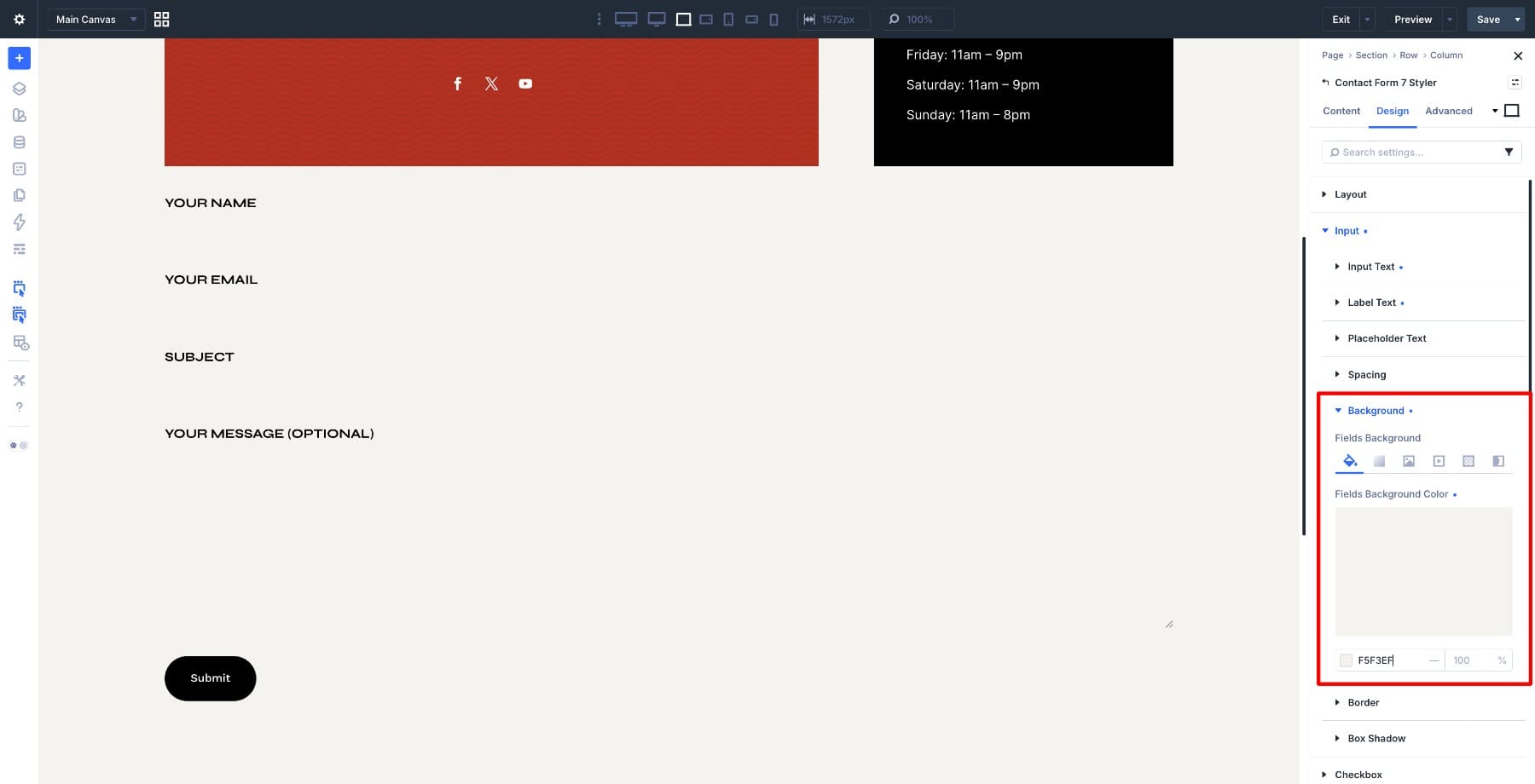
Next, set the field background color. Go to Input > Background and enter #f5f3ef. This keeps the fields close to the page background so the border can define the field shape without making the form feel heavy.
Now define the field borders. Open Design > Input > Border, set the width to 2px on all sides, and set the border radius to 0px to keep the edges sharp.
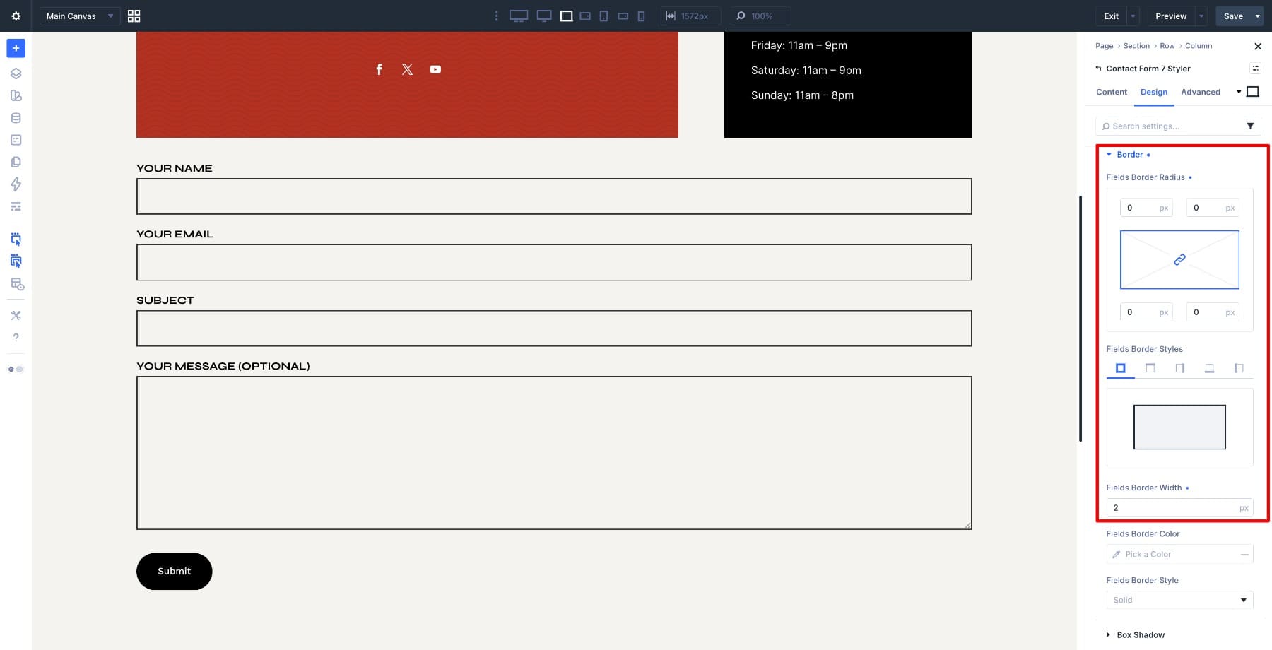
For the border color, choose black and reduce the opacity to around 20%. This gives each field a visible outline without overpowering the rest of the layout.
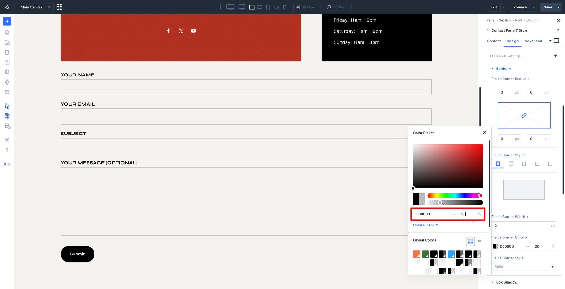
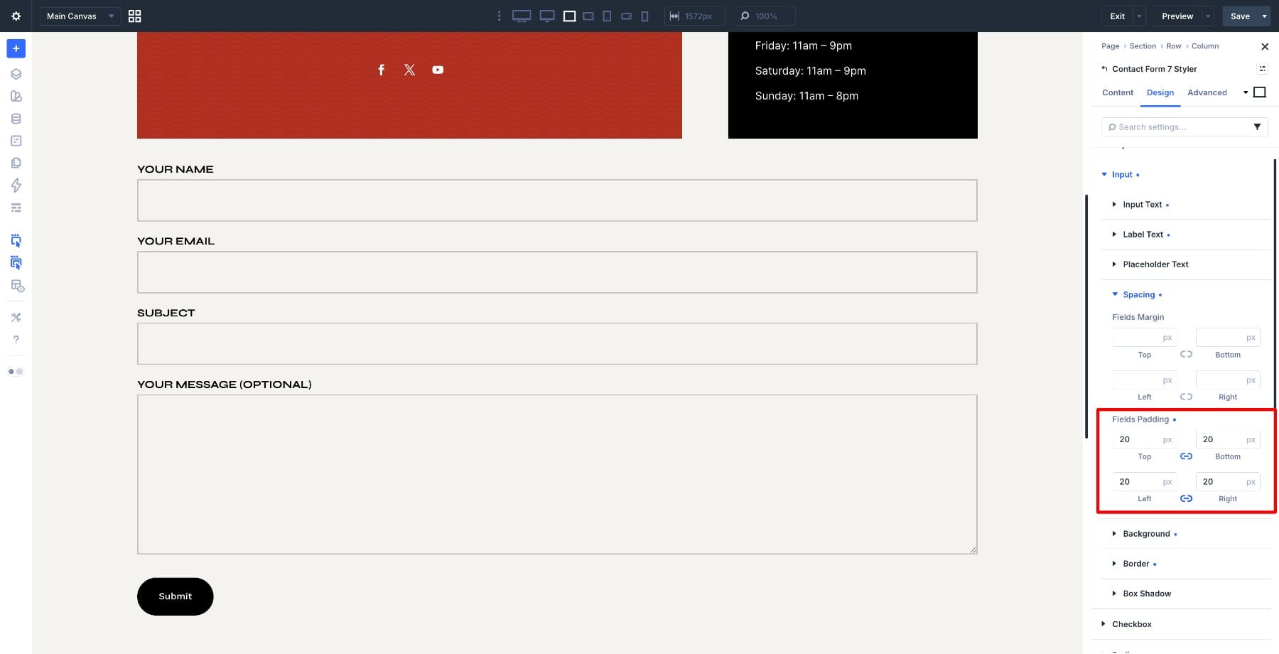
Finally, set the padding to 20px on all sides so the text has enough room inside each field.
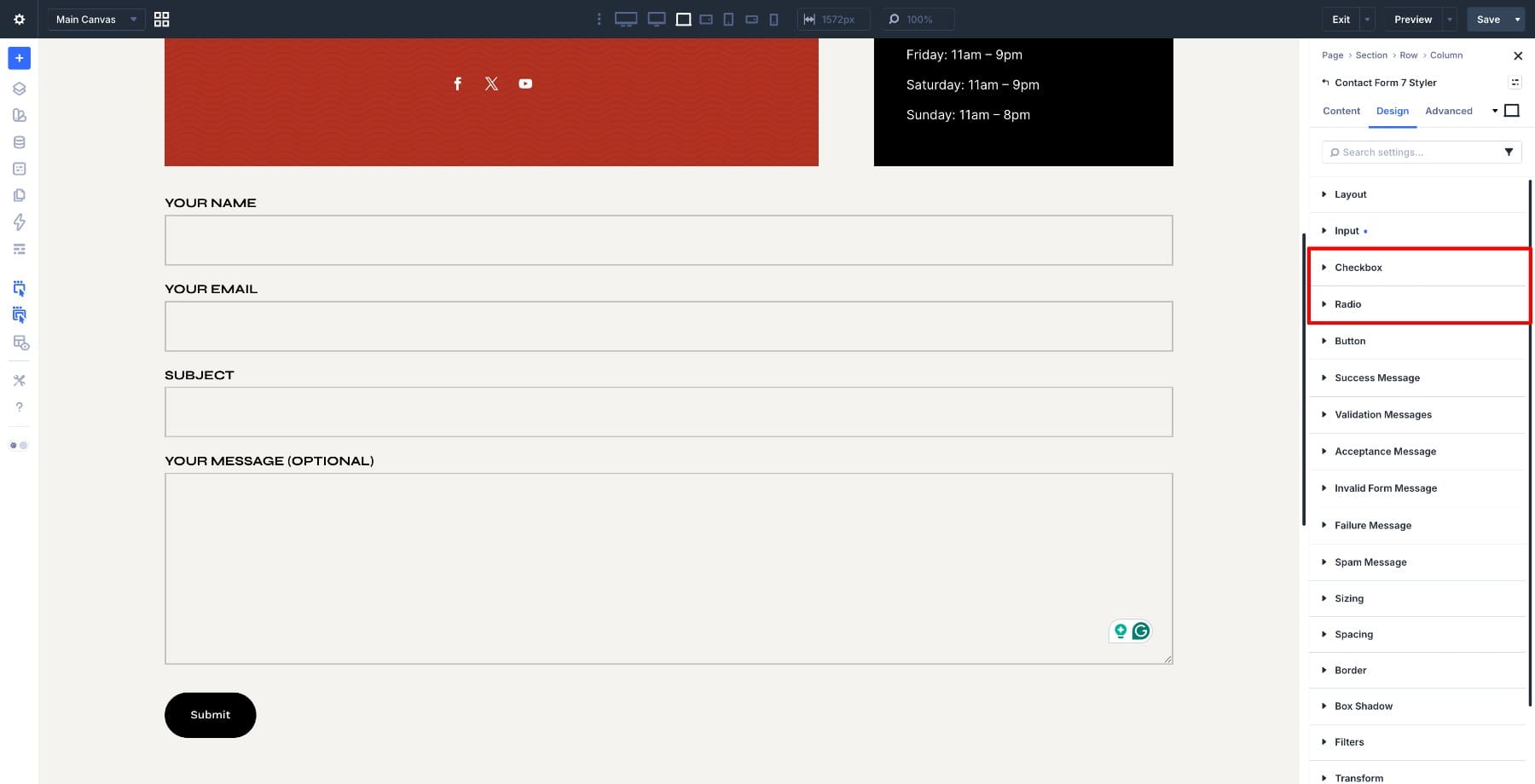
If your form includes checkboxes or radio buttons, style those next instead of leaving them at browser defaults. Go to Design > Checkbox and Design > Radio, then apply the same sizing, spacing, typography, and color logic.
Checkboxes and radio buttons also have selected states. Style the checked state so users get a clear visual signal when an option has been selected.
Step 3. Style Placeholder, Validation, And Success Messages
The input fields are only one part of the form. Placeholder text, validation errors, success messages, invalid form messages, failure messages, spam messages, and acceptance messages all appear at different points in the user journey. Each one should feel like it belongs to the same page.
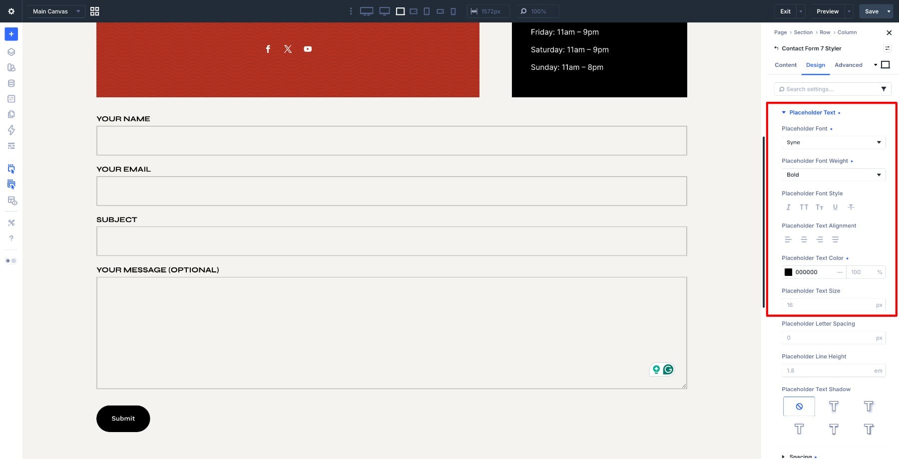
Go to Design > Input > Placeholder Text and apply the same font family and text size you used for the input fields. Keep the placeholder color lighter than the typed field text so it reads as guidance, not submitted information.
Next, move to the message settings. In the Design tab, style Success Message, Validation Messages, Acceptance Message, Invalid Form Message, Failure Message, and Spam Message.
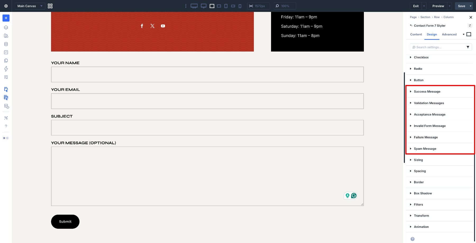
Use consistent typography across all messages, but do not rely on color alone. Error and success messages should be easy to read and clear enough for users to understand what happened or what they need to fix.
This is also a good time to review your actual Contact Form 7 messages. Divi controls the design, but the message text itself should still be helpful, direct, and specific.
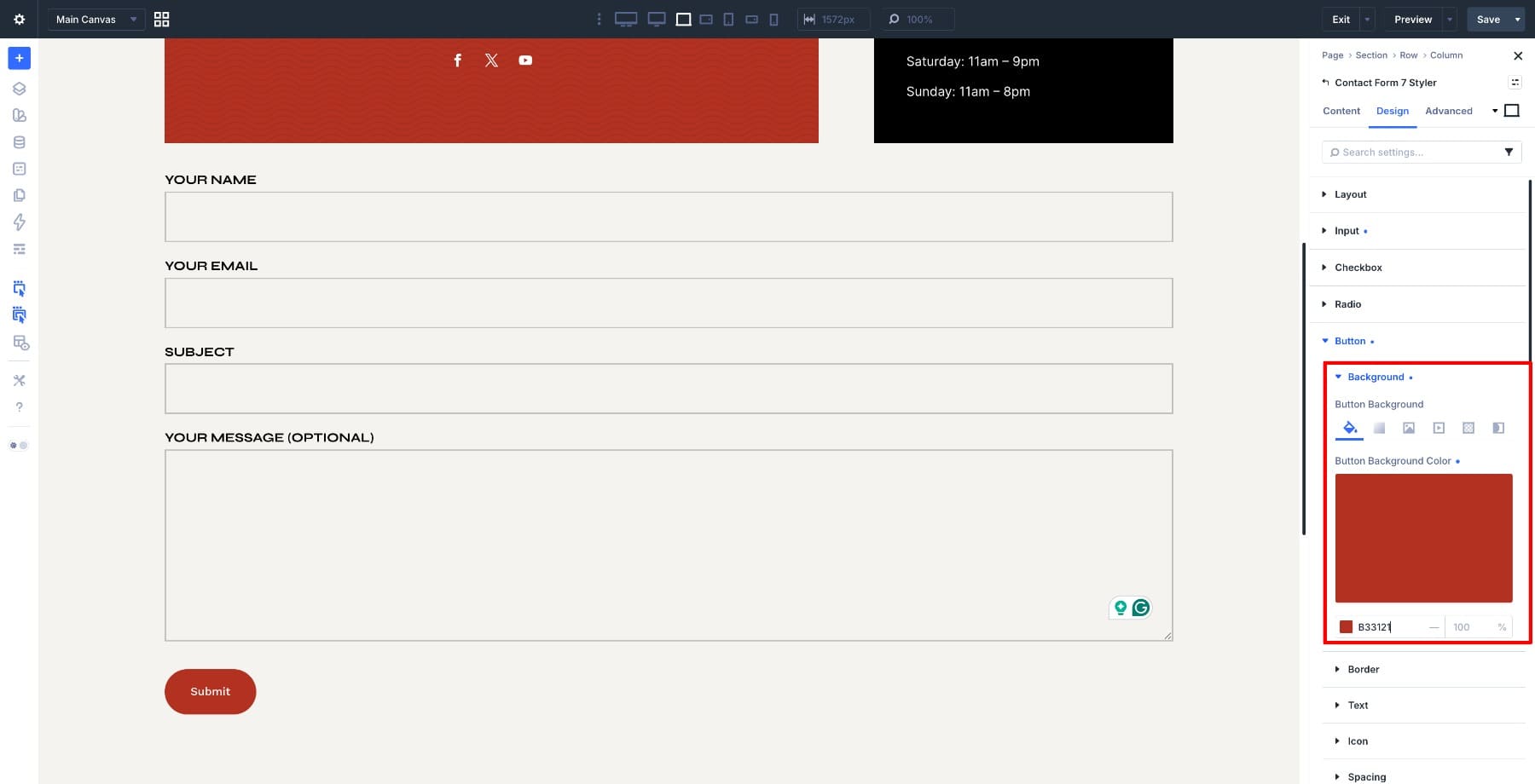
With the fields and messages styled, bring the submit button into the same system. Open the module settings and go to Design > Button. Set the Background Color to #b33121 so the button stands out clearly against the lighter form background.
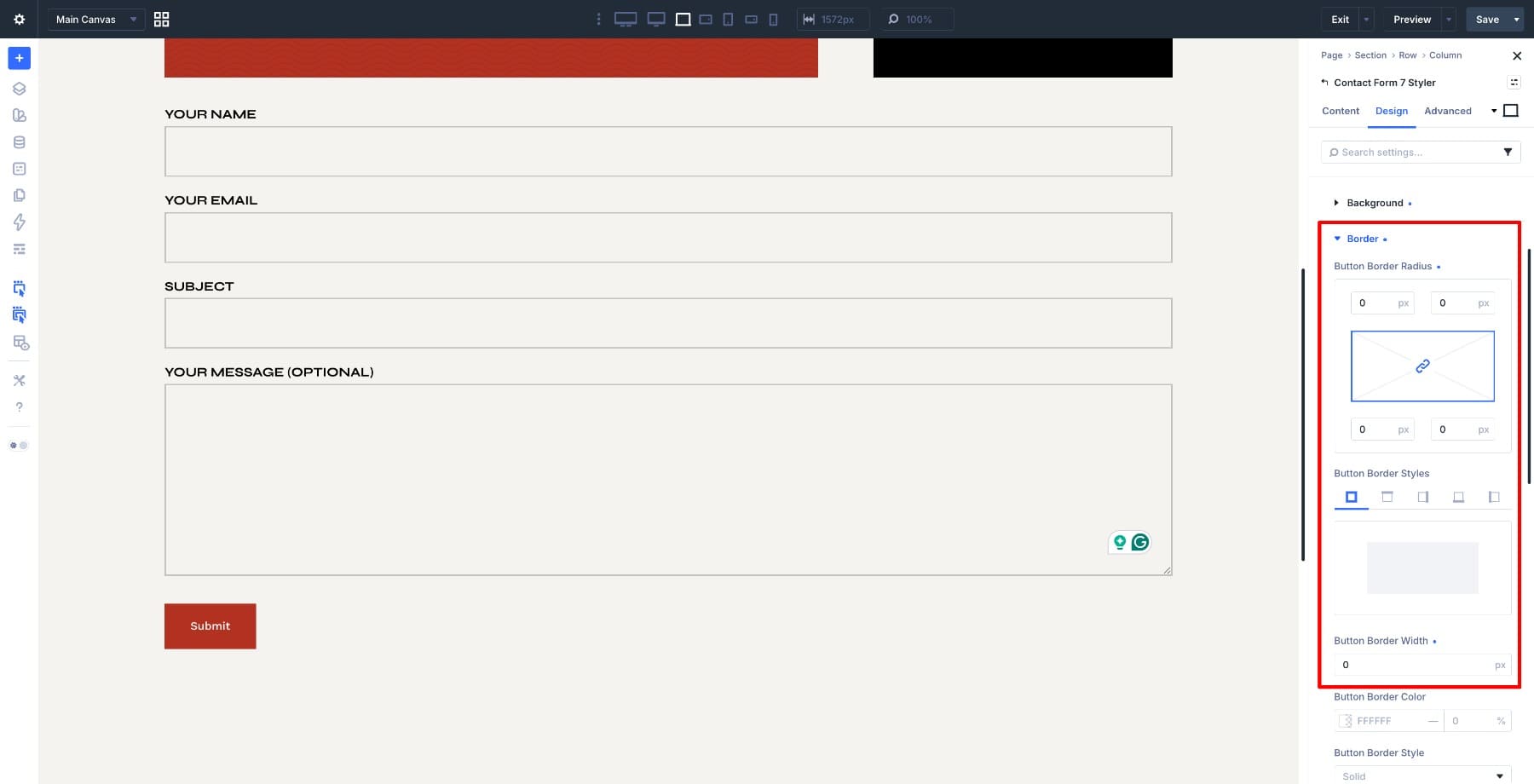
Set the Border Radius and Border Width to 0px. This keeps the button visually consistent with the sharp-edged input fields above it.
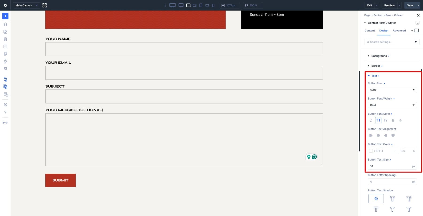
For the button text, use Syne, keep the same size and weight as the rest of the form, and enable All Caps. Set the text color to White so it remains readable on the darker background.
Finally, set the button padding to 12px top and bottom and 24px left and right. This keeps the button comfortable to click without making it visually overpowering.
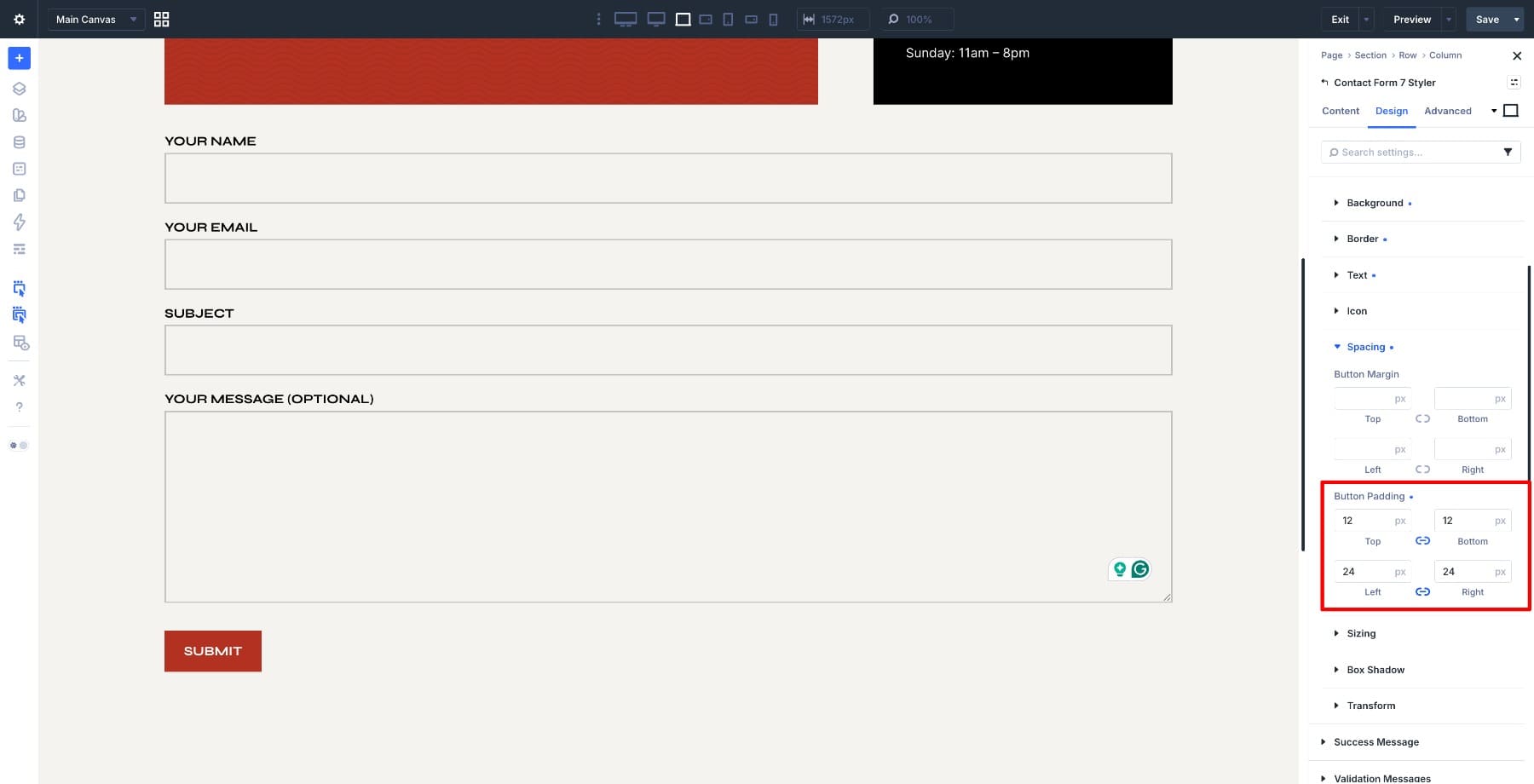
At this point, the static form design is in place. The next step is to style how the form responds when someone interacts with it.
Step 5. Style The Focus State
The focus state controls what a field looks like when a user clicks into it or tabs to it with a keyboard. It is not the same as hover. Hover depends on a pointer. Focus helps show which field is currently active.
To edit it, open the field option group you want to style and use the state or mode selector in the option group header. Switch from the default state to the Focus state.
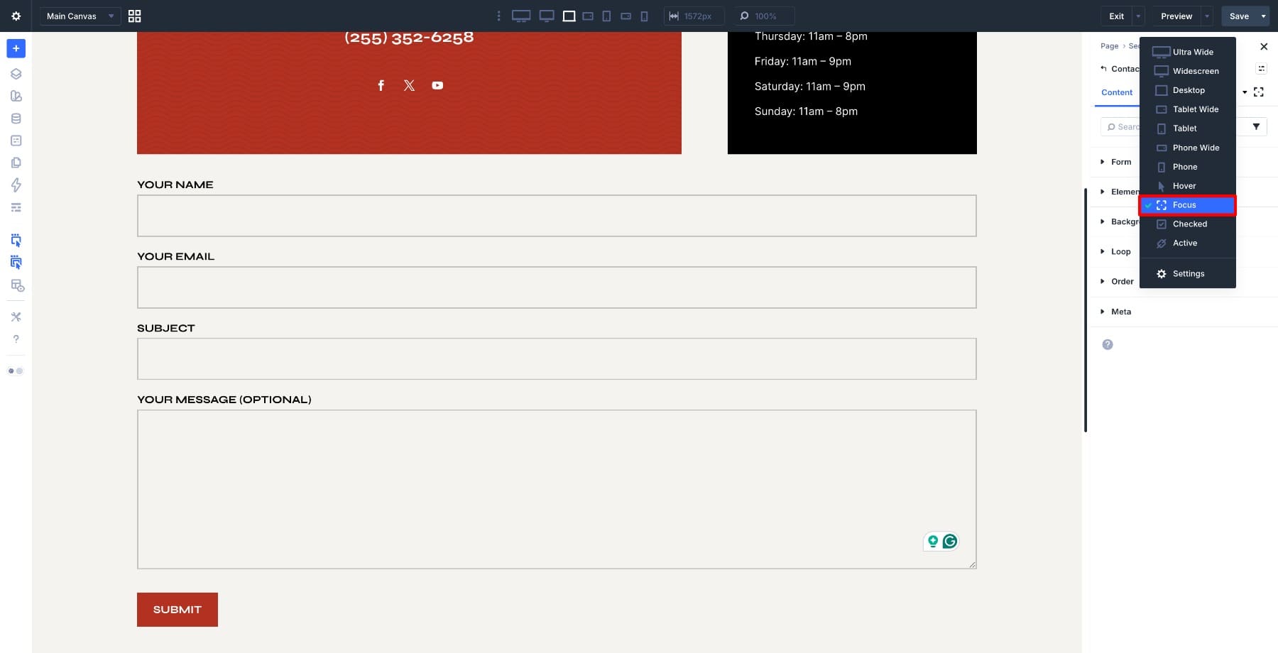
Start by changing the focus background color to white. This creates a clear visual shift when a field becomes active.
Next, open the composable settings for the input field and enable Transform.
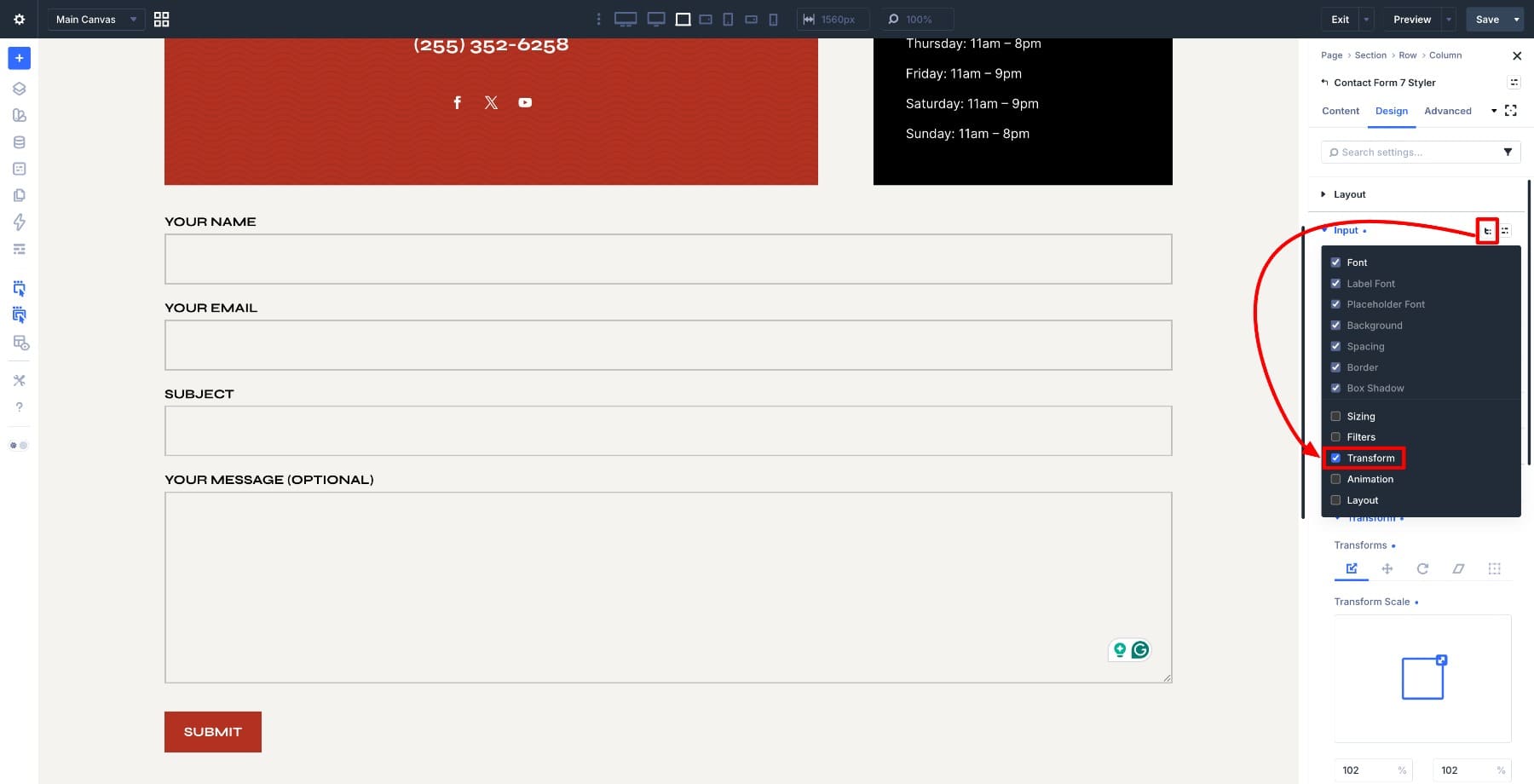
Set the scale to 102%. The effect is subtle, but it gives the active field a little more presence without making the form feel jumpy.
After adding a transform effect, preview the form on smaller screens. Scaling a focused field can affect the surrounding layout, so keep the interaction small and intentional.
Step 6. Preview Your Form
Before saving, click Preview and use the form like a real visitor would. Click into different fields, tab through the form with your keyboard, select checkbox and radio options, type into the fields, and submit the form to trigger validation and success messages.
Check that the spacing feels balanced, the focus effect is noticeable without being distracting, the selected checkbox and radio states are clear, and the submit button reads as the primary action.
Also check the form on mobile. Inputs should be comfortable to tap, labels should remain readable, and validation messages should not crowd the layout.
Once everything looks right, save your changes.
Reuse The Design With Copy/Paste Attributes And Presets
The design you just built does not have to live on one page. For a quick one-off reuse, right-click the styled Contact Form 7 Styler module and select Copy Attributes. Then go to another page or section, add a new Contact Form 7 Styler module, select your form, right-click, and choose Paste Attributes.
Copy/Paste Attributes is useful when you want to duplicate the same styling quickly. But if you plan to reuse the design across a whole site, turn those inline settings into presets instead.
Divi 5 gives you several preset options for this workflow:
- Option Group Presets: Save a specific group of settings, such as Input, Checkbox, Radio, Button, Border, Spacing, Background, or Typography. This is best when you want one reusable field style across multiple forms.
- Element Presets: Save the full Contact Form 7 Styler module design as a reusable module-level preset. This is best when you want the entire form component to use the same base design wherever it appears.
- Nested Option Presets: Use Option Group Presets inside Element Presets so the full form design is built from smaller reusable parts. For example, your CF7 form preset can include a shared input preset, button preset, border preset, and spacing preset.
A practical workflow looks like this:
- Create an Input Option Group Preset for field typography, background, border, padding, placeholder text, and focus styling.
- Create a Checkbox Option Group Preset for checkbox size, label typography, spacing, and checked state.
- Create a Radio Option Group Preset for radio size, label typography, spacing, and checked state.
- Create a Button Option Group Preset for the submit button typography, color, border, and padding.
- Create an Element Preset for the full Contact Form 7 Styler module and nest the relevant Option Group Presets inside it.
This gives you a cleaner design system than copied static settings alone. If you update the input preset later, every form using that preset can inherit the change. If you update the button preset, every form using that button style can stay consistent too.
This is where Divi 5’s design system becomes especially useful. Copy/Paste Attributes helps you move quickly. Presets help you scale the design without repeating the same decisions on every form.
Start Building In Divi 5 Today!
Every part of your website shapes how people experience your brand, and forms are no exception. With Divi 5, the Contact Form 7 Styler gives you design control over forms that would otherwise require custom CSS to match your site.
You can style fields, labels, placeholders, buttons, messages, focus states, checkboxes, and radios from the Visual Builder. Then you can reuse the design with Copy/Paste Attributes or convert it into presets for a more scalable system.
The result is a form that feels intentional at every step. It looks like it belongs on the page, behaves consistently when people interact with it, and can be reused across your site without rebuilding the same design over and over.










Leave A Reply