
Grid recently became an integrated part of Divi 5, bringing a different approach to building layouts. Grid gives you control over both horizontal and vertical placement simultaneously.
That flexibility comes with a trade-off: there are way more settings to understand. The Visual Builder now includes about 15 Grid options, which all work together to control how your content is positioned on the page.
This post breaks down each setting so you know exactly what it does and when to use it.
- 1 What Is Grid In Divi 5?
-
2
Understanding Every Setting Inside Grid
- 2.1 Layout Style
- 2.2 Horizontal Gap
- 2.3 Vertical Gap
- 2.4 Column Width
- 2.5 Number Of Columns
- 2.6 Collapse Empty Column
- 2.7 Grid Auto Columns
- 2.8 Row Heights
- 2.9 Grid Auto Rows
- 2.10 Grid Direction
- 2.11 Grid Density
- 2.12 Justify Content
- 2.13 Align Items
- 2.14 Align Content
- 2.15 Justify Items
- 2.16 Grid Offset Rules
- 3 Start Using Grid In Divi 5 Today
What Is Grid In Divi 5?
Divi 5’s new Grid system handles rows and columns together. It works with Sections, Rows, Columns, and Module Groups through the Layout Style dropdown in the Design tab.
Subscribe To Our Youtube Channel
The system gives you two ways to work. You can use pre-built grid templates without needing to learn CSS Grid, or you can access manual controls for creating custom layouts.
The grid sits at the container level. Add new items and they snap into place automatically. You set the structure once, and everything inside follows that pattern. This beats building individual layouts for each element.
Grid lets you mix column widths, set row heights, and make items span multiple cells.
How Is Grid Different From Divi’s Flexbox?
Pick Flexbox when you need simple alignment and spacing along one axis. It works well for laying out items in a row or a column with flexible sizes. Choose Grid when you want two-dimensional placement and precise control over rows and columns for more complex layouts.
In short, Flexbox is best for single-direction flow and alignment, while Grid is better for structured multi-directional layouts. Here’s a quick rundown of which use cases warrant which layout style:
| If Your Layout... | Choose |
|---|---|
| Flows in one direction (row or column) | Flexbox ✅ |
| Controls rows and columns simultaneously | Grid ✅ |
| Needs equal heights across items | Flexbox ✅ |
| Uses Loop Builder for dynamic content | Grid ✅ |
| Requires specific items to span multiple cells | Grid ✅ |
| Builds progressively as you add modules | Flexbox ✅ |
| Has full structure defined upfront | Grid ✅ |
| Needs content reordering on mobile | Flexbox ✅ |
You can change between Flexbox and Grid anytime in your element settings. Try one, observe how your content responds, and switch if it does not behave as you want. Divi 5 allows switching layout systems without removing modules or rebuilding your content.
Understanding Every Setting Inside Grid
The breakdown below walks through each setting in the order they appear, explaining what they control and how they affect your layout. Some handle the basics like spacing and column counts. Others deal with edge cases like overflow behavior and item placement. Take a look:
Layout Style
Layout Style is the dropdown that switches your container between different layout systems. You’ll find it at the top of the Layout settings in the Design tab.
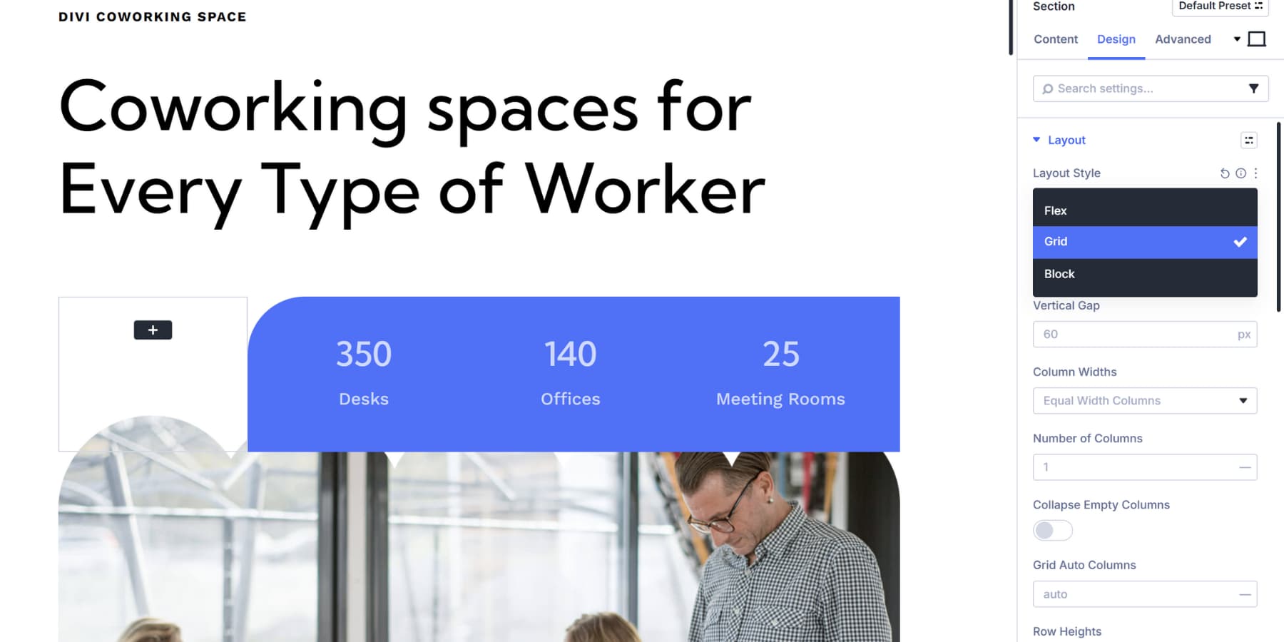
Select Grid from the Layout Style dropdown, and the entire settings panel changes. All the grid-specific options appear, including the gap controls, column and row settings, and placement options covered in this post.
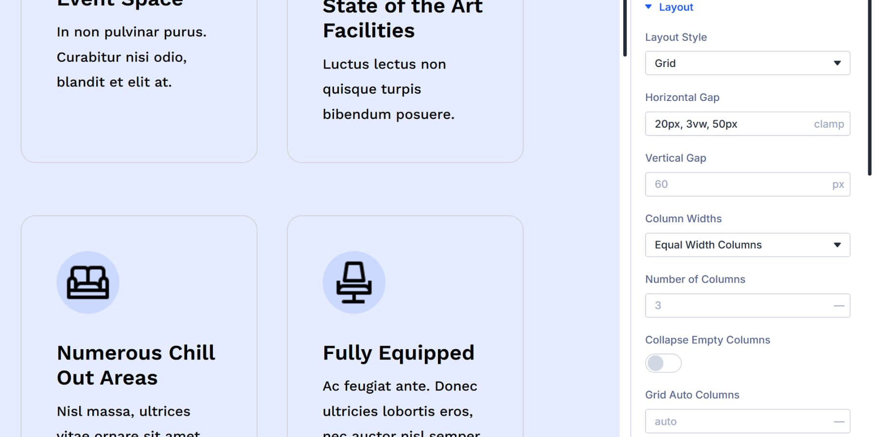
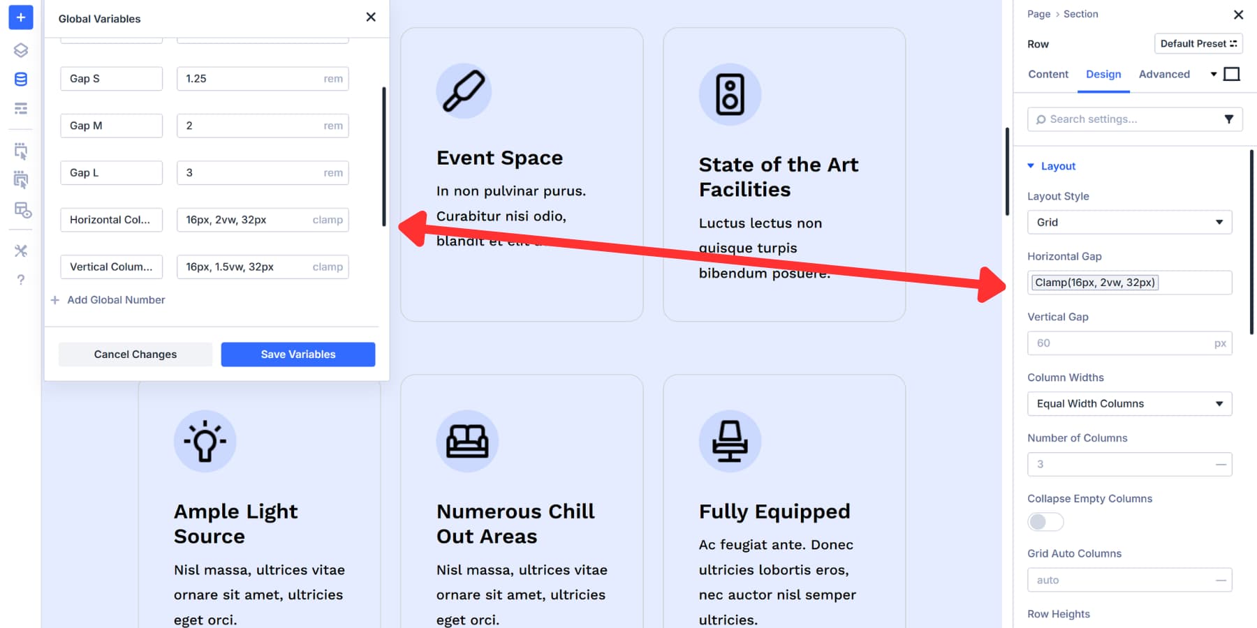
Horizontal Gap
Horizontal Gap controls spacing between your grid items from left to right. When you set Grid as your layout style, this option appears in the Design tab under Layout.
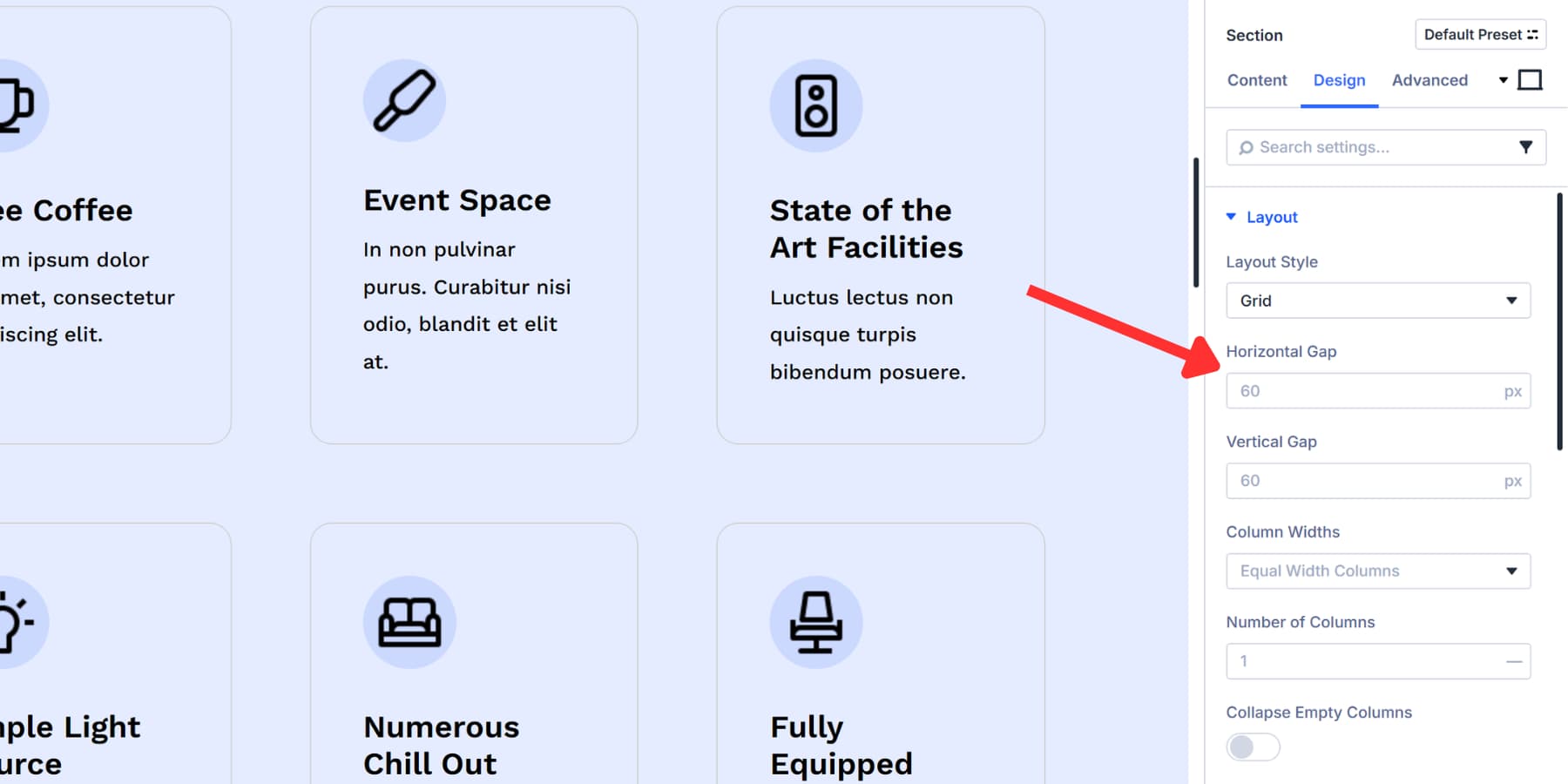
The field accepts pixel values by default. Type 30px and you get 30 pixels of space between each column. But Divi 5 lets you go beyond basic measurements here.
You can use Advanced Units like calc() or clamp() for responsive spacing. Something like clamp(20px, 3vw, 50px) scales your gaps based on screen size without touching breakpoints. Or try calc(2rem + 10px) to mix different unit types in one value.
Design Variables plug in here as well. Set up a spacing variable in the Variable Manager, then reference it across multiple grids. Change that variable once, and every grid updates together. This keeps spacing consistent across your entire site without hunting through individual settings.
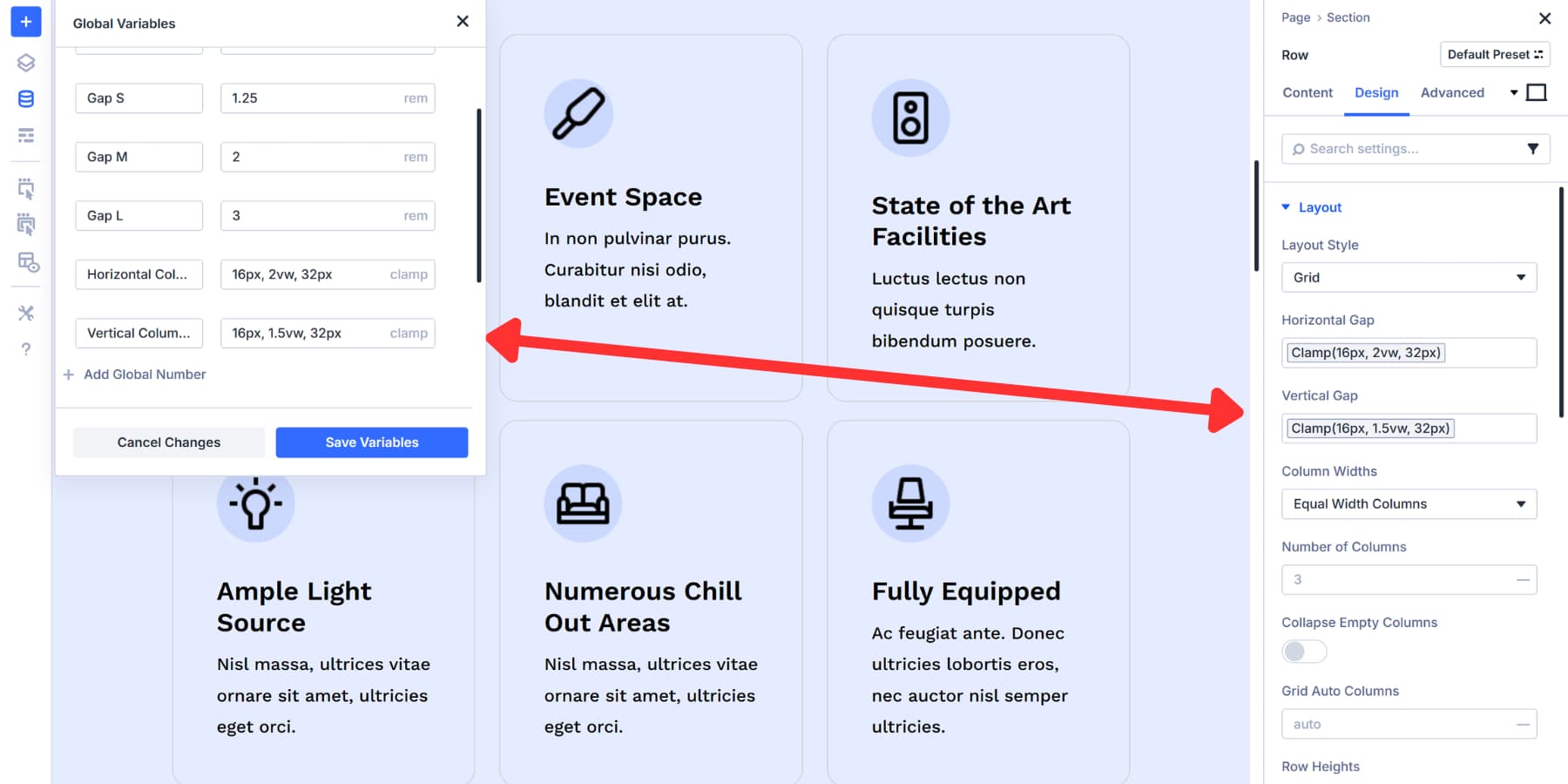
Vertical Gap
Vertical Gap works just like Horizontal Gap, except it controls the space between rows instead of columns. You’ll find it right below the horizontal option in the Layout settings.
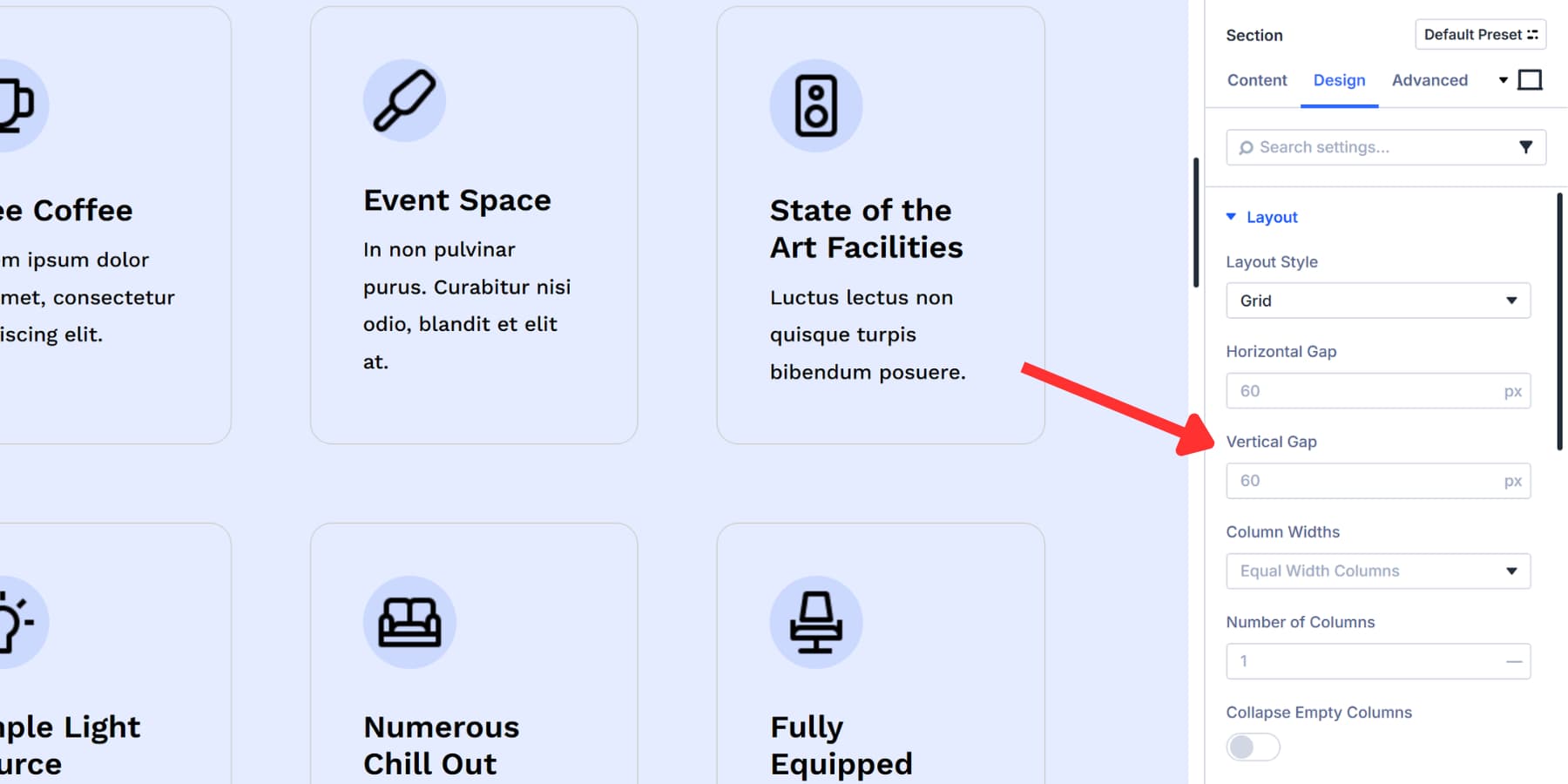
Advanced Units and Design Variables both work here. You can write formulas like clamp(15px, 2vh, 40px) to make row spacing respond to viewport height instead of width. That vh unit scales based on the height of the browser window, which works well for full-screen layouts or vertical content structures.
Design Variables you created for spacing apply to both directions. Use the same variable across horizontal and vertical gaps for uniform spacing, or create separate variables when you need different measurements for each axis.
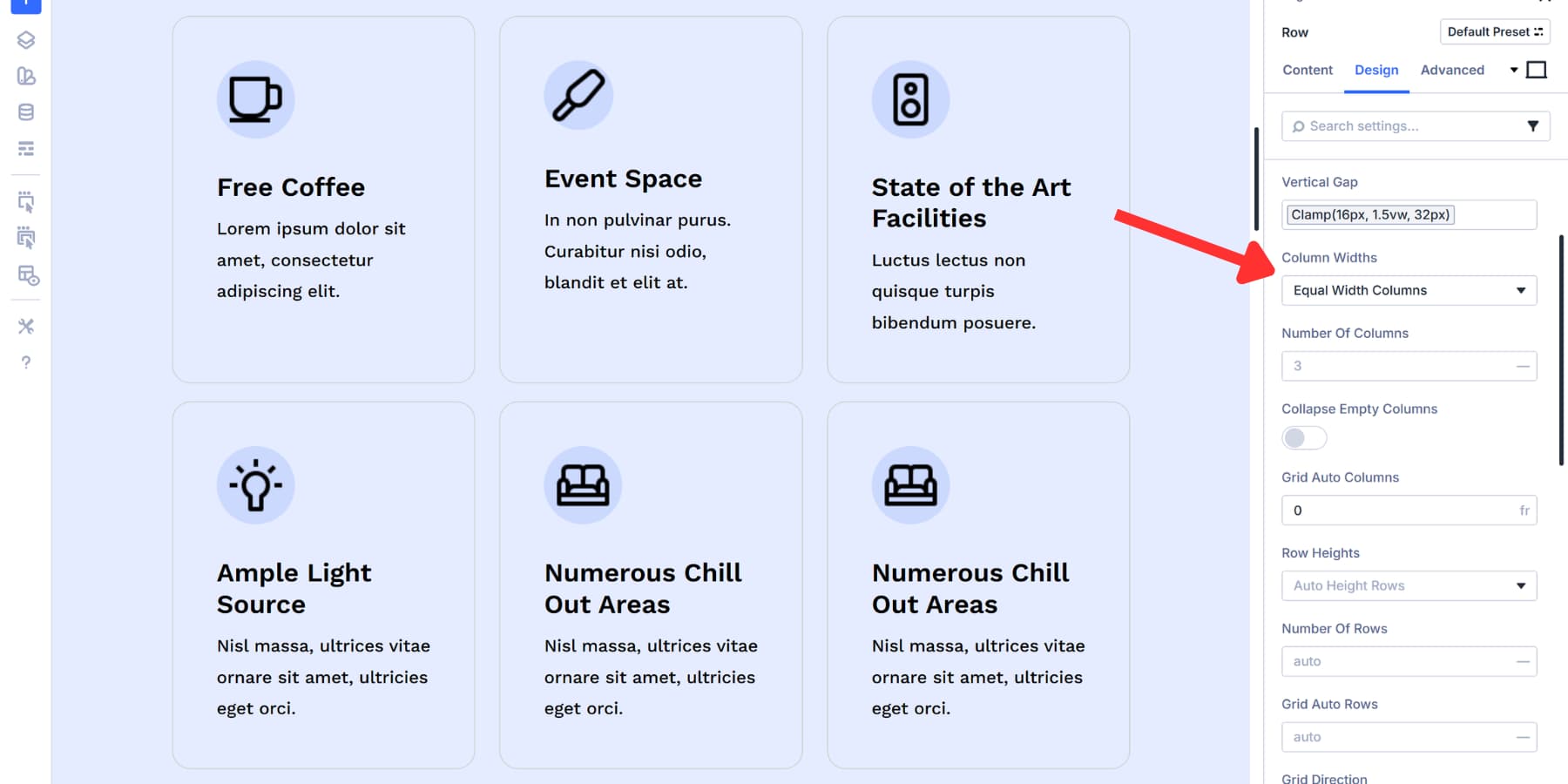
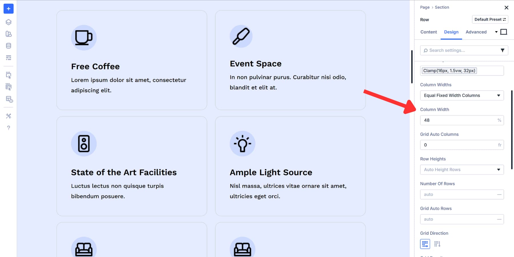
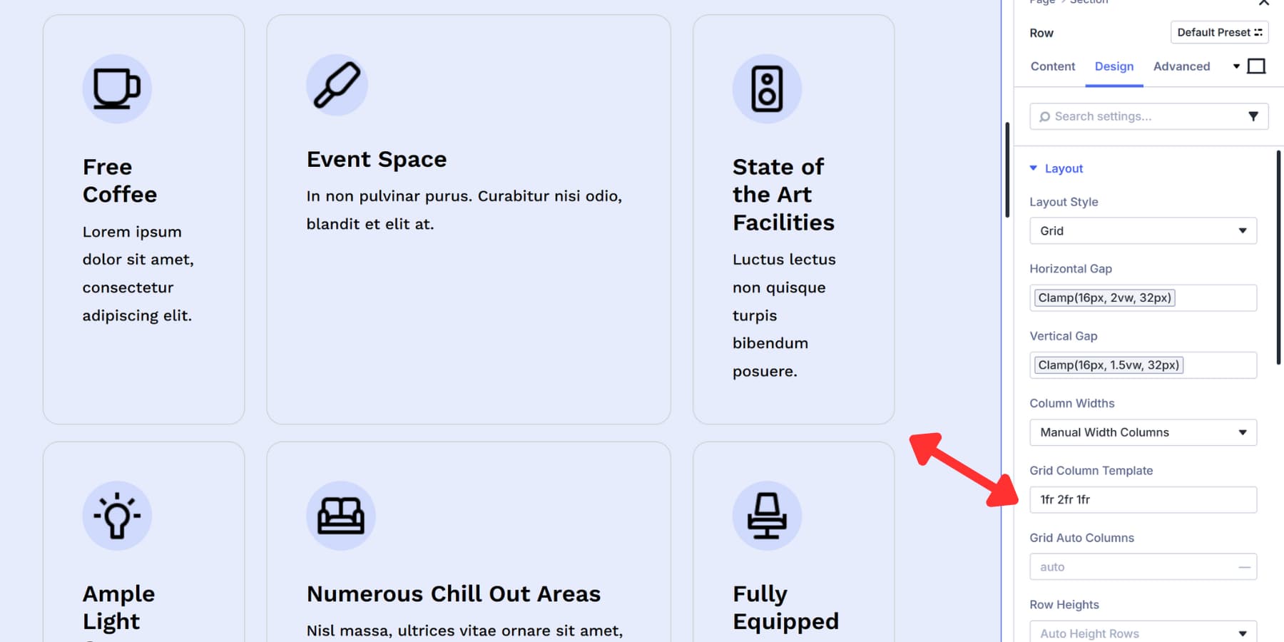
Column Width
Column Width defines how wide each column in your grid should be. This setting appears once you switch to Grid layout and works alongside Number of Columns to structure your grid.
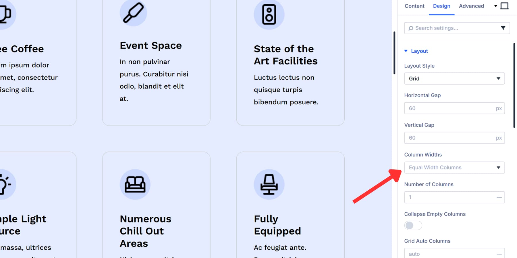
This dropdown appears after you switch to Grid layout and offers five modes for controlling column sizing.
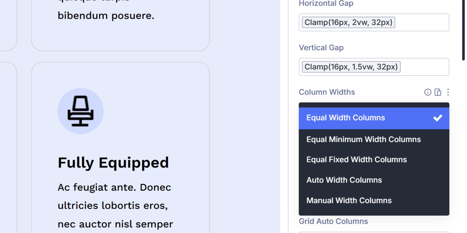
Equal Width Columns divides available space evenly. All columns get the same width using the fr unit. This works for layouts where balance matters more than specific measurements.
Equal Minimum Width Columns sets a floor that columns can’t drop below, but lets them grow when space allows. Columns stay readable on small screens while expanding on larger ones.
Equal Fixed Width Columns locks all columns at the same value. The width stays constant regardless of container size or content.
Auto Width Columns sizes each column based on its content and the space available, while Manual Width Columns lets you type custom patterns. Enter values like “1fr 2fr 1fr” to create three columns, with the middle one taking twice the space.
Or mix units like “300px 1fr 1fr” to lock the first column at 300 pixels while the others split the remaining space. You can use Advanced Units like clamp() or calc() here, and Design Variables work too.
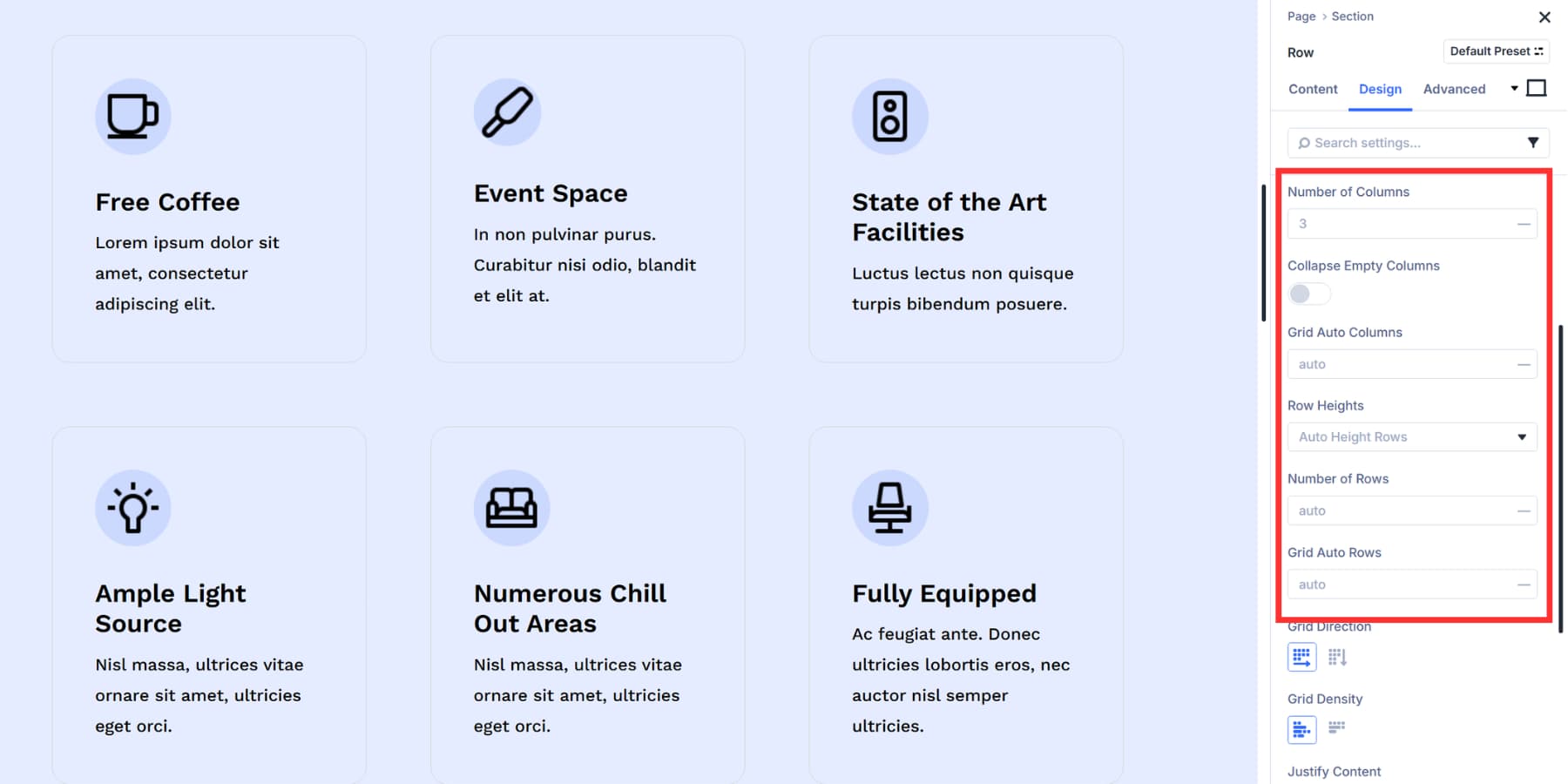
Number Of Columns
The Number of Columns option defines how many vertical tracks your grid creates.
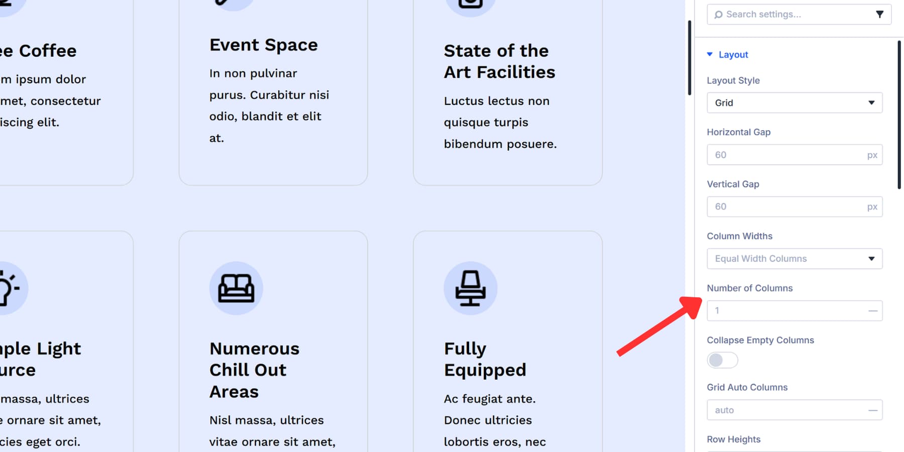
Type in a number and the grid builds that many columns across your container. Three creates three columns. Four creates four. When items fill up one row, the next item automatically wraps down to start a fresh row below.
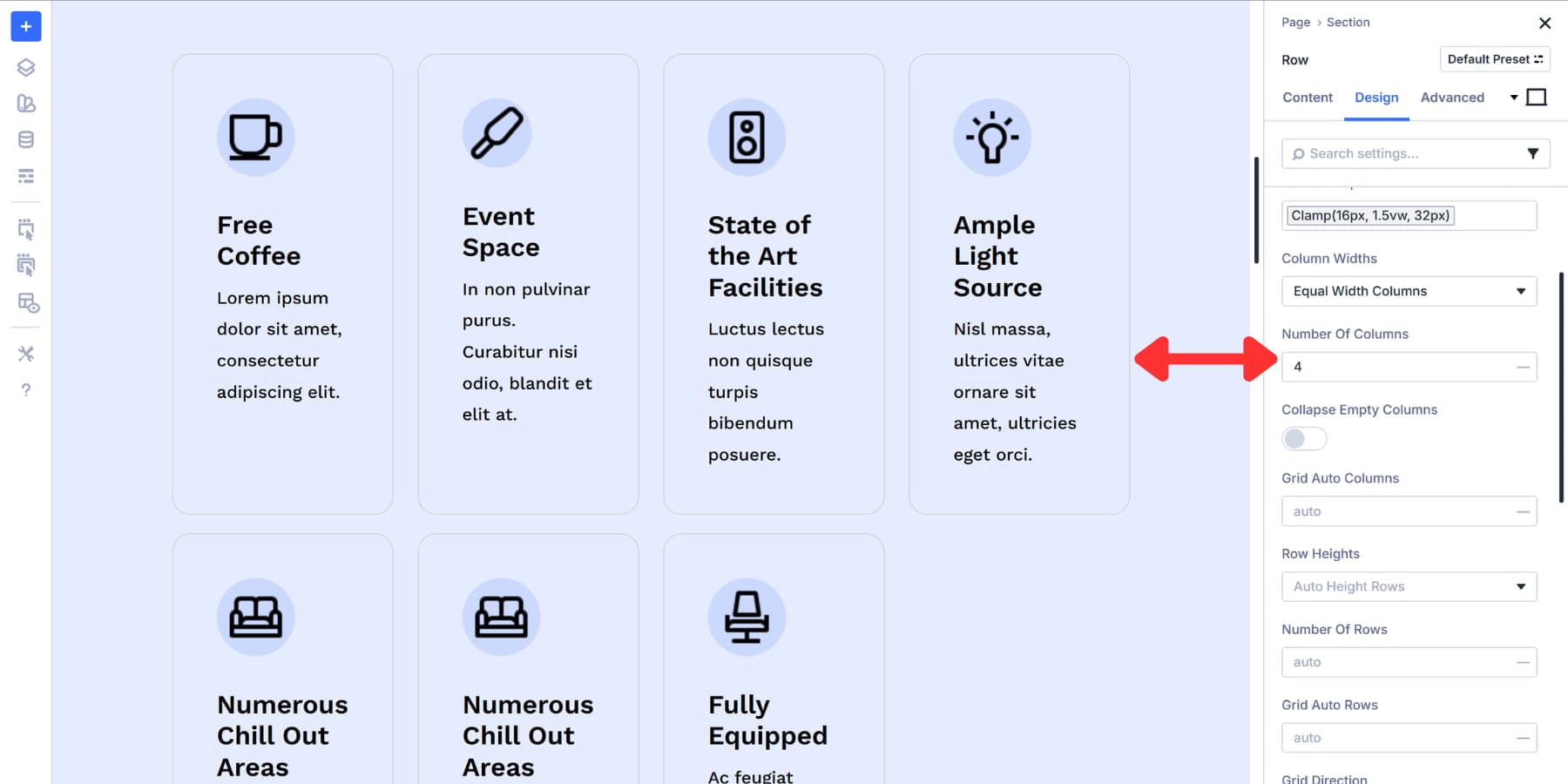
This setting shapes your horizontal layout structure. Higher numbers pack more items side by side, which works well for image galleries or product grids. Lower numbers spread things out with more space between elements, creating cleaner and simpler arrangements.
This setting also depends on the Column Widths setting you have selected.
Collapse Empty Column
Collapse Empty Columns removes vertical tracks that don’t have any content.
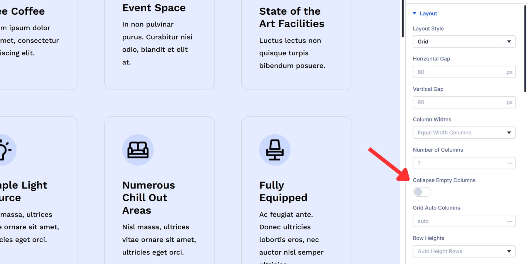
When enabled, the grid automatically scans for empty columns and eliminates them. The remaining columns shift over to fill the space.
This comes in handy with dynamic content where the number of items changes. Blog posts get removed, products go out of stock, or data fields come back empty. Instead of leaving visible gaps in your layout, the grid closes those spaces and keeps everything looking clean.
The feature only works on completely empty columns. If there’s even a single element inside, that column stays put. It won’t collapse based on empty space within modules, just truly vacant columns.
Grid Auto Columns
Grid Auto Columns sets the width for columns that appear when items land outside your main grid structure.
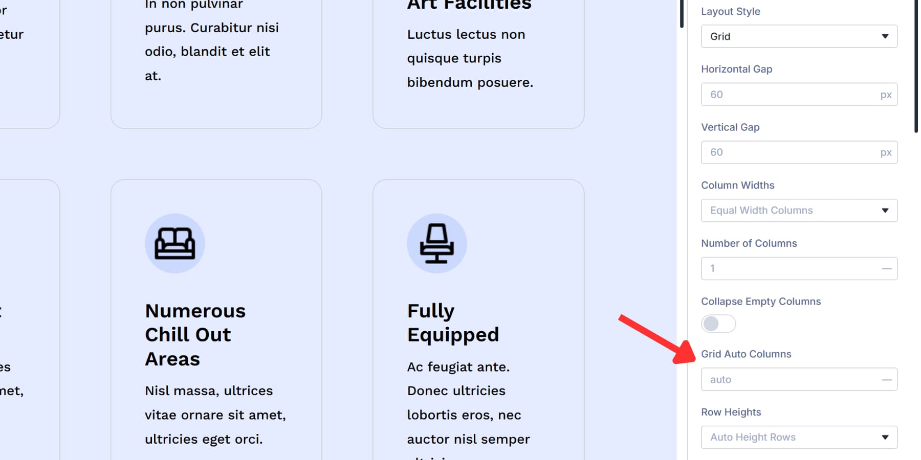
This keeps overflow columns from looking broken or mismatched. The grid generates that extra column automatically, and this setting determines its size.
The field accepts the same values as Column Width. Type 200px for fixed width, 1fr to match your existing tracks, or auto to size based on content.
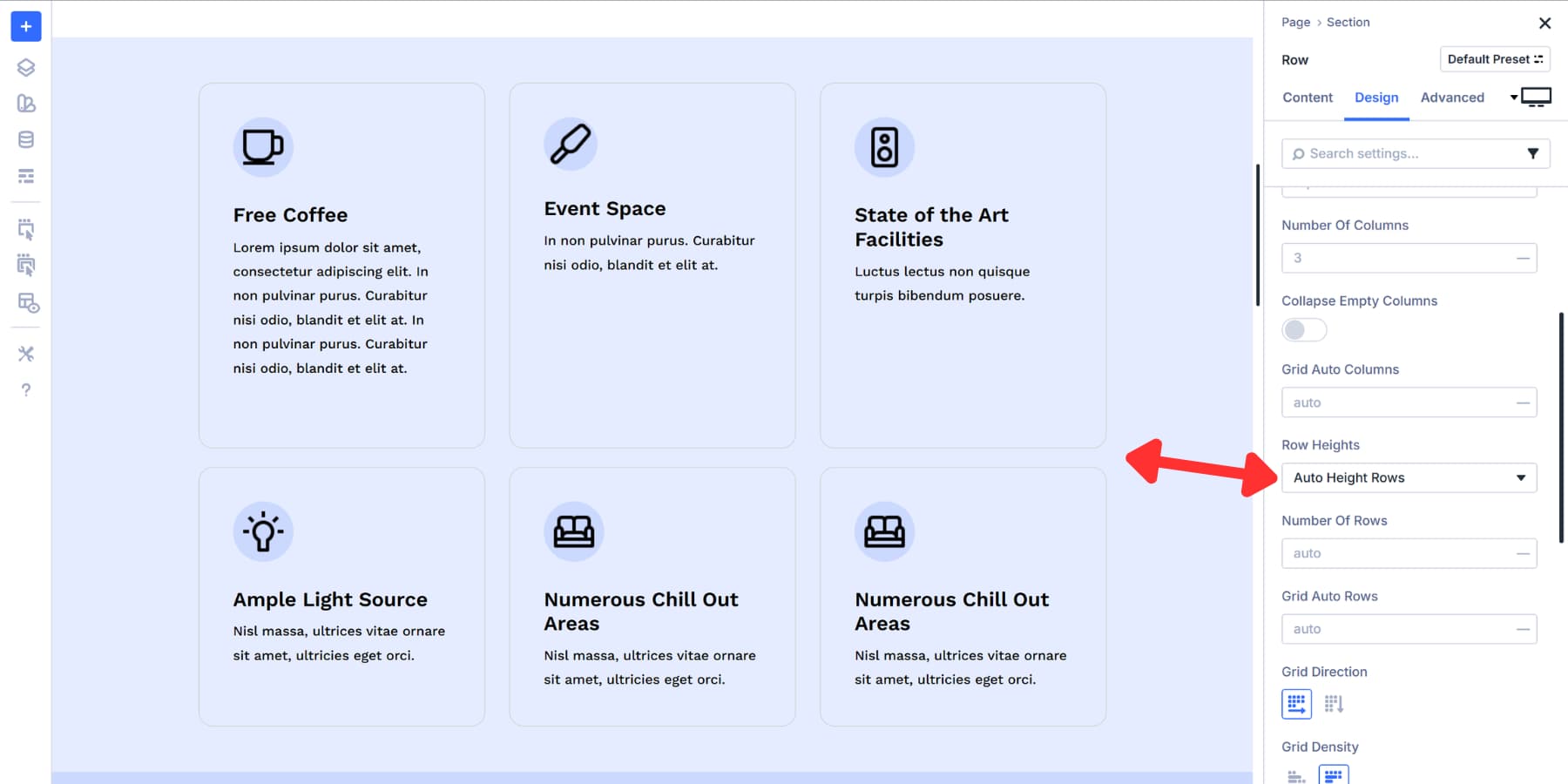
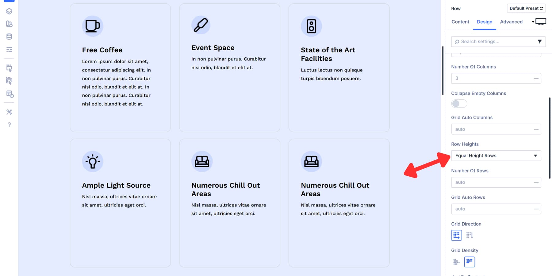
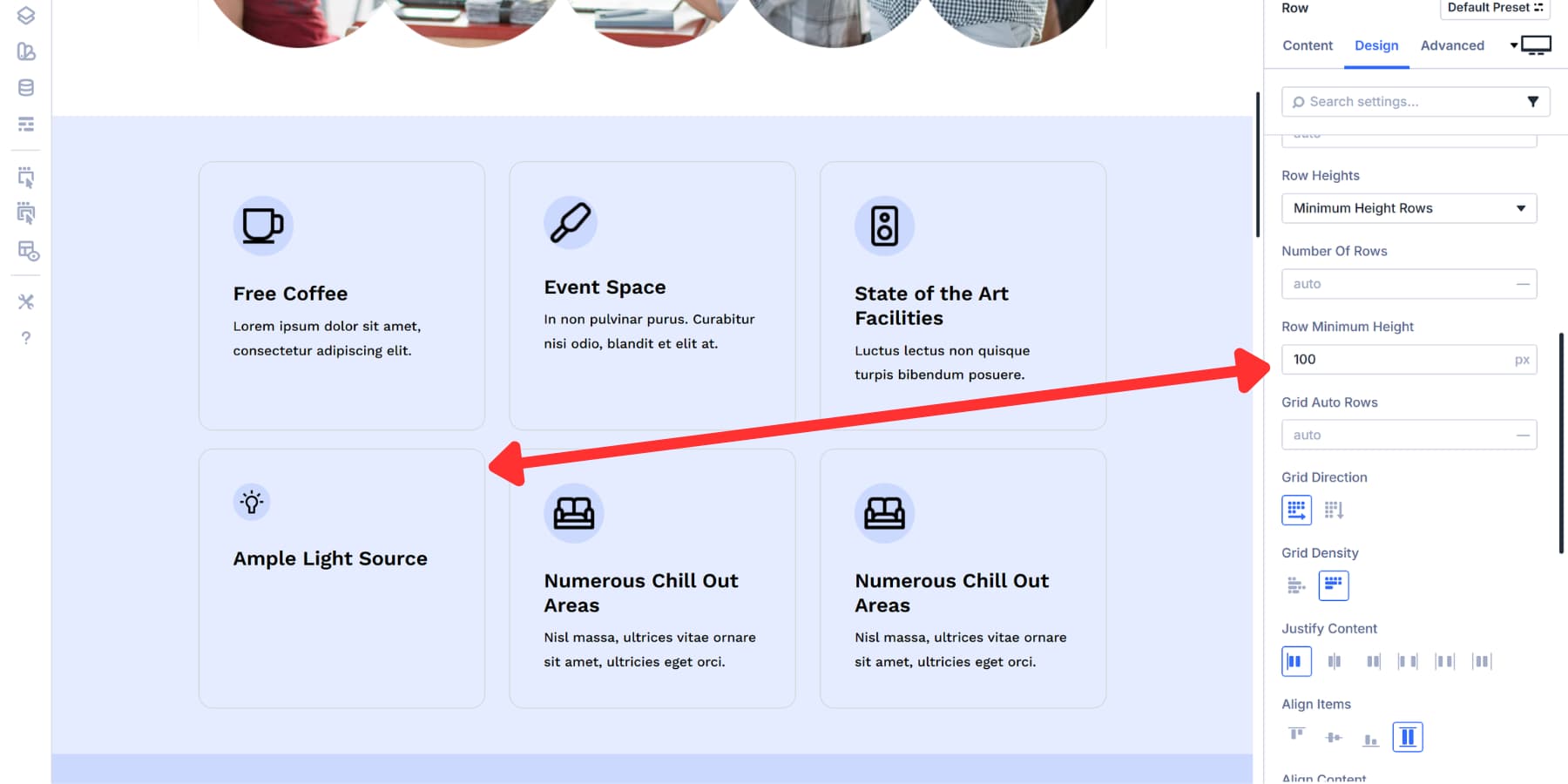
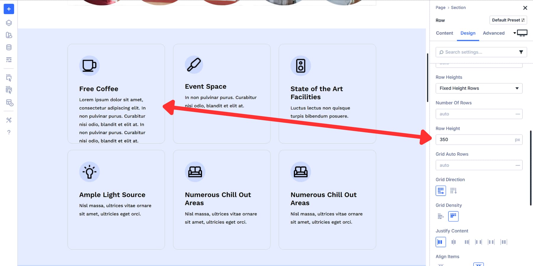
Row Heights
Row Heights gives you four ways to control vertical sizing in your grid.
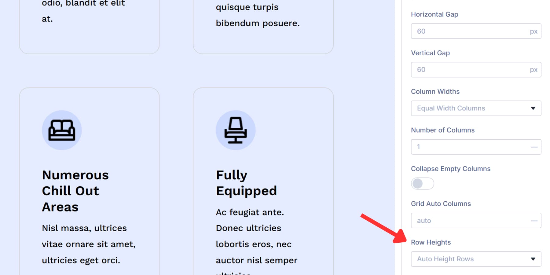
This dropdown appears in the Layout settings after you switch to Grid.
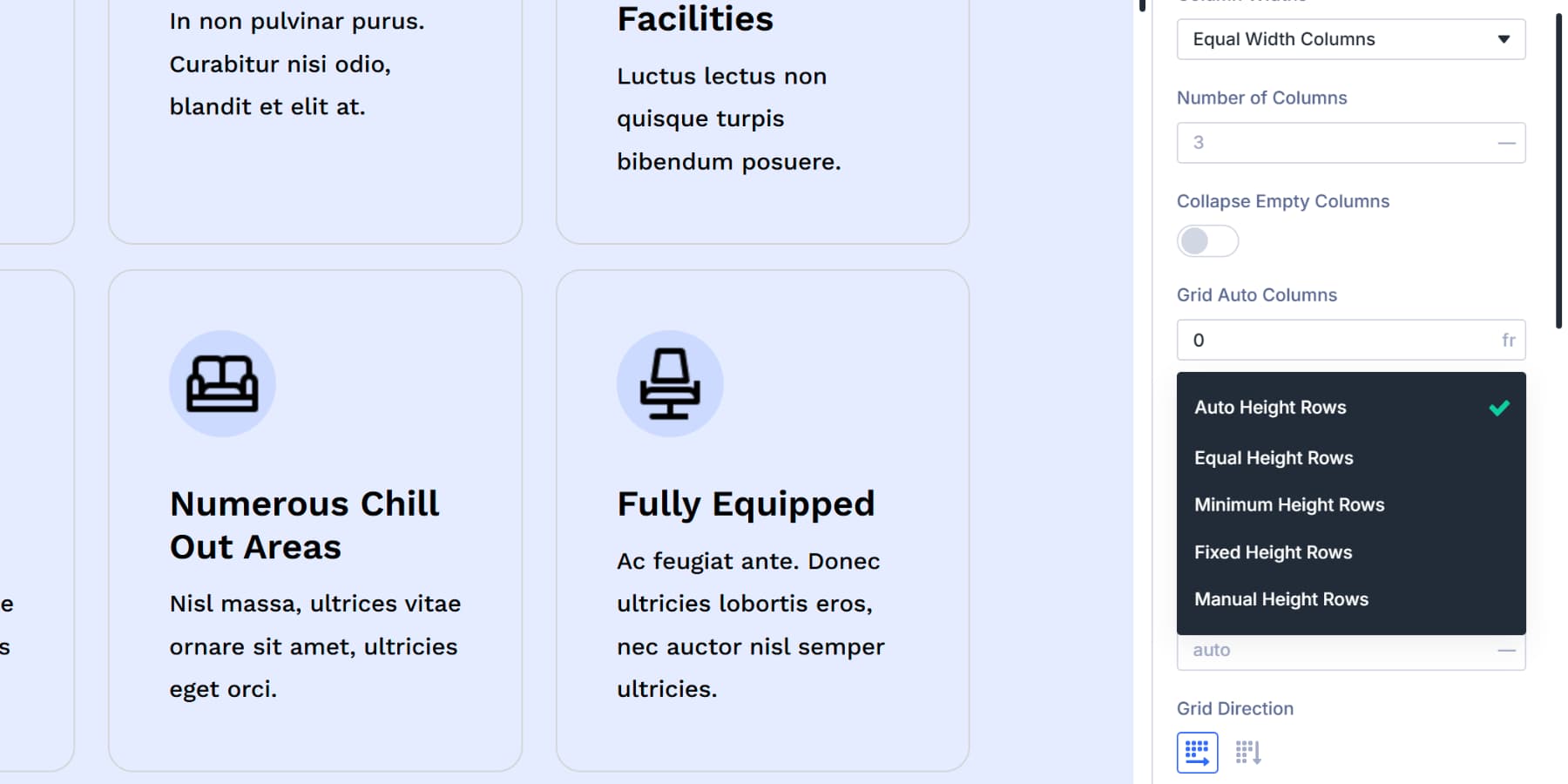
Auto height adjusts rows based on content. Each row grows or shrinks to fit whatever is inside it. For example, a row with small images stays shorter than one with a large block of text.
Equal height creates uniform rows across your grid. All rows match the same height, giving you visual consistency from top to bottom.
Minimum height sets a baseline. Rows can grow taller than this value but never shrink below it. This gives you a safety net while still allowing flexibility for varied content.
Fixed height maintains consistent row dimensions. You set a specific value, and every row holds that measurement. Depending on your other settings, content that exceeds the height might overflow or get cut off.
Manual Height Rows lets you define a custom Grid Row Template for precise track heights.
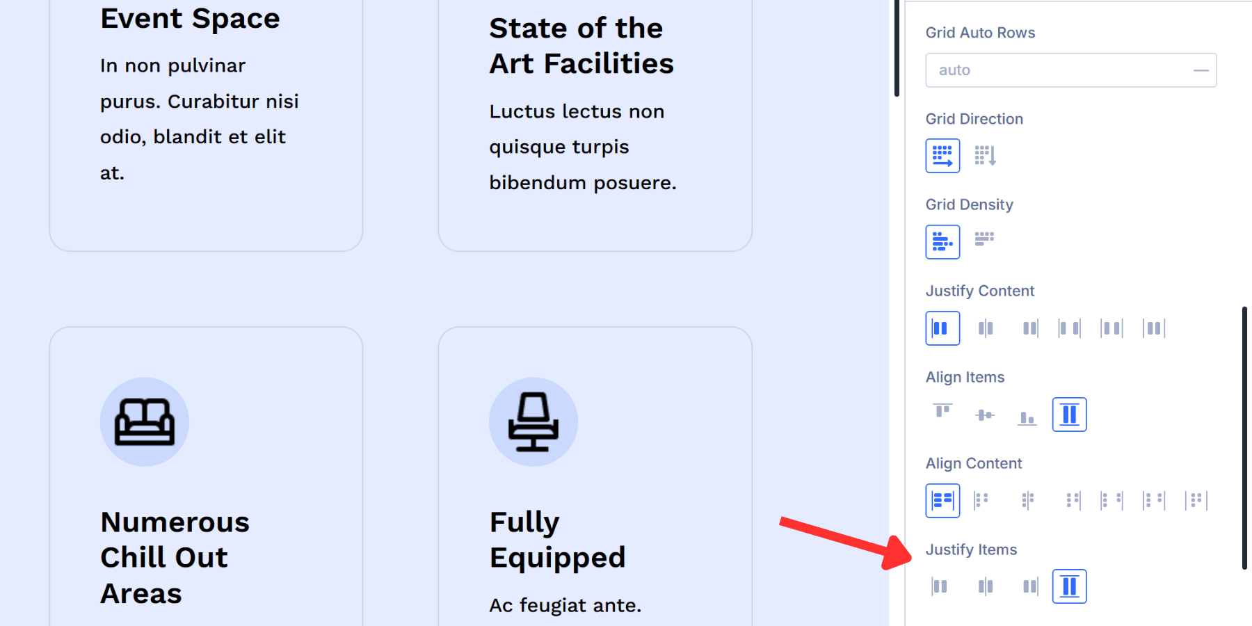
Grid Auto Rows
Grid Auto Rows mirrors what Grid Auto Columns does, except it handles the vertical side.
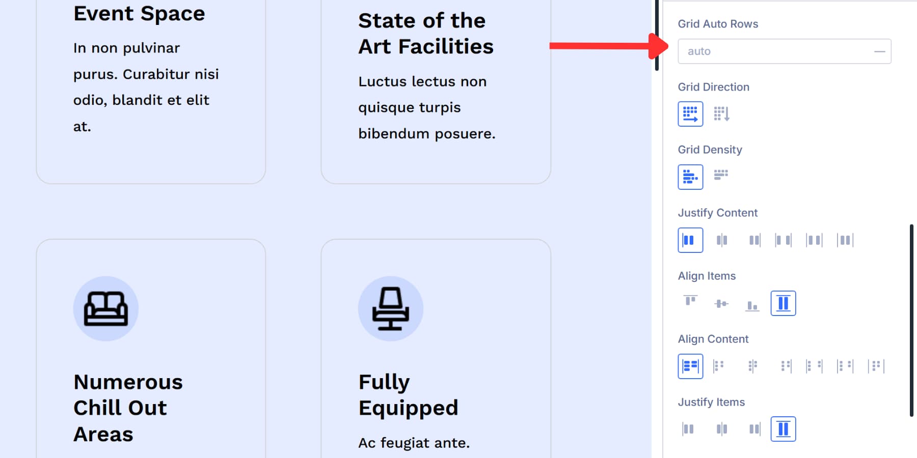
When your content runs past the rows you initially set up, the grid builds new ones to accommodate everything. This setting tells those extra rows how tall they should be.
You can enter fixed pixel values like 120px or use auto to let the content set the height. Advanced Units like calc(5vh + 30px) or clamp(100px, 8vh, 200px) work here for responsive sizing that adapts to screen dimensions. Design Variables fit in here, too.
Grid Direction
Grid Direction determines the path items take when filling your grid. The setting gives you two choices that change how the content flows.
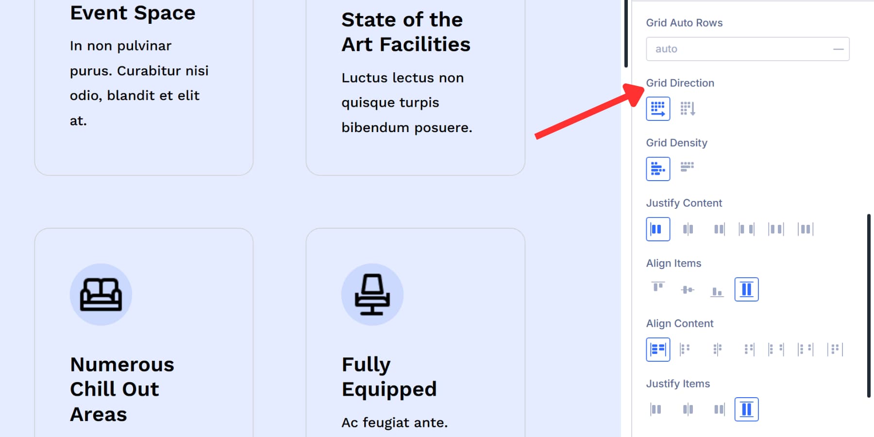
Row mode works horizontally. Items fill across the first row, wrap to the second, and continue down. This matches the standard reading pattern and works for most layouts. Row is selected by default.
Column mode works vertically. Items are stacked down the first column, and the next column is filled out to the right. You need to set several row values for this to work correctly, since the grid needs to know when to start a new column.
Columns work well for vertical timelines or lists where downward flow makes more sense than horizontal flow.
Grid Density
Grid Density controls whether your grid can shuffle items around to eliminate empty spaces.
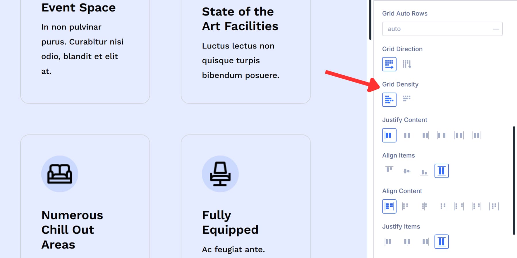
Dense mode actively fills gaps. When a large item leaves an empty cell, the grid looks ahead and pulls a smaller item up to fill that space. Your layout stays compact, but items might not appear in their original sequence.
Dense is the default setting and works well for image galleries or card layouts where visual tightness matters.
Auto mode preserves order. Items flow naturally without rearranging, even if that creates some empty cells. Switch to Auto for content like blog posts or lists where maintaining sequence is more important than filling every gap.
Justify Content
Justify Content distributes your grid items along the horizontal axis. This setting appears in the Layout options after switching to Grid mode.
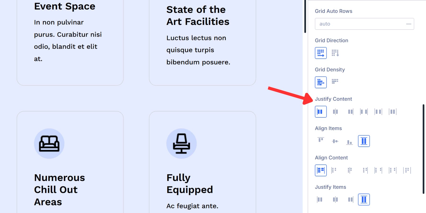
Start aligns everything to the left edge of your container. Center brings all items into the middle. End pushes them to the right side. These three options treat your grid as one unit and move it around inside the container.
Space Between makes the first column snap to the left edge, the last column snaps to the right, and any leftover space gets divided evenly between the columns. Nothing sits at the outer edges.
Space Around places equal spacing around each column. The outer edges get half the spacing compared to the gaps between columns.
Space Evenly splits all available space into identical gaps. Every single gap matches, including the ones at the container edges. Your columns sit with perfectly uniform spacing throughout.
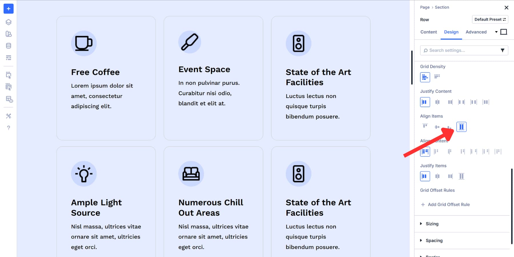
Align Items
Align Items positions content inside each grid cell along the vertical axis.
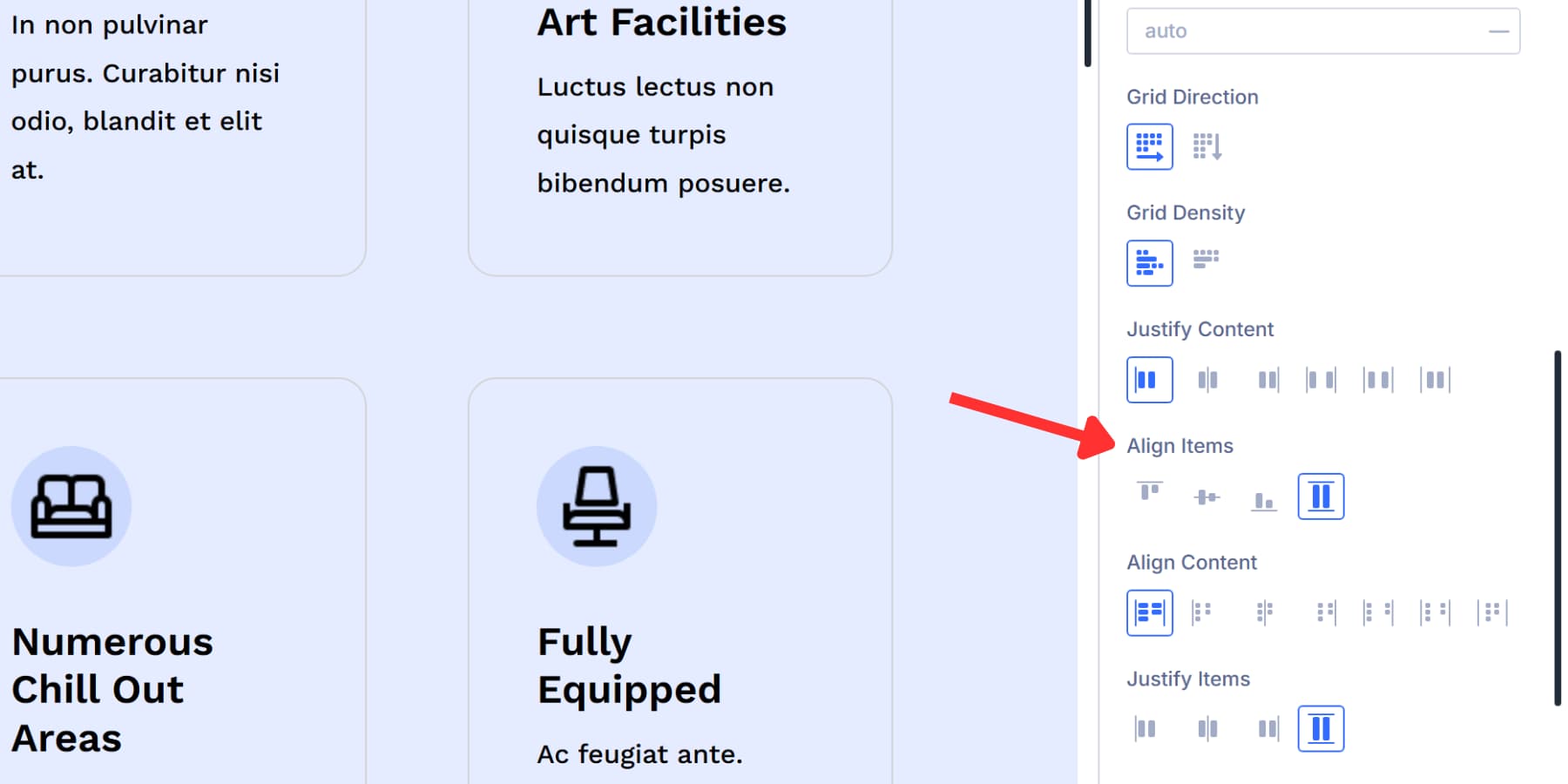
Start places items at the top of their cells. Any extra vertical space stays below the content.
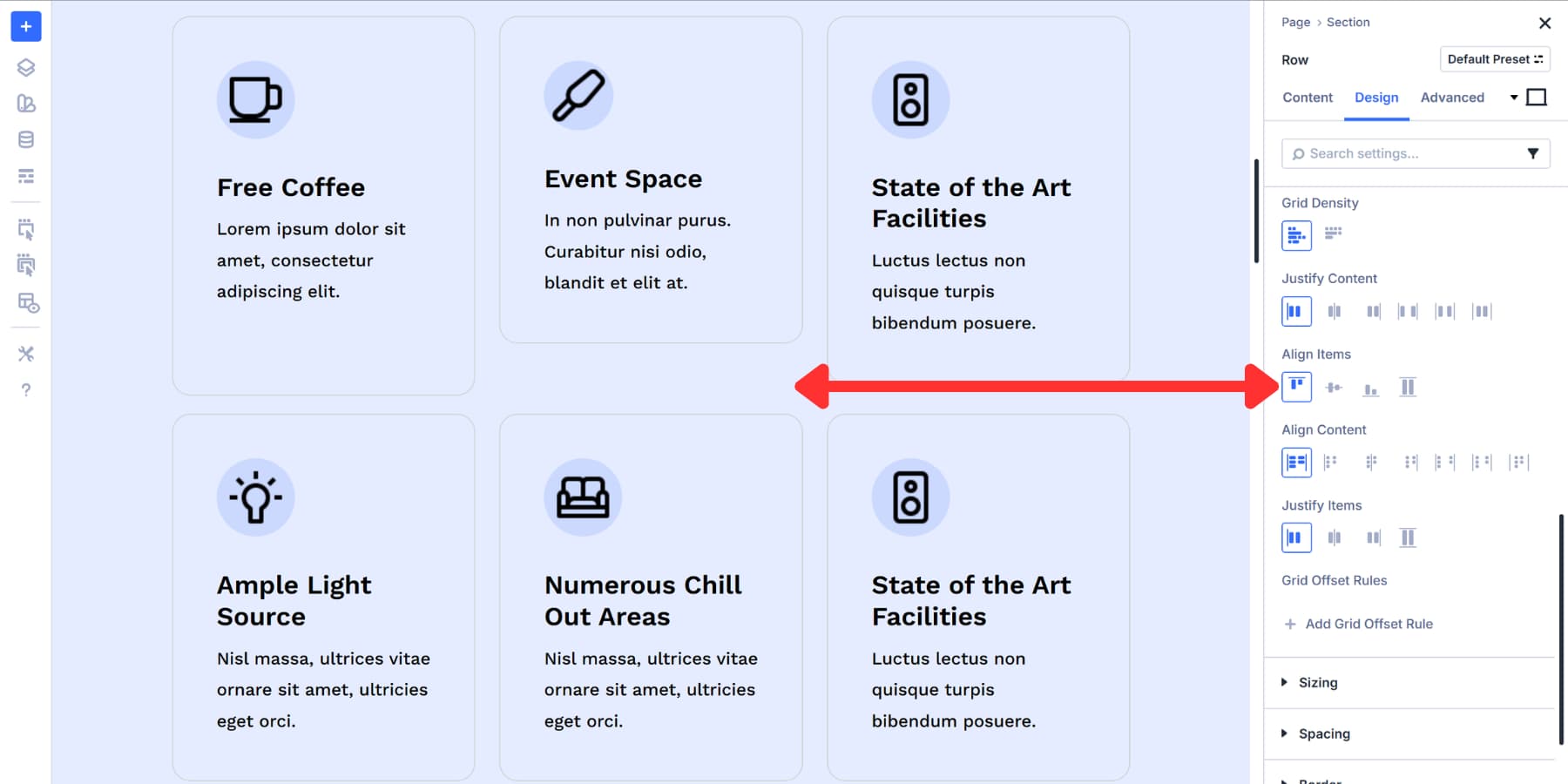
Center vertically aligns items in the middle of their cells. The spacing above and below matches exactly.
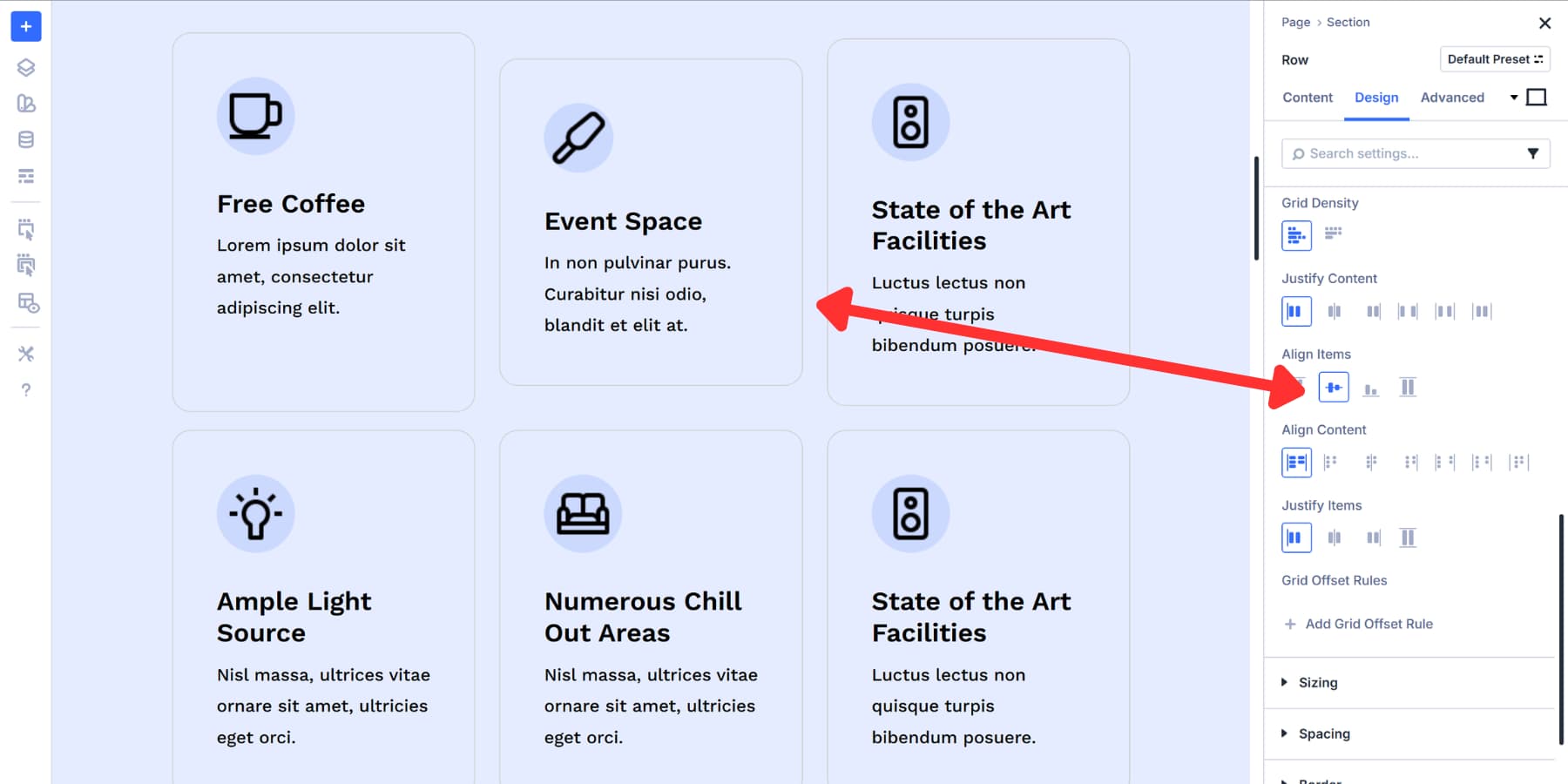
End sticks items to the bottom of their cells. Extra space collects above the content.
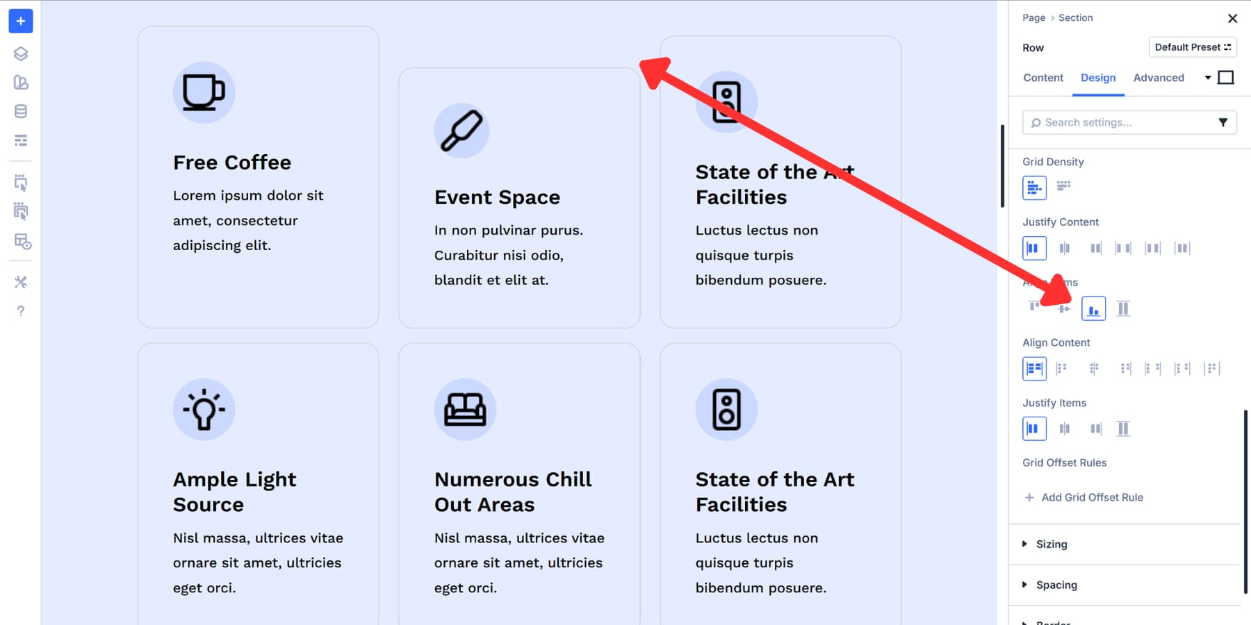
Stretch is the default option. It makes items expand to fill the entire cell height. If an item has a fixed height set, Stretch respects that measurement and leaves the item at its defined size.
Align Content
Align Content aligns your entire set of rows vertically inside the container.
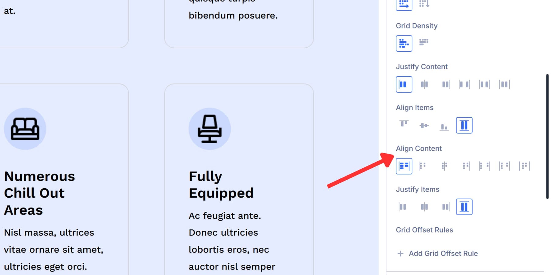
This setting only works when your grid container is taller than the total grid or when leftover vertical space needs to be distributed.
Stretch is the default. It expands row tracks proportionally until they fill all available container height. Start packs all rows at the top. Any free space sits below the grid. Center packs rows into the vertical middle. Equal free space appears above and below. End packs all rows at the bottom. Free space collects above the grid.
Space Between spreads rows vertically. The first row sticks to the top, the last row sticks to the bottom, and any free space gets divided evenly between rows. Nothing sits at the top or bottom edges.
Space Around places equal space around each row. The outer edges at the top and bottom get half-sized gaps compared to the middle gaps.
Space evenly divides free space into equal gaps everywhere. The spaces between rows, top, and bottom all match exactly.
Justify Items
Justify Items aligns content inside each grid cell along the horizontal axis. This setting only matters when a grid cell is wider than the item sitting inside it.
Start places content against the left edge of its cell. Extra space sits to the right of the item.
Center places content in the horizontal middle of its cell. Extra space splits evenly on both sides. End places content against the right edge of its cell. Extra space sits to the left of the item.
Stretch is the default option. It expands content to fill the entire width of the cell. If an item has a fixed width already set, that width stays locked. Otherwise, the content stretches across the whole cell from edge to edge.
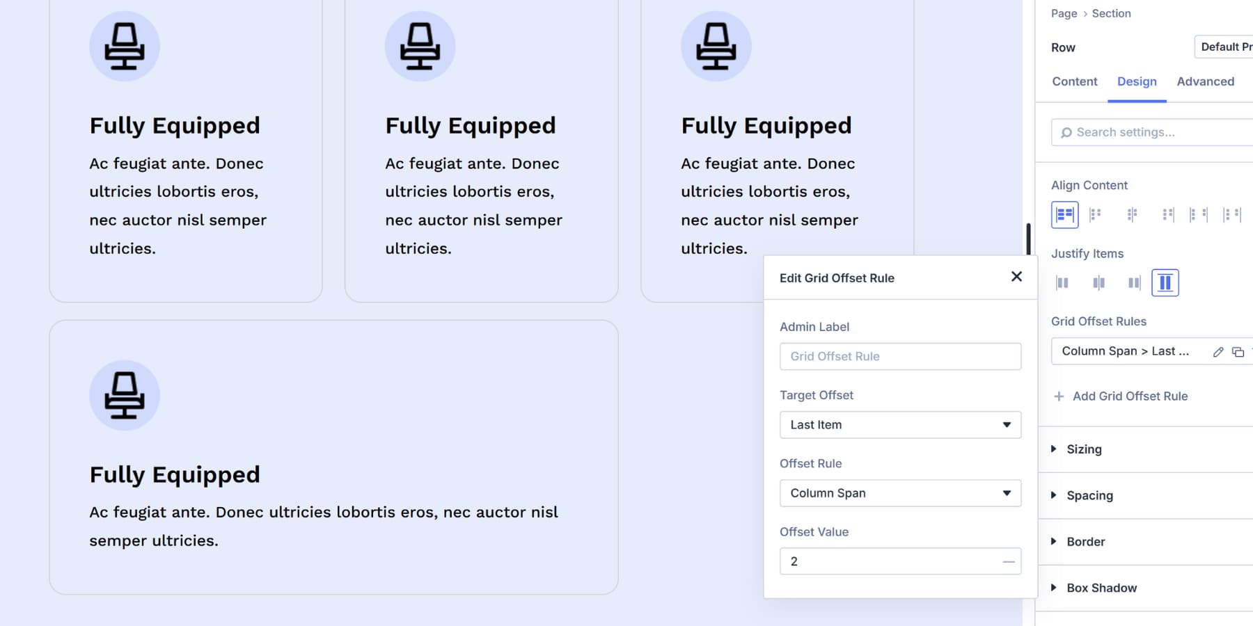
Grid Offset Rules
Grid Offset Rules break items out of the automatic flow and put them exactly where you need them.
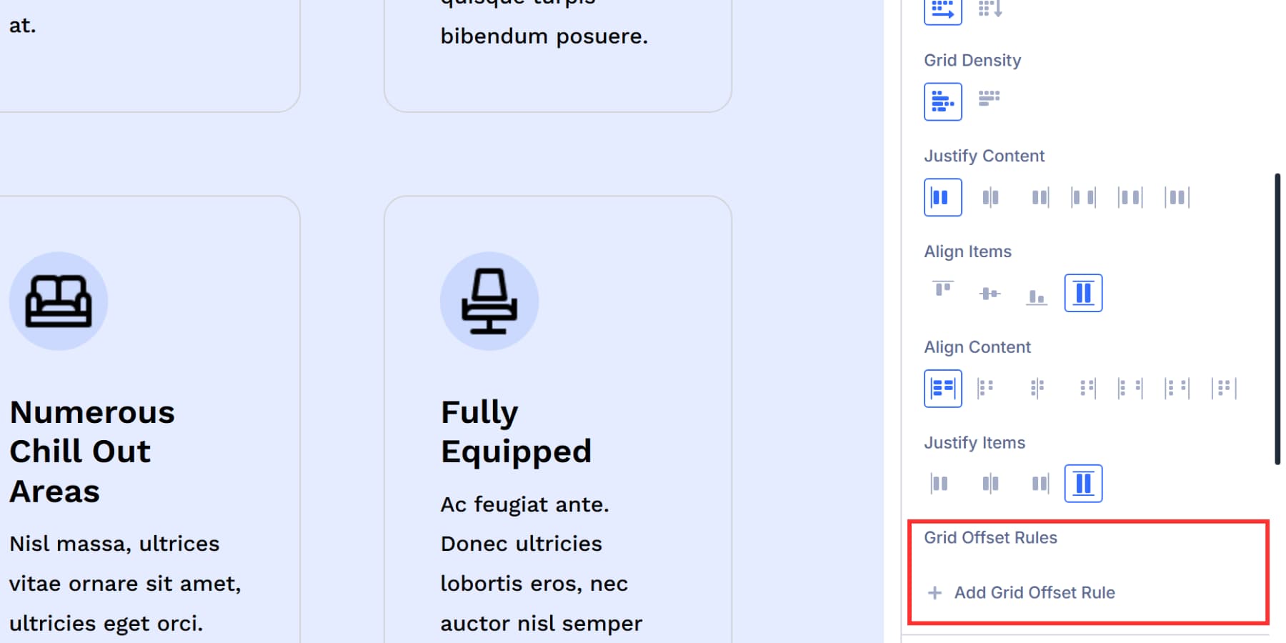
Your grid fills items in order by default: first item, first cell, second item, second cell. That works until you need something different. Grid Offset Rules give you manual control when the automatic placement doesn’t match your layout goals.
You can move an item to a specific row or column, span multiple cells, or shift it from its natural position. This matters for layouts where certain elements need to stand out or occupy specific spots regardless of their order in the code.
Let’s take a look at the options available within this setting:
Admin Label
Admin Label gives your offset rule a name.
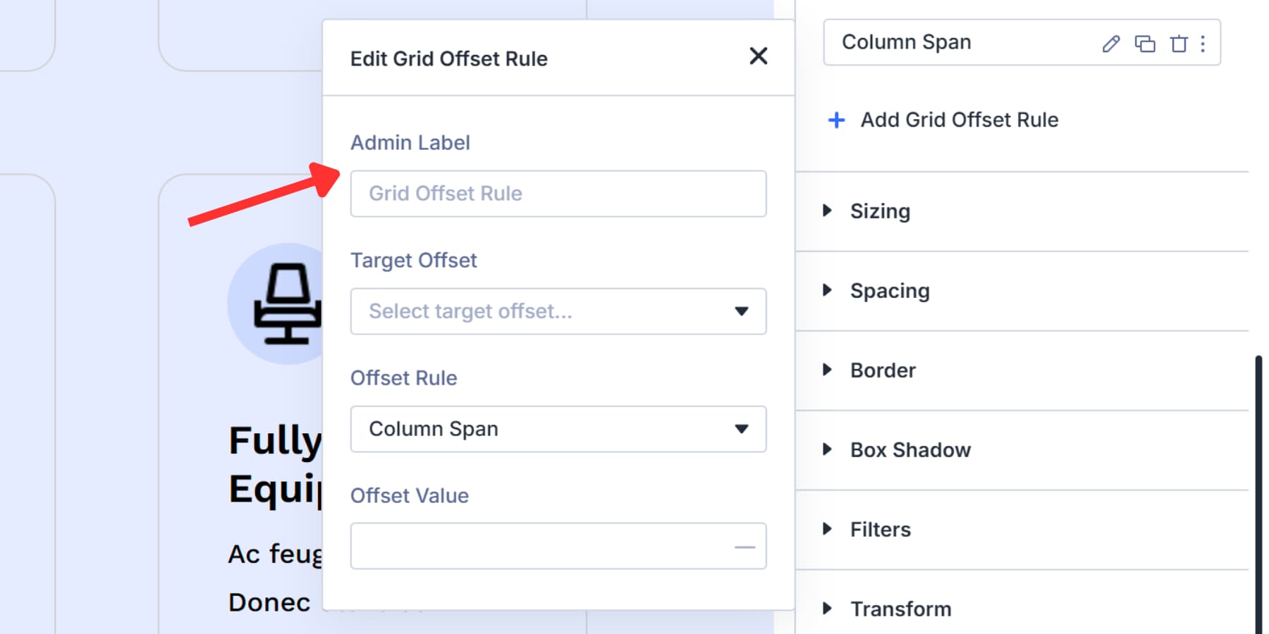
This field is optional, but it helps when you’re managing multiple rules. Type something descriptive like “Hero Image Span” or “Featured Post Position” so you can find the right rule later.
The label only appears in the rule list inside the Visual Builder. Visitors never see it. Skip this if you only have one or two rules. Use it when your grid gets complex and you need to tell your rules apart quickly.
Target Offset
Target Offset picks which items inside your grid are affected by the rule.
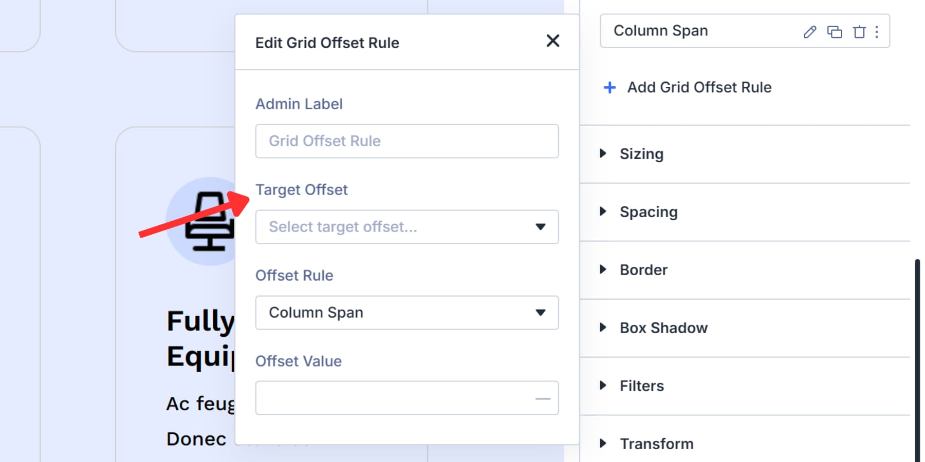
First Item and Last Item target single positions. First Item hits the opening element in your grid. Last Item catches the final one, which matters for dynamic content where the total count changes.
Even Items and Odd Items target alternating patterns. Even hits all even-numbered items (2nd, 4th, 6th). Odd catches odd-numbered ones (1st, 3rd, 5th).
The Every [Number] options target repeating intervals. Every Third Item hits items 3, 6, 9, and so on. Every Fourth catches items 4, 8, 12. The dropdown goes up to Every Tenth Item, covering most common pattern needs.
The Custom nth-child Rule lets you write your own selector when the preset options don’t match your layout. This handles complex patterns like “every third item starting from the 2nd” or “every fourth item but skip the first two.”
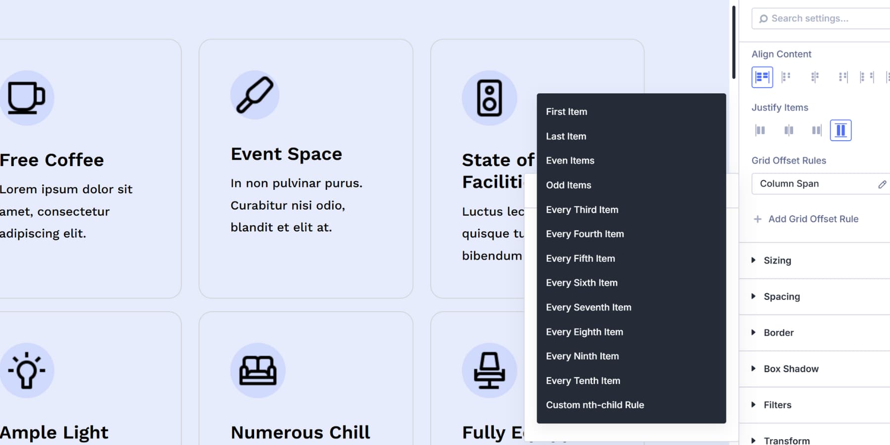
These targeting patterns work best with dynamic content. Your blog might show eight posts today and fifteen tomorrow. Setting a rule for Every Fourth Item keeps your featured post pattern consistent regardless of the number of items appearing.
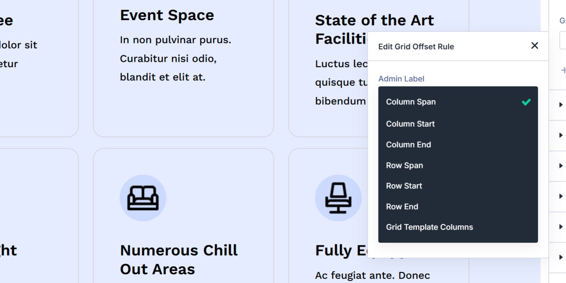
Offset Rule
Offset Rule picks the CSS grid property you want to apply.
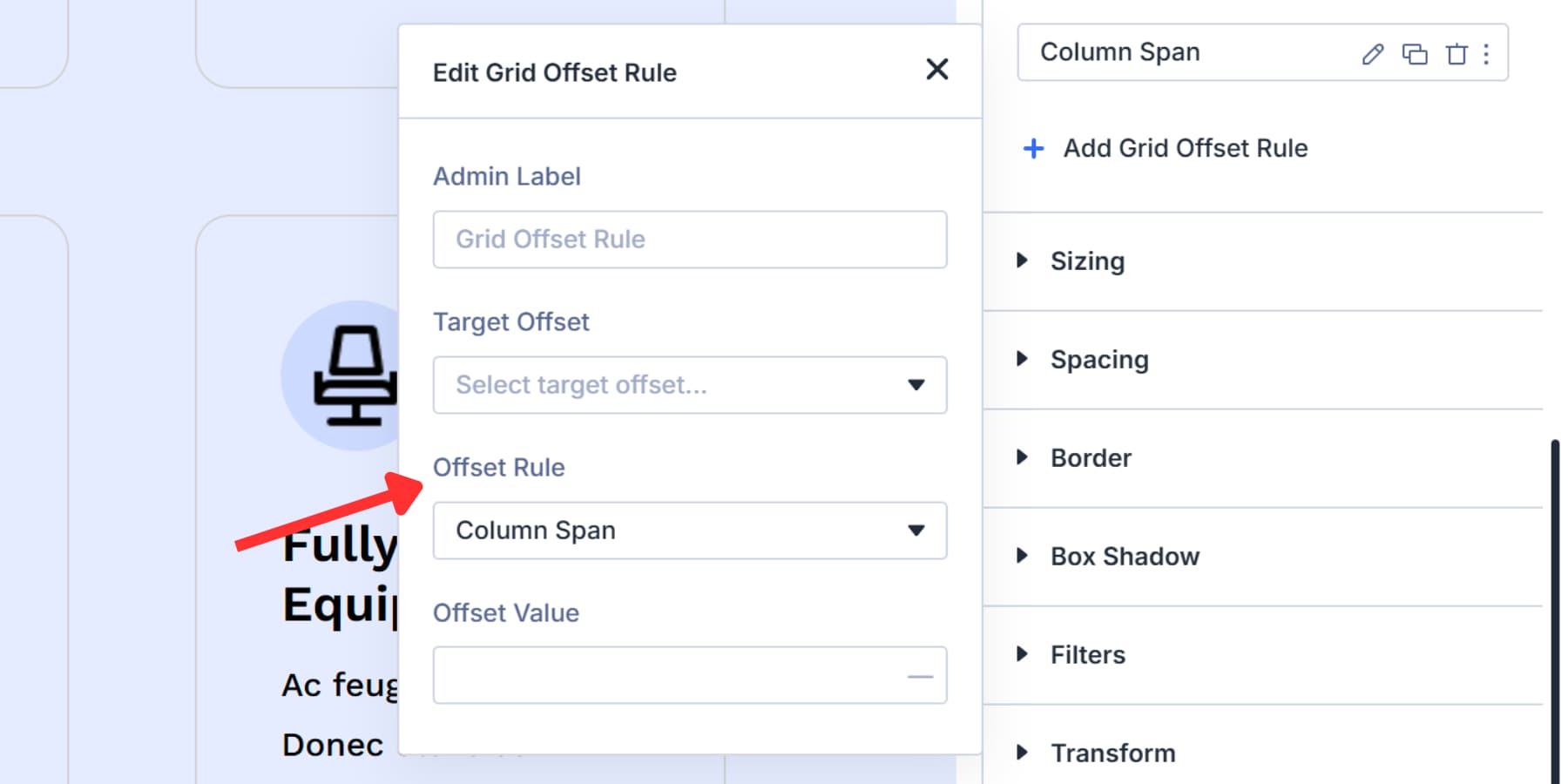
This dropdown lists seven positioning options that control where items sit and how much space they occupy.
Column Span makes an item stretch across multiple columns horizontally. Row Span makes an item stretch across multiple rows vertically. These two control the item size.
Column Start pins an item to begin at a specific vertical grid line. Column End pins where it stops. Row Start and Row End do the same for horizontal grid lines. These four control precise positioning.
With Grid Template Columns, a single item can be divided into its own set of columns. This is helpful for layouts like image + text inside a featured card.
You’ll use Column Span and Row Span most often to make featured items stand out. The Start and End options matter when you need exact grid coordinates. Grid Template Columns handles advanced nested layouts where items need their own internal grid structure.
Offset Value
Offset Value sets the number that defines how your chosen property behaves. What you enter here depends entirely on which Offset Rule you picked.
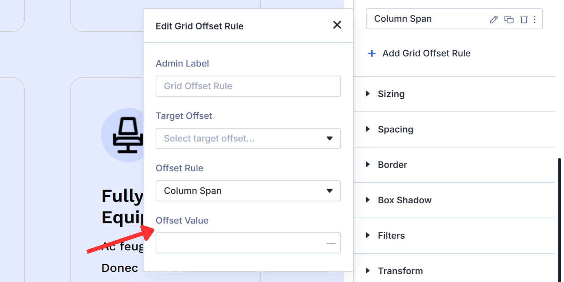
For Column Span or Row Span, type how many cells the item should cover. Enter “2” and the item stretches across two columns or rows. Enter “3” and it covers three. The number represents cells, not pixels.
For Column Start, Column End, Row Start, or Row End, type the grid line number where you want the item to begin or stop. Grid lines start counting at 1 from the left edge (for columns) or top edge (for rows).
Enter “2” in Column Start, and the item begins at the second vertical line. Enter “4” in Row End, and the item stops at the fourth horizontal line.
The value works with your overall grid structure. Setting the Column Span to 2 in a three-column grid makes the item occupy two-thirds of the width.
Your grid settings and offset values work together to create the final layout.
Start Using Grid In Divi 5 Today
These settings are what make Divi 5’s Grid builder stand out from the competition. Combining visual controls, offset rules, and Design Variables gives you layout power that other builders hide in custom CSS.
If you’re new to Grid, start with templates, then move to manual controls when you need custom work. Most layouts only need column widths, gaps, and an offset rule. The other settings address specific issues that arise.
Download Divi 5 and start building layouts that actually match what’s in your mind.


Leave A Reply