
The Holy Grail layout earned its name because it used to be frustrating to build. Designers wanted a clean header and footer with two sidebars flanking a main content column, but making those columns behave, especially responsively, often required hacks and workarounds.
That’s exactly the kind of problem Divi 5‘s Grid System is meant to solve. CSS Grid has always been one of the best tools for this layout, and Divi 5 brings Grid controls directly into the Visual Builder so you can set column ratios, spacing, and responsive behavior without leaving your workflow. In this post, we’ll build the Holy Grail layout step by step and fine-tune it for every device. Let’s get started!
What Is The Holy Grail Layout?
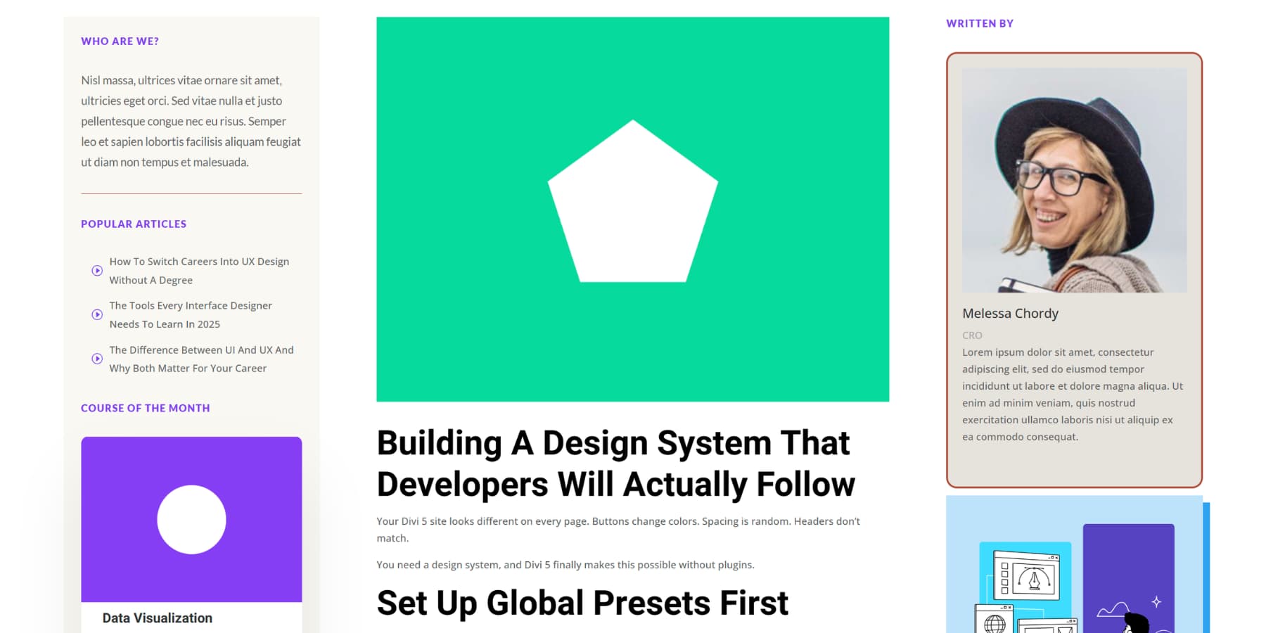
The Holy Grail layout features a header at the top, a footer at the bottom, and three columns in the middle. Your main content is positioned in the center column, which is typically the widest, while the left and right columns contain elements such as navigation or advertisements.
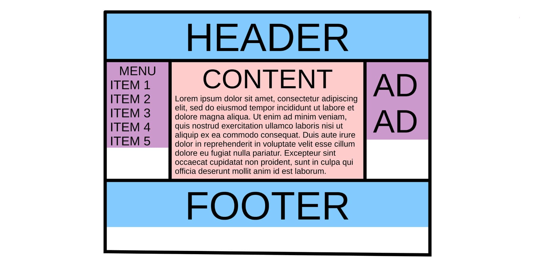
By David Lark – Own work, CC BY-SA 4.0, Link
In 2001, Rob Chandanai created the first pure CSS version of this three-column design. Eric Costello later gave it the “Holy Grail” name, and that label captured the frustration perfectly. Designers wanted this layout badly. Getting it to work right was another story.
The early methods used background images, JavaScript to match column heights, and an excessive number of nested divs. They got the job done, sort of. But every approach had problems.
What Makes The Holy Grail Layout So Desirable
The equal height columns made this layout a must-have. Content looked balanced, no matter how much text each column contained. Sites with lots of content benefited from the clear structure.
News portals could organize articles alongside ads and navigation. Blogs got clean sidebars for categories and recent posts. Online stores found space for product filters and recommendations.
The center column kept your central content front and center. Readers focused on what mattered while still having quick access to navigation and extras. The design worked just as well on phones as it did on desktops. Columns could stack or reorder based on screen size.
Meet Divi 5’s CSS Grid System
Divi 5 puts CSS Grid directly into the Visual Builder. Sections, rows, columns, and groups all work as grid containers now. Drop any module inside one of these containers, and it becomes a grid item. Text blocks, images, and buttons all snap into the grid structure you create.
When you add a section or row, you’ll see Grid templates alongside Flex options. Pick a three-column template, a four-column layout, or a sidebar structure. The templates handle the setup. You drop in content, and the grid automatically positions everything correctly. This auto placement fills cells in order. The first item goes in the first cell, the second in the second cell, and so on down the line.
What makes Divi 5’s Grids stand out is:
Column And Row Controls
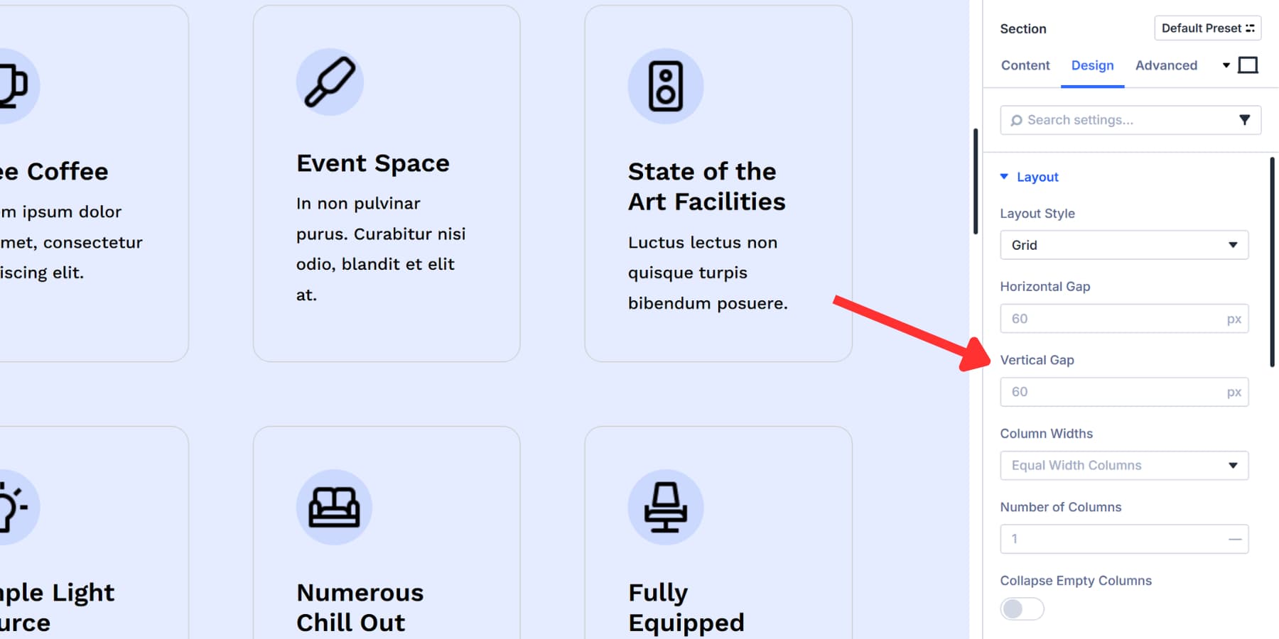
Gap controls handle spacing. Horizontal Gap puts space between columns. Vertical Gap spaces out rows. Set both to 20px, and you get consistent breathing room across your entire grid. The Visual Builder displays these changes live as you make adjustments.
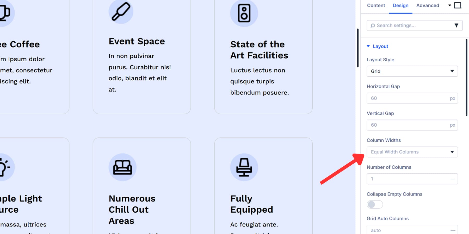
Column Widths give you five options. Equal Width Columns make everything uniform. Auto Width Columns size based on content. Manual Width Columns let you write your own CSS values like 1fr 2fr 1fr for custom proportions. Equal Minimum Width and Equal Fixed Width handle other sizing needs.
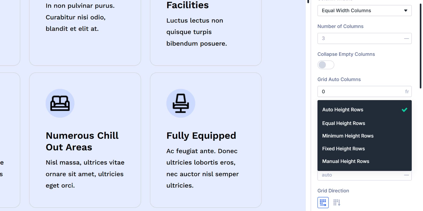
Row Heights work the same way. Auto adjusts to content, Equal makes them all match, Minimum sets a baseline, and Fixed locks in specific measurements. Mix a four-column grid with auto height rows, and you get a layout that adapts to whatever content you throw at it.
Device Specific Settings
Every grid setting works across all screen sizes. Change column counts for tablets, adjust gaps for phones, or change the entire Grid Direction on mobile devices. The responsive controls sit right inside each setting. Click the device icon, pick your breakpoint, and modify that specific screen size without touching the others.
Manual Control Through Offset Rules
Auto placement works until you need something different. Grid Offset Rules allow you to break items out of the automatic flow. You can make an item span multiple columns, pin it to a specific row, or shift its position regardless of where it sits in your code.
Target the first item, target every third item, or write custom nth child selectors for complex patterns. Set a Column Span of 2, and that item stretches across two columns. Pin it to Row Start 3, and it jumps to the third row. These rules create asymmetrical layouts where certain pieces stand out, while others adhere to the standard grid.
This system handles the Holy Grail layout we discussed earlier. Three columns on desktop, stacked on mobile, with precise control over every measurement and spacing value. All of it happens through dropdowns, sliders, and number fields. Divi cuts out the CSS so you can focus on building your aspired layouts visually.
If you want to explore all the options available for Grids, here’s a deep dive that goes over each of these options.
Making A Holy Grail Layout In Divi 5
The grid controls we just covered work together to create this Holy Grail layout without much effort. We’re going to build this step by step, and to show you how quickly the pieces fall into place once the initial structure is set. Have a look:
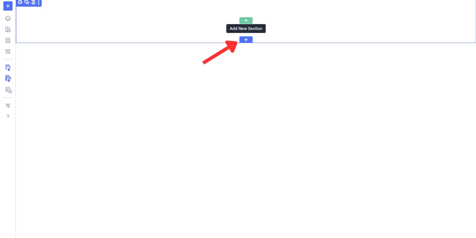
Add A Grid Section To Your Page
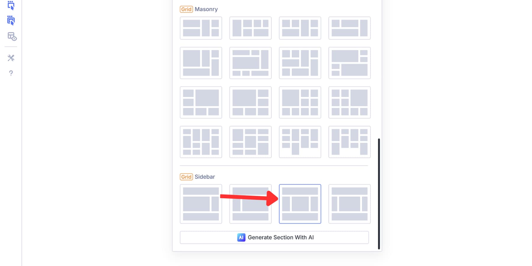
Start by adding a section to your page by clicking on the blue (+) icon on your page. Clicking on it reveals a bunch of premade layout templates for both Flexbox and Grid.
Since the Holy Grail layout works best with CSS Grids, we will select one of the premade Grid templates, which will be marked with a yellow badge.
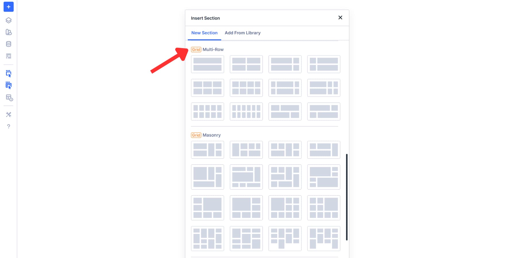
Pick the four-column template. This template features four columns arranged across two rows.
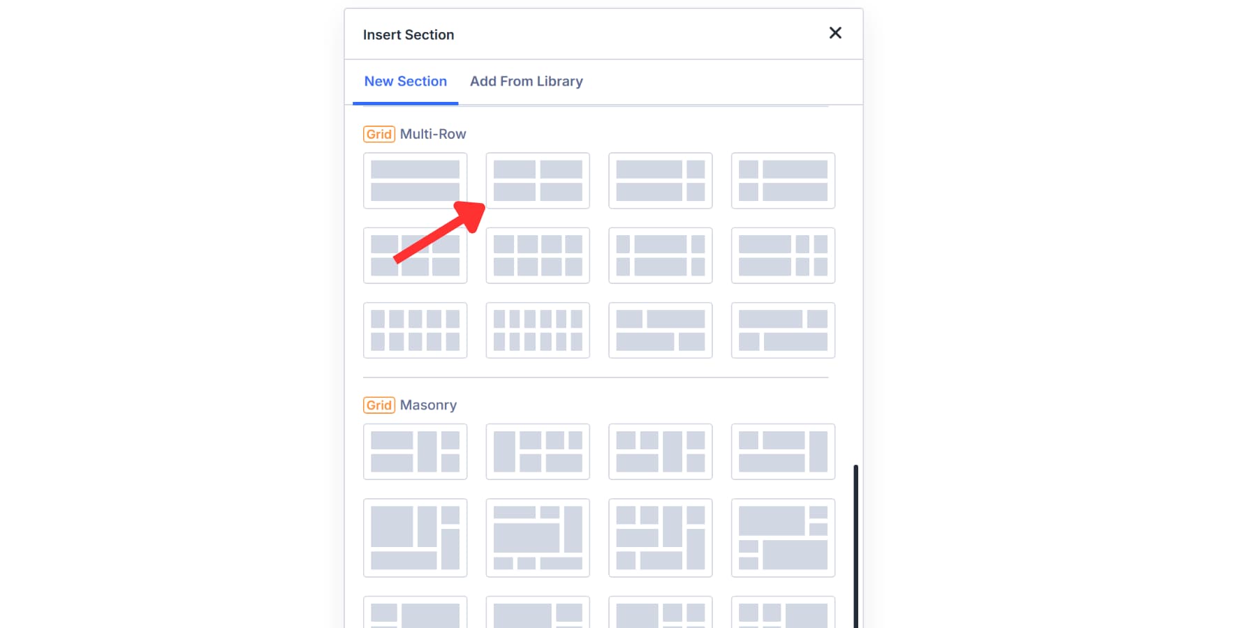
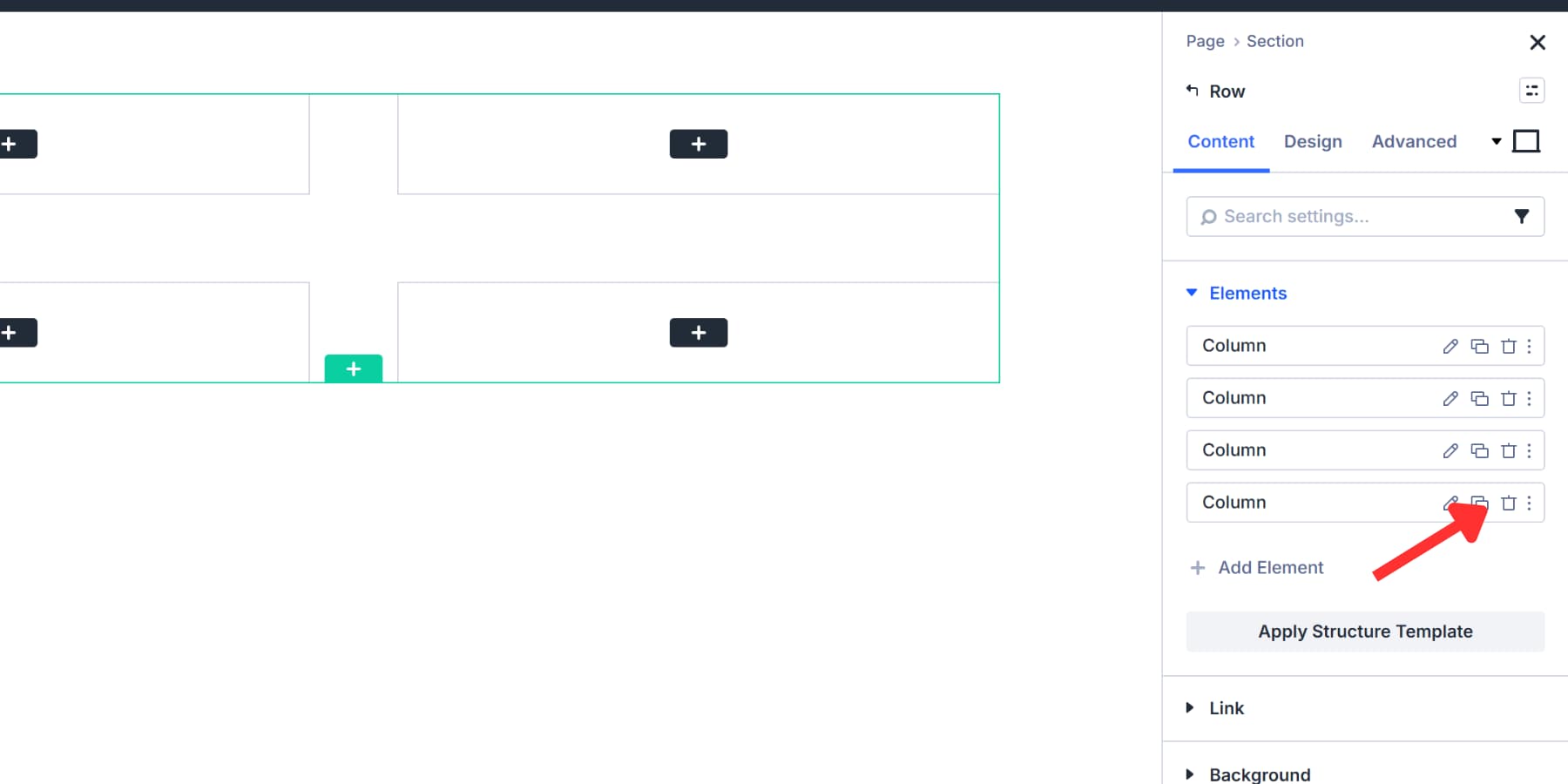
Delete the fourth column by clicking on the delete icon in the settings.
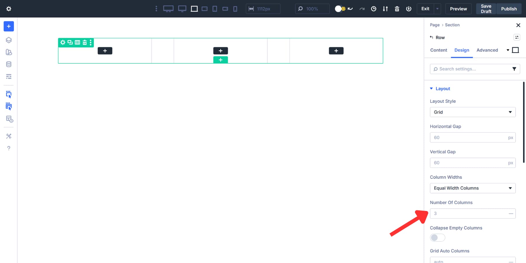
Then, head to the Number of Columns field and set it to 3 under Layout Settings in the Design tab. You’ll be left with a clean, three-column structure where each column occupies equal space.
Divi 5 actually includes a grid template that resembles the Holy Grail layout. It comes with header and footer columns already built in.
We’re skipping it so you can see how to build the structure from scratch. Removing the extra header and footer areas also requires additional steps beyond the scope of this walkthrough. However, if you are looking to build a landing page or would like to use the header and footer space for something else, feel free to use the said template.
Set Proportions
Now, the three columns we added have equal widths. But the Holy Grail design is different. Your main content should be placed in the center, where it receives the most space. The sidebars on each side should be narrower, as they only contain navigation, ads, or additional links.
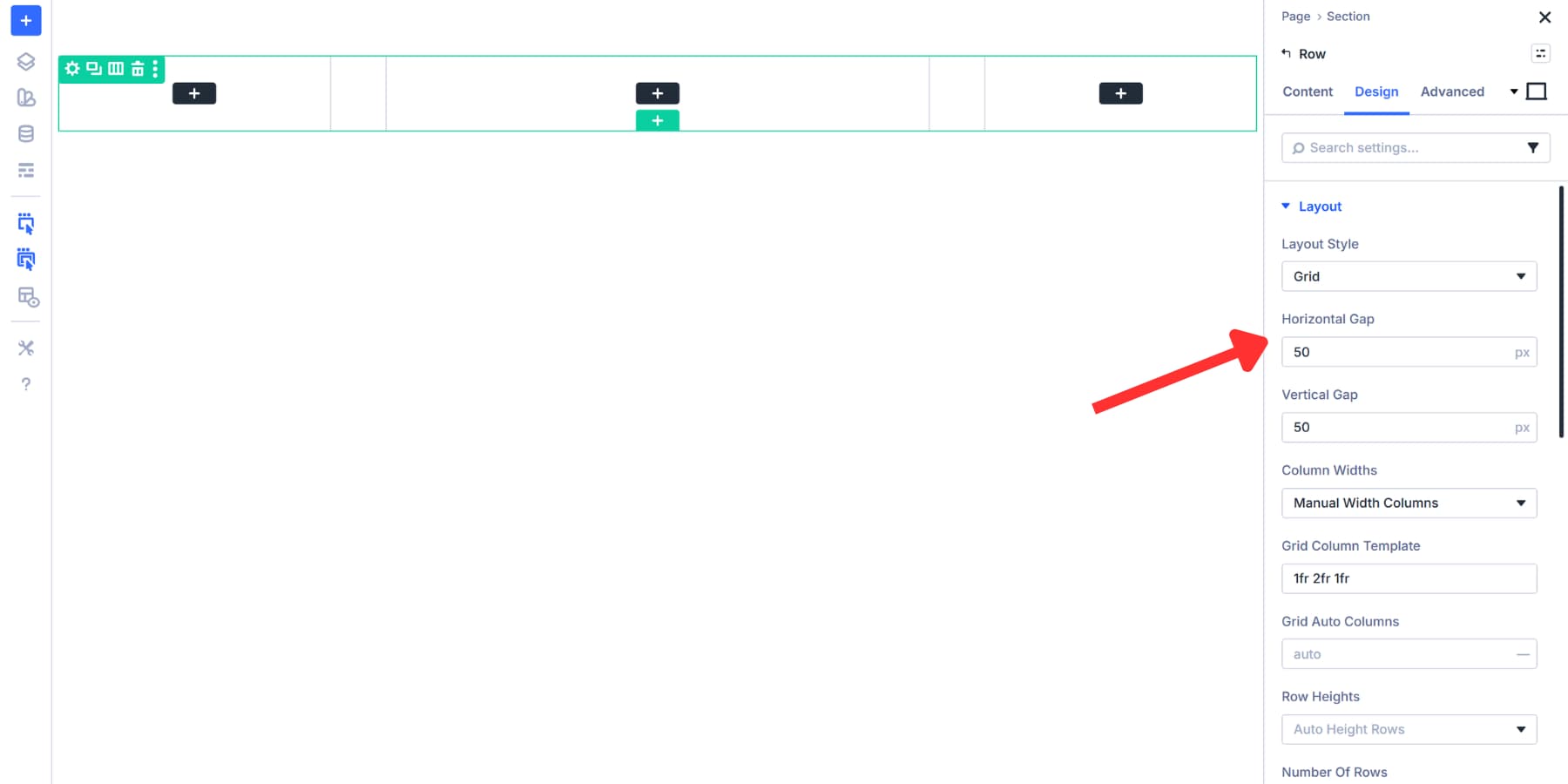
To achieve this, navigate to the Design tab and locate Column Widths under Layout. Click the dropdown and select Manual Width Columns. This option allows you to write custom values for each column, rather than keeping them uniform.

Type 1fr 2fr 1fr into the Grid Column Template field. The fr unit stands for fractional unit, and it divides your container’s available space into parts. These three values add up to a total of 4 parts.
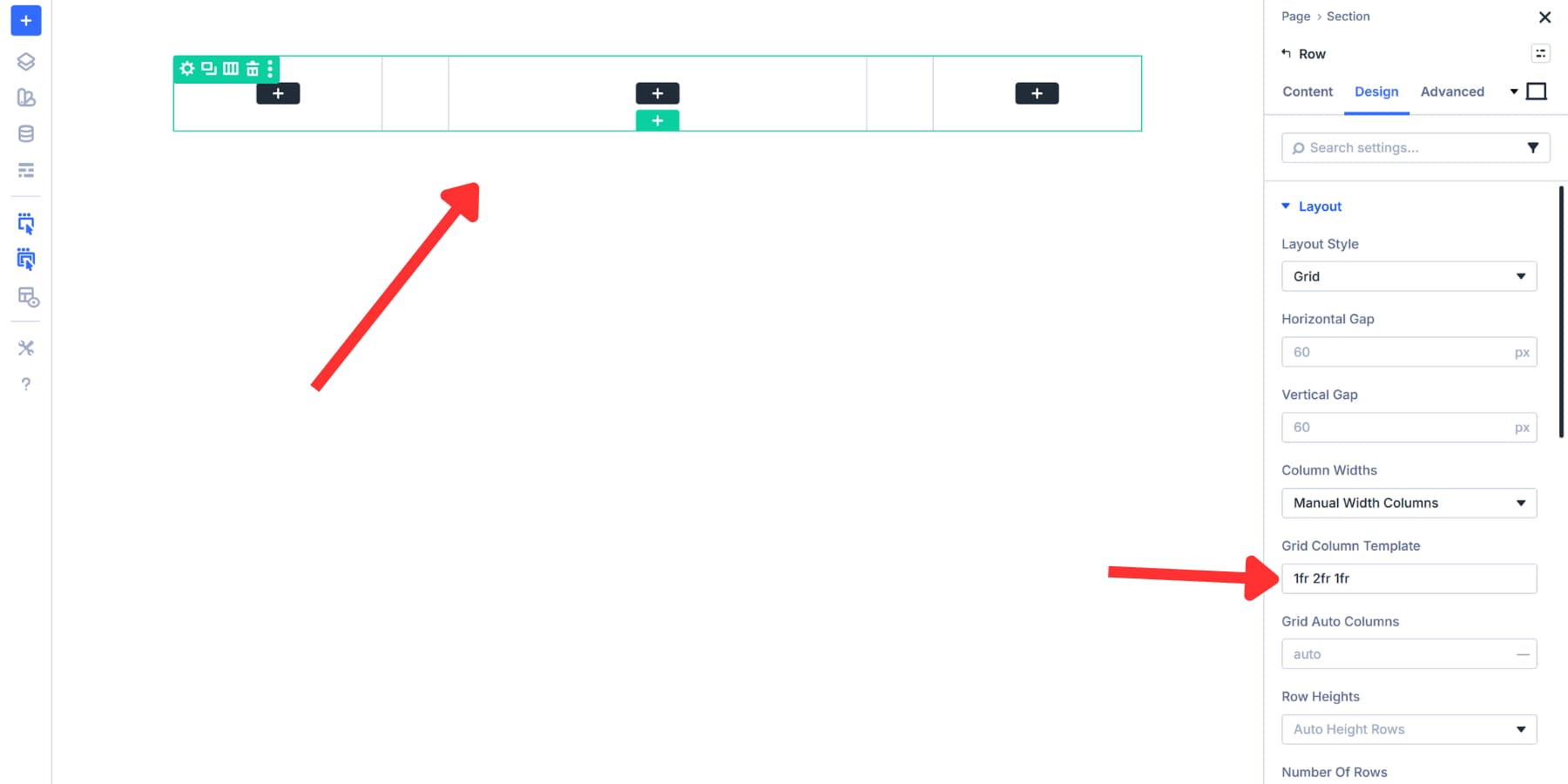
The left sidebar takes 1 part out of 4, which equals 25% of the width, while your center column takes 2 parts out of 4, which equals 50%. The right sidebar takes the final part, another 25%. This ratio creates the classic Holy Grail look with a prominent content area flanked by narrower sidebars.
You can adjust these numbers later if you want different proportions. Try 1fr 3fr 1fr for an even wider center, or 2fr 3fr 2fr for slightly bigger sidebars.
Adjust Gaps And Spacing
Your three columns are now sized correctly, but the layout looks cramped. That happens because Divi sets rows to 80% width by default. Head to the Sizing tab under Design. Change Width and Max Width to 99%. This makes your row span the full width of the container while still leaving some breathing space.
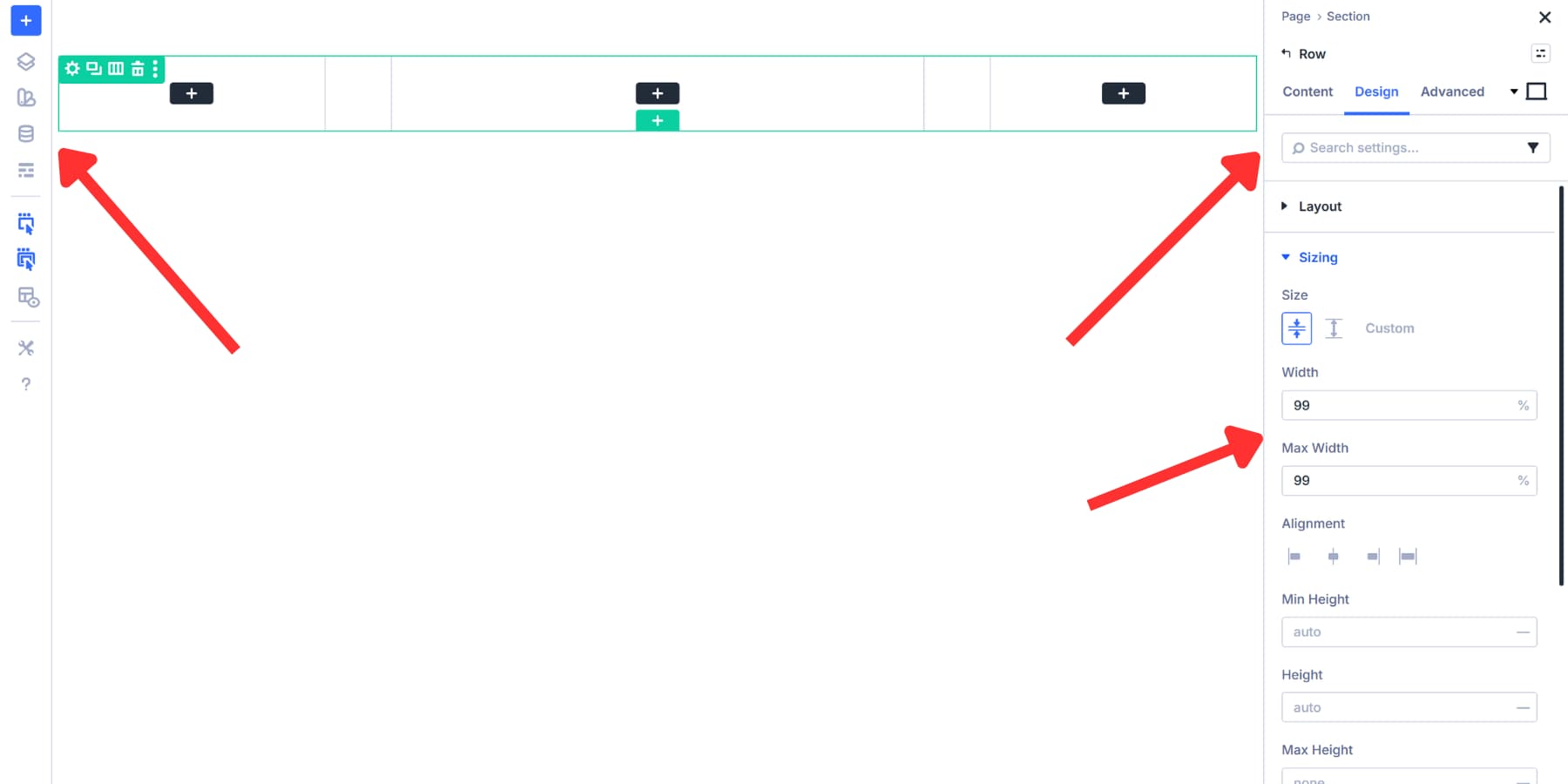
You could also use 99vw, which stretches the row across the entire viewport regardless of parent containers. The 99% value works better here since it respects your site’s content width settings and doesn’t create horizontal scrollbars.
Now for the gaps between columns. Find the Horizontal Gap field under Layout. Content-heavy sites, such as blogs, work well with gaps of 40px to 60px. Portfolios and image galleries appear more visually appealing with a tighter spacing of around 20px to 30px. Minimalist designs can go even wider at 80px or more.
Pixels work fine, but you’ll need to adjust them manually for each screen size. Divi 5 supports rem, em, percentages, clamp, and calc functions here, which can scale better.
If you want to take this further and automate these spacing decisions across your entire site while maintaining responsiveness, check out our guide on creating a gap-based spacing system in Divi 5.
The Holy Grail layout divides pages into three functional zones. The center column receives the most width to display primary content like articles, product listings, or portfolios.
Different site types need different content configurations. A blog centers articles in the middle column. The left sidebar shows post categories, archives by date, and a search function. The right sidebar holds author bios, popular posts, and email signup forms. News sites follow similar patterns but often add breaking news widgets or trending topics to a single sidebar.
While sidebar roles may flip based on regional preferences, the center always dominates:
- Blogs illustrate this by placing articles or post content in the middle, archives and search on the left, and bios or popular posts on the right.
- News sites often use similar configurations but frequently add breaking news widgets or trending topics to their sidebars.
- Portfolio sites showcase work in the center column using galleries or project grids. The left sidebar contains filters by project type, client, or year. The right sidebar features client testimonials, awards, contact forms, and social proof.
- Business and service sites prominently feature service descriptions or case studies. The left sidebar organizes services by category or industry. The right sidebar drives conversions with contact forms, business hours, and trust badges or client logos to establish authority.
- Membership sites and learning platforms place course content in the central column. The left sidebar displays persistent module navigation, progress tracking, and lesson lists. The right sidebar shows instructor information, upcoming live sessions, or discussion forums, aiding student retention.
Adding Modules To Your Columns
Click the black plus icon in your columns to see all the modules Divi 5 offers.
Modules such as Text, Images, and Blurbs support dynamic content that retrieves details from your database. You could assign dynamic content to a Title as the Post Title, and it will display the title of your post automatically.
Divi 5 also includes modules like Post Sliders for displaying content. For more control, you could pair the Group and Group Carousel modules with Divi 5’s Loop Builder.
The Loop Builder gives you specific content filters when you need them. You could enable the Loop option in your column settings before adding modules. From there, set your query type to “posts,” choose your post type, and filter by category, tag, or custom field. This setup works well for featured content sections, curated collections, or any scenario where automatic chronological ordering doesn’t meet your needs.
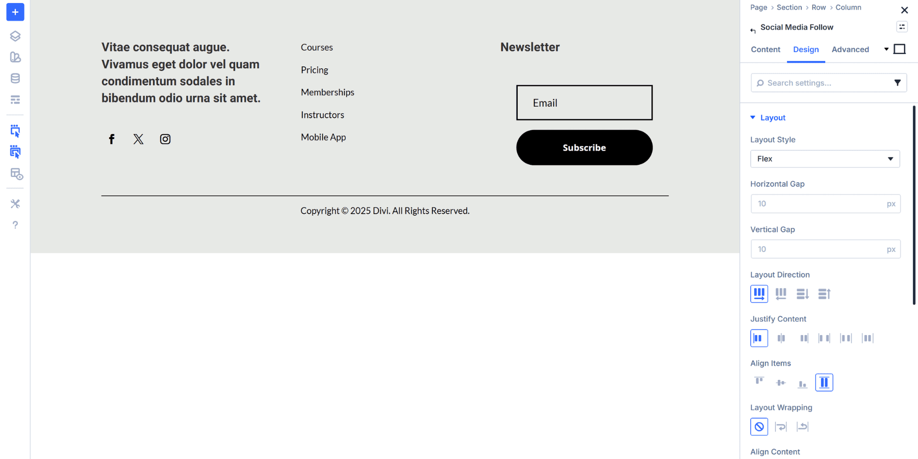
For navigation, you could use the Menu module and configure which menu to display in the module settings. An Icon List module also works well for organized navigation elements. You could add an Email Optin module at the top for newsletter signups and place a Social Media Follow module underneath for engagement. Image modules are great for banners or visual callouts throughout your layout.
Place these modules in whichever column makes sense for your site and preference. Your content type, audience needs, and design preferences should guide these decisions. Use animations and sticky effects to make these layouts more interesting.
You should test different arrangements and think from your visitor’s point of view, and adjust the module placement based on how people actually use your site, not just how you think they will.
After placing your modules, style them with your favourite colors, fonts, border styles, and more, making them more appealing. You can also use Design Variables for these elements and even create or use existing Option Group and Element Presets.
Configure How The Layout Looks On Devices
Now that your Holy Grail layout is coming together, you need to adjust it for all screen sizes to make it truly responsive. Divi 5 gives you seven customizable breakpoints. Each breakpoint allows you to preview and edit the exact screen size range.
It also includes a Responsive Editor that lets you control settings across all breakpoints simultaneously. Look for the small icon next to any setting field. Click it to open the responsive editor panel.
You can adjust values for each breakpoint without switching to a different view mode. The icon turns blue when a setting has modified values across different breakpoints.
That 40px spacing works on desktop but feels too loose on a 375px phone screen. Click the responsive editor icon next to the Vertical Gap field. Reduce it to 20px for the Phone breakpoint. Your Horizontal Gap won’t matter since columns stack vertically on mobile. Whatever changes you make only persist for the breakpoints at which they were made. This won’t affect how your desktop layout appears.
Stacking Your Layout To Better Fit Constraints
The Holy Grail layout works well on desktops, but requires adjustments for phones and tablets, as the horizontal space isn’t readily available.
Your three columns need to stack vertically on phones. Switch to the Phone breakpoint using the device icons at the top of the Visual Builder, then open your row settings. Navigate to Content and click Change Column Structure. Select the single-column option. This converts your three columns into a stacked layout for phones while preserving the desktop structure.
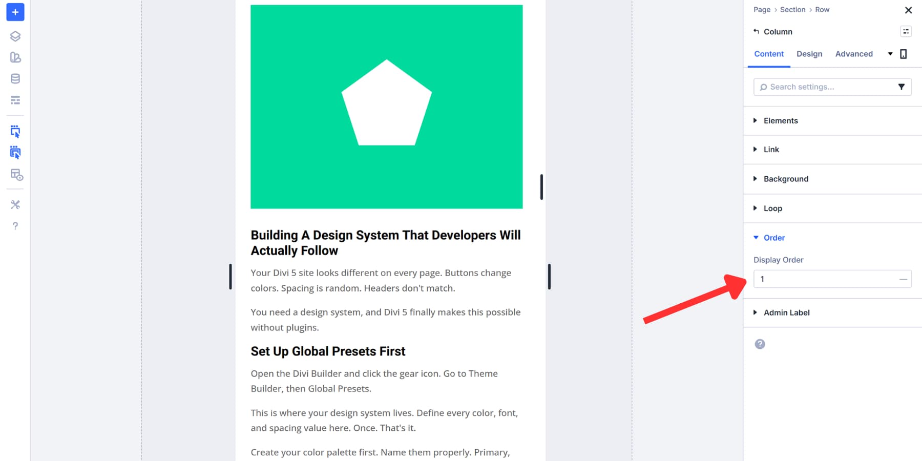
However, this can sometimes disrupt the content flow, as it pushes the main content far below, especially if your sidebars are filled with modules. To address this, you may open each column’s settings and find the Order tab. Adjust the order values to control the sequence. Set your center column to 1, left sidebar to 2, and right sidebar to 3. Columns will reorder on mobile without affecting desktop.
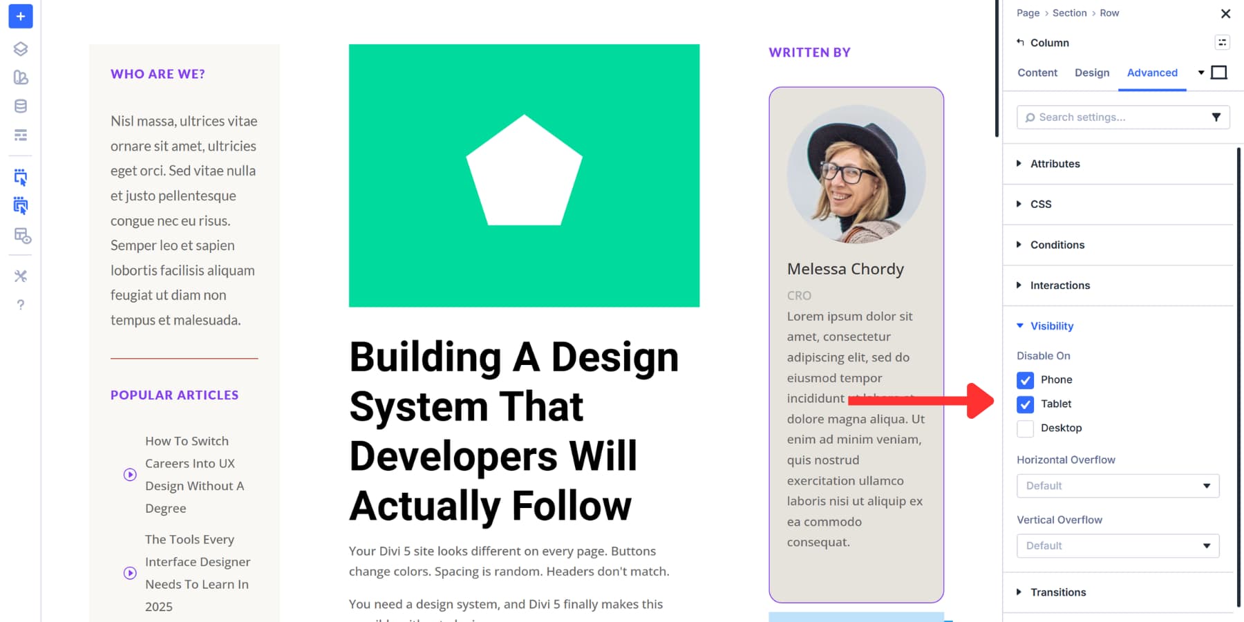
Lastly, if needed, you can always hide modules on mobile devices and tablets by going to Advanced > Visibility. This could be useful to make the main content appear quickly on certain devices.
Your Holy Grail layout requires a header at the top and a footer at the bottom. Divi’s Theme Builder takes care of everything that shows up across multiple pages. You build a header once and it appears on every page automatically. The same applies to footers, blog post layouts, product pages, and any other template you need to use sitewide.
Head to Divi > Theme Builder in your WordPress dashboard. You’ll see the default template sitting there at the top. Click Add Global Header or Add Global Footer, and the Visual Builder opens up just like when you built that three-column grid earlier.
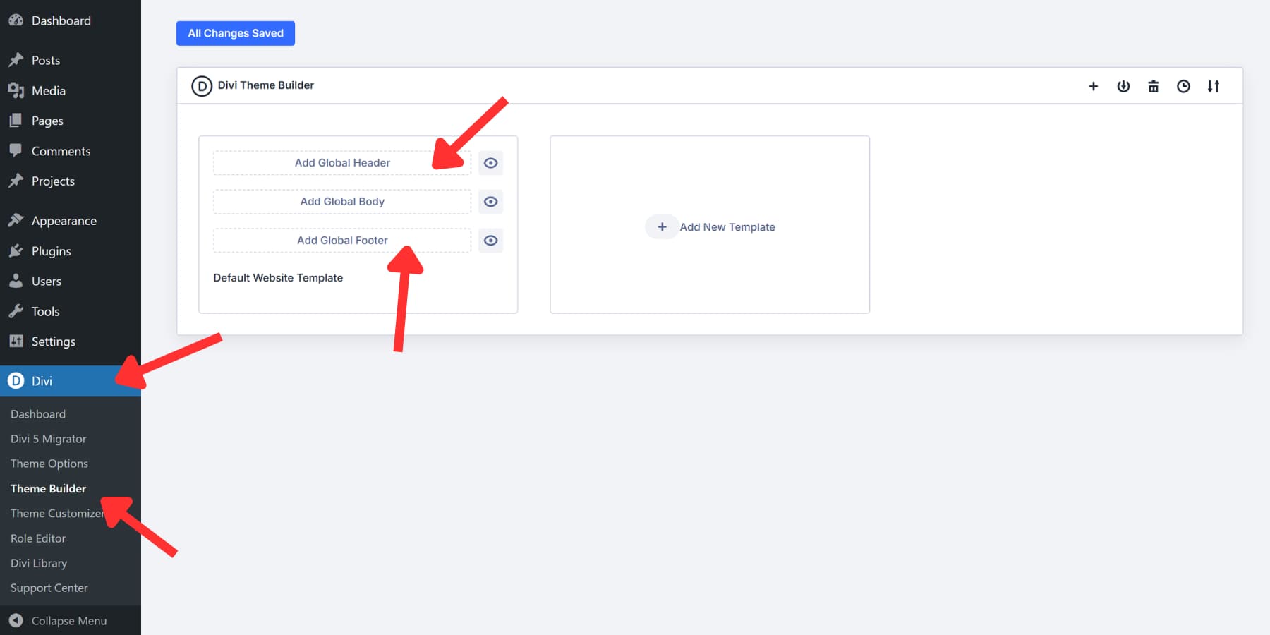
Drop in your menu modules, logos, social icons, and contact buttons. Style them however you want.
The footer works the same way.
And just like that, the layout once considered arduous is now just a matter of a few clicks with Divi 5.
Here’s where it gets useful. That Holy Grail structure you just built can become your actual blog post template. Create a new template, assign it to All Posts, and add a Post Content module right in your center column.
Now every blog post you publish fills that center space while your sidebars hold navigation and widgets exactly where you placed them.
You can also specify where templates appear. Display one header on your homepage and swap it out for something different on shop pages. Build custom layouts for WooCommerce products or category archives. Set conditions to display templates only on specific post types, exclude them from certain pages, or target individual categories and tags.
Try CSS Grid In Divi 5 Today!
The Holy Grail layout tested developers’ patience for years. Getting those three columns to behave took real skill and patience.
Well, luckily, you have Divi 5‘s Grid System. You get column layouts, responsive stacking, custom proportions, and precise control over every aspect of your design. The Visual Builder shows your changes live.
Everything we walked through here works without requiring any code changes. Build what used to take hours of CSS in just minutes with Divi 5.


Leave A Reply