
Divi 5 lets you style forms as part of a larger design system instead of repeating the same decisions in every module.
With new form field options, dedicated Input, Checkbox, and Radio option groups, focus and checked states, Design Variables, and the Preset Manager, you can style form fields once and reuse those decisions across your site.
In this tutorial, we’ll build a reusable form styling system in Divi 5. You’ll style inputs, checkboxes, radio buttons, focus states, checked states, and form buttons, then save everything as presets you can manage from one place.
- 1 Build A Reusable Form Styling System In Divi 5
-
2
Building And Styling Forms In Divi 5
- 2.1 Add A Contact Form Module In Divi 5
- 2.2 Set Up Your Input Field Styles
- 2.3 Style Your Checkboxes And Radio Buttons
- 2.4 Configure Focus And Checked States
- 2.5 Save Field Styles As Option Group Presets
- 2.6 Save The Complete Module As An Element Preset
- 2.7 Apply Your Saved Presets To The Email Optin Module
- 2.8 Use One-Off Overrides Carefully
- 2.9 Migrate Existing Forms With The Inspector
- 2.10 Make Changes In The Preset Manager
- 2.11 A Practical Preset Structure For Site-Wide Forms
- 2.12 Go Deeper With Composable Settings And Nested Presets
- 2.13 Bonus: Style Your Contact Form 7 Module
- 3 Build Your Forms In Divi 5 Today!
Build A Reusable Form Styling System In Divi 5
Divi 5 changes how form styling is structured.
Previously, Divi form modules used a single Field option group, and the available controls could vary depending on the module or field type. Divi 5 replaces that older structure with dedicated Input, Checkbox, and Radio option groups.
That gives each field type its own styling controls. Inputs can have their own background, border, spacing, typography, label text, and placeholder text controls where those elements apply.
Checkboxes and radio buttons can also be styled as their own field types. As a result, they can match the rest of your form design without relying on custom CSS for common styling decisions.
Divi 5 also adds focus and checked editing states for form fields. Focus controls how a field looks when someone clicks into it. Checked controls how checkboxes and radio buttons look when selected.
In addition, the Contact Form 7 module brings the same general styling workflow to CF7 forms. Existing Contact Form 7 forms can be rendered and styled inside Divi instead of being handled separately with custom CSS.
How The System Works
Form styling becomes much more powerful when it connects to Divi 5’s preset system.
Element Presets handle the full module. Once you style a Contact Form module, you can save the complete module design as an Element Preset.
That preset can include spacing, typography, button styling, field styling, and other module-level settings. Then, when you add another Contact Form later, you can apply the preset and start from the same design foundation.
Option Group Presets handle reusable style groups. Input, Checkbox, and Radio option groups support presets, so you can save field styles once and apply them across compatible form-based modules.
This is the layer that keeps your actual field design consistent across different form types.
Design Variables make the system easier to maintain. For example, use a color variable for your input border, a number variable for spacing, and a font variable for labels.
When the variable changes, every preset that uses it follows.
The scalable workflow looks like this:
- Design Variables store reusable values like colors, spacing, fonts, links, and images.
- Option Group Presets apply those values to reusable style groups like inputs, borders, buttons, and spacing.
- Element Presets save complete module designs that can include those option group presets.
- The Preset Manager lets you find, edit, reorder, import, and export those presets from one place.
Building And Styling Forms In Divi 5
The best way to understand the workflow is to build it once.
Start with a Contact Form module. Then, style the field groups, save those styles as presets, and reuse them across other forms.
By the end, you will have a form system instead of a one-off form design.
Add A Contact Form Module In Divi 5
Open a page in the Visual Builder, add a row, and click the plus icon to open the module picker. Search for “Contact Form” and insert the module.
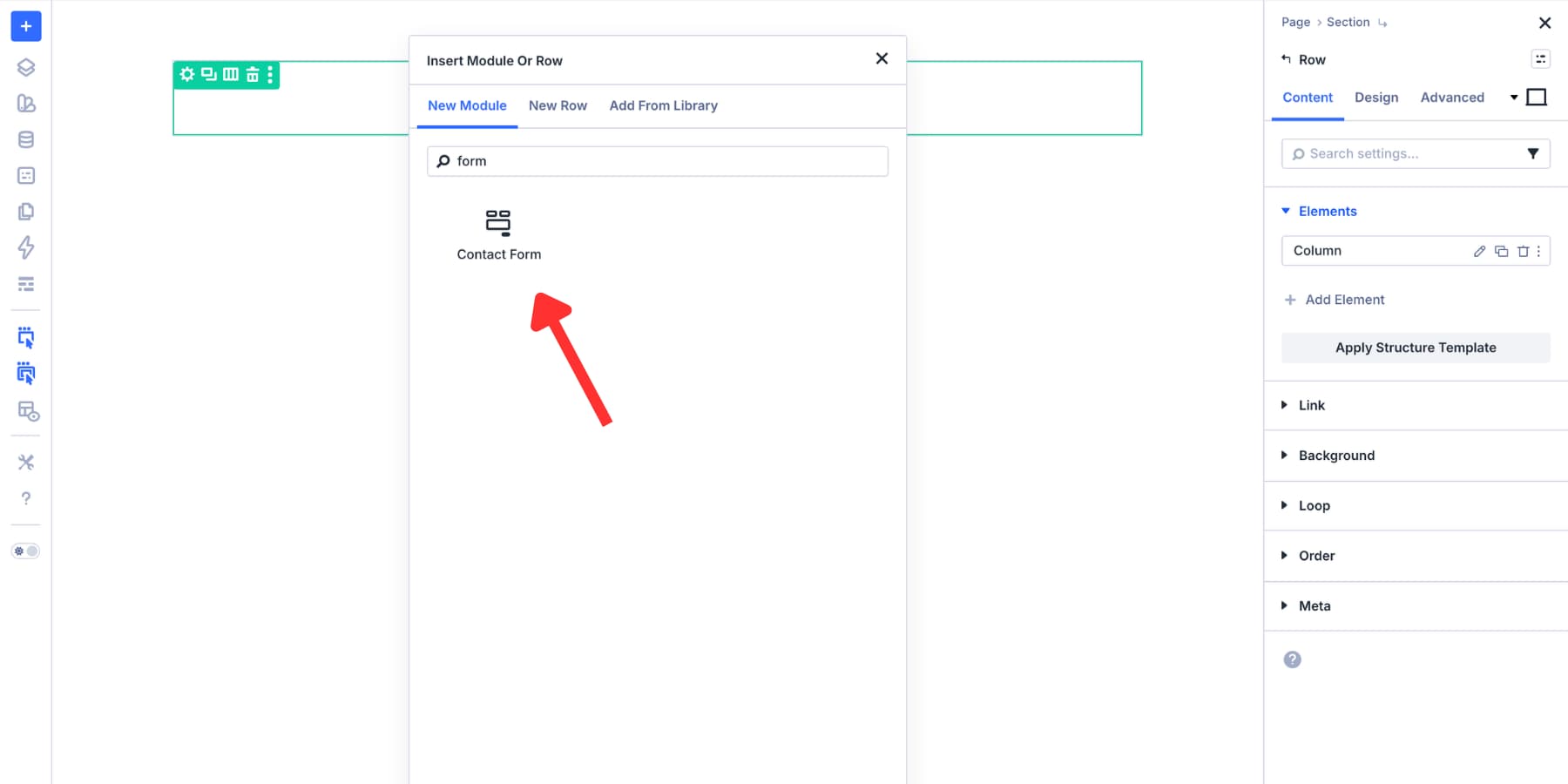
Divi adds a starting form to the page. From there, open the module settings and go to the Content tab. Next, click Add New Field.
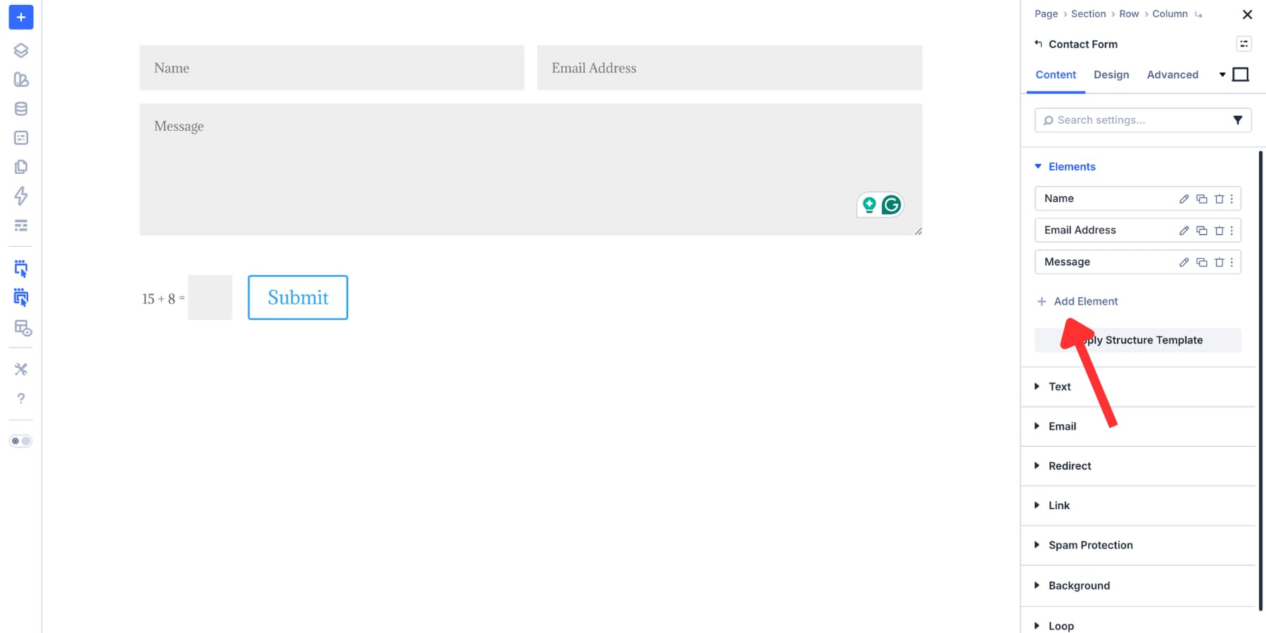
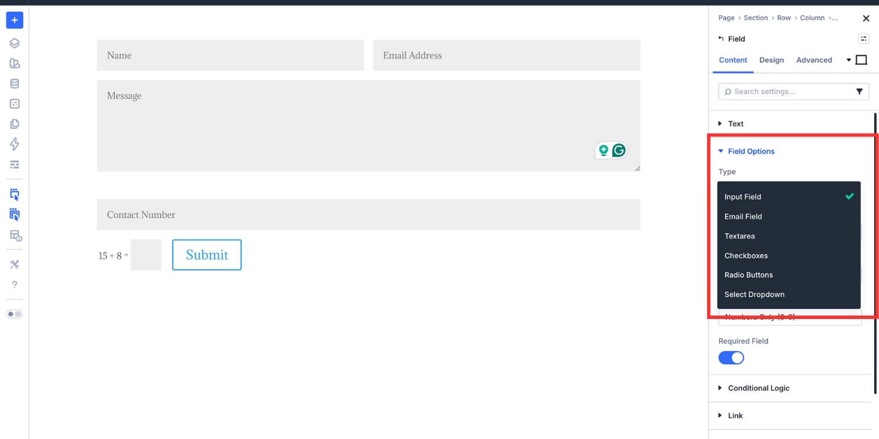
Choose the field option.
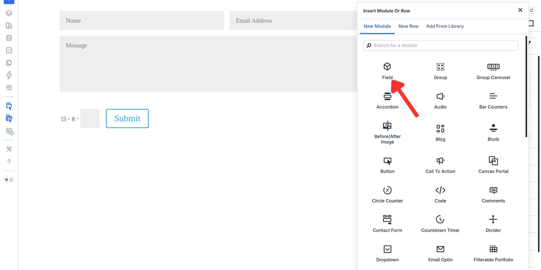
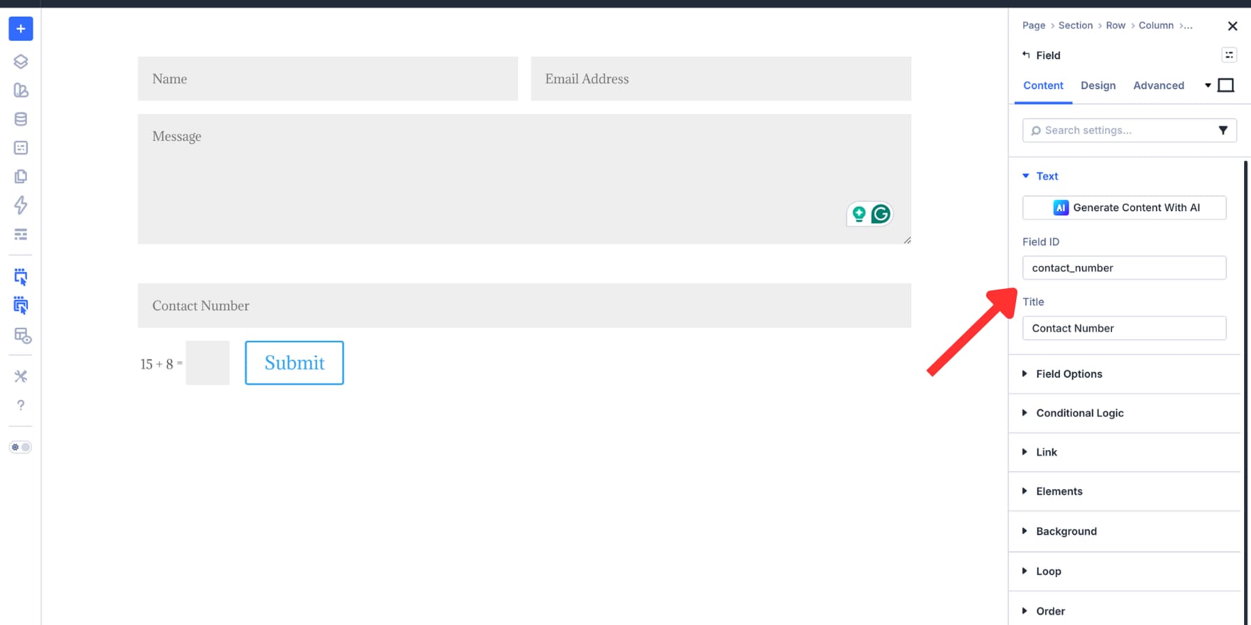
Each field needs a Field ID and a Title. The Field ID is the backend reference, so keep it simple and consistent.
Use lowercase characters and underscores instead of spaces, such as “phone_number” or “project_budget.” The Title is the visible label, so write it for humans.
After naming the field, use the Field Type dropdown under Field Options to choose what the field collects.
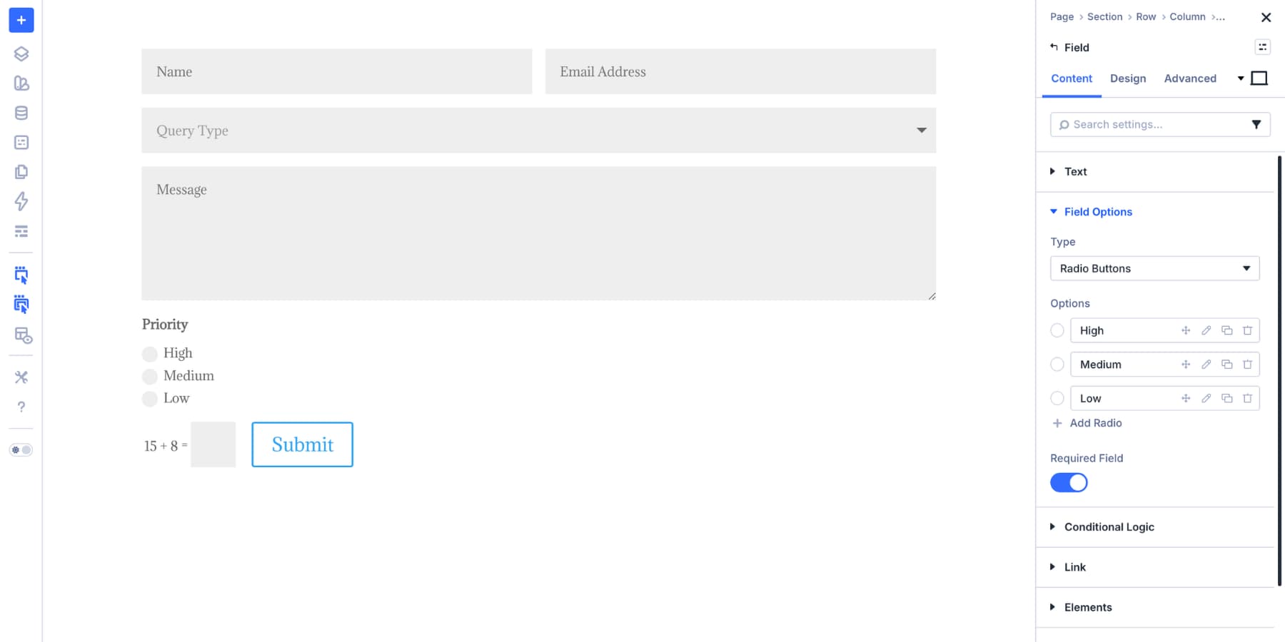
Common field types include Input for short text, Email for email addresses, Textarea for longer messages, Checkboxes when multiple selections are allowed, Radio Buttons when one answer should be selected, and Select Dropdown when a list would take up too much vertical space.
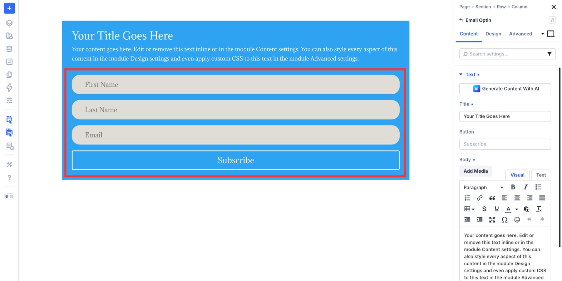
For this example, build a simple contact form with name, email, message, query type, and priority fields.
Set Up Your Input Field Styles
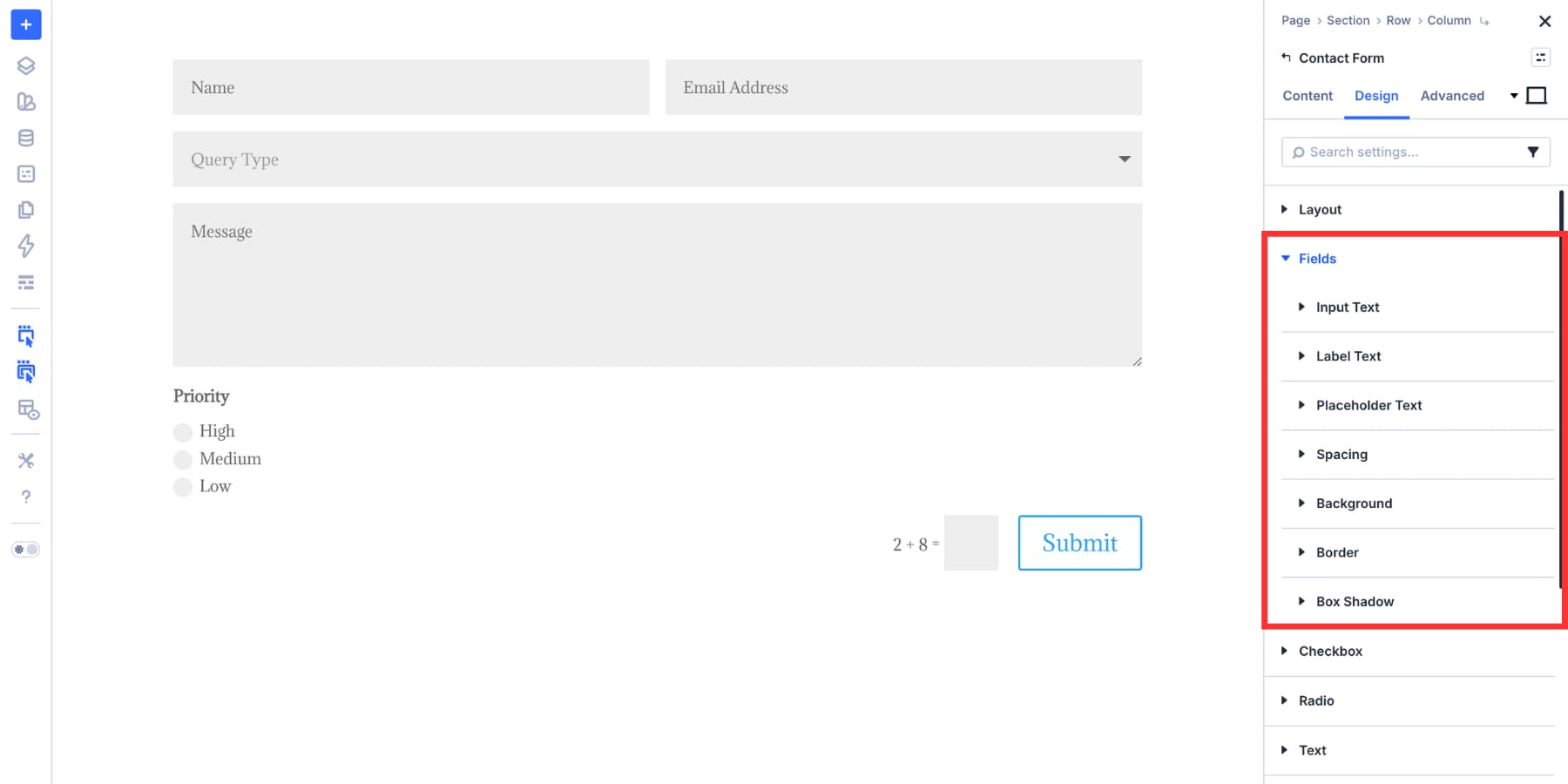
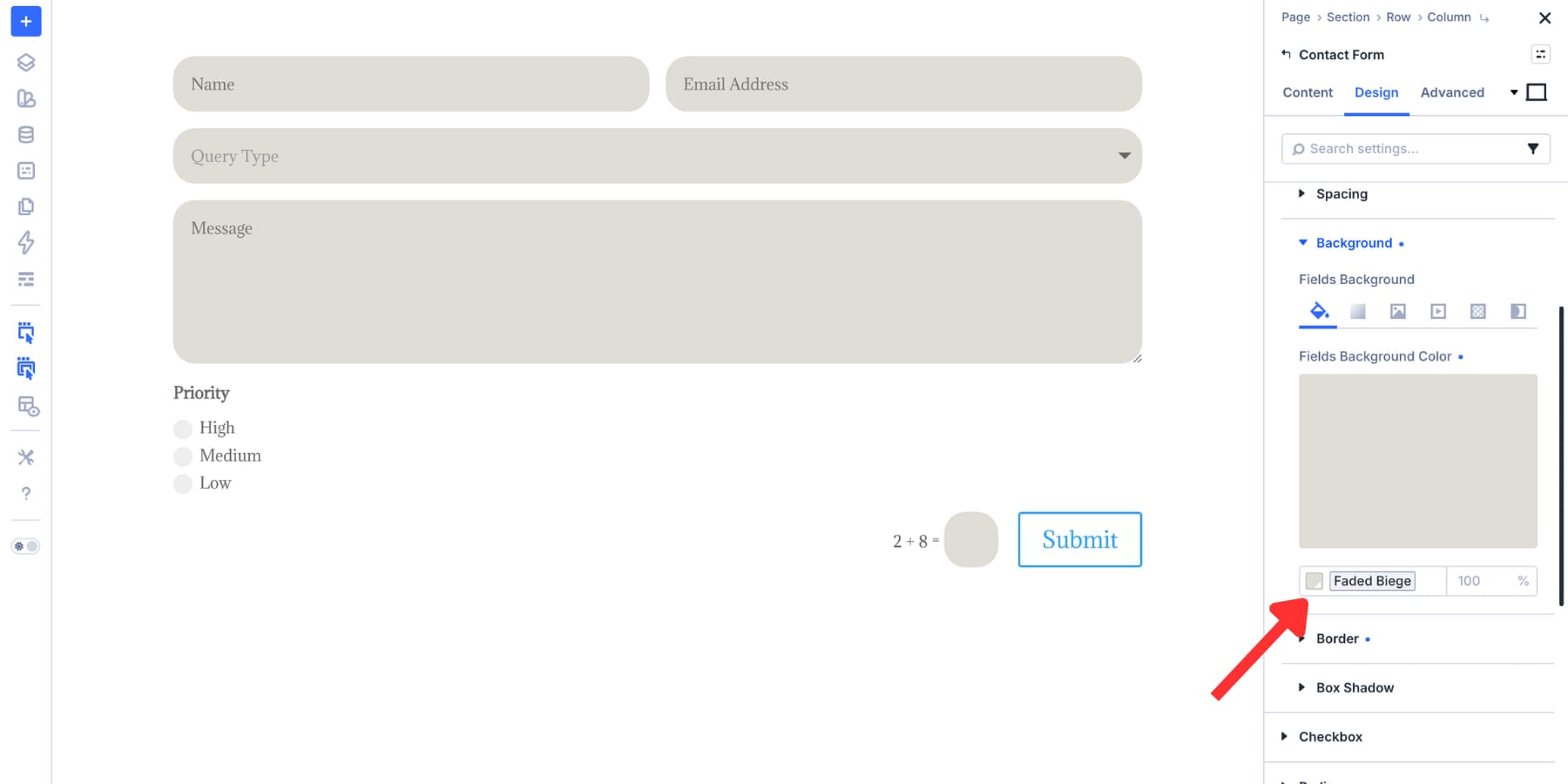
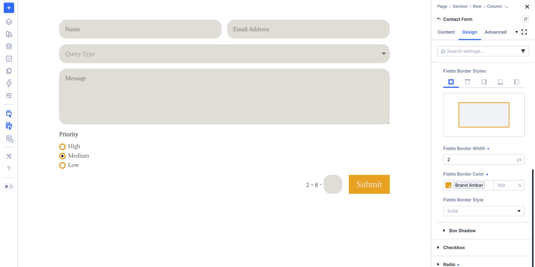
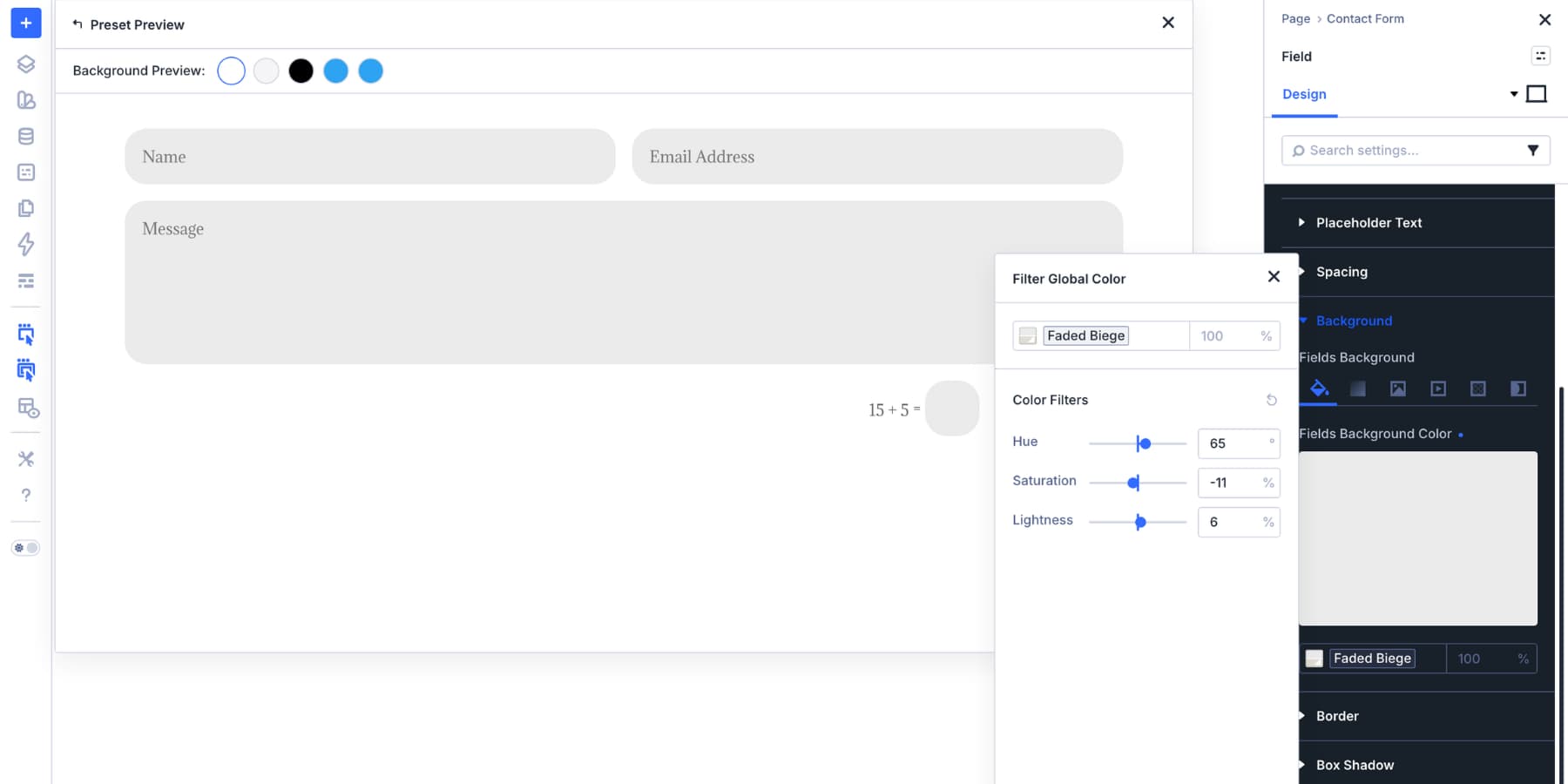
The Input option group in the Design tab is the starting point for standard text fields. Start with the field container. Background, border, and border radius define the base shape of the input.
A clear background gives the field structure. Meanwhile, a border defines its edge, and a consistent radius helps it match the rest of your design system.
This is a good place to use Design Variables. Use one color variable for the field background and another for the default border.
If your brand colors change later, update the variables instead of editing each form manually.
Next, style the text layers. Input Text controls what visitors type. Label Text controls the visible field titles. Placeholder Text controls hint text inside the field where placeholders are used.
Keep labels clear and readable. Also, do not rely on placeholder text alone to explain what a field is for because placeholder text disappears once someone starts typing.
Use placeholder text as a helper, not as the only label.
Finally, set spacing. Input padding determines whether the form feels open and comfortable or tight and cramped.
If your site uses number variables for spacing, use the same spacing scale for form fields. As a result, they will feel connected to your buttons, cards, sections, and other interface elements.
Checkboxes and radio buttons behave differently from text inputs. They are smaller, state-based controls, so the design needs to make selection obvious.
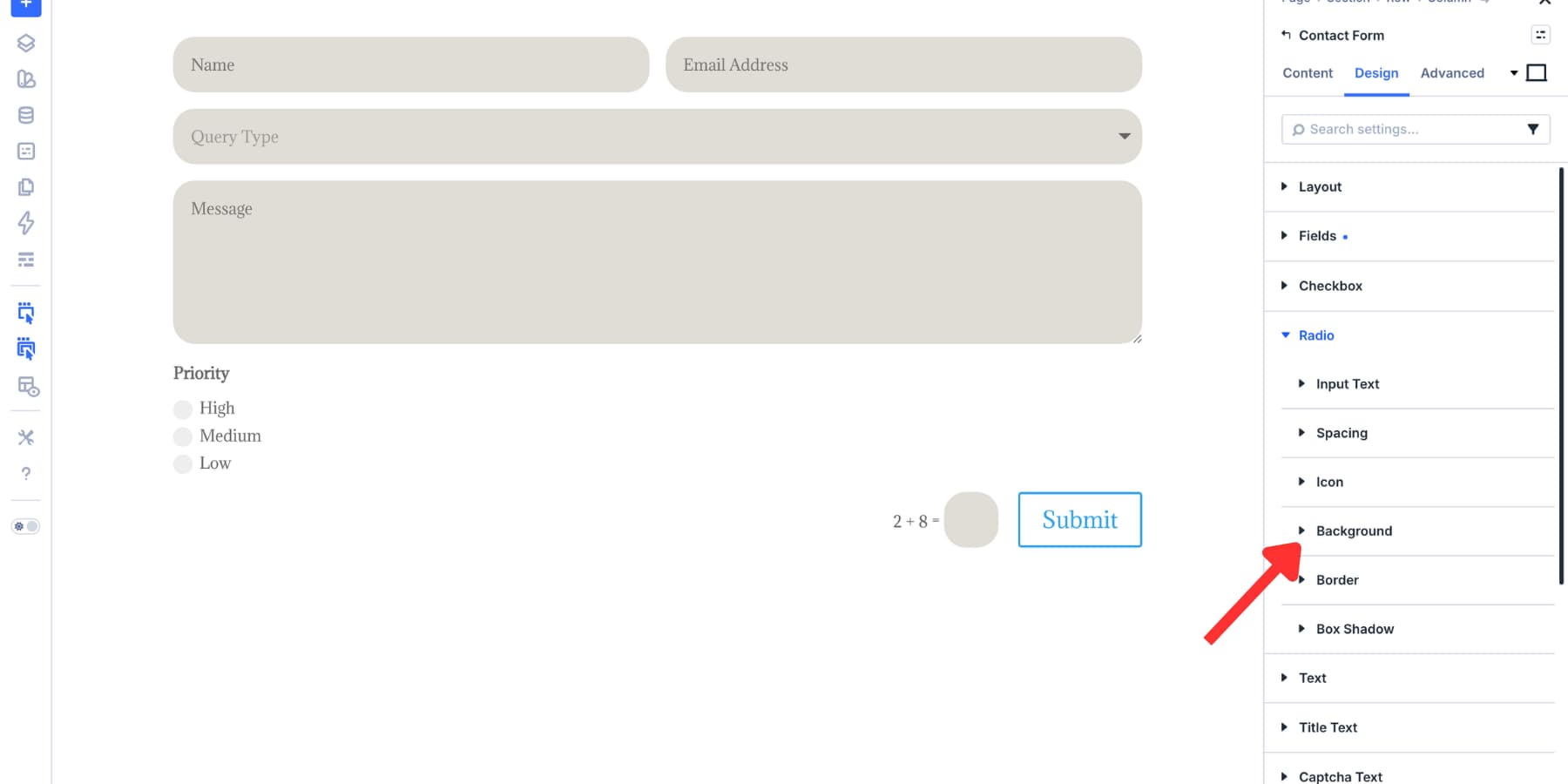
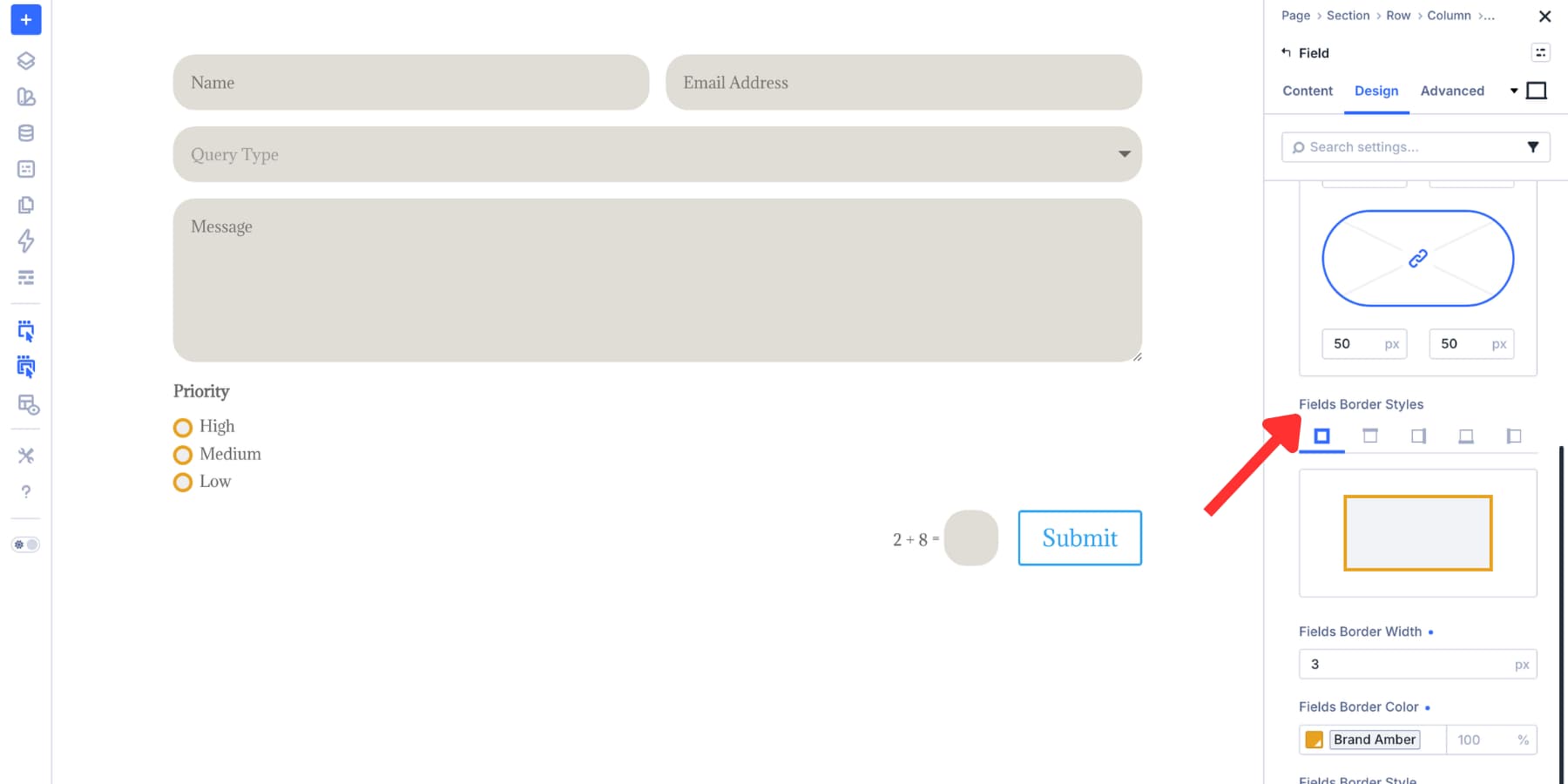
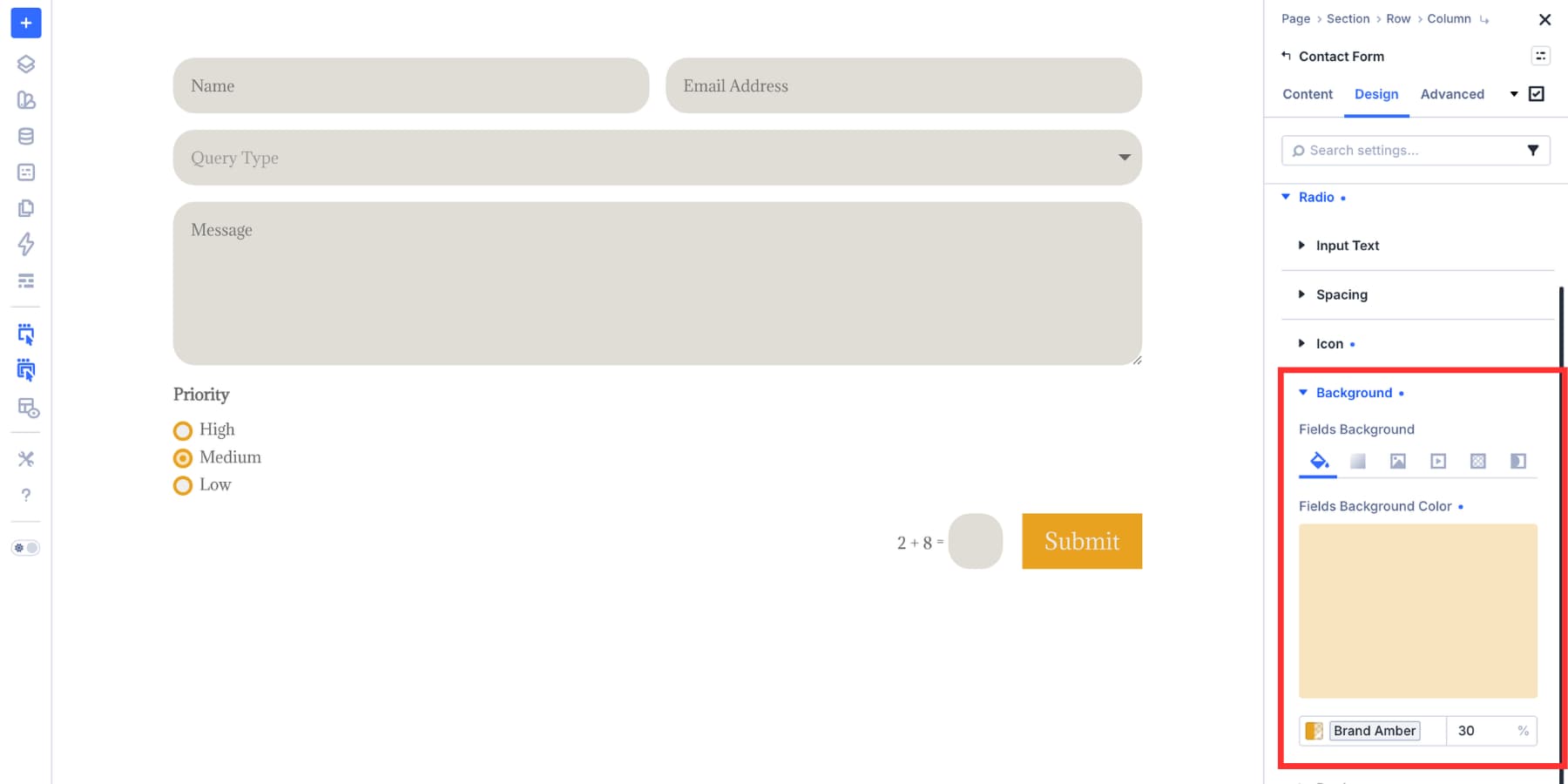
Open the Checkbox and Radio option groups in the Design tab. Their structure follows the same design-system logic as Input, but the most important decisions are size, shape, border, selected color, and label readability.
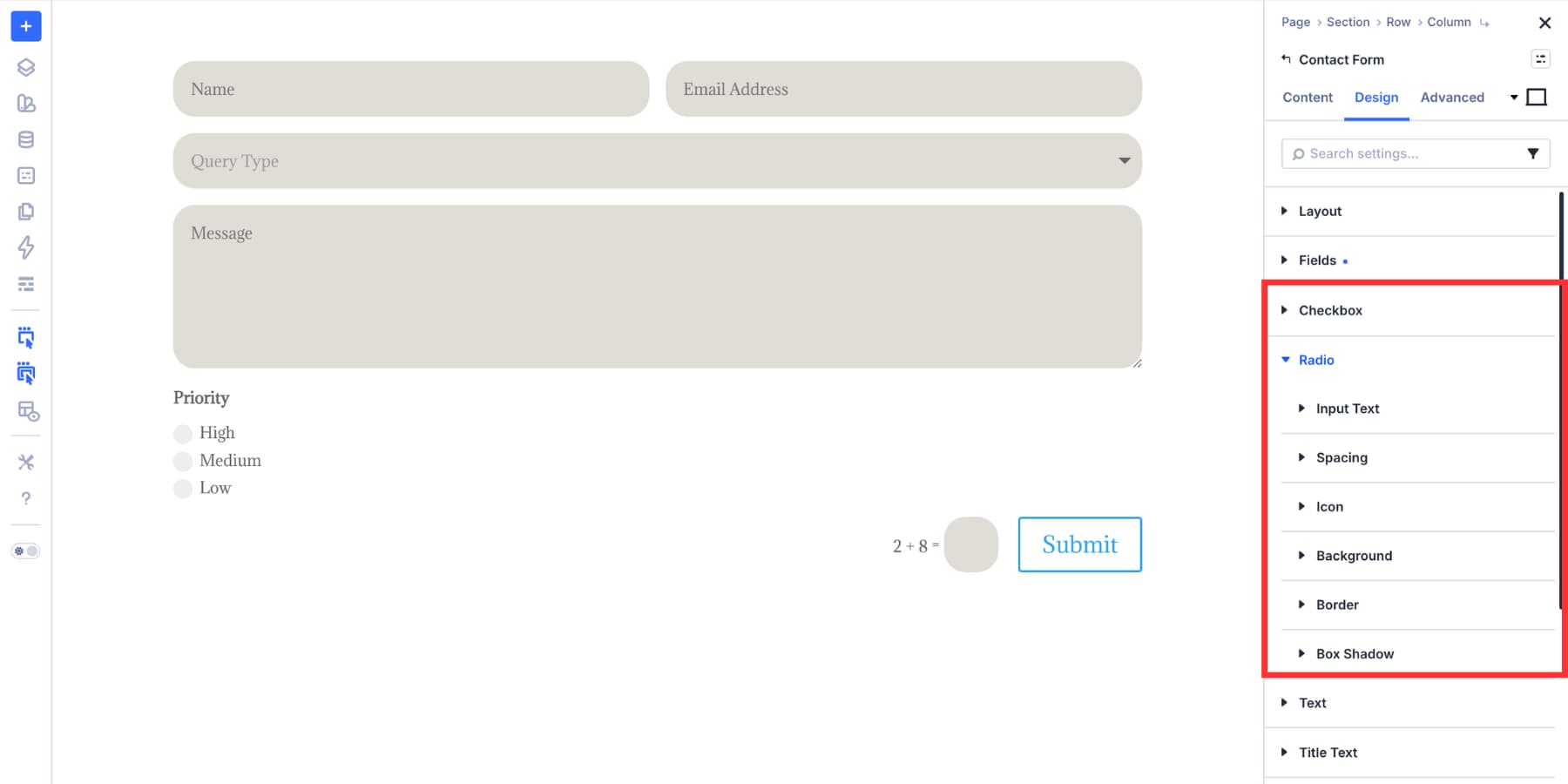
Use the background and indicator controls to define the selected state clearly. A selected checkbox or radio button should be easy to identify at a glance.
Next, use border radius to match the visual language of your site. Checkboxes can stay squared, become softly rounded, or take on a more pill-like shape.
Radio buttons should remain visually distinct from checkboxes. That way, visitors can quickly understand the difference between multiple-choice and single-choice inputs.
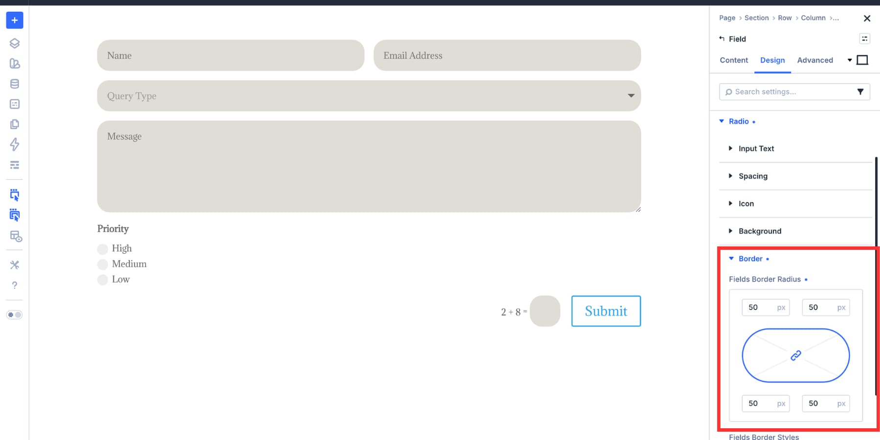
Because these controls are small, border width has a bigger visual impact than it does on a full text input. Test it carefully. A border that feels subtle on an input can feel heavy on a checkbox.
Configure Focus And Checked States
A form is not finished when it looks good at rest. It also needs to look good when someone interacts with it.
Focus and checked states are where that happens.
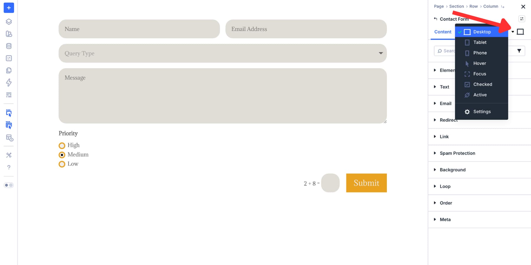
Use the state switcher in the settings panel to move from the default state into Focus or Checked. Focus styles apply when a visitor activates a field. Checked styles apply when a checkbox or radio button is selected.
For Focus, start with the input border. A focused border in your primary brand color is one of the clearest ways to show where the visitor is in the form.
A subtle background change can also help. However, keep it restrained. The goal is to guide the visitor, not distract them.
For Checked, style the selected checkbox or radio button so the state is unmistakable. A brand-colored fill paired with a contrasting indicator usually works well.
However, avoid relying on color alone if the difference between selected and unselected is too subtle.
Focus and checked styles build on top of your default field styles. Therefore, you only need to define what changes in that interaction state.
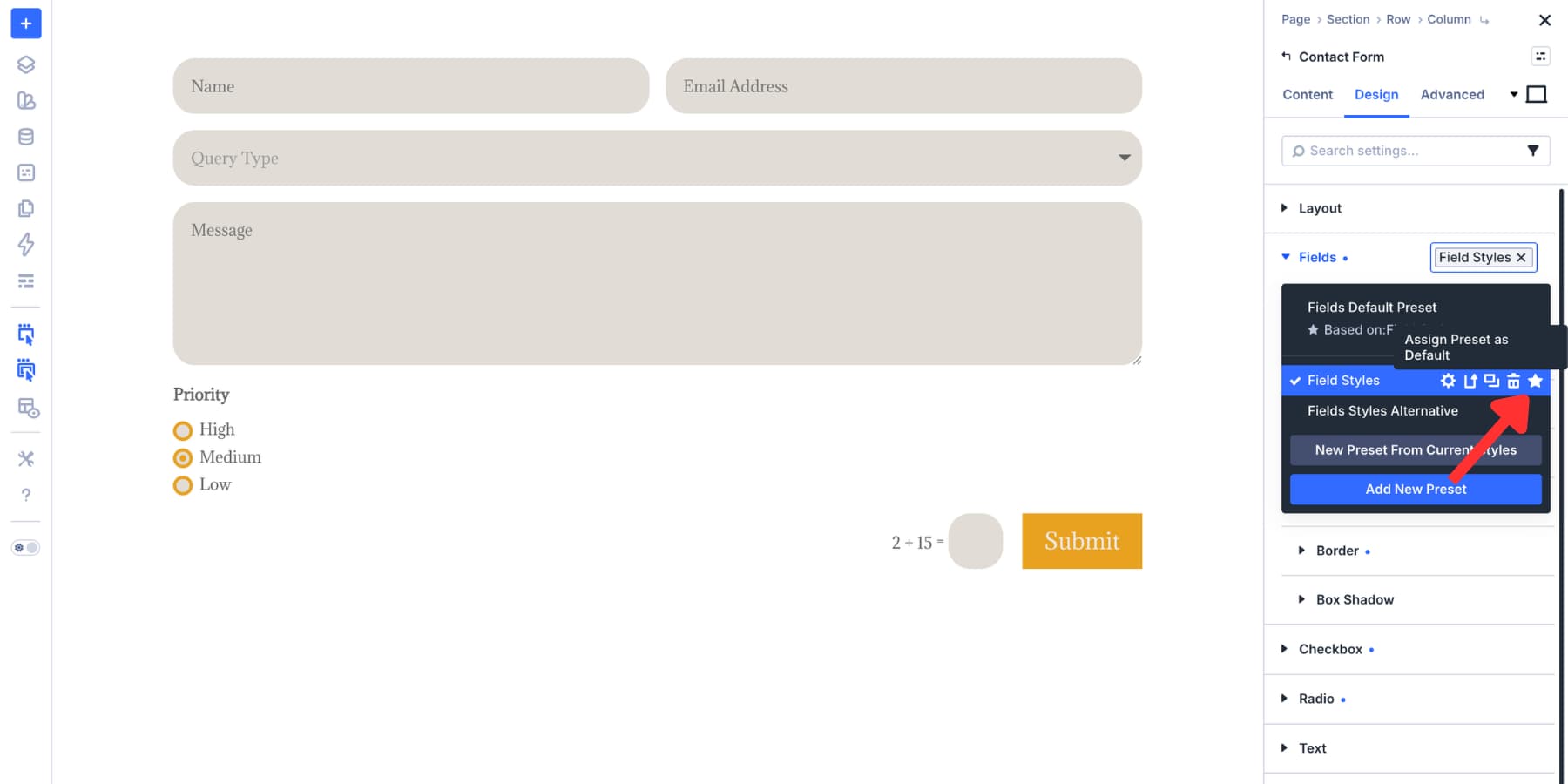
Save Field Styles As Option Group Presets
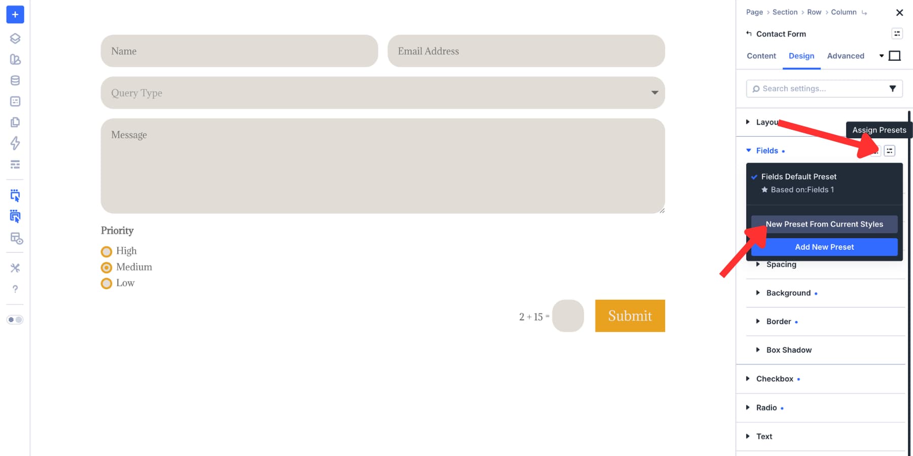
At this point, the form looks consistent, but the styles still live on one module. Option Group Presets turn those styles into reusable field presets.
To create one, hover over the Input, Checkbox, or Radio option group header in the Design tab. Then, click the preset icon, choose “New Preset From Current Styles,” and name the preset clearly.
Good preset names are descriptive:
- Form Input Default
- Form Input Focus
- Site Checkbox Default
- Site Radio Default
- Compact Form Input
- Dark Form Input
If a preset should be the starting style for future modules, set it as the default preset for that option group. New compatible form fields can then start from that base style automatically.
Option Group Presets are reusable across compatible option groups. That distinction matters.
For example, a border preset can be reused anywhere the same border option group exists. A spacing preset can be reused anywhere the same spacing group exists.
In other words, the preset follows the option group, not the original module.
Save The Complete Module As An Element Preset
Option Group Presets handle reusable parts. Element Presets handle the complete module.
After styling the Contact Form module, open the module preset dropdown at the top of the settings panel. Choose “New Preset From Current Styles” and name it something like “Primary Contact Form.”
Use Element Presets for the full form design. That includes field presets, button styling, spacing, typography, layout choices, and any other module-level decisions.
Use Option Group Presets for reusable pieces. These can include input styles, checkbox styles, radio styles, borders, spacing, buttons, and other groups you want to share across modules.
Together, they give you a layered system. Design Variables define the values. Option Group Presets reuse the style groups. Element Presets package complete form modules.
Apply Your Saved Presets To The Email Optin Module
Now add an Email Optin module to the page. If your Input preset is set as the default for that option group, the module can already inherit the same field styling.
If you did not set the preset as default, apply it manually.
Open the Email Optin module settings, go to the Design tab, find the field option group, open the preset menu, and choose your saved input preset.
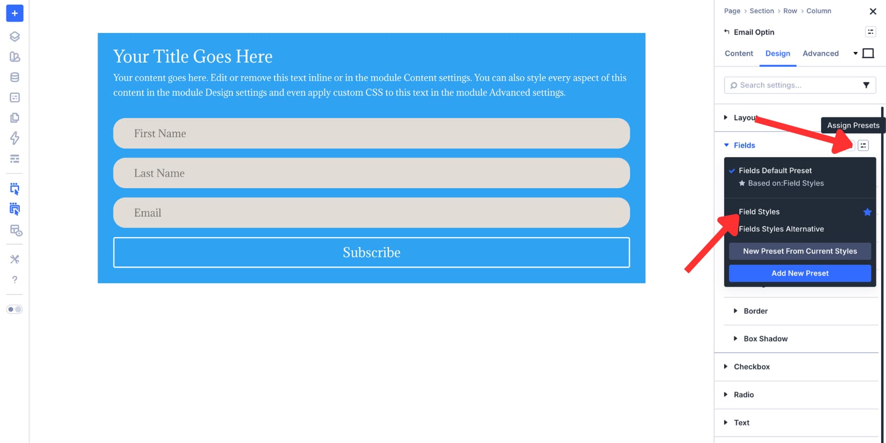
The Email Optin module now shares the same input background, border, border radius, typography, spacing, and focus state as the Contact Form.
When you update the preset later, both modules follow.
Use the same workflow for other compatible form-based modules. The goal is not to restyle every form by hand. Instead, the goal is to connect them to the same reusable field system.
Use One-Off Overrides Carefully
Presets do not lock you in. If one form needs a unique border color, extra spacing, or a different background, you can override that value directly on the module.
However, use overrides for true exceptions, not routine variations.
If you repeat the same override more than once, turn it into a new preset. That keeps your system clean and prevents hidden one-off styles from spreading across the site.
Migrate Existing Forms With The Inspector
If your site already has forms with static values, use the Inspector to bring them into your new design system.
Right-click a section, row, or module in the Visual Builder and choose Inspect. The Inspector shows modified values such as colors, spacing, fonts, media, and presets, so you can identify what has been customized.
From there, replace static values with Design Variables or apply presets where appropriate. For example, if several forms use the same hardcoded border color, replace that color with your field border variable.
If a form has custom input spacing, replace it with your input spacing preset. This is especially useful when updating older layouts or imported layouts that were not built from your current design system.
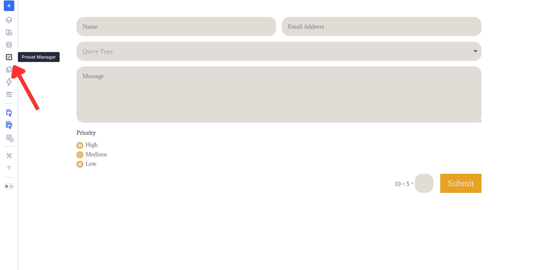
Make Changes In The Preset Manager
Saving presets inside a module is fast. However, the Preset Manager is better once the system grows.
Open the Visual Builder and click the Preset Manager icon in the left sidebar.
The Preset Manager lists your presets in one place. Use the Element tab for full module presets and the Group tab for Option Group Presets.
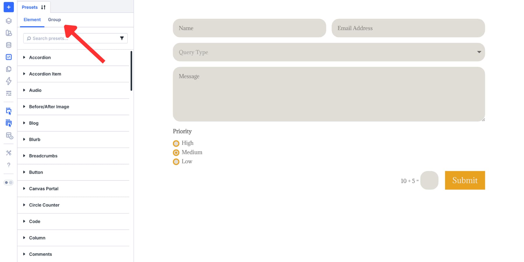
Search for terms like “Form Input,” “Contact Form,” or “Checkbox” to find your form presets quickly. You can also filter by module type.
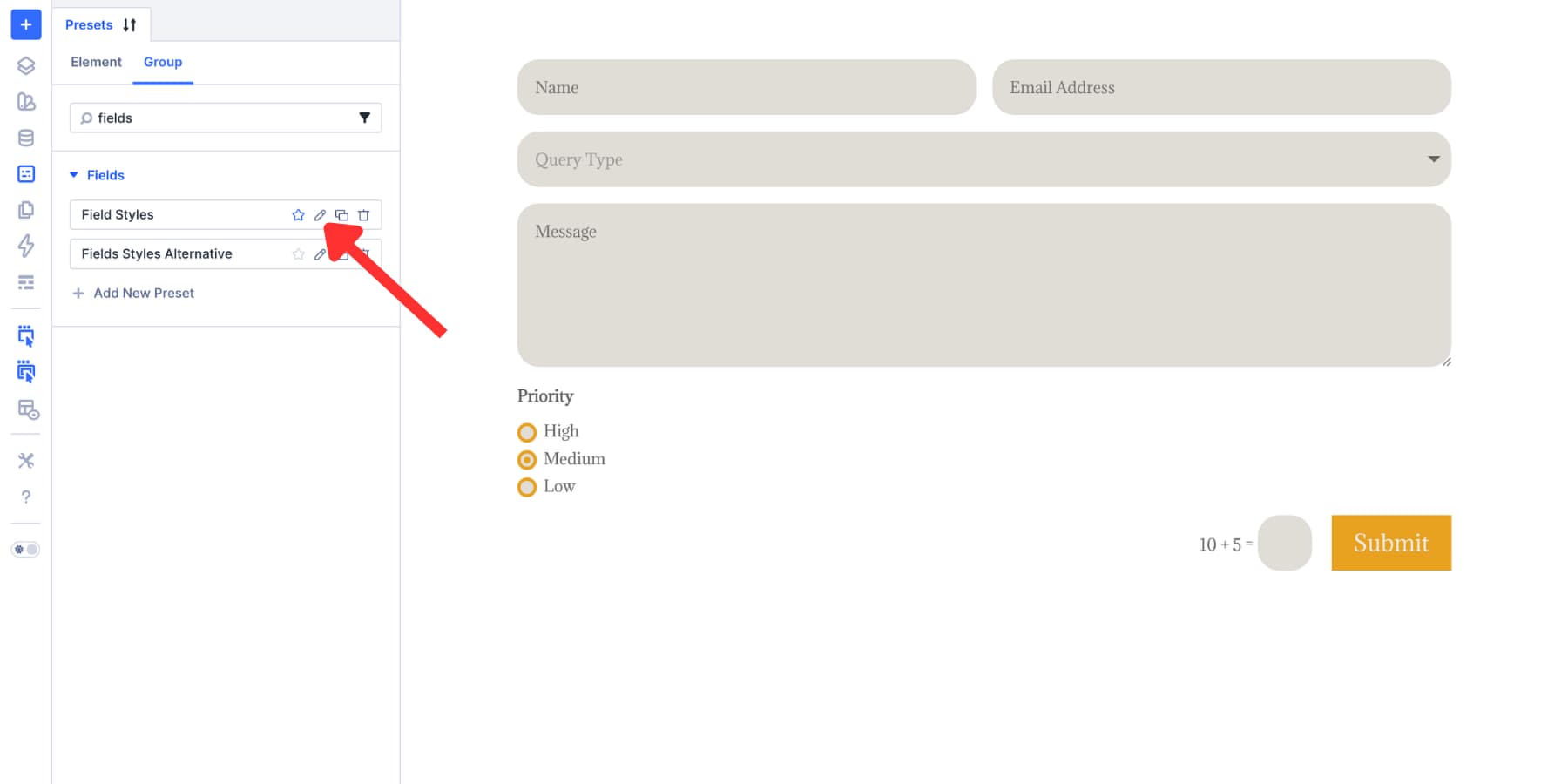
Click the Edit Preset icon to open the preset preview. Make your changes, save the preset, and every element or option group using that preset updates.
You can also reorder presets inside the Preset Manager. Put the presets you use most often near the top, and they will be easier to find inside module preset dropdowns.
A Practical Preset Structure For Site-Wide Forms
For a real website, keep the preset system simple enough that other people can understand it.
A good starting structure looks like this:
- Color Variables: Primary, Accent, Field Background, Field Border, Field Border Focus, Text, Muted Text, Error
- Number Variables: Field Padding, Field Radius, Field Gap, Button Radius
- Input Presets: Form Input Default, Form Input Compact, Form Input Dark
- Checkbox Presets: Site Checkbox Default, Site Checkbox Dark
- Radio Presets: Site Radio Default, Site Radio Dark
- Button Presets: Form Button Primary, Form Button Secondary
- Element Presets: Primary Contact Form, Compact Contact Form, Newsletter Optin, Login Form
This gives you room for variation without turning every form into a separate custom design.
Go Deeper With Composable Settings And Nested Presets
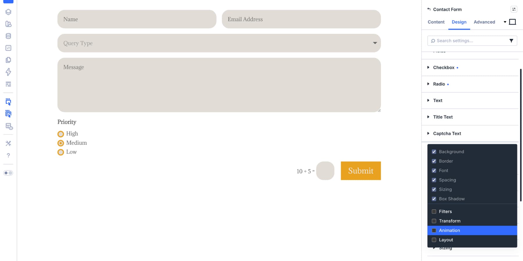
The Input, Checkbox, and Radio groups cover the fields. However, the submit button is another important part of the form.
Some sub-elements do not expose every design option by default. Composable Settings let you enable additional option groups for module sub-elements when you need more control.
Hover over the Button group header in the Design tab. Then, click the Toggle Options icon.
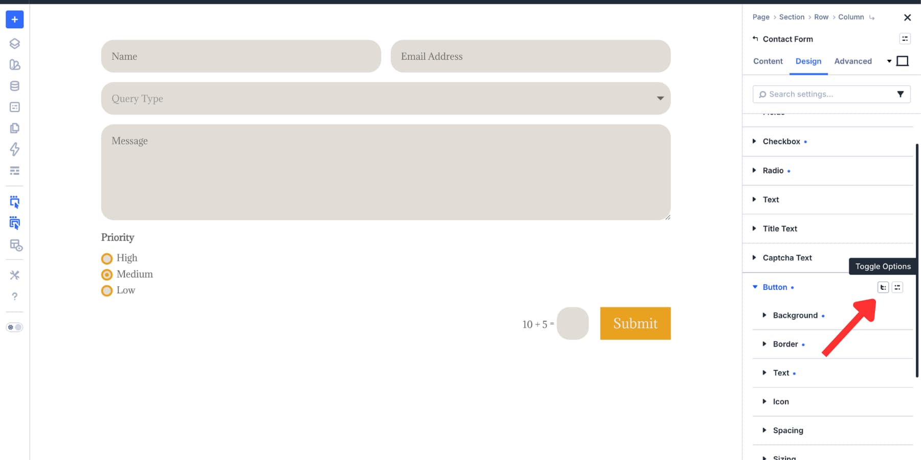
Enable the option groups you need, such as Sizing, Border, Transform, Box Shadow, or Animation. Those groups appear as nested options inside the Button group.
Style those nested groups the same way you would style any other option group. For example, a button border can use your brand border variable, your button radius variable, and a reusable border preset.
Once styled, nested option groups can support their own presets. Save a button border preset, nest it inside your button preset, and nest that button preset inside your Contact Form Element Preset.
That creates a deeper chain of control. Update the border preset, and every form button that uses it can follow without opening each form module.
Bonus: Style Your Contact Form 7 Module
Not every site uses Divi’s native Contact Form module. Many sites already rely on Contact Form 7, and rebuilding those forms only to match a new design system is not always practical.
Divi 5’s Contact Form 7 module helps bridge that gap.
Add the Contact Form 7 module from the module picker, choose the CF7 form you want to display, and style it from Divi’s Design tab.
The same general system applies. Use the Input, Checkbox, and Radio option groups where they apply. Then, use your saved Option Group Presets.
Design Variables can handle colors, spacing, and typography. In addition, focus and checked states can make interaction feel consistent.
This lets your CF7 forms live inside the same visual system as your Divi forms instead of feeling like a separate layer of the site.
Build Your Forms In Divi 5 Today!
A reusable form system starts with Design Variables, grows through Option Group Presets, and comes together with Element Presets. From there, the Preset Manager gives you one place to maintain the styles that power forms across your site.
That means you are not rebuilding the same input, checkbox, radio button, or form button styles every time you add a new form. You are applying a system that can scale with your site. Use the Inspector to bring older forms into that system. Then, use Composable Settings and nested presets when you need deeper control over sub-elements like buttons.
If you want every form on your site to feel consistent, polished, and easier to maintain, start building your form design system in Divi 5 today!


Leave A Reply