")
Canvases were recently introduced in Divi 5, providing detached workspaces for building off-canvas menus, staging areas, modal popups, and more.
Combine these Canvases with Interactions, and you have a complete system for controlling exactly how information flows while making your website interactive. That includes click triggers, scroll reveals, hover effects, and more.
Working together, these features give you a high level of control, and the setup is simpler than you might expect. In this post, we’ll show you how to wire everything together in Divi 5.
What Are Canvases In Divi 5?
Building modern websites means managing layers of content. Your main page layout, sure. But also popups, slide-out menus, modal windows, and other elements that appear on demand. Things get messy.
Canvases can give you separate workspaces for different parts of your design. Your page starts with a Main Canvas where your primary content lives. Then you can create additional Detached Canvases for slide-out menus, modal popups, sidebars, and newsletter forms. Each canvas can exist independently, keeping your builder interface clean.
These Detached Canvases can stay hidden in the Visual Builder. On the front end, canvas content is displayed once it’s appended to the Main Canvas (or when Divi automatically appends it when needed). No clutter. When someone visits your live site, the elements can appear when you trigger them.
You can make a canvas local or global. Local canvases are tied to a specific page or post. Global canvases can work across your entire site, so they’re good for sitewide navigation or reusable components like sitewide banners (like consent notices). Build it once, use it everywhere.
Canvases can work as staging areas too. Duplicate your Main Canvas to test design changes without touching your live page. Or create empty canvases to mess around with new layouts and preset combinations. You get space to experiment before you commit to anything.
What Are Canvas Portals?
The Canvas Portal Module lets you insert content from a Detached Canvas directly into a specific location on your Main Canvas or a Theme Builder template. You add the module to your Main Canvas, then select which Detached Canvas you want to display inside it.
This works like a window that shows content from another workspace. You might build a complex component in a Detached Canvas, then use portal modules to place that same component in multiple locations across your site. Update the content in the source canvas, and every portal displaying it updates automatically.
Portals work in both the Visual Builder and Theme Builder templates. You can drop them anywhere in your layout structure, treating them like any other module. The content they display inherits the styling and settings from its source canvas while sitting exactly where you place the portal.
A Quick Overview Of Interactions
Interactions are the control system that decides when and how your elements behave. The system consists of three interconnected components:
- Triggers detect events like clicks, hovers, scrolls, or page loads.
- Effects determine what happens next, such as showing elements, hiding them, applying style presets, and more.
- Targets specify which element receives the effect, whether that’s a module, row, column, section, or entire canvas.
You set this up inside the Advanced tab of any element. Add an interaction, pick your trigger, select an effect, and choose your target. Done. The interface uses dropdowns and clear labels, so you spend less time figuring out settings and more time building.
What makes Interactions useful is how you can combine triggers. A promotional banner might appear only after someone scrolls past your hero section, with a 5-second delay.
An image gallery could change layouts on hover and expand to full screen on click. You stack these behaviors to control exactly how visitors experience your content.
Pair Interactions with Canvases, and that stacking ability becomes even more powerful. Your Detached Canvases can appear on click, scroll, hover, or timed delays. Create a slide-out menu that triggers when a user clicks a button. Create modal popups that reveal themselves as visitors scroll past certain sections. The combination lets you control exactly when and how every part of your interface appears, all inside the Visual Builder without touching code.
Using Canvases And Interactions Together
Let’s put these together. We’re building a course overview that appears when someone hovers over a course card. This type of interaction feels professional because the information shows up exactly when visitors need it, without cluttering your main layout or requiring clicks.
It will also show you exactly how canvases, portals, and interactions connect in a real project. Let’s walk through the complete setup, step by step.
Creating A Detached Canvas
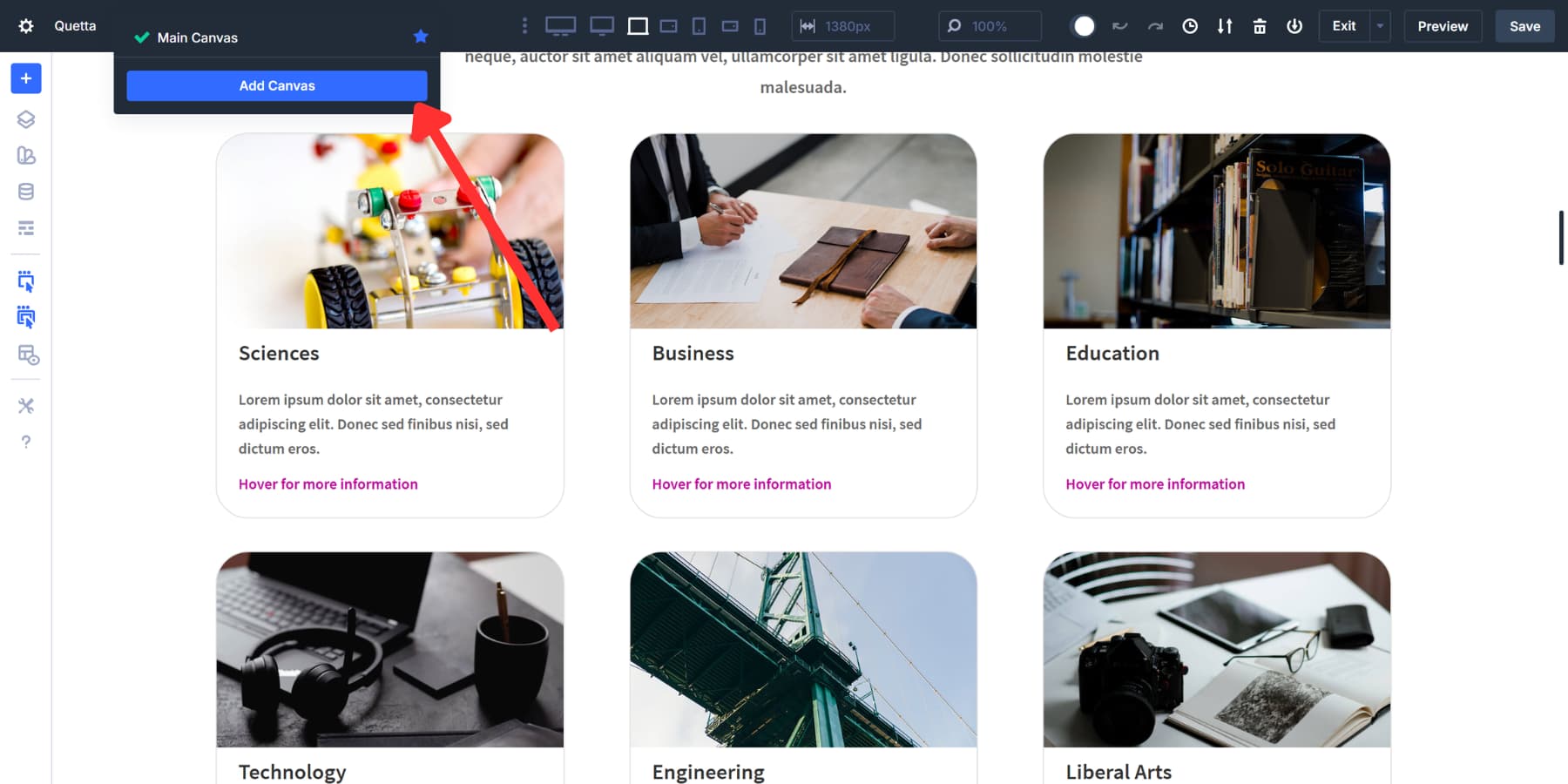
Look at the top of your Visual Builder. You’ll see the canvas dropdown menu right next to your page title.
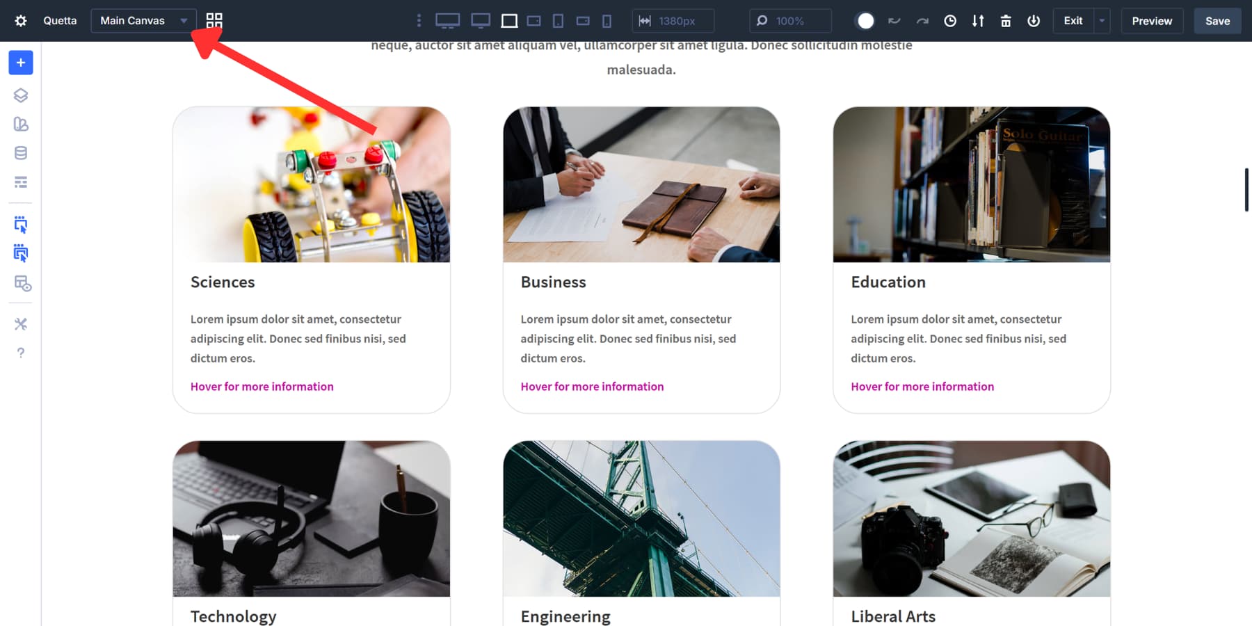
Click it, then hit the Add Canvas button.
Name this canvas something clear, such as “X Course Overview,” to avoid confusion, as there may be multiple course cards.
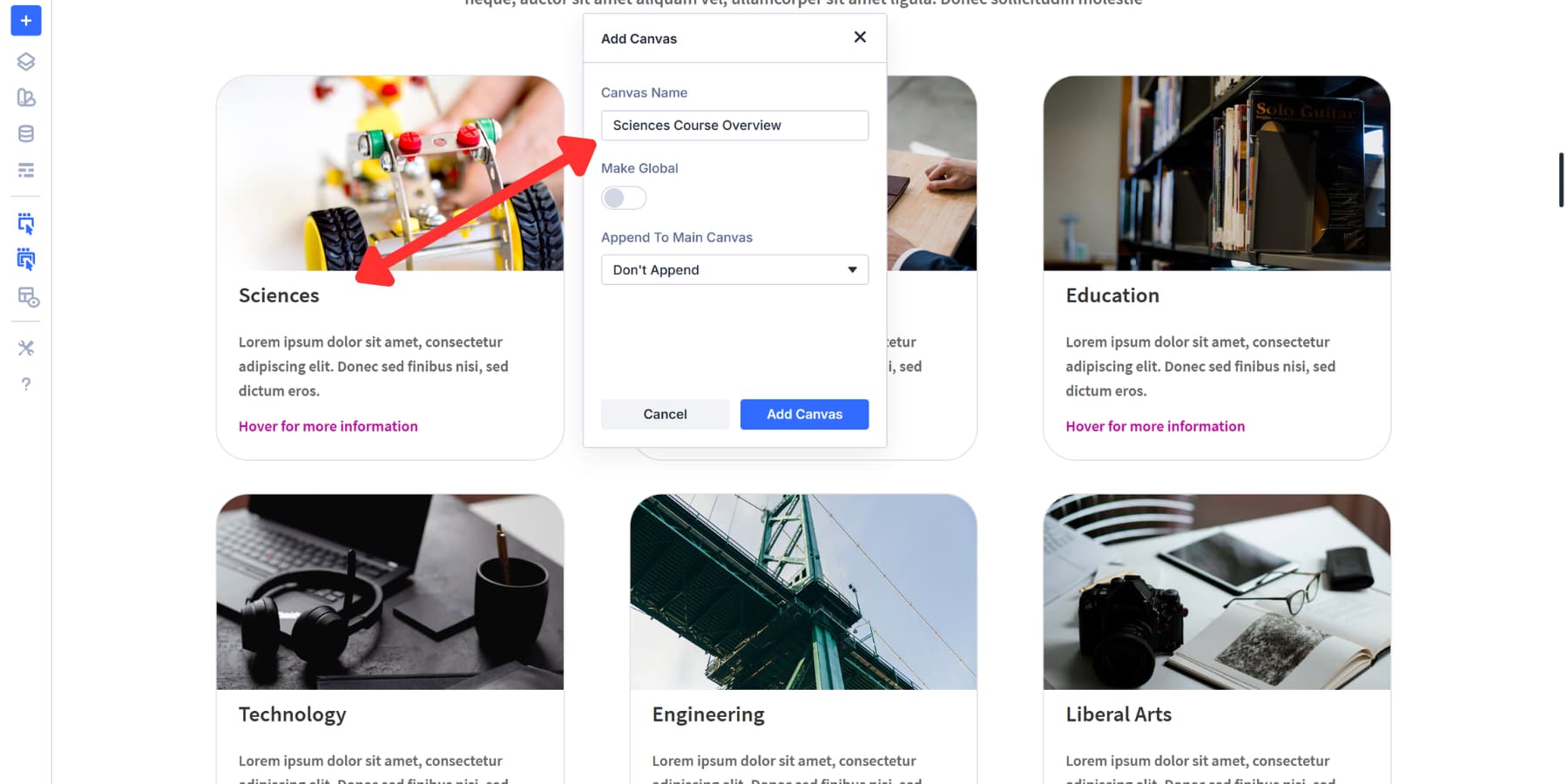
Keep this canvas local. Since we’re building a course overview that appears on a specific page with course cards, there’s no need to make it global. Local keeps it tied to this page only.
Turn on Append To Main Canvas. This setting makes your Detached Canvas show up on the front end of your site. Without it, visitors won’t see the course overview you’re about to build, no matter how good your interactions are. The canvas will exist in the builder but stay invisible on the live page.
Click Save. Your new Detached Canvas appears in the workspace, completely separate from your Main Canvas.
Building The Course Overview Content
Start by setting the background color of the section to transparent and the width to 350px. You can choose a width that suits your preference.
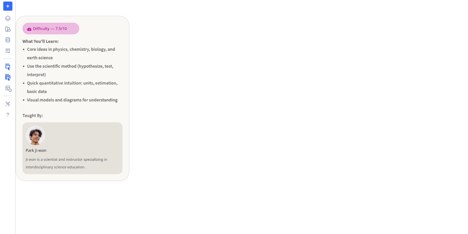
For this example, we’re building the course overview with specific content that makes sense for an educational site. This would include a brief description of the course’s content. A blurb module displays the instructor’s name and credentials.
We’ve also included the course difficulty level so visitors know what they’re getting into, as well as a background color. Everything uses our site’s existing design system setup with Design Variables, so the styling stays consistent when the overview appears.
You can build whatever you need in your canvas. There’s no limit to what you can add or how you structure it: Product specifications, team bios, pricing details, image galleries, and contact forms. The canvas is just a workspace. Fill it with any modules, rows, and sections you’d use on a regular page.
Adding A Portal Module
Now, search for and add the Canvas Portal Module outside the course cards.
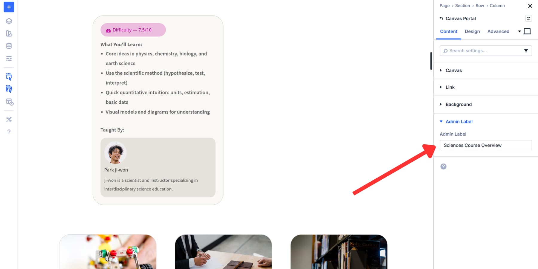
The settings panel opens on the right side of your screen. Look for the dropdown menu labeled Select Canvas. Click it and choose the Detached Canvas you just created, the one named “X Course Overview.” The portal now knows which content to display when triggered.
While you’re still in the settings panel, scroll down to the Admin Label field in the Content tab. Enter something like “X Course Portal” so you can identify this module later when setting up Interactions. Admin Labels don’t appear on your live site. They just help you stay organized in the Visual Builder, especially when you’re working with multiple portals or course cards on the same page.
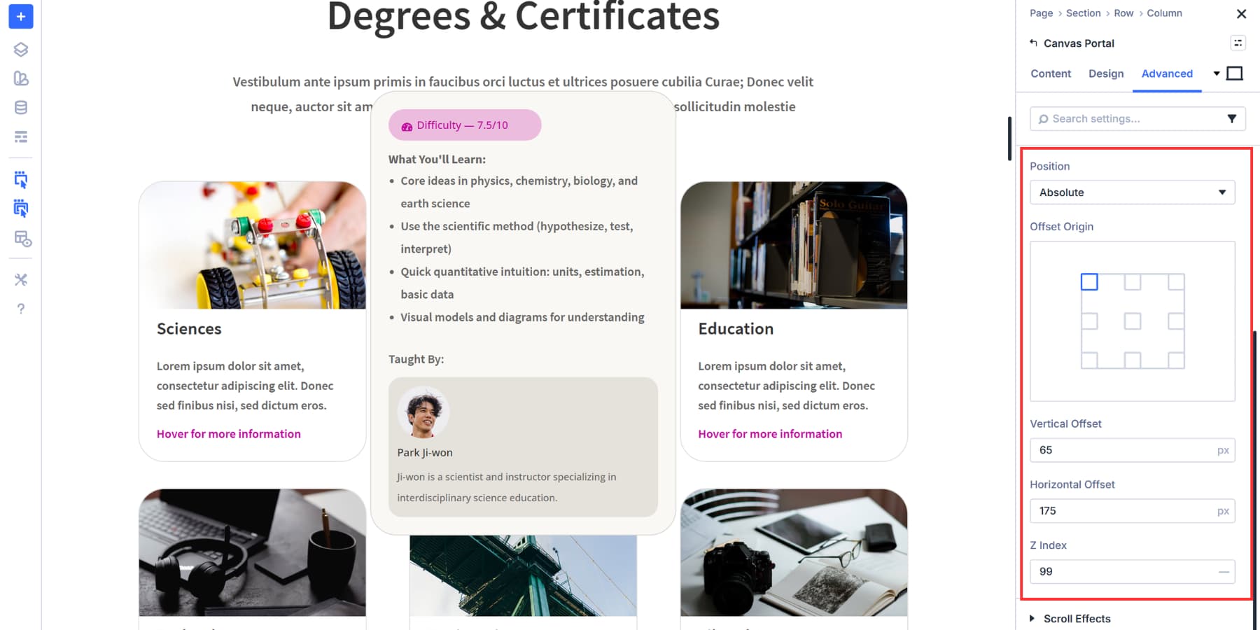
Positioning The Portal
Open the Canvas Portal Module settings and head to the Advanced tab. Scroll down to the Position section and expand it. Set the Position Type to Absolute and select Top Left as the origin. This allows the portal to float independently inside its parent column, giving you full control over placement.
For Horizontal and Vertical Position, choose a position that places the portal in a sensible location. You can increase this value later if you need spacing between the course card and the overview.
Lastly, set the Z Index to 99 so it appears on top of other cards.
Hiding The Portal By Default
Stay in the Advanced tab and scroll to the Visibility section. Check Hidden for all breakpoints. This keeps the portal invisible until an Interaction triggers it to appear.
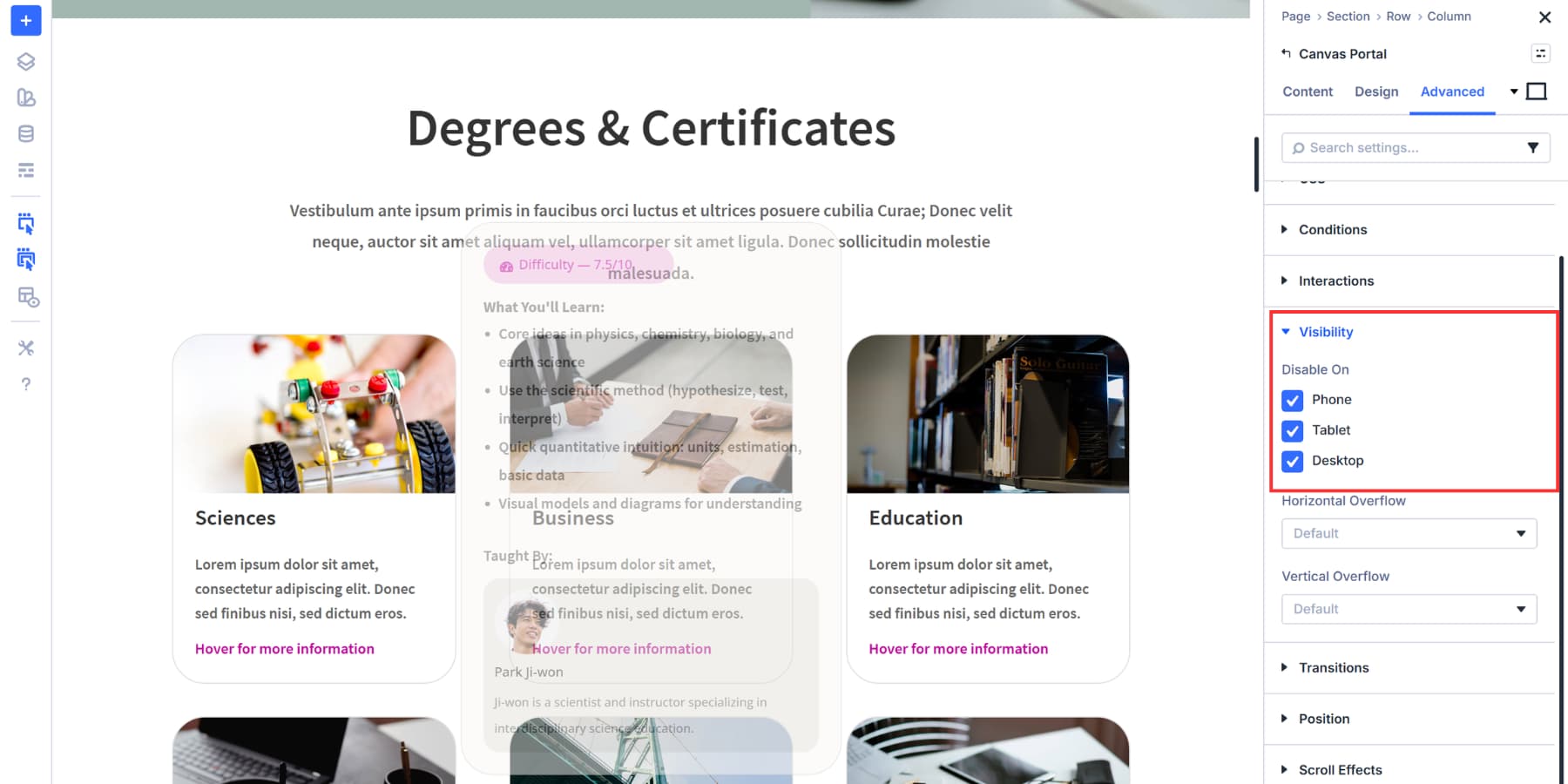
Without this setting, the course overview would display immediately when someone loads your page. We want it hidden until visitors hover over the course card. The portal is now set up and ready to use. Next, we’ll wire up the Interactions that control when it appears.
Assigning Interactions
Interactions go on whatever element you want to act as the trigger. We’re putting ours in the column containing the course card, so the entire card becomes hoverable. But you could place it anywhere that makes sense for your project.
A button inside the card gives you a clear, clickable area. An icon at the corner turns a small visual element into the trigger. A text module lets visitors click a heading or caption. Any module can hold an interaction, so you’re not locked into one approach.
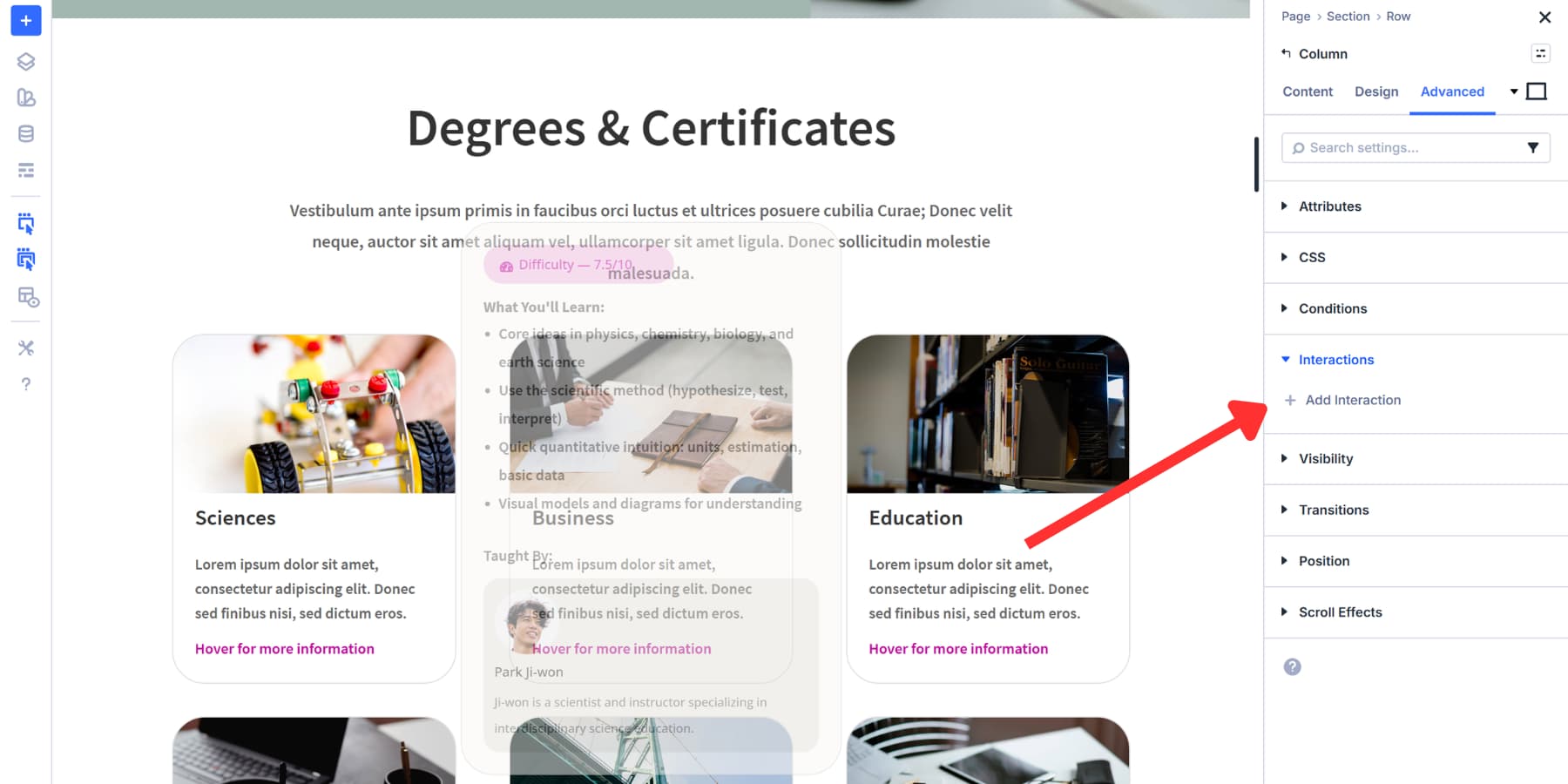
Open your trigger element’s settings and head to the Advanced tab. Find the Interactions section and click Add New Interaction.
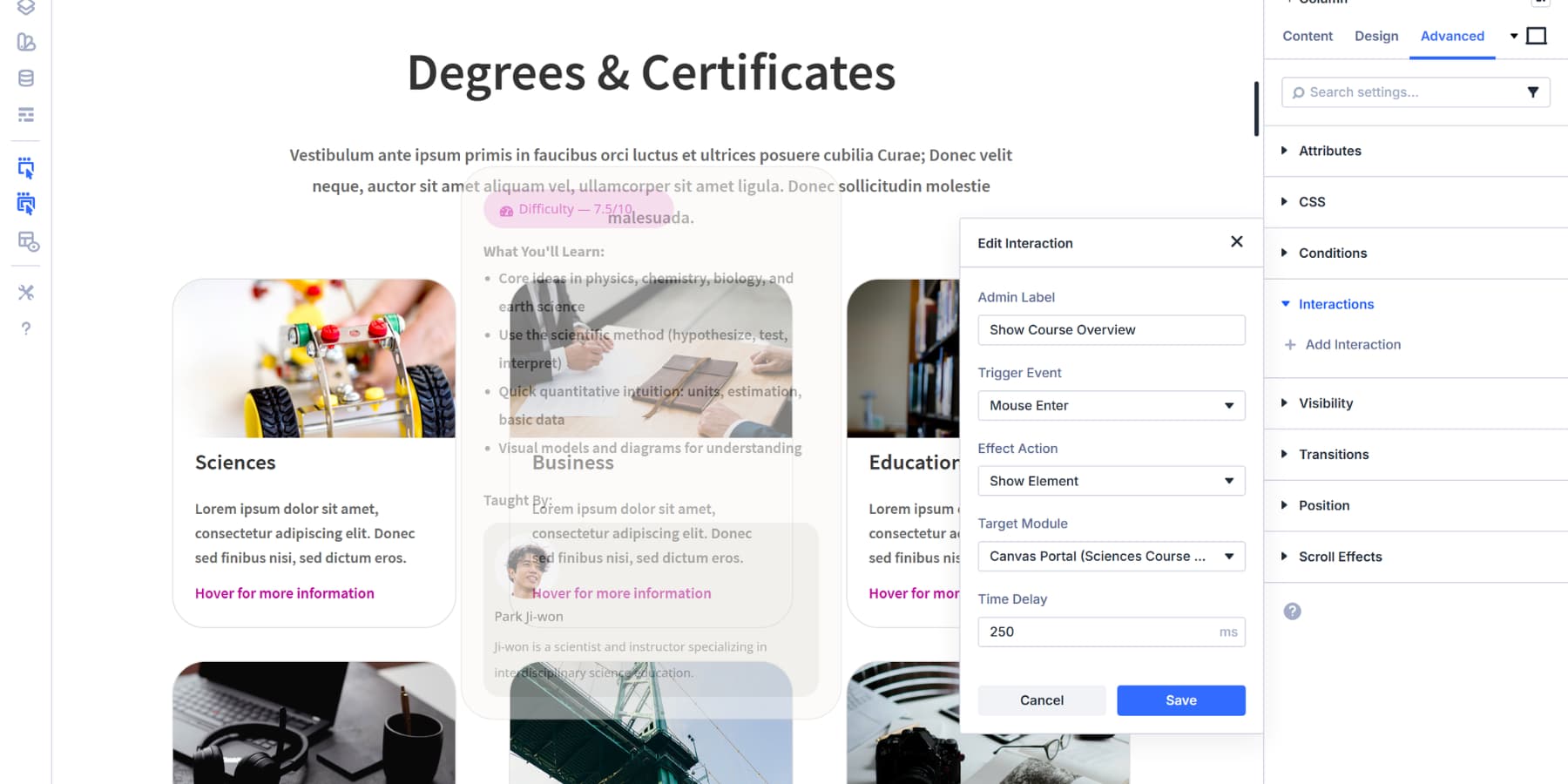
Setting Up The Show Interaction
The Trigger Event dropdown shows you every way visitors can interact with an element. Mouse Enter fires when someone hovers over your element. Mouse Exit detects when they move away. These two work together for hover effects. Click gives you a toggle behavior. Tap once to show, tap again to hide. Scroll Into View triggers when an element enters the viewport. Page Load fires immediately when someone lands on your page, good for popups or announcements.
For our course overview, we’re using Mouse Enter. The portal shows the moment someone hovers over the card.
Now pick your Effect Action. This determines what happens when the trigger fires. Show Element makes hidden content visible. Hide Element tucks it away. These are the primary effects we are going to use. If you want to learn more, check out this comprehensive guide.
The Target Module dropdown lists every element on your page. Find your portal by its Admin Label. That’s why we labeled it earlier. Without labels, you’d be hunting through generic names like “Canvas Portal Module.” Select your portal as the target. The interaction now knows what to show.
Add a label for the interaction itself. Something like “Show Course Overview” keeps things clear when you’re managing multiple interactions. Also, add a 250ms delay so it doesn’t look jarring when the portal is revealed.
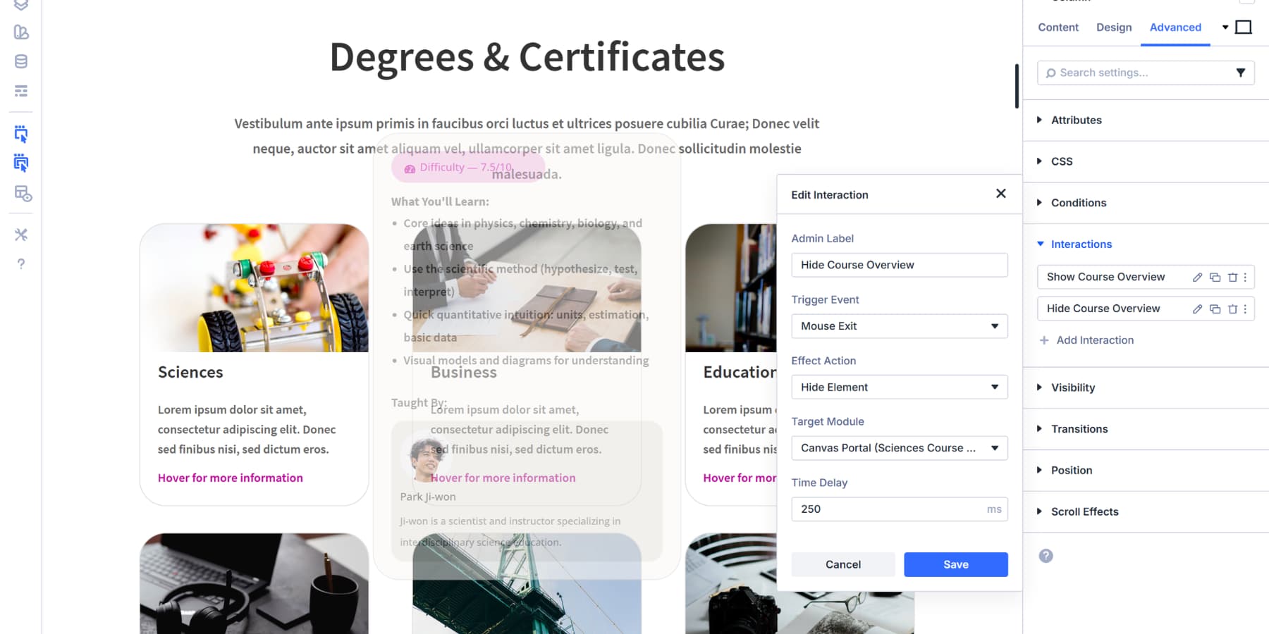
Adding The Hide Interaction
Now, use the duplicate icon and add another Interaction: Hide Course Overview
Set Trigger Event to Mouse Exit, Effect Action to Hide Element, and target the same portal module.
Now, hover reveals the portal; moving away hides it. The system works because you’ve told Divi exactly what to watch for and what to do when it happens.
Testing The Overview
Save your page and preview it on the front end. Hover your cursor over the course card. The portal appears to the right, displaying all the content you built in the Detached Canvas. Move your cursor away, and the portal disappears.
The interaction happens instantly because that’s how Mouse Enter and Mouse Exit work.
If you want visitors to click instead, go back to your Interactions and change the Trigger Event to Click. Set the Effect Action to Toggle Visibility instead of using separate Show and Hide interactions. One click reveals the portal, another click hides it.
You can repeat this process for each course card on your page. Create a new Detached Canvas for each course, add a new portal module to each card’s column, position it, and assign the interactions. The positioning values will need to be adjusted for each card, depending on its location in your layout.
The cards themselves can also become more interactive. Open your course card settings and switch to the Hover view in the Visual Builder.
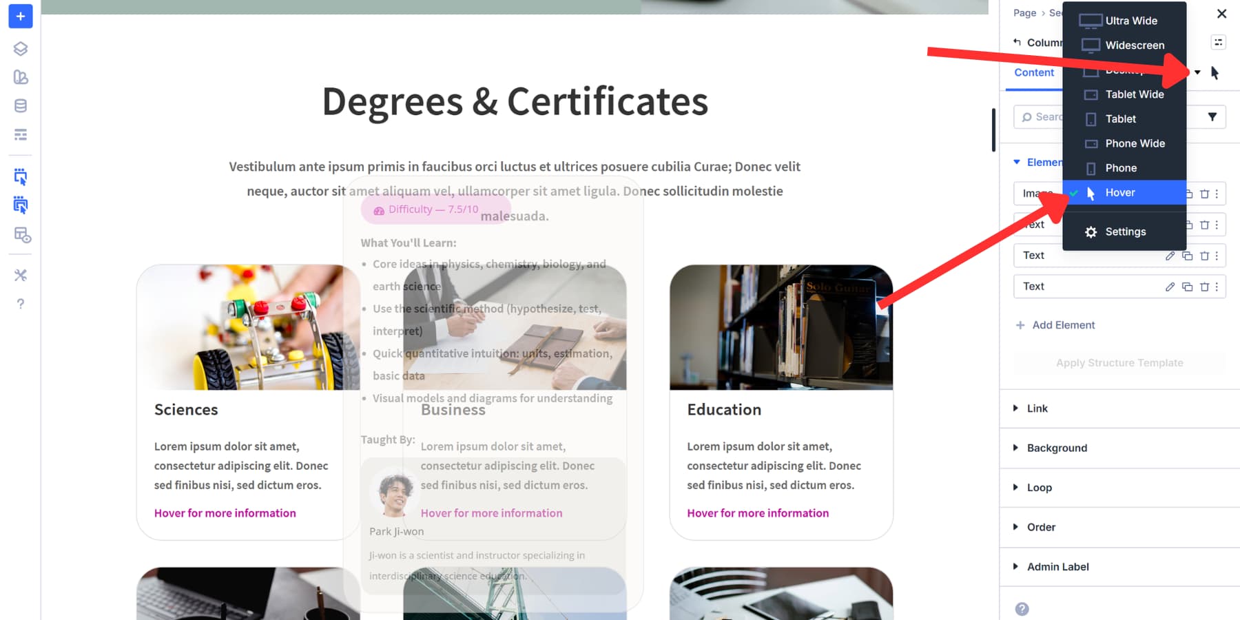
Add a background color change, shift the card up with a transform, or adjust the border. These visual cues indicate to visitors that the card has been interacted with before the portal appears.
Some More Use Cases
The same setup adapts to different needs across your site. Build a global canvas for your main navigation menu and wire it to slide in when someone clicks your hamburger icon. The entire menu structure lives in that Detached Canvas, keeping your main layout clean while giving visitors access to all your site links.
Product pages work well with this, too. Create a canvas holding detailed specifications or size charts. Position a portal near your product image, add a Click interaction to a small info icon, and visitors can toggle extra information without jumping to new pages or scrolling endlessly.
Newsletter signups feel less intrusive when you control their timing. Build your form in a global canvas, then use a Load trigger with a time delay. Set it to wait five seconds after page load before appearing. You can also try a Viewport Enter/Exit trigger on a specific section, so the signup appears only after visitors scroll past your hero area. That way, people see your main content first.
Pricing tables get simpler when you let visitors switch between options. Build separate canvases for monthly and yearly plans. Use Toggle Visibility with Click triggers on buttons. One tap displays monthly rates, while another tap shows yearly pricing.
Try Divi 5’s New Features Today!
You have everything you need to build interactive experiences that respond to your visitors in real time with Divi 5. Canvases keep your workspace organized, portals put content exactly where it belongs, and interactions control when and how everything appears.
These tools work together seamlessly without conflicting, and the setup takes just minutes instead of hours. Your visitors get exactly what they came for while you control every detail.
Try it in the Divi 5 and see what you can build with Canvases, Portals, and Interactions.


Is Extra Theme in the process of being discontinued? So far, Elegant Themes has not said a single word about Extra Theme.
As far as I’m aware, Extra was always just a tweaked version of Divi, so I’m sure that would follow once Divi 5 is out. Or There will be a migration from Extra to Divi 5 for example.