
Divi has always connected to WordPress menus through the Menu module. What the new Link module, Dropdown module, and Menu query type in the Loop Builder add is compositional control. Instead of relying on a pre-packaged menu component with a fixed structure and styling constraints, you can now build navigation from individually styleable modules using the same building blocks you use elsewhere in Divi 5.
The Menu query type in the Loop Builder is the other key ingredient. A Link module can be looped against a WordPress menu so it repeats once per menu item and dynamically pulls in each item’s text and URL. Add, remove, or reorder items in Appearance > Menus, and the navigation updates without requiring changes in the Visual Builder.
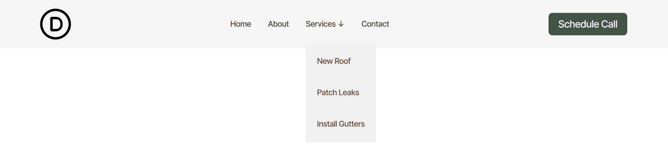
There is one current limitation to keep in mind: Divi 5’s new menu looping does not yet provide a complete one-loop solution for top-level items and nested sub-menu items together. These new modules and the Menu query type still provide a strong foundation, but for now, building dropdown navigation works best with a hybrid approach. Because of that, this tutorial covers two practical patterns: one for flat navigation driven entirely by a single menu loop, and one for navigation with dropdowns where the top level is built manually and each dropdown’s links are looped from a dedicated WordPress menu.
Go to Appearance > Menus and create the menus you want to loop. For flat navigation, a single menu containing all top-level items is enough.
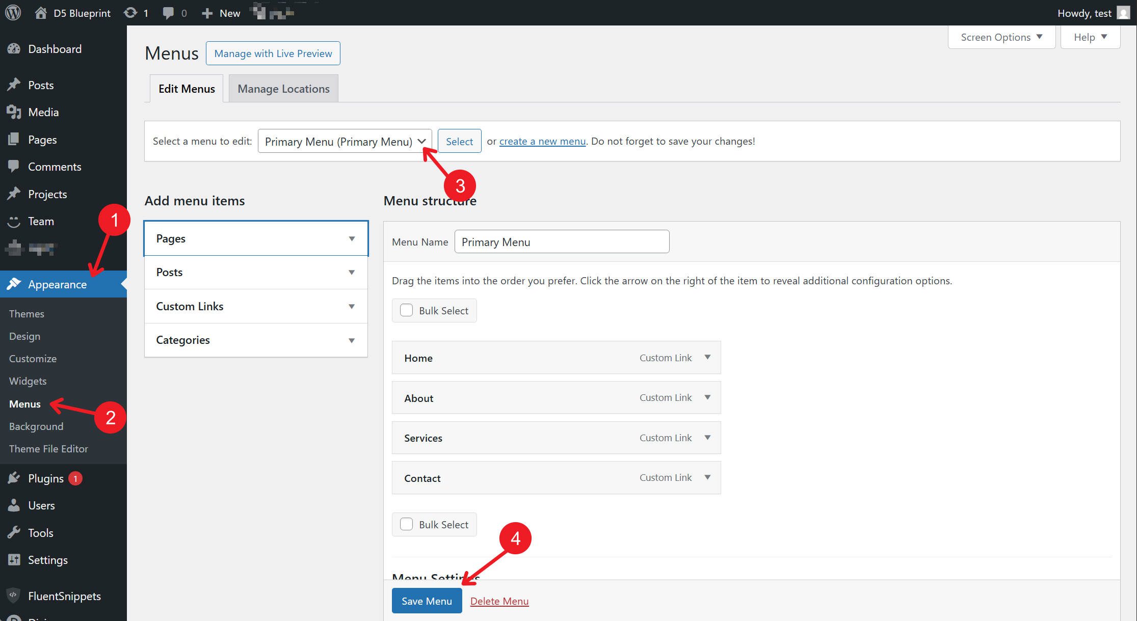
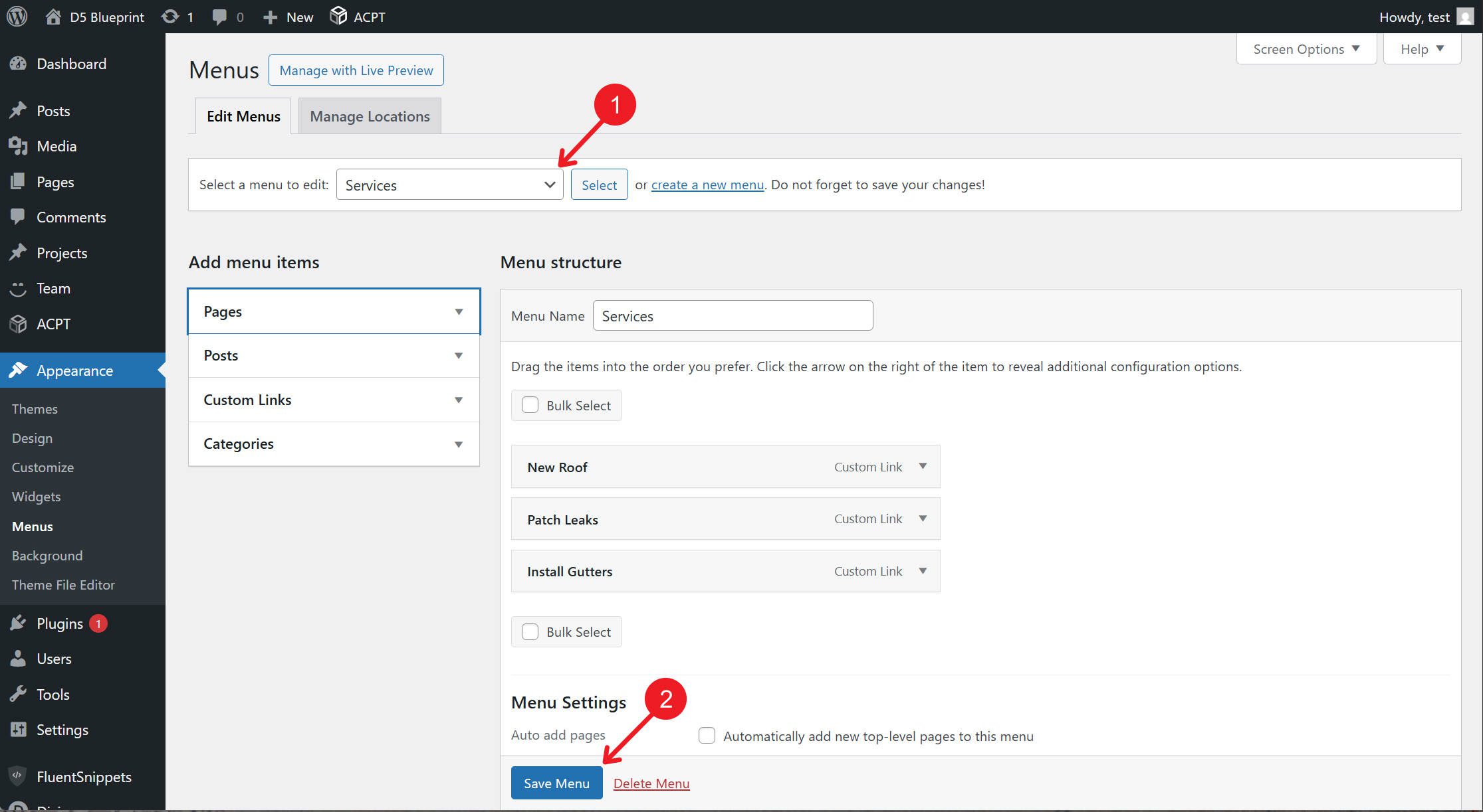
For dropdown navigation, create a separate menu for each set of dropdown links you want to output dynamically. In this tutorial, the “Services” menu contains only the links that appear inside the Services dropdown.
One last note before we start: this article focuses on the new modules, loop settings, and basic semantic structure. To stay on topic, it does not cover styling or building a broader design system for navigation. For that, refer to the detailed guidance on Design Variables and Nested/Stacked Presets.
This structure works well for navigation with no dropdowns. One Link module, configured as a loop template, handles the entire menu. Add or remove items in WordPress, and the navigation updates automatically.

Structure
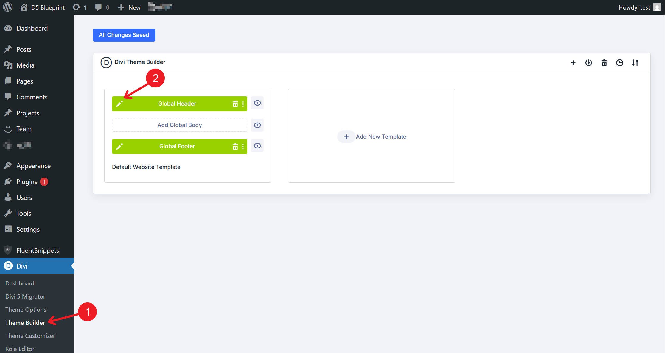
Open a Global Header template in the Theme Builder.
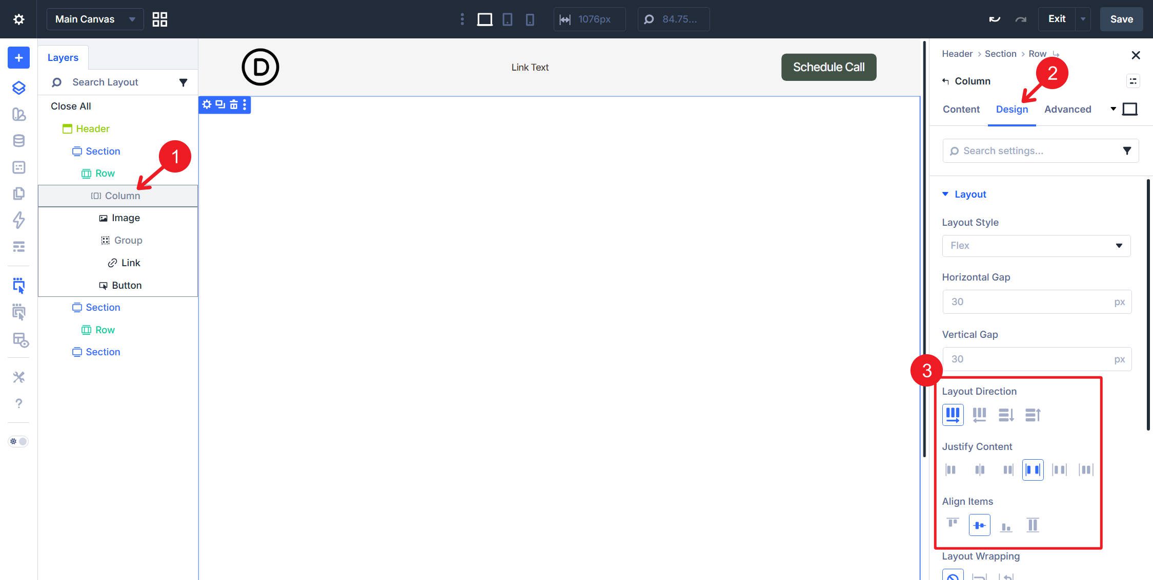
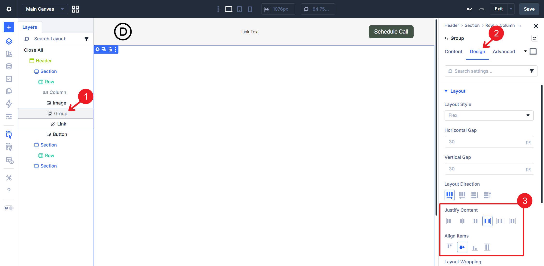
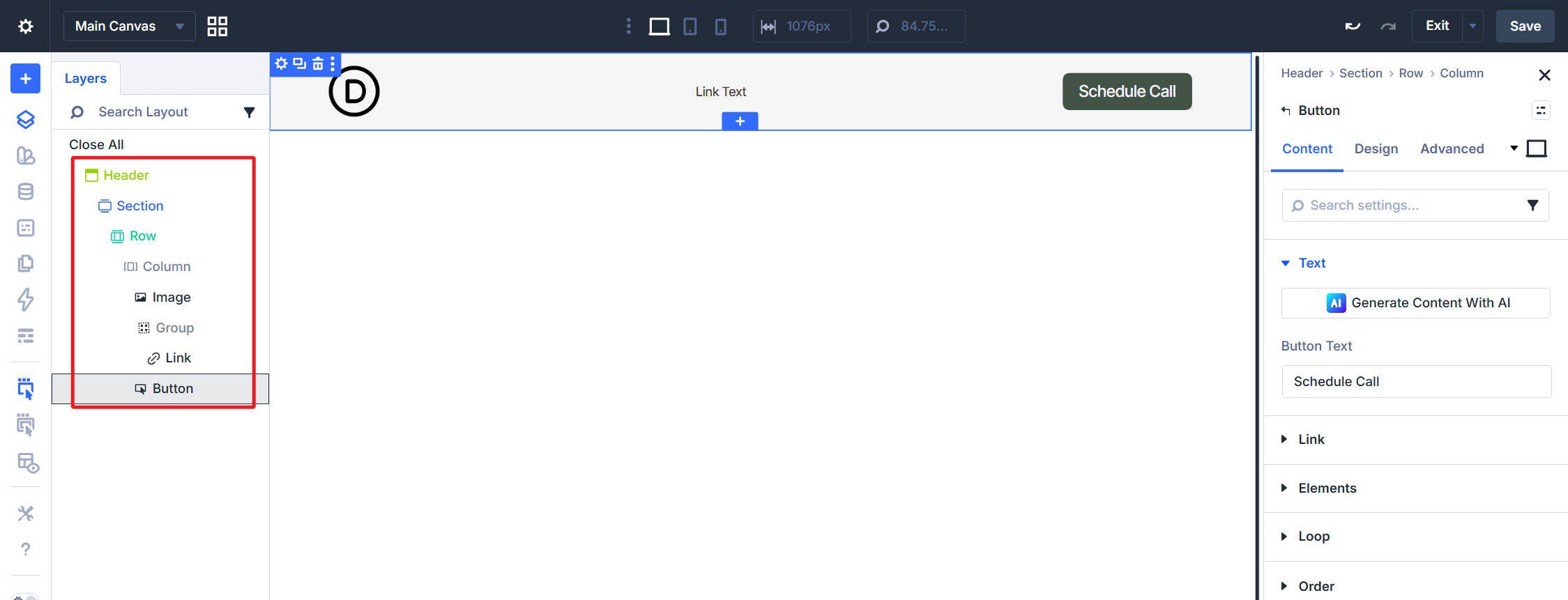
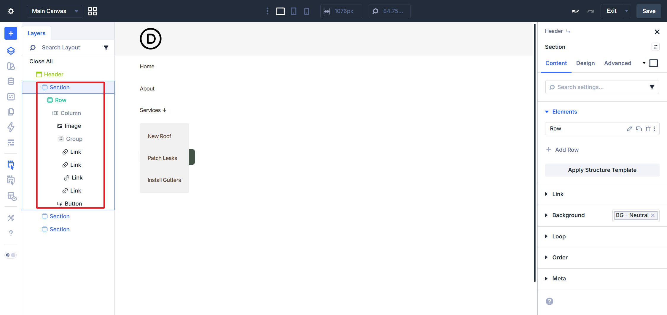
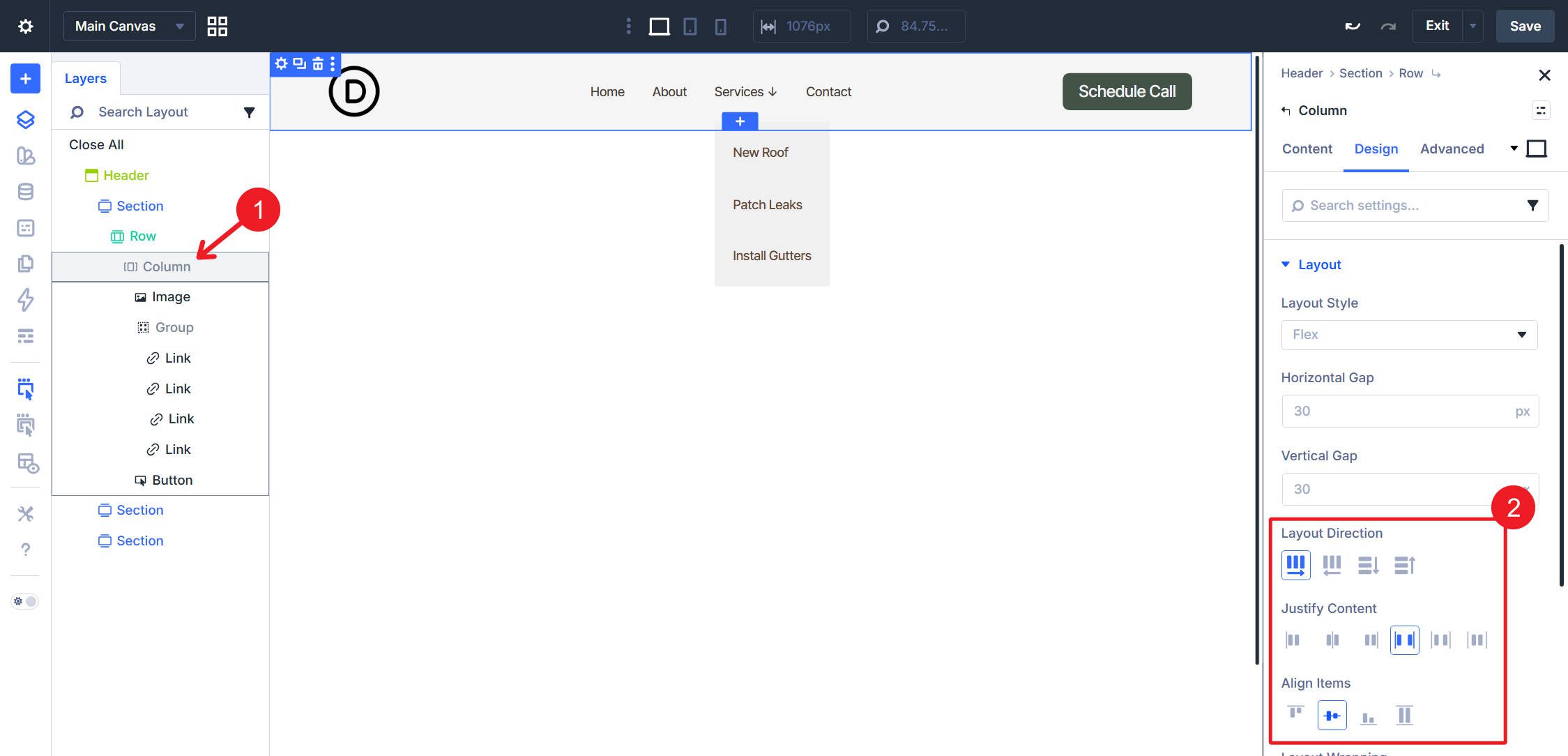
Use this structure: Section > Row > Column containing an Image module for the logo, a Group module with a single Link module inside it, and a Button module for a CTA. In the Column’s Design > Layout settings, set the layout to Flex, set Layout Direction to Row, Justify Content to Space Between, and Align Items to Center.
On the Group module, use these flex settings: Justify Content set to Space Between and Align Items set to Center.
The Link module inside the Group will serve as the loop template and output all menu items.
Loop Settings
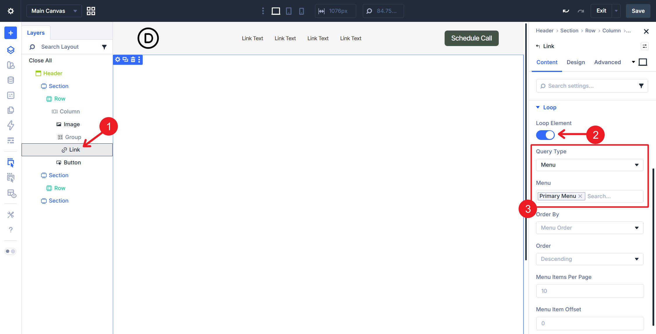
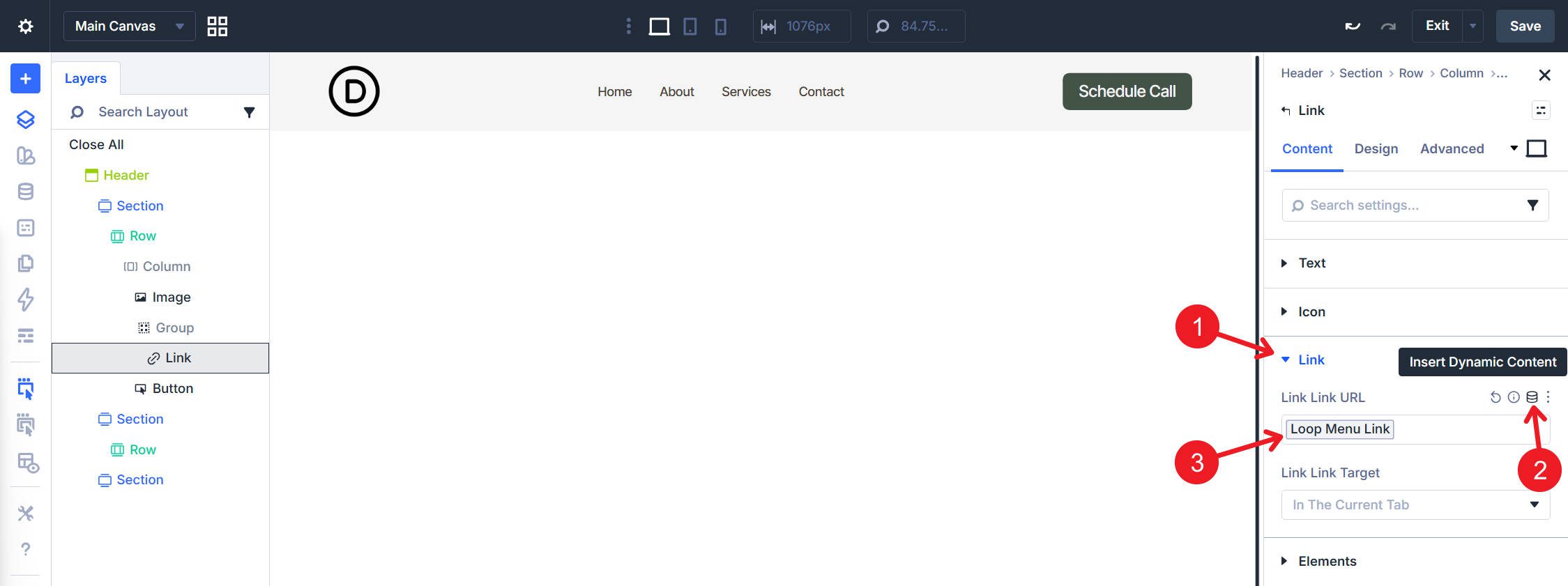
Select the Link module inside the Group. In the Content tab, open the Loop option group. Toggle Loop Element on, set Query Type to Menu, then select your primary navigation menu in the Menu field. Set Order By to Menu Order and Order to Ascending so the output matches the order you set in WordPress.
Set the Link module’s text field to pull dynamic values from the menu item so each repeated instance uses its own label. Use Loop Menu Text.
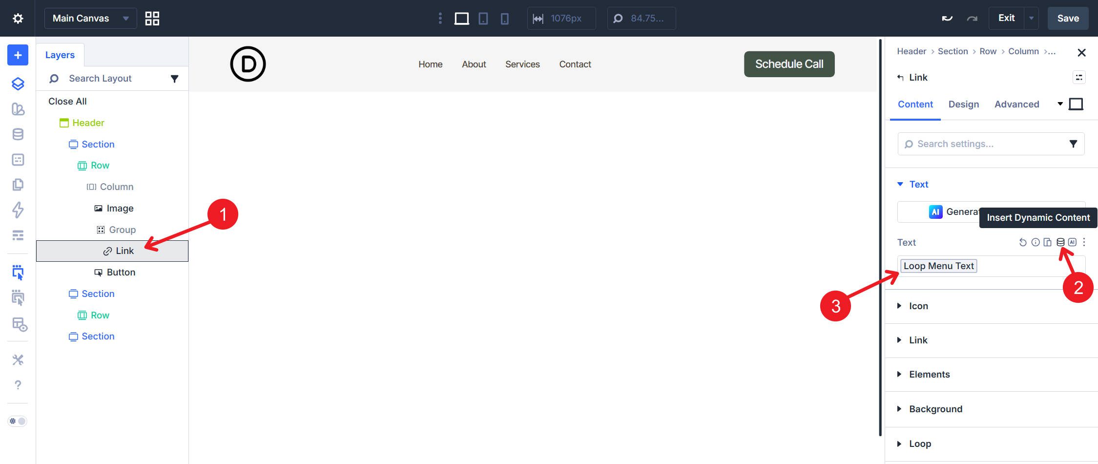
Do the same for the link destination by setting the Link field to use Loop Menu Link.
Semantics
Work through each layer from the outside in.
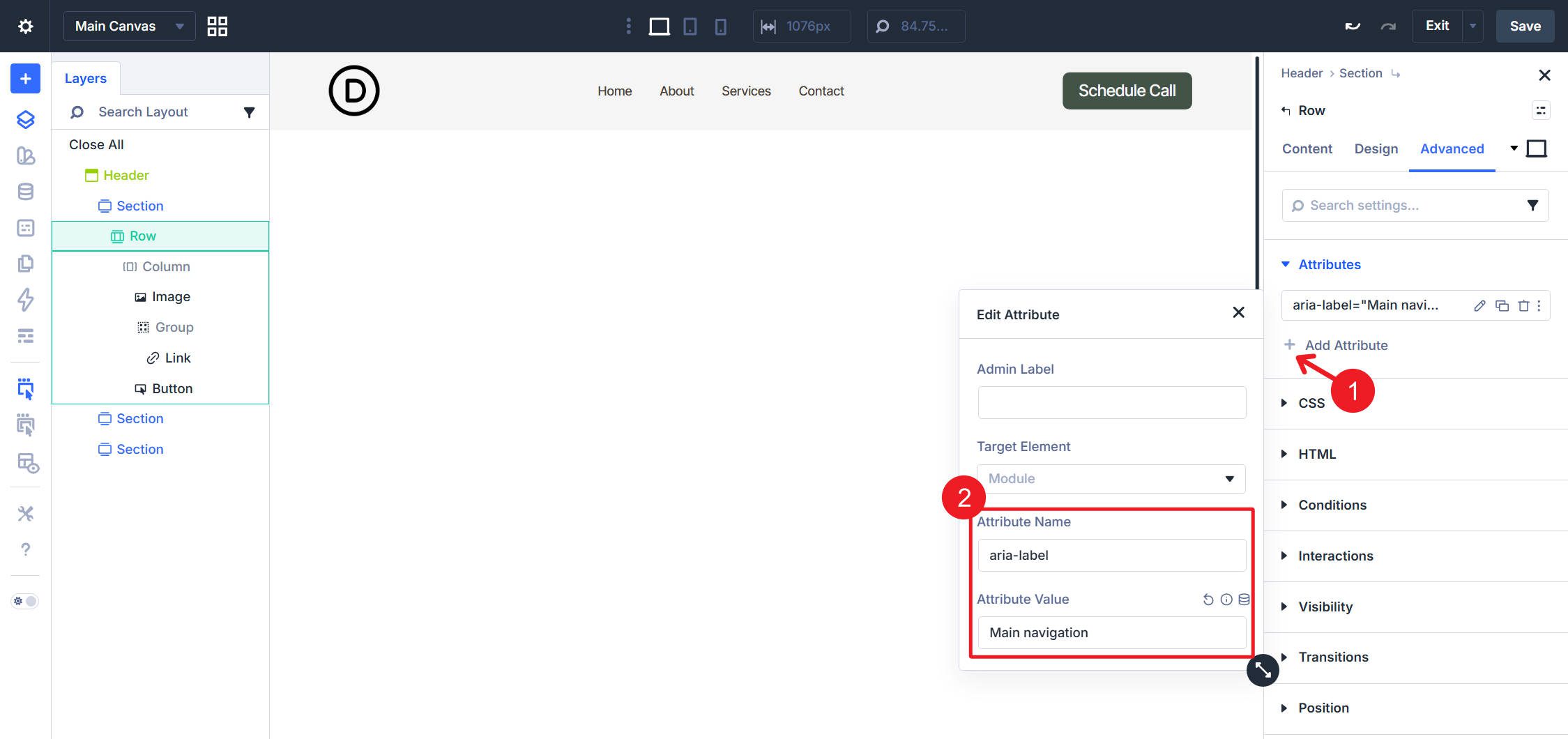
Row: In the Advanced tab, set the HTML element to <nav>.
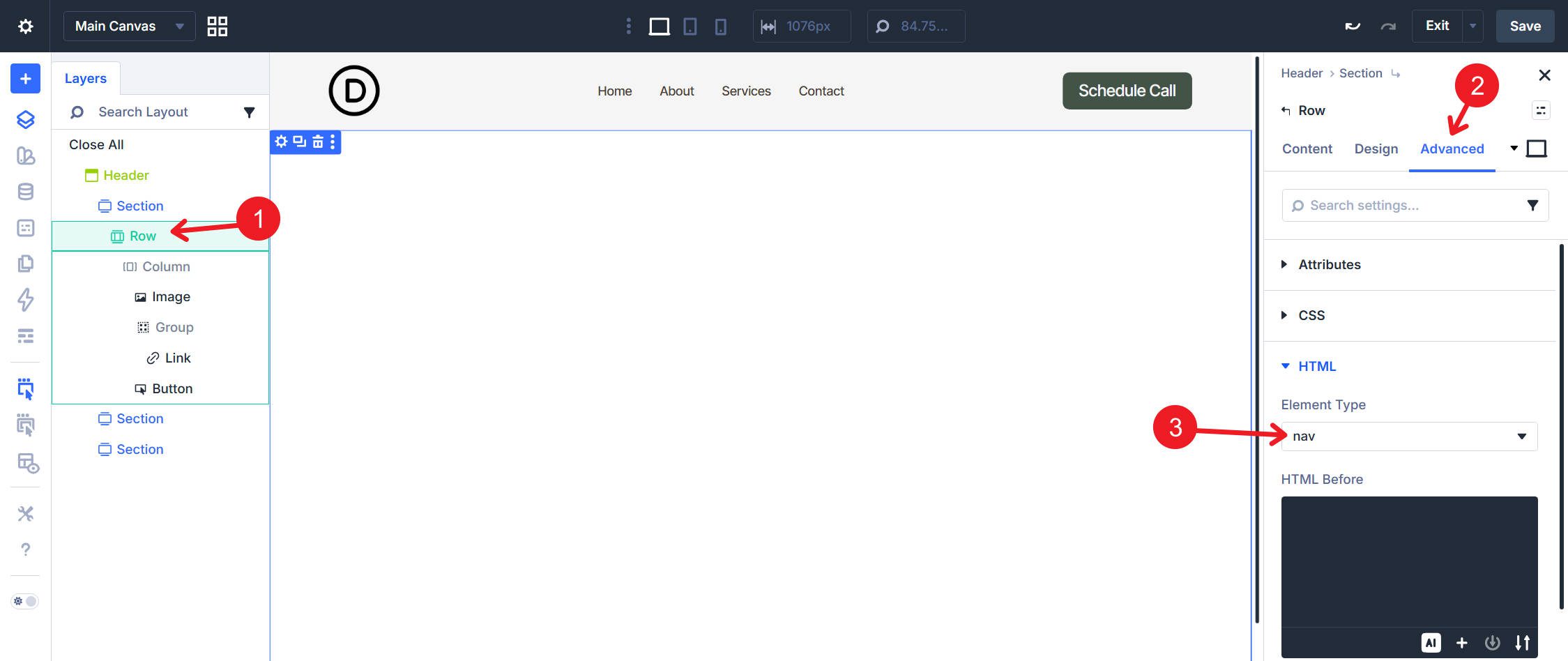
Then open Attributes and add aria-label=”Main navigation”.
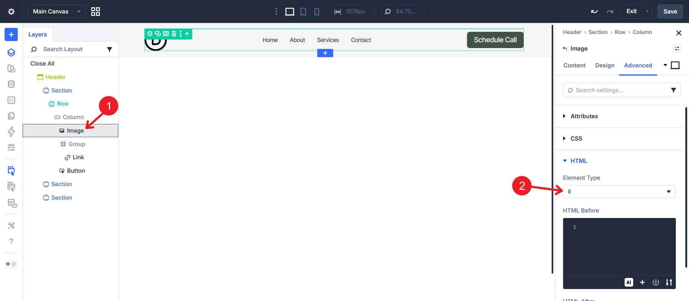
Column: In the Advanced tab, set the HTML element to <ul>.
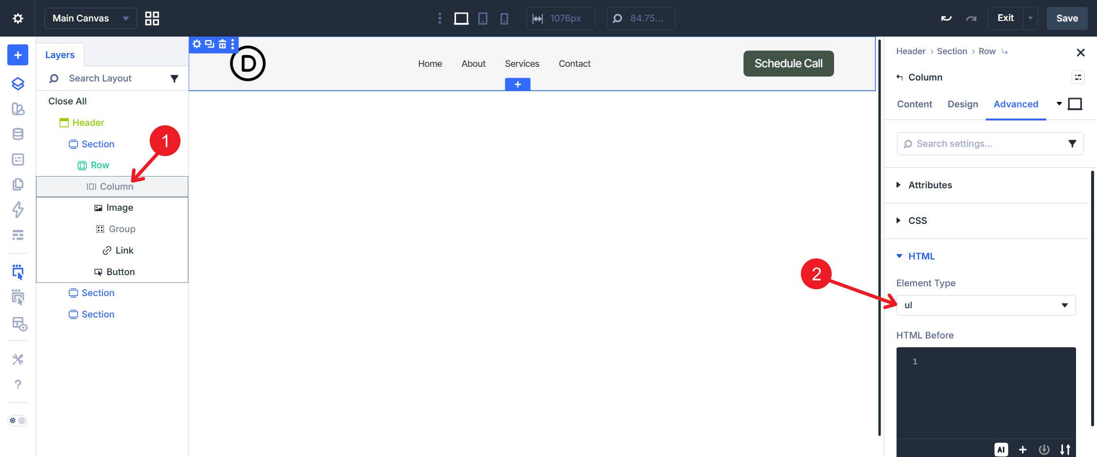
Image Module: In the Advanced tab, set the HTML element to <li>.
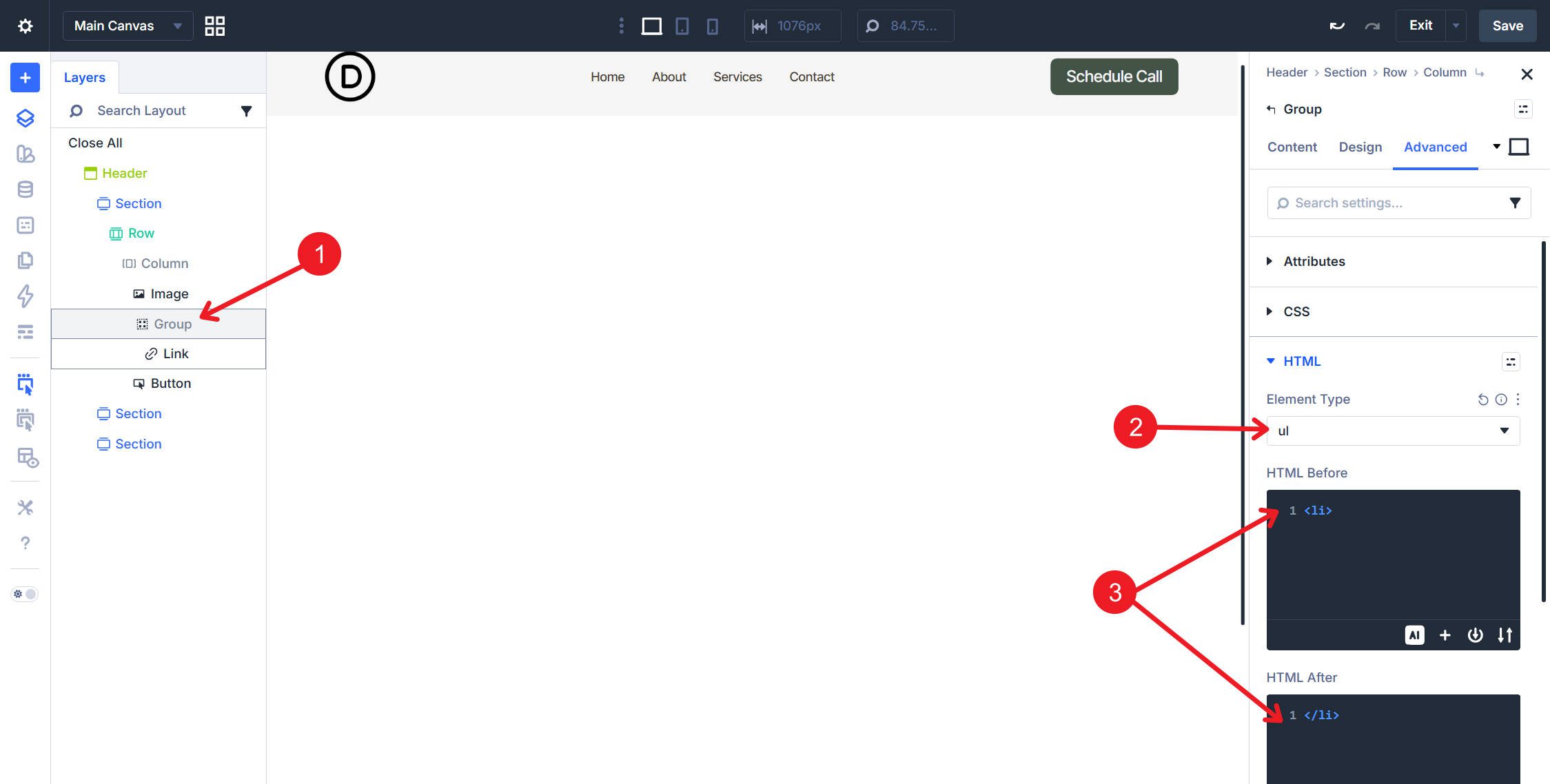
Group Module: In the Advanced tab, set the HTML element to <ul> and wrap the Group in a <li> using HTML Before and HTML After.
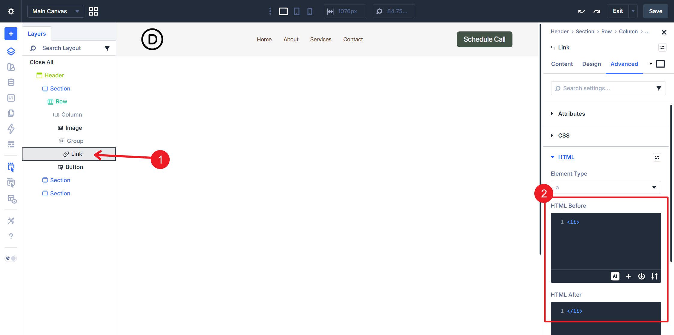
Link Module: In the Advanced tab, set HTML Before to <li> and HTML After to </li>.
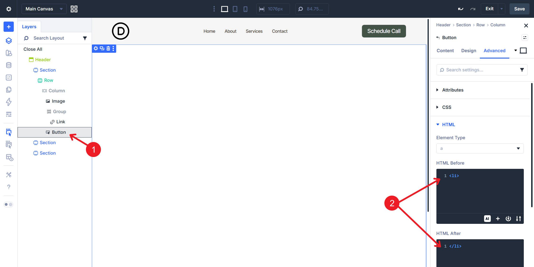
Button Module: In the Advanced tab, set HTML Before to <li> and HTML After to </li>.
With this setup, you have a simple, accessible header powered by a WordPress menu.
This structure works well when some top-level items reveal a sub-menu. The top level is built manually, which gives you control over which items exist and which of them open dropdowns. Each dropdown’s links are then looped from a dedicated WordPress menu.
Structure
The outer structure and layout settings for the Row, Column, and Group are the same as in the flat navigation example above.
The change happens inside the Group module. Add a Link module for each top-level navigation item and manually configure each item’s text and URL. For any item that opens a dropdown, such as Services in this example, nest a Dropdown module directly inside that Link module. Inside the Dropdown, place a single Link module. That nested Link module becomes the loop template for the dropdown items.
For both the Group and the Row, use Flex layout with Layout Direction set to Row, Justify Content set to Space Between, and Align Items set to Center.
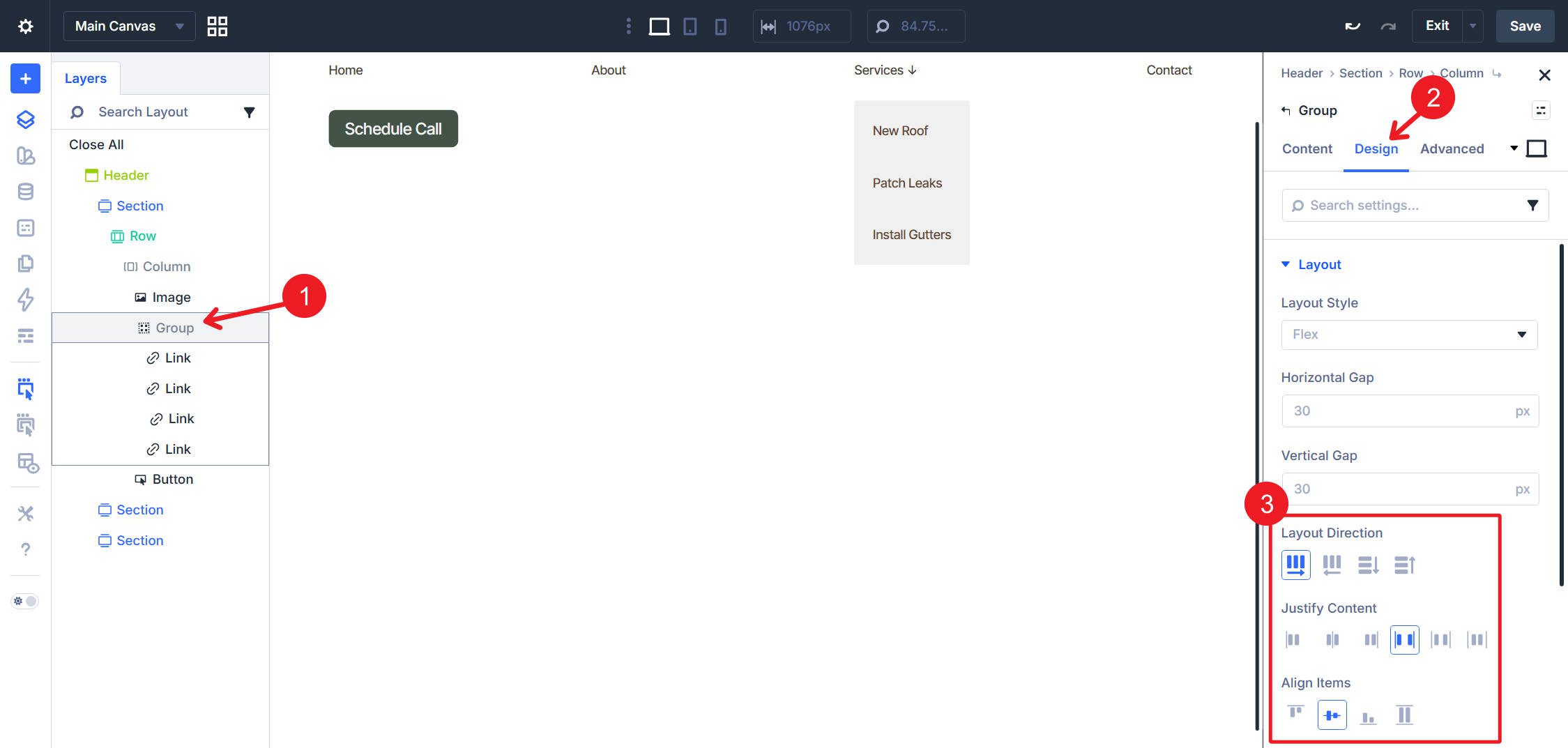
These settings allow your top-level Link modules to display horizontally, while the row-level layout distributes the logo, navigation, and CTA across the header.
Loop Settings
Select the Link module inside the Dropdown. In Content > Loop, toggle Loop Element on, set Query Type to Menu, and select the sub-menu for that dropdown, “Services” in this example. Set Order By to Menu Order and Order to Ascending. Repeat this for each dropdown’s Link module template.
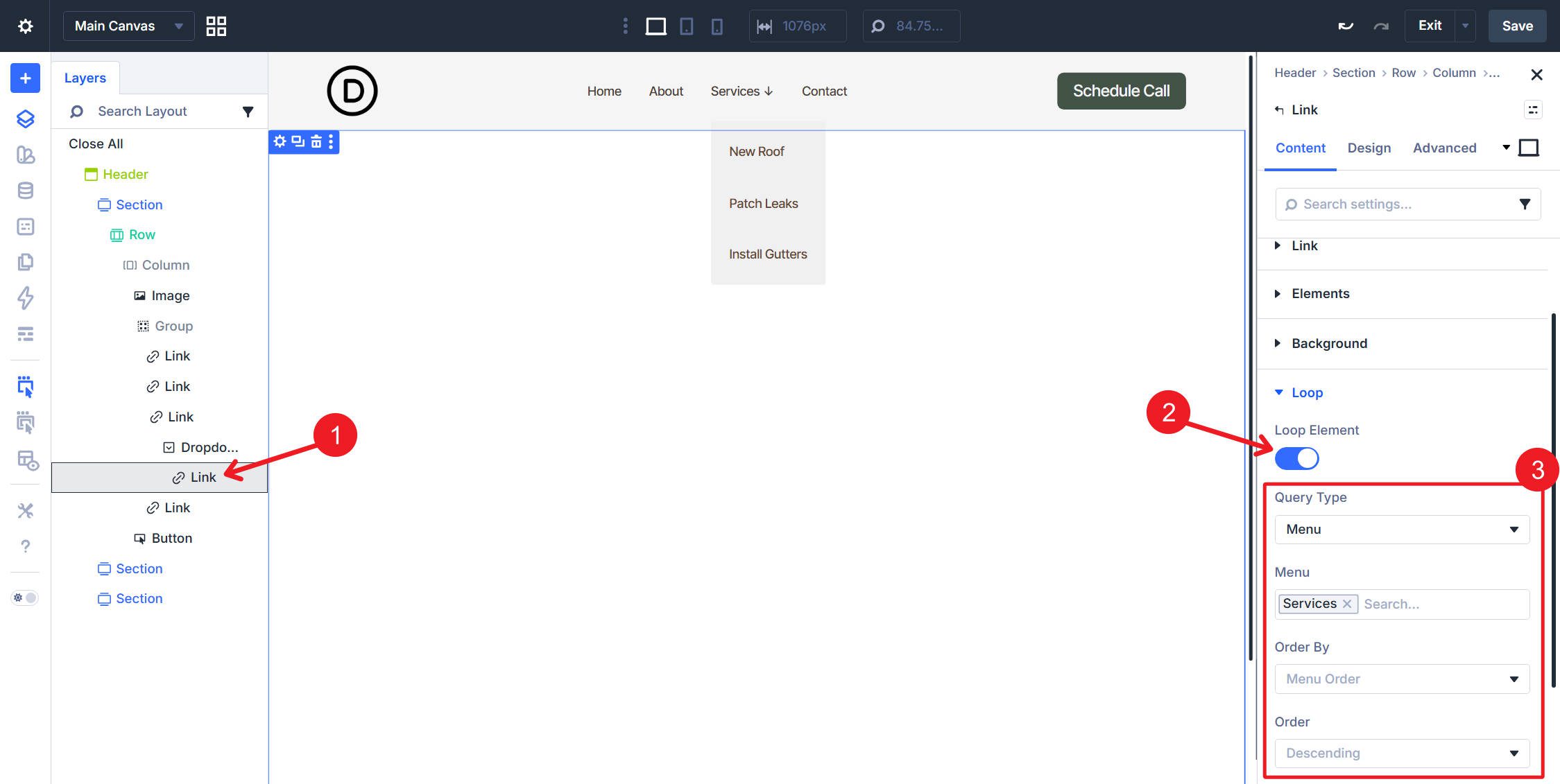
Inside that looped Link module, set the text to Loop Menu Text and the destination to Loop Menu Link so each repeated dropdown item outputs the correct label and URL.
Semantics
The outer layers follow the same pattern as the flat navigation. The additions here are specific to the trigger links and dropdown containers.
Row, Column, Image Module, and Button Module: Apply the same element, attribute, and HTML Before/After settings used in the flat navigation example above. The remaining changes apply to the dropdown-specific elements.
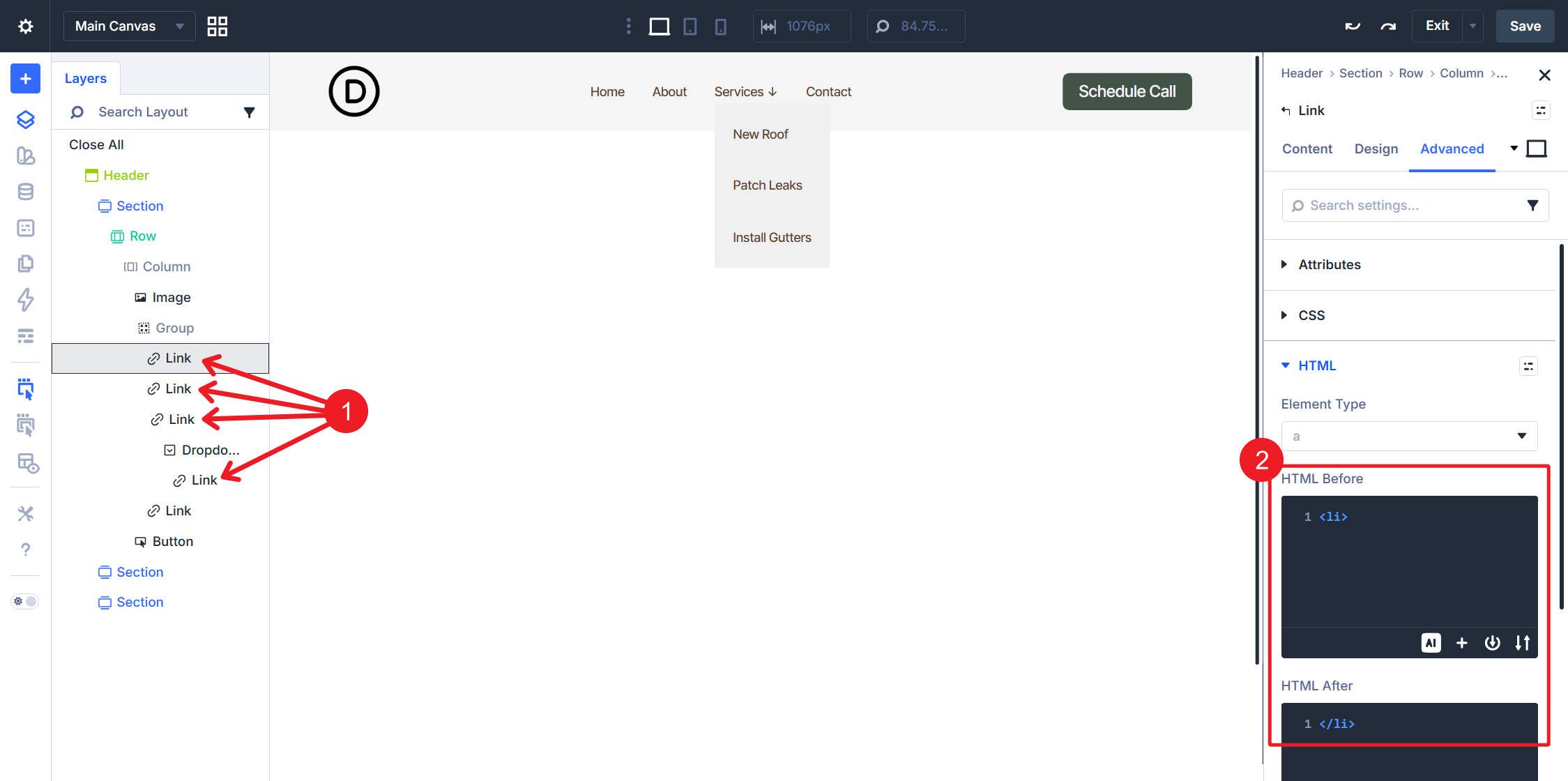
Manual top-level Link Modules (for example, Home, About, and Contact): In the Advanced tab, set HTML Before to <li> and HTML After to </li>. Because these top-level links are not looped, you need to apply this to each one manually.
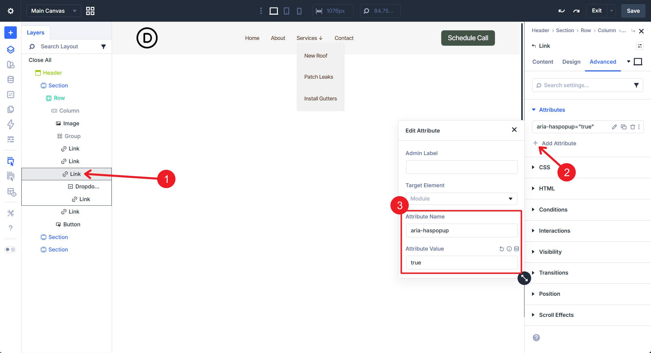
Top-level Link Modules that trigger a dropdown: In Attributes, add aria-haspopup=”true”. If your implementation includes a persistent open/closed state, also add or update aria-expanded to reflect that state.
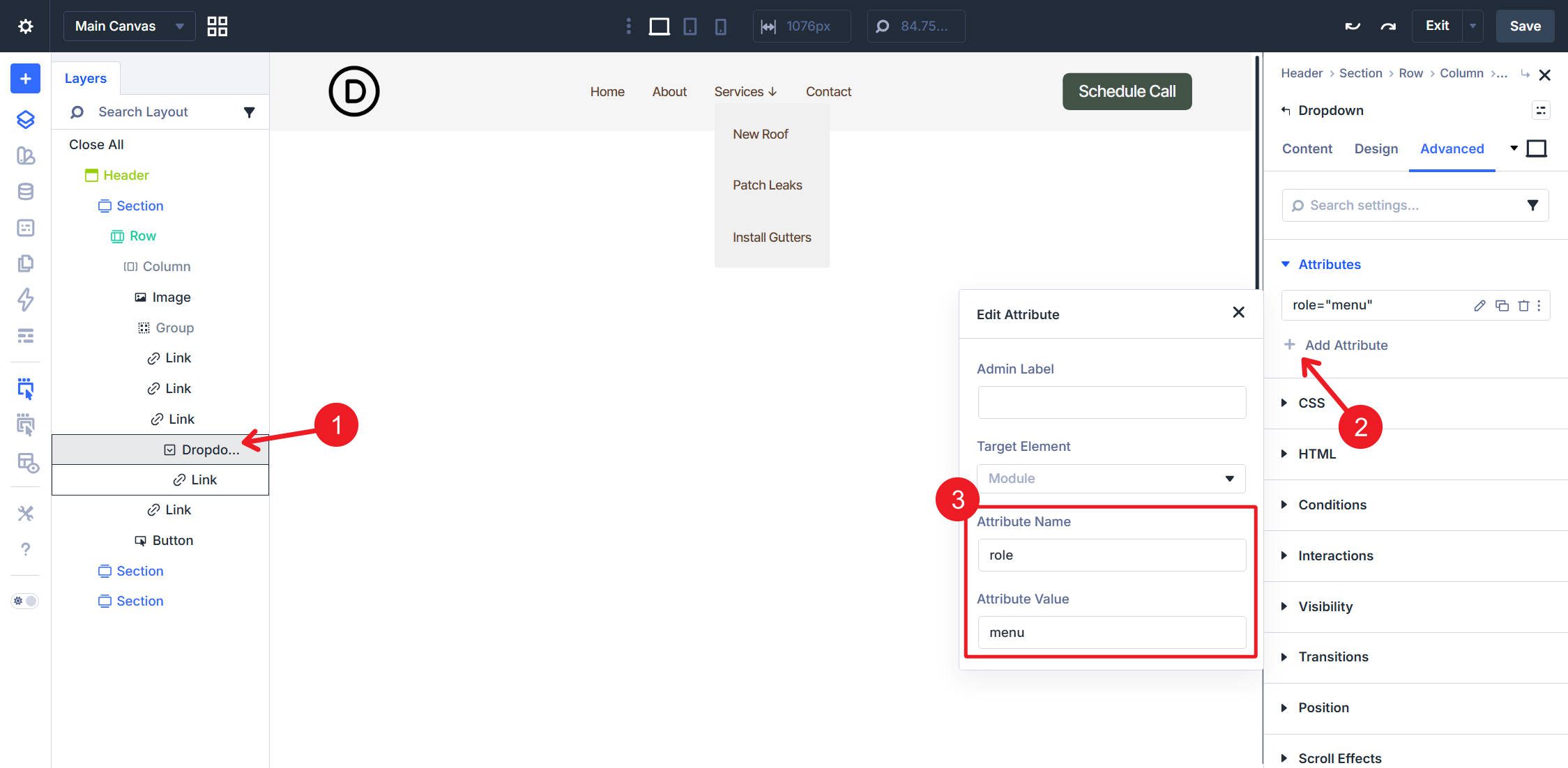
Dropdown Module: In the Advanced tab, set the HTML element to <ul>.
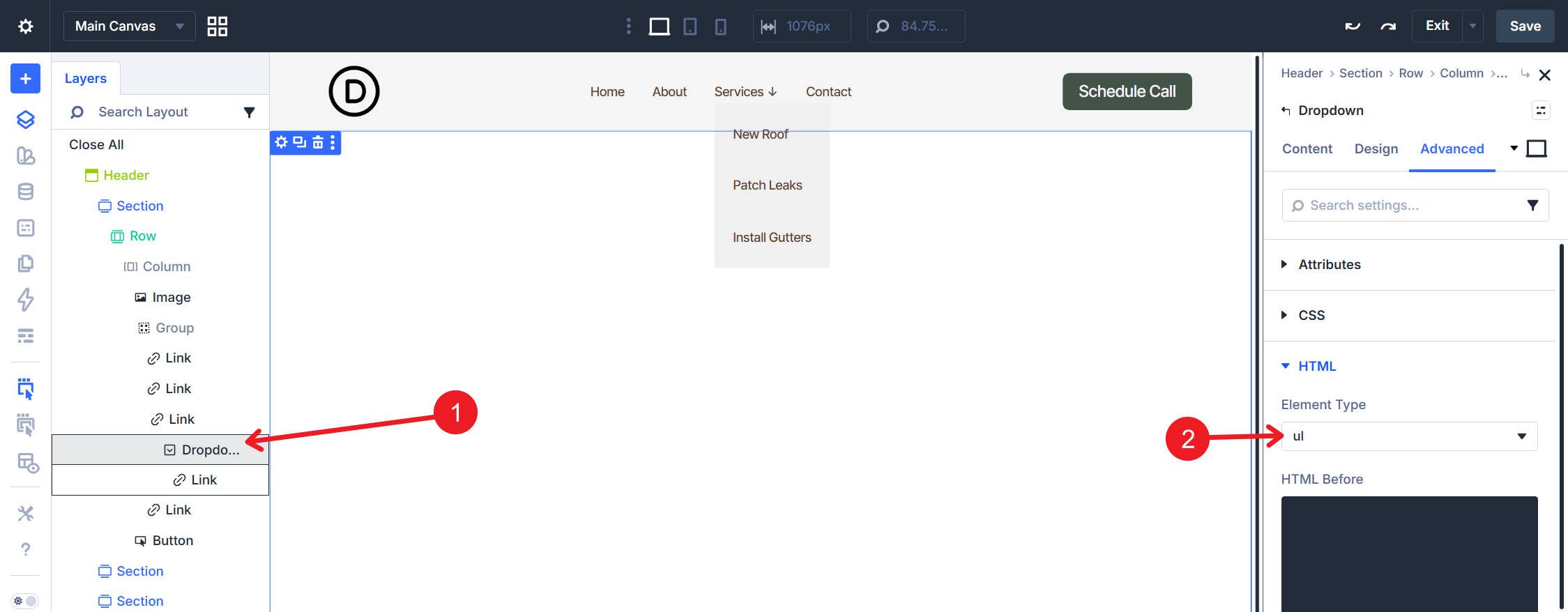
Then, in Attributes, add role=”menu”.
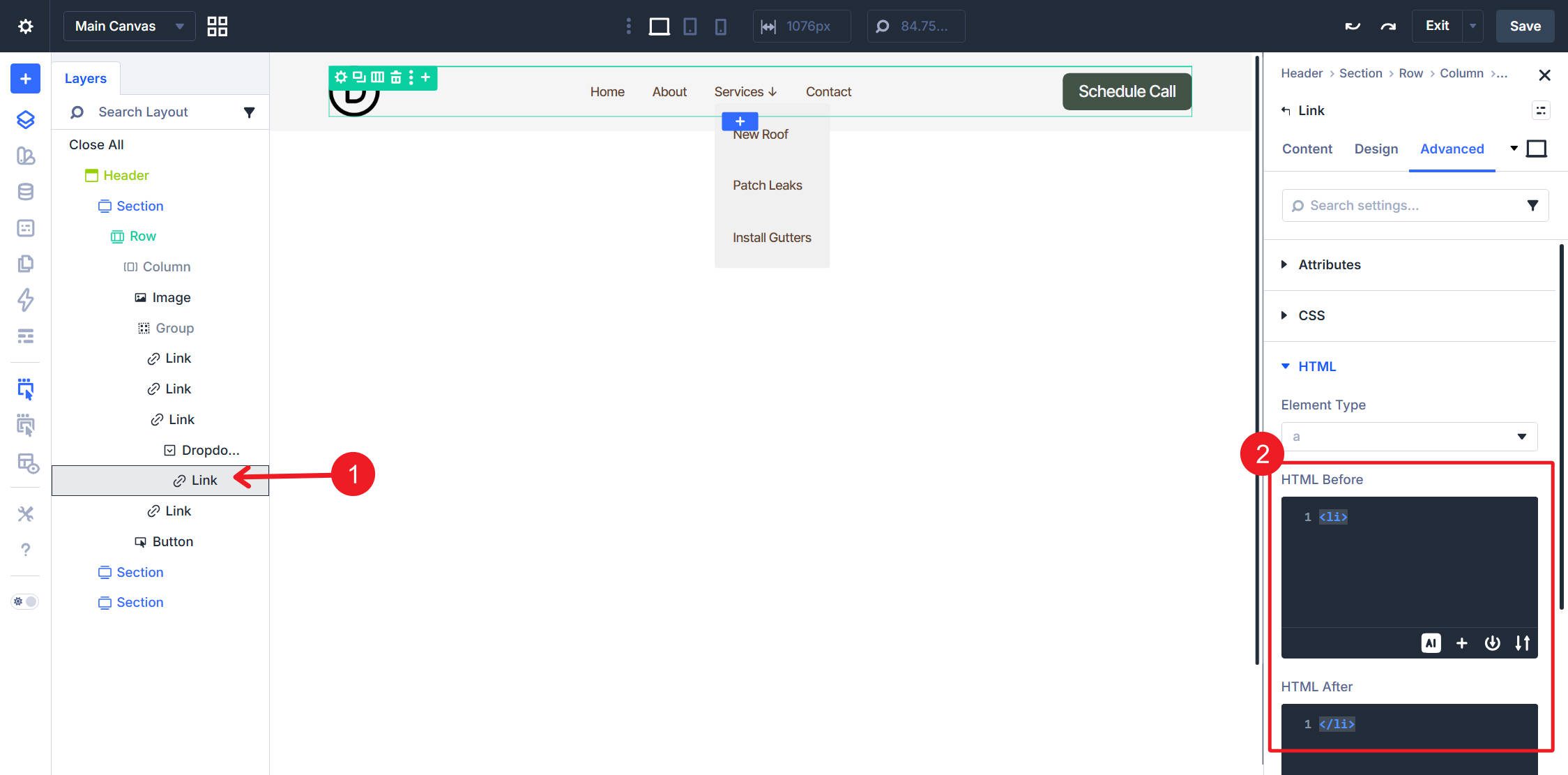
Looped Link Module inside the Dropdown: Set HTML Before to <li> and HTML After to </li>.
This setup takes a little more effort because there is more nesting, but it gives you a practical way to combine Divi 5’s modular menu building with dynamic WordPress-driven dropdown content.
With either structure in place, looped menu changes happen entirely in Appearance > Menus. The flat navigation will automatically reflect menu additions, removals, and reordering. In the dropdown version, each loop inside a Dropdown module updates from the WordPress menu assigned to that specific dropdown.
This is already a major step toward a more modular menu-building experience in Divi 5, and it pairs especially well with Design Variables and Presets once you’re ready to style the system consistently across your site.


I have been testing the new link module and drop down module, but I don’t know how to show the hamburger menu on tablet and mobile, how can do accomplish this?
Hi Alex, I think you can just add an icon module and use interactions to show or hide a popup menu with a replica of your custom menu inside
I really loved the menu loop feature when you add it guys but there is a big issue with it: using the custom loop were are loosing dynamic classes like “current item” for menu behavior that is pretty standard nowadays.
There is a way to have this working with the loop menu?
Thank you very much for your awesome work with Divi!
Best regards
Hey Carlo, we’re still working on Divi’s final form of custom menu building. We’re adding it layer by layer, starting with the most fundamental and working from there. Active page/menu item styling is something on our radar and definitely something to look forward to.
This is an interesting approach in creating a navigational menu.
Question: Using the tag in the Group and Button modules displays a “•” in the menu (I’m referring to the steps in the Flat Navigation section of this article). Is there a way to hide that marker?
Good catch. You can look at this post about exploring semantic lists in another way (and I Have the answer there). However, you’d want to include list-style: none; on that element. This is how you can have the semantic element + not have the automatic browser styles applied to it.
Thanks for the response – I’ll re-read that pertinent section in the semantics article.
I really like this idea! It’s unfortunate that you have to manually set the top links in the menu for every dropdown. I wish you could just loop the link+dropdown, and it could dynamically just pull from 1 menu. That would save a lot of work!
For sure, but baby steps!