
Card-based layouts dominate modern web design, from blog archives and team directories to product catalogs and portfolio grids. Search engines and assistive technologies interpret these layouts through HTML structure, not visual appearance. A grid of blog post cards that looks organized to sighted users may appear as disconnected fragments to screen readers if the underlying markup lacks semantic meaning.
Divi 5’s Loop Builder generates dynamic card layouts from WordPress content and lets you apply semantic markup through Divi 5’s Custom Attributes system and Element Type controls, creating accessible, SEO-friendly card grids. Proper semantic structure can improve screen reader navigation, make content relationships clearer to search engines, and make your markup easier to maintain.
The technique applies the <ul> and <li> pattern to dynamic content while layering additional semantic elements, such as <article>, <header>, and <figure>, within each card. Because the Loop Builder duplicates your configured column for each item in the query, you only need to set up the HTML structure once. The loop handles the rest, generating consistent list markup regardless of how many posts exist.
When To Use Looped Semantic Lists
Looped semantic lists are ideal whenever you display a repeating collection of similar content generated dynamically from a query. For WordPress websites, this commonly includes blog posts, products, portfolio items, team members, testimonials, events, or service listings. Because each item in the loop represents the same type of content, structuring the output as a semantic list helps browsers, search engines, and assistive technologies understand the relationship between those items.
Using a <ul> with repeated <li> elements communicates that the items belong to a single grouped collection. This improves navigation for screen reader users, who can quickly move through list items or hear how many items exist in the collection. It also gives search engines clearer signals about how related pieces of content are organized within a page.
Looped semantic lists work especially well for card-based layouts generated by Divi’s Loop Builder. Each card becomes a list item, and the loop automatically repeats that structure for every result in the query. Once the semantic structure is defined for the first item, Divi replicates it consistently across all items, ensuring every generated card follows the same accessible markup pattern.
Building The Semantic List Structure
This implementation uses a Section containing a Row configured as the list container. The Row holds a looped Column that becomes each list item. Inside each Column, a Module Group wraps the card content as an article. The featured image, title, metadata, and a Button Module for the read more link all sit inside the article.
Start by adding a new Section to your page in the Visual Builder. Click the Section to open its settings. Navigate to Advanced > HTML and open the Element Type dropdown. Select section. This ensures the Section renders as a semantic <section> element rather than a generic <div>.
Inside the Section, add a single-column flex row. Inside this row, place a Heading Module with text that describes the loop items below it. When using a <section> element, including a visible heading is usually the best approach, as it provides the section with an accessible name. An aria-label is better used as a fallback when a visible heading is not feasible for the design.
Configure The Loop Row Layout And Semantics
Add another Row using the Flex 3 Equal Columns predefined structure. This Row will serve as both the layout container and the semantic list wrapper.
Switch to Design > Layout to adjust the remaining flex properties. Enable Wrap so items flow to new lines when they exceed the container width. Flexbox, combined with predefined column widths, creates a responsive layout that adapts naturally to different screen sizes and numbers of child elements.
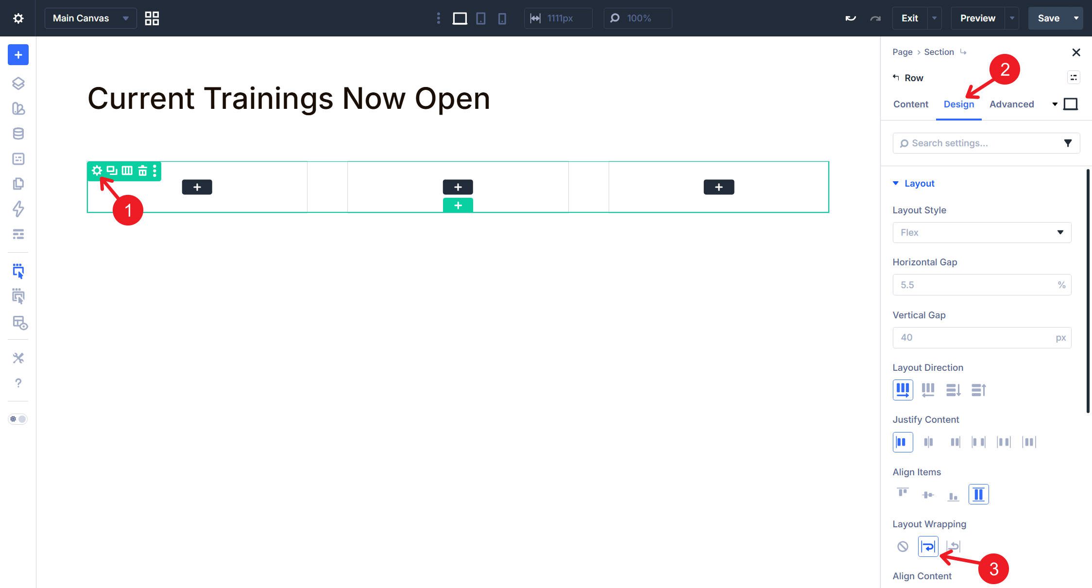
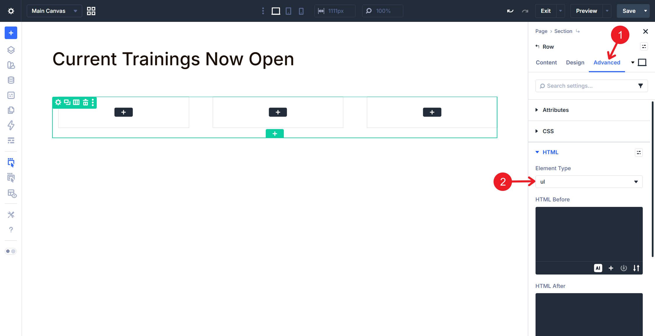
Still in the Row settings, navigate to Advanced > HTML. From the Element Type dropdown, select <ul> to create an unordered list.
Notice how the column outlines have an extra space to their left; we’ll deal with that below.
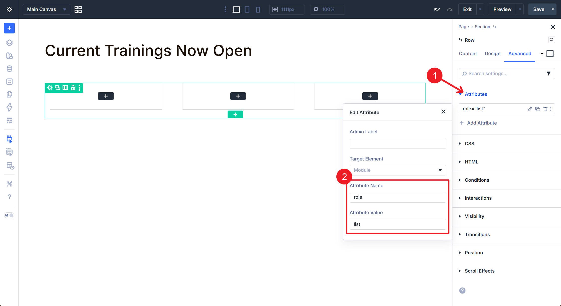
If you want an additional fallback for assistive technology, you can add a custom attribute of role=”list” in the Attributes option group. In standard HTML, a native <ul> already exposes list semantics, so this role is usually optional. Some teams still choose to add it as a defensive accessibility measure, especially when heavily customizing list presentation.
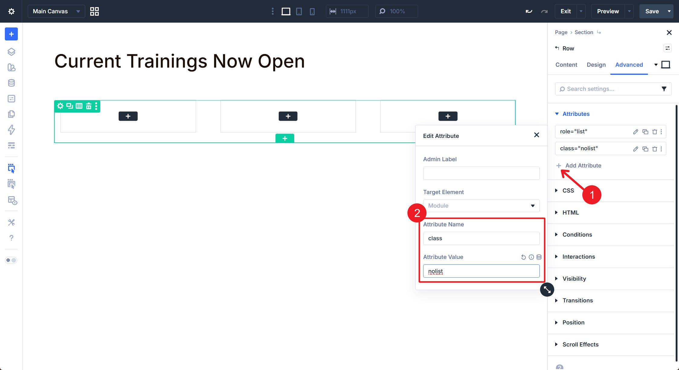
Next, navigate to Advanced > CSS, then add nolist to the CSS Class field.
Then, add the following CSS to your site, either in the Divi Theme Options CSS area or page-level CSS. You can also create a CSS Option Preset if you plan to use it often.
.nolist {
 list-style: none;
 padding: 0 !important;
 margin: 0 !important;
}
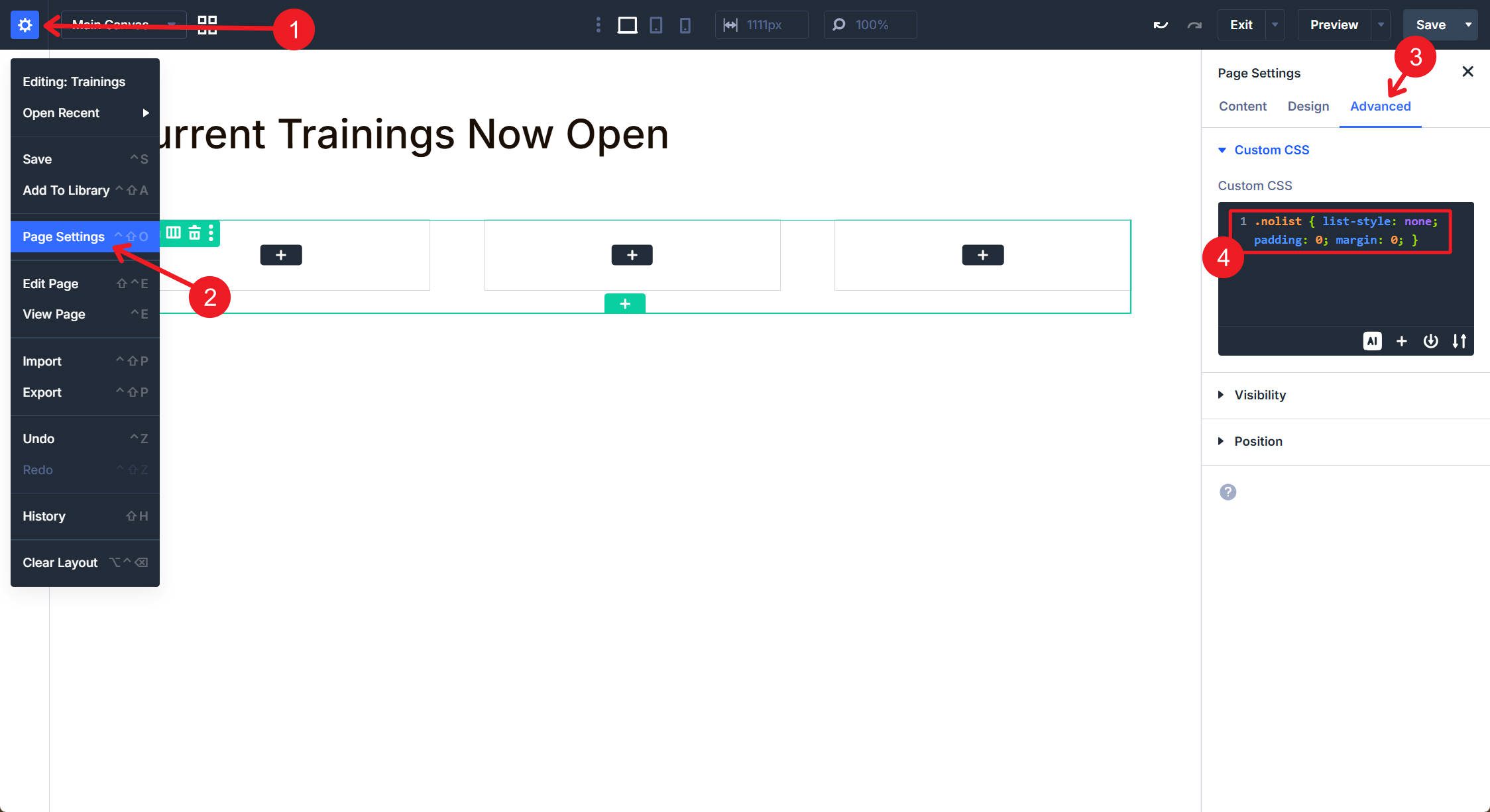
This CSS removes bullet markers and the default spacing browsers apply to a <ul>, bringing the layout back in line with the visual design.
Set The First Column As A Loop Item
Delete all columns in this row except one.
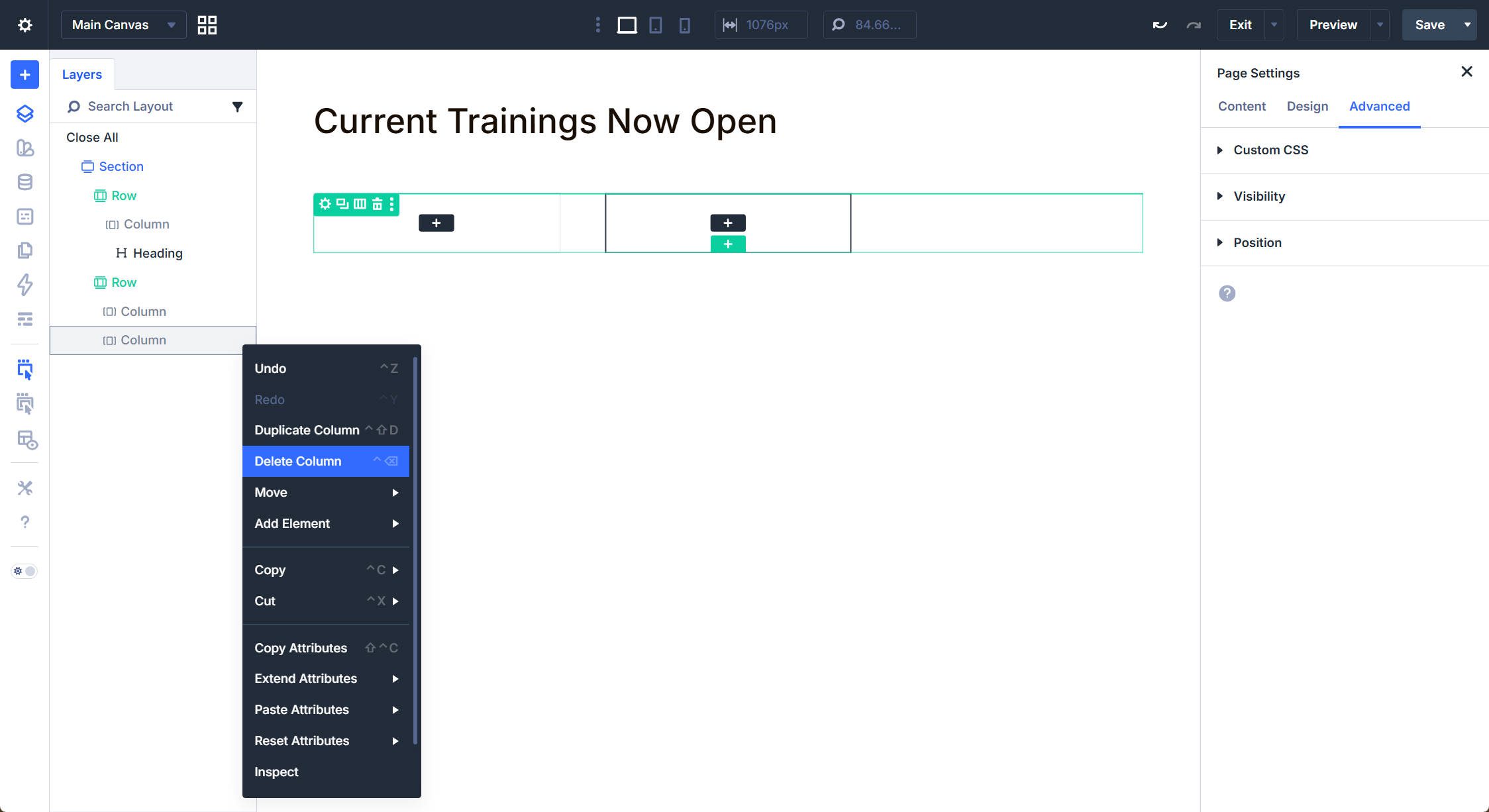
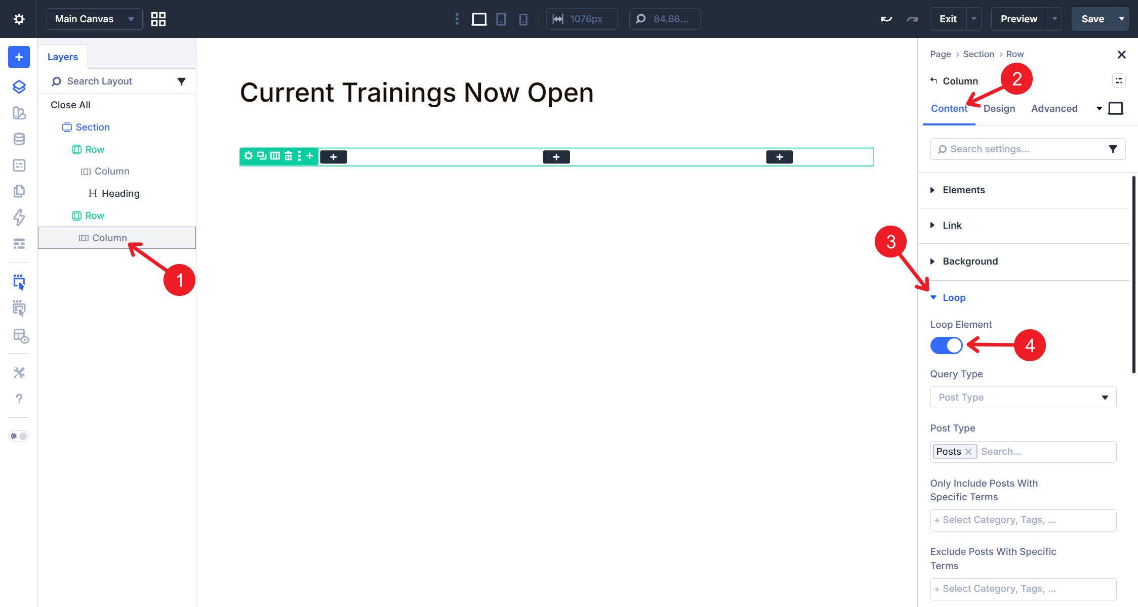
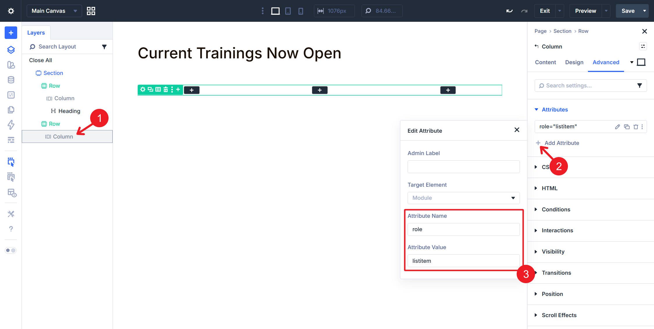
Click the lone Column in your Row, then navigate to Content > Loop and enable the loop. Set the content source to Posts and configure any filtering parameters you need, such as category restrictions or post count limits. The Column now serves as the template that the Loop Builder duplicates for each post matching your query. Any settings you apply here, including HTML attributes, propagate to every generated instance.
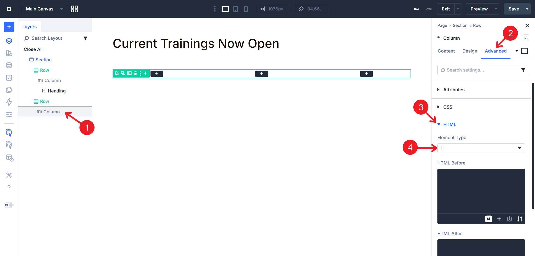
Navigate to the Column’s Advanced > HTML option group. Open the Element Type dropdown and select li. This changes the Column’s rendered element from a <div> to a <li>, making each looped card a proper list item within the parent <ul>.
You can also add role=”listitem” as a custom attribute if your team prefers the same defensive approach used on the parent Row, but native <li> semantics already cover this in standard HTML.
Now, make the entire card clickable. To do that, navigate to Content > Link and use the dynamic content icon to assign the Loop Link. Each card will have its own link based on the Loop settings.
Adding this to the Link option group makes the card itself clickable, expanding the interactive area beyond the linked elements you add inside it.
Add The Article Module Group
Each list item needs an <article> wrapper if the card represents self-contained, standalone content. Each looped item will be both a list item and contain an <article>. Module Groups provide a convenient container for grouping all of a card’s modules into a single semantic element.
Inside the Column, add a Module Group. All other modules for this card — the image, heading, metadata, and button — will go inside this group. Click the Module Group to access its settings, then navigate to Advanced > HTML. Open the Element Type dropdown and select article.
Add The Featured Image
Inside the Module Group, add an Image Module. This module pulls the post’s featured image dynamically through Divi’s dynamic content system. Click the dynamic content icon in the Image field and select Featured Image. The featured image often functions as a figure within the article, so navigate to the Image Module’s Advanced > HTML option group and select figure from the Element Type dropdown.
The <figure> element identifies self-contained content, usually visual in nature, that relates to the surrounding article. Featured images often fit that role well.
This is a freebie and unrelated to semantics: in image-based loops, setting a consistent aspect ratio makes every card feel more uniform. To do this, add a custom attribute such as class=”looped-image-aspect” to the image and then add some custom CSS.
.looped-image-aspect .et_pb_image_wrap {
 width: 100%;
 aspect-ratio: 16 / 11;
 overflow: hidden;
}

.looped-image-aspect img {
 width: 100%;
 height: 100%;
 object-fit: cover;
 object-position: center bottom;
}
Configure The Post Title
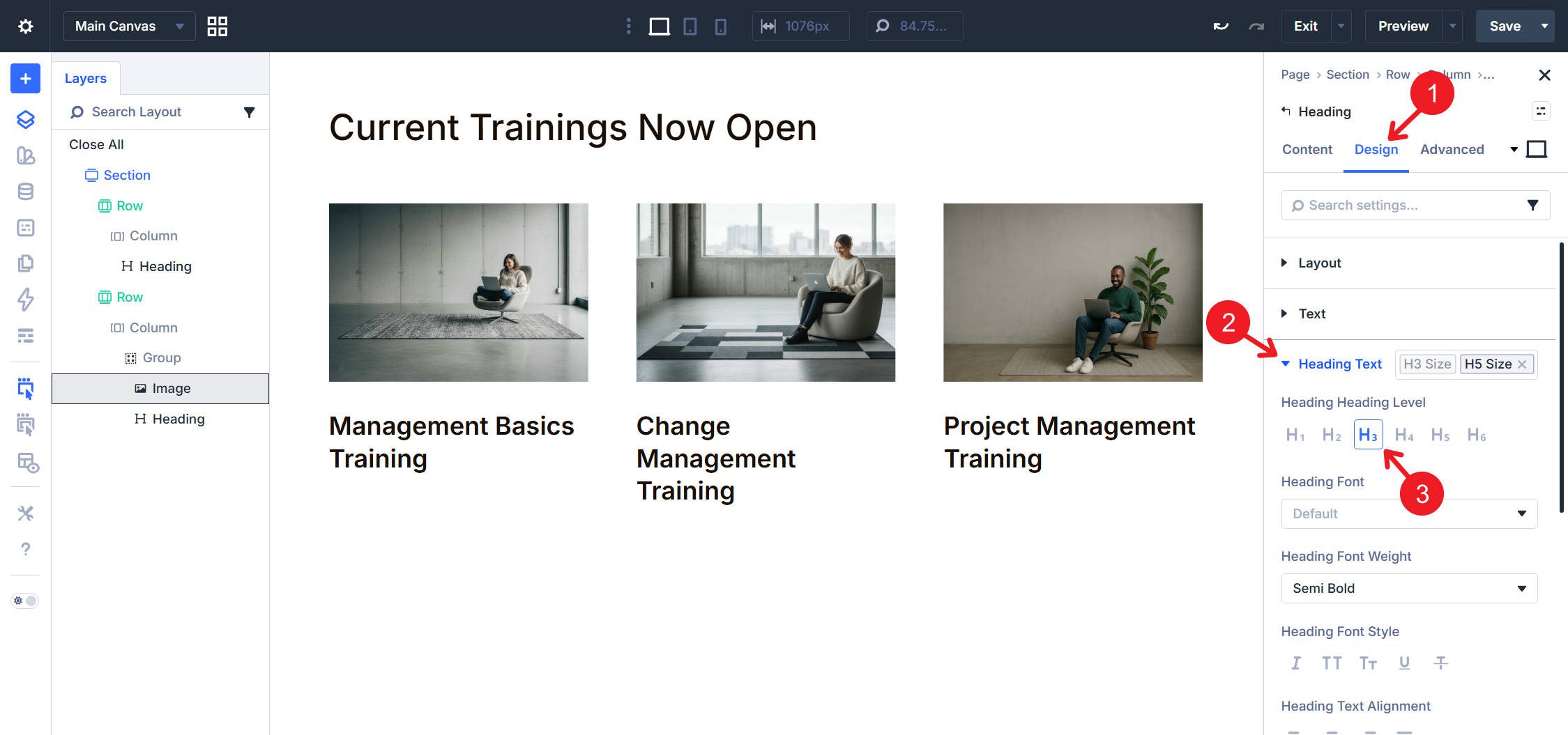
Below the Image Module, still inside the Module Group, add a Heading Module. Click the dynamic content icon and assign it to the Post Title. Then navigate to Advanced > HTML and open the Element Type dropdown. Select header. This wraps the heading in a semantic <header> element, indicating the article’s introductory content.
In the Content > Heading option group, set the heading level to H3 or H4. The H2 level is reserved for major page sections, and each card title functions as a subsection heading within the list. Since the example above uses an H2 heading for the section, H3 works well for the card titles.
You’ll notice I am using styles from my design system and won’t be covering them in this article. We have already published a detailed post about creating a design system with Design Variables and nested or stacked presets, which you can reference for styling.
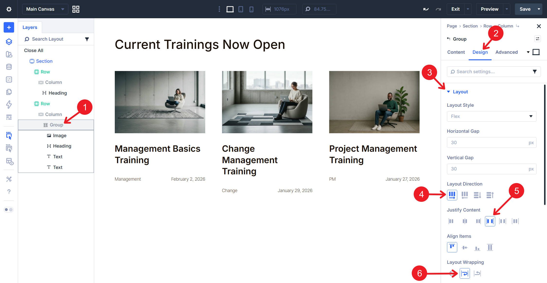
Configure The Post Meta
Below the Heading Module, still inside the Module Group, add Text Modules for each piece of metadata you want to display. Common options include category, date, and author. For each Text Module, click the dynamic content icon and assign the appropriate field. For the category, select the option to link to category archive pages.
The category renders as its own <a> tag pointing to the category archive, keeping it independent from the other links in the card.
At this point, set some Flex settings on the Group to place the two Text Modules side by side when there is enough room. To do that, set the Flex Direction to Row, Justify Content to Space Between, and enable Wrapping.
Below the Heading Module and Text Modules, add a Button Module. Set the button text to Read More or your preferred call to action. Navigate to Content > Link and use the dynamic content icon to assign the Loop Link. Each looped card will now have a button linking to its corresponding post.
The Button Module outputs a real <a> element in the markup. While the whole card is clickable through the Column’s Link setting, the Button provides a clear, semantic link target that assistive technologies and search engines can interpret directly.
Complete HTML Structure Reference
Semantically, we are done. The final rendered HTML for your semantic list follows this hierarchy, with a few extra wrapper elements depending on your Divi configuration
 <section>
<ul class="nolist">
<li>
<article>
<figure>
<img src="featured-image.jpg" alt="">
</figure>
<header>
<h3>Post Title</h3>
</header>
<footer>
<a href="/category/slug/">Category</a>
<time datetime="2026-02-01">February 1, 2026</time>
</footer>
<a href="/post-permalink/">Read More</a>
</article>
</li>
<!-- Additional li items generated by the loop -->
</ul>
</section>
Each element serves a specific semantic purpose. This is a lot of work, especially the first time, but it is worth it for loops. Once you get the structure right, Divi repeats it for every item in the query, so you are effectively designing multiple semantically correct cards at once.
I’ll end with most of the finishing design touches, though not all of them, because this post is focused on the semantics of this card structure.
Where And When To Use Semantic Lists
The <ul> and <li> pattern applies whenever you display a collection of similar items without inherent ordering. Blog post archives, team member directories, product catalogs, portfolio galleries, testimonial collections, navigation menus, and service listings all qualify as unordered lists. If the sequence matters, such as step-by-step instructions or ranked results, use <ol> instead.
When To Use Other Semantic HTML Elements
We’ve covered several semantic HTML elements above, so here is a quick reference for each one:
The <article> element belongs inside list items when each item represents standalone content. Blog posts, products, team bios, and case studies can all be considered articles, especially if they have their own standalone URLs. Navigation links, social icons, and simple labels are not articles. Reserve article markup for content that could meaningfully exist independent of its surrounding context.
The <header> element introduces content within a section or article. It typically includes headings, but may also include navigation, logos, or introductory text. Each <article> can have its own <header>, distinct from the page-level header. In card layouts, wrapping the title in a <header> signals that it introduces the article content that follows.
The <footer> element closes a section or article with supplementary information. Author attribution, publication dates, related links, and copyright notices can go here. Like <header>, each <article> can contain its own <footer>, but it does not always need one. For blog cards, metadata like date and category could be placed in a <footer> if you prefer that grouping over leaving them as standalone elements.
The <figure> and <figcaption> elements pair together for self-contained visual media with optional captions. The <figure> wraps images, diagrams, tables, icons, or videos that support the surrounding content. The <figcaption> provides a caption or description and appears as either the first or last child of <figure>. For team member cards, a <figcaption> containing the person’s name and title beneath their photo can create cleaner semantics than separate text elements.
Start Building In Divi 5 Today!
Semantic HTML transforms visual card layouts into machine-readable content structures. When used properly, screen readers can better interpret list items and article boundaries, and search engines can better understand content relationships.
Divi 5‘s Loop Builder, Custom Attributes, and Element Type controls provide the tools needed to layer semantic elements onto dynamic layouts. The Loop Builder multiplies your configuration across dynamic content, generating consistent list markup for any number of items.


Leave A Reply