
Divi 5 gives you a much more flexible way to build navigation than older Divi workflows. With the Link and Dropdown modules, plus features like Canvases, the Loop Builder, Interactions, and visibility settings, you can create custom dropdowns and mega menus directly inside Divi without relying on third-party plugins or custom code.
In this post, we’ll walk through a step-by-step approach to building a custom mega menu in Divi 5, including a separate mobile version.
Let’s get started.
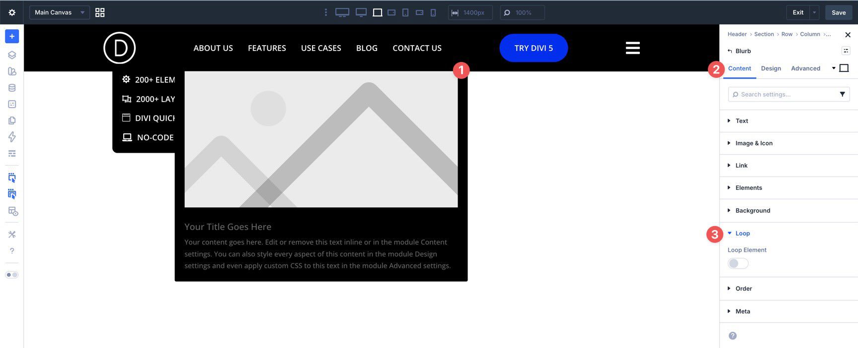
What Is The Dropdown Module?
The Dropdown module in Divi 5 is a dedicated container for building dropdown menus and mega menus. When you place a Dropdown module inside a parent element, such as a Link module, Divi connects the dropdown’s behavior to that parent element. That means the Dropdown module can work as part of a navigation item instead of feeling like a separate floating layout.
Subscribe To Our Youtube Channel
This is a major change from older Divi menu workflows, where more advanced dropdown layouts often meant relying on the standard Menu module, the Theme Customizer, or custom code. In Divi 5, the Dropdown module gives you a flexible area where you can place Groups, Rows, Columns, Links, loops, and other modules to create the exact submenu layout you need.
For simple navigation, you can add a few Link modules inside the Dropdown to create a clean submenu. For more advanced layouts, you can build out multiple columns, featured content, icons, or looped content to create a full mega menu.
The Dropdown module also gives you direct control over positioning, alignment, offset, layout direction, and trigger behavior, which makes it much easier to tailor your menus inside the Visual Builder.
The result is a menu-building workflow that is more visual, more flexible, and much easier to customize than the older all-in-one approach.
Divi 5’s menu tools work best when you think of them as separate building blocks. For some menus, the Link and Dropdown modules are enough. For more advanced navigation, Canvases, Interactions, Loop Builder, and visibility settings let you expand the structure without leaving the builder.
Here’s how each piece fits into the process:
Link Module
The Link module acts as the navigation item itself. You can use it for static links, dynamic page links, and menu-based items. It is the starting point for most custom menu structures in Divi 5.
Dropdown Module
The Dropdown module is the submenu container. You place it inside a parent element, usually a Link module, and then build the submenu content inside it. That content can be as simple or as complex as you need.
Canvases
Canvases let you create detached layouts that live outside the main page structure. They are especially useful for things like mobile menus, off-canvas menus, slide-ins, and overlays. In this tutorial, we’ll use a Canvas to build a separate mobile menu rather than forcing both menu experiences into one layout.
Interactions
Interactions handle the behavior around your menu. The Dropdown module already covers the basic opening and closing behavior for standard dropdowns, but Interactions become useful when you want to launch a mobile menu, trigger a Canvas, or hide and show elements at specific breakpoints.
Loop Builder
The Loop Builder makes a menu dynamic. Inside a Dropdown or Canvas, you can use loop-enabled modules to pull in posts, projects, products, pages, or other content automatically. That makes it possible to build a submenu that updates itself as content changes on your site.
Visibility Settings
Visibility settings help control what appears when and where. They are useful when you want to hide desktop menu elements on smaller screens, keep a mobile menu hidden until triggered, or simplify which pieces are active at different breakpoints.
When you combine these tools, you can build everything from a simple dropdown to a multi-column, content-driven mega menu with a separate mobile experience.
Now that we have the core pieces in place, we can build the menu. By the end of this tutorial, you’ll have a desktop header with custom dropdowns and a separate mobile menu built in a Canvas.
Step 1: Create The Desktop Header
Start by creating a new Global Header template in the Theme Builder.
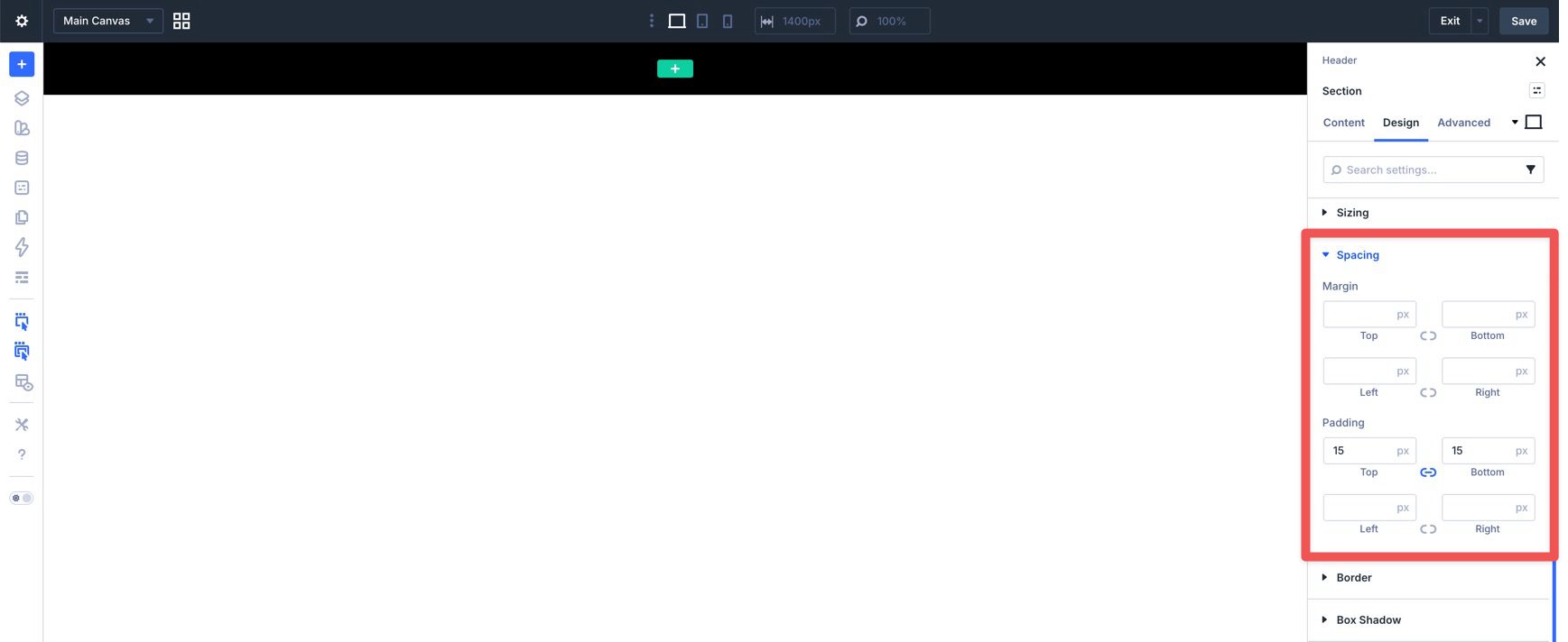
When the Visual Builder loads, select the Section and add a Background Color in the Content tab. Then switch to the Design tab and add 15px of padding to the top and bottom.
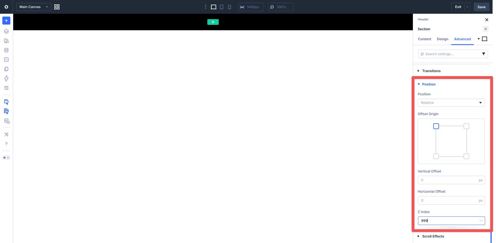
Next, open the Advanced tab, expand the Position settings, and set the Z Index to 999. This helps keep the header and dropdowns above the page content when they open.
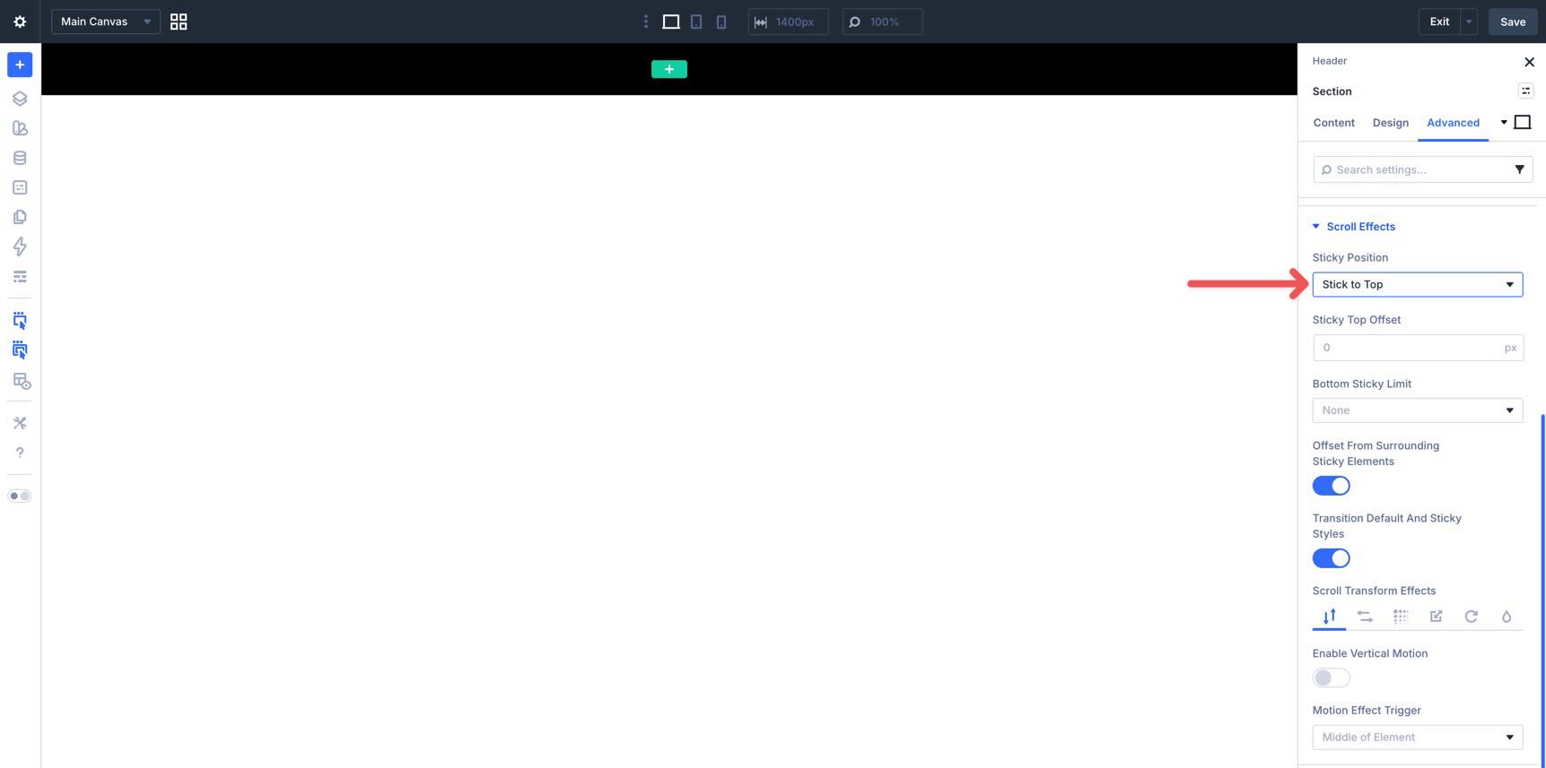
Finally, open Scroll Effects and set the section to Stick to Top.
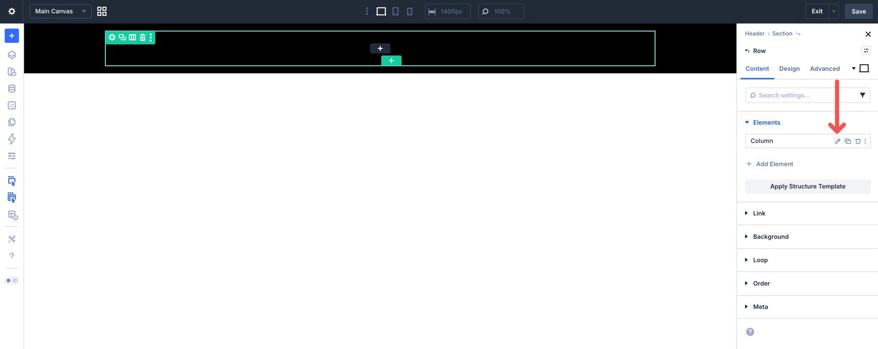
Now add a single-column Row to the section and edit the Row’s Column settings.
In the Design tab, expand the Layout settings and set Layout Direction to Row, Justify Content to Space Between, and Align Items to Center. This gives you a clean horizontal header layout with room for a logo, navigation, and supporting elements.
Start by adding an Image module for your logo. Use the Sizing settings in the Design tab to adjust it across breakpoints. Use the Customizable Responsive Breakpoints feature and the Responsive Editor to fine-tune its size for different devices.
Before moving on, go back to the Content tab and assign a dynamic homepage link to the logo.
Add A Group Module
Next, add a Group module to the row to hold the desktop navigation links. This gives you a cleaner way to manage the desktop menu as one unit, especially when you later decide what should appear or disappear at smaller breakpoints.
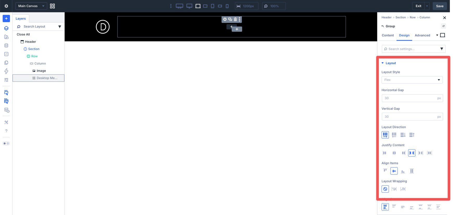
In the Group’s Design tab, expand Layout and set Layout Direction to Row, Justify Content to Space Between, and Align Items to Center.
Add Link Modules
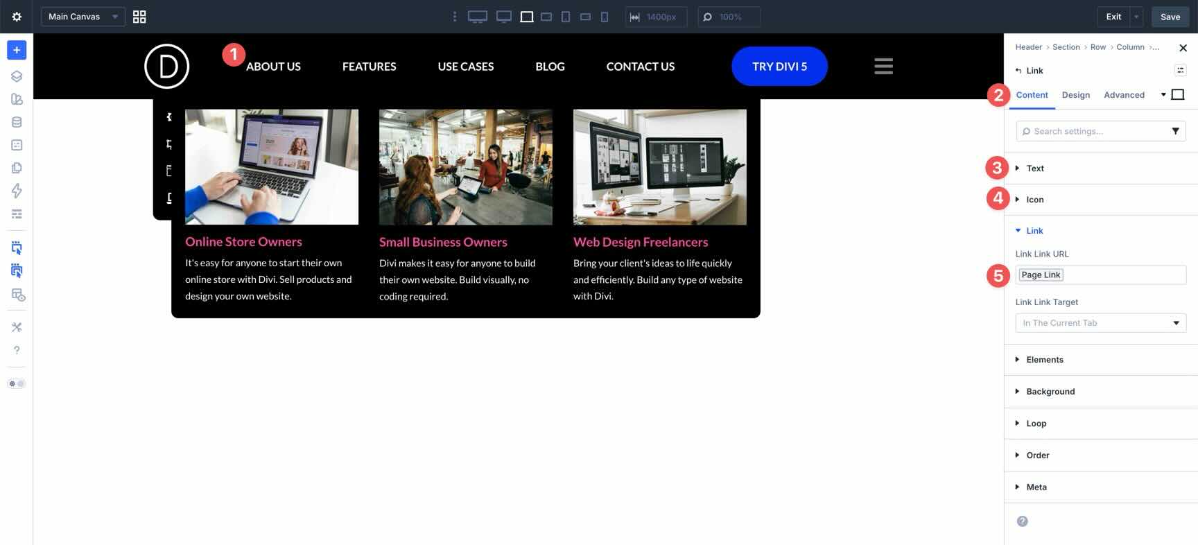
Now start adding your navigation links. Add a Link module and enter a label in the Text field.
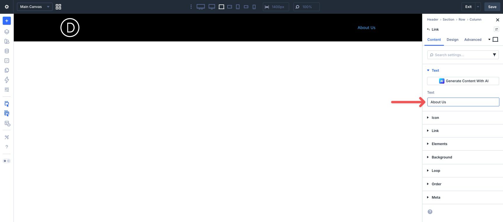
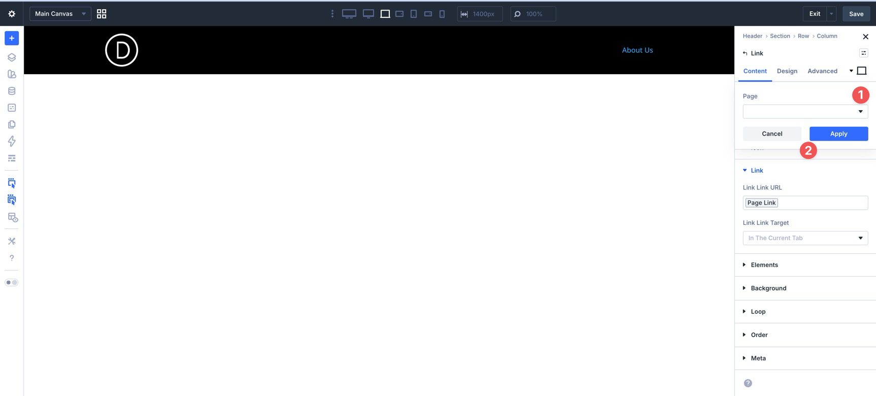
Expand the Link settings and use the dynamic content icon if you want to assign a dynamic Page Link.
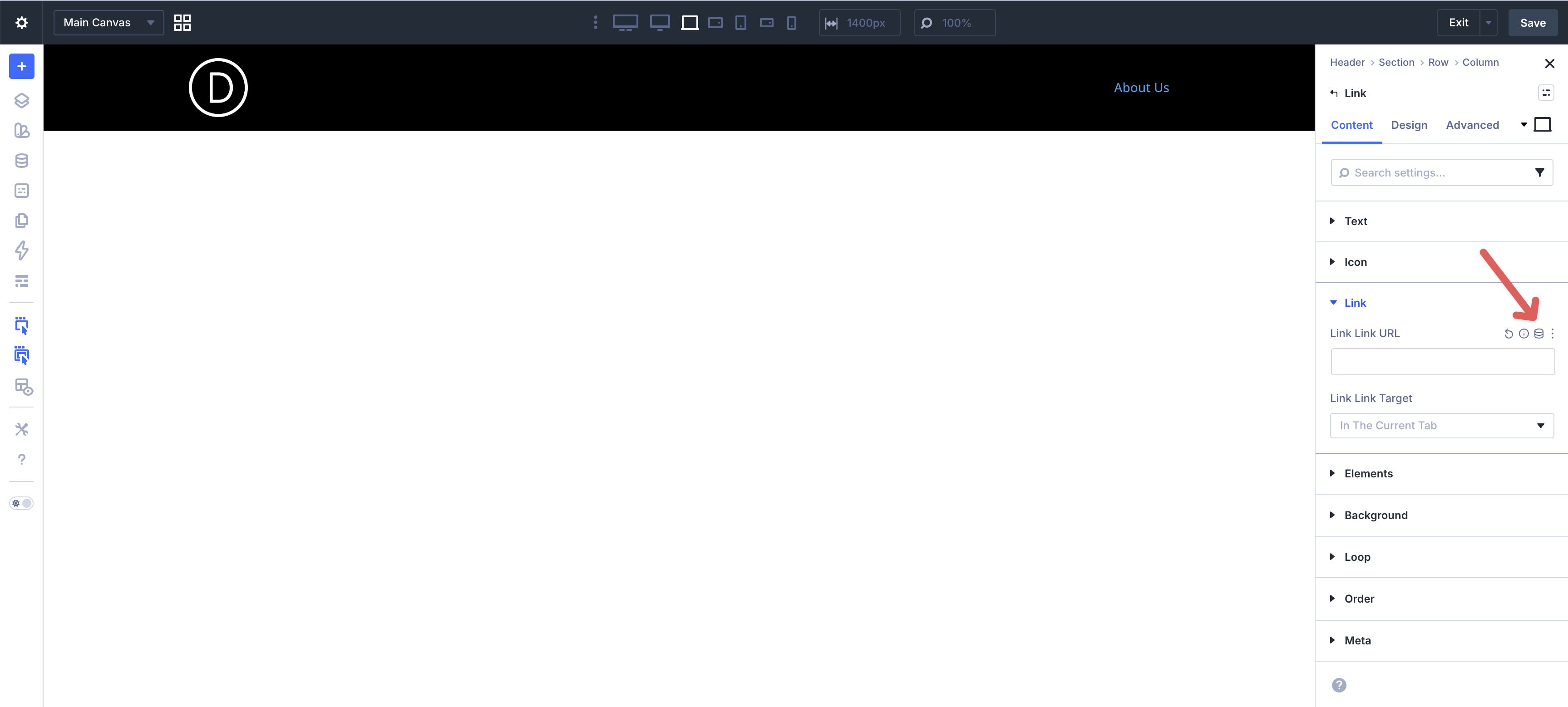
When the modal appears, choose Page Link.
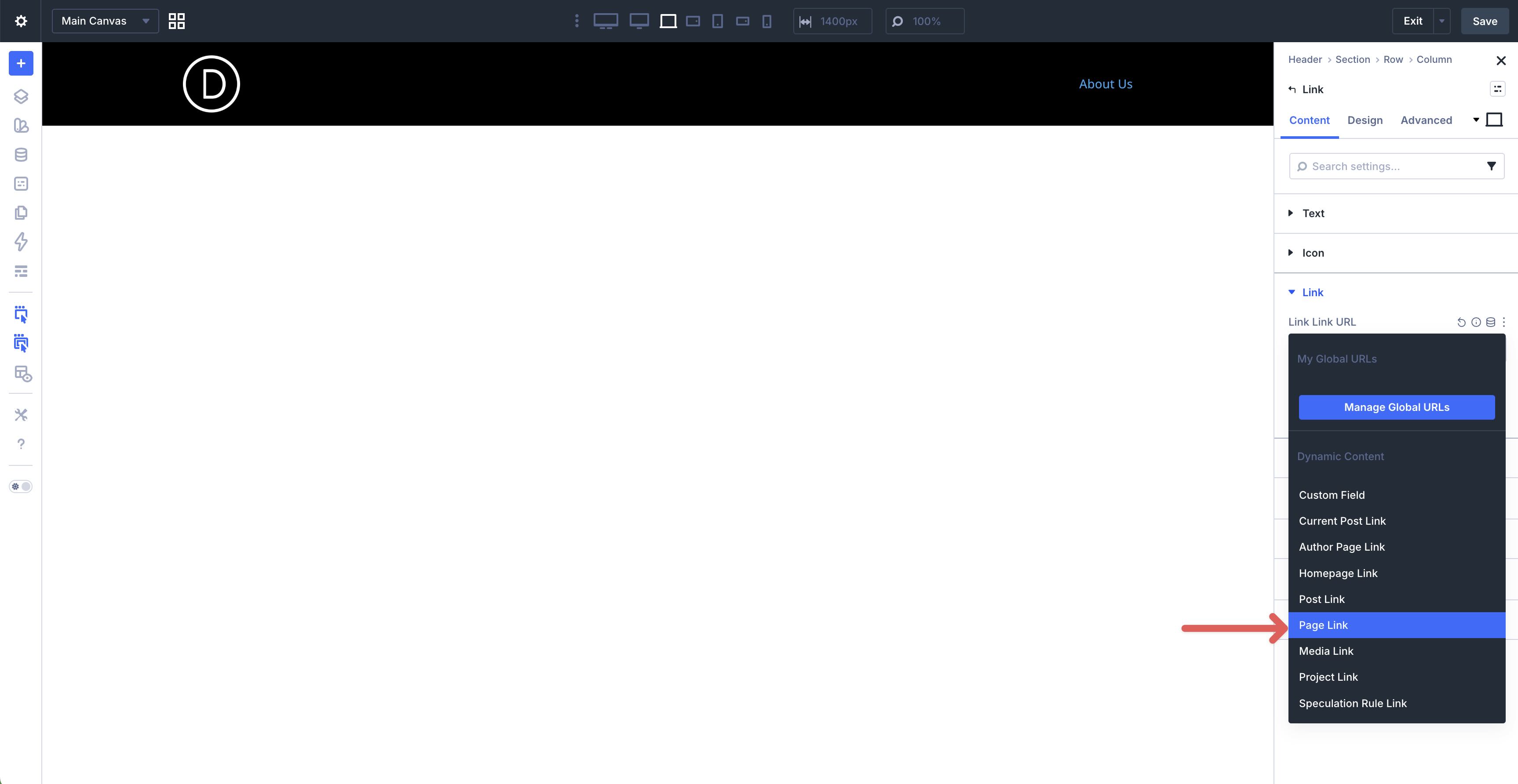
Use the page selector to choose the right page, then click Apply.
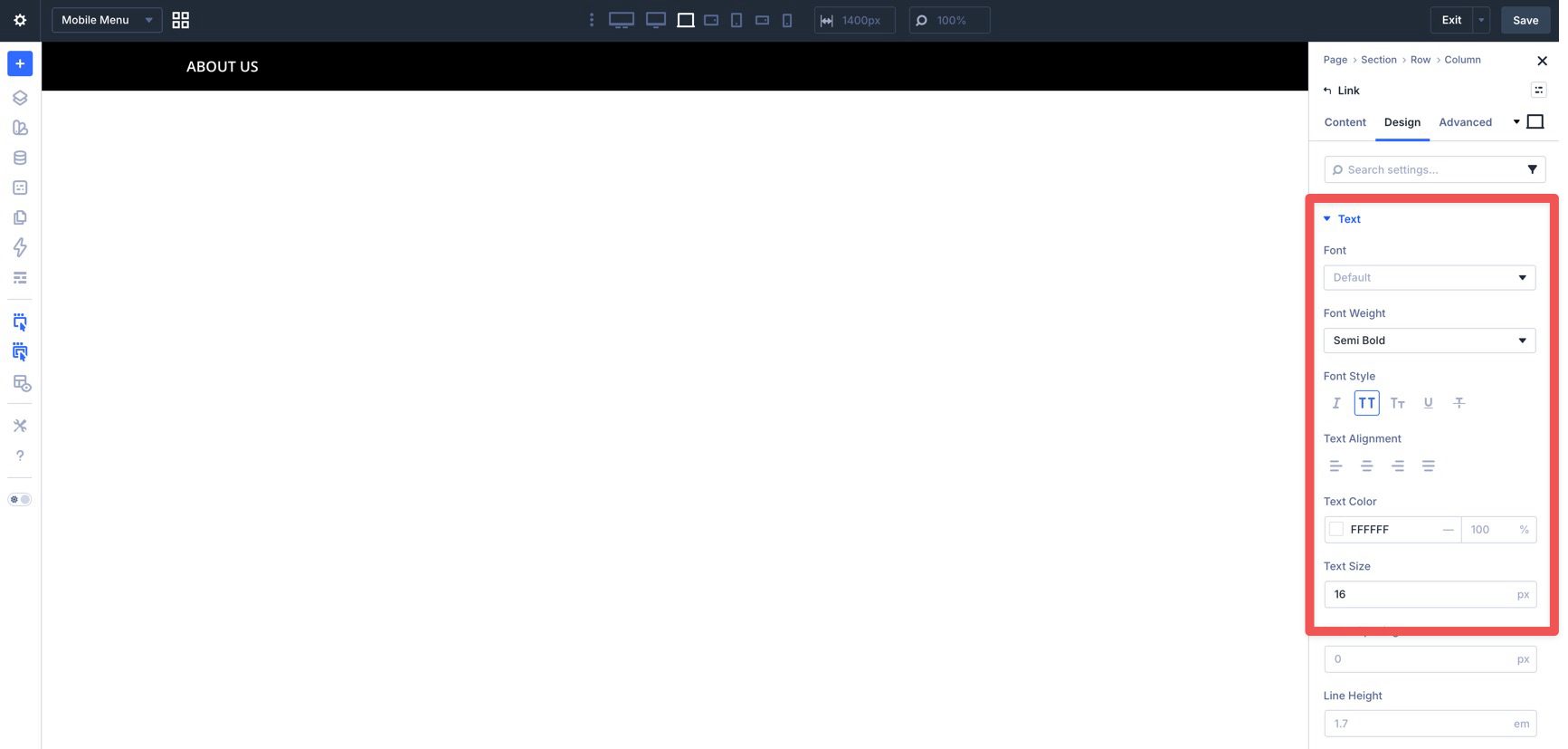
Switch to the Design tab to style the link, including font, weight, style, color, and text size.
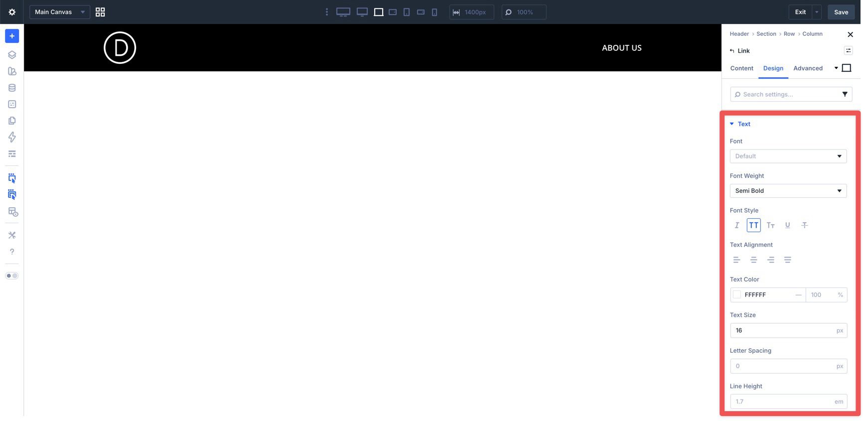
Use Divi’s hover controls if you want the link appearance to change on hover.
Set a hover Color and Border if desired.
When you finish styling the hover state, switch back to the default desktop state before continuing. That keeps your future edits from being applied only to the hover version.
Once one Link module is styled, duplicate it to create the rest of your top-level links, then update the text and destination for each one.
Add Additional Header Modules
To finish the top-level header, add a Button and an Icon module. The Icon will act as the mobile menu trigger later, so choose something recognizable, such as a hamburger icon, and style both modules to match the rest of your header.
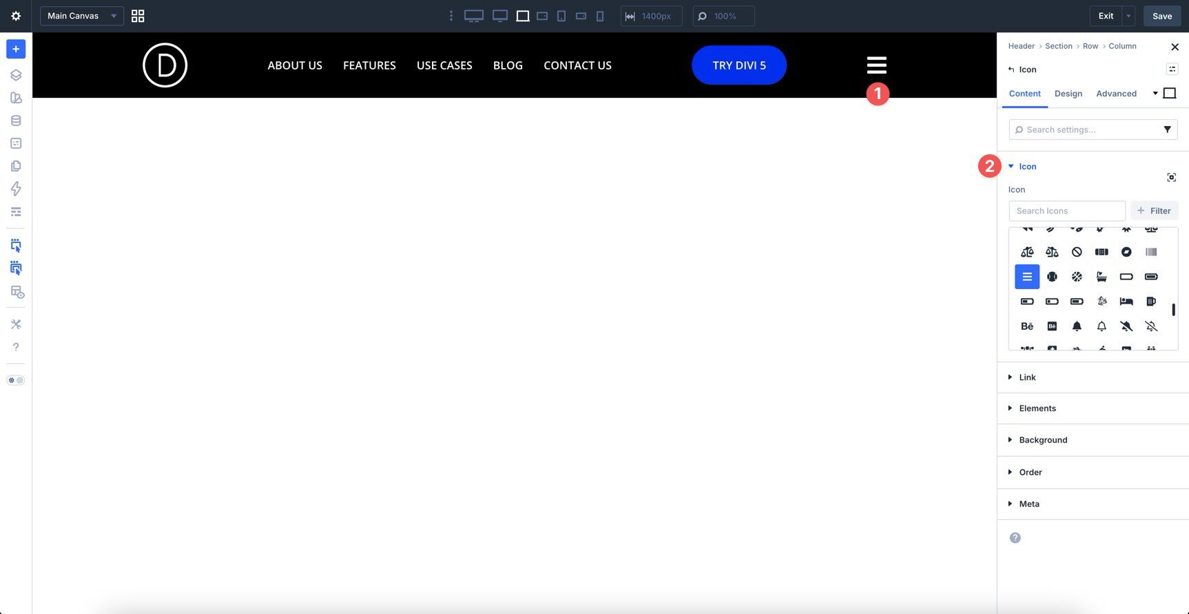
With the top-level navigation in place, we can now build the actual dropdowns. In this tutorial, we’ll create one traditional dropdown made of links and one content-driven submenu that uses the Loop Builder to display recent Projects.
Add A Dropdown Module
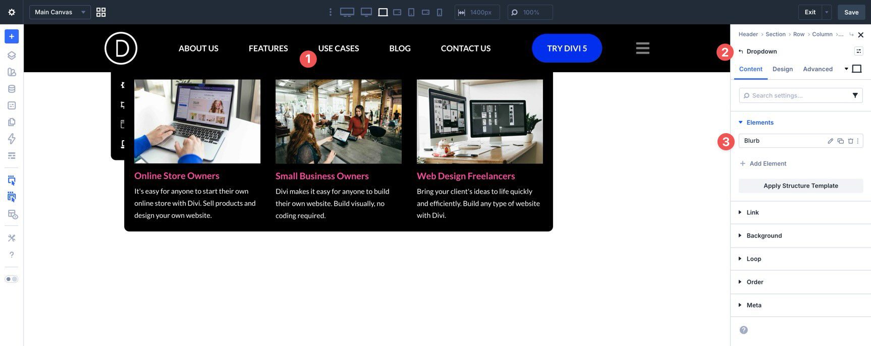
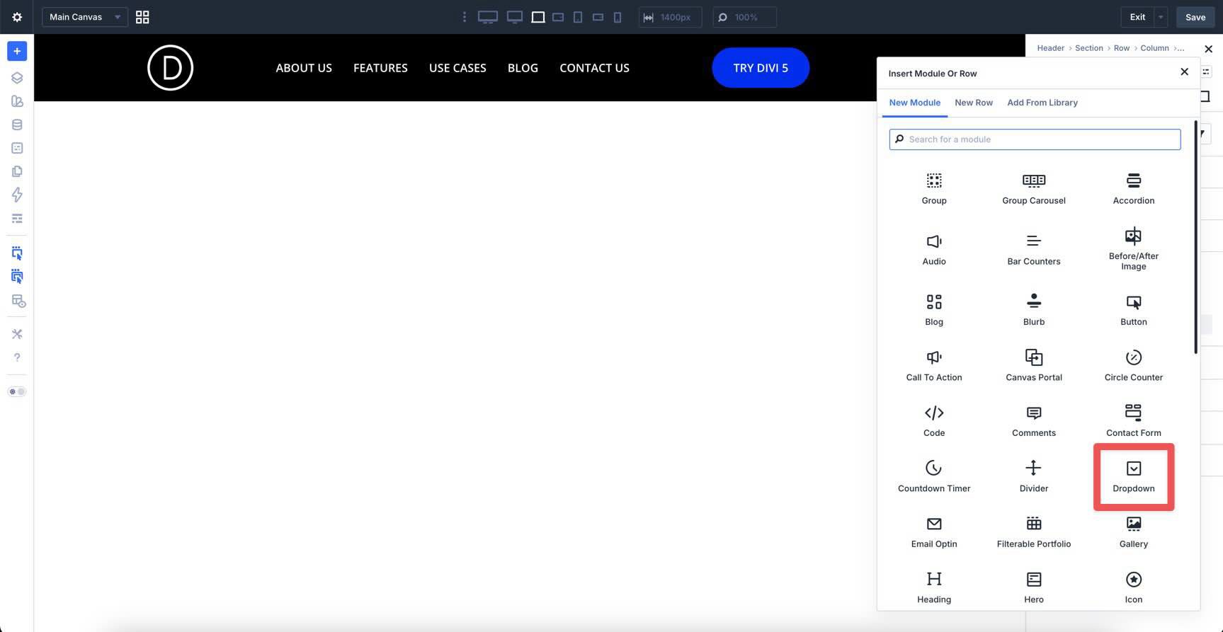
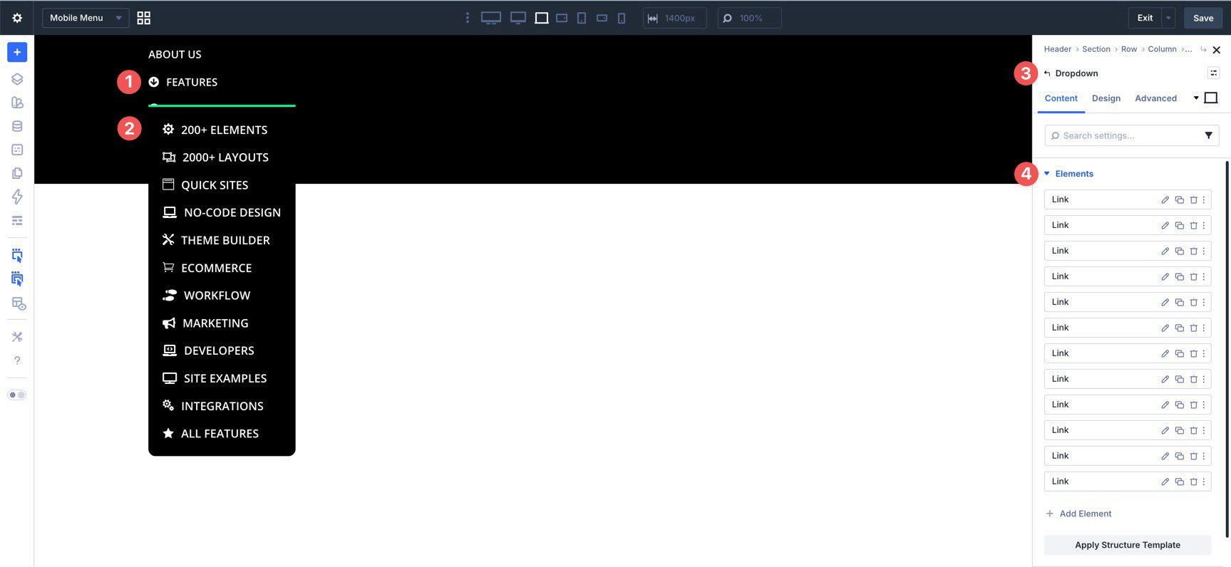
Start with the second menu item. Open its Link module, go to the Elements area in the Content tab, and click + Add Element.
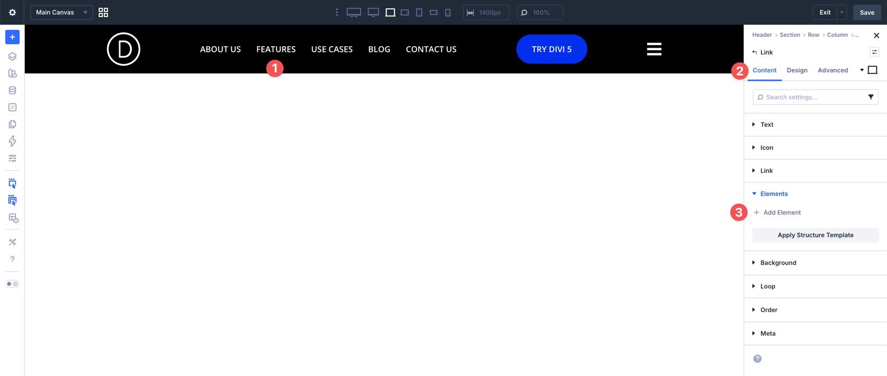
Select the Dropdown module from the module picker.
Inside the Dropdown, add a Group. Then add a Link module inside that Group.
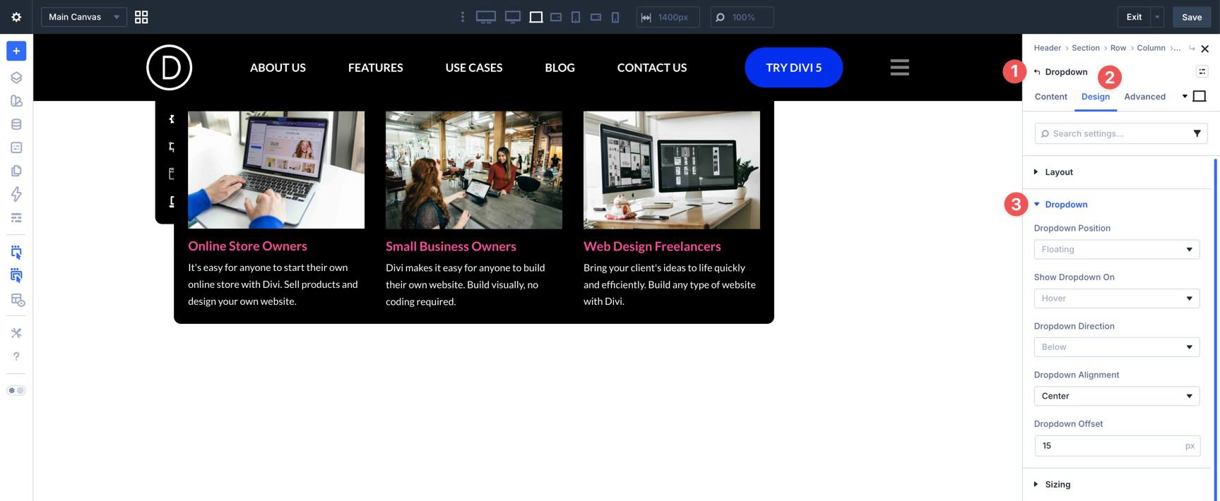
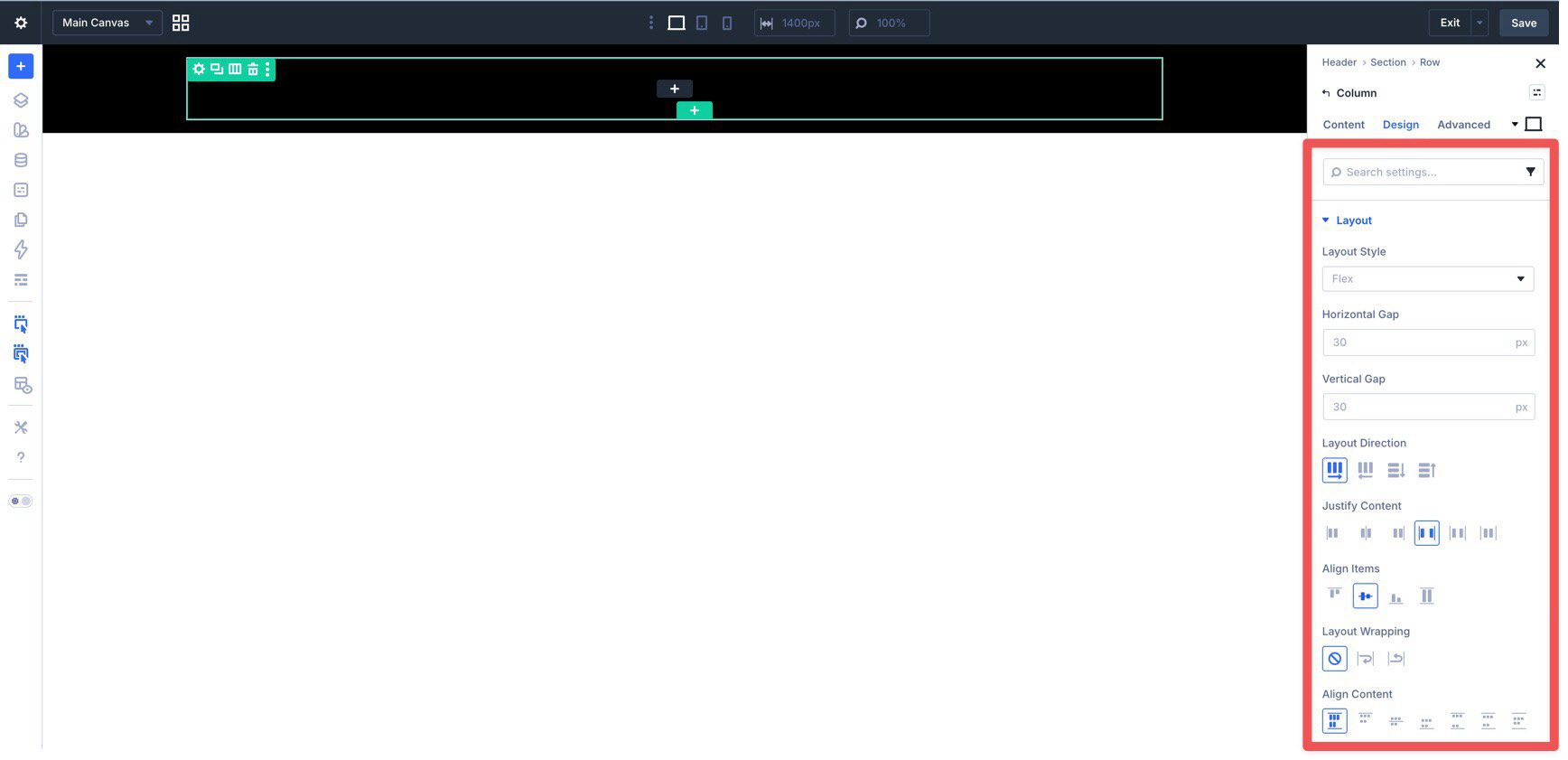
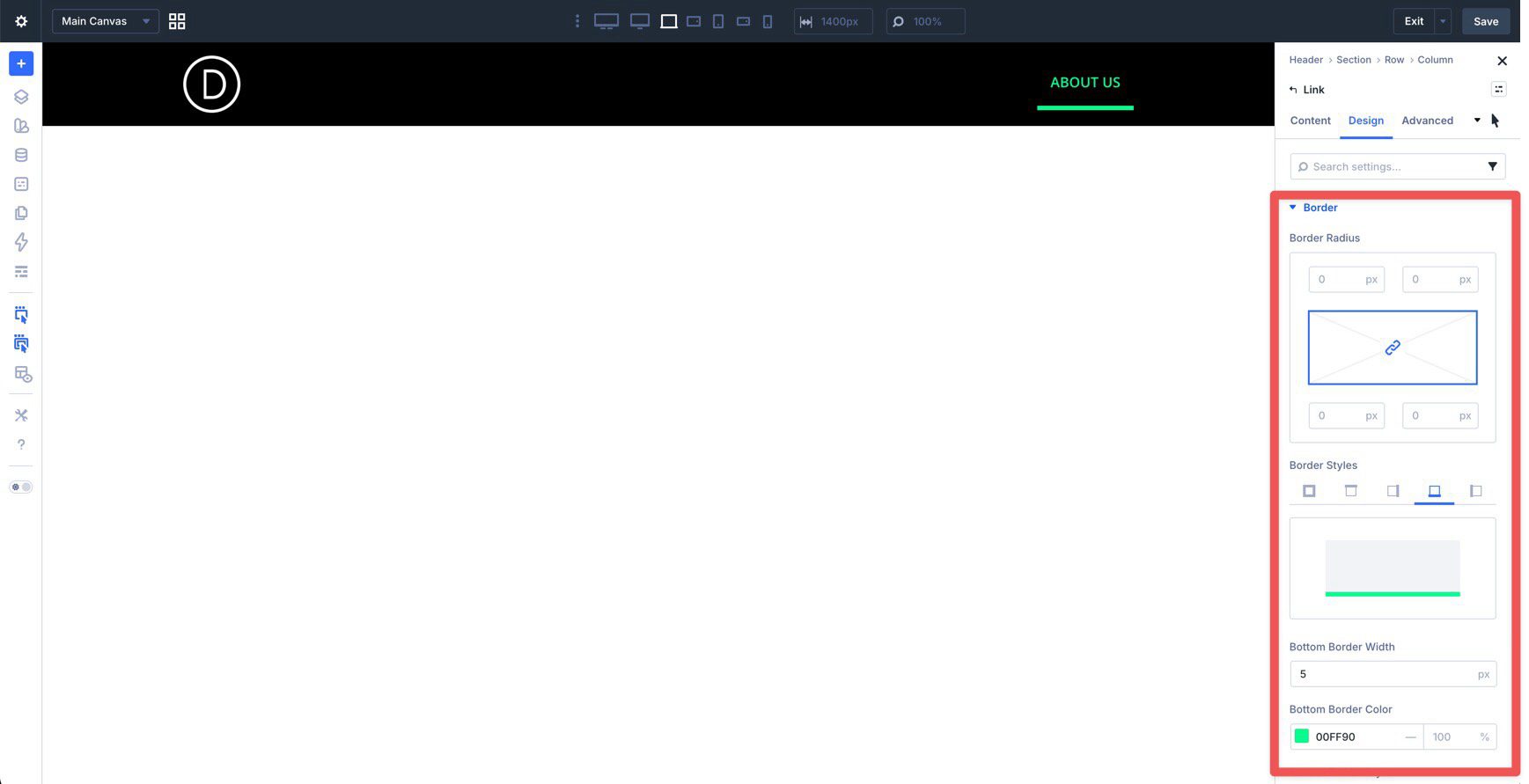
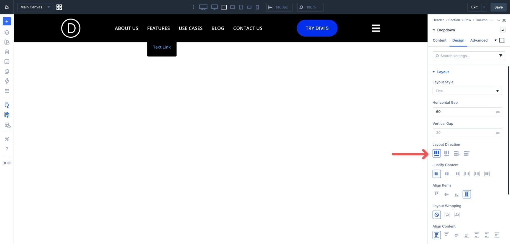
Before configuring the inner Link module, style the Dropdown itself. Open the Dropdown module and go to the Design tab. In Layout, set the Horizontal Gap to 60px and the Layout Direction to Row.
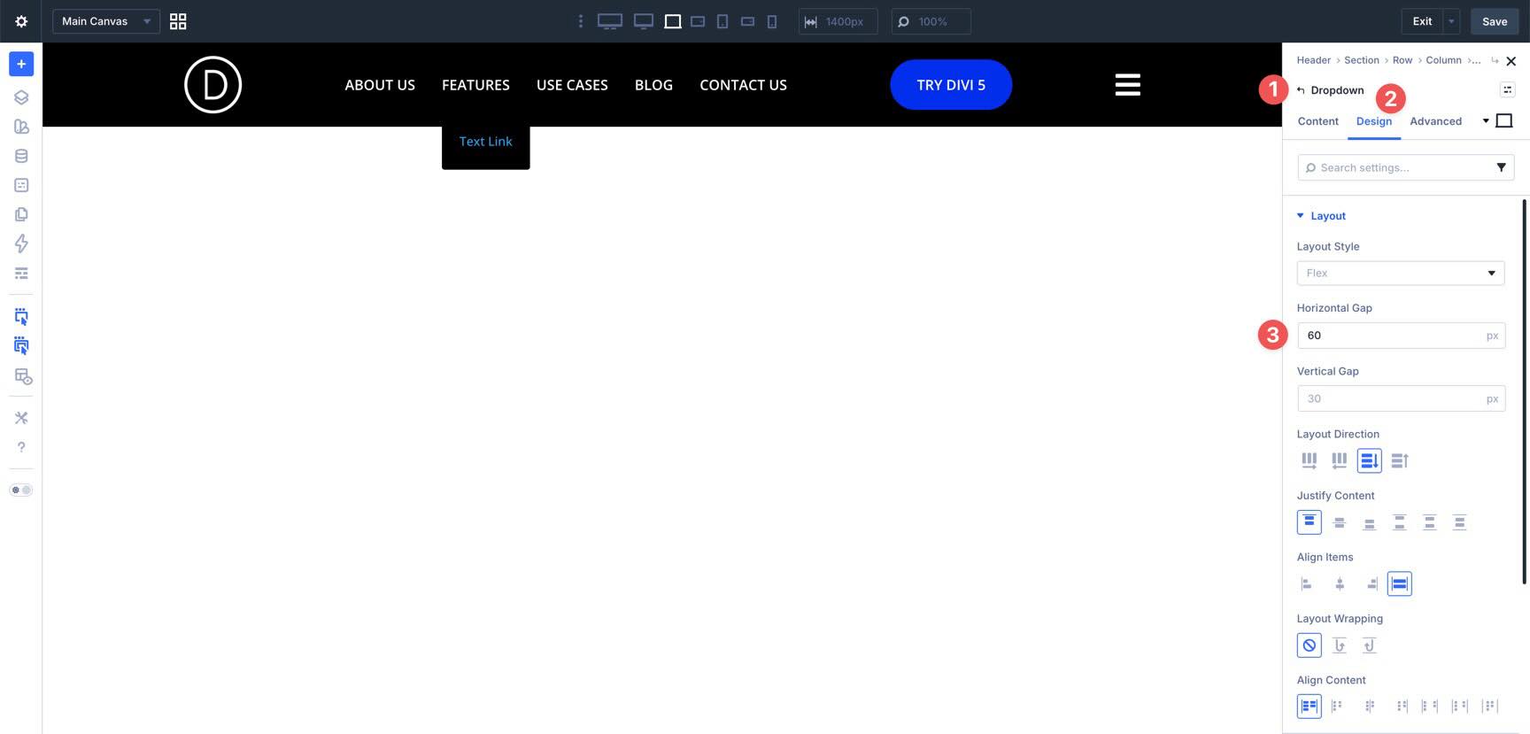
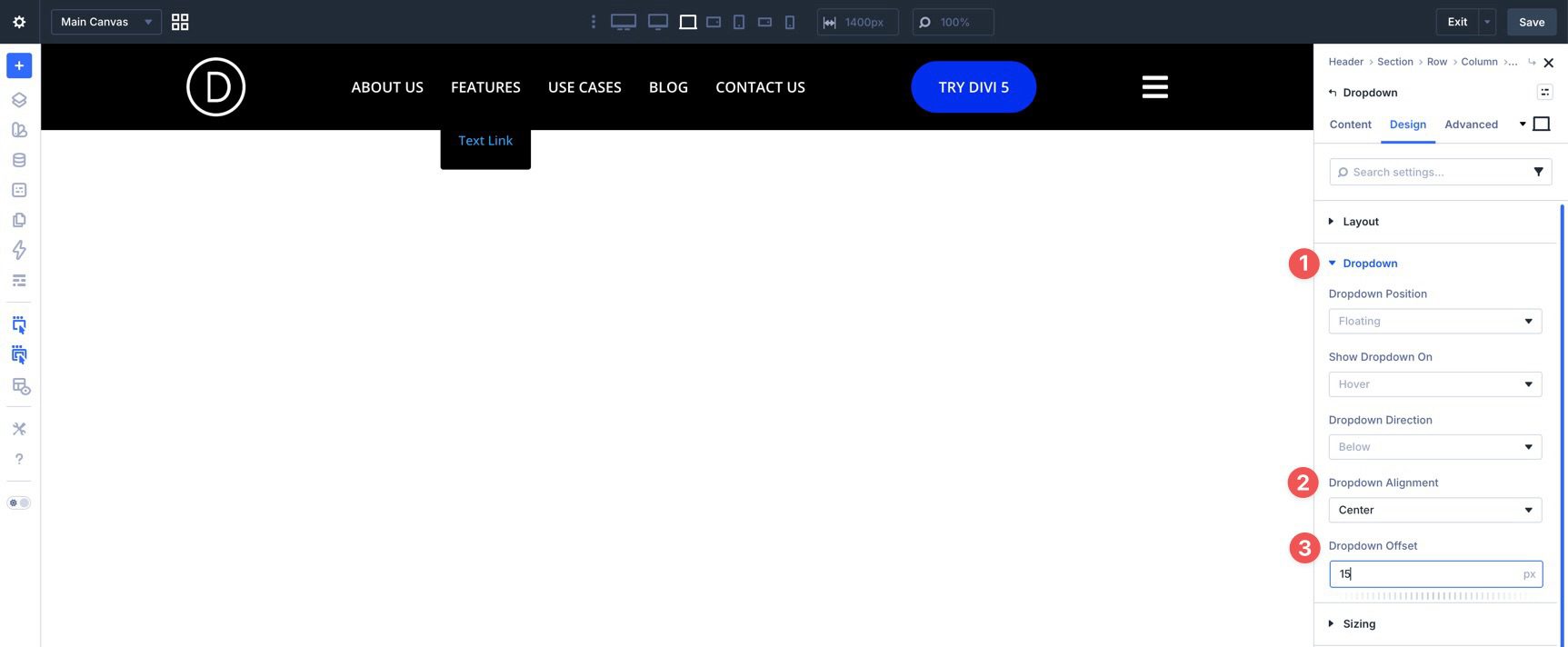
Then open the Dropdown settings and set Dropdown Alignment to Center and Dropdown Offset to 15px.
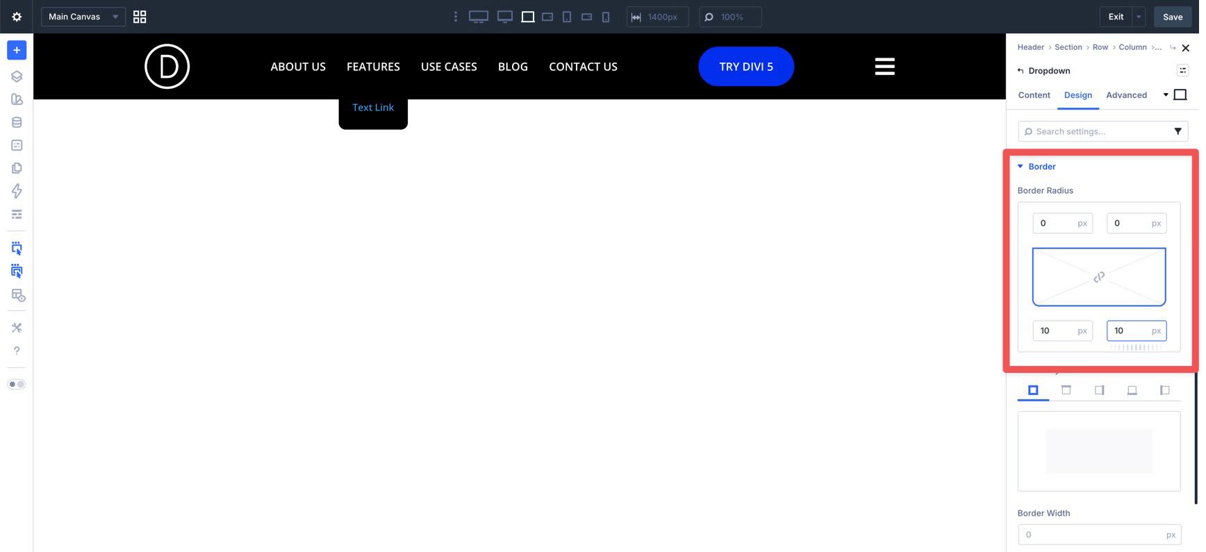
Finally, open Border and assign a 10px border radius to the bottom corners.
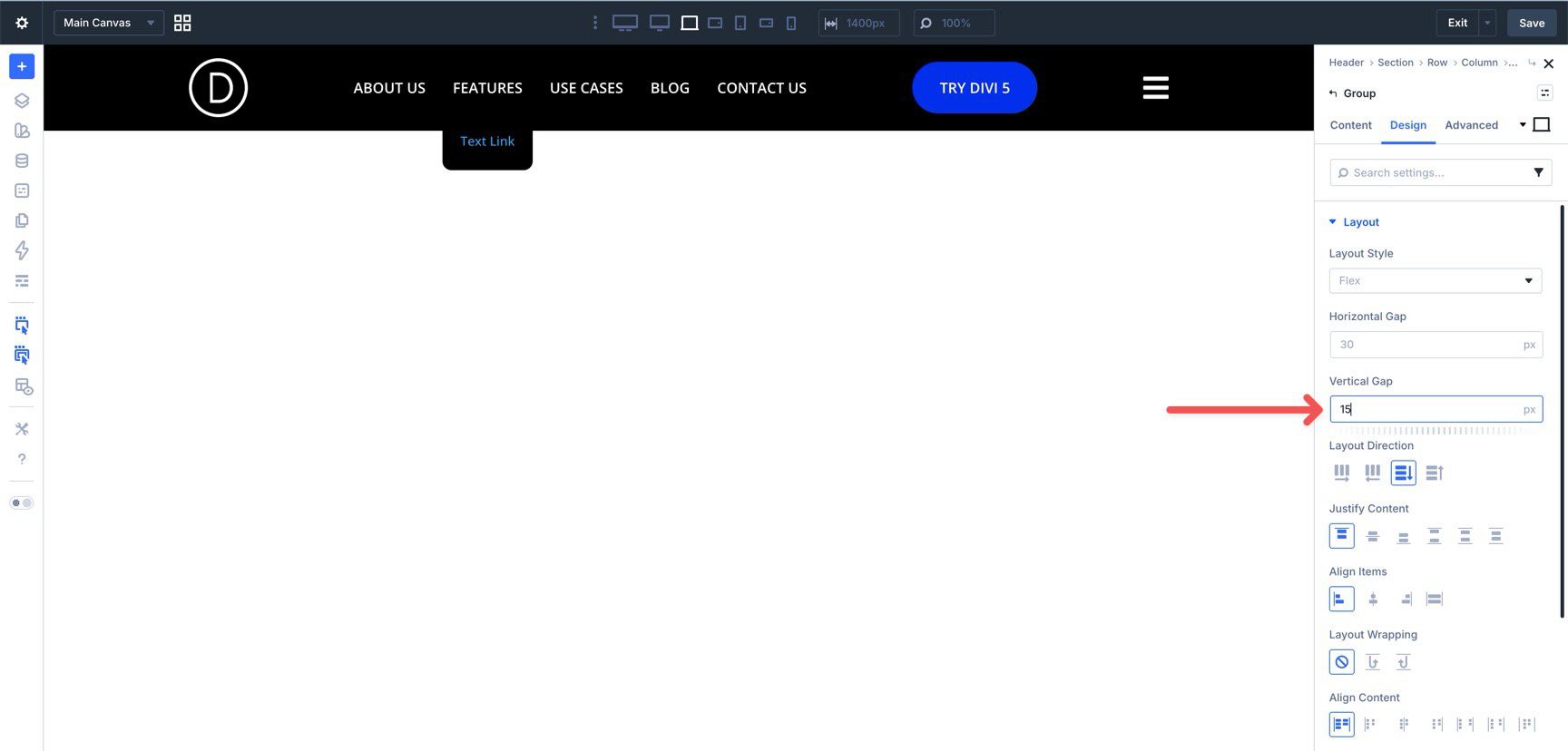
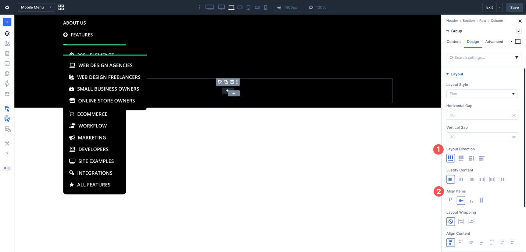
Style The Group Module
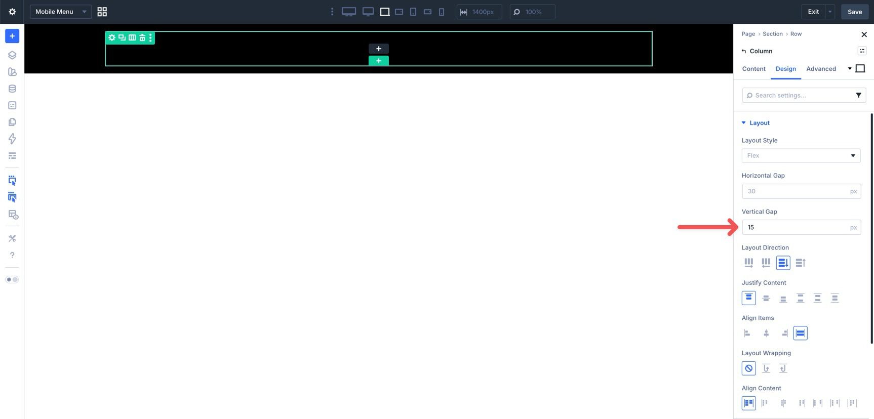
Now open the Group inside the Dropdown. In the Design tab, expand Layout and set the Vertical Gap to 15px.
Style The Inner Link Module
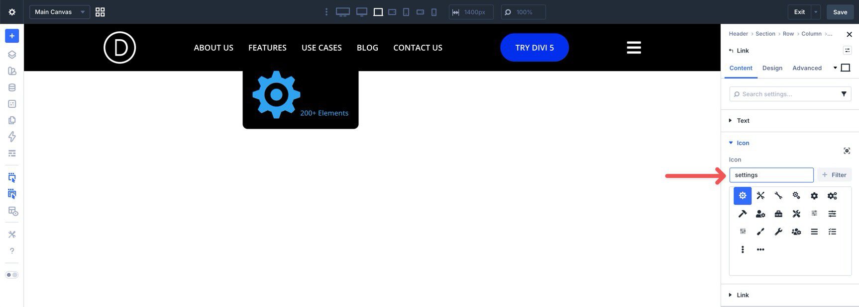
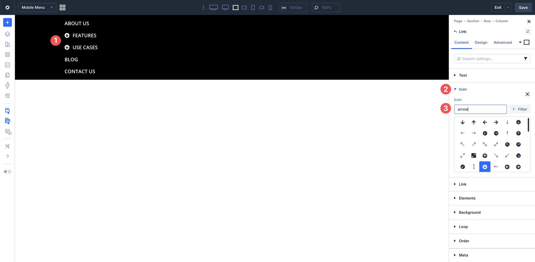
Select the inner Link module. Add a text label and assign a page link or other destination. If you want an icon next to each link, choose one in the Icon settings.
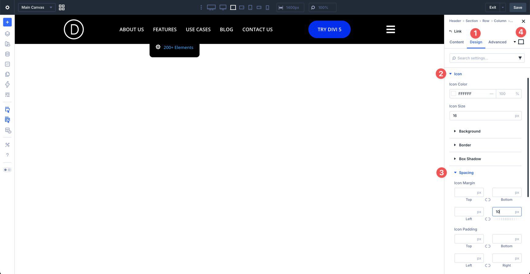
In the Design tab, style the icon with a color and size, then add a right margin to separate it from the text. If you want the icon color to change on hover, use the hover controls there as well.
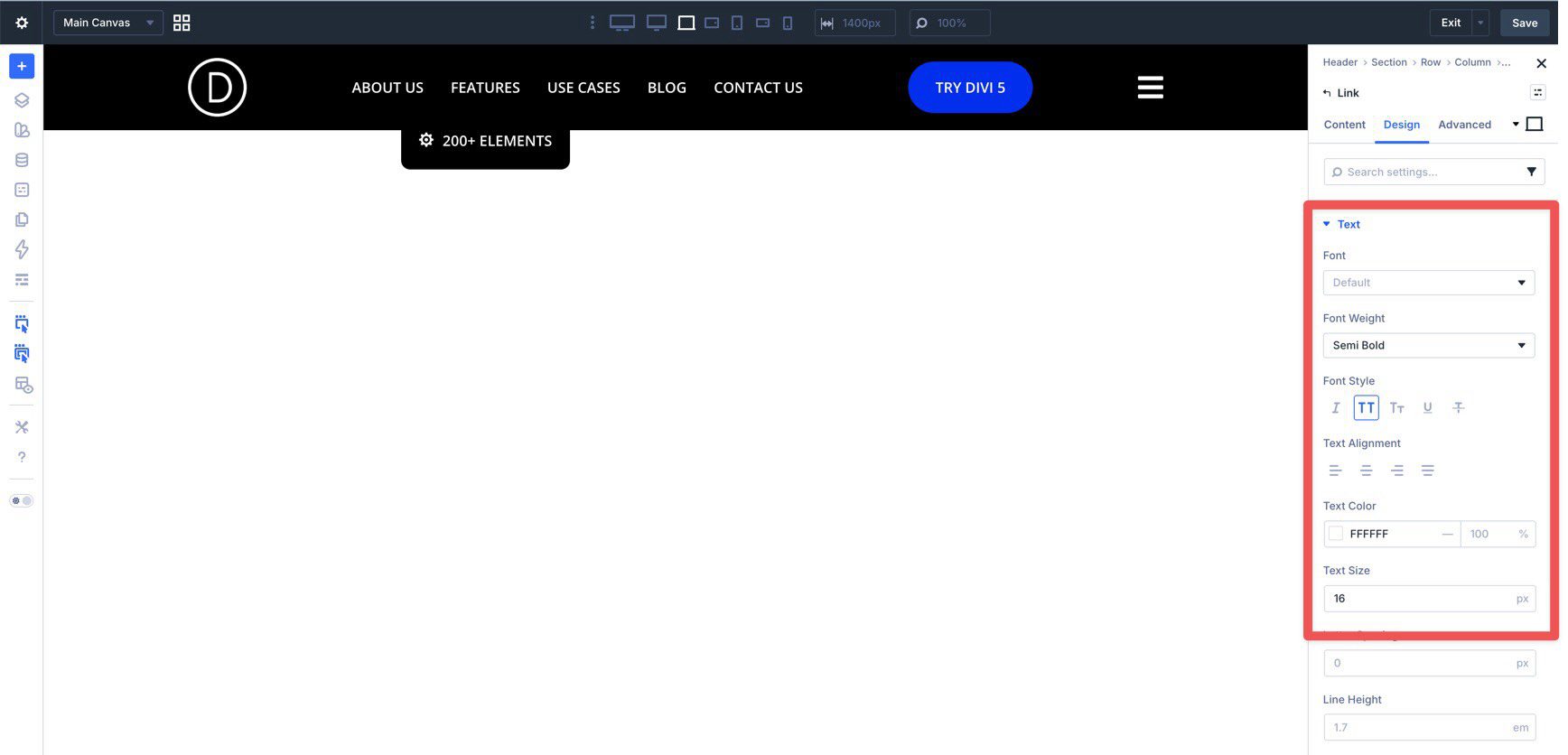
Then style the link text in the Text settings.
Once the first inner link is styled, duplicate it as many times as needed.
Then update the text, destination, and icon for each item. After that, duplicate the Group itself if you want multiple vertical link stacks inside the same dropdown. Those Groups will sit next to each other, creating the mega-menu effect.
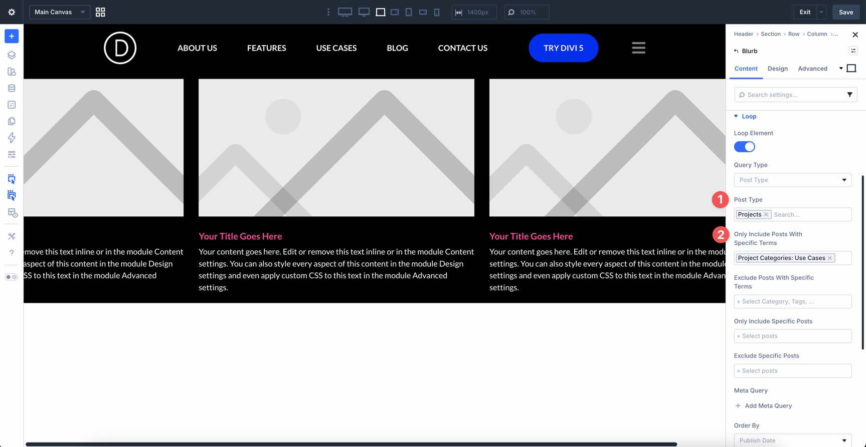
Step 4: Add A Project Loop To Another Dropdown
Next, we’ll create another submenu that uses the Loop Builder to display the three most recent projects. The same idea works for posts or other post types too.
Choose the top-level Link module where you want this submenu. In its Elements area, add another Dropdown module. Apply the same core dropdown settings you used in the previous step:
- Layout Direction: Row
- Dropdown Alignment: Center
- Dropdown Offset: 15px
- Bottom Border Radius: 10px
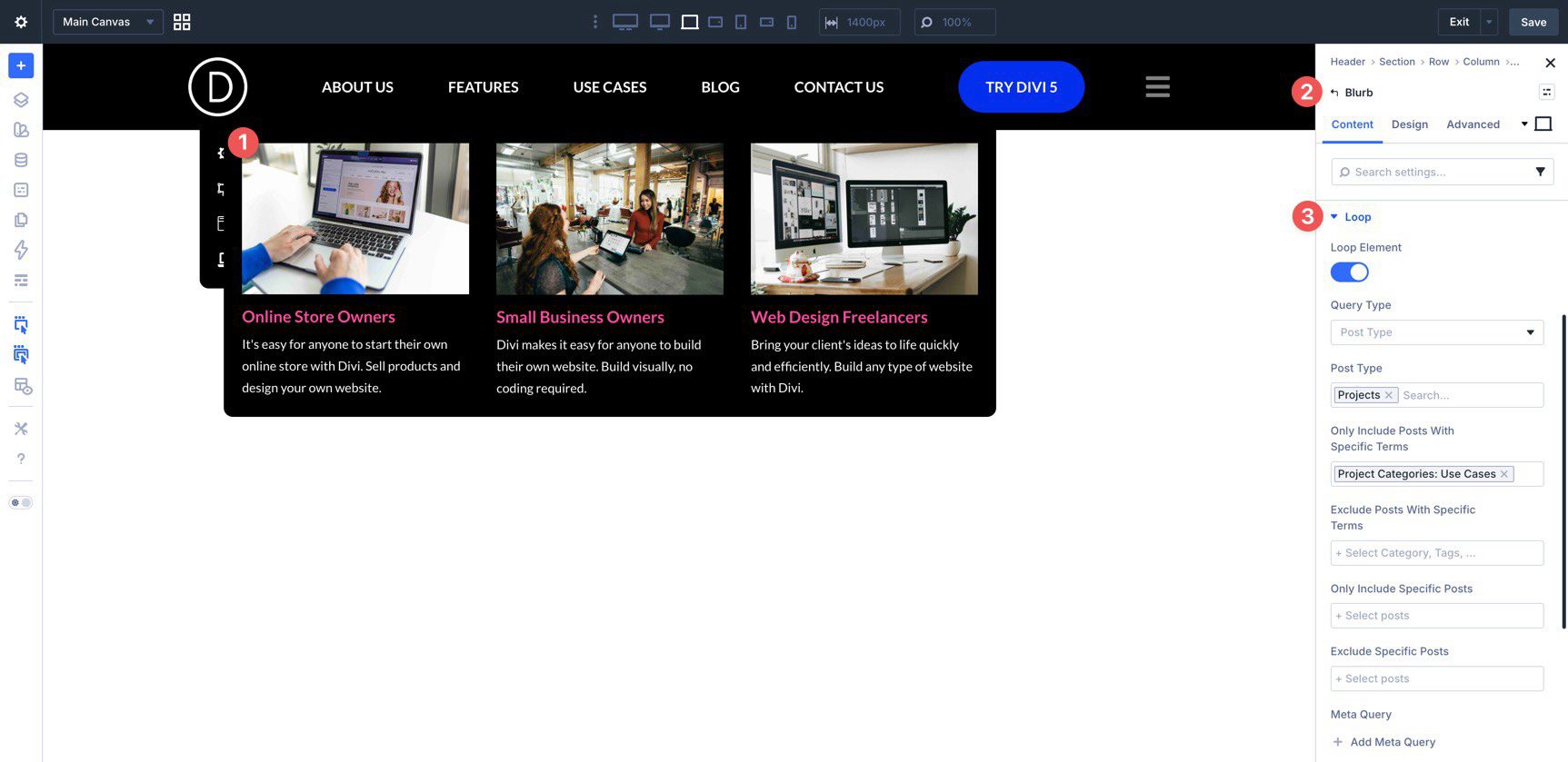
Now add a Blurb module inside the Dropdown.
In the Blurb module’s Content tab, open the Loop settings and enable Loop Element.
Set the Post Type to Projects. If you only want to show items from a certain category or term, use the term filter there as well.
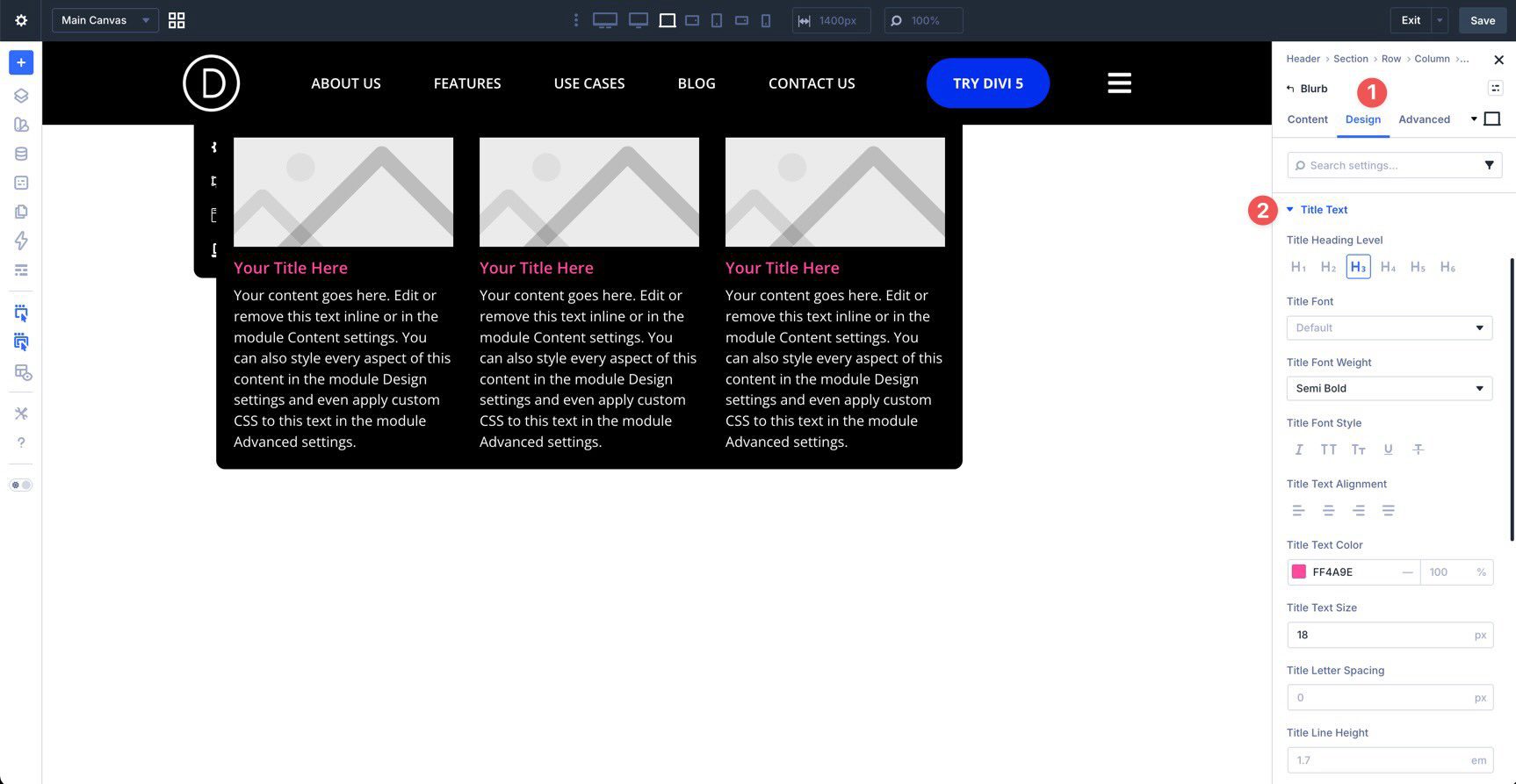
Style the Blurb in the Design tab so the title and excerpt fit the rest of your menu design.
Map The Dynamic Fields
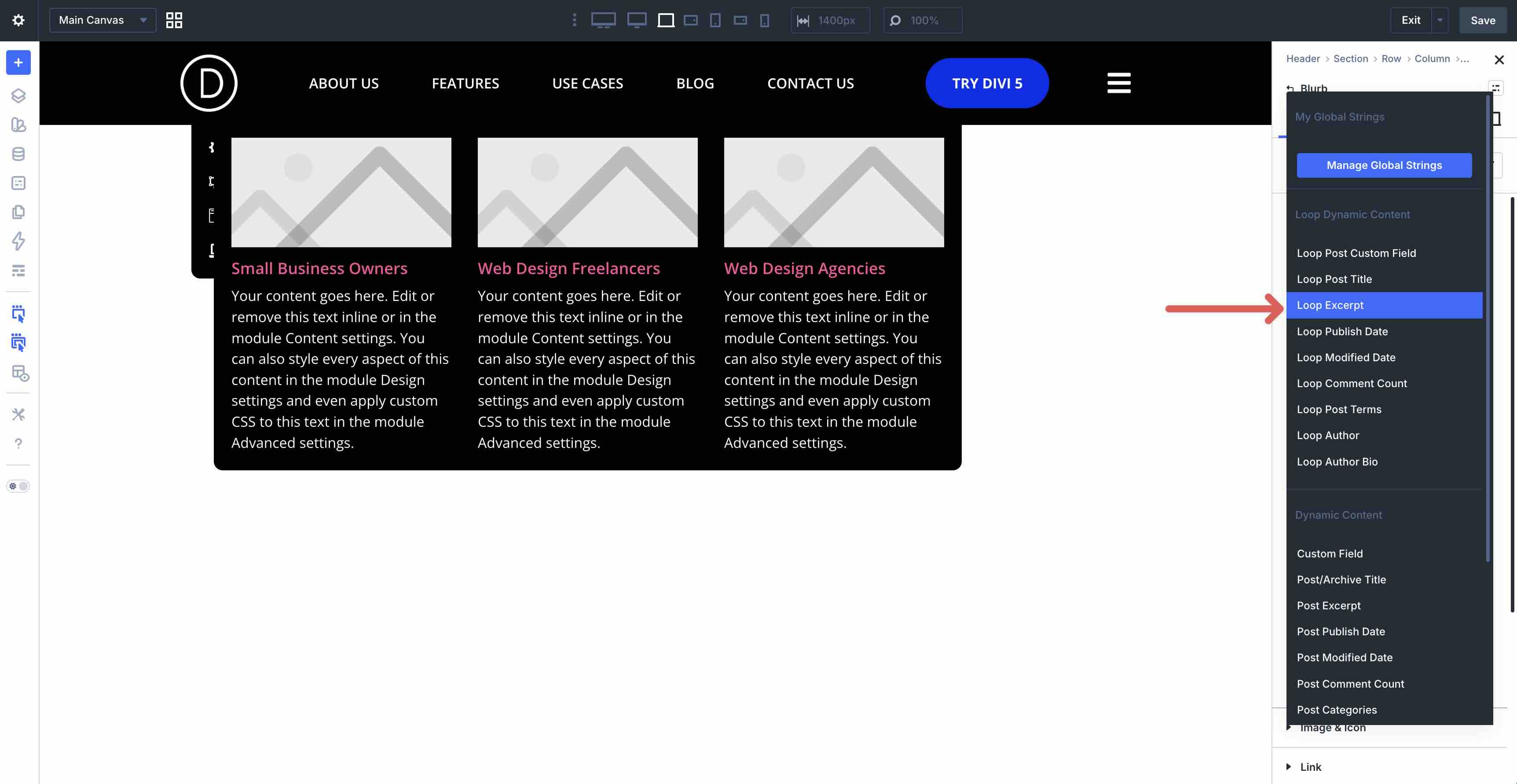
Now map the Blurb fields to loop-based dynamic content. In the Blurb’s Content tab, use dynamic content on the Title field and select Loop Post Title.
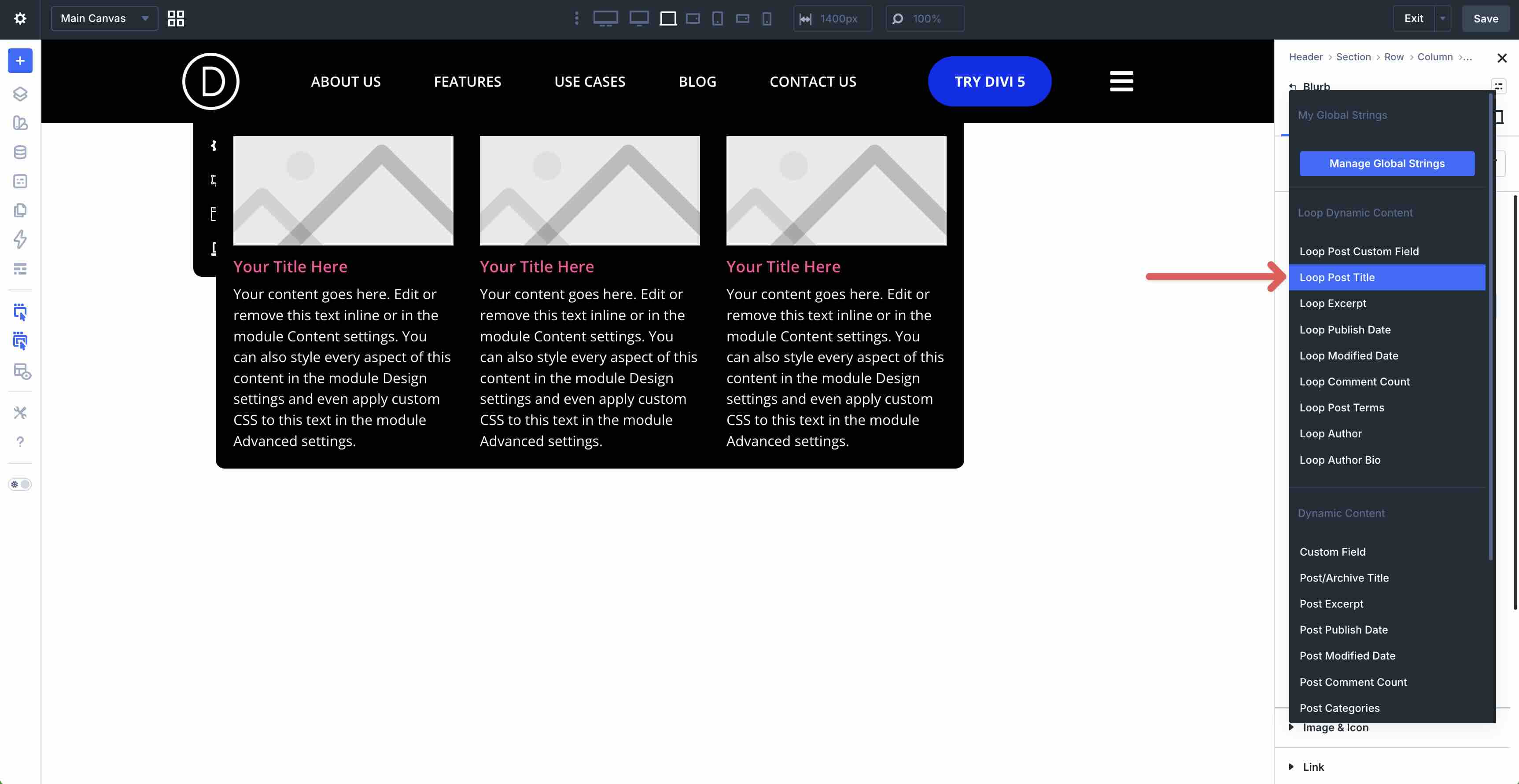
For the body content, select Loop Excerpt.
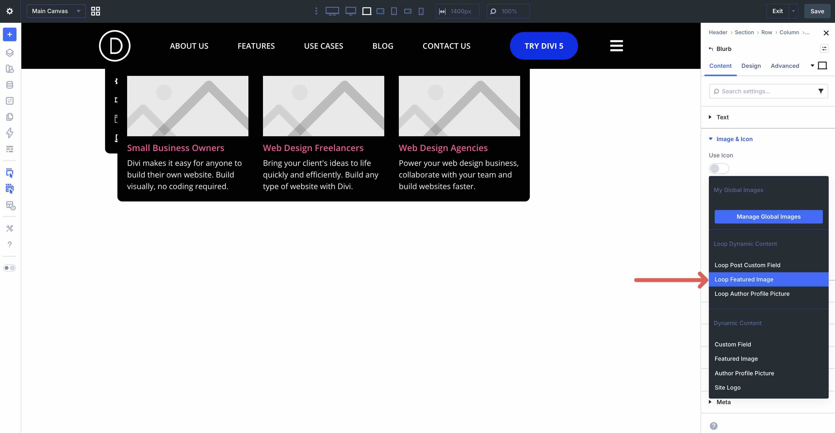
In Image & Icon, use dynamic content to choose Loop Featured Image.
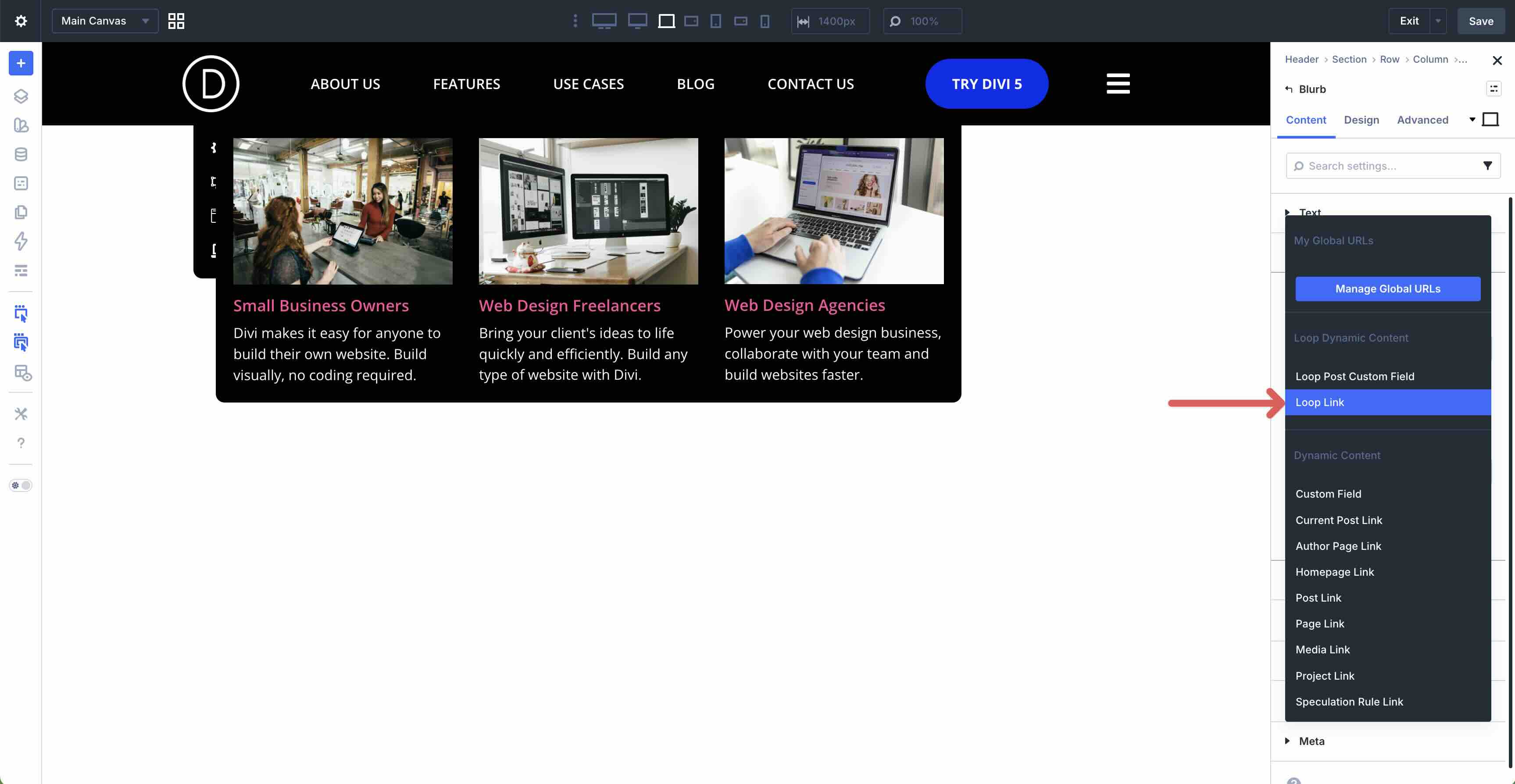
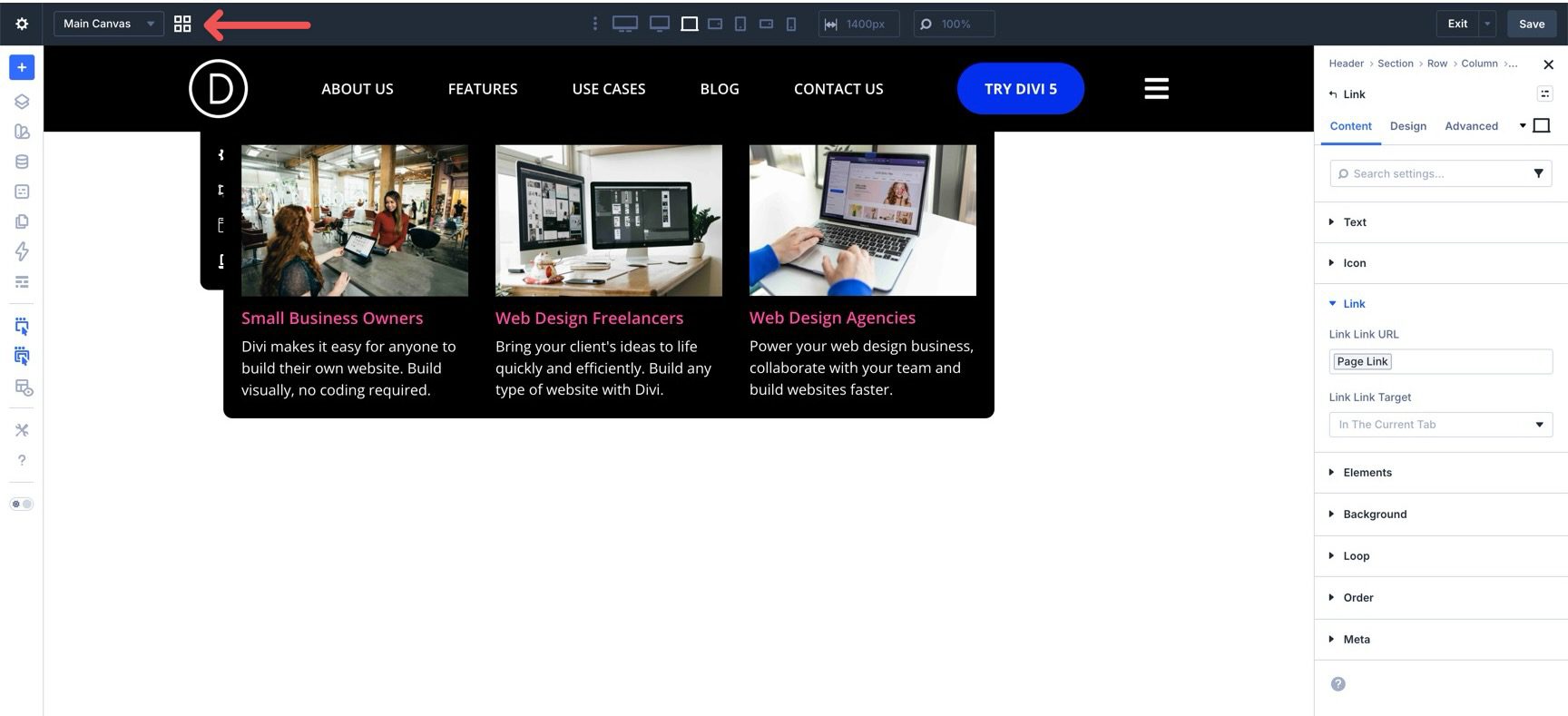
Finally, in the Link settings, map the Module Link URL to Loop Link.
Save the template before moving on.
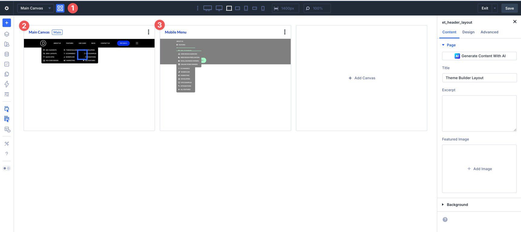
For the mobile version, we’ll use a Canvas so the menu can live separately from the desktop header. Start by clicking the Canvas Grid View button in the builder toolbar.
Click + Add Canvas.
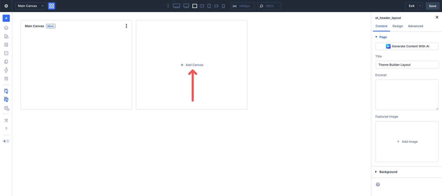
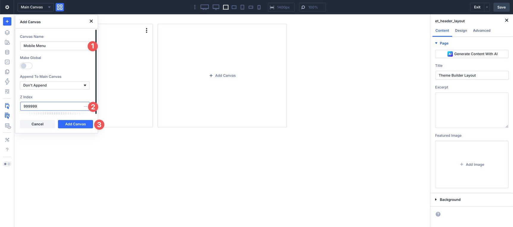
Give the Canvas a name, set its Z Index to 999999, and click Add Canvas.
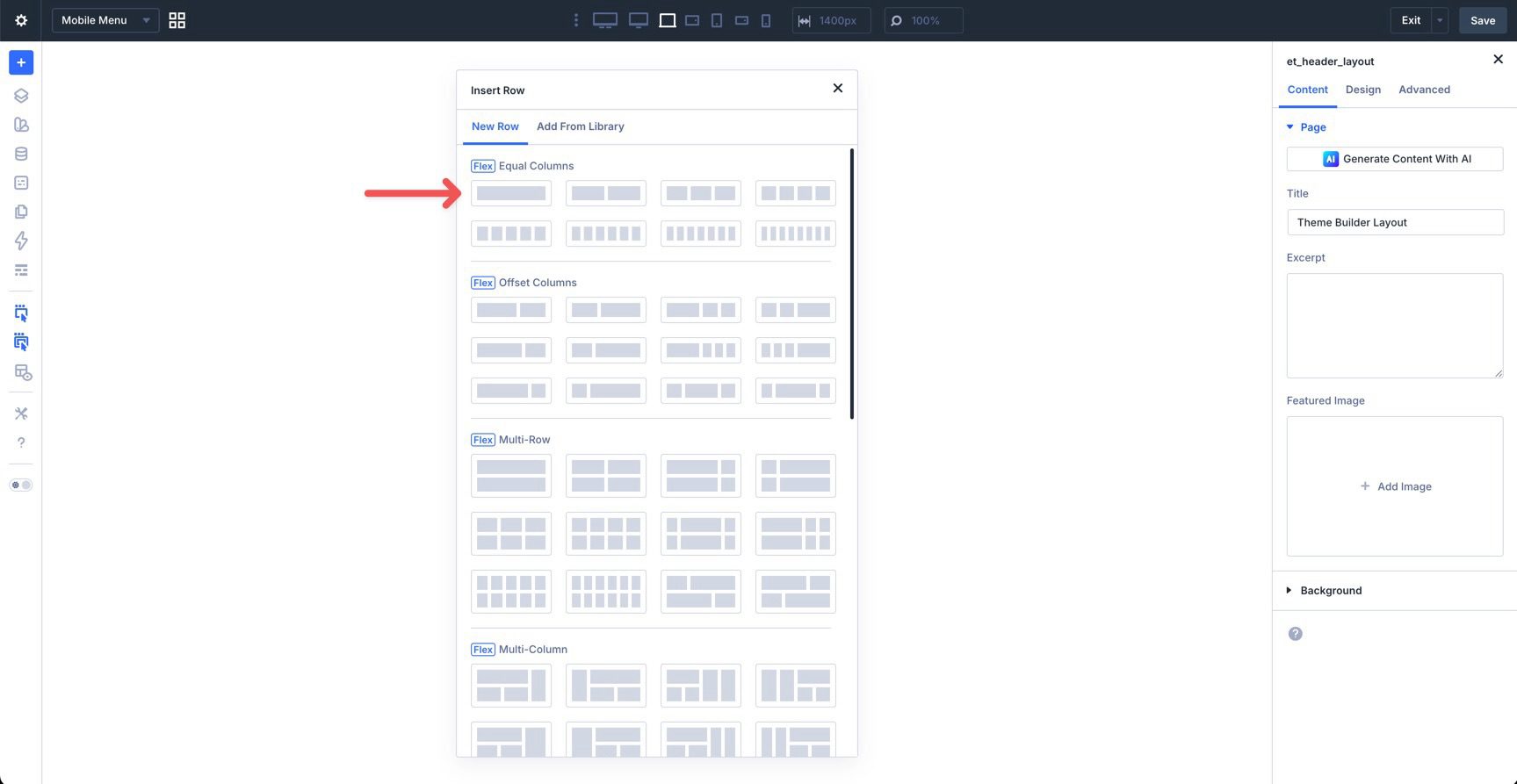
The builder will prompt you to add layout structure. Choose a single-column Row.
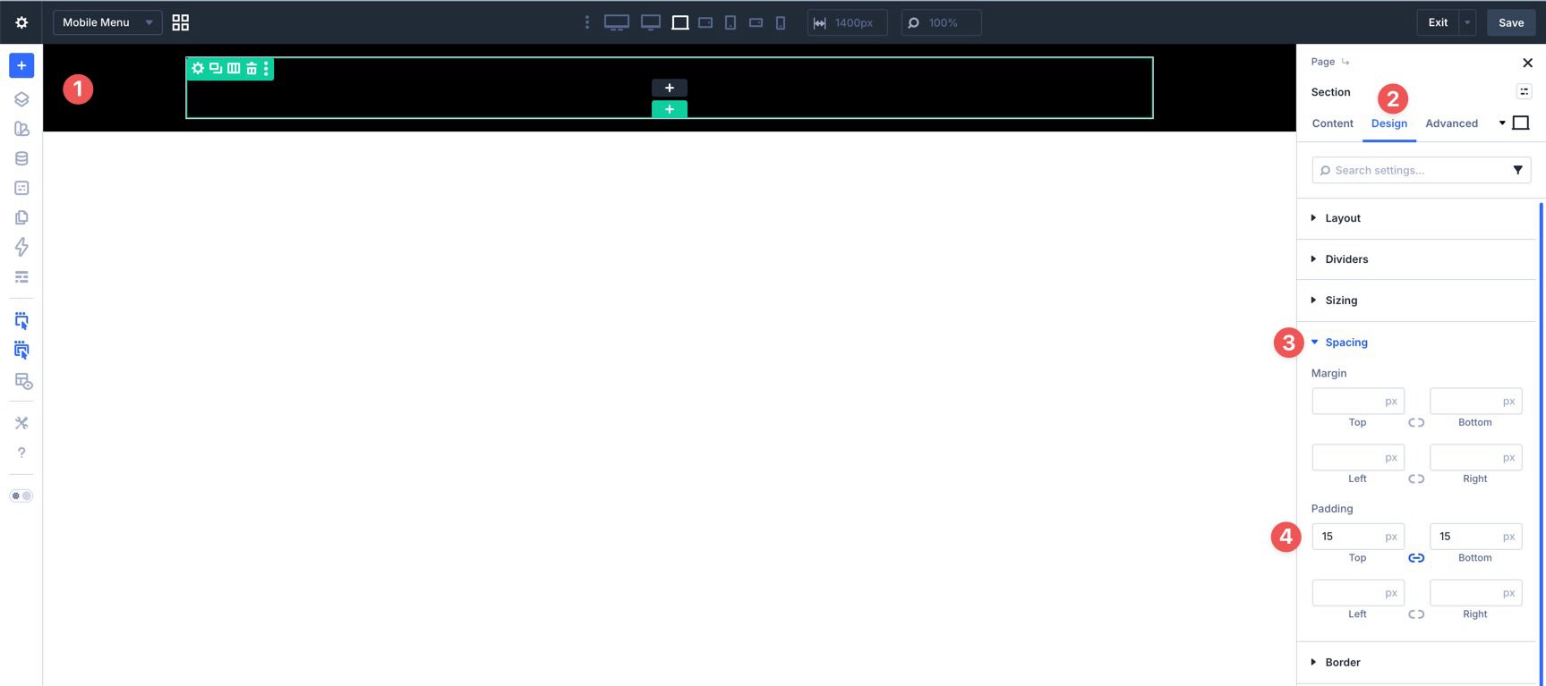
Before adding modules, configure the canvas layout. Select the Section, assign a Background Color, and add 15px of top and bottom padding.
Then edit the Row’s Column and set the Vertical Gap to 15px.
Add Modules To The Mobile Menu
Add a Link module to the column. Set its text and assign a destination, then style it to match your mobile design.
Duplicate the Link module to build out the top-level mobile navigation. Update the text and destination for each item. For menu items that should expand to reveal more options, it is often better not to assign a destination to the top-level trigger itself. That prevents accidental redirects when the user is trying to open the submenu.
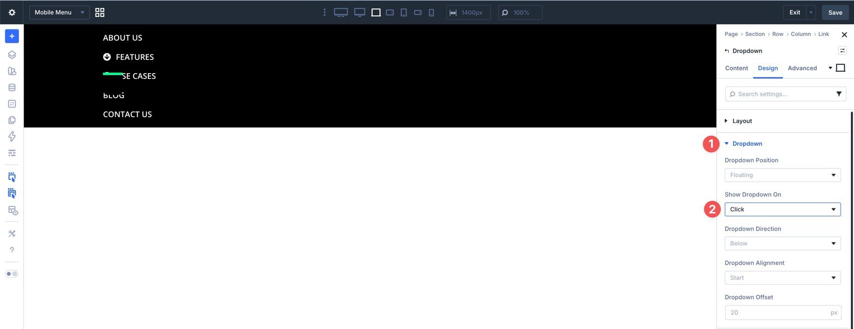
For one of those expandable items, add a Dropdown module in the Link module’s Elements area. Style it with a border radius and top border if desired.
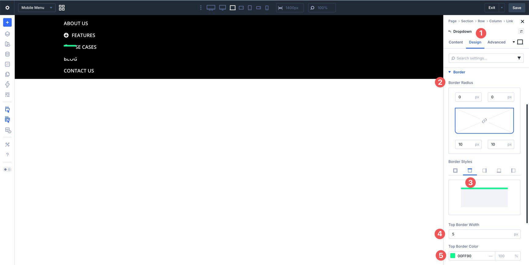
Then open the Dropdown settings and set Show Dropdown On to Click. That is usually the better trigger on touch devices.
Add as many inner Link modules as needed and style them to complete the submenu.
Repeat this process for any additional mobile submenus.
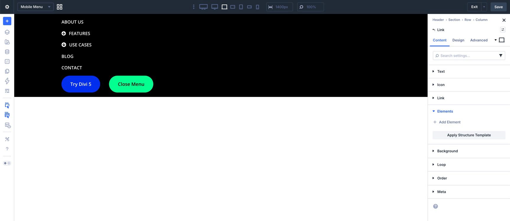
Add The Bottom Buttons
To finish the mobile menu, add a Group below the links and place two Button modules inside it. One of these buttons will act as the close trigger for the mobile menu.
Because expanded dropdowns may make the canvas harder to work with, the Layers View can be the easiest way to place this Group directly beneath the link list.
Set the Group’s Layout Direction to Row and Align Items to Center.
Now style the two buttons. At this point, the mobile menu canvas should be fully built.
Save the canvas before moving on.
Step 6: Add The Interactions
With both the desktop header and mobile canvas built, the last step is to connect everything with Interactions and visibility settings.
Mobile Menu Interactions
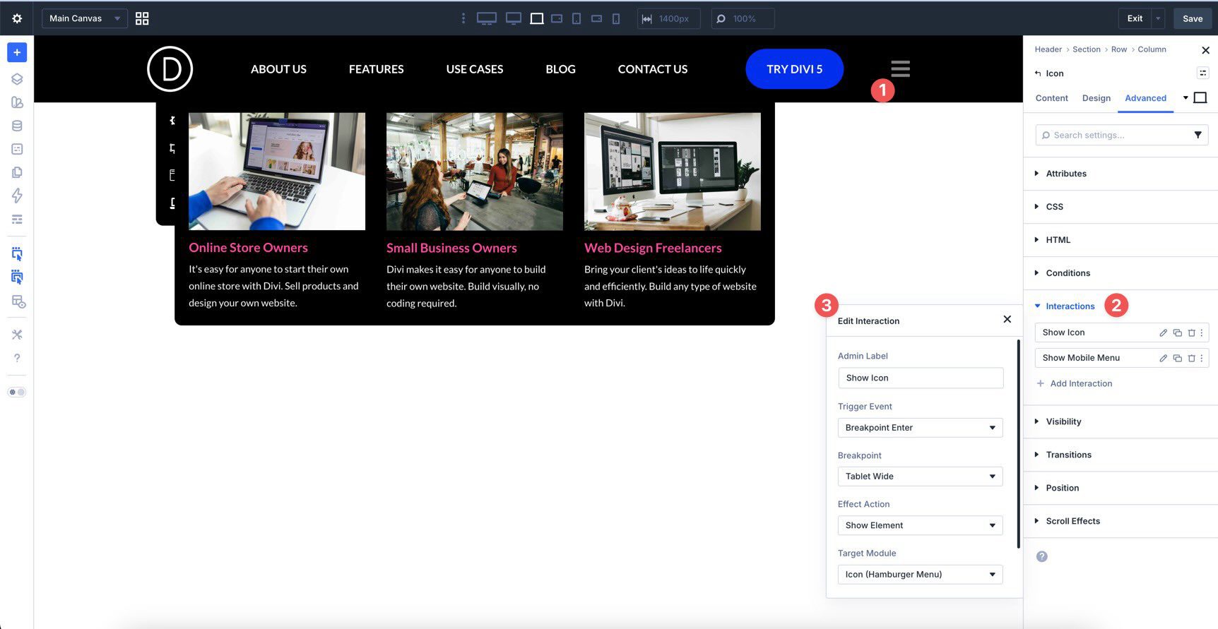
Start in the mobile menu canvas. Select the second Button module in the bottom Group and go to the Advanced tab. Open Interactions and add a new interaction.
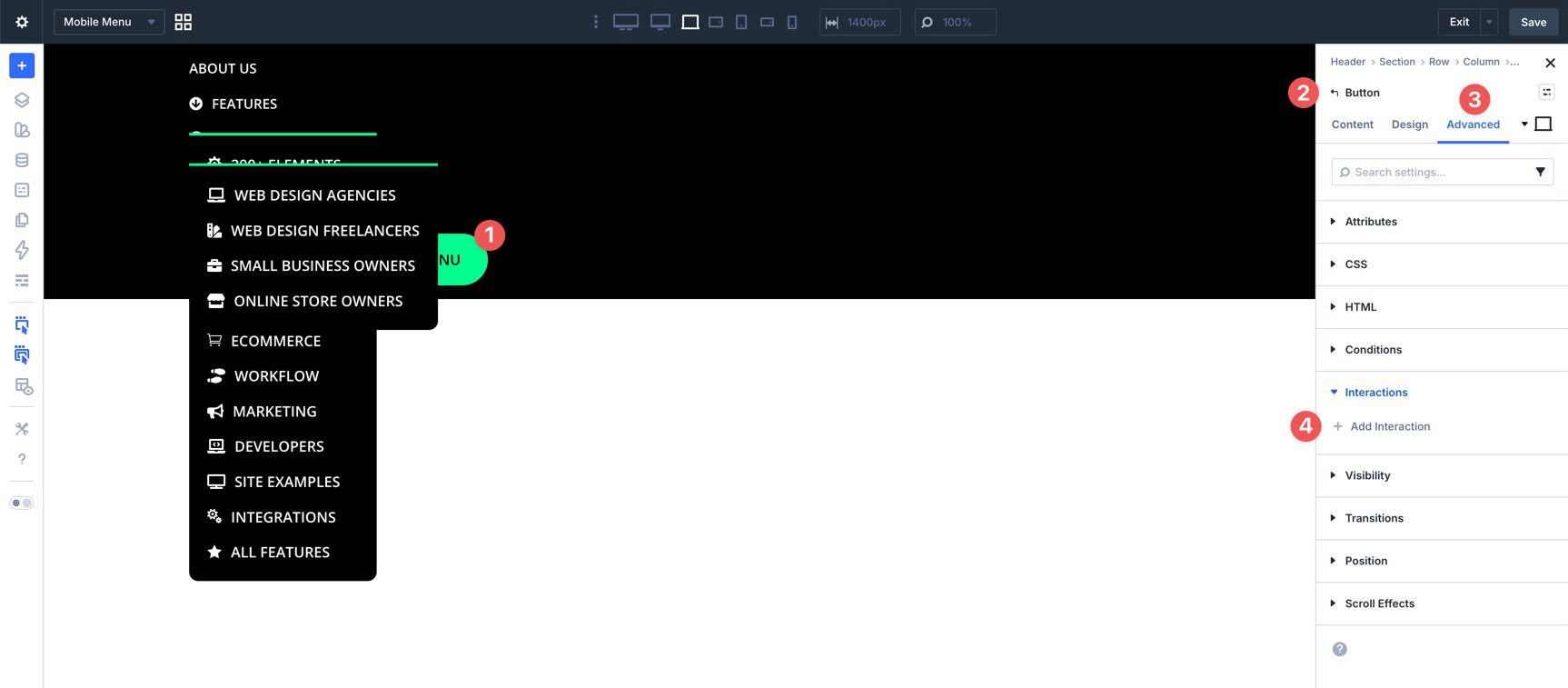
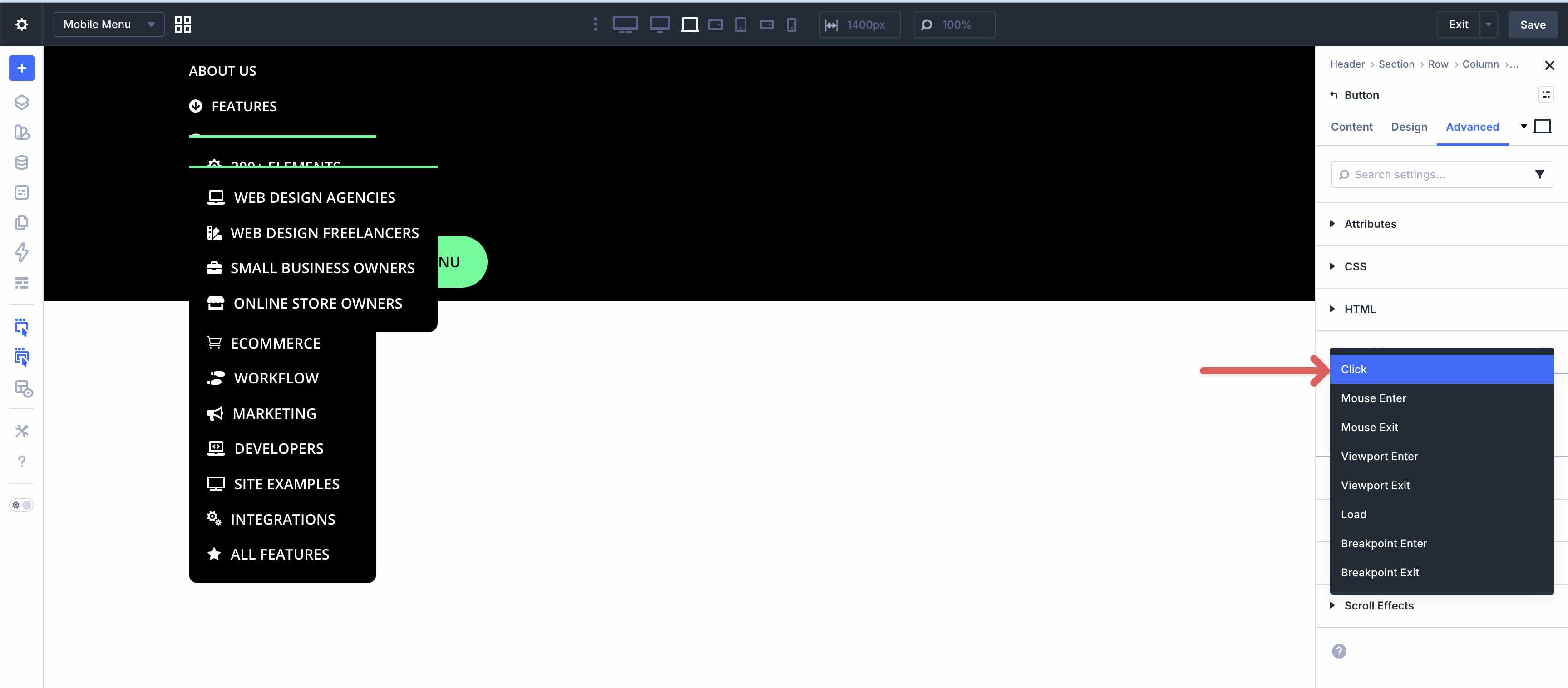
Choose Click as the trigger.
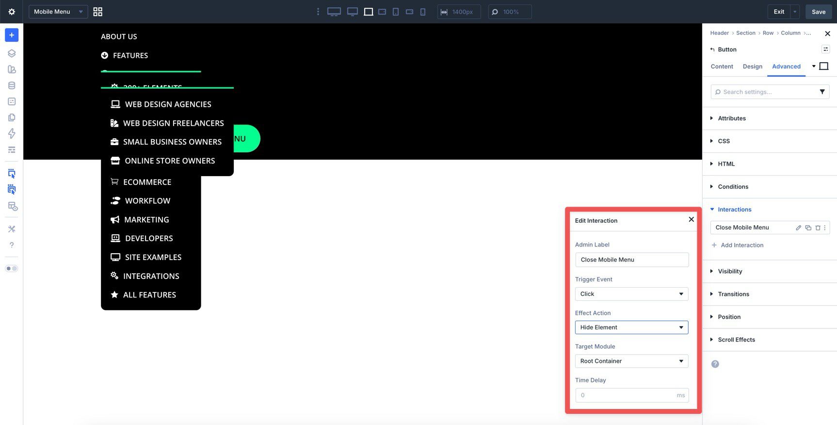
Give the interaction an Admin Label, set the effect action to Hide Element, and choose the canvas section as the target. This makes that button close the mobile menu.
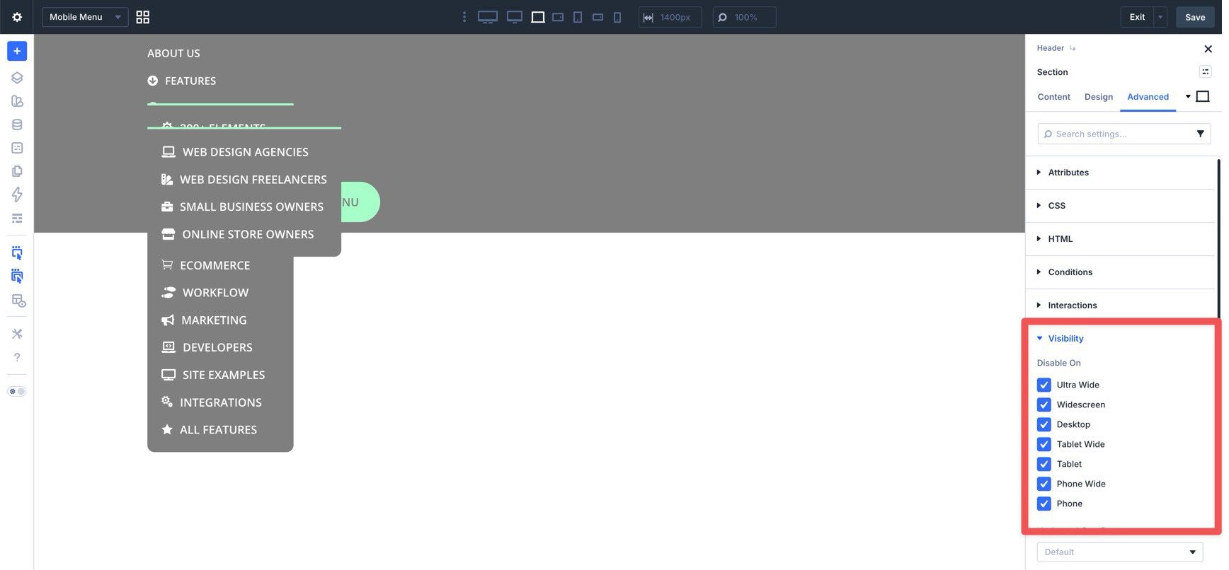
Now select the canvas Section and use its Visibility settings to keep it hidden by default until it is triggered.
Save the canvas and use Canvas Grid View to return to the main header.
Desktop Header Interactions
Now decide how you want the desktop navigation to behave on smaller screens.
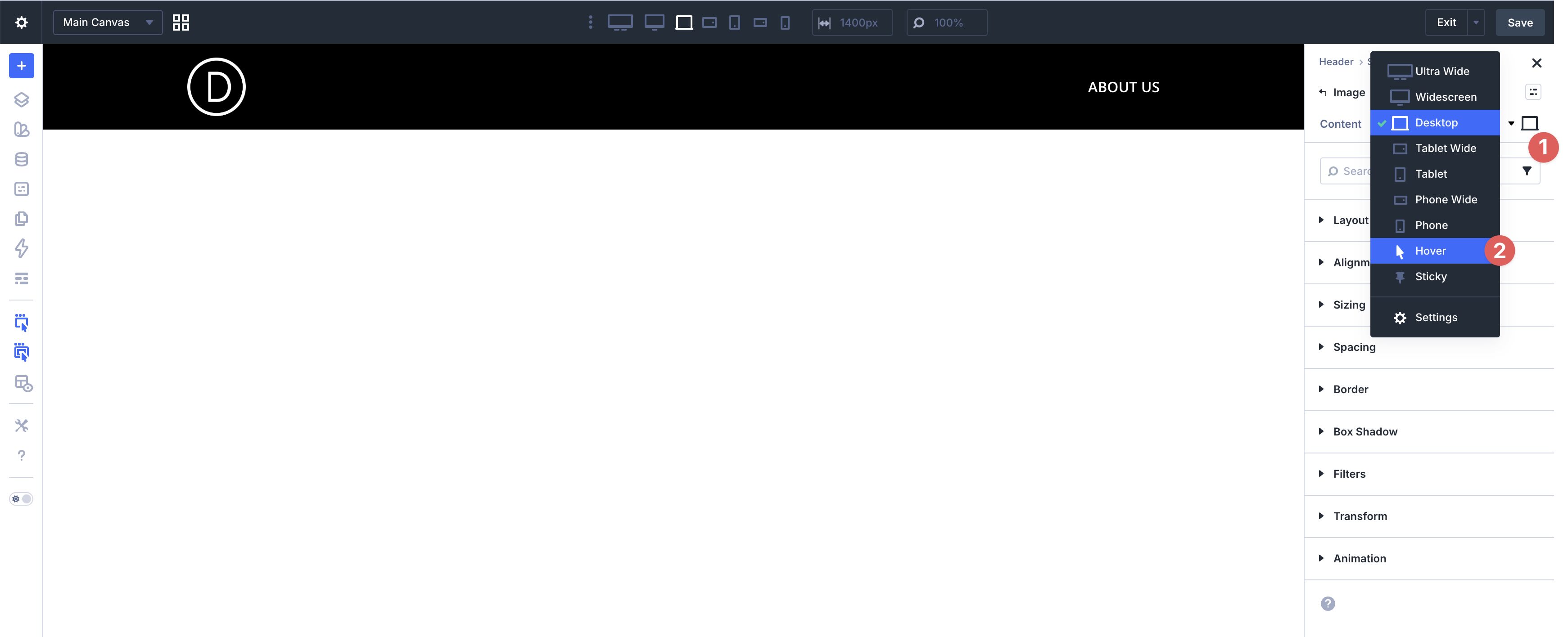
For the desktop link Group, you can use either breakpoint-based interactions or simpler breakpoint visibility controls. If the goal is only to hide the desktop nav at tablet and below, visibility settings are often the cleaner option. If you want the show and hide behavior tied to resizing events, breakpoint interactions are the better fit.
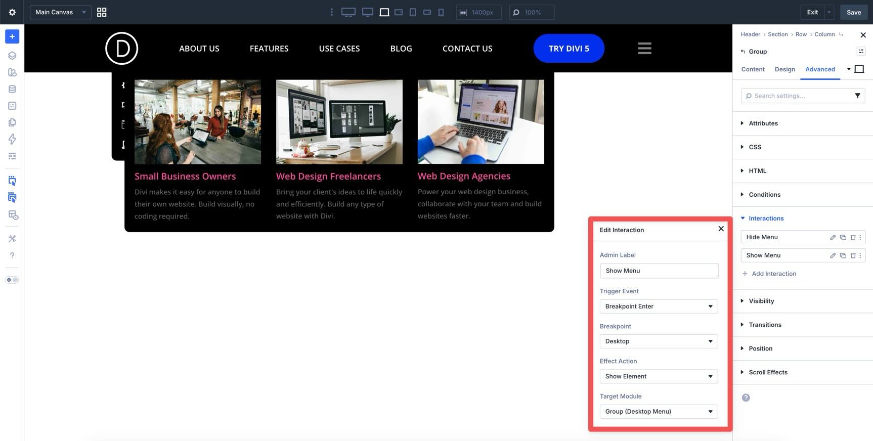
To follow the interaction-based route used in this tutorial, select the Group that contains the desktop links and add a Breakpoint Enter interaction set to Hide Element at Tablet Wide.
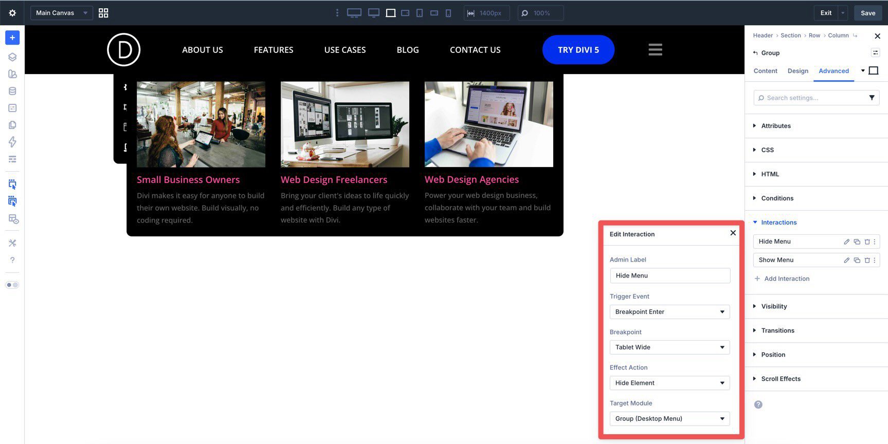
Then add a second Breakpoint Enter interaction set to Show Element at Desktop so it reappears when the layout returns to the desktop breakpoint.
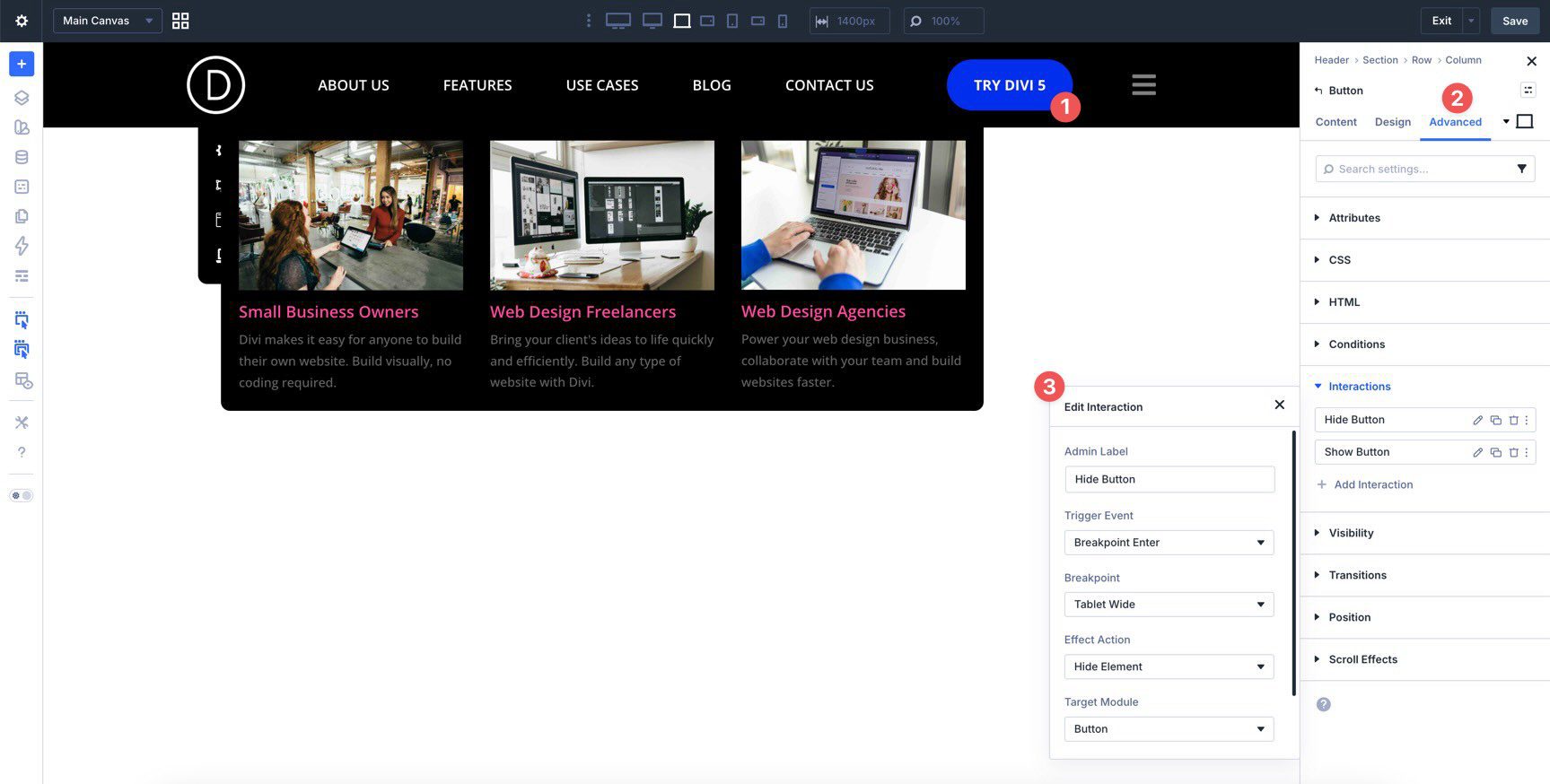
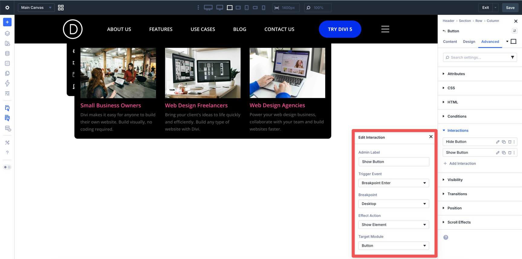
Repeat the same two interactions on the desktop Button module if you also want it hidden on smaller screens.
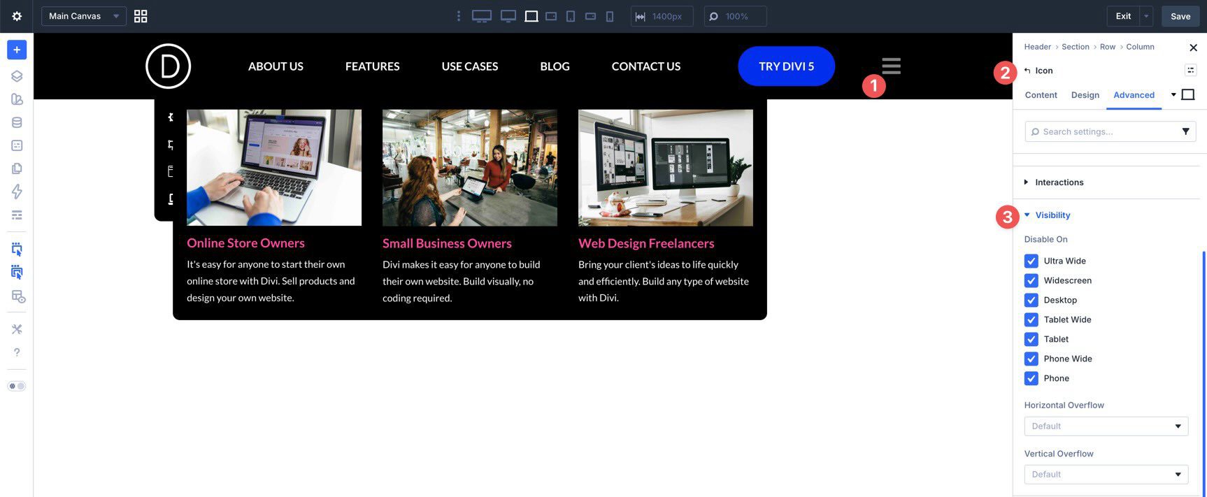
Finally, select the hamburger Icon in the main header. The most important interaction here is the Click trigger that reveals the mobile menu canvas section.
You can then use either breakpoint visibility settings or breakpoint interactions to keep the icon hidden on desktop and visible only on the smaller screen sizes where the mobile menu should take over.
At this point, you should have a working desktop mega menu and a separate mobile menu canvas.
Building a custom mega menu in Divi 5 is much more flexible now because the Link and Dropdown modules work alongside Canvases, Loop Builder, Interactions, and visibility settings. Instead of forcing everything through a single traditional menu structure, Divi 5 lets you build the navigation pattern that fits your project.
Whether you want a simple dropdown, a multi-column mega menu, a dynamic content-driven submenu, or a separate mobile overlay, these tools give you a visual way to build it inside the Visual Builder.
Download the latest release of Divi 5, start experimenting with custom menus, and adapt this structure to fit your own site’s navigation.


Leave A Reply