
Divi has always given you ways to create custom menus, most notably with the classic Menu module. That module is still useful, but it is also an all-in-one system, which means it can feel limiting when you want full control over structure, styling, dropdown behavior, or mobile navigation.
With Divi 5’s new menu features, you can build navigation from smaller, more flexible pieces. The new Link and Dropdown modules let you create custom menus, dropdowns, mega-menu style layouts, and mobile navigation directly in the Visual Builder, without relying on third-party plugins or custom code.
In this step-by-step guide, we’ll build a custom menu with submenus and a separate mobile version using native Divi 5 features.
Before building your menu, make sure you are using the latest version of Divi 5. You can start from a fresh install or use the Divi 5 Migrator if you are updating an existing Divi 4 site. If you are migrating a live site, test the upgrade on a staging site first so you can review everything before pushing changes live.
For this tutorial, we’ll build the menu inside the Theme Builder as part of a Global Header. That way, the menu appears consistently across the site. You can also create separate header templates for specific areas, such as archive pages, product templates, or other Theme Builder layouts, when a project needs different navigation in different contexts.
We’re intentionally skipping Menu Loops for the desktop menu in this guide. Menu Loops are useful for dynamic, repeating navigation structures, but they repeat the structure inside the looped element. If you place the same Dropdown module inside a looped Link module, each repeated link can inherit that same dropdown structure, which is not what most traditional desktop menus need.
For the desktop menu, we’ll use individual Link and Dropdown modules so each top-level item can have its own submenu content. Later, we’ll use Menu Loops for the mobile menu, where a straightforward repeated list of links makes more sense.
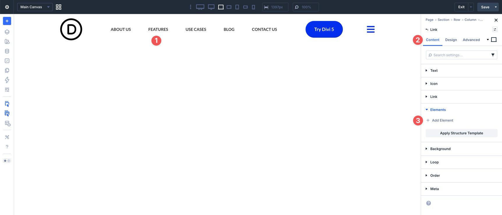
What Is The Link Module?
The Link module is a standalone, customizable link designed for navigation. You can use it as a top-level menu item, a submenu item inside a Dropdown module, or part of a more advanced navigation layout. Compared with plain text links or Button modules, the Link module gives you focused control over how individual navigation items look and behave.
Add your link text, assign a static or dynamic URL, and optionally include an icon.
Like other Divi modules, the Link module can be styled with Divi’s design settings.
Key Features At A Glance
- Granular Styling: Each Link module can have its own typography, colors, spacing, and hover styles.
- Icon Support: You can add icons directly inside the module, which is useful for custom menus, submenus, and more visual navigation patterns.
- Dynamic Content And Loop Compatibility: The Link module can pull labels and URLs dynamically, and it can work with menu loops when you want links generated from WordPress menu data.
- Semantic Flexibility: You can use Semantic Elements to choose more appropriate HTML output for your custom navigation structure.
What Is The Dropdown Module?
The Dropdown module is a container for submenu content. It can be nested inside a parent element, such as a Link module, to create layered navigation directly in the builder. It controls how and where submenu content appears.
Key Features At A Glance
- Automatic Parent Triggering: When placed inside a parent element, the Dropdown module can open on hover or click, depending on your settings.
- Flexible Content: The Dropdown module is not limited to links. Because it works with Nested Modules, you can place other Divi modules inside it, including images, buttons, text, rows, and more.
- Advanced Positioning: The module includes position, direction, alignment, and offset settings so you can control where the dropdown appears.
- Built-In Menu Behavior: For basic dropdown behavior, you can use the module’s built-in hover or click settings instead of manually creating that interaction from scratch.
Now that you know what the Link and Dropdown modules do, let’s put them to work. By the end of this tutorial, you’ll have a custom desktop menu with dropdowns and a separate mobile menu built with Canvases, Menu Loops, and Interactions.
Start by opening the Divi Theme Builder and clicking Add Global Header.
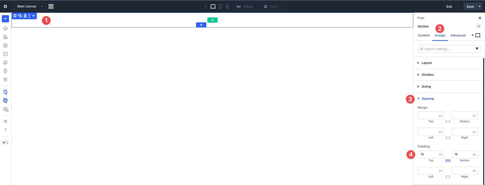
Before adding content, click into the Section on the canvas and go to the Design tab. Expand the Spacing menu and apply 15px of padding to the top and bottom.
Next, open the Advanced tab, expand the Position menu, and set the Z Index to 999. This helps keep the header above page content when dropdowns are open.
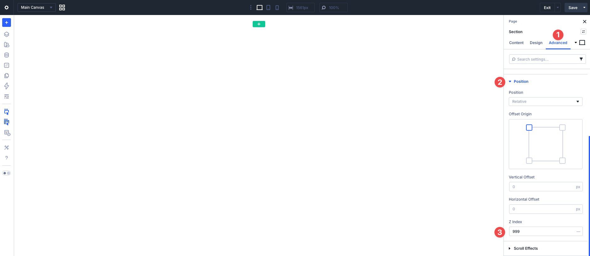
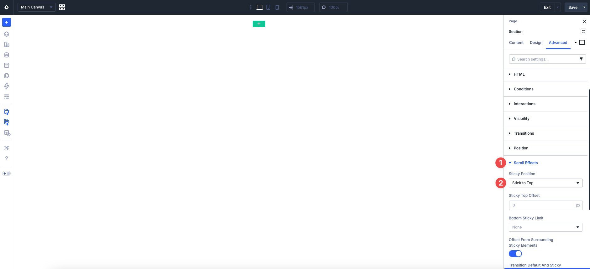
Finally, expand the Scroll Effects menu and set the Sticky Position to Stick to Top.
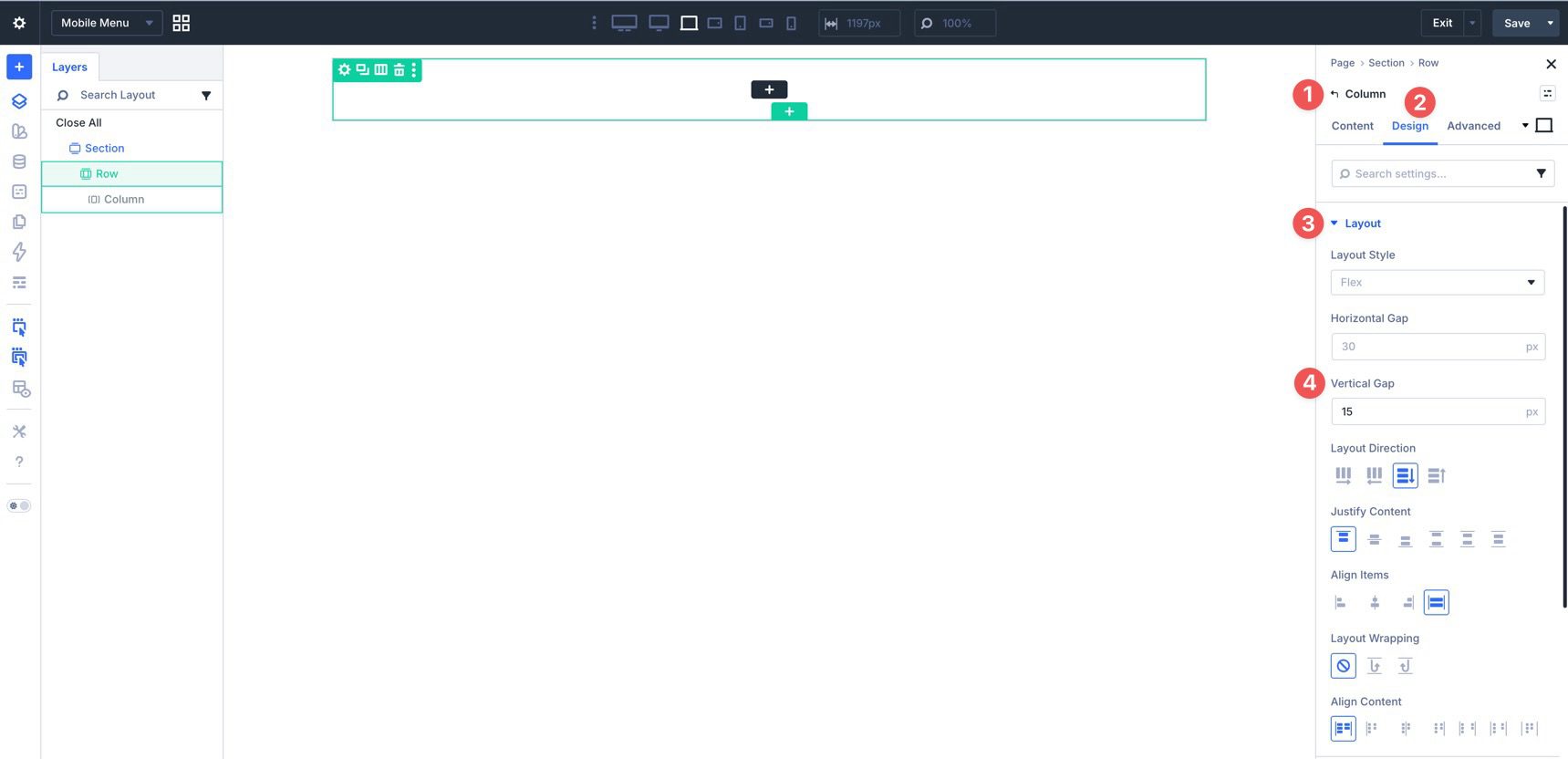
Now add a single-column Row to the Section. Edit the Column, switch to the Design tab, and expand the Layout menu. Set Layout Direction to Row, Justify Content to Space Between, and Align Items to Center. This creates a horizontal header structure with the child elements centered vertically.
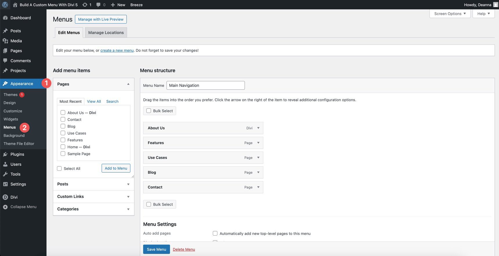
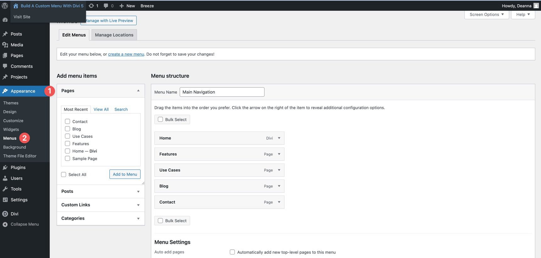
Before adding menu items, make sure you already have a WordPress menu created. If not, go to Appearance > Menus and add your page links there.
Add An Image Module
Add an Image module for your logo. Use Divi 5’s Responsive Editor or Customizable Responsive Breakpoints to size it appropriately for different screen sizes.
Add A Group Module
Next, add a Group to the Row. This will hold the top-level menu items. Inside the Group, add a Link module.
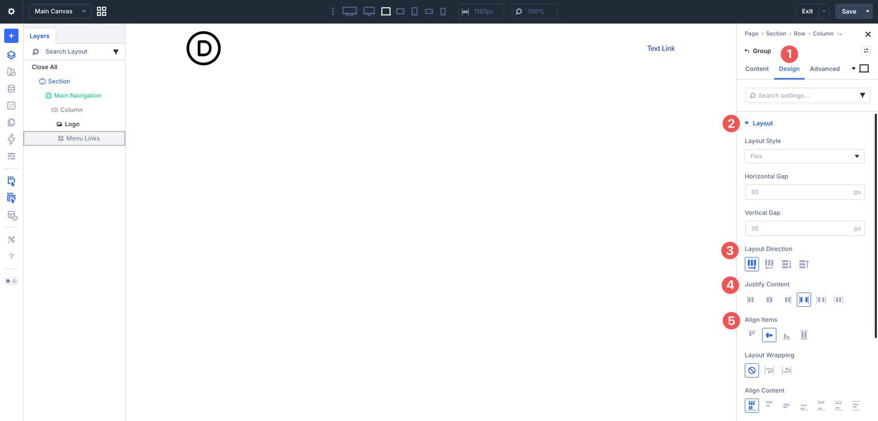
Go to the Group’s Design tab, expand the Layout menu, and set Layout Direction to Row, Justify Content to Space Between, and Align Items to Center. These settings place the top-level links side by side.
Add Link Modules
Select the first Link module and style it to match your branding. Use settings such as Font, Text Color, and Text Size to achieve the desired look.
You can also use hover-state styling to add a Background Color, Border Radius, or Spacing when users interact with the link.
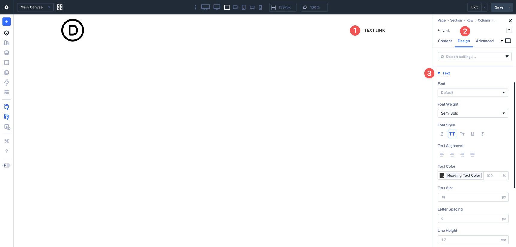
Next, add the label and URL for the first Link module. In the Content tab, expand the Text menu and add the label in the Text field.
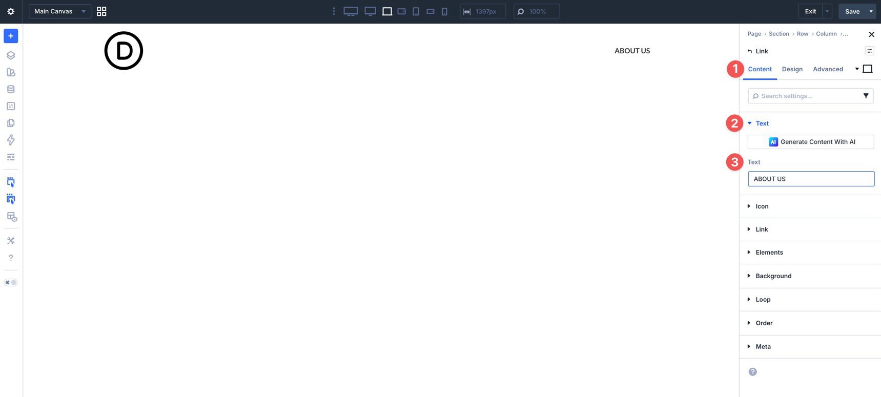
Then expand the Link menu. Use the dynamic content icon in the Link URL field if you want to assign the page link dynamically.
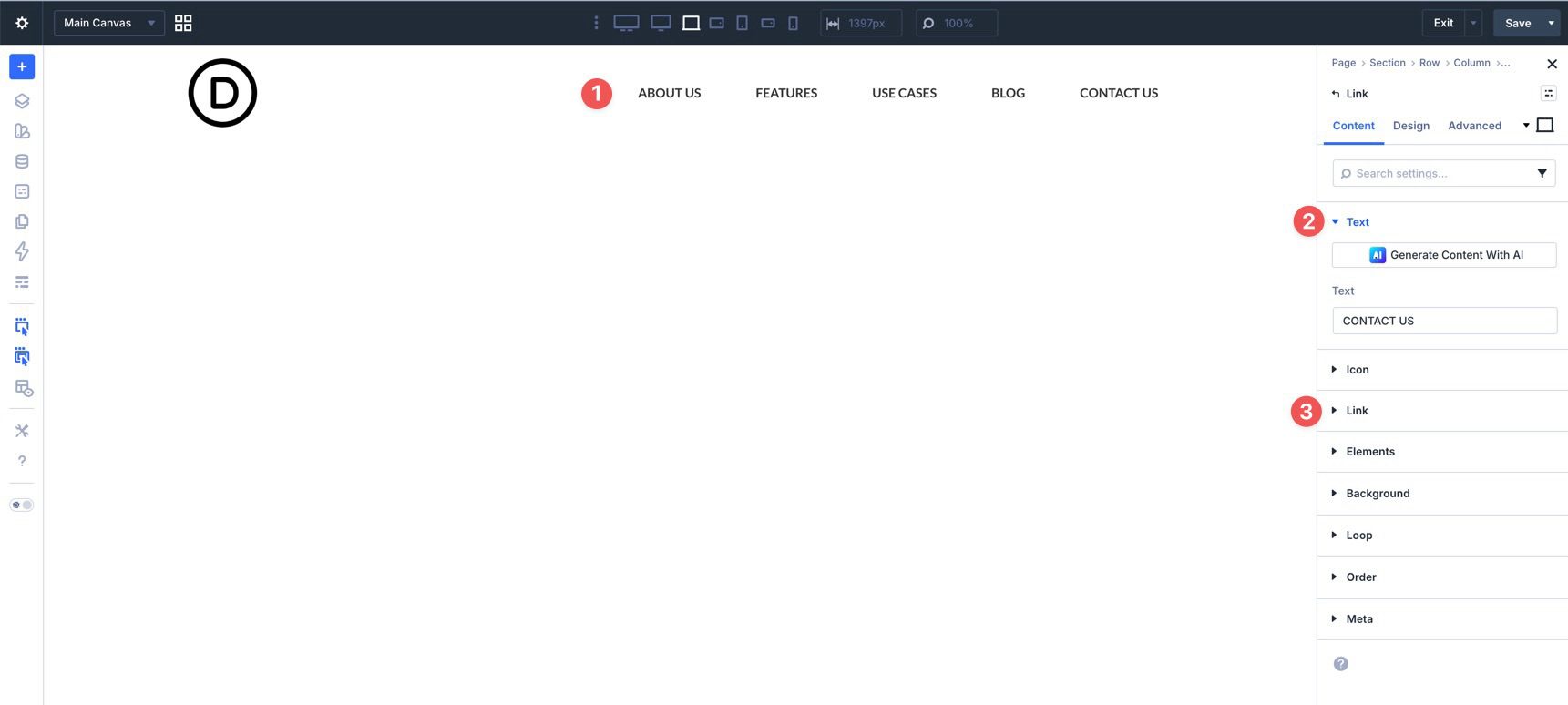
Duplicate the Link module as many times as needed to build the rest of your menu.
Update the Text and Link URL for each duplicated Link module.
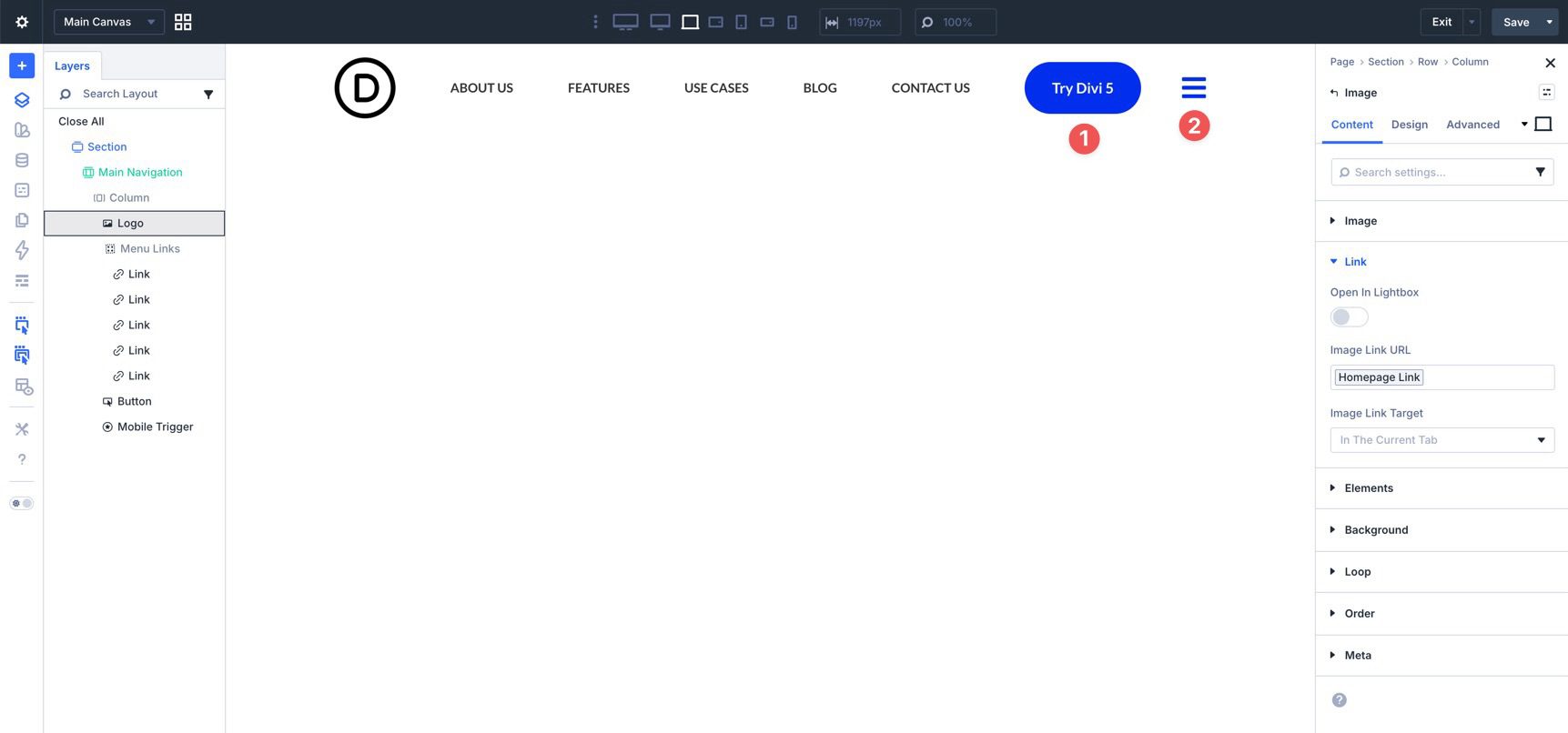
We’ll also add a Button and an Icon module to complete the top-level navigation. The Icon will serve as the mobile-menu trigger later in the tutorial.
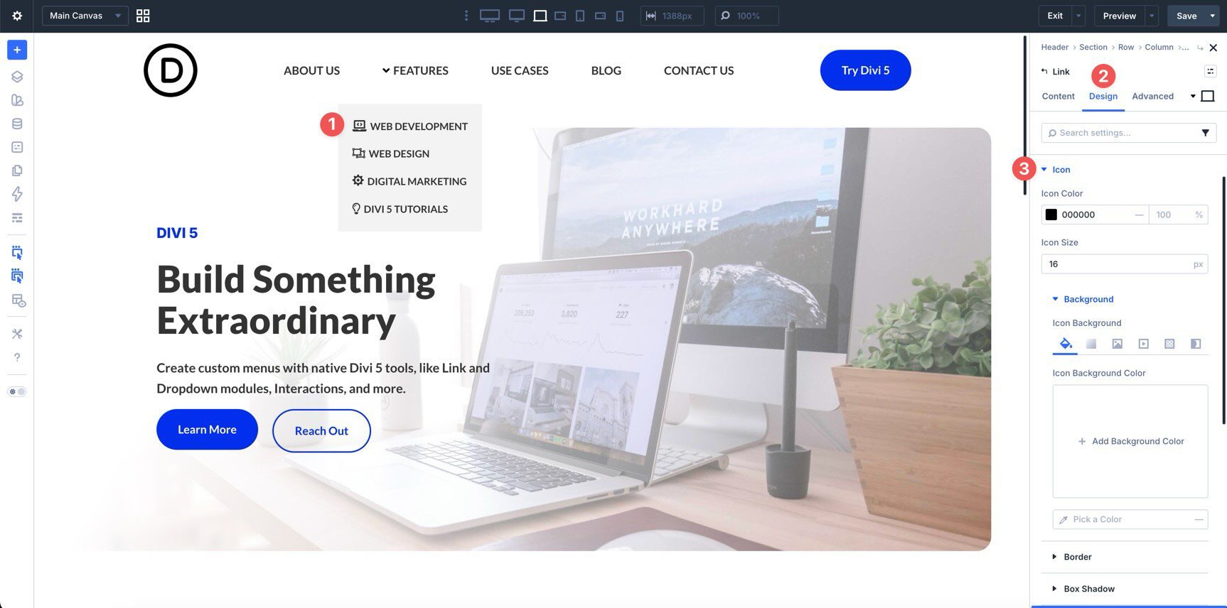
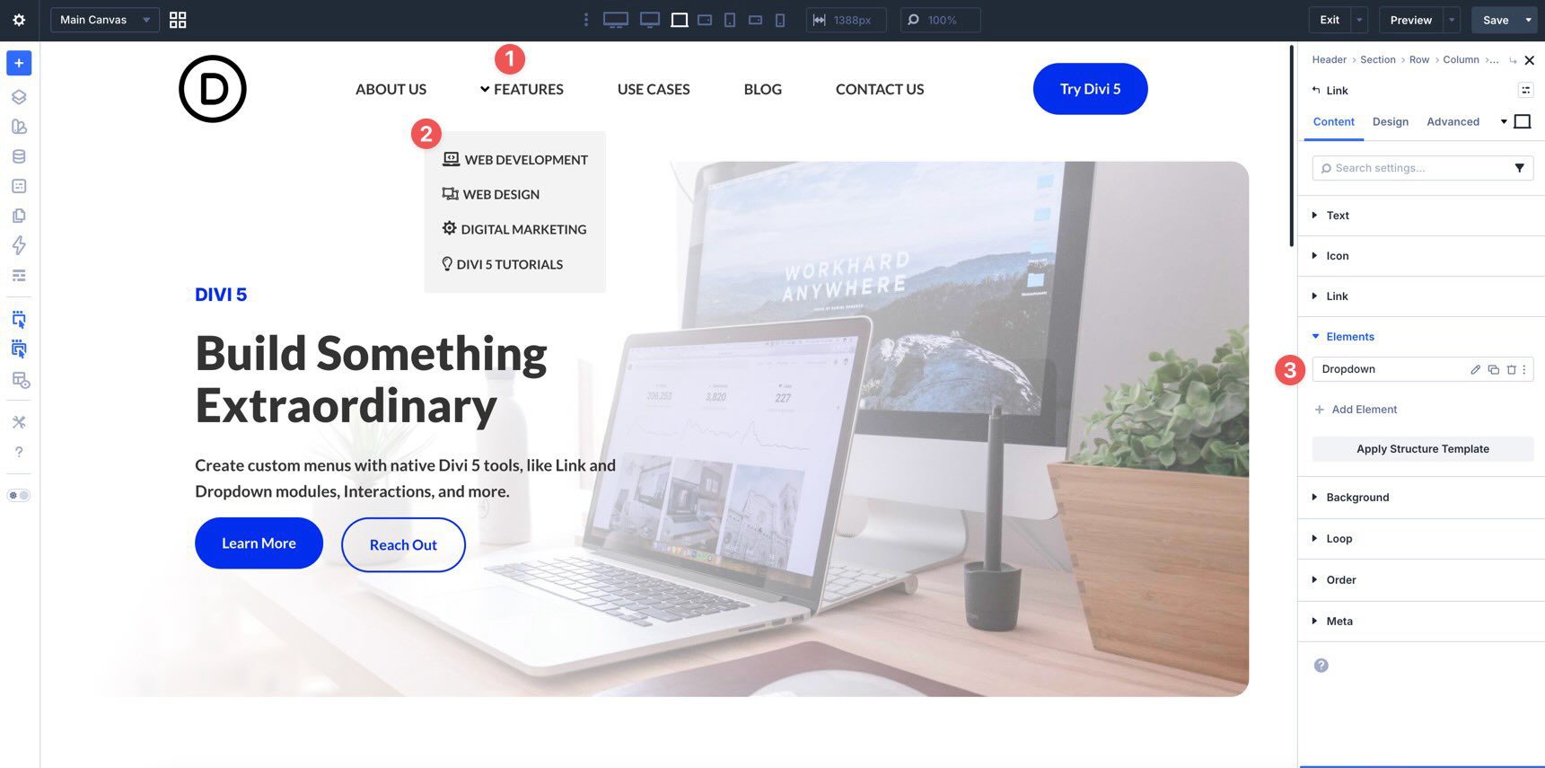
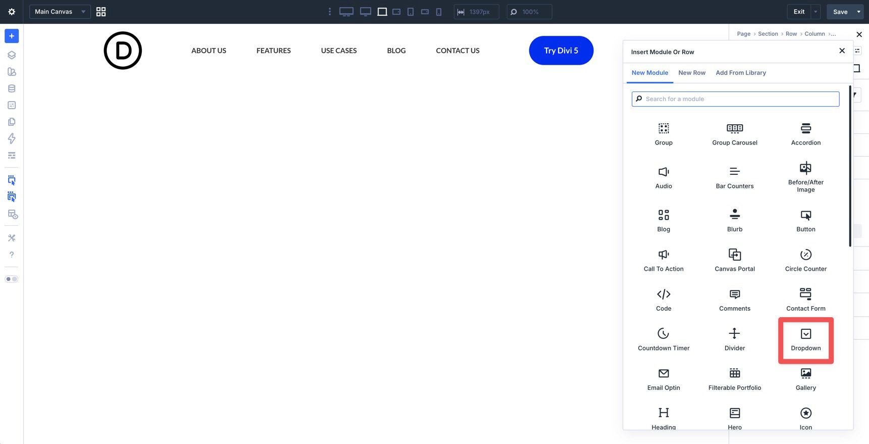
With the top-level navigation in place, you can start adding dropdowns for submenu items. Open one of the top-level Link modules in the main row. In the Content tab, expand the Elements menu and click + Add Element to add a nested module.
Select the Dropdown module when the Insert Module Or Row dialog appears.
Inside the Dropdown, add Link modules for the submenu items and style the dropdown background as needed.
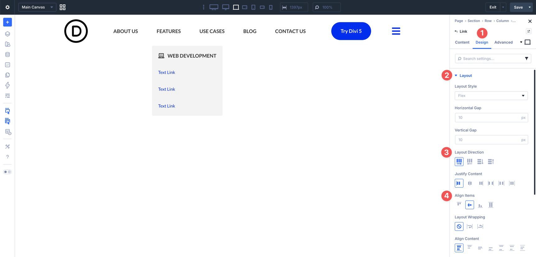
For the first Link module inside the Dropdown, use the Content tab to assign the label, icon, and URL.
In the Design tab, use the Layout settings to place the icon to the left or right of the text and align the icon and label.
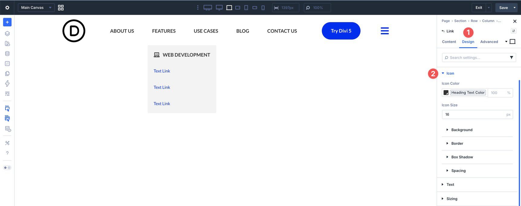
Use the Icon menu to style the icon color, size, and any background settings you want to add.
Duplicate the submenu link or copy and paste its attributes onto the other submenu links. Then update each label, URL, and icon as needed.
Once the submenu links are styled, return to the Dropdown module’s settings. In the Design tab, expand the Dropdown menu and adjust settings such as Dropdown Position, Show Dropdown On, Dropdown Direction, Dropdown Alignment, and Dropdown Offset.
Add additional Dropdown modules where needed, then save the template.
Because this custom desktop menu uses individual Link and Dropdown modules, we’ll create a separate mobile menu that opens when a user clicks the hamburger icon in the header. We’ll use Divi 5’s Canvases feature to build it.
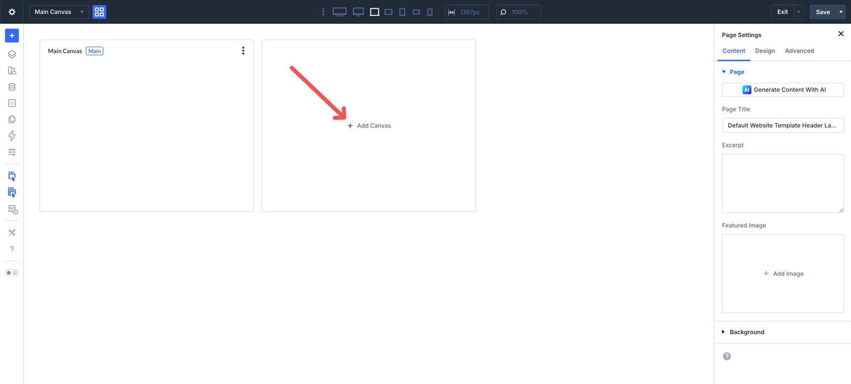
Add A New Canvas
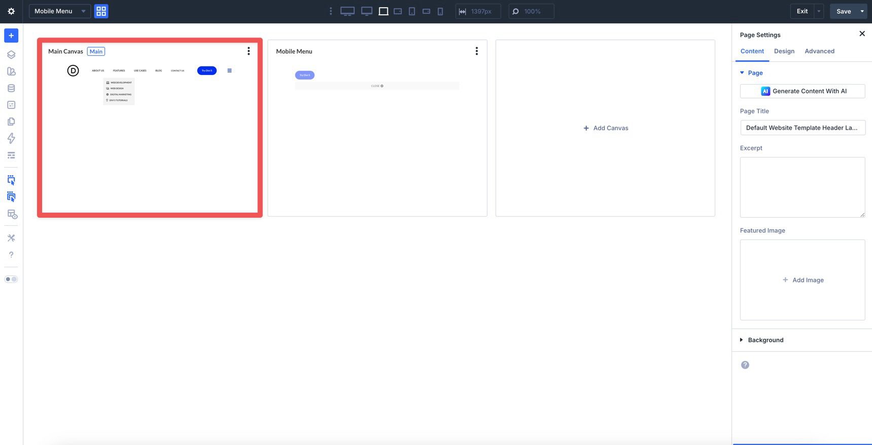
Click the Canvas Grid View icon to open the Canvas interface.
Click + Add Canvas to create a new Canvas for the mobile menu.
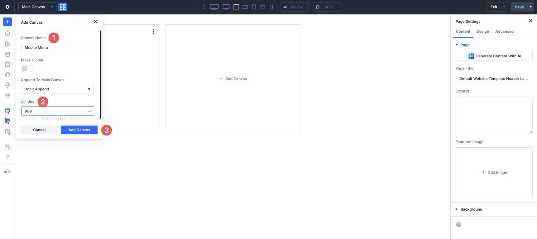
When the Add Canvas dialog appears, give the Canvas a name, such as Mobile Menu, and assign a Z Index of 999 so the mobile menu appears above the page content. Click Add Canvas to launch the builder.
In the Section settings, go to the Design tab, expand the Spacing menu, and assign 15px of padding to the top and bottom.
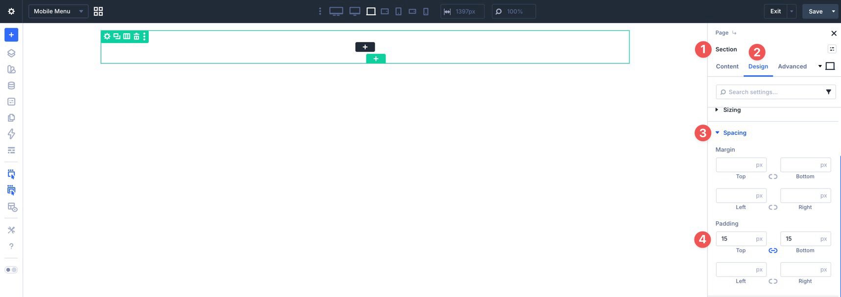
Add a single-column Row to the Canvas. Edit the Row’s Column and set the Vertical Gap in the Layout settings to 15px.
Add Navigation Elements
Add a Link module to the Row and style it as needed. Then expand the Loop menu in the Content tab and enable Loop Element.
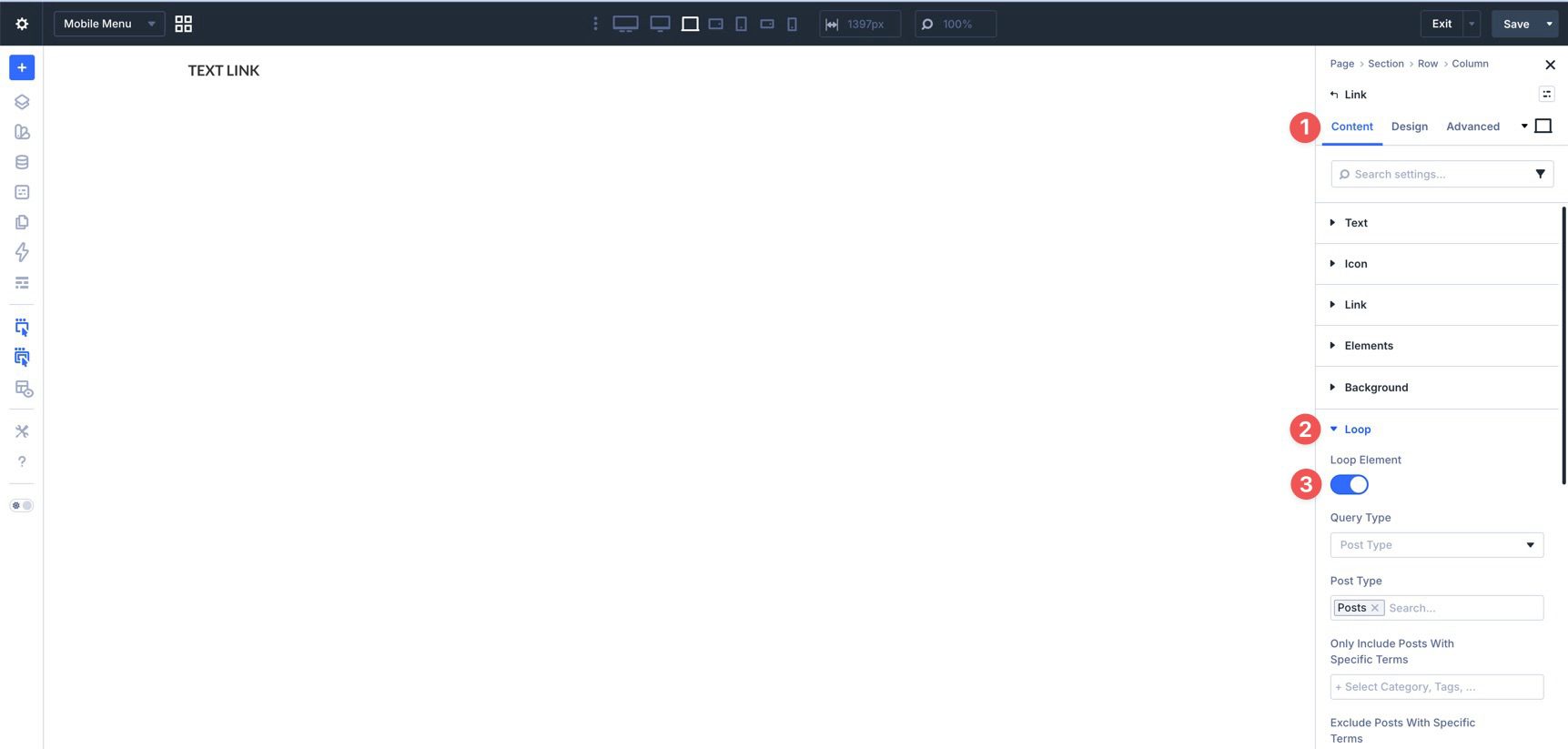
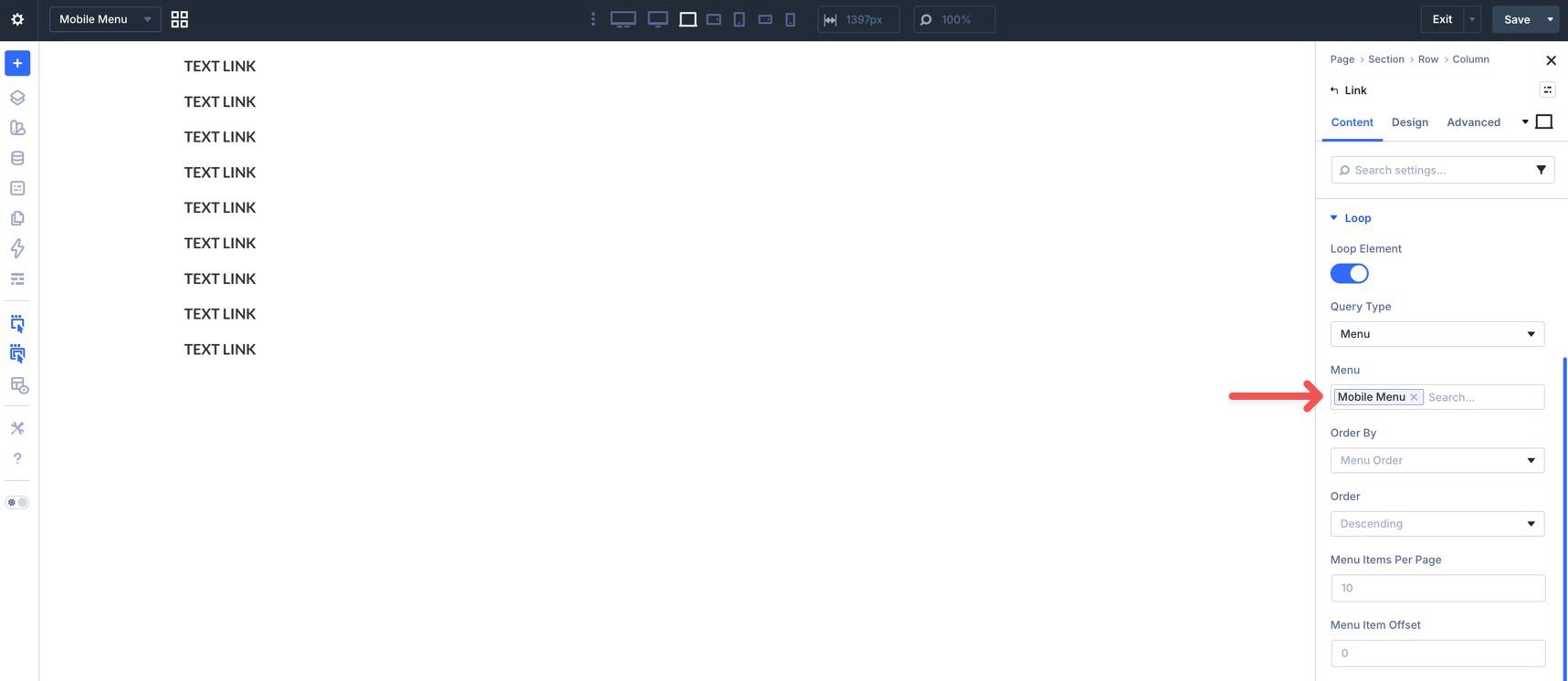
In the Query Type field, select Menu.
By default, Divi will use the Primary menu. Use the Menu field to choose the menu you want for mobile. Divi will populate the loop with the items from that selected menu. Because this is a Menu Loop, it is best suited to a straightforward repeated list of links, which is why this guide uses a separate mobile-only menu structure here.
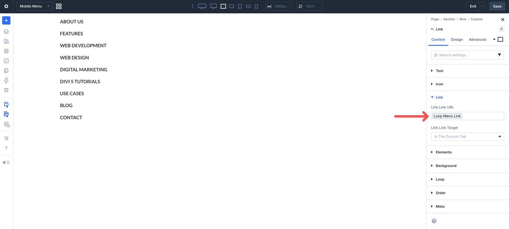
Instead of entering link text manually, use Divi’s dynamic content options to populate the link name. Click into the Link module’s Text field, use the Insert Dynamic Content icon, and choose Loop Menu Text. Divi will update each looped link with the correct menu label.
Expand the Link menu and use dynamic content to assign Loop Menu Link to the URL field.
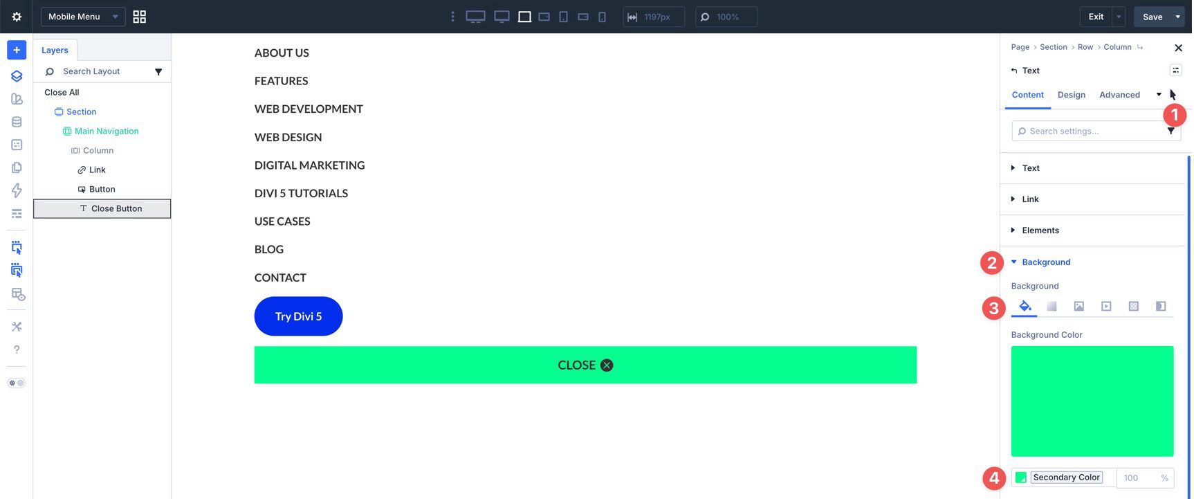
Finally, add two more modules, a Button and a Text module, and style them as desired. We’ll use the Text module as the close trigger for the mobile menu. In the Text module’s Background menu, add a Background Color.
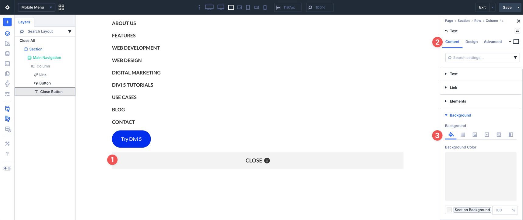
Switch to the Hover State and assign a hover Background Color.
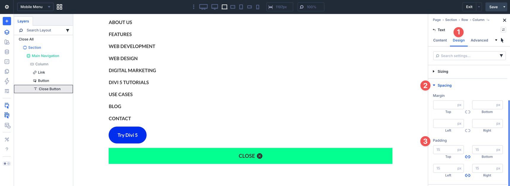
Switch to the Design tab and expand the Spacing menu. Add 15px of padding to all four sides.
Use Divi’s responsive settings to make any necessary tweaks before moving on.
Create The Interactions
We’ll use Divi 5’s Interactions to connect the hamburger icon to the mobile menu. You’ll create a trigger that opens the menu, a close action, and breakpoint-based visibility controls so the desktop and mobile navigation stay out of each other’s way.
Mobile Menu
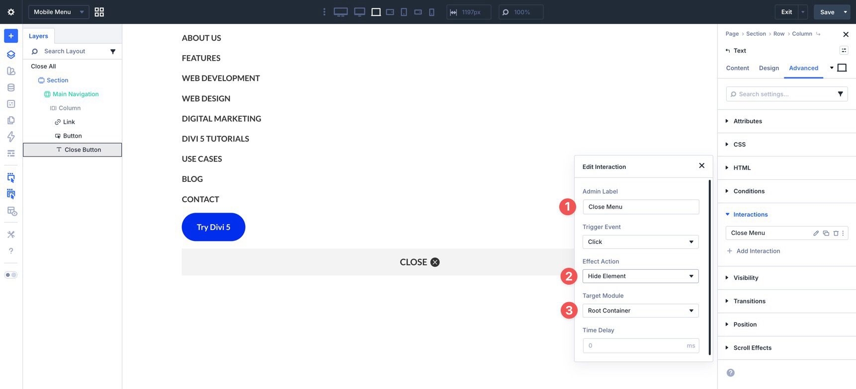
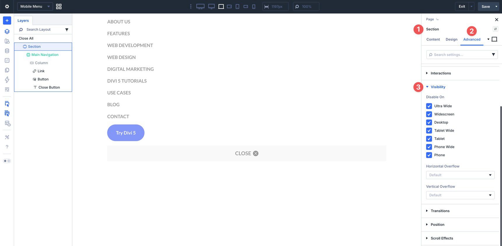
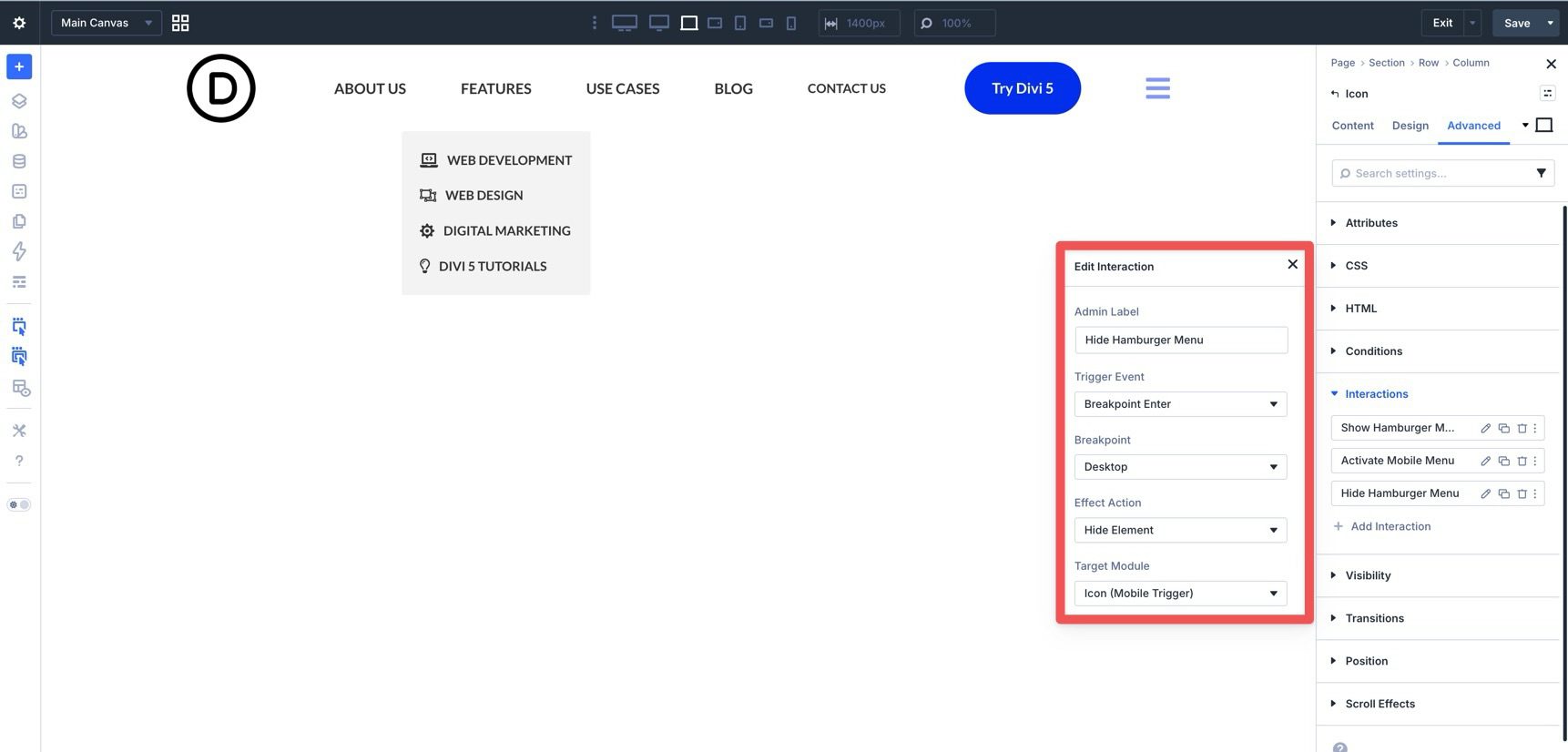
While editing the Mobile Menu Canvas, select the Text module at the bottom of the layout. Go to the Advanced tab, expand the Interactions menu, click + Add Interaction, and select Click.
In the Edit Interaction dialog, add an Admin Label, choose Hide Element as the Effect Action, and select Root Container as the Target Element. This makes the close trigger hide the mobile menu when clicked.
Now select the Canvas Section. To keep the mobile menu hidden until it is triggered, go to the Advanced tab, expand the Visibility menu, and disable the Section on all breakpoints.
Save the Canvas, then return to Canvas Grid View and select the Main Canvas.
Desktop Menu
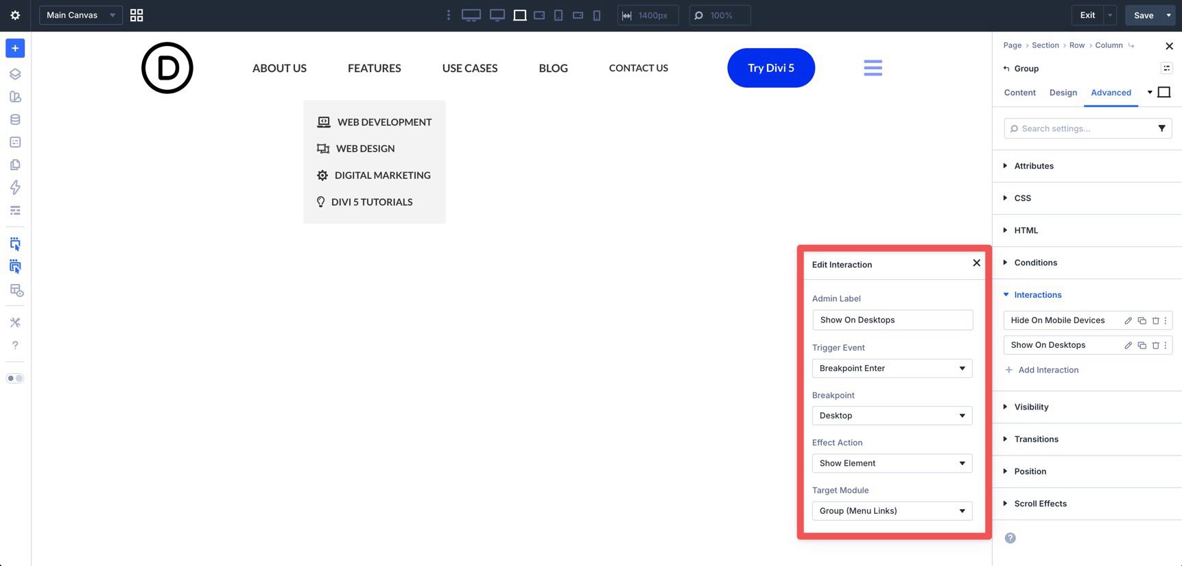
For the desktop menu, we’ll hide the Group containing the desktop links and the Button on smaller breakpoints. Those modules should only appear on desktop-sized screens.
Select the Group and go to the Advanced tab. Create an interaction titled Hide Desktop Menu. Select Breakpoint Enter as the trigger. Add an Admin Label, set the Breakpoint to Tablet Wide, and set the Effect Action to Hide Element. Finally, select the Group as the Target Element.
Repeat the same process for the Button module so it also hides on smaller breakpoints.
When you preview different breakpoints, the menu links and button should disappear once the Tablet Wide breakpoint is active.
Because users can resize their browser window, add another interaction to show these elements again when the layout returns to desktop size. Use the same settings, but set the Effect Action to Show Element and the Breakpoint to Desktop.
Reveal The Mobile Menu
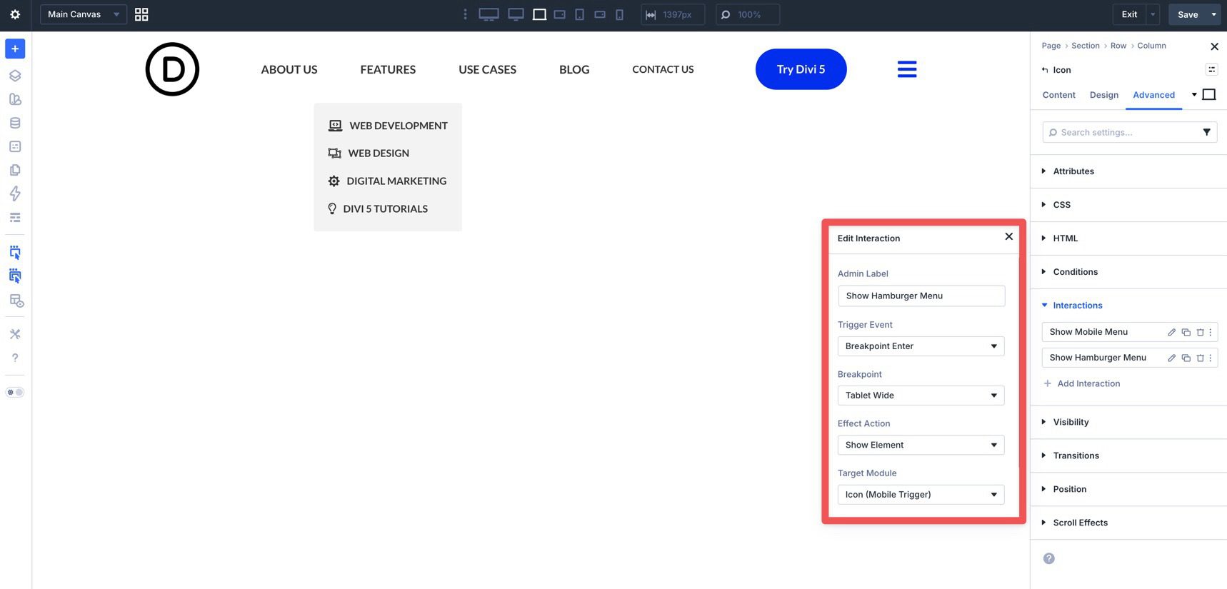
The final interactions will reveal the hamburger icon on smaller devices, hide it again on desktop, and use it to open the mobile menu.
Select the Icon module and add a new Interaction in the Advanced tab. Choose a Click trigger, add an Admin Label, choose Show Element for the Effect Action, and select the Mobile Menu Canvas Section as the Target Module.
For the second interaction, choose Breakpoint Enter as the Trigger Event. Set Tablet Wide as the Breakpoint, choose Show Element as the Effect Action, and select the Icon module as the Target Module.
For the third interaction, reverse that behavior when the browser returns to desktop size. Add a new interaction on the Icon module. Keep the settings the same, but change the Breakpoint to Desktop and the Effect Action to Hide Element.
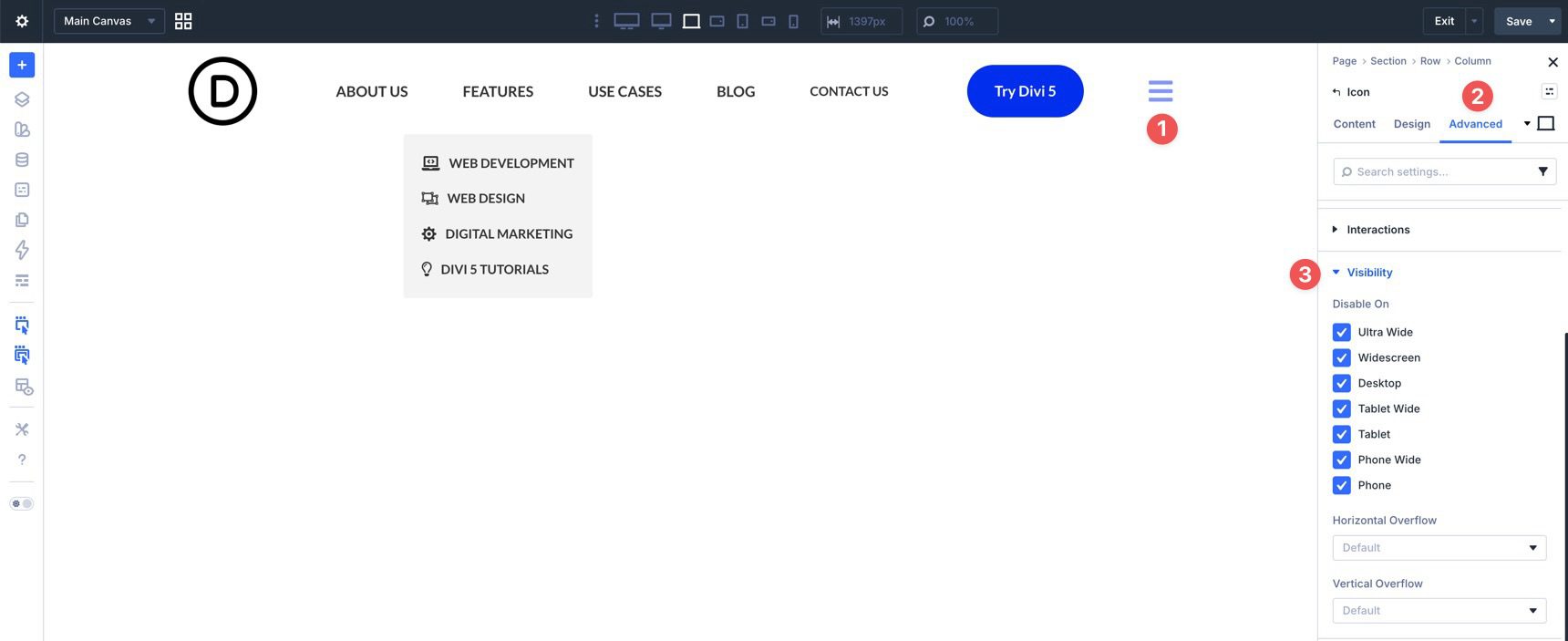
Finally, hide the hamburger icon by default on all breakpoints using the Visibility settings in the Advanced tab. The interactions will reveal it only when needed.
Test the finished menu in a new tab and make any necessary adjustments using Divi 5’s responsive settings.
The move from the classic Menu module to the new Link and Dropdown modules opens up a much more flexible way to build menus in Divi 5. Instead of relying on one all-in-one menu module, you can assemble custom navigation from smaller pieces that work with Divi 5’s broader systems, including nested modules, Menu Loops, Canvases, and Interactions.
The workflow is more hands-on, but it gives you more control over how your menu looks and behaves. Whether you’re building a simple dropdown, a mega-menu style header, or a custom mobile navigation experience, these tools make it possible to build that structure directly inside Divi. Download the latest Divi 5 release and experiment with the Link and Dropdown modules, Canvases, and Interactions to build your next custom menu.


How complicated do you want to make creating a menu? :/
I want to agree here. They way DIVI 5 wants us to do even a dropdown menu here is tooooo many steps.
Divi offers multiple ways to create menus/navs, some of them easier than others. It 100% depends on your needs and what exactly you want to build. Some of the easier methods might not have the same design flexibility. It comes down to understanding your options and which one works for your situation the best.
There should be easier ways to loop a menu with dropwdowns and mega menus in general. Especially so customers can edit it. I would recommend something like a Mega Menu Module. Why not?
A dedicated Mega Menu module, or an easier customer-friendly way to build dynamic dropdown and mega menu structures, would make a lot of sense!
Divi 5’s new menu tools are a big step forward, but we agree there’s room to make complex navigation easier to create, manage, and hand off to clients. We’ve created a feature request for this and shared it with the team.👍
From the article Christopher:
We’re intentionally skipping Menu Loops for the desktop menu in this guide. Menu Loops are useful for dynamic, repeating navigation structures, but they repeat the structure inside the looped element. If you place the same Dropdown module inside a looped Link module, each repeated link can inherit that same dropdown structure, which is not what most traditional desktop menus need.
_________________________
To me Christopher this is something that can be fixed in the link module while using the loop. If I choose a menu to loop all the items in the menu could show up in that module and be editable. Then add in the dropdown on the menu item we need saving us from having to do multiple link modules at once.
Wait! It’s the new canvas feature A11y compliant?
This is a really powerful approach for building custom navigations. But, are are Canvas-based layouts and interactive elements like dropdowns WCAG-compliant?
It would be great to see guidance on accessibility best practices when using these features, especially for navigation and mobile interactions.
Great question, Flo, and thanks for raising it! Canvas-based layouts and interactive elements can be built accessibly, but WCAG compliance depends on how they’re configured and used in the final design.
For example, proper keyboard navigation (Tab, Escape to close), focus management (moving focus into the canvas when it opens and returning it when it closes), and clear ARIA attributes (like aria-expanded, aria-controls, and appropriate roles) are all essential.
We’ll pass this feedback along to the team. More guidance around accessibility best practices for Canvases, dropdowns, keyboard navigation, focus management, and mobile interactions would definitely be helpful.
Am I inattentive, or is there no layout download in the post?
I’m sorry, but nowhere in the article does it say there’s a download.
How difficult can it be? I just want a simple collapsible hamburger menu for small screens, not these endless variations and possibilities. I dropped out before I was halfway following this recipe.