

Every site eventually needs UI that lives outside the page’s normal content flow: a pop-up, a sticky reminder, a slide-in panel, or a confirmation prompt. In Divi 5, you can build these with Canvases.
A Canvas is a detached design workspace that exists alongside the main page canvas. It is not a module dropped into the page layout. Instead, it gives you a separate workspace for off-canvas UI, pop-ups, menus, staging layouts, and other designs that should stay separate from the main page while you build.
This part of the Mastery Course covers two Canvas builds for the coworking homepage. The first is a small Event Reminder notice anchored to the bottom-left of the viewport and dismissible with a close icon. The second is a centered email opt-in pop-up that is hidden by default, gated by a cookie condition, and triggered when the visitor scrolls to a specific section.
Together, these two examples show the full Canvas, Interactions, and Display Conditions workflow.
Divi 5 Mastery Course Overview
| Part | Title | Visit |
|---|---|---|
| 1 | What To Prepare Before Building Your Divi 5 Website | Learn more |
| 2 | Exploring Every Aspect Of The Divi 5 Interface | Learn more |
| 3 | Creating A Divi 5 Global Design System With Design Variables | Learn more |
| 4 | Mastering Divi 5 Presets For Faster, More Consistent Web Design | Learn more |
| 5 | Building A Divi 5 Homepage From Scratch | Learn more |
| 6 | Building A Custom Header And Navigation In Divi 5 | Learn more |
| 7 | Building A Custom Footer In Divi 5 | Learn more |
| 8 | Using Divi 5’s Theme Builder To Create Global Website Templates | Learn more |
| 9 | Building The Core Inner Pages Of Your Divi 5 Website | Learn more |
| 10 | Mastering Flexbox In Divi 5 | Learn more |
| 11 | Mastering CSS Grid In Divi 5 | Learn more |
| 12 | Making Your Divi 5 Website Fully Responsive | Learn more |
| 13 | Creating Interactive Off-Canvas Elements (Popups & More) | Learn more |
| 14 | Mastering The Divi 5 Loop Builder | Learn more |
| 15 | Divi 5 Power User Workflow | Learn more |
| 16 | Auditing, Polishing, And Launching Your Divi 5 Website | Learn more |
What Canvases Are
A Canvas is a detached workspace in Divi 5. The main Canvas holds the visible page content. Additional Canvases give you separate places to build alternate layouts, hidden UI, off-canvas elements, pop-ups, menus, and design experiments.
When needed, Canvas content can be appended to the front-end page or injected with a Canvas Portal. You can still design inside a Canvas using familiar Divi elements, including Sections, Rows, Columns, Groups, Modules, Presets, and Design Variables.
There are two main Canvas types:
- Global Canvas: Available across the site and useful for reusable UI, such as pop-ups, menus, notification bars, and recurring site-wide elements.
- Local Canvas: Tied to a specific page or template and useful for one-off UI that only belongs in a specific context.
We’ll build both types in this tutorial. The Event Notice will be a local Canvas for the homepage. The email opt-in pop-up will be a Global Canvas, but we’ll trigger it from the homepage. If you want the same pop-up to appear elsewhere, you can add similar trigger interactions on other pages or templates.
How Canvas Visibility Works
Three features work together to make a Canvas behave like a pop-up, notice, or slide-in panel.
- Visibility settings: Hide an element by default so it does not appear until an interaction reveals it.
- Interactions: Create event-based behavior. A trigger, such as Click, Load, or Viewport Enter, runs an effect, such as Show Element, Hide Element, Toggle Visibility, Add Cookie, or Remove Cookie, on a target element.
- Display Conditions: Decide whether an element should render based on conditions such as user role, device, date, or cookie values.
This combination lets you design the element visually, hide it by default, reveal it at the right moment, and optionally prevent it from appearing again after a visitor closes it.
Event Reminder Notice
The Event Reminder is the simpler of the two builds. It is a small card pinned to the bottom-left of the viewport. It includes a light background, a dark border, a heading, a short description, and a close icon.
This notice appears when the page loads and can be dismissed for the current page view. Since we will not set a cookie for this one, it can appear again on a future page load.
Create The Local Canvas
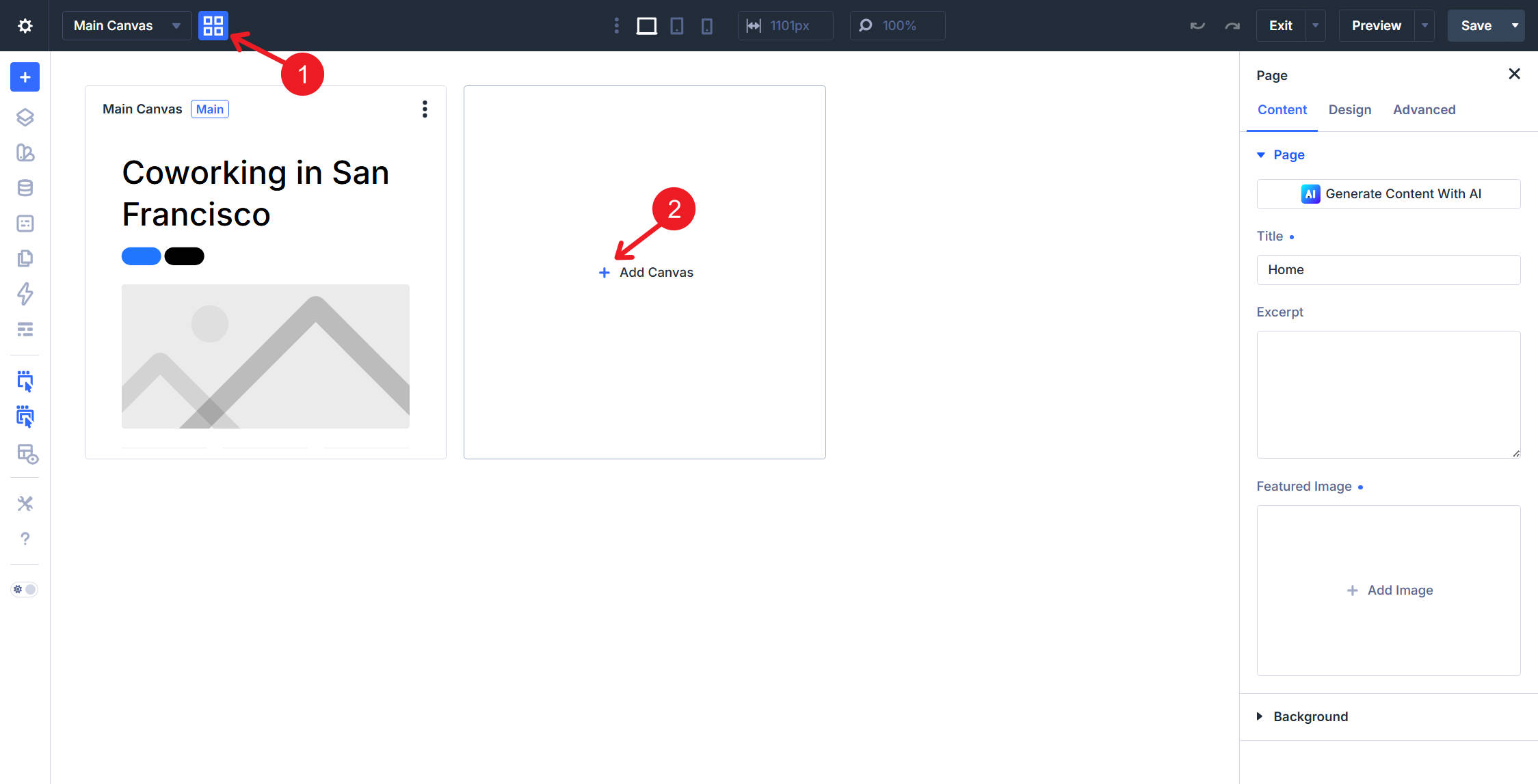
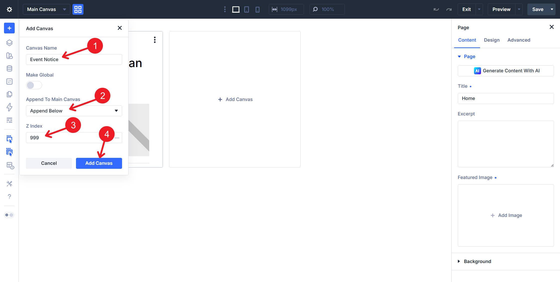
From the Visual Builder Top Bar, select Add Canvas. Do not make this one a Global Canvas. Name it Event Notice.
Set the Canvas to append below the main page content. Then, give it a z-index of 999 so it stacks above regular page elements but below the higher-priority pop-up we will build next.
Build The Section, Row, And Column
Open the new Canvas and add a Section. In the right sidebar, set the Section’s Admin Label to Event Notice. This label makes the section easier to find when creating interactions that target it.
In the Section’s Design tab, open Sizing. Set Width to min(250px, 40%), and leave Max Width alone. This CSS function caps the card at 250px on larger screens while allowing it to shrink on smaller screens.
Next, go to Advanced > Position. Set Position to Fixed and Offset Origin to bottom left.
Under Spacing, set Margin Top, Margin Bottom, and the left/right margin values to 1rem. This keeps the notice away from the viewport edges. Then, set Padding Top and Padding Bottom to 0px because the inner Column will handle the card padding.
Set the Row’s Width to 100%. Apply the Contained – Dark Element Preset to the Row, then set its Background Color to the Background – Light Gray variable.
Still on the Row, open the Design tab and apply the Outlined – Dark Option Group Preset to the Border option group. That is what draws the dark outline around the card. The Row now carries two presets: Contained – Dark at the element level and Outlined – Dark on its Border group.
The Column takes no preset. Set its Vertical Gap to 1rem so the modules inside stack with consistent spacing.
Add The Notice Content
Inside the Column, add three modules in this order:
- Icon module
- Heading module
- Text module
Use a close icon, such as an X, in the Icon module. Set its Position to Absolute, Offset Origin to top right, and the top/bottom and left/right margin values to 0.5rem. Set Icon Width to 26px.
Absolute positioning keeps the close icon anchored to the card’s corner instead of the viewport.
On the Heading module, apply the Subheading Element Preset and set the heading text to Reminder!.
On the Text module, apply the Small Text Element Preset and set the body text to: Networking event on Wednesday, August 16th, from 4 pm until 6 pm.
Wire The Close Interaction
Select the Icon module. Open the Advanced tab and expand the Interactions option group. Click Add Interaction and configure it like this:
- Trigger: Click
- Effect: Hide Element
- Target: Canvas, Section — Event Notice
Finally, return to the Section and set a background color with 0% opacity. This keeps the Section background transparent so it does not create visible sharp corners behind the rounded Row or Column styling while scrolling.
Save the Canvas and reload the front end. The notice should appear in the bottom-left corner and disappear when the close icon is clicked. Because no cookie is set, the notice can reappear on a future page load.
Email Opt-In Pop-Up
The email opt-in pop-up is more involved. It is a centered modal with a headline, reassurance text, a close icon, and an email signup form. It is hidden by default, shown when a visitor reaches a chosen homepage section, and blocked from future views after the visitor closes it.
Create The Global Canvas
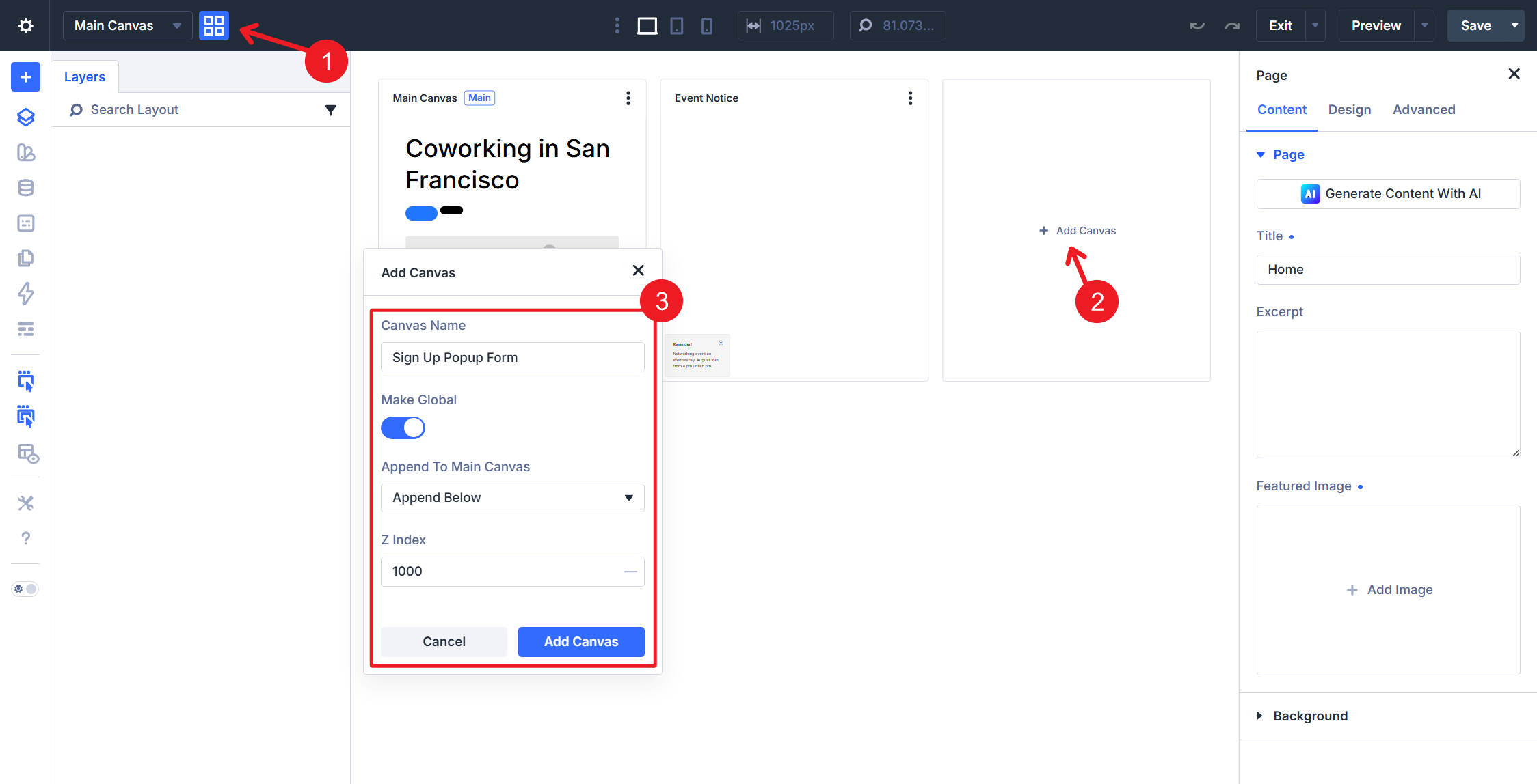
From the Visual Builder Top Bar, add another Canvas and make it a Global Canvas. Name it Sign Up Popup Form.
Append it below the main page content. Set its z-index to 1000 so it appears above the Event Notice if both are visible at the same time.
Build The Pop-Up Section
Add a Section and set its Admin Label to Subscribe. This is the name the homepage interaction will target.
In the Section’s Design tab, apply the Outlined – Dark Option Group Preset to the Border option group. This keeps the pop-up shell aligned with the rest of the design system. Then, set Background Color to Background – Light Gray.
Under Design > Sizing, set Width to 980px and Max Width to 80%. This gives the pop-up a generous desktop width while preventing it from exceeding the viewport on smaller screens.
Under Advanced > Position, set Position to Fixed and Offset Origin to center center.
Build The Row And Columns
Add a Row using a Flex container with Two Offset Columns, with 3/5 and 2/5 Column widths. Set the Row’s Layout Wrapping to Wrap. Then, duplicate the second Column to create a third Column.
Configure the three Columns with these desktop and tablet Column Classes:
- Column 1: 3/5 on Desktop and Fullwidth on Tablet and smaller.
- Column 2: 2/5 on Desktop and Fullwidth on Tablet and smaller.
- Column 3: Fullwidth on Desktop and smaller.
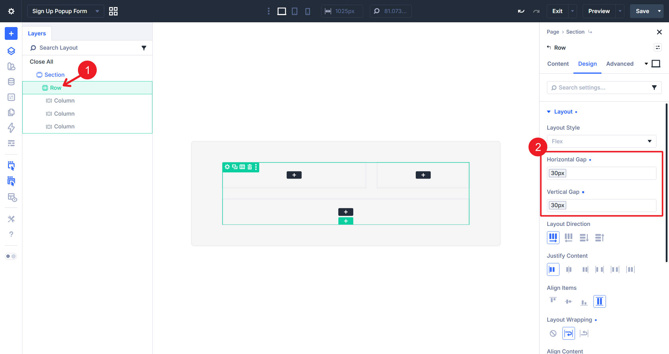
Set both Horizontal Gap and Vertical Gap to the Spacing – Medium Design Variable.
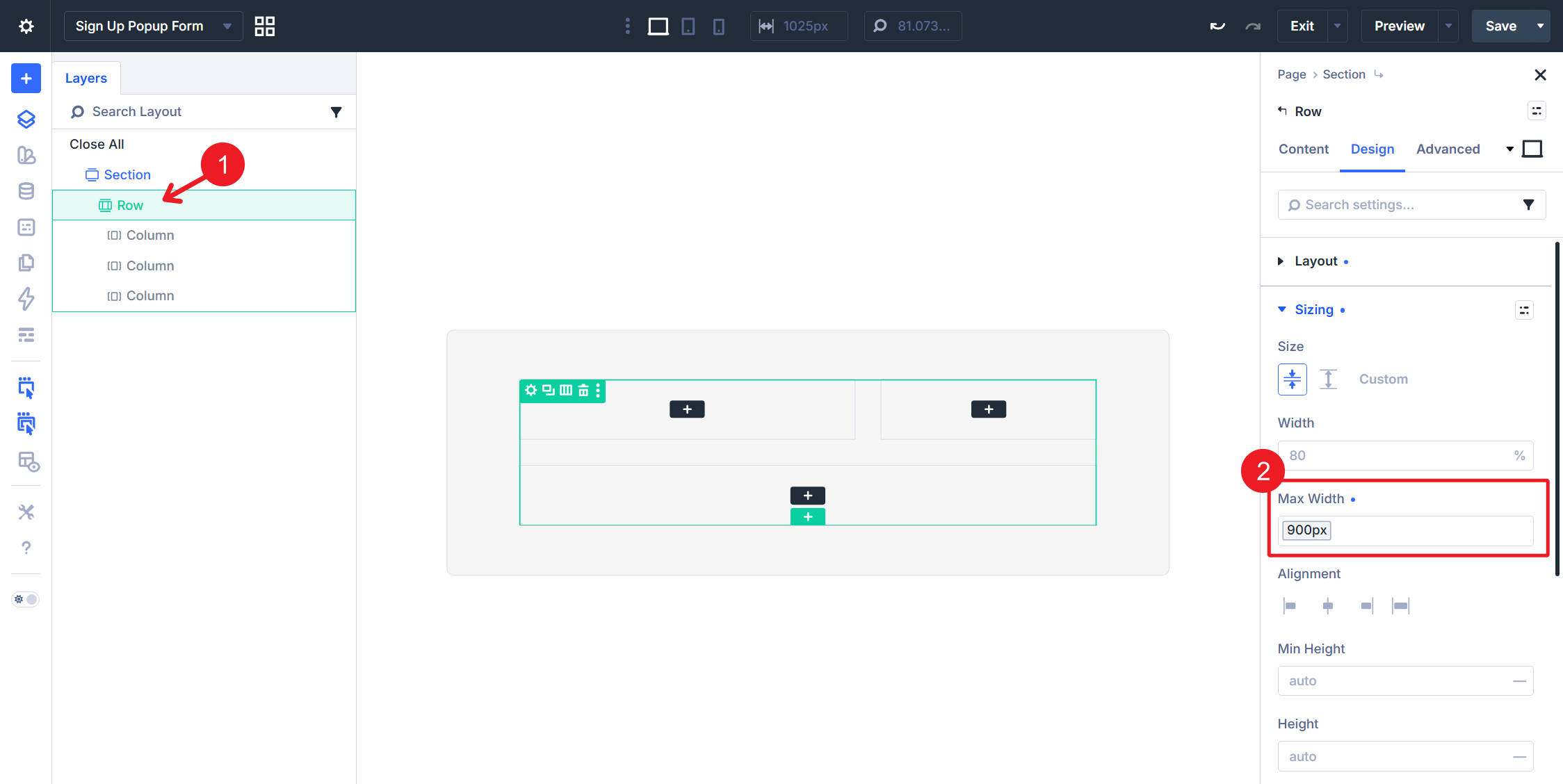
Cap the Row’s Max Width with the Max Width – 900 Design Variable to keep the inner content readable inside the wider pop-up shell.
Add The Pop-Up Modules
In Column 1, add a Heading module with the text Discounts, Giveaways, & Other News. Apply the H4 Preset to size and style it.
In Column 2, add an Icon module using a close icon. Set Position to Fixed, set Offset Origin to top right, and set the top/bottom and left/right margin values to 1rem. Set Icon Width to 26px.
This close icon uses Fixed where the Event Notice used Absolute. A Fixed element measures itself against its nearest transformed ancestor, and the pop-up Section is centered with a transform, so the icon lands in the pop-up’s top-right corner rather than the viewport’s.
Below the icon in Column 2, add a Text module and apply the Small Text Element Preset. Set the text to Max one email per week. On desktop, you can align this text to the right. On Tablet and smaller breakpoints, switch it back to the left so it reads naturally.
In Column 3, add an Email Optin module and apply the Dark Element Preset.
In the Content tab, set the Email Provider dropdown to your service of choice. This build uses MailerLite, but setup varies by provider. Connect the account, then remove the default heading text and body copy inside the module. For this pop-up, we’ll only include the email field.
Select the pop-up Section and go to Advanced > Display Conditions. Add a Cookie condition and configure it like this:
- Display Rule: Cookie Value Does Not Equal
- Cookie Name: hide-popup
- Cookie Value: true
This tells Divi to render the pop-up Section only when the hide-popup cookie does not equal true. After the visitor closes the pop-up and the cookie is written, the condition no longer passes, so the pop-up will not render again until the cookie expires or is cleared.
Select the close Icon module in Column 2. In the Interactions option group, add two interactions to the same click trigger.
- Click → Hide Element → Section Subscribe. This closes the pop-up immediately.
- Click → Add Cookie. Set Cookie Name to hide-popup and Cookie Value to true. If the interaction settings include a duration field, set the duration to the amount of time you want the pop-up to stay hidden.
Both interactions run from the same click event. The first gives the visitor an immediate visual response by closing the pop-up. The second writes the cookie that the Display Condition checks on future page loads.
Next, select the whole pop-up Section. Go to Advanced > Visibility and hide the Section across the breakpoints where the pop-up should start hidden. The homepage trigger will reveal it when the visitor reaches the chosen section.
Wire The Homepage Trigger
Save the Canvas, then return to the main homepage Canvas. We only need one trigger.
Open the Layers View from the left sidebar and select the section that contains Thrive in a better work environment. In that section’s Advanced tab, expand Interactions and add this interaction:
- Trigger: Viewport Enter
- Effect: Show Element
- Target: Canvas, Section — Subscribe
This shows the pop-up when the visitor scrolls that section into view. It also avoids showing the pop-up immediately on page load, which is usually a less intrusive experience.
The Event Notice can appear on page load because it is small and positioned out of the way. The email pop-up waits for a scroll-based trigger because it takes over the center of the screen. Both elements are closable with Icon interactions, and the email pop-up also uses a cookie condition to prevent repeat views after it is dismissed.
Start Building Canvases In Divi 5 Today!
With the Event Notice and email opt-in pop-up wired up, the coworking homepage now has interactive UI outside the normal page flow. The small notice surfaces timely information without taking over the screen, while the pop-up appears at a more deliberate moment and stays hidden after dismissal.
The same Canvas, Interactions, and Display Conditions pattern can power other off-page UI: cookie banners, slide-ins, announcement bars, confirmation prompts, onboarding panels, and off-canvas menus.
Part 12 of the Divi 5 Mastery course made the site hold up across breakpoints. This part added behavior and interaction. In Part 14, we’ll move into the Loop Builder, where dynamic posts, products, and custom query data can be turned into fully designed Divi layouts. That means the same design system you built throughout the course can render many items without duplicating the same modules by hand.










Leave A Reply