
Over the last decade, mobile devices have become the easiest way for people to browse the internet. According to census.gov, more than 68% of American households use a mobile device to search. By the year 2025, it’s estimated that three-quarters of the world will use a smartphone to access the internet. Web and marketing professionals must keep these statistics in mind when considering mobile SEO.
In this post, we’ll explain what mobile SEO is and why it’s important. Additionally, we’ll discuss best practices when building websites with a mobile-first mentality. Let’s get started.
Table of Contents
- What is Mobile SEO?
- The Importance of Mobile SEO
- Mobile SEO vs Desktop SEO in SERPs
- Use Data Analytics to Help Your Mobile SEO Strategy
- How to View Mobile Device Google Analytics
- Mobile SEO Best Practices
- Mobile SEO FAQs
- 1 What is Mobile SEO?
- 2 The Importance of Mobile SEO
- 3 Mobile SEO vs Desktop SEO: How They Differ in SERPs
-
4
Mobile SEO Best Practices
- 4.1 1. Improve Page Speed / Loading Times for Mobile Site SEO
- 4.2 2. Optimize Titles, URLs, and Meta Descriptions for SERPs
- 4.3 3. Configure Your Site for Mobile Devices
- 4.4 4. Use Responsive Web Design
- 4.5 5. Don’t Use Popups
- 4.6 6. Design for Maximum Impact
- 4.7 7. Optimize for Local Mobile SEO
- 4.8 8. Leave the CSS and Javascript Alone
-
5
Mobile SEO FAQs
- 5.1 Should I Have Separate Mobile and Desktop URLs and Site Designs?
- 5.2 What if Most of My Traffic Comes From Desktop Users?
- 5.3 Should I Use Google AMP For My Mobile Site SEO?
- 5.4 Do I Need to Create Different Content for Mobile?
- 5.5 What is “Responsive Design” and is it Better for Mobile SEO?
- 5.6 How Does Mobile SEO Differ from Desktop SEO in the SERPs?
- 5.7 Do Search Engines Index Mobile Sites Differently?
- 5.8 How Do I Know How Much Mobile Traffic I Have?
- 5.9 Should I Prioritize Mobile SEO if Most of My Traffic is Desktop?
- 5.10 How Does Local Mobile SEO Work?
- 5.11 Do Collapsable Accordion Modules and Tabs Get Indexed?
- 6 Wrapping Things Up
What is Mobile SEO?
Mobile search engine optimization (SEO) is a method used by marketers designed to improve the appearance and positioning of web pages in search results on devices with smaller screens than a desktop. In order to be successful in the competitive internet world, good SEO techniques are essential.

Mobile SEO is a bit different than desktop in that it utilizes a user’s location, the size of their mobile device’s screen, as well as their operating system to boost search engine rankings. A good developer will use a mobile-first approach when designing a website, which increases the likelihood of content being delivered successfully to all potential visitors regardless of the platform they use.
The Importance of Mobile SEO
As previously mentioned, the number of mobile users is increasing rapidly. This means that if you want your website to rank highly in search results, or show up at all, it has to be optimized for mobile devices.
Is Mobile SEO Important to Google?
As you may know, Google changed their algorithm back in 2018 to have a mobile-first mentality. That basically means that Google site crawlers are going to look for the mobile site first when determining how well your site should rank in the SERPs. In other words, you need to optimize your mobile site for SEO with a mobile-first SEO strategy. If not, your site is going to take a back seat to those that are. One of the best first steps in mobile SEO optimization should be to make your site as mobile-friendly as possible.
There are other considerations regarding the mobile-first train of thought. Conducting an SEO audit, and having a good understanding of core web vitals such as time to first byte (TTFB), cumulative layout shift (CLS), and site speed are critical when optimizing your website for mobile search results. Additionally, responsive design, keyword tracking, and user improvements are key.
Mobile SEO vs Desktop SEO: How They Differ in SERPs
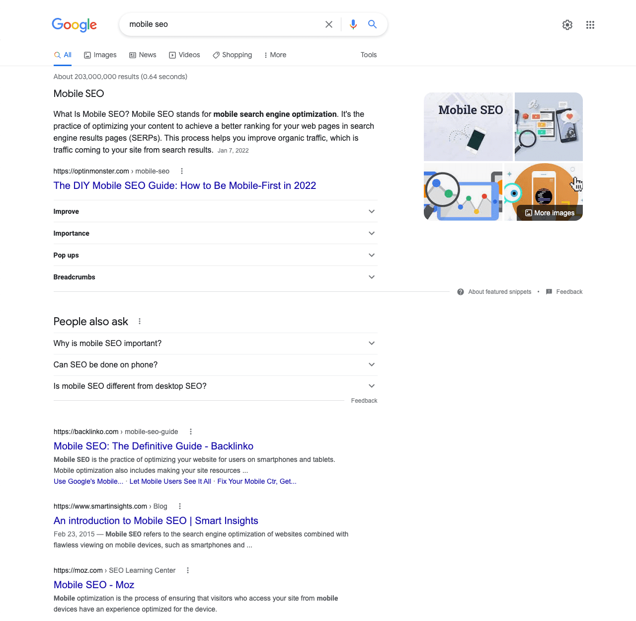
Marketing professionals should be aware that how they rank in the Search Engine Results Pages (SERPs) must be considered on both desktop and mobile. There are some differences between the two. First, Google and other search engines show results based on what a user expects, which varies depending on what device they are using to search. For example, mobile search results typically include photos or videos. Results are set up like cards. Because of this, mobile results will take up more vertical space. Larger results mean fewer results and more scrolls. Generally, users will see 2-3 results on their screen without having to scroll. This makes good mobile SEO critically important because you want your potential visitors to find your content within the first few results.
Alternatively, desktop results are generally only a few lines of text. This allows for more results to be displayed. Desktop users will likely be able to only scroll two to three times to see all results on the first page. People are conditioned to scroll more these days, but that doesn’t necessarily apply to mobile devices. People tend to grab the first device closest to them when they need to search for something, and most of the time, that’s a smartphone.
If your content isn’t revealed to them within the first scroll, you’re likely missing out on revenue.
Another aspect to consider with mobile SEO is the click-through rate (CTR). Ranking in the top three will ensure that mobile users see your content. Generally, the click-through rate for mobile devices is significantly lower than on desktops. One possible reason is that mobile results are easier to see with the card-like design and border. Another reason is likely due to mobile results having images along with them.
Use Data Analytics to Help Your Mobile SEO Strategy
Good SEO Techniques are important for desktop as well as mobile. That being said, it is important to have a good mobile SEO strategy because of the percentage of people who use mobile devices regularly. Using data analytics can help point you in the right direction. The first step is to determine what percentage of your site’s visitors find you on mobile devices. Google Analytics has a great tool to accomplish this goal. If you haven’t set up a web property for your website on Google Analytics, you should. These GA4 plugins can help.
We should mention that Google’s Universal Analytics will stop processing data next year. To learn more about what will replace the tried-and-true version of Analytics, check out our post on Google Analytics 4.
How to View Mobile Device Usage on Google Analytics
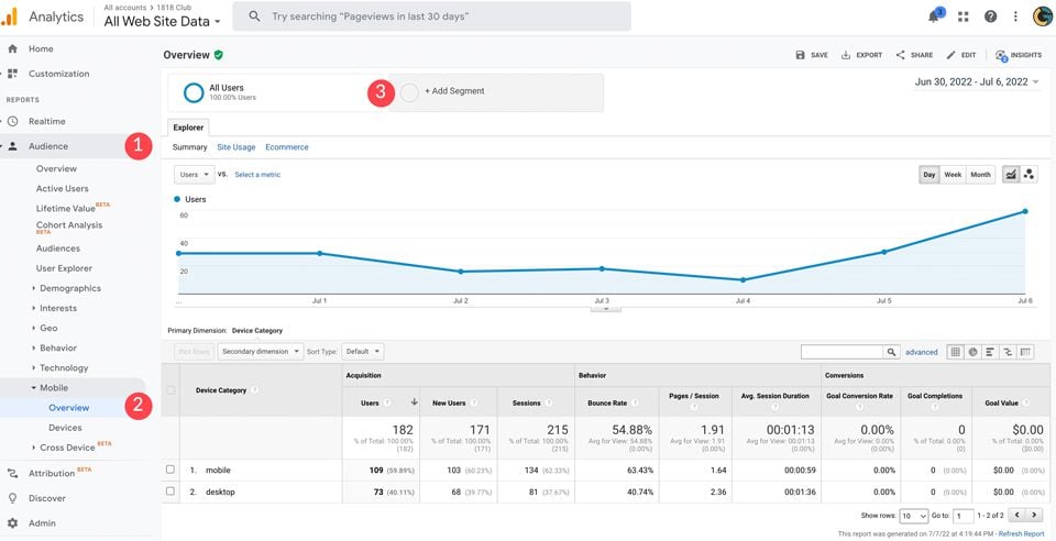
First, log in to your Analytics account and choose your web property. From there, click on audience, then mobile. Under overview, you’ll be able to see how many users have visited your site on the current day, week, or month.
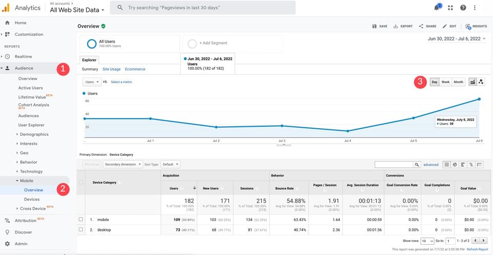
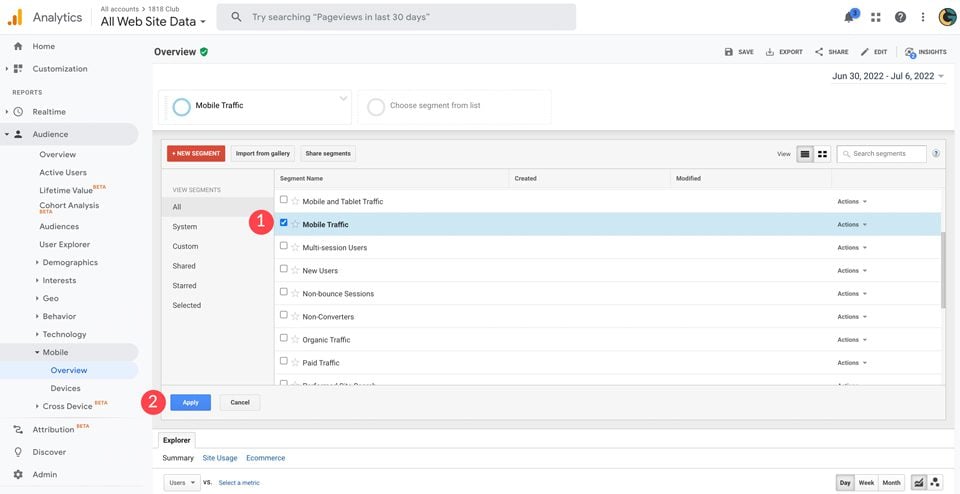
To compare all users to mobile users, click + Add Segment to add the mobile traffic view.
When the dialog box appears, choose Mobile traffic, then click apply. This will enable you to see what percentage of users are accessing your site from a mobile device.
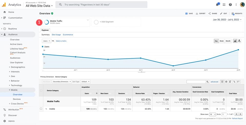
In our example, you’ll see that nearly 60% of site visitors used a mobile device.
Mobile SEO Best Practices
Once you’ve decided on implementing a mobile SEO strategy for your site, there are some important things you can do to ensure that your site’s content ranks high in search results for mobile devices. There are some free SEO tools out there to help, but your best bet is to invest in a quality SEO plugin for WordPress. Also, take some time to familiarize yourself with some SEO practices that you should avoid.
For now, let’s go over some best practices to follow to improve your Mobile SEO strategy and ensure your site’s visitors can find your content when searching with mobile devices.
1. Improve Page Speed / Loading Times for Mobile Site SEO
Page speed is one of the most important factors to consider when optimizing your website for mobile SEO. On average, 53% of mobile users will bounce off of a site if it takes more than 3 seconds to load. That’s why it’s crucial to take steps to improve page speed seo. The first thing you should look towards is image optimization. If your images are large, it will slow your site down considerably. You should consider adding an image optimization plugin to assist you with this. Secondly, consider hosting videos on YouTube or Vimeo. Videos that are hosted on your site are a huge factor when it comes to site speed.
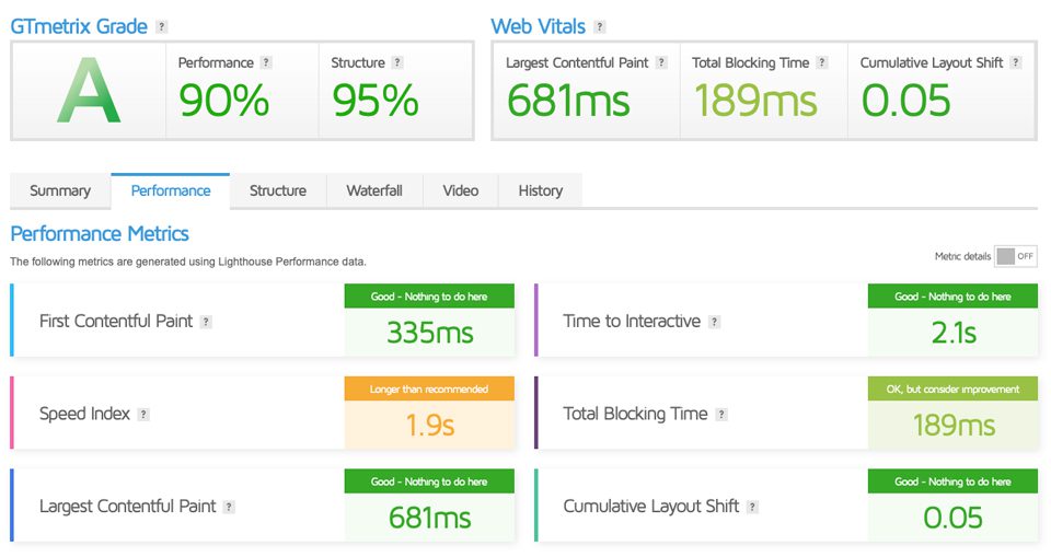
Additionally, consider creating accelerated mobile pages (AMP). Google’s AMP plugin will assist you in speeding up your website to deliver content much faster for mobile users. Additionally, you can use a tool such as GTmetrix to perform load testing. This will help determine the steps you’ll need to take to reduce your page speed load times. A bonus tip is to use a database optimization plugin to clean up any unwanted, unused and unnecessary bloat in your website’s database that could be slowing your site down.

2. Optimize Titles, URLs, and Meta Descriptions for SERPs
It is important to remember that screen size is a key factor for mobile SEO and SERPs. Ensure that your headings aren’t set to large sizes on mobile devices. Having large titles takes up too much valuable real estate. The same can be said for your SERP listing or snippet. Using an SEO plugin like Yoast can help optimize your snippet in the SERPs. With it, you can optimize your SEO Title, meta descriptions and URL’s. Remember, Search Engine Results Pages (SERPs) are much less condensed on mobile devices.
3. Configure Your Site for Mobile Devices
In the past, some developers have advocated for a separate mobile site for SEO to display websites with less content or to deliver content that is more optimized for screen size. There are many landing page plugins that can help with building mobile-responsive, mobile-first pages for this specific strategy. In this situation, there is a landing page that will direct users to either a desktop or mobile version of the site. With advancements in operating systems and responsive WordPress themes, this is no longer necessary. Aside from being very time-consuming, if not done properly, Google will view it as duplicate content, which can kill your search rankings.
Another way to ensure the proper delivery of content is to use dynamic serving. Instead of directing users to a completely different site, they will see a version that contains a different set of CSS rules and HTML that is compatible with the device they are using. The downside to this is that there’s no guarantee that things will work according to plan. It’s pretty common for dynamic serving sites to display the desktop version regardless of what device is being used.
The best, and most common, way to configure your site for mobile SEO is to use responsive design which allows you to optimize your site for mobile without all the fuss.
4. Use Responsive Web Design
The good news is that if you’re using WordPress, you likely have this part covered. If not, consider using a responsive theme such as our own Divi to design your website responsively, so that it translates well on all platform sizes. There are also various WordPress mobile plugins that can help make your website mobile-ready. If you’re building a static HTML site, you can use media queries and flex display CSS to ensure that your website looks good not only on desktops but on tablets and smartphones too.

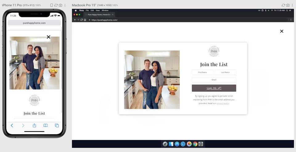
5. Don’t Use Popups
Popups can be a good way to increase client engagement or advertise promotions on your site. That being said, those elements may not be the best thing for mobile users. Popups take up a lot of space, which can limit the message you are trying to send. Additionally, they could lead to increased bounce rates, which is the time spent on your site.
6. Design for Maximum Impact
Be sure to have good use of buttons and call-to-actions (CTAs) so that your site visitors can access relevant information when they want to. If your buttons or CTAs are too small for those with larger fingers, you’re missing out on potential sales or click-through rates. Don’t give your mobile users too many choices, either. Limit the number of CTAs for greater impact. Prioritize the content you wish to showcase and keep everything else to a minimum.
7. Optimize for Local Mobile SEO
As previously mentioned, mobile SEO differs from desktop SEO because it uses location information based on a user’s location. That’s why it’s essential to optimize your site for local seo. At the minimum, you should include the business name, address, and phone number in your website’s metadata (usually in the footer) to optimize your website for local search results. For more advanced tactics, you should look into claiming a Google My Business page and using Schema markup to create rich snippets in the SERPs. You can use a schema plugin to help with the creation of structured data for your site.
8. Leave the CSS and Javascript Alone
Up until a few years ago, most developers would block CSS, Javascript, and some images because some mobile operating systems had difficulty handling them properly. Thankfully, smartphone manufacturers and updates to operating systems have widely made this a non-issue. Google wants to be able to identify all content as users see it, so it’s not a good idea to hide anything. Doing so can result in lower domain authority, hurting your search results rankings.
Mobile SEO FAQs
Now that we’ve explained the importance of mobile SEO and provided you with a few tips for a good mobile SEO strategy, you should be ready to tackle your website’s SEO needs. However, if you are just venturing into the world of SEO and want to learn everything you can about it, take a look at our post on the best SEO training courses you can take to turn yourself into an SEO wizard.
Still have questions? We have answers.
Should I Have Separate Mobile and Desktop URLs and Site Designs?
No. This is an outdated principle that no longer applies to current web design principles. Many WordPress themes are now responsive, which enables designers and developers to create gorgeous content that displays flawlessly on both desktop and mobile devices. For static websites, the use of bootstrap or CSS flex properties enables developers to display content effectively on mobile devices.
What if Most of My Traffic Comes From Desktop Users?
In this case, track your website on Google Analytics to check your bounce rate on mobile devices. Additionally, look for improvements by using Google’s mobile-friendly test. If you aren’t getting a lot of traffic to your site from mobile devices, then you are missing out on a huge opportunity to reach more people. Finally, take steps to make any necessary adjustments to design and/or content to boost the number of mobile site visitors.
Should I Use Google AMP For My Mobile Site SEO?
It depends. There are pros and cons to using accelerated mobile pages (AMP). One benefit is that you could see a boost in your search rankings. Additionally, you can conserve server resources by not providing image-heavy content. Lastly, your pages will likely load faster. That all sounds great, but what is the downside to using AMP? Well, first, you’ll be stripping your content down to the bare minimum. This is fine if your website is largely informational without a log of graphical elements. For example, a news website would likely benefit greatly from using AMP. On the other hand, if your site is highly interactive, you might want to stay away from AMP and use other methods such as caching, to speed up your site.
Do I Need to Create Different Content for Mobile?
It depends. If you want your site visitors to see completely different content that is more suited for mobile devices, then yes. With WordPress themes such as Divi, designers can use visibility options to show or hide content on desktop, tablet, or mobile devices. This is a great way to deliver different experiences to your site’s visitors based on screen size. Additionally, you can create content with a mobile-first design.
What is “Responsive Design” and is it Better for Mobile SEO?
Responsive design is a term used to describe how a design performs on all platforms — desktop, tablet, and mobile. Using responsive design principles is important when it comes to mobile SEO. As previously mentioned, the majority of all internet searches are initiated by smartphones. It is critical for not only search results rankings, but overall user experience.
How Does Mobile SEO Differ from Desktop SEO in the SERPs?
Mobile SEO considers user location when appearing in search results. Additionally, web developers must ensure SEO title, URL length, and meta description length aren’t taking up too much space. Remember, mobile devices generally only show the top 3 results, whereas desktops will show many more.
Do Search Engines Index Mobile Sites Differently?
Yes. Search engines have started to show search results based on mobile optimization, more than desktop. For example, Google’s algorithm is designed to look for mobile enhancements first. If it deems your site unfriendly to mobile users, you’re getting skipped over. Due to mobile-first indexing, those with responsive websites will rank much higher than those who don’t.
How Do I Know How Much Mobile Traffic I Have?
As shown above, you can use Google Analytics to determine the percentage of mobile users. This is a very useful tool to determine who is using your site, and whether or not they are staying on your site long enough to get your message. You can set up segments to determine mobile user breakdown by device, and bounce rate.
Should I Prioritize Mobile SEO if Most of My Traffic is Desktop?
Yes. Since Google enacted the mobile-first method in 2018, it has actively prioritized mobile optimization first. While you may not have many mobile visitors, that doesn’t mean they aren’t trying. If your site isn’t mobile-friendly, people attempting to reach your site’s content via smartphone or tablet may not even be able to see it. You see, even if you have the keyword they are searching for, Google won’t show them your site unless it’s optimized for mobile devices.
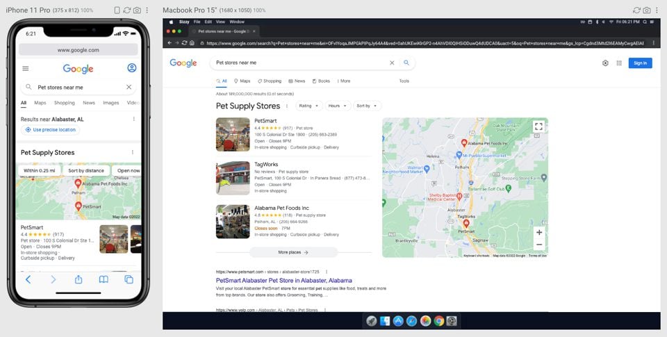
How Does Local Mobile SEO Work?
If you’ve ever used search terms such as “pet stores near me” or “coffee shops in Atlanta”, the results you see first are mobile-optimized websites. There could be other pet stores or coffee shops that meet your search criteria, but if they don’t fit the mobile-first requirements, you aren’t going to see them. That’s how mobile SEO works. Search engines use local metadata embedded in websites, along with mobile-friendly designs to serve up those search results first. For more, check out our complete guide to Local SEO.
Do Collapsable Accordion Modules and Tabs Get Indexed?
Yes. Designers and developers sometimes use accordions or tabs on websites to condense large amounts of content. These modules can be especially useful when designing for smaller screens, such as smartphones. The good news is that this content is still searchable and indexed by search engines.
Wrapping Things Up
As you can see, mobile SEO should be a vital part of your overall SEO strategy. With smartphone usage exploding globally, it’s essential for developers and marketers to enact a mobile-first mentality when designing and developing websites. With the tips we’ve outlined, along with a close evaluation of keywords and website analytics, you can ensure that smartphone users will have a much better chance and finding your website’s content in their search results.
What steps do you take when considering optimizing for mobile devices? Sound off in the comments section below.


I’m starting a new blog and this article really helped answer a lot of questions. Thanks a lot.
good read!
Excellent post. This article has helped me to understand mobile SEO.
Hi Deanna,
That was an excellent article. I love learning new stuff about web development and I I’ll be implementing the points you mentioned here.
Kind regards,
Neil.
Thank you, Neil. Glad you were able to gain valuable knowledge from it.
Well written!
This is quite an informative blog. I love to read that. My doubts are clear now regarding SEO.
The majority of my questions about mobile SEO were answered. However, there are still some confusions. I never felt comfortable with the mobile version of my company’s website, such as m.example.com. The contents are same for mobile and desktop but design is not same. So It take some extra effort for mobile to make SEO friendly.
And for WordPress I have a site which I didn’t use AMP plugin but I found so many experts always say to use AMP. But I didn’t feel to use AMP, because it’s responsive and working fine. So is there any extra benefit to use AMP plugin? Will Google give extra value for using AMP plugin?
It was once thought that optimizing your site with AMP gave you higher search engine rankings, but Google has debunked that. Yes, AMP will speed up your site if your website is heavy with images or graphical elements. That being said, you don’t really need it if you optimize those images. In Google’s advanced SEO guide, they state “While AMP itself isn’t a ranking factor, speed is a ranking factor for Google Search. Google Search applies the same standard to all pages, regardless of the technology used to build the page.” So there you have it. If your site speed tests conclude that your site is fast, you don’t really stand to gain anyting by implementing AMP.
45 / 5.000
Very nice explanation for SEO Marketing.
Thanks
I have been experiencing a serious issue with Divi mobile SEO. There is no way to prevent larger desktop content, like videos, from loading on mobile. The disable feature only hides them from view on mobile but doesn’t prevent loading, which can significantly slow the page load speeds and pagespeed scores.