
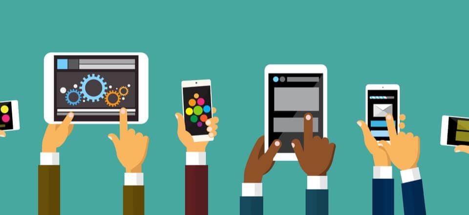
Mobile traffic data consumption grew by 74% in 2015 alone, with more than a billion devices sold during that same period, and this trend is showing no intention of slowing down. That alone should be enough to underline the importance of optimizing your designs for mobile.
Some WordPress themes are better optimized to handle responsive designs and resolutions than others, but that doesn’t mean you need to jump ship if you want to improve your site’s mobile friendliness. In fact, there are a number of easy to implement fixes that will enable you to make great gains when it comes to optimizing your designs for mobile devices.
Over the course of this article, we’ll be covering everything from tips for specific mobile OSs, to image optimization, layout design, and many other subjects. Let’s get started!
- 1 Tip 1: Add iOS Icons and Splash Screens
- 2 Tip 2: Use Multiple Image Sizes in Combination With Media Queries
- 3 Tip 3: Optimize Your Images
- 4 Tip 4: Consider Using SVGs
- 5 Tip 5: Pick the Right Fonts
- 6 Tip 6: Treat Text as Part of the UI
- 7 Tip 7: Use Contrasting Colors to Your Advantage
- 8 Tip 8: Design Mobile Menus
- 9 Tip 9: Use CSS3 Instead of Images (Where Possible)
- 10 Tip 10: Use These Tools to Test Your Designs for Mobile
- 11 Conclusion
Tip 1: Add iOS Icons and Splash Screens
Image by lenjoyeverytime / shutterstock.com
Despite the many inroads made by Android, iOS devices remain hugely popular and enjoy the backing of an active community of developers. The point is, a lot of your viewers are likely to visit your site from the comfort of their iPhones and iPads, and if they enjoy your content enough, they might even save your website to their home screens.
To prep for this eventuality, let’s go over how you can add some custom iOS icons to your WordPress website.
First of all, you’ll have to find your theme’s header.php file, since we’ll need to add some code in between the <head> tags in order to make this work.
Are you there yet? Great! Here’s the code you’ll want to add:
<link rel="apple-touch-icon" href="touch-icon-iphone.png" />
<link rel="apple-touch-icon" sizes="72x72" href="touch-icon-ipad.png" />
<link rel="apple-touch-icon" sizes="114x114" href="touch-icon-iphone-retina.png" />
As you can see, the code mentions specific icons for iPhones, iPads and Retina devices, which all need to be prefaced by the apple-touch-icon rel attribute.
As long as you’re still editing that header.php file, you can also design a brand new iOS splash screen for your website and throw it in there by adding the following line of code:
<link rel="apple-touch-startup-image" href="splash-screen.png" />
Tip 2: Use Multiple Image Sizes in Combination With Media Queries
Image by Artem Kovalenco / shutterstock.com
You’re, of course, already familiar with media queries. Think of them as specific design rules embedded in your CSS in case a specific scenario comes into play. In the case of mobile design, these scenarios are different resolutions, device orientations, and browser dimensions. The problem with media queries nowadays is that a lot of designers and developers create websites with a mobile-second approach in mind, whereas ideally, it should be the other way around.
This mobile-second approach can be spotted in media queries when you see popular device dimensions (i.e. 320px, 480px, 768px) being used as guidelines. While in theory this might seem like a sound approach, since you’re being efficient instead of introducing needless queries, in the real world, new devices (with new screen sizes and resolutions) are always coming out.
So, next time you’re working on a design, try approaching it from a mobile-first perspective:
- Design your queries working your way upwards, from small viewports.
- Avoid using pixels to declare your breakpoints. Instead, try working with ems and percentages as often as possible in order for your designs to adjust themselves depending on the level of zoom.
- Remember to adjust your media queries to adapt to retina devices (i.e. min-resolution: 192dpi).
Tip 3: Optimize Your Images
Image by Ganibal / shutterstock.com
Even if you have a fantastic and fully responsive design, potential viewers could be scared away from your site if it takes too long to load, and images play a big factor in this aspect. Users expect pixel perfect graphics and they expect them to load blazingly fast, so you need to find a way to keep file sizes down while quality remains high.
While this may seem like a conundrum, there are plenty of tools which can help you achieve these results. On the plugin front, we have the likes of EWWW Image Optimizer and WP Smush, which once installed, will automatically apply lossless compression techniques to every image uploaded to your WordPress website and can even go through your media catalog to optimize images uploaded in the past.
If you’d rather not add yet another plugin to your website, there are always standalone tools such as TinyJPG and TinyPNG, which essentially accomplish the same goal as EWWW Image Optimizer by selectively reducing the number of colors in your images, as well as stripping out unnecessary meta data. This results in vastly smaller file sizes while only inducing near-invisible changes, which is an ideal compromise for most graphics.
Tip 4: Consider Using SVGs
Image by Giingerann / shutterstock.com
Scalable Vector Graphics (SVG) are a nifty tool to add to your personal list of tricks. Despite what the name would imply, they use a form of XML markup language instead of a straight-up image format, and they’re particularly useful for simple graphics such as logos, icons, infographics, and other such applications.
“Why are SVGs so useful?”, you might reasonably be asking. Well, for starters, they’re scalable (hence the name) which means you won’t have to worry about adapting them to different viewports. On top of that, they can also be easily animated using CSS, which is a process we previously covered in detail on How to Create an Animated Logo with SVG and CSS.
You should already be familiar with tools such as Adobe Illustrator, Inkscape and Sketch, all of which include support for this format, so try it out!
Tip 5: Pick the Right Fonts
Image by Neuevector / shutterstock.com
Mobile design isn’t all about images. Choosing which fonts to use can have as much of an (if not greater) impact on your designs as graphics do, since most sites use text as their primary method to convey information.
From a designer’s perspective, this means picking the right fonts for the job, and that entails:
- Shying away from thin or complex letterforms. Users already have to place mobile screen close to their faces; you don’t want them to have to zoom in even further on every line to figure out what it says.
- Avoid fonts with too little spacing in between the letters for better readability.
- If using media queries for your text, use ems for sizes instead of pixels.
- Consider using sans serif fonts, since they tend to scale better across most resolutions.
Tip 6: Treat Text as Part of the UI
Image by Aleksandr Bryliaev / shutterstock.com
While we’re on the topic of text, what font you use isn’t the only concern when it comes to readability. Since we’re going to be working with a wide variety of viewports, you want your mobile designs to take text into consideration as part of the entire UI experience right from the get-go in order to maximize readability. This means:
- Using media queries to maintain a manageable limit of characters per line (remember to use ems instead of pixels!). The generally agreed amount is set at somewhere between 45-75 characters.
- Consider using the vw, vh, and vhmin (these are all related to viewport percentage lengths) CSS3 values in order to keep font size relative to the size of your container on any given viewports.
Tip 7: Use Contrasting Colors to Your Advantage
Image by MaluStudio / shutterstock.com
Anyone who’s even remotely familiar with design fundamentals will tell you the same thing – contrast plays an important part in web design. Since we just finished talking about typography, let’s take a look at a great example of website design which uses contrast to highlight text:
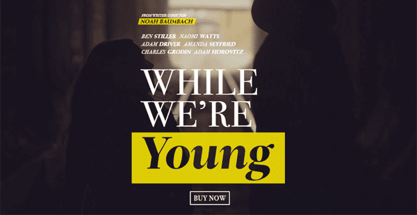
Here the eye is drawn towards the text thanks to the contrast in colors. This technique can also be applied to other parts of your layout, and you don’t need to stick to simple white on black – clashing colors also can look great in certain design contexts.
If you’re not quite sure whether the colors you’ve chosen are compliant with good design guidelines (or those of the World Wide Web Consortium), you can use this simple online tool to tell you if you’re on the right track. All you have to do is enter two colors and it will tell you whether their contrast is adequate from a design standpoint.
Image by Gamegfx / shutterstock.com
If your WordPress theme doesn’t include mobile menus for some unfathomable reason, there are plenty of tools you can use to tackle this issue right away. For example, on the plugin front, we have a couple of strong contenders:
Superfly
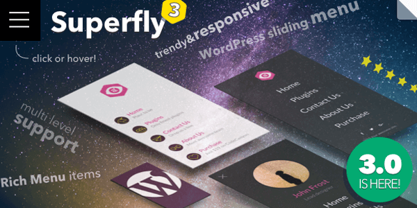
Superfly enables you to create a wide variety of additional menus which can be used to replace your theme’s default ones or complement them. For example, you could easily customize your Superfly menus to display only on mobile resolutions and not display on selected pages.
On top of rendering all kinds of regular mobile menus, Superfly also offers you the option of creating icon-based vertical menus.
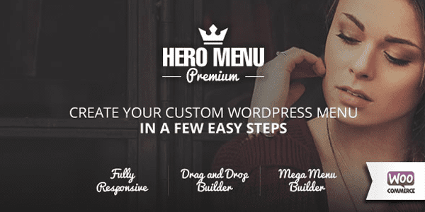
Hero Menu simplifies the creation process with a drag-and-drop editor and fully responsive features. The plugin comes with dozens of prebuilt menu layouts, color combinations, and custom-made icons to make each menu unique. Menus built using the plugin will automatically display using a lighter version when on a mobile interface.
Tip 9: Use CSS3 Instead of Images (Where Possible)
Image by 10 FACE / shutterstock.com
This one is pretty straightforward. Although the temptation to use graphic design tools to craft every aspect of your website may be strong, there are plenty of occasions where a little CSS3 trickery will suffice instead of using additional images.
Take this run of the mill button, for example.

If you guessed that to be some complex graphic trickery then you were mistaken. It was all accomplished using CSS3, and with a little bit of imagination (or the right tutorial) you can accomplish a lot of complex effects that would otherwise require more complex (and heavier) graphics to pull off.
To check out some great examples of buttons handcrafted using CSS3, check out 40 CSS3 Button Tutorials For Designers.
Tip 10: Use These Tools to Test Your Designs for Mobile
Image by Iconic Bestiary / shutterstock.com
One of the biggest problems with mobile design arises from the vast number of different viewports and resolutions you need to account for. While there are a few resolutions which enjoy widespread popularity, the market is by no means uniform when it comes to this aspect and there are new devices being released every month.
Therefore, unless you somehow have access to a wide variety of physical devices, you need to look for alternative methods to test your mobile designs. Thankfully, the web is chock-full of apps created for these express purposes, such as:
BrowserStack
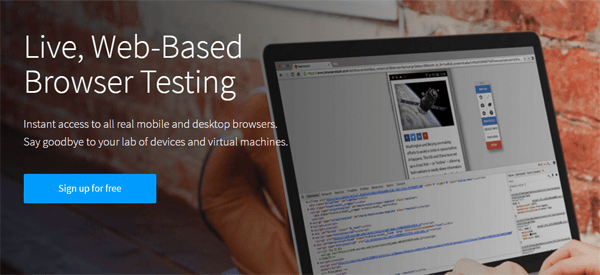
BrowserStack is a fully featured solution which includes a remote testing lab for actual physical devices, including a wide range of Android and iOS phones and tablets. On top of that, you also get access to multiple versions of all the most popular browsers (and some not quite as popular, such as Edge and Yandex). This combination of test environments is perfect for checking out how your designs will perform in real life scenarios and is useful not only from a design perspective but also for developers.
The best part is you don’t even have to test your designs manually on each device, since the service includes a Quick Screenshots feature, which will automatically test your site with over 700 combinations of devices, browsers, and resolutions so you can quickly pinpoint any errors in specific environments.
StudioPress
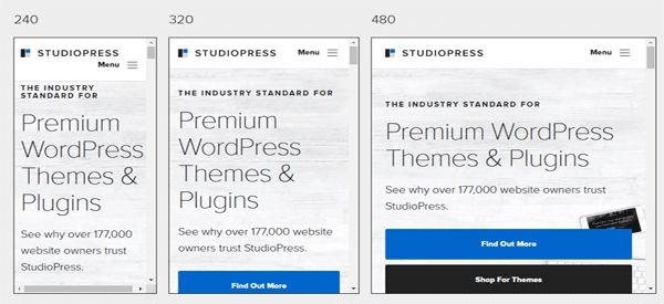
StudioPress doesn’t pack half the features that BrowserStack does. In fact, it only allows you to test live sites for specific widths (which you can manually configure) or using preset device sizes. However, it is completely free and you don’t have to sign up in order to use it.
Aside from the above tools, you might also want to turn to Chrome Developer Tools or the Firebug add-on for Firefox, which enable you to test out how your site will display in multiple resolutions without leaving your browser at all.
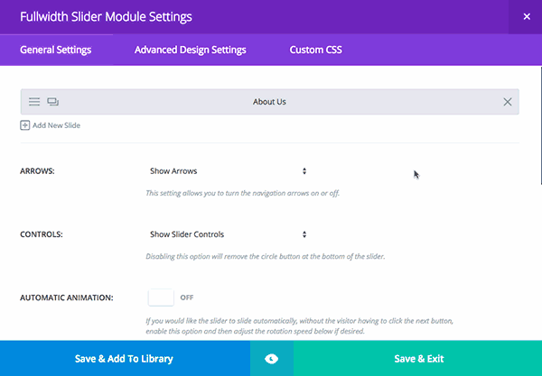
Divi’s Multi-Device Settings & Preview Modes
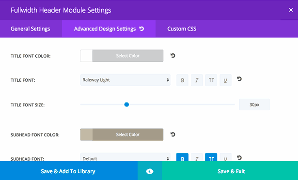
Finally, if you’re a Divi user, you can use the built-in responsive design controls to create modules and layouts that best fit each screen size. You can also preview these changes without ever leaving the Divi Builder.
Conclusion
While these tips will certainly have a positive impact on your website, you need to remember that mobile optimization is something that you must revisit constantly, since mobile users have little patience for sloppy design practices.
There are always new devices coming out, changes in design trends, OS updates, and other factors which could cause problems with your designs. With that in mind, let’s review the what we’ve covered in this article:
- Create iOS icons and a splash screen.
- Follow our guidelines for media queries and optimize images accordingly.
- Consider replacing images with SVGs or CSS when possible.
- Pick the right fonts and treat typography as part of the UX.
- Design custom mobile menus.
- Don’t forget to test your designs!
Do you have tips you’d like to share concerning web design for mobile platforms? Let us know in the comments section below!
Article thumbnail image by Shai_Halud / shutterstock.com


Great article!
Thank you, Tom.
And one more question.
If you recommend two plugins for image optimization ( EWWW Image Optimizer and WP Smush), does it mean that it is useful to install both? Or it is better to choose one?
Thanks for answer
Hello Irina. It’s better to try both and decide which one meets your needs as they all carry out the same kinds of tasks. Thanks for your comment!
Thank you much, Tom.
Intuitively I felt that. You were helpful.
Hey Tom
That’s an excellent article, definitely worth reading! With 47 percent of internet traffic coming from mobile, 80 percent of media consumed is on mobile, mobile is providing the best ever opportunity to businesses to create a one on one connect with their customers. But one of the most neglected area is the registration form. You can’t expect your visitors to fill those long sign up forms with the tiny keys of their mobile, can you? Social Login works as savior by simplifying this process by letting them authenticate themselves using social identities. It not only prevents your visitors from leaving, but also provides business first party data. Isn’t it a win win situation for both? What are your views on this?
Megan Barnett
Are there plans to improve Divi’s menu in the current versions. For example have an accordion-style mobile menu. Or be able to have different types of menus on mobile and desktopn (e.g. slide-in menu on mobile, horizontal menu on desktop)?
Great Tips I really Love this Post Thanks.
Good one Tom. Really interesting and informative
Some very Good basic tips and ideas here, I really like that. My SEO approach is simple but complex. Everything has to be consistently tracked and tested.
Nice Post,
Optimizing Images is the first best thing we can do
and Scalable Vector Graphics is the one which I found new
Superb tips overall
Thanks for the post
Good article but kind of leaves you hanging. I’d like to know more about the relevance and importance of using percentages and/or ems when determining the viewport. are there other links and/or examples that can be shown around this? and how would they work with Divi?
you make mention of the divi options for presetting padding/margins etc to mobile/tablet/pc and also the test view option but how does Divi handle the changing viewport? with px? or em/%?
You make an interesting comment about displaying different image sizes using CSS based on the viewport. this is something of interest to me but if you are simply setting display:none in CSS doesn’t this mean the image is still being downloaded – but not viewed? and if thats the case aren’t you at risk of downloading all the different versions of your image (diff sizes) which would slow the refresh/download rate?
I notice with Divi when you set a section or module to be displayed only with mobile or table or pc that it downloads the content and makes it invisible. Not perfect…. I wonder if this will be improved or if its the best that can be offered with the technology.
Thanks for the article. it stimulates thought and discussion.
Hi John, thank you for your comment. Lots of good thoughts and questions here. As I look at the content calendar I believe we have a post on em and % slated for the near future. It’s part of a series we’ve been working on. Hopefully when that launches your questions will be answered!
Tom: well done! I’m right smack dab in the middle of a project that is heavily focused on quality mobile output and I only wish this article had come two weeks sooner!
Divi & All: While I agree that there are some fantastic mobile menu plugins out there, I do feel that Divi’s mobile menu lacks 1 essential feature, key to any mobile menu: the ability to add text next to the Menu Bars.
I know that there are CSS snippets (content: ‘…’) to use to create text next to the mobile menu bars, but I feel like it should be far easier to create a menu that is INTUITIVE on mobile.
One question: in order to speed up page loading, in DIVI, how can I load the same image in different sizes depending on the device?
Now I can set the text size, maybe you can add the ability to upload images in different sizes for desktop, tablet or smartphone.
Great tips, these really can improve the mobile UX, many thanks for sharing Tom!
Nice article!
But I think DIVI misses 1 feature. In my case if you have a full width slider on the front-page, then you need also a picture that is a reasonable size to look nice, say 300 kB. But on mobile, this is way to much. There is no option to show a downsized version so Google Pagespeed comes with a penalty.
Grtz! Emile
You can create a second version of your slider with a downsized image, then using the right-click disable option make your small one visible on mobile devices and your large one only visible on desktop.
That’s a good one! Thanks for the answer
ah but does this stop the large one from downloading to a mobile device? or do they both download with the larger one being set to display:none?
and what is this ‘right click’ option you talk about? the divi builder doesn’t have any options for right click. does it?
btw: I’m trying to get discussion about this on the fb page but nobody is biting.
Hi John,
If you are speaking of the fact that Divi doesn’t support responsive images evan as well as core WordPress (e.g. srcset) I am with you. I am trying to start a movement (I am a child of the sixties) to get ET to sort it out.
Hi William. Yes that is what I’m getting at. I want my sites to look good on all viewports but not get penalized by Google for taking too long to load images because a) they are larger than they need to be or worse b) that I’ve disabled the display of the image in Css. Yet the image has still downloaded in the background.
It’s best that the website be smart enough to only send the correct sized content to the device based on its viewport.
John, we need to nag ET to alter the Divi builder so that it falls into line with the WordPress core media handling, i.e. it must allow the selection of an image size when selecting an image for a module element, and it must use the core “srcset” attribute functionality.
I am a huge Divi fan, but this is a glaring and horrible shortcoming.
Hi John,
Yes, the Divi Builder has right click actions. Just right click on any section/row/module to see what’s possible.
To answer your question about loading: If something is disabled for mobile, tablet, and desktop then it isn’t output to the page at all. If its enabled on at least one view then it will be output to the page and simply hidden with CSS when disabled.
Best,
Nathan
“Even if you have a fantastic and fully responsive design, potential viewers could be scared away from your site if it takes too long to load, and images play a big factor in this aspect. Users expect pixel perfect graphics and they expect them to load blazingly fast, so you need to find a way to keep file sizes down while quality remains high.”
I find this ironic in a post on the Elegant Themes blog. Elegant Themes is the maker and publisher of the Divi and Extra themes, and the Divi Builder plugin which are market leaders, AND WHICH DO NOT SUPPORT RESPONSIVE IMAGES!!!!!!!!!!!!!!!!!!!!!!
I also have problems getting the responsive image feature of WP 4.4 work correctly with Divi (featured and post images load at full size on mobile). Is this a current Divi limitation?
Hi Christophe, Yes, it is! Please log an update suggestion in the help forums, and help me to nag!
Great article, love this Blog man!
Thanks!
Thanks Tom, I will be re-reading this a few times and taking it on board.
Re item 1, I was under the impression that uploading a “Site Identity” image in Divi meant it acted as an image or “App icon” on mobile phones. Am I right?
I did try to use an SVG image a while back and had problems in uploading it to WordPress.Is there a trick to using SVG images?
At the moment you have to use a plugin for SVG images with WordPress. I’ve haven’t used this particular plugin but it’s got reputable stats in the WordPress repository.
https://wordpress.org/plugins/svg-support/
I tried to read this on my mobile, but it is pretty unreadable without magnifying. How about mobile optimising the elegantthemes blog?
It’s in the works 🙂
One of the better advanced user articles… No argument here! HTML5 CSS3 responsive grid / bootstrap enabled layouts have become virtually mandatory for developing any new sites. Theme developers need to keep that in mind. One reason I lean more heavily on ET themes…! The responsive MENU area still needs some work. I still find myself using responsive menu addons for some sites who ask for very custom header areas.
The tips in this article are excellent !! It’s now bookmarked..!!!
Glad to hear it John!
Nice article once again.
It would have been nice if you mentioned Googles free developers simulating tool in the Crome browser. No registration and upcoming $50 monthly fees as BrowserSlack and others. And It really does the job.
Great point Martin!
—
Well it seems like I’m up to speed – I’m already doing all of this! Great list, it incredible how optimising just a few things can make a site perform perfectly.
Props to you for being ahead of the game Laura! 😉
—
Great article! The majority of web designers will agree that mobile optimization is key, but many think that their mobile work is done after installing a responsive theme. However, your article proves there’s a lot more to be done.
My question though: As SVG’s are becoming more and more popular, do you think WordPress will start allowing them in the media library? As of now they’re blocked, and can only be added in Divi by uploading them elsewhere and pasting the image path. Do you think this will change soon?
I’m not sure. I think SVG’s are becoming more interesting and important so I would definitely like to see them adopted by WordPress.
Here’s a plugin that I haven’t tried yet: https://wordpress.org/plugins/scalable-vector-graphics-svg/