Creating a website that works well on mobile isn’t easy, but it can be done. As long as you check your site thoroughly before shipping it, there’s no reason why mobile users shouldn’t have a great experience. However, you may wonder what elements need your attention the most.
In this article, we’re going to provide you with a simple checklist of seven criteria your site should meet. If it does, your users will probably have a great mobile experience, and if it doesn’t, we’ll tell you how to turn things around. Let’s start with point number one!
- 1 The Importance of Having a Mobile-Friendly Website
-
2
A 7-Step Mobile-Friendly Checklist to Follow on Every Website You Create
- 2.1 1. Test Your Website at Multiple Resolutions
- 2.2 2. Make Sure Your Menus and Navigation Display Well on Smaller Screens
- 2.3 3. Check if Your Images Look Good at Smaller Resolutions
- 2.4 4. Test Your Content for Readability
- 2.5 5. Ensure Your Site’s Elements Are Easy to Interact With
- 2.6 6. Make Sure You’re Not Overly Relying on Pop-Ups
- 2.7 7. Test Your Website’s Loading Times
- 3 Conclusion
The Importance of Having a Mobile-Friendly Website
Having a mobile-friendly website is more important than ever nowadays.
The term ‘mobile-friendly’ sounds a little vague. To put it simply, a site can be considered mobile-friendly if you can consume its content easily and interact with it using mobile devices of any sort.
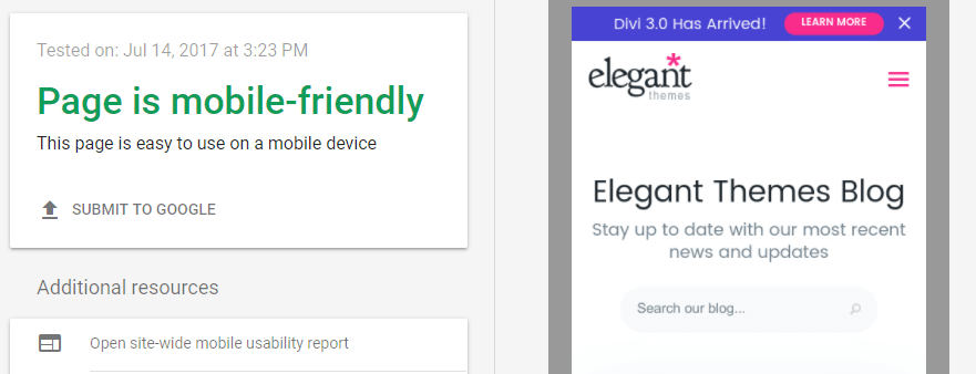
As you probably know, mobile browsing is on the rise, meaning a lot of people use them as their primary way to navigate the web. If your site isn’t easy to use, users may seek an alternative. Fortunately, there are several ways to test whether your website is mobile-friendly. For example, Google offers a test that any site can use just by pasting its URL:

Keep in mind though, no automated test is perfect – so you’ll also need to exercise some common sense. To that end, here are some tips to help you ensure your site is as friendly as it can be for mobile users.
A 7-Step Mobile-Friendly Checklist to Follow on Every Website You Create
Given the importance of mobile traffic, it’s critical that every website you build is mobile-friendly from the get-go. This checklist will help you make sure it hits every step. Let’s take a look!
1. Test Your Website at Multiple Resolutions
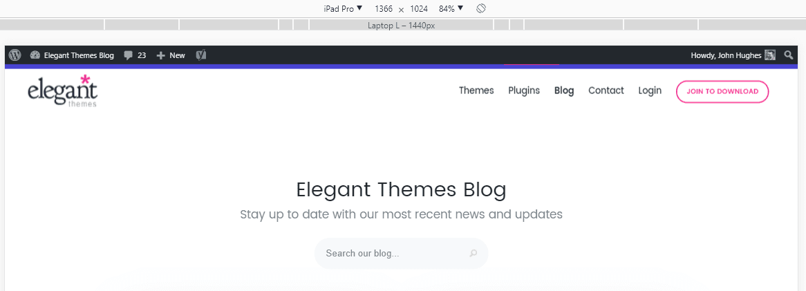
Testing your website at multiple resolutions is easy with the right tool.
One of the most important things when it comes to mobile sites is that your site doesn’t look like it was shrunk from its desktop version. This means every single one of your elements should look good at multiple resolutions.
If, on the other hand, none of your elements look good on mobile, it may impact your bounce rate negatively. The smart thing to do is test your website at multiple resolutions beforehand and see if any issues arise.
Fortunately, this process isn’t as complicated as it sounds, and you don’t need to own multiple devices to do it. There are plenty of services that enable you to test any website on different resolutions quickly, such as:
- Chrome Dev Tools: This built-in Chrome browser feature includes a Device Toolbar you can use to test your site at multiple resolutions.
- Services such as Screenfly and BrowserStack: These third party services enable you to test your site across a much wider variety of resolutions.
All of the tools we’ve mentioned are free, so budget shouldn’t be an issue and there’s no excuse to skip this step!
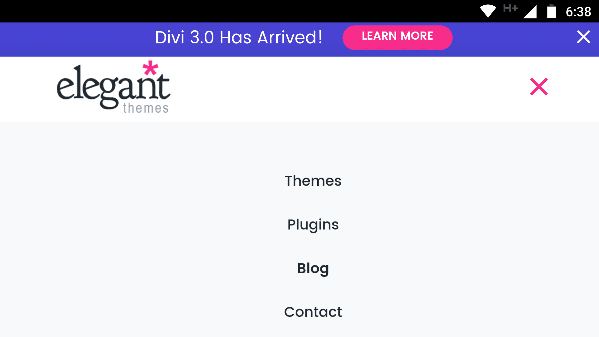
Ensuring your menus display well on mobile is important to keep your site usable.
In most cases, menus are the main way that people navigate around your site. If your links are tough to click or read at smaller resolutions, it will affect usability. In addition, you also want to ensure all of your menu items are easily accessible regardless of the device used to browse.
With that in mind, let’s go over a few steps to ensure you don’t miss anything when it’s time to test your mobile menus:
- Check that all menu elements are visible. If not ascertain whether they can be reached by scrolling.
- Make sure each link is aligned, and that sub-menus are nested.
- Double-check if you can read each menu item as well as click on it.
Most modern WordPress themes such as Divi will automatically create responsive menus for you. If you’re running into problems with this aspect of your site, it might be worth considering updating to a new theme.
3. Check if Your Images Look Good at Smaller Resolutions
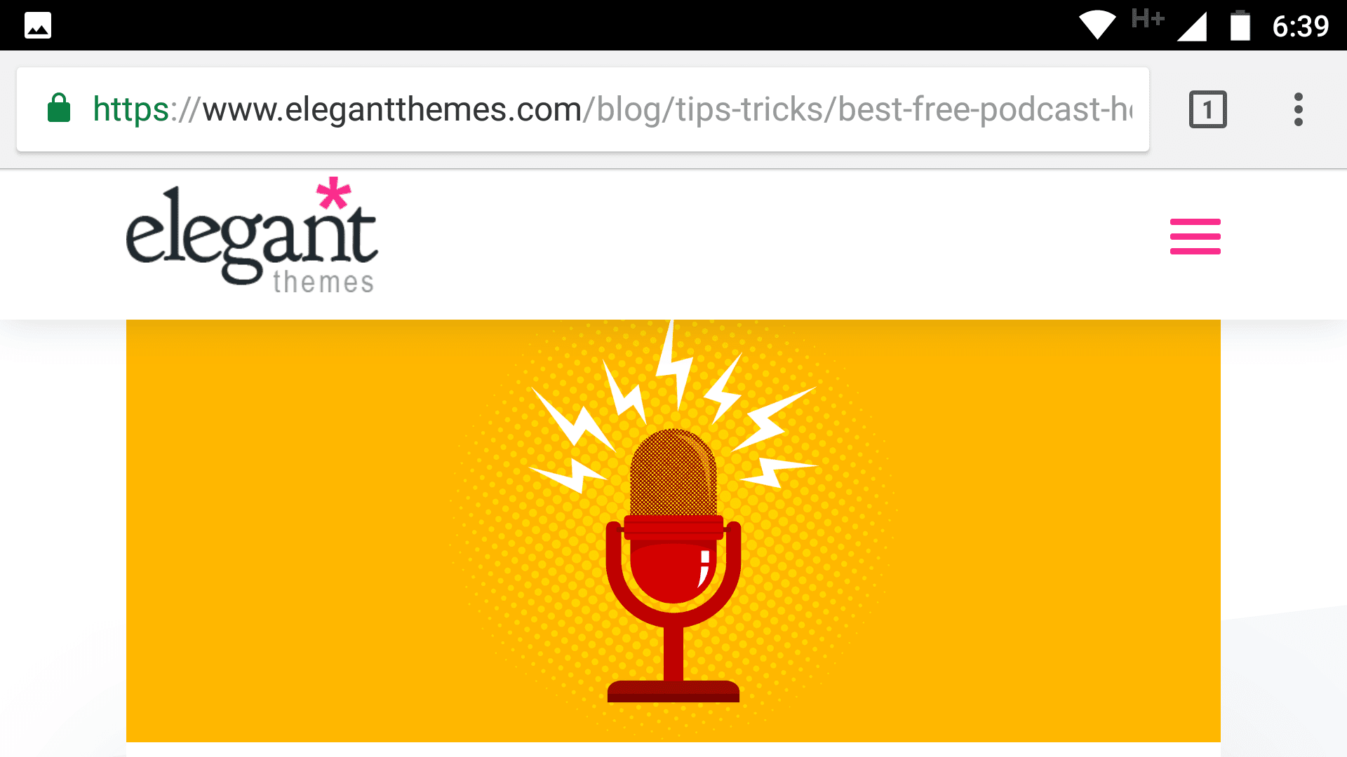
Your site’s images should look equally stunning regardless of their resolution.
Images are a key component to any website, but sometimes your graphics may not look their best at lower resolutions. For example, if your logo isn’t readable when someone accesses your site via mobile, it’s clearly going to affect your branding.
In most cases, people are more worried about ‘warping’ their images, but scaling them down can also be an issue. Not every image can be adapted to look perfect at every resolution, but you can take steps to make it less of an issue:
- Focus your efforts on images important to your branding.
- Look for scalable alternatives to popular image types, such as SVGs.
- Whenever possible, opt for better-cropped images, so they’ll look better at smaller sizes.
As long as you keep these tips in mind, you should be good to go. Just remember that when it comes to very complex images, such as infographics, it might not be possible to adapt them completely to low resolutions.
4. Test Your Content for Readability
Smalls screens can impact readability, but it’s easy to adjust to them.
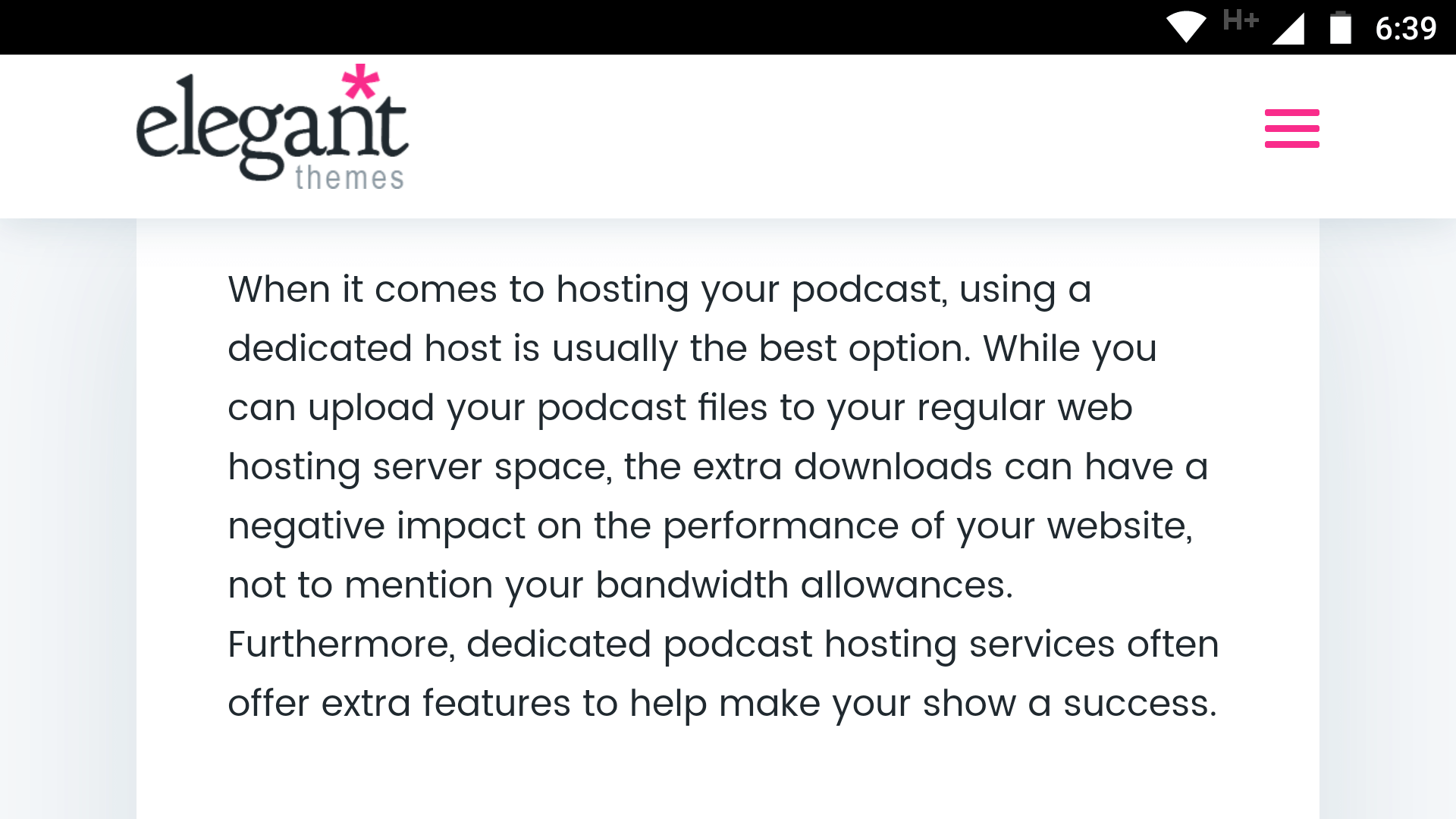
One aspect that impacts mobile device usability the most is readability. When you’re working with a smaller form factor, you need to compensate by making sure your text still displays at a size that’s readable, instead of simply shrinking. The goal here is simple – your users shouldn’t have zoom and pinch their way through your site. After all, that’s a perfect recipe for an annoyed visitor.
Fortunately, readability is an aspect that’s relatively straightforward to tackle:
- Pick a highly-readable base font for the body of your content.
- Use subheadings whenever possible to break down your content into easily scannable sections.
- Opt for a theme that gives you more control over how your text displays.
With regard to our last point, a lot of modern themes should offer you the control you’re looking for. For example, Divi enables you to fine-tune the size of any module text for both desktop and mobile.
5. Ensure Your Site’s Elements Are Easy to Interact With
It can be tricky to interact with elements using your fingers, so you’ll have to adjust your designs.
This step could cover a lot of ground, but bear with us. So far, we’ve covered how important it is for your menus to be easy to use, but the same also goes for the rest of your site’s interactive elements. Buttons, links, forms, and more – they all need to remain usable for mobile devices.
The key consideration here is, of course, size. As we move downwards in resolution, most of the elements we’ve talked about shrink as well. It’s your job to test if they’re too difficult to interact with, since that can impact your site’s usability.
As for how to do it, we recommend using real mobile devices here instead of the services we mentioned earlier. After all, you need to know if your elements are easy to use with your fingers instead of a mouse. Here’s what you need to look out for:
- Make sure your Calls To Action (CTA), forms, and menu items are easy to click.
- Check if there’s any overlap between critical elements, which could cause users to click the wrong one.
Once you know which elements are giving you trouble, it’s just a matter of resizing them as needed. If you’re using a theme such as Divi, you can do this from each module’s settings screen.
6. Make Sure You’re Not Overly Relying on Pop-Ups
Pop-ups can be effective, but they also impact your site’s usability.
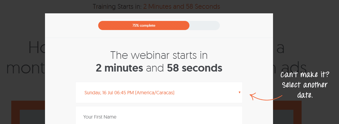
Opt-in pop-ups and the like often result in very significant increases in conversion. However, they also tend to annoy at least as many people as they convert.
It’s hard to pinpoint exactly how many people you scare off if you use intrusive mobile pop-ups, but we can tell you that some search engines – such as Google – will penalize you for it. If you use any pop-ups that obscure your main content or force users to go through them before accessing it, your Search Engine Optimization (SEO) will suffer for it.
We know that pop-ups can be useful, but there are less intrusive alternatives, such as:
- Stylish opt-in forms.
- Optimized CTAs.
It’s hardly groundbreaking, but optimizing your forms and CTAs can net you a bigger payoff in the long term, since you’ll alienate fewer users. Plus, your search engine rankings won’t be affected either.
7. Test Your Website’s Loading Times

If your website loads in less than a second, you can be very happy with your results.
If you’re an Elegant Themes regular, you’ll know we always emphasize performance whenever possible. A fast-loading site isn’t something that a lot of people notice, but they certainly take note when the opposite happens.
High loading times often lead to an increase in your bounce rate, and they make your site less usable. Moreover, they’re particularly important for mobile users since some of them may be browsing your site using less than optimal connections.
Optimizing your WordPress website is a subject that could take an entire article in and of itself, but here are some quick tips:
- Try a mobile-optimized theme such as Divi if possible.
- Optimize your images so they take up less space.
- Implement a caching solution for your website.
These are all solid steps, but they’re not all you can do to keep your loading times low. For more information, check out this full piece we published a while back on how to optimize your WordPress setup.
Conclusion
Making sure your website is mobile-friendly is more important than ever. If the current trend keeps up, you’ll see most of your traffic coming from mobile sources over the next few years (if it doesn’t already). The smartest thing you can do right now is to provide an equally substantial experience on both desktop and mobile devices.
If you’re not sure whether your website can be considered mobile-friendly, here’s a simple checklist to help you find out:
- Test your website at multiple resolutions.
- Make sure your menus and navigation display well on smaller devices.
- Check if your images look good at lower resolutions.
- Test your content for readability.
- Ensure your site’s elements are easy to interact with.
- Make sure you’re not overly relying on pop-ups.
- Test your website’s loading times.
Do you have any questions about how to make sure your site is mobile-friendly? Let’s talk about them in the comments section below!
Article thumbnail image by 32 pixels / shutterstock.com.




Hi I am a new Divi user. Will it allow me to create a different page layout for mobile that includes fewer elements than the desktop version? Beyond adjusting the font size and menu, I want remove page elements (photos, video,& text) and/or move them for the a simplified and fast loading mobile version of the page.
Thank you so much for the tips, this will help a lot 🙂 As far as I know, if the site is not mobile friendly it will affect search engine rankings too.
Nice points to make your responsive website SEO friendly.
Thanks, Anthony! 🙂
This is a good resource! I am currently dabbing with AMP. I don’t see any great benefit at the moment as Divi does work well on mobile. Any suggestions on making my life easier to optimise my AMP pages with Divi or should I just drop AMP altogether?
Thanks, Joe! 🙂 You should be able to fully optimize your pages for mobile using Divi, without the need for any other tools. AMP is still useful in some circumstances, of course. Check out our article on the project for more information: https://www.elegantthemes.com/blog/resources/google-amp-what-is-it-and-is-it-right-for-your-wordpress-website.
What about AMP? Elegant Themes and DIVI don’t seem to give any clarity about how or if it’s recommended to implement AMP with DIVI? It’s surprising that a blog about a check list for mobile friendliness could possibly ignore AMP. Can someone give some clarity, please?
Hi Rob! AMP is definitely a useful tool, and we would recommend checking it out. For more information, you may want to give this article a read: https://www.elegantthemes.com/blog/resources/google-amp-what-is-it-and-is-it-right-for-your-wordpress-website.
I am facing a problem here. I am having Menu structure listing about 5 main pages and 5 sub pages for each. But when am viewing in mobile it just showing everything in a row, which is just collapsing everything.
Hi! It’s difficult to diagnose the kind of problem you’re having without some more details about your setup. If you’re using Divi, we recommend posting in the forums (https://www.elegantthemes.com/forum/) to see if another user has some ideas that can help. 🙂
The Menu Structure is hiding the content, only when they are lengthy. Is there any way to override the url and make the content visible in both mobile and desktop?
Hi Aslam! It’s hard to say without seeing your setup (and knowing what tools you’re using). Try posting some details about what you’re experiencing in the forums (https://www.elegantthemes.com/forum/), and some other users may be able to help. 🙂
Your concerns about resolution are not phrased properly. If I change my monitor to a lower resolution, everything looks *larger*, since it’s displaying fewer pixels in the name number of inches. Don’t make it sound like resolution and screen size are the same thing. “Scaled poorly” or “fuzzy” would be more descriptive and less confusing than “shrunk.”