Typography is a key component of web design and the choice of which font to use on your projects, while often overlooked, can have a huge impact on how well they’re received.
Popular design wisdom establishes that different kinds of fonts are better suited for specific purposes, such as serif being better for printed works, and sans serif excelling when it comes to high-impact headlines. Today, we’re focusing on readability in web design, and as such, we’ll be covering only serif fonts, which (being more easily identified by the human eye) are considered more legible than their sans serif counterparts.
Without further ado, let’s quickly go over the WordPress font installation process, then over our picks one by one.
- 1 How to Add Fonts to Your WordPress Website
-
2
30 Incredibly Readable Serif Fonts for Your Next Web Design Project
- 2.1 1. Calendas Plus
- 2.2 2. Bitter Ht
- 2.3 3. Fritz
- 2.4 4. Cinzel
- 2.5 5. Modum
- 2.6 6. Margot
- 2.7 7. Medio
- 2.8 8. Ainslie
- 2.9 9. Korneuburg Slab
- 2.10 10. Aleo
- 2.11 11. Klinic Slab
- 2.12 12. Bandera Text
- 2.13 13. Tryst
- 2.14 14. Fenix STD
- 2.15 15. Gaspar
- 2.16 16. Butler
- 2.17 17. Ethos
- 2.18 18. Voga
- 2.19 19. Meticulous Ariel
- 2.20 20. Recia
- 2.21 21. Henry
- 2.22 22. Stuart
- 2.23 23. Andada
- 2.24 24. Borgia Pro
- 2.25 25. Calluna
- 2.26 26. Lora
- 2.27 27. Roboto Slab
- 2.28 28. Merriweather
- 2.29 29. Arvo
- 2.30 30. Vollkorn
- 3 Conclusion
How to Add Fonts to Your WordPress Website
There are two ways you can go around adding fonts to your WordPress repertoire. The first involves making some simple CSS modifications, but they can get annoying if you want to try out a bunch of them.
The second route involves, of course, plugins. Our personal pick for this case is Use Any Font:
This handy little plugin enables you to upload third party fonts to your server via a simple interface, and use them via the WordPress editor without any additional setup. It supports both TTF and OTF file extensions, and is fully free to use.
30 Incredibly Readable Serif Fonts for Your Next Web Design Project
1. Calendas Plus
The history of Calendas goes all the way back to 2010 when it was designed for (you guessed it) a calendar project. It’s a classic, elegant typeface designed to remain readable even when used in small sizes, and it’s available for free.
2. Bitter Ht
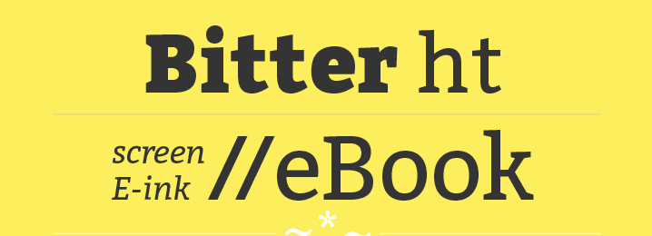
Bitter Ht is a serif font with a bold design. It was designed to be used for eBooks, which means it’s optimized for readability, even at low resolutions. The best part? It’s completely free.
3. Fritz
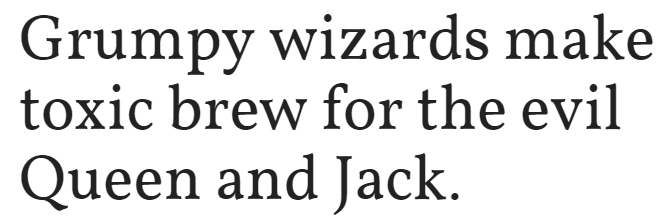
As you can see, Fritz is a unique serif font. Its letters boast thin stems and arms, with unbracketed serifs, giving them an eye-catching, mechanical look. The font comes in four variations with multiple weights, and it’s available in all major font formats.
4. Cinzel
Cinzel is a classic typeface inspired by the origins of the Latin alphabet, with a modern contemporary twist to its design. The font was designed specifically to be included in the Google Fonts library (so you know it’s got to be good), and it’s fully free.
5. Modum

Modum is a serif font with a contemporary feel, and happens to be the recipient of the MyFonts Font of the Month Award for April 2014, as well as boasting a Merit Award from the HiiBrand International Typography Competition.
6. Margot
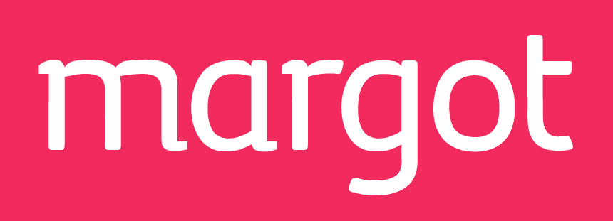
While Margot works well in small prints, it shines when it comes to posters and large signages – making it perfect for big designs with an emphasis on readability. Plus, its emphasis on soft curves gives it a friendly and accessible feel.
7. Medio
Medio is an elegant serif font that combines a mix of thin and wide strikes and stems, resulting an attractive visual effect. The contrast is not so easily spotted when using small sizes, but becomes readily apparent when employing the font in titles or headings.
8. Ainslie
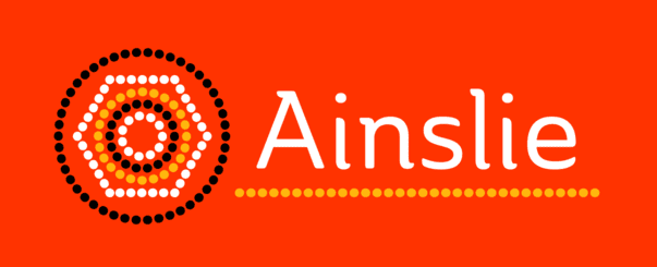
Ainslie is actually a ‘semi serif’ font, the first of its kind from its creators, Insigne Design. It was originally created for the Canberra Australia Centennial Typeface Competition in 2013 and is now available for sale in 42 variations (all great as far as readability is concerned) over at their website.
9. Korneuburg Slab

Korneuburg Slab is a softened down version of a different serif typeface, Korneuburg Display. It was made as a semester project and its design was inspired, in part, by the famous archways of Korneuburg.
10. Aleo
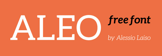
Aleo is a sleek slab serif font that boasts a lot of personality while still being highly readable. This free font comes in six different styles, and its bold version is well-suited for high-impact headlines and headers.
11. Klinic Slab
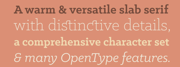
Yet another slab serif font, although this one was handcrafted by just one man. It comes in four different weights for a total of eight fonts, and is well-suited for both print and display design. You can obtain this font under a ‘pay what you want’ licensing deal for personal use.
12. Bandera Text
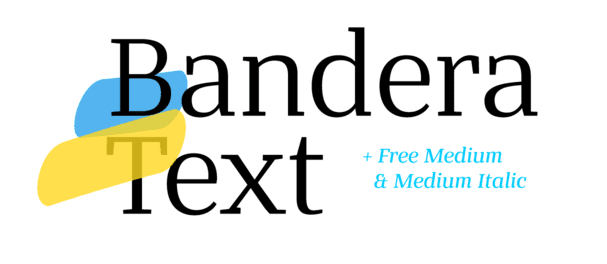
Bandera Text is a versatile font which can stand out both in regular print work or in large headlines. It has a very classic design which nonetheless doesn’t feel dated, and comes in six different weights.
13. Tryst
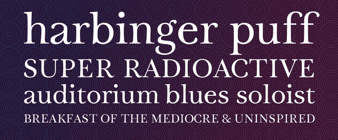
Tryst is an elegant type which takes inspiration from 18th-century typography. Its letters are soft and easy on the eyes due to their high stroke contrast, making it an ideal choice for digital displays.
14. Fenix STD
Fenix STD is a font designed with long reads in mind, composed of rough calligraphic strokes and boasting strong serifs. It’s also entirely free under a ‘pay what you want’ license.
15. Gaspar

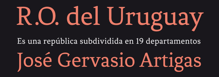
Gaspar is a slab serif font created for intensive editorial use. Its creator, Carlos Alonso Costa, had a simple goal in mind when designing this typeface: a legible font that wouldn’t appear too dense to the eye.
16. Butler
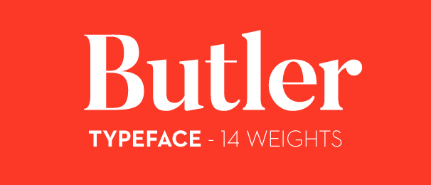
Butler aims to modernize the style of serif fonts through the addition of an extra stencil family. This font is highly versatile and wouldn’t look out of place in posters, books, or digital displays, thanks to its high contrasts.
17. Ethos
Ethos is more than a single typeface – it’s a serif font family, with 36 styles in total. This huge variety of types enables Ethos to adjust itself to any design situation. Plus, it boasts a few OpenType features, such as small caps and ligatures.
18. Voga
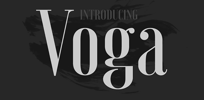
Voga is a sexy (yes, we stand by our choice of words) and elegant Didone typeface. With its high and sleek letters, it wouldn’t look out of place in a fashion magazine or blog.
19. Meticulous Ariel
Since we’re already on a fashion kick, let’s take a look at Meticulous Ariel. While not as sleek as Voga, Meticulous Ariel does have a definite high-end feel, thanks to its classic European touches and strong types.
20. Recia
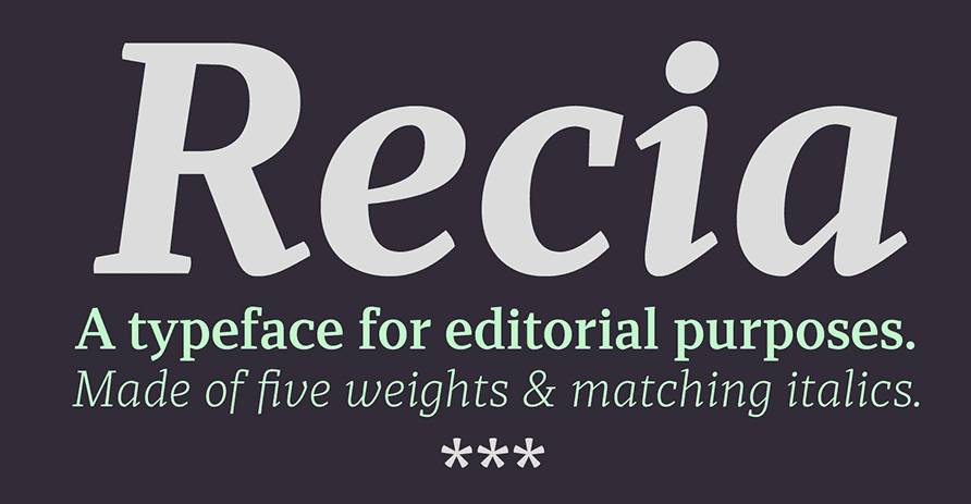
Recia is a serif font with five styles, designed by Carlos del Toro for use in print and display. It boasts noticeable x-heights, the type is slightly condensed, and it is very readable across all of its styles.
21. Henry
Henry is a serif font with classic, pleasing proportions, designed by Matthieu Cortat. It has a high cap-height, strong, angular serifs, and is perfect for print work or eBooks.
22. Stuart
Stuart is yet another font by Matthieu Cortat. This one featuring softer strokes and a nice balance between the x-height and cap-height, making it well-suited for various kinds of designs.
23. Andada
Andada is a slab serif font with a solid feel to it, and a medium stroke contrast. It was the recipient of an award at the Ibero-America Design Biennial and was originally designed by Carolina Giovagnoli.
24. Borgia Pro
Borgia Pro is an eight-font serif family that looks great in high-density designs, such as printed works. Its letters have a softness to them which makes them pleasing to the eye – partly due to the thinness of their bowls.
25. Calluna
Funnily enough, Calluna was created partly by accident. Its author was fooling around while taking a break from working on a different font, decided to fool around with a full-slab serif design instead, and thus Calluna was born.
26. Lora
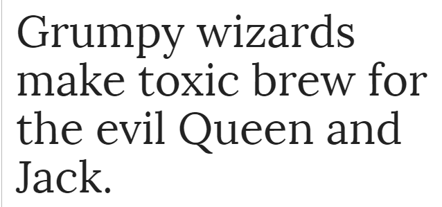
Lora is a modern serif with calligraphic roots and enough contrast to make it a good pick for designs that involve lots of text. Despite working well in print, it was originally designed with digital displays in mind.
27. Roboto Slab
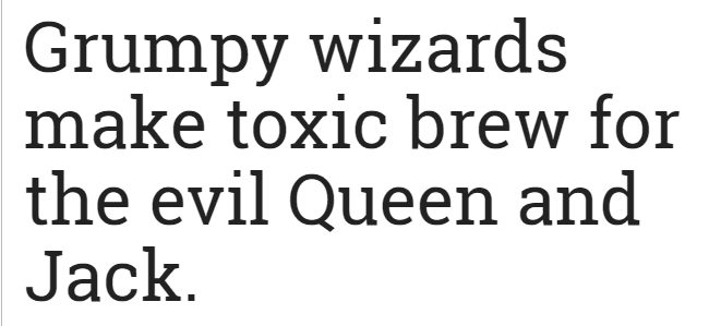
Roboto Slab is a font with lots of character. Its design consists mainly of geometric shapes, giving it a mechanical look that somehow still manages to remain friendly. It’s perfect if you’re trying to achieve a somewhat technical look while still retaining a friendly feel.
28. Merriweather
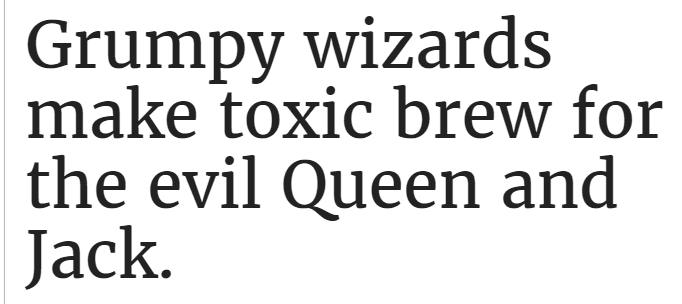
Merriweather is a serif font designed by Eben Sorkin. This typeface features ample x-heights, condensed letters, and sturdy serifs – making it a good choice for designs that need to be highly readable.
29. Arvo
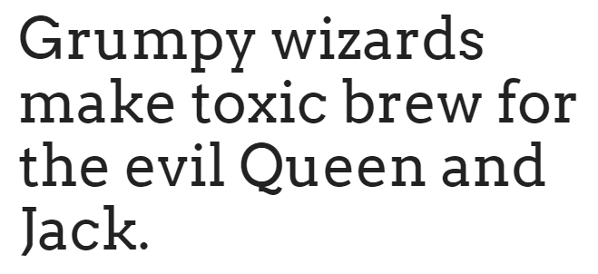
Arvo is a geometric slab serif typeface that includes four different weights. Its tails feature a strong slant, which alongside its bracketed serifs, will lend an air of sturdiness to your designs.
30. Vollkorn
Vollkorn was the first typeface that Friedrich Althausen ever designed, and it still remains in use after 11 odd years. According to Althausen, he designed the font to be a modest, solid text face for everyday use in both print and web projects.
Conclusion
While a good font alone won’t turn your design projects into masterpieces, it certainly can help you catch (and keep!) the eye of your viewers. Choosing a font with readability in mind is especially crucial for those scenarios where you know there will be a lot of reading involved, since they’re particularly easy on the eyes.
These serif fonts should pretty much cover any kind of project you might consider, but don’t just take our word for it – feel free to look around and see what else is out there before tying the knot with any particular font.
How do you choose whether to implement a serif or a sans serif font into your designs? Subscribe to the comments section below and share your process with us!
Article thumbnail image by Neuevector / shutterstock.com













I loved the typography resource that you provide. I was recently researching and with lots of information, I found that serifs fonts have made a comeback to the font battle but still they are not as preferrable as body text.
Since this article is about serifs, I would love to know your opinion about using frieght text pro as copyblogger uses it?
Personally, I love lora from the list. 🙂
Hello Swadhin! Freight Text Pro is certainly a good example of a legible serif, so they are definitely out there – as this article proves. 🙂 Thanks for your comment!
You’re most welcome Tom. Thanks for replying!
Thanks. I like Fenix STD
Glad you’ve found ‘the one’, Datsun. 😀 Thanks for your comment!
Thanks
You’re welcome! Good luck with the redesign!
Just in the process of redesigning a website. This is very helpful.
So often lists of fonts include many that are ugly or amateur. This list is a pleasant change. Some really attractive fonts here. Thanks!
Thanks, Rose!
Hi Tom,
One question please, can we use Cyrillic letters with those fonts?
Thanks,
Igor
I’m sorry Igor, I don’t have an answer for you. The best suggestion is to either browse each developers’ website, or contact them directly. Good luck!
Thank you for this post and for introducing FREE fonts.
I run in some other posts here introducing nice but (imho) way too expensive for a website project for just titles or H1
Thanks!
Thanks, Xav!
I like Lora too, and FF Tisa.. They are easy to read in all sizes, work well in many places and feel balanced. Brandon Grotesque and Montserrat work well with them!
Everyone has their favorites – that’s what’s so great about having choice!
I agree. Typography is a crucial element in web design. Your Typography should stand out without compromising readability.
Thanks for your comment! Fortunately, we have so much choice nowadays for something so crucial!
This is first time I notice very good collection of Serif fonts. It was in 2010, I mostly prefer serif fonts rather than arial or times new roman. And now Google fonts, mostly Open Sans. I am still fan of Serif. Thanks for very good collection and will soon try it.
Thanks Paul!
Thank you for the article. Could you do a follow up post on fonts that pair well with each of these fonts?
Sounds like a great idea!
I hate to be a total troll but as a lifetime account member, I must point out that a significant number of EE’s blog posts are dubious, misleading, or lacking in depth. This blog post falls into the misleading category.
My takeaway is “use one of these serif fonts and your website will be more readable.” Without novices having some basic understanding of typography, I can envision a landfall of Divi sites with body text set in Fritz, Voga, and Cinzel.
Readability and legibility are different characteristics. What makes serif fonts “generally” more readable is the serifs create a baseline for the reader’s eyes. This applies to large blocks of text, such as in a novel. Sans-serif fonts are “generally” more legible because each individual letterform is more discernable – the exception being I,l, and 1 which require the addition of a serif to keep them straight. Further, issues of pixel density and dot gain (in print) complicate font choices.
So while it is fun to see a list of pretty fonts, I just think it is irresponsible to suggest they will improve readability and legibility.
Richard, sounds like you are very knowledgeable in this topic. It would be great if you perhaps offered some suggestions for some of the more novice website designers so they can learn how to become better “graphic” designers. It’s very easy to “troll” as you called it!!! Offer some suggestions and contribute 🙂
Realize that someone took the time to research and write this article in an effort to contribute!
Cheers!!!!
Exactly Steven. Add to that, the ‘novices’ have access to a wealth of information just with Elegant Themes archives not to mention elsewhere on the net and most have the hunger and drive to find answers and learn quickly. Trolls like to bash but rarely offer constructive information. Great article, as usual.
My “suggestion” woulld be, if in doubt, use a simple sans-serif font for body text and restrict the use of serif fonts for headlines.
That said, if you want a readable serif font for all uses, Droid serif is excellent. It also is available in a sans-serif version.
Thank you for contributing Richard. I’ve heard from different sources that Tahoma is a good Font for text. What are your thoughts on that?
Tahoma is sans-serif. Not the subject of the article but a good font nonetheless.
If you are looking for “readable” serif fonts, “A List Apart” is one of the predominate authorities on usability and they use Georgia. The “Medium” blogging platform is known for great typography. They have a history of refining their font choices but currently use Charter for body text. What is unique about the platform is everybody uses the same font sets, so everything is very consistent.
From the list above, I’ve used Robota Slab in projects but it was a compromise choice. It has a very high x-height, so while it is clear on screen, it is rather distorted.
Finally, I still must hark back to my original points: (1) it is irresponsible to characterize this article as about “readable serif fonts” and (2) EE is too focused on once-a-day blog distribution rather than original, quality content that brings value (i.e., the motherload of the Google algorithm).
Exactly. Critique is useless when not backed up with good alternatives.
BTW only a few post ago there was a blog on ET about online magazines covering these kind of subjects, i guess you havent read that one, its a typography galore, great for experts like you (http://www.elegantthemes.com/blog/resources/19-web-design-magazines-you-should-be-reading-in-2016).
Fonts, fonts, fonts…. it used to be simple in the old days – either Arial or Georgia (Times Roman, etc). Google fonts make it easy to jazz up your site with something different, but try going through 800 fonts to find that perfect font! Finding fonts and finding images can take up most of the design time!
Thanks for this post. I like seeing different fonts. I also appreciate the mention of Use Any Font. I’m working on a client site now where they want to use a specific font – not a Google Font. I’ve done this before but would have to Google how to do it again – my retention is very low. 🙂 I’ll give Use Any Font a try.
I find the biggest hindrance to readability is using too small font size, too tight of line spacing, and too long of lines. Also, using too light of font color – light grey on white background for example.
Thanks for this post!
Thanks for the comment, Bob! It seems like you know what you want, which is half the battle. 🙂 Google Fonts also has a nice search feature (as you’d expect) – it helps to narrow down the choices somewhat!
Wonderful post, as usual. I really appreciate these showing up in my inbox every day.
This post was great for font geeks like me.
I was surprised, thought, that you didn’t have Alegreya on your list. It’s from a world-class foundry and part of it is free on Google.
There’s always one that doesn’t make it, Steve. 🙂 Thanks for your comment!
So many serif (and sans) seem so same-same. This a nice, varied list of interesting fonts, kind of refreshing after a season of overdone curly-Q calligraphy fonts.
Thanks for your comment, Kathy!
Valuable post. I love the plug-in Use Any Font. It will make the use of fonts so easy. I recently used typeface Bree, a serif font which is very good readable.
Thanks Walter!
I looked at the plugin and read the comments as recently as a couple months ago that this plugin is in violation of the WordPress rules in that it requires payment to use the plugin for more than one font. Since you appear to use the plugin, did you have to pay to use it (whether called a payment, donation, contribution, upgrade, pro, etc.) or is it actually “fully free to use” as the above post reads?
I wouldn’t say it contravenes the terms per se, Philip, as it does offer limited free use. Other plugins have similar tiered payment options, so it’s up to you to decide if the terms are right for you. Thanks for your comment!
—