
Divi makes adding images to your website easy. The challenge for some however, is knowing the correct image sizes to use in each instance. There is no standard “perfect” size for all websites because each website is different. But, there are some things you as a web designer can do to make sure your images are a good fit for your Divi site. That’s where this post comes in!
In this article I’m going to take the guess work out of using images within Divi and teach you how to find (or create) the perfect image sizes for your Divi website, every time.
- 1 The Big Picture
- 2 Divi Image Optimization Guidelines
- 3 Image Dimension Guidelines Based on Divi’s Column Layouts
-
4
Image Dimensions for Different Divi Modules
- 4.1 Image Module
- 4.2 Slider and Post Slider Background Images
- 4.3 Fullwidth Slider Background Images
- 4.4 Slider and Post Slider Featured Image
- 4.5 Images in Lightbox Displays
- 4.6 Audio Module Cover Art Image
- 4.7 Blog Module Featured Images with Fullwidth Layout
- 4.8 Blog Module Featured Images with Grid Layout
- 4.9 Porfolio Module Featured Images (Fullwidth and Grid Layout; Standard and Filterable)
- 4.10 Blurb Module Image
- 4.11 Gallery Module Images (Slider and Grid Layout)
- 4.12 Person Module Image
- 4.13 Post Title Module Featured Image
- 4.14 Shop Module Product Images
- 4.15 Testimonial Portrait Images
- 4.16 General Guidelines for Background Images
- 4.17 General Guidelines for Fullwidth Background Images
- 4.18 Fullwidth Header Module
- 5 Final Thoughts
The Big Picture
Finding the perfect image sizes for your Divi website depends on three main factors:
- aspect ratio: the height and width of your image.
- column layout: the maximum width of your image.
- responsiveness: the changes made to the dimensions of your image on different screen sizes.
In the sections below I’ll show in detail how an understanding of these three factors can be used throughout Divi, resulting in perfect image sizes for any use case.
Divi Image Optimization Guidelines
Use Divi’s Image Aspect Ratio (16:9, 4:3, 3:4)
Aspect ratio expresses the proportional dimensions of the width and height of an image or screen. The number on the left of the colon represents the width (x axis) and the number on the right of the colon is the height (y axis). The two most popular aspect ratios are 4:3 and 16:9. These should look familiar to you if ever adjusted your TV screen or monitor settings before. The 4:3 aspect ration is the standard screen size for older TV’s and monitors and has a more box-like display. The newer high definition televisions and monitors today have the 16:9 aspect ratio which has a wider display. The 3:4 aspect ratio is useful in Divi for displaying portraits.
Divi was built with three aspect ratios in mind – 16:9, 4:3, and 3:4. For this post, I will be basing all recommended image dimensions on these aspect ratios. If you haven’t already done so, you can check out Divi’s image templates to see the standard sizes and aspect ratios recommended for your images.
Note: There are useful aspect ratio calculators out there that may help you find the right image dimensions as well.
Optimize Images Before You Upload
It is always best to optimize (resize, compress, crop, etc…) your images before uploading them to WordPress. Also try your best to keep all of your image file sizes between 60kb and 200kb. That way you aren’t slowing your page load time down too much. For a complete guide on how to optimize your images, go here.
Don’t Forget SEO
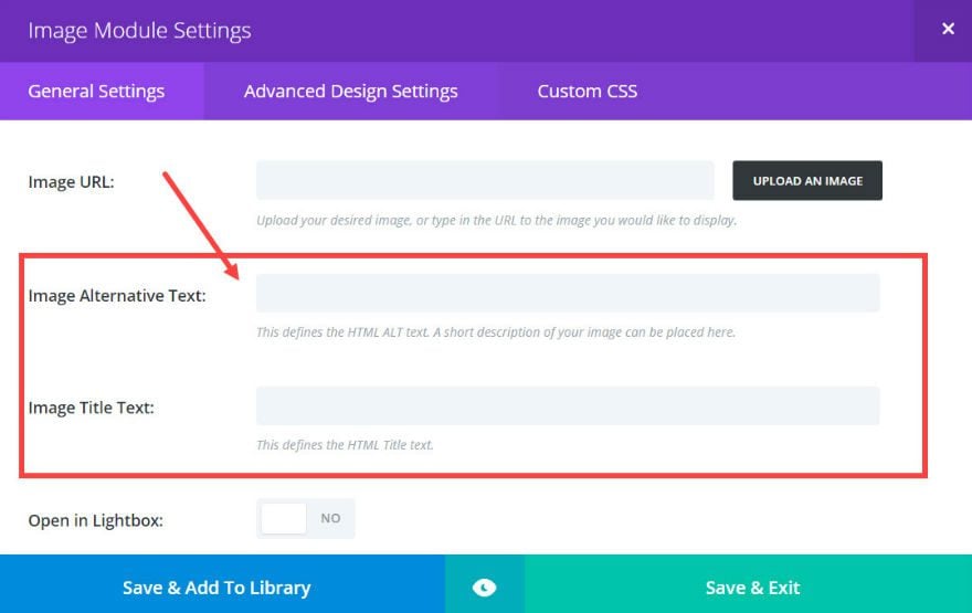
When it comes to reading images, search engines rely on the image’s filename, ‘alt’ text, captions, file type, file size, etc… This info is placed in the img tag which displays your image. Make sure you are adding this info to your images whenever uploading a new image to your media gallery.
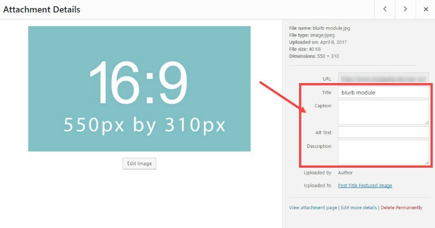
Additionally, the Divi Builder allows you to add ‘alt’ text and title text from within certain modules. Keep an eye out for these when using certain Divi Modules.
From what I have researched, Google doesn’t read background images automatically since they are not wrapped in an img tag. Background images are displayed using CSS and are mostly used purely for design purposes.
File Formats
In general, most images on the web are either in JPEG, PNG, of GIF format. JPEG’s are good for most situations because of its compatibility, use of color, and small file size.
JPEG’s should be used for all of your full-color photographs like featured images and background images.
PNG is also a very compatible format for the web. PNG’s are great for smaller images with a lot of detail. The PNG format also supports transparent background capability which is perfect for logos and graphical elements.
GIF’s are good for small images with limited color. GIF’s are unique because they can be animated, which is sometimes useful.
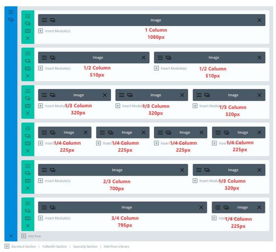
Image Dimension Guidelines Based on Divi’s Column Layouts
The following guidelines for image dimensions are based on Divi’s default layout settings. This includes a content width of 1080px and a gutter width of 3. Changing these settings may require you to adjust the dimensions of your images slightly.
The general rule of thumb is to have your images be at least as wide as the column in which it sits. Here are the dimensions you need to have for your image according to each column layout.
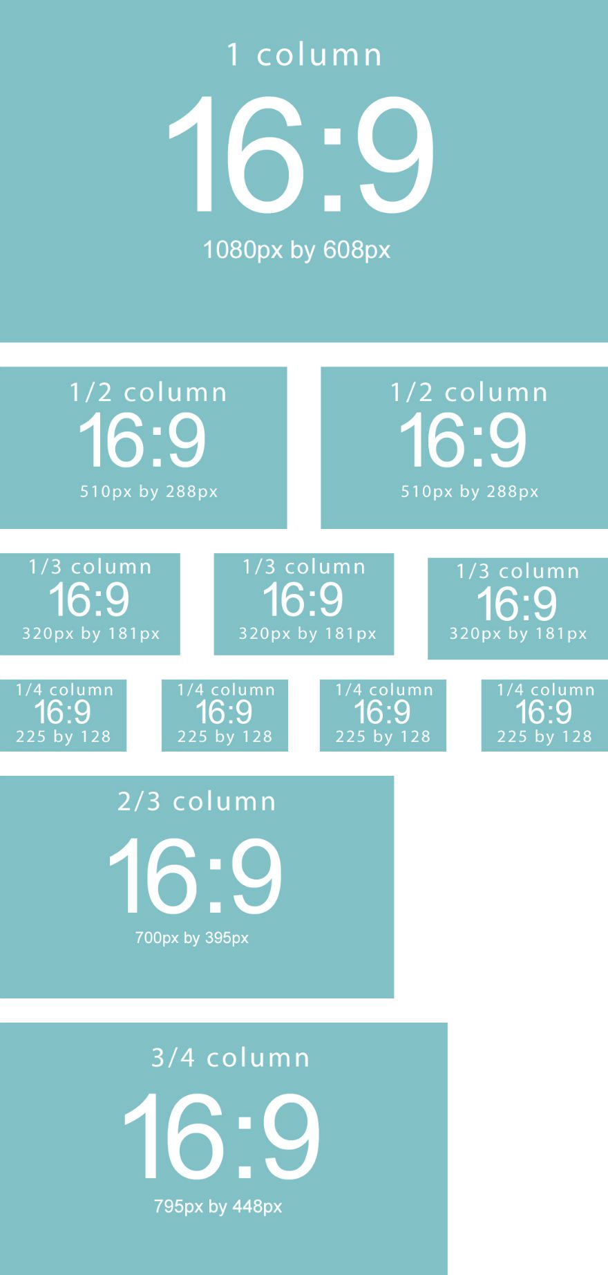
This doesn’t address the height your images need to be. So, here is a list of dimensions according to the 4:3 and 16:9 aspect ratios. This is helpful to keep your images at a width and height that scales appropriately for mobile.
The following image dimensions follow the 16:9 aspect ratio standard
1 column: 1080 x 608
¾ column: 795 x 447
⅔ column: 700 x 394
½ column: 510 x 287
⅓ column: 320 x 181
¼ column: 225 x 128
The following image dimensions follow the 4:3 aspect ratio standard
1 column: 1080 x 810
¾ column: 795 x 597
⅔ column: 700 x 526
½ column: 510 x 384
⅓ column: 320 x 241
¼ column: 225 x 170
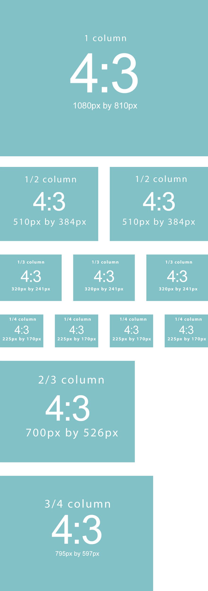
Image Dimensions for Different Divi Modules
Image Module
When using the image module, you can simply follow the 16:9 and 4:3 layouts to choose what image size you need for each column layout.
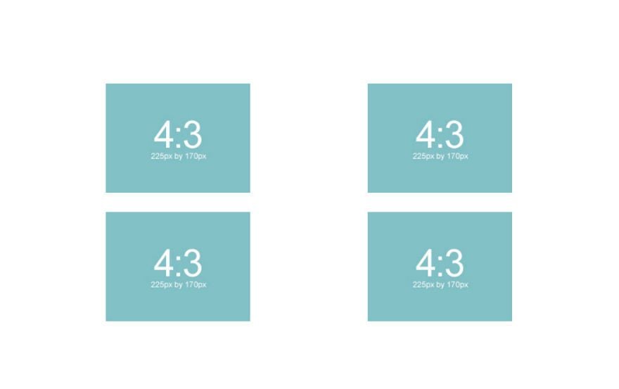
For example, if you are using a 4 column layout with a 4:3 aspect ratio, you would insert an image that is 225px by 170px for each column.
The upside to using the specific sizes for each column is that it gives you the exact image size you need without wasting image file size which may slow down your page load time.
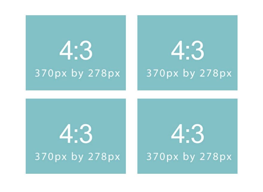
The downside is that it doesn’t fill the column width on smaller screens like tablets. When the screen size drops below the 1080px breakpoint, the 4 column layout changes to a 2 column layout. This 2 column layout has room for an image size with a width of 370px. So if you want the image to fill the column width on tablet displays, you may want to start with an image size with a width of 370px instead of the 225px width.
Here is what a 4 column layout with 225px by 170px images looks like on a 2 column tablet display:
That looks pretty good, but if you started with an image that was 370px wide you would get an image that fills the column width on the 2 column tablet display like this:
So if you are looking to have your images fill the maximum width of the column on all devices, I recommend the following sizes for each column layout when using the image module.
For 4:3 aspect ratio:
1 column: 1080 x 810
⅔ column: 770 x 578
¾ column: 770 x 578
½ column: 770 x 578
⅓ column: 770 x 578
¼ column: 370 x 278
For 16:9 aspect ratio:
1 column: 1080 x 608
⅔ column: 770 x 433
¾ column: 770 x 433
½ column: 770 x 433
⅓ column: 770 x 433
¼ column: 370 x 208
Slider and Post Slider Background Images
Slider background images should be at least the width of the column that it sits in. So deciding on image size is pretty straightforward. Just use the guideline for image sizes for each column width.
The height of your slider background image will be determined by the content of the slider, so you may need to adjust the height of your background image.
The following image dimensions follow the 16:9 aspect ratio standard:
1 column: 1080 x 608
¾ column: 795 x 447
⅔ column: 700 x 394
½ column: 510 x 287
⅓ column: 320 x 181
¼ column: 225 x 128
The following image dimensions follow the 4:3 aspect ratio standard:
1 column: 1080 x 810
¾ column: 795 x 597
⅔ column: 700 x 526
½ column: 510 x 384
⅓ column: 320 x 241
¼ column: 225 x 170
And if you want the slider to span the width of columns on mobile devices use these guidelines:
For 4:3 aspect ratio:
1 column: 1080 x 810
⅔ column: 770 x 578
¾ column: 770 x 578
½ column: 770 x 578
⅓ column: 770 x 578
¼ column: 370 x 278
For 16:9 aspect ratio:
1 column: 1080 x 608
⅔ column: 770 x 433
¾ column: 770 x 433
½ column: 770 x 433
⅓ column: 770 x 433
¼ column: 370 x 208
Fullwidth Slider Background Images
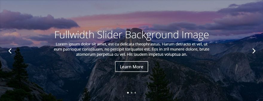
Recommended minimum width: 1920px
The width of your fullwidth slider background image is always determined by the browser width. Based on standard screen sizes we recommend that your images are at least 1280px wide. But for larger monitors, a safer bet would be to use an image that is 1920px wide.
Again, with sliders, the height is always determined by the amount of content, so you may need to adjust the height to fit your needs.
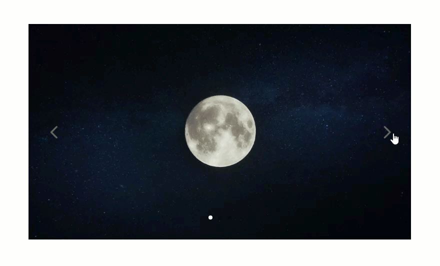
Slider and Post Slider Featured Image
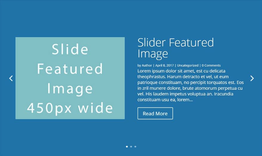
Slide featured images will only appear in sliders that are in ⅔ column, ¾ column, or 1 column widths. We recommend that your slide images are at least this wide in order to adjust for desktop and mobile devices.
1 column: 450
¾ column: 330
⅔ column: 320
Note: A browser width that is less than 768px will hide the image and just show the post excerpt.
Images in Lightbox Displays
If you are using the lightbox feature with your image, you may want to use a larger image. Usually, 1500 x 844 works well for a good full-screen image in a lightbox display for large monitors.
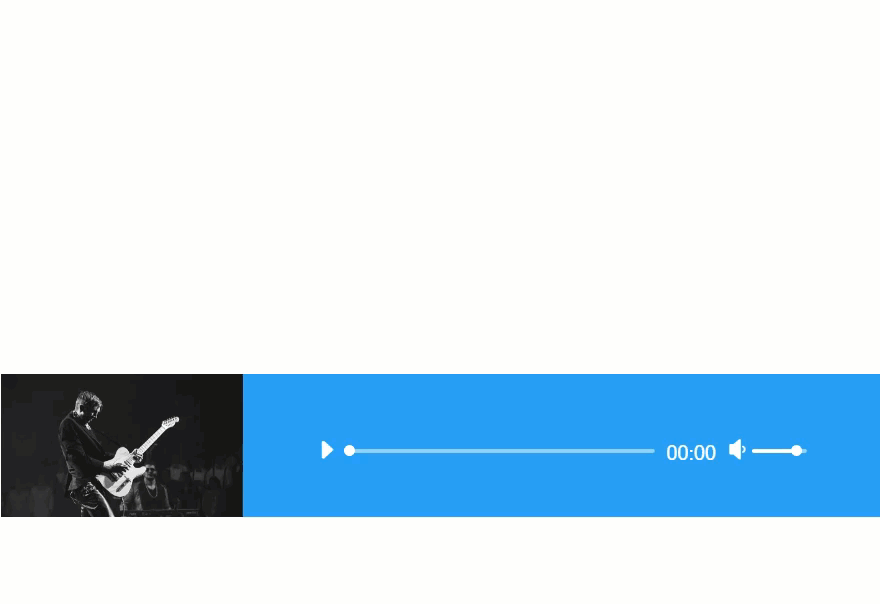
Audio Module Cover Art Image
Width: at least 780px
Even though the image starts out small (230 x 130), it spans the full width of the content section on screen sizes less than 780px.
Blog Module Featured Images with Fullwidth Layout
Image width: equal to the size of its column width
Adding featured images to your posts to be displayed using the Blog Module is pretty straightforward. The featured images should be as wide as the column it sits in. For example, if you are using a blog module in a two-thirds column with a right sidebar, you would need to use a featured image at least 700px width since that is the width of a two-thirds column in Divi.
Don’t forget that the featured image will also be used on your single post template (the page that displays your full post after you click on the post excerpt). So, make sure your single page template is also using a two-thirds column to display your featured image.
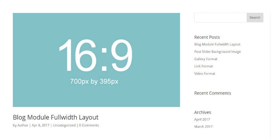
1 column: 1080
¾ column: 795
⅔ column: 700
½ column: 510
⅓ column: 320
¼ column: 225
Blog Module Featured Images with Grid Layout
Width: Equal to the size of the single post column width (default 795px)
And, just like with the Blog Module Fullwidth layout, the featured image needs to be large for your single post display. What is great about the Blog Grid layout is that Divi uses a smaller version of the featured image uploaded to the media gallery (with a width of 400px). Since this smaller image is created and displayed automatically, there is no need to worry about your page loading an image file size that is too big for the grid column.
Porfolio Module Featured Images (Fullwidth and Grid Layout; Standard and Filterable)
Width: equal to your single post column width (default: 795px)
When you click to view your portfolio item from the grid layout, the featured image will span the width of the content section. Just like for the Blog Module,
Just like for the Blog Module, Divi creates a smaller version (400px wide) of the portfolio featured image to be used for the Portfolio Module grid layout. This is helpful for reducing file size and keeping your page load time down. So, when creating a new portfolio item, it is important that your featured image be at least as wide as the column of your single portfolio post template.
Blurb Module Image
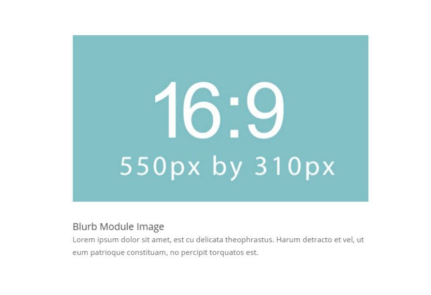
Maximum width: 550px
The blurb image follows the same rule of matching image width with column width, with the exception of the 1 column, which has a max-width of 550px instead of the normal 1080px. Therefore, a safe bet would be to insert images with a max-width of 550px. Here are the image widths for the Blurb Module in each column layout.
1 column: 550px
½ column: 510px
⅓ column: 320px
¼ column: 225px
Gallery Module Images (Slider and Grid Layout)
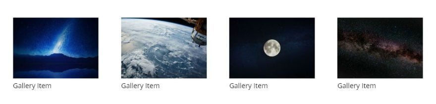
Recommended dimensions: 1500 x 844
Since the gallery module images open in a lightbox display, I recommend using an image that is big enough to fill the browser window when viewing the image in lightbox (somewhere around 1500px wide for large monitors).
For the grid layout, Divi creates a smaller version (400px wide) of the gallery. So, the large image file size reserved for lightbox won’t be displayed on the gallery grid. This is helpful for reducing file size and keeping your page load time down.
For the slider display, it is important to try and keep all of your images the same width and height since the height of the images will change as you go through the slides.
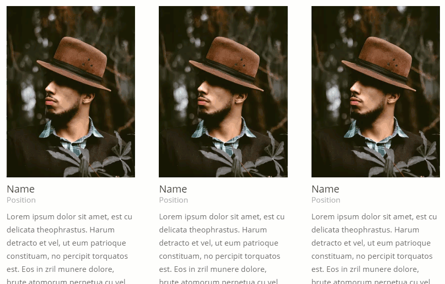
Person Module Image
Recommended Dimensions
Width: 600px
For the person module, it’s time to introduce the aspect ratio 3:4 which is a great size for portraits. Here are the recommended person module image sizes for each aspect ratio:
3:4 – 600 x 800 (recommended for portraits)
16:9 – 600 x 338
4:3 – 600 x 400
Responsive Functionality
A person module image on a 1 column layout will be displayed on the left side of the content at 320px.
When the screen size is less than 767px the image spans the width of the content area at a max-width of 600px.
The following gif shows the person module using a 600 x 800 image (using the 3:4 aspect ratio) on different screen sizes.
Post Title Module Featured Image
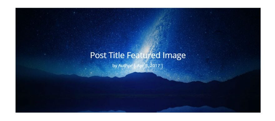
Width: equal to the column width
The Post Title Module displays the title of your current post, and optionally the post Featured Image. You can choose the placement of your featured image to be above the title, below the title, or as a background of the title. Whatever your selection, the image will still span the width of the content section. So if you are using a 1 column layout for your Post Title Module, 1080px width is ideal for your featured image.
Shop Module Product Images
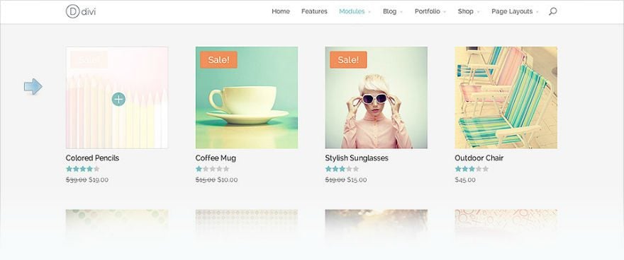
Recommendations
Recommended width: 330px
Recommended number of columns: 3 or more
The shop module allows you to display your products in a one-column layout all the way up to a six-column layout. Here are the widths of the product images when displayed on each column layout:
6 column: 150px
5 column: 183px
4 column: 240px
3 column: 332px
2 column: 520px
1 column: 1080px
Functionality
Divi generates a smaller version of the product image (with a max-width of 400px) because the Shop Module was really built to show products on ⅓ column or smaller. This means that your two-column and one-column layout may show a blurry version of your product image.
Also, once you click on a product in the shop module, the single product page displays your product image at 300px.
To accommodate for a 3 column layout and the single product page, I recommend sticking with a product image size at least 330px wide.
Testimonial Portrait Images
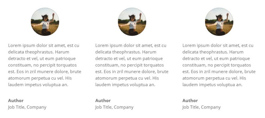
Image size based on module settings
By default, Divi converts your portrait image to a 90 x 90 size and a 90 border-width displaying it as a circle. So if you are keeping the default settings, I would recommend your image dimensions be exactly 90 x 90. You can get away with having really large images without a 1:1 aspect ratio but this will be a lot of wasted file size that will slow down your page load time.
You can customize the dimensions and border-radius of the portrait image from within the Advanced setting of the Testimonial Module.
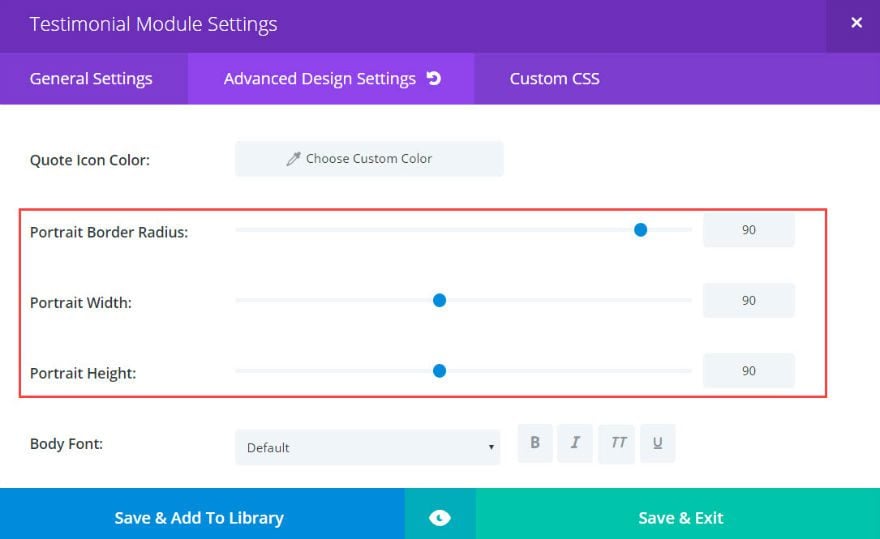
When changing these settings, make sure that you keep the width and height the same and the border-radius at 100 if you want to keep the circled images looking good.
General Guidelines for Background Images
When using a background image for your module, the background image will always need to be at least as wide as the column in which it sits. Simply follow the guidelines for Divi’s column widths:
1 column: 1080
¾ column: 795
⅔ column: 700
½ column: 510
⅓ column: 320
¼ column: 225
Here are some modules that need background images to match the width of their column:
Portfolio Module
Filterable Portfolio Module
Call to Action Module
Post Slider Module
Post Title Module
Slider Module
Text Module
General Guidelines for Fullwidth Background Images
If using a fullwidth section background image, these images will expand to the full width of your browser. That means you should make these images at least as wide as most larger monitor displays which are around 1920px.
The following modules would require a 1920px width background image:
Fullwidth Header
Fullwidth Portfolio
Fullwidth Slider
Fullwidth Post Title
Fullwidth Post Slider
Fullwidth Image
Also, it is important to note that for all of these modules, the height of the background image is determined by the amount of content within the module so you may need to adjust the height of your images as needed.
Fullwidth Header Module
Fullscreen Background Images
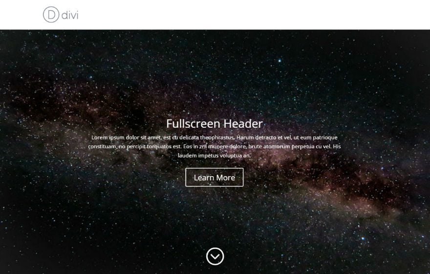
Not to be confused with fullwidth background images, the fullscreen background image refers to the setting on your Fullwidth Header Module that allows your header to span the full size (both width and height) of your browser window.
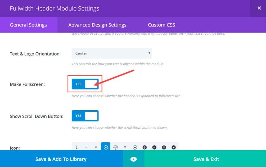
Since most monitors follow the 4:3 and 16:9 aspect ratio and will only be 1280px or 1920px wide I recommend the following dimensions for fullscreen background images:
4:3 – 1280 x 960 (recommended for portraits)
16:9 – 1920 x 1080
Fullwidth Header Module Logo Image
The fullwidth header module allows you to place a logo inside the header content area.
There are no standard image sizes for logos. As a general guideline, I would suggest keeping the logo large enough to see clearly on large desktops but small enough to fit smaller devices like smartphones.
Divi’s theme logo is 93 x 43 which gives you a good idea.
Fullwidth Header Image
Recommended dimensions: 510 x 288
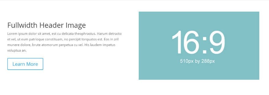
In addition to a logo, the fullwidth header module allows a header image to be displayed in the header content area. By default, the header image will be displayed on the right column of a 2 column layout. Since the image sits in a ½ column, a 510 x 288 image makes the best sense for most situations.
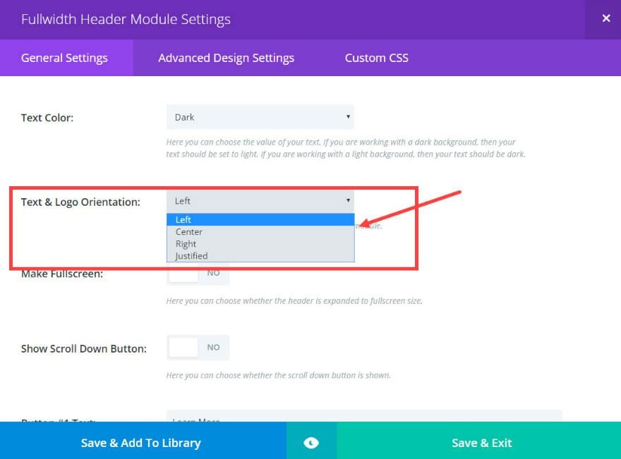
Changing the Text & Logo Orientation option in the Module’s General Settings will allow the header image to be displayed on the left column or centered if you prefer that setup.
You can also adjust the vertical alignment to the bottom if you want your image to hug the bottom of the header.
Final Thoughts
As I mentioned before, there is no one perfect standard image dimension for all websites and screen sizes. However, understanding the Divi column layout and how each module displays certain images will allow you to create dimensions that work perfectly for your Divi site.
I hope this serves as a helpful resource for your future projects. I look forward to reading your feedback in the comments.
Cheers!


This is rather outdated, I think. WebP is widely supported and more useful than JPG oder PNG. Its smaller and supports transparency!
And as far as the image sizes for different display widths are concerned there is srcset automatically running.
And what about using high resolution images? @2 or @3 images?
Am I right?
I think this document is out of date ?
I would like to be able to limit the maximum height of an image in post title module but it seems I cannot
The problem seems to be that Divi wants to display the image to fill the column width so an image with a 3:5 aspect becomes very high.
Even if I constrain the row or column width Divi overides these constraints when the image is displayed.
If Divi is such a great builder I think it should be more flexible displaying images in the post title module
Great article! Thank you!
But could i please make a request that the Elegant themes crew do an in depth tutorial on how parallax works with images.
Choosing the image size for parallax, how divi translates those images onto different devices, etc.
I have been using divi for years now and no matter how many forum post questions are answered i still don’t have a clue about how it actually works so that i can objectively set about getting what i want out of the look of my site.
I find it utterly mystifying and frustrating and given the amounts of posts in the forums about this subject it would probably be a very popular blog post, just like this one.
Thank you.
Thanks, but my Fullwidth Header Image isn’t responsive on mobile.
This is my third website with Divi and Responsive is not good(in my opinion)
Can anyone help me for the responsive css?
Thanks
Fantastic resource – thank you!!! I’ve looked everywhere for this info, and here you have it all in one easy-to-read post. Awesome!
This is a great guide.
But, why can’t I just use an image WordPress already resized? WordPress does a lot of the work for me.
I know can can use Photoshop to resize and optimize, but, it seems like wasted effort when it’s been done for me.
A plugin like CPT Layout Injector let’s me set which size of the wordpress set sizes I can use for an archive. Very nice.
Great article, Jason! Thank you for taking the time to write it out in a well structured, logical presentation!
Could you please address the 1080 px default width selection. As well, in one of the post-article exchanges, there was a reference to 1366 px as “the most widely used screen resolution”.
I am confused about these references, because when I look at the width resolution of typical Apple devices, even not the latest, they are substantially larger.
For example, Mid-2014 21.5 inch iMac has 1920×1080 resolution. Even my older 2008 20 inch iMac has 1680×1050. One could argue that usually browser is not opened in full screen on a desktop, but even small laptops and iPads have much wider resolutions. For example, my 4th gen 9.7 inch iPad (2012) is 2048×1536 (at 264 ppi). And on iPad, browser always opens into a full screen view.
Hence, my question, wouldn’t an image sized to a 1080 px or even 1366 px column width have a lower quality display when scaled up to 2048 px (4th gen iPad), to 2560 px (MacBook Pro 13 inch 2015), or to 2880 px (MacBook Pro 15 inch 2016). On all of these, a typical usage of a browser is to open it in a full screen mode.
Thank you!
Simply, awesome!
Thank you, Thank you, Thank you 🙂
Jason, great article, thanks a lot for putting it together. Question for you — the on-screen displayed sizes of the images does not match the recommended sizes even when I use the exact same size. For example: for a 3/4 width, I use image width of 795, but on the screen, it is displayed at 765. For 1/2 width, I use image width of 510, but on the screen, it is displayed at a width of 490. As the last example, for 1/3 width, I use image width of 320, but on the screen, it is displayed with a width of 310.
Does this mean that the images are actually getting scaled to slightly lower sizes before being displayed?
Can you please help us understand this discrepancy.
Thanks and Regards,
— venkat
This was great to read. It helps out so so much. Thank you!
Hey Guys,
Any idea if Divi will start supporting Srcset? I read that WordPress now supports them natively.
hello! have you made the main photo (the upper one) with DIVI or Photoshop? because I´d like to show my images like this…
thanks!
Jason, you care about your audience. Much effort has been put into comprehensive information, clear writing, and superb images. I’m turning this into a poster!
The answer I was looking for, however, was not addressed here (as it seems this article was more about size and ratio):
How can I set a lightbox image (png, knockout product with transparent background to be exact) to remain transparent once it is fully zoomed? I see that it’s transparent while zooming but once it stops it has a dark gray background.
Another great tutorial about transparency? Or just a simple answer here? Thanks in advance either way.
I’m definitely subscribing to your articles if I can. I purchased the Unlimited Divi package a year ago and everyday since is like Christmas!
Got the same issue; dont seem to be able to configure this either.
Solution:
Add this to the CSS in Divi -> Theme Customizer -> Additional CSS
.mfp-figure:after {
box-shadow: none;
background: transparent;
}
and the grey box is becoming transparent.
This article is one that’s been requested so many times, thanks Jason for taking the time and effort to pull this together. A very useful resource indeed.
Thank you for this great article!!
However, there is something I don’t understand: should I generate manually all those sizes of images?
I.e., for example, if I want to use a full image header should I generate manually all sizes of images you suggested in this post?
Because currently I just generated 1 image and I see that WordPress generate other smaller sizes automatically…
Thank you.
My problem is that I upload very high efficient and compressed original files. Let say a PNG of 18 kB. But WordPress and I think Divi is the problem creates lots of other files like:
Factuurprogramma-V6-PNG8-150×150.png
Factuurprogramma-V6-PNG8-157×157.png
Factuurprogramma-V6-PNG8-400×250.png
Factuurprogramma-V6-PNG8-400×284.png
Factuurprogramma-V6-PNG8-400×400.png
Factuurprogramma-V6-PNG8-400×516.png
Factuurprogramma-V6-PNG8-510×274.png
Factuurprogramma-V6-PNG8-510×382.png
Factuurprogramma-V6-PNG8-768×413.png
Factuurprogramma-V6-PNG8-1080×581.png
Factuurprogramma-V6-PNG8-1080×675.png
Factuurprogramma-V6-PNG8.png <<—– this is the original one
And the problem is now that the 1080×675 file is 155kB!! Almost 9 times larger in size then the original!!! I installed WP-SMUSH and did set the setting of media file to 0 pixels in WP ( except for thumbs). How can I turn this behaviour of?
I think they might be generated by wordpress for the various dashboard viewing options
This is something WP does. It pre-creates a lot of image files “just in case” WP needs it for thumbs etc. And it creates different sizes for different needs. This is completely out of ET’s control – this is just something that WP does as “standard”. Meaning, WP doesn’t really resize an image, it uses the different sizes depending on who is looking at the page and on what medium. It’ll use the smaller 1:1 thumbs for a phone or a tablet, and bigger 1:1 thumbs for a bigger screen etc. Yes, it takes up space on our servers, no, there is nothing we can do about it. Better just leave it rather than mocking about with the settings and messing up the website. Trust me, been there done that, had to start over.
Hi,
use the EWWW Image Optimizer plugin – allows to disable some image sizes!
Cheers!
Thanks Beate! The ‘most’ articles on the internet are telling us that the theme is also creating such files. With PHP-functions like:
add_image_size( ‘homepage-thumb’, 220, 180, true );
Not so happy, but there is nothing you can do about it 😉 Thanks again.
No one?!
Thank you for this awesome guide
Awesome and useful resource!
Thanks Jason!
Great guide! I will use this article as a reference when I’ll be adding more images to my Divi website.
Thank you so much, Jason, for this truly ultimate guide. I will revisit it again and again. And thank you so much, Elegant Themes, for educating me with this amazing blog.
Warm Regards
Rikke
Its your constant resources and articles that help designers like myself and many others im sure in so many ways. It cant be easy but the blogs are so helpful and make the combination of being an ET member and the Divi theme miles out from the rest. Even though it may have taken a while to get this info which I’ve been crying out for you still had the PSD’s available to help get us started. Keep up the good work and thanks for the detail in this post it’s going to the top of my book marks page!
This is one of the best and most useful posts ever!!! Awesome.
Great summary. Thanks for posting.
Wow has this information been a long time coming. Thank you very much for the level of detail you’ve put into this post.
Is extra the same sizes? Thank you!
When is a tutorial for parallax? It is almost impossible to achieve a correct effect without the photo undergo a zoom effect …
I’ll second that Caminade! Could we please have a detailed explanation of how images work with parallax. It’s like it is a mysterious dark art, only for the initiated.
Is it relevant what the “Website Content Width” setting is set to in the Layout Settings?
I can’t remember the default Divi setting – but I have my width set to 1331px (1366 minus paddding) because 1366 is the most widely used screen resolution – according to statistics.
Will this setting affect the image sizes to use?
Allan,
Yes, this will affect the size of your images for desktop display. For instance, with a 1331px content width, you images for a one column layout should be 1331px wide instead of the default 1080px. Make sense?
Does Divi not have support for 4:6 aspect ratio for images? This is the standard ratio that most photographers use, as it is the ratio from all standard DSLR cameras? I had been planning to use Divi for websites for photographers, but this gives me pause, as all images will have to be cropped to fit one of your aspect ratios.
Michael,
The aspect ratios are there as a guide. And yes, as Beate says, the widths are most important to get right. The heights are really up to you. But, making your images the same height will help you keep consistency in certain instances. For example, using the slider with different height images will cause the slider to change heights when scrolling through the slider.
I use Divi for my photography work – and I decide the aspects I need myself. What is most interesting in this article, are the widths. You can crop however you want, as long as you use the with as a rule of thumb before cropping/resizing. I hardly do any cropping, mostly just resizing and paying attention to width. Some images I crop to 16:9 to make the headers pretty and such. But yeah, the width is what is important here for us photographers. 🙂
Great Article, thanks alot for many tips.
Good Guide, I’m curious how the retina a 4k displays affects divi images?
Good question. I’ll keep this in mind for a future post. Thanks.
Great article. As a photographer using Divi this is exactly what I was looking for. Thanks.
Great Job . I expect this in the docu of any elegant theme as big help 😉 thanks a lot
Very useful post, thanks! Do you have a recommendation for page background images (one image to cover the whole site background)?
You are welcome, Wilhelm. I think 1920 x 1080 should be a good size for fullscreen backgrounds.
Great info Jason, bookmarked
But I have a question related to this image size, is the setting in the:
Customizing ▸ General Settings ▸ Layout Settings ▸ WEBSITE CONTENT WIDTH will give an effect to the all image size width setting you mention on this article?
Thanks
I’m curious as to why you keep referencing the aspect ratio standard? It’s not like you can choose whether your Divi site is ALL 4:3 or ALL 16:9.
When/how would you even specify aspect ratio for modules? As far as I know, you don’t.
I think maybe you need to make a comment of “typically, you would use 4:3 in a module using default settings unless it is a full-width/full-screen module, or used as a full-width background image. In those cases you’re better to use a 16:9 image” …or something like this to offer some clarity.
There’s also a question I have about selecting images that you know are going to be small on the front-end, but are uploaded as a larger image.
Eg. a project image that, when clicked, opens in a lightbox. You don’t want the smaller image to load and render the 1920px version even though it’s only 300px on the front-end… so how to you choose the WordPress copped version so you don’t have to upload multiple sizes of the same image.
Inversely, if it IS going to open in a light-box, ideally, you don’t want the lightbox to display your 300px version. You want it to show your higher-res image. How do you set this?
Hi Reece,
Thanks for the questions. I am recommending these aspect ratios for the images, not the modules. I am not suggesting that you try to adjust the aspect ratios for the modules themselves. Furthermore, these suggestions are meant to be guidelines in order to take the guesswork out of optimizing your images for your Divi site (not a firm standard). Sorry if that was confusing.
Using the 4:3 or 16:9 ratios is really up to the designer. They may need to use other ratios as well. My hope with this article is to shed some light on how the modules handle images so you can have a better idea of how to size them appropriately.
As far as the lightbox functionality for a project image goes, the thumbnail that initially displays from the portfolio module will be a smaller version of the larger full size image that will be used with lightbox is engaged. In other words, you wouldn’t upload a 300 x 300 image for your portfolio item featured image. You should upload the full size and then the theme will display the smaller image automatically. No need to upload different sizes.
I hope that answers your questions. Thanks again.
Jason, I’m trying to figure out where/when Divi displays smaller (thumbnail) versions and when it displays a css shrunken version. I have an SEO checker that tells me that I am displaying full version all of the time… I am not using lightboxes–the images are just for illustration in a tile card and/or a blog post.
Best. Post. Ever!!
This is a great tutorial to bookmark! Thanks a lot!
Great article, I love using DIVI but I always had this doubt. I will actually print these guidelines and paste them on my wall.
Another great question I have and maybe more people, about the spaces within each module and also the spaces within each specific column.Please do a tutorial on this.
Thanks Paulo,
Could you clarify what you mean about “spaces within each module and column”?
Thank you very much. I have been looking for this guide long time ago. Now it is here.
Saved! Thank U Sir!
How nice to have this info all in one place! Thank you Jason.
Very very useful post ! Great !
Thanks, thanks and again : THANKS 🙂
Jason two words —-> YOU ROCK!
What an incredible resource! Thank you for putting this together, Elegant Themes team! 🙂
Finally! The question I get asked most from clients is, what size image should I use in this space? Now I have a simple resource that I can send to them. Thank you!
In the wordpress dashboard in the mutimedia settings section, I gave value to 0 in all image sizes, is that good or bad?
Thank you
James,
I wouldn’t suggest it. What are you trying to accomplish? Maybe I can help.
Thanks
When you say one column image dimensions should be 1080 x 608, is it a full width layout page or a page with a sidebar?
Thank you
Correct. The 1080 x 608 would be for a fullwidth layout.
Great article Jason. Breaking this down in the detail you did, in layman’s terms, is much appreciated by someone like me (knows just enough about web design to be dangerous), as well.
Great resource, thank you!
Interesting and helpful. Two comments/questions.
1) I was wondering about the SEO section. I always fill the alt, caption, and description in the media library, but it doesn’t seem like Divi actually uses these fields. Instead, I have to retype them in the module. Do you know if this will be changed in future updates?
2)How do you best handle retina images with Divi?
Thanks!
I learned this the hard way. I built a site that had over 100 logo images. I entered in all the Alt information in the Media Library. I assumed Divi included this Alt information in the final HTML. I was wrong! It seems pointless for Divi to not use the Alt information. Or at least have a toggle switch in the Image module that allows you to use or not use the Alt media info.
Maybe if enough people request this feature, Elegant Themes will actually do something about it. I will make a request today!
+1
+1
+1
+1
+1 on this request
This and similar SEO issues have been addressed for years. It appears that DIVI (others as well) completely disregard the media information in wordpress.
If you create a gallery for example, the filename is used in place of “alt” tag and description. A fix has been requested, by myself and others, for the past few years. The response is always the same, developers have it on their list.
One of the reasons people use WordPress is SEO, but here we shoot ourselves in the foot.
one of the best articles… I have to translate this for the german users.
Thanks so much, Jason!
Just what I’ve been looking for, a definitive guide!
3×4 ratio will always be an issue with photographers, since digital cameras shoot at a 2×3 ratio. It forces you to crop every image. 16×9 is the ratio for HD video, which makes it a perfect ratio for video – and is considered a “widescreen” ratio.
Additionally, “4×3” ratio is NOT widescreen, and most new screen monitors are going widescreen ratios.
Very useful. Thanks
Can you explain why when I add an image into my blog post using the ” add media option, no matter what size the image it always come out magnified and distorted? Thanks
Great article. Bookmarked.
Thanks, Jason!
All I can say is Thank you, thank you, thank you for doing this. Required reading for anyone starting to work with Divi!
Might be worth considering using shareable image sizes for social sharing.
Google+, FB all pick up images off posts. Saves making multiple copies of images.
Did not see in the article if DIVI can automatically choose smaller faster loading versions of images to deliver to a mobile device.
Thanks for all this.
The other guides I use with Divi are a couple I made that show where the type live areas for sliders sit.
I can use these as templates in photoshop to position images and fade or darken the type live areas as needed.
Thanks again,
ernie
This is an awesome resource! Thanks so much. There are soooo many questions asked and so much discussion in the Divi groups about image sizing best practices….now I can just refer them to this post. 😉
Thank you for this guide.
With the Extra theme, ET support recommends the featured image size should be 948×557, a 1.7:1 aspect ratio.
Thank you, fortunately I used Extra theme.