
Why write a button design guide? Are buttons that important? Why spend so much energy on such a small part of the user interface?
While buttons are very common in web design and seem simple, their importance should not be underestimated. They are vital site elements that perform very important duties.
Especially as main calls to action and on e-commerce sites, buttons literally influence the bottom line. However, also as social sharing buttons, email sign-up and form-submission buttons are they central to a website’s success.
For that reason, in this article want to talk in detail about this often-neglected design element and how to create high-converting buttons for WordPress websites. While the focus will be on CTAs (calls to action), we will also talk about a lot of general advice when it comes to button design.
Did that topic push your button? Then keep reading.
Before We Get Started, a Quick Word on A/B Testing
Further below, we will go over some clear guidelines for creating and using buttons. These principles will help you think through the design, positioning and other important attributes of any buttons on your site.
However, at the same time it is important to keep in mind that this only forms the basis for improving your conversion rate. Design principles let you take an educated guess on what will work, yet to truly know which kind of button holds the key to converting visitors to subscribers, buyers or else lies in testing. Running A/B tests allows you to figure out what truly works for your site, which button colors, copy, position and other markers visitors best respond to.
Because everything matters. Even the smallest change can have a surprisingly large effect on conversion rates — both positive and negative. Go over these examples to understand what I am talking about.
So, while our button design guide will help you understand best practices, it is best supplemented with healthy experimenting to find the winning combination to your site’s success.
After this caveat, we now turn to what goes into crafting well-performing buttons for better calls to action and increased conversion rates. Enjoy!
Design Them to Fit Your Brand or Site
Before getting into functional design, it’s important to think about the context in which the buttons will appear. It’s no use creating the perfect button if it messes up your site.
For that reason, while the guidelines below are important, it also matters that their result integrates well with the context it appears in. That means your buttons fit you site’s color palette, style and overall design guidelines.
While you want buttons to stand out in order to prompt action, the goal is to have them stand out in a positive way. That means one that is in harmony with the overall design and doesn’t destroy it.
At the same time, don’t be afraid to experiment a bit. Sometimes a button in a contrasting color is just what’s needed to spice up an otherwise bland design.
The first step to design buttons that get clicked on is to make them actually look like buttons. Calls to action and sharing options are good for nothing if users don’t understand they are supposed to take advantage of them.
Users have certain expectations when it comes to button design. If you don’t fulfill them at all, they will have a hard time taking the desired action. Therefore, it’s important to include visual cues that help them understand.
The first clue is shape. The most common shape for buttons is rectangular or rectangular with rounded corners. Computer users have been exposed to this design for a long time and are thus very familiar with it.
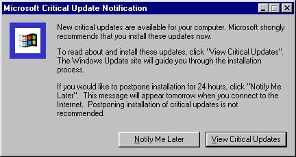
Source: Wikipedia Used with permission from Microsoft
Of course, other shapes are also possible, including squares, circles, triangles or even custom shapes. In fact, there are many examples of quirky and unusual buttons, for example on dribbble
Going with a less traditional shape can make sense in order to keep your site design congruent. Yet, as Apple’s iOS has proved with its rounded squares, that doesn’t mean it doesn’t work.
Image by Ienjoyeverytime / shutterstock.com.
Whatever you choose, just makes sure to stay consistent. Avoid using different designs for different buttons. Not only does that make for much better UI but also ensures that users will be able to identify buttons throughout your entire site.
Another important design cue are shadows and highlights. Drop-shadows have become a universal cue to show that elements are clickable or can be tapped. Even otherwise flat design uses them as a signal for functionality.

Source: Material.io
Provide Clear Labels
Besides the basic design, clear labels are also important for button usage. Without a label, there is no way for users to determine what they do.
Labels don’t necessarily have to be written, icons also work (see social sharing buttons). Using both together is another possibility, especially on buttons related to e-commerce.
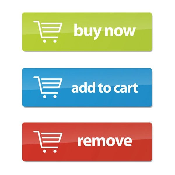
Image by Prixel Creative / shutterstock.com.
What’s important is that the user can understand what effect their action of clicking on a button will have. If they don’t, they might avoid doing so in the first place.
Here are some guidelines for clear labels:
- Be descriptive and specific
- Use action verbs, e.g. Sign Me Up, Submit Form, Create Account
- Address the user directly
- Create a sense of urgency with words like Now or Today
- Keep it simple and clear
Labels are of special importance when it comes to CTAs. Changing just a few words can have great impact on a buttons performance. For example, Unbounce saw a 90 percent increase in click through rate by simply changing their button copy from “Start your free 30 day trial” to “Start my free 30 day trial”.
Yes, such can be the power of one word.
This is really a no-brainer. If your users can’t find your buttons, will be hard pressed to click on them. For that reason, another factor for their effectiveness is location.
There are some conventions. For example, the main CTA can usually be fond above the fold. This makes sense and is by now anticipated by users.
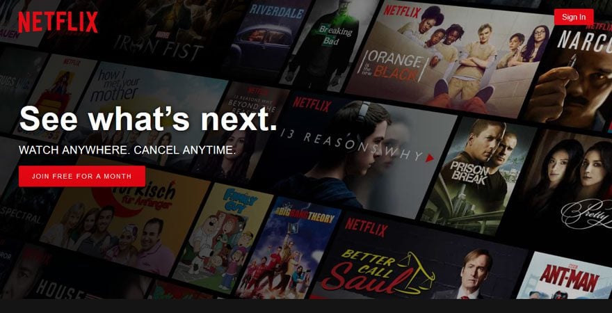
Source: Netflix
The same goes for other types of buttons where users have be trained to expect certain locations. For example, buttons for previous and next are usually ordered left and right of each other.
Since this is so ingrained in the public consciousness, reversing the order might frustrate visitors and cause them to leave. And that’s the last thing you want.
However, also for buttons that have more flexible locations, e.g. social sharing buttons, thinking through where to put them is paramount. For example, you might think that placing social buttons at the end of your articles is a good idea. That way, users can share the post once they have finished it, right?
However, the majority of readers doesn’t even get to the end of your posts. As a consequence, a better idea is to place buttons where they can be accessed at any point of the reading experience. One such example is the Monarch floating sidebar:
When in doubt, a good rule of thumb for button placement is to ask yourself where users are going to look next. Design is supposed to guide the user on their way, so buttons can be the logical conclusion to their path across the site.
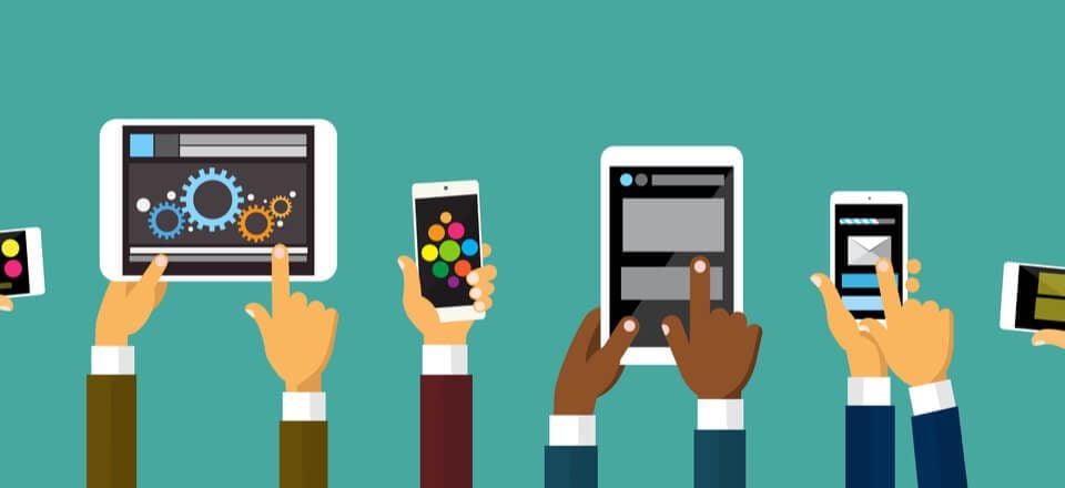
Pay Attention to Size and Spacing
Now we come to a topic that is especially important in mobile design. People who interact with your site via touch are less precise in their actions that those using a mouse. For that reason, you need to make it possible for them to use and reach buttons without a problem or the danger of tapping on the wrong one.
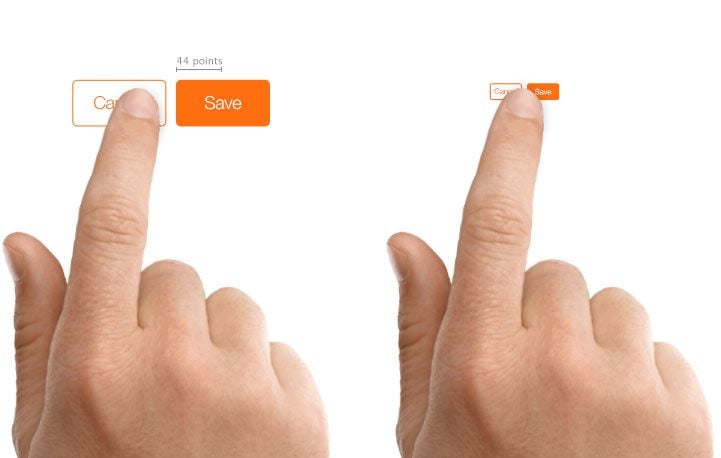
Source: Apple
The first step is to make sure your buttons are large enough. The average human fingertip is 8-10mm large. As a consequence, Apple suggest to make elements that are to be used by touch at least 44px by 44px (use points instead of pixels for retina displays). The recommendations from other manufacturers also revolve around the 10mm mark. Of course, the size can be slightly decreased for web design aimed at desktop usage.
At the same time, you need to consider the spacing between buttons. You don’t want to frustrate users because they accidentally push stuff they didn’t mean to. Ample space also makes the elements easier to spot, which matters for primary calls to action.
Provide Feedback
Once buttons or your site are identifiable as such and usable, it’s time to think about the moment they are actually called in to action. Buttons can have several states of existence:
- Normal — Identifiable as button, signals ability to be clicked
- Focused — Changing when hovering mouse over it, confirmation for user that action is possible
- Pressed — Further change to reward user for taking action and confirms that something is happening
- Busy — When action is taking place in the background, button can reflect that
- Disabled — Shows that other actions are possible, just not at this time
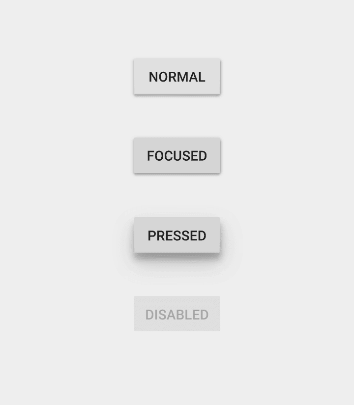
Source: Material.io
By providing visual feedback to users for make use of buttons, you can make the interaction clearer and more pleasant. For other, similar ideas, check out article on micro interactions.
Make Good Use of Contrast
Not all buttons are created equal. While a landing page might have several links to click on, there should be only one that really matters.
The tools to make this clear to visitors are color, contrast and location. Use them effectively to grab attention and get users to click.
By contrasting buttons from the rest of the interface, you make them more noticeable. In addition to that, it avoids that they are getting lost among other elements.
When it comes to color, there is no one best option. Again, much here depends on your own design. A good rule of thumb is to go with a contrasting color and take it from there. For more on that topic, check our article on color matching techniques.
In addition to color, you can use different ways to introduce contrast including size, typography and whitespace. Contrast between button color and text can further enhance the effect and make copy more legible. Combined with a prominent position, these make buttons really pop.
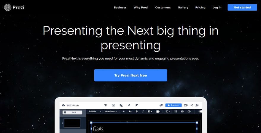
Source: Prezi
To figure out whether your call to action is noticeable, use the good old “squint test”. Apply the design, take a few steps from the screen, squint your eyes and see if your button stands out. I know, it doesn’t sound very professional but it works!
Are you squint testing your #CTA? It's the best way to tell if your call to action stand out. http://t.co/uO53xJIOPu pic.twitter.com/wzNPyTErD2
— Design Pickle (@designpickle) July 25, 2015
Contrasting buttons also matters in order to establish order between them. When given two or more choices, a stronger color can signify which one you’d prefer or advise visitors to take.
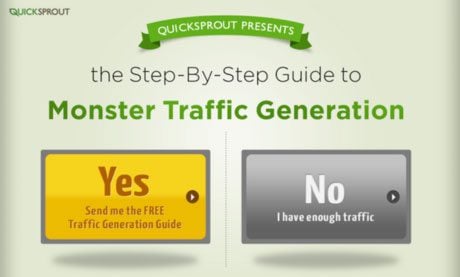
Source: Quicksprout
Summing Up
Buttons are a central but often neglected element of web design. Undeservedly so. Especially in the form of calls to action, they can have tremendous influence on conversions, click through rates and other important markers of success.
For that reason, the topic of button design and placement should not be taken lightly. To recap, in order to create effective buttons:
- make sure they fit your overall design
- ensure users can identify them as buttons
- provide clear labels
- place them where users can find them
- pay attention to size and spacing
- provide feedback when they are used
- make them stand out from the rest of the site
These guidelines will help you set up buttons your users can’t help but click. However, as mentioned in the beginning, these best practices are meant to be treated as a starting point. To really figure out what buttons work for your site and how to improve conversions, button design should always go hand in hand with thorough A/B testing. Luckily, we also have an article on that topic.
What is your experience with button design? Anything important to add to the above? Please let us know in the comments section below!
Article thumbnail image by BerryCat / shutterstock.com


Nice article. How is a 3D round button created in Divi?
Great post! I especially liked the ” make use of contrast”. Most beginner web designers forget about that and it hurts user experience when the title merges with the background. Creating buttons with an accent color so it stands out is also something very prominent nowadays. It pays, quite literally, to make your button stand out!
Informative and Insightful Post.
Thanks
Thanks for the comment!
Nick That was the most detailed article on the button.extremely helpful, I am forwarding this to my team members to give a look before they start the day today.
Most important the article has some really actionable stuff. Thanks once again
You are most welcome! I’m happy to hear you got something out of it.
Nice read and insight, buttons seem to go through trends quickly but I notice a lot of sites put little emphasis on mobile button sizing.
Hey Nick! Great article. Thanks for the info. Much needed. Have a great week ahead of you!
Thanks man, you too!
Thank You so much for the post, Conversion is one of the most difficult things when it comes to internet marketing, and everything helps, thank again I’ll put some of the ideas you have charged in practice…
Happy to hear that, Bolivar. Please come back to tell us how it went.
Wonderful summary of very sound button design philosophies.
One “mantra” we subscribe to is that your Primary button should be one color, and all other action requests a secondary color. For example, the “Add to Cart” button on a product detail page could be red, while all other buttons and actions on the page are green (or whatever two colors are best for your brand). We find that having one primary color act point to the most important action on the page helps users identify (and draws them to) the ideal next step we want.
Thanks a lot for that important addition, Bret!
Really helpful stuff. I have just started with divi and love how many options there are for customization. One thing that may be obvious for most, but not for newcomers is also to decide what happens when the button is clicked. Do you want visitors to be taken away from the page, or taken to a new tab in the web browser?
Typically I stick to anything except site-wide links set to open in new tabs. 🙂
Hey Kyle, thanks for the addendum. That is, of course, the next step to consider. Cheers!
Great article read! Do you think urgency words like now, today, and hurry still work in today’s world considering consumers are sort of immune to common advertising practices. Should button labels be more native?
Hey Monica, I think it depends on the offer. If there’s actual urgency, it probably won’t hurt conveying it. Aside from that, my verdict is test it to find out. Cheers!
Thanks Nick S.
Simple, yet effective button creation and design advice. It’s obvious only after someone points it out like you have, but until then it can remain a mystery. Very helpful indeed 🙂
Matthew
Hey Matthew, thanks for your comment! I agree, there are a lot of ‘duh!’ moments in this article, however, it also talks about a lot of things we take for granted without thinking about them. Being more aware of what goes into button design helps be more conscious about it. Glad you found it helpful. Cheers! Nick
Very nice post. I really love this post. Thank you so much sharing this awesome post. All of your post are very good to read.
Thanks!
Also, post