")
Microinteractions are a great way to enhance user experience as they interact with your site. Slight animations of icons, images, or form fields can cue the user to take action in a fun and purposeful way. There are countless microinteractions you can include on your site, but a good rule of thumb is to keep them “micro”. You don’t want to overdue it.
Today I’m going to show you some simple microinteractions that work seamlessly with Divi. Some of the more advanced microinteractions require more advanced jquery to implement. But, for this tutorial, I’m going to show you how to add some animations using only CSS. I’ll be concentrating on those elements that users normally interact with – buttons, icons, images, and forms.
Let’s get started.
6 Microinteractions That Will Make Your Divi Site More Enjoyable (& How to Achieve Them)
Subscribe To Our Youtube Channel
Implementing the Design In Divi
#1 Animating Blurb Icons on Hover
Divi comes with a library of icons that can be added to your site easily with the Blurb Module. This is useful for adding an illustration to those important bits of information like features or skills. If you want to draw attention to your information, you can animate the icon above your content.
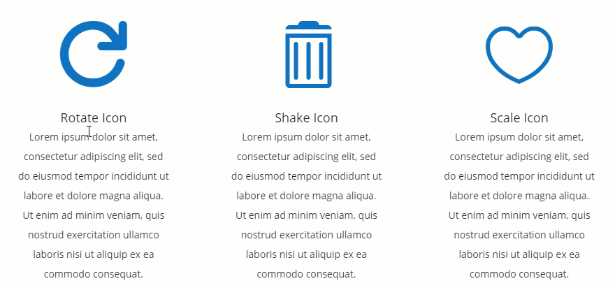
I’m going to show you two ways to trigger the animation of the icon. In this first example, the icon animation is triggered when hovering over the actual icon. The types of animation I’m using are rotate, shake, and scale.
First add your blurb modules. Using the Divi Builder, add a standard section with a three-column layout, and insert a blurb module in the first column.
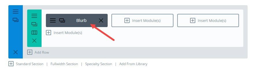
In the Blurb Module Settings, update the following settings:
Enter Title
Enter URL (i’m using # for now)
Use Icon: YES
Select an Icon
Icon Color: #0c71c3
Image/Icon Animation: No Animation
Content: [add your content]
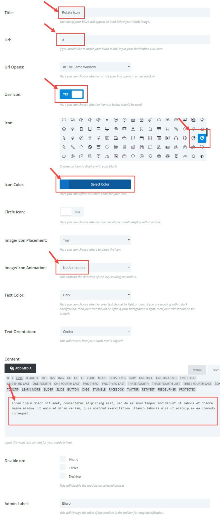
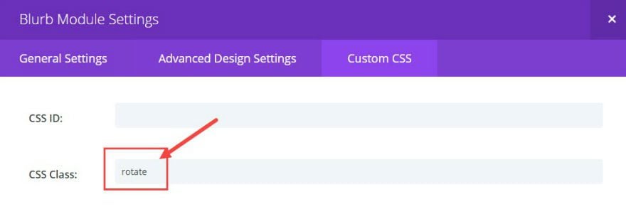
Under Custom CSS, add a CSS Class called “rotate”. This will be used to trigger the a rotate animation.
Save & Exit
Before we add our custom CSS, set up the next two blurbs by duplicating the one you made previously twice and dragging them over to the two empty columns.
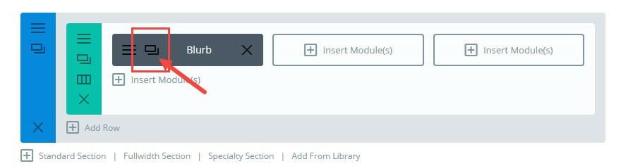
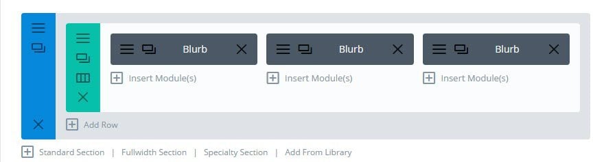
Click the hamburger icon on the second (middle) blurb to edit the settings. Under the Blurb Module Settings go to the Custom CSS section and replace the CSS Class “rotate” with the new class “shake”.
Save & Exit
Repeate the same process for the third blurb on the right column and replace the CSS class “rotate” with a new class called “scale”.
Now that your blurbs are in place. Go to Divi → Theme Options and add the following in the Custom CSS box:
.rotate .et-pb-icon, .scale .et-pb-icon, .shake .et-pb-icon {
  -webkit-transition: all .2s ease-out;
  -moz-transition: all 0.2s ease-out;
  -ms-transition: all 0.2s ease-out;
  -o-transition: all 0.2s ease-out;
  transition: all 0.2s ease-out;
}
.rotate .et-pb-icon:hover {
  -moz-transform: rotate(360deg);
  -webkit-transform: rotate(360deg);
  -o-transform: rotate(360deg);
  transform: rotate(360deg);
}

.shake .et-pb-icon:hover {
  animation: shake 0.82s cubic-bezier(.36,.07,.19,.97) both;
  transform: translate3d(0, 0, 0);
  backface-visibility: hidden;
  perspective: 1000px;
}

@keyframes shake {
  10%, 90% {
    transform: translate3d(-1px, 0, 0);
  }

  20%, 80% {
    transform: translate3d(2px, 0, 0);
  }

  30%, 50%, 70% {
    transform: translate3d(-4px, 0, 0);
  }

  40%, 60% {
    transform: translate3d(4px, 0, 0);
  }
}

.scale .et-pb-icon:hover {
-moz-transform: scale(1.2);
-webkit-transform: scale(1.2);
-o-transform: scale(1.2);
transform: scale(1.2);
}
Check out your page and hover over the icons to see the effect in action.
The second way to trigger the icon animation is by hovering over the blurb module area.
To do that, replace the CSS you just added with the following:
.rotate .et-pb-icon, .scale .et-pb-icon, .shake .et-pb-icon {
    -webkit-transition: all .2s ease-out;
    -moz-transition: all 0.2s ease-out;
    -ms-transition: all 0.2s ease-out;
    -o-transition: all 0.2s ease-out;
    transition: all 0.5s ease-out;
}
.rotate:hover .et-pb-icon {
-moz-transform: rotate(360deg);
-webkit-transform: rotate(360deg);
-o-transform: rotate(360deg);
transform: rotate(360deg);
}

.scale:hover .et-pb-icon {
-moz-transform: scale(1.2);
-webkit-transform: scale(1.2);
-o-transform: scale(1.2);
transform: scale(1.2);
}

.shake:hover .et-pb-icon {
  animation: shake 0.82s cubic-bezier(.36,.07,.19,.97) both;
  transform: translate3d(0, 0, 0);
  backface-visibility: hidden;
  perspective: 1000px;
}

@keyframes shake {
  10%, 90% {
    transform: translate3d(-1px, 0, 0);
  }

  20%, 80% {
    transform: translate3d(2px, 0, 0);
  }

  30%, 50%, 70% {
    transform: translate3d(-4px, 0, 0);
  }

  40%, 60% {
    transform: translate3d(4px, 0, 0);
  }
}
This effect is really useful when featuring content without a button. Having the icon move on hover is a useful microinteraction that engages the user to click the icon.
Adding a pulse animation on your CTA button can be a effective attention grabber. The trick is to make it subtle enough so that it grabs the user’s attention without becoming a distraction.
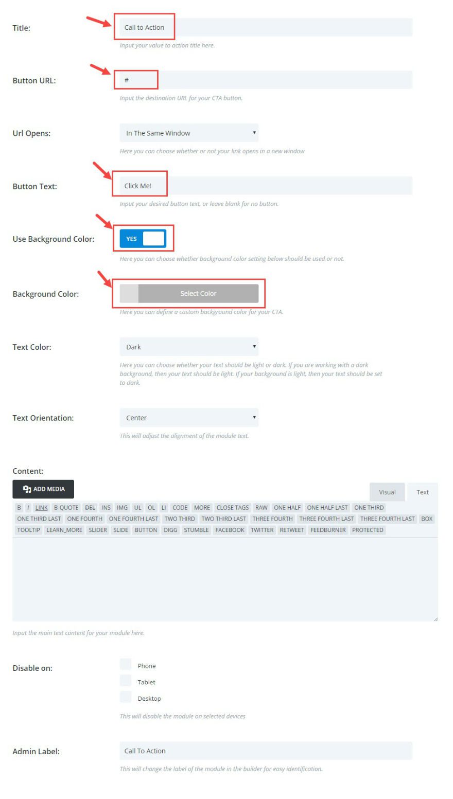
First, add a standard section with a fullwidth column. Then add a Call to Action Module. In the Call to Action Module Settings, under General Settings, change the following:
Enter Title
Enter Button URL (I’m using “#” for now)
Enter Button Text (I’m using “Click Me!”)
Use Background Color: YES
Background Color: #dddddd
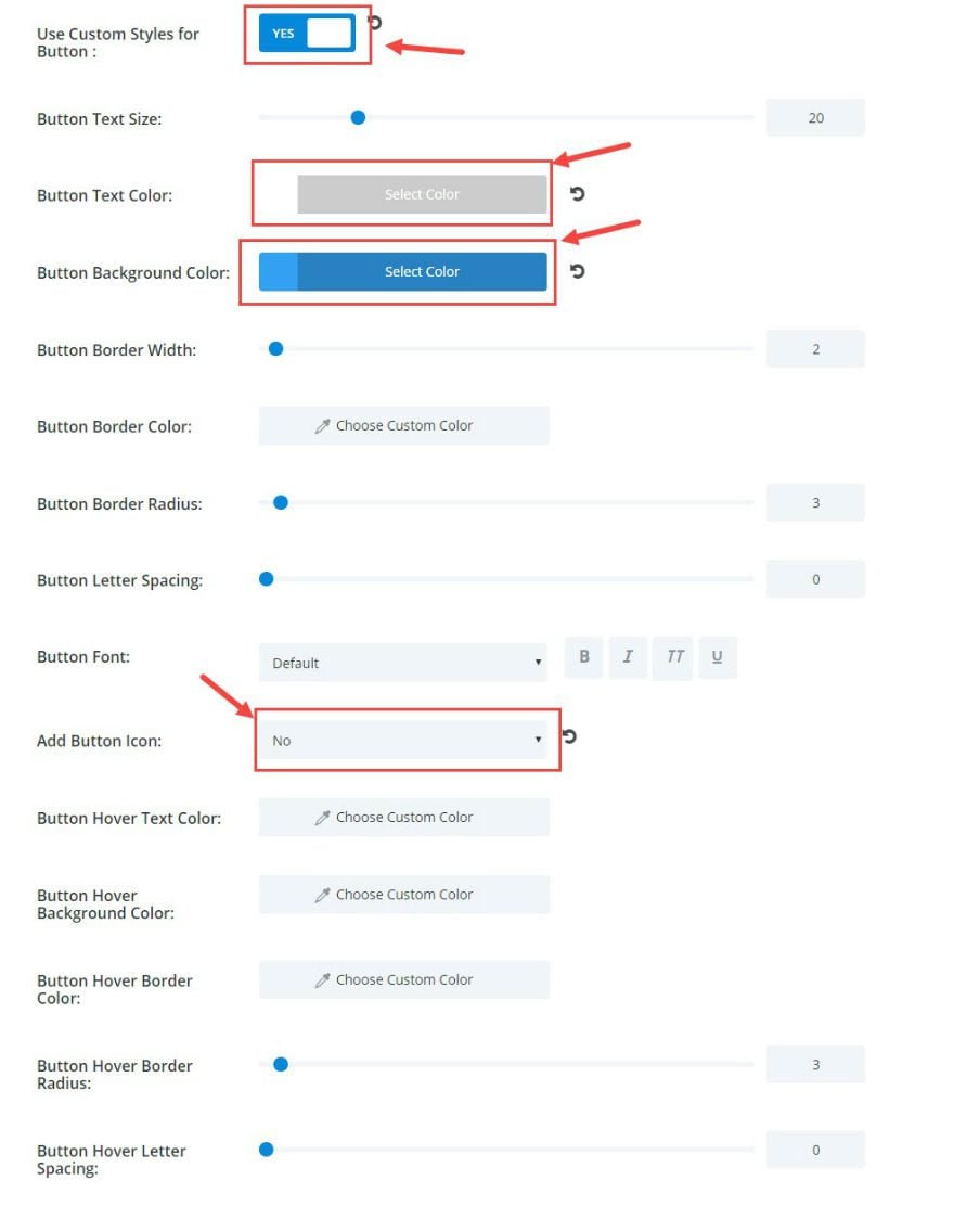
Under Advanced Settings, change the following:
Use Custom Styles for Button: YES
Button Text Color: #ffffff
Button Background Color: #2ea3f2
Add Button Icon: NO
Under Custom CSS add the CSS Class “pulse”.
Now go to Divi → Theme Options and enter the following Custom CSS for your pulse effect:
.pulse .et_pb_button {
animation-name: pulse;
animation-duration: 5000ms;
transform-origin:70% 70%;
animation-iteration-count: infinite;
animation-timing-function: linear;
}
@keyframes pulse {
0% { transform: scale(1); }
30% { transform: scale(1); }
40% { transform: scale(1.08); }
50% { transform: scale(1); }
60% { transform: scale(1); }
70% { transform: scale(1.05); }
80% { transform: scale(1); }
100% { transform: scale(1); }
}
.pulse .et_pb_button:hover {
animation: none;
}
Now your CTA button will pulse twice every 5 seconds.

This next effect lifts the CTA button instead of making it pulse. On hover, it raises the button slightly with a shadow underneath to create the perception of elevation.
Now that we already have a CTA section created, make a duplicate of that entire section you just created for the pulse CTA.
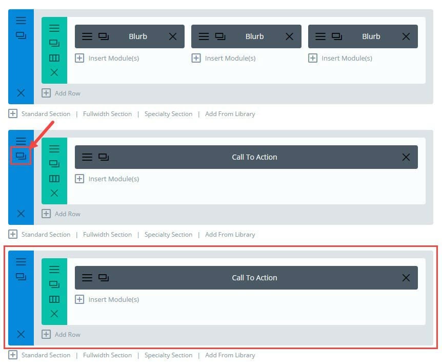
Click to edit the Section Module Settings of your new duplicated section and change the background color to #ffffff.
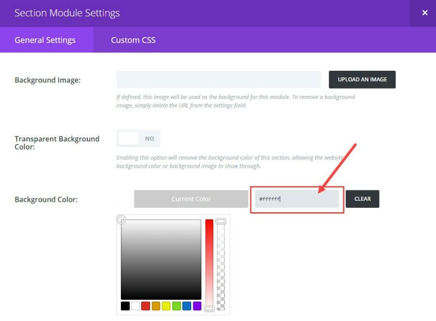
Save & Exit
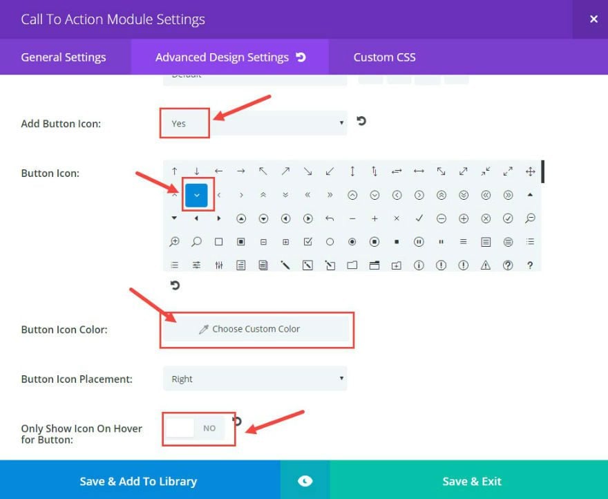
Now edit the Call to Action Module Settings. Under Advanced Design Settings, change the following:
Add Button Icon: YES
Choose Button Icon (an arrow point down works well for this example)
Button Icon Color: #ffffff
Only Show Icon On Hover for Button: NO
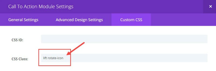
Under Custom CSS add a CSS Class called “lift” under the Custom CSS tab.
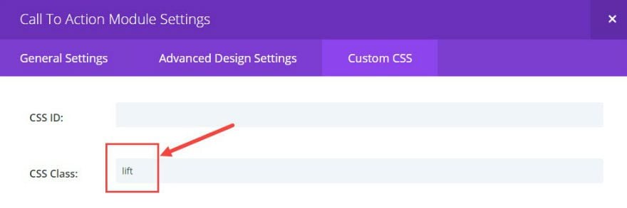
Go to Divi → Theme Options and add the following Custom CSS:
.lift .et_pb_button:hover{
box-shadow: 0 25px 55px 0 rgba(0, 0, 0, 0.21), 0 16px 28px 0 rgba(0, 0, 0, 0.22);
margin-top: -5px;
margin-bottom: 5px !important;
}
Check out the results.

To make the button icon rotate on hover, go back to the Call To Action Module Setting and add the CSS Class “rotate-icon” (one space after the class “lift”) under Custom CSS.
Then go to Divi → Theme Options and add the following Custom CSS:
.rotate-icon .et_pb_button:hover:after {
-webkit-transform: rotate(-90deg);
transform: rotate(-90deg);
}
Go check out your button. Notice the button icon rotates 90 degrees counter-clockwise creating a microinteraction for the user that literally gives direction.
#5 Adding Microinteractions with Images
Adding Microinteractions with images is like icing on the cake. Images are already engaging, and adding another dimension of interaction gives them that extra clickable quality you may need.
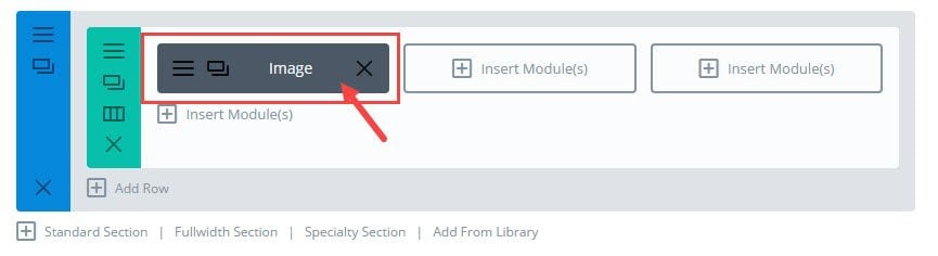
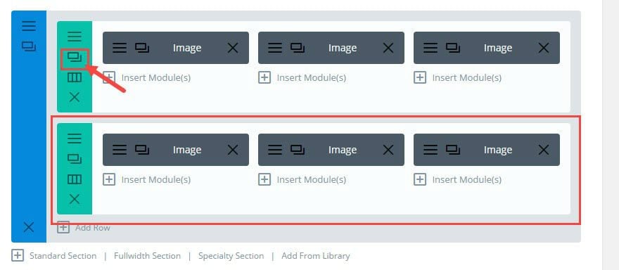
Let’s get started. Add a standard section with a three-column layout and insert an image module in the first column.
Click to edit the Image Module Settings. Under General Settings, upload an image and switch the option “Open in Lightbox” to YES.
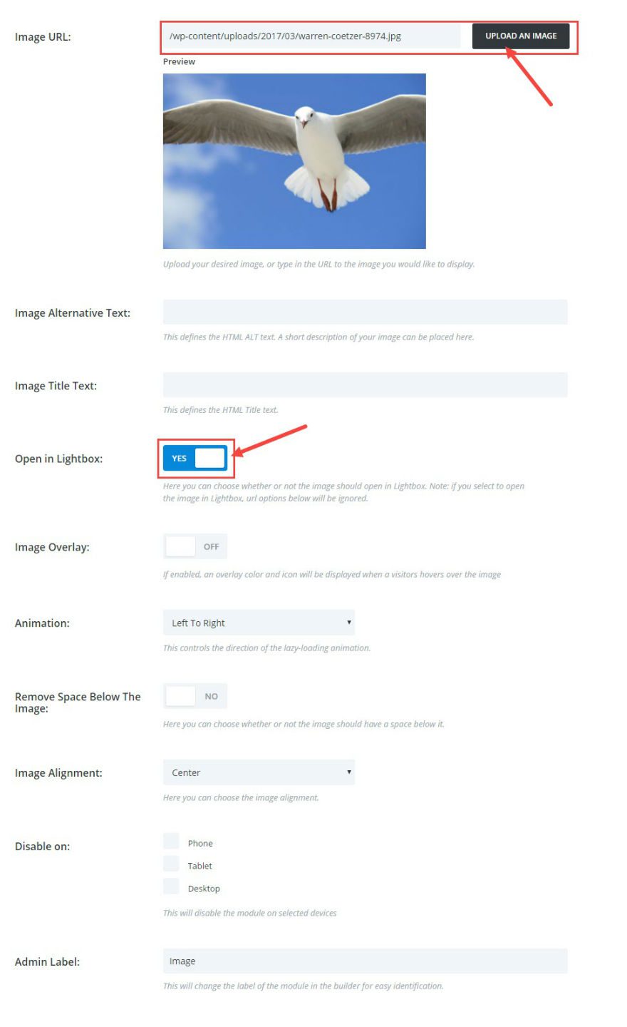
Under Custom CSS, add the CSS Class “tilt”.
Save & Exit
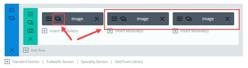
Duplicate your image module twice and drag them to the other two columns in your row.
Now add the Custom CSS in Divi → Theme Options:
.tilt.et_pb_image {
    -webkit-transition: all .2s ease-out;
    -moz-transition: all 0.2s ease-out;
    -ms-transition: all 0.2s ease-out;
    -o-transition: all 0.2s ease-out;
    transition: all 0.2s ease-out;
border: 1px solid #fff;
}

.tilt.et_pb_image:hover {
-moz-transform: rotate(5deg) scale(1.1);
-webkit-transform: rotate(5deg) scale(1.1);
-o-transform: rotate(5deg) scale(1.1);
transform: rotate(5deg) scale(1.1);
box-shadow: 0 3px 10px rgba(0, 0, 0, 0.43), 0 3px 10px rgba(0, 0, 0, 0.36);
border: 1px solid #fff;
}
Now go check out your row of images on your page.
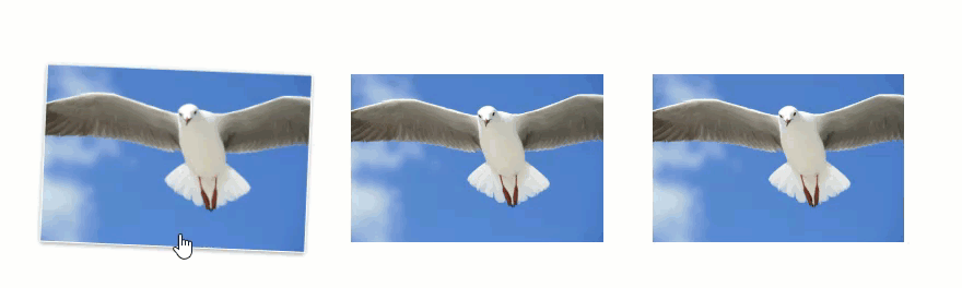
On hover, the images increase their size by 10%, rotate 5 degrees, and pop off of the page with the use of a shadow.
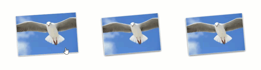
Now let’s add an opposite effect. This time, the images will start off tilted and shadowed. Then on hover, the images will return to the normal state.
Duplicate the row of images you just made.
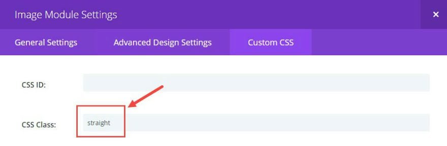
Now go through each of the three new photos on the row and change the Custom CSS class from “tilt” to the new class “straight”.
Then add the Custom CSS in Divi → Theme Options:
.straight.et_pb_image {
-webkit-transition: all .2s ease-out;
-moz-transition: all 0.2s ease-out;
-ms-transition: all 0.2s ease-out;
-o-transition: all 0.2s ease-out;
transition: all 0.2s ease-out;
-moz-transform: rotate(-5deg) scale(0.8);
-webkit-transform: rotate(-5deg) scale(0.8);
-o-transform: rotate(-5deg) scale(0.8);
transform: rotate(-5deg) scale(0.8);
box-shadow: 0 3px 10px rgba(0, 0, 0, 0.43), 0 3px 10px rgba(0, 0, 0, 0.36);
border: 1px solid #fff;
}

.straight.et_pb_image:hover {
-moz-transform: rotate(0deg) scale(1);
-webkit-transform: rotate(0deg) scale(1);
-o-transform: rotate(0deg) scale(1);
transform: rotate(0deg) scale(1);
border: 1px solid #fff;
box-shadow: none;
}
<
#6 Animating Contact Form Fields
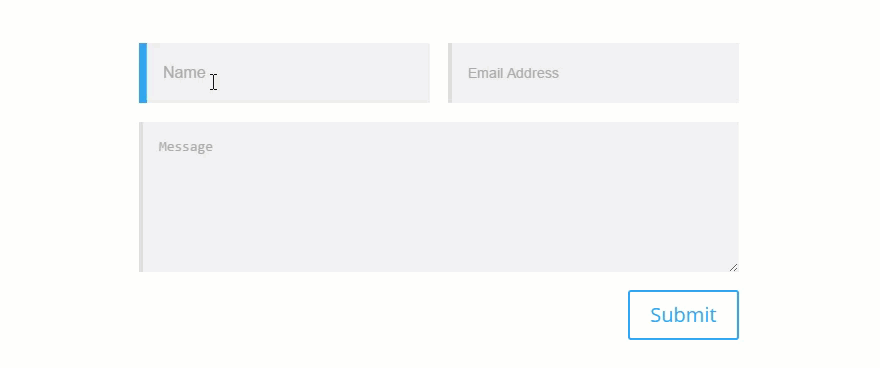
This last microinteraction adds some animation to the input fields on Divi’s Contact Form. The purpose of this microinteraction is to aid the user in the process of filling out important information. The hover and focus effect on the input fields helps with identification and assurance through the process. And, it is easy to implement.
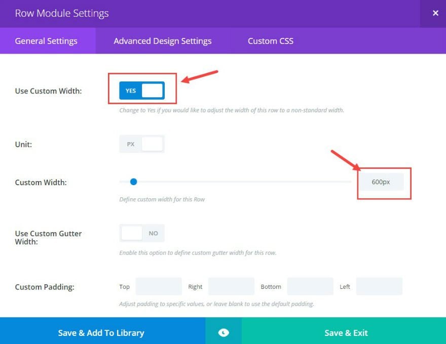
First, add a contact form module to a standard section with a fullwidth column layout. Edit the Row Module Settings. Under General Settings, set “Use Custom Width” to YES, and set the Custom Width to 600px.
Save & Exit
Next edit the Contact Form Settings.
Under General Settings, change “Display Captcha” to NO. (optional)
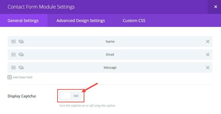
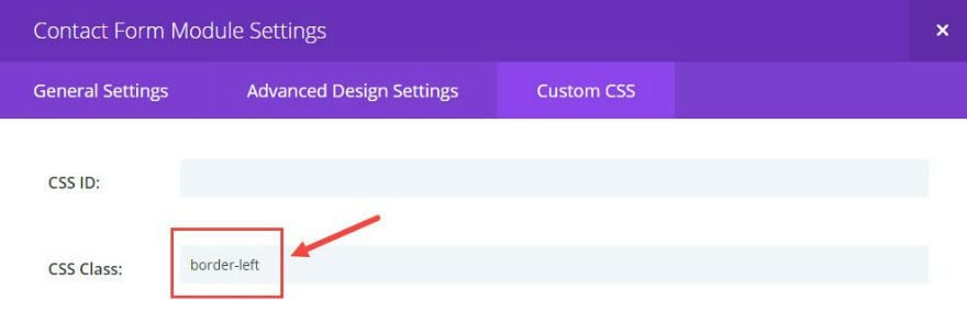
Under Custom CSS, add a CSS Class called “border-left”.
Go to Divi → Theme Options and enter the following Custom CSS:
.border-left .et_pb_contact p input, .border-left .et_pb_contact p textarea {
height: 60px;
border-left: 4px solid #ddd;
-moz-transition: all 0.2s ease-out;
-ms-transition: all 0.2s ease-out;
-o-transition: all 0.2s ease-out;
transition: all 0.2s ease-out;

}
.border-left .et_pb_contact p input:hover,.border-left .et_pb_contact p textarea:hover, .border-left .et_pb_contact p input:focus, .border-left .et_pb_contact p textarea:focus {
border-left: 8px solid #2ea3f2;
font-size: 16px;
}
That’s it. You now have a simple yet interactive contact form that adds a colored tab effect in combination with a slight increase of the input field font size both on hover and on focus.
Final Thoughts
I hope you find these microinteractions useful. They are simple to use with Divi (using only CSS) throughout your site. Feel free to adjust the CSS for these examples to fit your needs or come up with something completely new.
Enjoy!
As always, feel free to post your ideas, comments, and/or questions below.


Hi,
Great article, thank you very much!
Is it possible to setup these effects also for the button of the Divi contact email module?
I tried it based on the css / class of the button, but in vain.
Thank you very much!
Hi
Great article. I have implemented the microinteractions for Blurps but when I look at your video it seems the transition is very smooth compared to what I get from your code.
In your transition section you use “0.2s ease-out;” could it be you have used something different for the demo in your video ?
Advanz,
If you are referring to the gif I have as the video, then yes, it is a little different. I would suggest slowing down your transition to something like “0.5s ease-out” to get a similiar effect.
Thanks
What would be the CSS to add shadow in the fixed menu bar?
Carlos,
Would you mind taking this to the support team. They are good at this kind of stuff.
Thanks.
I have more doubts about other effects … where can I post these doubts?
What doubts? You can share them here.
Jason could not make it work on the cell phone …. does this only work on the computer?
How do I work on my cell phone?
Most work on hove which isn’t really compatible with mobile. Sorry.
Thank You for your article but… I work like you but after I insert the CSS code lines, the preview page is not visible. In its place the error
“WordPress database error Table ‘Sqlxxxxxx_1.wp300_et_divi_ab_testing_stats’ doesn’t exist per la query DELETE FROM wp300_et_divi_ab_testing_stats WHERE test_id = 762 fatta da post_preview, edit_post, wp_update_post, wp_insert_post, do_action(‘save_post’), call_user_func_array, et_pb_metabox_settings_save_details, et_pb_ab_remove_stats”
Can you help me?
Regards
Stefano,
Sorry for the trouble. I’m not sure what that could be. You man need to take that to support.
Thanks
Hi! This is so much help, for a recent project, Thanks!
Quick question, i’m trying to use the ‘#3 Adding Lift Effect on CTA Button’ but just to a Button Module instead of a Call To Action Module, but it doesn’t seem to respond, I have gone through the code but can’t seem to understand why it won’t work on Button.
Any Suggestions?
Add this CSS:
.lift.et_pb_button:hover{
box-shadow: 0 25px 55px 0 rgba(0, 0, 0, 0.21), 0 16px 28px 0 rgba(0, 0, 0, 0.22);
margin-top: -5px;
margin-bottom: 5px !important; }
Let me know how that works.
Really fantastic.
Thanks and regards!
Really fantastic.
Thanks.
Great article. My recommendation: Sell the code rights to ET and get them to incorporate the effects as animation drop-downs in Divi and Extra (:
Loved ! Keep motivating.
Wow, very cool guys.
tips like this for a beginner are fantastic.
I was looking for this long ago! Thank you! Perfect tutorial!
Thanks for the post! Really awesome. Is there a way to flip vertically a blurb icon on hover ???
In the button module settings, under custom css, add the CSS class “flip”. Then add the following Custom CSS in Divi –> Theme Options:
.flip .et-pb-icon {
-webkit-transition: all .2s ease-out;
-moz-transition: all 0.2s ease-out;
-ms-transition: all 0.2s ease-out;
-o-transition: all 0.2s ease-out;
transition: all 0.5s ease-out;
}
.flip .et-pb-icon:hover {
-moz-transform: rotateX(180deg);
-webkit-transform: rotateX(180deg);
-o-transform: rotateX(180deg);
transform: rotateX(180deg);
}
Let me know how it goes.
Thanks!
Seriously. You deserve a drink for this article. Excellent and timely. Always timely. You guys have a knack of being there just when we need you.
Thanks Simon. I appreciate your support.
I love these little tricks! I added the shake to a page’s blurb modules, and I feel like it’s Christmas! So simple yet impactful. Thanks!
Wonderful!
Super post !
Gracias ..
Great Article!
One question, how can I add a pulse animation to “Button Module” analogue to “Adding Pulse Animation to The CTA Button”?
Thanks and regards!
In your button module settings, under custom css, add the CSS class “pulse”. Then add this CSS under Divi –> Theme Options:
.pulse .et_pb_button, .et_pb_button.pulse {
animation-name: pulse;
animation-duration: 5000ms;
transform-origin:70% 70%;
animation-iteration-count: infinite;
animation-timing-function: linear;
}

@keyframes pulse {
0% {
transform: scale(1);
}
30% {
transform: scale(1);
}
40% {
transform: scale(1.08);
}
50% {
transform: scale(1);
}
60% {
transform: scale(1);
}
70% {
transform: scale(1.05);
}
80% {
transform: scale(1);
}
100% {
transform: scale(1);
}
}

.pulse .et_pb_button:hover { animation: none; }
Let me know how it goes.
Thanks
Great, works fine! Thanks a lot!
Jason,
Great stuff. One thing …
Would it not make sense to add the CSS in the page specific area of the Divi builder if the effect is just required on one page only let’s say?
It would be a little more optimized rather than running the CSS on every page through Divi theme options.
The only problem is it seems a little hidden away in the page specific area … whereas the overview of all custom CSS seems in Divi theme options has an advantage.
What do you think.
My question really is “what do you think the best practice is with using Divi and CSS that applies only to specific pages”
Its been on my mind 😉
Look forward to a reply.
Many Thnaks
Regards Mark
Jason,
I notice that Herman above comes on and says:
“This is a really nice post and very, very useful! Thanks a lot Jason Champagne!”
You take the time to answer this post with:
“You are very welcome!”
To users, bar sentiment, it is valueless.
I come on with the post above that addresses an important issue about where we apply CSS so as not to bloat our sites … and to seek second opinion for best practice with Divi …
and nothing!
I take time out of my working day to provide specific value that relates to this post entirely … and yet you can’t be arsed to provide an answer.
Are your answers based on value … or a timeframe?
I’d really like to know your thoughts on this … because the default position that you present is one of … run the CSS on any page and be damned.
Many Thanks
Reader and sensible contributor to your article,
Mark
Good question.
For best practices, I would suggest that you reduce the number of times a css file is downloaded on page load. That means keeping all your css in one place (ideally in your child themes style.css file). Because your css file is cached, it makes sense limit the need to download a new file for each new page.
Plus, for me, it is very difficult to keep track of all of the css if it isn’t in one place.
If optimization and speed is a concern, I would suggest using a plugin to reduce the size of your css file(s) and use a CDN. But for most websites, having all of your css in the custom css box under theme settings should not affect speed enough to be concerned in my opinion.
Hope that makes sense.
Thanks for the question and feedback.
This is so great!! Now I can use the css settings w/out knowing css.
Anyone know how to make a price, in the pricing table module, to pulse?
Cheers!!
That was something really needed.
Implemented straight away on blurb icon in maint. page of my site here: vertidesk.com
Thanks Jason
It would have been nice to distinguish the css code for rotate, shake and scale independently.
Thnaks,
Kiran
Very nice. Is it possible to use your own images in the blurb effects featured at the beginning of the article
Thanks! You’re awesome!
These are great! Thank you *so* much!
Great tricks to give a more visual touch to sites. I’m going to include it in agunos of my sites.
Thanks for the post
Really useful and well writen article. Thank you !
Excellent!
Great, good job. Thank you
Awesome! New ideas are welcome, thanks.
Fantastic!!
Thank you! I appreciate these!
Thanks for the great post once again Jason.
This would be able to apply to the person module and the button in the full width header reasonably easily would it?
Yes, you just need to find the right css class to target.
Do you have a trick how I easily can find the right css classes?
Thanks for the reply – can’t wait to try it out 🙂
Keep up the great work you and the team do!
This is great. Love these! Thanks!
Super post !
Merci
De rien!
Love it! Thank you.
Divi is the best… even if i would some more customization in the structure itself!!! but that can be achieved with a few tweaks here and there…
but i must say, the articles that you boost through are awesome… and i don’t usually check emailings… but from you guys at divi… i do check all of them. it’s well written (cleverly written i must say;) and an example to follow by everyone who wants to get followers!!!
Well done ET.
#gohome ?
Great Article ?
This is a really nice post and very, very useful! Thanks a lot Jason Champagne!
You are very welcome!
This is awesome. I can’t tell you just how informative this blog is and I am very new to Divi but the wealth of information out there is incredible.
Thanks for sharing. Glad it was helpful, Jayson. Nice name by the way!
My sentiments, exactly. Thank you, Jason.
A very helpful article — thank you Jason!
I would really like to take the effects used in the blurb module and use them on blurb images instead of icons. How would this be possible? I tried replacing “icon” with “image” in the css code, but that did not seem to work.
Thanks very much! Just implemented changes and they worked perfectly.
you need to replace “.et_pb_icon” with “.et_pb_main_blurb_image img”. The following css would add that functionality for all three effects:
.rotate .et_pb_main_blurb_image img, .shake .et_pb_main_blurb_image img, .scale .et_pb_main_blurb_image img { -webkit-transition: all .2s ease-out; -moz-transition: all 0.2s ease-out; -ms-transition: all 0.2s ease-out; -o-transition: all 0.2s ease-out; transition: all 0.2s ease-out; } .scale .et_pb_main_blurb_image img { -moz-transform: scale(1.2); -webkit-transform: scale(1.2); -o-transform: scale(1.2); transform: scale(1.2); } .rotate .et_pb_main_blurb_image img:hover { -moz-transform: rotate(360deg); -webkit-transform: rotate(360deg); -o-transform: rotate(360deg); transform: rotate(360deg); } .shake .et_pb_main_blurb_image img:hover { animation: shake 0.82s cubic-bezier(.36,.07,.19,.97) both; transform: translate3d(0, 0, 0); backface-visibility: hidden; perspective: 1000px; } @keyframes shake { 10%, 90% { transform: translate3d(-1px, 0, 0); } 20%, 80% { transform: translate3d(2px, 0, 0); } 30%, 50%, 70% { transform: translate3d(-4px, 0, 0); } 40%, 60% { transform: translate3d(4px, 0, 0); } }Works for rotating thanks
its not working for scale can you post the exact css for scale
thanks
I got it after a few tries ;), it was missing the “:hover” part
.scale .et_pb_main_blurb_image:hover img {
-moz-transform: scale(1.2);
-webkit-transform: scale(1.2);
-o-transform: scale(1.2);
transform: scale(1.2);
}
Sorry Kiran. Please replace this:
.scale .et_pb_main_blurb_image img { -moz-transform: scale(1.2); -webkit-transform: scale(1.2); -o-transform: scale(1.2); transform: scale(1.2); } [\css] with this: [css] .scale .et_pb_main_blurb_image img:hover { -moz-transform: scale(1.2); -webkit-transform: scale(1.2); -o-transform: scale(1.2); transform: scale(1.2); }Jason drops only the dankest of Divi tips.
Another great post, thanks so much!
We’ve been hearing a lot about micro-interactions of late so this article is perfectly timed and very helpful – thanks guys!
It´s good
So that’s what “microinteractions” are:)
Thanks for the post Jason – I might have a play with a few of these.
Great post Jason, will definitely be using some of these in my next projects!
Great!
Just wanted to say I loved the article and these little tips to make your site unique. Thank you!
You’re welcome, Travis. Glad you loved it.
cheers Jason! 🙂
Cheers!