
There is a psychology behind the use of color. Many clients want shiny and flashy, and they choose colors because they like them. But a color they like might not have the desired effect. Color plays an important role in the success of UX. Users tend to click and scan on things that visually appeal to them. If used correctly color is pretty. And people in general look at the pretty. This is why color matching is so important for websites.
As web designers we need to be able to choose the right color combinations for websites. This includes every visual element of your layout: colors of fonts, buttons, headers, backgrounds, titles, links, borders, etc. Color even plays a role in your branding.
In this article, we will look at a few color matching techniques to help with web design.
Understanding and Using Color Theory and Psychology
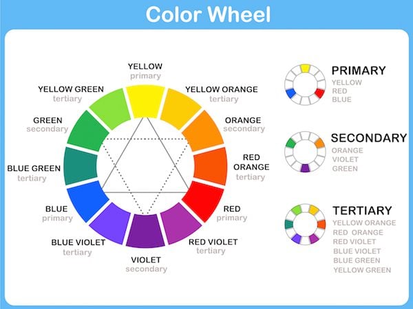
Image by aekikuis / shutterstock.com
Color selection is an art that takes a long time and a lot of experience to master. It’s also subjective. It comes down to its context. The topic and mood of the site will help determine the colors that will best work for the audience. There is no one right answer for every case. What works for one audience might not work for another. Where one audience prefers subdued colors another might prefer pastel.
The color scheme would depend on the feel that you’re going for. Certain colors are expected for certain topics. For example, hunters and fishermen gravitate toward rustic colors. White is prominent for websites about weddings. The color-scheme goes with the topic. In these cases you could experiment with different colors for highlights and accents while staying true to the primary color-base.
This doesn’t mean that every website on a specific topic should be the same color. Each website has specific goals. Colors should be chosen to match those goals. First and foremost is the needs of the project. Colors are typically associated with feelings. They can create moods. The wrong colors can send a reader running to find the next website. The correct colors can draw them in and keep them there. It helps to use a little bit of color psychology.
Color Psychology
Here’s a quick look at color psychology as explained by Vandelay Design:
- Black, White, and Gray – impact. These are great for backgrounds. Black suggests power. White suggests innocence. Black and white work great together. Gray is neutral and is a good choice for tradition and calmness. If used incorrectly is can lack energy. All three are great to show seriousness.
- Brown – wholesomeness. They’re calm and elegant. This is a great choice for textured backgrounds for sites that want to show tradition. Tans show piety. Dark brown shows reliability. Brown is great for sites that want to show reliability and experience.
- Blue – calming. This is great for sites that want to show trustworthiness and dependability. Dark shades show experience and success. Light shades are friendly.
- Red – exciting. Associated with passion, power, and anger. Warm colors can be strong and comforting and are great for sites that want to portray the solid qualities of a brick wall. Bright colors are energetic and work great for websites geared toward youth.
- Pink – youthful femininity. It’s playful and innocent and ideal for feminine audiences.
- Orange – energetic and inviting. It’s a good choice for sites that want to portray movement and energy.
- Yellow – energizing. It’s associated with warmth and happiness. Bright shades are great for children. Darker shades suggest antiquity, which is associated with wisdom and is a good choice to portray authority and intelligence.
- Green – calm and rejuvenating. Dark shades are associated with money and is good for sites that need to portray growth and stability. Lighter shades are associated with spring and are great for sites to portray relaxation, honesty, and ethical standards.
- Purple – noble. Dark purple implies wealth and luxury. Light shades are romantic.
Of course these colors might have a different purpose or response in cultures outside the US. Ultimately it comes down to your target audience.
Looking at Examples
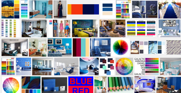
One of the best places to get ideas is from other successful websites. Color-matching is one of those topics that has no exact answer, but there are choices that are better suited to a specific purpose than others. Many websites take a different approach than others and they can give you a better idea of what works and what doesn’t. Take a look at the color-combinations of popular websites to see what color palettes work. Also look at sites specific to your niche. Try to understand the angle the site is using to present information to the audience. Evaluate who their audience is and look at how they’re using color psychology to appeal to that audience.
Another place to get ideas is from magazines. Virtually every topic has a magazine. Look at how they build their branding colors, their pages, headers, backgrounds, etc. Although it’s a much different medium, the use of color for that audience still applies.
Google Search
One of the best ways to see color combinations is to do a Google search for “color combinations with” and then include the color you’re interested in. This will give you results that include Pinterest, ColorCombos.com, and Better Homes and Gardens. You can also do an image search and see lots of examples of combos. You can grab colors from images that you like using color matching tools, as we’ll see later.
Palette Search
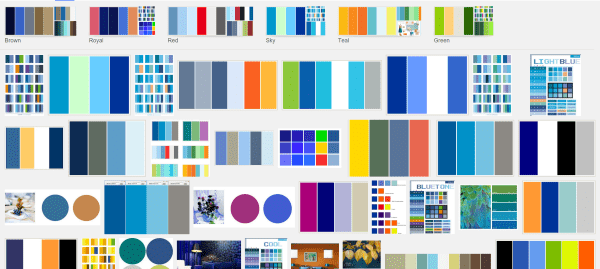
You can also search for color palettes. Often, color palette will give you the hex or RBG values. If not then you can use one of the color dropper tools to capture the colors and recreate the palettes.
Experimenting with Colors
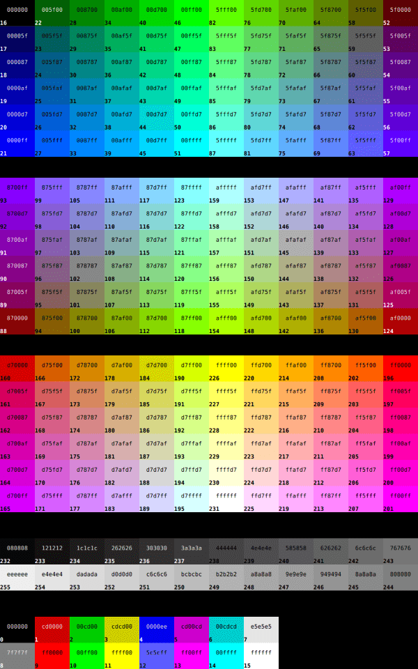
Image by Wikimedia Commons
Start with fewer colors and add as you feel comfortable. It’s better to have two colors that you know work together before adding a third. Use one color as the dominant and use the others for highlighting. Choose a color and then choose another shade of that color. Try using one shade for backgrounds and another for highlights.
Since businesses often have a dominant color in their branding you should consider that color, but don’t be afraid to experiment and try something different. Ultimately, it shouldn’t clash with the branding colors.
This is where an A/B test comes in handy. You can deliver one color to half your audience and another color to the other half. You can then follow the statistics and see what works and what doesn’t. A/B testing will be added to Divi 2.7. This will be an excellent tool for experimentation.
Experimenting with Contrast
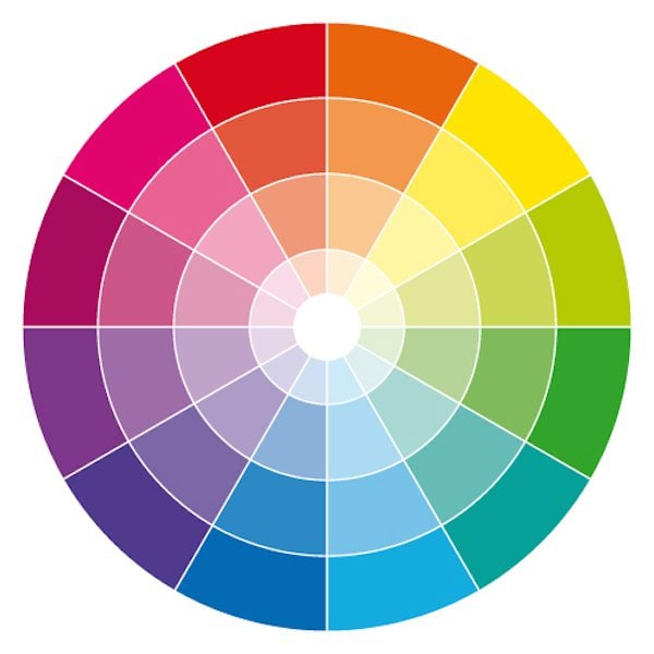
Image by -Albachiaraa- / shutterstock.com
Contrast lets colors stand apart from each other. Choose colors that have an interesting contrast. If there isn’t enough contrast it will be too difficult to read the text and it can cause readers to experience eye-strain. If there’s too much contrast, or the wrong kind of contrast, readers will turn away because it just doesn’t look good. Used correctly, contrast can direct attention. Contrast should be used with buttons, links, icons, etc. It’s a good tool to direct users to your call-to-action.
Practicing Color Matching Techniques with Tools
There are lots of tools to help design color palettes and match colors. You can choose a color and you are given contrasting and blending colors. Not surprisingly, many of the free online tools are made specifically for Google’s Material Design. There are also several good image-editing apps. I’ve included a look at the most popular and a few free apps that have some professional features.
Material Design Color Palettes
This is a full set of color palettes from Google that provides primary colors with matching colors for accents for Android, Web, and iOS.
Each color provides a hex value. It also provides sample applications so you can see how they work together. It includes light, dark, and various levels of opacity. You can customize the color palette for Android. There’s also a downloadable zip file containing color swatches for Photoshop and Illustrator.
Material Palette
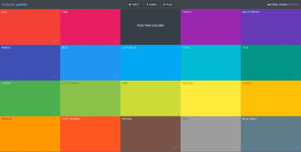
Material Palette is an online color generator designed for Google’s Material Design. It’s a color tool to help you choose color palettes for websites.
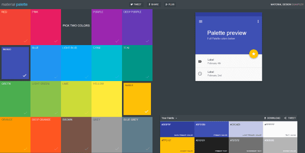
Choose any two colors and you’re given a color palette that works with those colors. It will identify them as:
- Dark primary
- Primary
- Light primary
- Text/icons
- Accent
- Primary text
- Secondary text
- Divider
This takes the guesswork out of trying to figure out which colors to use for what. You can also turn off one of the colors if you don’t want the contrast. You can download your palette and share it on social media.
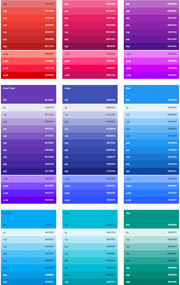
Material UI
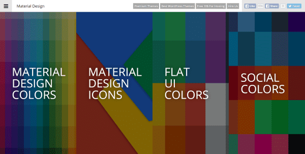
Material UI is a set of tools for Material Design, Flat design, and social media. It gives you a listing of colors for each and you can easily get the hex or RGB values. Here’s a quick look at each one.
Material Design Colors
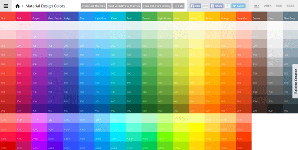
Material Design Colors is a tool from MaterialUI that lets you choose colors and then see them in action. Selecting the color adds the value to your clipboard. Once you’ve selected your colors click on the Palette Creator.
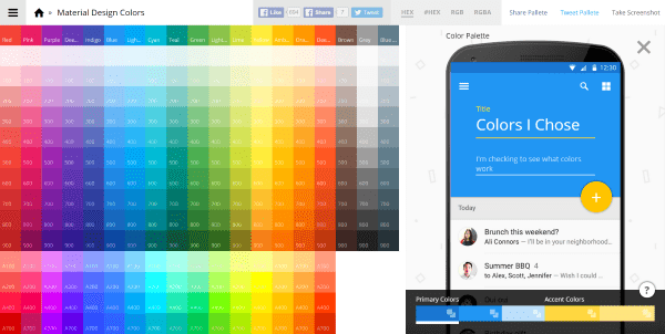
It will show you what your color palette looks like on a mobile device. You can change any color within the color palette to see how they look together. It shows primary and accent colors and gives the hex and RGB values so you can use the colors even if you’re not using Material Design. You can share your color palette on social media if you want.
Flat UI Colors
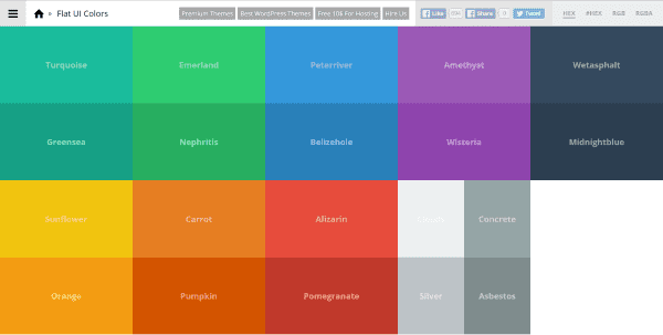
This tool from MaterialUI provides a listing of colors that you can choose from for flat design. You select the color you’re interested in and the hex or RGB value is copied to your clipboard. The presentation lets you see how they work and contrast with each other.
Social Colors
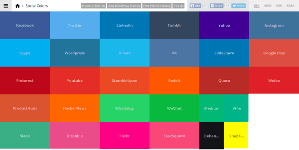
Social Colors from MaterialUI works in the same way as Flat UI Colors in that you select the color you’re interested in and it copies the hex or RGB value to your clipboard. The colors are labeled with the names of the social networks they’re used on. The layout gives you a good indication of how the colors work together.
ColorBlender
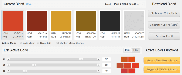
ColorBlender lets you create color palettes using RGB sliders. You can select from their premade palettes or adjust them any way you want. It has an auto match mode that will adjust the accent colors to match adjustments that you make to the primary color. You can change colors independently in direct mode. Once you’re happy with your colors you can download the blend for Photoshop, Illustrator, or simply use the HTML and RGB values. You can also have it emailed to you. If you like a specific color within the blend you can use that color as the primary and the rest will match it. It will also suggest a Pantone match. You can save your blends and reload them later.
Paletton
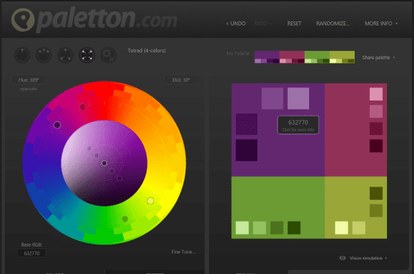
Paletton provides an interesting color wheel that lets you choose colors in several different ways. Once you’ve chosen your primary color it will show you accent colors, with each color family having primary and secondary colors. When you mouse over the colors it gives the hex value.
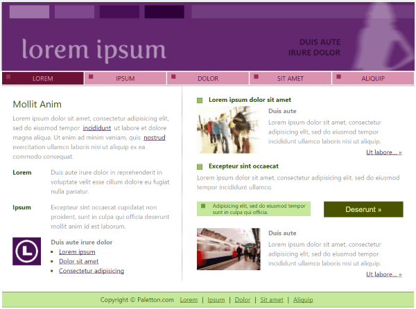
You can preview the color palettes and see example websites with your color choices. You can choose light, dark, positive, and negative. It will also show animation and artwork. Each choice has multiple choices within them. This is an excellent tool to see how colors will look within WordPress themes without having to place the colors within your themes.
Adobe Color CC
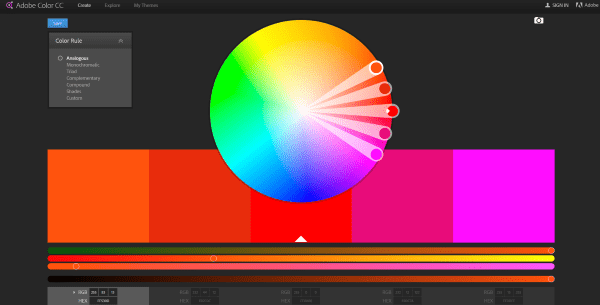
Adobe Color CC is an interactive color wheel that will adjust accent values as you adjust the primary value. You can also adjust an accent value while keeping the primary value. All other values will automatically adjust to match. You can choose from 7 different matching rules including a custom mode that lets you control each color independently. It gives you RGB and hex values for each color. You can save your colors and come back to them later.
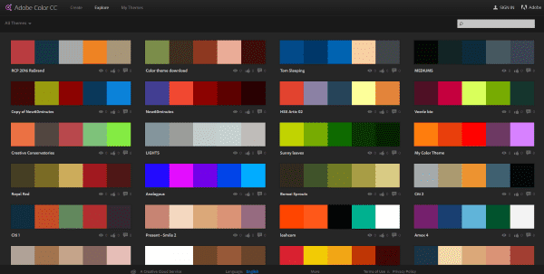
It has an Explore tool where you can see, compare, edit, and save premade color palettes.
Pick Color from Image
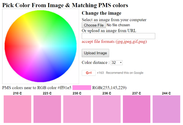
Pick Color from Image & Matching PMS Colors is an interesting tool. You can upload a logo and get the Pantone color. It will also give you the closest PMS color so you can see variations on the Pantone color. Additionally, you can choose a color from the color wheel and get the closest PMS color to it. Uploading the logo image is a useful way to get the color values if you don’t have Photoshop or Illustrator. There are a few alternatives to the Adobe offerings that have a nice dropper feature.
Paint.NET
Paint.NET is free image editing app for PC with some high-end features. If you find a color you want but do not have the RGB or hex values, simply paste the image into Paint.NET, select the color-picker, and click on the color you want. That color will become your primary and will give you the RGB and hex values. You can also choose secondary colors and then save your color palette for later use.
Gimp
Gimp is free app for Windows, OSX, Linux, and more, with high-end features including a great color-picker and palette-building tool. Paste in the image you want to get the color from, choose the color picker, and select your color. You can use this to building and reusing color palettes.
Photoshop
Adobe’s Photoshop is the gold standard in visual design tools. It runs on Windows and Mac and has virtually every color matching and adjustment feature you can imagine including customizable index tables, an eye dropper to choose colors from images and build your own palettes, swatches, a color panel, and more. You can preview the sampled color above the foreground. You can choose colors by RGB, hex, HSB, Lab, and CMYK. The color picker has a web-safe feature that gives you 216 colors that will work well on any system. It’s the most expensive option but I can’t imagine needing to do something it can’t do. Photoshop is a professional’s tool.
Sketch
Sketch is a designer tool for Mac with lots of high-end design features. It’s perfect for building scalable vectors and reusable UI elements. It has a built-in color picker with dropper so you can sample any photo to build your palettes. It has lots of third-party extensions available including some that will let you save and reuse color palettes.
It has an extension called Sketch Palettes that lets you save and load palettes into the color picker.
Final Thoughts
The use of color is just as much art as science. Color can help shape your visitors’ mood. It can help pique their interest, make them feel secure, see a website as an authority, make them feel playful, keep them coming back, and much more. Matching colors correctly can improve your call-to-action response and share rate. Correct choice of color can hook the visitor and keep them on the site. With a few color matching techniques and tools you can use color psychology to your advantage. Ultimately it takes lots of practice and experience, but it’s a practice worth investing time into. You only get one chance to make a great first impression.
Your turn! Do you have any color-matching techniques to add? Do you have a favorite color tool? Let us know in the comments below.
Article thumbnail via karawan / shutterstock.com


What a great article. Your suggestions are spot on and provide loads of helpful resources. Thank you!
Thanks for this helpful article. I would like to add one to the mix. There is a very handy extension for Chrome called Palette For Chrome. You just right click on any image and it will show you a 16, 24, 32, or custom color palette.
All the links to the tools from materialui.co are broken… they have been since you published this article. Any ideas? Is their site broken or did you use incorrect links?
Hi Dan. I double checked and these are the same links I used when writing the article. It looks like the site has gone down. Hopefully it will be back soon. Thanks for letting us know.
This is such a great post. I’m going to start pushing people to it. I created a colour picker for my website so that people could get an idea of what they need. I cover the basics of Colour Psychology but nothing at detailed as this.
always fascinated by colour theory, especially when you can see the data to back the theory up…changing a button from green to red may not only look beter but may also attract more clicks…if t A/B testing is introduced in Divi 2.7 it will be fun to test things out…
Great Post. Happy to hear that Divi will implementiert A/B Test functionality!
ColorSchemer Studio is a tool that I have used for years. It can take a photo and break out the colors. It has many features.
Great post, thanks.
I use Paleton to create attractive website. Choose colors can be complicated.
Thanks!
Really usefull article (lot of info)
I m going to keep the armony of my websites with your tips 🙂
Regards
Randy, really great article! Color is such a powerful and influential tool that can make a huge difference in your web site design. Thanks for providing good resources.
Wow, what an in-depth article. I’ve always had an interest in color psychology although I’m not sure theres much truth to any of it – I imagine color affects people in different ways.
Randy, awesome article! This is one of my most time consumed parts of my design phase. Lol. I often use the color swatches in Adobe Illustrator to help choosing my colors.
Really enjoyed this article, I always enjoy matching colours to themes and ideas when creating a website. Using colour to attract the user’s attention to specific functions also works really well. Adobe has a great tool for matching colours together as well. Awesome insightful writing!
It was very nice article but the star of David in the Color Theory does seem silly.
Thanks Randy, great and useful tools.
I will re-read to apply.
Shared on Twitter via @OscarCanoL
Really great post Randy! This is the kind of post I pass on to other folks who consider themselves “designers”. Like Alex above, I rely on Adobe Kuler. It has always served me well and integrates perfectly with Photoshop.
Thanks again for a really useful article.
One of the best and most informative useful articles I’ve read. I will definitely bookmark this post. Lots of valuable resources and practical tools.
Thank you!
Great article, thanks!, by the way, could be a good idea (for Divi) to improve the color picker, to save and name colors, and/or even select gradients for backgrounds…
Those sound like great ideas 🙂
Kuler is my friend when I just am not sure of which direction and I need inspiration.
Great article. Color is vital and I see websites destroyed by not understanding color theory.
Personally, I just go to Adobe Kuler, pick my main color, choose one of the pre-selections (Complementary, Triad, etc.) and then save those colors to Photoshop. I stick to these colors and my sites come out looking great.
One of the most practically useful on colours I have read (and I’ve read a few) Thabk you
Thanks Randy. Well researched and informative.
I’ve seen common market themes that had been color-themed to produce something totally different in terms of the look. Just goes to prove the point you are trying to make. I had a client who changed some website i had built for them and it was terrible. I had to remove that website from my portfolio.
Great post, interesting and useful about a important step in website building. Thank you.
Alberto