
Responsiveness in web design isn’t optional anymore. Hardly anyone would argue with that premise – unless they’ve been living in a cave for the past decade. The real debate lies in how to best go about making your designs responsive. Should you start your designs from a mobile standpoint and build your way up to regular viewports? Should you simply stick to adjusting your finished designs to mobile? It’s a complicated choice.
Everyone’s workflow is different, and chances are you’ve already developed your own approach to responsive design. The one thing we can state with near absolute certainty is that if you haven’t yet begun to incorporate viewport units (e.g. vw, vh, and rem) into your CSS, you’re missing out.
Before we dive into incorporating these units into Divi to create fluid pages, let’s review exactly what makes them preferable over using regular measurement units.
What Are Viewport Units Exactly?
Vw (viewport width) and vh (viewport height) are length units that represent exactly 1% of the size of any given viewport, regardless of its measurements. Rem (short for ‘root em’) is also similar in its functionality, although it deals specifically with font sizes, and derives its name from the value of the font size of the root element – which should default to 16 pixels on most browsers.
There are also a few more viewport units available for use (although they’re even less widely used than vw and vh), such as vmin (minimum viewport) and vmax (maximum viewport) which refer respectively to 1% of the viewport’s smaller dimension, and 1% of its larger dimension. We also have ex (x-height) and ch (character units), which are even less common than vmin and vmax – mostly due to how insanely specific they are. X-height, for example, uses the size of a lowercase ‘x’ to determine its base value, which is roughly equal to 0.5em (i.e. 8 pixels or a 6-point font), and character units use the measure of the ‘0’ character as their reference point.
To make a long story short – should you ever find yourself perusing someone else’s CSS and come across these relative units, you’d do well to direct them to the nearest mental health institution.
Interestingly enough, browsers actually calculate the entire browser window when it comes to width, meaning they factor the scrollbar into this dimension. Should you attempt to set the width of an element to a value of 100vw, it would force a horizontal bar to appear, since you’d be lightly stretching your viewport.
What’s the Advantage of Using Viewport Units?
Simply put, by implementing viewport units correctly, you can create a fluid responsive effect that is quite different from a simple adaptive website. A responsive design will automatically adjust its size as your viewport changes, whereas an adaptive design will correct itself once your viewport reaches a specific size, thanks to the use of media queries.
The advantage is obvious from an aesthetic standpoint – a fluid design simply looks better. Additionally, using viewports over fixed units poses the additional advantage of being easier to implement and maintain. Implementing an adaptive design will, in most cases, require the addition of multiple media queries, with specific values that must be pixel perfect.
What’s more, using viewport units enables you to easily design your text to always remain at a comfortable line length, then have that experience scale upwards or downwards as your resolution adjusts. You could also tweak your CSS in order to have your text always remain proportional, like this:
h1 {

font-size: 6vw;

}

h2 {

font-size: 3vw;

}

p {

font-size: 2vmin;

}
In that example, your text would always remain proportional to each other, and to your viewport’s width as it changes. You can even take it a step further and use these units to create containers for your text which, at the proper width, would always provide an optimal line length as we mentioned earlier.
Let’s take a crack at another short and sweet example. This time, we’ll be creating a few boxes using viewport units that will serve as a basic demonstration of fluid pages. We begin with the HTML:
<h1>Example of Fluid Responsiveness</h1>

<div class=”responsivebox”></div>

<div class=”responsivebox”></div>

<div class=”responsivebox”></div>

<div class=”responsivebox”></div>
Then we move onto the CSS:
body {

padding: 3vh 3vw;

text-align: center;

}

.responsivebox {

display: inline-block;

width: 16vw;

height: 60vmin;

margin: 2vh 2vw;

background-color: #81d8d0;

}
A quick look at the code should be everything you need to figure out exactly what it does. First, we created four divs with the responsivebox class, then we gave them a width, height, and margin – all using viewport units. The only thing we’re missing there is giving the h1 a relative size in order to have a 100% fluid page (albeit a very basic one), so let’s go ahead and correct it:
body {

padding: 3vh 3vw;

text-align: center;

}

h1 {

font-size: 6vw;

}

.responsivebox {

display: inline-block;

width: 16vw;

height: 60vmin;

margin: 2vh 2vw;

background-color: #81d8d0;

}
These are the basics of what can be accomplished using viewport units, but as you may have expected, some people have taken their implementation further and cobbled together some really cool stuff using them – take a look at this CSS MacBook on CodePen, for example.
If you took a look at the CSS, you may have noticed how it mixes viewport units with regular old pixel values in order to achieve a very cool effect. Our point being, as with everything else CSS related, the sky’s the limit when it comes to what can be done with it.
With the basics behind us, it’s time to move on and apply our newly found wisdom to the Divi theme.
How to Use Viewport Units With Divi
Up until now, everything we’ve covered has been pretty straightforward, and fortunately for you, it’s going to stay that way, since using viewport units to create Divi pages is pretty darn simple.
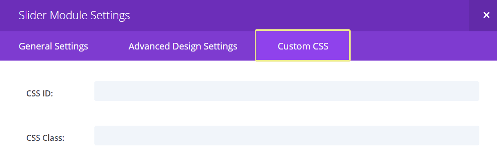
In fact, all you need to achieve this is to familiarize yourself a bit with the Divi builder, and know how to add custom CSS to your sections and modules. Then, it’s just a matter of tweaking the code until you’re satisfied with your results. Once you’re inside the Divi Builder, you’ll want to click on one of these icons in order to launch the Settings window of the corresponding section or module:
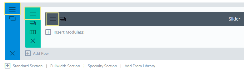
Each of these windows will have a Custom CSS tab, enabling you to easily add CSS to the entire block in a single move. In order to maintain a higher degree of control over the size of your modules, you’ll want to add CSS directly to them, rather than their containers:
Let’s use one of Divi’s predefined layouts as our testing grounds. This is the Homepage Basic layout, with a couple of small tweaks:
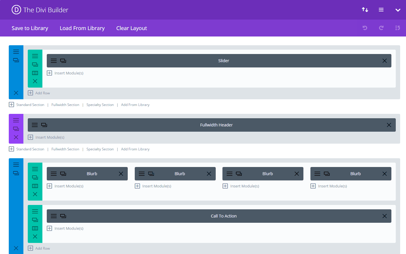
If you want to follow our testing process without affecting any of your existing WordPress pages, simply create a new page, activate the Divi Builder, click on Load From Library, and choose any of the multiple predefined layouts available. We recommend you do so, since we can’t exactly show you these fluid pages in action – plus it’ll help you familiarize yourself with the process.
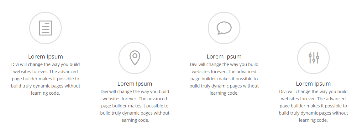
The Homepage Basic layout is a simple combination of a small number of modules. A slider, a full-width header, four blurbs with corresponding icons, and a call to action. Let’s play around a bit with that slider:
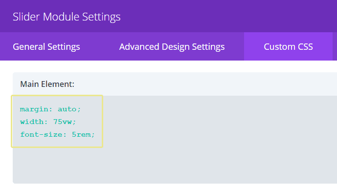
As you can see, we set the slider’s width at 75% of the viewport’s width, a 5rem font size (which is relative to the HTML’s default font size value). Although the effect looks pretty similar to Divi’s default responsiveness, with this configuration you’ll be able to exercise greater control over how your site will look in different resolutions.
Now, moving onto the full-width header. If all you’re using is a simple title as the Homepage Basic layout does, you’ll want to enter your CSS into the Title box within the Custom CSS tab:
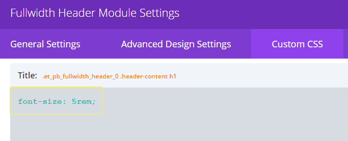
Font sizes can scale pretty fast using rem units, so be careful. While the header in question was set at 30 pixels by default in this layout, overriding that value with 5rem as seen above would result in the equivalent of an 80-pixel font size.
For our final example, let’s try something a little bit different. As you might have noticed, the Homepage Basic layout includes four text blurbs with accompanying icons. Now, with a pretty simple tweak on just two of these blurbs – the second and the fourth…
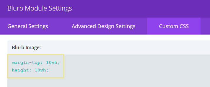
…we can obtain a pretty nice (and fully responsive) scaling effect:
As you can see, implementing viewport units into your CSS to create fluid Divi pages is pretty simple. All you need is a little time and patience to tweak your module’s settings until you’re happy with your results across multiple resolutions.
You will, of course, need to test these settings constantly to see how they hold up – we’ve got you covered there.
Conclusion
The importance of creating mobile-ready designs can hardly be overstated, as we’re all aware of. Mobile devices have become the norm so quickly that failing to incorporate responsiveness into your designs may very well be tantamount to stating that you don’t care about their success. All of this means that it’s important to stay ahead of the curve as far as best practices go.
As far as Divi is concerned, keep in mind the following tips when creating fluid pages:
- Familiarize yourself with the new custom CSS option within the Divi Builder settings.
- Use viewport units in order to create fluid boxes for your page’s ‘building blocks’.
- Put your CSS to the test by checking whether your pages hold up over multiple resolutions.
Do you have any tricks up your sleeve when it comes to responsive design? Share them with us and subscribe to the comments section below!
Article thumbnail image by yurikslb / shutterstock.com


Shouldnt these units already be in use in the Divi theme layouts? It is a responsive theme.
Hi and thanks. I wasn’t aware at all of this viewport unit… and as everything is going so fast in Web design… i shall take the time to learn from your blog post.
Not great to see my comment written yesterday not included!
Pete, it did get included (if you take a look above), but all comments have to go through a manual moderation process, which can sometimes take a little longer than we’d like. 🙂
can you make a video to exp[lain this more i really think this is a good information to know better
Browser support?
thank you
No problem. 🙂
Cool
Thanks!
Quite helpful article. I like the example with using vh for creative blurb alignments.
Those techniques are good enhancements (not replacements) to adaptive design.
Glad you enjoyed it, Amadeusz!
So glad you built this function into the builder.
Helps simple people like me keep up with the current speed of technology.
Thanks!!!
Don’t do yourself an injustice, David. You’re a Divi user, so you’re ahead of the pack in that regard. 🙂
Great article John,
We noticed a couple of months ago on a sample by Elegant Themes designer Mario Maruffi here:
https://www.elegantthemes.com/preview/Divi-Builder/sewing/
The main title used: font-size: 7vw;
We investigated further and worked out what the ‘magic’ code did.
We’ve used this many times on sites and love the fact it practically does away with media queries.
Amazing how things are constantly developing and moving on.
🙂
Indeed, Pete! Glad you’re loving the ‘magic’ code. 😀
Awesome, Thanks!
No problem. 😀
Great post, will make use of this for my next pages usin divi.
Thx
Thanks, Ismail!
I feel like there are so many posts here that teach me stuff I really need to know and learn. This is a great example. Thank you for all the great content!
No problem, Beelissa – glad we could be of service. 🙂