
Typography can make or break your website before visitors even read your content. When someone lands on your page, poor font choices instantly raise red flags to your visitors before they even start reading the words themselves.
Most designers hate dealing with website fonts. Their builder makes typography way too hard. However, modern builders like Divi are making typography simple again. Let’s check out typography problems, find solutions that work, and see how Divi 5 makes it easy to apply them.
Why Text Can Make Or Break Your Website
Your website’s typography creates an instant emotional response before visitors even process your words. Research shows that poor font choices literally make people frown. This triggers negative feelings in the amygdala, a part of your brain that handles emotions and memory. Your font choices become part of how people remember your business.
Visitors who see badly designed text feel worse about your site, creating lasting negative memories tied to your brand. Most visitors spend less than a minute on your site, reading only a quarter of your content. Within those precious seconds, typography either pulls them in or pushes them away.
Over half of users consider aesthetics the main reason they won’t return to a website. Your typography forms the backbone of that judgment. Poor text design triggers an immediate “this looks unprofessional” response, and visitors can’t shake that feeling.
Experienced designers know typography is a powerful tool for engagement and brand messaging. Typography isn’t just about readability; it’s also about personality and emotional connection.
The move to expressive typography shows a deeper understanding of font psychology. Fonts carry emotions:
- Serif fonts suggest tradition and trust.
- Sans-serif fonts feel modern and clean.
- Script fonts show elegance or creativity.
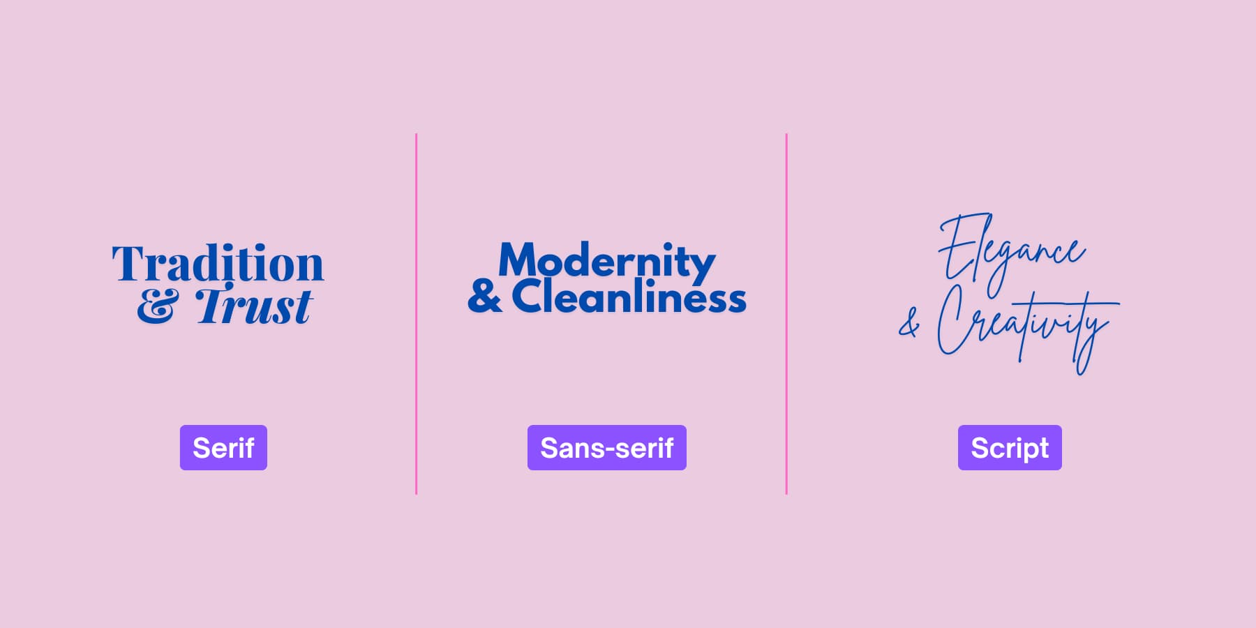
These feelings shape how visitors see your credibility and trust. This happens before they read a single word.
The Growing “Trendy” Font Issue
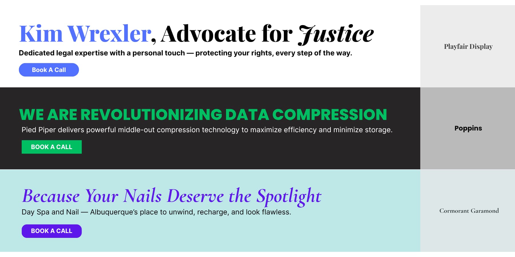
When selecting fonts for your brand, start by defining your core personality traits. Are you professional and established? Consider refined serifs like Playfair Display or Crimson Text. Building a tech startup or modern service? Contemporary sans-serifs like Inter, Poppins, or Montserrat communicate innovation and approachability. Running a luxury brand or creative studio? Elegant options like Cormorant Garamond or Abril Fatface can convey sophistication.
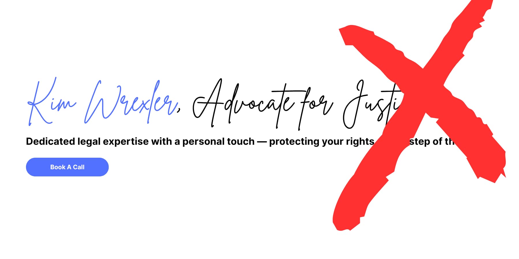
Test your font choices with your target audience in mind. A law firm using playful script fonts might confuse clients who expect serious, traditional styles. Choose typography that fits the feeling you want to create, not just what’s trendy.
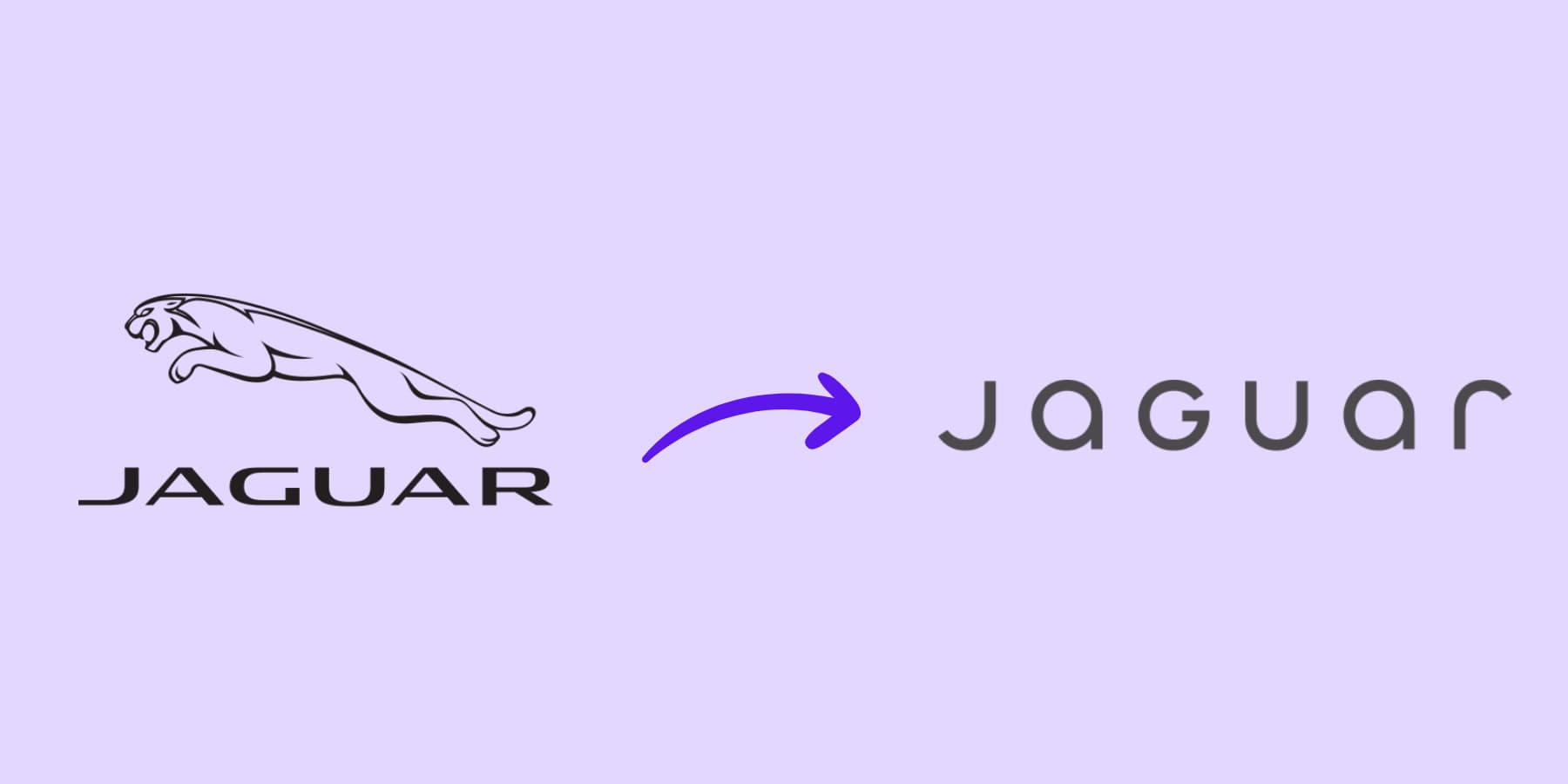
For example, Jaguar’s recent rebrand can be considered a failure. The new logo font resembles a tech company, which can confuse the target audience. Show it to someone unaware of the brand, they wouldn’t guess it’s for a luxury car.
The rebrand didn’t match what luxury car buyers want: sophistication and power. The classic Jaguar symbol, used since 1945, was replaced by a trendy font that feels unoriginal.
3 Big Typography Problems That Hurt Websites
When typography fails on websites, it usually happens in one or all of these three ways. These problems appear so consistently that learning to spot them becomes the first step toward better website typography. Let’s explore.
Trap 1: The Static Text Problem
Picture this: you spend hours getting your website’s text just right on your laptop. The headlines look great, the body text flows nicely, and everything feels right. Then you open your site on the phone and have to squint to read anything.
You’ve hit the static text trap. When designers set fonts to fixed pixel sizes, they design for one screen and cross their fingers for everything else. This old approach treats websites like printed pages, where nothing changes size.
Device variety makes this worse. Your text must work on phones, tablets, laptops, and giant desktop screens. Fixed sizes can’t handle this range. What reads well on an iPhone becomes tiny on a smartwatch or massive on a 4K display.
The size differences between your headlines and body text get messed up on different screens, and readers can’t tell what’s important anymore.
A perfect typography needs to scale fluidly with screen size. It should maintain readable proportions whether someone visits your site on an outdated phone or an ultrawide monitor. This adaptive approach respects both your design intentions and your readers’ varied viewing conditions.
Trap 2: The Hierarchy Nightmare
You instantly know where to look when you walk into a well-organized store. Clear signs guide you to different sections. Your website’s text works the same way.
Bad typography hierarchy turns your content into a confusing maze. Imagine trying to read a newspaper where headlines, subheadings, and body text all use nearly identical fonts and sizes. You’d give up quickly, right?
This happens on websites constantly. Designers make headlines too small or body text too big. Everything blends together into gray blocks of similar-looking text. Visitors land on these pages and immediately feel overwhelmed.

And salt to wounds, most people don’t actually read websites word by word. They scan first, looking for interesting bits. Clear typography hierarchy helps users navigate content efficiently, while poor hierarchy forces them to spend extra mental energy figuring out what’s important. When your text sizes don’t create obvious differences, scanning becomes impossible.
Poor hierarchy also signals poor quality. Visitors subconsciously judge your expertise based on how organized your content looks. Messy text hierarchy suggests messy thinking. Clear text hierarchy builds trust before people even read your first sentence.
Problem 3: Slow Loading Fonts
Your brand font looks perfect in Figma. You export it and upload it to your site, but suddenly, your pages take forever to load.
Most designers don’t realize how heavy fonts actually are. That beautiful custom typeface? It’s probably a few hundred kilobytes per weight. Add regular, bold, and italic versions, and you’re looking at over a megabyte of font data.
Font files often become 3x larger than they should be when using uncompressed formats like TrueType Font (TTF) or OpenType Font (OTF), and each font requires a separate HTTP request that adds to loading time.
Your visitors pay the price. Browsers won’t show text until fonts finish downloading. People on slow connections see empty white spaces where your headlines should be, known as Flash of Invisible Text (FOIT).
The problem compounds with multiple font files. Three font weights mean three separate downloads, each blocking your content from appearing smoothly. Safari hides text until custom fonts are ready, while other browsers show fallback fonts that can cause jarring layout shifts when the real fonts finally appear.
Variable fonts solve this mess. Variable fonts pack multiple styles into one file, slashing load times. Even better with Web Open Font Format (WOFF/WOFF2) fonts.
Today’s Typography Basics
Modern web typography operates on three core principles that separate good websites from great ones. Getting these fundamentals right affects everything from user engagement to search rankings.
Typography Systems Beat Random Choices
The type scale determines how much bigger or smaller fonts are rooted in the base or default font. Using this method, your base size is 100% if you like percents or 1em, if that’s your preferred unit. Don’t pick font sizes randomly. Use mathematical relationships between text elements.
Start with a base font size (16- 18px is common) and choose a scaling ratio from 1x to 2x, tailored to your app’s needs. For example, eCommerce apps often use a larger ratio to make text elements stand out more, while sites with data-rich dashboards might go for a smaller ratio. A 1.25 ratio creates subtle differences perfect for text-heavy sites. For example:
- Body text: 16px
- H5: 20px (16 × 1.25)
- H4: 25px (20 × 1.25)
- H3: 32px (25 × 1.25)
- H2: 40px (32 × 1.25)
- H1: 49px (40 × 1.25)
A 1.618 ratio creates dramatic contrasts ideal for marketing pages. Also known as the Golden Ratio. For example:
- Body text: 16px
- H4: 26px (16 × 1.618)
- H3: 42px (26 × 1.618)
- H2: 68px (42 × 1.618)
- H1: 68px (42 × 1.618)
This creates dramatic size differences that grab attention and guide readers through your content hierarchy.
This systematic approach prevents the hierarchy nightmare we discussed earlier. When your H1, H2, and body text follow mathematical relationships, readers instantly understand your content structure.
Use Clamp() For Automatic Scaling
The CSS clamp function creates fluid typography that smoothly scales text between minimum and maximum sizes. Instead of jumping between fixed sizes at breakpoints, clamp() creates smooth transitions that work at every screen width.
The syntax is simple: clamp(minimum, preferred, maximum). For example, clamp(16px, 4vw, 32px) means your text starts at 16px on small screens, scales at 4% of viewport width, and caps at 32px on large screens. This single line replaces multiple media queries.
You should use fluid typography to smoothly scale text with a larger difference between the minimum and maximum size and maintain consistent sizing.
This works best for headlines and display text where dramatic size changes make sense. Body text with minor size differences can stick to traditional responsive methods.
You can apply clamp() to any text element in your scale. An H1 might use clamp(32px, 8vw, 72px) while an H3 uses clamp(20px, 3vw, 28px). This creates typography that feels natural at any screen size without complex calculations.
Context Shapes Font Performance
Design size and scale based on content: Readable typography can depend as much on other content as font selection. The scale and sizes of text elements often differ depending on how much text is rendered at one time and the type of content on the screen.
A blog post needs typography that is different from that of product pages. Long-form articles benefit from generous line spacing and comfortable reading sizes. Product pages need punchy headlines and scannable descriptions.
Typography selection: First, start with a font that looks great and reads well on a small screen. Then, test it on a larger screen. This mobile-first approach prevents choosing fonts that look great on desktops but become unreadable on phones.
Content Type Determines Typography
Consider your audience’s reading behavior, too. Visitors to a news site want to get information quickly. They move through headlines fast, so the text must be clear and direct. Body text should help you find key details without slowing you down.
The font choices on financial services sites are meant to make users feel secure and confident. Serious, traditional typefaces reinforce that feeling of trust.
If you land on a creative agency’s website, they expect bold design choices sometimes. Here, typography grabs their attention and often becomes part of the brand experience. Unusual fonts or layouts help the agency show off its personality and creativity.
ecommerce sites face unique challenges. Product names vary wildly in length, from “iPhone” to “Ultra-Lightweight Mountain Bike with Advanced Suspension System.” Your typography system must handle both gracefully without breaking layouts.
Landing pages work differently from informational sites. Visitors spend seconds deciding whether to stay or leave. Headlines need immediate impact. Body text should be scannable. Call-to-action buttons require clickable and urgent fonts.
Documentation sites prioritize function over form. Code snippets need monospace fonts for proper alignment, and step-by-step instructions benefit from numbered lists with a clear hierarchy.
Technical Implementation Drives Results
According to the Baymard Institute, the consensus seems to be between 50 and 75 characters per line. Line length directly affects reading comprehension. Too wide text forces readers to work harder to track from line to line.
Too many font sizes and styles can create a cluttered and inconsistent design. Not testing typography on different devices and screen sizes leads to readability issues on some screens.
Font loading strategy matters too. Browsers won’t show text until custom fonts download, creating blank spaces where your content should appear. Planning fallback fonts that match your custom font’s spacing prevents jarring layout shifts when fonts load.
Font Loading Speed Makes The Difference
Choose fallback fonts that closely match your custom font’s metrics. If you use Montserrat, specify Arial as backup since both have similar character widths. Use Times New Roman as a fallback for serif fonts like Playfair Display. This prevents text from jumping around when custom fonts finally load.
Preload your most important fonts. WP Rocket handles font preloading automatically without touching your theme files. You simply enable the font preloading option in WP Rocket’s settings, and it handles the technical implementation. It also caches your web pages so they remain blazing fast for all of your visitors.
This works alongside fast hosting like SiteGround to serve font files quickly from optimized servers, creating the ideal setup for fast-loading typography.
How Modern Website Builders Should Handle Typography
Most website builders treat typography like an afterthought. They give you basic font dropdowns and size sliders, then leave you to figure out the rest. This old approach creates the same typography problems everywhere: static text that breaks on mobile, confusing hierarchies, and slow-loading pages.
Modern builders should work differently. They should provide systems, not just options like:
- Variable Font Support: Modern builders should support these formats without extra work. They should also support modern web font formats like WOFF/WOFF2.
- Fluid Typography: Better builders should include mathematical functions like clamp() built into their interfaces. You type clamp(16px, 4vw, 32px) and watch your text scale smoothly across all devices. Less media queries needed.
- Typography System Integration: Good builders let you create reusable text styles. You define your H1 size once as a variable, then apply it everywhere. Change your heading size in one place, and every H1 updates across your site. Set one font family as a variable and reference it throughout your design.
- Global Font Management: They should also include centralized control for typography variables. You set your heading font once, body font once, and font sizes once as reusable variables. Need a larger text site-wide? Update the variable and watch every instance change automatically.
…And Why Most Website Builders Don’t
Many website builders don’t offer the typography tools you need, and this is often due to business choices.
- User Experience: Most builders focus on making things easy to use immediately, rather than offering long-term flexibility. A simple font menu is much less intimidating for new users than complex functions.
- Development Investment: Creating advanced typography tools takes a lot of engineering work. Features like variable font support and design systems need custom interfaces, thorough browser testing, and continuous upkeep.
- Support Challenges: Complex typography features can lead to more support questions. When you can adjust things like clamp values or variable fonts, you might encounter issues that simpler controls wouldn’t cause. Some builders avoid this complexity to keep their support costs down.
- Older Systems: Many older builders were built before variable fonts existed. Adding these new features means overhauling core systems while still ensuring old sites continue to work. Often, they opt for small improvements instead of big changes that could disrupt current users.
While experienced programmers used to be the main ones asking for better typography tools, newer builders see that even beginners can create advanced typography if they have the right interface.
These builders provide simple controls for quick tasks and robust options for when you want to do more. This way, you can start simple and improve your typography skills without switching platforms.
Web Design (And Typography) Made Simple With Divi
When you’re working on web typography, the wrong tools can turn what should be creative work into technical frustration. Most page builders give you basic font controls that break on mobile or create messy code behind the scenes. You spend more time fighting your tools than designing.
Divi takes a different approach. This WordPress page builder prioritizes visual design while providing the technical control needed for professional typography. The visual editor shows you your changes as you make them, so when you adjust font sizes or line spacing, you see exactly how it affects your page.
The builder includes more than 200 modules you can position anywhere on your page. Text modules, heading modules, and specialty content blocks all work together, so you’re not stuck with preset layouts that force your content into uncomfortable boxes.
What sets Divi apart is its library of over 2000 professional layouts. These aren’t basic templates. Each design comes built for specific industries. Restaurants, photographers, consultants, tech companies — you’ll find layouts that understand your audience and business goals.
Building Without the Technical Barriers
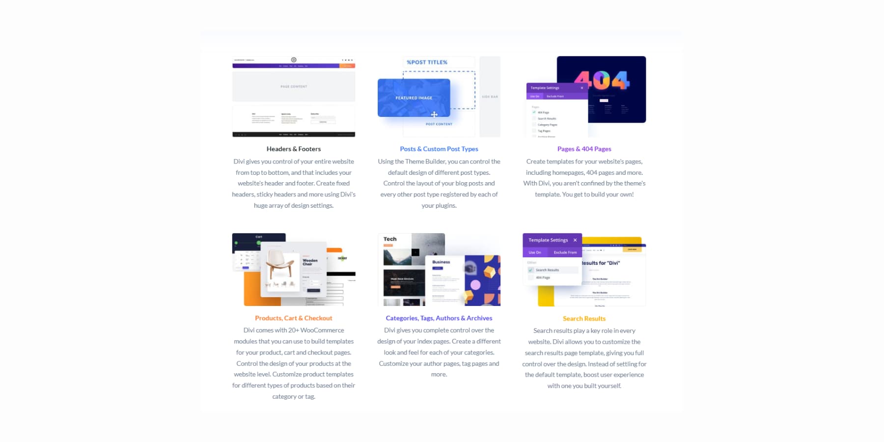
The Theme Builder gives you control over every aspect of your site’s typography. You can design custom headers that match your brand voice. Blog layouts that make long-form content readable. Even your 404 pages can maintain consistent typography and branding.
Divi AI brings artificial intelligence directly into your design process. Generate headlines that match your tone and product descriptions that sound like your brand.
Even full-page sections that understand your business context.
And relevant code when needed.
Photo editing happens right in the builder, too. Describe what you need changed in an image, and the AI makes those adjustments. And of course, it can generate new images.
Divi Quick Sites solves the blank page problem that stops many projects before they start. Professional starter sites come with typography already established. Our design team creates these templates with unique images and artwork you won’t see elsewhere.
Divi Quick Sites with Divi AI can also build custom layouts based on your business description. Tell it about your consulting practice or restaurant, and it creates relevant pages with appropriate copies for your industry.
This isn’t just a wireframe: you get real headlines, body copy, and images that make sense for your business.
You can set your brand fonts and colors upfront and let the AI work within those parameters. Afterward, everything remains fully editable, so you can refine the typography to match your exact vision.
Typography (And Everything Else) Gets Better With Divi 5
Creating websites should feel as natural as writing in your favorite notebook. You have ideas; your tools should help express them clearly without creating obstacles. This philosophy drove us to rebuild Divi completely from the foundation up.
Divi 5, currently in alpha, is ready for new website projects. We listened to honest feedback about what makes web design work better. Not flashy features that look good in demos, but practical improvements that make your daily work faster and more enjoyable.
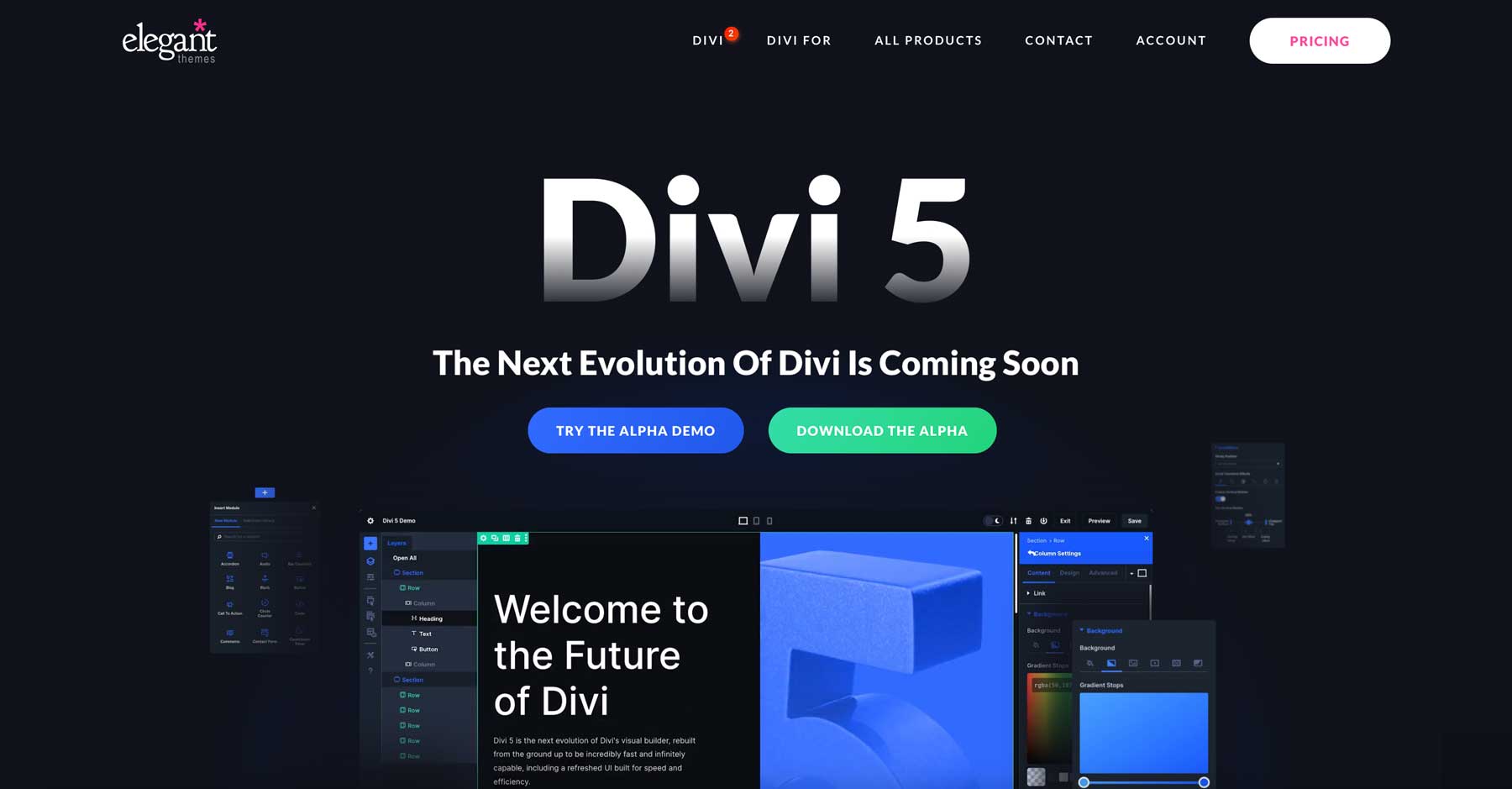
We kept everything that works well in the current Divi and built upon it. The interface is refreshed, and everything underneath runs better. The rebuild uses modern best practices throughout. Pages load noticeably faster. Controls respond more smoothly. You can maintain consistent typography across your entire site without extra manual work.
What’s Actually New?
- Complete Framework Rebuild removes the old shortcode system entirely. Everything now runs on modern block-based architecture that browsers handle more efficiently.
- One-Click Editing means clicking any text element immediately opens its typography controls. No more hunting for small edit icons or navigating through multiple menus to change a font.
- Customizable Breakpoints expand from three screen sizes to seven. You can adjust each breakpoint to match your specific typography needs across different devices.
- Advanced Units Support brings CSS functions like calc(), clamp(), min(), and max() directly into the visual interface. Create fluid typography that scales perfectly without writing custom code.
- Design Variables let you store fonts, colors, sizes, and spacing values in one central location. Change your heading font once, and every H1 across your site updates automatically.
- Option Group Presets save complete typography styles for borders, fonts, shadows, and spacing. These presets work across different modules, so your typography stays consistent.
- Nested Rows allow rows inside other rows. Build complex typography layouts without needing special section types.
- Module Groups combine multiple modules into a single unit. They make it easier to manage complex layouts with mixed typography, and you can even create custom modules.
- The Multi-Panel Workspace lets you position the panels wherever works best for you. You can keep typography controls open while adjusting other design elements.
- Attribute Management gives you precise control when copying, pasting, and resetting typography styles between page elements.
- Light/Dark Mode provides interface themes that reduce eye strain during long design sessions.
- Canvas Scaling resizes your work area to preview how typography looks on different screen sizes without switching to preview mode.
- Performance Improvements make pages load faster, display more quickly, and feel more responsive while you’re building.
Try Divi 5 Now
Divi 5 is available today for new website projects. We rebuilt it from scratch to make typography and design workflow more natural. Download the Public Alpha and test it on your next new site to experience the improvements firsthand. All Divi members get access at no additional cost.
We recommend using it only for new sites while we perfect the migration system for existing Divi 4 websites. If you’re starting a fresh project, this is the perfect time to experience the updated interface and improved performance.
Setting Up A Scalable Typography System In Divi 5
Good typography systems save you hours of work while keeping your site looking professional. With Divi 5’s new features, instead of styling each text element manually, you create a central system that updates your entire site with a few clicks. Have a look:
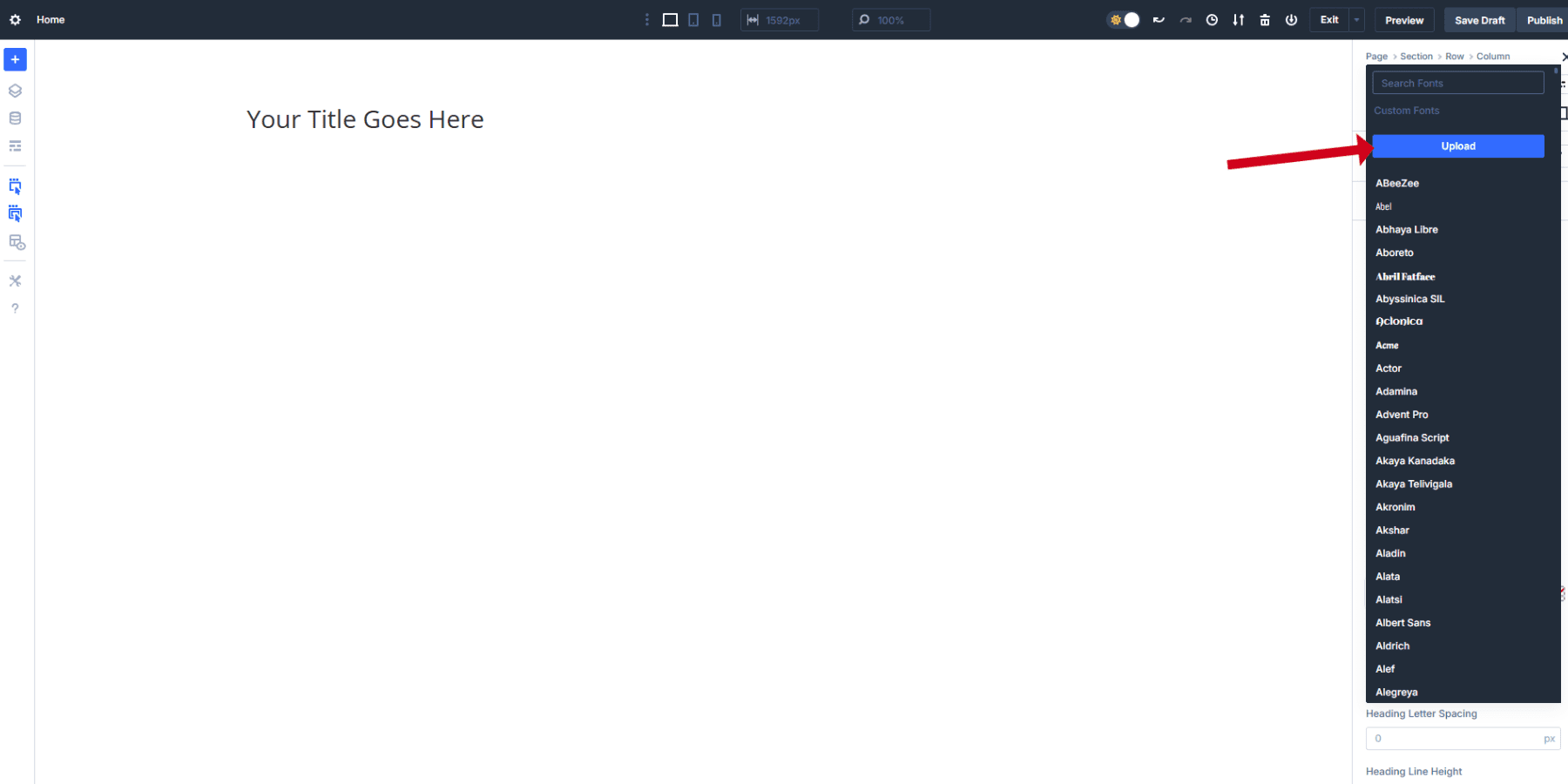
Building a typography system that works across all devices starts with choosing the right fonts. Begin your search at Google Fonts, which houses over 1,700 font families, including an impressive collection of variable fonts. All Google Fonts are available within the Divi font selector.
You can also upload custom fonts directly to Divi. However, for now, we only support uploading TTF and OTF fonts.
Design Variables: Your Design’s Foundation
Design Variables in Divi 5 give you central control over every design aspect of your website. You can create six different types of variables:
- Color Variables: Store brand colors, gradients, and text colors that stay consistent across your site
- Font Variables: Save your heading and body fonts for instant application anywhere
- Number Variables: Control font sizes, spacing, border radius, and other measurements
- Image Variables: Store logos, background patterns, or frequently used images
- Text Variables: Save phone numbers, addresses, taglines, or any repeating text content
- URL Variables: Keep social media links, affiliate URLs, or call-to-action buttons organized
Each variable type handles different parts of your website. When you change a variable, every element using that variable updates automatically across your entire site.
To access Design Variables, open the Variable Manager in the top-left corner of the Visual Builder. The interface shows all six variable types in separate tabs, making it easy to organize your design system.
Creating Your Typography System With Design Variables
Start by setting up:
- Font Variables, used to store your primary heading and body fonts for consistent use throughout your site. This way, you avoid scrolling and selecting from a large list every time.
- Color Variables, for keeping your text colors consistent across all elements. No need to remember hex codes.
Next up, you can set up Number Variables for your text. Divi 5 supports static pixel values, relative units like rem and em, and advanced functions like clamp() for fluid typography.
The clamp() function works best for responsive websites because it smoothly scales text between minimum and maximum sizes. We recommend that you set up clamp() from the start.
Using the 1.25 scale discussed earlier, here are the best clamp() values you can add as Number Variables:
- H1: clamp(2.5rem, 5vw, 3.8rem)
- H2: clamp(2rem, 4vw, 3.05rem)
- H3: clamp(1.6rem, 3vw, 2.44rem)
- H4: clamp(1.25rem, 2.5vw, 1.95rem)
- H5: clamp(1rem, 2vw, 1.56rem)
- H6: clamp(0.8rem, 1.5vw, 1.25rem)
- Body Text: clamp(1rem, 1vw, 1.25rem)
- Small Body: clamp(0.75rem, 0.8vw, 1rem)
These values will depend on your design, but they give a proper springboard to adapt to your needs. Each clamp() function contains three values: minimum size, preferred size (which creates the scaling behavior), and maximum size. The middle value uses viewport width (vw) units to create smooth scaling as screen sizes change.
Create these as Number Variables in the Variable Manager. Give them clear names like “Heading-H1” or “Body-Text” so you can easily find them when building pages.
Applying Design Variables To Your Text Elements
Once your variables are saved, applying them takes just a few clicks. In the text module, navigate to the Design tab, click the variable icon next to the font dropdown, and choose your saved Font Variables. The text instantly adopts your variable settings.
Then, locate the font size field. You’ll see a small variable icon next to the input box. Click it to open your saved Number Variables. Select your “Heading-H1” variable instead of typing a static size.
Repeat the same for all six headings and the body text. You may repeat the same for your font colors if you wish to apply specific colors to specific headings.
Creating Reusable Option Group Presets
Option Group Presets save specific styling groups that work across different module types in Divi 5. Unlike Element Presets, which save entire modules, Option Group Presets focus on particular design aspects like text styling, borders, or spacing.
The same text preset works on Heading modules, Blurb modules, and any other element with text options. This cross-module compatibility means you style once and apply everywhere. When you update an Option Group Preset, every element using that preset updates instantly across your site.
This saves hours of manual work and keeps your design consistent without hunting through individual modules.
After adding the typography and colors to your text modules, you can also add the spacing and visual effects you want in this style. You can also use number variables to create reusable spacing values. You even add animations to the text, which will be stored and repeated everywhere the preset is used.
When your text styling looks perfect, hover over the Option Group Preset icon beside the “Heading” label. Click it to open the preset management menu.
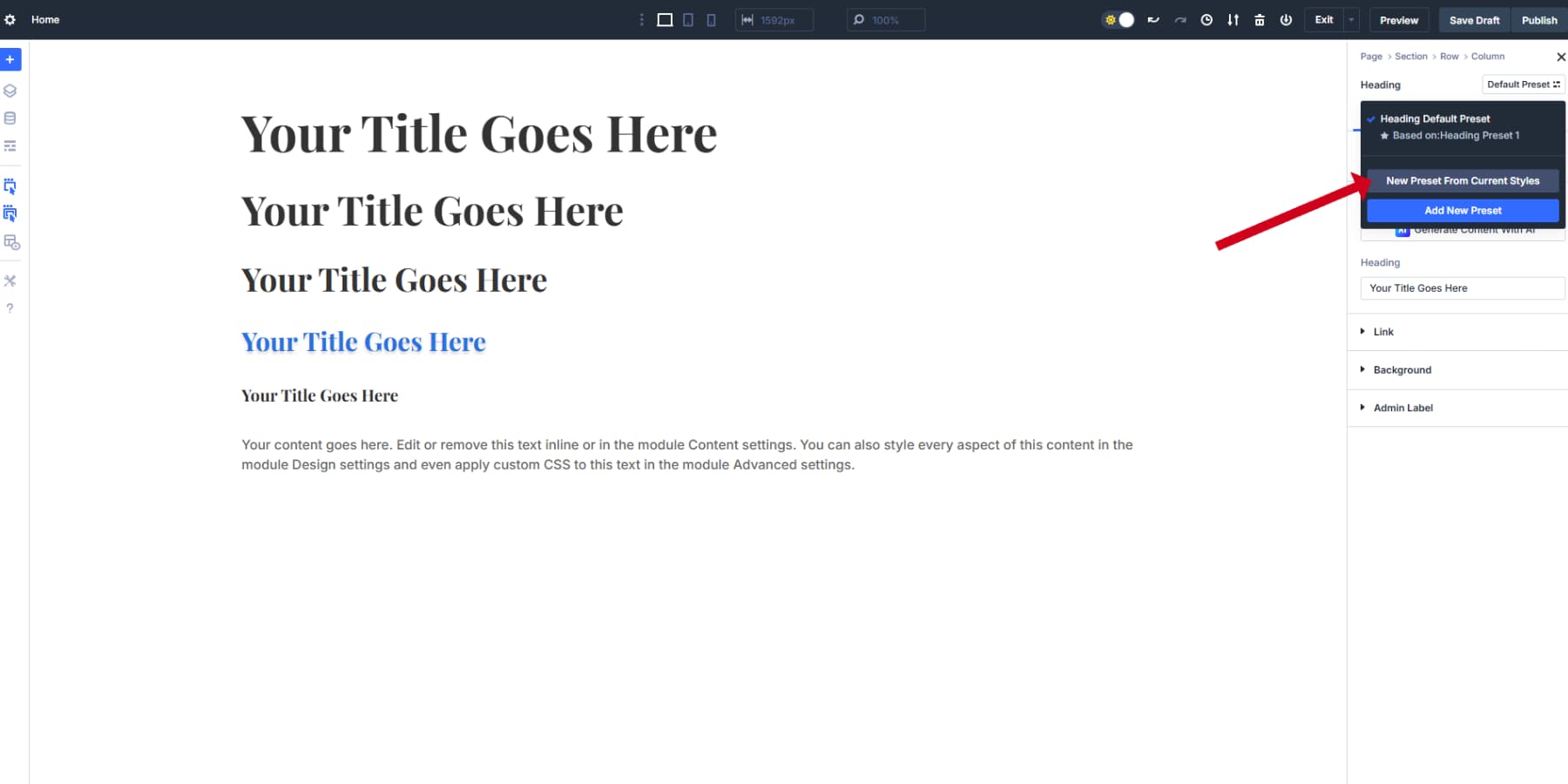
Select “Create Preset From Current Styles” and name it something clear, like “H4 Style” or “Card Titles Default.” The preset captures all styling you applied to that option group, including your variable references. Click save to store it.
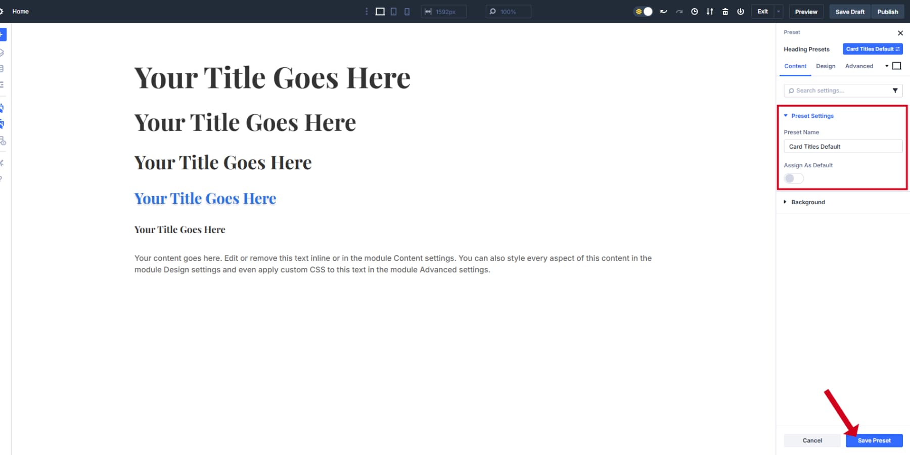
Applying Option Group Presets
You can now apply this exact styling to any module with text options. Add a card and click the Option Group Preset icon in its text settings. Your “Card Titles Default” appears in the dropdown list. Select it, and the Card heading instantly adopts your original styling.
Setting presets as defaults saves even more time. Click the star icon next to your most-used preset to make it the default choice. Every new text element will automatically use your typography system without manual setup.
Build separate presets for each heading level and body text variation. Create special presets for testimonial text, button labels, or call-out boxes. This systematic approach means you style once and reuse everywhere. The underlying variables keep everything connected and easy to update when needed.
This systematic approach transforms how you work with Divi 5. When a client asks for “slightly bigger headings” or wants to test a different font, you change one variable instead of editing dozens of pages. Your typography stays mathematically proportional across all devices, and new pages inherit your design decisions automatically. Most importantly, you spend time creating instead of repeating the same font selections.
Divi 5 has many more features that will make your website design journey a bliss. Check out our resources for detailed guides on Divi 5 to get started and master Divi 5 in a few days, and stay ahead of the curve.
Try Divi 5 For Optimal Website Typography
Poor typography kills websites. People judge your business based on your fonts before they even read your content. We’ve walked through the main problems: static text that breaks on mobile, confusing hierarchies, and slow-loading fonts that frustrate visitors.
Good typography takes work. You need proper scales, fluid sizing, and fast loading. Most builders make this harder than it should be. Your typography matters. Don’t let it hurt your business.
Divi 5 is a website builder that actually gets typography right. Design Variables store your fonts and sizes in one place. Option Group Presets let you apply consistent styling across different modules. The clamp() support means your text scales smoothly without writing media queries.
⚠️ Divi 5 is ready for new websites, but we don’t recommend migrating existing Divi websites yet.


Thank you for the article.
Is there a chance we’ll ever get one _GLOBAL_ font manager in Divi? So I can define a h2 ONCE and don’t have to do it over and over again for each individual kind of module (Text Module, Blurb Module, even Headline Module, etc…?)
I think this is one of the biggest downsides of Divi and it’s so annoying I just end up defining font sizes in the Stylesheet of my child theme rather than making use of Divi’s global variables and presets.
+1
Agreed, a global manager where you define the specs of a heading and it will apply automatically to all those headings would be much easier and time saving. The assigning of every small spec to so many modules every time feels outdated.
Hello,
Thank you for this very interesting article.
Unfortunately, I think I’ve spotted a small error:
H2: 68 px (42 × 1.618)
H1: 68 px (42 × 1.618)
If I understand correctly, H1 should be 110 px (which seems quite large to me).
Best regards.